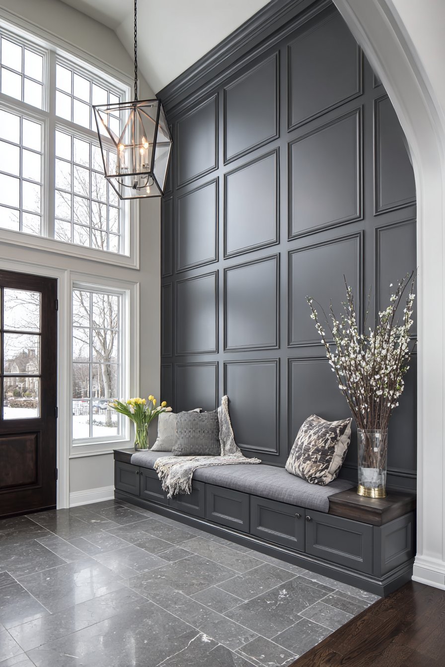
Wall wainscoting represents one of the most sophisticated and versatile design elements available to homeowners seeking to elevate their interior spaces. This architectural detail, which has graced homes for centuries, continues to captivate modern designers and homeowners alike with its ability to add depth, character, and visual interest to any room. Whether you’re drawn to the clean lines of contemporary design or the ornate details of traditional styling, wainscoting offers endless possibilities for creating spaces that reflect your personal aesthetic while adding tangible value to your home.
The beauty of wainscoting lies not only in its aesthetic appeal but also in its practical benefits. Beyond serving as a stunning visual element, wainscoting provides durable wall protection in high-traffic areas, conceals imperfect walls, and creates the illusion of higher ceilings when proportioned correctly. From classic raised panels that evoke timeless elegance to modern board and batten installations that bring contemporary flair, each style tells a unique story and serves a specific design purpose.
In this comprehensive guide, we’ll explore twenty-three distinctive wainscoting ideas that span various design styles, room applications, and aesthetic preferences. Each concept has been carefully curated to showcase the remarkable versatility of this architectural element, demonstrating how wainscoting can transform spaces ranging from formal dining rooms to casual mudrooms, from sophisticated home offices to serene nurseries. Whether you’re planning a complete renovation or seeking a single impactful upgrade, these ideas will inspire you to harness the transformative power of wainscoting in your own home.
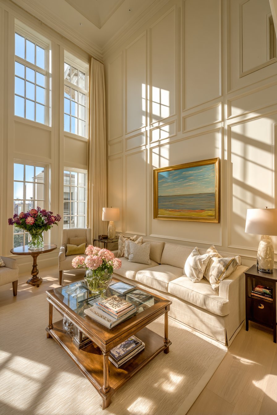
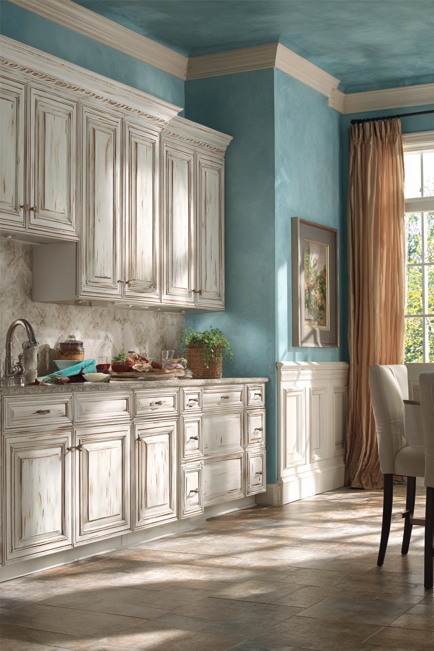
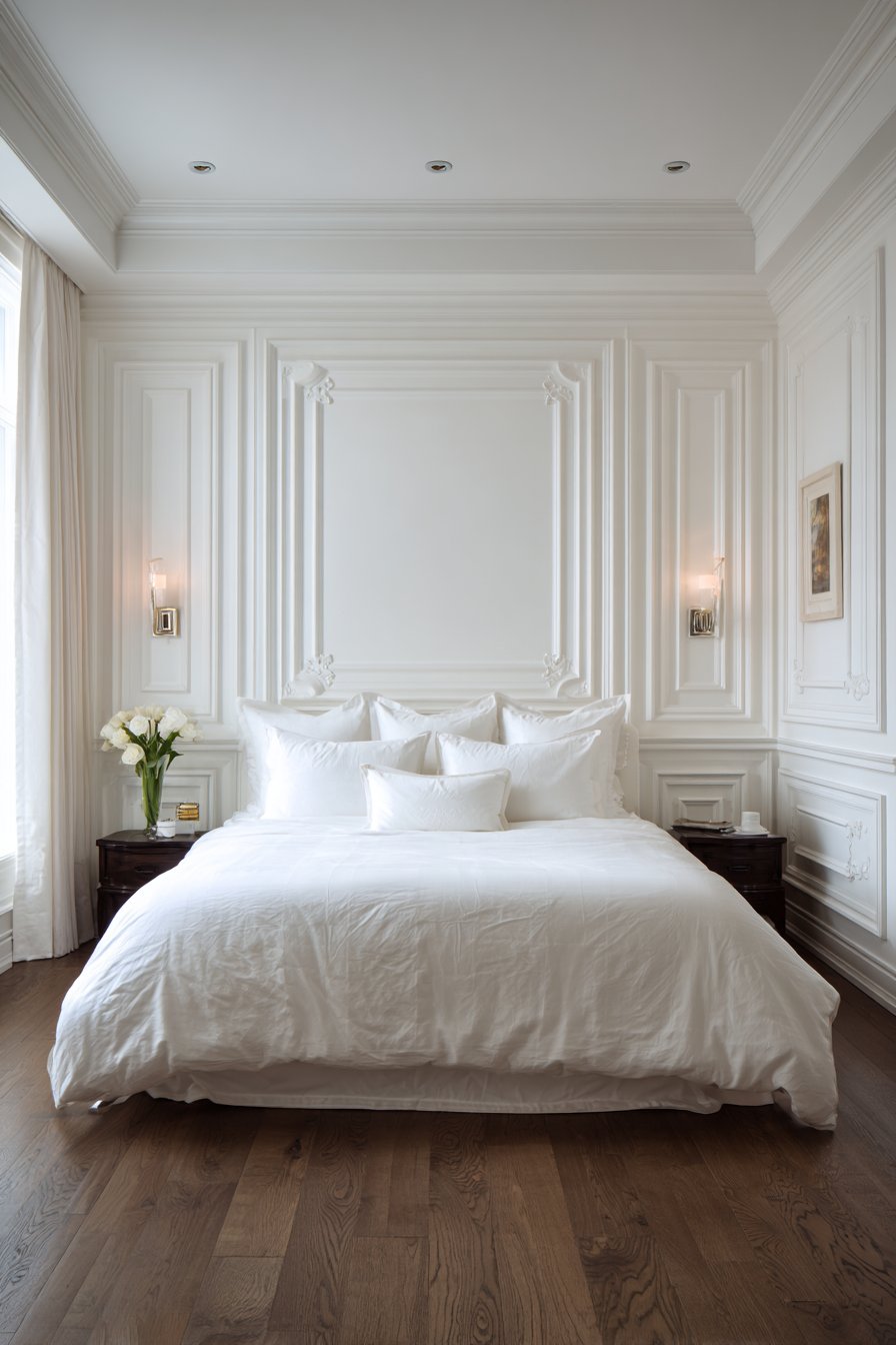
1. Traditional Living Room with Raised Panel Elegance
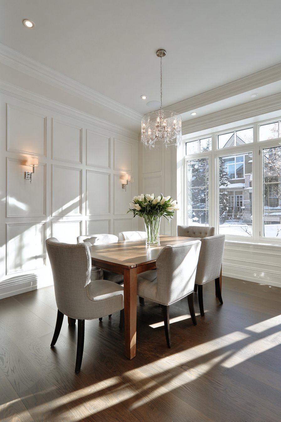
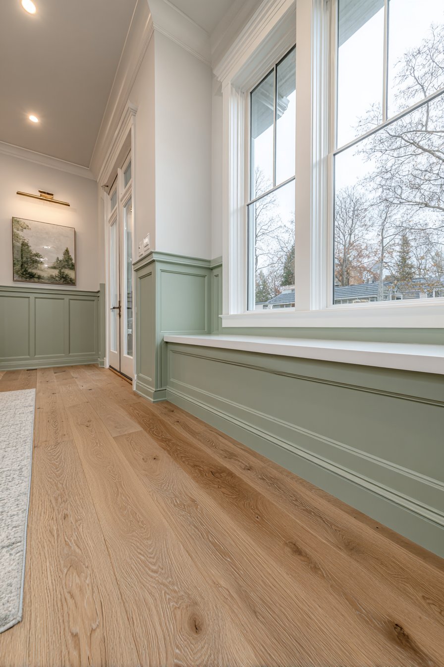
The traditional living room featuring raised panel wainscoting creates an atmosphere of refined sophistication that never goes out of style. Picture soft white panels extending precisely 36 inches from the floor, each panel displaying careful geometric proportions with detailed chair rail molding that serves as the transition point between the wainscoting and sage green painted upper walls. The natural oak flooring provides a warm foundation that complements the crisp white paneling, creating a balanced color palette that feels both fresh and timeless.
What makes this design particularly compelling is the play of light across the dimensional surfaces. Soft natural lighting from adjacent windows highlights the three-dimensional quality of the panel work, creating subtle shadows within the molding details that emphasize the craftsmanship involved. The raised panels add architectural interest without overwhelming the space, allowing furniture and décor to shine while providing a sophisticated backdrop that elevates the entire room.
The marriage of traditional elements with a fresh color palette demonstrates how classic design principles can feel contemporary. The sage green upper walls introduce a current color trend while the white wainscoting maintains timeless appeal. This balance ensures the space won’t feel dated as trends evolve, making it a smart long-term design investment.
Key Design Tips:
- Maintain proper proportions by extending wainscoting to one-third of the wall height for standard 8-foot ceilings
- Choose soft white or cream for paneling to maximize light reflection and create an airy feel
- Select a complementary paint color for upper walls that adds personality without competing with the architectural detail
- Install quality chair rail molding that’s substantial enough to create visual weight and definition
- Ensure panels are evenly spaced and symmetrical for a polished, professional appearance
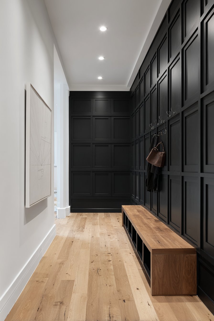
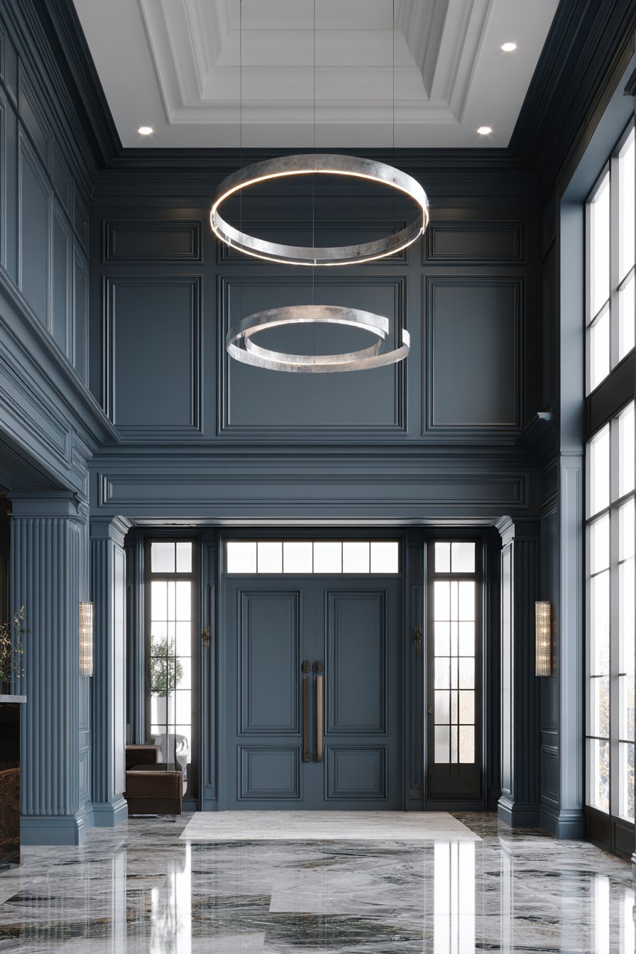
2. Modern Entryway with Bold Board and Batten
A modern entryway transformed by vertical board and batten wainscoting in matte black makes an unforgettable first impression. This dramatic design choice creates striking contrast against white upper walls, with boards evenly spaced at eight-inch intervals extending 48 inches high. The simple cap rail provides clean definition without unnecessary ornamentation, allowing the bold color and linear pattern to take center stage. A floating wooden bench integrating seamlessly with the wainscoting design offers both function and visual cohesion, while minimalist hooks continue the streamlined aesthetic.
The power of this design lies in its confident use of contrast and its embrace of contemporary minimalism. Black wainscoting might seem like a bold choice, but when executed with precision and balanced with crisp white upper walls, it creates a sophisticated entry that feels both welcoming and stylish. The vertical lines draw the eye upward, making the ceiling appear higher while adding dynamic visual interest to what might otherwise be a utilitarian space.
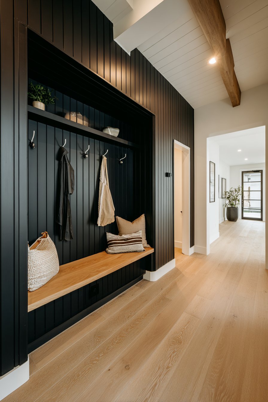
This approach proves that wainscoting isn’t limited to traditional applications or neutral palettes. By choosing matte black, you create a statement that reflects current design trends while maintaining the timeless structure that makes wainscoting enduringly popular. The integration of practical elements like the bench and hooks demonstrates how form and function can coexist beautifully.
Key Design Tips:
- Use matte finish paint to avoid fingerprints and maintain a sophisticated appearance in high-touch areas
- Space vertical boards consistently using a measuring guide to ensure professional results
- Paint both walls and wainscoting before installation for cleaner lines and easier application
- Integrate functional elements like hooks and benches directly into the wainscoting design for cohesive aesthetics
- Balance dark wainscoting with lighter upper walls and adequate lighting to prevent the space from feeling enclosed
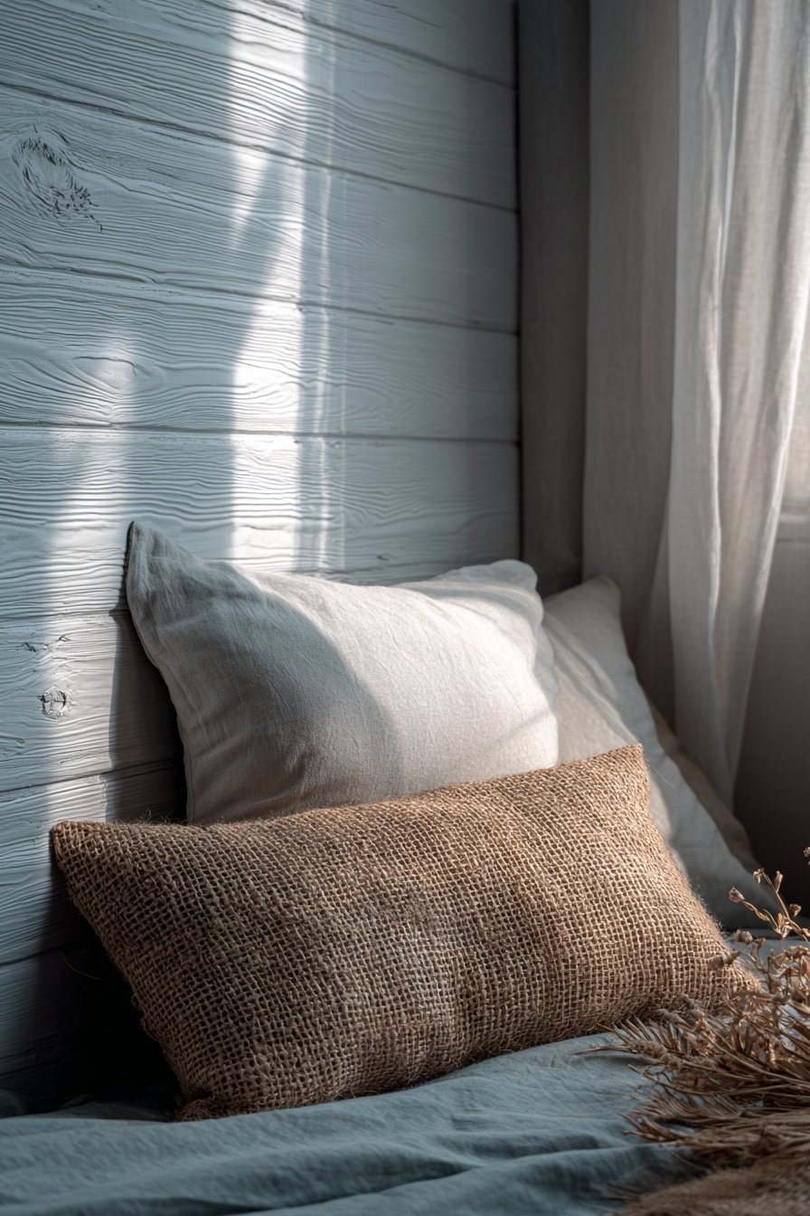
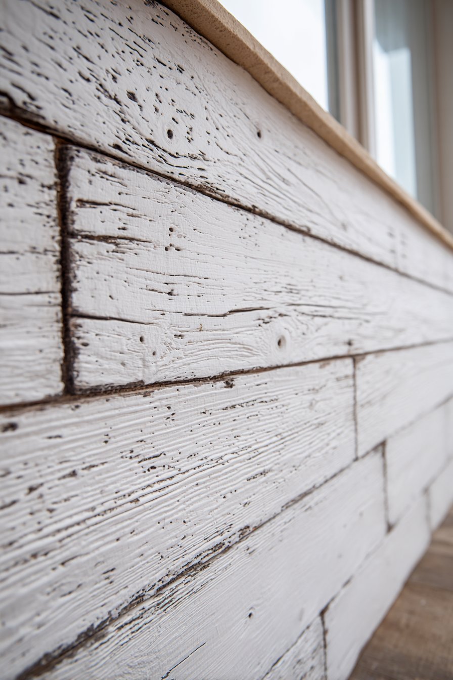
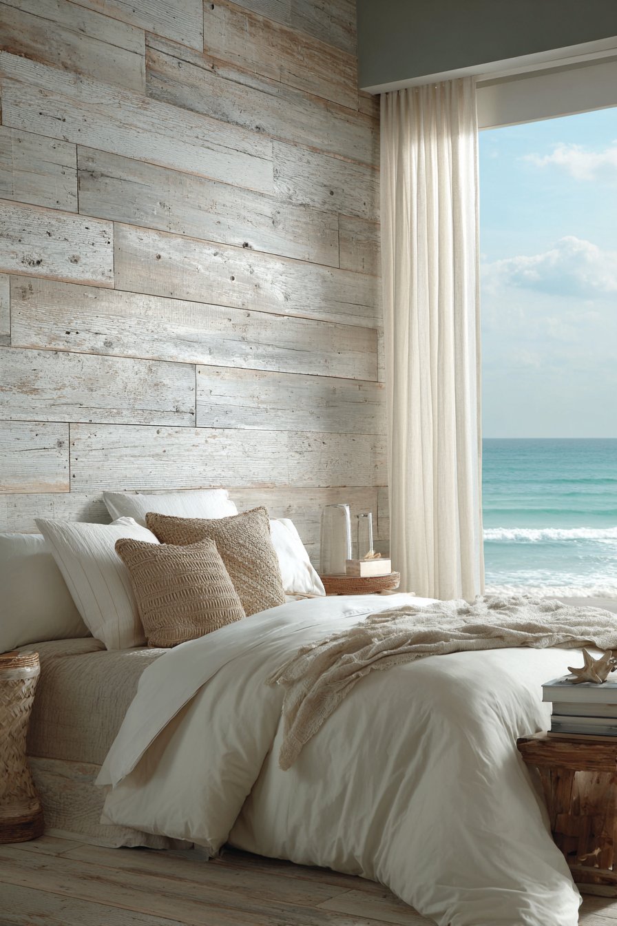
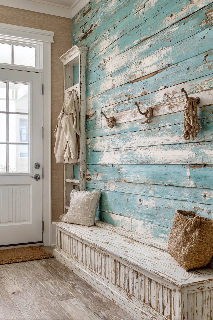
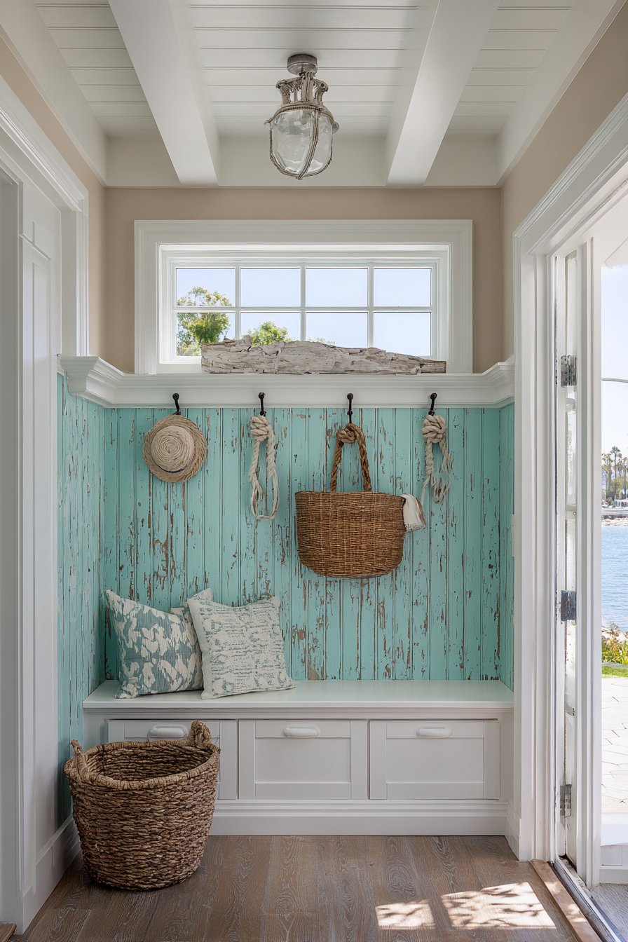
3. Coastal Bedroom with Weathered Shiplap Charm
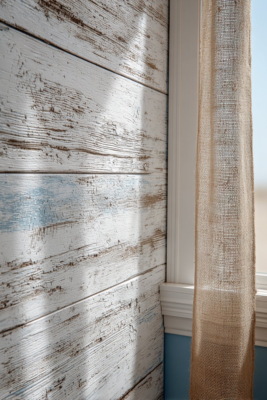
Transform your bedroom into a serene coastal retreat with horizontal shiplap wainscoting in weathered white, featuring subtle texture variations that evoke beachside living. Installed to 42 inches height, these panels display authentic wood grain detail with visible nail heads that add rustic charm rather than detract from the design. Soft blue-gray paint covering the upper walls enhances the maritime atmosphere, while natural jute accents throughout the space reinforce the beachy aesthetic. Natural daylight streaming through sheer curtains highlights the texture of the wood planks, creating an ever-changing play of light and shadow throughout the day.
The beauty of shiplap wainscoting in a bedroom setting lies in its ability to create texture and interest without overwhelming the space where relaxation is paramount. The horizontal lines have a calming effect, leading the eye around the room in a gentle, unhurried manner. The weathered white finish introduces an aged, collected quality that makes the room feel like a cherished beach cottage passed down through generations.
This design approach works particularly well in bedrooms because it creates visual interest at eye level when seated or lying in bed, exactly where your gaze naturally falls. The combination of weathered wood texture with soft blue-gray creates a color palette inspired by sand, sea, and sky, promoting the restful atmosphere essential for a bedroom sanctuary.
Key Design Tips:
- Choose shiplap boards with authentic texture rather than perfectly smooth surfaces for genuine coastal character
- Install horizontally for a calming effect that visually widens the room
- Leave small gaps between boards for authentic shiplap appearance and to accommodate wood movement
- Select weathered or distressed finishes that show natural variation rather than uniform color
- Pair with soft, muted colors in the blue-gray family to reinforce the coastal theme without feeling themed or overdone
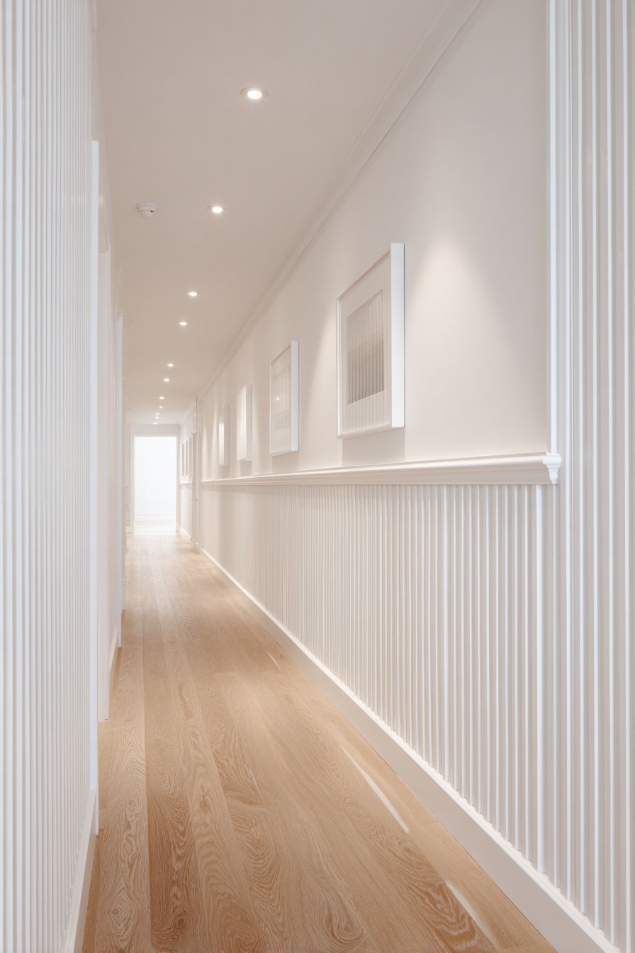
4. Scandinavian Hallway with Subtle Gray Paneling
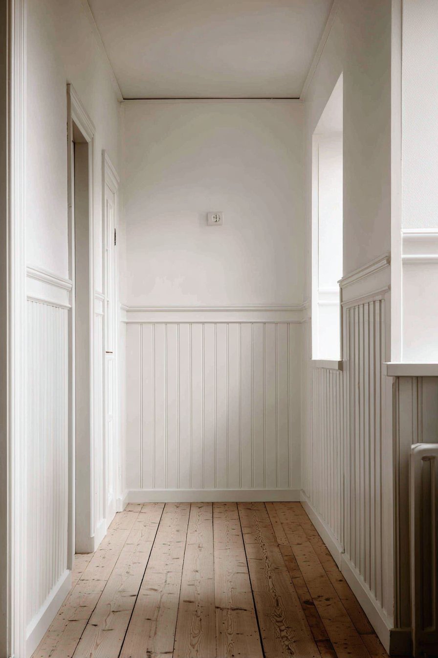
A Scandinavian-inspired hallway featuring painted tongue and groove paneling in light gray exemplifies the Nordic principle of lagom—not too much, not too little, just right. The vertical panels extend two-thirds up the wall height, creating subtle linear texture with minimal ornamentation and a simple cap rail detail. White upper walls and natural pine flooring maintain the characteristic Nordic aesthetic of bringing natural materials and light colors together in harmonious balance. Recessed lighting creates gentle highlights on the paneling texture, enhancing the dimensional quality without harsh shadows.
The genius of this design lies in its restraint. Scandinavian design principles emphasize function, simplicity, and connection to nature, all of which are evident in this wainscoting application. The light gray color adds depth and sophistication without the starkness of pure white, while the vertical orientation of the tongue and groove boards draws the eye upward, making the hallway feel more spacious.
This approach transforms a utilitarian hallway into a design feature in its own right. The wainscoting provides durable wall protection in a high-traffic area while elevating the aesthetic from basic corridor to thoughtfully designed passage. The simplicity of the design ensures it won’t compete with artwork or other decorative elements you might want to display.
Key Design Tips:
- Choose light gray tones with cool undertones to maintain the Scandinavian aesthetic
- Extend wainscoting to two-thirds wall height in hallways to create balanced proportions
- Keep trim details minimal and streamlined rather than ornate
- Use matte or eggshell paint finishes for an authentic Scandinavian look
- Install recessed or minimal lighting fixtures that don’t detract from the clean lines
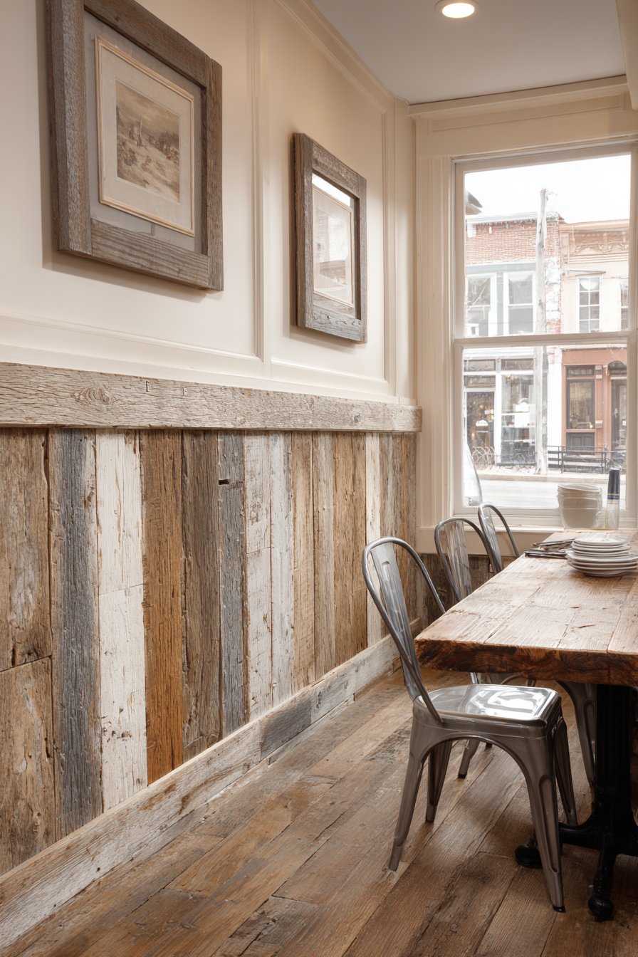
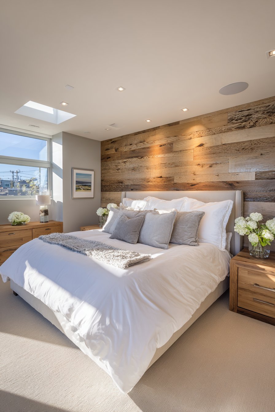
5. Farmhouse Dining Room with Reclaimed Wood Character
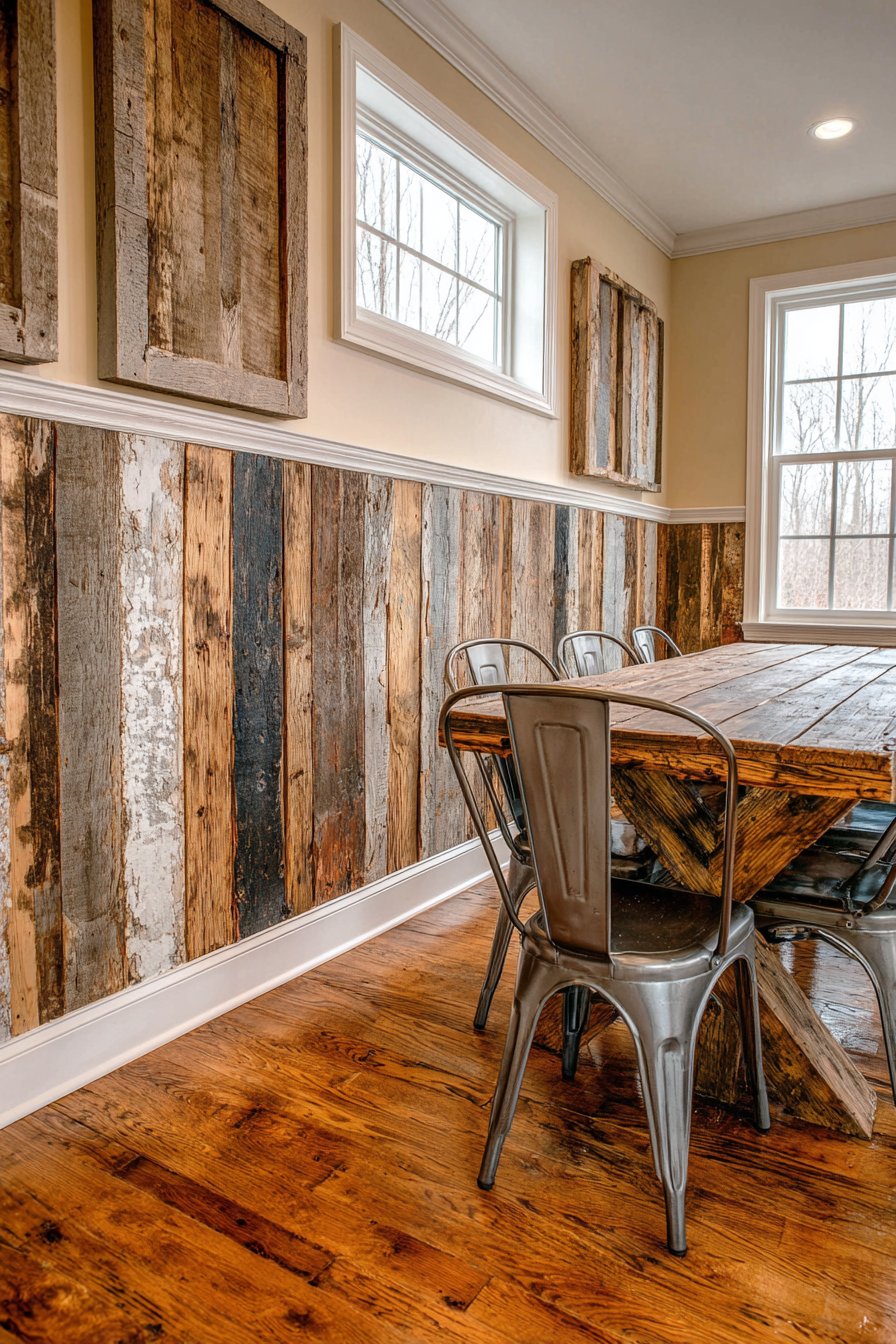
A farmhouse dining room featuring rustic reclaimed wood planks arranged horizontally as wainscoting creates a space rich with history and character. The installation reaches 40 inches, showcasing natural color variations from honey to medium brown tones that tell the story of the wood’s previous life. The rough-hewn appearance and visible weathering add authenticity that can’t be replicated with new materials. Cream-colored upper walls provide soft contrast that allows the wood to be the star, while a vintage wooden table and metal chairs complete the farmhouse aesthetic. Natural window light emphasizes the authentic texture and character of the reclaimed materials, highlighting the grain patterns and age marks that make each plank unique.
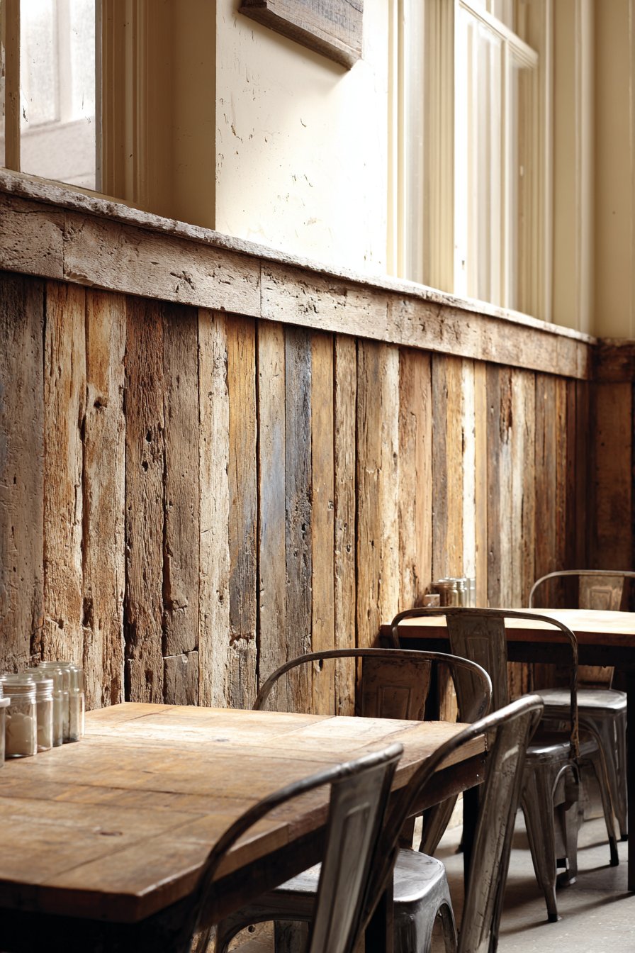
What sets this design apart is its celebration of imperfection and history. Each piece of reclaimed wood brings its own story—nail holes from a century-old barn, saw marks from hand-hewn beams, weathering from years of exposure. These “imperfections” are precisely what give the space its soul and distinguish it from cookie-cutter designs. The horizontal installation creates visual width in the room, making it feel more expansive and open.
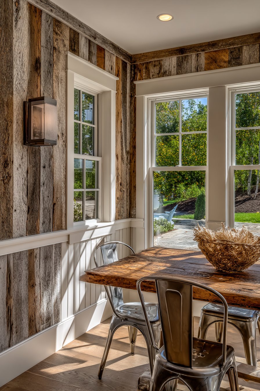
The warmth of the reclaimed wood creates an inviting atmosphere perfect for gathering around the dining table. Unlike pristine new materials, reclaimed wood has a lived-in quality that makes guests feel immediately comfortable. The varied tones within the wood prevent the space from feeling monotonous while maintaining a cohesive natural palette.
Key Design Tips:
- Source reclaimed wood from reputable suppliers who properly clean and prepare materials for interior use
- Embrace the natural color variations rather than trying to stain for uniformity
- Seal the wood properly to protect against moisture while maintaining its authentic appearance
- Mix plank widths for added visual interest and authenticity
- Allow visible nail holes and weathering marks to remain as character-adding details rather than defects to be hidden
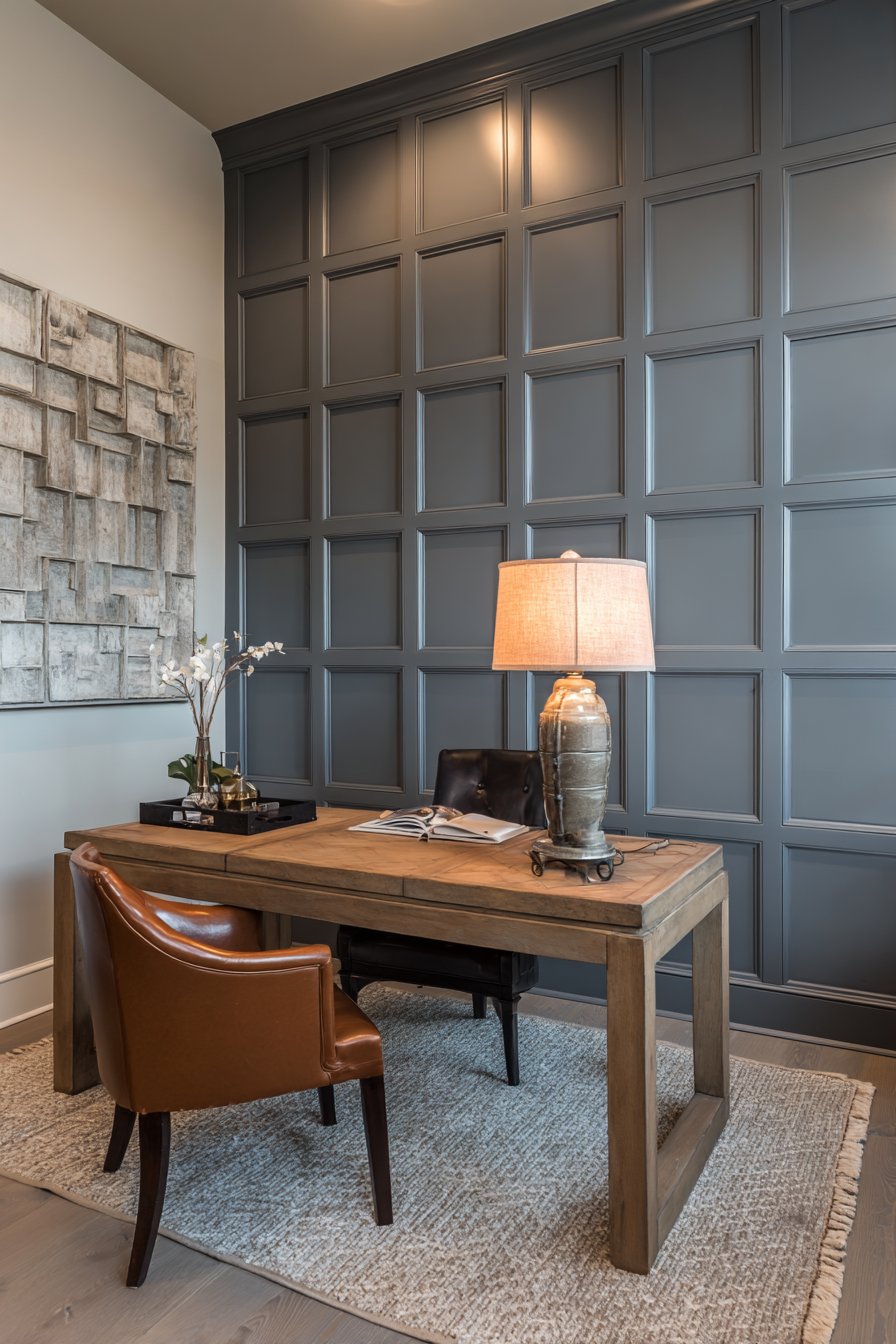
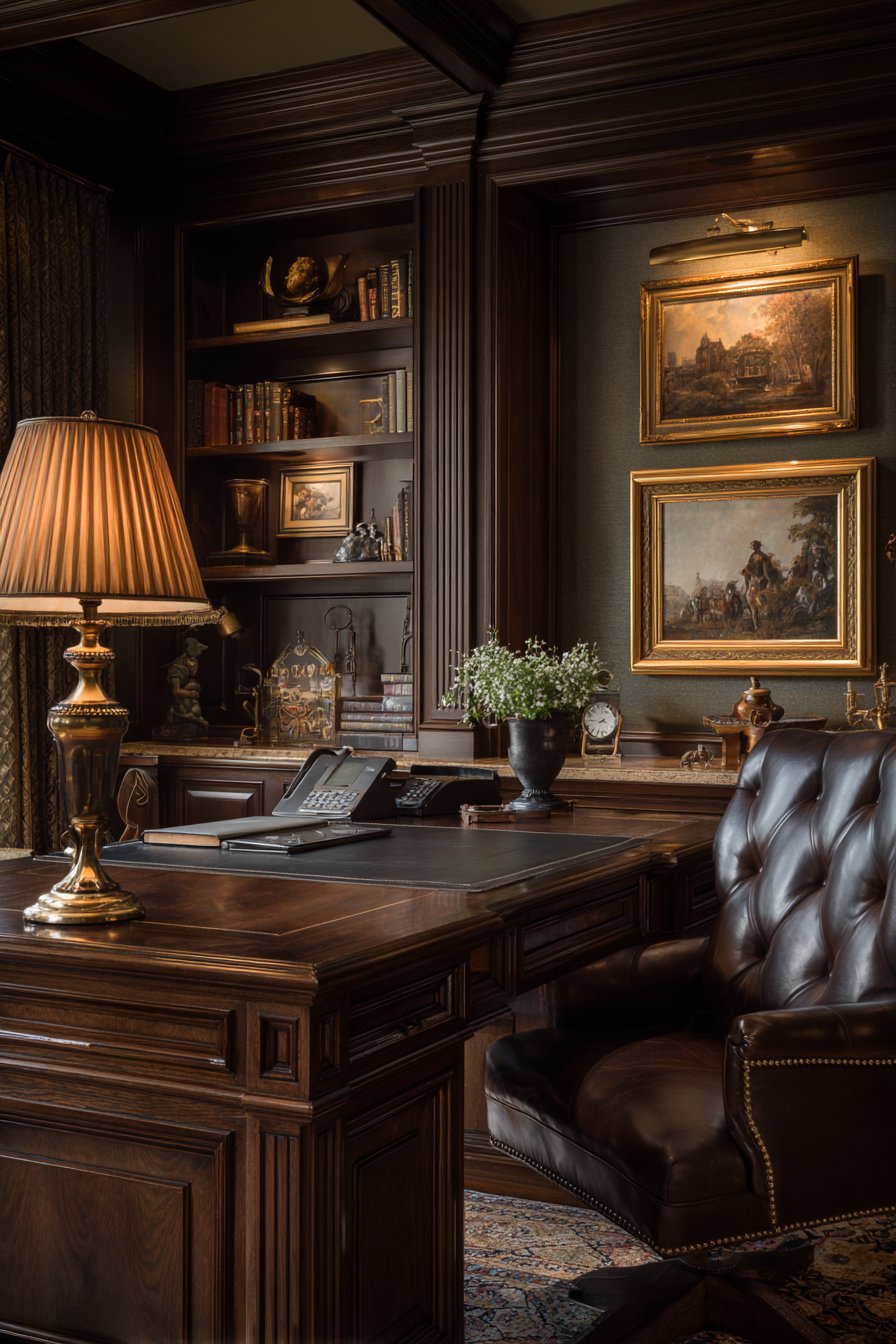
6. Contemporary Home Office with Geometric Sophistication
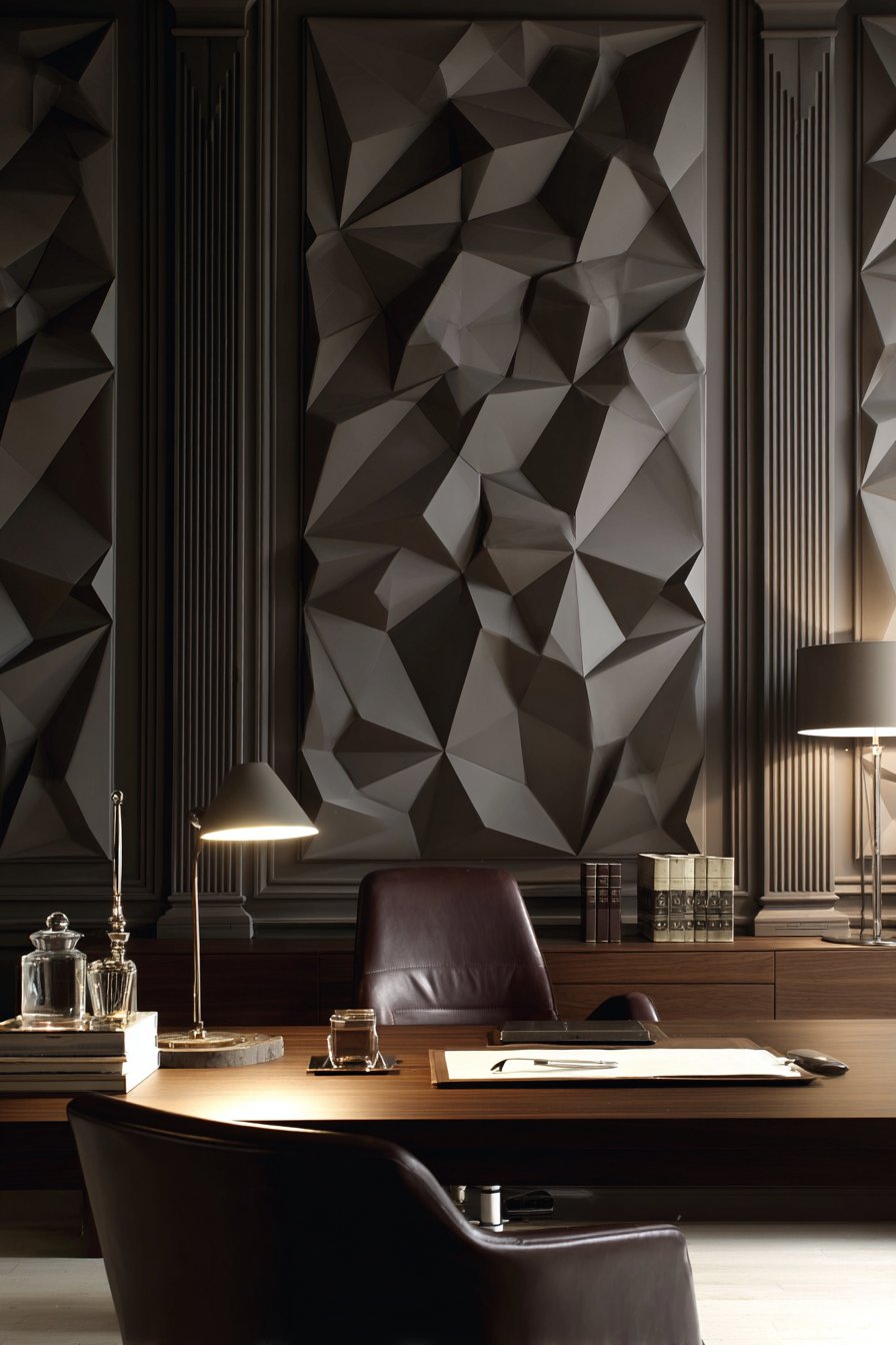
A contemporary home office featuring geometric panel wainscoting in charcoal gray creates a sophisticated accent wall behind a minimalist desk setup. The clean rectangular frames showcase precise edges and modern proportions, extending 54 inches high to create substantial visual impact. The warm wood desk surface and leather chair provide textural contrast that prevents the space from feeling cold, while balanced artificial and natural lighting highlights the architectural geometry. This design transforms a functional workspace into an environment that inspires creativity and productivity.
The power of geometric wainscoting in a home office lies in its ability to create visual structure that subtly influences the mindset of the person working in the space. The orderly arrangement of rectangular panels suggests organization and clarity of thought, while the charcoal gray color adds gravitas appropriate for professional video calls and focused work. The modern proportions—larger panels with cleaner lines—distinguish this from traditional wainscoting, firmly rooting it in contemporary design.
This application demonstrates how wainscoting can define zones within a room. By creating a dramatic accent wall behind the desk, the wainscoting establishes the work area as a distinct space, even in an open floor plan or multipurpose room. The architectural interest adds depth to video call backgrounds, creating a professional appearance without requiring extensive decoration.
Key Design Tips:
- Use larger panel sizes for a contemporary look rather than numerous small panels
- Choose deep, sophisticated colors like charcoal or navy for a professional home office atmosphere
- Ensure precise installation with perfectly square corners and even reveals for a polished modern appearance
- Balance dark wainscoting with warm wood tones and natural textures to prevent a cold feeling
- Position the wainscoting to serve as a backdrop for video calls, creating an impressive professional background
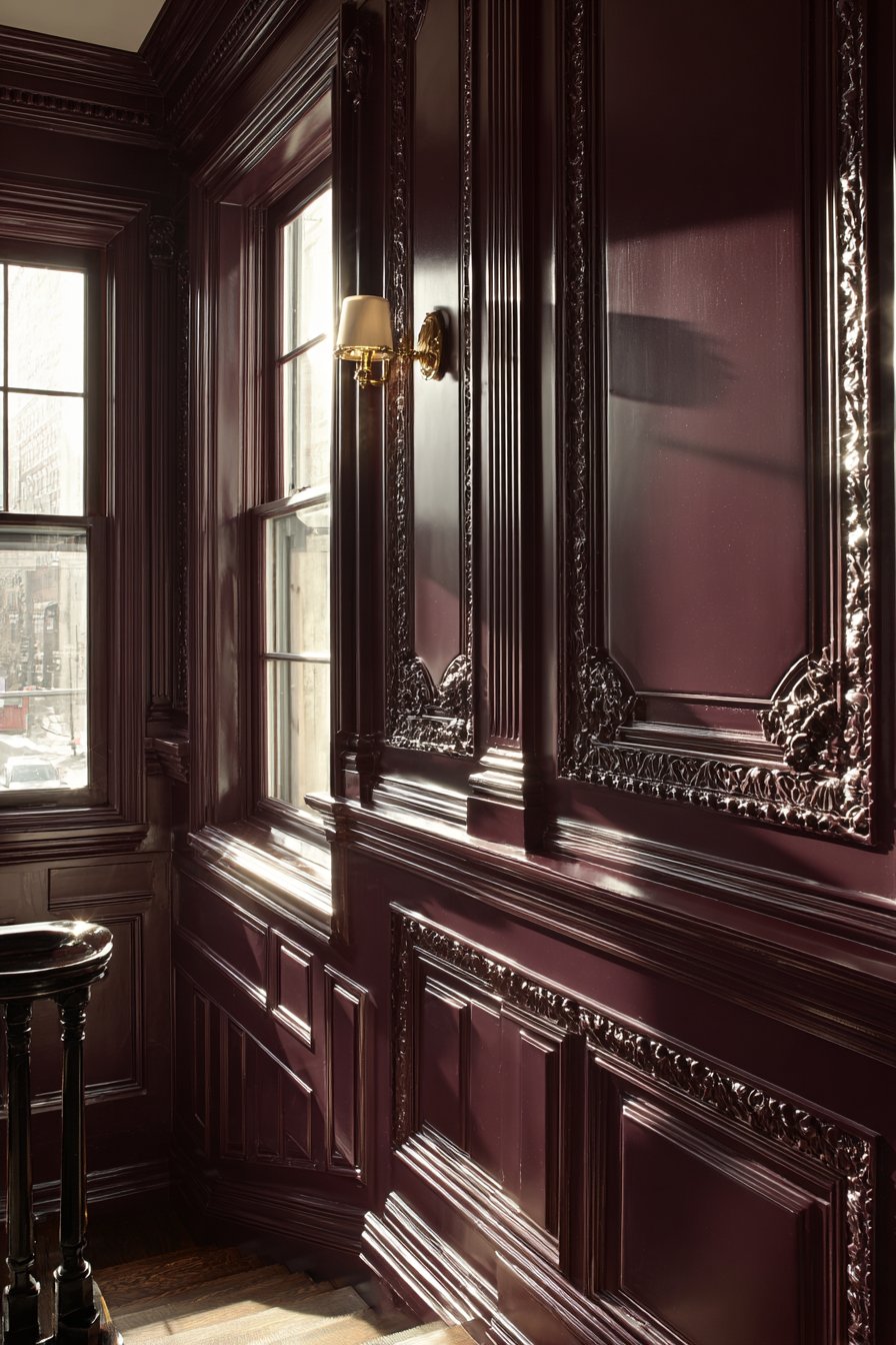
7. Victorian-Inspired Stairway with Ornate Detailing
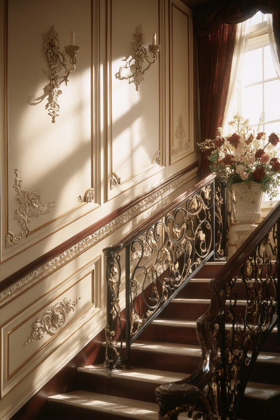
A Victorian-inspired stairway featuring ornate raised panel wainscoting in deep burgundy with gold undertones creates an entrance of dramatic elegance. The wainscoting extends along the staircase wall at varying heights, following the stair angle with elaborate chair rail and baseboard moldings displaying intricate beadwork details. Upper walls in rich cream create elegant contrast, allowing the ornate details of the wainscoting to command attention. Natural light from a landing window casts dramatic shadows that emphasize the dimensional relief, creating an ever-changing display as light moves throughout the day.
This design approach celebrates the opulent aesthetic of Victorian-era architecture, where craftsmanship and detail were marks of quality and sophistication. The deep burgundy color adds richness and drama, while the gold undertones catch the light and add warmth. The ornate moldings represent the Victorian appreciation for decorative elements, with beadwork and carved details that demonstrate skilled craftsmanship.
The varying heights of the wainscoting as it follows the staircase create visual interest and solve the practical challenge of wainscoting installation on angled walls. This solution maintains consistent visual weight while accommodating the architectural reality of the staircase. The result is a grand entrance that makes a statement about the homeowner’s appreciation for historical design and attention to detail.
Key Design Tips:
- Work with a professional carpenter for complex stairway installations that require precise angle cuts
- Choose deep, rich colors that reflect Victorian sensibilities while working with your home’s existing palette
- Invest in high-quality moldings with authentic period details rather than simplified modern versions
- Ensure adequate lighting to showcase the ornate details and dimensional relief
- Consider the view from multiple angles—bottom of stairs, top landing, and midway—to ensure the design works from all perspectives
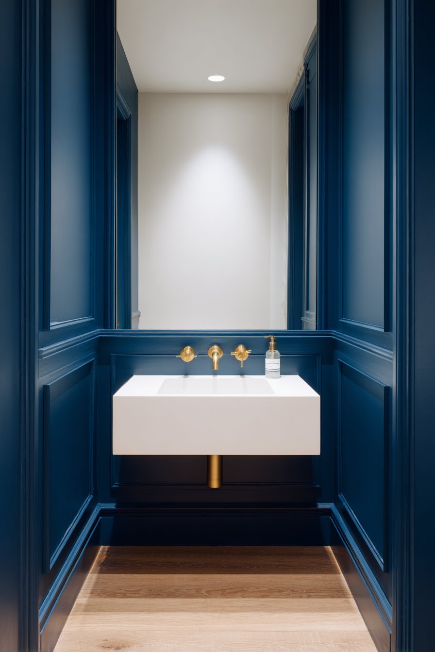
8. Minimalist Powder Room with Navy Sophistication
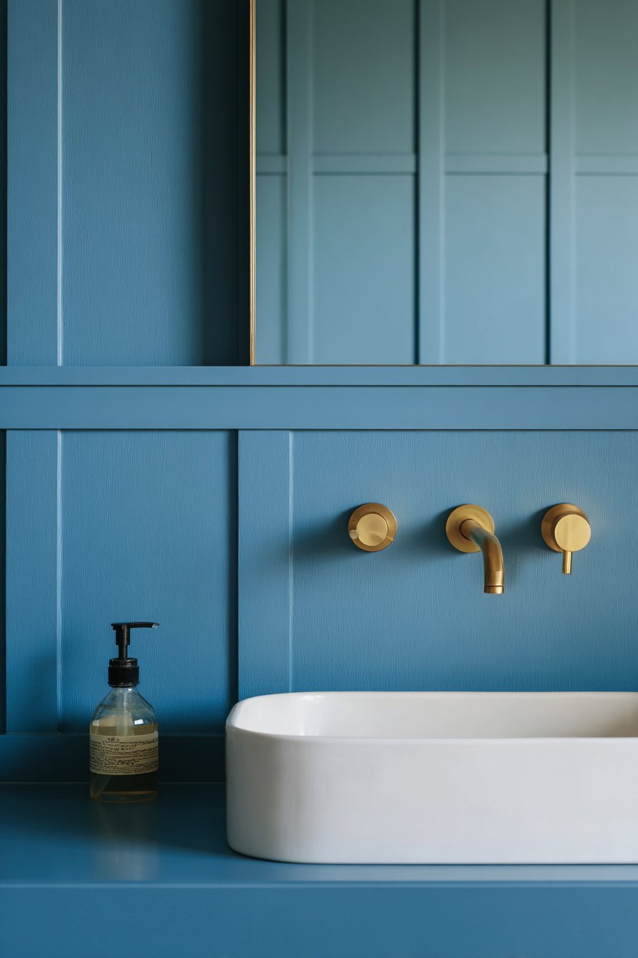
A minimalist powder room displaying simple flat panel wainscoting in matte navy blue demonstrates how restraint can create maximum impact. Installed to 36 inches with ultra-thin reveal lines creating subtle geometric interest, the wainscoting provides structure without ornamentation. Brass fixtures and a floating white ceramic sink provide refined accents that pop against the deep blue backdrop, while upper walls in soft white maintain the restrained aesthetic. Concealed LED lighting creates even illumination that highlights the smooth painted surface and enhances the jewel-box quality of this small space.
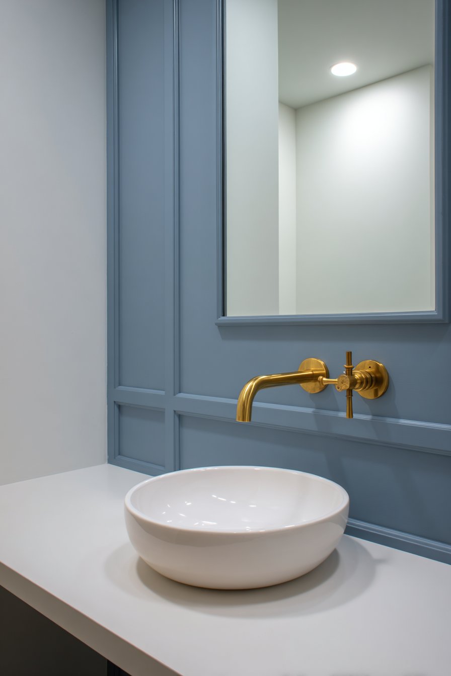
The magic of this design lies in its editing—what’s left out is as important as what’s included. Flat panels rather than raised, thin reveals rather than substantial moldings, matte finish rather than gloss—each choice reinforces the minimalist aesthetic. The navy blue color adds richness and sophistication while maintaining the simplicity of the overall design. In a powder room, where space is limited, this approach creates impact without visual clutter.
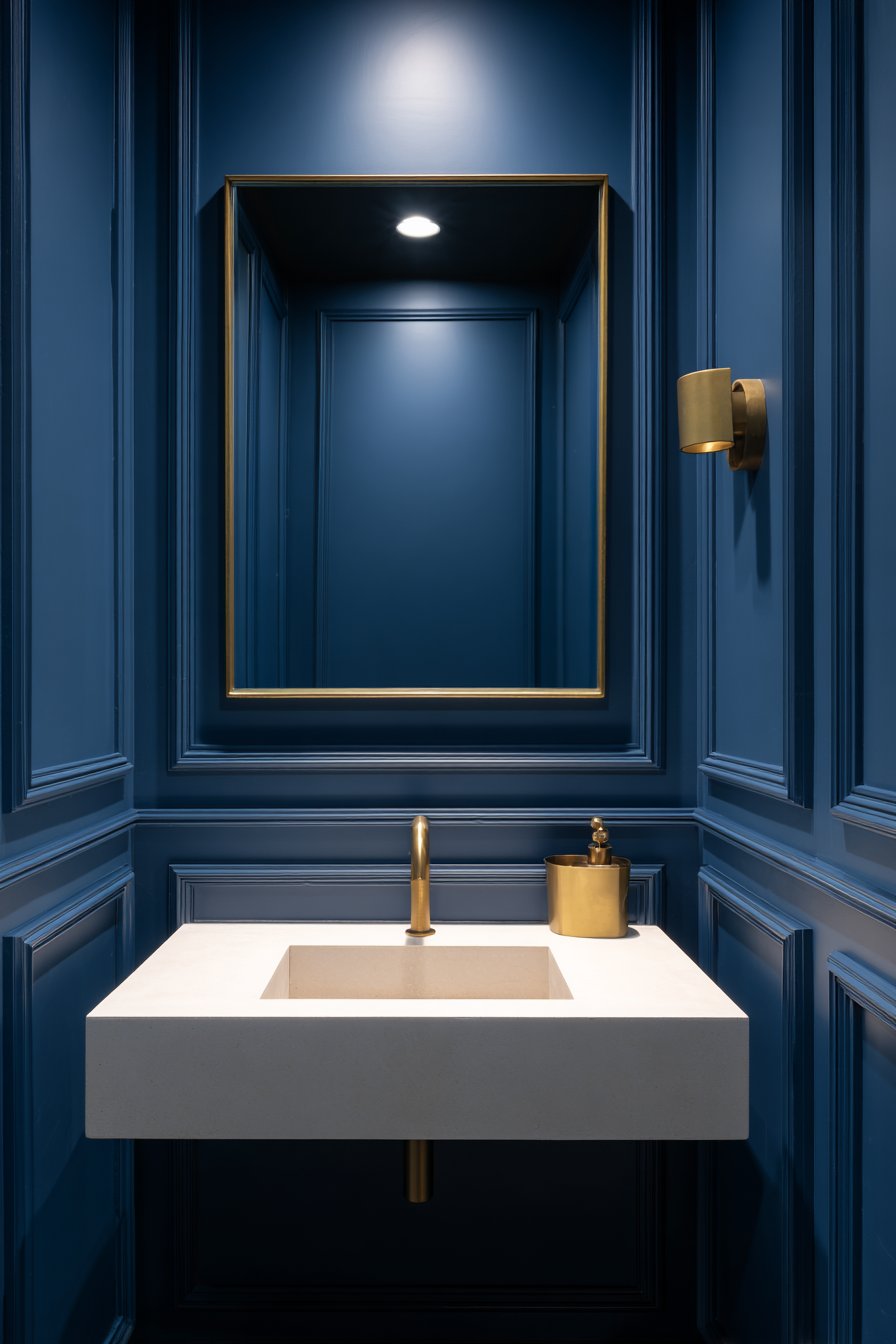
The combination of navy blue wainscoting with brass fixtures represents a current design trend that feels both fresh and timeless. The warm metallic tones of brass complement the cool depth of navy, creating a balanced palette that feels curated and intentional. The floating sink emphasizes the minimalist aesthetic while providing practical function.
Key Design Tips:
- Use flat panel wainscoting with minimal reveals for an authentically minimalist look
- Choose matte paint finishes to reinforce the contemporary aesthetic and minimize the appearance of imperfections
- Limit the color palette to two or three colors maximum for visual simplicity
- Invest in high-quality fixtures in warm metallic finishes to provide visual interest without clutter
- Ensure even, shadow-free lighting to maintain the clean, minimal appearance
9. Transitional Living Room with Picture Frame Molding
A transitional living room featuring picture frame molding wainscoting in warm greige creates an elegant foundation for layered design. Rectangular panels of varying sizes create visual rhythm across the wall, with the installation extending 48 inches high and featuring traditional chair rail and substantial baseboard. The honey-toned hardwood floors and neutral sofa complement the classic treatment, while soft afternoon light through tall windows creates gentle shadows within each molded frame. This design bridges traditional and contemporary aesthetics, offering timeless elegance with subtle modern sensibility.
Picture frame molding represents one of the most versatile wainscoting styles, working equally well in formal or casual spaces. The varying panel sizes add visual interest and prevent the geometric pattern from becoming monotonous. The warm greige color—a sophisticated blend of gray and beige—provides neutral sophistication that works with virtually any décor style or color scheme, making it an ideal choice for spaces that may evolve over time.
The transitional nature of this design makes it particularly appealing for homeowners who appreciate both traditional and contemporary elements. The classical structure of the picture frame molding satisfies those who love traditional architecture, while the updated color palette and varied panel sizes introduce contemporary touches. This balance ensures the space feels current without risking premature dating.
Key Design Tips:
- Vary panel sizes throughout the installation to create visual interest and avoid monotony
- Choose warm gray tones (greige) for versatility that works with both cool and warm color palettes
- Use substantial but not overly ornate moldings for authentic transitional style
- Maintain symmetry in panel placement while varying sizes to achieve balance
- Consider the room’s natural light patterns when planning panel layout to maximize shadow effects
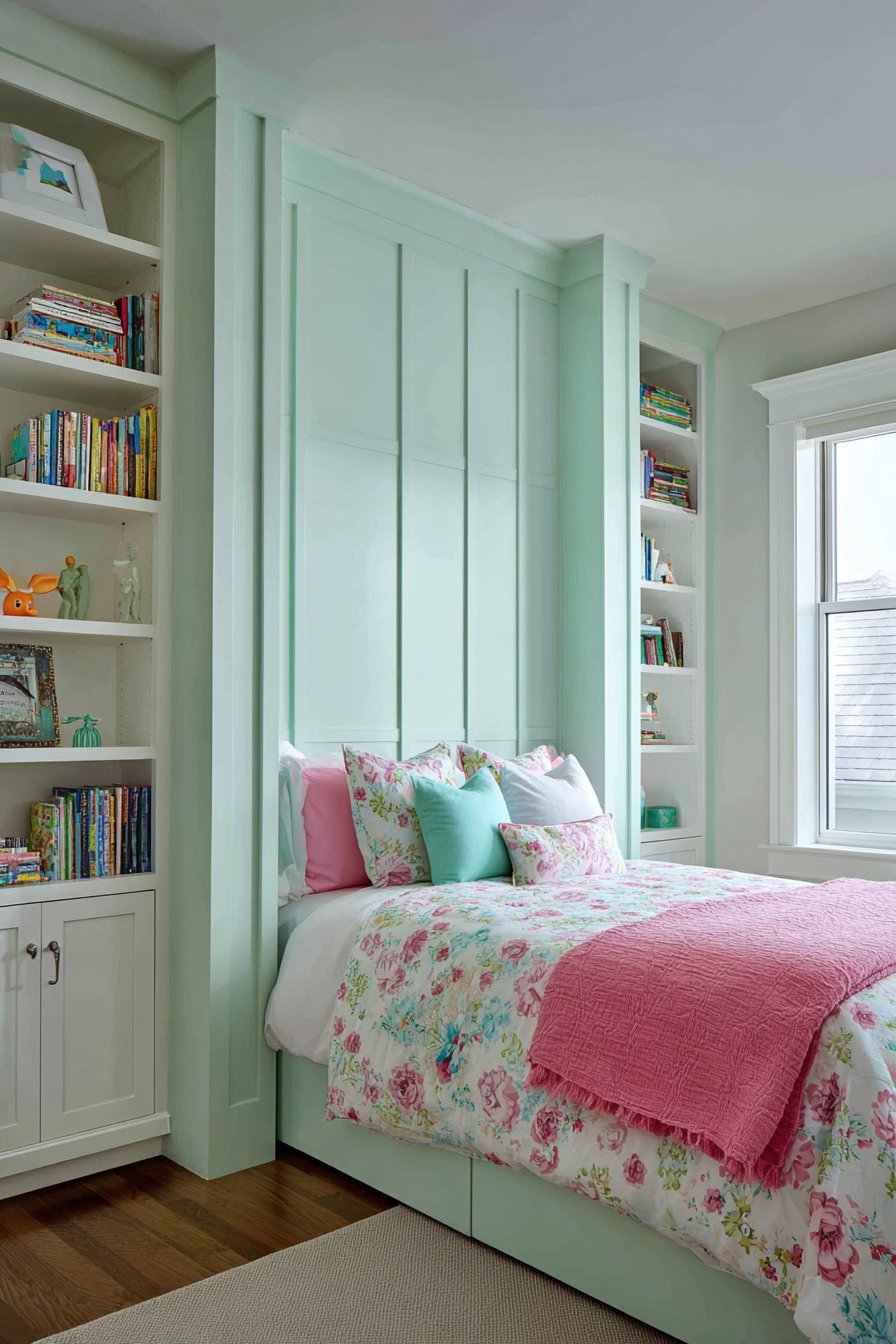
10. Children’s Bedroom with Playful Mint Green
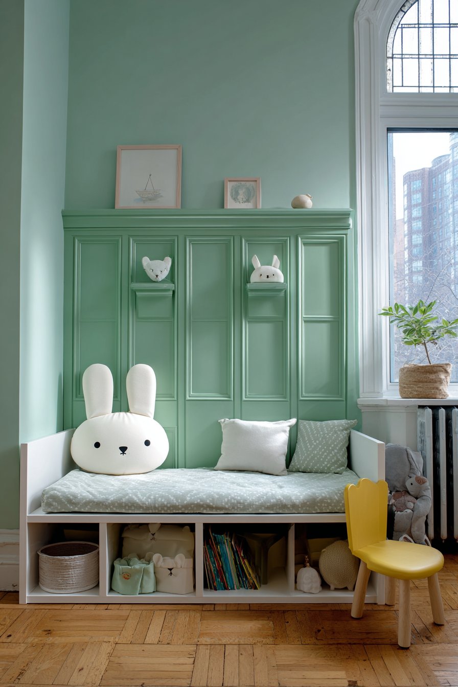
A children’s bedroom showcasing playful board and batten wainscoting in soft mint green with white battens creates a cheerful environment that grows with the child. The two-tone effect at 40 inches height adds visual interest without overwhelming the space, while vertical boards spaced to align with room features create intentional symmetry. Built-in shelving integrated into the wainscoting design provides practical storage for books and toys, making the wall treatment both beautiful and functional. Natural daylight and whimsical décor accessories complete this thoughtfully designed space that balances playfulness with sophistication.
The genius of this design lies in its ability to feel youthful without being overly childish. Soft mint green is playful and fresh but sophisticated enough to work as the child grows from toddler to teen. The white battens add crisp contrast that keeps the design from feeling too sweet or saccharine. The integration of functional storage directly into the wainscoting demonstrates smart space planning, particularly valuable in children’s rooms where storage needs are substantial.
The alignment of vertical boards with room features—windows, doors, bed placement—creates a sense of intentional design that elevates the space beyond typical children’s room aesthetics. This attention to detail teaches children to appreciate thoughtful design while providing a backdrop that can accommodate changing décor as interests evolve.
Key Design Tips:
- Choose colors that are playful but sophisticated enough to grow with the child
- Create two-tone effects by painting panels and battens in contrasting colors
- Integrate functional storage directly into the wainscoting design to maximize space efficiency
- Align vertical elements with room features for intentional, professional-looking symmetry
- Use durable, washable paint finishes appropriate for high-touch children’s spaces
11. Craftsman-Style Living Room with Rich Walnut
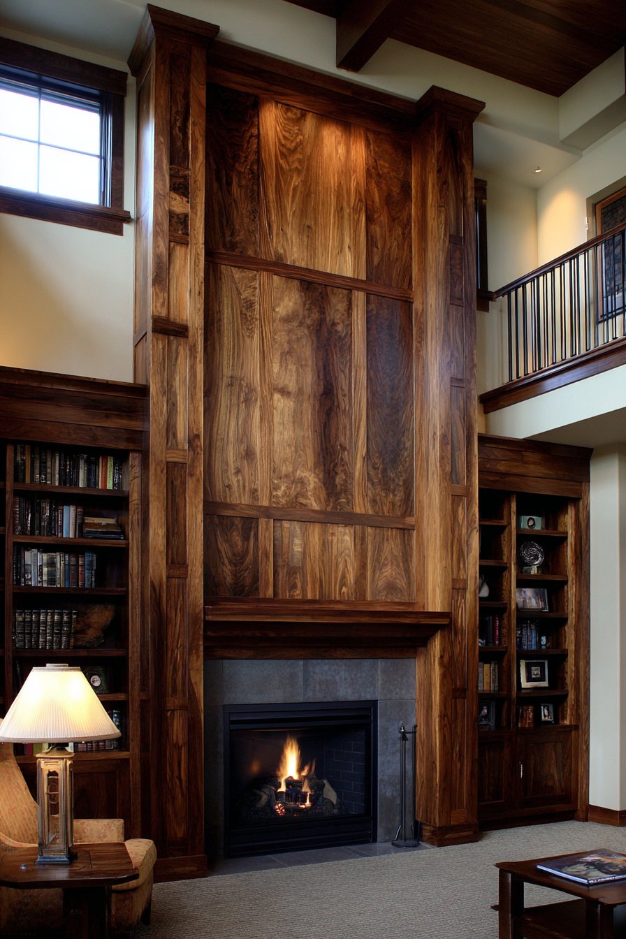
A craftsman-style living room featuring rich walnut stained flat panel wainscoting celebrates the Arts and Crafts movement’s appreciation for natural materials and skilled craftsmanship. The visible wood grain extends 42 inches with substantial Arts and Crafts style trim work, with square panel proportions reflecting period-appropriate design principles. Coordinating dark wood built-in bookcases flanking a stone fireplace create a cohesive architectural envelope, while warm ambient lighting from table lamps highlights the depth of the wood stain and intricate grain patterns. This design creates a cozy, intellectual atmosphere perfect for reading and conversation.
What distinguishes craftsman-style wainscoting is its honest celebration of materials and construction. Rather than painted surfaces that conceal the wood beneath, the walnut stain showcases the natural beauty of the wood grain. The substantial trim work reflects the craftsman principle that construction details should be visible and celebrated rather than hidden. Square panel proportions, rather than tall rectangles, are characteristic of the style and reflect Frank Lloyd Wright’s influence on the Arts and Crafts movement.
The warmth of walnut-stained wood creates an enveloping, comforting atmosphere that encourages people to linger. The dark wood provides rich contrast against lighter walls and creates depth in the room. When paired with other craftsman elements like built-in furniture and natural materials, the wainscoting becomes part of a holistic design philosophy rather than a surface decoration.
Key Design Tips:
- Choose quality hardwoods that will showcase beautiful grain patterns when stained
- Use authentic craftsman proportions with square or horizontal rectangles rather than tall vertical panels
- Install substantial trim work that reflects the movement’s appreciation for visible joinery and construction
- Coordinate wainscoting stain with other built-in woodwork for a cohesive craftsman aesthetic
- Ensure adequate warm lighting to showcase wood tones and prevent the space from feeling dark
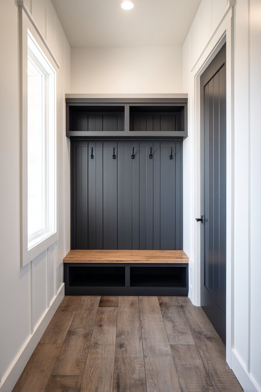
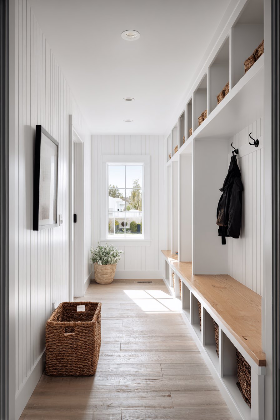
12. Modern Farmhouse Mudroom with Floor-to-Ceiling V-Groove
A modern farmhouse mudroom displaying vertical V-groove paneling in crisp white extends from floor to ceiling, creating a bright, practical space with significant visual impact. Coat hooks mounted directly into the grooves at strategic heights demonstrate clever integration of function with aesthetics, while a natural pine bench with storage cubbies anchors the space with warm wood tones. Natural light from a nearby window highlights the dimensional quality of the grooves, creating subtle linear shadows that add texture and interest to the white surfaces.
The floor-to-ceiling installation of V-groove paneling serves multiple purposes in a mudroom setting. Practically, it provides durable, easily cleanable wall protection in a high-traffic, high-mess area. Aesthetically, it creates a cohesive envelope that makes the space feel intentionally designed rather than merely utilitarian. The vertical grooves draw the eye upward, making the ceiling appear higher and the space feel more generous than its square footage might suggest.
The modern farmhouse aesthetic shines in this application, combining the crisp, clean look of contemporary design with the practical, unpretentious spirit of farmhouse style. White V-groove paneling has become synonymous with this design movement, offering a fresh take on traditional farmhouse bead board while maintaining a clean-lined contemporary sensibility.
Key Design Tips:
- Extend paneling floor to ceiling in mudrooms for maximum durability and visual impact
- Mount hooks directly into grooves for integrated functionality that doesn’t interrupt the visual flow
- Choose semi-gloss or satin paint finishes for easy cleaning in high-traffic areas
- Balance white walls with warm wood tones in furniture and flooring to prevent a sterile feeling
- Incorporate abundant storage solutions that maintain the clean aesthetic while providing practical function
13. French Country Kitchen with Distressed Beadboard
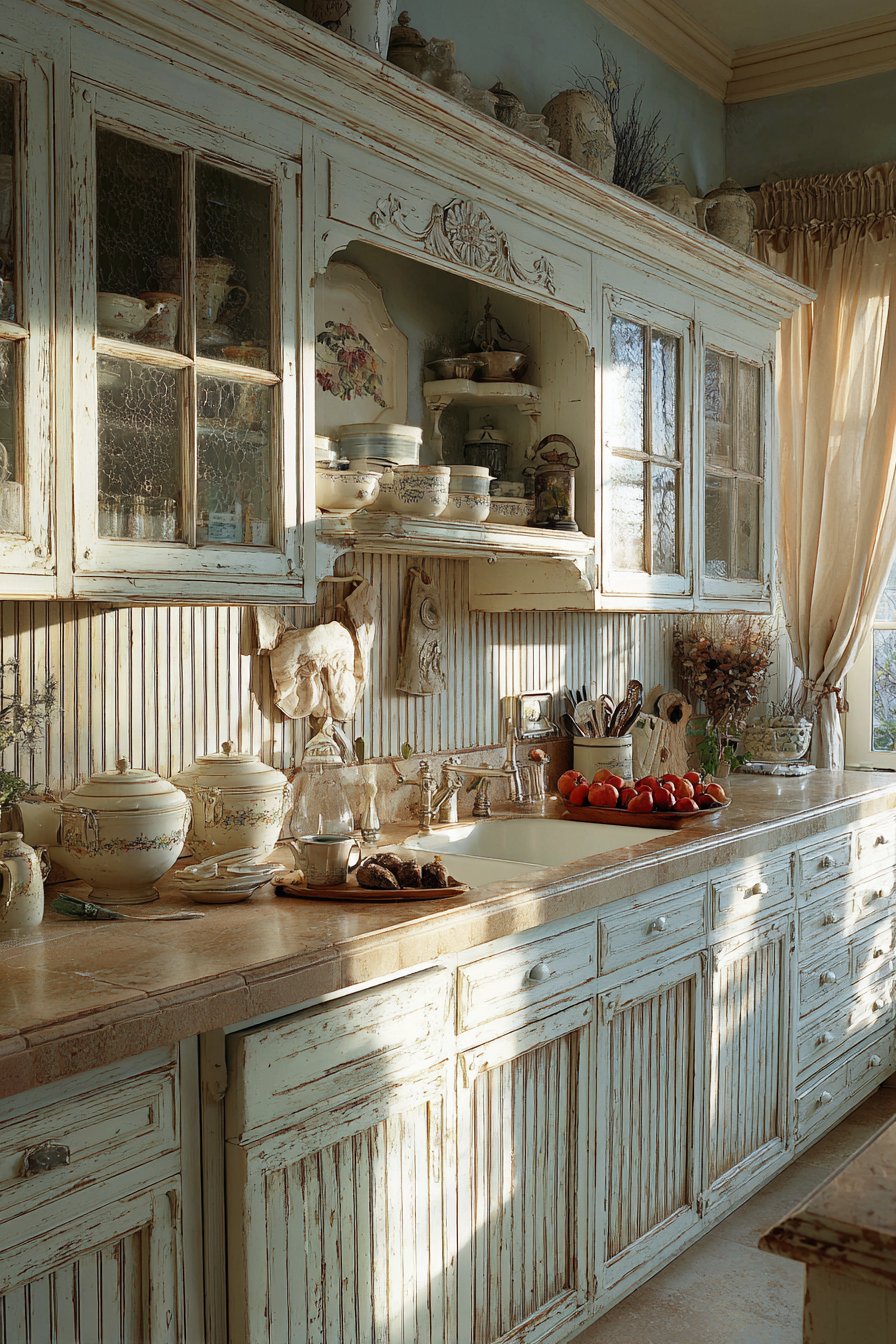
A French country kitchen featuring beadboard wainscoting in antique white with subtle distressing creates a romantic, lived-in aesthetic perfect for gathering and cooking. Installed to 36 inches as a practical and beautiful backsplash alternative in the dining nook area, the wainscoting features a delicate chair rail that caps the installation. Soft blue-gray upper walls complement vintage-inspired décor, while natural morning light through café curtains creates a warm glow on the textured surface. This design celebrates the French country aesthetic of aged elegance and comfortable sophistication.
The beauty of beadboard in a French country setting lies in its humble elegance. The narrow vertical beads create subtle texture that adds interest without demanding attention, allowing other elements—vintage cookware, fresh flowers, artisan pottery—to shine. The antique white finish with distressing suggests a kitchen that has been loved and used for generations, creating instant charm and character that new construction often lacks.
Using wainscoting as a backsplash alternative in the dining nook area demonstrates creative problem-solving. While not suitable for areas with heavy water exposure, beadboard wainscoting works beautifully in dining areas where you want the warmth and character of painted wood rather than the clinical feel of tile. The practical height of 36 inches provides protection behind seating areas while maintaining appropriate scale.
Key Design Tips:
- Apply subtle distressing that looks naturally aged rather than artificially beaten up
- Use antique white or cream rather than stark white for authentic French country aesthetic
- Install as a backsplash alternative in dining areas but avoid high-moisture zones
- Pair with soft, muted colors in the blue-gray or sage family for classic French country palette
- Choose delicate, feminine chair rail profiles rather than heavy, substantial moldings
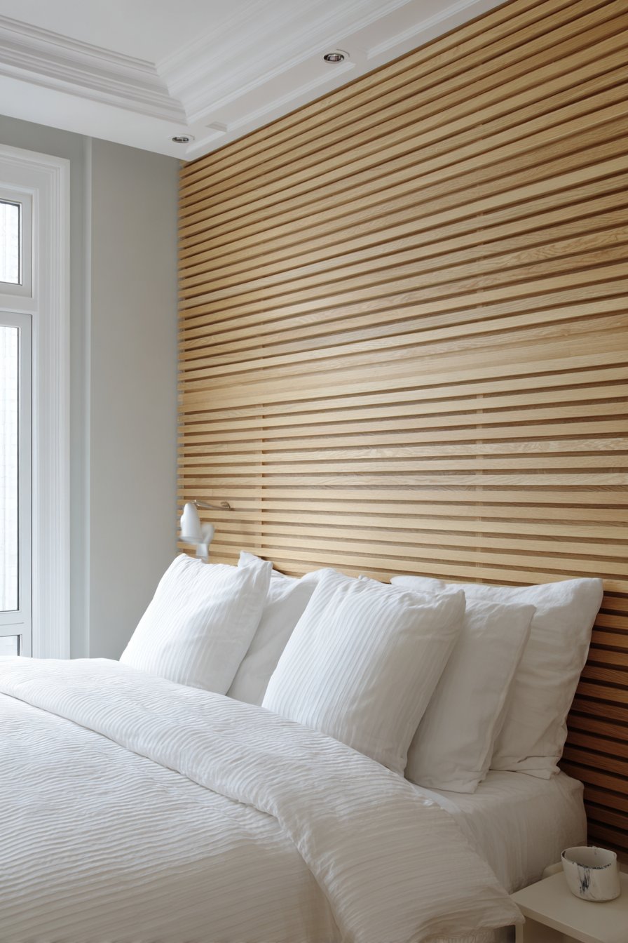
14. Contemporary Master Bedroom with Horizontal Wood Slats
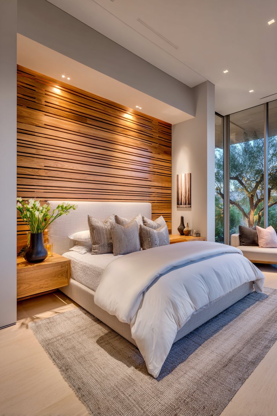
A contemporary master bedroom showcasing horizontal wood slat wainscoting in natural oak creates a modern accent wall behind the bed that brings warmth and texture to the space. The visible wood grain extends from floor to 60 inches, with uniform spacing between slats creating rhythmic shadow lines that add dimensional interest. Soft gray upper walls and white bedding maintain a serene palette that promotes rest and relaxation, while recessed lighting grazes the slats to emphasize their texture and dimension. This design demonstrates how natural materials can be incorporated into contemporary spaces in fresh, unexpected ways.
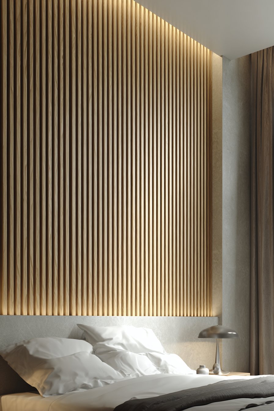
Horizontal wood slats represent a thoroughly modern interpretation of wainscoting, departing from traditional panel systems while maintaining the concept of creating visual interest in the lower portion of the wall. The spacing between slats is crucial to the design’s success—too wide and it becomes merely decorative; properly spaced, it creates a sophisticated rhythm that draws the eye across the wall. The natural oak finish celebrates the wood’s inherent beauty without stain or paint, reflecting contemporary design’s appreciation for honest materials.
In a master bedroom, this design creates a stunning focal point that grounds the bed and defines the sleeping zone. The texture adds visual warmth that prevents the minimalist aesthetic from feeling cold or austere. The horizontal orientation has a calming effect appropriate for a bedroom, while the extension to 60 inches provides substantial visual weight behind the bed.
Key Design Tips:
- Choose quality hardwoods with attractive grain patterns that will be visible in natural finish
- Space slats consistently—typically 1-2 inches apart—for professional results and optimal shadow effects
- Extend to 60-72 inches behind beds to create appropriate visual weight for the furniture
- Install LED strip lighting above to graze the slats and emphasize texture
- Seal wood properly to protect against dust accumulation while maintaining natural appearance
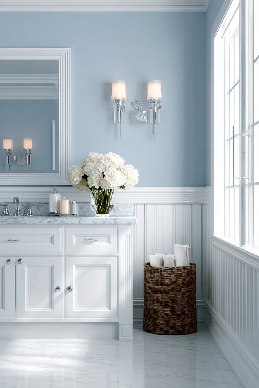
15. Traditional Bathroom with Classic Beadboard
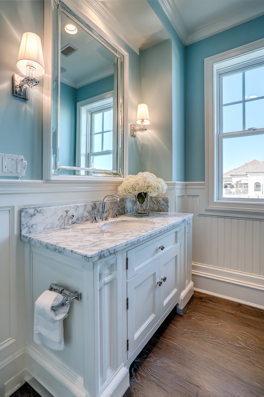
A traditional bathroom featuring classic beadboard wainscoting in glossy white extends 42 inches around the perimeter, creating timeless elegance enhanced by substantial chair rail detail. The vertical beaded texture provides both visual interest and practical durability in a moisture-prone environment. Pale blue painted upper walls create a fresh, clean aesthetic that evokes classic bathroom design, while polished chrome fixtures and marble countertops complement the refined treatment. Natural window light creates subtle highlights on the glossy painted surface, enhancing the bright, airy feeling essential for bathroom spaces.
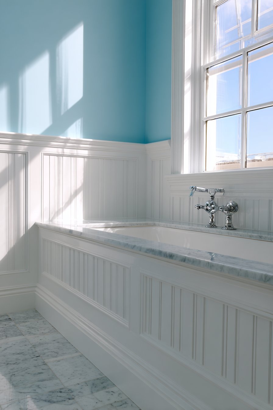
Beadboard wainscoting has been a bathroom staple for over a century, and for good reason. The narrow vertical beads create texture that adds interest to what might otherwise be plain painted walls, while the vertical orientation visually heightens the space. The glossy finish serves practical purposes—easier to clean, more resistant to moisture—while adding a subtle shimmer that enhances the room’s brightness. The 42-inch height provides substantial coverage in moisture-prone areas while maintaining proper visual proportion.
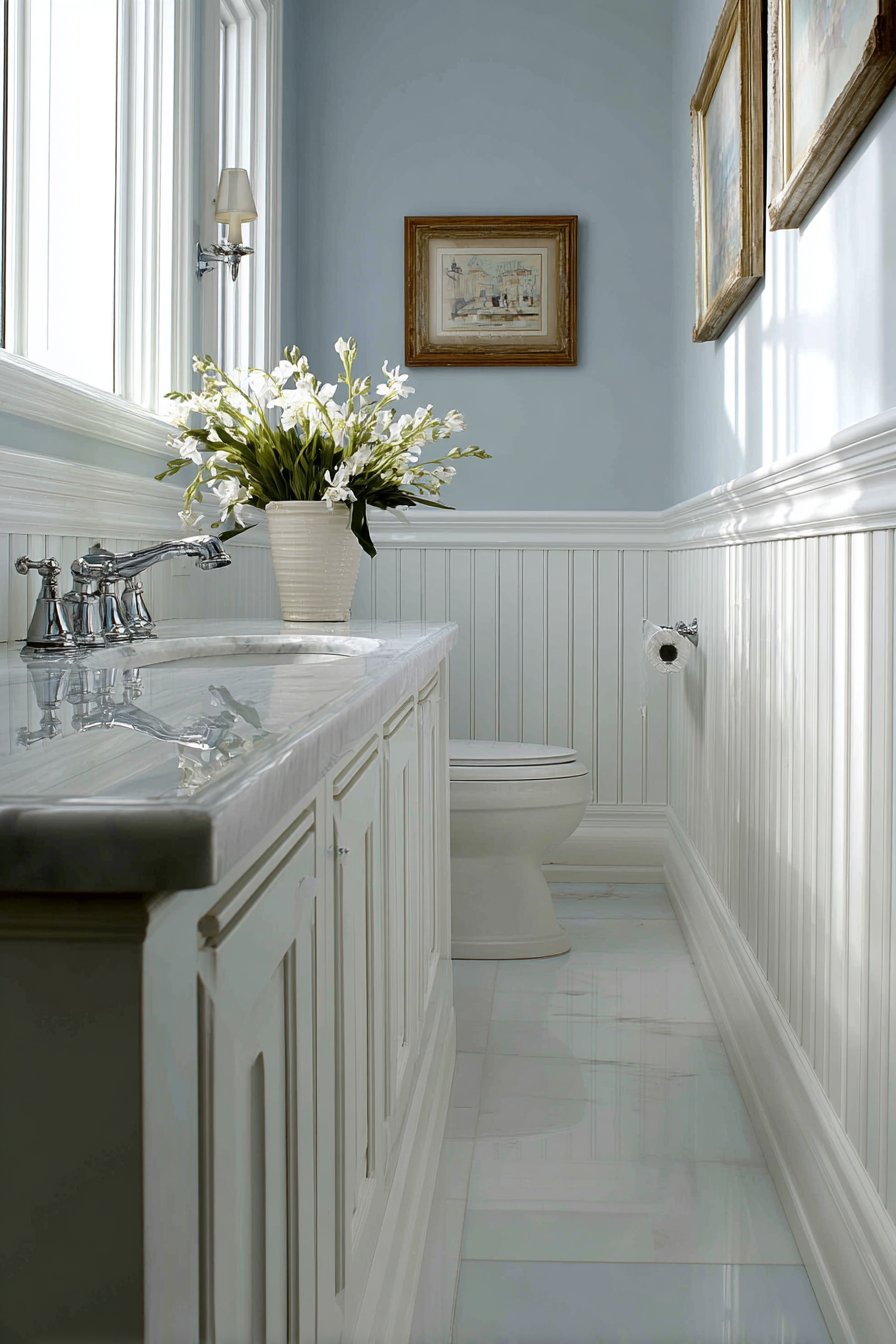
The combination of white beadboard with pale blue walls represents a classic bathroom color scheme that has endured because it works so well. The white creates cleanliness and brightness, while the pale blue adds softness and serenity. This palette works equally well with chrome, brass, or nickel fixtures, providing flexibility as styles evolve.
Key Design Tips:
- Use semi-gloss or high-gloss paint finishes for moisture resistance and easy cleaning
- Install with proper backing and sealing to prevent moisture damage
- Extend to 36-42 inches for standard bathrooms to balance protection with visual proportion
- Choose substantial chair rail molding to create clear definition between wainscoting and wall
- Pair with classic bathroom colors—soft blues, greens, or neutrals—for timeless appeal
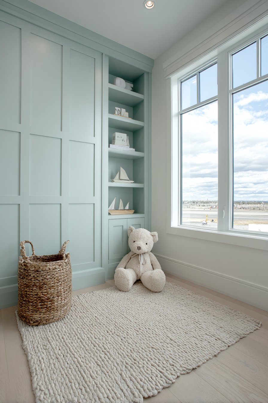
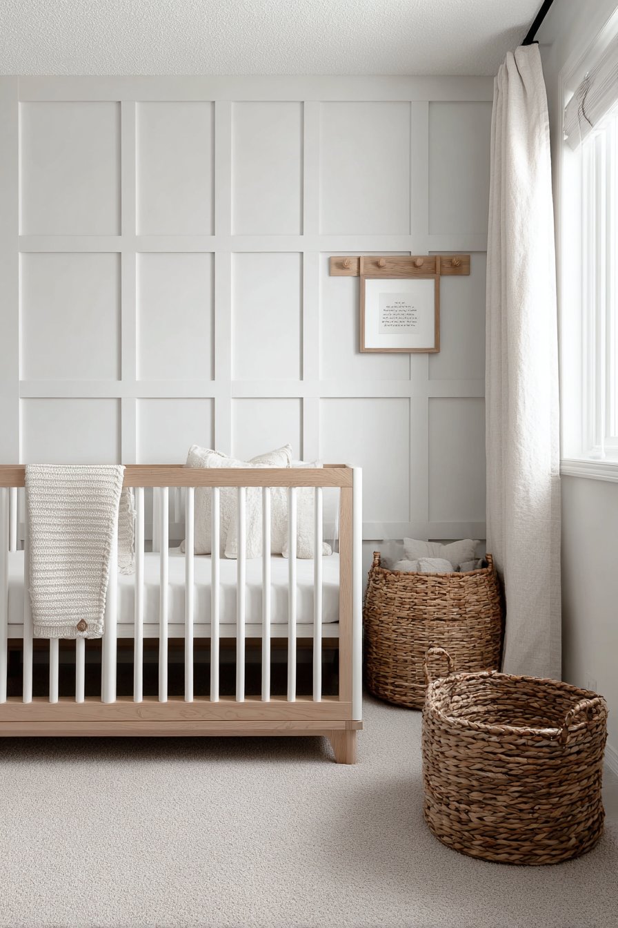
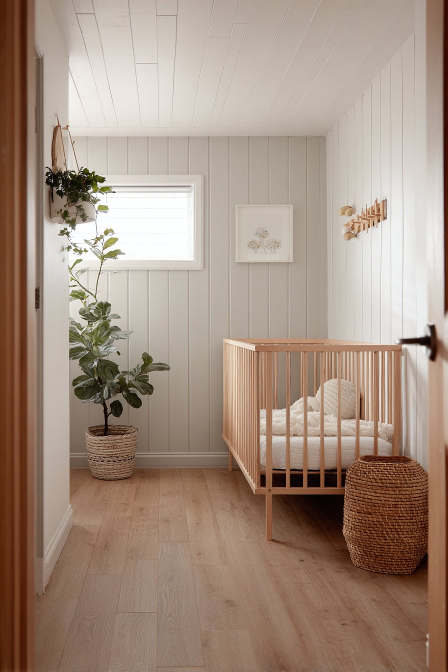
16. Scandinavian Nursery with Pale Gray Planks
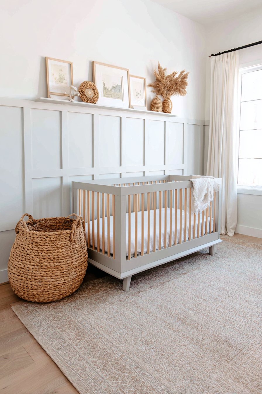
A Scandinavian nursery displaying simple horizontal plank wainscoting in pale gray creates a calming lower wall treatment that promotes the peaceful atmosphere essential for infants and young children. Installed to 40 inches with minimal trim details maintaining the understated Nordic aesthetic, the design features upper walls in soft white with a simple peg rail for hanging items. Natural wood crib and woven basket storage complement the organic palette, while diffused natural lighting creates a serene atmosphere perfect for rest and bonding. This design demonstrates how thoughtful simplicity can create nurturing environments.
The Scandinavian approach to nursery design prioritizes calm, simplicity, and natural materials—all evident in this wainscoting application. The pale gray color adds gentle depth without the starkness of pure white or the heaviness of darker colors. The horizontal plank installation with minimal trim reflects Nordic design’s preference for simple, clean lines that don’t compete for attention. The result is a backdrop that supports the room’s function as a peaceful retreat for both baby and caregivers.
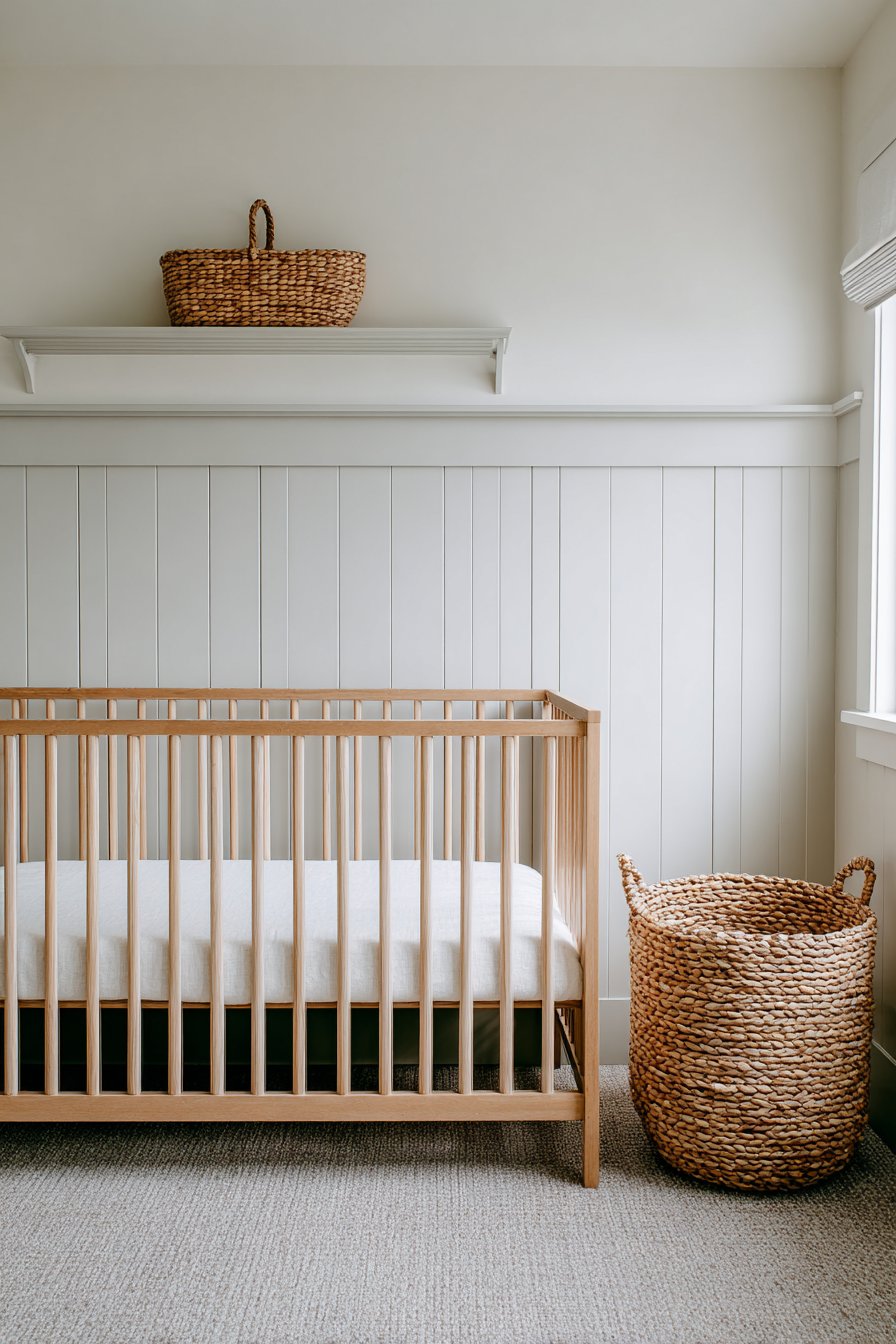
The 40-inch height serves practical purposes in a nursery, providing durable wall protection at exactly the height where bumps and marks are most likely to occur as the child grows and becomes mobile. The matte finish is appropriate for a child’s space, avoiding the glare and formality of glossy paint while remaining practical and cleanable.
Key Design Tips:
- Choose soft, muted colors that promote calm rather than stimulating primary colors
- Use matte or eggshell finishes appropriate for child-friendly spaces
- Keep trim details minimal to maintain the Scandinavian aesthetic of simplicity
- Extend to 40-48 inches to provide protection as the child becomes mobile
- Pair with natural materials like wood and cotton to create a nurturing, organic environment
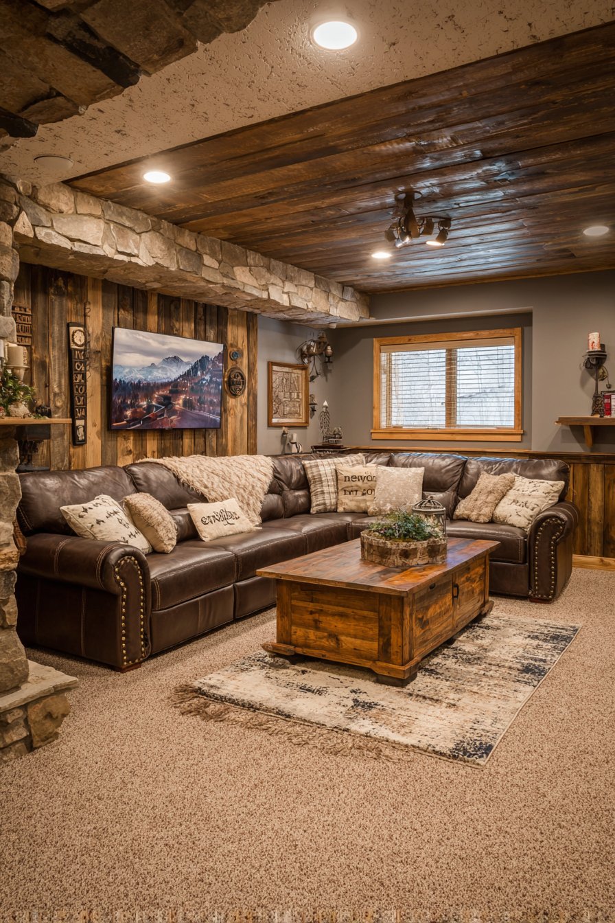
17. Rustic Basement with Rough-Sawn Cedar
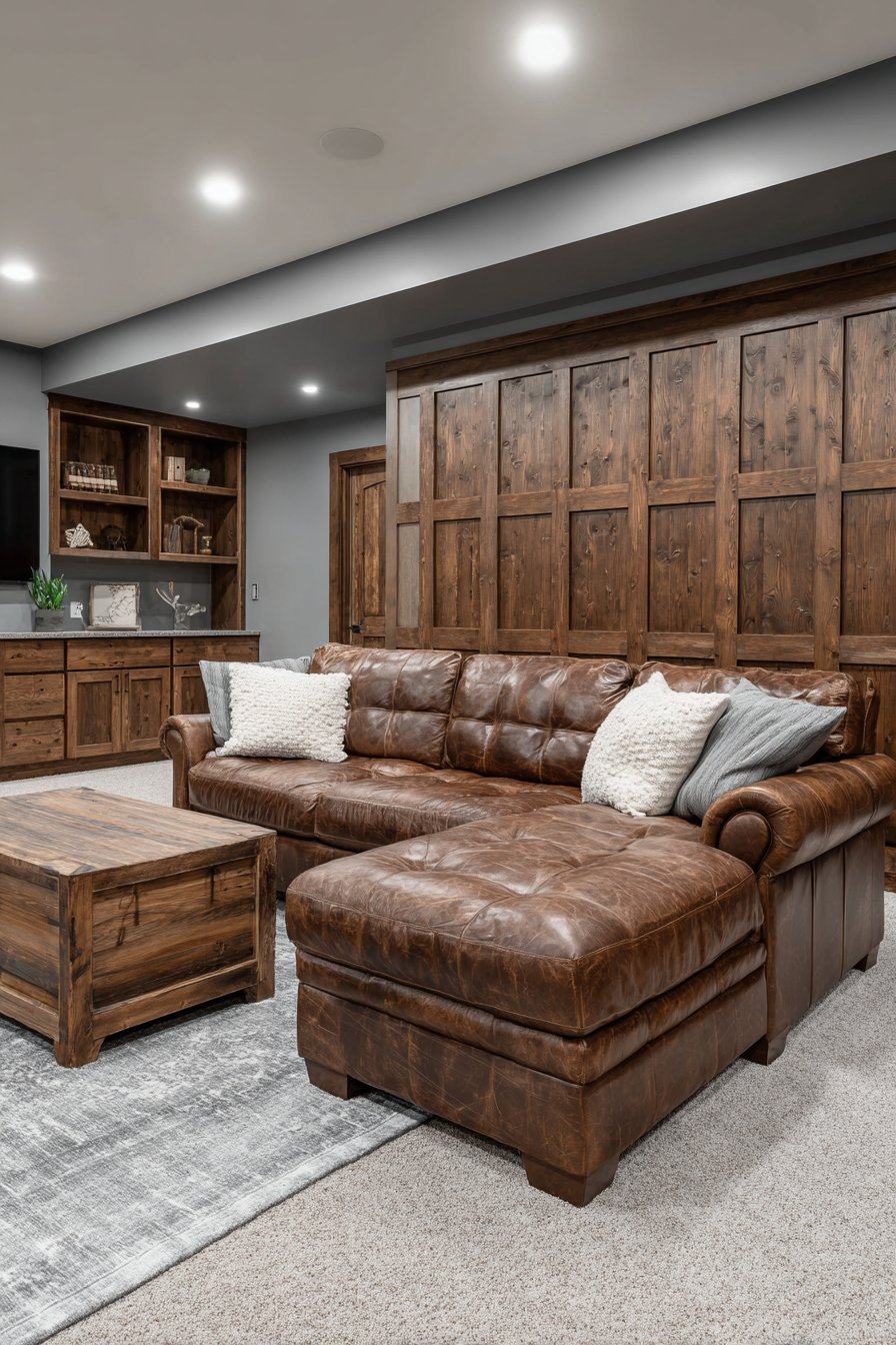
A rustic basement family room featuring rough-sawn cedar board and batten wainscoting with natural finish celebrates the wood’s organic texture and color variation. The installation extends to 48 inches, with wide battens creating bold vertical emphasis that draws the eye upward and makes the typically low-ceilinged basement feel more spacious. Stone gray painted upper walls provide subtle contrast that allows the wood to be the focal point, while leather furniture and industrial lighting complete the masculine aesthetic. Warm ambient lighting highlights the natural wood character and texture, creating a cozy retreat perfect for watching sports or entertaining friends.
The rough-sawn cedar brings authenticity and character that smooth, finished materials cannot replicate. Each board displays the marks of the saw blade, creating texture that catches light and casts subtle shadows. The natural finish allows the cedar’s inherent color variations—from pale blonde to rich amber—to show through, creating a dynamic surface that changes appearance with different lighting conditions. In a basement setting, where natural light may be limited, this textural interest becomes even more valuable.
The 48-inch height is particularly effective in basements with standard 7-8 foot ceilings. This substantial coverage creates visual weight and presence while breaking up the wall plane in a way that makes the space feel more finished and less utilitarian. The board and batten pattern with wide battens creates bold vertical lines that counteract the horizontality that can make low ceilings feel oppressive.
Key Design Tips:
- Leave cedar in natural finish to showcase inherent color variations and character
- Choose wide battens—6-8 inches—for bold vertical emphasis in basement spaces
- Seal wood properly to protect against basement moisture while maintaining natural appearance
- Extend to 48-60 inches in basements to create substantial visual presence
- Pair with warm lighting to counteract the typically cool feeling of basement spaces
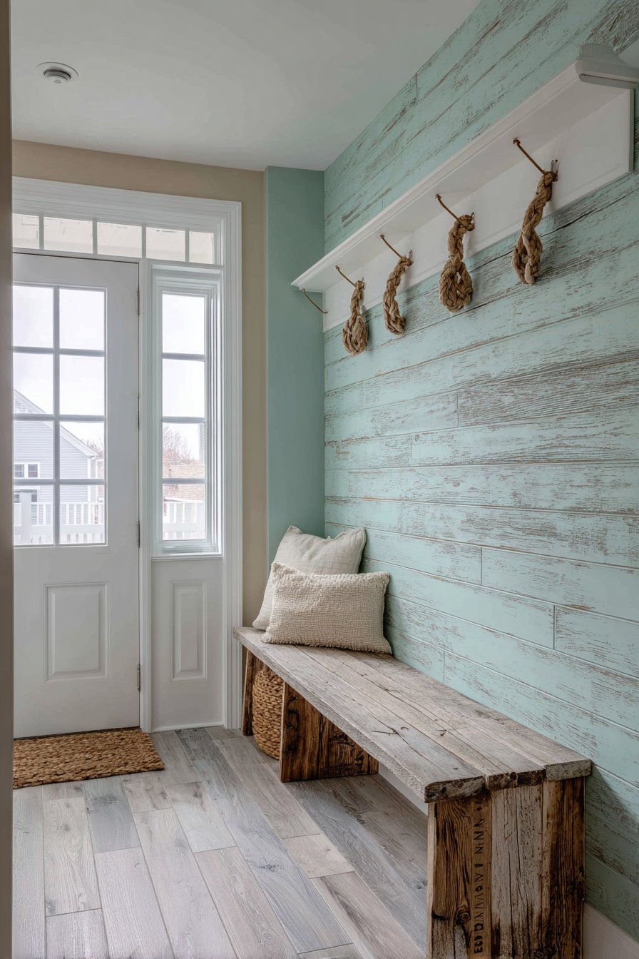
18. Coastal Entryway with Seafoam Shiplap
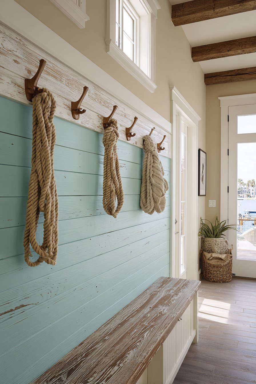
A coastal entryway showcasing weathered shiplap wainscoting in soft seafoam green creates an immediate sense of beachside living from the moment guests enter. Extending 44 inches with authentic horizontal plank installation showing slight gaps between boards, the wainscoting features a whitewashed wooden bench and rope-wrapped hooks that integrate perfectly with the coastal theme. Upper walls in sandy beige complete the beach-inspired palette, while natural light from a transom window emphasizes the painted wood texture. This design proves that wainscoting can establish a home’s aesthetic from the very first impression.
The seafoam green color choice is what elevates this entryway from generic to memorable. Rather than predictable beach house white or navy, the soft green-blue evokes sea glass and shallow tropical waters. The weathered appearance of the shiplap adds authenticity, suggesting a cottage that has weathered salt air and sunshine. The slight gaps between boards are characteristic of authentic shiplap installation and add to the casual, coastal aesthetic.
The integration of functional elements—the bench and hooks—directly into the coastal theme demonstrates thoughtful design. The whitewashed wood bench could have come from a beach house porch, while rope-wrapped hooks add textural interest and thematic consistency. These details transform a standard entryway into a cohesive coastal experience.
Key Design Tips:
- Choose soft, muted coastal colors like seafoam, aqua, or weathered blue rather than bright primary blues
- Install shiplap horizontally with slight gaps between boards for authentic appearance
- Incorporate natural materials like rope, jute, and weathered wood for textural interest
- Pair with sandy beiges and soft whites to create a complete beach-inspired palette
- Use weathered or distressed finishes that suggest natural aging rather than perfect painted surfaces
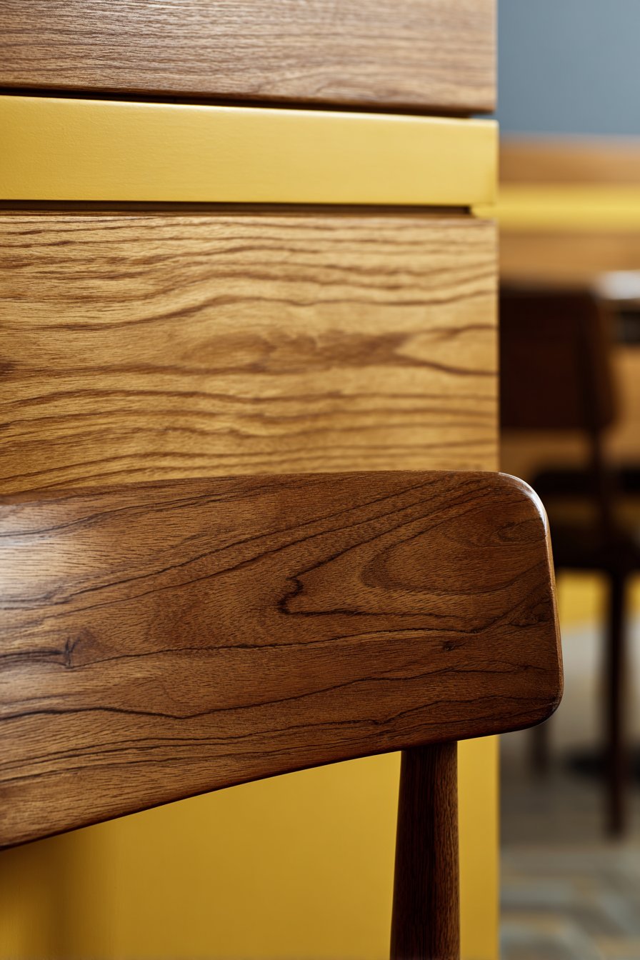
19. Mid-Century Modern Dining Room with Teak Panels
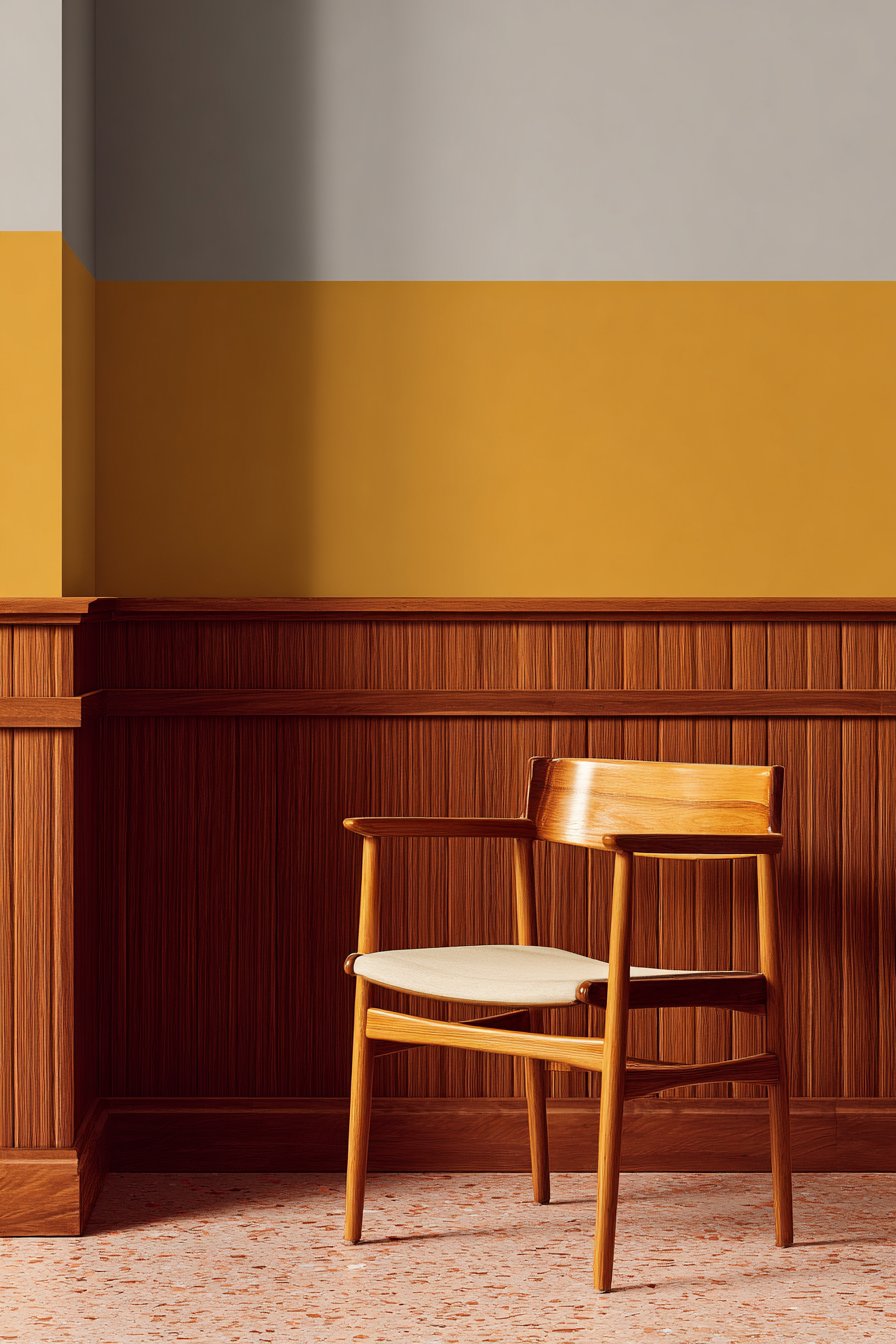
A mid-century modern dining room featuring horizontal wood panel wainscoting in warm teak showcases authentic 1960s proportions that honor the design movement’s principles. Extending 36 inches with minimal trim and clean lines, the panels display natural wood grain with subtle variations that create visual interest. Mustard yellow upper walls provide period-appropriate color contrast that boldly celebrates the era’s love of saturated hues, while vintage dining furniture complements the retro aesthetic. Balanced natural and artificial lighting highlights the rich wood tones that define mid-century modern design.
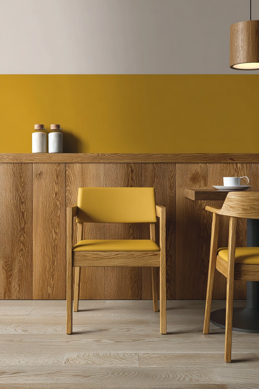
The beauty of teak wainscoting in a mid-century setting lies in its authenticity to the era. Teak was highly prized in the 1950s and 60s for its warm color, durability, and beautiful grain, appearing in everything from furniture to architectural elements. The horizontal orientation of the panels reflects the mid-century modern appreciation for horizontal lines that create visual calm and emphasize connection to the landscape. The minimal trim work aligns with the movement’s principle that ornamentation should be honest and functional rather than purely decorative.
The pairing of warm teak with mustard yellow demonstrates the mid-century modern willingness to embrace bold color in ways that feel confident rather than garish. This color combination—warm wood with saturated retro hues—immediately establishes the room’s design era while creating a welcoming, energetic atmosphere perfect for dining and entertaining.

Key Design Tips:
- Choose teak or similar warm-toned woods that were popular in the mid-century modern era
- Install panels horizontally with minimal trim for authentic mid-century proportions
- Pair with bold, saturated colors popular in the 1950s-60s like mustard, orange, or avocado
- Use minimal, streamlined moldings that don’t compete with the wood’s natural beauty
- Ensure balanced lighting that showcases wood tones without creating harsh shadows
20. Contemporary Foyer with Oversized Charcoal Panels
A contemporary foyer displaying large-scale raised panel wainscoting in deep charcoal gray creates dramatic architectural impact from the moment guests enter. The modern proportions extend 54 inches, with oversized panels and minimal ornamentation reflecting current design trends toward bold simplicity. White upper walls and marble tile flooring enhance the sophisticated palette, creating high contrast that emphasizes the architectural geometry. Statement pendant lighting creates focal illumination that draws the eye and showcases the wainscoting’s dimensional quality.
The power of this design lies in its confidence and scale. Rather than numerous small panels, the large-scale approach creates bold graphic impact that feels thoroughly contemporary. The charcoal gray color is sophisticated and unexpected, departing from traditional white or natural wood while maintaining elegance. The 54-inch height is substantial without overwhelming, creating presence that matches the importance of the entry space.
This application demonstrates how traditional architectural elements like raised panel wainscoting can be reinterpreted through contemporary design principles. By simplifying the panel design, enlarging the scale, and choosing unexpected colors, the result is wainscoting that honors tradition while feeling decidedly current. The high contrast with white upper walls creates drama appropriate for a space designed to make first impressions.
Key Design Tips:
- Use oversized panels—minimum 24×36 inches—for contemporary scale and impact
- Choose deep, sophisticated colors that create drama without heaviness
- Minimize trim ornamentation to maintain clean, contemporary lines
- Extend to 54-60 inches in entry spaces with standard or tall ceilings for appropriate presence
- Pair with statement lighting that showcases the wainscoting as an architectural feature
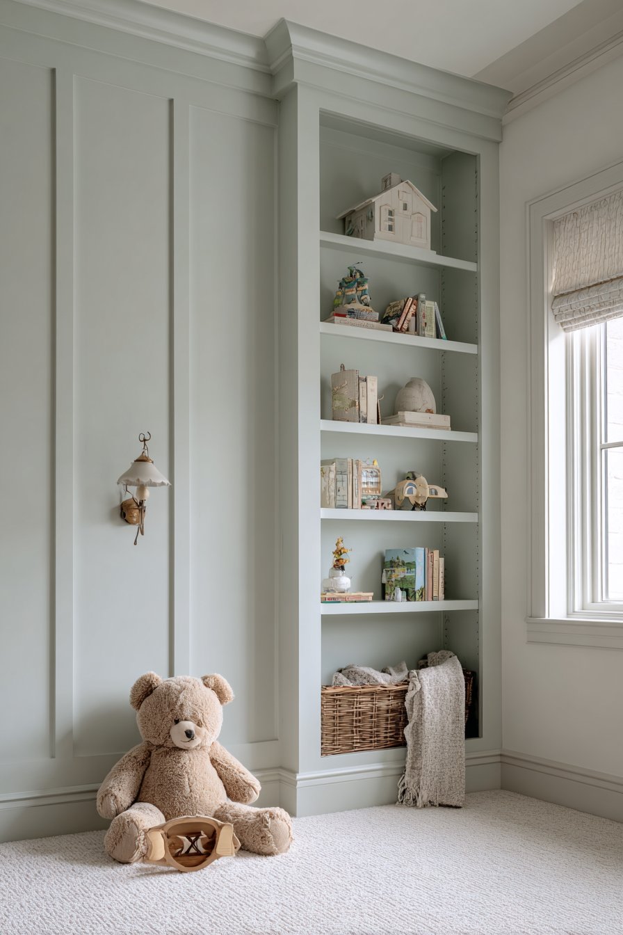
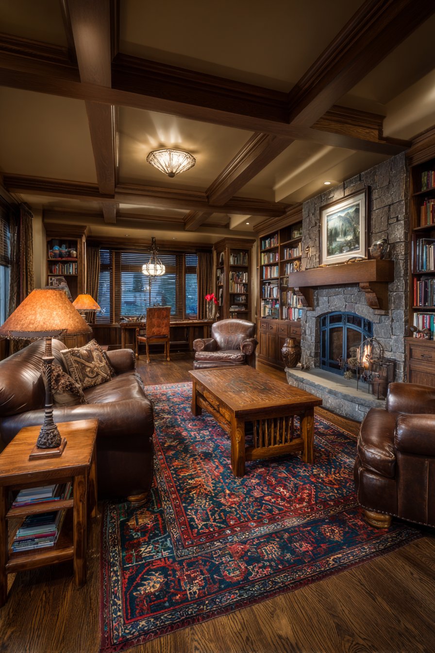
21. Traditional Study with Mahogany Richness
A traditional study featuring rich mahogany raised panel wainscoting creates a scholarly atmosphere perfect for reading, writing, and contemplation. The intricate molding details extend 48 inches around built-in bookshelves, creating a cohesive library aesthetic where architectural woodwork and functional storage merge seamlessly. The panels display deep wood grain with satin finish that catches light beautifully, while sage green upper walls complement the dark wood tones. Brass picture lights and leather furniture complete the scholarly atmosphere, creating a space that feels both intellectual and comfortable.
The richness of mahogany wood creates an enveloping, serious atmosphere appropriate for a study or library. The deep reddish-brown color adds warmth and sophistication, while the visible grain provides visual interest that rewards close observation. The intricate molding details reflect traditional craftsmanship and add layers of dimensional interest that create shadows and highlights as lighting changes throughout the day.
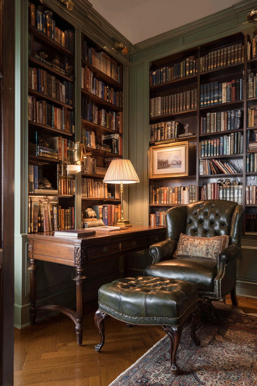
The integration of wainscoting with built-in bookshelves demonstrates thoughtful architectural planning. Rather than treating these elements as separate features, they work together to create a unified design that feels custom and intentional. This approach is characteristic of traditional library and study design, where wood paneling creates an envelope that promotes focus and learning.
Key Design Tips:
- Choose rich hardwoods like mahogany or cherry for authentic traditional study aesthetic
- Integrate wainscoting with built-in furniture for cohesive architectural design
- Use satin finish that showcases wood grain while remaining practical for high-touch areas
- Pair with classic study colors like sage green, burgundy, or deep blue for upper walls
- Install picture lights or sconces to highlight the wood’s richness and create ambient lighting for reading
22. Scandinavian Kitchen with Clean White Paneling
A Scandinavian kitchen featuring simple tongue and groove paneling in pure white creates a practical and beautiful backsplash treatment in the breakfast nook. Extending 40 inches with vertical installation and minimal trim, the design maintains the clean aesthetic characteristic of Nordic design. Light gray upper walls and natural wood countertops provide subtle contrast that keeps the space from feeling sterile, while pendant lighting and potted herbs add functional charm. Natural daylight creates soft shadows between the grooves, adding subtle texture to the white surfaces.
The genius of this application lies in its dual function as both design feature and practical surface. In a breakfast nook, where splashes and marks are inevitable, the tongue and groove paneling provides durable, cleanable protection while adding architectural interest. The vertical orientation creates visual height, making the nook feel more spacious and connected to the main kitchen. The pure white color reflects Nordic design’s love of light and brightness, essential in regions with long dark winters.
The minimal trim details maintain the Scandinavian principle of lagom—balanced, appropriate, not excessive. Rather than elaborate moldings that would distract from the clean lines, simple cap and base trim provide necessary finishing without calling attention to themselves. The result is wainscoting that feels like an integral part of the architecture rather than an applied decoration.
Key Design Tips:
- Use pure white rather than off-white for authentic Scandinavian brightness
- Install vertically in kitchen areas to create visual height and interest
- Choose tongue and groove paneling for subtle texture without ornamentation
- Seal properly for moisture resistance while maintaining the natural wood appearance under paint
- Pair with natural wood and soft gray tones to prevent the white from feeling stark
23. Transitional Bedroom with Greige Sophistication
A transitional bedroom showcasing sophisticated picture frame molding wainscoting in soft greige creates an elegant accent wall behind the headboard. The installation extends 60 inches, with varying panel sizes arranged symmetrically providing visual interest without chaos. Cream upper walls and white bedding maintain the serene palette essential for restful sleep, while bedside sconces create gentle ambient lighting that highlights the dimensional molding work. This design demonstrates how architectural details can create luxury and sophistication without overwhelming the peaceful atmosphere necessary for bedroom spaces.
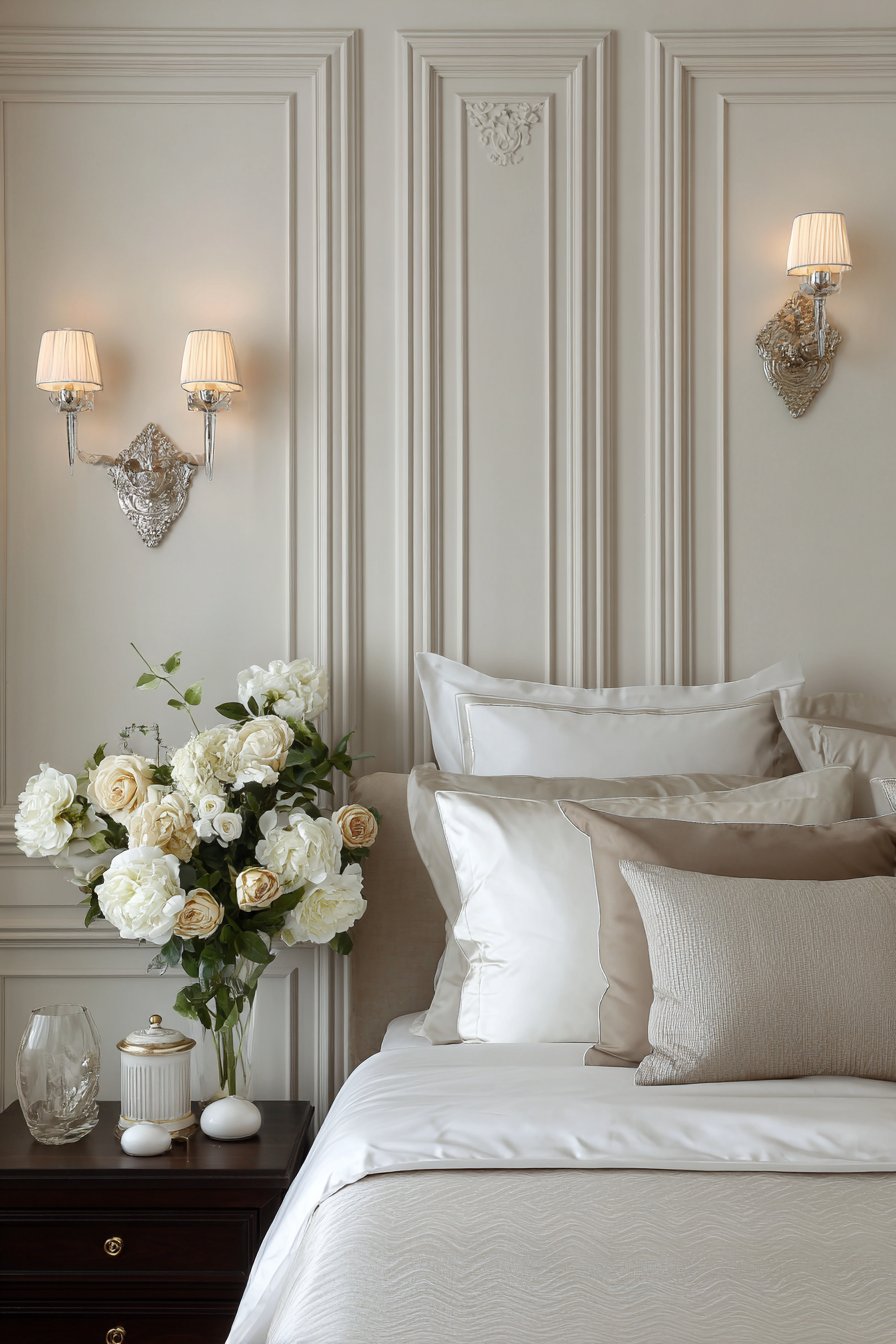
The greige color—that perfect balance of gray and beige—represents the sophistication of transitional design. It’s neutral enough to work with various color schemes and décor styles, yet more interesting than pure white or beige. The varying panel sizes prevent monotony while maintaining the symmetrical arrangement that creates visual calm. This balance between interest and restraint is the hallmark of successful bedroom design.
The 60-inch height behind the headboard creates substantial presence without extending too far up the wall, where it might interfere with artwork or make the ceiling feel lower. The picture frame molding creates gentle shadows that add dimension and interest, catching light from the bedside sconces in ways that change throughout the evening as you’re reading in bed. This interplay of light and shadow creates a dynamic yet soothing environment.
Key Design Tips:
- Choose warm gray tones (greige) that work with both cool and warm bedding and décor colors
- Vary panel sizes while maintaining symmetrical arrangement for visual interest with calm
- Extend to 60-72 inches behind beds to create appropriate scale for the furniture
- Install sconces that highlight the dimensional molding and provide reading light
- Keep upper walls and bedding in soft neutrals to maintain the serene atmosphere essential for sleep
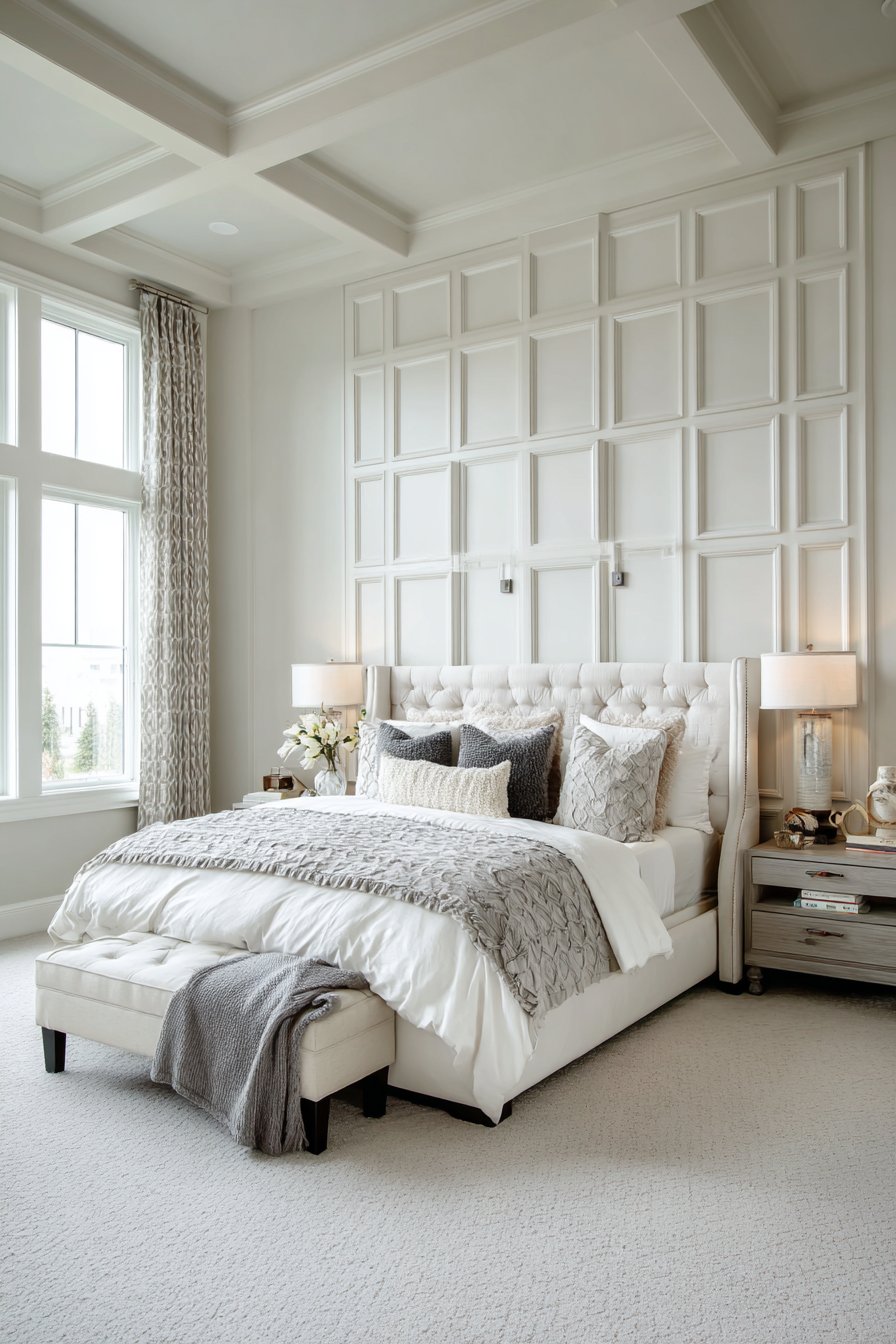
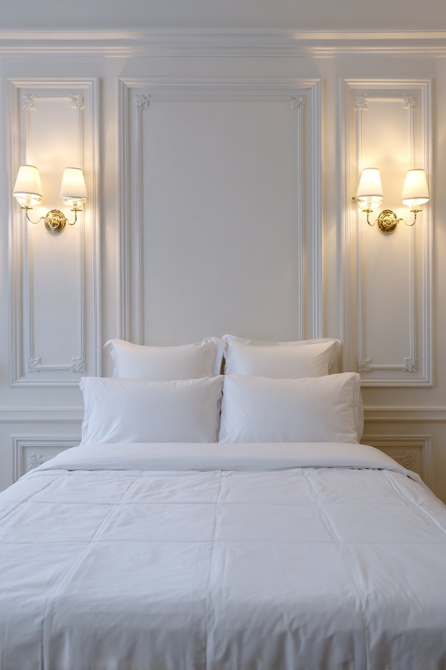
Conclusion: Transforming Your Home with Wainscoting
Throughout this comprehensive exploration of wall wainscoting ideas, we’ve discovered the remarkable versatility and transformative power of this timeless architectural element. From the classic elegance of raised panel wainscoting in traditional living rooms to the bold contemporary statement of geometric panels in modern home offices, wainscoting offers design solutions for every style preference, room type, and functional need. The beauty of wainscoting lies not only in its aesthetic appeal but in its practical benefits—providing durable wall protection, concealing imperfections, adding architectural interest, and creating visual structure that elevates any space.
Each of the twenty-three designs we’ve explored demonstrates different approaches to incorporating wainscoting into your home. We’ve seen how color choices can dramatically affect the mood, from the serene coastal charm of seafoam green shiplap to the sophisticated drama of charcoal gray geometric panels. We’ve explored various styles—from the ornate details of Victorian-inspired stairways to the clean simplicity of Scandinavian hallways—proving that wainscoting adapts beautifully to any design aesthetic. We’ve examined different materials and finishes, from the warm richness of walnut-stained craftsman panels to the crisp freshness of painted beadboard, each bringing unique character and atmosphere to a space.
The practical applications we’ve discussed demonstrate wainscoting’s versatility across room types. In high-traffic areas like mudrooms and entryways, floor-to-ceiling V-groove paneling provides durable protection while creating welcoming first impressions. In moisture-prone bathrooms, glossy beadboard offers both style and practicality. In bedrooms, carefully scaled wainscoting creates sophisticated focal points that promote restful atmospheres. In dining rooms and kitchens, various wainscoting styles add character while serving functional purposes.
As you consider incorporating wainscoting into your own home, remember that successful implementation begins with understanding your space’s specific needs and your personal design preferences. Consider the room’s proportions—standard 8-foot ceilings typically look best with wainscoting extending one-third to one-half up the wall, while taller ceilings can accommodate more substantial installations. Think about the room’s function—high-traffic areas benefit from durable finishes, while bedrooms and living rooms can embrace more delicate treatments. Reflect on your home’s existing architectural style and choose wainscoting that complements rather than conflicts with these elements.
Don’t be intimidated by the prospect of adding wainscoting to your home. While some installations require professional expertise—particularly complex stairway applications or intricate raised panel work—many simpler styles like board and batten or flat panel wainscoting are accessible DIY projects for confident homeowners. Start with a smaller space like a powder room or hallway to build skills and confidence before tackling larger, more visible areas. Research thoroughly, measure carefully, and don’t rush the process—quality installation is worth the investment of time and attention to detail.
The investment in wainscoting pays dividends beyond immediate aesthetic improvement. Well-executed wainscoting adds tangible value to your home, appealing to potential buyers who appreciate architectural character and quality craftsmanship. It creates a sense of permanence and intentional design that distinguishes your home from others with plain painted walls. Perhaps most importantly, wainscoting allows you to express your personal style and create spaces that feel uniquely yours—rooms that inspire, comfort, and delight you every day.
As you embark on your wainscoting journey, embrace the process of discovery and experimentation. Visit showrooms, study homes you admire, save inspiration images, and don’t be afraid to combine elements from different styles to create something uniquely suited to your space. The twenty-three ideas we’ve explored represent just a fraction of the possibilities available—consider them as starting points for your own creative interpretation rather than rigid formulas to follow exactly.
Ultimately, the best wainscoting design is one that enhances your daily life, reflects your personal aesthetic, and creates spaces where you and your loved ones want to spend time. Whether you choose the timeless elegance of raised panels, the clean lines of board and batten, the textural interest of shiplap, or any other style we’ve discussed, wainscoting has the power to transform ordinary rooms into extraordinary spaces that you’ll love for years to come.