Picture walls have become one of the most powerful tools in interior design, offering homeowners an opportunity to showcase their personality, memories, and artistic sensibilities while transforming blank walls into captivating focal points. Whether you’re drawn to minimalist arrangements or maximalist collections, picture walls provide endless possibilities for creative expression and visual storytelling. These displays go beyond simple decoration—they create emotional connections, spark conversations, and anchor entire rooms with their presence. The beauty of picture wall ideas lies in their versatility; they can adapt to any design style, budget, or space constraint while making a significant impact on the overall aesthetic of your home.
In today’s design landscape, picture walls have evolved far beyond the traditional single frame above a sofa. Modern approaches embrace everything from symmetrical grids that satisfy our love of order to eclectic salon-style arrangements that celebrate collected treasures over time. The right picture wall can define a room’s character, enhance architectural features, and even solve design challenges like awkward wall spaces or lack of color. From grand two-story entryway displays to intimate corner arrangements, these installations offer solutions for every room and every style preference.
This comprehensive guide explores thirty-one distinctive picture wall ideas, each offering unique approaches to creating stunning visual displays in your home. Whether you’re looking to create a cohesive minimalist statement, a vibrant family timeline, or an artistic collection that rivals gallery exhibitions, you’ll discover practical insights, design principles, and actionable tips to help you curate the perfect picture wall for your space. These ideas span various styles, techniques, and applications—from traditional framed photography to innovative digital displays and three-dimensional installations—ensuring there’s inspiration for every taste and every home.
1. Symmetrical Grid Gallery Wall
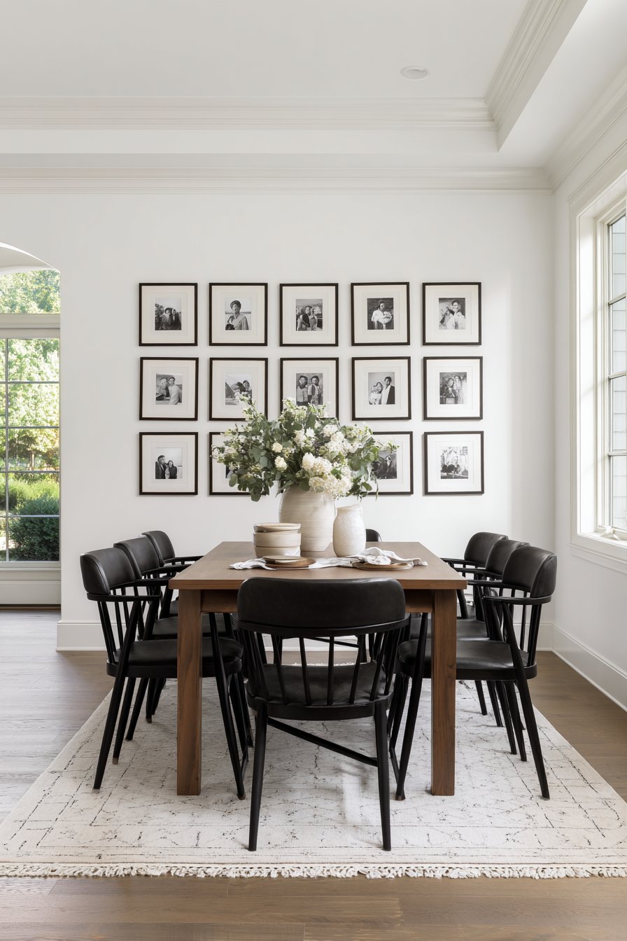
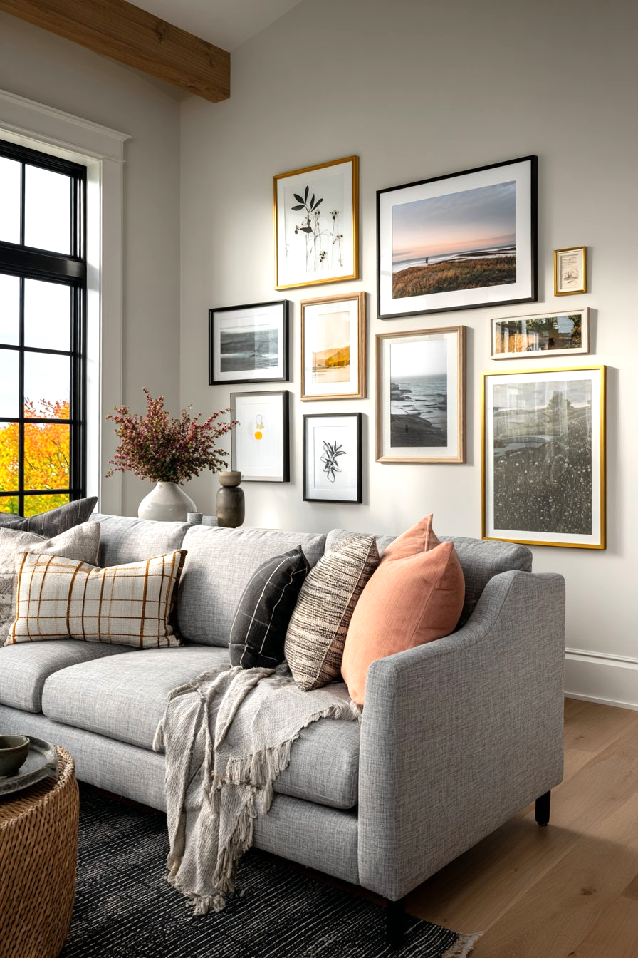
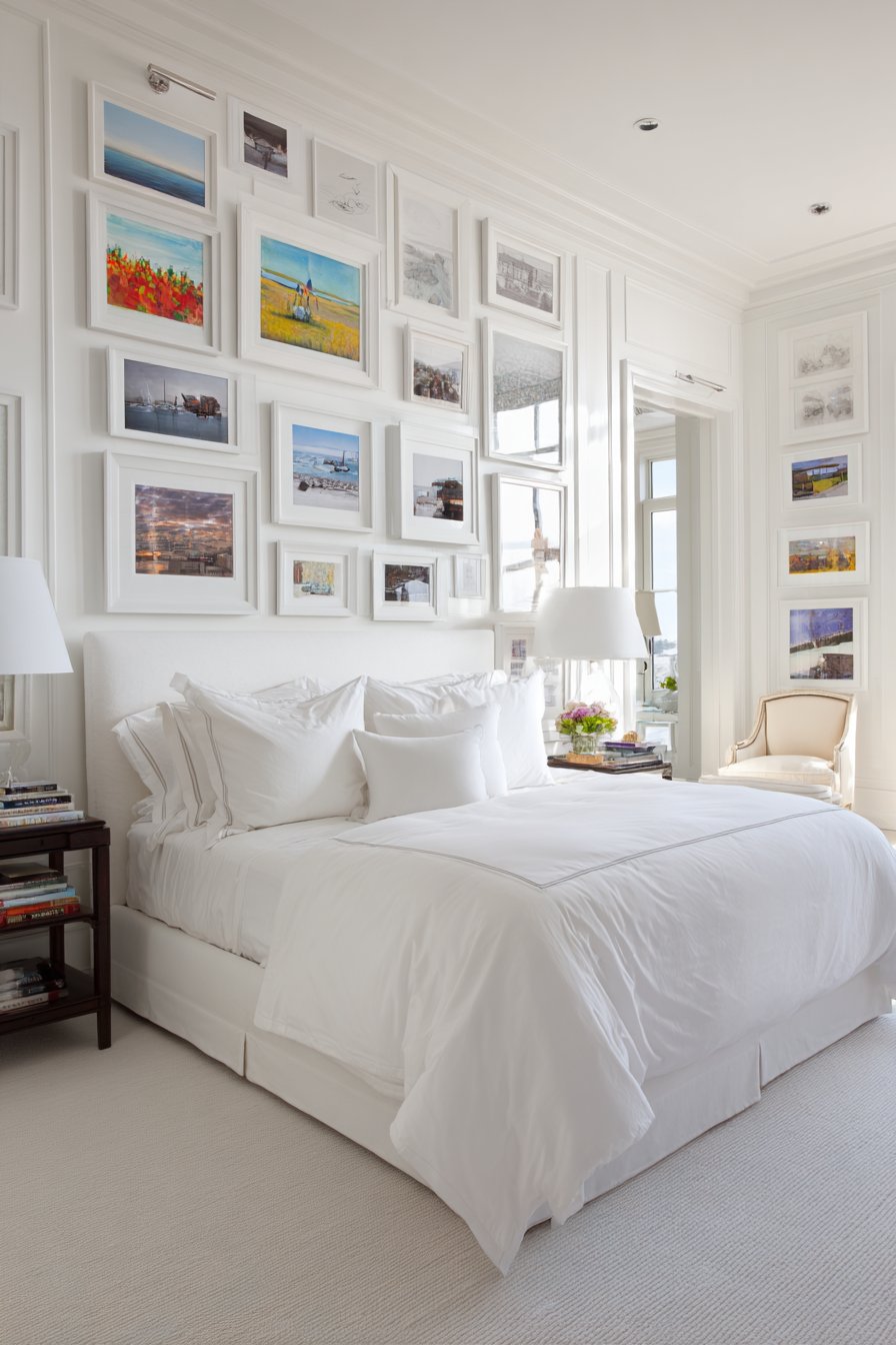
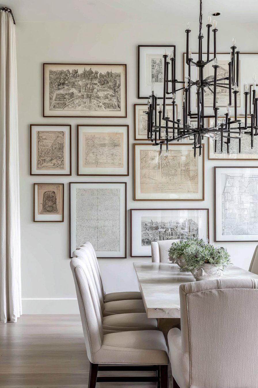
The symmetrical grid arrangement represents the epitome of organized elegance in picture wall design. This approach features twelve identically-sized black frames arranged in perfect rows and columns, creating a harmonious display that appeals to those who appreciate balance and order. The monochromatic black and white family photographs within each frame create a cohesive narrative while the precise spacing—typically two inches between frames—ensures visual rhythm that’s pleasing to the eye. When positioned above a modern walnut dining table, this arrangement bridges the gap between contemporary furniture and timeless photography, creating a focal point that’s both personal and sophisticated.
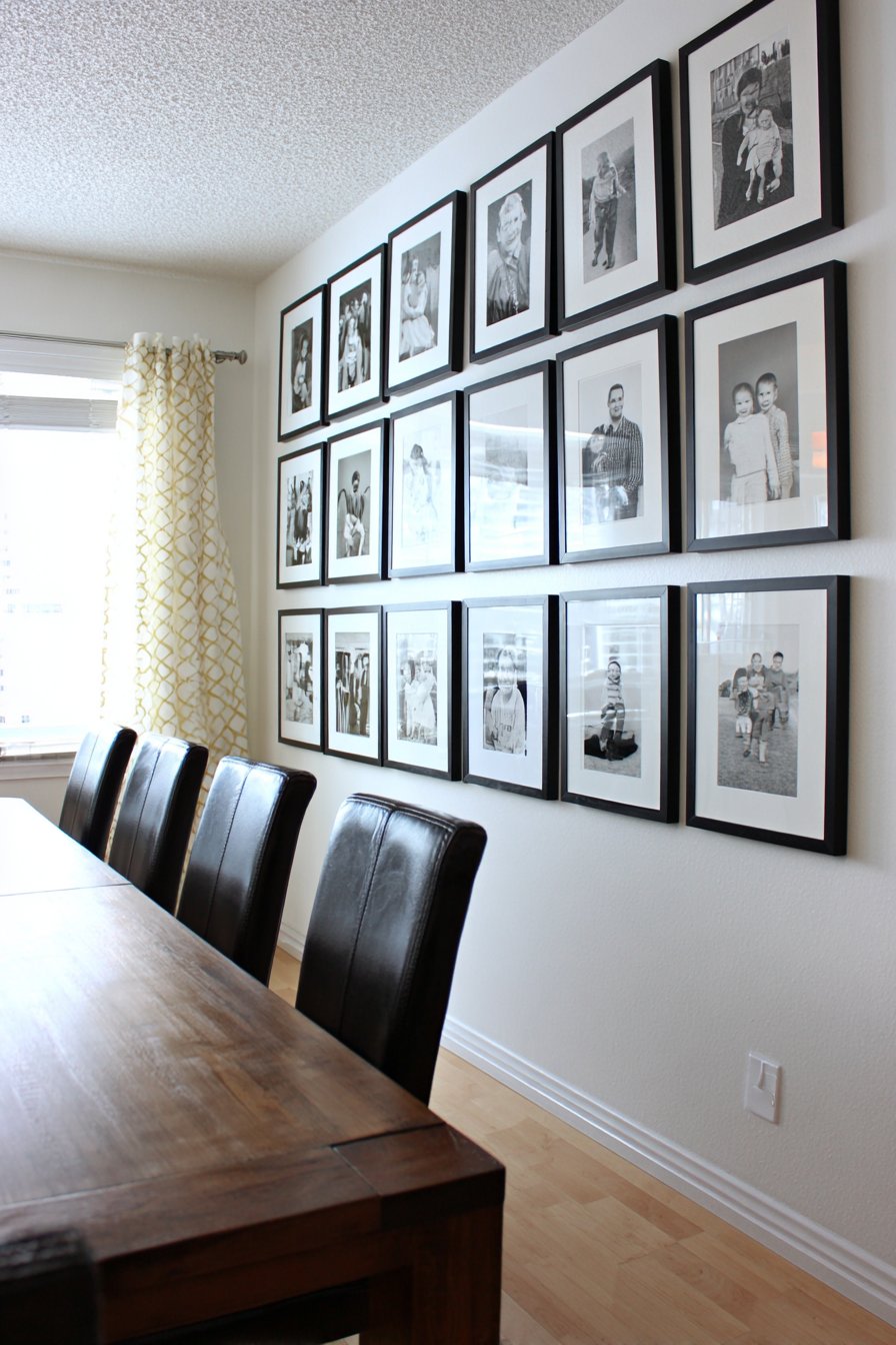
The beauty of this symmetrical approach lies in its mathematical precision and restraint. Unlike more casual arrangements, the grid system demands careful planning and exact measurements, but the payoff is a display that feels intentional and professionally curated. Natural daylight streaming from side windows adds dimension to the composition, creating subtle highlights on the frame glass and casting delicate shadows that change throughout the day. This dynamic interplay between light and shadow adds life to what might otherwise feel static, proving that even highly structured arrangements can possess organic qualities.
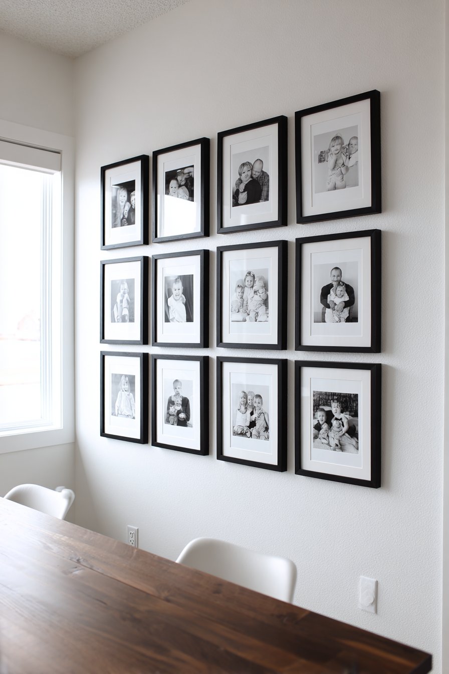
The dining room setting for this particular arrangement makes perfect sense—it creates a conversation starter during meals and provides visual interest without overwhelming the space. The contrast between the warm walnut tones of the dining table and the crisp black and white palette of the frames creates a sophisticated tension that elevates both elements. For those concerned about the stark nature of monochrome, the varied subjects within the photographs provide subtle tonal variations that prevent the display from feeling too severe.
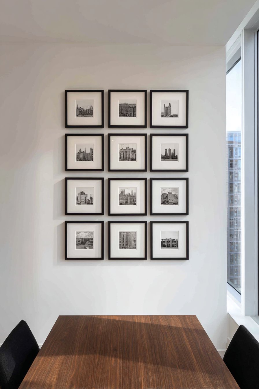
Key Design Tips: Choose frames with identical dimensions, preferably 12×12 inches, to maintain perfect symmetry. Use a level and measuring tape to ensure precise spacing—consistency is crucial for this style. Convert all photographs to black and white during editing to maintain visual cohesion, even if they were originally taken in different settings or time periods. Consider the viewing distance from your dining table when determining frame size and height placement. Mount the arrangement so the center point aligns with eye level when seated for optimal viewing during meals.
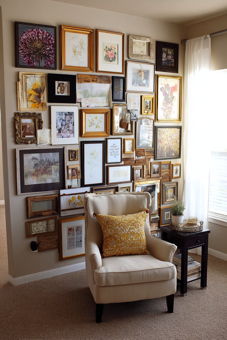
2. Eclectic Salon-Style Statement Wall
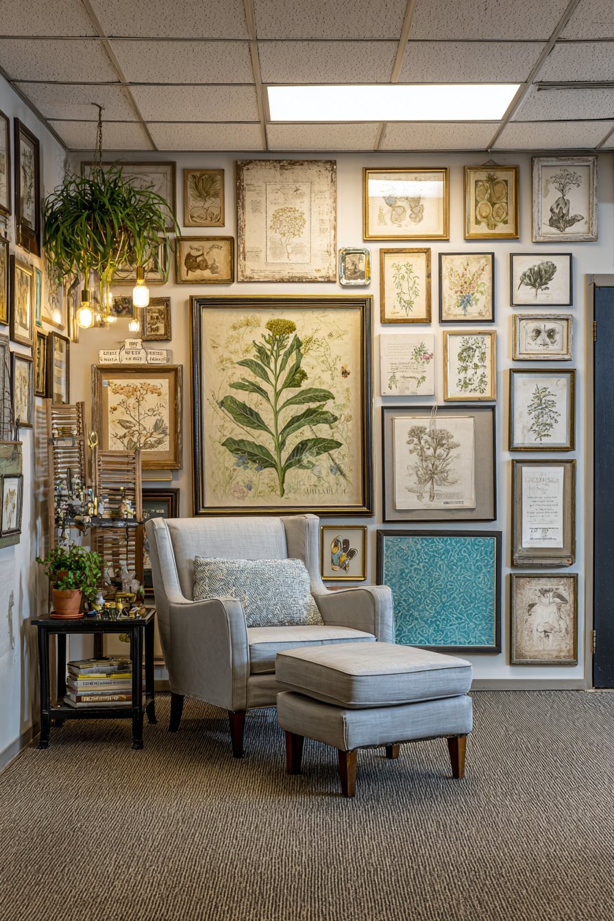
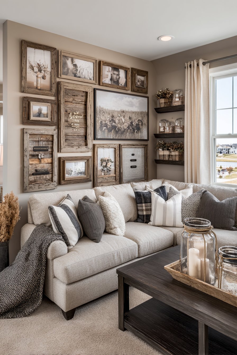
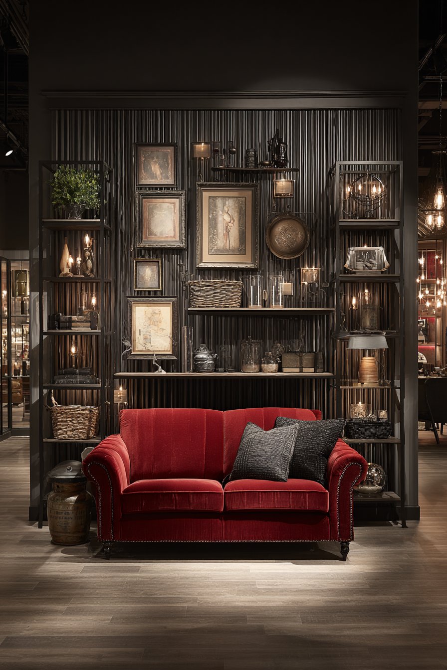
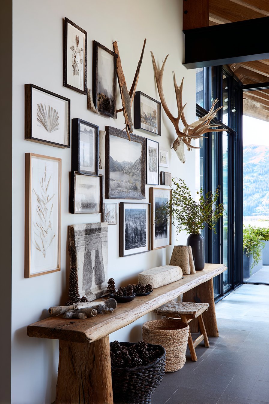
For those who embrace maximalism and the beauty of collected treasures, the salon-style gallery wall offers unparalleled opportunity for self-expression. This approach completely covers an accent wall in a home office with frames of every imaginable size—from tiny 4×6 inch pieces to substantial 20×24 inch statements—creating a rich tapestry of visual interest. The mixed materials spanning distressed wood, ornate gold, and simple black frames add textural variety that prevents the eye from becoming bored, while the diverse content including vintage botanical prints, family portraits, abstract watercolors, and inspirational quotes tells a complex story about the inhabitant’s interests and values.
The genius of salon-style arrangements lies in their apparent spontaneity, though successful execution actually requires considerable planning. The key is achieving what designers call “balanced asymmetry”—an arrangement that feels organic and unplanned while maintaining visual equilibrium across the entire composition. Starting with your largest pieces as anchor points, you gradually fill in surrounding areas with medium and small frames, constantly stepping back to assess the overall balance. The inclusion of a comfortable reading chair and small side table adjacent to the wall reinforces the personal, curated nature of the space, inviting contemplation and closer examination of individual pieces.
This approach works particularly well in home offices where creative thinking is valued and personal expression enhances productivity. The variety of imagery provides mental stimulation during breaks from work, while the sheer density of the display creates a backdrop that’s both inspiring and comforting. Soft diffused lighting eliminates harsh glare on frame glass while ensuring every piece can be appreciated, creating an intimate gallery atmosphere within a working environment.
Key Design Tips: Begin by laying out your entire collection on the floor to experiment with arrangements before committing to the wall. Start hanging from the center outward, using your largest or most important piece as an anchor. Vary frame styles intentionally rather than randomly—aim for a mix that includes 40% traditional frames, 40% modern frames, and 20% ornate or unusual frames. Maintain consistent spacing between frames—typically 2-3 inches—even when frame sizes vary dramatically. Include at least one piece at or below eye level that invites close inspection and serves as an entry point into the collection.
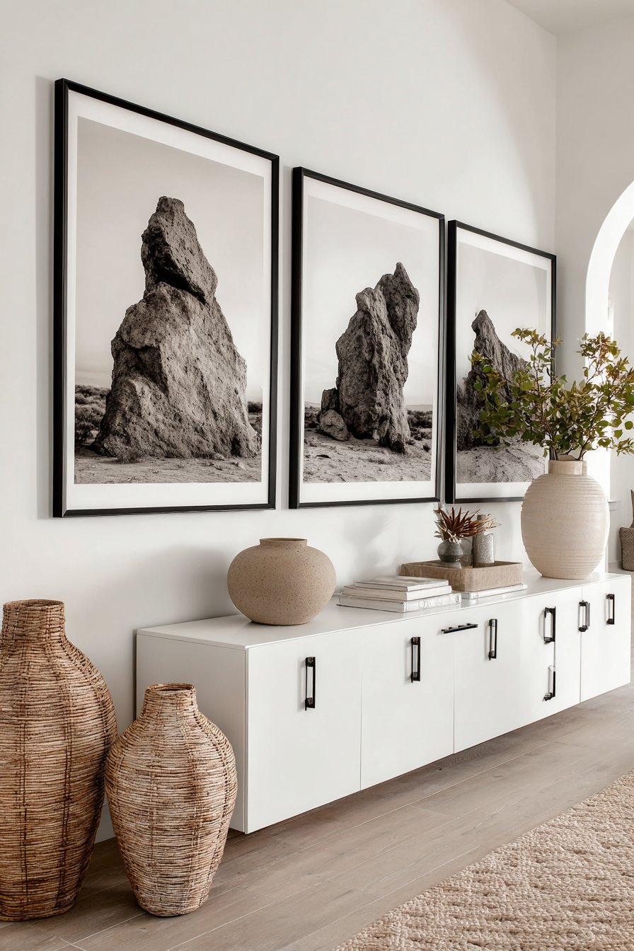
3. Linear Landscape Photography Display
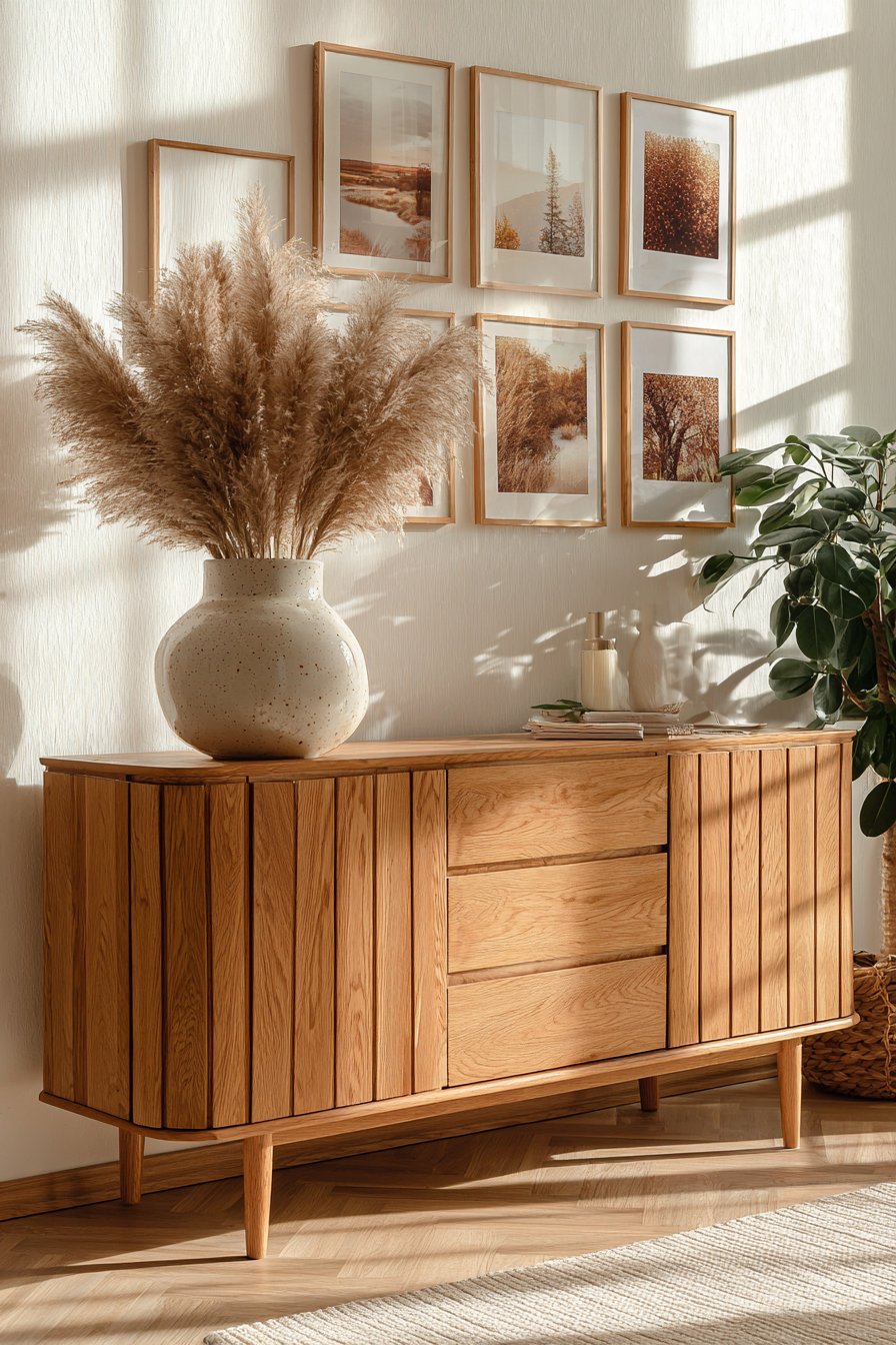
Clean lines and horizontal emphasis define this sophisticated approach to picture wall design. Five large-format frames, each measuring 20×30 inches and finished in natural oak, are positioned in a perfectly straight line above a mid-century modern credenza. The landscape photography within each frame showcases earthy tones—ochre, terracotta, sage, and burnt umber—that complement the warm wood tones of both the frames and the furniture below. This horizontal arrangement naturally draws the eye across the wall, creating a sense of movement and expansion that can make rooms feel wider than their actual dimensions.
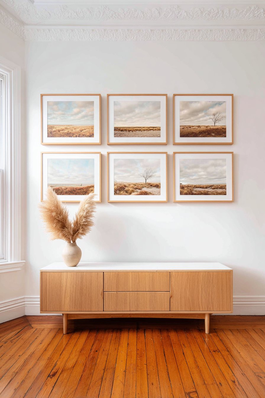
The simplicity of this linear arrangement shouldn’t be mistaken for lack of sophistication. By limiting the display to five substantial pieces rather than numerous small frames, this approach embraces the “less is more” philosophy that characterizes mid-century modern design. Each photograph receives individual attention rather than competing for notice within a crowded composition. The even spacing between frames creates a rhythm that’s mathematical in its precision, yet the organic subject matter of landscape photography softens what could otherwise feel too rigid or industrial.
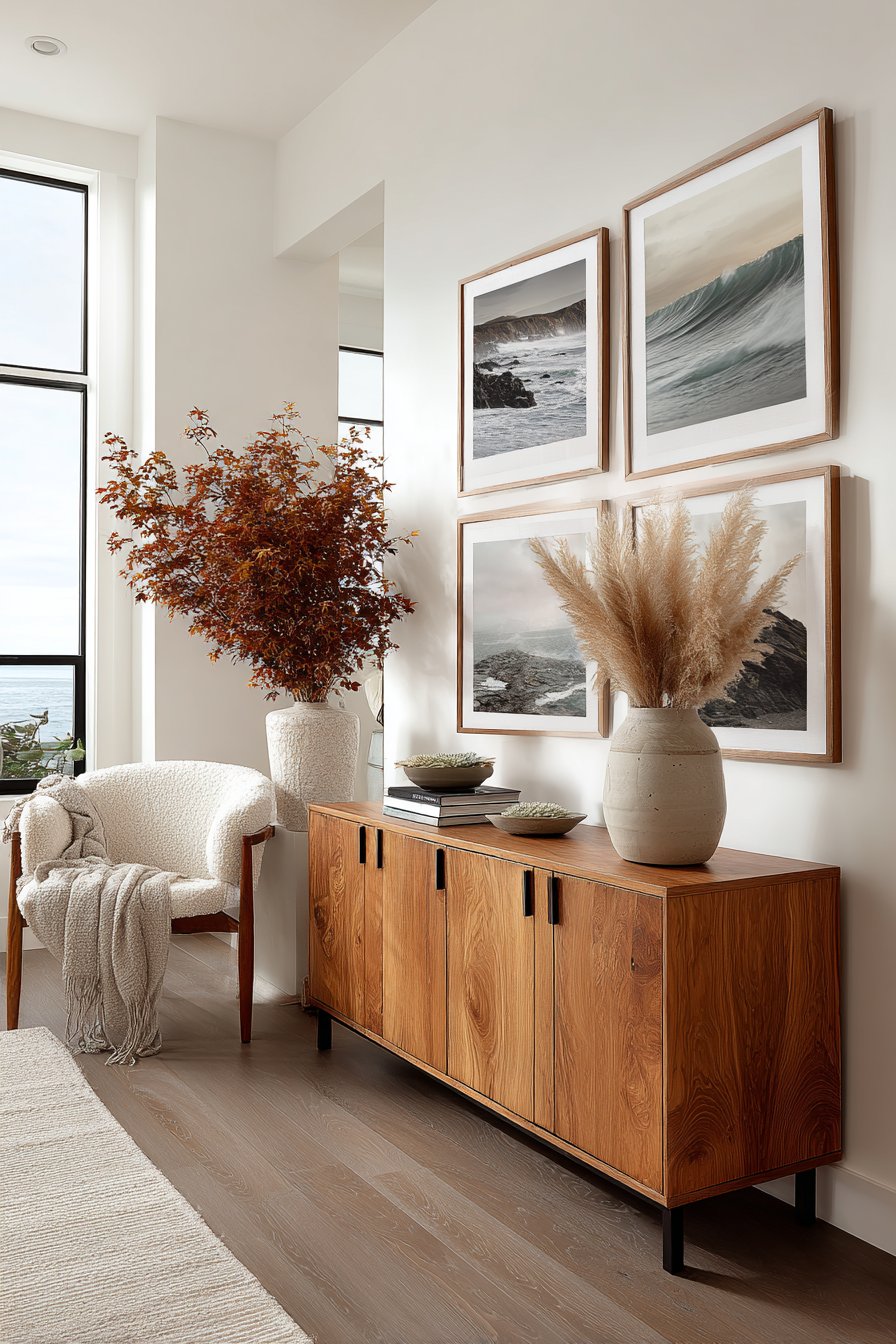
The strategic placement above a mid-century credenza creates a cohesive design moment that exemplifies how furniture and wall art should work in harmony. The addition of a ceramic vase holding dried pampas grass on the credenza surface introduces vertical interest and natural texture without disrupting the strong horizontal lines established by the frames above. Natural light from nearby windows washes across the arrangement evenly, eliminating hot spots and ensuring balanced illumination that changes subtly as the day progresses.
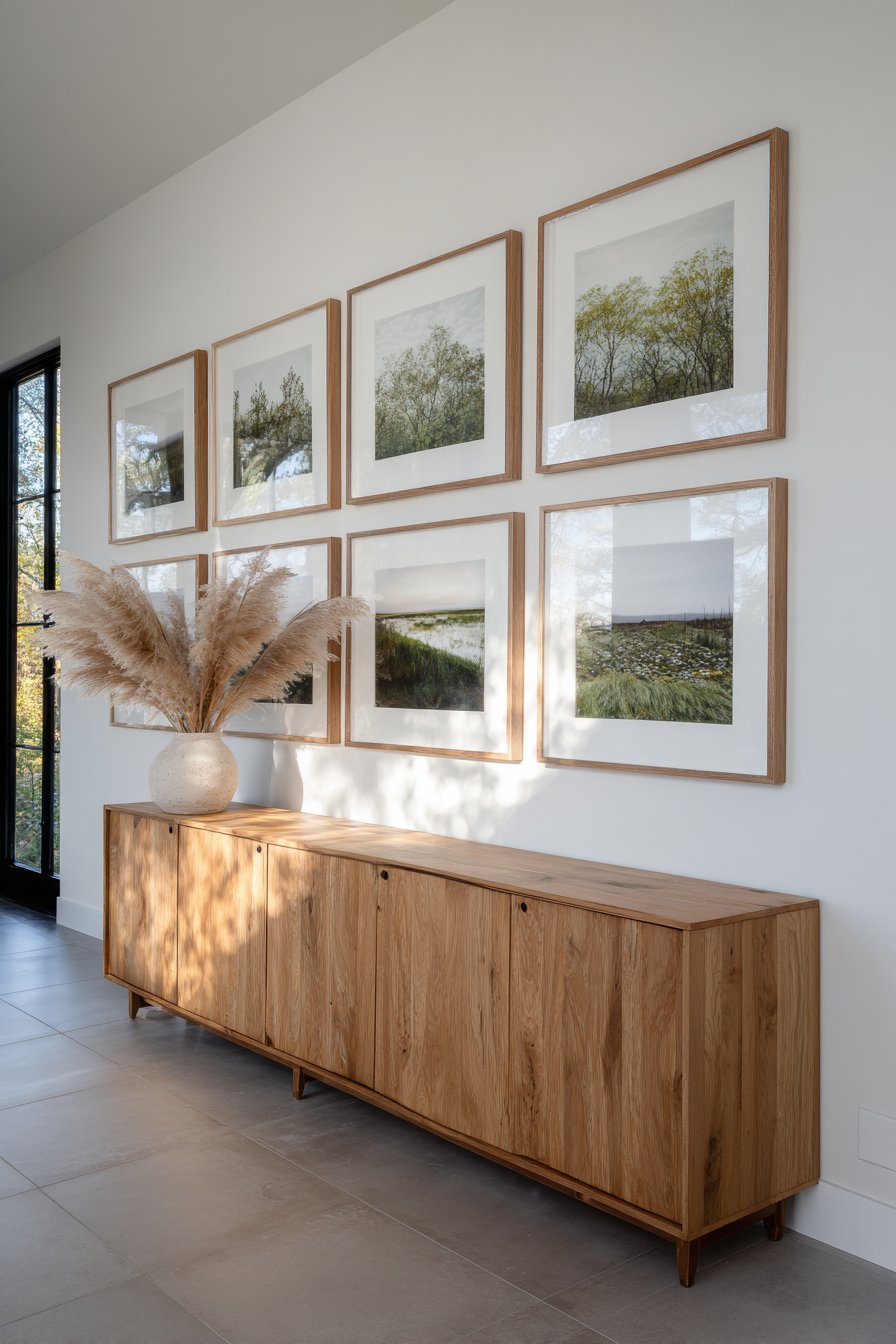
Key Design Tips: Maintain identical frame sizes and finish for this style—consistency is essential to achieve the clean, streamlined look. Position frames at eye level, typically with the center of each frame 57-60 inches from the floor. Use a laser level to ensure perfect alignment; even slight deviations become glaringly obvious in linear arrangements. Space frames evenly—for 20×30 inch frames, 4-6 inches between each works well. Choose landscape photography with similar tonal qualities to create visual flow while allowing each image to maintain its individual character.
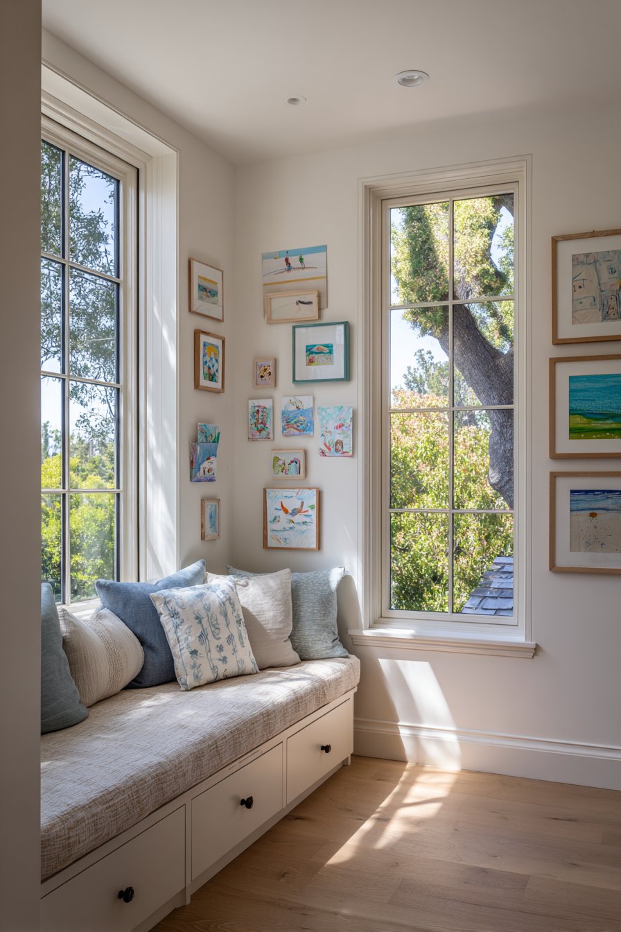
4. Corner-Wrapping Gallery Wall
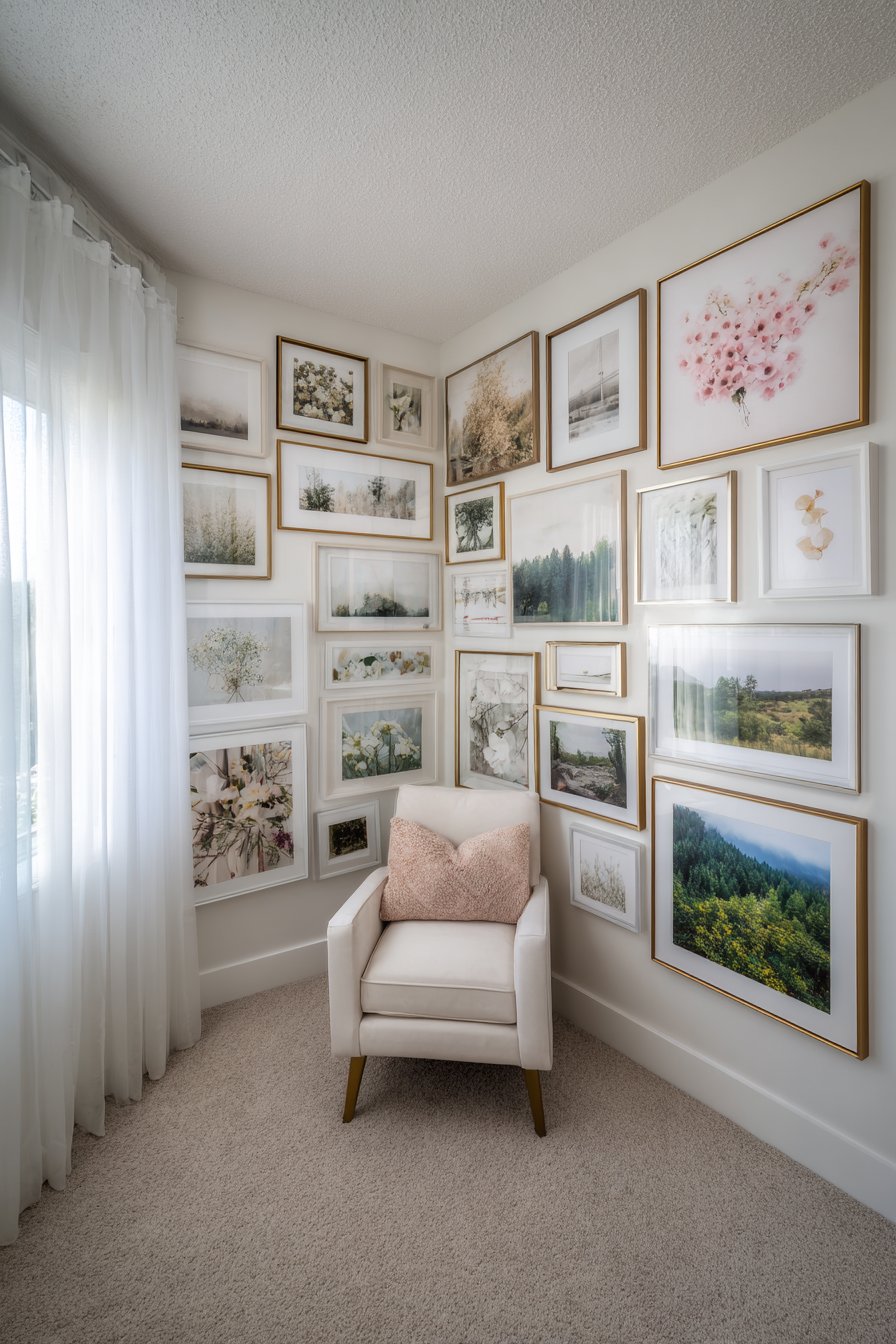
Corner spaces often present design challenges, but the corner-wrapping gallery wall transforms this potential problem into an opportunity for dramatic impact. This innovative approach begins densely near the corner intersection where two perpendicular walls meet, then gradually becomes more sparse as the arrangement extends outward along each wall. The frames themselves—a coordinated mix of white and light wood finishes—maintain visual cohesion while the soft pastel artwork and serene nature photography within create a calming atmosphere perfect for bedroom settings.
The transitional quality of this arrangement is what sets it apart from traditional gallery walls. Rather than treating each wall as a separate entity, this approach views the corner as a focal point that radiates outward, creating visual flow that guides the eye naturally around the space. The density near the corner creates visual weight and importance, while the gradual dispersal prevents the walls from feeling overcrowded. This technique works particularly well in bedrooms where you want impact without overwhelming the restful atmosphere.
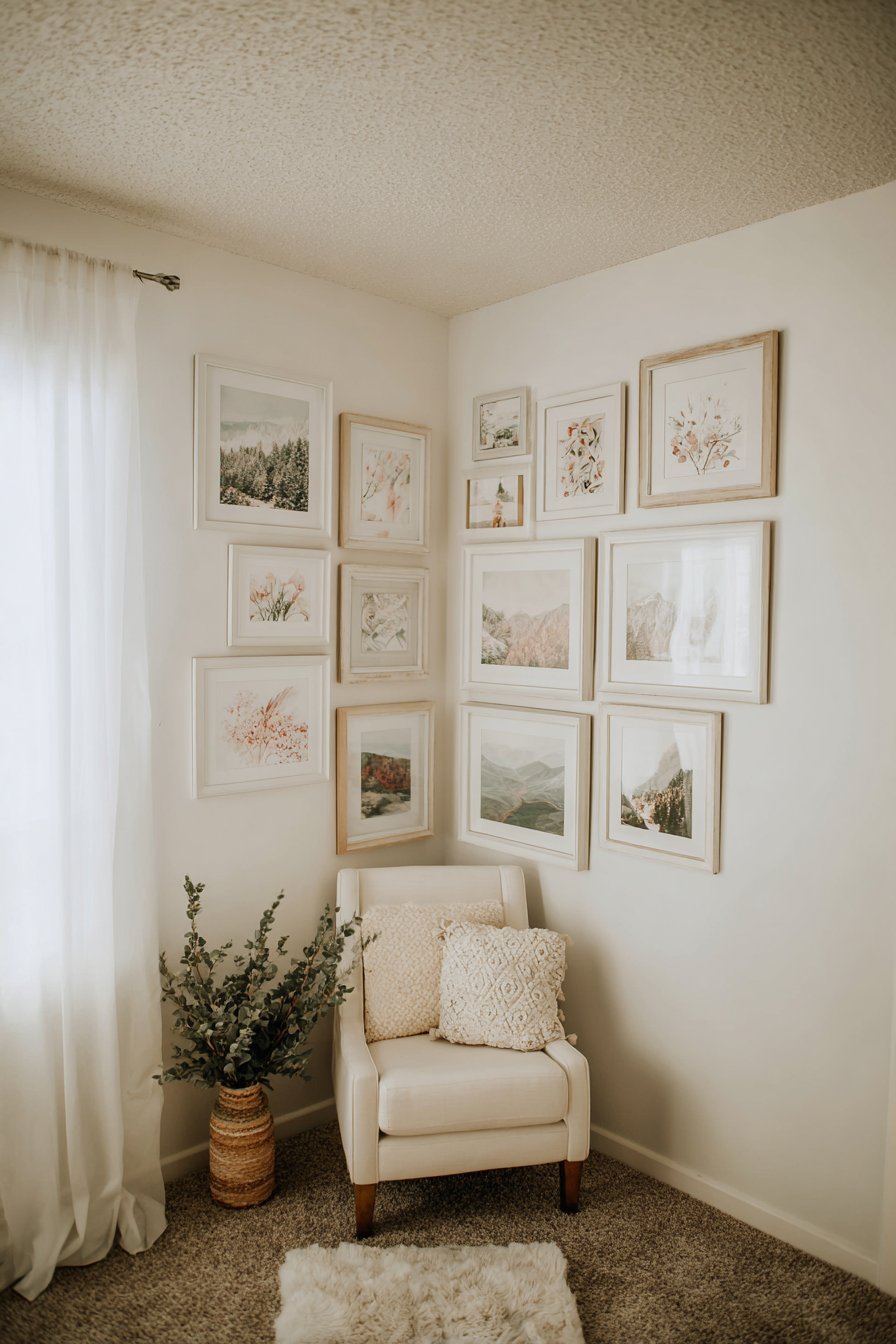
The integration of a plush reading nook with a velvet chair positioned below the display creates a functional relationship between the art and the living space. The chair placement invites inhabitants to settle in and contemplate the images surrounding them, transforming passive wall decoration into an interactive experience. Soft morning light filtering through sheer curtains adds an ethereal quality to the pastel palette, while the varied frame finishes catch and reflect light differently, adding subtle visual interest even when viewing from a distance.
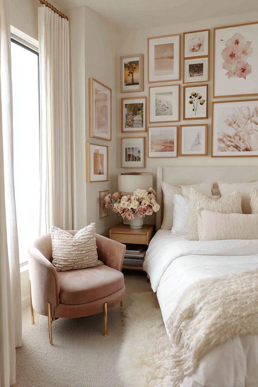
Key Design Tips: Start at the corner with your largest or most important piece positioned slightly to one side rather than directly in the corner. Work outward along both walls, decreasing frame density as you move away from the corner. Vary frame sizes while maintaining a consistent color palette—mixing white and light wood creates visual interest without chaos. Allow at least 6-8 inches of space between the corner and your first frame to prevent a cramped appearance. Use smaller frames as you reach the edges of your arrangement to create a natural fade-out effect.
5. Dramatic Two-Story Entryway Gallery
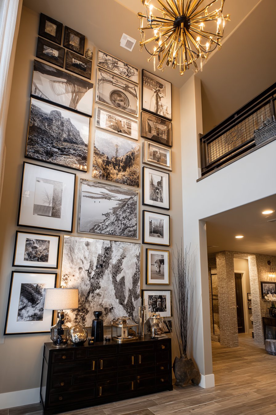
Grand architectural spaces demand equally impressive design solutions, and few picture wall ideas deliver impact like a floor-to-ceiling gallery wall in a two-story entryway. This expansive display spans the entire vertical height of the space, incorporating over thirty frames in a carefully balanced asymmetrical arrangement. The frame finishes—matte black, brass, and dark walnut—provide enough variety to maintain visual interest across such a large expanse while maintaining sufficient cohesion to read as a unified installation. The diverse content including travel photography, abstract art, and family heirlooms creates a personal museum that immediately communicates the homeowner’s sophistication and life experiences.
The challenge of designing for such dramatic height lies in creating visual flow that works from multiple vantage points—from the entry level looking up, from the second floor looking down, and from the staircase at intermediate heights. Successful execution requires careful attention to the relationship between larger anchor pieces and smaller supporting frames, ensuring that no single area feels too dense or too sparse when viewed from any angle. The inclusion of a console table at ground level helps anchor the massive vertical display, providing a logical starting point for the eye before it travels upward.
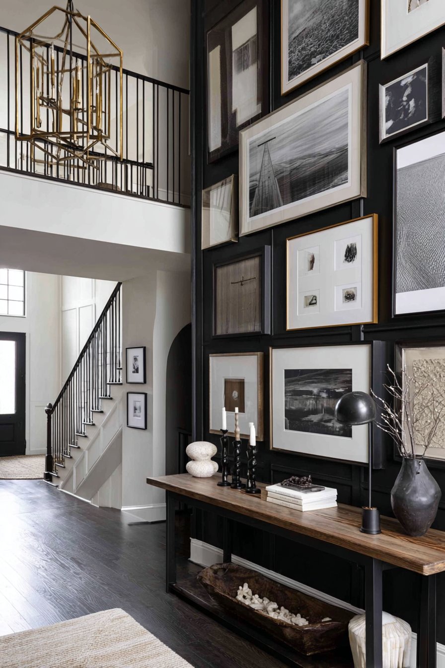
Statement lighting becomes crucial in spaces like this where natural light may not reach all areas evenly. A carefully selected chandelier not only provides necessary illumination but also becomes part of the overall composition, its decorative presence complementing rather than competing with the framed artwork. The warm ambient lighting it casts in the evening hours transforms the display, highlighting frame finishes and creating dramatic shadows that add depth and dimension to the arrangement.
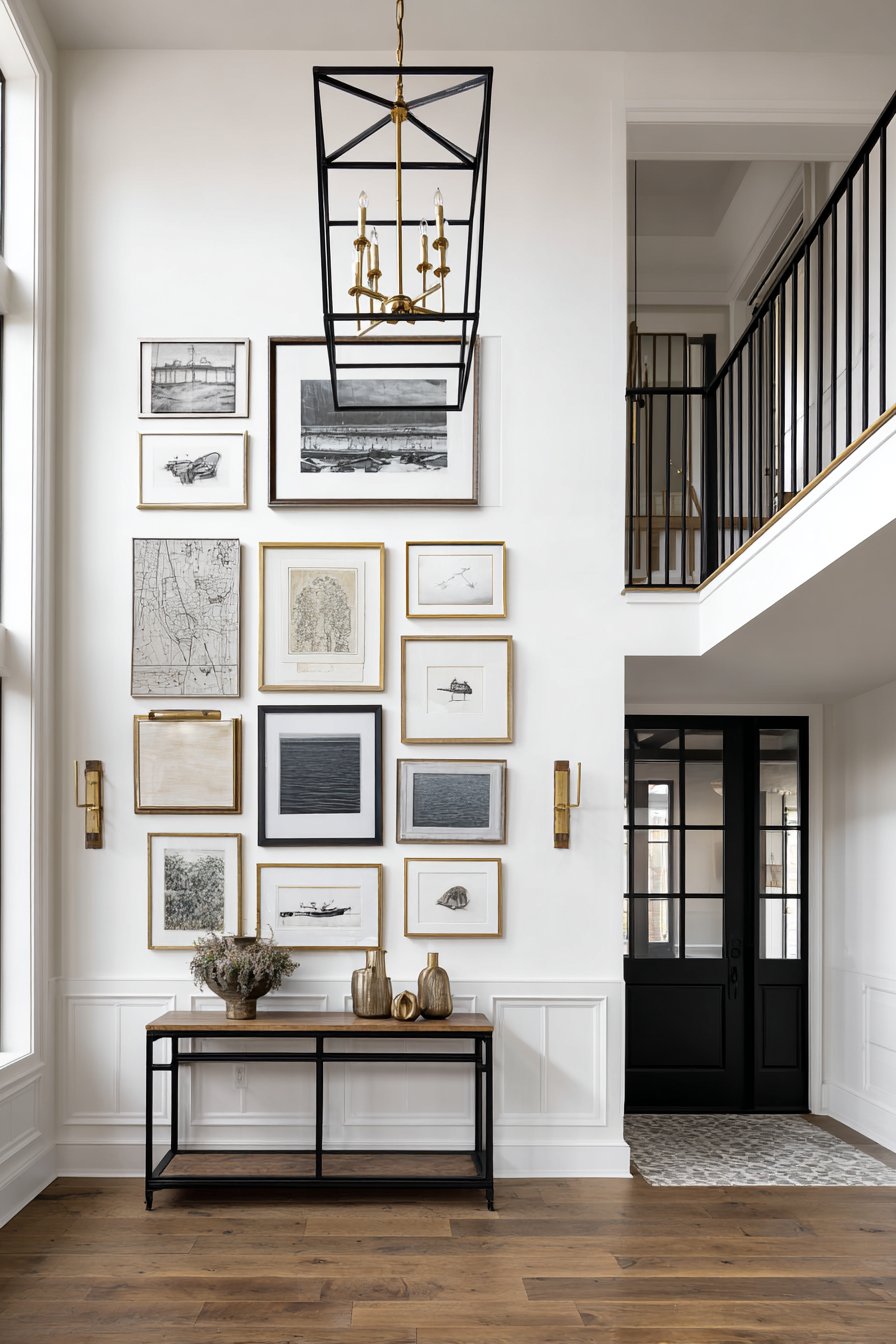
Key Design Tips: Create a detailed floor plan that maps every frame position before beginning installation—improvisation at this scale leads to problems. Use the largest frames in the lower two-thirds of the display where they can be appreciated in detail. Incorporate at least three different frame finishes to prevent monotony across such a large area. Install proper lighting that can be adjusted to highlight different areas of the display. Consider hiring professional installers for pieces above 10 feet—safety and proper anchoring are crucial at this scale.
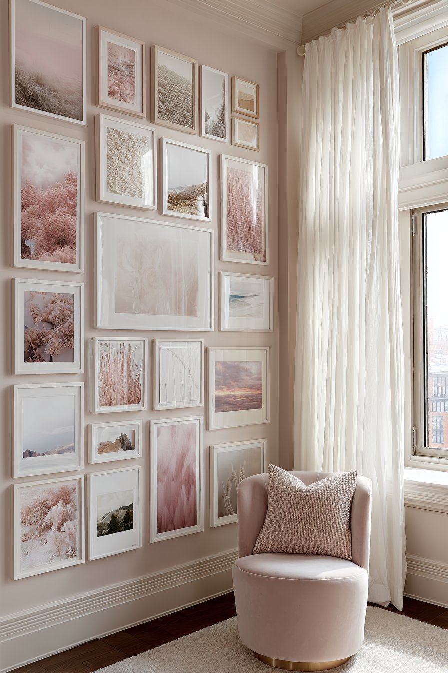
6. Coastal-Themed Color Coordination
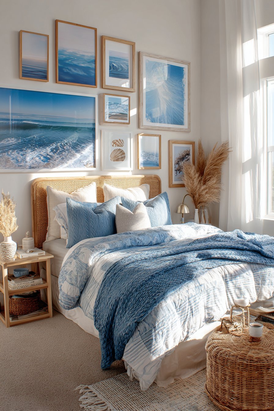
Thematic unity through color creates powerful visual impact, as demonstrated perfectly by this coastal bedroom gallery wall. Twelve frames in whitewashed wood and rope-wrapped finishes immediately establish the beach aesthetic before you even consider the content. The imagery—ocean photography capturing various shades of turquoise and navy, seashell prints showing delicate spiral patterns, and beach landscape paintings depicting sandy shores—reinforces the theme through consistent color palette adherence. Every piece maintains the coastal color story of blue, white, and sand tones, creating a cohesive visual experience that transports viewers to seaside destinations.
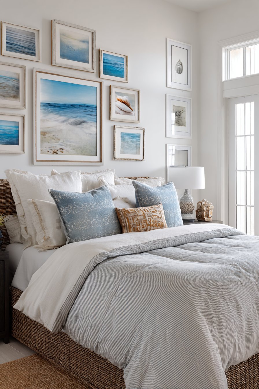
The arrangement follows what designers call a “loose grid pattern”—it has the underlying structure of a grid for stability but allows for intentional spacing variations that prevent rigidity. This balance between order and organic flow mirrors the coastal theme itself, where natural forces create patterns that are structured yet never perfectly uniform. The whitewashed wood frames feel weathered and sun-bleached, their texture suggesting driftwood collected during beach walks, while rope-wrapped elements add tactile interest that begs to be touched.
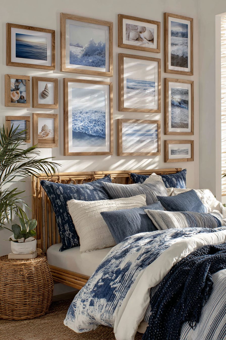
The relationship between the gallery wall and the woven rattan headboard below creates a layered coastal narrative. The headboard’s natural texture echoes the rope elements in the frames while its warm honey tones provide gentle contrast to the cool blue palette above. Natural light flooding through bedroom windows mimics the bright, clear quality of seaside illumination, making the blues appear particularly vibrant during midday hours while taking on deeper, more mysterious tones during evening hours.
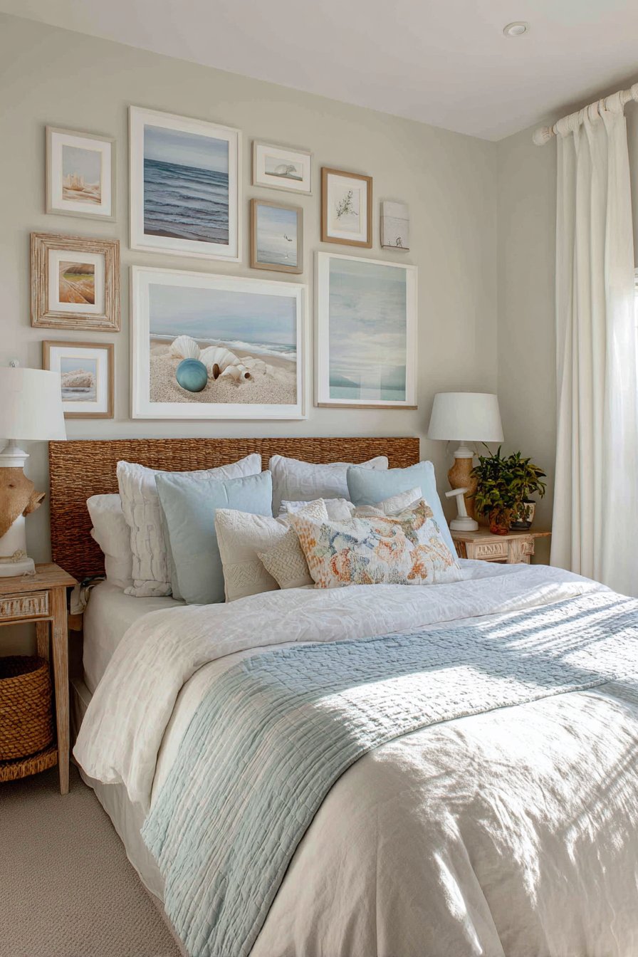
Key Design Tips: Establish your color palette before selecting any artwork—in this case, limit yourself to blues, whites, and neutral sand tones. Source frames that reflect the theme through material choices like weathered wood, rope accents, or sea-glass-inspired finishes. Include varied subject matter within your theme—mix close-up details with expansive landscapes to create visual variety while maintaining thematic consistency. Position frames following a loose grid with 2-4 inch spacing variations to avoid excessive rigidity. Ensure at least 8-10 inches of space between the top of your headboard and the bottom of your lowest frame.
7. Minimalist Three-Piece Linear Statement
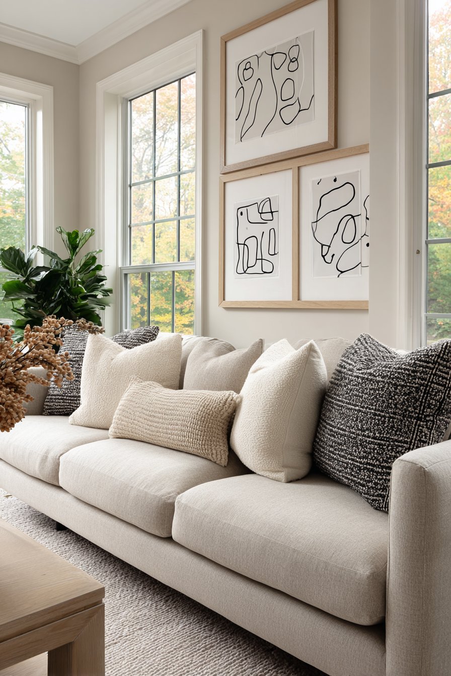
Sometimes restraint makes the strongest statement, as proven by this minimalist approach featuring just three large frames. Each 24×36 inch frame in light oak contains an abstract line drawing executed in black ink on pristine white backgrounds. The frames hang in a perfect horizontal row with mathematical precision in their spacing, creating a display that embodies Scandinavian design principles of simplicity, functionality, and understated elegance. This approach recognizes that walls don’t always need to be completely filled—intentional negative space can be as important as the art itself.
The power of this minimal arrangement lies in its confidence and clarity. By limiting the display to three substantial pieces rather than numerous smaller frames, each artwork receives undivided attention. The abstract line drawings provide visual interest through their gestural quality and varying line weights without introducing color that might compete with other room elements. The light oak frames add just enough warmth to prevent the black and white artwork from feeling cold or sterile, creating a bridge between the art and the neutral linen sofa positioned below.
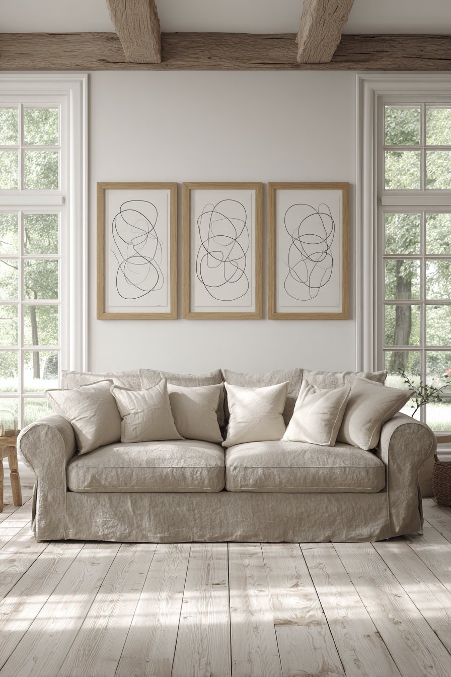
The abundant natural light pouring through large windows plays a crucial role in this design’s success. Scandinavian design emerged partly in response to the Nordic region’s limited daylight hours, so maximizing available natural light is fundamental to the style. The bright, airy atmosphere created by generous windows amplifies the sense of space and openness, while the simple artwork and minimal furniture allow light to bounce freely throughout the room without obstruction or absorption by heavy decorative elements.
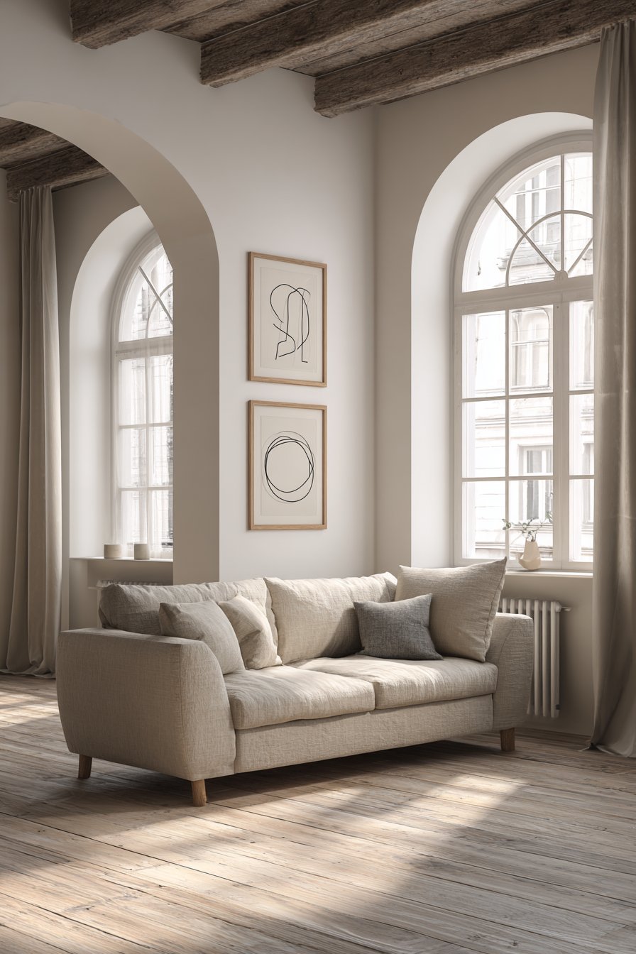
Key Design Tips: Invest in fewer, larger pieces rather than many small frames when pursuing minimalist aesthetics. Maintain perfect alignment and equal spacing—use a laser level and measuring tape for precision. Choose artwork with simple, clean compositions that don’t compete for attention through excessive detail or color. Allow generous negative space around your frames—aim for at least 12-18 inches between frames and other room elements. Mount frames so the center point sits at 57-60 inches from the floor for optimal viewing from standing and seated positions.
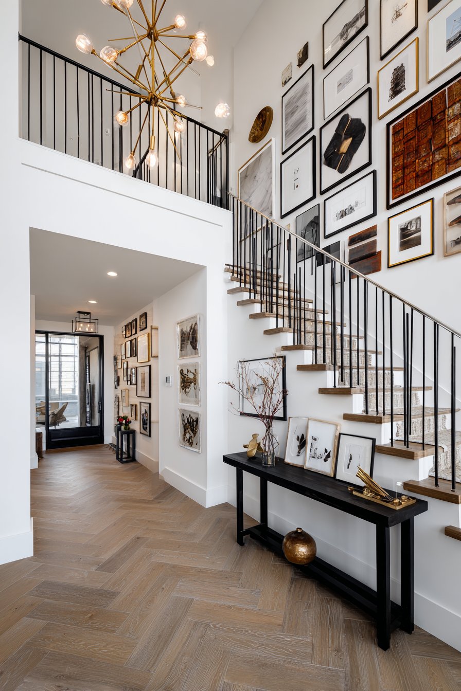
8. Ascending Stairway Gallery
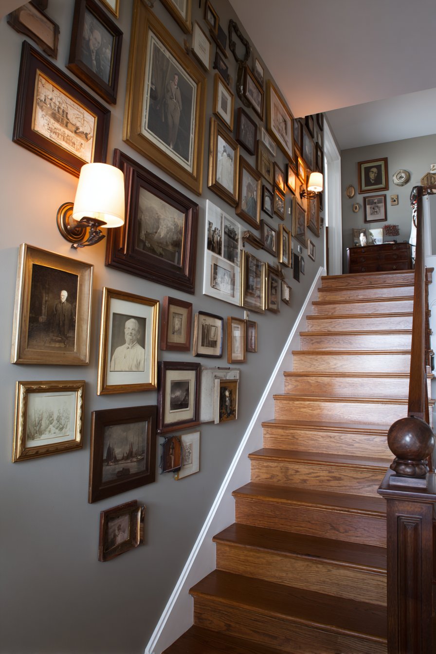
Stairways present unique opportunities for picture wall displays that evolve as viewers move through space. This traditional approach positions frames of varying sizes in matching antique gold finish along the stairway wall, following the ascending angle created by the stairs themselves. The vintage family portraits and heirloom artwork contained within these frames create a literal journey through family history as inhabitants climb from one floor to another. Each frame is carefully positioned to maintain consistent spacing from the stair rail, creating a diagonal line that feels both dynamic and orderly.
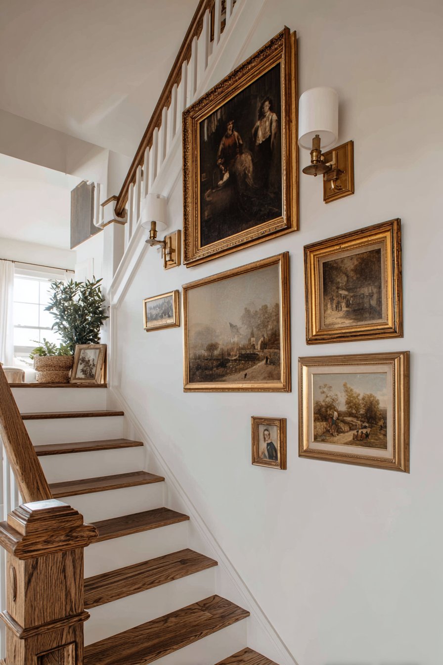
The challenge of stairway galleries lies in creating an arrangement that looks intentional and balanced despite the angled orientation. Unlike flat walls where frames can be arranged in grids or organic clusters, stairway displays must account for the diagonal sightline created by ascending or descending the stairs. The varying frame sizes prevent monotony across the long expanse while the unified antique gold finish provides cohesion. The classic wooden banister adds warmth that complements the gold frames, creating a rich, traditional aesthetic that speaks to permanence and legacy.
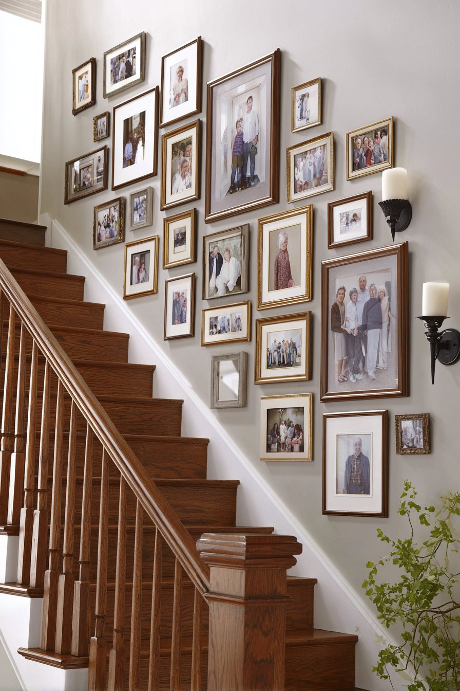
Lighting becomes particularly important in stairway installations where natural light may be limited or inconsistent. Soft wall sconces positioned at regular intervals provide gentle illumination that highlights the frames without creating harsh glare on protective glass. The sconces themselves become part of the overall design composition, their traditional styling reinforcing the heritage aesthetic established by the vintage portraits and ornate frames.
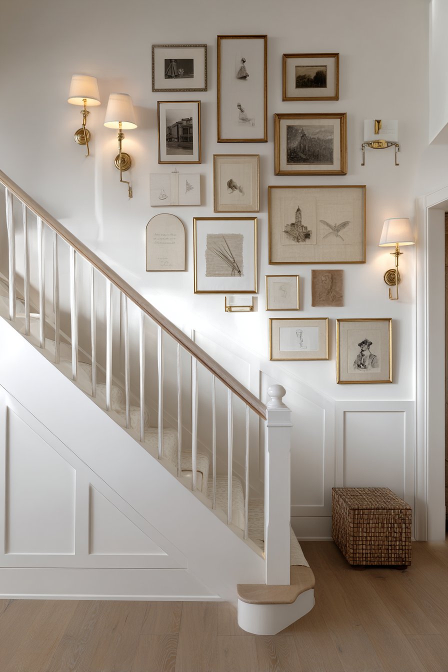
Key Design Tips: Measure and mark the stair rail angle using a long level or string line to establish your baseline for frame placement. Position frames so their bottom edges follow a consistent distance from the stair rail—typically 6-8 inches. Vary frame sizes while maintaining the same orientation (all horizontal or all vertical) for cohesion. Space frames based on horizontal distance rather than distance along the angled wall to maintain visual rhythm. Install proper anchoring for each frame as stairs create vibration that can loosen hardware over time.
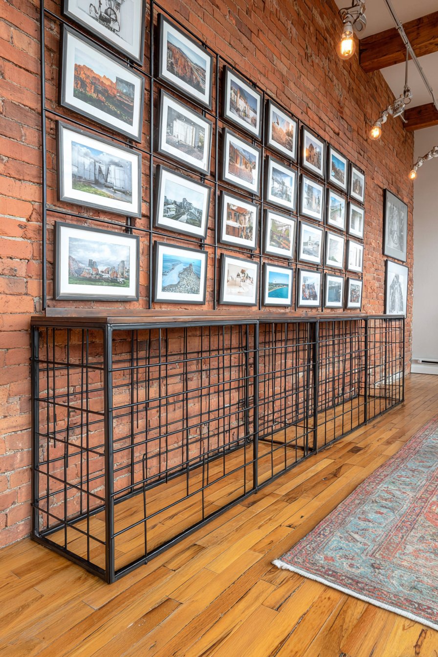
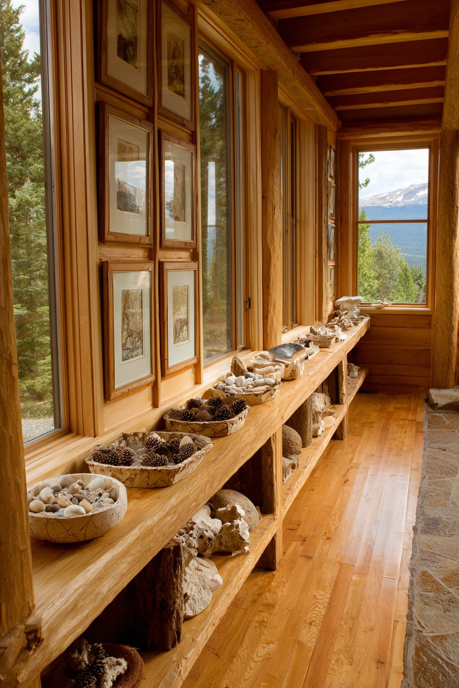
9. Flexible Picture Ledge System
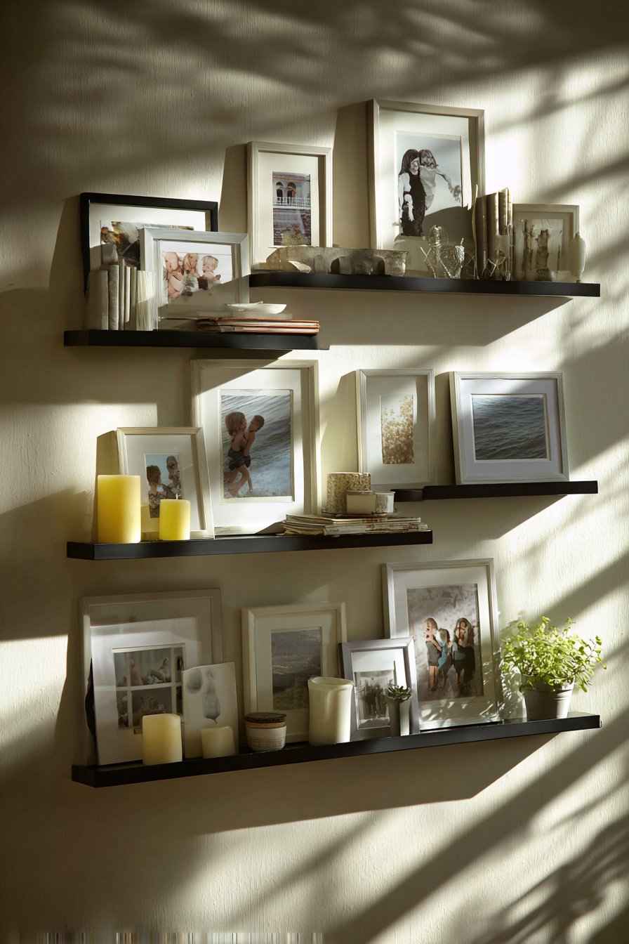
The picture ledge approach revolutionizes gallery walls by introducing flexibility and ease of change. Three 36-inch black metal floating shelves stacked vertically with 12 inches between each level create a display system where frames lean casually rather than being permanently mounted. This allows for effortless rearrangement—swap out photos, try new compositions, or rotate seasonal imagery without tools or wall damage. Various-sized frames rest on the ledges with some layered in front of others, creating depth and a collected-over-time aesthetic. Small decorative objects like candles and plants interspersed among the frames add dimension and prevent the display from reading as purely photographic.
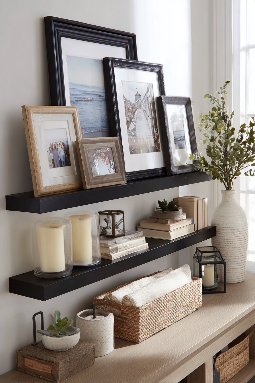
The beauty of ledge systems lies in their forgiving nature. Unlike traditional hanging methods where every hole matters and mistakes are costly, ledges allow experimentation and evolution. You can easily adjust frame positions, add new pieces, or remove ones that no longer resonate with your current aesthetic. The casual leaning quality feels more relaxed and less precious than formal hanging, making the display approachable and inviting rather than museum-like and untouchable.
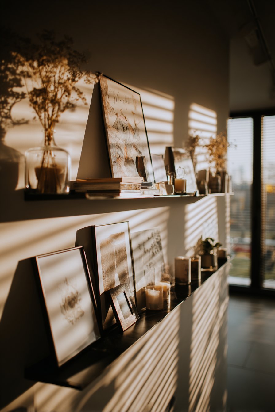
The layered arrangement possible with ledges creates sophisticated depth that flat-hung frames cannot achieve. By overlapping frames of different heights and allowing some to lean forward while others rest flat against the wall, you create a three-dimensional quality that catches light from multiple angles. Natural light creates dimension and shadow that changes throughout the day, keeping the display visually dynamic. The black metal finish of the ledges provides strong graphic lines that frame and contain the more organic arrangement of frames and objects.
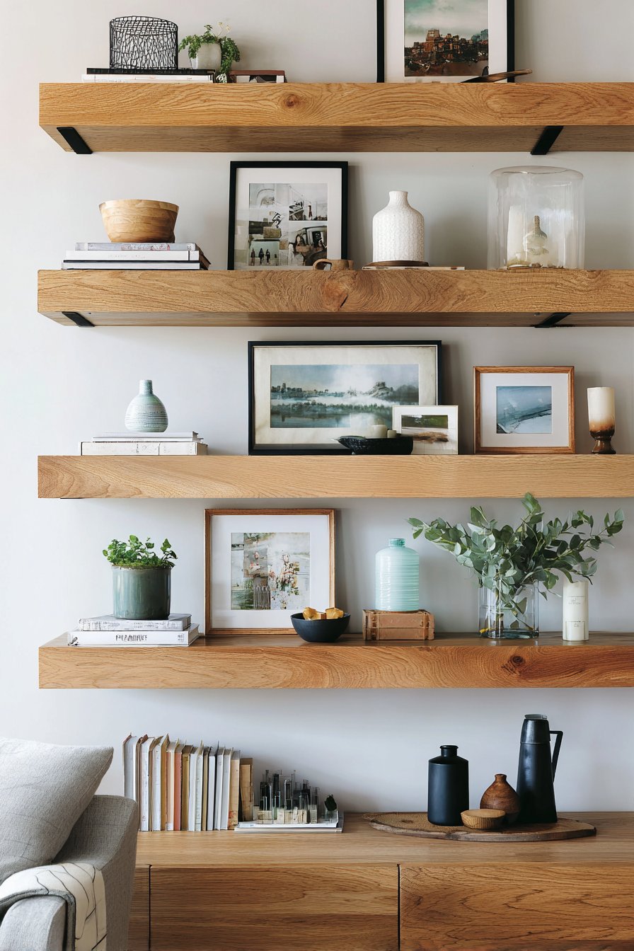
Key Design Tips: Choose ledges with a front lip at least 2 inches deep to securely hold frames and prevent slipping. Space ledges 12-15 inches apart vertically to accommodate various frame heights without overcrowding. Mix frame sizes and orientations, leaning some frames in front of others to create depth. Limit decorative objects to no more than 20% of the display to keep focus on photography. Include small felt pads under frame corners to protect ledge surfaces and improve stability.
10. Oversized Bedroom Triptych
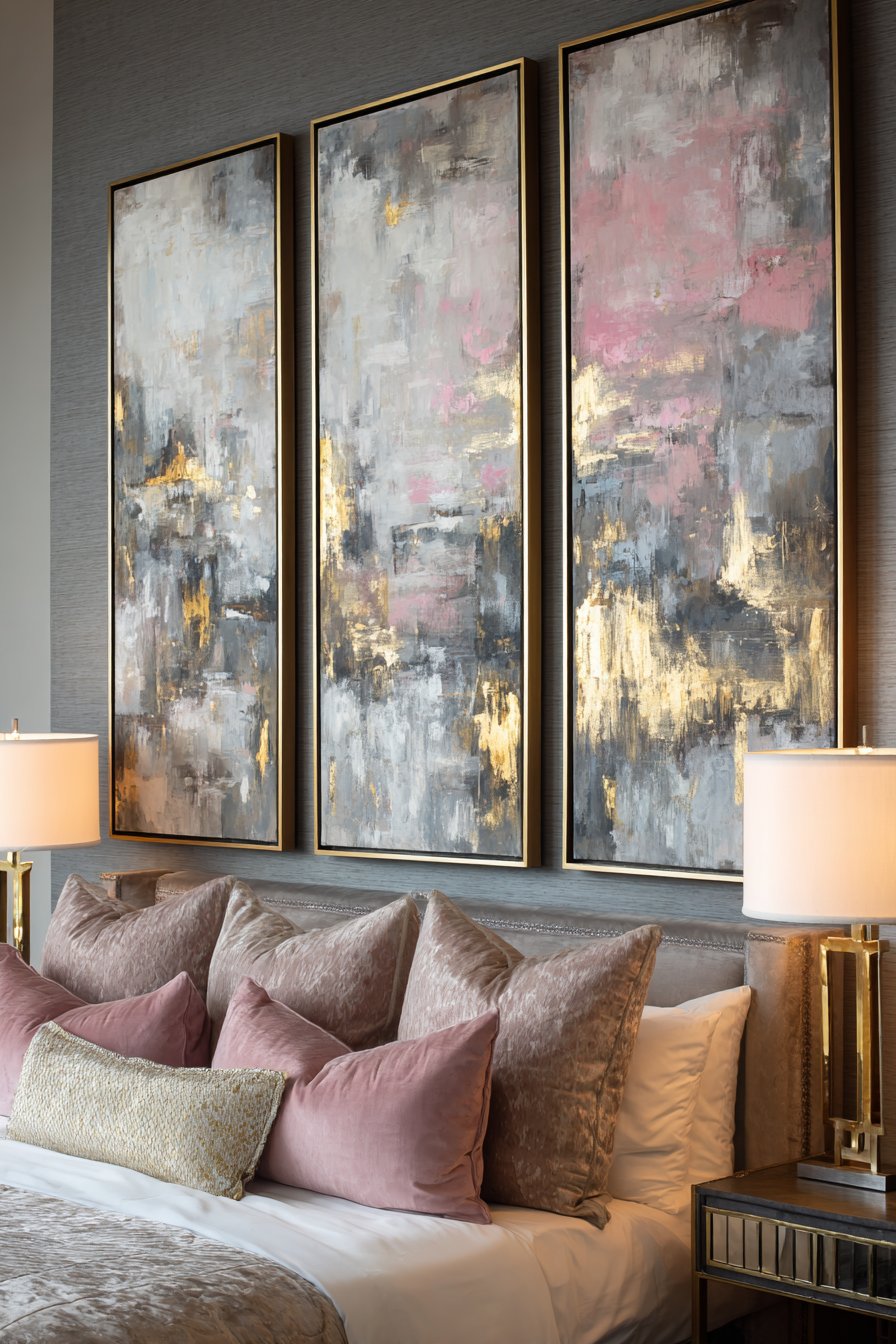
Bold scale creates undeniable impact in this bedroom statement wall featuring three large canvas frames positioned in a horizontal triptych formation. Each 30×40 inch piece showcases abstract brushstroke paintings in a coordinated palette of gray, blush, and gold that thoughtfully complements the bedding below. The thin black metal frame profiles feel modern and understated, allowing the artwork itself to command attention without competition from ornate framing. This arrangement demonstrates how oversized art can anchor a space and establish a room’s entire color scheme and mood.
The triptych format—three panels forming a unified composition—has classical roots but feels entirely contemporary when executed with abstract artwork and modern framing. The horizontal orientation emphasizes the width of the wall behind the bed, making the room feel more spacious and luxurious. The spacing between the three panels creates negative space that prevents the large-scale art from feeling overwhelming, while the coordinated color palette ensures the separate pieces read as an intentional set rather than random selections placed side by side.
The relationship between the artwork’s palette and the bedding creates a cohesive design story. The gray tones ground the composition, the blush adds warmth and softness appropriate for a bedroom setting, and the gold accents provide just enough glamour without veering into excessive opulence. Bedside lamps provide soft accent lighting that can be adjusted to highlight the texture of the brushstrokes in the evening hours, transforming the artwork from daytime focal point to nighttime ambiance enhancer.
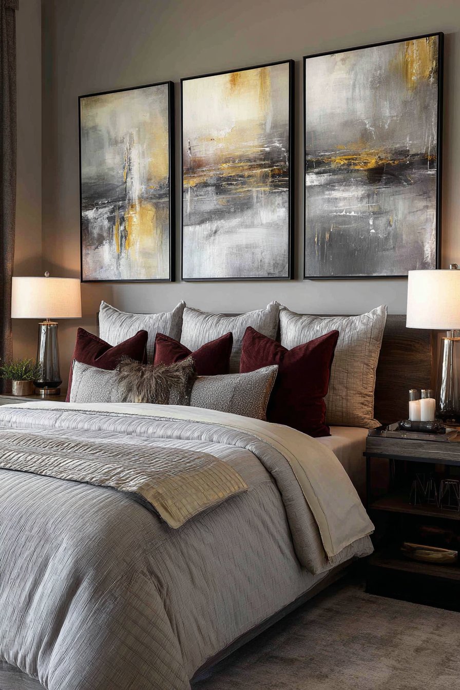
Key Design Tips: When selecting triptych artwork, ensure all three pieces share a color palette even if they don’t form a continuous image. Space panels 4-6 inches apart to create breathing room while maintaining visual connection. Mount the center of each canvas at 8-12 inches above the top of your headboard—too high feels disconnected, too low creates awkward proportions. Choose frame profiles no wider than 1-2 inches for large-scale pieces to keep focus on the artwork rather than the frames. Consider the view from both standing at the foot of the bed and lying in bed when determining final height placement.
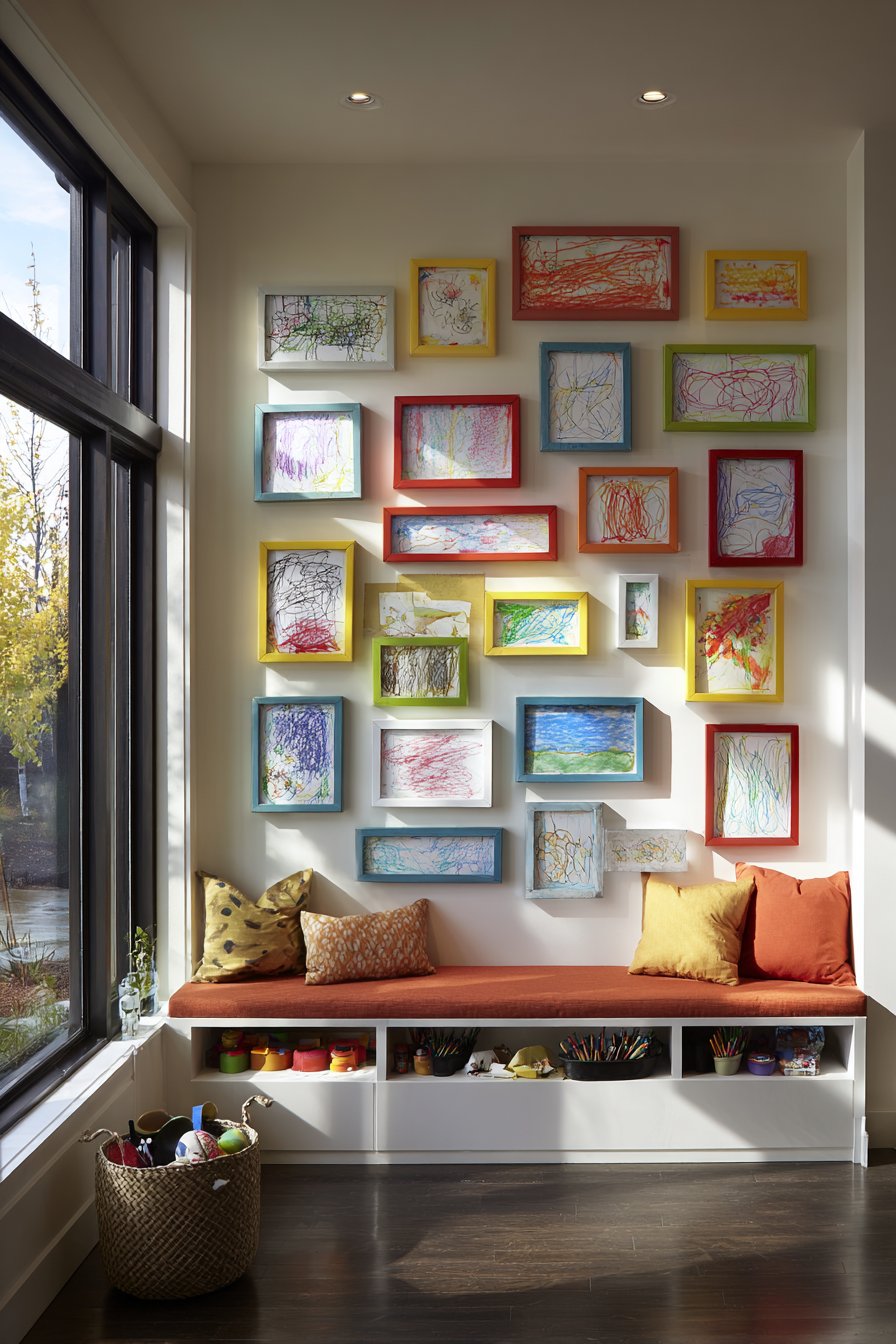
11. Playful Children’s Art Gallery
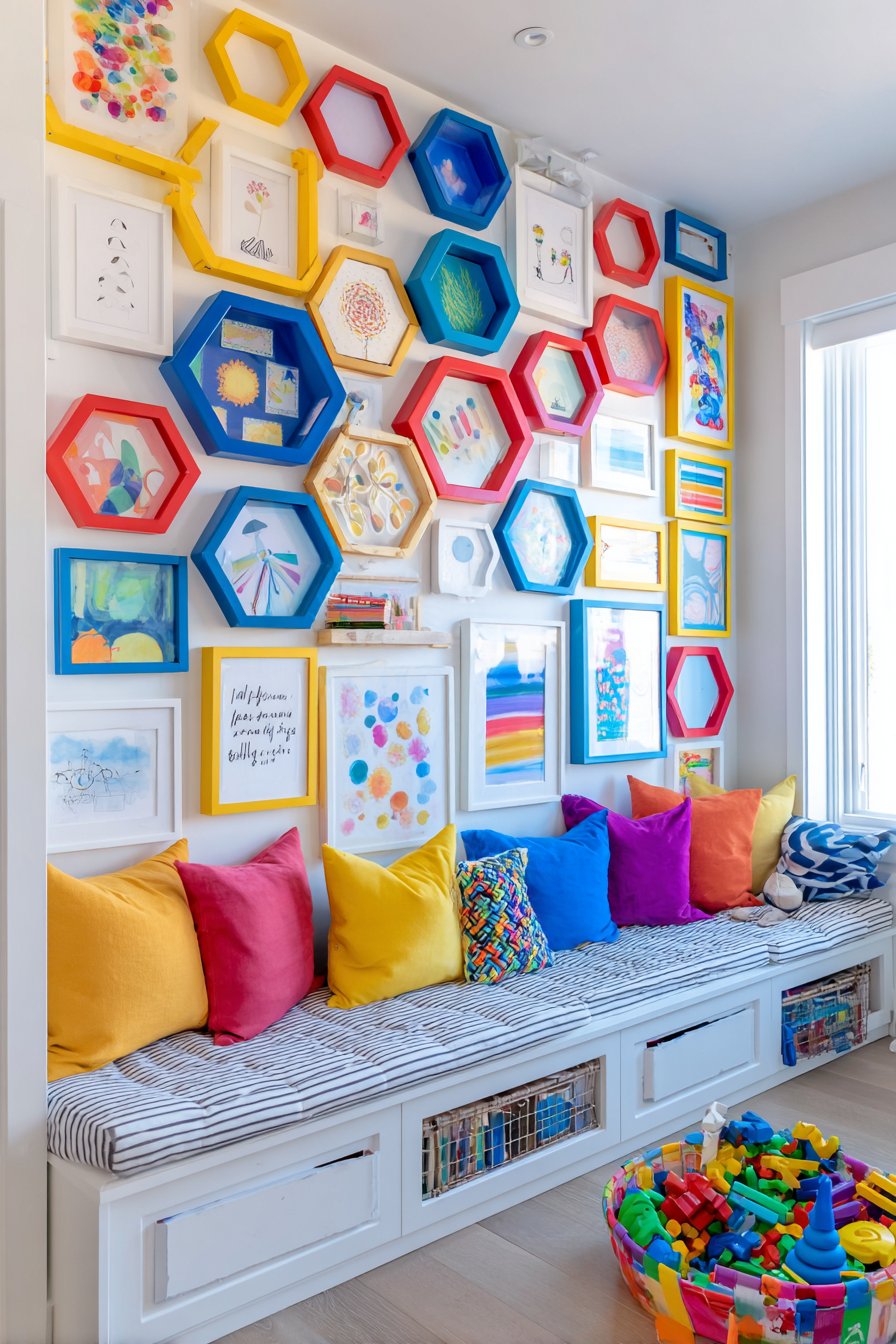
Designing picture walls for children requires different considerations than adult spaces, and this playful asymmetrical arrangement perfectly captures youthful energy while maintaining visual appeal. Colorful frames in various shapes—circles, rectangles, and hexagons—in bright primary colors display children’s artwork, inspirational quotes, and whimsical illustrations. The scattered quality of the arrangement mirrors the energetic, creative chaos of childhood while careful underlying structure prevents it from feeling truly random or messy. The frames hang at child height, empowering young ones to interact with their display and swap out artwork as they create new pieces.
The genius of this approach lies in its celebration of childhood creativity without condescension. Rather than relegating children’s artwork to refrigerator magnets or drawer storage, this dedicated gallery wall treats their creations with the same respect adults give to fine art collections. The bright frame colors coordinate with typical playroom palettes while adding graphic punch that energizes the space. The varied frame shapes introduce geometric interest and play that appeals to young minds developing spatial awareness and pattern recognition.
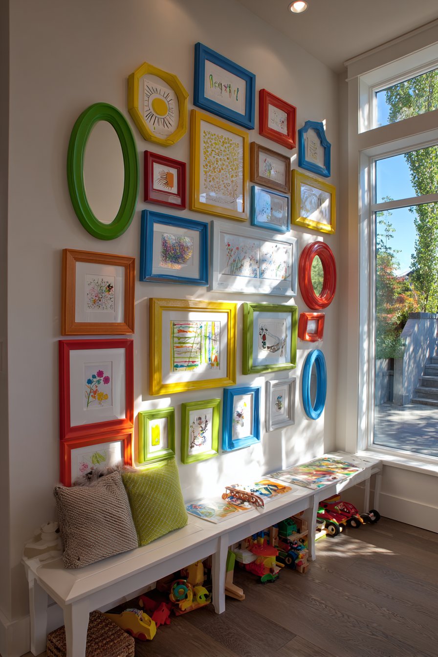
The low storage bench positioned below serves dual purposes—practical toy storage and a functional platform for children to stand on when changing out artwork or simply admiring their displayed creations. Bright natural lighting keeps the space feeling cheerful and active rather than dark or enclosed. The entire design communicates that creativity is valued, encouraging continued artistic expression and building confidence in young creators.
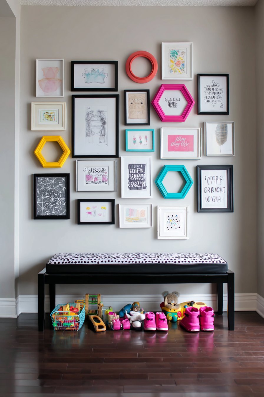
Key Design Tips: Mount frames at 36-42 inches from the floor so children can easily see and reach their artwork. Use lightweight frames with shatterproof acrylic rather than glass for safety. Create a simple system for swapping artwork—frames with easy-open backs or clips make rotation effortless. Include a mix of their artwork and purchased prints to maintain visual interest even when new art isn’t available. Use removable adhesive strips rather than nails for easier repositioning as children grow and preferences change.
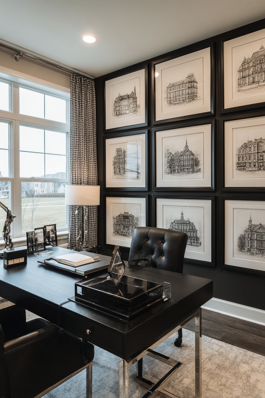
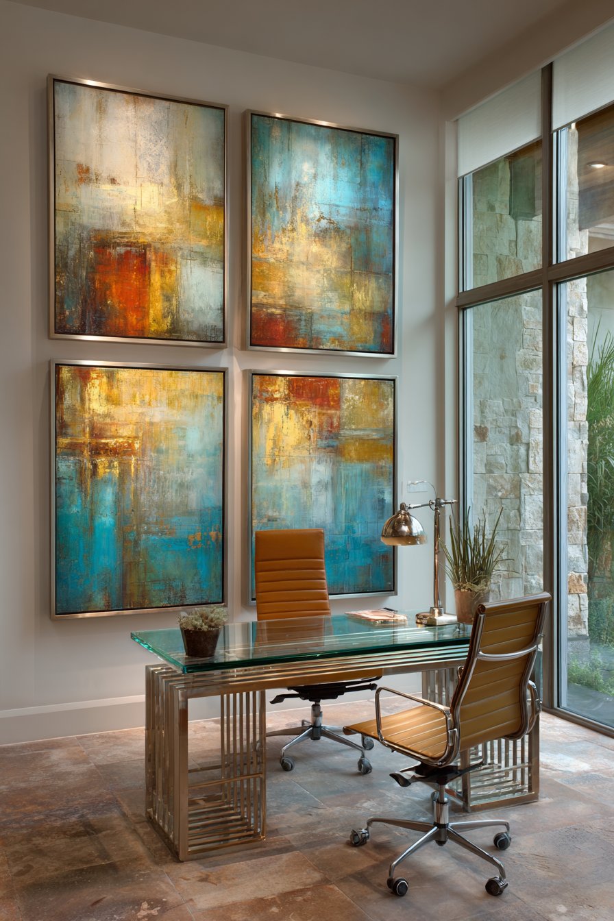
12. Professional Monochromatic Grid
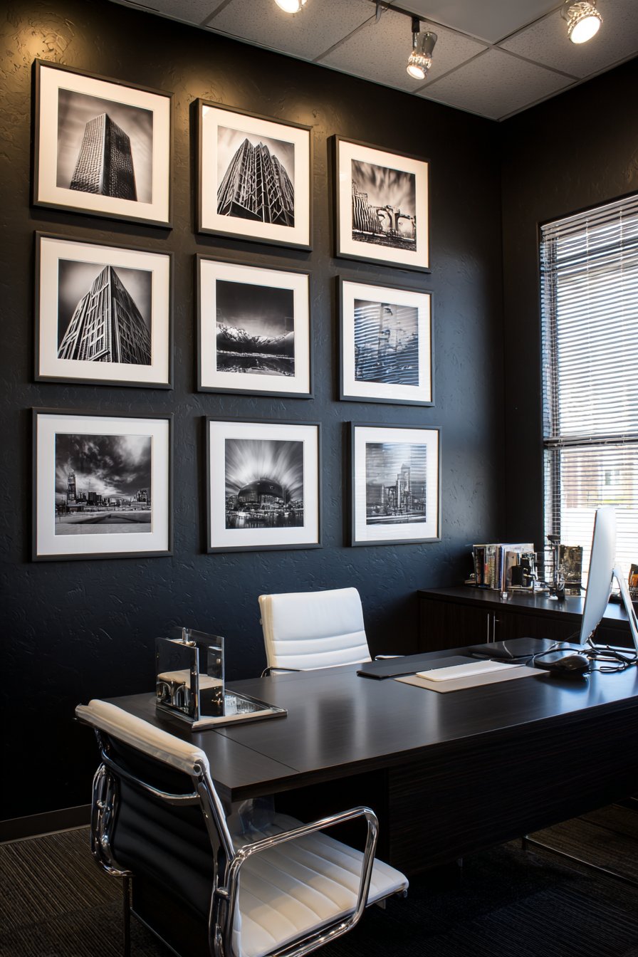
Corporate sophistication meets residential comfort in this home office gallery featuring nine black and white architectural photographs arranged in a perfect 3×3 grid. The identical 16×20 inch black frames with white mats create a gallery-quality presentation that communicates professionalism and attention to detail. Each photograph showcases high-contrast architectural details—geometric patterns in building facades, dramatic angles, bold shadows—creating visual interest through composition and form rather than color. The charcoal accent wall behind amplifies the dramatic quality of the monochromatic imagery while the sleek modern desk with chrome accents below reinforces the contemporary aesthetic.
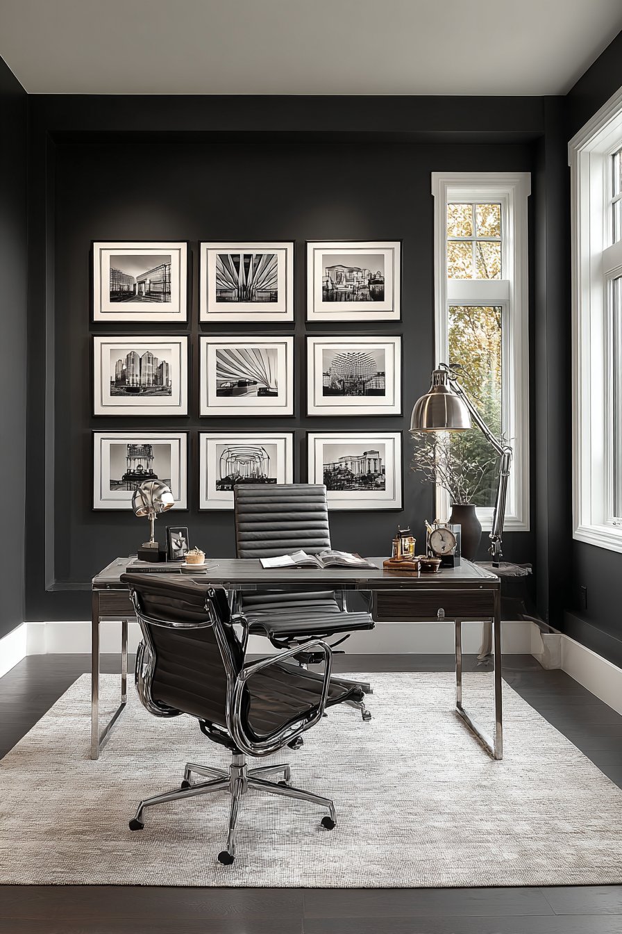
The perfect grid arrangement demonstrates the power of repetition and consistency in design. By using identical frames, mats, and spacing throughout, the individual photographs merge into a larger unified artwork that has greater impact than the sum of its parts. The white mats provide breathing room around each image, preventing the dark frames and photographs from becoming visually heavy or oppressive. The grid’s mathematical precision reflects the organized thinking and clear methodology valued in professional environments.
The combination of task lighting and natural window light ensures the display remains visible and impactful throughout changing work hours. Morning sunlight might create interesting shadows across the frames, while evening desk lamps highlight the photographs from below, creating entirely different viewing experiences within the same installation. The monochromatic palette won’t clash with video conference backgrounds, making this approach particularly practical for home offices where virtual meetings are frequent.
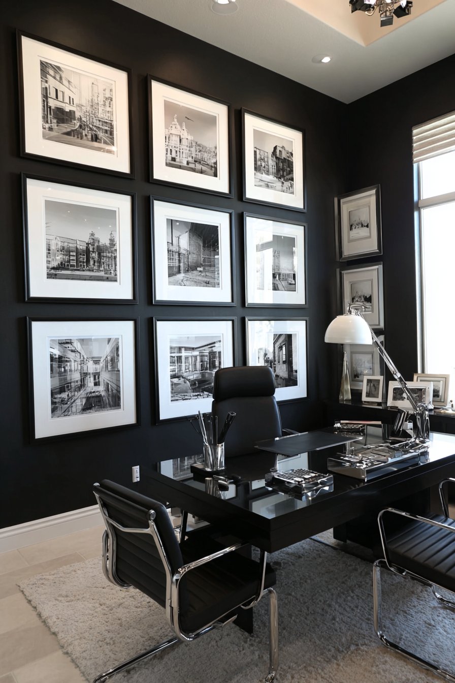
Key Design Tips: Use identical frame sizes and consistent mat widths throughout—2-3 inch white mats work well for 16×20 inch frames. Measure and mark your grid precisely using a level and tape measure before installing any frames. Space frames evenly—for 16×20 inch frames, 3-4 inches between each creates proper visual separation. Choose photographs with similar tonal ranges and contrast levels to maintain cohesion. Mount the center row at eye level for primary viewing from your desk chair position.
13. Rustic Farmhouse Hearth Display
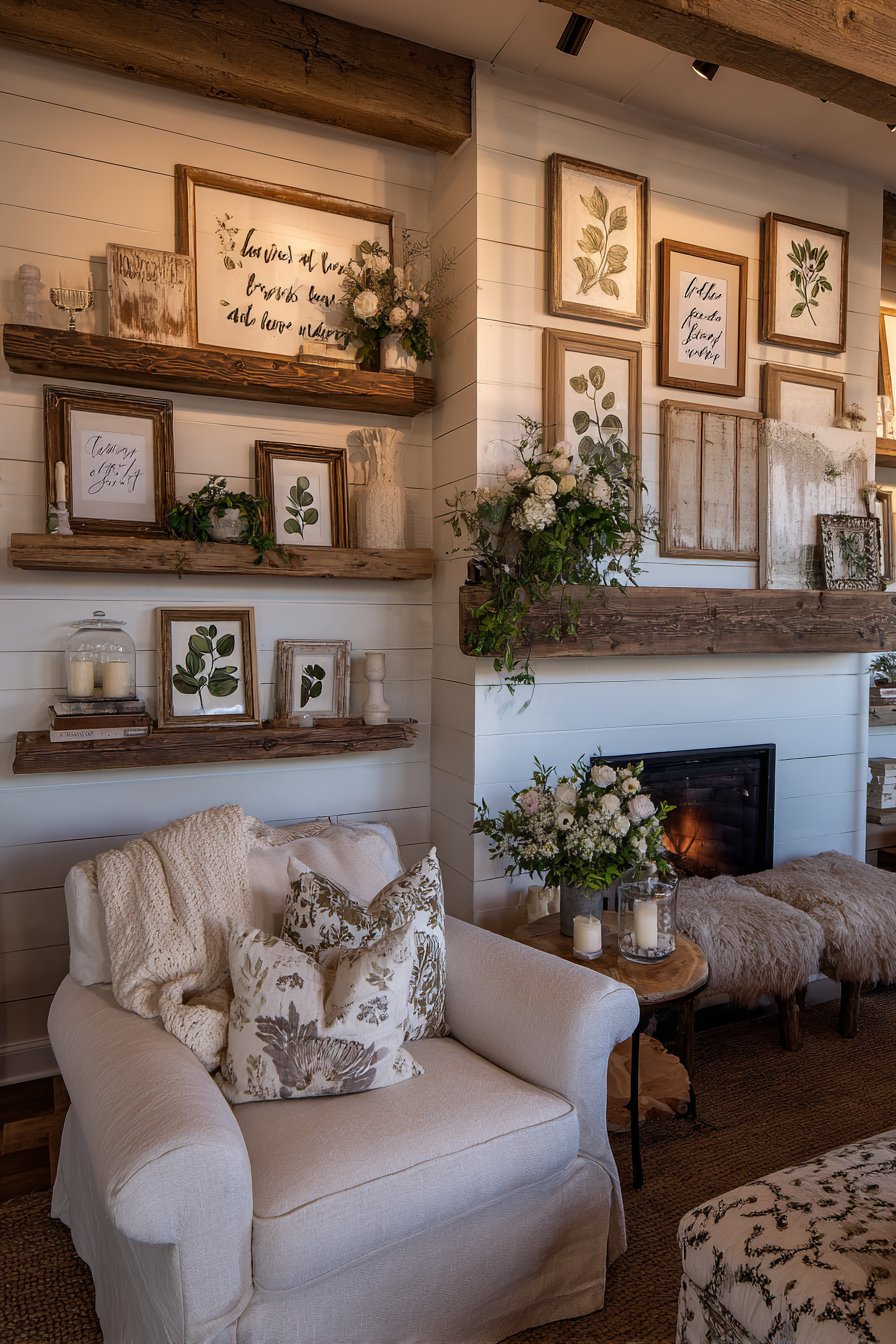
The fireplace mantel has long been a traditional focal point, and this rustic farmhouse gallery wall capitalizes on that inherent prominence. Frames in distressed white, weathered wood, and galvanized metal finishes cluster above the shiplap-clad fireplace in an intentionally informal arrangement. The content—vintage farm photography showing pastoral scenes, botanical prints featuring herbs and wildflowers, and inspirational farmhouse sayings in simple typography—reinforces the agricultural heritage aesthetic. The purposeful informality in spacing and alignment feels authentic to farmhouse style, which values comfort and function over rigid perfection.
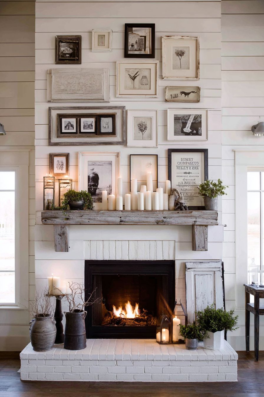
The relationship between the gallery wall and the wooden mantel below creates natural visual flow. The mantel serves as both physical and conceptual foundation for the display, with small potted plants and candles arranged on its surface echoing the natural elements depicted in the frames above. The shiplap wall treatment provides subtle horizontal lines that add texture without competing with the frames, while its white painted surface brightens the space and provides clean background for the varied frame finishes.
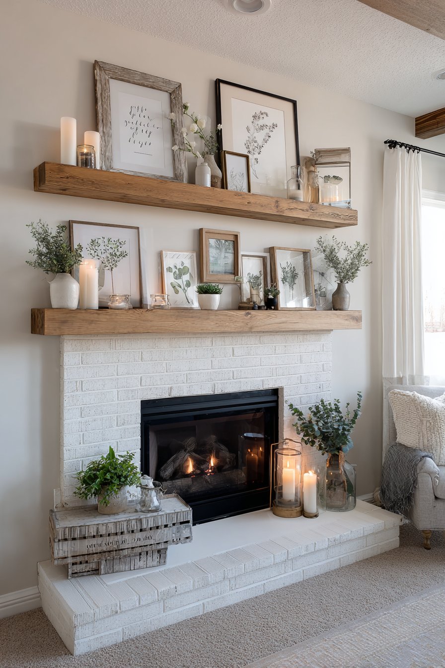
The interplay between warm fireplace glow and natural daylight creates dynamic lighting conditions that transform the display throughout the day and evening. Daylight hours reveal the weathered textures and distressed finishes of the frames in clear detail, while evening firelight casts flickering shadows and warm amber tones that enhance the cozy, nostalgic farmhouse atmosphere. This dual lighting quality makes the display equally appealing during different times and seasons.
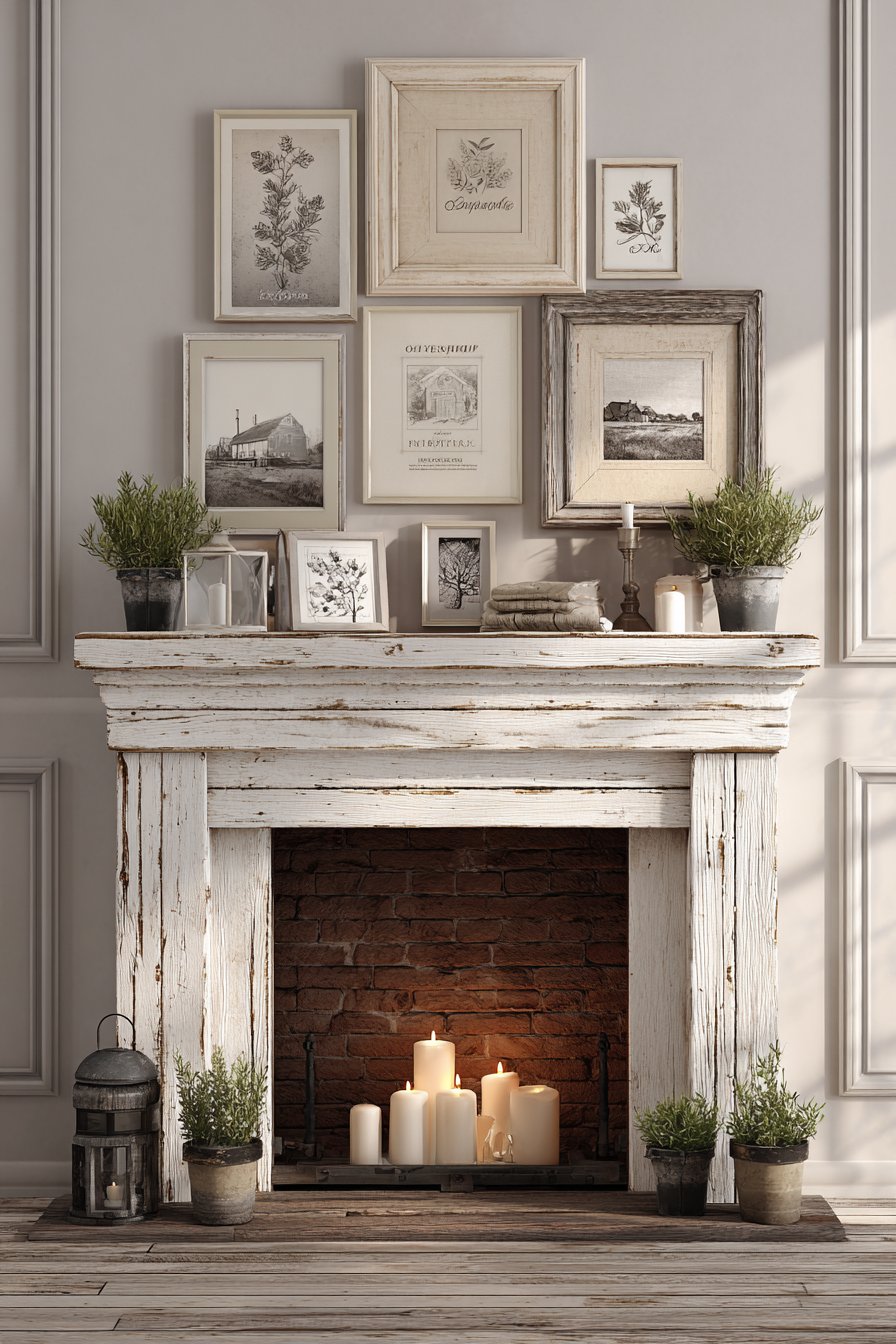
Key Design Tips: Mix three different frame finishes but keep them within the same rustic family—distressed white, natural weathered wood, and metal all complement farmhouse aesthetics. Allow slight variations in frame alignment and spacing to achieve that collected-over-time quality. Include at least one three-dimensional element like a small wreath or architectural fragment to add depth. Position your largest or most important piece above the mantel center, then build the arrangement outward. Leave 4-6 inches between the top of your mantel and the bottom of your lowest frame to prevent overcrowding.
14. Narrow Hallway Vertical Stack
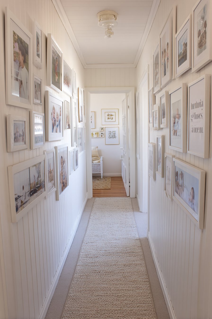
Challenging spaces often inspire creative solutions, and this narrow hallway gallery wall proves that limited width needn’t limit impact. Ten frames ranging from 5×7 to 11×14 inches in matching white finish stack vertically on the narrow wall between doorways, creating a striking vertical element that draws the eye upward and makes the hallway feel taller. The collection includes family photos, small art prints, and meaningful quotes arranged to create visual interest along the path of movement through the space. This approach transforms a typically overlooked transitional space into a meaningful gallery experience.
The vertical orientation works with rather than against the hallway’s proportions. Where horizontal arrangements might emphasize the narrow width and feel cramped, the vertical stack celebrates height and creates a sense of upward movement. The uniform white frames maintain simplicity appropriate for a potentially crowded sightline, while the varied content provides enough interest to warrant pausing and looking closely. The mix of sizes prevents monotony while the consistent finish ensures cohesion despite the variety.
Recessed hallway lighting provides even illumination that eliminates the dark, tunnel-like quality narrow hallways often suffer from. The white frames reflect available light, further brightening the space and making it feel more open and welcoming. The strategic placement between doorways means inhabitants pass by this gallery multiple times daily, allowing them to appreciate different pieces during each passing and creating an evolving relationship with the displayed images.

Key Design Tips: Measure your available width carefully—leave at least 6 inches of clearance on each side of your frames. Use a consistent frame color to maintain simplicity in narrow spaces where visual clutter quickly overwhelms. Start with your largest frame at eye level (57-60 inches from floor) and build upward and downward from there. Space frames 2-3 inches apart vertically to create rhythm without gaps. Include a mix of horizontal and vertical orientations to add variety within the vertical stack.
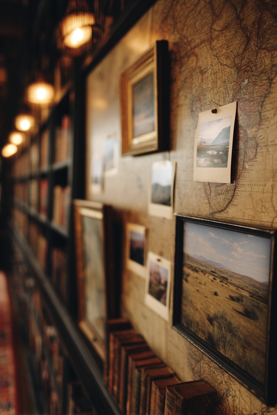
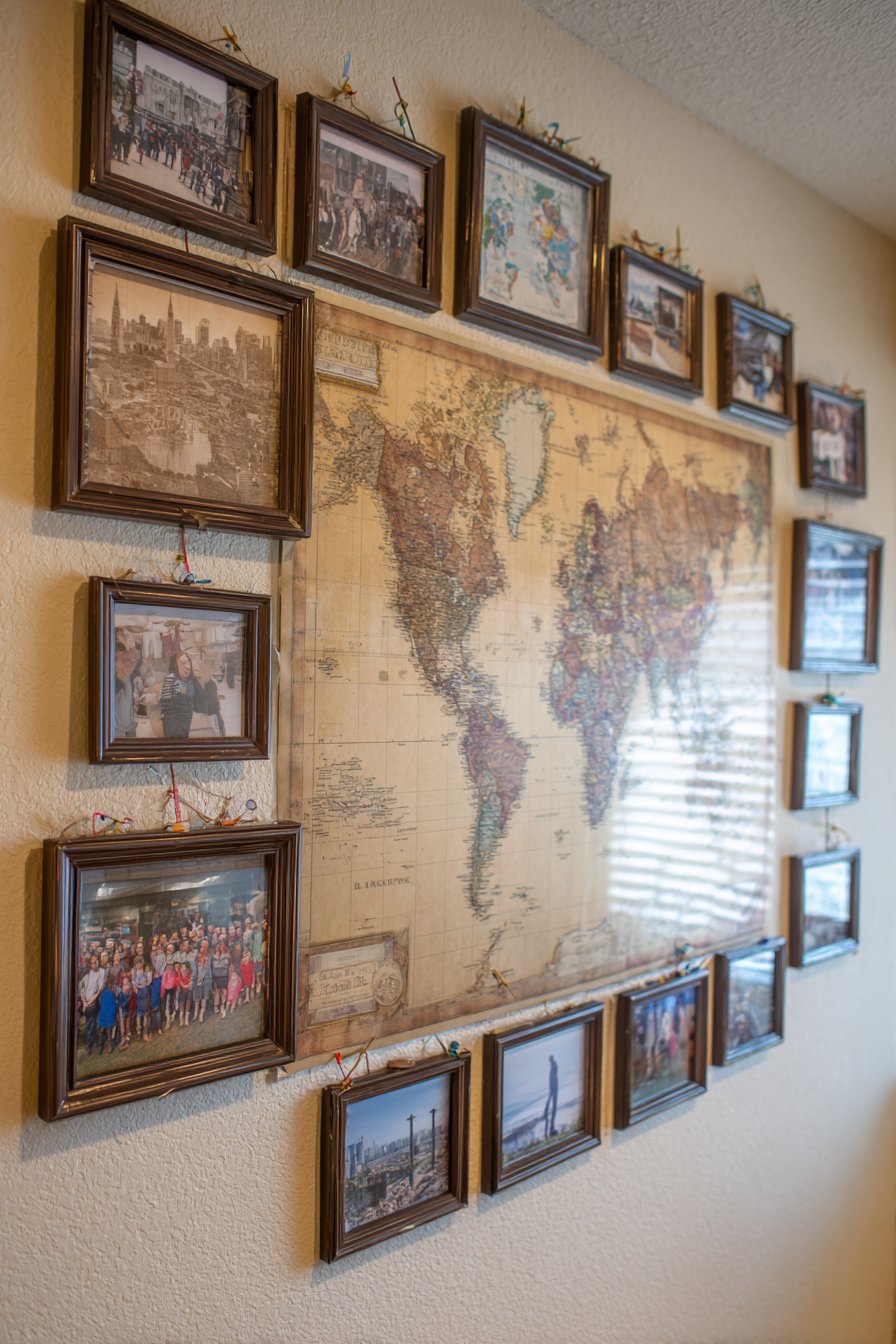
15. Travel-Inspired World Map Display
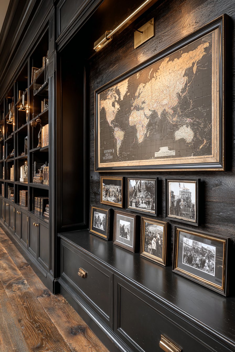
For wanderlust-filled homeowners, this travel-themed gallery wall in a home library creates a visual travel journal that celebrates global adventures. A large vintage world map serves as the dramatic centerpiece, its aged paper and antique cartography providing historical context and geographic reference. Surrounding the map, frames in dark wood and bronze finishes contain travel photography from various destinations—azure Mediterranean coastlines, bustling Asian street markets, African wildlife, South American landscapes. Small pins or subtle markers on the map connect to corresponding photographs, creating an interactive element that invites viewers to trace journeys and reminisce about adventures.
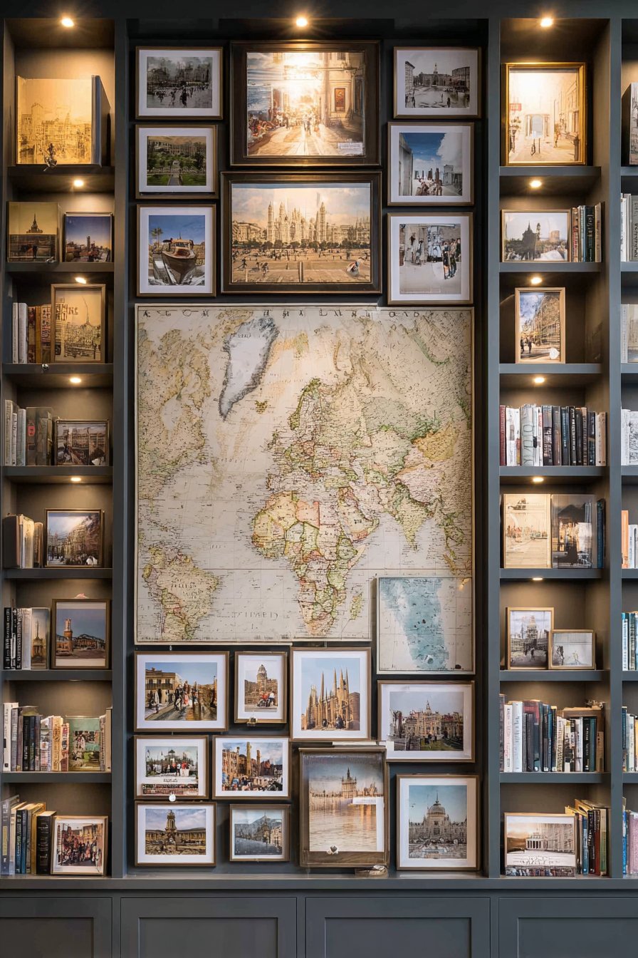
The relationship between the central map and the surrounding photographs creates narrative structure often lacking in random gallery walls. The map provides context and continuity, transforming individual photos from isolated moments into chapters of a larger story. The dark wood and bronze frame finishes feel sophisticated and worldly, echoing the explorer aesthetic without veering into kitsch. The varied frame sizes accommodate different photograph orientations and compositions while maintaining visual balance around the central map.
Built-in bookshelves flanking the display reinforce the library setting while providing practical storage for travel guides, atlases, and books about visited destinations. The combination of visual and textual travel resources creates an immersive environment for planning future adventures or reliving past ones. Warm library lighting creates an intimate atmosphere conducive to contemplation and storytelling, transforming the gallery wall into more than decoration—it becomes a lived experience documented and celebrated.
Key Design Tips: Choose a map large enough to serve as a genuine focal point—36×48 inches minimum for impact. Use matching or coordinating frame finishes for all surrounding photos to maintain cohesion. Position photographs strategically around the map to create balanced visual weight. Include a legend or simple labeling system connecting map pins to corresponding photographs. Mount the map center at 60 inches from the floor, then arrange photographs around it at varying heights to create organic flow.
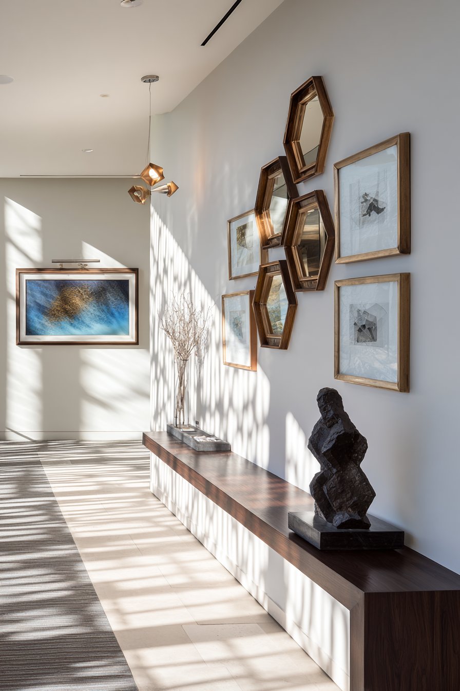
16. Modern Geometric Frame Cluster
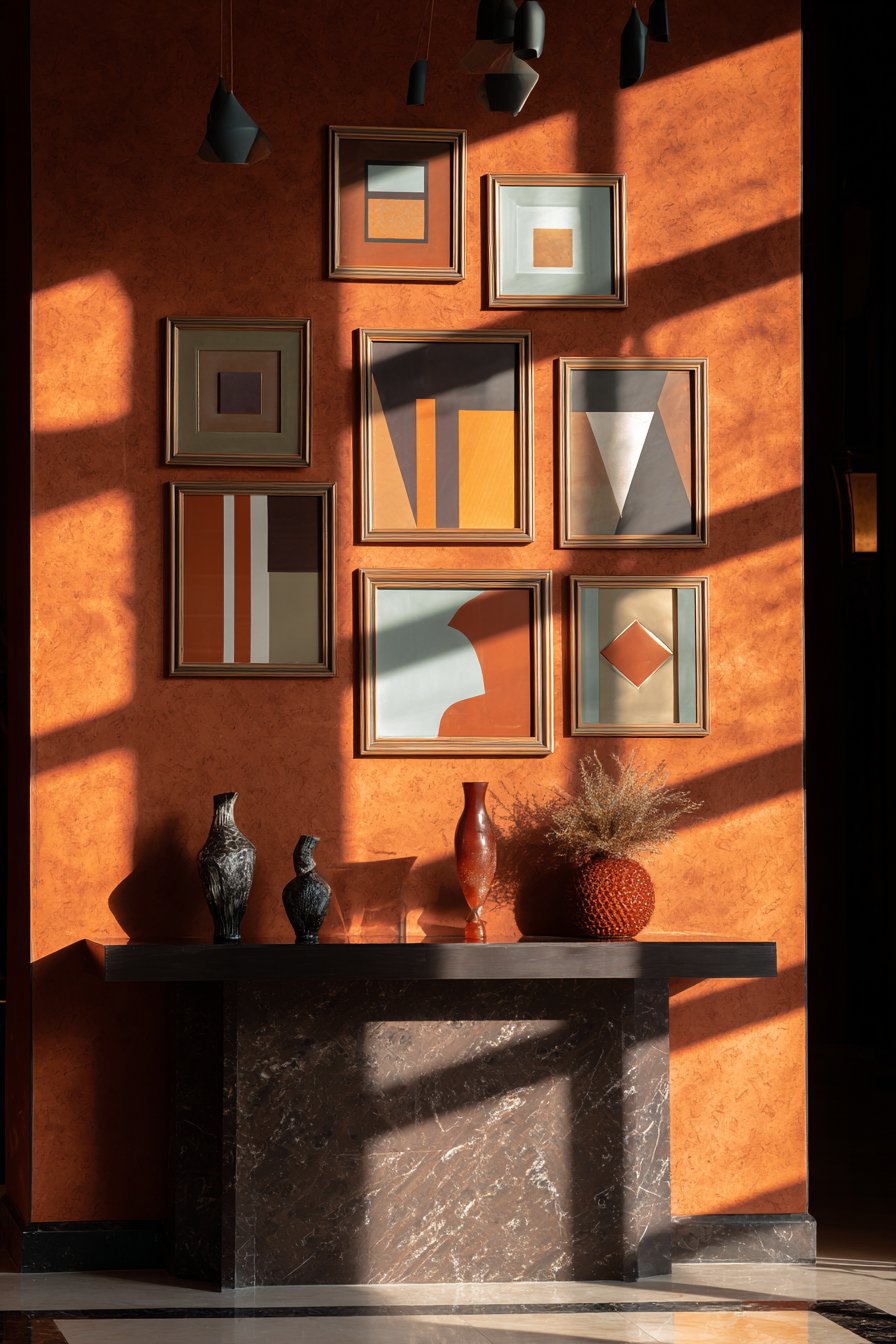
Contemporary art collectors and design enthusiasts will appreciate this bold geometric arrangement using non-traditional frame shapes. Hexagonal and diamond-shaped frames in matte gold and copper finishes contain abstract geometric artwork and modern photography arranged in an artistic cluster pattern on an entryway wall. The unconventional shapes immediately distinguish this display from standard rectangular galleries, while the metallic finishes catch and reflect light in ways that create visual movement and sparkle. The intentional negative space around the frames becomes as important as the frames themselves, creating dynamic interplay between art and empty wall.
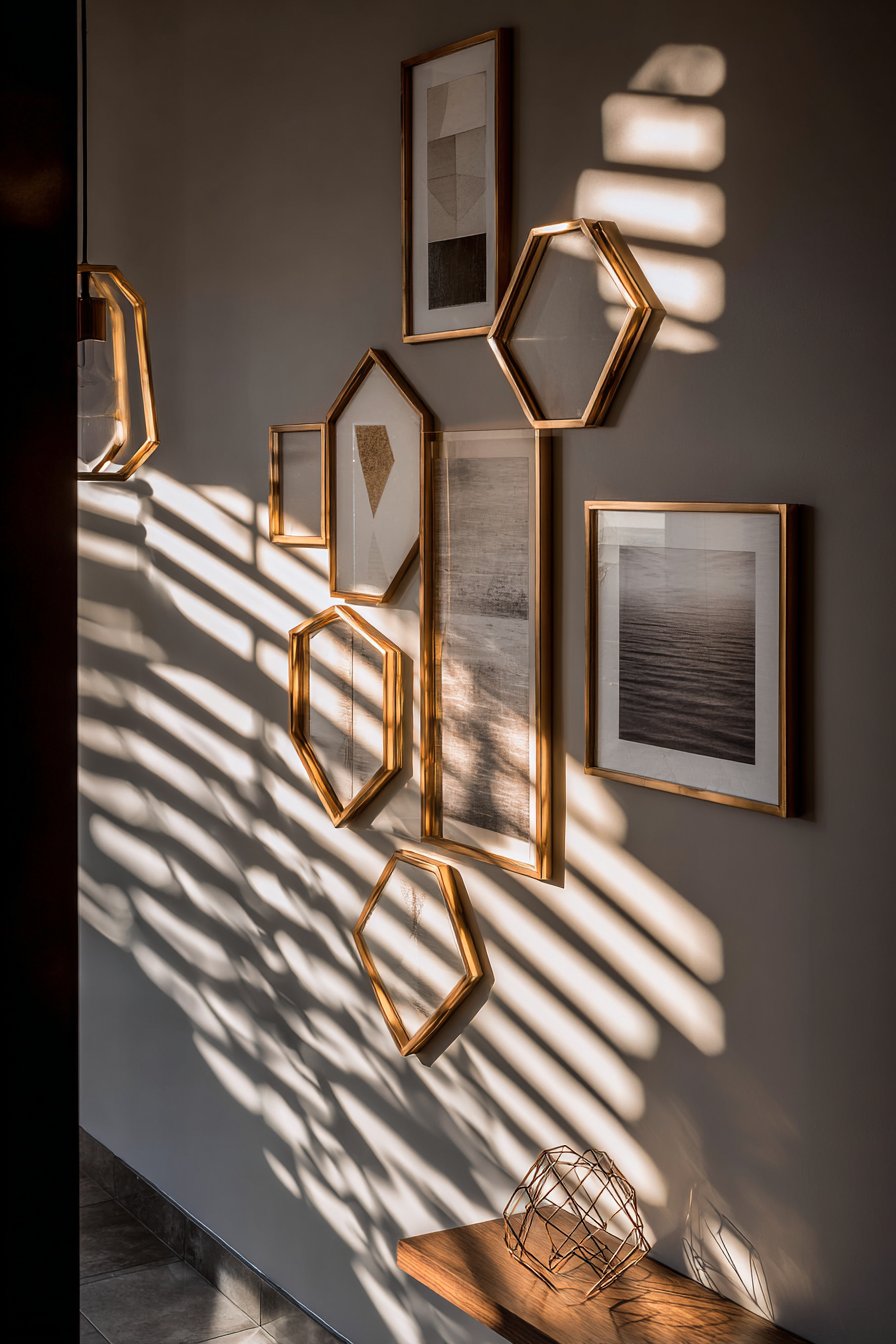
The geometric theme carries through from frame shapes to artwork content, creating cohesive visual language. Abstract pieces featuring triangular compositions, circular patterns, or linear geometric abstractions complement the angular frames, while the modern photography often captures architectural details or natural patterns that echo geometric principles. The matte gold and copper finishes feel contemporary and luxurious without the pretension of high-gloss metallics, striking a balance between elegance and approachability.
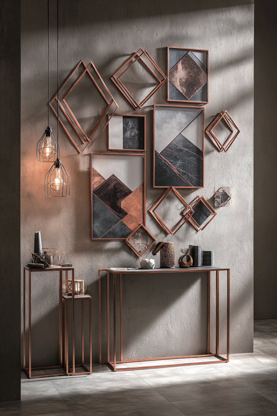
The narrow console table positioned below provides grounding for the floating geometric arrangement above, while sculptural decorative objects on its surface continue the geometric theme at a three-dimensional level. Pendant lighting casts dramatic shadows from the angular frames, creating an ever-changing display as natural light moves throughout the day. The entire composition feels curated and intentional, making a strong design statement in the crucial first impression space of the entryway.
Key Design Tips: Source hexagonal and geometric frames from specialty retailers or custom framers—standard stores rarely stock unusual shapes. Plan your arrangement carefully using paper templates before mounting—geometric shapes create unexpected spacing challenges. Limit yourself to 2-3 metallic finishes maximum to prevent visual chaos. Include plenty of negative space—geometric frames are visually complex and need breathing room. Consider the shadows created by angled frames when planning lighting positions.
17. Family Timeline Wall
Sentimental and storytelling approaches to gallery walls create emotional resonance that purely aesthetic displays cannot match. This family timeline wall arranges frames in coordinating natural wood finishes chronologically from left to right, documenting family milestones through photographs and memorabilia. Small plaques beneath select frames note significant dates and events—births, weddings, graduations, anniversaries—transforming the wall into an interactive family history lesson. The arrangement spans eight feet horizontally at eye level, perfect viewing distance from the comfortable sectional sofa positioned to face the display.
The chronological organization provides narrative structure that makes this more than a random photo collection. Viewers can literally see family growth and evolution, noticing how children age, how styles change, how the family expands with marriages and births. The natural wood frame finishes feel warm and timeless, appropriate for images spanning decades with varying photographic styles and qualities. The consistent horizontal line creates order despite the potentially chaotic mixture of different photo sizes, orientations, and subjects.
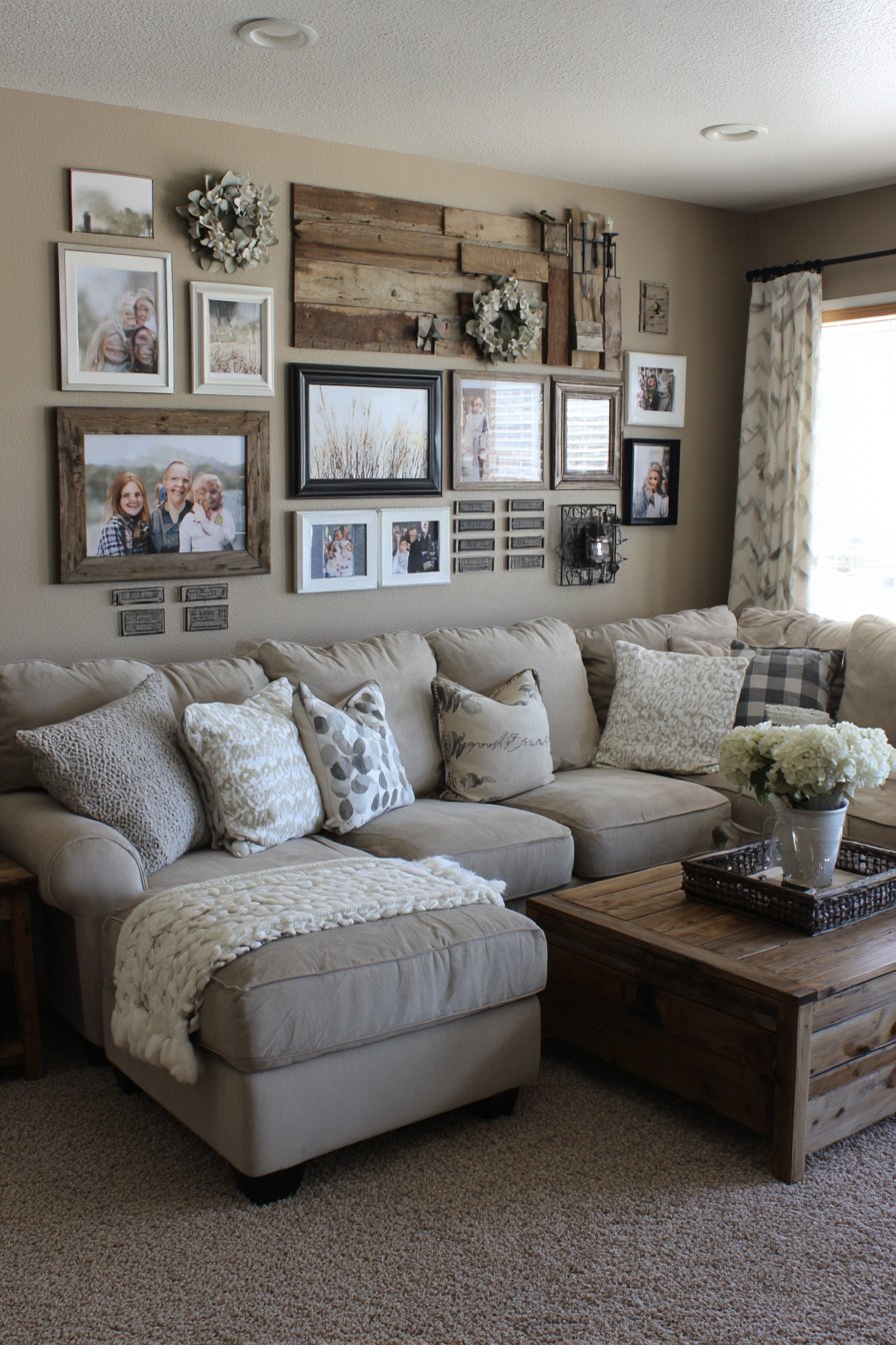
The living room setting ensures regular family interaction with this timeline, making it a lived element of the home rather than a formal display that’s admired from a distance. During gatherings, it naturally becomes a conversation starter as family members reminisce about captured moments or explain significant events to younger generations. Warm ambient lighting creates an intimate atmosphere that encourages this storytelling, while the comfortable seating arrangement provides perfect viewing distance for appreciating individual photographs.
Key Design Tips: Collect all photographs and memorabilia before beginning—seeing the complete timeline helps you plan spacing and frame needs. Use identical or closely coordinating frame finishes to maintain cohesion across potentially disparate imagery. Create small plaques or labels using a label maker or printed cards for consistency. Space frames based on time elapsed—more space between events separated by years, less space between events from the same period. Leave room at the end of your timeline for future additions—family histories continue evolving.
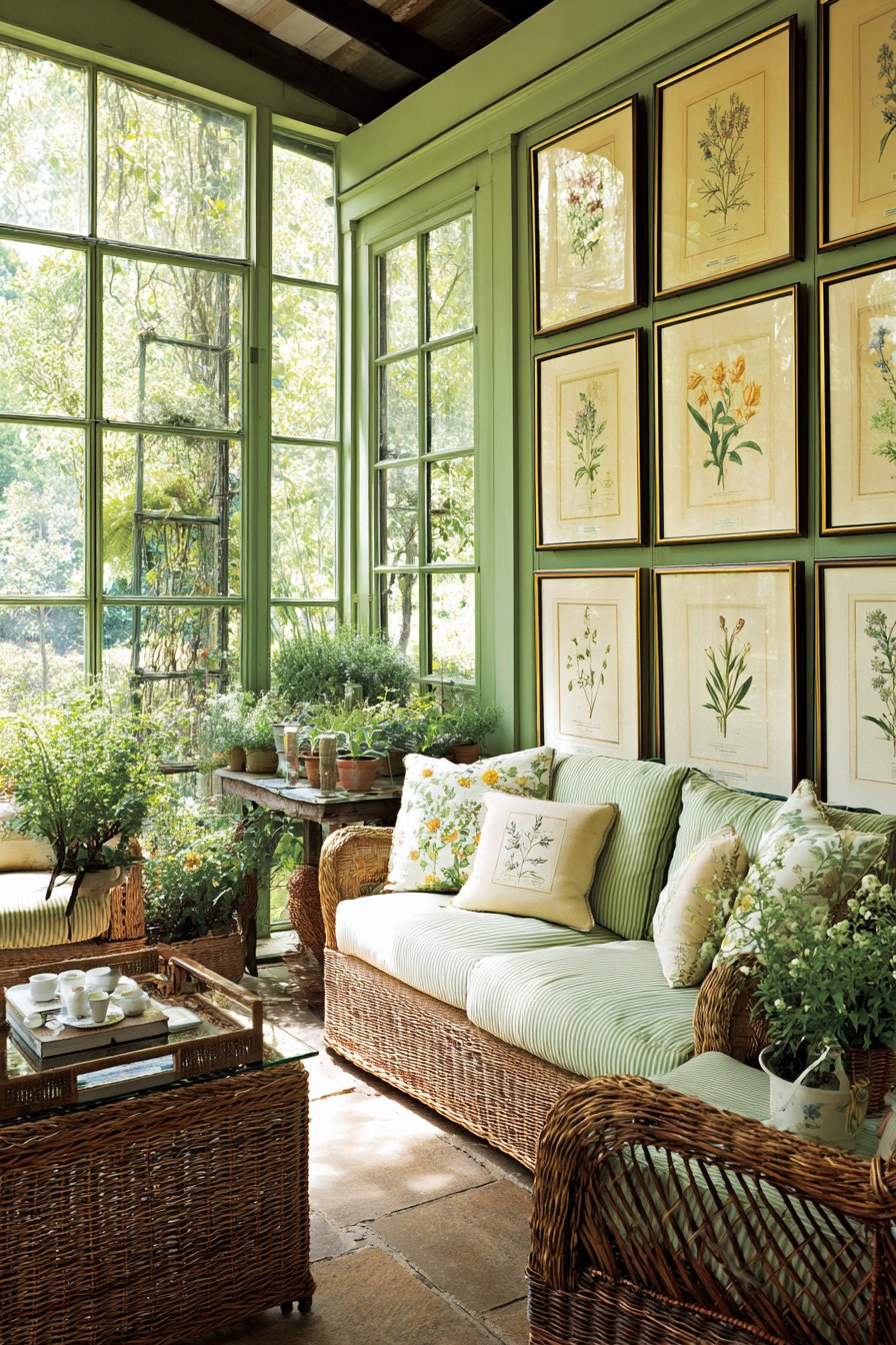
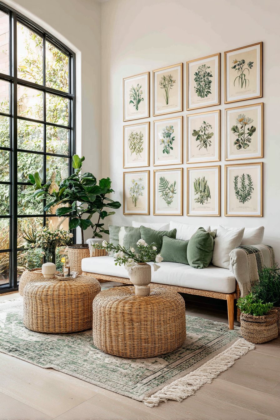
18. Botanical Print Collection
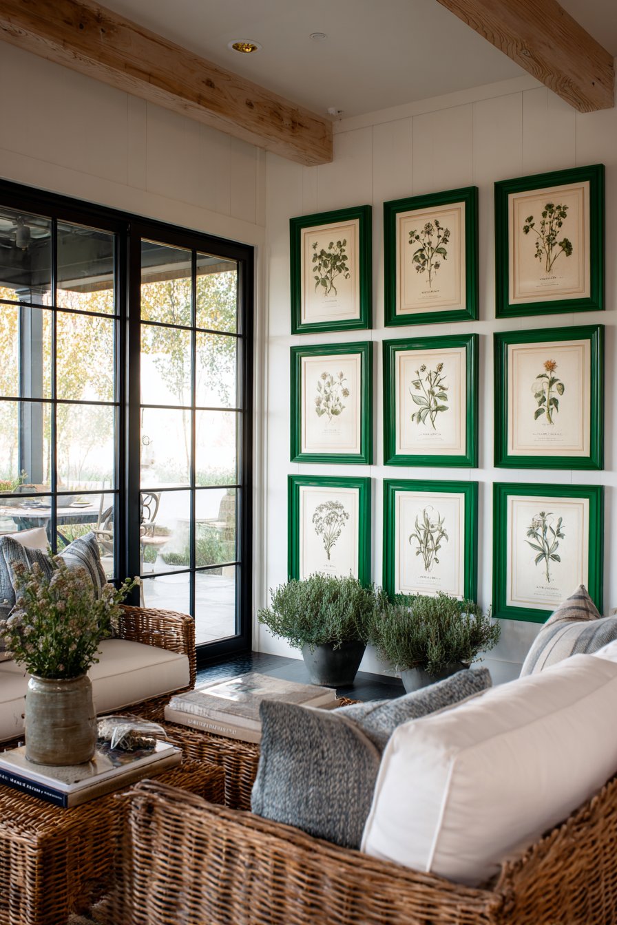
Nature-inspired design reaches its zenith in this botanical print collection displayed in a sunroom or garden room. Twelve vintage-style botanical illustrations in matching green frames with cream mats create a study-like atmosphere reminiscent of 19th-century natural history collections. The prints feature detailed drawings of herbs, flowers, and plants rendered with scientific precision yet artistic sensitivity. The repetition of frame style and matting creates a cohesive museum-quality presentation, while the subject matter perfectly complements the room’s function as a transitional space between indoor and outdoor environments.
The green frames feel like an inspired choice rather than an obvious one—where white or natural wood might feel safe, the green directly references the plant life depicted in the illustrations while adding unexpected color that energizes the display. The cream mats provide substantial visual breathing room around each detailed illustration, preventing the densely drawn botanical subjects from feeling claustrophobic. The arrangement in three rows of four creates satisfying symmetry that mirrors the scientific, organizational impulse behind botanical categorization.
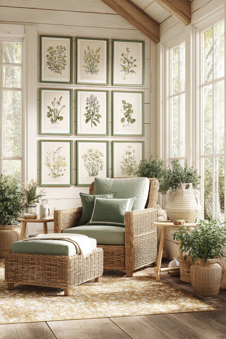
Large windows flooding the space with natural light create ideal viewing conditions for detailed botanical illustrations. The abundant daylight reveals subtle color variations in the vintage-style prints—the slight yellowing of aged paper, the delicate watercolor washes, the fine pen-and-ink linework. Wicker furniture and potted plants throughout the room create an immersive garden atmosphere where the boundary between actual plants and illustrated ones becomes pleasantly blurred.
Key Design Tips: Source vintage botanical prints from antique markets, reproduction prints from botanical gardens, or high-quality digital downloads from museum collections. Use identical frame sizes and matting throughout—consistency is key for scientific collections. Arrange prints in a grid pattern to echo the organizational principles of botanical classification. Choose frame colors that reference nature—green, warm wood tones, or even black for dramatic contrast. Position the arrangement where natural light will illuminate without creating glare on frame glass.
19. Mixed Media Three-Dimensional Wall
For those who refuse to be constrained by traditional notions of gallery walls, this mixed media approach incorporates three-dimensional objects alongside traditional frames. Small shelves holding trailing plants interrupt the pattern of framed artwork, decorative plates add circular forms among rectangular frames, woven baskets provide textural relief, and sculptural elements create physical depth. Frames in various finishes and sizes are interspersed throughout, but they share the stage rather than dominating it. The result feels collected and personal, reflecting diverse interests and travels.
The dimensional quality of this arrangement creates endless visual interest—it demands to be examined from multiple angles and distances to be fully appreciated. Flat framed artwork provides background structure, while the three-dimensional elements project forward, creating layers that catch light and cast shadows in ways purely two-dimensional displays cannot. The trailing plants add living, growing elements that change over time, ensuring the display never becomes static. This evolution and change mirror how real collections develop organically rather than being installed complete in a single day.
The velvet loveseat in jewel tones positioned below feels appropriately opulent for such a maximalist display. The rich color and luxurious texture of the furniture match the abundance and layering of the wall above. Layered lighting from multiple sources—natural window light, directed spotlights, ambient overhead lighting—creates dramatic shadows and highlights that change throughout the day, revealing different aspects of the three-dimensional elements at different times.
Key Design Tips: Start with a strong foundation of framed artwork before adding dimensional elements. Limit three-dimensional objects to 30-40% of the total display to prevent it from feeling cluttered. Use sturdy wall anchors appropriate for the weight of shelves and heavy decorative objects. Create visual rhythm by repeating certain elements—if you include one plant shelf, include at least two more. Step back frequently during installation to assess balance and ensure no single area becomes too heavy or too sparse.
20. Minimalist Single Statement Piece
Sometimes the boldest choice is restraint, as proven by this minimalist approach featuring one oversized canvas above a modern dining buffet. The single 40×60 inch piece in a simple black floating frame contains a striking abstract painting with bold brushstrokes in navy and gold. Rather than filling the wall with numerous smaller pieces, this approach allows one carefully selected artwork to command complete attention. The singular focus creates dramatic impact without clutter, embodying the minimalist principle that one perfect element surpasses many mediocre ones.
The scale of this piece is crucial to its success—anything smaller would feel insufficient for the wall space and lose impact. At 40×60 inches, the canvas has genuine presence and gravitas, functioning almost as a window into another realm rather than merely decoration on a wall. The bold brushstrokes in the abstract painting possess enough internal movement and complexity to sustain visual interest that smaller or simpler pieces might not maintain. The navy and gold palette feels sophisticated and deliberate, establishing the color story for the entire dining area.
The sleek buffet below displays minimal decorative objects, continuing the restrained aesthetic. Large windows to the side flood the space with natural light that highlights the textural quality of the canvas—the buildup of paint, the direction of brushstrokes, the subtle variations within each color. This natural illumination changes throughout the day, revealing different aspects of the painting and ensuring it never becomes static or boring despite being the sole focus.
Key Design Tips: Invest significantly in your single piece—when it’s the only art in the space, quality matters enormously. Choose artwork measuring at least 40 inches in the smallest dimension for proper impact. Center the piece on the wall and mount it 6-8 inches above your furniture below. Ensure adequate lighting—a single piece needs proper illumination to justify its prominence. Select artwork with enough complexity to sustain prolonged viewing—you’ll look at it daily for years.
21. Vintage Mirror and Frame Combination
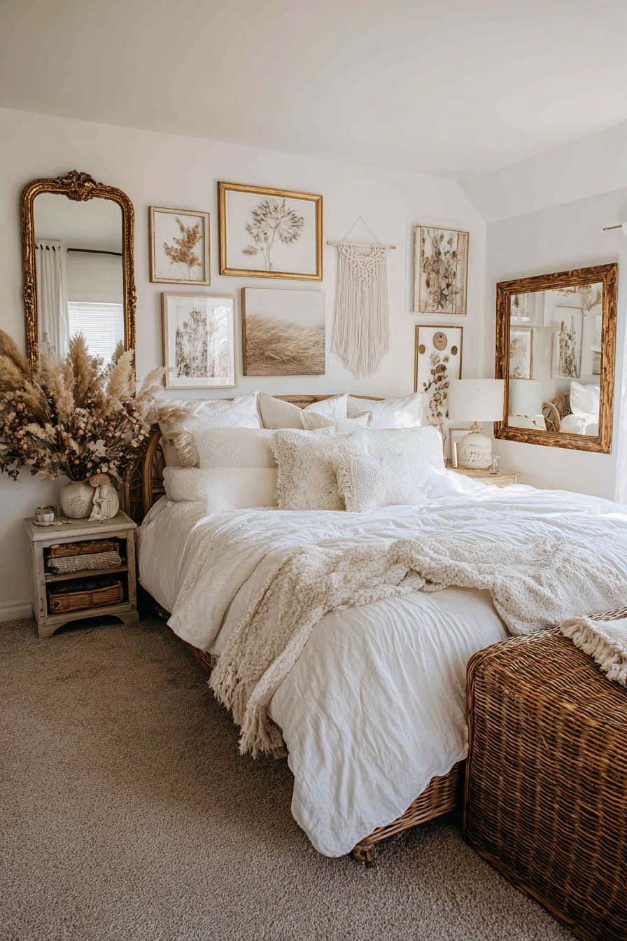
Blending functional mirrors with decorative frames creates unexpected dimension and light reflection in this bohemian bedroom display. Ornate vintage mirrors in various shapes and sizes intermingle with decorative frames containing pressed flowers, macramé art, and nature photography. The mixed finishes—distressed gold, antique silver, and weathered wood—feel collected over time at flea markets and estate sales rather than purchased as a coordinated set. The arrangement has an organic, evolved quality that perfectly suits bohemian design philosophy, which rejects matching sets in favor of personal curation.
The mirrors serve dual purposes—they function as reflective surfaces that bounce light around the room while also contributing to the overall artistic composition. Their reflective quality adds visual depth by creating the illusion of space beyond the wall surface, while their varied shapes introduce geometric diversity. The antique quality of the mirrors, with slight imperfections in the silvering and ornate frame details, adds character impossible to achieve with new pieces.
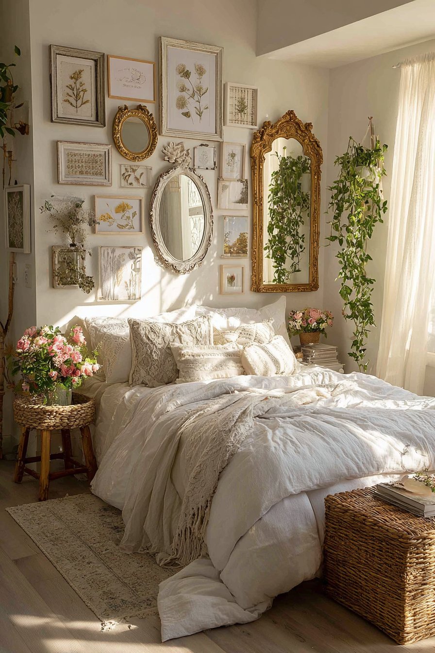
The rattan bed with textured linens positioned below continues the natural, bohemian aesthetic. The combination of woven rattan, soft fabrics, and the variety of materials in the frames and mirrors creates a tactile richness that invites touch and close examination. Soft natural light creates a dreamy, romantic atmosphere that complements the collected, personal nature of the display. The entire composition feels like a reflection of the inhabitant’s unique personality rather than a designer’s prescribed vision.
Key Design Tips: Mix functional mirrors with purely decorative frames for versatility and light reflection. Source vintage and antique pieces from estate sales and flea markets for authentic character. Limit metallic finishes to three maximum—too many different metals create visual chaos. Include varied shapes—round mirrors, oval frames, rectangular pieces—to prevent monotony. Test mirror placement carefully—consider what they reflect to ensure they enhance rather than clutter the view.
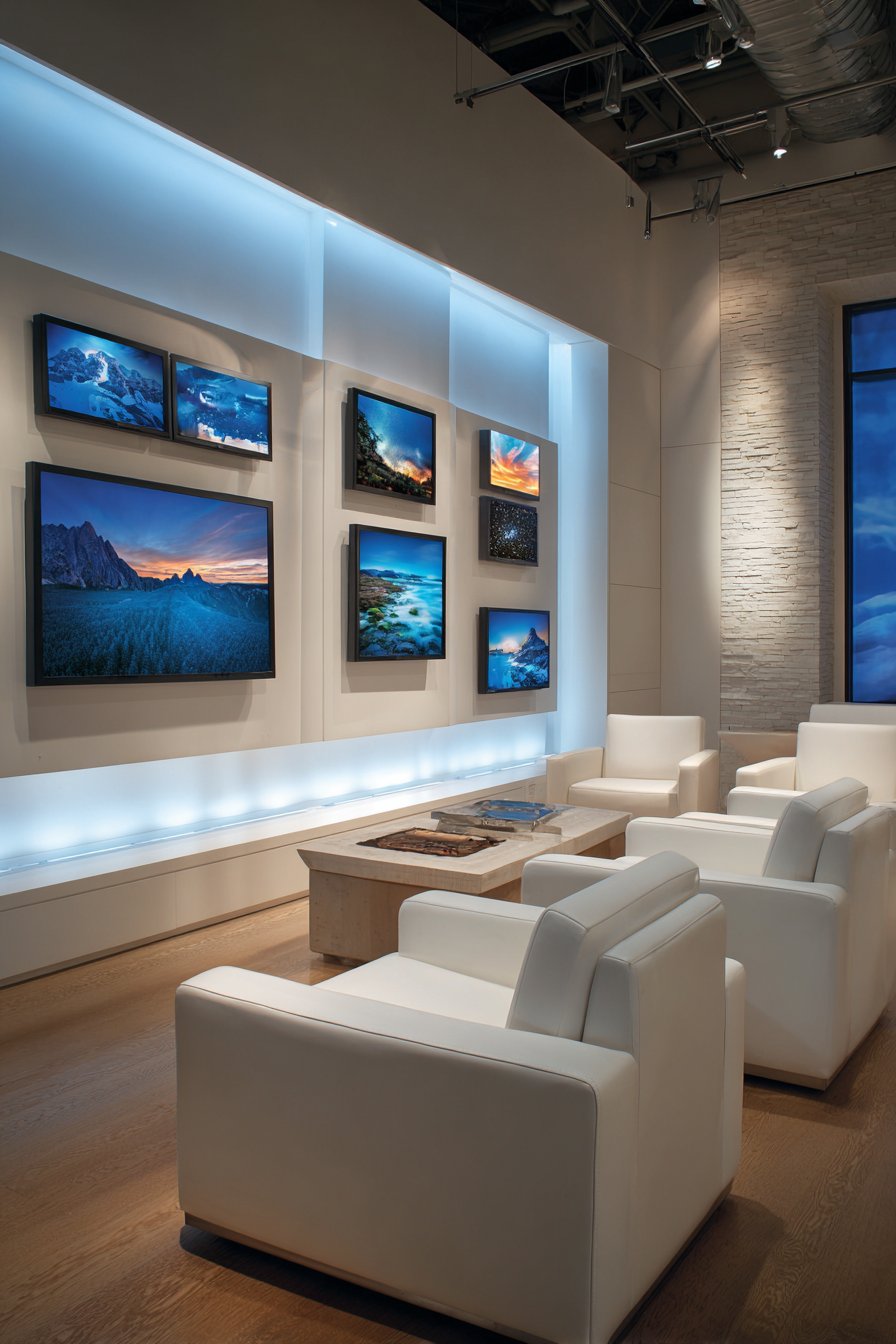
22. Digital Frame Technology Integration
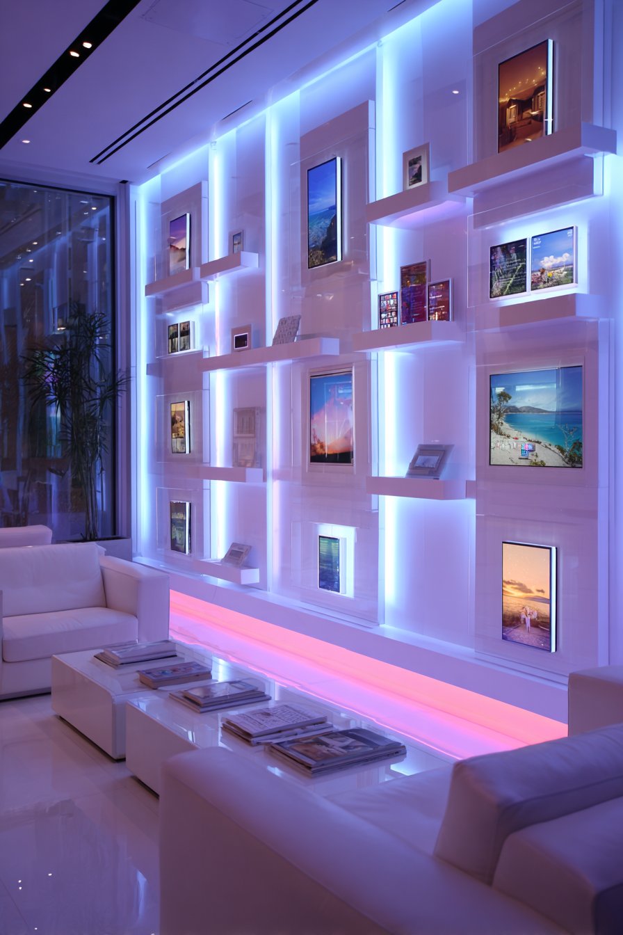
Contemporary technology merges with traditional gallery wall concepts in this forward-thinking display featuring digital photo frames. Sleek black digital frames of varying sizes display rotating family photos and artwork, creating a living gallery that changes throughout the day and season. The frames arrange in a modern grid pattern on a feature wall with subtle built-in LED backlighting that creates a floating appearance. Smart home controls nearby allow easy management of the displayed content, enabling quick updates for holidays, seasons, or mood.
The digital approach solves common gallery wall frustrations—no need to print photos, buy frames, or make nail holes for every image you want to display. The rotation capability means you can enjoy hundreds or thousands of images in the same physical space, with smart scheduling allowing different collections at different times. Morning might display energizing landscape photography, afternoon could show family vacation memories, and evening might feature calming abstract art. This dynamic quality keeps the display perpetually fresh and engaging.
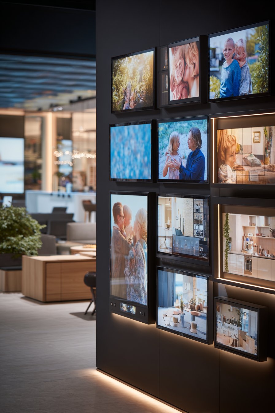
The contemporary furniture with clean lines positioned below reinforces the high-tech aesthetic. The built-in LED backlighting creates ambiance while ensuring the digital displays remain visible even in dim conditions. The even artificial lighting prevents the screen glare issues that often plague digital displays, creating a presentation quality that rivals traditional printed photographs. The entire installation feels futuristic yet warm, proving that technology and emotional content can coexist harmoniously.
Key Design Tips: Invest in high-quality digital frames with excellent resolution—cheap screens undermine the entire concept. Create diverse content collections to take advantage of rotation capability—landscapes, family photos, abstract art, inspirational quotes. Set rotation times thoughtfully—3-5 minutes per image works well for ambient displays. Include physical frame elements around some digital screens to blend new technology with traditional aesthetics. Ensure smart controls are intuitive for all household members—complex systems don’t get used.
23. All-White Frame Cohesion
Sophisticated restraint characterizes this monochromatic gallery wall using exclusively white frames and mats in a bright bedroom. The frame sizes vary from 8×10 to 20×24 inches, creating visual interest through scale variation, while the unified white color creates unexpected harmony. The imagery within the frames is diverse—color family photos, black and white prints, watercolor paintings—but the consistent white framing ties everything together into a cohesive collection. This approach proves that unity in presentation can accommodate diversity in content.
The genius of the all-white approach lies in how it highlights the imagery rather than the frames. When frames vary in color and style, they often compete for attention with the content they’re meant to showcase. By neutralizing the frames through consistent white color, the eye moves directly to the photographs and artwork, appreciating each piece for its individual merit. The white frames also create a bright, fresh aesthetic that feels particularly appropriate for bedrooms where tranquility and light are valued.
The white upholstered headboard and crisp white bedding continue the serene, monochromatic palette throughout the room. This tonal consistency creates a sophisticated, gallery-like atmosphere that feels spa-like and restorative. Abundant natural light flooding through windows emphasizes the fresh, clean aesthetic while revealing subtle texture variations in the white painted frame finishes. The lack of color allows attention to focus on form, composition, and the emotional content of the imagery.
Key Design Tips: Use exclusively white frames but vary sizes to maintain visual interest. Include diverse content—the white frames will unify even disparate imagery. Vary frame styles slightly—some with simple profiles, some with wider moldings—to prevent excessive uniformity. Space frames consistently, typically 2-3 inches apart, using a level to maintain straight alignments. Consider cream or warm white frames rather than pure white if your walls are bright white to create subtle definition.
24. Industrial Metal Grid Display
Urban loft aesthetics inform this industrial-style gallery wall utilizing metal frames and clip systems. Black metal grid panels mount directly on exposed brick, providing a flexible framework where photos attach with industrial clips rather than being permanently framed. This modular system allows instant rearrangement—clip photos on and off as mood strikes, rotate seasonally, or completely redesign the layout in minutes. Additional photos lean casually against the wall on a metal console table below, reinforcing the relaxed, utilitarian approach.
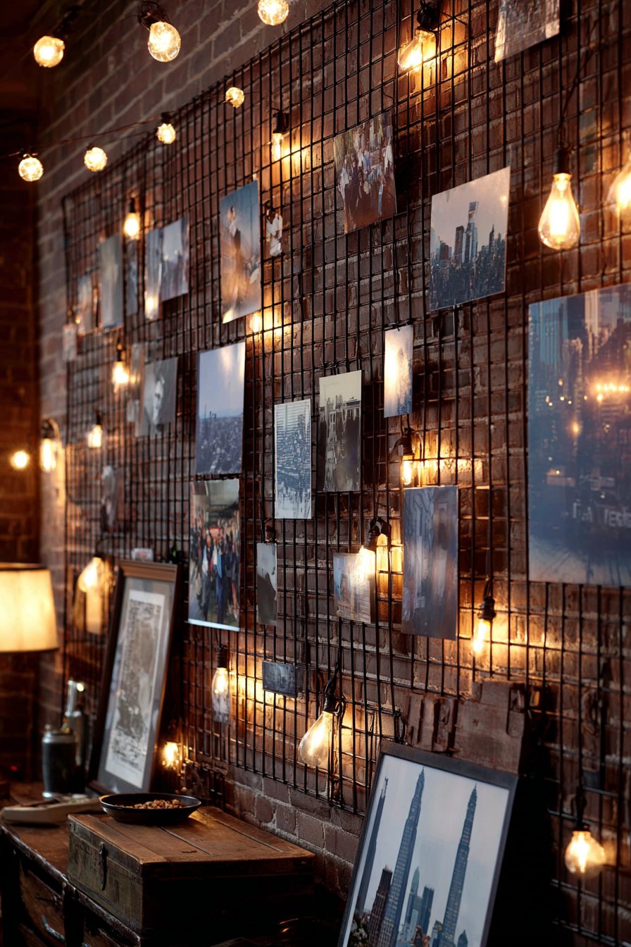
The raw materials—metal grids, exposed brick, industrial clips—celebrate function over ornamentation in pure industrial style. The black metal provides strong graphic lines that organize what could otherwise feel chaotic, while the clip attachment method maintains flexibility that permanent hanging cannot match. The exposed brick behind adds texture and warmth that prevents the metal elements from feeling cold or institutional, creating the balance between raw and refined that characterizes successful industrial design.
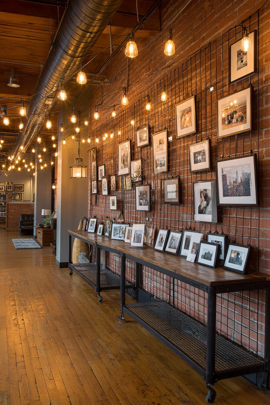
Edison bulb string lights provide warm ambient lighting that softens the hard-edged industrial materials. The warm glow contrasts beautifully with the cool metal and masonry, creating atmospheric lighting particularly appealing in evening hours. The metal console table below offers additional display surface while maintaining material consistency with the grid system above. The entire installation feels authentic to industrial design principles rather than merely decorative mimicry.
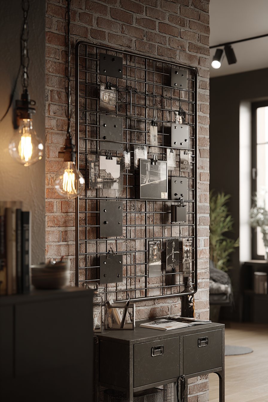
Key Design Tips: Source metal grid panels from industrial supply companies or specialty retailers—look for powder-coated finishes that won’t rust. Use sturdy wall anchors appropriate for masonry if mounting on brick or concrete. Invest in quality metal clips with rubber grips that won’t damage photos. Create a few different photo groupings you can quickly swap between to maximize the flexibility this system offers. Include a mix of vertical and horizontal orientations for visual variety.
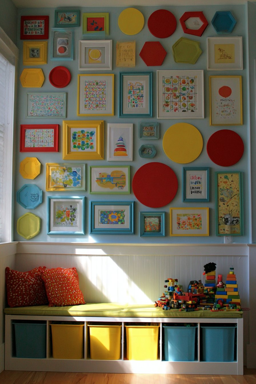
25. Child-Height Rotating Art Display
Family-friendly functionality meets design sophistication in this children’s art showcase wall. Simple, inexpensive frames in primary colors—red, yellow, blue, and green—display children’s paintings and drawings in a cheerful, rotating gallery. The strategic placement at child height allows young artists to independently swap out artwork as they create new pieces, fostering ownership and pride in their creations. The bright frame colors coordinate with typical playroom or family room palettes while the simple frame construction keeps costs low for frequently changed content.
This approach solves the common dilemma of what to do with the constant stream of artwork children produce. Rather than storing everything or displaying nothing, this dedicated gallery acknowledges that children’s art deserves recognition while accepting that not every piece needs permanent display. The rotation system teaches curation skills—children learn to select their best or favorite works rather than expecting everything to be showcased. The simple frames keep the focus on the artwork rather than expensive framing materials.
The low storage bench positioned below provides dual functionality—organized storage for art supplies and extra artwork while offering a platform for children to stand on when changing displays. Bright natural lighting keeps the space energetic and positive, creating an environment that encourages continued creative expression. The entire system communicates that creativity is valued and celebrated in the household, building confidence and enthusiasm for artistic pursuits.
Key Design Tips: Mount frames so the center sits at 36-40 inches from the floor for easy child access. Use lightweight plastic frames with shatterproof acrylic to prevent injuries from broken glass. Create a simple artwork rotation system—a designated drawer or folder where new pieces wait for display. Include a few frames for permanent favorite pieces alongside the rotating displays. Teach children to mat their artwork on colored paper to create consistent sizes that fit standard frame dimensions.
26. Salon Wall with Professional Matting
Gallery-quality presentation transforms this formal dining room display into a sophisticated salon wall. Various-sized frames in matching black lacquer finish feature professional matting with widths varying from 2 to 4 inches depending on the artwork size and proportion. The collection includes fine art prints, architectural drawings, and vintage maps, all unified through the consistent black frames and cream-colored matting. The balanced asymmetrical arrangement follows classical salon wall principles where variety within consistency creates visual richness without chaos.
The professional matting makes a substantial difference in the overall impact. Properly proportioned mats provide visual breathing room around each piece, preventing the artwork from feeling cramped within its frame. The varied mat widths demonstrate sophisticated understanding of design principles—larger pieces often need narrower mats to avoid overwhelming the artwork, while smaller pieces benefit from generous mats that give them presence and importance. The cream matting creates warm contrast with the black frames while providing neutral background that doesn’t compete with the artwork.
The elegant dining table with upholstered chairs positioned below reinforces the formal, sophisticated aesthetic. Chandelier lighting provides refined illumination that highlights the professional quality of the framing and matting. The entire composition communicates attention to detail and appreciation for proper art presentation, creating an environment suitable for formal entertaining or intimate family dinners where the surroundings enhance the experience.
Key Design Tips: Invest in professional matting cut to proper proportions for each piece—typically 2.5-4 inches depending on artwork size. Use acid-free mat board to prevent yellowing and protect artwork over time. Maintain consistent mat color throughout even when frame sizes vary. Include a mix of horizontal and vertical orientations but aim for roughly 60% horizontal pieces for visual stability. Step back frequently during arrangement planning to ensure balance—no area should feel significantly heavier than others.
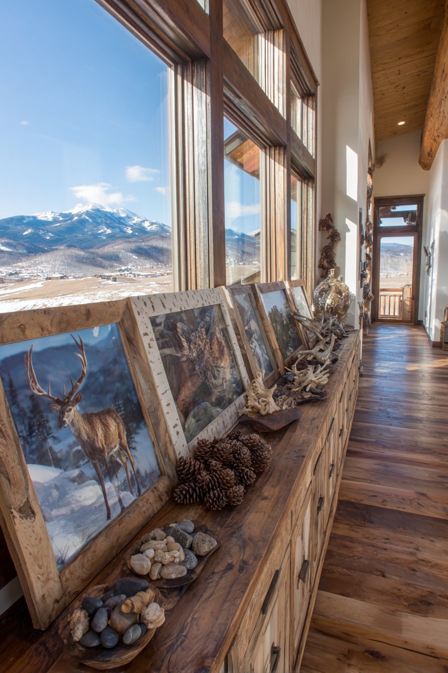
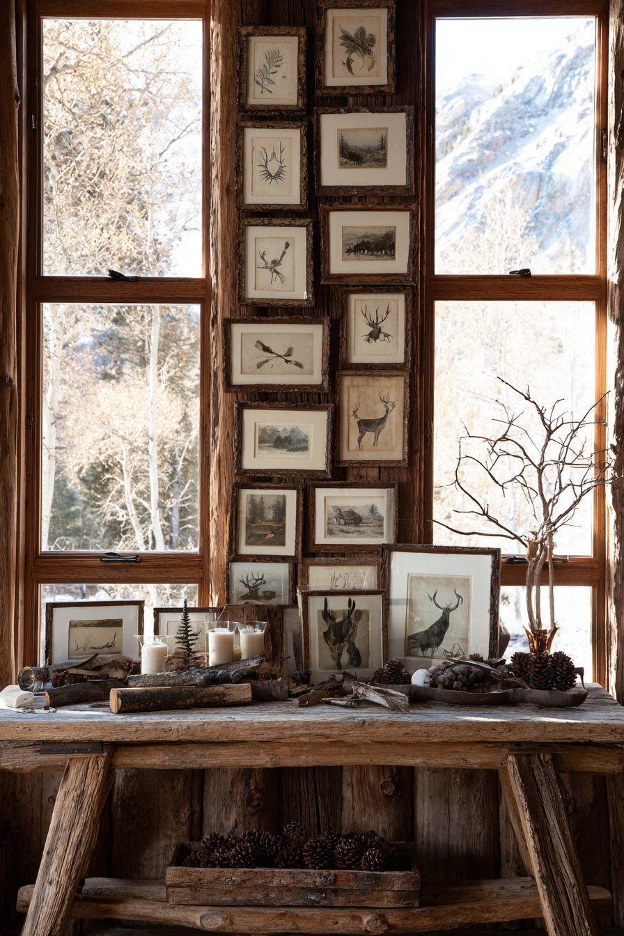
27. Nature-Inspired Mountain Cabin Gallery
Organic materials and nature themes unite in this mountain cabin picture wall above a console table. Frames crafted from natural wood, birch bark, and even antler finishes display wildlife photography, forest landscapes, and botanical illustrations that celebrate the surrounding natural environment. The arrangement itself echoes natural patterns—not rigid grids but organic clustering that mimics how elements appear in nature. The rustic wooden console below holds additional nature elements like pinecones, river stones, and pieces of driftwood, creating seamless connection between the wall display and the three-dimensional space.
The frame materials feel integrated with their content—wildlife photography in antler frames, forest scenes in bark-finished frames, botanical prints in natural wood. This thoughtful pairing of material and content creates coherent narrative where every element reinforces the nature theme. The organic arrangement, with its gentle curves and clustering rather than straight lines, mirrors patterns found in forest canopies, river stones, or animal groupings, creating subconscious harmony with the natural world.
Large windows framing mountain views beyond create extraordinary connection between indoor gallery and outdoor reality. The wall display essentially serves as transition between interior space and exterior landscape, celebrating the natural beauty visible just beyond the glass. Natural light creates warm, earthy tones throughout the display, while the varied frame materials catch and reflect light differently, adding subtle texture and depth. The entire space feels like a nature sanctuary that honors rather than dominates the surrounding environment.
Key Design Tips: Source frames made from natural materials—look for sustainable wood, naturally shed antlers, or bark-covered frames. Choose artwork that directly references local flora and fauna to create place-specific connection. Arrange frames following organic patterns rather than rigid grids—study natural clustering in forest growth or river rocks for inspiration. Include three-dimensional natural elements on surfaces below to extend the nature theme into the living space. Position the display where natural views are visible to create dialogue between indoor art and outdoor reality.
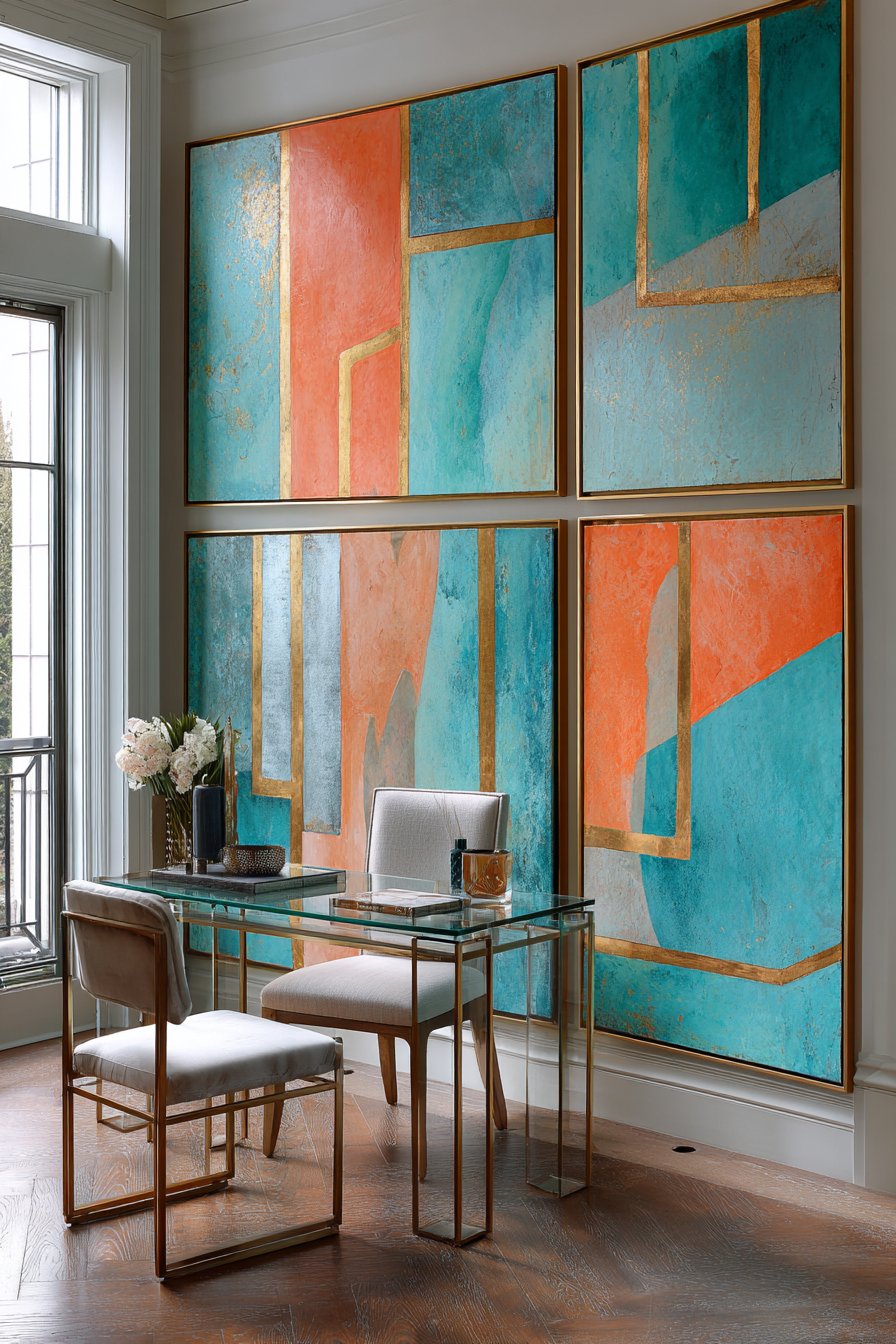
28. Bold Contemporary Abstract Collection
Artistic sophistication takes center stage in this contemporary home office featuring large-scale abstract paintings. Four substantial pieces measuring 24×36 inches each are mounted in thin metallic frames and arranged in a 2×2 grid. The abstract paintings coordinate through shared color palette—teal, coral, and gold—with bold geometric shapes and dynamic compositions that energize the workspace. The thin frame profiles feel modern and understated, allowing the artwork itself to dominate without competition from ornate framing.
The scale of these pieces creates immediate impact while the coordinated palette ensures they work together despite being individual artworks. The bold colors stimulate creativity and energy appropriate for a productive workspace, while the abstract nature of the imagery avoids the distraction that representational artwork might create. The geometric shapes within the paintings create visual movement and complexity that sustains interest during brief mental breaks from work tasks.
The glass-top desk with modern office chair positioned below maintains the contemporary aesthetic while the transparent desk surface prevents visual heaviness. Task lighting combined with natural window light provides balanced illumination throughout the workday—bright functional lighting during active work hours, softer ambient lighting during video calls or creative thinking time. The entire environment communicates professional sophistication and creative confidence, creating a workspace that feels inspiring rather than purely utilitarian.
Key Design Tips: Invest in original artwork or high-quality prints from contemporary artists for authentic impact. Choose a coordinated color palette across all pieces even if they’re from different artists. Use thin metal frames—typically 0.5-1 inch profiles—for contemporary artwork to maintain clean aesthetic. Space frames evenly in the grid—typically 3-4 inches between pieces. Mount the grid so the center point aligns with eye level from your desk chair for optimal viewing during work.
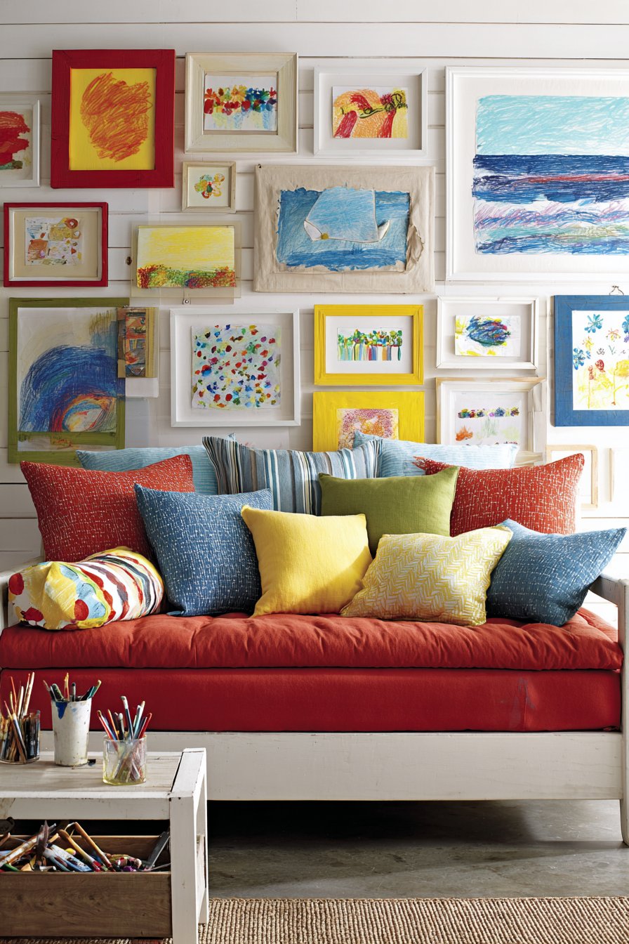
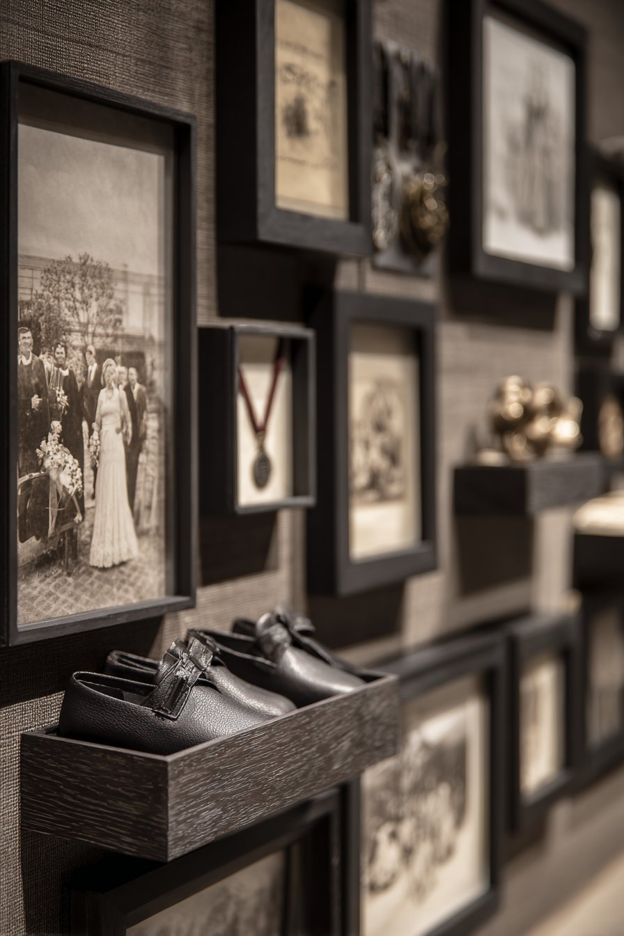
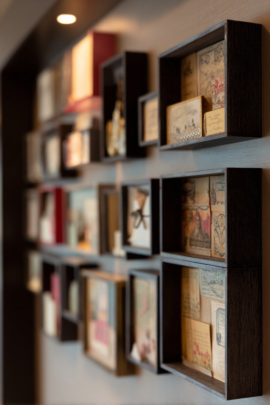
29. Sentimental Shadow Box Collection
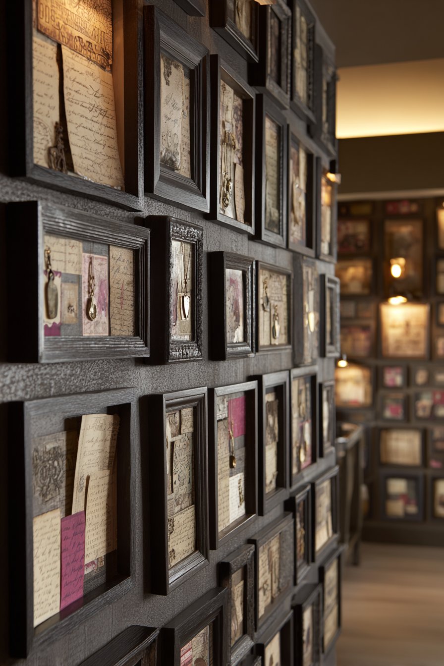
Dimensional storytelling distinguishes this shadow box collection wall in a family hallway. Various-depth shadow boxes in coordinating dark wood finishes showcase three-dimensional memorabilia that wouldn’t work in traditional flat frames—wedding invitations in their original envelopes, preserved baby shoes, sports medals suspended on ribbons, travel souvenirs including coins and maps, concert tickets, military insignia. The boxes vary in size from 8×10 to 16×20 inches, arranged in thoughtful composition that creates visual balance despite the varied depths projecting from the wall.
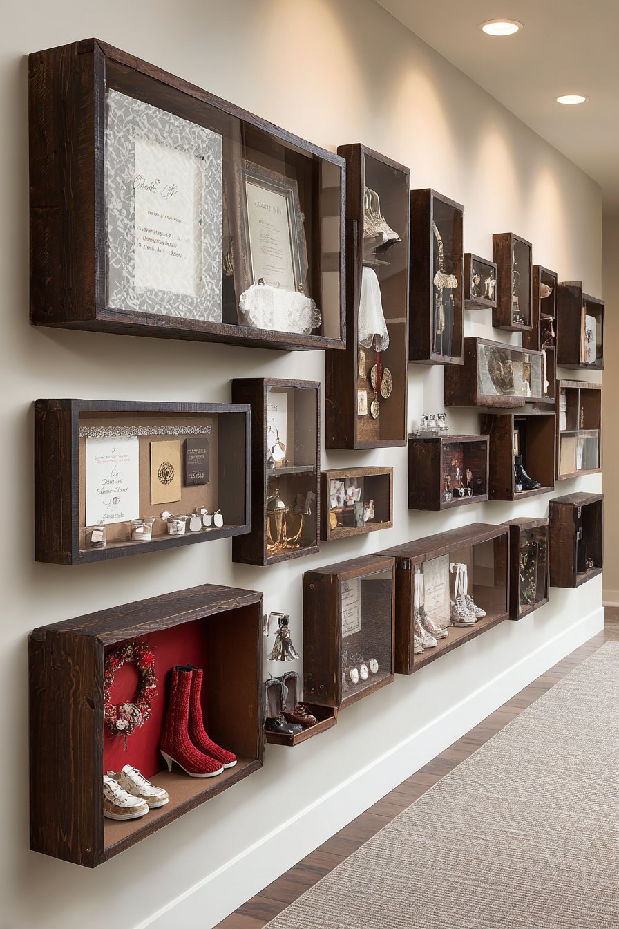
The dimensional quality of shadow boxes allows preservation and display of objects that hold emotional significance but lack the flat format required for standard framing. Each box becomes a three-dimensional vignette telling a specific story—the wedding box might include invitation, dried flowers from the bouquet, and a photograph, while the travel box could contain foreign currency, ticket stubs, and small cultural artifacts. The dark wood frames provide sophisticated presentation that elevates sentimental objects beyond scrapbook treatment.
The hallway location ensures family members encounter these memory displays multiple times daily, keeping significant life events and achievements present in everyday consciousness. Soft hallway lighting creates intimate viewing conditions that encourage pausing and remembering, transforming a purely functional transit space into meaningful personal museum. The arrangement invites storytelling—as family members pass by, they might point out specific boxes and share the stories behind the displayed items.
Key Design Tips: Purchase shadow boxes with adequate depth for your objects—typically 1.5-3 inches depending on what you’re displaying. Use acid-free backing and materials to prevent deterioration of sensitive items like paper and fabric. Arrange objects within each box thoughtfully—create mini-compositions rather than randomly placing items. Mix shadow boxes with some traditional flat frames to prevent the arrangement from feeling too busy. Include small labels or plaques identifying what events or periods the boxes commemorate.
30. Casual Polaroid String Display
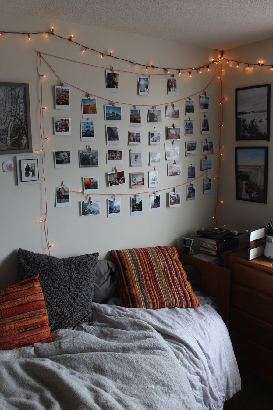
Youthful energy and flexibility define this teenage bedroom picture wall using instant photos and string lights. Twine or copper wire strands mount horizontally across the wall with small clips holding dozens of instant photographs—Polaroids, Instax prints, or printed smartphone photos cut to instant camera dimensions. Fairy lights woven through the strings add magical ambiance while the clip attachment allows effortless rearrangement as new photos replace old favorites. The casual, ever-changing nature feels perfect for teenage years when friendships, interests, and self-identity evolve rapidly.
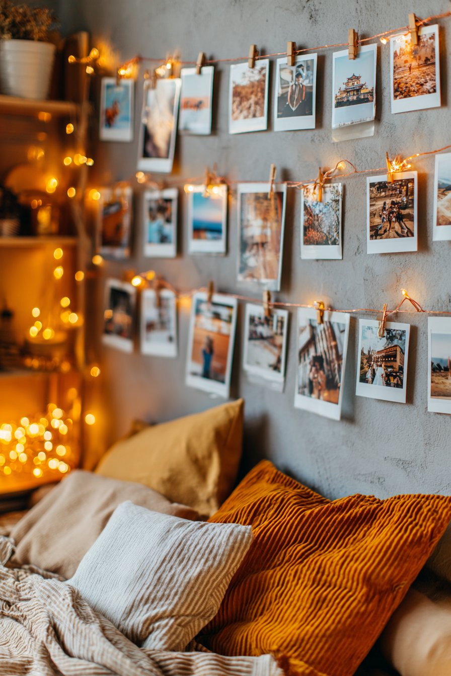
The low-commitment nature of this approach appeals to renters, students, or anyone hesitant to commit to permanent wall installations. The string and clips cause minimal wall damage compared to nails or picture hangers, while the flexibility allows complete redesign in minutes. The instant photo format feels authentic to teenage experience—capturing casual moments with friends rather than formal portraits, documenting everyday life rather than special occasions. The accumulation of photos over time creates visual diary documenting growth and change.
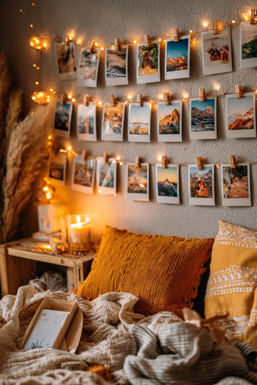
The cozy bed with layered textiles positioned below creates comfortable viewing space where inhabitants can lie back and contemplate their displayed memories. Warm string light glow supplements natural daylight, creating dreamy ambiance particularly appealing during evening hours. The entire display feels personal and authentic, celebrating the present moment and current relationships rather than fixed family history.
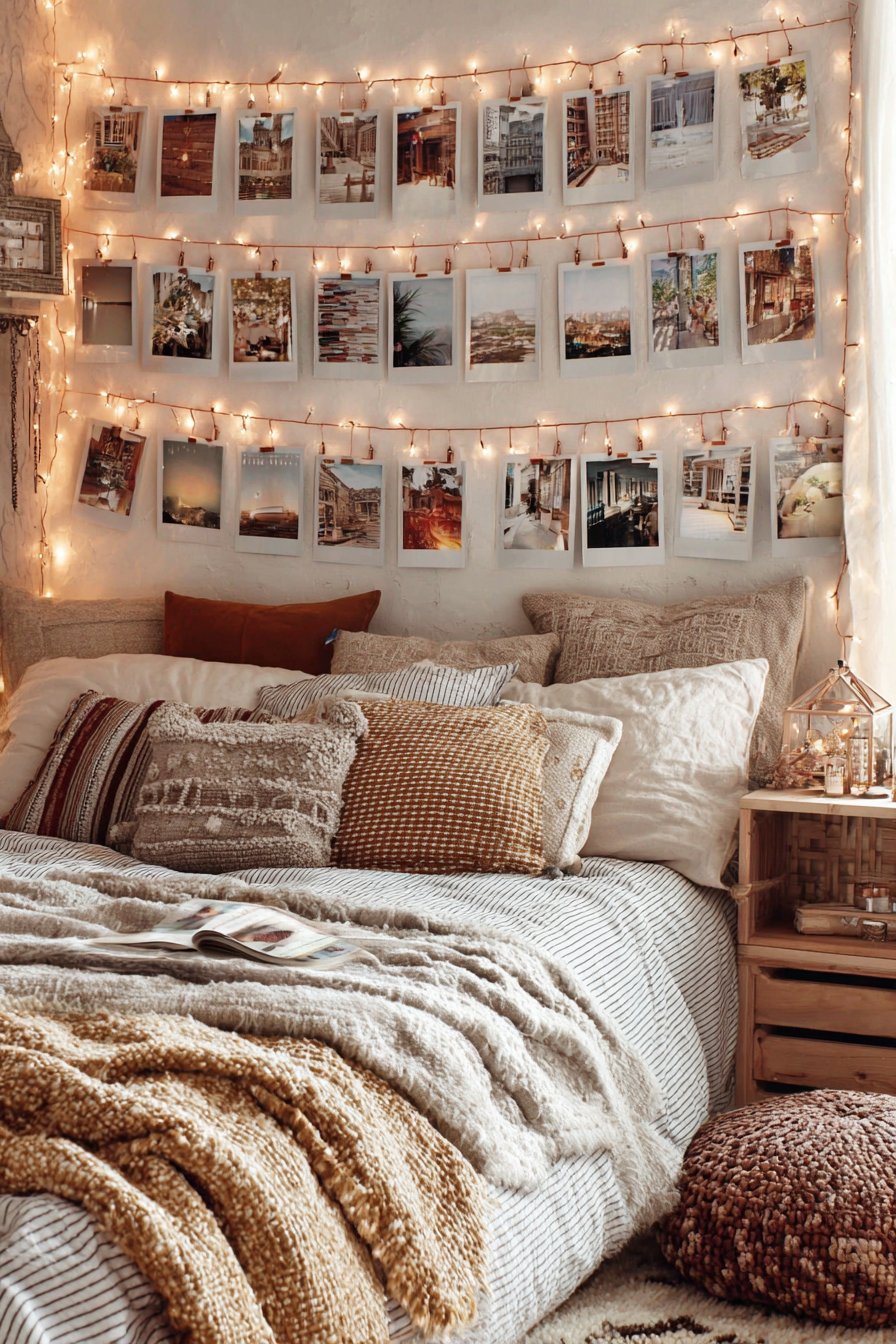
Key Design Tips: Use removable adhesive hooks rather than nails to minimize wall damage—important for rentals or dorm rooms. Space string strands 8-12 inches apart vertically to accommodate instant photo dimensions. Include more clips than you initially need to allow display growth as new photos accumulate. Choose battery-operated LED fairy lights to avoid electrical cord limitations. Create a collection box where new photos await clipping to encourage regular updates and rotation.
31. Museum-Quality Oversized Photography
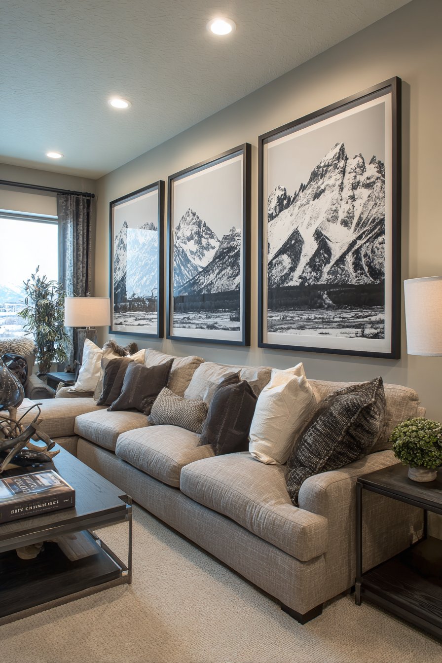
Cinematic drama characterizes this high-impact living room display featuring massive black and white landscape photography. Three enormous 36×48 inch frames in ultra-thin black metal profiles display dramatic landscape images—perhaps mountainscapes, seascapes, or desert vistas captured with professional photography techniques. The frames hang in a horizontal line with minimal spacing creating almost continuous visual experience that feels like looking through windows into epic landscapes. The sheer scale transforms photography from decoration into immersive visual experience.
The minimal spacing between frames—typically just 2-3 inches—creates the continuous effect while the ultra-thin frame profiles (typically 0.5 inches or less) nearly disappear, keeping focus entirely on the imagery. The black and white treatment emphasizes form, composition, and dramatic lighting rather than color, creating images with timeless quality that won’t feel dated as color trends evolve. The horizontal orientation and massive scale naturally draw the eye across the wall, creating sense of expansiveness that makes rooms feel larger and more open.
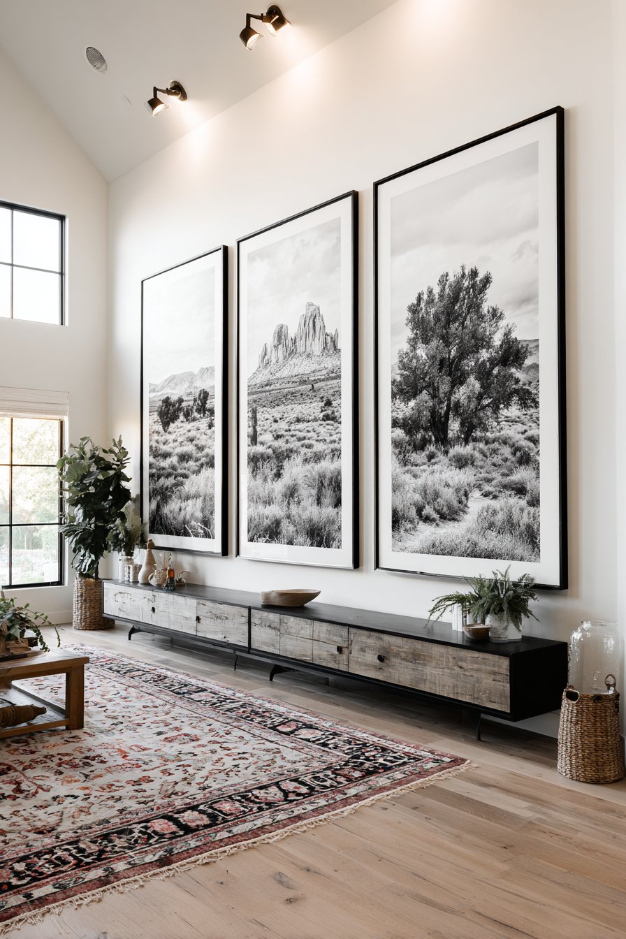
The low-profile media console positioned below maintains clean, minimal aesthetic while providing necessary function. The console receives minimal styling—perhaps one or two sculptural objects—to avoid visual competition with the commanding photographs above. Architectural lighting washes the wall evenly, ensuring proper illumination without creating glare on the large glass surfaces. The entire installation creates museum-quality impact typically reserved for public galleries, bringing that level of visual drama into residential space.
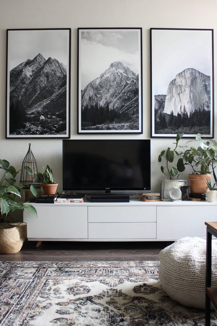
Key Design Tips: Commission professional printing at proper scale—consumer printers cannot achieve the quality needed for such large formats. Use museum-quality printing on premium paper or canvas to justify the investment in scale. Mount frames using proper wall anchors rated for the substantial weight of large frames with glass. Position the bottom edge of frames 8-12 inches above your furniture to create proper relationship without gaps. Consider professional installation for pieces this large—proper leveling and secure mounting are crucial at this scale.
Why These Picture Wall Ideas Represent Excellence in Home Design
The thirty-one picture wall ideas presented in this comprehensive guide represent the finest approaches to creating meaningful, beautiful, and functional wall displays in contemporary homes. These concepts span the full spectrum of design possibilities—from minimalist restraint to maximalist abundance, from traditional techniques to cutting-edge technology, from formal sophistication to casual charm. Each approach offers unique advantages and speaks to different personalities, lifestyles, and spatial situations, ensuring every homeowner can find inspiration suited to their specific needs and preferences.
What elevates these ideas above standard gallery wall concepts is their attention to the complete experience—not just the visual impact of frames on walls, but the relationship between display and furniture, the role of lighting in creating atmosphere, the integration of personal meaning and storytelling, and the practical considerations of installation and maintenance. These aren’t theoretical design concepts divorced from real life; they’re achievable approaches that account for actual living spaces, realistic budgets, and the need for flexibility as lives and tastes evolve. The ideas range from investment-level installations requiring professional assistance to weekend DIY projects that can transform spaces with minimal tools and expense.
The diversity of styles represented ensures relevance across all major design aesthetics currently influencing residential interiors. Scandinavian minimalism finds expression in the three-piece linear arrangement and the single statement piece approach. Bohemian eclecticism flourishes in the mixed media three-dimensional wall and vintage mirror combination. Industrial design principles guide the metal grid display system. Farmhouse charm permeates the rustic hearth gallery. Contemporary sophistication shines through in the geometric frame cluster and bold abstract collection. Traditional elegance manifests in the stairway gallery and salon wall with professional matting. This stylistic range means the concepts remain relevant regardless of current trends or personal preferences.
The technical excellence demonstrated throughout these ideas reflects deep understanding of design principles—balance, proportion, rhythm, harmony, and emphasis. Whether creating perfect symmetry in grid arrangements or carefully choreographed chaos in salon-style walls, these approaches show mastery of fundamental design concepts that ensure visual success. The attention to practical details like frame spacing, mounting heights, lighting considerations, and material selection demonstrates expertise that helps readers avoid common pitfalls that can derail gallery wall projects. The specific measurements, spacing recommendations, and material specifications provide actionable guidance rather than vague aspirational imagery.
Functionality receives appropriate emphasis throughout these concepts, recognizing that beautiful displays must also serve practical purposes in real homes. The picture ledge system allows easy rearrangement for those who value flexibility. The child-height rotating display accommodates the constant stream of artwork children produce. The digital frame technology integration solves photo management challenges of the smartphone era. The narrow hallway solution addresses challenging spaces often overlooked in design discussions. The timeline wall serves both decorative and sentimental functions, documenting family history while creating beauty. These functional considerations ensure the ideas work in actual daily life rather than existing solely for photographic perfection.
The emotional resonance of these picture wall ideas sets them apart from purely decorative approaches. Gallery walls at their best tell stories—of family connections preserved in timeline arrangements, of adventures documented in travel-themed displays, of childhood creativity celebrated in dedicated art galleries, of natural world appreciation shown through botanical collections. These displays become more than decoration; they’re visual narratives that give meaning to spaces and create emotional connections between inhabitants and their homes. The most successful picture walls trigger memories, spark conversations, and reinforce identity and values through careful curation of displayed imagery.
Material quality and presentation standards evident throughout these ideas reflect commitment to excellence that distinguishes professional-level design from amateur attempts. The emphasis on proper matting, appropriate frame selection, quality printing and mounting, secure installation, and thoughtful lighting demonstrates understanding that details matter enormously in final results. The museum-quality photography installation and salon wall with professional matting show that residential spaces can achieve gallery-level presentation when appropriate care is taken. Conversely, the polaroid string display and children’s art gallery prove that meaningful, beautiful displays don’t always require expensive materials or complex installation.
The integration of lighting considerations throughout these concepts acknowledges this crucial but often overlooked element of successful picture walls. Natural light receives appropriate emphasis in spaces where windows provide abundant illumination. Artificial lighting solutions address the challenges of interior walls, narrow hallways, and evening viewing conditions. The specific mention of soft diffused lighting, warm ambient illumination, task lighting, and architectural washing demonstrates sophisticated understanding of how different lighting approaches affect viewing experience and atmospheric quality. The recognition that lighting changes throughout the day and seasons, transforming how we perceive displayed imagery, adds temporal dimension often missing from static design concepts.
These picture wall ideas also acknowledge the full range of commitment levels homeowners bring to design projects. The permanent, investment-level approaches like the two-story entryway gallery and museum-quality oversized photography require significant resources and professional assistance, appealing to those ready to make long-term design commitments. The flexible, low-commitment solutions like the picture ledge system and polaroid string display accommodate renters, students, or those who prefer frequently refreshing their spaces. This spectrum ensures everyone can participate in the picture wall trend regardless of their situation or resources.
The sustainability and evolution considerations woven through these concepts reflect modern understanding that rooms must adapt as lives change. The timeline wall explicitly plans for future additions. The ledge system and digital frames allow effortless updates. The child-height display accommodates growing children’s changing artistic output. The salon-style arrangement can absorb new acquisitions collected over years. This forward-thinking approach prevents gallery walls from becoming static installations that feel outdated or irrelevant as time passes, instead creating dynamic displays that grow and evolve alongside their owners.
Finally, these picture wall ideas succeed because they inspire action rather than paralyzing readers with perfectionistic expectations. The specific, actionable design tips accompanying each concept provide the practical guidance needed to move from inspiration to execution. The acknowledgment that different approaches suit different skill levels, budgets, and commitment levels removes barriers that prevent many homeowners from attempting gallery walls. The emphasis on authenticity and personal meaning over rigid adherence to design rules empowers readers to adapt concepts to their unique situations rather than feeling obligated to exactly replicate photographed examples.
Conclusion
Picture walls represent one of the most versatile and impactful design tools available to homeowners seeking to transform their spaces with personal meaning and visual beauty. The thirty-one ideas explored in this comprehensive guide demonstrate the remarkable range of possibilities available—from minimalist restraint featuring single oversized pieces to maximalist abundance in salon-style arrangements covering entire walls, from traditional framed photography to innovative digital displays and three-dimensional installations, from formal sophistication suitable for elegant dining rooms to casual charm perfect for teenage bedrooms.
The key to successful picture wall implementation lies in understanding fundamental design principles while remaining true to personal vision and practical needs. Balance, proportion, appropriate scale, thoughtful lighting, quality materials, and careful curation all contribute to results that feel intentional and professionally executed. However, the most successful displays also incorporate authentic personal meaning—whether through family photographs documenting shared history, artwork reflecting individual taste and values, or collections commemorating significant experiences and achievements.
As you embark on your own picture wall journey, remember that there’s no single correct approach. Your personal circumstances—the architectural features of your space, your design aesthetic preferences, your budget and skill level, your lifestyle and how you use your rooms—should guide which concepts you pursue and how you adapt them to your unique situation. Start with inspiration from these ideas but allow your own creativity and personal story to shape the final result. The most beautiful picture walls aren’t those that perfectly replicate design magazine examples but those that authentically reflect the people who live with them daily, creating spaces that feel like home in the deepest sense. Whether you choose bold dramatic statements or subtle understated elegance, invest significant resources or work within tight constraints, embrace perfect precision or celebrate organic spontaneity, your picture wall can become one of the most meaningful and satisfying design elements in your home.