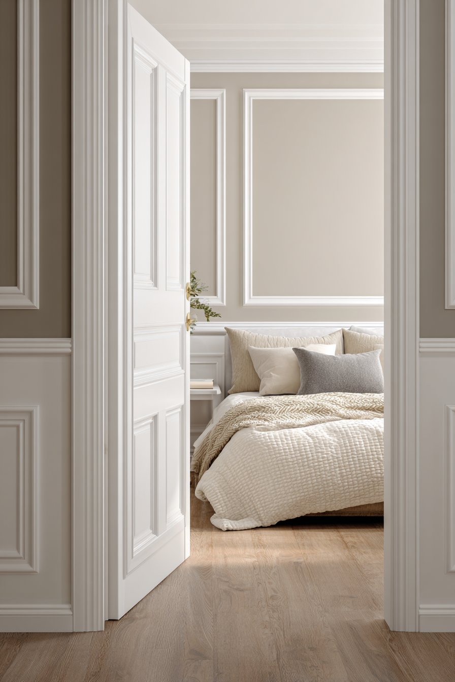
The power of paint to transform a living space cannot be overstated. With the right color palette, technique, and vision, interior house painting becomes more than mere decoration—it evolves into an art form that shapes mood, defines character, and breathes life into every corner of your home. As homeowners increasingly seek to personalize their environments, the quest for innovative painting ideas has never been more relevant. Whether you’re drawn to serene neutrals, bold statement walls, or intricate decorative finishes, the possibilities are as limitless as your imagination.
Interior painting serves as the foundation upon which all other design elements rest. It’s the backdrop that either amplifies or subdues furnishings, the canvas that highlights architectural details, and the silent storyteller that communicates your personal aesthetic. Beyond mere aesthetics, thoughtful paint choices can visually expand cramped spaces, create intimate zones within open floor plans, and even influence the perceived temperature of a room. The psychology of color plays a crucial role in how we experience our homes, affecting everything from our energy levels to our sense of tranquility.
In this comprehensive guide, we’ll explore twenty-seven distinctive interior painting concepts that span the spectrum from timelessly classic to daringly contemporary. Each approach offers unique opportunities to express creativity while addressing practical considerations such as lighting conditions, room function, and architectural features. Whether you’re planning a complete home makeover or refreshing a single room, these ideas will inspire you to see paint not just as a covering, but as a transformative tool that can redefine your living spaces and reflect your evolving lifestyle.
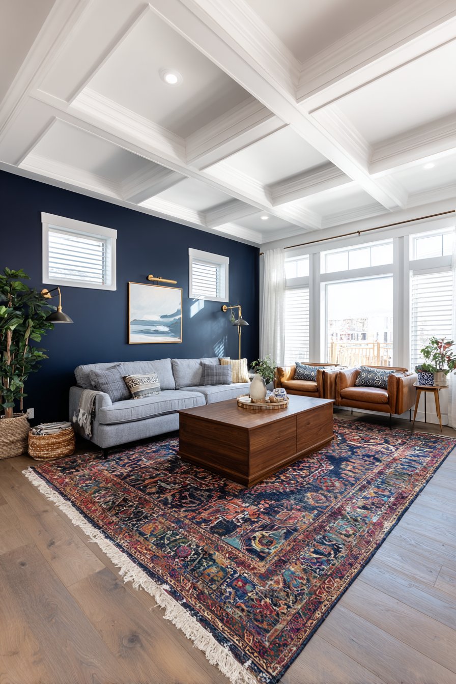
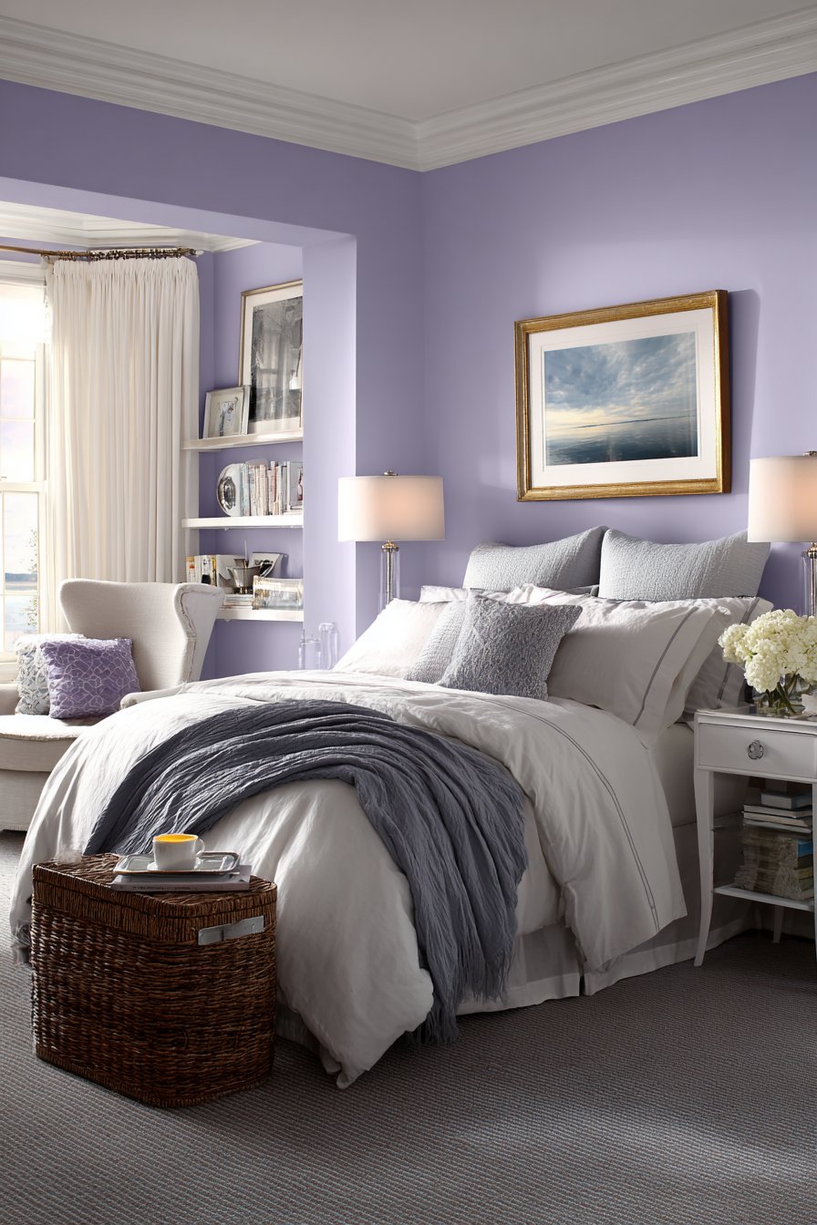
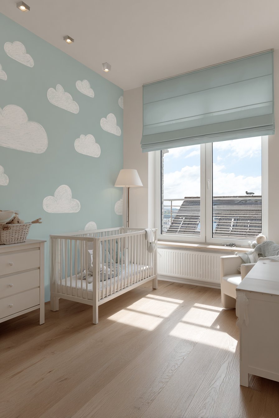
1. Soft Sage and Cream Sanctuary
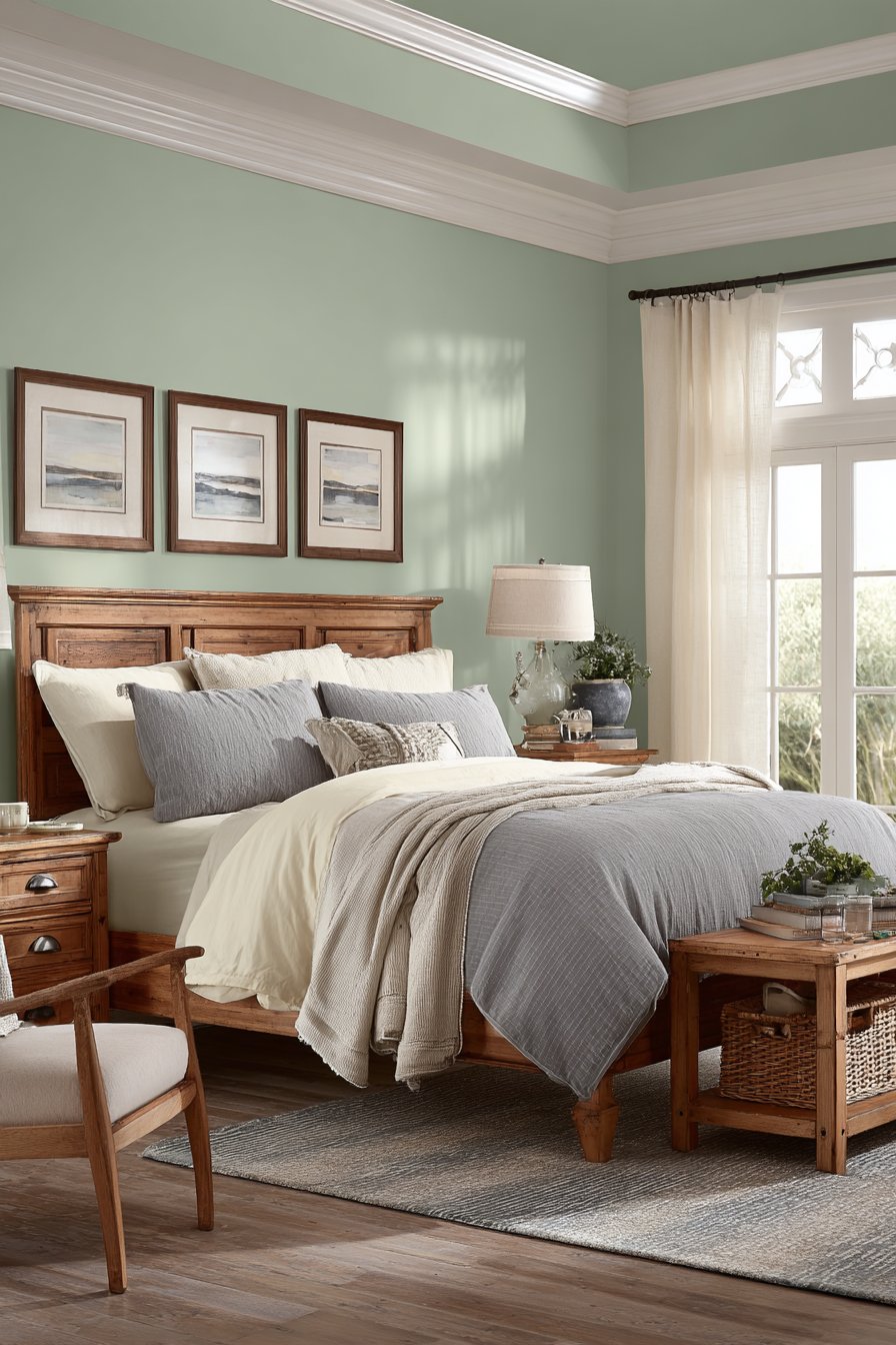
Creating a peaceful retreat within your home begins with color choices that soothe the senses. A soft sage green paired with warm cream tones establishes an immediately calming environment that feels both fresh and timeless. This combination works beautifully in bedrooms, living rooms, or any space where relaxation is paramount. The sage brings nature indoors with its botanical undertones, while cream provides a neutral anchor that prevents the green from feeling too cool or clinical. Consider painting the main walls in sage and using cream for trim, crown molding, and accent walls to create visual interest and architectural definition.
The beauty of this palette lies in its versatility and its ability to adapt to changing light throughout the day. Morning sunlight will illuminate the green tones, creating an energizing yet gentle awakening space, while evening light softens everything into a cocoon-like warmth. This dynamic quality means your space will never feel static or one-dimensional. The combination also serves as an excellent backdrop for both natural wood furniture and painted pieces, making it forgiving if you decide to change your décor over time.
When executing this painting scheme, pay attention to the undertones in your chosen shades. Sage greens can lean yellow, gray, or blue, and your selection should complement the natural light in your space. Rooms with abundant natural light can handle cooler sage tones, while spaces with limited windows benefit from warmer, yellow-based sages. The cream should be rich enough to feel substantial rather than stark white, creating that enveloping quality that makes a room feel finished and intentional. Consider using a matte or eggshell finish on walls for a sophisticated, light-absorbing quality, while semi-gloss on trim provides subtle contrast and durability.
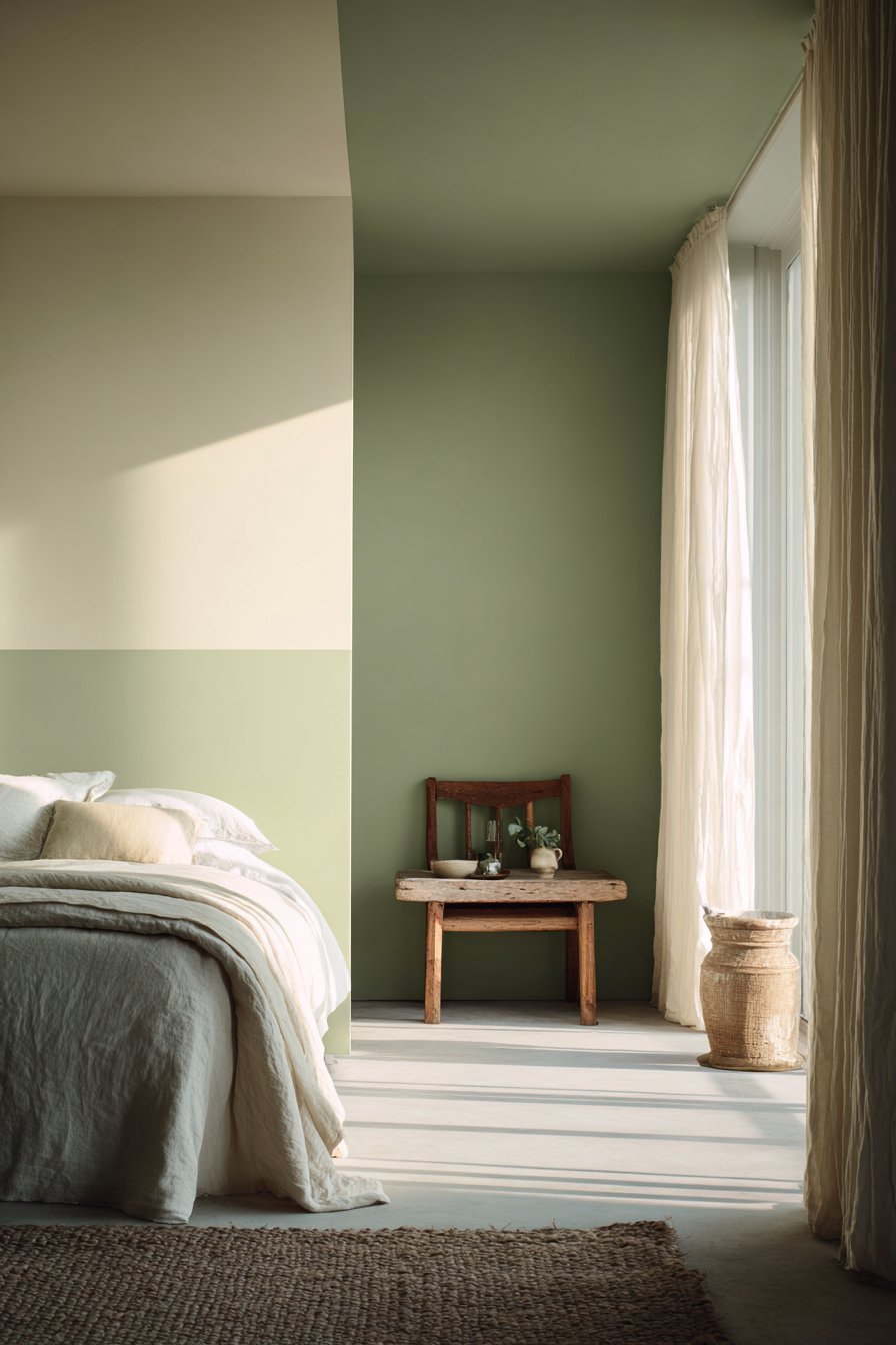
Key Design Tips: Select sage with gray undertones for north-facing rooms to prevent the space from feeling too cool. Use cream with warm yellow undertones to add richness and depth rather than stark brightness. Apply painter’s tape carefully when creating crisp lines between the two colors for a professional finish. Consider painting the ceiling in the lighter cream shade to enhance the sense of height and airiness. Test both colors in your space at different times of day before committing to ensure they work harmoniously with your lighting conditions.
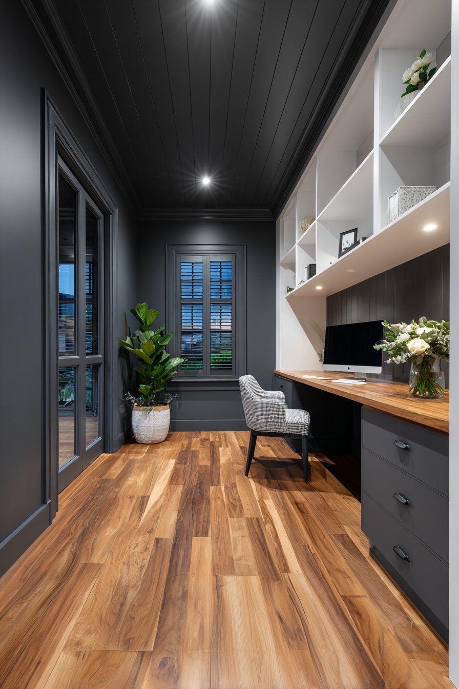
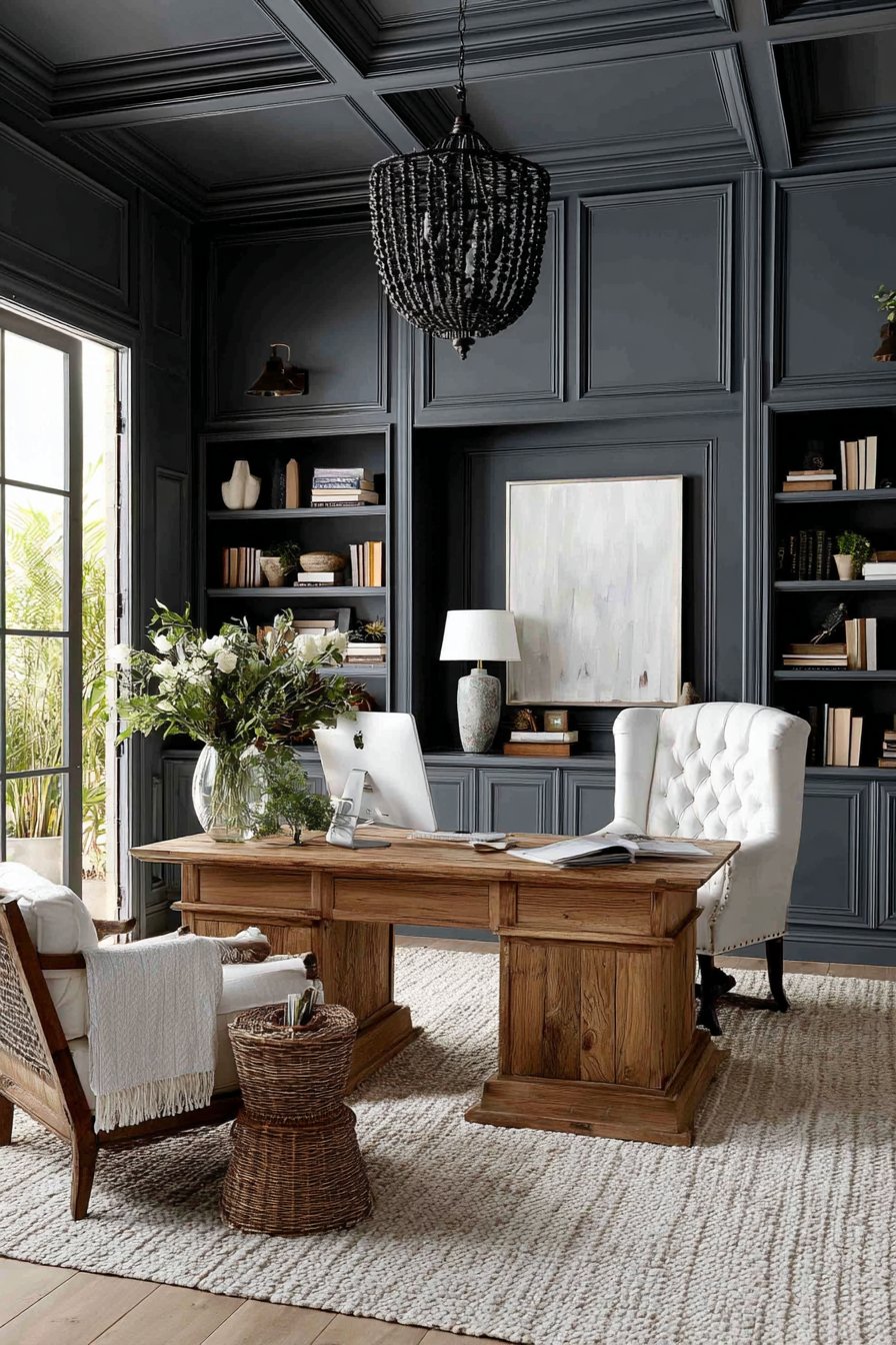
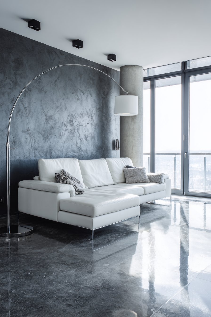
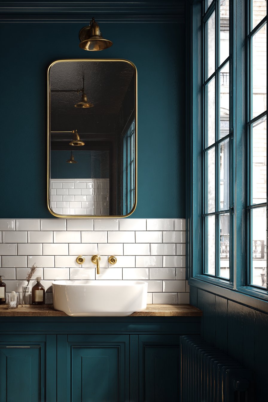
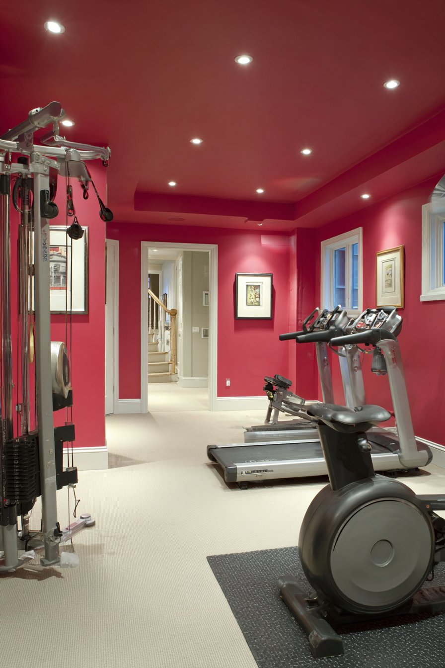
2. Dramatic Charcoal and White Contrast
For those who appreciate bold, graphic interiors, a charcoal and white color scheme delivers maximum impact with minimal complexity. This high-contrast approach creates spaces that feel architecturally significant and visually striking. Charcoal gray—deeper than typical grays but not quite black—provides sophistication without the harshness of true black, while crisp white creates the necessary contrast to prevent the space from feeling heavy. This combination works exceptionally well in contemporary homes, urban apartments, or any space where you want to make a strong design statement.
The strategic application of these two colors can dramatically alter the perception of space and proportion. Painting one accent wall in charcoal while keeping remaining walls white creates a focal point that draws the eye and anchors the room. Alternatively, charcoal on all walls with white trim, doors, and ceiling creates an envelope effect that feels cocooning rather than claustrophobic when executed properly. The key is ensuring adequate lighting—both natural and artificial—to prevent the darker color from overwhelming the space. This scheme particularly shines in rooms with abundant windows, where natural light can play against the dark surfaces throughout the day.
Texture becomes especially important in a two-tone scheme like this. Consider using different finishes to add dimension—perhaps a matte charcoal on walls paired with semi-gloss white on trim and doors. This subtle variation in sheen creates visual interest even within a limited color palette. The charcoal also serves as an excellent backdrop for displaying art, colorful accessories, or metallic accents, as the neutral yet dramatic background allows other elements to truly pop. White furnishings against charcoal walls create a gallery-like aesthetic, while darker furniture maintains a more grounded, cohesive feel.
Key Design Tips: Balance the darkness of charcoal with ample white surfaces to prevent visual heaviness and maintain brightness. Install layered lighting including ambient, task, and accent fixtures to properly illuminate charcoal walls and prevent shadows. Use high-quality paint in both colors to ensure even coverage and true color representation, especially with the dark charcoal. Consider the room’s function—charcoal works beautifully in entertaining spaces but might feel too dramatic for rooms intended for relaxation. Add warm-toned wood elements or brass fixtures to soften the cool gray-white palette and introduce warmth.
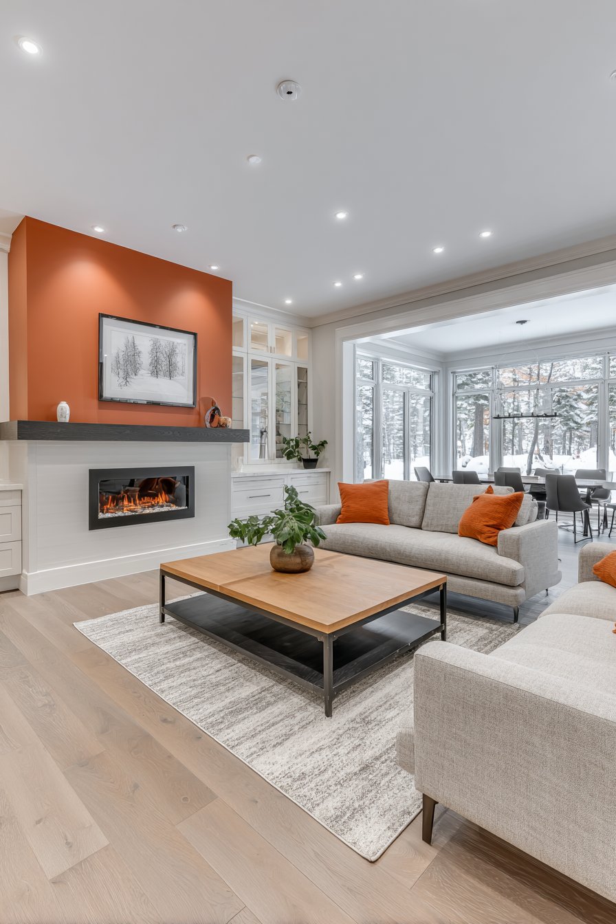
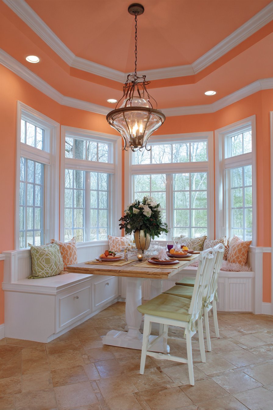
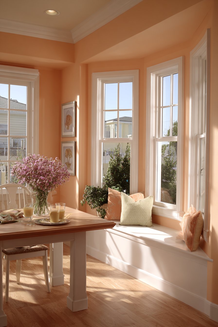
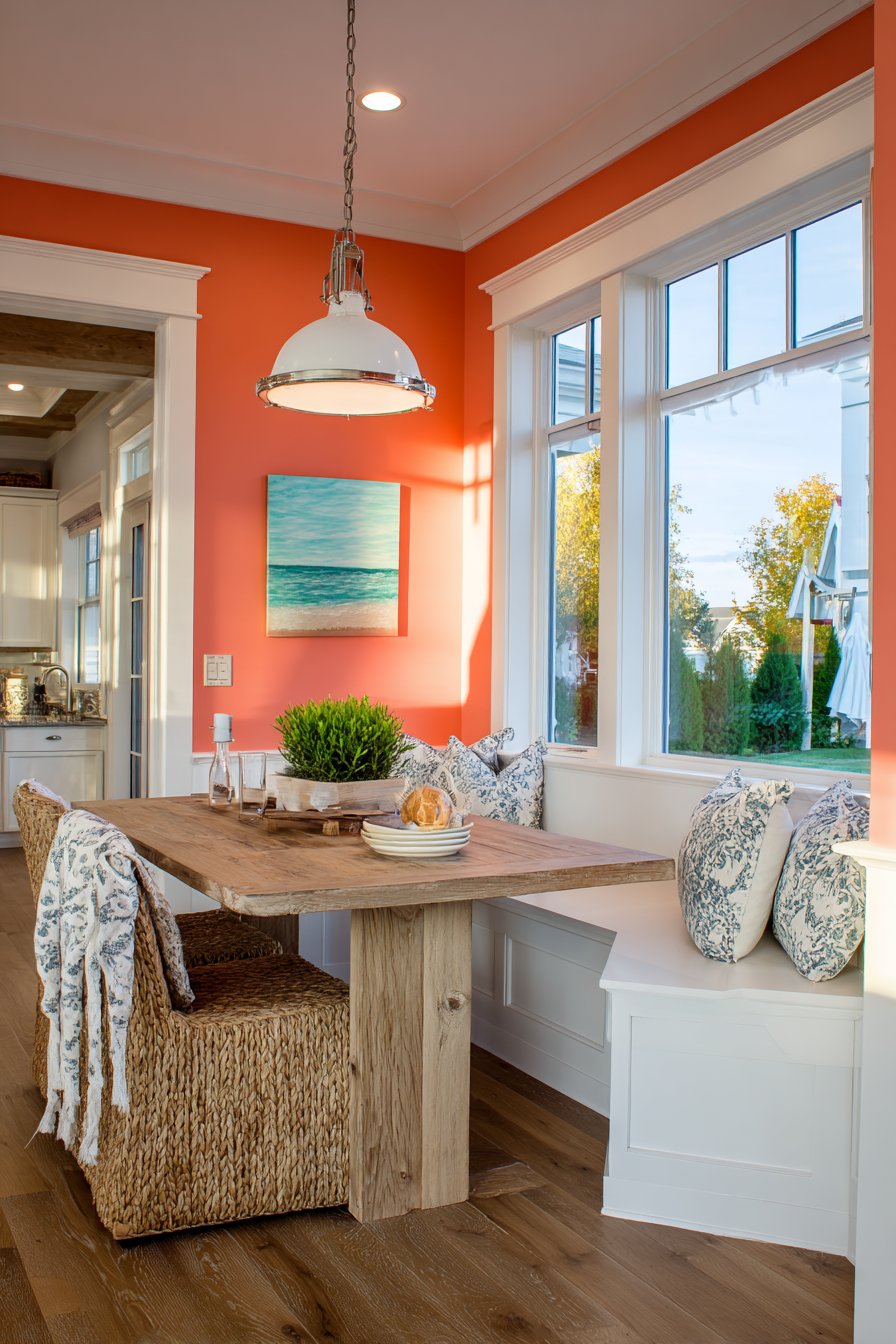
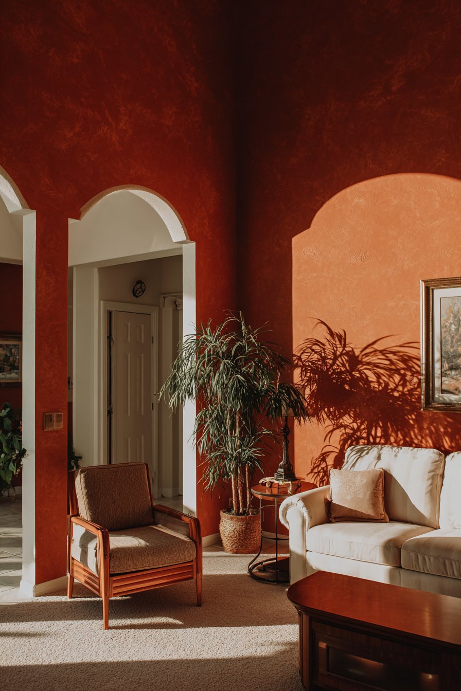
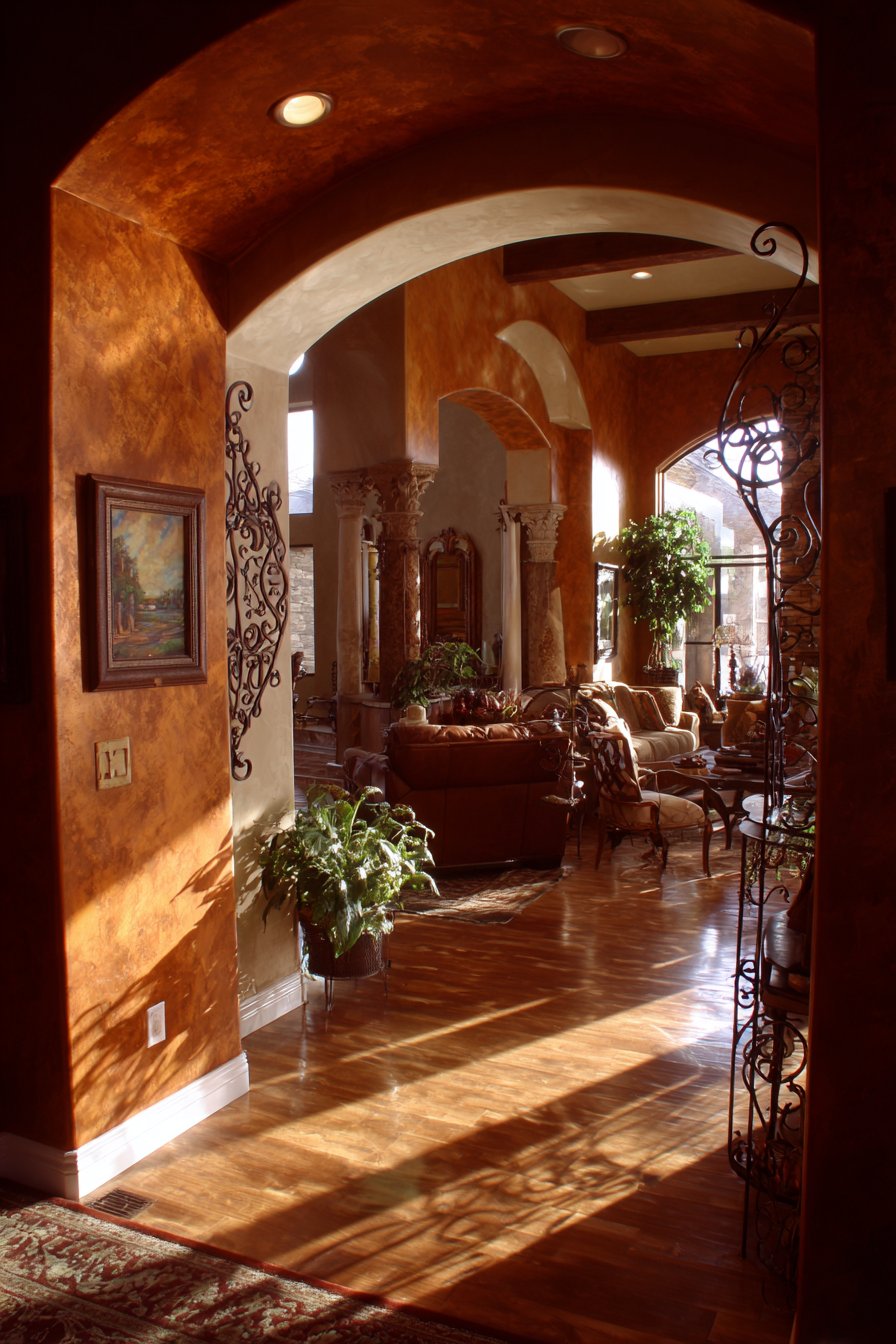
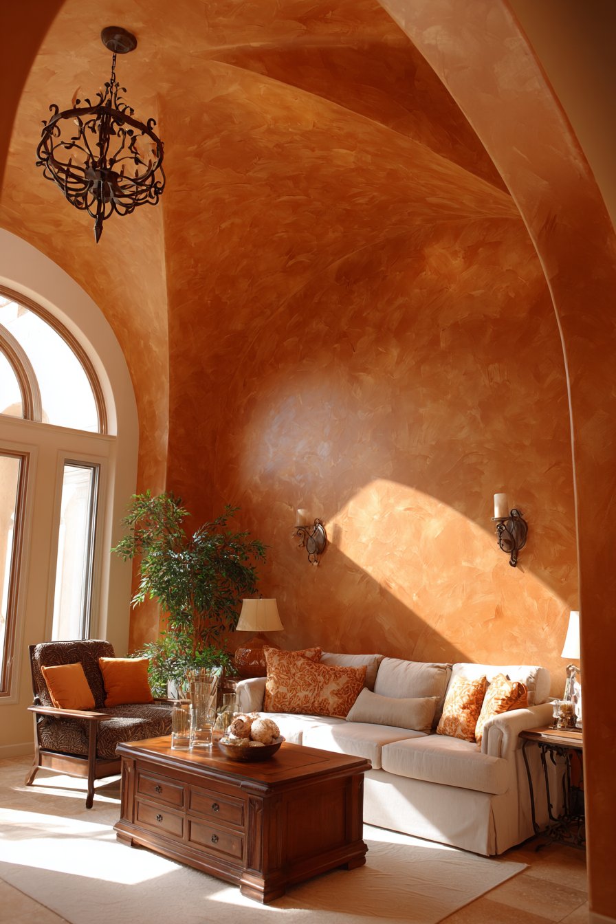
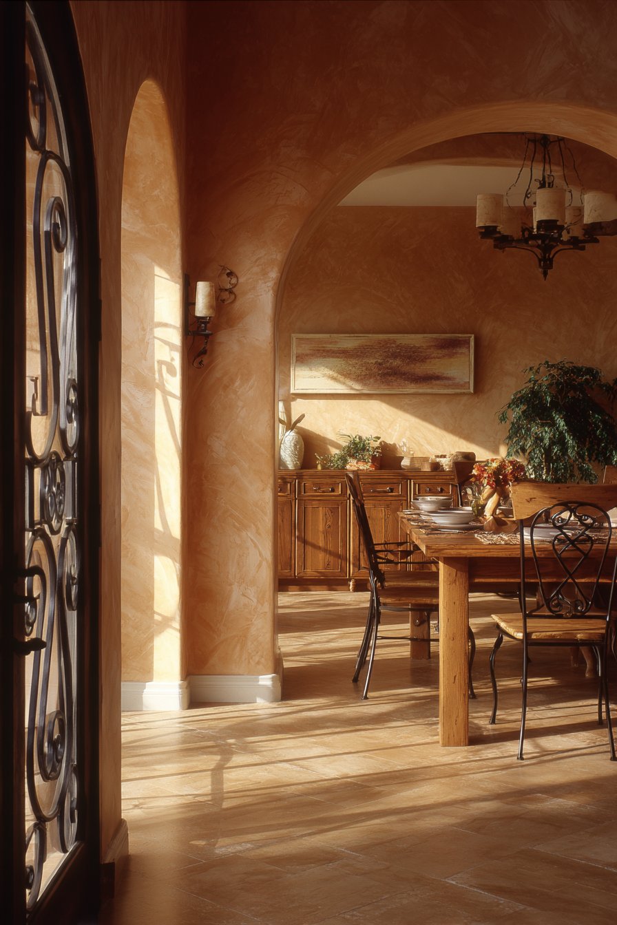
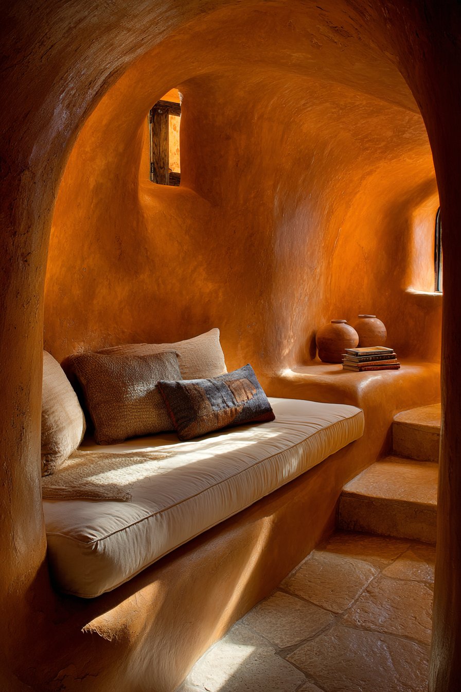
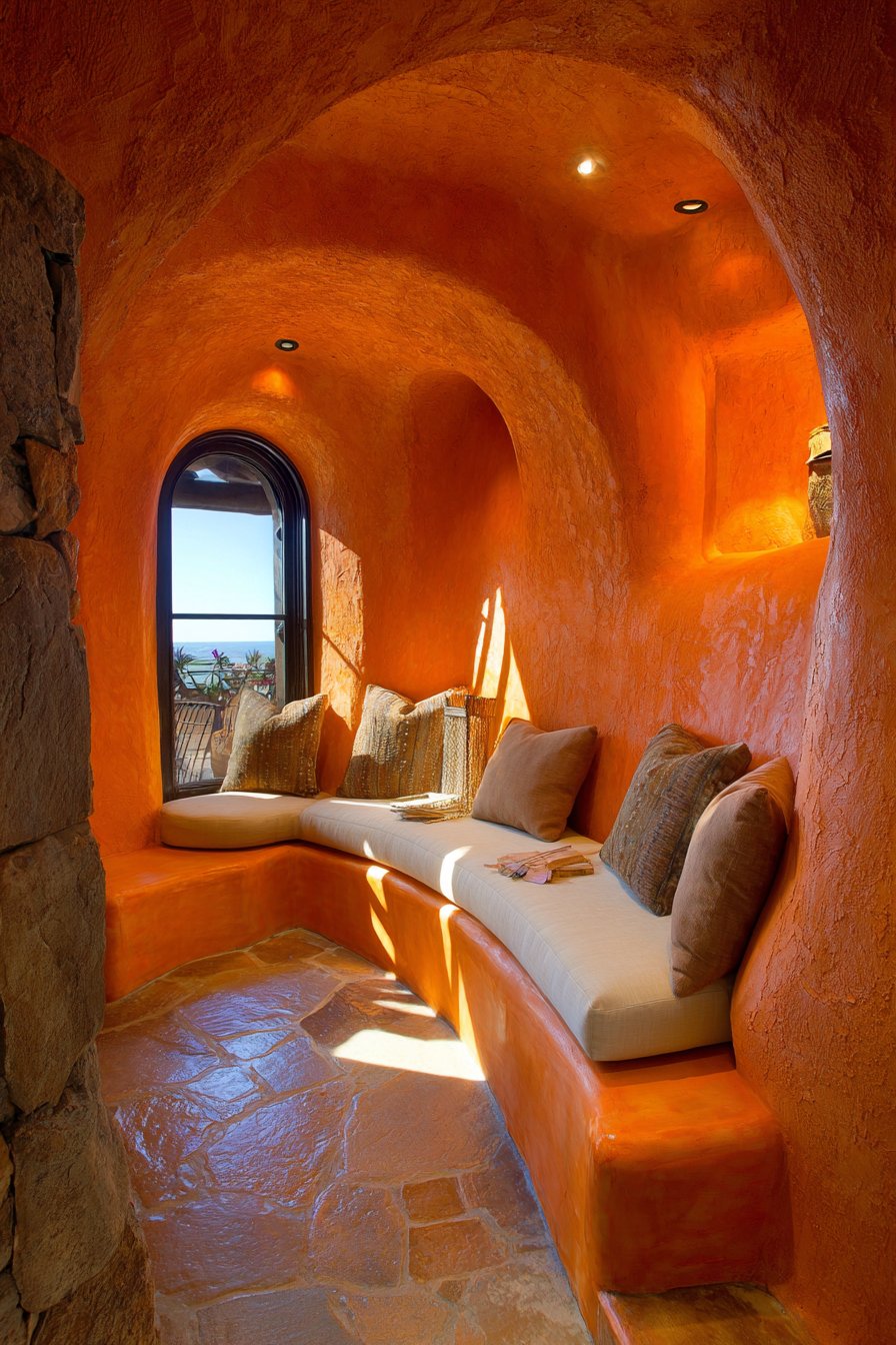
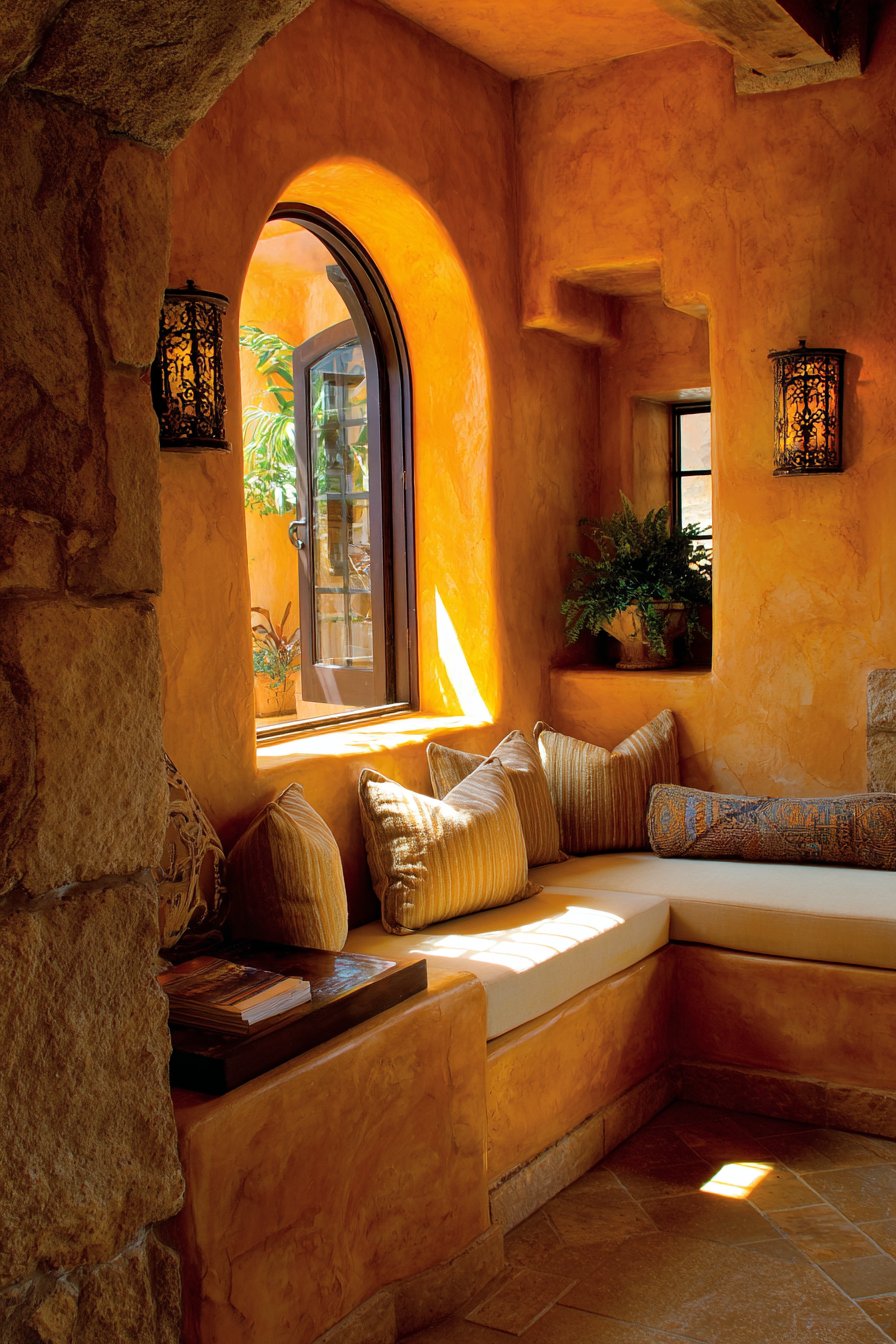
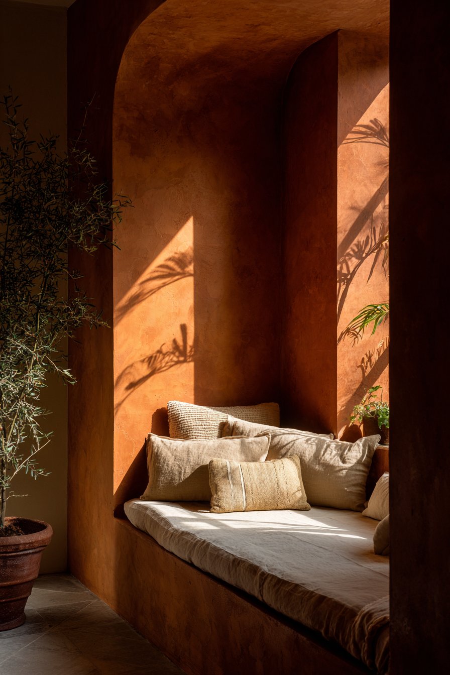
3. Warm Terracotta Embrace
Terracotta has experienced a remarkable resurgence in interior design, and for good reason. This earthy, clay-inspired hue brings warmth, richness, and a connection to natural elements that feels both ancient and contemporary. Unlike trendy colors that quickly date, terracotta has been used in architecture and design for millennia, giving it a timeless quality that transcends passing fads. When used as an interior paint color, terracotta creates spaces that feel inherently welcoming and grounded. The color works beautifully in living rooms, dining areas, bedrooms, and even kitchens, adapting to various design styles from Mediterranean to Southwestern to modern eclectic.
The complexity of terracotta is part of its appeal. It’s not simply orange or red, but a nuanced blend that can include pink, brown, and burnt orange undertones. This complexity means terracotta walls interact beautifully with natural light, appearing almost luminous in bright conditions and deeply saturated in softer light. The color has an innate ability to make spaces feel cozy without being dark, warm without being overwhelming. Pairing terracotta with crisp white trim creates clean definition, while combining it with cream or off-white tones produces a more harmonious, monochromatic effect. Natural materials like wood, rattan, and linen complement terracotta beautifully, creating layered, tactile spaces.
Application technique matters significantly with rich colors like terracotta. Proper wall preparation ensures even coverage, and using a high-quality primer prevents the color from appearing splotchy. Consider whether you want terracotta on all walls or as an accent. A single terracotta wall behind a bed or sofa creates instant focal point drama, while full-room application establishes complete immersion in the color’s warmth. The finish you choose also affects the final appearance—flat or matte finishes emphasize the earthiness of terracotta, while eggshell adds subtle luminosity that enhances the color’s natural glow.
Key Design Tips: Sample terracotta in your specific lighting conditions as it can read very differently under various light sources. Pair with natural materials and textures like jute, leather, and unfinished wood to enhance the earthy quality. Use cooler accent colors like sage green or dusty blue to create visual balance and prevent overwhelming warmth. Consider terracotta for rooms with northern exposure where warmth is needed to counteract cool natural light. Layer in plenty of plants to create a connection between the clay-like wall color and living greenery.
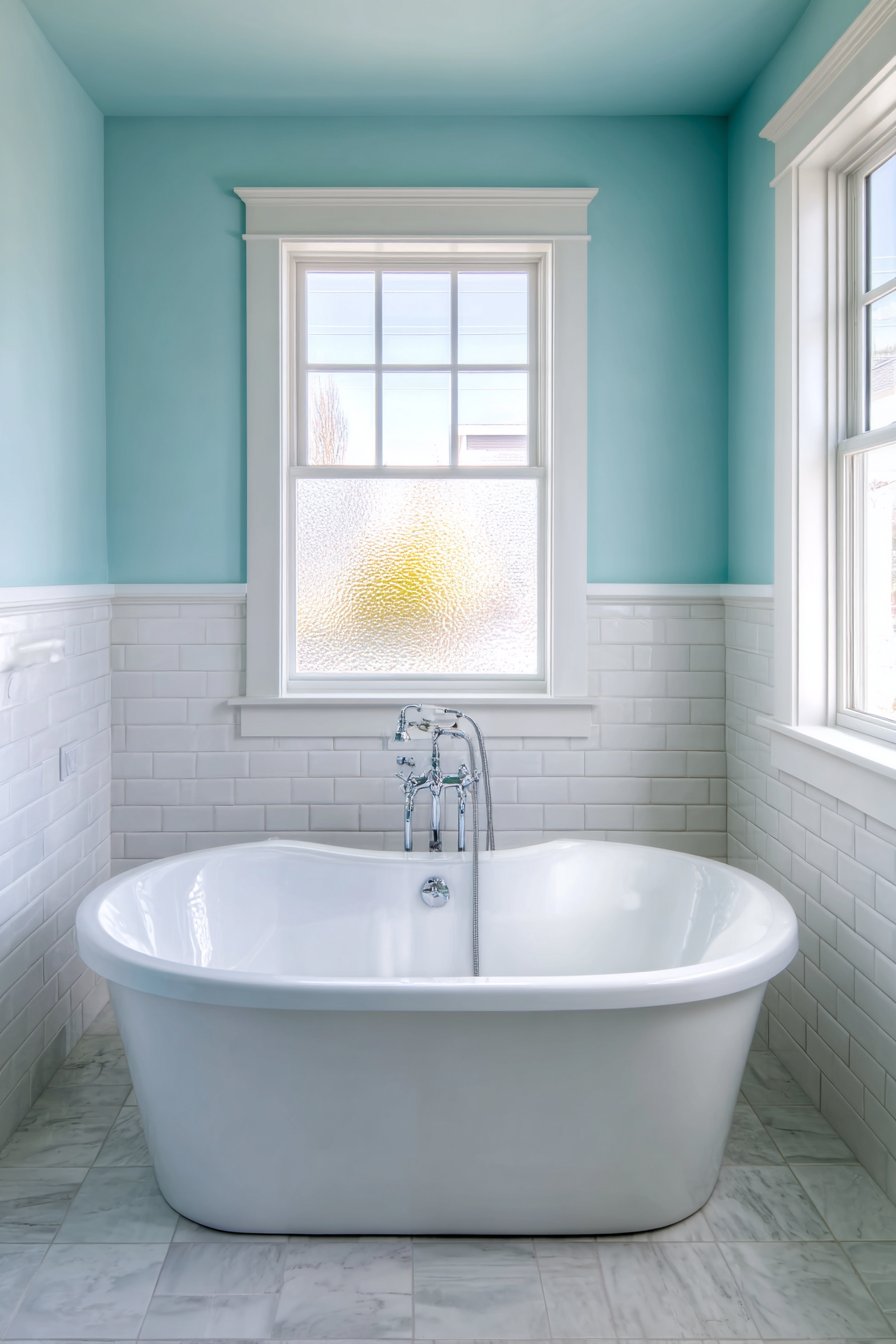
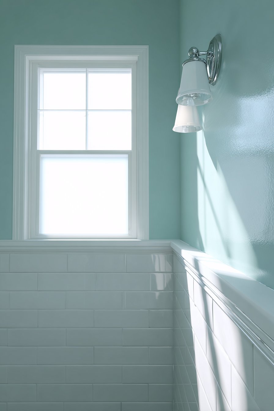
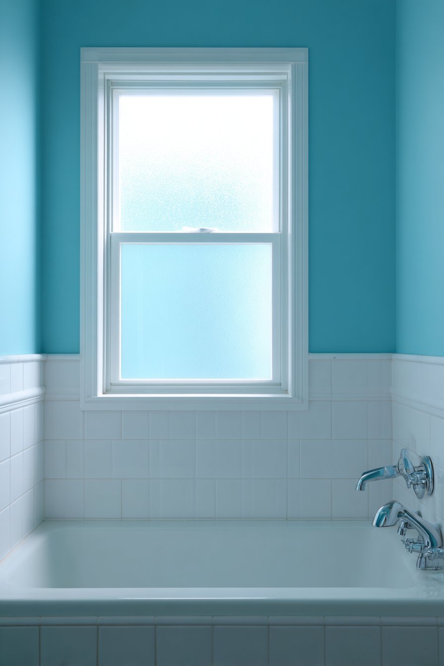
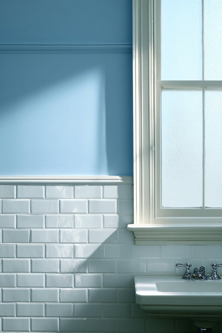
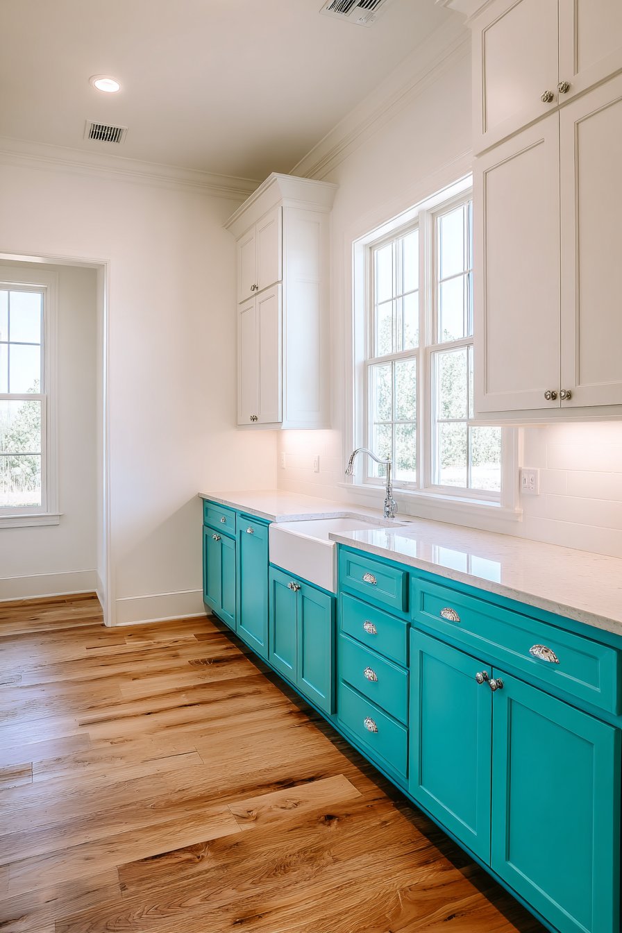
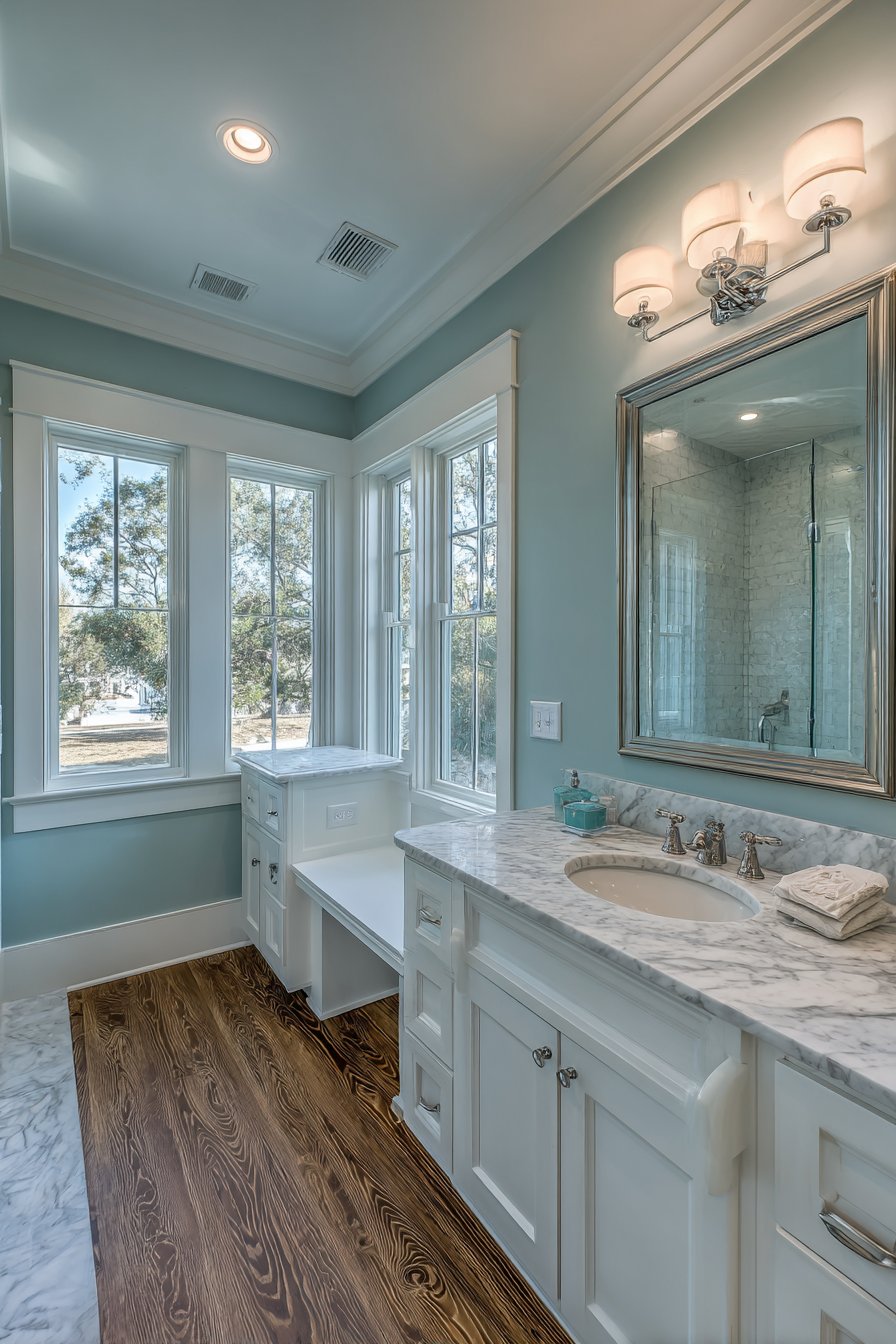
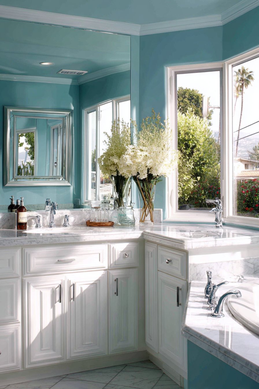
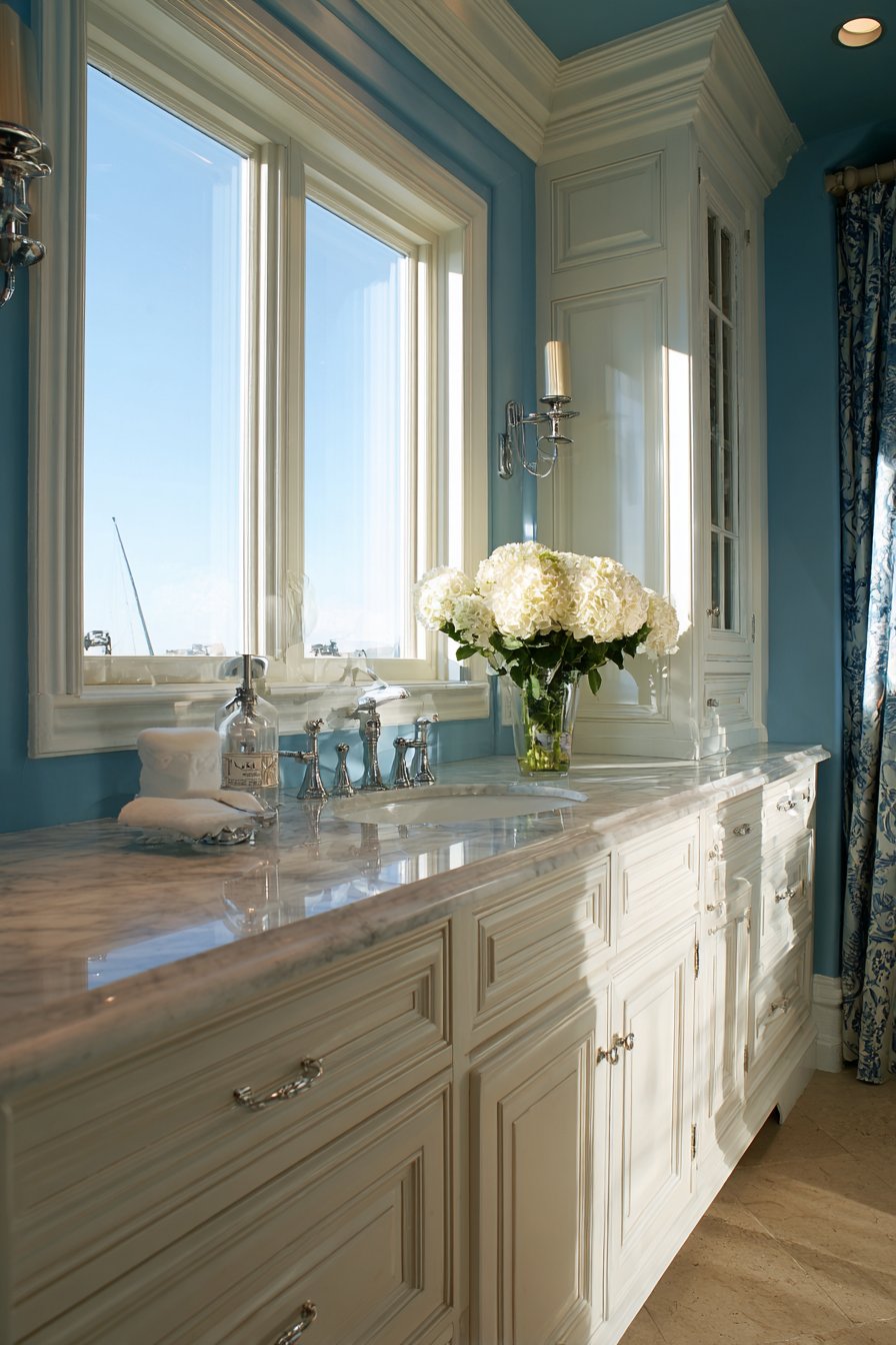
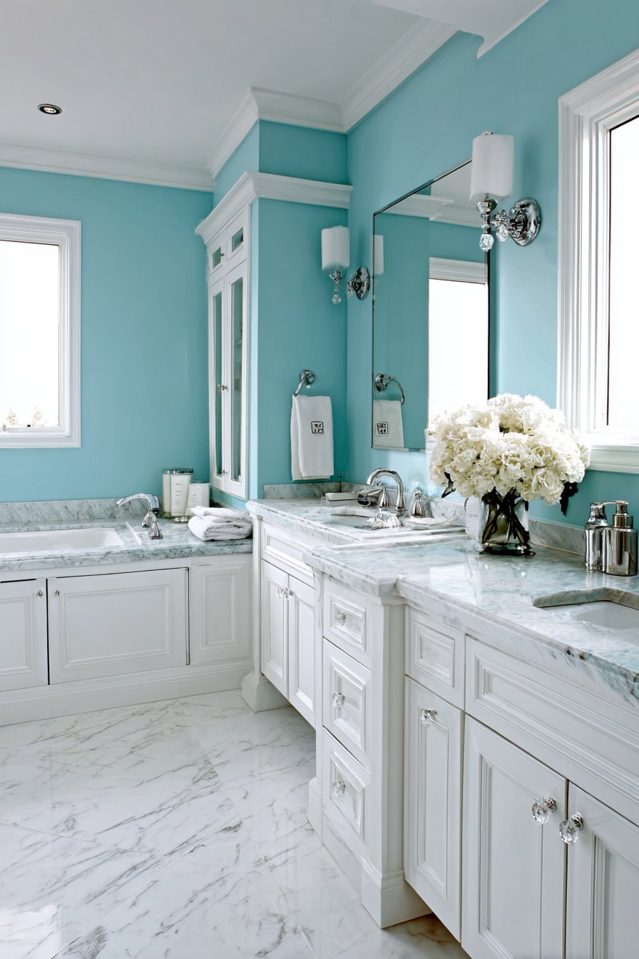
4. Coastal Blue and Sandy Beige
Bringing the serenity of the shoreline into your home creates a perpetual vacation atmosphere. A palette of coastal blue paired with sandy beige captures the essence of beach living regardless of your geographic location. This combination evokes the meeting point of sea and sand, creating spaces that feel airy, relaxed, and effortlessly elegant. The blue can range from soft sky tones to deeper ocean hues depending on your preference and the room’s natural light, while beige grounds the scheme with warm neutrality. This pairing works particularly well in bedrooms, bathrooms, and living spaces where a calming atmosphere is desired.
The beauty of this coastal combination lies in its inherent balance. Blue, particularly in lighter shades, can sometimes feel cold or sterile, but the warm sandy beige provides the necessary counterpoint to create comfort. Consider painting the majority of walls in soft blue while using beige for an accent wall, or reverse this for a predominantly neutral space with blue as the highlight. Alternatively, blue walls with beige trim and ceiling creates a wrapped feeling that’s cozy rather than overwhelming. The scheme also provides an excellent foundation for incorporating white elements, natural textures like rope and driftwood, and nautical-inspired accessories without veering into overly themed territory.
Finish selection significantly impacts how these colors perform in your space. Blue walls in a matte or flat finish create a softer, more diffused appearance that enhances the calming quality, while satin or eggshell finishes add subtle sheen that can make a room feel slightly more formal. For beige, a warmer undertone prevents the color from appearing gray or lifeless—look for beige with peachy or golden notes rather than those with gray undertones. The interplay between blue and beige also allows for layering different shades within each color family. You might use two or three shades of blue in varying intensities to create depth while maintaining the monochromatic coastal feeling.
Key Design Tips: Choose blue shades with gray undertones for a sophisticated coastal look rather than primary blue which can feel juvenile. Ensure your beige has warm undertones to provide adequate contrast and prevent a washed-out appearance. Incorporate natural textures like linen, sisal, and weathered wood to enhance the coastal atmosphere. Use white strategically on trim, doors, and ceiling to add crispness and prevent the color combination from feeling muddy. Consider the room’s exposure—south-facing rooms can handle cooler blues while north-facing spaces benefit from warmer blue tones.
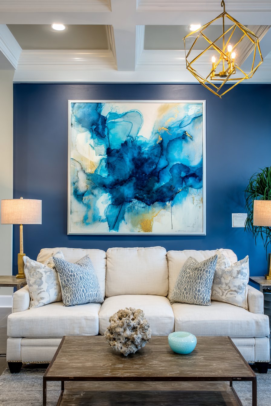
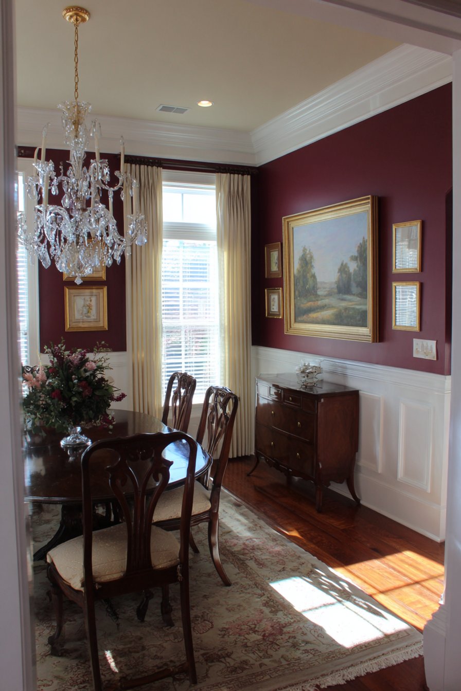
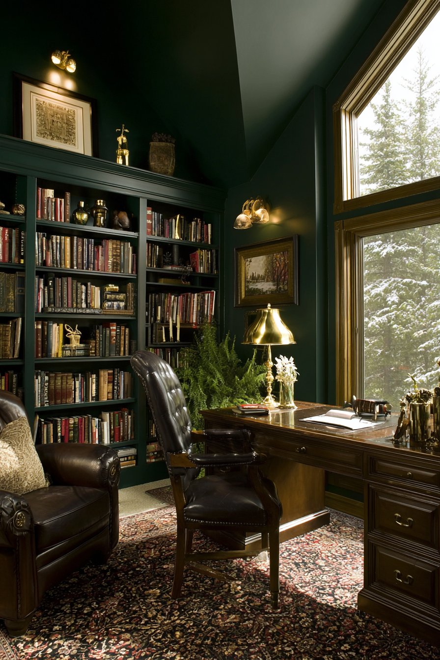
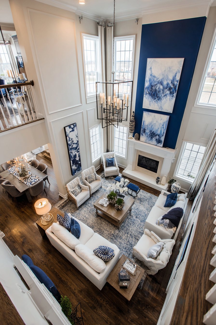
5. Sophisticated Navy and Gold Accent
For spaces demanding elegance and drama, few combinations rival navy blue walls with gold accents. This pairing channels classic luxury with a modern sensibility, creating rooms that feel both timeless and current. Navy provides depth and richness without the severity of black, while gold introduces warmth and glamour. This scheme works beautifully in formal living rooms, dining rooms, home offices, or master bedrooms where you want to create an enveloping, jewel-box atmosphere. The key to success lies in balancing the dark navy with adequate lighting and strategic placement of gold elements.
Navy paint on walls creates an immediately sophisticated backdrop that makes artwork, mirrors, and decorative objects stand out dramatically. The color has the unique ability to feel both bold and neutral, serving as a versatile canvas for various design styles from traditional to contemporary. When incorporating gold, consider it as an accent rather than a dominant color—gold-painted trim, gold-leafed ceiling details, gold hardware on furniture and cabinetry, or gold-framed mirrors and artwork. The warm metallic provides the necessary contrast to prevent navy from feeling too cool or somber, while adding an element of luxury that elevates the entire space.
The technical execution of this color scheme requires attention to detail. Navy paint often requires multiple coats for even coverage, and proper wall preparation is essential to avoid visible flaws that dark colors can emphasize. Consider using a tinted primer to reduce the number of topcoats needed. For gold accents, decide whether you want true gold, champagne gold, or brushed brass tones—each creates a different effect against navy. True gold feels more traditional and opulent, while brushed brass or champagne gold reads as more contemporary and understated. Lighting becomes crucial in navy rooms; layer ambient, task, and accent lighting to ensure the space feels inviting rather than cave-like.
Key Design Tips: Paint a sample board in navy and live with it in your space for several days to ensure you’re comfortable with the depth of color. Incorporate cream or white elements to provide visual relief and prevent the navy from overwhelming the space. Use warm white light bulbs rather than cool white to enhance the richness of navy and the glow of gold accents. Consider navy on just one or two walls if full-room application feels too intense for your comfort level. Add reflective surfaces like mirrors and glass to bounce light around and prevent the dark walls from absorbing too much brightness.
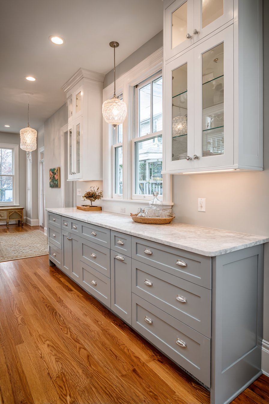
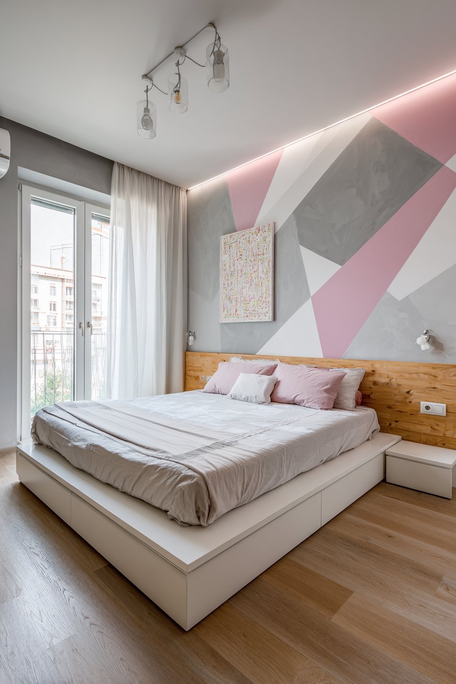
6. Blush Pink and Gray Harmony
The combination of blush pink and gray creates a sophisticated, contemporary palette that works far beyond traditionally feminine spaces. This pairing has gained tremendous popularity for its ability to feel both soft and grounded, romantic yet modern. Blush—a muted pink with peachy or mauve undertones—brings warmth and gentleness, while gray provides the necessary stability and sophistication to prevent the pink from feeling juvenile or overly sweet. This combination works beautifully in bedrooms, nurseries, living rooms, and even home offices where you want to create a calm yet inspiring environment.
The success of this color scheme depends heavily on tone selection. The gray should be true gray rather than one with strong blue or green undertones, as these can clash with the warm tones in blush pink. Medium to light grays work best, as they provide contrast without creating harsh division. For the blush, avoid anything too bright or saturated—you want a muted, dusty pink that feels sophisticated rather than candy-like. Consider painting three walls in soft gray with one accent wall in blush, or reverse this for a predominantly pink space with gray providing anchoring contrast. Gray on trim and molding with blush walls creates traditional elegance, while blush trim against gray walls offers a more contemporary twist.
Texture and finish contribute significantly to how this color combination performs. Blush in a matte finish emphasizes its softness and creates a chalky, sophisticated appearance, while a slight sheen adds subtle glamour. Gray walls in matte or eggshell finishes feel more contemporary and relaxed, while satin finishes add formality. The combination also provides an excellent foundation for metallic accents—rose gold and copper complement the warm pink tones beautifully, while chrome and silver work harmoniously with the cool gray. This flexibility allows you to adjust the overall feel of the space through your hardware, lighting fixture, and accessory choices.
Key Design Tips: Test your chosen blush and gray together as paint samples can appear quite different from small chips. Use true gray without undertones to ensure it coordinates rather than clashes with the warm blush tones. Incorporate white elements through trim, ceiling paint, or furnishings to add crispness and prevent the combination from feeling too muted. Consider varying the intensity of gray—perhaps a medium gray on walls with lighter gray trim for subtle dimension. Add greenery and natural wood tones to ground the palette and prevent it from feeling too cool or overly matched.
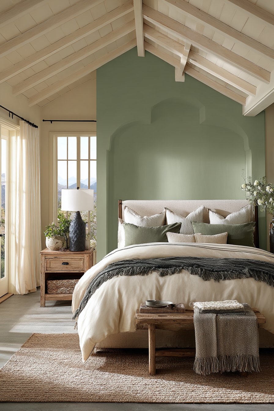
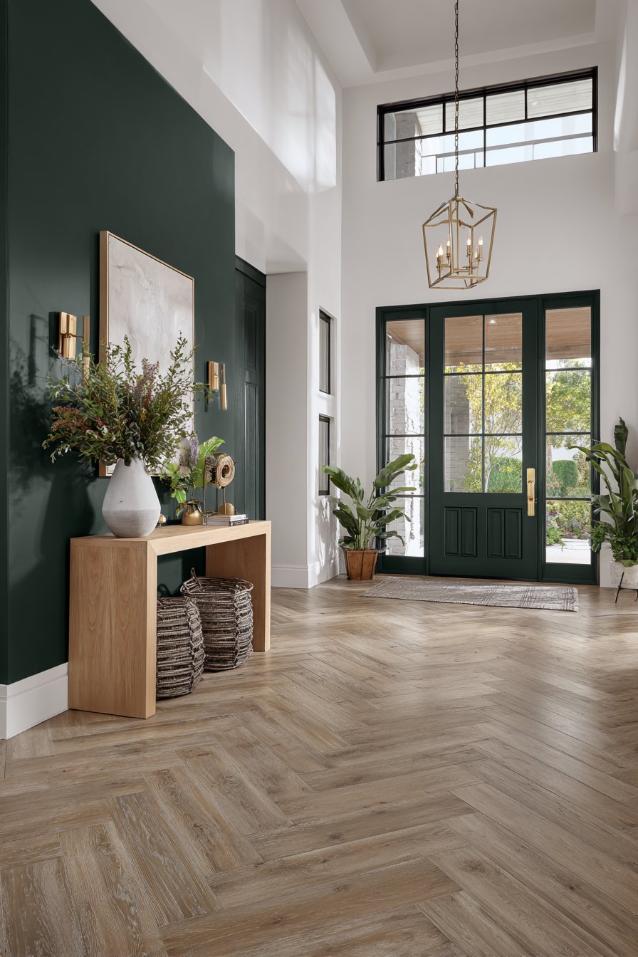
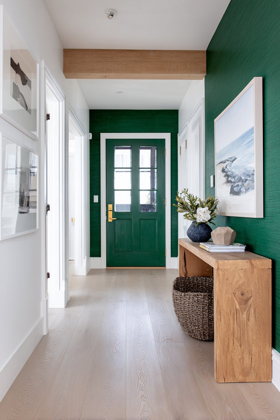
7. Forest Green Feature Wall
A forest green feature wall delivers instant sophistication and natural elegance. This deep, rich green connects interior spaces to the natural world while providing a dramatic backdrop that enhances rather than overwhelms. Unlike brighter greens that can feel overwhelming or difficult to live with, forest green’s depth and complexity make it remarkably versatile and livable. This approach works exceptionally well when you want to create a focal point without committing to bold color throughout an entire room. The feature wall technique allows you to experiment with dramatic color while maintaining overall balance and brightness.
Selecting the right wall for your forest green feature is crucial to the success of this design approach. The best candidates are walls that naturally draw attention—behind a bed in a bedroom, behind a sofa in a living room, or the wall featuring a fireplace. The architectural qualities of the wall matter too; one with interesting details like paneling, built-in shelving, or a beautiful window can be further enhanced by the rich color. Keep the remaining walls in neutral tones like cream, soft gray, or warm white to allow the green to shine without creating visual competition. The contrast between the dark feature wall and lighter surrounding walls creates depth and dimension that makes the space feel larger rather than smaller.
The finish you select for your forest green wall significantly impacts the final effect. A matte or flat finish emphasizes the wall’s depth and creates a sophisticated, almost velvety appearance that absorbs light in a beautiful way. Eggshell or satin finishes add subtle luminosity and are more practical in high-traffic areas as they’re easier to clean. Consider the room’s lighting when making your finish choice—rooms with abundant natural light can handle the light-absorbing quality of flat finishes, while spaces with limited windows benefit from finishes with slight sheen to reflect available light. The forest green also serves as an excellent backdrop for displaying artwork, creating a gallery-like quality that makes colors in artwork appear more vivid.
Key Design Tips: Choose a forest green with slight blue undertones for a more sophisticated appearance, avoiding yellowy greens that can appear muddy. Ensure adequate lighting on and around the feature wall to prevent it from appearing as a dark void. Paint the adjacent walls in warm white or cream rather than stark white to create harmonious transition. Consider the scale of furniture and art that will be placed against the wall—the dark background requires appropriately sized pieces to avoid being overwhelmed. Use brass, gold, or warm wood tones against the green rather than chrome or silver for the most flattering contrast.
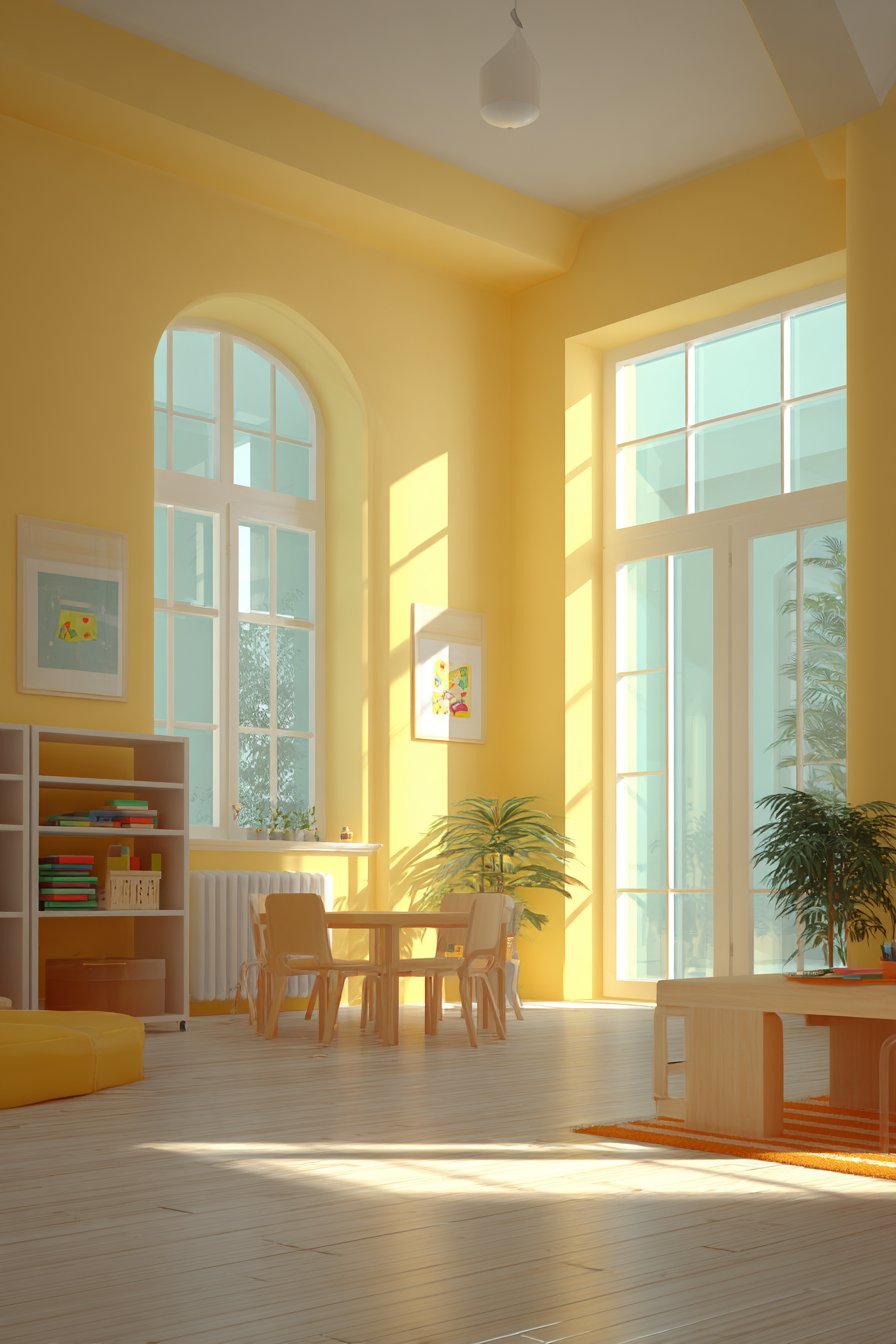
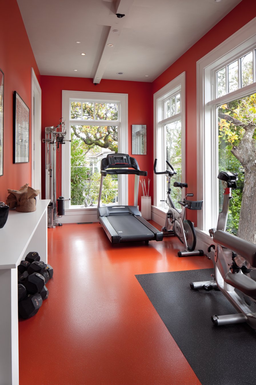
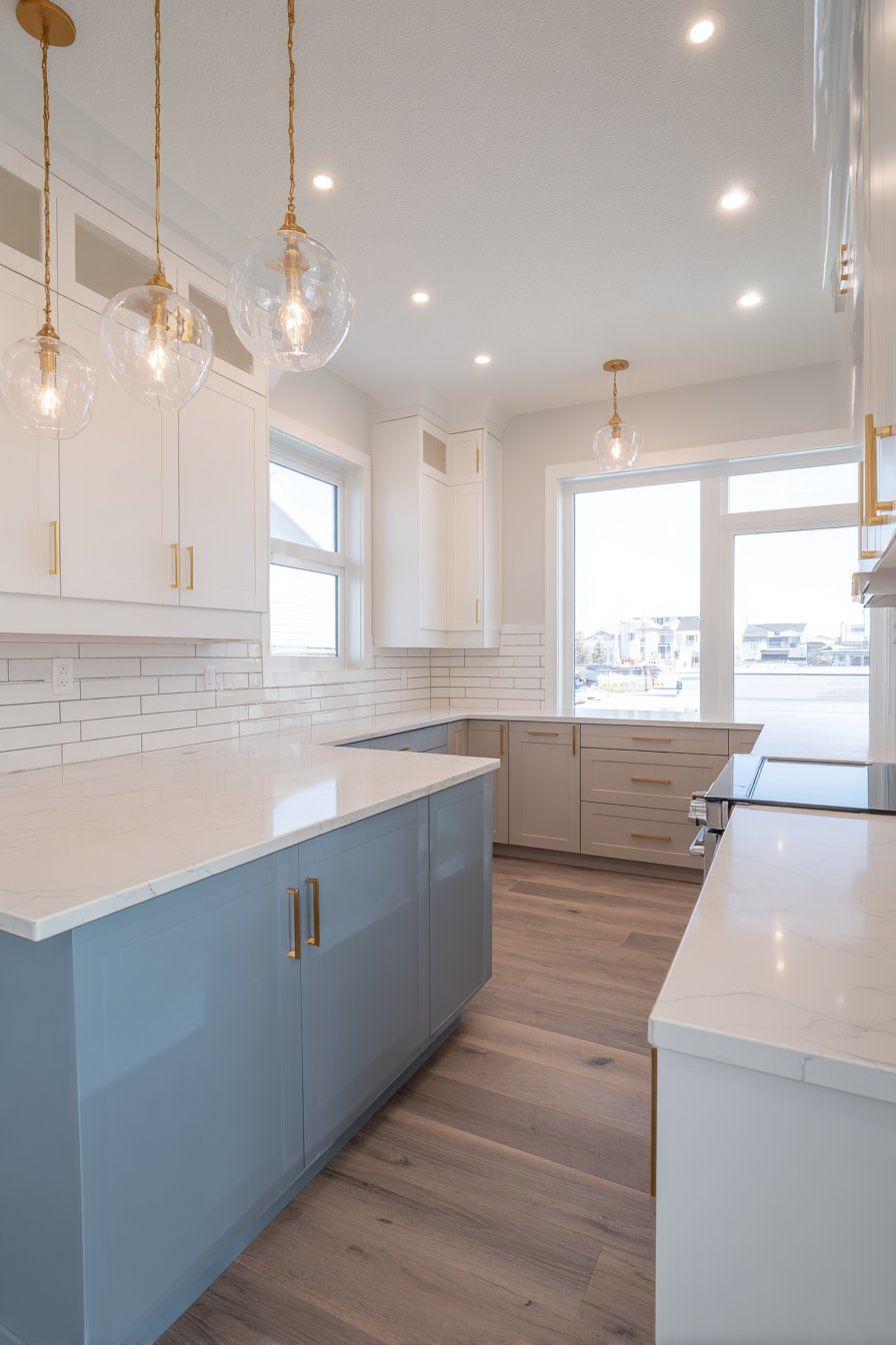
8. Sunshine Yellow Kitchen Energy
Few colors energize a space quite like carefully chosen yellow. In kitchens—the heart of the home where families gather and meals are prepared—yellow paint creates an atmosphere of warmth, optimism, and vitality. The key to successfully incorporating yellow lies in selecting the right shade and intensity. Avoid overly bright, primary yellows that can feel overwhelming and instead opt for softer, more sophisticated tones like butter yellow, golden yellow, or pale lemon. These gentler interpretations provide the uplifting quality of yellow without the visual assault that can occur with more saturated versions.
Yellow’s remarkable ability to reflect and amplify light makes it particularly effective in kitchens, which often benefit from as much brightness as possible. This is especially true for kitchens with limited natural light, where yellow walls can significantly improve the sense of illumination. Consider painting upper cabinets or just the walls in yellow while keeping lower cabinets in neutral tones for balance, or vice versa. Yellow also pairs beautifully with white cabinetry and trim, creating a clean, classic combination that feels both fresh and timeless. For a more contemporary approach, combine yellow walls with gray cabinets or stainless steel appliances for sophisticated contrast.
The undertones in your yellow selection matter tremendously. Yellows with warm, golden undertones create a cozy, traditional feel and pair beautifully with honey-toned wood and brass fixtures. Yellows with cooler, lemony undertones feel more contemporary and work well with chrome hardware and marble or quartz countertops. Consider the color temperature of your lighting as well—warm white bulbs enhance golden yellows while appearing slightly jarring against cool-toned yellows, and vice versa for cool white bulbs. Testing samples in your actual kitchen lighting at different times of day is essential, as yellow can appear dramatically different under various light conditions.
Key Design Tips: Select softer, muted yellow tones rather than saturated shades to ensure the color remains comfortable to live with long-term. Pair yellow with crisp white trim and cabinetry to create definition and prevent color overwhelm. Use yellow on just upper walls above white or neutral lower cabinets for balanced color distribution in smaller kitchens. Consider the existing elements in your kitchen—yellow works beautifully with natural wood but can clash with certain countertop colors, so test thoroughly. Add plants and natural materials to create connection between the sunny walls and organic elements.
9. Moody Plum Bedroom Retreat
For those seeking to create a truly distinctive sleeping space, moody plum offers depth, richness, and unexpected sophistication. This complex purple-red hybrid brings together the regal qualities of purple with the warmth of red, resulting in a color that feels both luxurious and intimate. Plum works exceptionally well in bedrooms where you want to create a cocooning, romantic atmosphere conducive to rest and relaxation. The color’s inherent drama means it’s best suited for spaces where you can commit fully to the mood—half-hearted application of such a distinctive color rarely succeeds.
The psychology of color supports plum as an excellent bedroom choice. Purple tones are associated with creativity, luxury, and introspection, while the red undertones add warmth that prevents the space from feeling cold. This combination creates an environment that feels both stimulating enough to be interesting and calming enough for sleep. When painting a bedroom in plum, consider how the color will appear under both natural daylight and artificial evening light—plum walls can appear quite different at bedtime versus morning. Layer your lighting carefully, incorporating dimmer switches that allow you to control the intensity and mood as needed throughout the day.
Balancing plum’s intensity requires thoughtful consideration of accompanying elements. Crisp white trim, bedding, and ceiling paint provide necessary visual relief and prevent the color from overwhelming the space. Metallic accents in gold, brass, or rose gold complement plum’s warm undertones beautifully, adding glamour and light reflection. Natural wood furniture works well against plum walls, though lighter woods create more contrast than dark woods. Consider the proportions of your bedroom as well—plum can make a large bedroom feel more intimate and cozy, while in a very small bedroom, it might feel too enveloping. An accent wall behind the bed in plum with lighter walls elsewhere can provide the drama with more breathing room.
Key Design Tips: Prime walls thoroughly before applying plum, as deep colors require proper base preparation for even coverage. Choose plum with red rather than blue undertones for warmth that enhances the bedroom’s cozy factor. Incorporate plenty of lighting layers including bedside lamps, overhead fixtures, and perhaps accent lighting to prevent the room from feeling too dark. Use luxurious textures like velvet, silk, and faux fur to enhance the rich, sophisticated mood the color creates. Balance the dark walls with light-colored flooring or large area rugs to maintain visual connection to brightness.
10. Crisp White with Colored Ceiling
The often-overlooked ceiling presents a unique opportunity for creative painting that can dramatically alter a room’s character. While white walls have long been a safe default, painting ceilings in color while keeping walls white or neutral creates unexpected visual interest and can solve various design challenges. This approach works beautifully in rooms with high ceilings that you want to feel more intimate, in spaces where you want to draw the eye upward to appreciate architectural details, or simply when you want to introduce color in a subtle, sophisticated way.
Color choice for ceilings should be intentional and connected to the room’s purpose and existing elements. Soft blue ceilings evoke sky and create a sense of expansiveness even while bringing the ceiling visually lower. Pale pink or peach ceilings cast a flattering, warm glow on everything below. Deeper colors like navy, charcoal, or even black can make high ceilings feel more grounded and intimate, particularly effective in bedrooms where a cocooning feeling is desirable. The colored ceiling technique also works beautifully in rooms with interesting architectural details—painting coffered ceilings, tray ceilings, or ceiling beams in contrasting colors highlights these features beautifully.
Technical execution matters when painting ceilings in color. Proper preparation including patching any imperfections is essential, as ceiling imperfections become more visible with non-white paint. Consider the sheen carefully—flat paint minimizes imperfections but shows marks more easily, while slight sheen adds subtle elegance and is more cleanable. The relationship between ceiling color and lighting is also crucial. Warm white bulbs enhance warm ceiling colors while cool white bulbs complement cooler tones. Consider how the colored ceiling will cast tinted light on the walls below—this can be a beautiful effect but should be anticipated rather than surprising.
Key Design Tips: Select ceiling colors that are lighter or more muted than you think necessary, as horizontal surfaces appear more intense than vertical ones. Test your chosen color on a large board held up to the ceiling before committing to painting the entire surface. Use painter’s tape carefully where ceiling meets walls to create crisp, professional lines. Consider painting walls in bright white rather than off-white to maximize the impact of the colored ceiling contrast. Plan for adequate ventilation during ceiling painting as fumes accumulate more intensely when working overhead.
11. Two-Tone Horizontal Wall Division
Creating visual interest through two-tone horizontal wall division offers sophisticated style with traditional roots. This technique—painting walls in two different colors divided by a horizontal line—adds architectural interest to spaces that may lack distinctive features. The classic approach places darker color on the bottom third to half of the wall with lighter color above, creating a wainscoting effect without the expense and installation of actual woodwork. This division grounds the space visually while adding dimension and character that single-color walls cannot achieve.
The proportions of your two-tone division significantly impact the overall effect. Traditional chair rail height—approximately one-third up the wall—creates classic elegance and works well in formal dining rooms, hallways, and living spaces. Dividing the wall precisely at the midpoint creates more contemporary symmetry, while placing the division higher—perhaps two-thirds up the wall—produces a more dramatic, unexpected look. Color selection matters equally to proportion. Classic combinations include darker bottom sections in colors like navy, forest green, or charcoal with lighter tops in cream, soft gray, or pale blue. The darker bottom section has the practical advantage of hiding scuffs and marks in high-traffic areas.
Executing crisp, professional-looking division requires careful planning and proper technique. Use a level and measuring tape to mark the division line precisely around the entire room—variations in height will be immediately visible and appear sloppy. Paint the lighter color first across the entire wall, allow it to dry completely, then tape off the division line and paint the darker color. Remove the tape while the paint is still slightly wet to prevent peeling. Consider adding actual molding along the division line after painting for enhanced dimension and a finished look that hides any imperfections where colors meet. This molding can be painted in either the top color, bottom color, or white for varied effects.
Key Design Tips: Ensure both paint colors have compatible undertones—warm with warm or cool with cool—for harmonious visual flow. Use low-tack painter’s tape designed for delicate surfaces to prevent paint peeling when removing tape. Calculate the division height based on the room’s specific proportions rather than using a standard measurement. Consider the room’s furnishings—the color division should work with rather than compete with furniture heights. Add crown molding and baseboards painted in accent colors to create complete traditional elegance.
12. Gradient Ombre Effect
For those seeking truly artistic walls, the ombre or gradient technique creates stunning visual impact. This approach blends one color into another, typically moving from dark at the bottom to light at the top or vice versa, creating a seamless transition that adds depth and movement to walls. Ombre painting requires more skill and patience than standard painting but delivers results that feel custom and artistic. This technique works beautifully in bedrooms, nurseries, accent walls, or any space where you want to create a focal point that feels both sophisticated and whimsical.
Successful ombre execution begins with careful planning. Select your color range—monochromatic ombre uses varying shades of a single color, while more adventurous versions transition between related colors like blue to purple or pink to orange. Purchase or mix at least four to five shades ranging from darkest to lightest. Working with wet paint is essential for ombre, as you’ll be blending colors while they’re still wet to create seamless transitions. This means working in manageable sections and potentially with a partner. The darkest color typically goes at the bottom, with colors gradually lightening as you move upward, though reversing this creates interesting effects too.
Technique varies among painters, but most successful ombre walls are created by painting horizontal bands of color—darkest at bottom, lightest at top—then using a large dry brush, sponge, or even a spray bottle with water to blend where colors meet while paint is still wet. Work quickly and step back frequently to assess the overall effect from a distance. The goal is gradual, imperceptible transition rather than obvious stripes. Consider the room’s lighting—ombre effects appear most dramatic with even lighting that illuminates the entire wall uniformly. The technique works on any wall but creates the most impact on larger, uninterrupted walls without windows or doors breaking the gradient flow.
Key Design Tips: Practice your ombre technique on large poster board before attempting the actual wall. Work with a partner—one person paints while the other blends for more efficient execution before paint dries. Choose colors that are closely related on the color wheel for the most natural-looking gradients. Consider starting with lighter, more subtle color transitions for your first ombre wall rather than dramatic dark-to-light jumps. Protect flooring thoroughly as this technique involves more paint manipulation and potential drips than standard painting.
13. Geometric Color Blocking
Geometric color blocking transforms walls into modern art installations through strategic placement of bold color shapes. This technique involves painting distinct geometric shapes—rectangles, triangles, circles, or abstract forms—in contrasting colors to create graphic, contemporary statements. Unlike traditional accent walls that cover an entire surface in a single color, color blocking creates dynamic visual interest through shape interaction and color relationships. This approach works brilliantly in modern and contemporary spaces, children’s rooms, creative studios, or anywhere you want to make a bold, youthful statement.
Planning geometric color blocking requires both artistic vision and mathematical precision. Sketch your design on paper first, determining the size, shape, and placement of each colored block. Use painter’s tape to mark out your shapes on the wall, ensuring clean lines and precise corners. The background color—often white or light neutral—should be painted first and allowed to dry completely before taping and painting subsequent colors. Work from lightest to darkest colors when overlapping shapes to ensure proper coverage. The shapes can be orderly and symmetrical for a structured, calming effect, or random and asymmetrical for more energetic, playful spaces.
Color selection makes or breaks geometric blocking. Monochromatic schemes using varying shades of one color create sophisticated, cohesive looks. Analogous color schemes—colors adjacent on the color wheel like blue, blue-green, and green—provide harmony with variety. Complementary colors—opposites on the color wheel like blue and orange—create vibrant, high-energy statements. Consider the room’s overall palette and ensure your color blocking complements rather than clashes with furnishings. The proportion of each color matters too—generally, one color should dominate with others used as accents to avoid visual chaos.
Key Design Tips: Use level and measuring tape to ensure geometric shapes are properly aligned and sized according to your plan. Invest in quality painter’s tape and press edges firmly to prevent paint bleeding under tape. Remove tape while paint is still slightly wet for cleanest lines without peeling. Consider the room’s function—busy color blocking works well in active spaces but can be overstimulating in bedrooms. Photograph your wall from multiple angles and distances to ensure the design works both close-up and from across the room.
14. Textured Paint Finishes
Beyond color selection, the texture of paint itself offers rich opportunities for creating dimensional, interesting walls. Textured paint finishes add tactile and visual depth that flat color cannot achieve, creating surfaces that interact with light throughout the day. Techniques range from subtle to dramatic: sponging creates gentle, mottled effects; ragging produces soft, fabric-like patterns; stippling delivers fine, dotted texture; and Venetian plaster creates polished, marble-like surfaces. These finishes work beautifully in formal living rooms, dining rooms, powder rooms, or any space where you want to create something special beyond standard painted walls.
Each texture technique requires specific tools and methods. Sponging involves applying glaze or paint with a natural sea sponge over a base coat, creating organic, cloud-like patterns. Ragging uses crumpled cloth to apply or remove glaze, producing subtle, romantic texture. Color washing creates translucent, watercolor-like effects by applying thinned paint over base coats. Venetian plaster—the most complex technique—involves applying multiple thin layers of plaster with specialized tools, burnishing each layer to create depth and sheen. Strie creates fine, lined texture by dragging stiff brushes through wet glaze. Your choice depends on desired effect, skill level, and the formality of the space.
Successful textured finishes begin with proper wall preparation—imperfections that might hide under flat paint become emphasized by textured techniques, so surfaces must be smooth and clean. Practice your chosen technique on large sample boards first, as these finishes require different skills than standard painting. Consider the scale of the texture relative to room size—small rooms benefit from subtle textures while large spaces can handle more dramatic finishes. Lighting dramatically affects how texture appears; shadows cast by dimensional surfaces create depth that changes throughout the day. Textured walls also provide excellent backgrounds for artwork and mirrors, as the dimensional surface adds interest without competing visually.
Key Design Tips: Start with less dramatic textures like sponging or color washing before attempting complex finishes like Venetian plaster. Choose colors with enough contrast between base coat and texture coat to make the technique visible without being overwhelming. Work in small sections to maintain wet edges and ensure consistent texture application. Consider hiring professionals for specialized finishes like Venetian plaster to ensure quality results. Seal textured walls with clear protective finish in high-touch areas to maintain appearance and ease cleaning.
15. Striped Accent Walls
Painted stripes deliver classic elegance with versatile style options. Vertical stripes can visually heighten ceilings, horizontal stripes expand perceived room width, and varied stripe widths create rhythm and movement. This technique works beautifully in traditionally styled homes, children’s rooms, bathrooms, and feature walls in living spaces. Stripe patterns range from classic equal-width repeating stripes to more contemporary unequal widths, from monochromatic tone-on-tone subtlety to bold contrasting colors. The key to successful striped walls lies in precise measurement, careful taping, and strategic color selection.
Planning striped walls requires mathematical precision. Measure the wall width and divide by your desired number of stripes, adjusting as necessary to ensure stripes end at corners symmetrically. For vertical stripes, start at the room’s focal point—usually the center of the wall—and work outward to ensure balanced appearance. Use level and measuring tape to mark stripe positions lightly in pencil, then apply painter’s tape along these lines. Paint the base color first—typically the lighter of your two colors—allow to dry completely, tape off stripes, then paint the second color. The tape placement determines whether stripes will be sharp and graphic or slightly softer.
Color and width choices dramatically affect the final impression. Thin stripes create refined, formal elegance, while wide stripes feel more casual and contemporary. Monochromatic stripes—varying shades of one color—provide sophisticated subtlety perfect for adult spaces. High-contrast stripes—navy and white, black and cream—create bold statements suited to modern aesthetics. Metallic stripes alternating with solid colors add glamour and light reflection. Consider the room’s existing elements when choosing stripe direction—vertical stripes work beautifully in rooms with low ceilings, while horizontal stripes can make narrow rooms feel wider. The proportions matter too; generally, stripes should be wide enough to be appreciated but not so wide they read as color-blocking rather than stripes.
Key Design Tips: Invest in quality painter’s tape and press edges firmly with a credit card or similar tool to prevent paint bleeding. Paint a coat of the base color over tape edges before applying the stripe color to seal the tape and ensure crisp lines. Remove tape at a 45-degree angle while paint is still slightly wet to prevent peeling. Consider tone-on-tone stripes in similar values for sophisticated subtlety that adds interest without overwhelming. Ensure stripe width and spacing are proportional to room size—larger rooms can handle wider stripes while small spaces benefit from narrower stripes.
16. Chalkboard Paint Feature Wall
Chalkboard paint offers both aesthetic appeal and practical functionality, transforming walls into interactive surfaces perfect for family homes, home offices, and creative spaces. Available in traditional black as well as numerous colors including navy, green, and gray, chalkboard paint creates matte, writable surfaces that invite interaction and creativity. This approach works brilliantly in kitchens for grocery lists and meal planning, in children’s rooms for creative expression, in home offices for brainstorming, and even in dining rooms where you can write menu details for dinner parties.
Successful chalkboard walls require proper surface preparation and application technique. Walls must be extremely smooth as imperfections become magnified under the ultra-matte chalkboard finish. Prime walls with appropriate primer—many chalkboard paints require specific primers for proper adhesion. Apply chalkboard paint in thin, even coats, typically requiring three coats for optimal coverage and performance. Allow each coat to dry completely before applying the next. After final coat application, wait three to five days before conditioning the surface—rubbing the entire surface with chalk on its side, then erasing completely. This prevents ghosting where the first marks become permanent.
Strategic placement maximizes chalkboard wall functionality while maintaining design integrity. A full wall can feel overwhelming, so consider a large rectangular section framed with decorative molding, creating the appearance of an oversized framed chalkboard. This approach contains the matte surface visually while still providing ample writing space. Alternatively, paint a wide horizontal band at convenient height for writing and drawing. In children’s rooms, position chalkboard paint in lower sections where kids can easily reach. Pair chalkboard walls with practical elements—a small shelf below for chalk and eraser storage, or a narrow rail for hanging chalk bags. Remember that chalkboard surfaces don’t reflect light, so ensure adequate artificial lighting prevents these walls from creating dark spots.
Key Design Tips: Choose chalkboard paint color that complements rather than contrasts sharply with surrounding walls for cohesive appearance. Frame chalkboard areas with decorative molding to create intentional, finished looks. Consider magnetic chalkboard paint for added functionality, allowing magnets to hold papers and images. Place chalkboard walls away from upholstered furniture to prevent chalk dust settling on fabrics. Include convenient storage nearby for chalk, erasers, and possibly wet cleaning cloths for maintaining clear, clean surfaces.
17. Metallic Accent Strokes
Incorporating metallic paint creates luminous accents that catch and reflect light beautifully. Rather than painting entire walls in metallics—which can appear garish or overwhelming—strategic metallic accents add glamour and visual interest while maintaining sophistication. Metallic paints now come in various finishes including gold, silver, copper, bronze, and even rose gold, allowing you to complement any color scheme. These special-effect paints work beautifully as accents on feature walls, ceiling details, trim, doors, or within patterns and designs.
Application methods for metallic paints vary depending on desired effect. For subtle shimmer, mix small amounts of metallic paint into your wall color, creating walls that glow gently when light hits them—particularly beautiful in dining rooms and bedrooms. For more dramatic effect, use metallic paint to highlight architectural details like crown molding, ceiling medallions, or picture frame molding. Create geometric patterns or stripes with metallic paint against matte-finished walls for contemporary contrast. Ombre effects that fade from solid color to metallic create stunning feature walls. Stenciling with metallic paint adds pattern and shine simultaneously—large-scale damask or geometric patterns in metallic over solid-colored walls deliver traditional elegance or modern style depending on pattern choice.
Metallic paints behave differently than standard paints, requiring adjusted technique. They tend to show brush strokes and roller marks more readily, so application must be more careful and consistent. Foam rollers often produce better results than standard nap rollers for smooth metallic application. The surface preparation must be impeccable, as metallics highlight rather than hide wall imperfections. Consider the room’s lighting carefully—metallic paints perform best in spaces with good natural or artificial light that allows their reflective properties to shine. In dimly lit spaces, metallic accents may not provide the impact you expect. The sheen of surrounding surfaces matters too; pair metallic accents with matte or eggshell-finished walls for maximum contrast and impact.
Key Design Tips: Test metallic paints on large sample boards as they appear dramatically different from small paint chips. Use metallics sparingly as accents rather than on large surfaces to avoid overwhelming shine. Choose metallic tones that complement your overall color scheme—gold with warm colors, silver with cool tones. Apply thin, even coats of metallic paint as thick application can appear uneven and clumpy. Consider the room’s style—traditional spaces suit gold and bronze while contemporary rooms work well with silver or gunmetal tones.
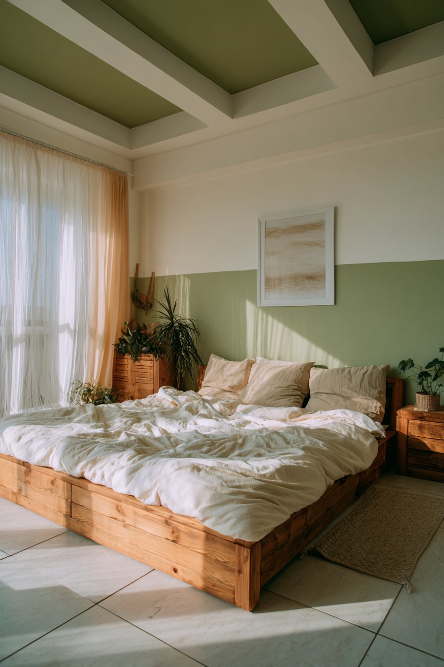
18. Color-Dipped Bottom Walls
The color-dipped technique creates the illusion that walls have been partially submerged in paint, with color covering the bottom portion and fading organically upward. Unlike crisp two-tone horizontal divisions, color-dipped walls feature graduated fading where colors meet, creating softer, more artistic transitions. This approach adds whimsy and visual interest while maintaining sophisticated appeal. The technique works beautifully in nurseries, children’s rooms, creative spaces, and contemporary living areas where you want personality without formality.
Executing the color-dip effect requires a blending technique similar to ombre. Begin by painting the lower portion of walls in your chosen color to desired height—typically one-third to halfway up the wall. While the paint is still wet, use a wide, clean dry brush or damp sponge to blend the top edge upward, creating a soft fade into the base wall color above. Work quickly and blend thoroughly for gradual transition rather than obvious demarcation. The goal is creating the appearance of dipped rather than painted walls. This technique works with any color but appears most effective with soft, muted tones rather than intensely saturated colors.
Color selection for dipped walls should complement the overall room palette while providing enough contrast to be visible. Soft blues, pinks, greens, or grays work beautifully against white or cream upper walls. The technique also works in reverse—dark upper sections fading down into lighter lower walls—though this creates a more unusual, artistic effect. Consider the room’s proportions when determining dip height; lower dips can ground spaces and hide lower wall wear in high-traffic areas, while higher dips create more dramatic impact. The soft, irregular top edge of the color creates organic, natural feeling that contrasts beautifully with the geometric lines of furniture and architectural elements.
Key Design Tips: Practice the blending technique on poster board before attempting the wall to develop consistent fading method. Work in sections small enough to complete before paint begins drying and becoming difficult to blend. Use paint with extended working time or add paint extender to give yourself more blending time. Consider using complementary colors for dipped effect and base wall for contemporary color theory application. Ensure adequate lighting during application to clearly see the fade effect you’re creating.
19. Monochromatic Layered Tones
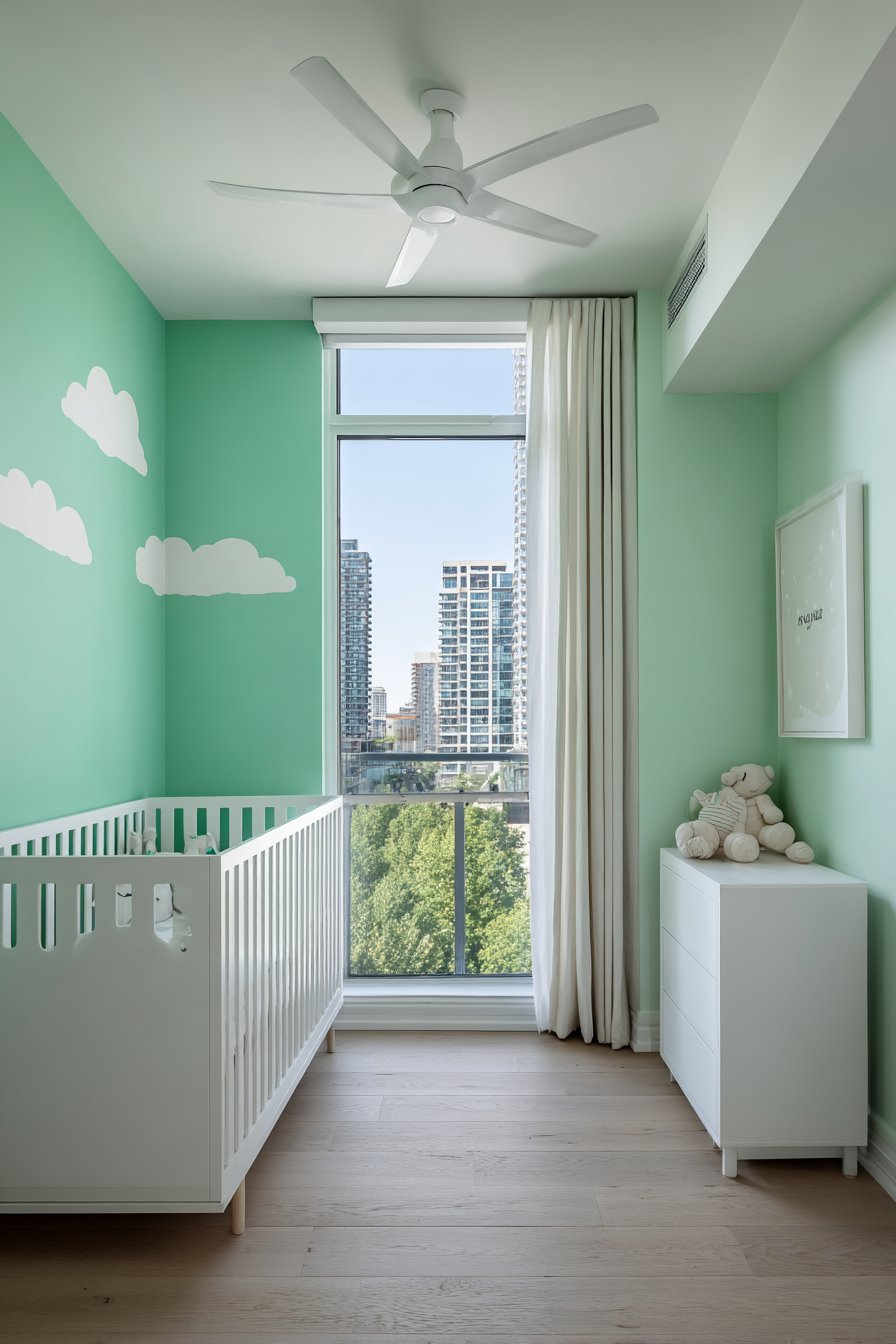
Monochromatic color schemes—multiple shades of a single color—create sophisticated, cohesive spaces with remarkable depth despite limited color range. This approach uses various tints, tones, and shades of one color throughout a room or on feature walls, creating visual interest through subtle variation rather than contrasting colors. Monochromatic schemes feel inherently calming and unified, working beautifully in bedrooms, bathrooms, living rooms, and anywhere you want to create serene, pulled-together atmosphere. The technique demonstrates that color depth and interest don’t require multiple colors, just thoughtful application of one.
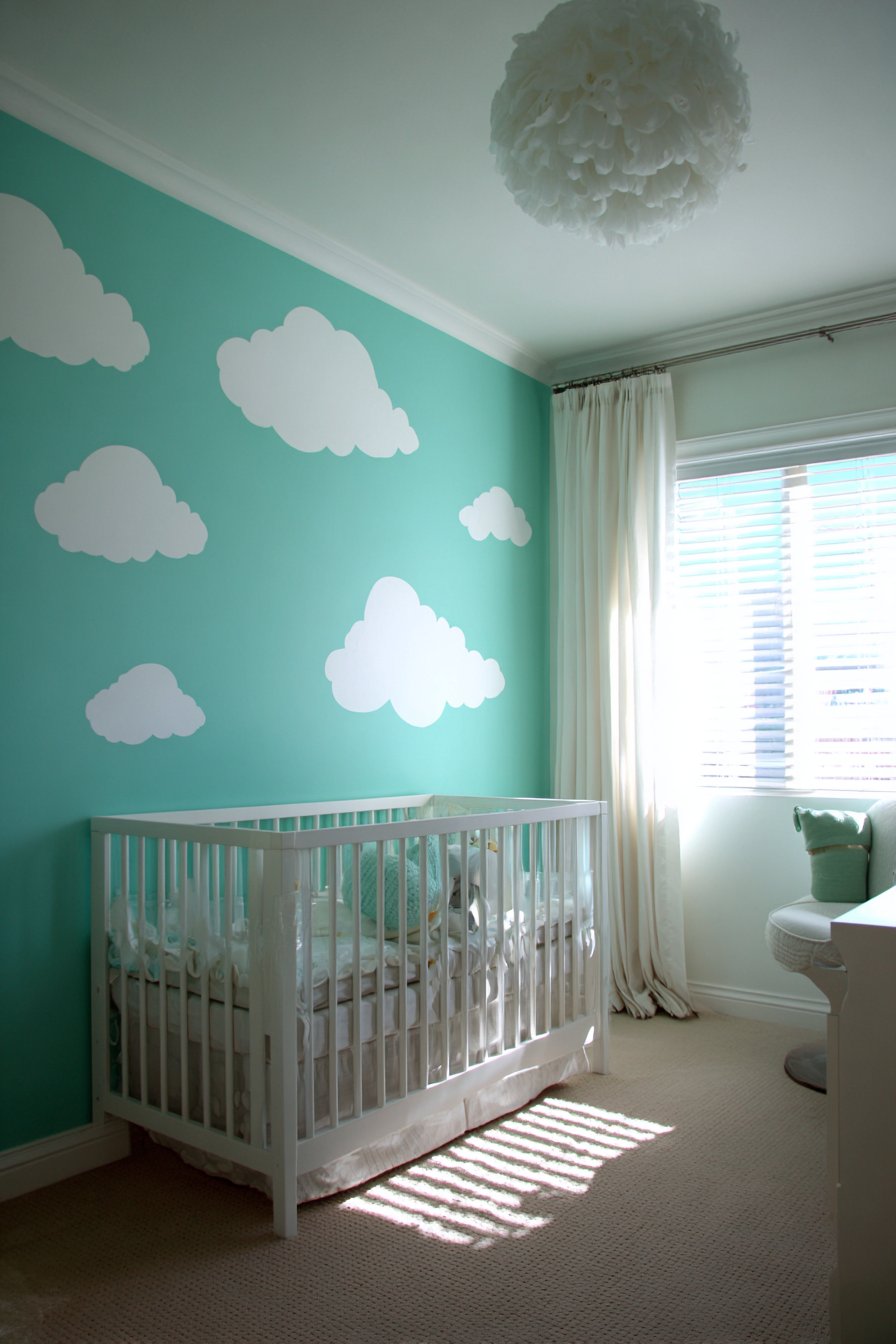
Creating successful monochromatic schemes requires strategic shade selection. Choose your base color, then select at least three to five variations—lighter tints, deeper shades, and varying intensities. For example, a blue monochromatic scheme might include pale sky blue, medium periwinkle, deeper slate blue, and navy, all working together harmoniously. Apply the lightest shades to ceilings and upper walls, medium tones to main wall surfaces, and deeper shades to accent walls, trim, or lower portions of walls. This graduated application creates dimension and prevents monochromatic schemes from appearing flat or one-dimensional. The eye reads the variations as depth rather than color contrast.
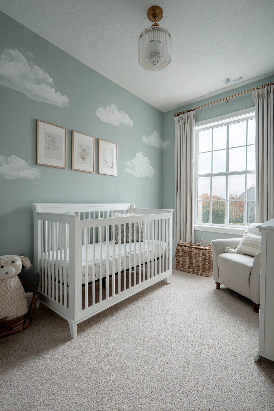
Texture becomes particularly important in monochromatic spaces where color variation is limited. Incorporate different finishes—matte on walls, slight sheen on trim, glossy on doors—to create subtle contrast. Layer various textures through furnishings, window treatments, and accessories to add visual interest beyond color. Consider incorporating pattern in your single color—geometric patterns, stripes, or organic designs all in varying shades of your chosen color add movement without introducing new colors. Metallic accents work beautifully in monochromatic schemes, adding glamour and light reflection while maintaining color cohesion. White accents provide crisp punctuation without disrupting the monochromatic flow.
Key Design Tips: Select your color family carefully as you’ll be living with various intensities of it throughout the space. Ensure adequate variety in your shade selection—too similar reads as unsuccessful color matching rather than intentional monochromatic design. Use the 60-30-10 rule with your shades—60% dominant shade, 30% secondary shade, 10% accent shade. Consider natural and artificial lighting as it will affect how each shade appears and relates to others. Add white or cream strategically to prevent the monochromatic scheme from feeling too heavy or monotonous.
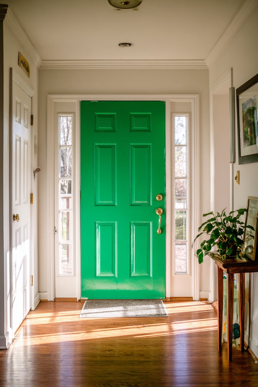
20. Accent Door Color Pop
While walls receive most painting attention, doors offer excellent opportunities for color experimentation with minimal commitment. Painting interior doors in bold colors creates instant personality and visual interest while requiring little paint and time. This approach works brilliantly when you want color impact without painting entire walls, when you have beautiful trim you want to highlight through contrast, or when you simply want to add unexpected elements to otherwise neutral spaces. Colorful doors create focal points and can unify spaces by repeating the same door color throughout your home.
Door color selection should be strategic rather than random. Consider the room’s overall palette and choose door colors that complement without matching exactly—matching reads as expected and therefore less impactful. Bold jewel tones like emerald green, sapphire blue, or amethyst purple create sophisticated statements against neutral walls. Soft pastels add cheerful personality without overwhelming smaller spaces. Black doors against white or light walls create classic, gallery-like contrast. Metallic paints on doors add glamour and catch light beautifully. Consider door style too—panel doors showcase multiple paint colors beautifully through painting panels in contrasting colors to frames, while flat slab doors provide clean canvases for solid color statements.
Technical execution ensures professional-looking results. Remove doors from hinges and paint horizontally on sawhorses for easiest application and best finish—this prevents drips and ensures even coverage. Paint all edges including the hinge edge for complete coverage. Use appropriate primer for the door material—wood doors, metal doors, and fiberglass doors each require specific primers. Apply thin, even coats rather than thick single coats to avoid drips and ensure proper drying. Consider painting both sides of the door in the same color for cohesion, or paint the side facing the room in the feature color with the corridor-facing side matching hallway colors. Hardware color matters too—matte black, brushed brass, or chrome hardware can dramatically affect the overall door aesthetic.
Key Design Tips: Choose paint finish carefully—semi-gloss or satin finishes on doors provide durability and ease of cleaning without excessive shine. Remove all hardware before painting for clean, professional results and paint hardware separately if desired. Lightly sand doors between coats for ultra-smooth finish that enhances color vibrancy. Consider the door’s proportion to the room—large doors can handle bolder colors while small doors benefit from softer tones. Test your chosen door color against actual room colors at various times of day before committing.
21. Trompe L’oeil Architectural Details
Trompe l’oeil—French for “deceive the eye”—uses paint to create convincing illusions of three-dimensional architectural details on flat walls. This technique can add moldings, panels, columns, archways, or even windows where none exist, creating architectural interest in spaces lacking original details. While requiring more skill than standard painting, successful trompe l’oeil transforms ordinary rooms into spaces with character and distinction. This approach works beautifully in apartments or newer homes lacking architectural detail, in areas where you want to suggest features without installation expense, or simply for artistic expression.
The most accessible trompe l’oeil projects involve painted moldings and panels. Study actual molding profiles to understand how light and shadow define their dimensional appearance. Use multiple shades of your base wall color—lighter for highlighted areas, darker for shadows—to create the illusion of depth. Measure and mark where faux panels will appear, then paint subtle shadows along what would be inside edges and highlights along outside edges. The key is understanding light direction in your room and painting shadows and highlights consistently with that light source. More complex projects like painted archways or doorways require strong drawing skills and careful attention to perspective to appear convincing.
Color selection affects trompe l’oeil success. Monochromatic schemes—where faux details are painted in lighter and darker shades of the wall color—create subtle, sophisticated illusions. Alternatively, paint faux moldings in contrasting colors like white or cream against colored walls for more obvious dimensional effect. Consider the room’s style—traditional spaces suit painted crown molding and panel moldings, while contemporary rooms might feature painted geometric architectural elements. Lighting plays crucial roles in trompe l’oeil—strong directional lighting enhances the illusion while diffused light from multiple sources can make painted details appear flat. Test your technique on poster board first, adjusting highlight and shadow placement until the three-dimensional illusion convinces before attempting walls.
Key Design Tips: Study real architectural elements to understand how light creates the shadows and highlights that define dimension. Use several shades within your color palette—typically five or more from light to dark—for convincing dimensional illusion. Practice on large sample boards or less visible walls before attempting prominent spaces. Consider hiring skilled decorative painters for complex trompe l’oeil rather than attempting beyond your skill level. Photograph your work in progress from various distances and angles to identify areas needing adjustment before paint dries.
22. Stenciled Pattern Walls
Stenciling offers a cost-effective method for adding pattern and visual interest to walls without wallpaper expense or installation challenges. Modern stencil designs range from traditional damask and floral patterns to contemporary geometric and abstract motifs, allowing you to achieve virtually any pattern style through paint. This technique works beautifully as an all-over pattern on entire walls, as pattern on a single accent wall, or as decorative borders and accents. Stenciling provides the graphic impact of patterned wallpaper with the flexibility of paint—you control color combinations completely and can paint over or change patterns easily.
Successful stenciling begins with proper materials and setup. Purchase or create stencils in appropriate scale for your space—small patterns work in compact rooms while large-scale patterns suit spacious areas. Use stencil-specific paint or very thick regular paint to prevent bleeding under stencil edges. Foam rollers, stencil brushes, or spray paint can all be used depending on the look you want—rollers create even coverage, brushes allow precise control, spray paint works quickly but requires careful masking. Secure stencils firmly to walls with painter’s tape or spray adhesive. Mark registration points to ensure pattern alignment as you move the stencil across and down the wall.
Color choices dramatically affect stenciled pattern impact. Tone-on-tone stenciling—pattern in slightly darker or lighter shade than base wall—creates subtle, sophisticated texture perfect for formal spaces. High-contrast combinations—white pattern on navy walls or black pattern on white walls—deliver bold, graphic statements. Multi-color stenciling adds complexity and visual richness but requires more time and precision. Consider the pattern’s density too—all-over patterns create busy, energetic walls while more spaced patterns feel calmer and allow base wall color to remain visible. The pattern should complement the room’s scale; small, intricate patterns can appear as textured color from a distance in large rooms, while large, bold patterns risk overwhelming small spaces.
Key Design Tips: Use minimal paint on your application tool—too much paint causes bleeding under stencil edges and muddy pattern. Clean stencils frequently during application to prevent paint buildup that transfers to walls. Practice your technique and test color combinations on poster board before starting walls. Consider creating custom color combinations rather than using paint straight from cans for unique, personalized results. Plan pattern placement carefully to ensure repeats align properly at corners and around obstacles like windows and doors.
23. Southwestern Terra Cotta and Turquoise
The combination of warm terra cotta and vibrant turquoise creates spaces with distinctive Southwestern character. This pairing draws inspiration from desert landscapes, Native American art, and adobe architecture, bringing warmth, energy, and cultural richness to interiors. The earthy orange-red of terra cotta grounds the space with natural, clay-like warmth while turquoise adds cooling brightness and spiritual significance historically associated with protection and healing. This bold color combination works beautifully in casual living spaces, dining areas, kitchens, and bedrooms where you want to create vibrant, welcoming atmosphere.
Balancing these two intense colors requires thoughtful application. Consider terra cotta as the dominant color on three walls with turquoise as an accent wall, or reverse this for turquoise-focused spaces with terra cotta accents. Alternatively, use terra cotta on lower portions of walls with turquoise above for dynamic division. White or cream serves as essential neutral anchor—use it on trim, ceiling, and perhaps one wall to prevent color overwhelm. The combination also works beautifully with natural wood, wrought iron, and copper elements that enhance the Southwestern aesthetic. Consider the room’s natural light; this warm-cool combination works best in spaces with good illumination where both colors can be properly appreciated.
Achieving authentic rather than clichéd Southwestern style requires restraint. While the terra cotta-turquoise combination is distinctively Southwestern, avoid obvious thematic accessories that push the space into costume territory. Instead, allow the paint colors to establish the aesthetic foundation while keeping furnishings and accessories simple and organic. Natural materials like wood, leather, stone, and woven textiles complement the palette beautifully. Metallics like copper and iron provide warm accents that bridge the terra cotta and turquoise. Plants—particularly desert varieties like cacti and succulents—create natural connection to the Southwestern landscape that inspired the palette. The goal is sophisticated nod to regional style rather than theme-park recreation.
Key Design Tips: Choose earthy, muted terra cotta rather than bright orange to ensure sophisticated rather than cartoonish results. Select turquoise with slight gray undertones for adult sophistication rather than pure turquoise which can appear juvenile. Incorporate ample neutral whites and creams to provide visual rest between the two bold colors. Add natural textures like sisal, jute, and raw wood to ground the vibrant colors with organic elements. Consider the room’s size—this bold combination works best in spaces with adequate square footage to absorb the color impact.
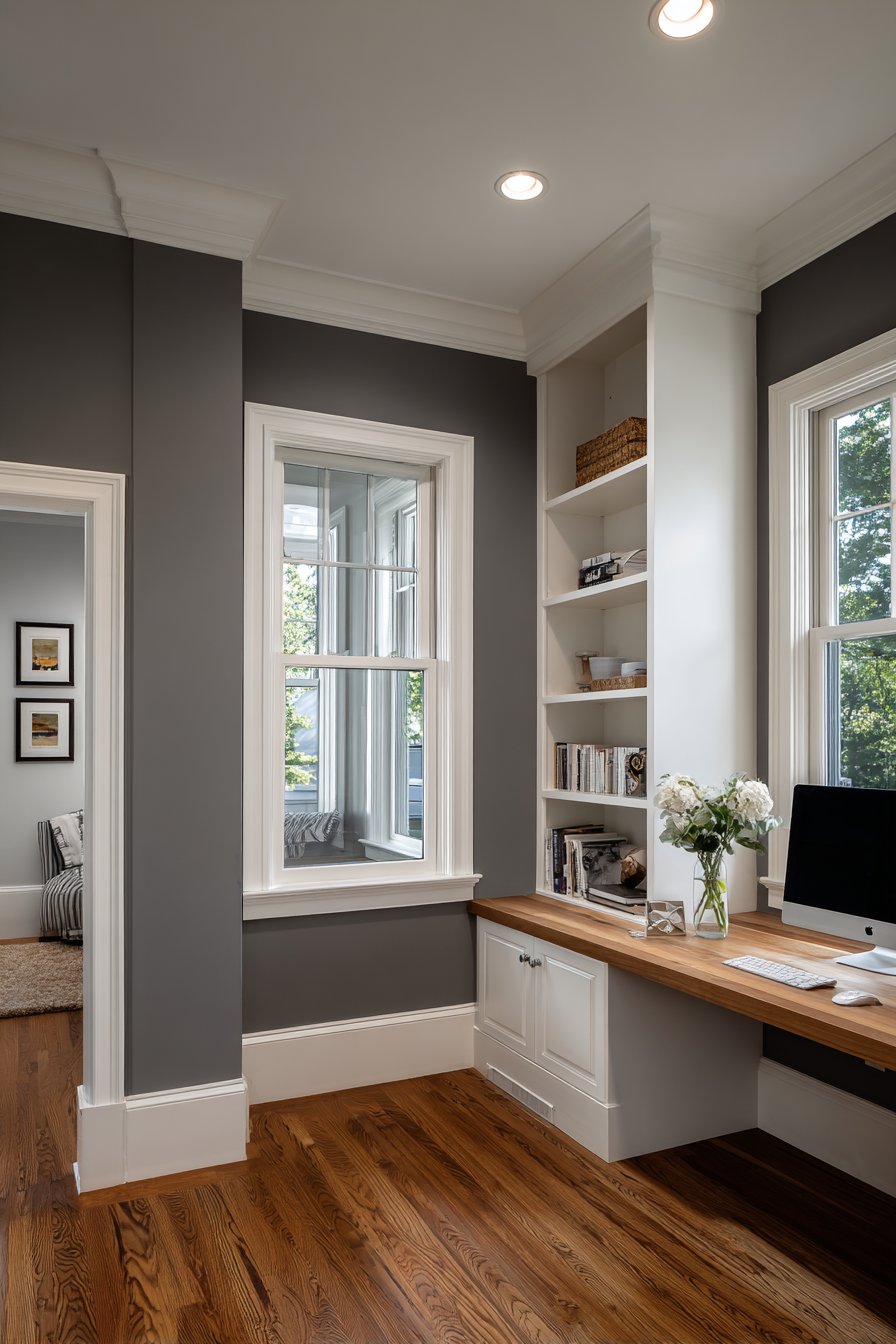
24. Sophisticated Greige Throughout
Greige—the harmonious blend of gray and beige—has emerged as the ultimate neutral for modern interiors. This chameleon-like color shifts appearance based on lighting and surrounding elements, appearing more gray in some conditions and more beige in others. Greige provides the warmth that pure gray lacks while offering more contemporary sophistication than traditional beige. This versatile neutral works throughout homes as cohesive color that flows seamlessly from room to room, creating harmonious backdrop for varying furniture styles and colorful accessories. Greige’s adaptability makes it ideal for those who want neutral walls that never feel cold or stark.
The challenge with greige lies in selecting the right formulation. Greige paints vary dramatically—some lean heavily gray with just hints of warmth, others read predominantly beige with gray undertones, and the best achieve true balance. The undertones matter immensely; some greiges have green undertones that can appear sickly in certain lights, others have pink or purple undertones that read as mauve. Test multiple greige options in your specific lighting at different times of day before committing. Consider your home’s existing elements—flooring, countertops, cabinetry—and ensure your chosen greige coordinates with these permanent features. North-facing rooms benefit from warmer greiges while south-facing rooms can handle cooler gray-leaning versions.
Greige’s neutrality makes it an excellent backdrop for virtually any design style or color accent. In contemporary spaces, pair greige with chrome, glass, and white for sleek, minimal aesthetic. In traditional homes, greige works beautifully with crown molding, wainscoting, and rich wood tones. Scandinavian-style spaces come alive with greige walls, natural wood, and white accents. Bohemian interiors gain sophisticated grounding when greige provides neutral background for colorful textiles and global accessories. The color’s adaptability means you can change your décor style over time without repainting—greige accommodates everything from midcentury modern to farmhouse to industrial.
Key Design Tips: Purchase sample quarts of multiple greige shades and paint large poster boards to evaluate in your actual space. Assess samples at different times of day in various lighting conditions before selecting your final color. Consider undertones carefully—cooler greiges with gray dominance suit modern aesthetics while warmer beige-leaning versions work in traditional spaces. Use varying finishes—matte walls, slight sheen on trim—to add dimension within the monochromatic neutral. Pair with true whites rather than creamy whites to maintain the contemporary quality that makes greige appealing.
25. Jewel Tone Powder Room
Powder rooms—small spaces used briefly by guests—present perfect opportunities for bold color experimentation. Jewel tones like emerald green, sapphire blue, ruby red, or amethyst purple create luxurious, memorable spaces that delight visitors. These rich, saturated colors work in small powder rooms where they might overwhelm larger spaces, creating jewel-box intimacy that feels special rather than suffocating. The brief time spent in powder rooms makes intense color comfortable, while the small square footage makes dramatic paint choices economically feasible. This approach transforms utilitarian spaces into design statements.
Selecting your jewel tone should consider the existing fixtures and finishes in your powder room. Emerald green works beautifully with gold or brass fixtures and mirrors, creating traditional elegance with botanical undertones. Sapphire blue pairs gorgeously with chrome or silver fixtures for crisp, clean contrast. Deep amethyst purple complements both gold and silver while adding royal sophistication. Ruby red creates dramatic impact and works with virtually any metallic finish. Consider the undertones in your tile, flooring, and countertop when selecting your jewel tone to ensure harmonious rather than clashing relationships. White fixtures and trim provide necessary visual relief against intense wall colors.
Finish selection matters significantly in small powder rooms. High-gloss paint creates glamorous, reflective surfaces that bounce light around and visually expand small spaces while adding to the jewel-like quality. Satin or semi-gloss finishes provide similar light reflection with slightly less drama and better hide minor wall imperfections. Matte finishes absorb light and can make jewel tones appear deeper and richer, though they may make small powder rooms feel darker. Consider the quality and quantity of lighting—jewel-toned powder rooms require excellent artificial lighting to prevent dungeon-like atmosphere. Layer lighting with overhead fixtures, sconces, and perhaps LED strips around mirrors to properly illuminate the rich colors.
Key Design Tips: Choose true jewel tones rather than pastel versions for authentic luxurious impact. Incorporate mirrors strategically to reflect light and prevent the small space from feeling too dark despite bold color. Select light fixtures in complementary metallic finishes—gold with warm jewel tones, silver with cool tones. Use high-quality paint as jewel tones can appear uneven with inferior products. Consider adding a statement ceiling—painted in coordinating lighter shade or even metallic finish—to complete the jewel-box effect.
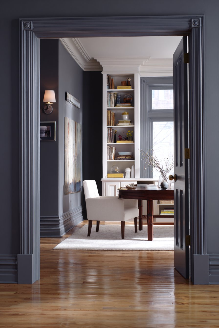
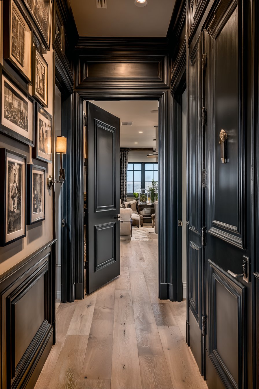
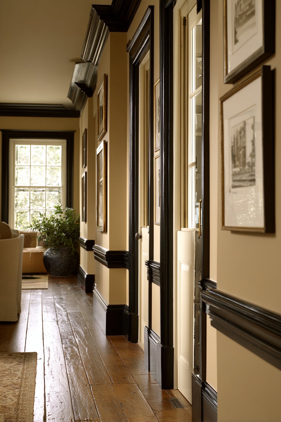
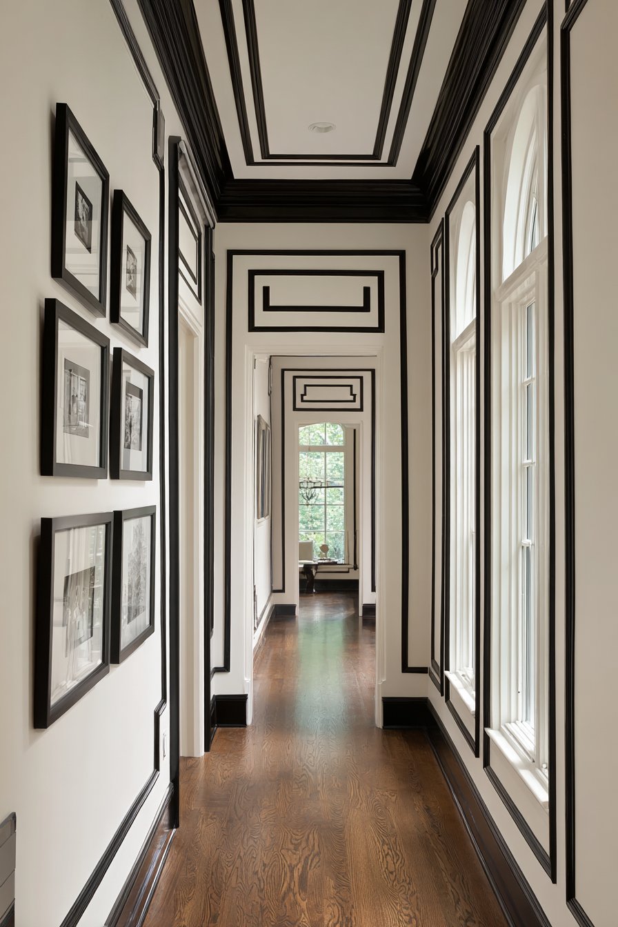
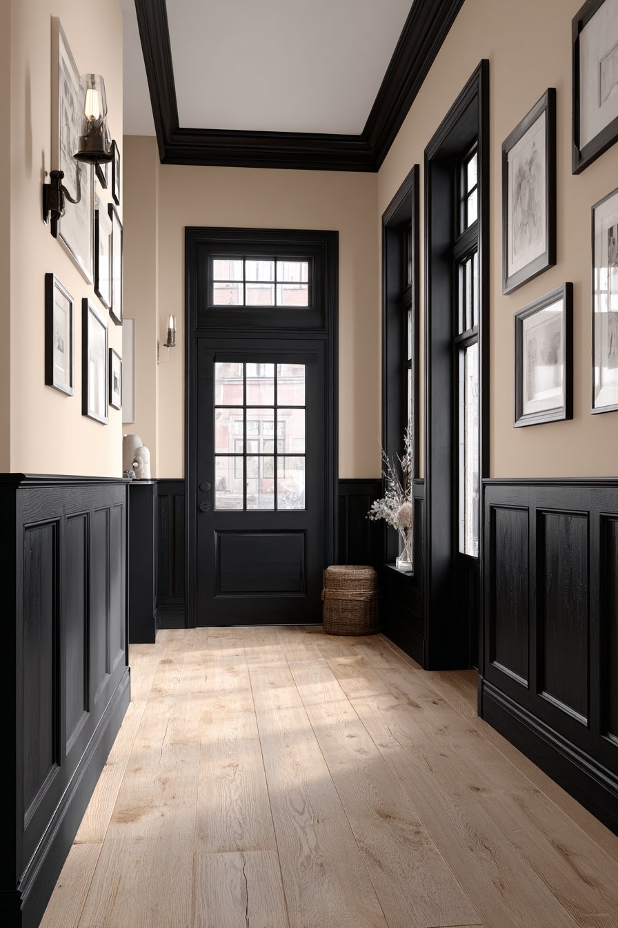
26. Crisp Black Trim Contrast
Black trim against white or light-colored walls creates striking, contemporary contrast that defines architectural details with graphic clarity. This bold approach reverses traditional white-trim convention, delivering modern sophistication and visual impact. Black baseboards, crown molding, window frames, and door casings create dark outlines that frame and anchor spaces while highlighting architectural features. This technique works brilliantly in contemporary and transitional homes where you want to make strong design statements, in spaces with beautiful woodwork that deserves emphasis, or anywhere you want to create gallery-like aesthetic.
The success of black trim depends on quality execution and thoughtful proportion. Black shows every flaw—gaps, uneven lines, and sloppy application become glaringly obvious—so precise painting technique is essential. Remove trim when possible for painting on sawhorses to ensure clean lines and proper coverage. When painting trim in place, use high-quality painter’s tape and steady hand to create crisp edges. The proportion of black trim to wall color matters significantly. In rooms with modest trim, black creates dramatic accents without overwhelming. In spaces with extensive molding—heavy crown, chair rail, baseboards, and picture frame molding—black trim can dominate, which works if that’s your intention but can feel oppressive in smaller rooms.
Black trim affects the overall spatial perception and mood. Against white walls, black trim creates high-contrast, modern gallery aesthetic perfect for displaying art and photographs. Against soft gray or beige walls, black trim provides grounding definition while maintaining slightly softer overall effect. Against bolder wall colors like sage, navy, or terra cotta, black trim creates sophisticated framing that contains and defines the color. Consider the room’s natural light—spaces with abundant windows can handle black trim easily, while darker rooms may feel too heavy with black outlines. The style of your home matters too; black trim suits contemporary, industrial, and modern farmhouse aesthetics but can appear jarring in traditional or cottage-style homes.
Key Design Tips: Use true black rather than near-black or charcoal for maximum impact and clean definition. Apply multiple thin coats rather than thick single coat to ensure even coverage without drips. Paint black trim in semi-gloss or satin finish for durability and subtle sheen that enhances the architectural lines. Consider painting doors black along with trim for complete cohesive statement. Balance the black trim with adequate white or light wall surfaces to prevent the space from feeling too dark.
27. Watercolor Wash Effect
The watercolor wash painting technique creates soft, artistic walls with dreamy, ethereal quality. Unlike sharp color blocking or precise patterns, watercolor walls feature gentle color gradations, soft edges, and organic variation that mimic actual watercolor paintings. This approach adds artistic sophistication to bedrooms, nurseries, creative studios, or any space where you want walls that feel handcrafted and unique. The technique requires patience and willingness to embrace imperfection—the goal is artistic rather than uniform appearance. Each watercolor wall becomes truly one-of-a-kind, bearing the marks of your individual application process.
Creating watercolor walls involves diluting paint with water or glaze medium to create translucent consistency similar to watercolor paint. Begin with white or very light base coat as your canvas. Mix your desired color with water—experiment with ratios but start with approximately 1 part paint to 3 parts water, adjusting as needed. Apply this thinned paint to walls using large brushes, sponges, or even spray bottles, working in irregular, overlapping strokes. Allow colors to blend and blur organically rather than attempting control or uniformity. Multiple thin layers build depth and complexity—allow each layer to dry before adding subsequent layers in same or complementary colors.
Color selection for watercolor walls should favor soft, muted tones rather than intense saturated colors. Soft blues, pinks, greens, and lavenders create gentle, dreamy atmospheres perfect for restful spaces. Multiple related colors can be layered—perhaps pale blue with hints of lavender and soft gray—for depth and complexity. The beauty of watercolor walls lies in their imperfection and variation; no two areas will look identical, and that’s precisely the point. This organic quality brings warmth and humanity to spaces in ways that perfectly uniform paint cannot. Consider the overall mood you want to create—cooler colors for calming, serene spaces; warmer tones for cozy, nurturing environments.
Key Design Tips: Practice the watercolor technique on large poster boards to develop your preferred application method before attempting walls. Work quickly while paint is wet to allow organic blending and blurring. Embrace imperfection and variation rather than attempting to achieve uniformity. Use multiple thin layers rather than thick single application for depth and translucency. Seal completed watercolor walls with clear matte finish to protect the delicate surface and ensure durability.
Why These Interior Painting Ideas Represent the Best Design Solutions
The twenty-seven interior painting concepts presented in this comprehensive guide represent the pinnacle of contemporary paint application, combining timeless principles with modern innovations. These designs succeed because they acknowledge fundamental truths about color psychology, spatial perception, and the transformative power of paint while offering diverse approaches suitable for varying aesthetic preferences, skill levels, and budgetary constraints. From the serene sage and cream sanctuary to the bold drama of charcoal and white contrast, each concept addresses specific design challenges while creating spaces that enhance daily living experiences.
The enduring appeal of these painting ideas lies in their versatility and adaptability across architectural styles, room functions, and personal tastes. The warm terracotta embrace works equally well in contemporary lofts and traditional adobes, demonstrating how color transcends specific style categories when applied thoughtfully. Similarly, the sophisticated navy and gold accent scheme adapts from formal dining rooms to cozy home libraries, proving that great design concepts remain relevant across functional spaces. This flexibility ensures these painting approaches remain valuable regardless of changing trends or evolving personal preferences, representing investments in timeless design rather than fleeting fashions.
Technical excellence distinguishes these ideas from amateur painting approaches. The gradient ombre effect, geometric color blocking, and textured paint finishes require skill development and practice, but they deliver professional results that elevate spaces beyond simple color application. The trompe l’oeil architectural details and stenciled pattern walls demonstrate how paint can create visual complexity and dimensional interest without expensive architectural modifications. These techniques prove that thoughtful application matters as much as color selection, encouraging homeowners to view painting as craft worthy of time, attention, and skill development rather than merely maintenance tasks.
The psychological impact of these color schemes cannot be overstated. The blush pink and gray harmony creates spaces that soothe and nurture, while the sunshine yellow kitchen energy invigorates and uplifts. The moody plum bedroom retreat encourages introspection and rest, and the coastal blue and sandy beige combination promotes relaxation and escape. Each palette has been carefully considered for its emotional resonance and ability to support the intended function of the space it colors. This attention to color psychology ensures these designs create not just beautiful rooms, but spaces that actively enhance mood, productivity, and wellbeing.
Environmental considerations and practical functionality also elevate these painting concepts. The sophisticated greige throughout demonstrates how single cohesive colors can flow seamlessly through homes, creating visual continuity that makes spaces feel larger and more unified. The two-tone horizontal wall division provides practical benefits—darker lower sections hide wear in high-traffic areas while maintaining visual interest. The chalkboard paint feature wall combines aesthetic appeal with genuine functionality, proving that beautiful design can serve practical purposes. These approaches acknowledge that successful interior design must balance aesthetics with livability and maintenance realities.
The incorporation of contemporary techniques alongside traditional approaches ensures these ideas remain relevant for modern lifestyles while respecting design heritage. The crisp black trim contrast brings contemporary edge to architectural details while the striped accent walls reference classical design traditions. The watercolor wash effect embraces artisanal, handcrafted aesthetics increasingly valued in our mass-produced world, while the metallic accent strokes introduce modern glamour and light-play. This blend of innovation and tradition creates painting approaches that feel both fresh and familiar, allowing homeowners to express contemporary sensibilities without disconnecting from design history.
Color theory principles underpin each of these designs, ensuring harmonious combinations that please the eye rather than accidentally clash or overwhelm. The Southwestern terra cotta and turquoise pairing demonstrates successful complementary color relationships, while the monochromatic layered tones showcase the depth achievable within single color families. The forest green feature wall proves how nature-inspired colors ground spaces and create tranquility, while the jewel tone powder room illustrates how saturated colors create luxury in appropriate contexts. These examples teach fundamental design principles through practical application, helping homeowners develop their own color confidence.
Accessibility across skill levels makes these painting ideas particularly valuable. Beginning painters can successfully execute the soft sage and cream sanctuary or the sophisticated greige throughout with minimal experience, while more adventurous DIYers can tackle the geometric color blocking or stenciled pattern walls as skills develop. The gradient ombre effect and watercolor wash technique challenge even experienced painters while remaining achievable with practice and patience. This range ensures everyone can find appropriate projects regardless of current abilities, encouraging skill development and creative exploration while maintaining realistic expectations about outcomes.
Economic considerations enhance the appeal of these painting solutions. Paint remains one of the most cost-effective ways to dramatically transform spaces, requiring minimal financial investment compared to renovations, new furniture, or architectural modifications. A gallon of quality paint costing under fifty dollars can completely change a room’s character, making these designs accessible to virtually any budget. The ability to refresh and change painted surfaces over time provides flexibility as tastes evolve, allowing homeowners to experiment with color without permanent commitment. This economic efficiency combined with transformative impact makes painting the ultimate design intervention for maximum effect with minimum investment.
Lighting interactions receive careful consideration throughout these concepts, acknowledging that paint colors perform differently under varying light conditions. The crisp white with colored ceiling approach demonstrates how paint can direct and reflect light, while the dramatic charcoal and white contrast shows how proper lighting prevents dark colors from overwhelming spaces. The coastal blue and sandy beige combination acknowledges how natural light varies throughout the day, creating palettes that remain beautiful from morning through evening. This attention to lighting ensures these painting ideas succeed in real-world conditions rather than only in ideal circumstances.
Spatial manipulation through paint represents another significant advantage of these approaches. The two-tone horizontal wall division can visually alter room proportions, making spaces feel taller or more grounded depending on application. The gradient ombre effect creates movement and flow that directs the eye, while the monochromatic layered tones build depth within limited color ranges. The forest green feature wall demonstrates how accent colors can anchor spaces and create focal points, while the striped accent walls prove how pattern direction affects spatial perception. These techniques provide powerful tools for addressing architectural challenges without structural changes.
The cultural richness embedded in several of these concepts adds depth beyond mere aesthetics. The Southwestern terra cotta and turquoise pairing references Native American design traditions and desert landscapes, connecting interiors to broader cultural narratives. The jewel tone powder room evokes historical associations between color and luxury, when rich dyes and pigments represented wealth and status. The warm terracotta embrace connects to ancient Mediterranean building traditions spanning millennia. These cultural connections add meaning and significance to color choices, transforming paint selection from arbitrary decisions into intentional design statements rooted in human history and experience.
Trend resistance characterizes these enduring designs. Rather than chasing fleeting color-of-the-year proclamations, these concepts focus on timeless combinations and techniques that remain relevant across decades. The sage and cream sanctuary has pleased homeowners for generations and will continue doing so, while the navy and gold accent scheme references design traditions spanning centuries. Even more contemporary approaches like the blush pink and gray harmony or the sophisticated greige throughout have demonstrated staying power beyond initial trendiness. This longevity ensures these painting investments won’t quickly date, providing lasting value and satisfaction.
Personal expression opportunities abound within these frameworks. The geometric color blocking allows infinite pattern possibilities limited only by imagination, while the stenciled pattern walls offer countless design options through pattern and color selection. The metallic accent strokes can be applied in uniquely personal ways, and the watercolor wash effect guarantees no two walls will ever appear identical. This built-in customization ensures these concepts serve as starting points rather than prescriptive formulas, encouraging homeowners to adapt and personalize according to individual preferences and circumstances.
Professional quality becomes achievable through the detailed guidance accompanying each concept. Understanding proper surface preparation, appropriate finish selection, careful taping techniques, and thoughtful color testing empowers homeowners to execute these designs with confidence. The key design tips distill professional knowledge into actionable advice, preventing common mistakes that undermine results. This education transforms painting from intimidating task to manageable project, encouraging DIY completion and the satisfaction of personal accomplishment while ensuring quality outcomes that rival professional work.
Ultimately, these twenty-seven interior painting ideas represent the best design solutions because they successfully balance beauty, practicality, achievability, and personal expression. They acknowledge that successful interior spaces must function well while appearing beautiful, that design should be accessible rather than exclusive, and that homes should reflect the unique individuals inhabiting them. Whether you’re drawn to serene neutrals, bold jewel tones, artistic techniques, or classic combinations, these concepts provide roadmaps for transformation that honor both design principles and personal vision, ensuring your painted spaces become true reflections of your ideal living environment.
Conclusion
Interior house painting represents one of the most powerful tools available for personal expression and spatial transformation. Throughout this comprehensive exploration of twenty-seven distinctive painting concepts, we’ve journeyed from serene sage and cream sanctuaries to dramatic jewel-toned powder rooms, from sophisticated monochromatic schemes to bold geometric color blocking. Each approach offers unique opportunities to reshape your living environment, address specific design challenges, and create spaces that truly reflect your personality and support your lifestyle.
The transformative power of paint extends far beyond simple wall covering. As we’ve discovered, thoughtful color selection influences mood and emotions, affects spatial perception, and can even impact the perceived temperature and size of rooms. Techniques like ombre gradients, textured finishes, and trompe l’oeil details prove that paint can create artistic effects and dimensional interest rivaling more expensive architectural modifications. Whether you’re working with a modest budget or planning comprehensive renovations, paint provides accessible entry into meaningful design transformation.
As you consider implementing these ideas in your own home, remember that successful painting projects begin with careful planning, proper preparation, and realistic assessment of your skills and comfort level. Start with simpler concepts like the sage and cream sanctuary or sophisticated greige throughout if you’re new to painting, then progress to more challenging techniques like watercolor washes or geometric blocking as your confidence grows. Always test colors in your actual space under your specific lighting conditions, invest in quality materials and tools, and don’t rush the process—patience and attention to detail separate amateur results from professional-looking outcomes.
Most importantly, view these concepts as inspiration rather than rigid formulas. Adapt color combinations to suit your preferences, adjust techniques to match your skill level, and personalize applications to reflect your unique vision. Your home should tell your story and support your daily life, and paint provides the vocabulary for that narrative. Whether you embrace bold jewel tones or prefer subtle neutrals, favor artistic techniques or clean simplicity, these painting ideas offer starting points for creating spaces where you’ll love to live, work, and gather with those you cherish.