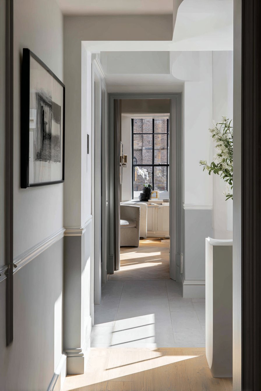
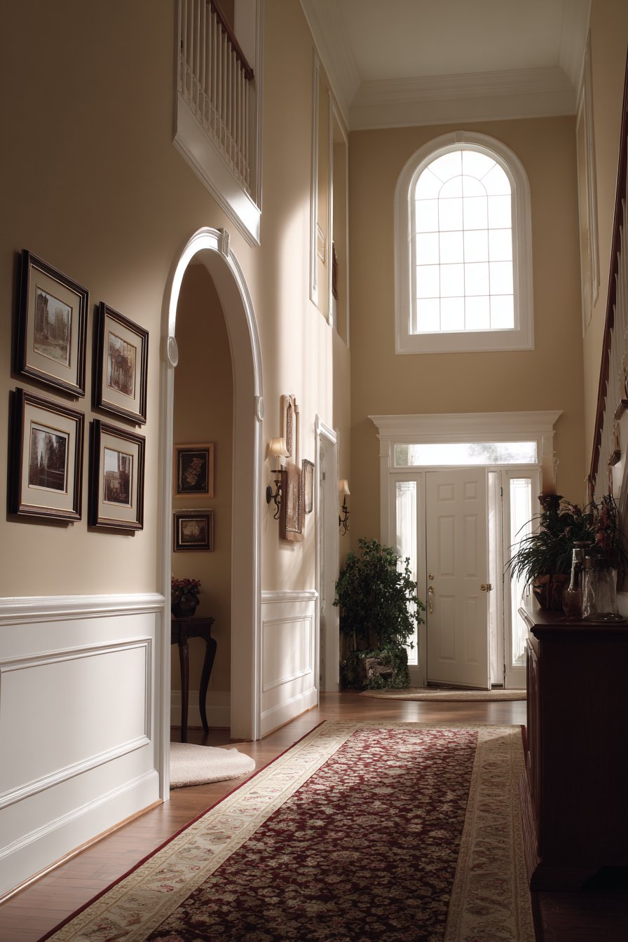
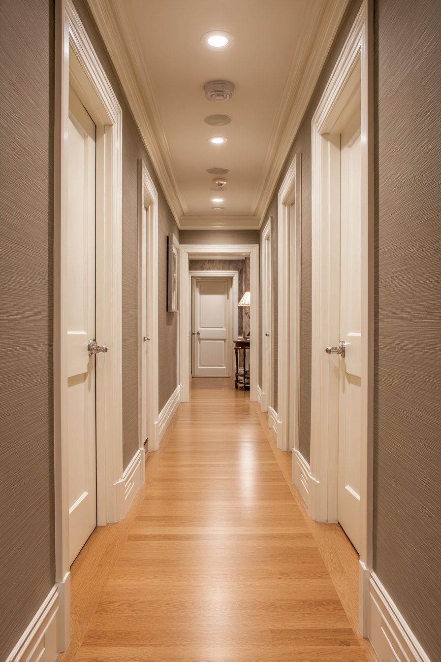
The hallway is often the most overlooked space in home design, yet it serves as the critical first impression of your home and the connecting thread between all your living spaces. While bedrooms and living rooms receive careful consideration and generous budgets, hallways are frequently relegated to afterthought status, painted in safe, uninspiring neutrals that do nothing to showcase their potential. This oversight represents a missed opportunity to create visual interest, establish your home’s design narrative, and maximize the impact of every square foot of your property.
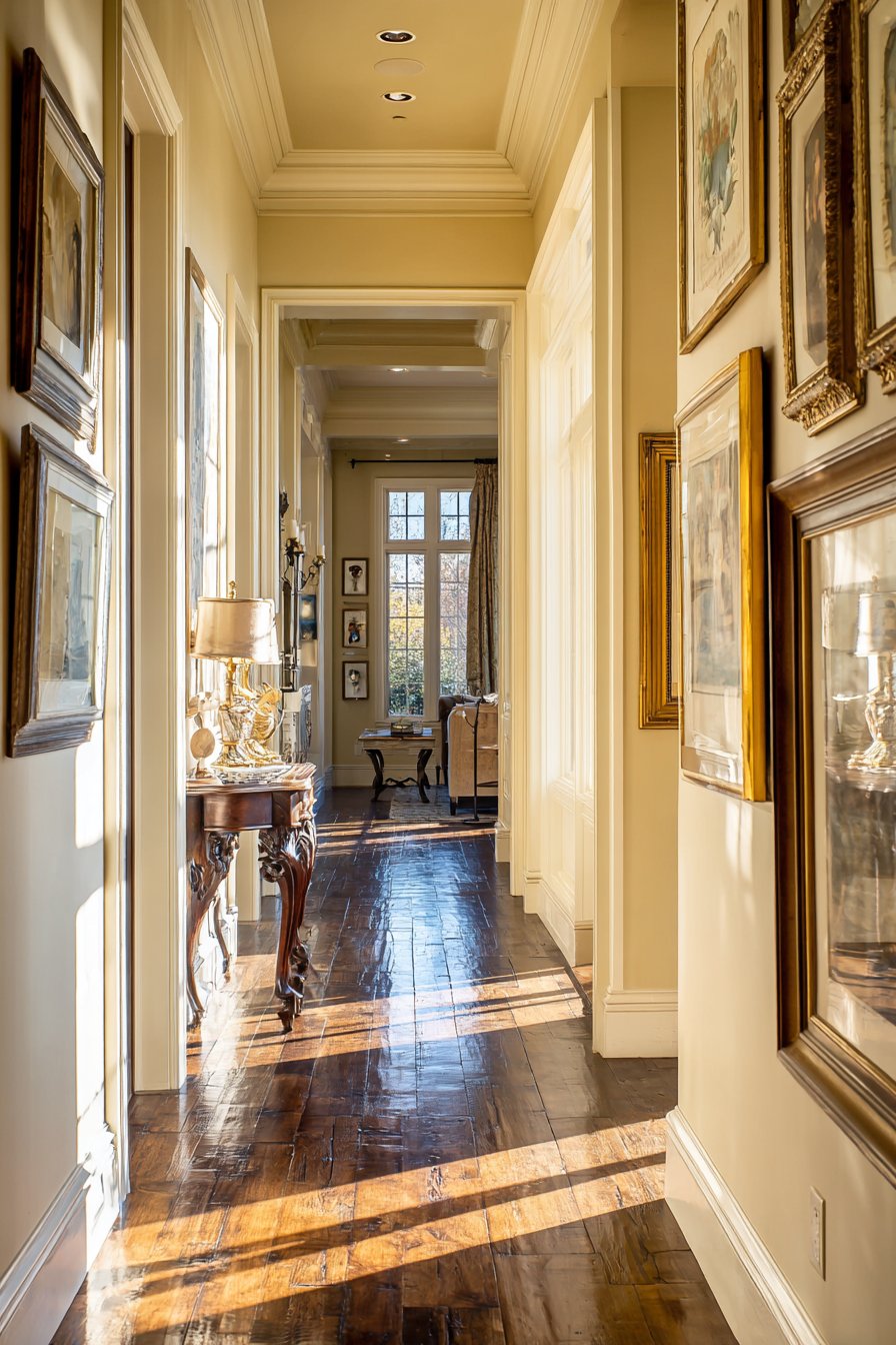
Thoughtful hallway paint choices can dramatically transform these transitional spaces from mere passageways into architectural features that enhance your home’s overall aesthetic. The right paint color and technique can make narrow corridors feel more spacious, dark hallways feel welcoming, and bland passages feel intentional and designed. Whether you’re working with a grand entrance hall with soaring ceilings or a compact apartment corridor, strategic paint applications offer the most cost-effective way to achieve remarkable visual transformation.
This comprehensive guide explores twenty-three innovative hallway paint ideas that span the full spectrum of design possibilities—from timeless traditional approaches to bold contemporary statements. You’ll discover how to use color psychology, architectural paint techniques, and strategic lighting to create hallways that don’t just connect rooms but elevate your entire home’s design story. Each concept has been carefully crafted to provide practical, achievable solutions that real homeowners can implement, complete with professional insights on materials, application methods, and styling considerations.
1. Calming Sage Green Matte Welcome
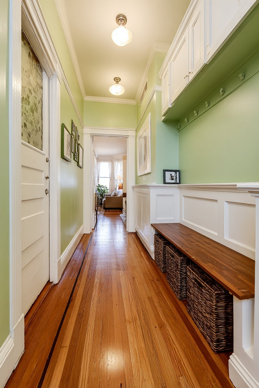
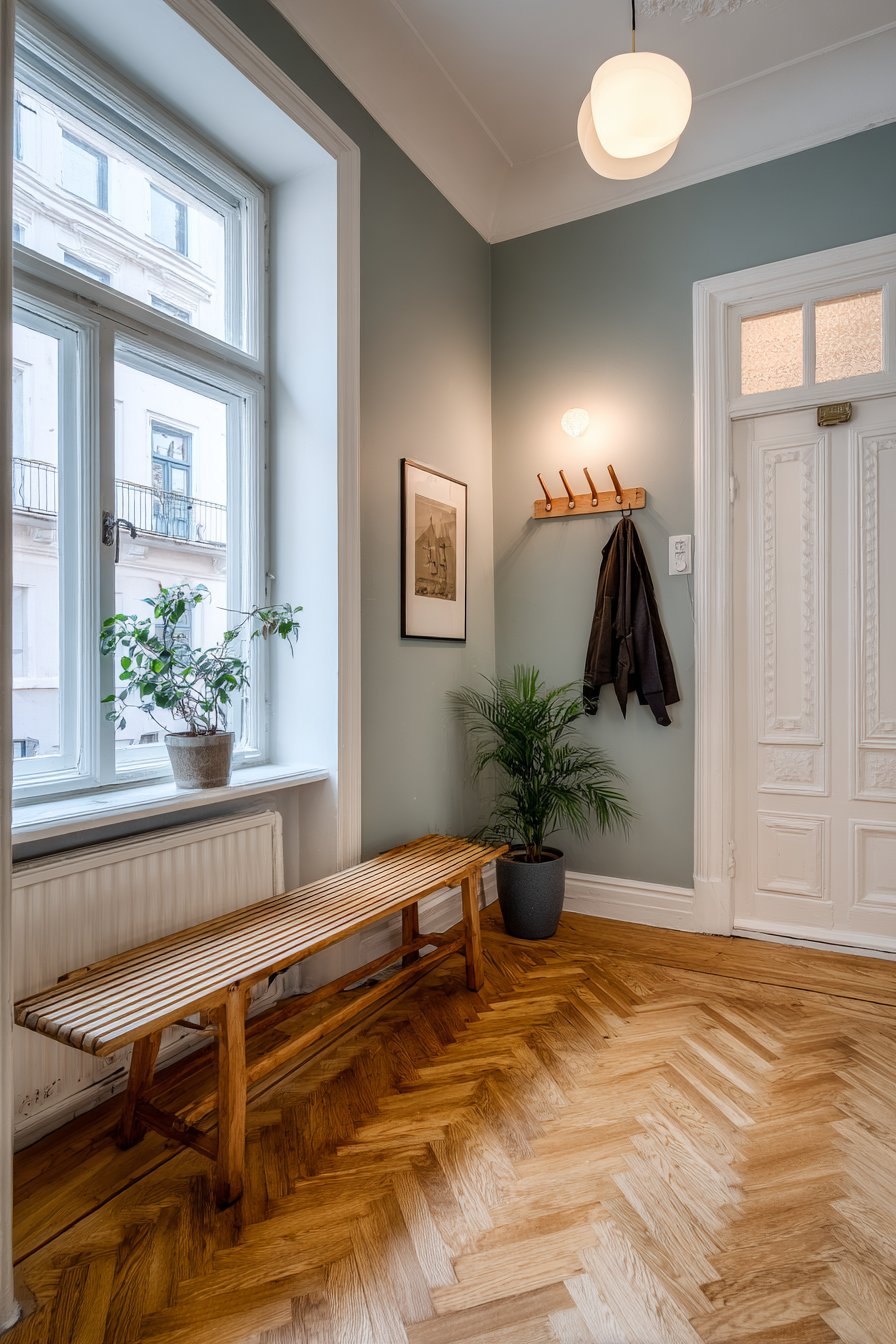
A welcoming hallway features walls painted in soft sage green with a luxurious matte finish that immediately establishes a calming, nature-inspired atmosphere. This hallway paint idea taps into the growing wellness design movement, where color choices directly impact mood and psychological wellbeing. The gentle green tone creates an immediate sense of tranquility as guests enter, signaling a home that values serenity and connection to natural elements. The light-reflective quality of this particular sage shade works exceptionally well in narrow corridors where darker colors might feel claustrophobic.
White trim molding frames doorways and runs along baseboards, providing the crisp contrast essential for making sage green hallway paint feel intentional rather than dated. This classic combination prevents the green from skewing too vintage or country, instead creating a fresh, contemporary interpretation of traditional color pairing. The trim work also serves the practical purpose of defining architectural features and creating visual boundaries that help the eye navigate the space.
Practical elements seamlessly integrate into this design, with a small wooden bench positioned against one wall offering both seating for putting on shoes and aesthetic warmth through natural wood tones. Woven baskets tucked underneath provide concealed storage for everyday items like dog leashes, reusable shopping bags, or seasonal accessories. Natural lighting filtering from an adjacent room demonstrates how this hallway paint color performs in real home conditions—maintaining its soothing quality even in spaces without direct window access.
Key Design Tips:
- Choose sage green shades with gray undertones for a more contemporary feel, avoiding yellowy greens that can appear dated
- Matte finishes hide wall imperfections better than glossy options while creating a sophisticated, modern appearance
- Incorporate natural materials like wood and woven fibers to reinforce the organic feel of green hallway paint
- Ensure adequate lighting in hallways painted green, as insufficient light can make the color appear muddy or dull
- Use pure white (not cream or ivory) for trim to maintain the fresh, clean contrast that keeps sage green feeling current
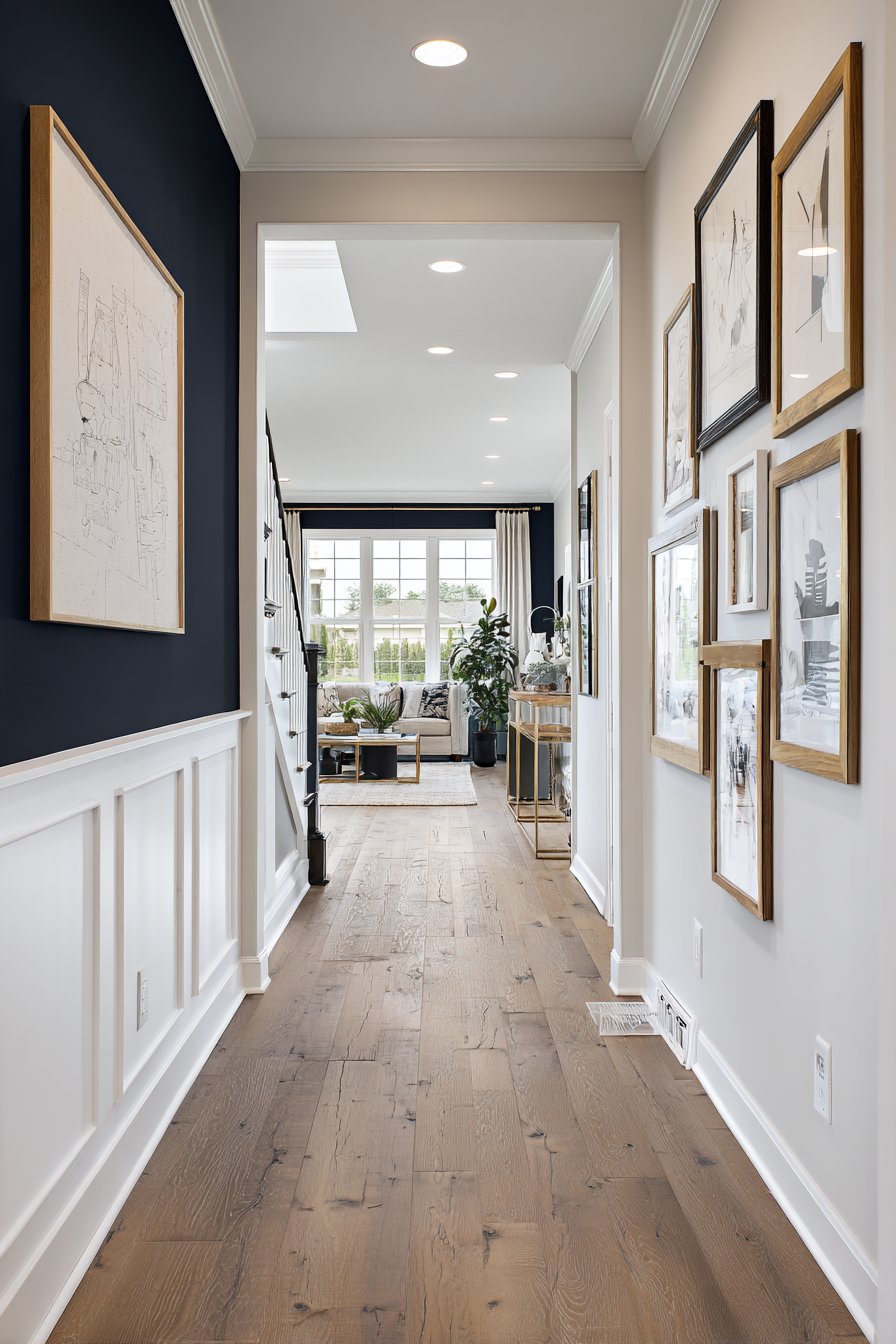
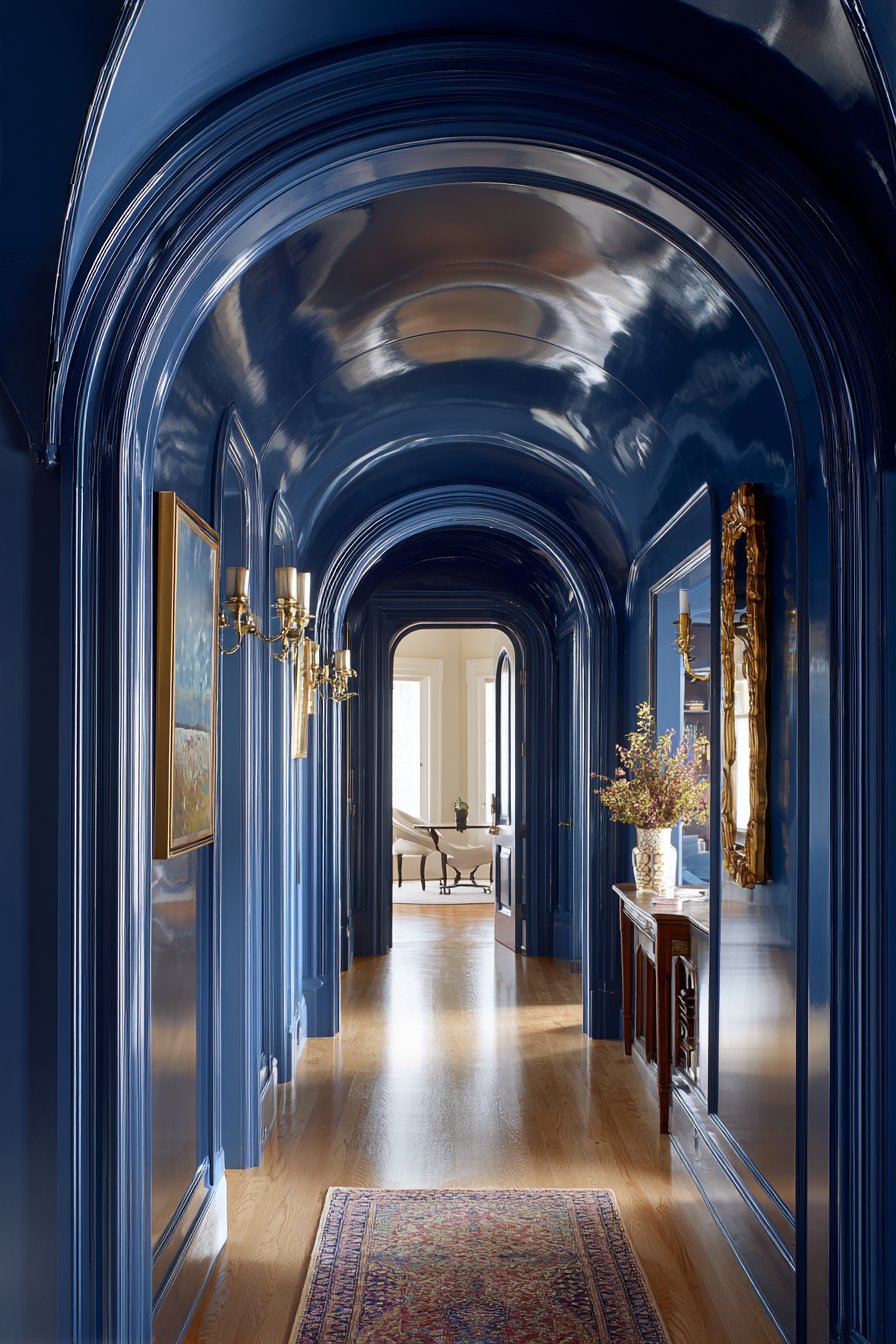
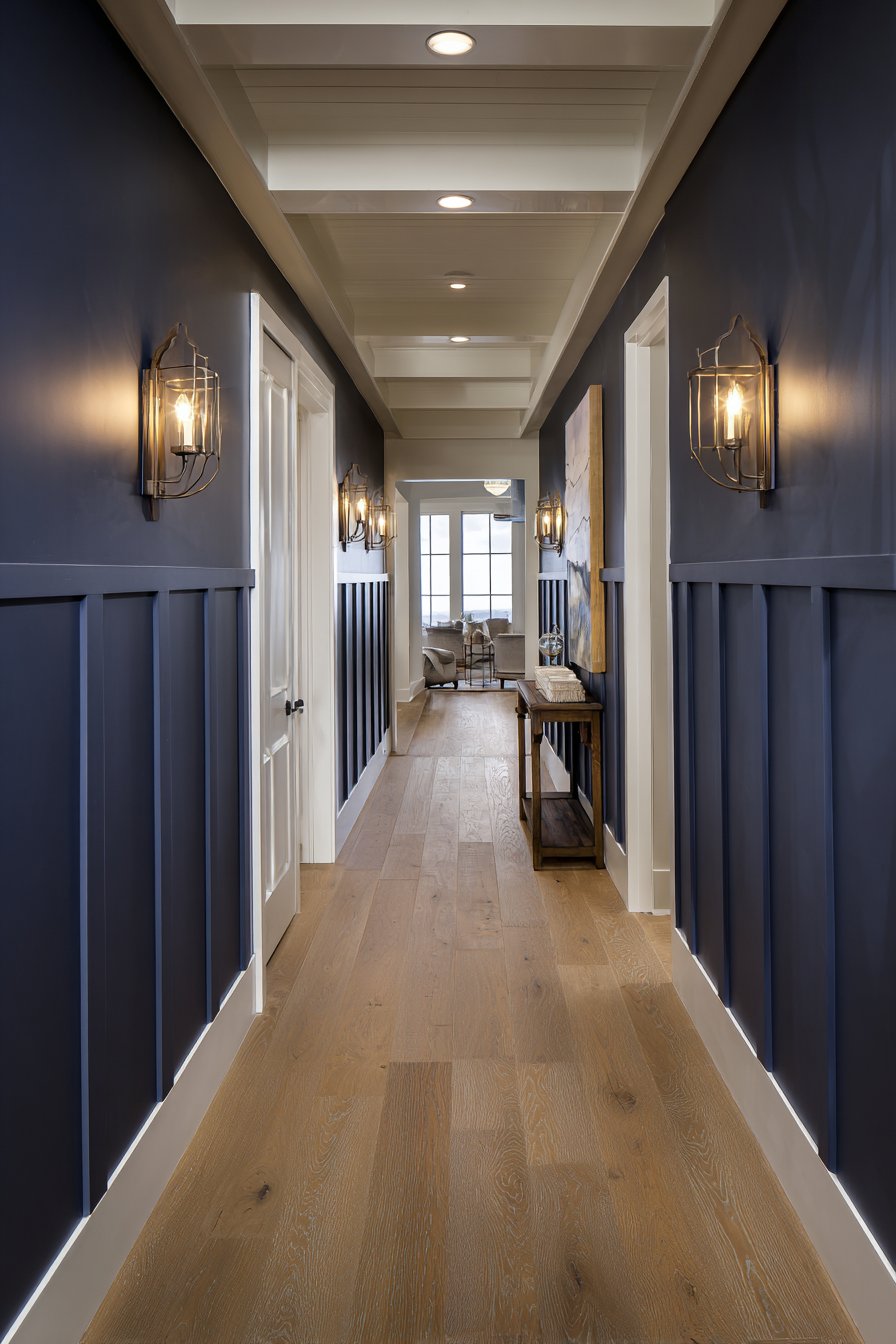
2. Dramatic Navy Blue Focal Point
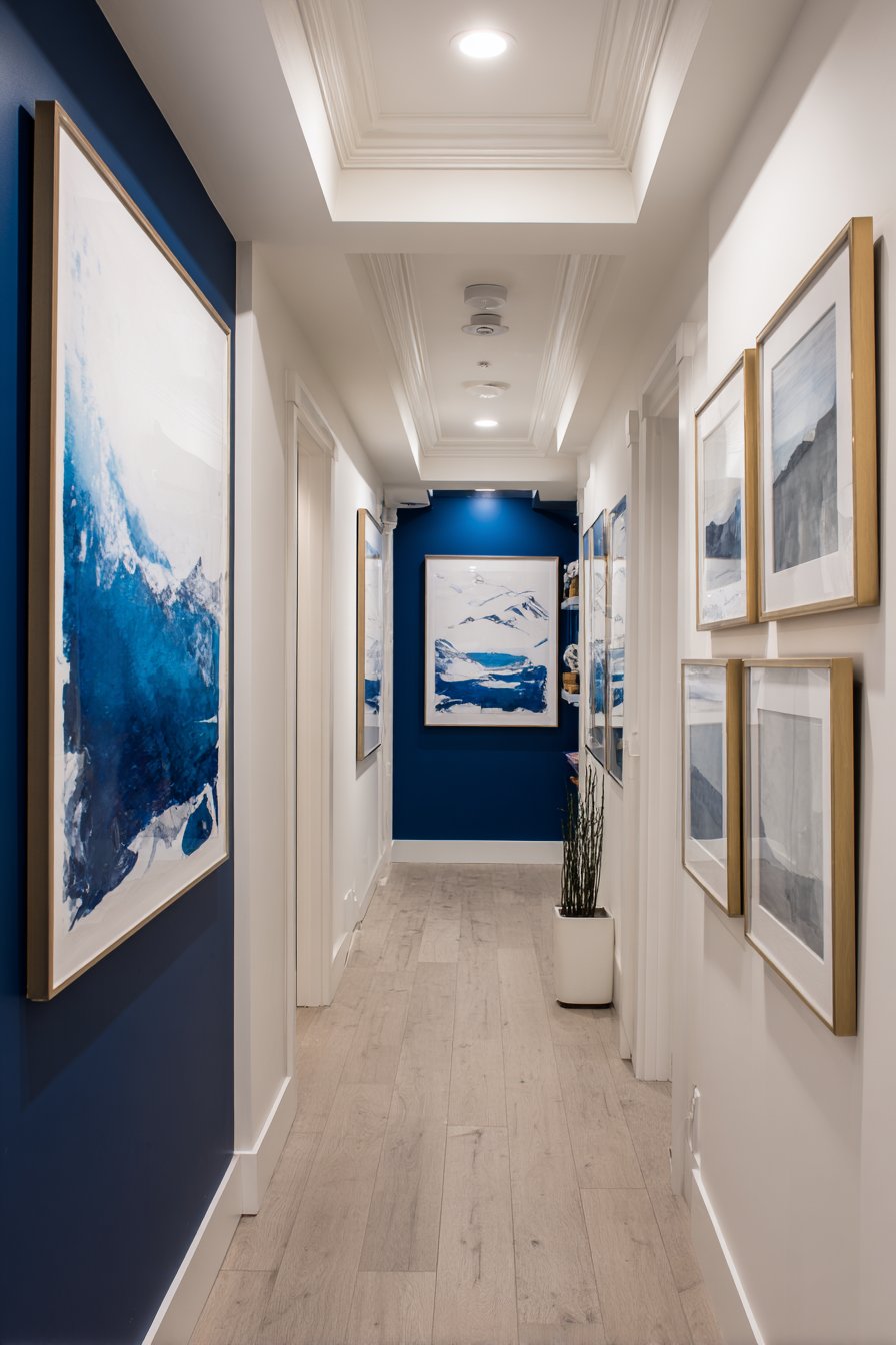
This hallway paint idea employs strategic color blocking to create maximum visual impact with minimal paint investment. A bold navy blue accent wall positioned at the end of a neutral hallway serves as a compelling focal point that draws the eye and creates a sense of destination in what might otherwise feel like aimless corridor space. The remaining walls feature a complementary warm white that maintains openness and light reflection—crucial in hallways where natural light may be limited.
The psychology of this hallway paint approach is sophisticated: by painting only the end wall in navy, you create intrigue and visual pull that makes the hallway feel purposeful rather than merely functional. Crown molding painted in crisp white adds architectural detail that becomes more pronounced against both the white walls and navy focal point, creating layered visual interest. A carefully curated gallery wall arrangement guides visitors’ eyes along the neutral walls toward the dramatic navy destination, with frame styles and artwork creating a path of visual breadcrumbs.
Recessed lighting fixtures provide even illumination that’s particularly important with this hallway paint strategy. The fixtures are positioned to highlight both the artwork along the journey and the rich depth of the navy accent wall, preventing the dark color from becoming a black hole that swallows light. The balanced exposure demonstrates how proper lighting transforms bold paint choices from potentially overwhelming to intentionally dramatic.
Key Design Tips:
- Test navy paint samples on the specific wall you plan to paint, as orientation and light exposure dramatically affect how dark blues appear
- Limit bold accent colors to a single wall to maintain balance—painting multiple walls navy in a standard hallway can feel oppressive
- Position artwork and lighting to create a visual path that enhances rather than competes with the accent wall
- Consider the sight lines from adjacent rooms to ensure the navy wall creates impact from multiple viewing angles
- Use the same white paint for all trim, ceiling, and neutral walls to create cohesion and make the navy pop effectively
3. Modern Two-Tone Gray and White Division
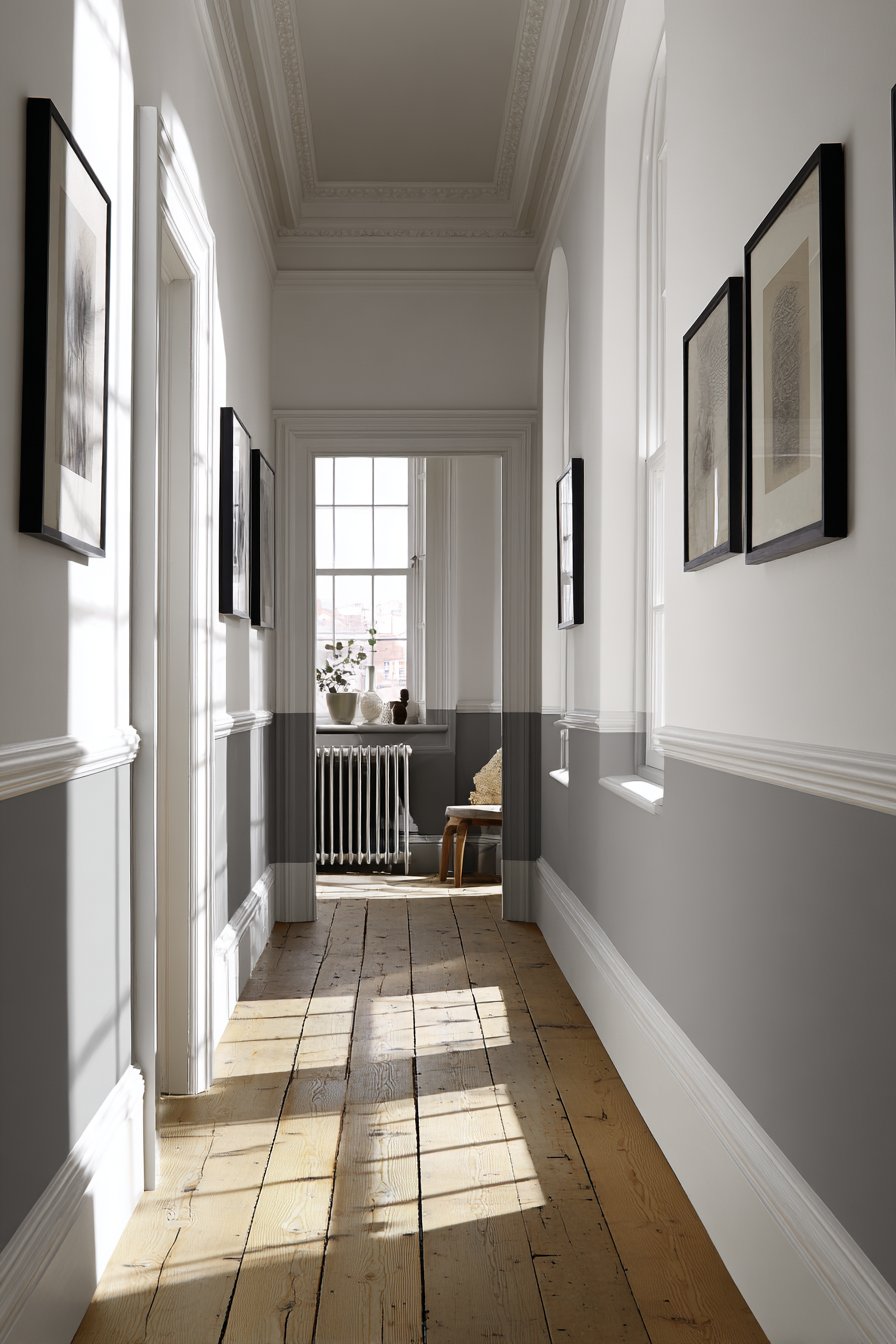
A clean two-tone treatment transforms this hallway through deliberate color blocking that creates the illusion of greater height and architectural sophistication. The upper two-thirds features soft dove gray while the lower third showcases bright white, separated by a simple chair rail that serves as both visual boundary and practical wall protection. This hallway paint technique is particularly effective in narrow corridors where vertical emphasis can counteract the tunnel-like feeling that often plagues these spaces.
The color proportions in this design are carefully calculated—positioning the division point approximately one-third up from the floor rather than at the midpoint prevents the space from feeling cut in half horizontally. The dove gray upper section draws eyes upward while the white lower section reflects light at the level where it’s most needed for navigation. Light oak flooring adds warmth that prevents the gray-and-white palette from feeling too clinical or cold, while black-framed artwork provides grounding visual weight against the soft gray backdrop.
Natural light streaming from an end window demonstrates this hallway paint’s versatility across different lighting conditions. In bright daylight, the gray maintains its soft, elegant character. As afternoon progresses and light becomes more diffused, the paint reveals subtle warm undertones that prevent the space from feeling sterile. Strategic placement of the artwork at the gray-white junction creates a gallery-like presentation that celebrates both paint colors.
Key Design Tips:
- Position the color division at approximately one-third height rather than halfway to create better proportions and make ceilings appear taller
- Use painter’s tape and a level to ensure your chair rail line is perfectly straight—even slight variations become obvious in hallways where walls face each other
- Select gray paint with warm undertones to prevent the two-tone treatment from feeling too cold or institutional
- Install chair rail molding at the division point for both aesthetic polish and practical protection in high-traffic areas
- Light the hallway from multiple sources to demonstrate how shadows and highlights interact with the two-tone treatment
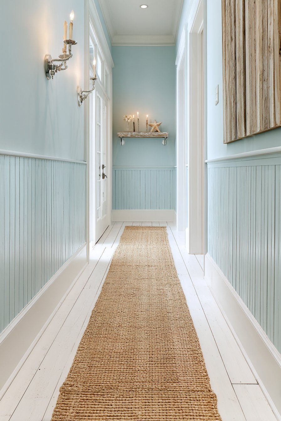
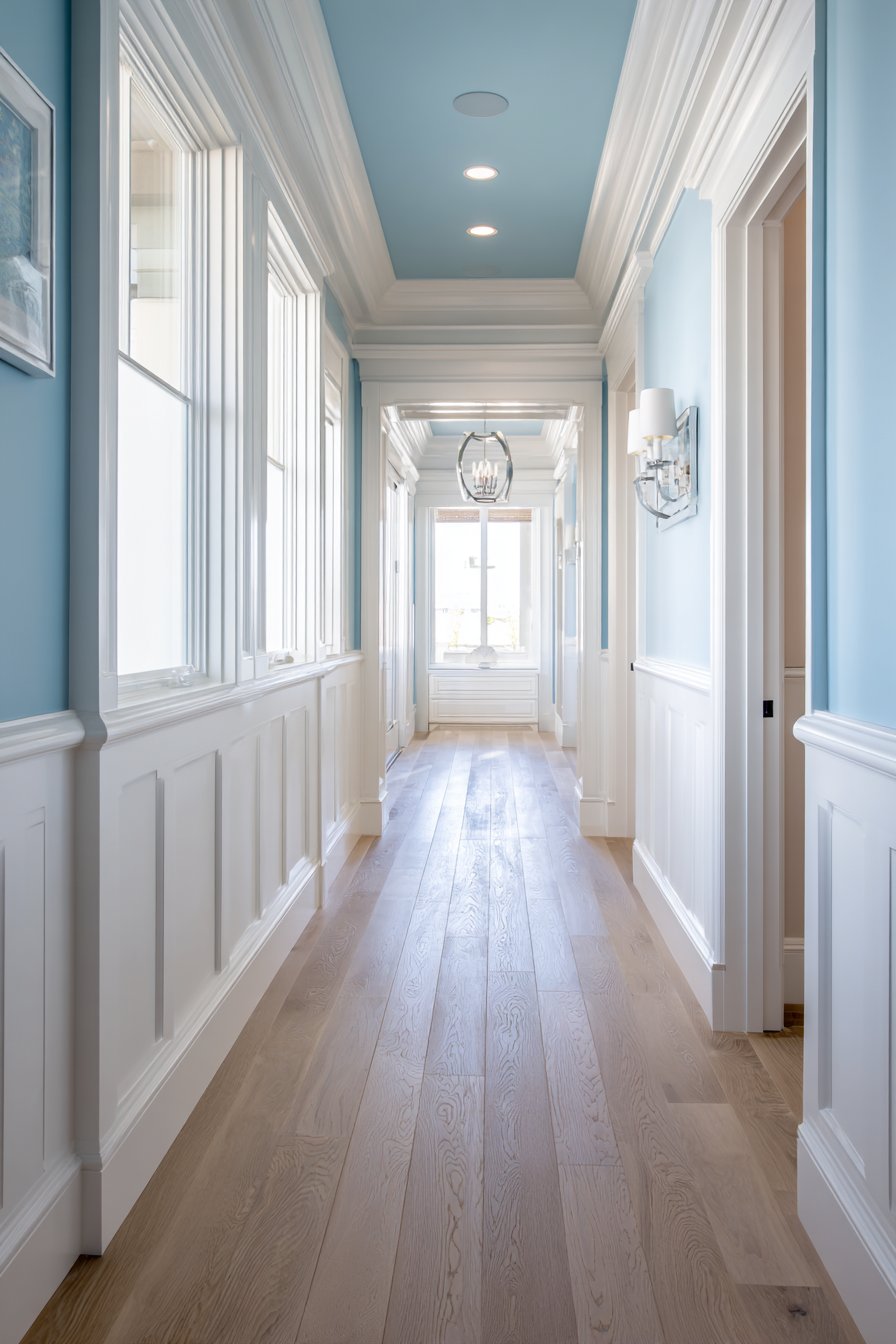
4. Coastal Light Blue-Gray Serenity
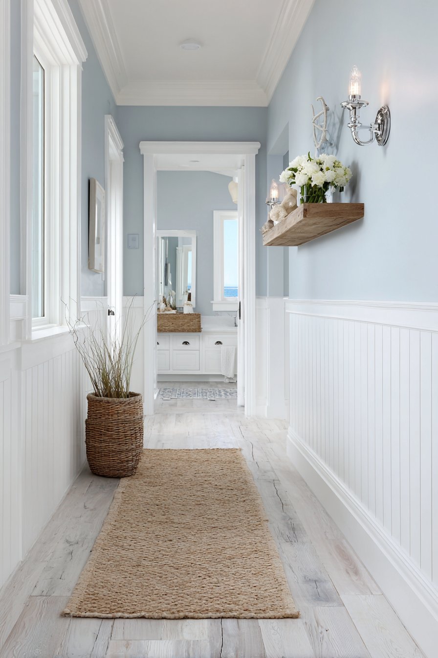
Transport yourself to a seaside retreat with walls painted in a serene light blue-gray reminiscent of morning ocean mist. This hallway paint idea captures the essence of coastal living through color alone, creating an immediate sense of calm and vacation-like relaxation. The specific shade selection is crucial—too blue and the space risks feeling cold, too gray and the coastal connection disappears. The perfect balance creates a color that shifts subtly between blue and gray depending on light conditions, much like ocean water itself.
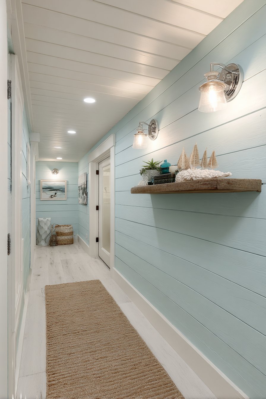
White shiplap wainscoting covers the lower wall portion, adding the texture and architectural detail that defines authentic coastal design. The horizontal planks create visual width in what might otherwise feel like a narrow passage, while the tactile quality of the shiplap adds dimension beyond what paint alone could achieve. Brushed nickel wall sconces provide ambient lighting that enhances rather than overwhelms the paint’s subtle undertones, with the metal finish complementing the cool color palette.
A natural fiber runner rug leads down the hallway over white-painted wood floors, layering texture upon texture in the coastal tradition. The organic quality of the rug fiber reinforces the natural materials ethos central to beach-house aesthetics. A small floating shelf displays carefully edited beach-inspired decor—perhaps a collected shell, a piece of driftwood, or sea glass in shades that echo the wall paint. The overall effect creates a hallway that feels like a breath of sea air, regardless of your home’s actual proximity to water.
Key Design Tips:
- Choose blue-gray paint with a slight green undertone for the most authentic coastal feel, avoiding stark grays that feel too modern or industrial
- Install shiplap with proper spacing and alignment—poorly executed shiplap can cheapen rather than enhance coastal design
- Limit beach decor to carefully curated pieces rather than overwhelming the space with shells and nautical symbols
- Use brushed nickel or matte chrome hardware and fixtures to maintain the soft, relaxed coastal aesthetic
- Incorporate natural materials like sisal, jute, or seagrass through rugs and accessories to reinforce the organic coastal connection
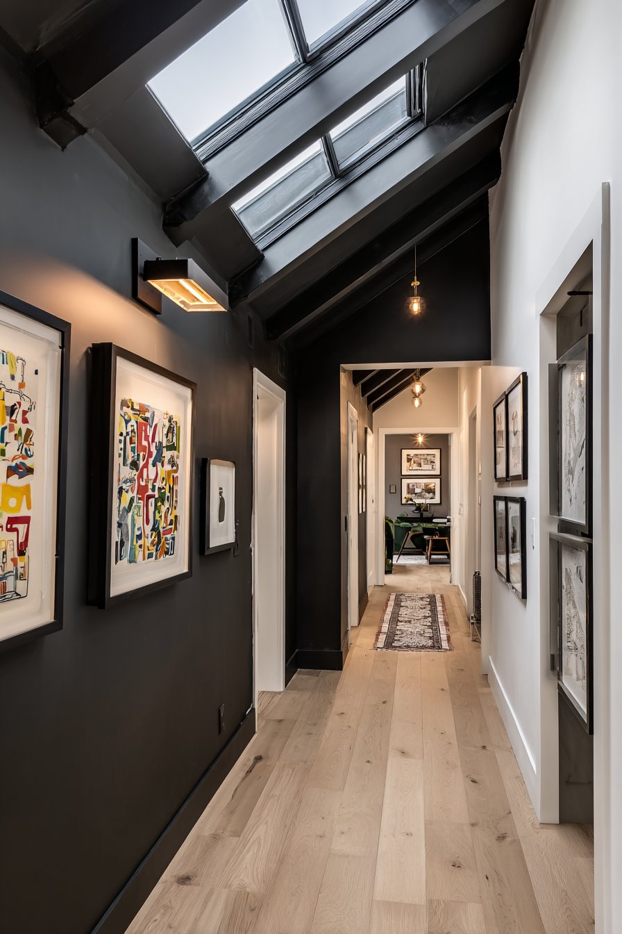
5. Intimate Charcoal Gray Gallery Atmosphere
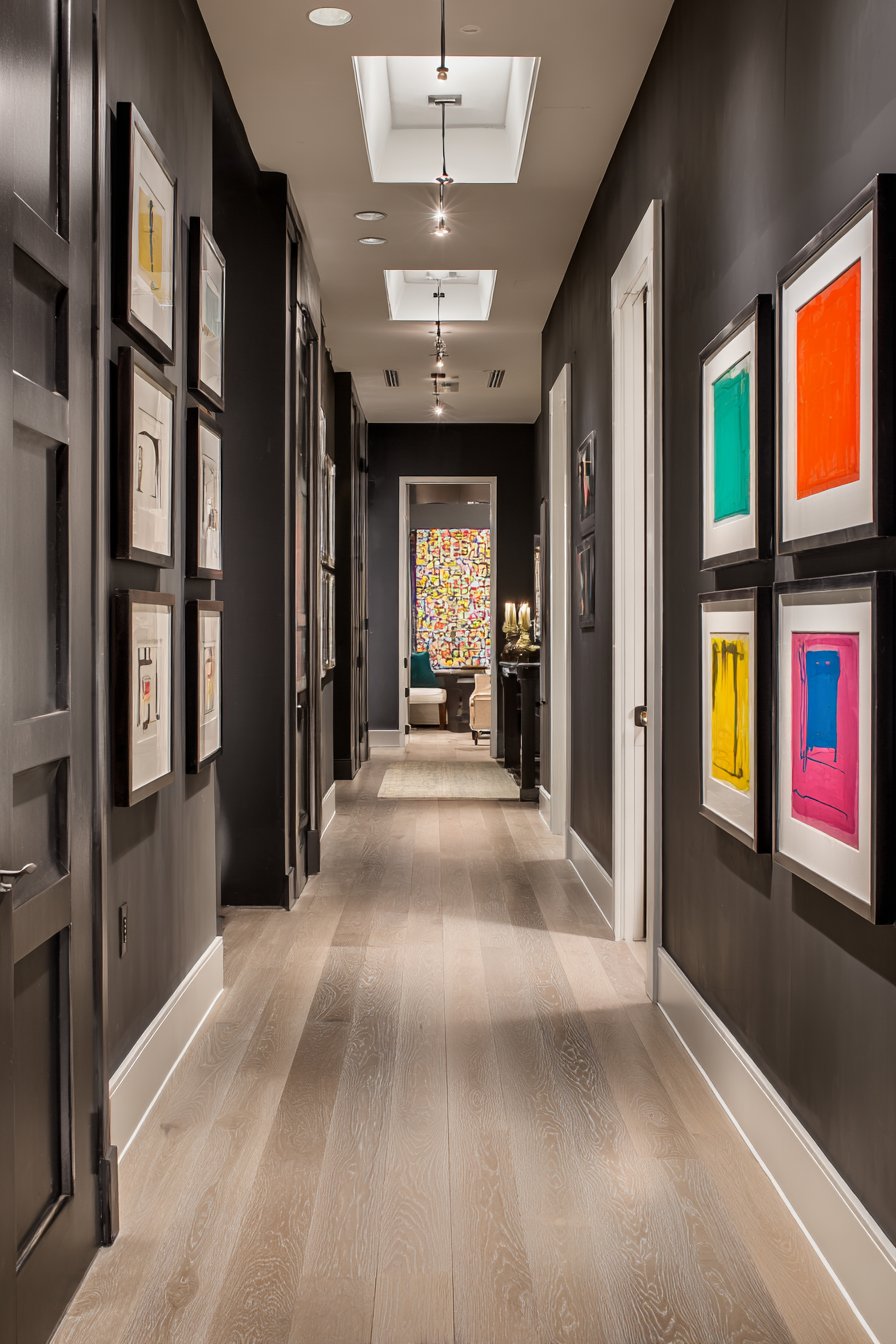
Bold homeowners who embrace drama will appreciate this sophisticated hallway paint approach featuring walls in charcoal gray that create an intimate, gallery-like atmosphere. This design challenges the conventional wisdom that hallways must be light-colored, instead demonstrating how dark paint can create intentional coziness and architectural sophistication. The key to success lies in balancing the dark walls with abundant natural light—in this case, a skylight positioned above floods the space with daylight that prevents the charcoal from feeling oppressive.
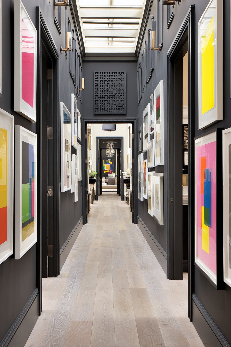
Light-colored flooring in bleached oak provides essential contrast and light reflection at ground level, bouncing illumination upward and creating visual relief from the dark walls. White door frames create crisp architectural punctuation against the charcoal backdrop, their brightness intensified by the dark paint surrounding them. Modern abstract art in colorful frames transforms the hallway into a curated gallery space, with the dark walls serving the same function as gallery walls in museums—providing a sophisticated, receding backdrop that makes artwork the undisputed focal point.
Minimalist wall-mounted LED lighting ensures the space feels intentional rather than accidentally dark. The fixtures are carefully positioned to graze the walls, creating subtle highlights that add dimension and prevent flat, lifeless appearance. The lighting strategy also illuminates the artwork properly, with individual pieces receiving focused attention. This hallway paint idea proves that dark colors can work beautifully in corridors when supported by proper lighting design and thoughtful contrast elements.
Key Design Tips:
- Never attempt charcoal hallway paint without ensuring abundant natural or artificial light—dark paint requires at least double the illumination of light colors
- Use eggshell or satin finishes rather than matte to help reflect light and add subtle sheen that prevents flat appearance
- Install dimmer switches to control lighting intensity and allow adjustment based on time of day and desired mood
- Maintain at least 50% of other surfaces (floors, ceilings, trim) in light colors to prevent the space from feeling like a cave
- Consider professional lighting design consultation for dark hallway projects to ensure proper illumination levels
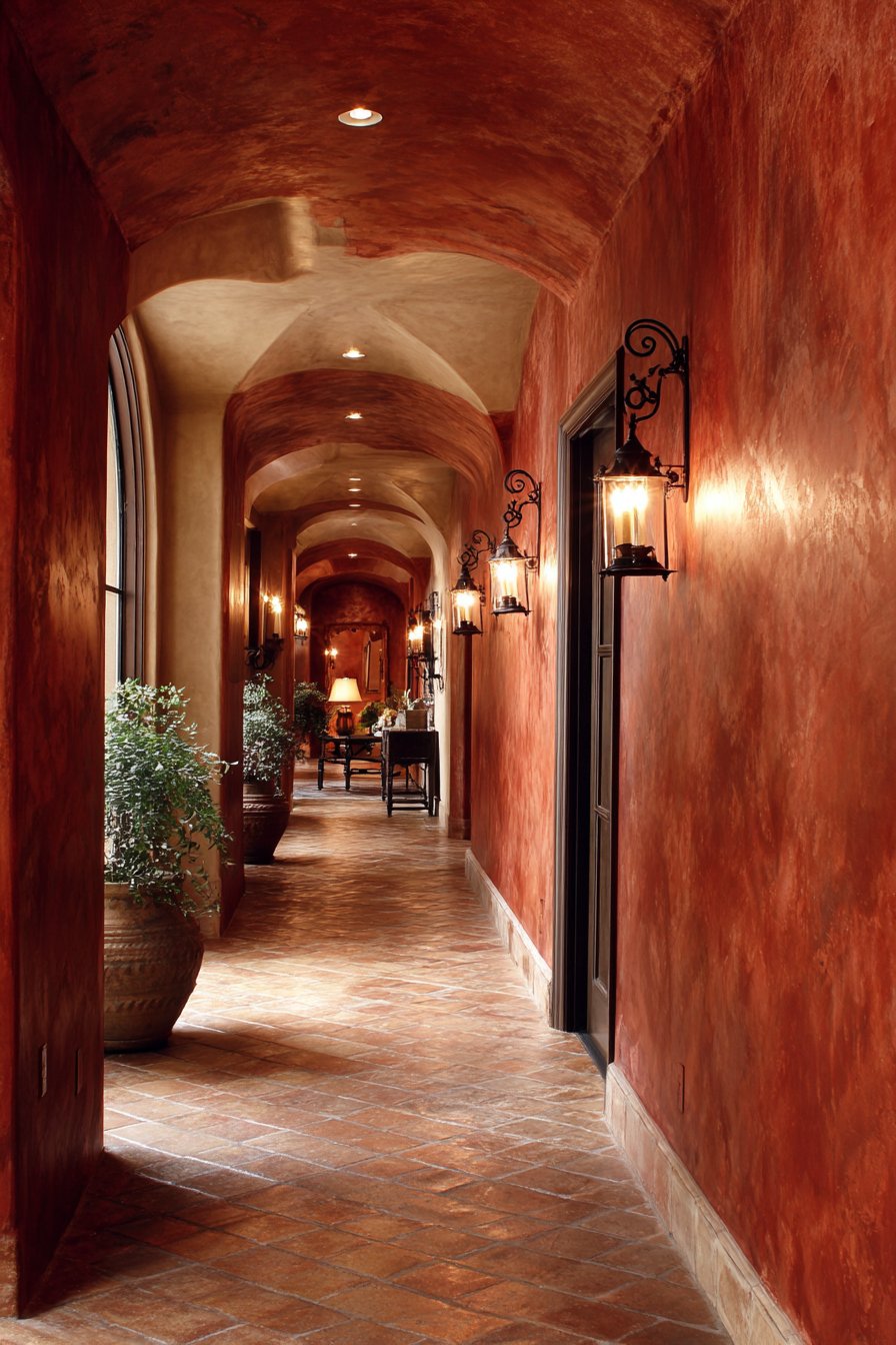
6. Mediterranean Terracotta Warmth
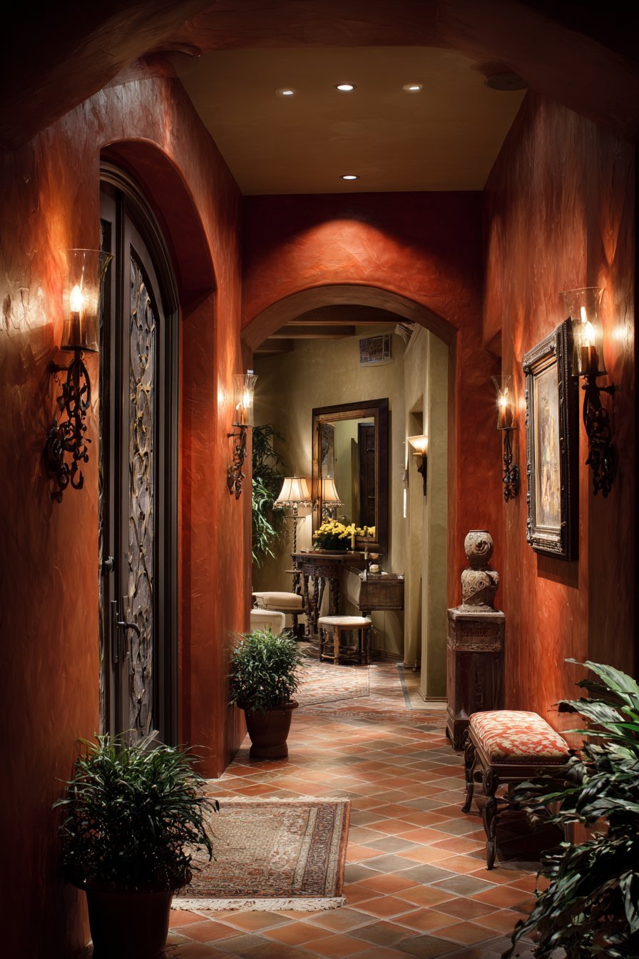
Rich terracotta paint envelops this hallway in Mediterranean warmth, bringing the sun-baked beauty of Southern European villas into your home. This hallway paint idea taps into the current trend toward warm, earthy tones that create immediate coziness and psychological warmth. The terracotta shade selection ranges from dusty rose-orange to deeper clay tones, with the ideal choice depending on your natural light levels and desired intensity. Cream-colored baseboards and door trim provide gentle contrast that complements rather than fights the warmth of the walls.
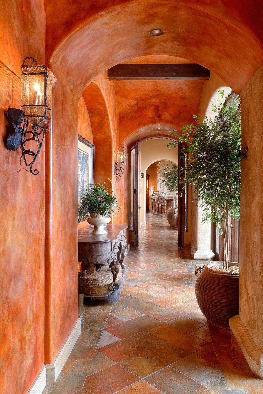
The textured plaster finish elevates this hallway paint beyond simple color application into authentic architectural technique. The subtle variations in the plaster create depth and visual interest that changes as light moves across the walls throughout the day. This texture mimics the aged, hand-finished walls found in historic Mediterranean homes, adding character that flat paint cannot achieve. Wrought iron wall sconces cast warm ambient lighting that enhances the earthy paint color, their metal work and vintage-inspired bulbs reinforcing the Old World aesthetic.
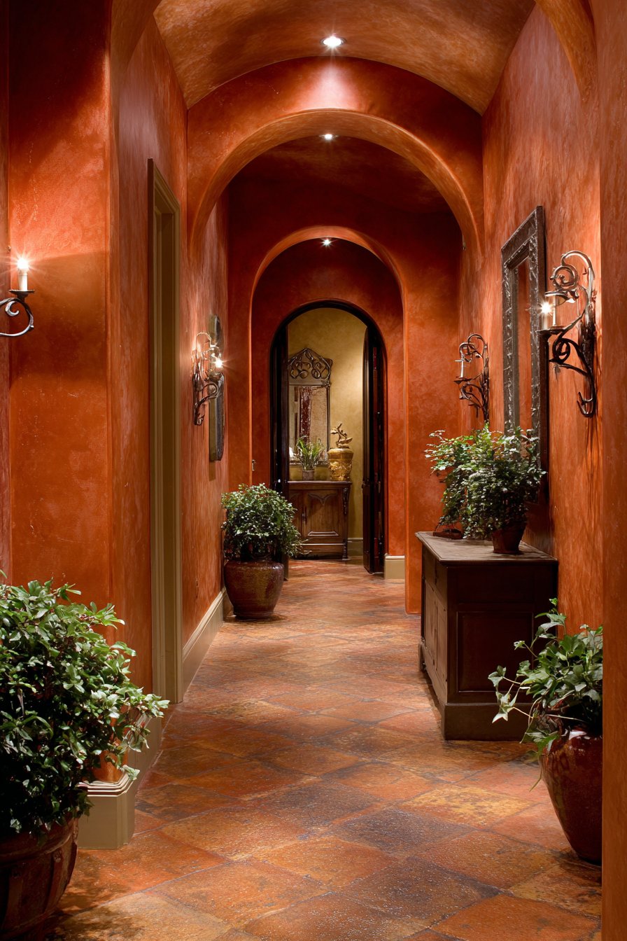
Terra cotta tile flooring completes the Mediterranean vision, creating a monochromatic warmth that feels cohesive and intentional. The repetition of terracotta tones between walls and floor could risk feeling overwhelming, but the variation in materials—matte plaster walls versus glossy tiles—provides enough textural contrast to maintain interest. Potted plants positioned along the hallway add essential natural elements and living green that pops beautifully against the warm terracotta backdrop.
Key Design Tips:
- Apply textured plaster finish in multiple thin layers rather than one thick application for the most authentic, dimensional result
- Test terracotta paint in your actual hallway before committing—these warm colors can appear dramatically different in north-facing versus south-facing corridors
- Balance warm terracotta walls with cooler accent colors in adjacent rooms to prevent your entire home from feeling too warm-toned
- Choose wrought iron or oil-rubbed bronze hardware and fixtures to reinforce the Mediterranean aesthetic
- Incorporate living plants to add freshness and prevent terracotta from feeling heavy or dated
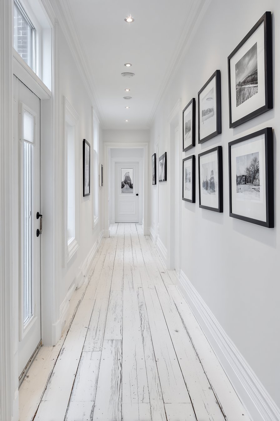
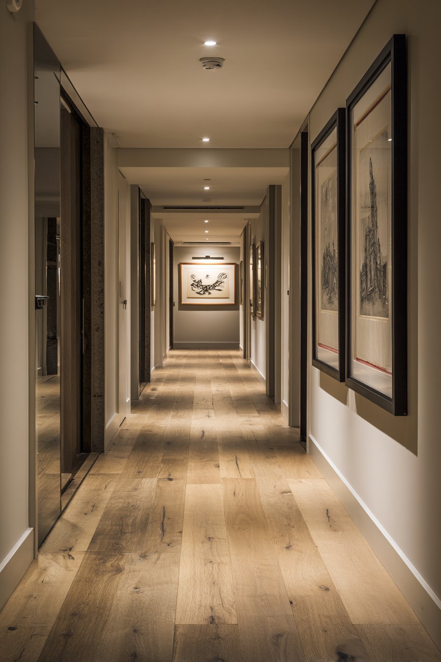
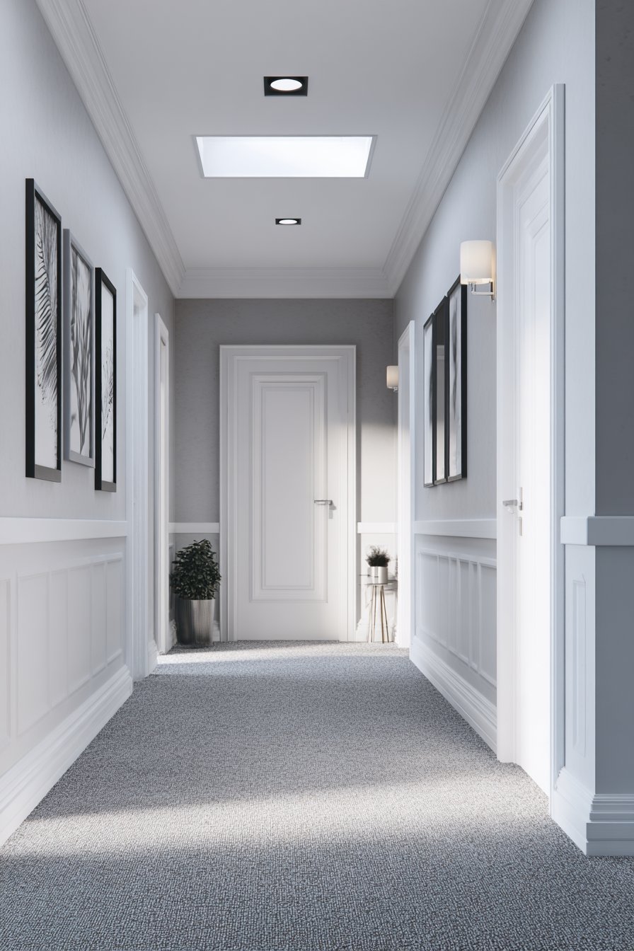
7. Minimalist Pure White Light Maximization
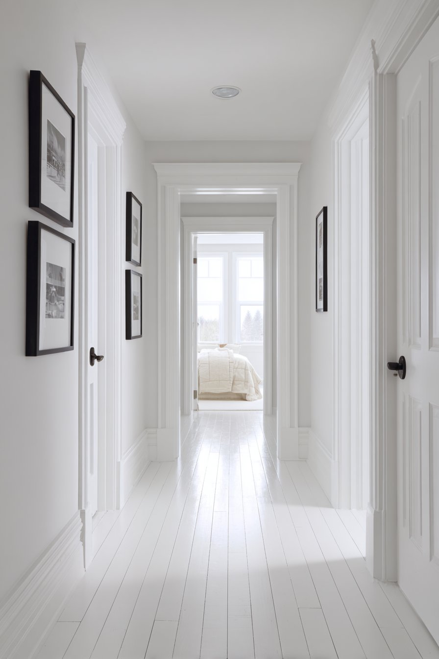
Embrace the power of simplicity with pure white hallway paint featuring a subtle eggshell finish that maximizes light reflection in a windowless corridor. This minimalist approach proves that white walls, when executed with intention and proper finish selection, create sophistication rather than blandness. The monochromatic scheme serves as a clean, gallery-like backdrop for black-framed photography that becomes the hallway’s focal point. Natural maple flooring adds the only warm color accent, grounding the white walls with organic wood tones.
The eggshell finish is crucial to this hallway paint’s success—unlike flat paint that can appear chalky and dead, or high-gloss that creates harsh reflections, eggshell provides subtle light reflection while hiding minor wall imperfections. In windowless corridors where natural light is absent, this gentle sheen becomes essential for distributing artificial light evenly throughout the space. Recessed ceiling lights provide bright, even illumination that demonstrates how white paint works in spaces with limited natural light, effectively doubling the perceived brightness through reflection.
Simple modern hardware in matte black on white doors creates crisp definition and visual punctuation in the otherwise minimal space. The black frames on photography and door hardware provide just enough contrast to prevent the white-on-white from feeling sterile or boring. This hallway paint idea exemplifies the minimalist principle that simplicity requires meticulous attention to detail—every element must be precisely chosen and perfectly executed when working with such a pared-down palette.
Key Design Tips:
- Choose eggshell or satin finishes for white hallway paint rather than flat, as some sheen is essential for light reflection and easier cleaning
- Use pure white (not off-white or cream) for maximum light reflection and crisp, modern appearance
- Install substantially more lighting than you think necessary—white walls require adequate illumination to avoid appearing dingy
- Select one contrasting accent color (like black) and use it consistently in frames, hardware, and accessories for visual coherence
- Maintain white walls in pristine condition through regular cleaning, as scuffs and marks show dramatically on pure white surfaces
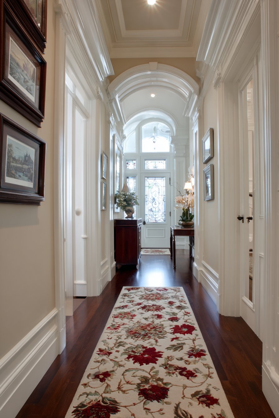
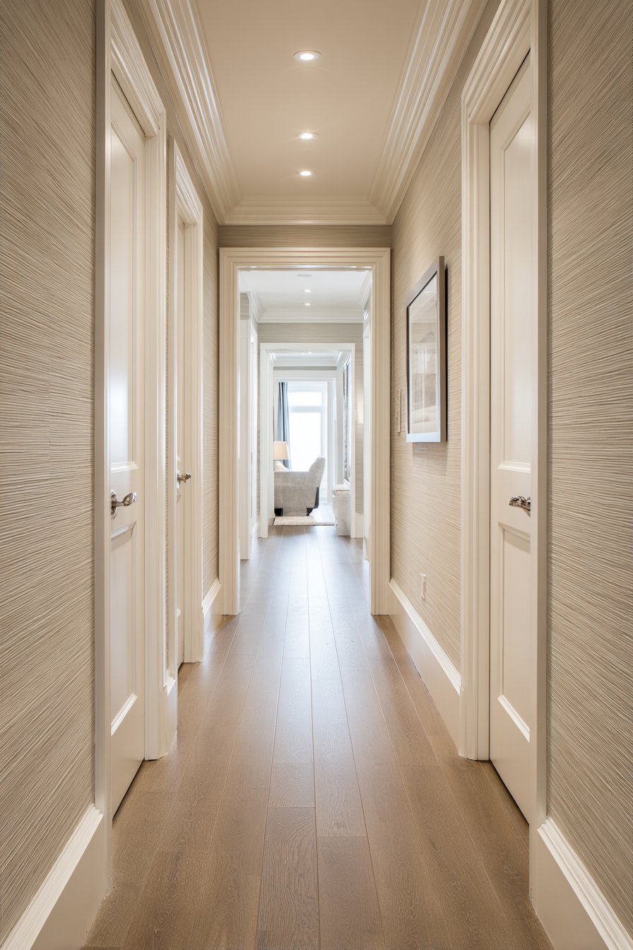
8. Elegant Warm Beige Timelessness
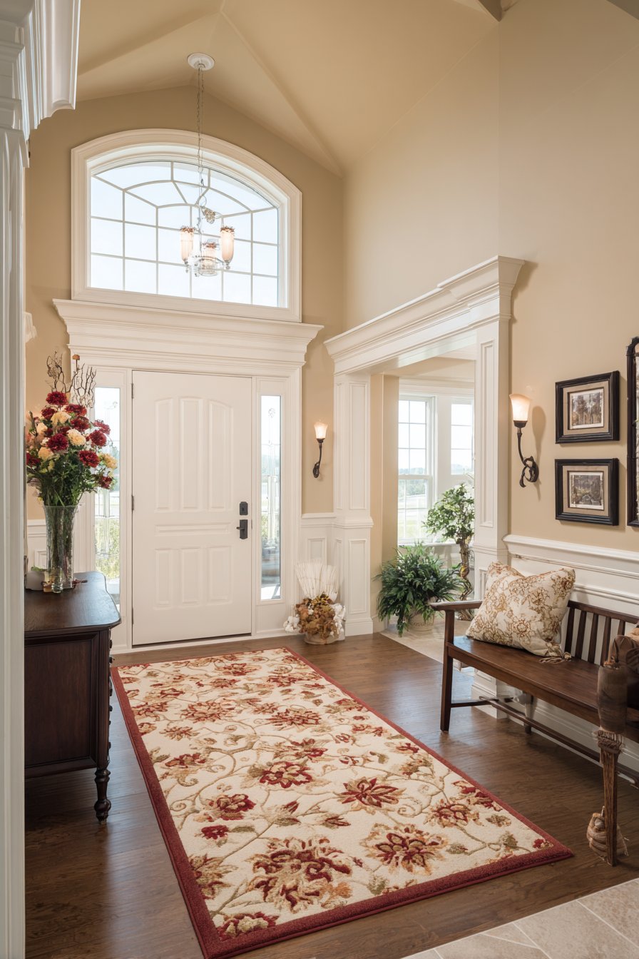
Classic warm beige hallway paint creates timeless elegance that transcends passing design trends. This traditional approach showcases Benjamin Moore-style warm beige that establishes an immediately welcoming atmosphere as guests enter your home. The neutral warmth serves as the perfect backdrop for family photos displayed in matching dark wood frames, creating a personal gallery that celebrates family history without competing with bold wall colors. White crown molding and picture rail add architectural sophistication that elevates the beige from basic to refined.
The beauty of this hallway paint choice lies in its proven longevity and universal appeal. While trendy colors come and go, quality warm beige remains perpetually appropriate, making it ideal for homeowners who plan to stay in their homes long-term or who want to avoid frequent repainting. The specific shade selection leans warm without becoming yellow, maintaining enough neutral character to coordinate with various decor styles while providing more personality than stark white or cool gray.
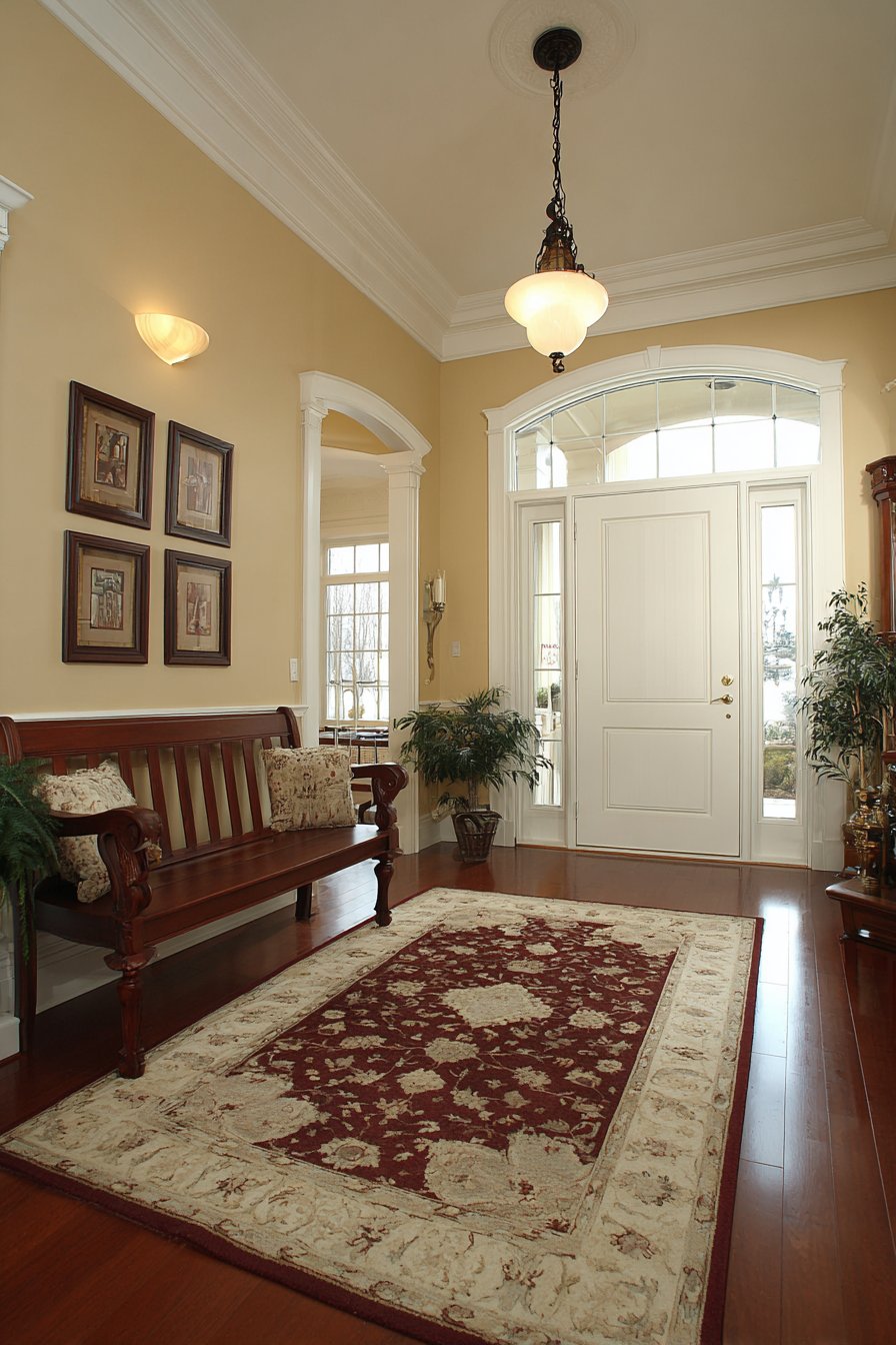
A traditional runner rug in burgundy and cream tones complements the warm beige walls while adding pattern and visual interest at floor level. Natural light from a transom window above the front door illuminates the space, demonstrating how this hallway paint color maintains its welcoming character in varying light conditions. The overall effect creates an entrance that feels established and gracious—the hallmark of traditional design done well.
Key Design Tips:
- Select warm beige with subtle yellow or peach undertones rather than pink or gray undertones for the most flattering, welcoming effect
- Use white (not cream) for crown molding and trim to create crisp definition and prevent the space from feeling too beige
- Coordinate undertones between wall paint and wood furniture to ensure harmonious rather than clashing warmth
- Layer pattern through rugs and textiles to add visual interest to neutral beige walls
- Consider the adjacent room colors to ensure your beige selection flows smoothly throughout your home
9. Artistic Ombre Gradient Technique
An innovative ombre hallway paint technique creates a stunning gradient transitioning from light cream at ceiling height to deeper taupe at floor level. This artistic approach transforms a standard hallway into a unique design statement that showcases advanced painting technique and creative vision. The gradual color shift creates visual interest that unfolds slowly as you move through the space, with the subtle transitions requiring careful blending during application for professional results.
The gradient hallway paint treatment serves a clever architectural purpose—making the space feel taller by drawing the eye upward from the darker floor-level tones toward the lighter ceiling area. White baseboards ground the design and provide a clean visual terminus for the darkest paint shade, preventing the gradient from bleeding into the floor. Light oak flooring prevents the lower taupe tones from feeling too heavy while adding warmth that complements both ends of the color spectrum.
Simple modern artwork positioned at eye level sits comfortably within the mid-tone section of the gradient, demonstrating how the ombre technique creates natural zones for decoration without requiring traditional wainscoting or chair rails. Balanced natural and artificial lighting reveals the gradient’s subtle sophistication, with different light sources highlighting various sections of the color transition throughout the day.
Key Design Tips:
- Work with a professional painter for ombre application, as achieving smooth, professional transitions requires specific blending techniques and experience
- Choose colors within the same family (cream to taupe, for example) rather than contrasting hues for the most sophisticated gradient
- Apply the gradient vertically rather than horizontally to enhance ceiling height perception
- Use high-quality paint with excellent blending properties to achieve seamless transitions between shades
- Install multiple light sources at different heights to showcase the gradient effect throughout the day
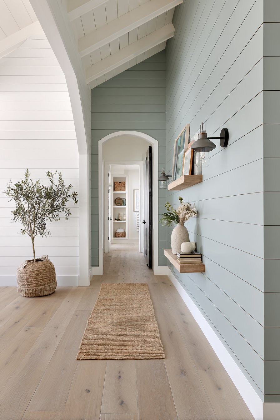
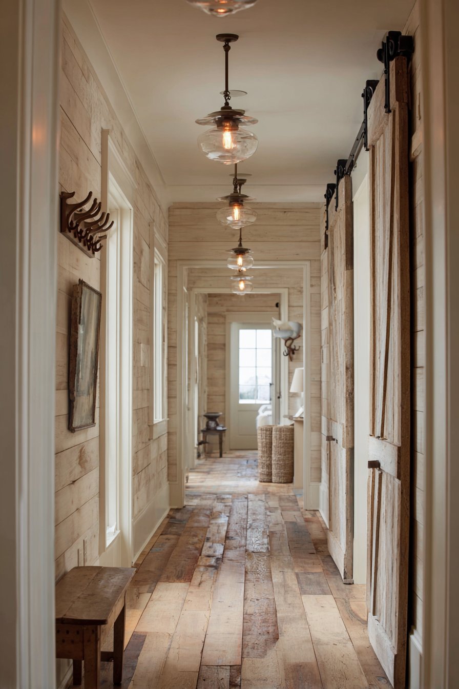
10. Rustic Farmhouse Greige Shiplap
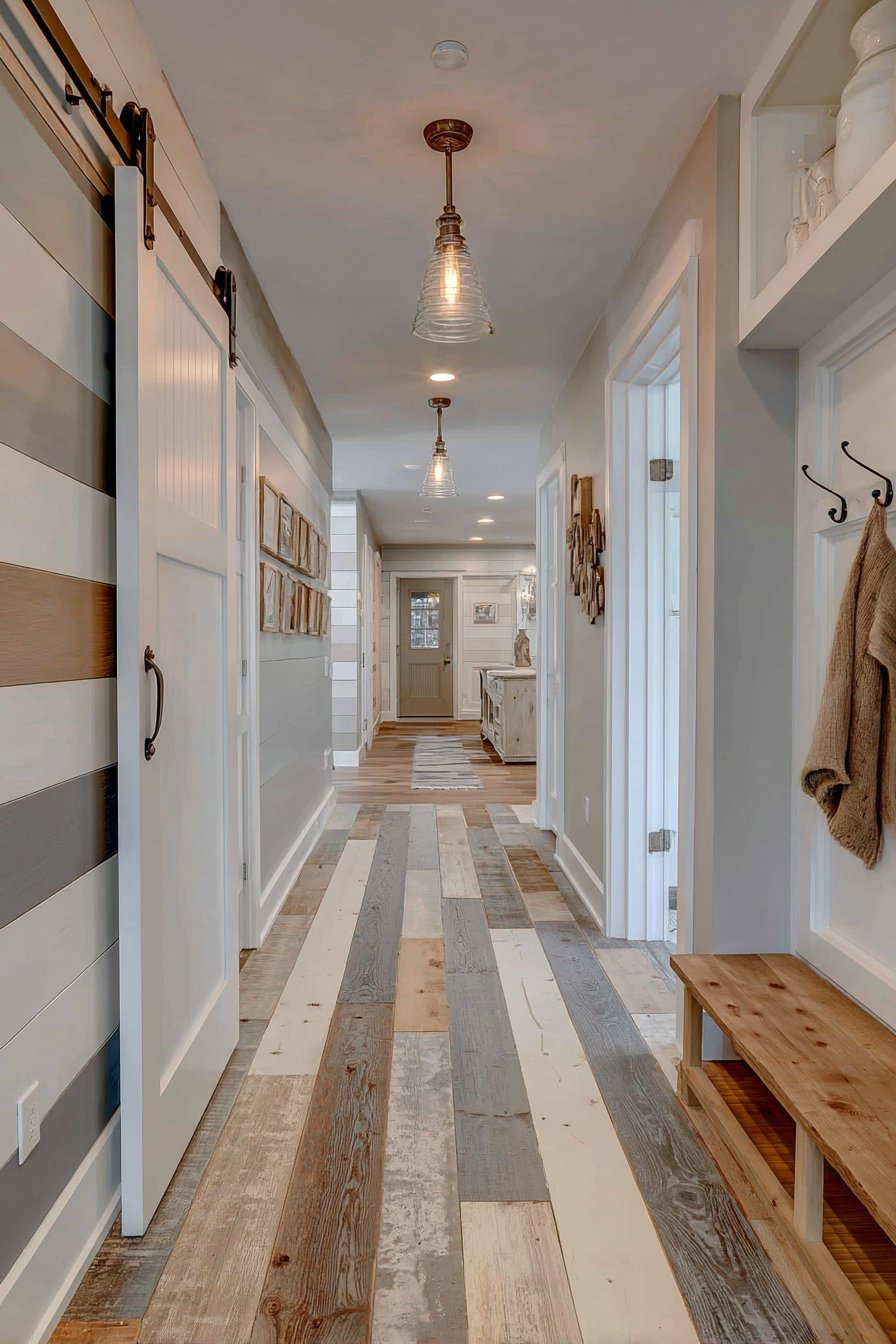
Horizontal shiplap walls painted in soft greige create authentic farmhouse charm that goes beyond simple color choice into textural architectural detail. This hallway paint idea combines material application with color selection, demonstrating how texture and paint work together to create cohesive style. The matte finish enhances the rustic character while the greige color—that perfect gray-beige hybrid—keeps the farmhouse aesthetic feeling current rather than dated country.
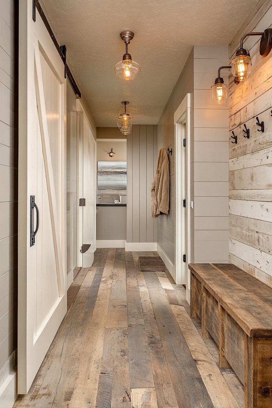
White-painted barn door hardware and traditional baseboards provide essential contrast against the greige shiplap, their crisp brightness preventing the neutral walls from feeling too monochromatic. Vintage-inspired pendant lights with Edison bulbs cast warm ambient lighting that enhances the farmhouse character, their visible filaments and aged metal finishes reinforcing the rustic-meets-refined aesthetic. Reclaimed wood flooring in varied tones adds authenticity through genuine age and patina, coordinating with the greige walls through shared warmth.
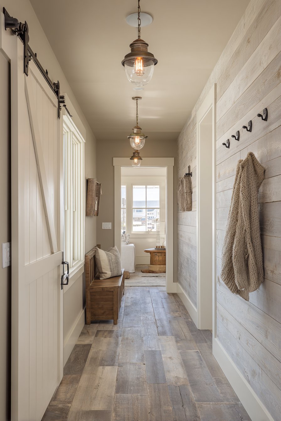
A wooden bench with mounted coat hooks demonstrates the farmhouse commitment to functional styling—every element serves a purpose while contributing to the overall aesthetic. The bench provides seating for removing shoes, the hooks offer convenient coat storage, and both pieces showcase natural wood grain and simple construction that epitomizes farmhouse design philosophy. This hallway paint and material combination creates a welcoming entrance that immediately establishes your home’s design direction.
Key Design Tips:
- Install actual shiplap planks rather than using shiplap-textured wallpaper for authentic appearance and long-term durability
- Paint shiplap after installation to ensure paint fills the grooves properly and creates uniform coverage
- Choose greige paint with warm undertones to reinforce farmhouse coziness rather than cool grays that feel too modern
- Incorporate reclaimed or distressed wood elements to add authentic age and character
- Use matte paint finishes exclusively for the most authentic farmhouse appearance
11. Luxurious Deep Forest Green Statement
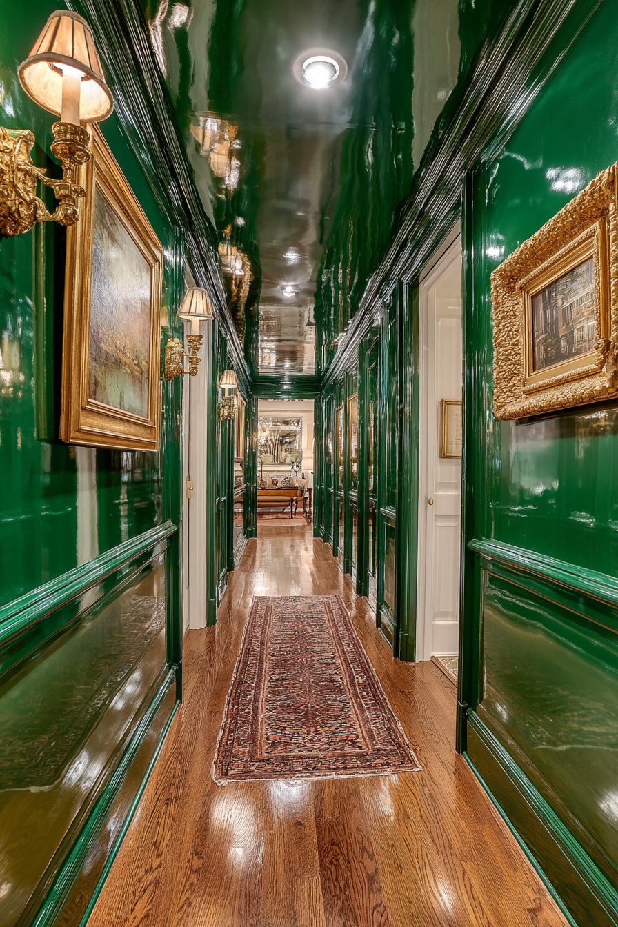
Make a bold statement with deep forest green hallway paint in semi-gloss finish that creates dramatic sophistication and jewel-box luxury. This daring choice demonstrates confidence and design commitment, transforming an ordinary corridor into an unforgettable architectural experience. The rich green tones evoke nature’s deepest forests while the semi-gloss finish adds reflective quality that prevents the dark color from absorbing all light. Gold-framed mirrors and brass wall sconces provide luxurious metallic accents that sing against the rich paint color.
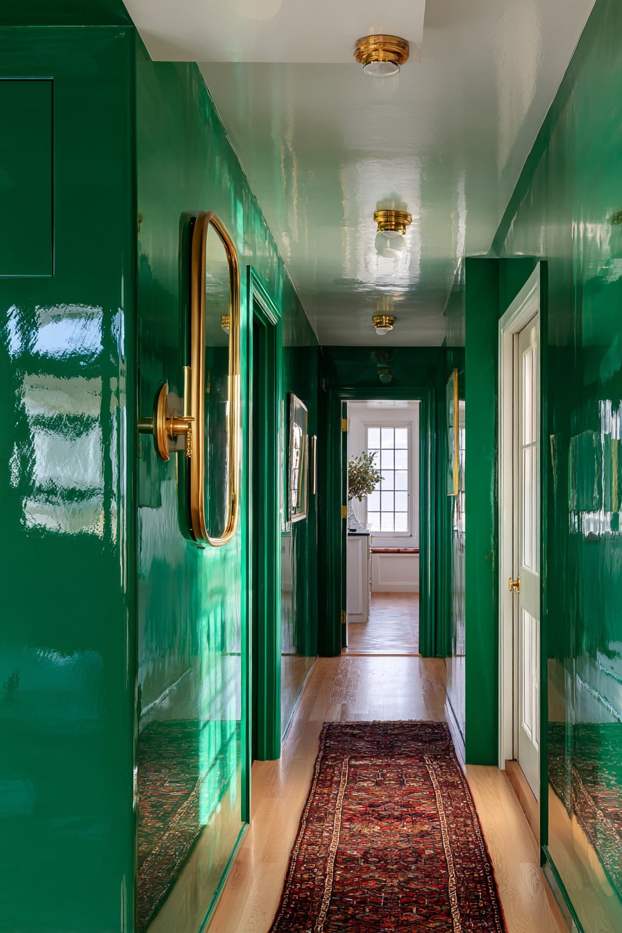
The white ceiling and light hardwood flooring provide essential brightness that prevents the deep green from making the space feel enclosed or cave-like. This contrast is non-negotiable with such saturated wall colors—attempting deep jewel tones without adequate light-colored surfaces results in oppressive rather than luxurious atmosphere. The reflective paint finish becomes functional as well as aesthetic, helping bounce light throughout the narrow space and creating the illusion of greater width.
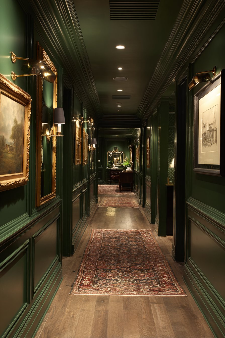
A vintage Persian runner adds pattern, color, and warmth at floor level, its traditional design reinforcing the luxurious, collected-over-time aesthetic that pairs beautifully with deep green walls. The runner’s warm tones and intricate pattern provide visual relief from the solid green walls while adding textural softness that balances the glossy paint finish. Professional lighting design ensures the deep green appears rich rather than muddy, with careful attention to color rendering and light placement.
Key Design Tips:
- Test deep green paint samples in your actual hallway at different times of day—these colors appear dramatically different in various lighting conditions
- Use semi-gloss or high-gloss finishes with deep colors to add light reflection and prevent flat, lifeless appearance
- Ensure your hallway receives abundant natural or artificial light before attempting deep paint colors
- Incorporate metallic accents in warm tones (gold, brass) rather than cool (chrome, nickel) to enhance the luxurious feel
- Keep at least the ceiling and one other major surface (floor or doors) in light colors for essential contrast
12. Nordic Gray-Blue Minimalism
Soft gray-blue hallway paint embodies Scandinavian minimalism and creates the calm, uncluttered aesthetic central to Nordic design philosophy. This cool-toned paint provides a serene backdrop that promotes the mental clarity and peaceful atmosphere Scandinavian design strives to achieve. Natural light oak flooring and crisp white trim create the classic Scandinavian contrast—light wood paired with white and soft blue-gray that defines this beloved design style.
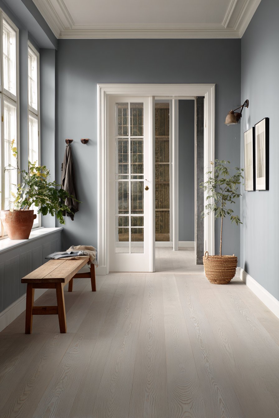
The minimalist approach extends beyond color into the entire hallway treatment. A simple wooden bench provides the only seating, its clean lines and natural wood finish exemplifying Scandinavian furniture design principles. A wall-mounted coat rack offers function without visual clutter, its simple pegs and minimal frame disappearing against the soft blue-gray walls. Natural light from glass panel doors illuminates the space while demonstrating the paint’s subtle blue undertones that become more apparent in bright daylight.
A single potted plant adds the essential touch of nature that Scandinavian design requires, its green leaves providing organic contrast against the cool wall color. The plant represents the Nordic connection to nature and seasons, bringing living elements indoors to counteract long, dark winters. This hallway paint idea creates a space that feels restful, organized, and purposeful—the essence of successful Scandinavian design.
Key Design Tips:
- Choose gray-blue paint with subtle undertones rather than vivid blues to maintain Scandinavian restraint
- Use natural materials (wood, linen, wool) exclusively for furniture and textiles to reinforce the organic Nordic aesthetic
- Limit accessories to functional items and one or two carefully chosen decorative elements
- Ensure abundant natural light through windows or glass doors to create the brightness essential to Scandinavian design
- Select furniture with clean, simple lines rather than ornate or heavily decorated pieces
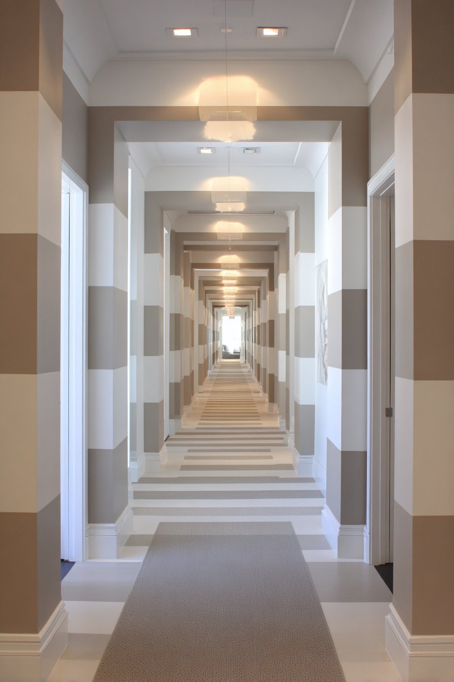
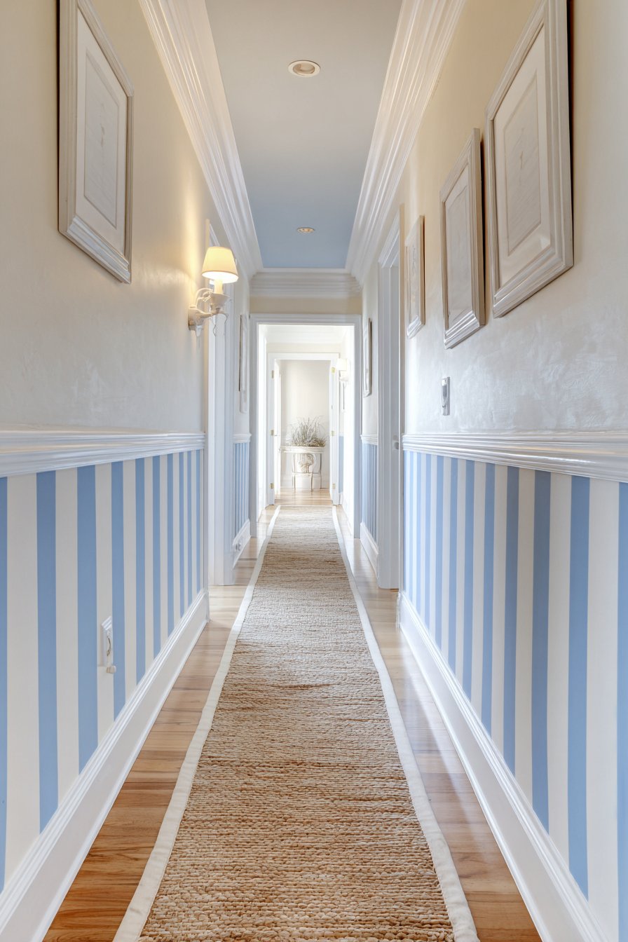
13. Playful Horizontal Stripe Pattern
Alternating horizontal bands of cream and soft taupe create geometric visual interest while making a narrow corridor feel wider through clever optical illusion. This striped hallway paint design adds playful sophistication while maintaining neutral elegance that won’t quickly feel dated. Each stripe is precisely painted with clean edges separated by subtle spacing that defines the pattern without creating busy visual noise. The horizontal orientation works specifically to counteract narrow hallway proportions.
White door frames and baseboards integrate seamlessly into the striped pattern, their placement requiring careful planning to ensure stripes meet door and floor elements at visually pleasing points. Modern linear lighting fixtures are strategically positioned to align with the horizontal paint stripes, reinforcing the geometric pattern through both painted surface and lighting design. The alignment creates cohesive intentionality that elevates the stripes from decorative pattern to integrated architectural feature.
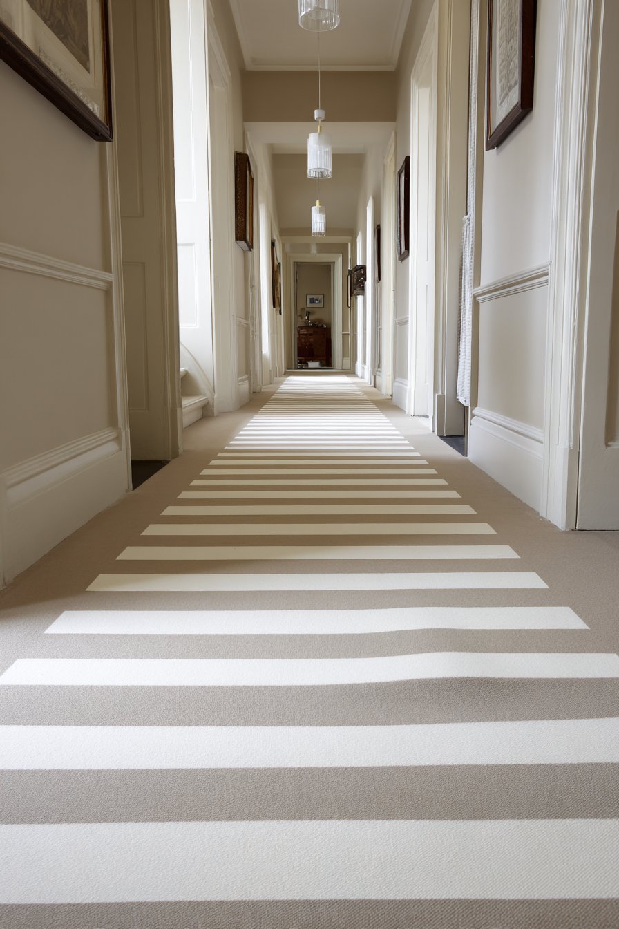
Light gray carpet runner grounds the design while adding softness that balances the graphic wall treatment. The runner’s solid color provides visual rest from the stripes, preventing pattern overload that could result from striped walls meeting patterned flooring. The overall effect demonstrates how thoughtful hallway paint patterns can transform corridor proportions and create memorable design impact with relatively simple materials.
Key Design Tips:
- Use painter’s tape and a level to ensure perfectly straight stripe edges—even slight wavering becomes obvious in geometric patterns
- Plan stripe width based on your hallway’s scale—wider hallways can accommodate wider stripes, while narrow spaces need more delicate proportions
- Limit stripe patterns to two colors within the same tonal family for sophisticated rather than busy results
- Consider how stripes will meet doorways and corners, planning these intersections before beginning painting
- Pair striped walls with solid-colored flooring and minimal accessories to prevent visual overwhelm
14. Moody Charcoal Blue-Gray Cocoon
Create an intimate, cocooning effect with charcoal blue-gray hallway paint that embraces rather than fights limited corridor dimensions. This moody approach transforms a potential design liability—a narrow, enclosed hallway—into an intentional feature through saturated color that creates depth and drama. The dark paint establishes an intimate atmosphere that makes the hallway feel like a purposeful transition space rather than a neglected pass-through.
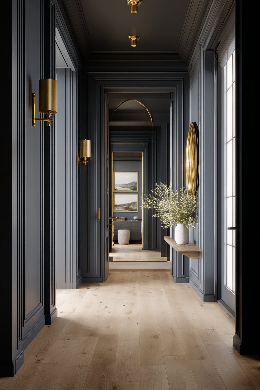
Brass picture lights illuminate framed artwork with warm, focused lighting that creates pools of illumination against the dark walls. This targeted lighting approach works specifically for dark hallway paint, where overall ambient lighting alone can leave the space feeling murky. White wainscoting adds essential contrast at lower wall level, protecting high-traffic areas while breaking up the dark color expanse. Light natural oak flooring prevents the space from feeling too dark by reflecting light upward and providing warm tones that balance the cool charcoal walls.
A gold-toned mirror positioned at the hallway end performs double duty—reflecting light throughout the space while its metallic frame adds luxurious accent that enhances the moody sophistication. The mirror’s placement creates the illusion of extended space beyond the hallway’s actual terminus, a crucial optical trick in compact corridors. Professional lighting design demonstrates how dark hallway paint succeeds only when supported by comprehensive illumination strategy.
Key Design Tips:
- Install at least three types of lighting (overhead ambient, wall sconces, picture lights) when using dark hallway paint to prevent dungeon-like atmosphere
- Add white or light-colored wainscoting to break up dark walls and provide visual relief
- Position mirrors strategically to reflect and multiply light sources throughout the space
- Use warm-toned metallic accents (brass, gold, copper) to add warmth to cool dark colors
- Ensure excellent paint coverage when using dark colors—thin application reveals streaks and uneven color
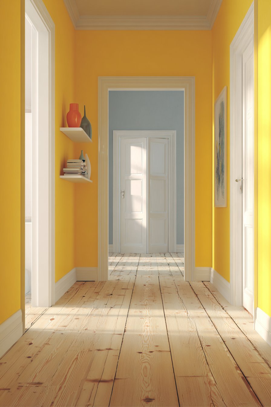
15. Cheerful Sunny Yellow Energy
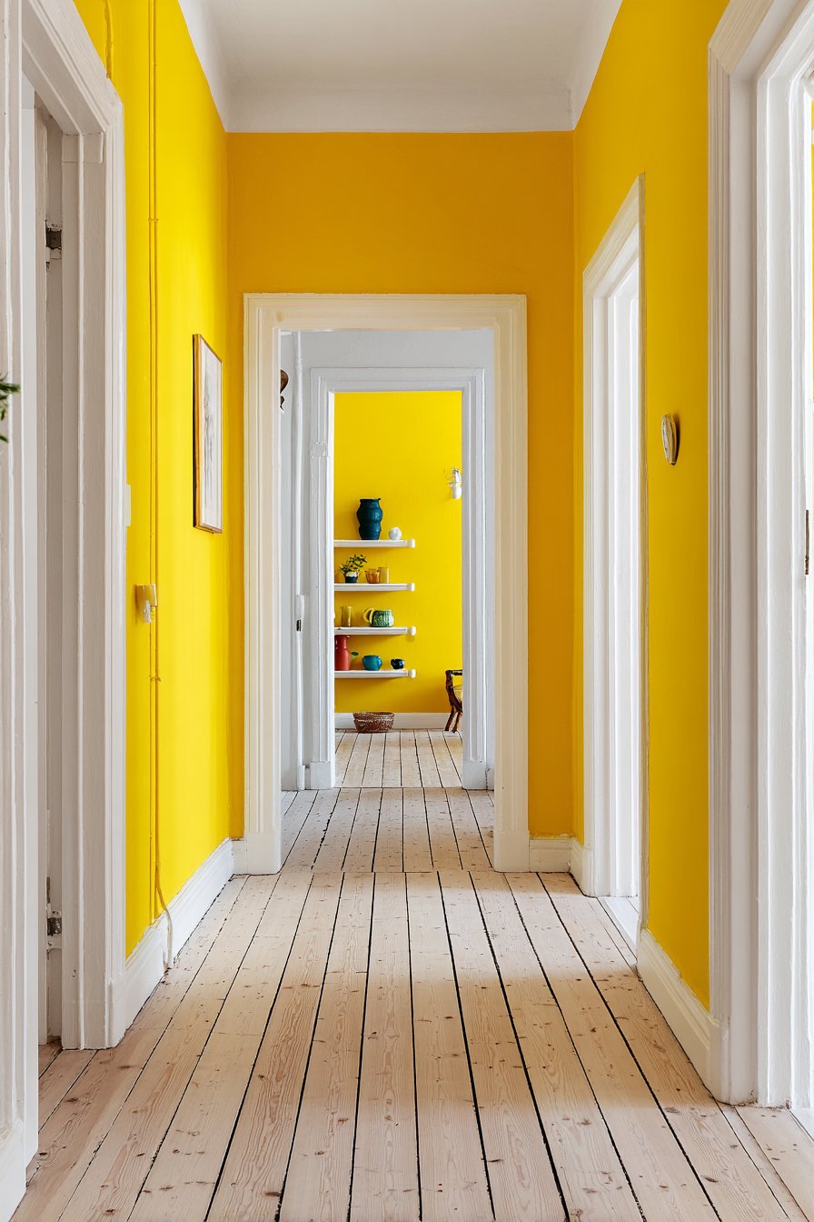
Transform a previously dark entrance corridor with cheerful sunny yellow hallway paint that brings instant energy and warmth to your home. This bold color choice challenges conservative neutral conventions, instead embracing color’s psychological power to influence mood and create welcoming atmosphere. The specific yellow shade selection is critical—too bright verges on garish, too muted reads as mustard. The ideal sunny yellow maintains vibrancy while remaining sophisticated enough for adult spaces.
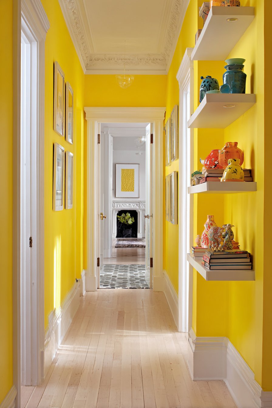
White trim work including baseboards, door frames, and crown molding provides essential visual boundaries that prevent the bright yellow from overwhelming the space. This crisp contrast creates definition and architectural detail while giving the eye places to rest from the saturated wall color. Natural light from adjacent rooms enhances the warm, welcoming effect, with the yellow paint actually amplifying and reflecting available light throughout the space.
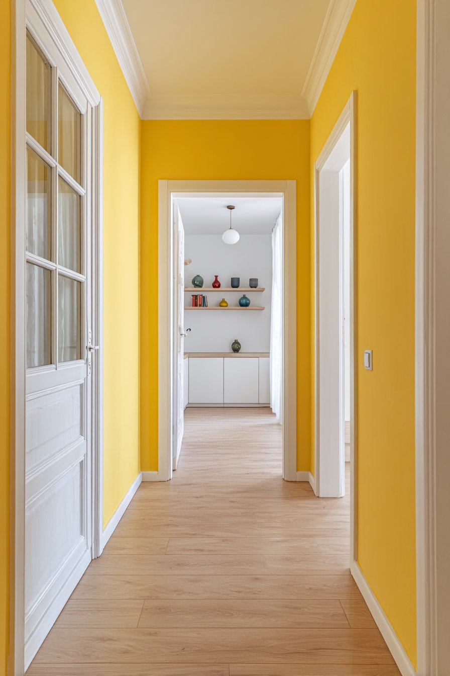
Simple white floating shelves display colorful ceramics and books that celebrate rather than compete with the bold wall color. The accessories incorporate yellows, oranges, and complementary blues that harmonize with the wall paint while adding pattern and visual interest. Light wood flooring in natural finish balances the vibrant walls with organic neutrality, grounding the energetic color scheme with natural material warmth.
Key Design Tips:
- Test yellow paint samples extensively, as yellows shift dramatically in different lighting and can appear either fresh or sickly depending on undertones
- Use pure white (never cream or ivory) for all trim to create crisp, fresh contrast with yellow walls
- Limit yellow to hallways and entrance areas rather than entire homes to prevent color fatigue
- Incorporate natural materials and plants to balance the intensity of yellow paint
- Ensure your hallway receives adequate natural or artificial light—yellow walls in dark spaces can appear muddy or dull
16. Dimensional Metallic Mushroom Taupe
Specialty hallway paint with subtle metallic flecks in a mushroom taupe base creates dimensional interest that transforms throughout the day as light conditions change. This sophisticated technique goes beyond flat color, incorporating light-reflective particles that catch and scatter illumination creating visual movement and depth. The textured paint becomes an architectural feature in itself, offering complexity that rewards closer inspection while maintaining neutral versatility.
Simple white trim and contemporary brushed nickel hardware wisely keep focus on the dimensional wall treatment rather than competing for attention through additional decorative elements. The neutral supporting cast allows the specialty paint to be the star, demonstrating the design principle that one special feature per space creates impact while multiple special elements create chaos. Recessed lighting with dimmer control allows adjustment of how dramatically the metallic elements sparkle, offering different moods for different occasions.
Medium-toned hardwood flooring complements the sophisticated mushroom taupe without precisely matching it—an important distinction that prevents the space from feeling too matchy or one-note. Professional interior photography captures both close-up texture details and overall room impact, demonstrating how this hallway paint technique works at multiple viewing distances. From afar, the walls read as elegant neutral; up close, the metallic dimension reveals its magic.
Key Design Tips:
- Apply specialty metallic paints according to manufacturer’s directions, as improper application can result in uneven sparkle distribution
- Use these paints sparingly in high-impact areas rather than entire homes to maintain their special quality
- Install dimmer switches to control how prominently the metallic elements appear
- Choose metallic paints with subtle rather than obvious sparkle for sophisticated rather than glittery appearance
- Test samples on your actual walls, as metallic paints appear completely different on sample cards versus large surfaces
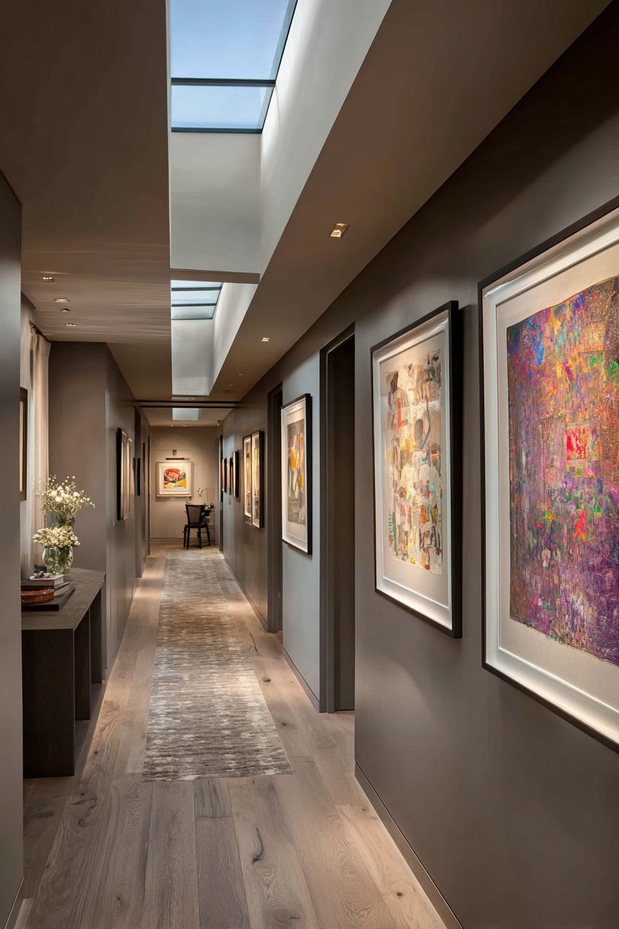
17. Sophisticated Monochromatic Gray Tones
Walls, trim, and doors painted in varying shades of soft gray create a sophisticated monochromatic scheme that demonstrates advanced color understanding. This tonal hallway paint approach uses subtle variations—from pale silver on upper walls to deeper charcoal on baseboards—to create architectural interest without pattern or contrasting colors. The seamless gray color flow creates depth and dimension through value changes alone, proving that monochromatic doesn’t mean boring when executed with skill.
Modern artwork in black frames provides necessary contrast and focal points within the gray tonal scheme, their crisp black elements creating visual punctuation and preventing the space from feeling too soft or undefined. Metallic accents in light fixtures add essential sparkle and light reflection, their polished surfaces catching and distributing illumination throughout the gray space. Natural light from a skylight demonstrates the paint’s tonal complexity, revealing how different gray values shift and interact as light conditions change.
The genius of this hallway paint idea lies in its demonstration that monochromatic color schemes require MORE careful attention to value and undertone than multi-color schemes. Each gray must be selected to harmonize with its neighbors while providing enough contrast to create definition. The resulting space feels cohesive, sophisticated, and intentionally designed—the hallmark of successful monochromatic color work.
Key Design Tips:
- Select all gray shades from the same paint fan deck to ensure undertones match and colors harmonize
- Create clear value contrast between adjacent grays—too-similar shades blur together rather than creating intentional gradation
- Use at least three distinct gray values for successful monochromatic schemes
- Add metallic accents and black elements to prevent all-gray from feeling flat or lifeless
- Consider how natural light affects your grays throughout the day, as undertones shift dramatically in different lighting
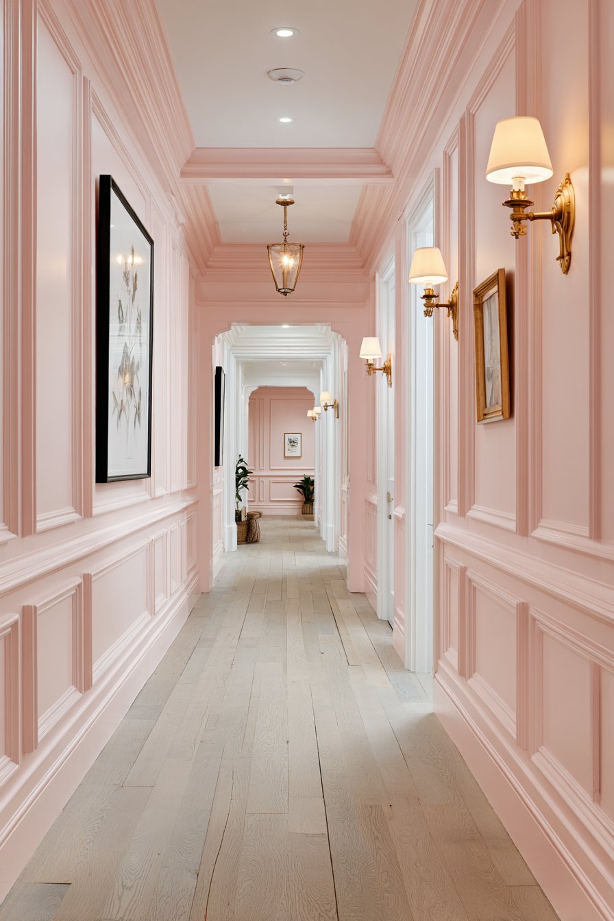
18. Romantic Blush Pink Elegance
Sophisticated dusty rose hallway paint creates soft, romantic atmosphere while maintaining adult elegance through careful shade selection and styling. This blush pink approach challenges the notion that pink is inherently juvenile, instead demonstrating how muted, sophisticated pink tones create warmth and personality without sacrificing grown-up appeal. White Victorian-style trim molding and picture rails provide elegant architectural contrast that frames the feminine paint color within traditional details.
Vintage brass wall sconces cast flattering warm light that enhances the pink’s rosy undertones while adding metallic elegance through their aged finish. The warm light prevents the pink from appearing too cool or stark, instead maintaining a welcoming glow that makes the color feel intentional and inviting. Light gray-washed wood floors provide neutral grounding that keeps the pink from feeling too sweet or saccharine, their cool tones balancing the wall color’s warmth.
Black-framed botanical prints add necessary grounding contrast and visual weight that prevents the soft pink from floating away into cotton candy territory. The dark frames anchor the delicate wall color while the botanical subjects reinforce the organic, natural quality that makes dusty pink feel sophisticated rather than childish. Natural light from transom windows shows the paint’s elegant undertones, revealing complexity that elevates it beyond simple pink.
Key Design Tips:
- Choose dusty, muted pink tones with gray undertones rather than bright or peachy pinks for sophisticated adult spaces
- Balance pink walls with cool-toned flooring and dark accent pieces to prevent overly sweet or juvenile appearance
- Use white (not cream) trim for crisp, fresh contrast that keeps pink feeling current
- Incorporate natural materials and botanical elements to reinforce the organic quality of sophisticated pink
- Test pink samples in multiple lighting conditions, as these colors shift dramatically between natural and artificial light
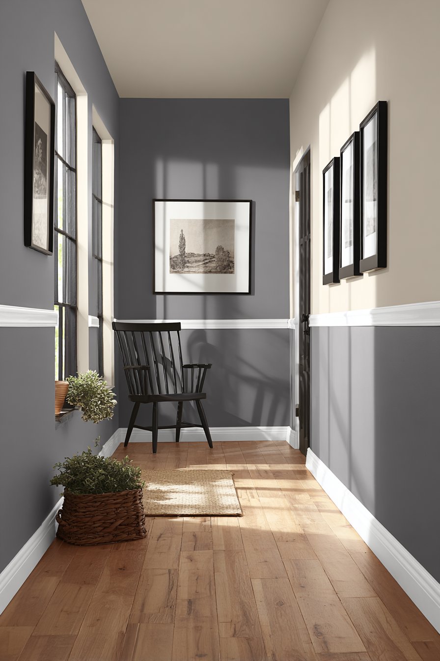
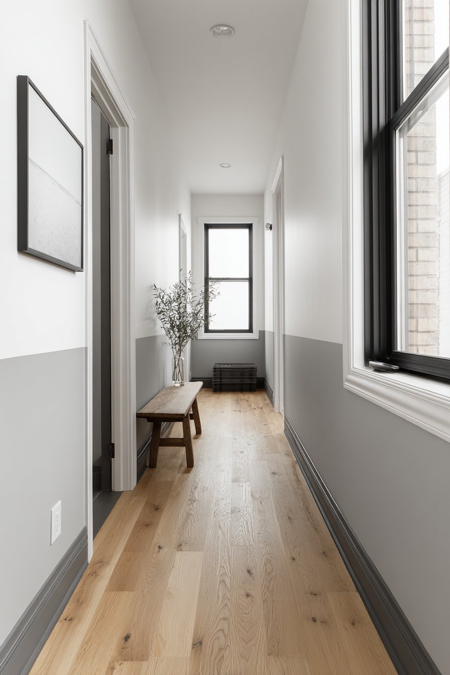
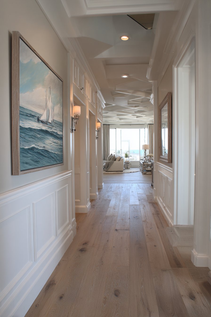
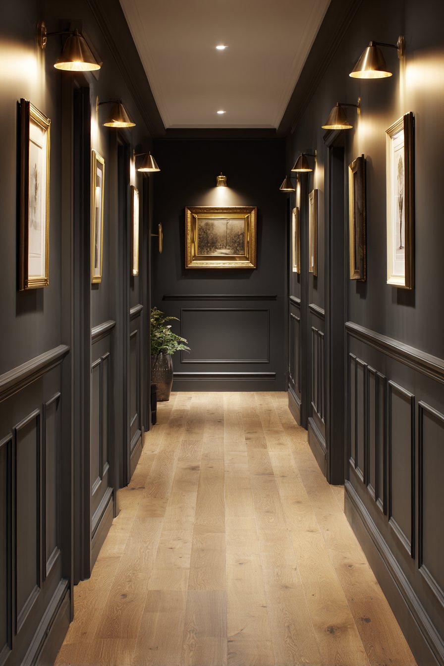
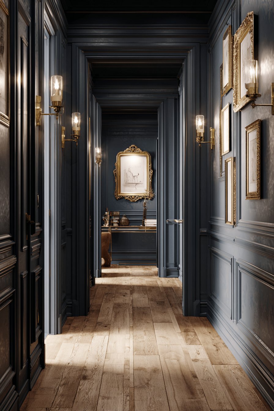
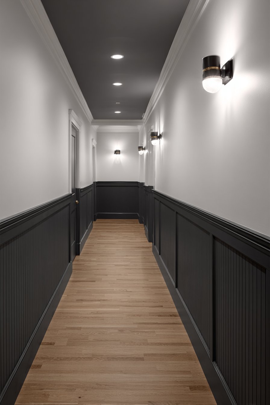
19. Classic Charcoal and White Wainscoting
Deep charcoal gray upper walls combined with white board-and-batten paneling create timeless architectural interest through the marriage of bold color and traditional detail work. This wainscoting hallway paint idea demonstrates how painted surfaces and dimensional millwork collaborate to create impact beyond what either element could achieve alone. The two-tone treatment adds visual height by drawing eyes upward from the white lower section toward the dramatic charcoal upper walls.
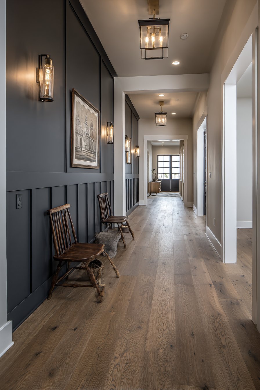
The chair rail separating the color zones is painted white to match the wainscoting, creating clean definition and visual continuity with the lower wall treatment. Warm wood flooring and brass hardware inject essential warmth into the otherwise cool gray-and-white palette, preventing the space from feeling too stark or cold. Wall-mounted lighting highlights the dimensional quality of the board-and-batten paneling, creating shadows and depth that flat walls cannot achieve.
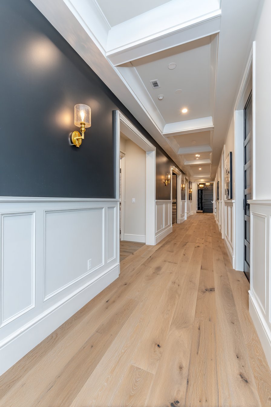
The wainscoting serves practical purposes beyond aesthetics—protecting high-traffic lower walls from scuffs, bumps, and furniture marks that inevitably occur in hallway spaces. The white paint makes touch-ups easy and inexpensive compared to maintaining pristine walls in darker colors at floor level. This hallway paint and millwork combination represents the perfect marriage of beauty and practicality that defines successful residential design.
Key Design Tips:
- Install wainscoting to approximately one-third wall height for proper proportions in standard 8-foot ceilings
- Paint wainscoting and trim in the same white color for visual cohesion and simplified maintenance
- Choose charcoal paint with warm rather than cool undertones to prevent sterile or institutional feel
- Ensure wainscoting installation is level and properly aligned—crooked boards ruin the polished look
- Use semi-gloss or satin paint on wainscoting for durability and easier cleaning in high-traffic areas
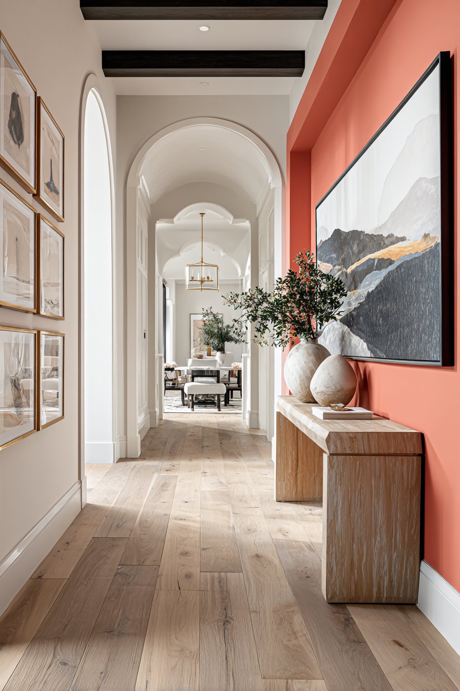
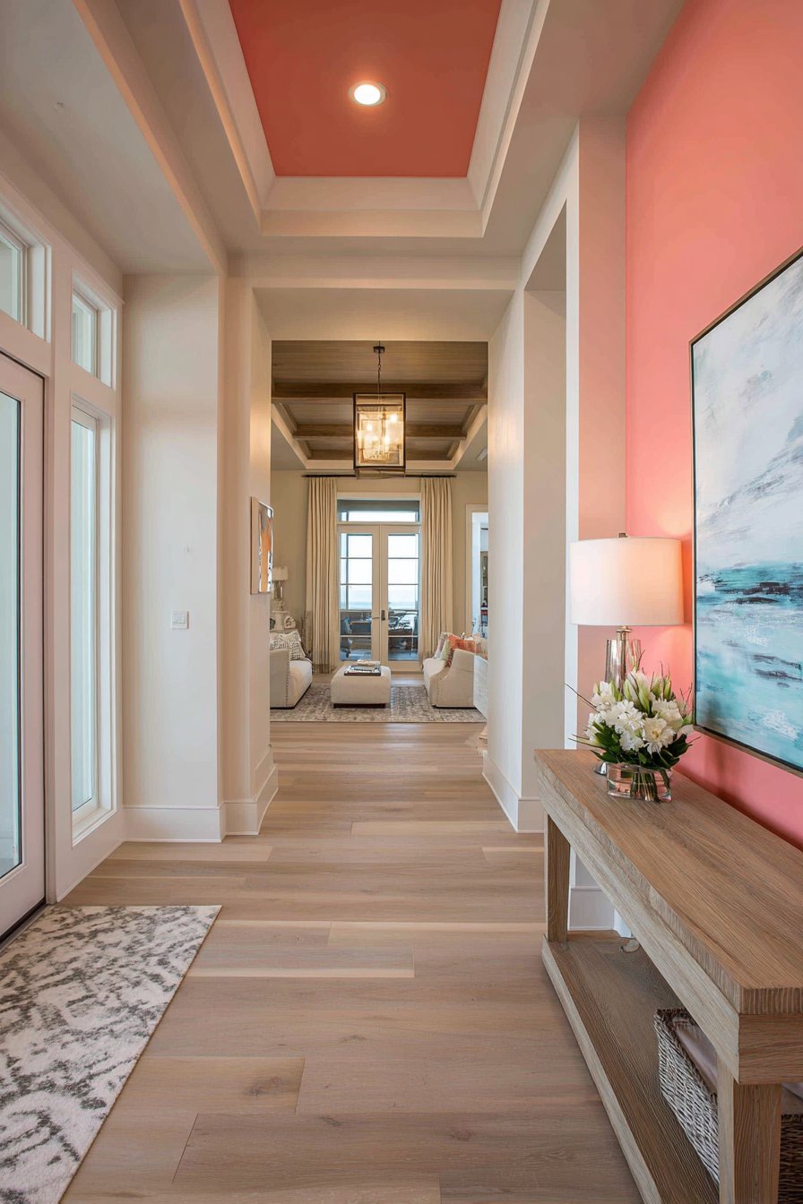
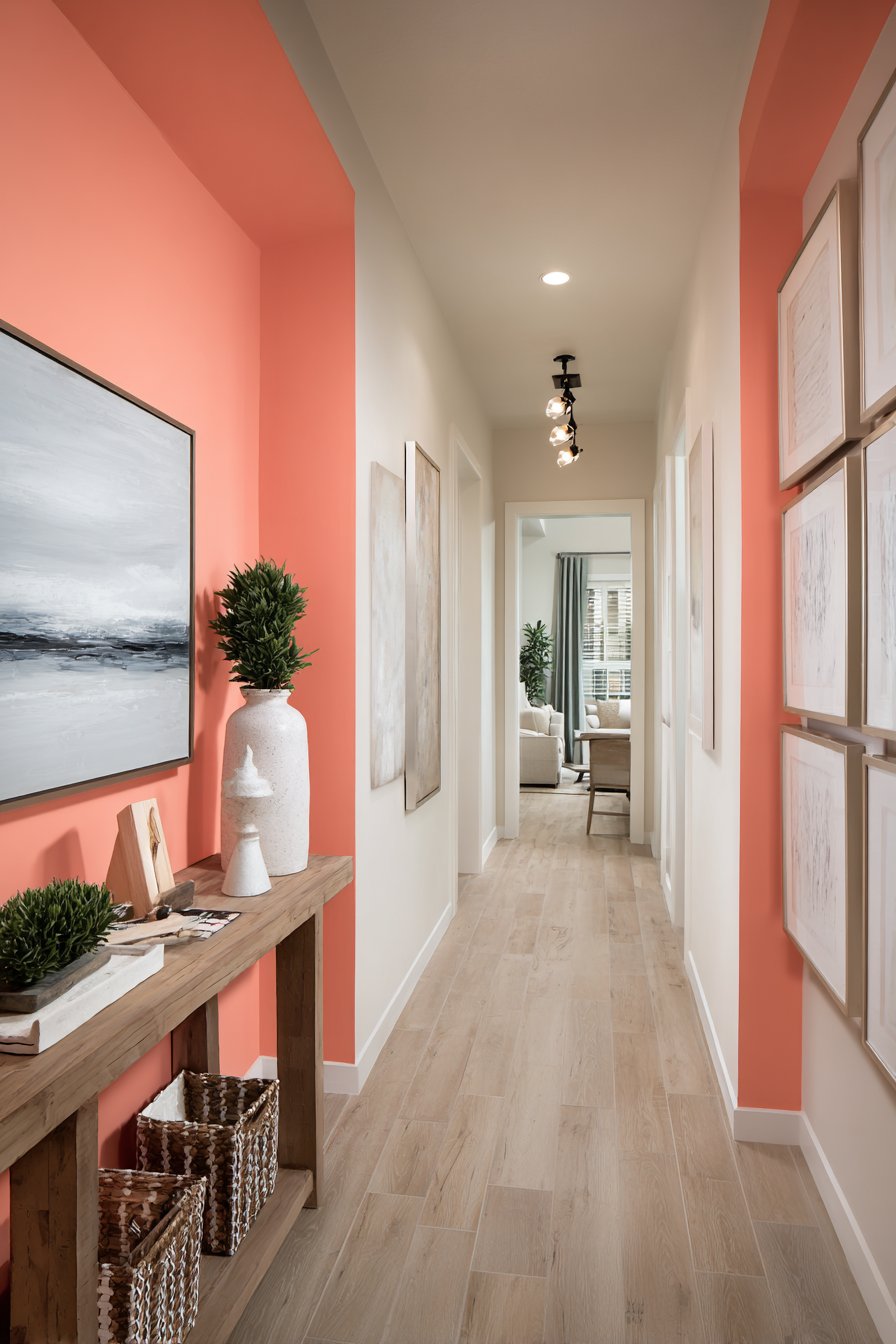
20. Vibrant Coral Accent Wall Strategy
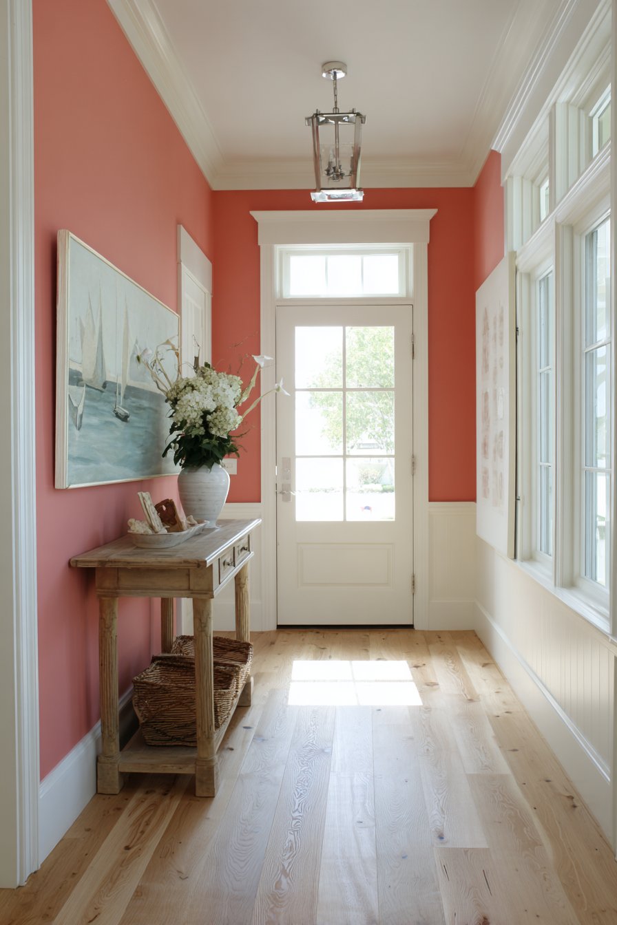
Strategic placement of vibrant coral hallway paint on a single end wall creates dynamic focal point while maintaining overall space brightness through neutral surrounding walls. This accent wall approach demonstrates how to incorporate bold color without overwhelming small or narrow spaces—by limiting the saturated color to one wall, you gain impact while preserving the openness that white walls provide. The coral paint creates visual destination that draws the eye through the hallway.
White trim throughout unifies the design, flowing seamlessly from neutral walls across doorways to the coral accent wall. This consistent white treatment prevents the color shift from feeling jarring or disconnected, instead creating intentional color blocking that feels designed rather than random. A natural wood console table positioned against the coral wall provides functional surface space while adding organic warmth that complements the warm coral tones.
Gallery lighting mounted above highlights artwork against the accent paint, demonstrating how proper illumination makes bold color choices successful. The focused lighting prevents the coral from appearing flat or one-dimensional, instead revealing its depth and vibrancy. Natural flooring in light oak maintains overall airiness while providing neutral ground that allows the coral wall to remain the undisputed star.
Key Design Tips:
- Limit accent wall colors to a single wall—painting multiple walls defeats the accent wall purpose and can overwhelm the space
- Choose the wall with best natural light or most interesting architecture for accent color placement
- Use the same white paint on all trim, ceiling, and neutral walls for cohesive appearance
- Position furniture and lighting to enhance rather than obscure the accent wall
- Consider sight lines from adjacent rooms to ensure the accent wall creates intended impact from multiple viewing angles
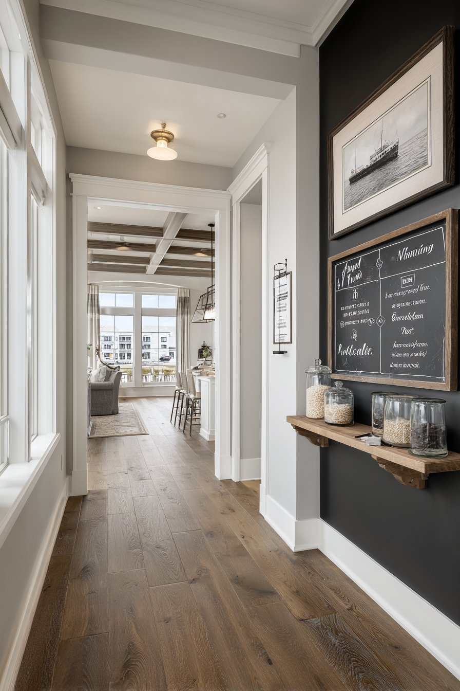
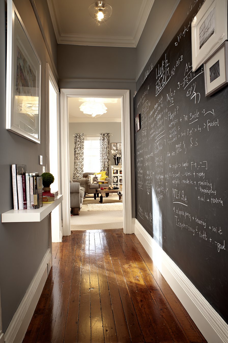
21. Interactive Chalkboard Paint Innovation
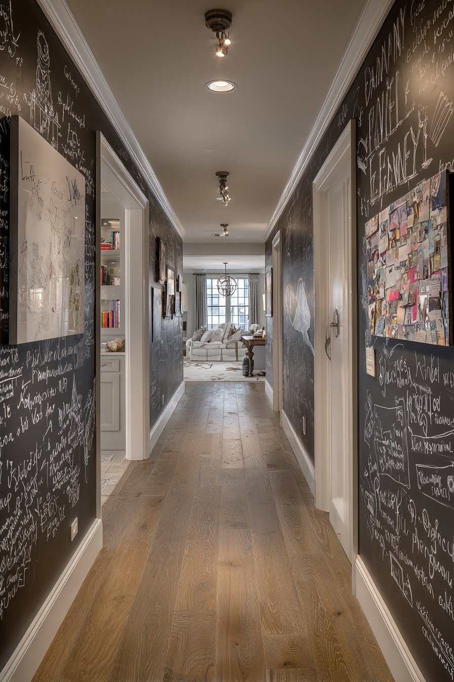
Transform one hallway wall section into an interactive family message center using specialty chalkboard hallway paint in classic black, creating both function and conversation piece. This innovative approach demonstrates how paint can do more than provide color—it can add interactive functionality that serves real household needs. The practical chalkboard section is balanced by remaining walls in soft gray, preventing the black from overwhelming while maintaining cohesive neutral palette.
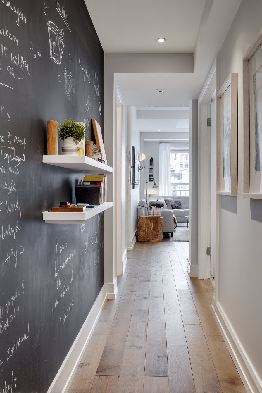
White trim frames the chalkboard section like artwork, creating intentional boundaries that make the functional surface feel designed rather than random. A small floating shelf positioned below holds chalk and eraser within easy reach, demonstrating the attention to practical detail that makes this hallway paint idea truly functional rather than merely decorative. Natural light from an adjacent room provides illumination necessary for reading and writing on the chalkboard surface.
Hardwood flooring in medium tone grounds the creative design while providing warm contrast to the cool gray and black paint colors. The chalkboard becomes a living element that changes daily with family messages, to-do lists, children’s drawings, and seasonal decorations—adding personality and life that static artwork cannot provide. This hallway paint innovation creates a space that actively serves family needs while making a unique design statement.
Key Design Tips:
- Use high-quality chalkboard paint and apply according to manufacturer’s directions for proper surface finish
- Prime the chalkboard surface by rubbing chalk over entire area then erasing before first use
- Frame chalkboard sections with trim or painter’s tape for clean, intentional edges
- Position chalkboard at appropriate height for all family members who will use it
- Install shelf or ledge below for convenient chalk and eraser storage
22. Cottage Vertical Stripe Wainscoting
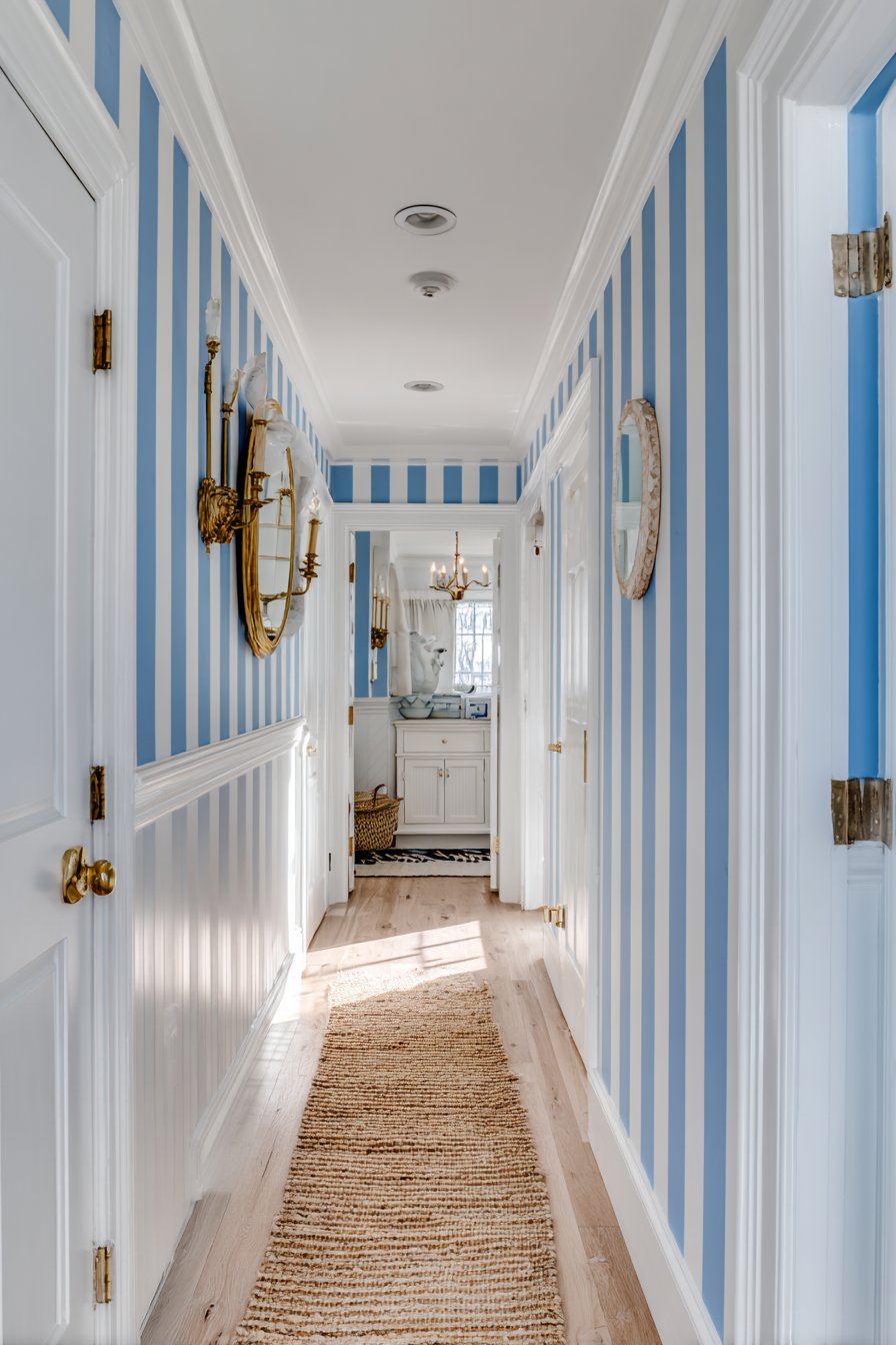
Playful vertical stripes in alternating cream and soft blue cover the lower wall section while upper walls remain solid cream, creating cottage charm through pattern and color combination. This striped wainscoting hallway paint idea adds personality and coastal-inspired freshness while maintaining sophisticated execution through subtle color palette and precise stripe application. The vertical orientation of the stripes creates upward visual movement that makes standard ceiling heights feel taller.
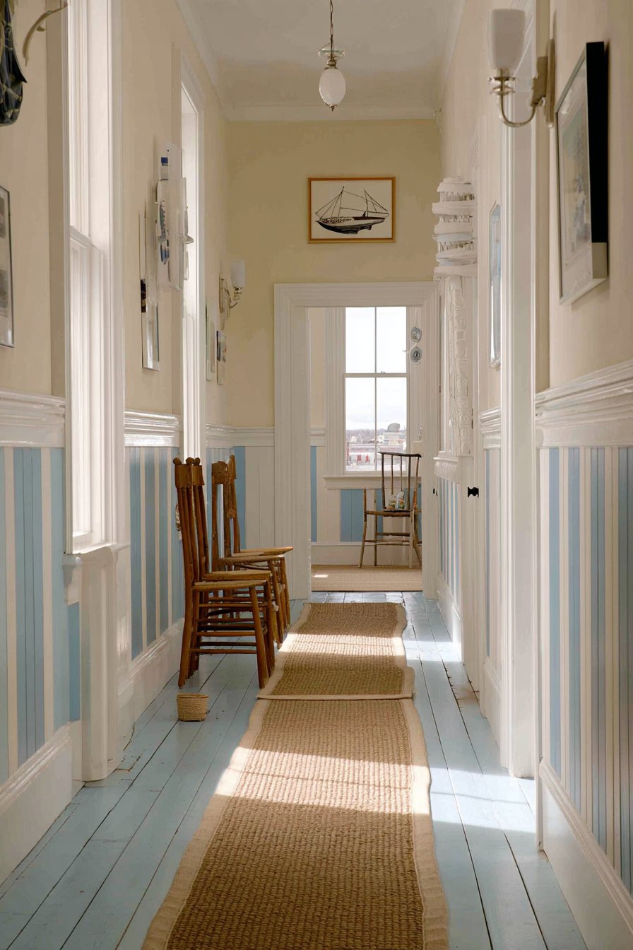
White chair rail provides clean separation between the striped lower section and solid upper walls, its traditional molding profile reinforcing cottage aesthetic. Nautical-inspired brass hardware and light fixtures complement the blue tones without literal boat or anchor motifs—demonstrating how to reference coastal style sophisticaly. Natural fiber runner adds organic texture that grounds the blue-and-cream palette with neutral warmth.
Natural lighting demonstrates the paint’s fresh, airy quality and reveals how the stripes create subtle visual interest without overwhelming the relatively small hallway space. The cottage charm remains decidedly adult through restrained color choices and careful styling that avoids cutesy or overly nautical elements. This hallway paint technique proves that pattern can work beautifully in compact spaces when executed with precision and restraint.
Key Design Tips:
- Measure and mark stripe placement carefully to ensure even spacing and vertical alignment
- Use painter’s tape rated for delicate surfaces to prevent paint bleeding and ensure crisp stripe edges
- Choose stripe widths proportional to your hallway size—narrow hallways require more delicate stripe proportions
- Limit striped treatment to lower wall sections to prevent visual overwhelm in small spaces
- Select colors within the same value range for subtle rather than high-contrast striped effect
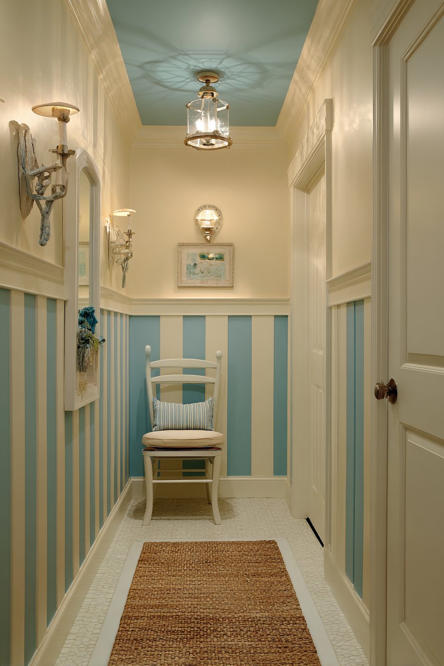
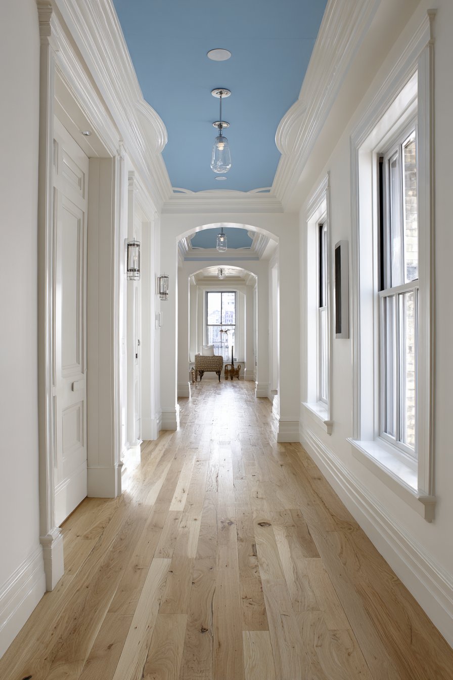
23. Unexpected Ceiling Accent Treatment
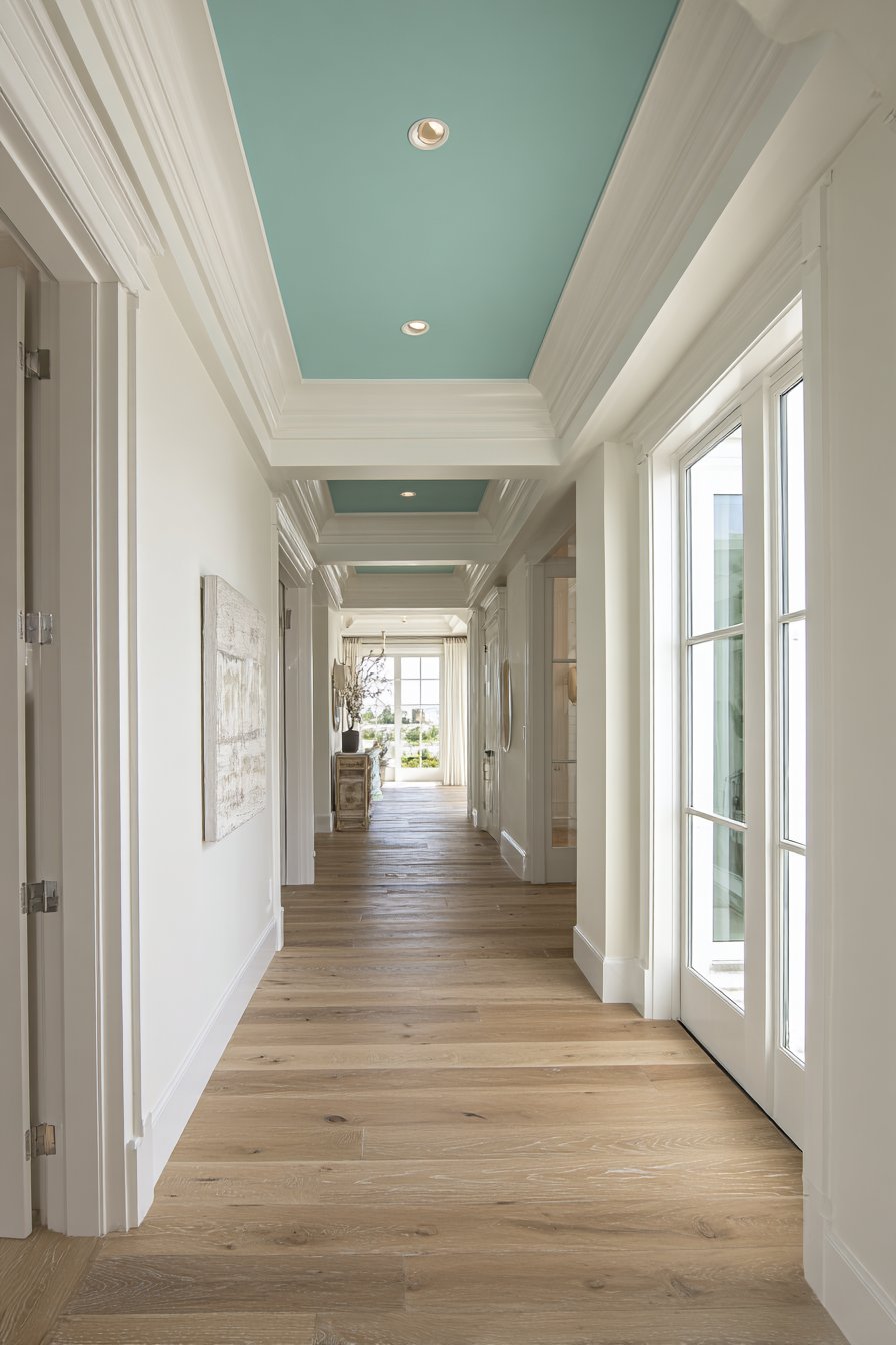
Challenge conventional hallway paint wisdom by keeping walls classic white while painting the ceiling soft robin’s egg blue, creating unexpected visual interest that draws eyes upward. This innovative ceiling hallway paint idea demonstrates that color placement can be as important as color choice itself. The blue ceiling makes the corridor feel taller by creating upward visual pull, while the unexpected color location creates memorable design moment that defies expectations.
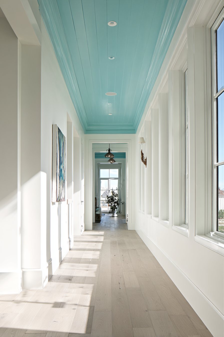
White crown molding frames the blue ceiling elegantly, creating clean transition between wall and ceiling planes. Natural light from end windows showcases the blue’s cheerful, optimistic quality while demonstrating how ceiling color changes throughout the day as light shifts. Light oak flooring and simple white wainscoting maintain overall airiness essential for making colored ceilings successful rather than overwhelming.
Modern flush-mount lighting fixtures integrate seamlessly into the blue ceiling, their simple white forms disappearing against the painted surface. This ceiling hallway paint treatment works particularly well in corridors with good natural light and adequate ceiling height—low ceilings painted in color can feel oppressive. The overall effect creates architectural interest through color placement alone, proving that innovation sometimes means rethinking where rather than what color to apply.
Key Design Tips:
- Use light, bright ceiling colors rather than dark tones to maintain upward lift and prevent heavy feeling
- Ensure adequate ceiling height (minimum 8 feet) before attempting colored ceiling treatments
- Paint crown molding white to create clean definition between ceiling and wall colors
- Consider the sight lines from adjacent rooms to ensure ceiling color feels intentional from multiple viewing angles
- Use low-VOC paint for ceiling applications to minimize fumes in enclosed hallway spaces
Why These Hallway Paint Ideas Represent the Best Design Solutions
The twenty-three hallway paint ideas presented in this comprehensive guide represent the pinnacle of current interior design thinking, combining timeless principles with contemporary innovation to address the unique challenges hallways present. These solutions stand out as the best available options because they address the practical realities of hallway spaces—limited natural light, narrow proportions, high traffic, and transitional function—while delivering genuine aesthetic impact that enhances your entire home’s design narrative.
Each hallway paint approach has been carefully selected to represent proven color theory principles and architectural paint techniques that professional designers rely on daily. The sophisticated warm greige gallery demonstrates how complex neutrals create versatile backdrops that work with evolving decor, while the dramatic navy focal point proves that strategic color placement achieves maximum impact with minimal paint investment. These aren’t arbitrary color suggestions—they’re evidence-based design solutions grounded in understanding how color, light, and spatial perception interact in corridor environments.
The inclusion of both traditional approaches like warm beige timelessness and innovative techniques like ombre gradients ensures these hallway paint ideas serve diverse homeowner needs and design preferences. Conservative homeowners seeking safe, proven solutions will find comfort in classic combinations like gray-and-white two-tone treatments and Scandinavian minimalism. Bold design enthusiasts ready to push boundaries will embrace deep forest green statements and high-gloss eggplant purple drama. This range represents the best of contemporary hallway design because it acknowledges that “best” varies based on individual context, lifestyle, and aesthetic preferences.
The technical execution details provided for each hallway paint idea elevate these concepts beyond simple color recommendations into actionable design plans. Understanding that sage green requires gray undertones to feel current, that charcoal walls demand triple lighting, and that metallic paints need specific application techniques—these insights represent professional knowledge that separates successful amateur projects from disappointing DIY failures. The best hallway paint ideas include not just what to do but how to execute successfully, addressing the practical challenges that determine whether a beautiful concept becomes a beautiful reality.
Material selections, finish choices, and complementary element recommendations ensure these hallway paint ideas integrate seamlessly into comprehensive design schemes rather than existing as isolated color decisions. The coastal blue-gray concept doesn’t simply suggest a paint color—it specifies shiplap wainscoting, natural fiber rugs, brushed nickel fixtures, and carefully curated accessories that collectively create authentic coastal atmosphere. This holistic approach represents best practice in interior design, where every element works synergistically to support the overall vision.
The lighting strategies embedded in each hallway paint idea acknowledge the critical role illumination plays in color perception and spatial experience. Dark hallway colors require abundant artificial lighting and strategic natural light access. White maximalist approaches need proper finish selection to prevent sterile appearance. These lighting considerations transform theoretical color schemes into practical, livable spaces that function beautifully throughout the day and across seasons as natural light conditions change.
Contemporary design trends favoring authenticity, sustainability, and wellness inform the material and color selections throughout these hallway paint ideas. The emphasis on natural materials like reclaimed wood, organic fibers, and real shiplap rather than synthetic substitutes reflects growing consumer demand for genuine quality and environmental responsibility. Color choices like sage green and soft blue-gray acknowledge research connecting color psychology to wellbeing, demonstrating how thoughtful paint selection contributes to healthier, more supportive home environments.
The versatility demonstrated across these twenty-three hallway paint ideas ensures homeowners working with any budget, skill level, or existing architectural constraints can find applicable solutions. Simple approaches like pure white minimalism require only quality paint and careful application, while complex techniques like ombre gradients may warrant professional expertise. This range of complexity ensures the best hallway design solutions remain accessible regardless of resources, democratizing good design rather than presenting it as exclusively available to those with unlimited budgets.
Regional adaptability makes these hallway paint ideas universally relevant despite geographic differences in light quality, architectural styles, and design preferences. The warm terracotta Mediterranean approach works beautifully in sun-drenched southwestern homes while the cool Scandinavian minimalism suits northern light conditions perfectly. Color psychology principles and spatial perception strategies apply universally, even as specific shade selections adapt to local context—demonstrating truly best practices that transcend regional limitations.
The enduring quality of these hallway paint selections ensures your investment delivers value beyond immediate trend cycles. While some concepts embrace current design movements like jewel tones and specialty finishes, the foundational principles remain sound regardless of passing fads. Classic combinations like charcoal-and-white wainscoting and warm beige traditionalism have proven their staying power across decades, offering confidence that your hallway will remain stylish and relevant long-term.
Professional photography and presentation standards referenced throughout these hallway paint ideas ensure successful execution translates to beautiful results worthy of documentation and sharing. Understanding proper lighting for photography, optimal viewing angles, and compositional principles helps homeowners not just create beautiful hallways but capture and share their achievements effectively. This attention to presentation demonstrates how the best design solutions consider both the lived experience and the documented record of successful projects.
The functional considerations embedded in each hallway paint approach—from chalkboard paint’s interactive utility to wainscoting’s practical protection—demonstrate that truly excellent design serves real needs beyond aesthetic appeal. Hallways endure constant traffic, accumulate scuffs and marks, and must perform daily functions while looking beautiful. The best hallway paint ideas acknowledge these realities through washable finishes, protective treatments, and durable material selections that maintain beauty despite heavy use.
The psychological and emotional impact of color choices receives appropriate attention across these hallway paint ideas, recognizing that homes must support occupants’ mental and emotional wellbeing. Calming sage greens reduce stress, energizing yellows boost mood, and cocooning charcoal creates security—these effects matter in spaces we traverse multiple times daily. The best hallway designs acknowledge that color influences how we feel in our homes, making thoughtful paint selection an investment in quality of life.
Integration with adjacent spaces receives careful consideration throughout these hallway paint concepts, ensuring corridor colors enhance rather than disrupt your home’s overall flow. Recommendations to consider sight lines from other rooms, coordinate undertones with existing palettes, and use consistent trim colors demonstrate understanding that hallways don’t exist in isolation. The best solutions create harmonious transitions that make your entire home feel cohesive and intentionally designed.
Conclusion
The hallway represents one of home design’s most underutilized opportunities—a space that connects every room in your home yet often receives the least design attention and smallest budget allocation. These twenty-three hallway paint ideas demonstrate conclusively that corridors deserve thoughtful color consideration and intentional design treatment that transforms them from neglected passages into architectural features that enhance your entire home’s aesthetic impact and functional performance.
From the sophisticated versatility of warm greige galleries to the dramatic boldness of deep jewel-tone statements, from the timeless appeal of traditional beige to the playful innovation of chalkboard paint functionality—these concepts prove that hallways can accommodate virtually any design vision when approached with proper technique and thoughtful planning. The key lies in understanding your specific hallway’s challenges and opportunities: its light conditions, proportions, traffic patterns, and relationship to adjacent spaces.
Success with hallway paint requires more than selecting attractive colors from fan decks. It demands understanding how finish selection affects light reflection, how architectural details like wainscoting and trim create visual interest, how lighting design reveals or conceals color complexity, and how material choices throughout the space interact with painted surfaces. The comprehensive approach presented throughout this guide provides the knowledge necessary to make informed decisions that result in professionally executed spaces worthy of the investment.
We encourage you to experiment with these hallway paint ideas in your own home, adapting the concepts to suit your unique space, budget, and aesthetic preferences. Begin by carefully assessing your hallway’s current challenges—is it too dark, too narrow, too bland? Then select paint approaches specifically designed to address those issues. Test paint samples extensively in your actual space, viewing them at different times of day and under various lighting conditions before committing to full application.
Remember that successful hallway design requires patience and attention to detail. Proper surface preparation, quality paint and materials, careful application technique, and thoughtful styling all contribute to results that justify your effort and investment. Don’t hesitate to consult professionals for complex techniques like ombre gradients or specialty finishes—sometimes expert assistance makes the difference between disappointing amateur results and stunning professional outcomes.
Your hallway deserves the same design consideration you give to more public spaces like living rooms and kitchens. By implementing the paint ideas, techniques, and principles explored in this guide, you’ll transform your corridors from forgotten passages into designed spaces that welcome guests, connect your home’s rooms with intentional beauty, and demonstrate your commitment to creating a thoroughly designed, cohesive living environment. The impact of thoughtfully painted hallways extends far beyond the corridor itself, elevating your entire home’s design quality and your daily experience of the space you inhabit.