In a world where cookie-cutter interiors dominate social media feeds and design magazines, there’s something deeply refreshing about spaces that dare to break the rules. Funky eclectic decor represents the ultimate form of self-expression in interior design—a celebration of individuality that transforms homes into personal galleries of collected treasures, bold colors, and unexpected combinations. This design philosophy embraces the beauty of contrast, where vintage meets modern, where patterns clash in the most delightful ways, and where every piece tells a story. Unlike minimalist or monochromatic approaches that follow strict guidelines, eclectic design thrives on creative freedom, allowing homeowners to curate spaces that genuinely reflect their personalities, travels, interests, and aesthetic evolution over time.
The magic of funky eclectic interiors lies in their ability to make you feel something—whether it’s joy from a vibrant color palette, nostalgia from a vintage find, or inspiration from an unexpected furniture pairing. These spaces aren’t created overnight; they’re thoughtfully layered over time, with each element carefully chosen to contribute to the overall narrative while maintaining its individual character. From maximalist living rooms bursting with personality to whimsical reading nooks that transport you to another world, eclectic design proves that rules are meant to be creatively bent, if not broken entirely.
Throughout this comprehensive guide, we’ll explore twenty-three distinctive approaches to funky eclectic decor, each showcasing different aspects of this liberating design philosophy. You’ll discover how to layer patterns without creating chaos, mix furniture styles across decades and design movements, create cohesive color stories from seemingly disparate palettes, and infuse your spaces with the kind of personality that makes guests say, “This is so you!” Whether you’re drawn to bold jewel tones, vintage treasures, global textiles, or unexpected furniture pairings, these ideas will inspire you to embrace the beautiful imperfection and creative courage that defines truly memorable interiors.
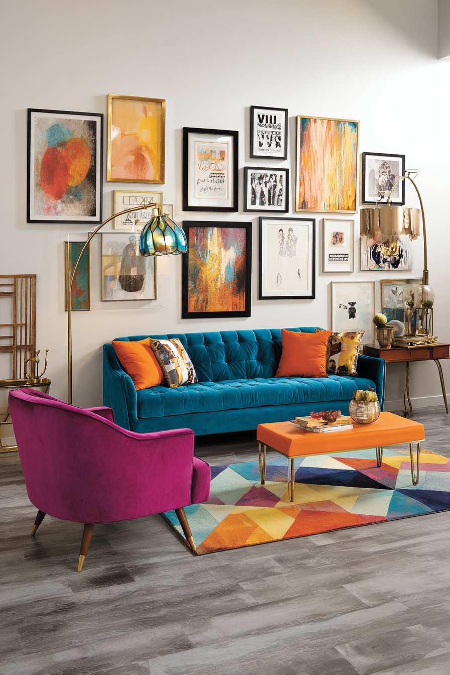
1. Vibrant Living Room with Bold Color Blocking
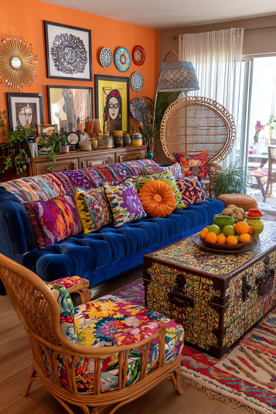
Step into a living room where color takes center stage with unabashed confidence, featuring a stunning teal velvet sofa that anchors the space with luxurious texture and saturated hue. This showstopper is beautifully contrasted by a hot pink vintage armchair positioned at an angle, creating dynamic visual tension and inviting conversation. An orange mid-century modern side table completes this fearless color trio, proving that bold hues from different families can coexist harmoniously when balanced with intention. The walls serve as a curated gallery, displaying mismatched frames in various sizes, styles, and finishes—from sleek modern black frames to ornate vintage gold—containing everything from abstract contemporary art to vintage travel posters and cherished family photographs.
Underfoot, a geometric patterned rug in multiple colors creates a foundation that ties the diverse color palette together while adding another layer of visual interest. The pattern features interlocking shapes in shades that echo the furniture pieces, creating subliminal connections throughout the space. A brass floor lamp with a colorful glass shade provides ambient lighting that casts warm, tinted glows across the room during evening hours, adding to the space’s theatrical quality. The wide-angle perspective captures how natural daylight streams through windows, highlighting the various textures—the plush velvet, the smooth vintage wood, the woven rug fibers—and creating dynamic shadows that change throughout the day.
What makes this space truly exceptional is its masterful demonstration of the 60-30-10 rule applied to maximalist design. While traditional interior design suggests one dominant color, one secondary, and one accent, this eclectic approach expands that concept by treating each “accent” with equal importance, creating a balanced tension rather than a hierarchy. The key lies in distributing these bold colors throughout the space in varying proportions and repeating them in smaller accessories, artwork, and decorative objects to create visual rhythm.
Key Design Tips:
- Invest in one statement furniture piece in a bold color to anchor your room
- Mix warm and cool tones deliberately to create visual energy
- Use varied frame styles but maintain consistent mat colors for gallery wall cohesion
- Layer lighting sources at different heights to create dimensional ambiance
- Select a multi-colored rug that incorporates your major color choices
- Balance saturated colors with metallic finishes like brass to add sophistication
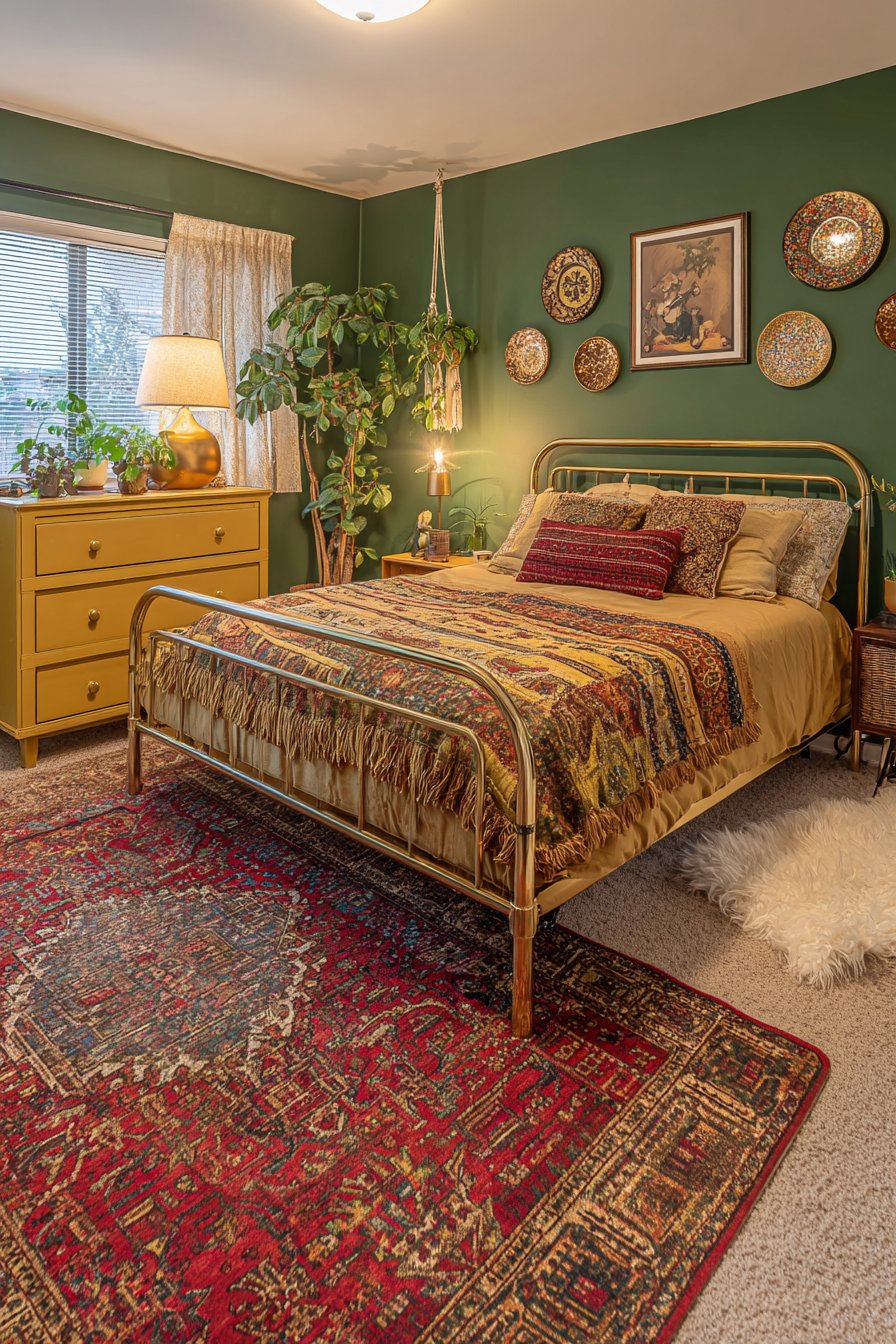
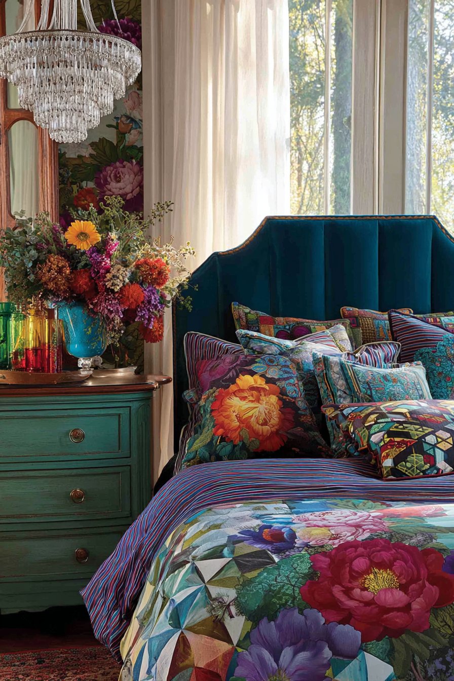
2. Bohemian Bedroom with Textile Layering
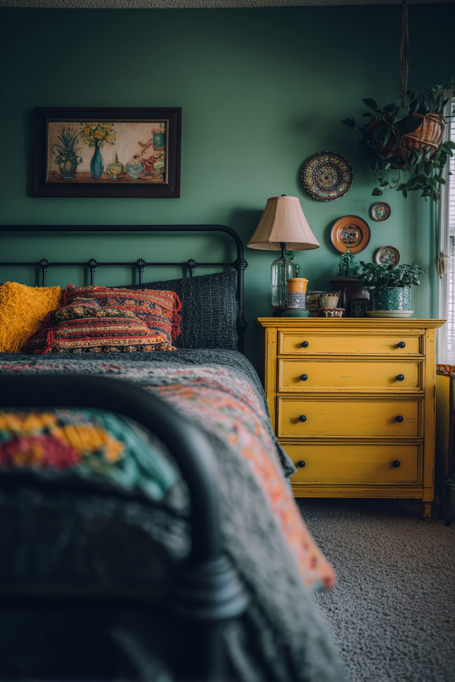
This deeply personal bedroom sanctuary showcases the power of textile layering in creating a space that feels collected, cozy, and worldly. The brass bed frame serves as a stunning architectural element, its warm metallic finish providing a sophisticated backdrop for the explosion of pattern and color that defines the bedding. A suzani bedspread—traditional Uzbek embroidered textile featuring circular floral motifs in vibrant pinks, oranges, and golds—drapes across the bed as the focal textile layer, immediately establishing the room’s global aesthetic. Kilim pillows in geometric patterns featuring traditional Turkish and Persian designs add dimensional pattern mixing, their earthy terracotta, indigo, and cream tones creating a bridge between the bedspread’s vibrancy and the room’s overall palette.
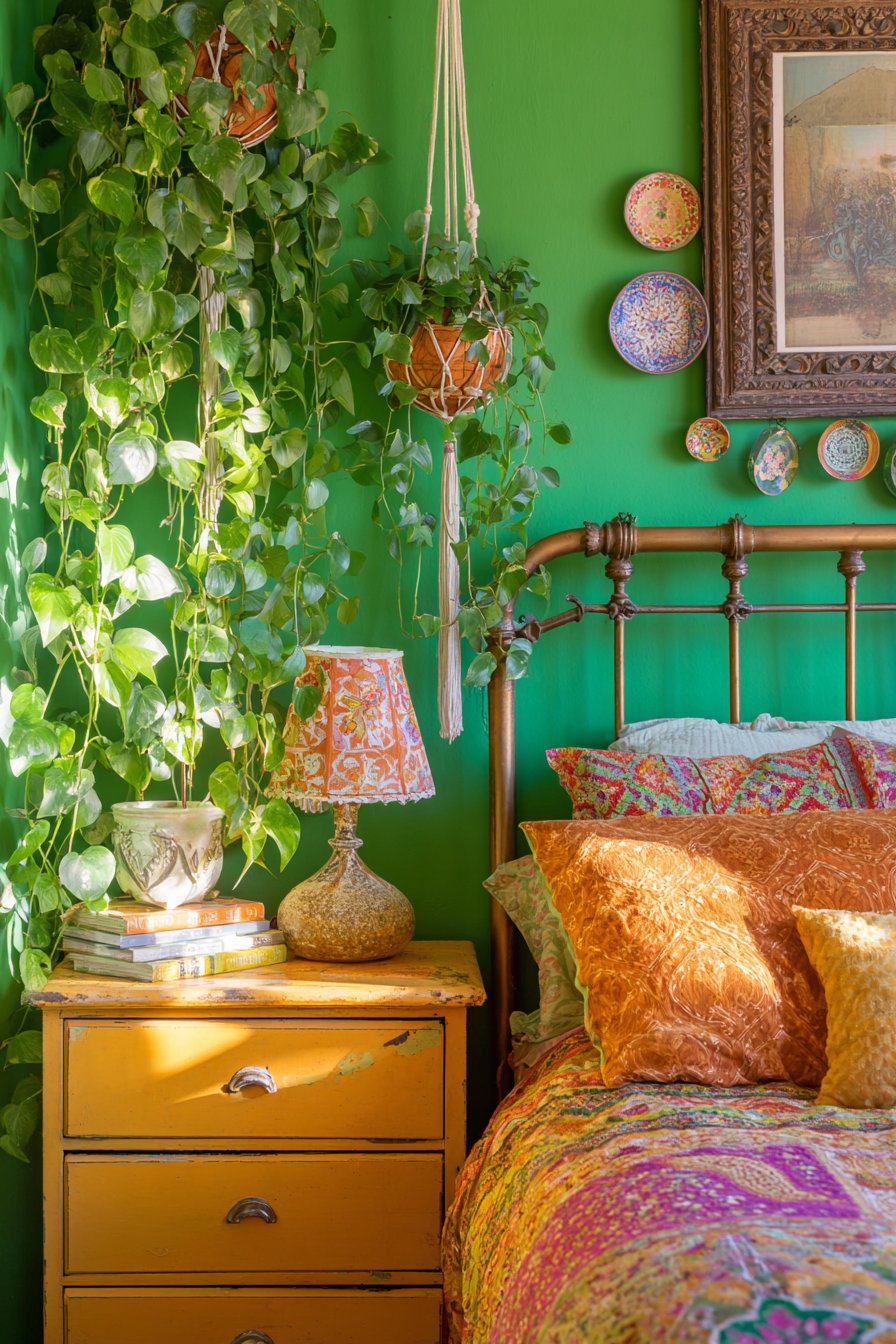
One wall painted in a lush, deep emerald green provides a dramatic backdrop for a curated collection of vintage ceramic plates mounted in a carefully casual arrangement. These plates, varying in size, pattern, and origin—perhaps including majolica, transferware, and hand-painted ceramics from different continents—create a three-dimensional wall installation that celebrates craftsmanship and travel. The refurbished vintage dresser painted in a warm mustard yellow adds another bold color note while providing essential storage. Atop this piece sits a collection of quirky table lamps with mismatched shades—perhaps one with fringe, another with beading, and a third with vintage fabric—each contributing to the room’s layered lighting scheme.
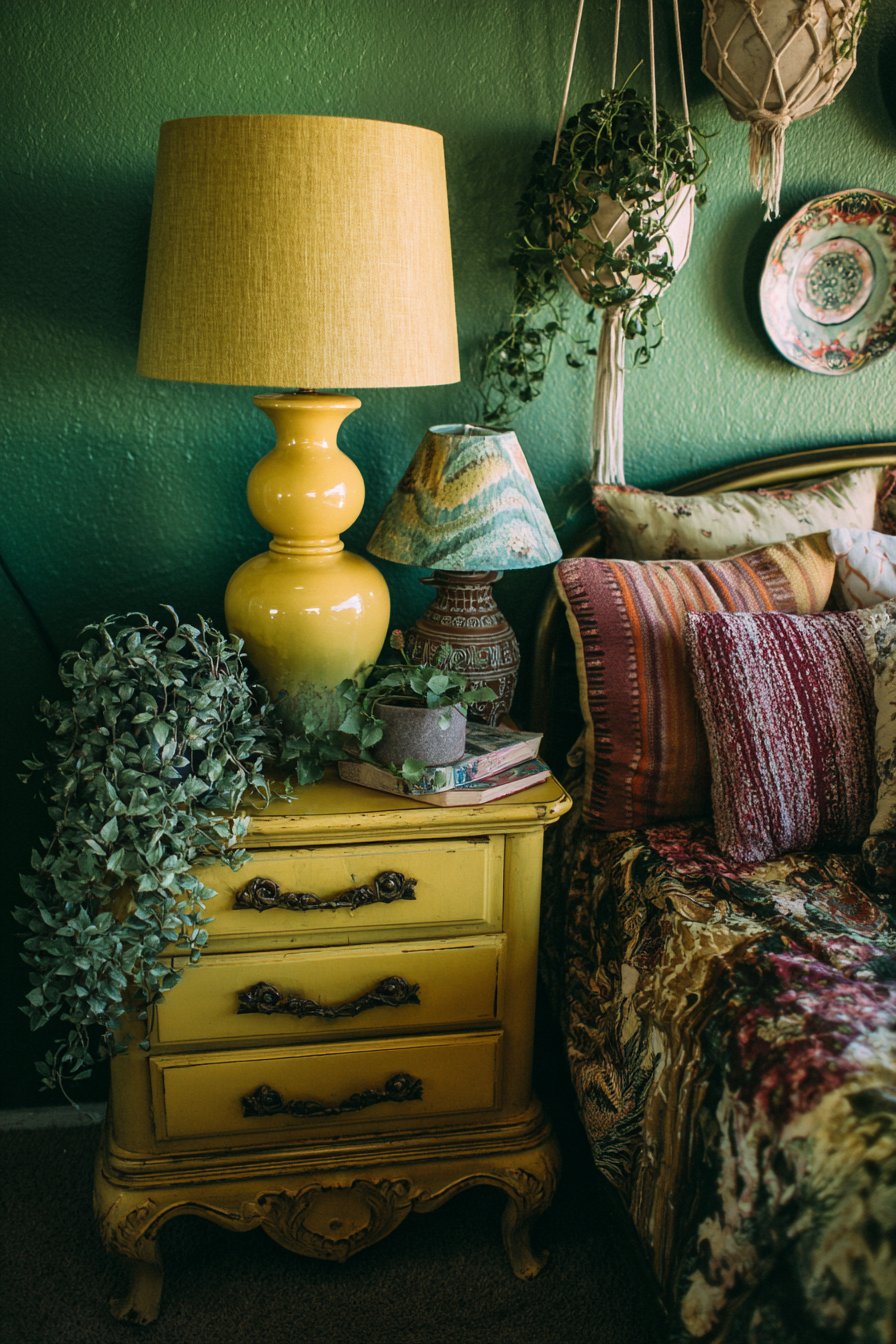
Macramé plant hangers suspended at varying heights hold trailing pothos plants, their cascading green vines adding organic movement and softening the room’s geometric patterns. The interior design photography captures soft morning light filtering through sheer curtains, illuminating the textural variety—the smooth brass, the nubby embroidery, the woven kilim, the ceramic glazes—and creating a sanctuary that feels simultaneously energizing and deeply restful. This space demonstrates how a cohesive color story can unite diverse patterns and origins.
Key Design Tips:
- Start with one hero textile piece and build your color palette from it
- Mix patterns by varying scale—pair large florals with small geometrics
- Create visual breathing room by using solid colors strategically
- Install plants at different heights to add vertical interest and soften hard edges
- Source vintage textiles from flea markets and online marketplaces for authentic character
- Use accent paint colors boldly on single walls to define zones within the bedroom
- Select furniture in warm wood or brass tones to complement rather than compete with textiles
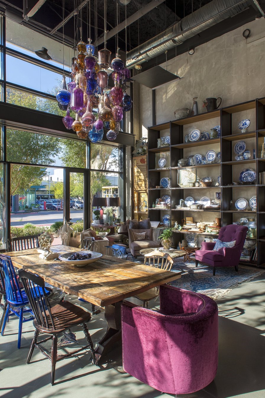
3. Dining Room with Mismatched Chair Collection
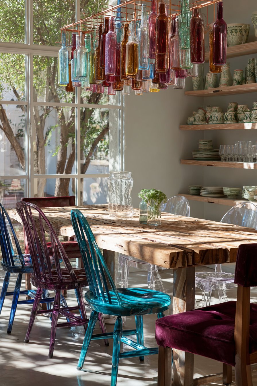
This dining space exemplifies one of eclectic design’s most charming principles: the intentional curation of mismatched elements that somehow create a cohesive whole. The reclaimed wood farmhouse table provides a neutral, substantial foundation that grounds the space with its raw texture and natural variations in grain and tone. Surrounding this table is a deliberately diverse collection of seating—each chair a different style, era, and color, yet working together to create a dynamic, welcoming dining environment. A Windsor chair painted in a vibrant cobalt blue brings traditional craftsmanship into conversation with bold contemporary color choices. An acrylic ghost chair offers modern transparency that visually lightens the space while providing clean-lined seating. A vintage bentwood chair celebrates turn-of-the-century design innovation, its curved wood construction creating sculptural interest. Finally, an upholstered velvet chair in deep burgundy introduces luxurious texture and a jewel-tone accent.
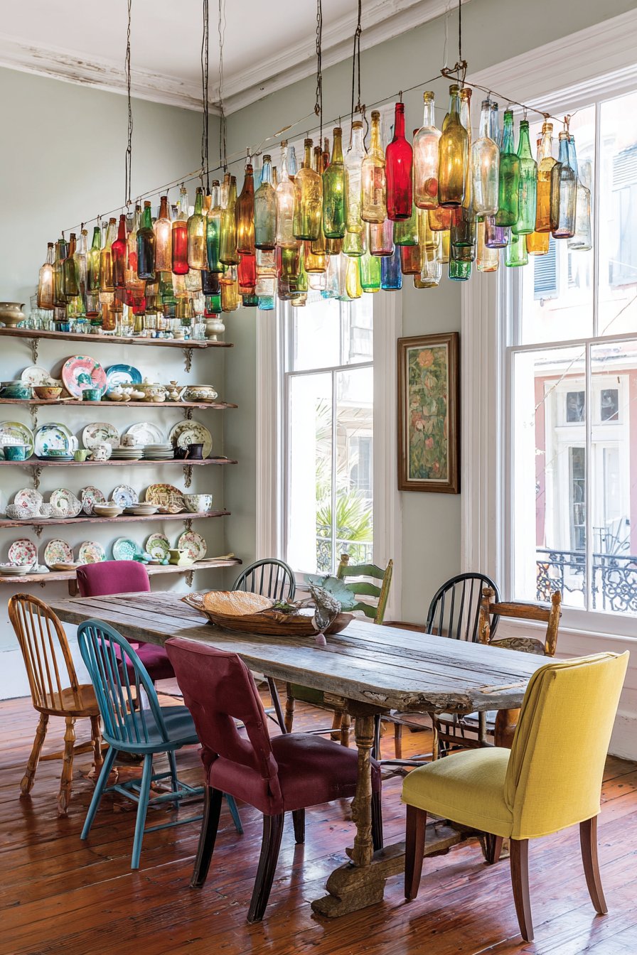
Overhead, a remarkable statement chandelier crafted from colorful glass bottles transforms recycled materials into functional art. This piece might feature bottles in various hues—emerald green, amber, cobalt blue—suspended at different heights to create a sculptural lighting installation that casts colorful light patterns across the table during evening meals. Open shelving along one wall displays a deliberately curated collection of vintage dishware representing different patterns, eras, and origins—perhaps mixing delicate floral china with bold geometric mid-century pieces and rustic stoneware. This display serves both functional and aesthetic purposes, keeping frequently used items accessible while creating a visually engaging focal point.
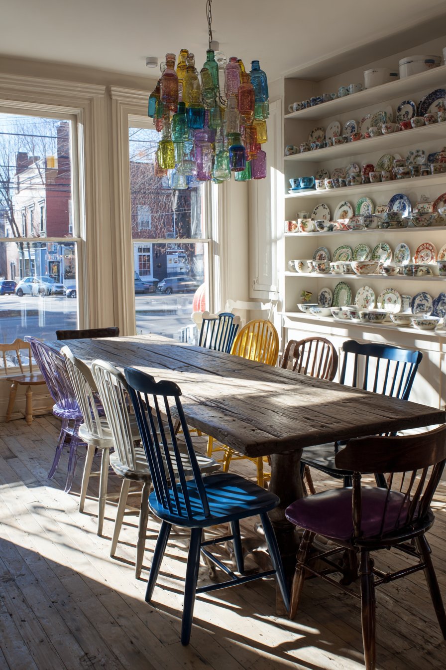
Natural lighting floods through large windows, creating dynamic shadows that change throughout the day and highlighting the varied chair styles from different angles. The wide-angle interior photography captures the full breadth of this eclectic gathering space, emphasizing how diversity in furniture styles can create energy and conversation. The success of this design lies in its underlying cohesion—while the chairs differ dramatically, they share a similar seat height and proportion, ensuring dining comfort while maximizing visual interest.
Key Design Tips:
- Maintain consistent chair height (standard 18 inches) despite varied styles
- Use a substantial, neutral table to anchor mismatched seating
- Repeat colors from your chair collection in wall art or dishware displays
- Consider repainting vintage chairs in bold, contemporary colors
- Display collections on open shelving to add personality without clutter
- Choose one statement lighting fixture to unify the diverse elements below
- Ensure adequate space between chairs (24 inches) regardless of style variation
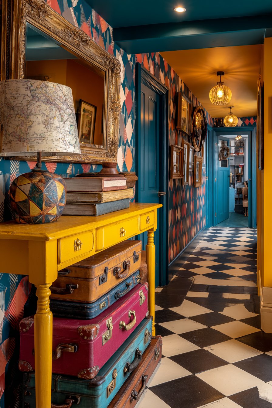
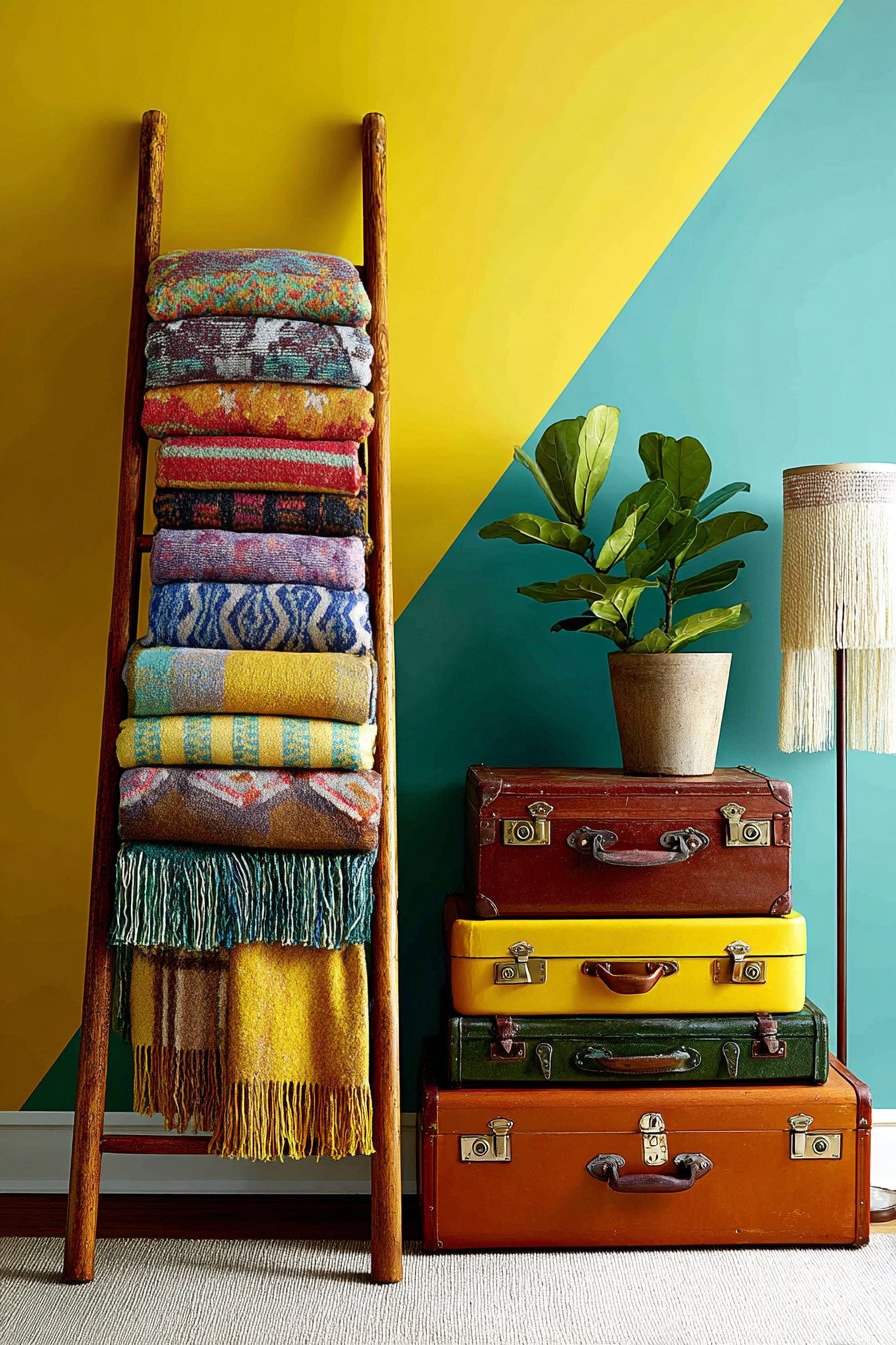
4. Bold Entryway with Geometric Wallpaper
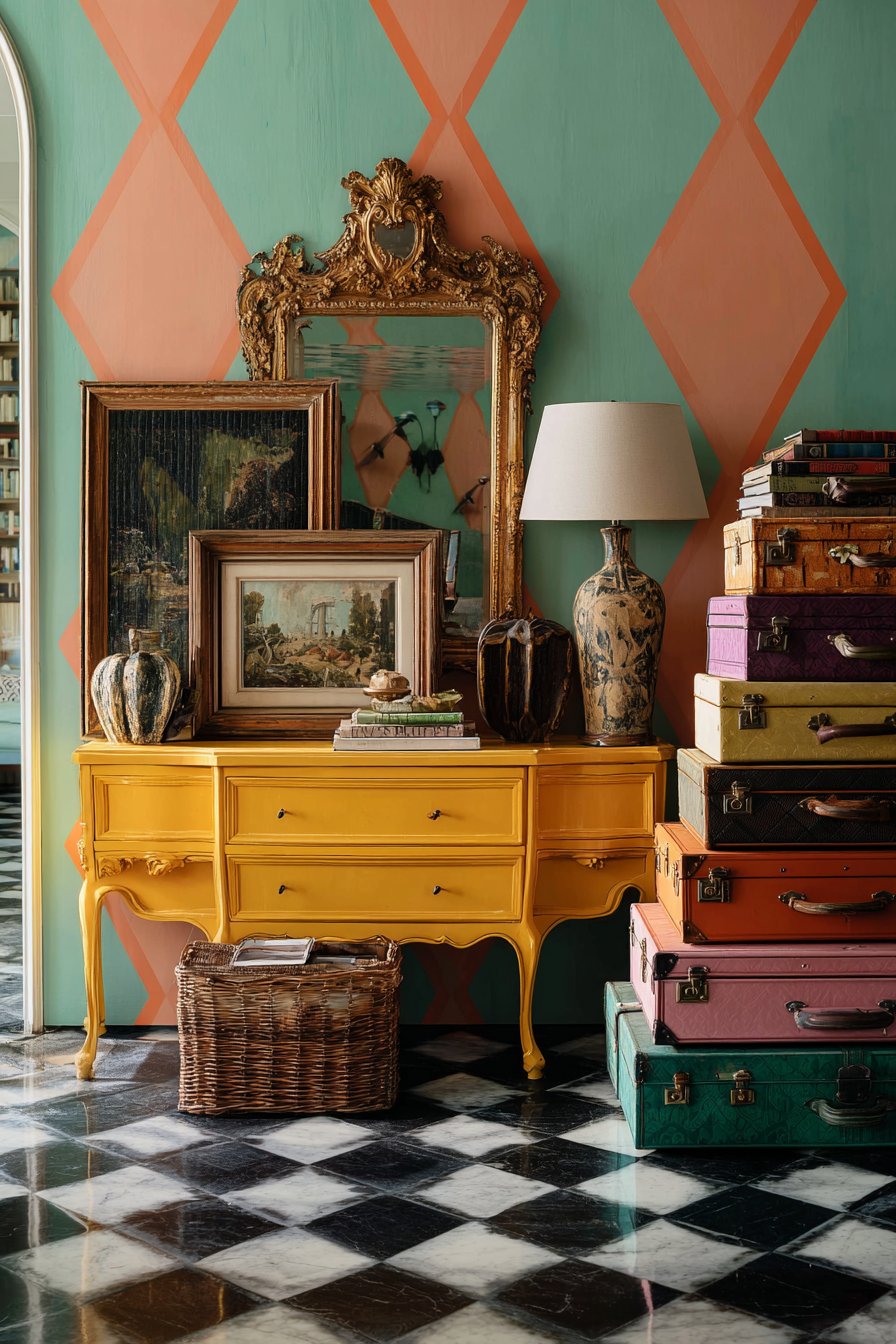
First impressions matter, and this entryway delivers immediate visual impact through fearless pattern and color application. The walls showcase bold geometric wallpaper in a striking combination of teal and coral, featuring large-scale shapes—perhaps overlapping circles, angular chevrons, or interlocking hexagons—that create movement and energy in what’s often a transitional space. This dramatic backdrop transforms a functional area into a memorable design statement that sets the tone for the entire home. A vintage console table painted in glossy yellow lacquer provides both practical surface space for keys and mail while serving as a functional sculpture. The high-gloss finish reflects light and adds contemporary polish to the vintage form.
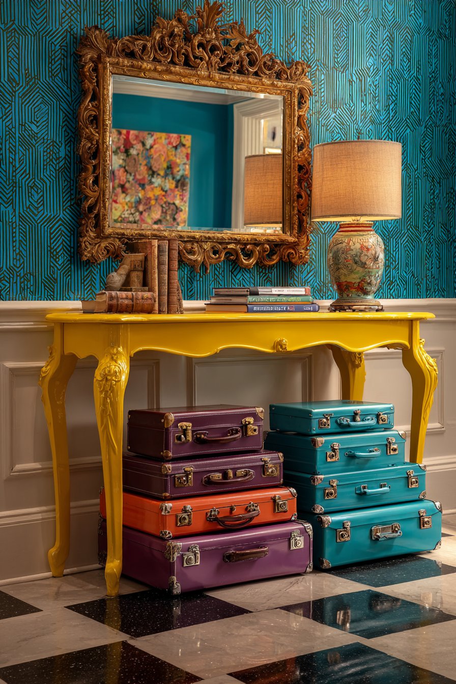
Atop this cheerful console sits a quirky lamp constructed from stacked vintage books, their spines facing outward to display titles and create a literary sculpture topped with a simple drum shade. This DIY-aesthetic piece adds personality and conversation-starting detail while providing essential task lighting. Above the console, an ornate gilt mirror with decorative flourishes and aged patina hangs alongside modern abstract art in a complementary color palette, creating an intentional style clash that epitomizes eclectic design confidence. The floor features classic black and white checkered tile—a timeless pattern that somehow feels both retro and contemporary, providing visual grounding for the colorful walls above.
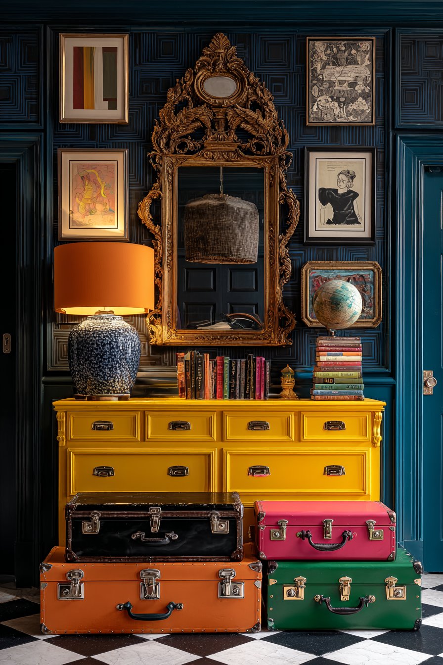
A collection of colorful vintage suitcases stacked vertically creates sculptural storage while adding nostalgic travel-inspired character. These practical pieces might include a robin’s egg blue hard-shell case, a tan leather weekender with brass hardware, and a floral tapestry overnight bag—each contributing color, texture, and story to the space. The wide-angle interior photography captures the entryway’s dramatic first impression, showing how balanced exposure highlights the interplay between the bold wallpaper pattern, the glossy furniture finish, and the various collected objects that give this space its distinctive personality.
Key Design Tips:
- Choose large-scale wallpaper patterns for small spaces to create bold impact
- Paint one vintage furniture piece in an unexpected high-gloss color
- Mix ornate traditional elements with clean modern pieces for contrast
- Use checkered or geometric flooring to ground pattern-heavy walls
- Create vertical storage solutions with stacked vintage luggage
- Layer multiple light sources including table lamps and overhead fixtures
- Embrace the rule of three when arranging objects on console surfaces
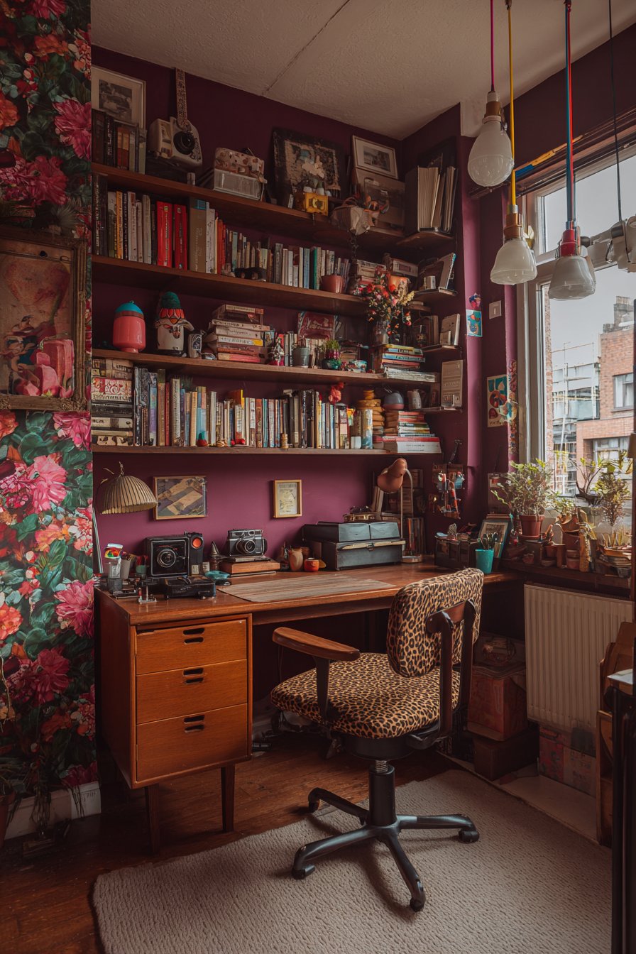
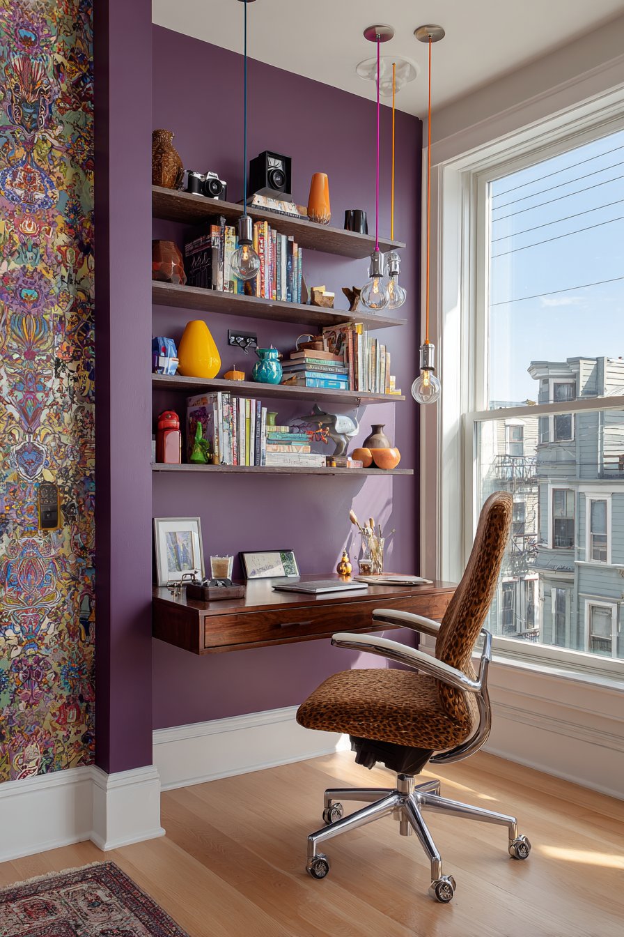
5. Creative Home Office with Pattern Mixing
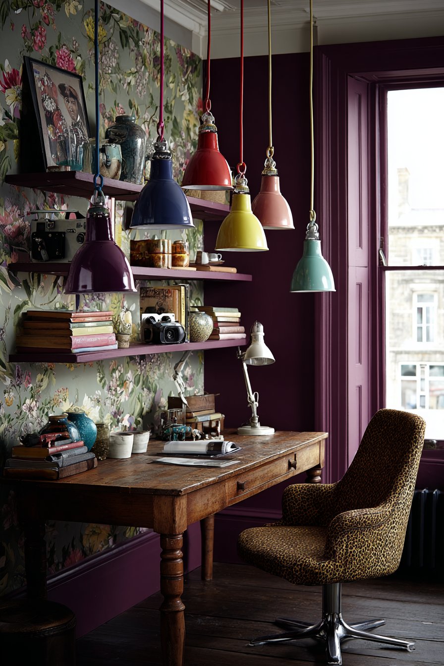
This home office proves that productive workspaces need not sacrifice personality for functionality, instead creating an environment where creativity and focus coexist through bold design choices. A vintage wooden desk with generous proportions and possibly original hardware provides substantial workspace while contributing authentic character and craftsmanship. Paired with this traditional piece is a thoroughly modern ergonomic chair upholstered in leopard print fabric—a daring choice that injects wildness and unexpected glamour into the office environment. This juxtaposition of vintage work surface and contemporary statement seating exemplifies the eclectic principle of mixing eras and aesthetics with confidence.
Floating shelves mounted on one deep plum accent wall create both practical storage and curated display opportunities. The shelving showcases what appears to be “curated chaos”—books arranged by color or subject, vintage cameras celebrating analog photography, colorful pottery in various glazes and forms, and small sculptures that might include anything from African art to modern abstract pieces. This deliberate disorder creates visual interest while revealing the inhabitant’s diverse interests and aesthetic sensibilities. The remaining walls feature botanical print wallpaper with detailed illustrations of leaves, flowers, and vines in complementary tones, creating an immersive environment that brings nature indoors and provides visual respite during long work sessions.
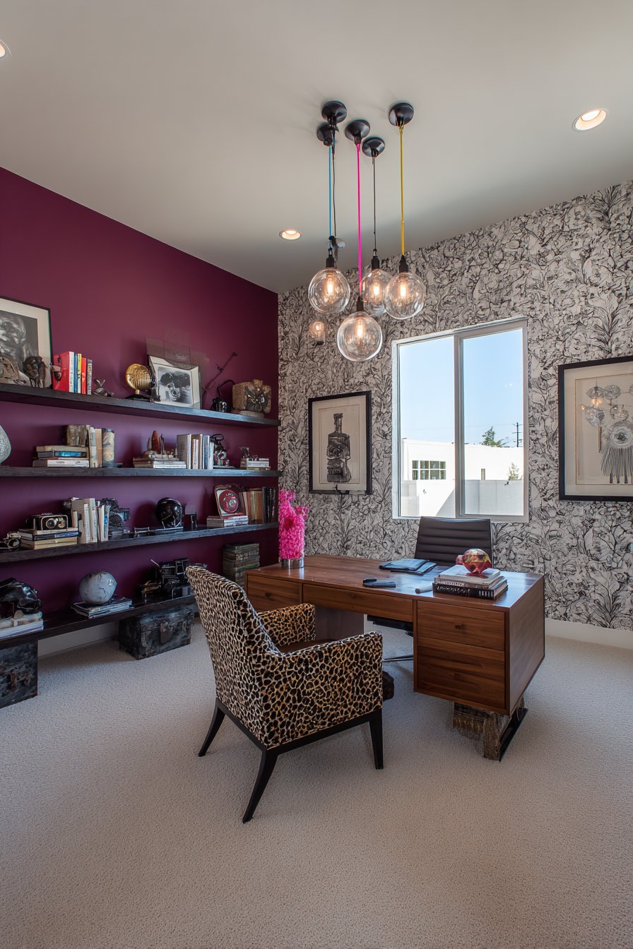
Industrial pendant lights with colored cords—perhaps red, yellow, and teal—hang at varying heights above the desk, creating focused task lighting while adding playful contemporary elements to the traditional workspace. The cords themselves become linear design elements, drawing the eye upward and creating visual connections between the ceiling and work surface. Interior photography captures the creative workspace bathed in natural light streaming from a nearby window, highlighting how this office balances stimulating visual interest with functional work requirements. The varied textures—smooth desk wood, soft upholstery, ceramic glazes, paper book spines—create a tactile environment that engages multiple senses.
Key Design Tips:
- Invest in ergonomic seating even if it means splurging on bold upholstery
- Use one accent wall in a deep, saturated color to define the workspace
- Arrange books and objects by color for visual cohesion within collections
- Install adjustable task lighting at appropriate heights for your work
- Mix wallpaper and paint strategically to create zones within the office
- Display personal collections that inspire your creative or professional work
- Maintain clear desk surfaces despite surrounding visual richness
- Choose vintage wood furniture for warmth in technology-heavy spaces
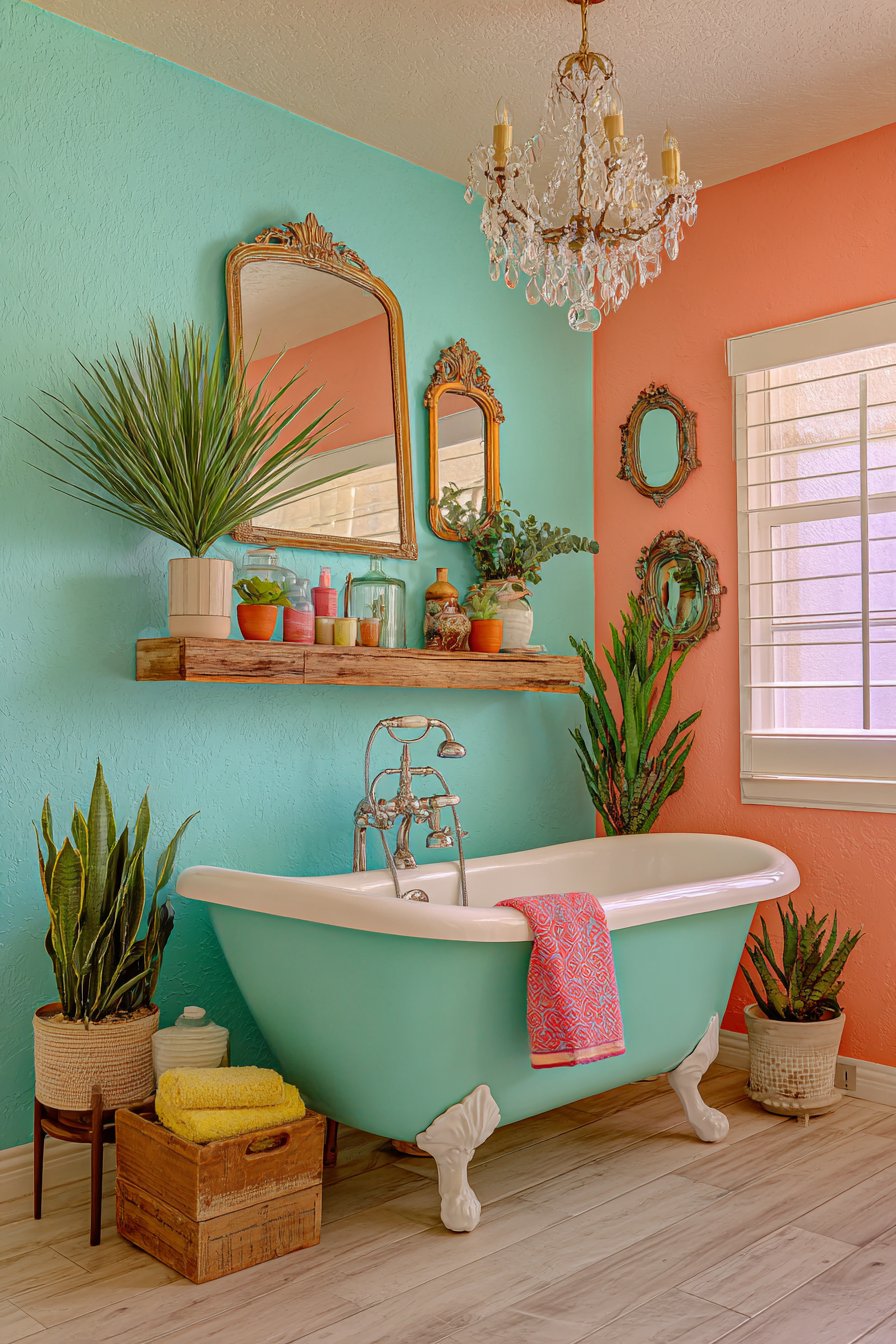
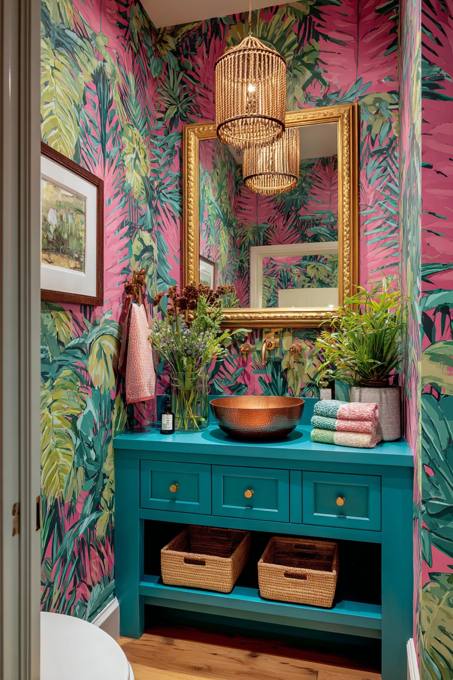
6. Playful Bathroom with Rainbow Tile Floor
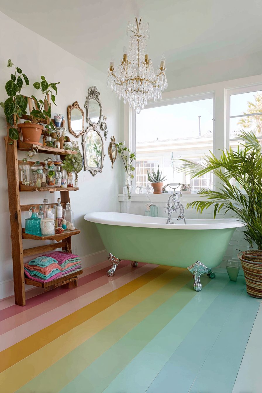
This bathroom transformation demonstrates how even the most utilitarian spaces can become sources of daily joy through unexpected material choices and whimsical details. The penny tile flooring creates a stunning rainbow gradient effect, transitioning smoothly from warm tones—reds, oranges, and yellows on one end—through cool tones of greens, blues, and purples on the other. This labor-intensive installation requires careful planning and gradual color transitions, but the result is a floor that feels like walking on a permanent rainbow, instantly elevating mood and creating a distinctive focal point that grounds the entire space’s playful aesthetic.
Against this colorful foundation, a classic clawfoot tub painted on the exterior in soft sage green provides a surprising twist on a traditional bathroom fixture. While most clawfoot tubs retain their original white enamel or are left in natural cast iron, this painted exterior approach personalizes the piece and connects it to the room’s overall color story. Above this unexpected bathing centerpiece hangs a vintage crystal chandelier—a dramatic juxtaposition of formal elegance and casual bathroom function that epitomizes eclectic design’s rule-breaking spirit. The chandelier catches light from windows and fixtures, casting prismatic reflections across the colorful floor and creating magical lighting effects.
Open shelving constructed from reclaimed wood with visible grain, knots, and natural variations provides practical storage while adding organic warmth to balance the room’s more glamorous elements. These shelves display carefully folded colorful towels in solid jewel tones that echo the floor’s rainbow palette, vintage apothecary jars filled with bath salts and cotton balls, and a collection of potted succulents in ceramic containers. One wall features an artistic arrangement of vintage hand mirrors in ornate frames—different shapes, sizes, and finishes creating a three-dimensional gallery that celebrates beauty rituals across eras. Professional interior photography with soft diffused lighting highlights the sophisticated playfulness, showing how this bathroom balances whimsy with functionality.
Key Design Tips:
- Create gradual color transitions in tile work for rainbow effects
- Paint unexpected surfaces like tub exteriors in coordinating colors
- Install glamorous lighting fixtures in casual spaces for delightful contrast
- Use open shelving to display colorful towels as functional decor
- Collect vintage accessories like mirrors or perfume bottles for wall displays
- Choose succulents for bathroom greenery as they tolerate humidity well
- Seal painted surfaces in wet areas with waterproof topcoat
- Balance busy floors with simpler wall treatments
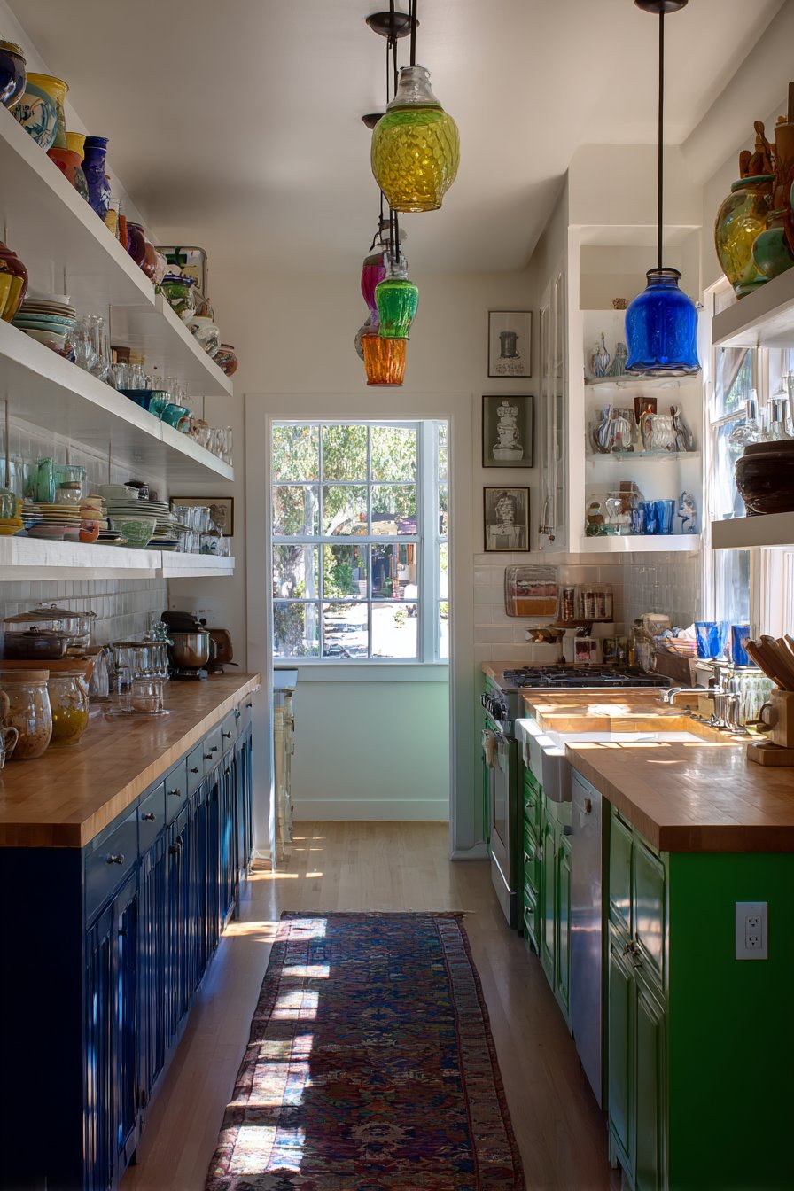
7. Kitchen with Color-Blocked Cabinetry
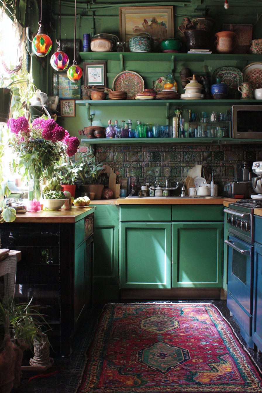
This kitchen boldly rejects the traditional single-color cabinetry approach, instead embracing color-blocked lower cabinets that create visual rhythm and personality in the heart of the home. Navy blue cabinets on one side provide deep, sophisticated grounding, their rich hue suggesting both traditional elegance and contemporary confidence. Forest green cabinets on the opposite side introduce an earthy, organic counterpoint, creating a balanced color conversation that feels both intentional and slightly rebellious. This two-toned approach to cabinetry allows for creative expression while maintaining functionality, with each color possibly corresponding to different kitchen zones—perhaps food preparation versus storage areas.
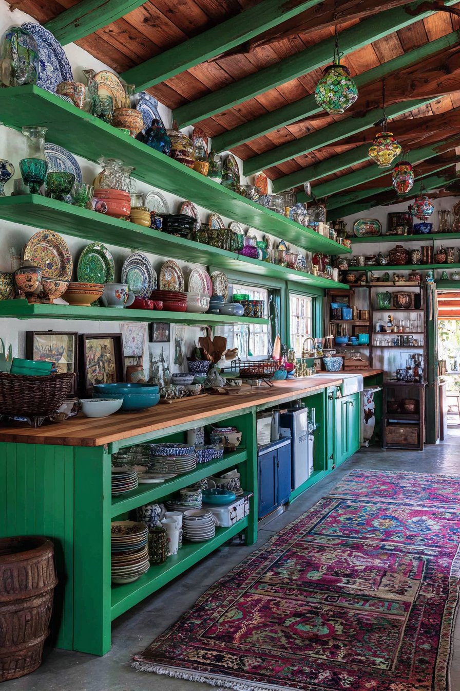
Butcher block countertops spanning both colored cabinet sections provide warm, natural contrast to the saturated cabinet colors while offering practical, renewable work surfaces ideal for food preparation. The visible wood grain and honey tones create visual breathing room between the bold cabinet colors and the display areas above. Open shelving replaces upper cabinets, showcasing a deliberately mismatched collection of vintage dishes representing different eras, patterns, and manufacturers—perhaps mixing delicate floral transferware, bold mid-century geometric designs, and rustic hand-thrown pottery. Colorful glassware in various hues catches light and adds transparent pops of color, while pottery pieces in varied glazes contribute textural and chromatic interest.
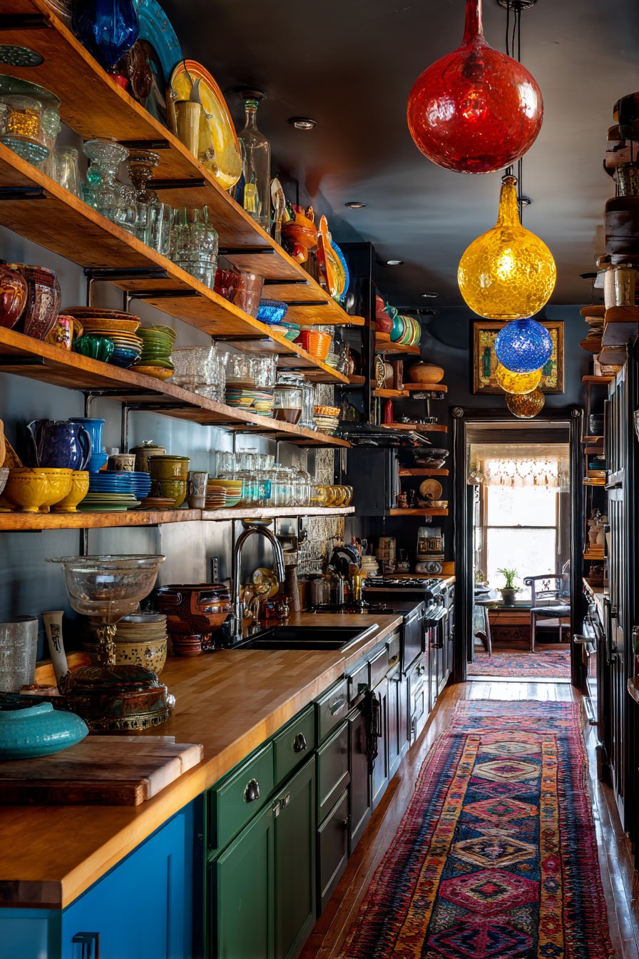
A vintage Persian runner in rich jewel tones with traditional geometric or floral motifs adds pattern to the floor while protecting high-traffic areas and introducing another layer of color and history. Overhead, pendant lights feature colorful glass shades in different shapes—perhaps one dome, one cone, one globe—creating an eclectic lighting installation that provides focused task lighting over work areas while serving as functional sculpture. Wide-angle photography captures the full kitchen space bathed in natural daylight from windows, emphasizing the collected-over-time aesthetic where each element appears chosen for both function and beauty, creating a cooking space that inspires creativity and nourishes both body and spirit.
Key Design Tips:
- Paint different cabinet sections in complementary bold colors
- Use natural wood countertops to provide warmth and visual relief
- Display everyday dishes as decor on open shelving
- Organize displayed items by color, size, or function for visual order
- Choose vintage or handmade pottery to add unique character
- Install pendant lights at 30-36 inches above countertops
- Use runners in high-traffic kitchen areas for both protection and pattern
- Mix cabinet hardware styles to enhance the eclectic aesthetic
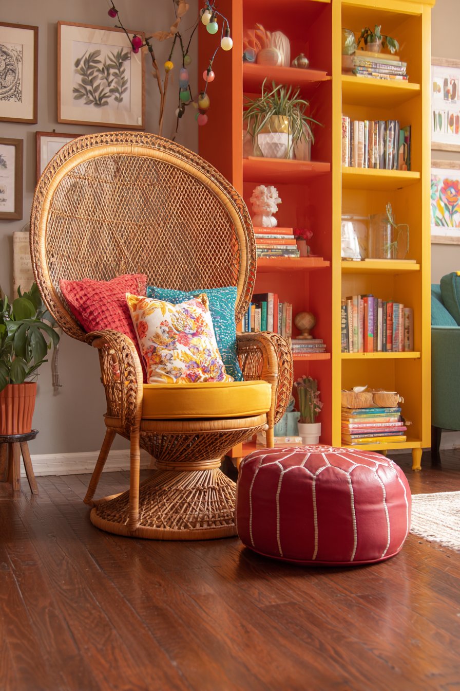
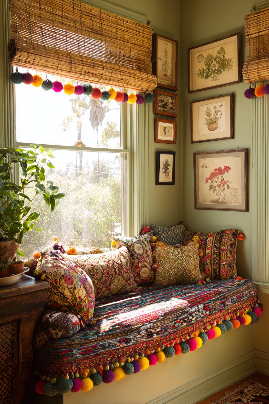
8. Cozy Reading Nook with Rainbow Shelving
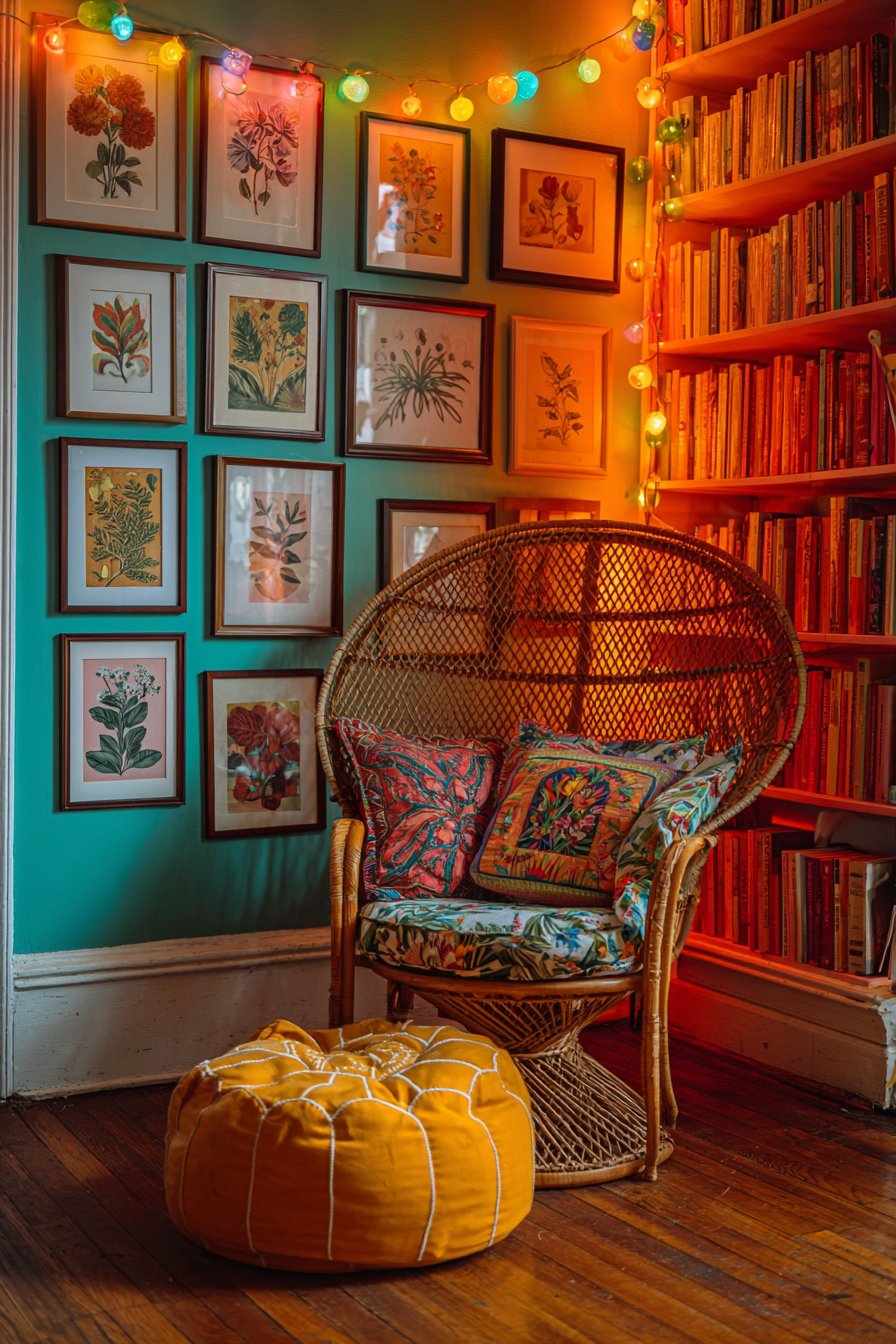
This reading nook creates an intimate sanctuary dedicated to literature and contemplation, featuring a curved vintage rattan peacock chair whose dramatic fan back and intricate woven pattern make it a sculptural focal point. The natural rattan material provides organic texture and bohemian character, while vibrant cushions in mixed patterns—perhaps combining geometric prints, floral textiles, and ethnic-inspired designs—transform the chair into a supremely comfortable reading throne. Positioned beside a floor-to-ceiling bookshelf, this seating creates the perfect relationship between reader and literature, making book selection effortless and creating an immersive literary environment.
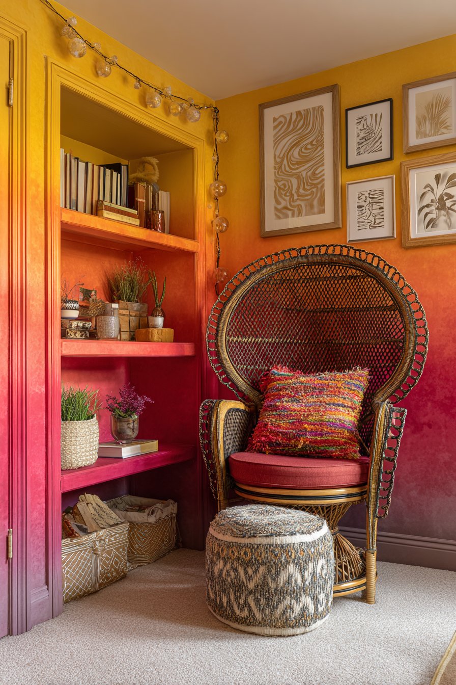
The bookshelf itself undergoes a transformative treatment with gradient-painted backing or sides transitioning from yellow at the bottom through orange to red at the top, creating a warm, energizing rainbow effect that celebrates color’s emotional power. This painted gradient serves as both artwork and functional storage, turning a practical shelving unit into a statement piece that elevates the entire space. The books themselves might be arranged by color to enhance this rainbow effect, creating visual harmony while making the collection feel curated and intentional. A Moroccan leather pouf in rich color—perhaps deep burgundy or bright turquoise—serves as a versatile footrest, additional seating, or impromptu side table for tea and reading glasses.
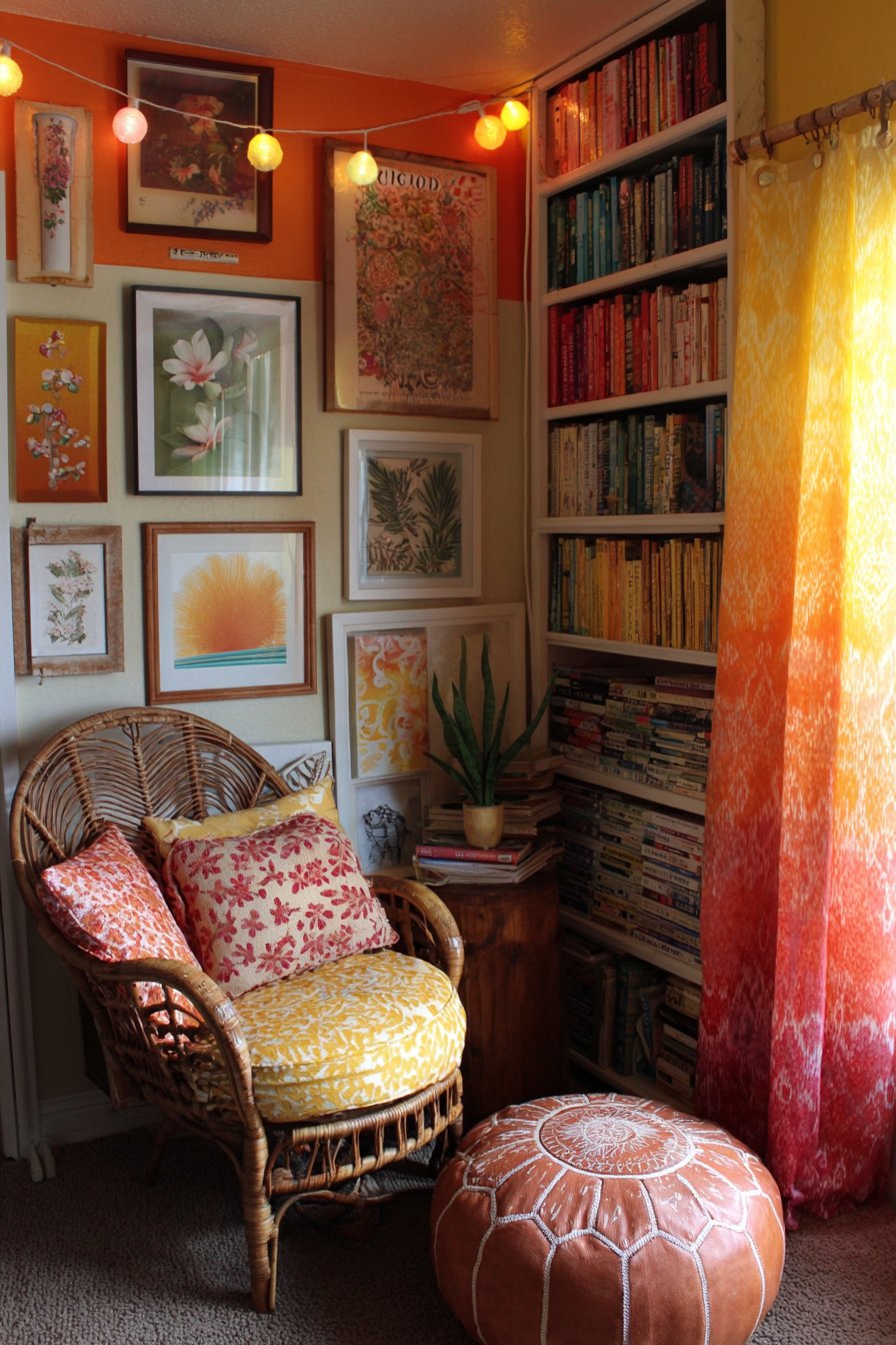
String lights with colorful bulbs drape overhead in casual swoops, creating a magical canopy effect that transforms the nook into an enchanted space, especially during evening reading sessions. These lights provide soft, flattering ambient illumination that’s gentle on eyes during extended reading while adding whimsical charm. The surrounding walls display a curated mix of framed vintage botanical prints—featuring detailed scientific illustrations of plants, flowers, and ferns—alongside contemporary graphic art with bold shapes and limited color palettes. This combination honors both traditional and modern aesthetics while maintaining the space’s literary, contemplative character. Detail-focused interior photography captures this cozy corner bathed in soft natural lighting from a nearby window, highlighting the interplay of textures—woven rattan, soft textiles, smooth book spines, hand-painted wood—and the progressive rainbow of colors that makes this nook feel like a personal treasure.
Key Design Tips:
- Create color gradients on bookshelf interiors using painter’s tape for clean lines
- Choose statement seating like peacock chairs for reading areas
- Layer cushions in mixed patterns with complementary color schemes
- Use string lights on dimmer switches for adjustable ambient lighting
- Arrange books by color for maximum visual impact
- Position reading chairs near natural light sources when possible
- Include footrests or poufs for comfort during long reading sessions
- Mix botanical and graphic art for balanced wall interest
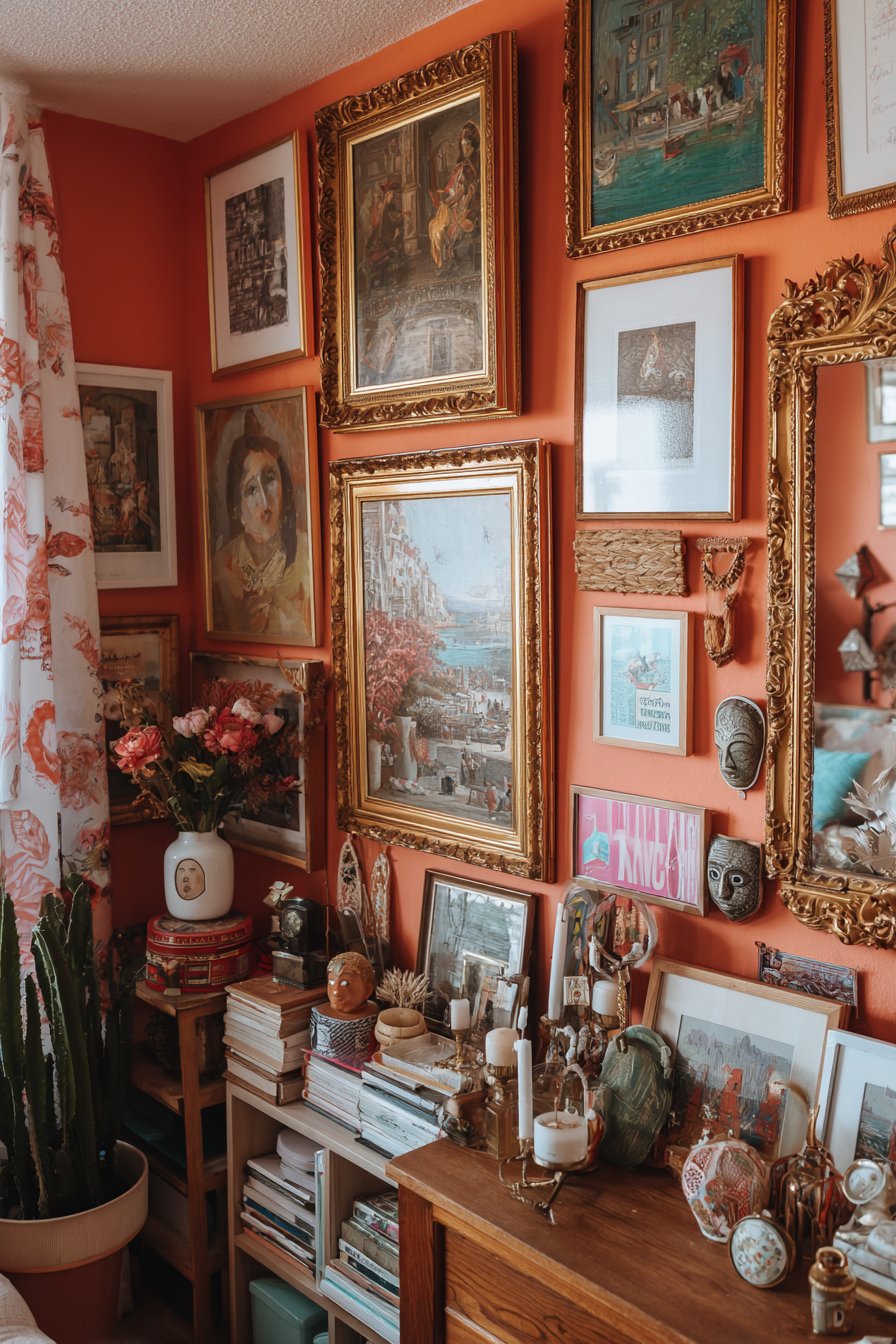
9. Maximalist Gallery Wall Showcase
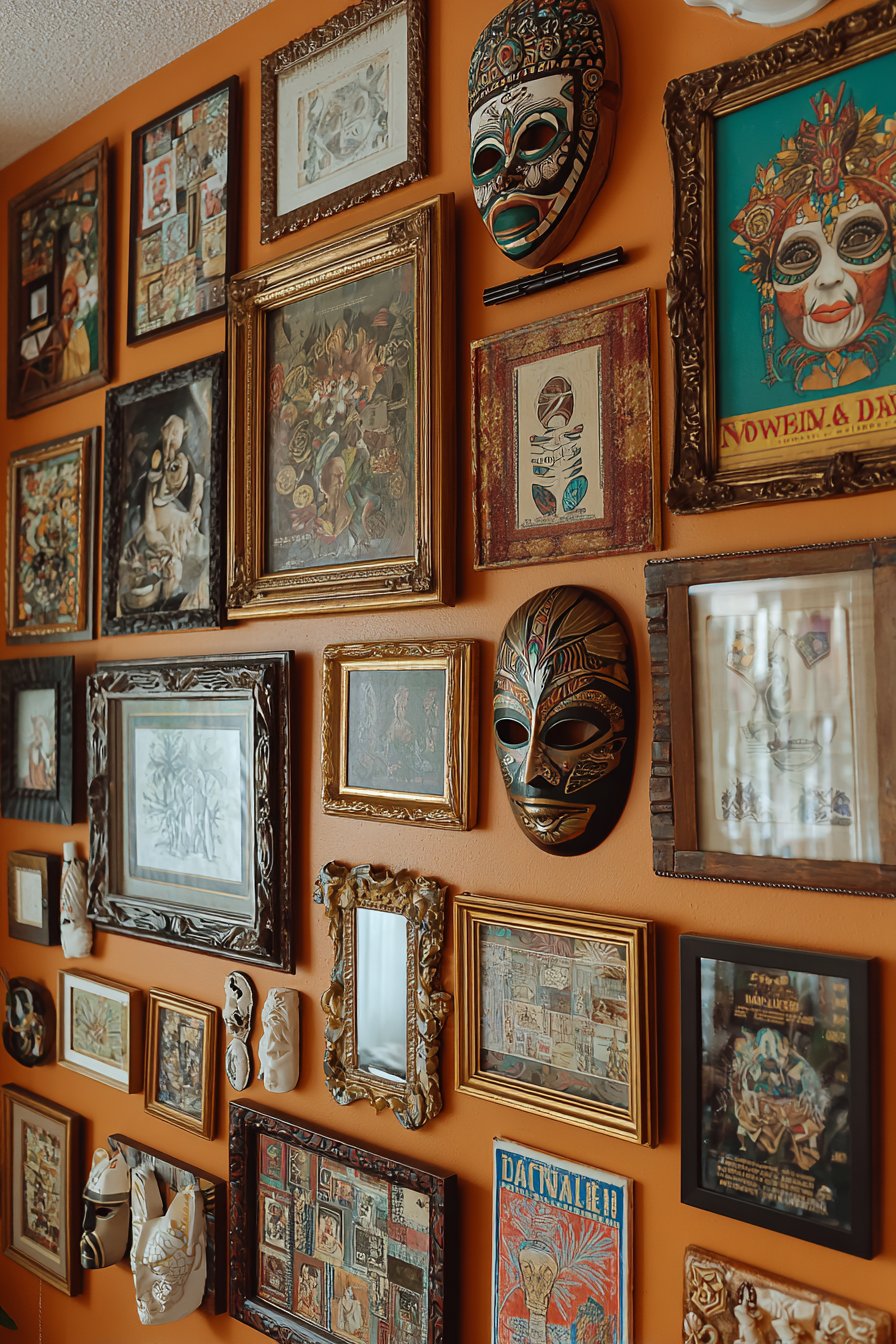
This feature wall represents the pinnacle of eclectic curation, showcasing the art of creating organized chaos through thoughtful arrangement of diverse artistic elements. The gallery wall spans floor to ceiling, edge to edge, featuring an intentional mishmash of art styles, eras, and mediums that somehow coalesce into a cohesive visual statement. Oil paintings in ornate gold frames suggesting classical or romantic subject matter hang beside stark modern minimalist prints with simple black frames and bold typography or abstract shapes. Vintage travel posters celebrating mid-century destinations with stylized graphics and saturated colors contribute nostalgic charm while introducing representational imagery to the abstract mix.
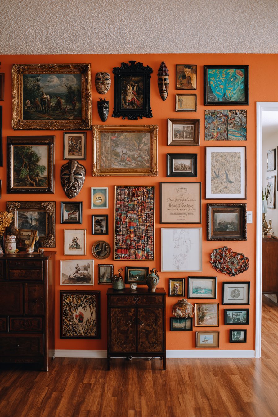
Textile art adds dimensional and tactile interest—perhaps a small woven wall hanging in earth tones, an embroidered piece featuring folk art motifs, or a framed vintage textile sample showing traditional patterns. Small mirrors in various shapes and sizes reflect light and create depth, their reflective surfaces adding interactive elements that change as viewers move past. Three-dimensional objects break the two-dimensional plane: African masks with carved wood and authentic patina, sculptural ceramic pieces mounted on shadow boxes, small architectural fragments, or found object assemblages that blur the line between art and artifact. Frames vary wildly in style, color, and size—massive ornate baroque frames in distressed gold, sleek modern aluminum, rustic weathered wood, painted frames in unexpected colors—creating visual rhythm through contrast rather than repetition.
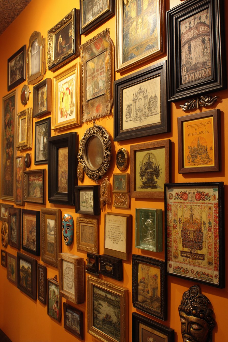
The warm burnt orange wall color provides a unifying backdrop that makes diverse artwork and frames appear intentional rather than random. This bold wall choice creates enough visual strength to support the busy arrangement while warm undertones complement both metallic frames and colorful artwork. Professional interior photography with carefully balanced lighting shows the careful curation within the apparent randomness—how larger pieces anchor corners, how color repetitions create visual pathways across the wall, how varying frame depths create subtle dimension, and how the overall effect feels collected over time rather than purchased in one shopping trip. This gallery wall demonstrates that eclectic design succeeds through thoughtful editing despite its “more is more” philosophy.
Key Design Tips:
- Start with largest pieces and arrange smaller works around them
- Maintain consistent spacing between frames (2-3 inches) despite size variations
- Create paper templates of each piece to test arrangements before hanging
- Use a unifying wall color to provide visual cohesion
- Mix frame colors and styles but keep mat colors consistent (white or cream)
- Include three-dimensional objects for added interest and depth
- Repeat certain colors across multiple pieces to create visual connections
- Allow the collection to evolve over time rather than completing it all at once
- Aim for varied eye levels to encourage movement and exploration
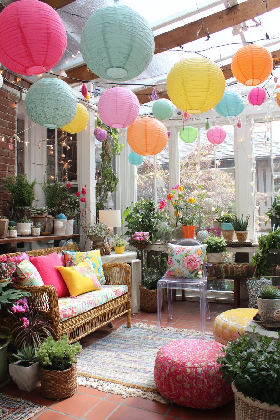
10. Plant-Filled Sunroom Sanctuary
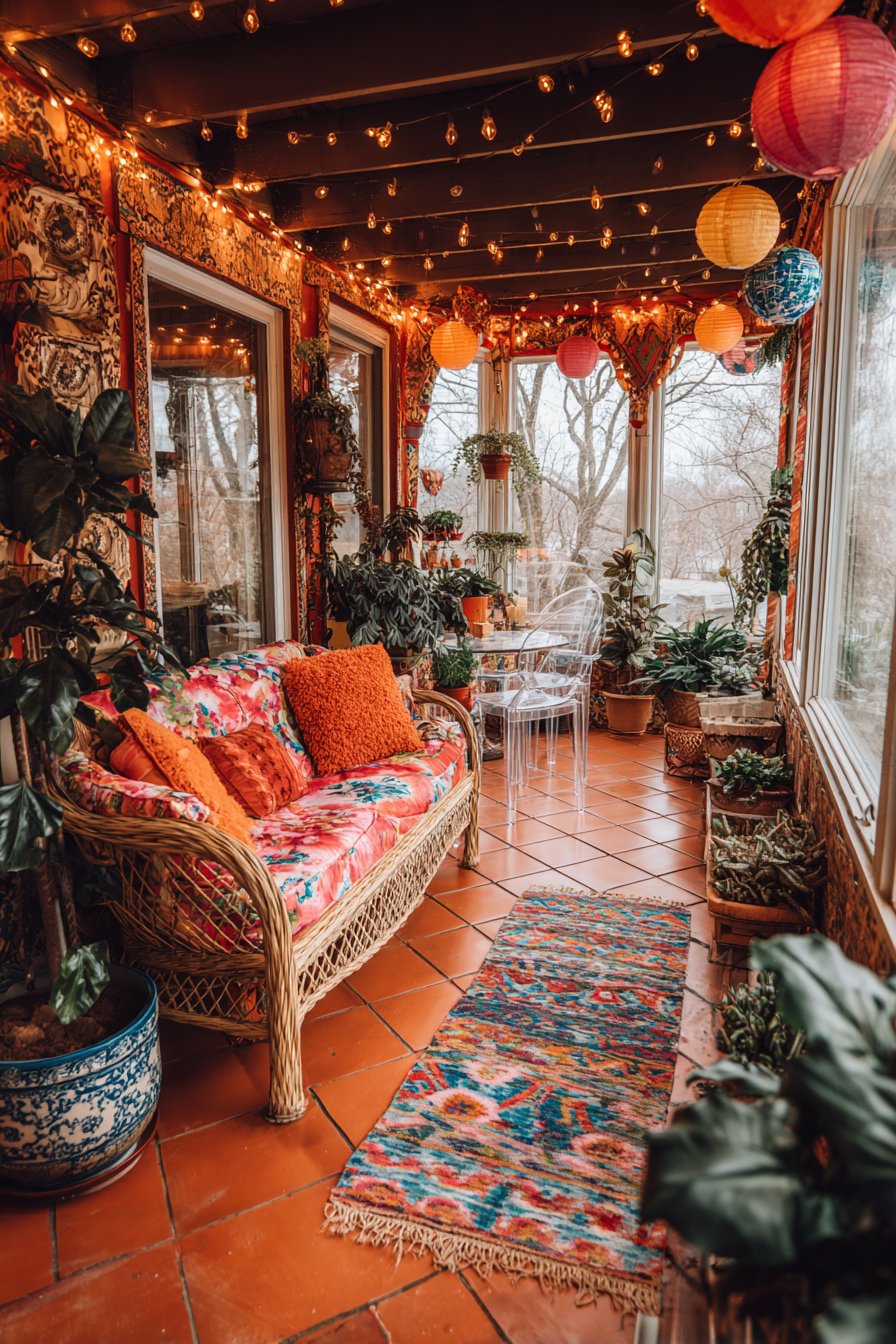
This sunroom exemplifies the botanical maximalist approach, transforming a light-filled transitional space into an indoor garden where plants take center stage in containers representing every imaginable style and era. Ceramic pots in bold glazes—perhaps cobalt blue, emerald green, sunny yellow, and deep burgundy—showcase various plant specimens from trailing pothos to upright snake plants. Vintage tins with nostalgic graphics and patina provide unexpected containers for herbs and succulents, their aged character contrasting beautifully with fresh green foliage. Woven baskets in natural materials like seagrass, water hyacinth, and rattan add organic texture while concealing plastic nursery pots, and repurposed teapots, pitchers, and even old shoes become whimsical planters that inject humor and personality.
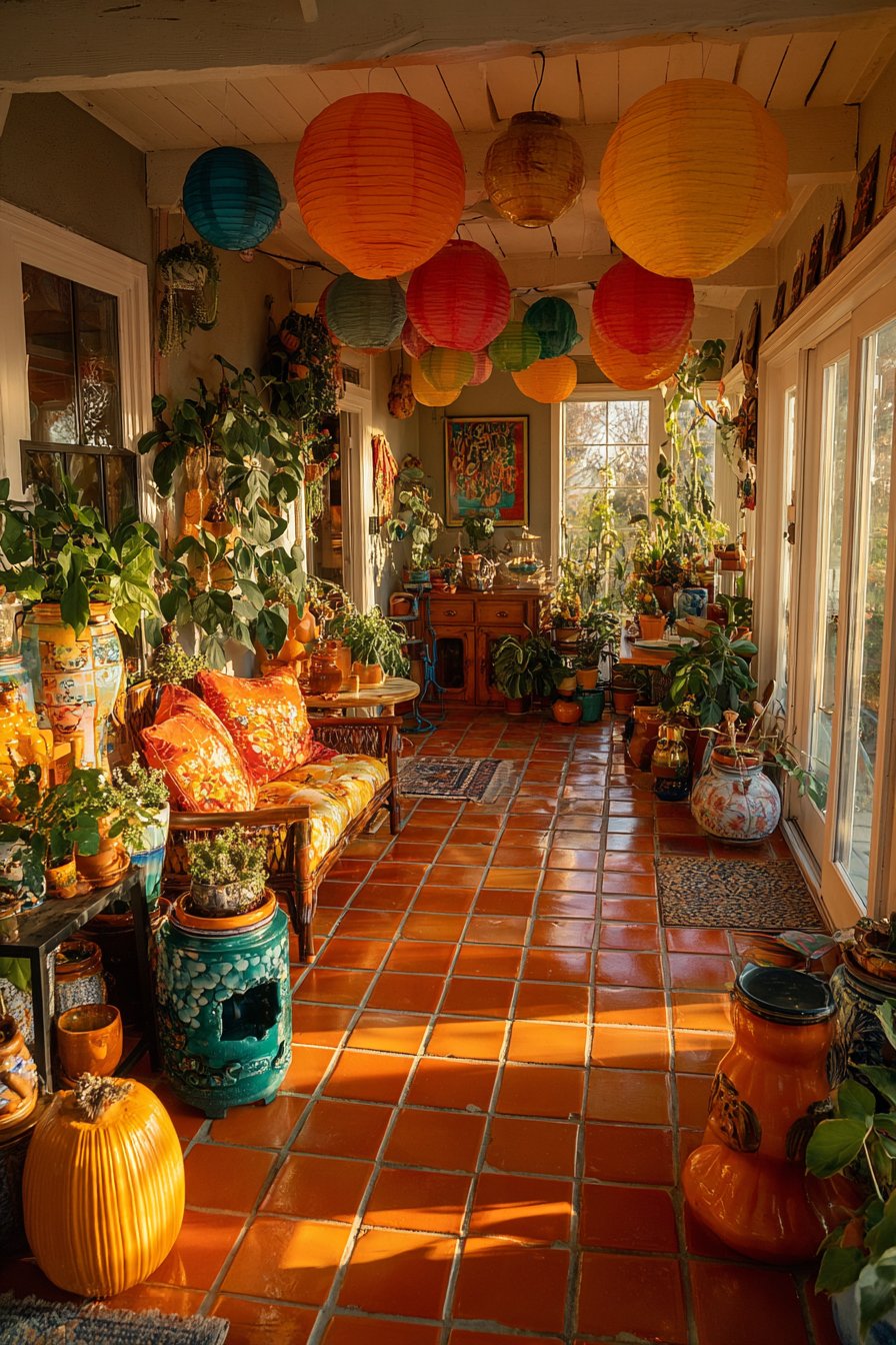
Seating creates comfortable human zones within this botanical paradise, featuring a vintage wicker loveseat with deep cushions covered in bright floral fabric that echoes the living plants surrounding it. The natural wicker material connects to the plant theme while providing comfortable support for hours of reading or conversation. A modern acrylic chair offers transparent contemporary seating that visually disappears, allowing the plants to remain the focal point while providing necessary seating for guests. The terracotta tile floor with its warm orange-red tones creates a garden-appropriate foundation that’s both practical for plant care (water spills, soil accidents) and aesthetically harmonious with the botanical theme. A colorful kilim rug defines the seating area, its traditional geometric patterns and rich jewel tones adding another layer of pattern and cultural texture.
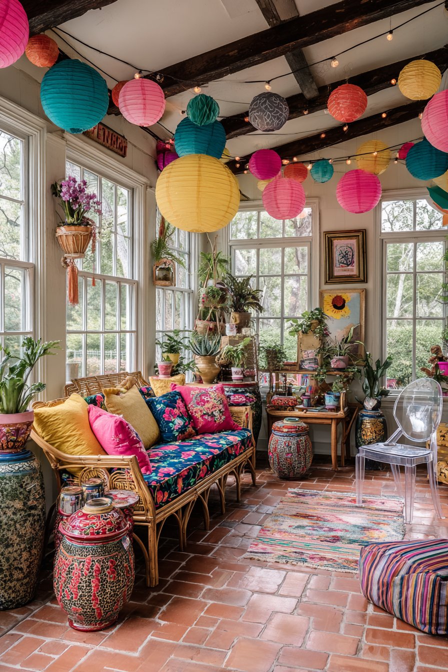
String lights and paper lanterns in various colors hang from exposed beams overhead, creating a magical canopy effect that transforms the sunroom into an enchanted garden space during evening hours. These lights might include globe-shaped paper lanterns in soft pastels, traditional Edison-style string lights with warm filaments, and perhaps even colored glass lanterns casting tinted light across the plants. Wide-angle interior photography captures this lush, maximalist space flooded with natural golden hour light streaming through windows on multiple sides, creating a warm glow that illuminates the varied green tones and makes the space feel alive with growth and possibility. The abundance of plants at varying heights creates natural layers and depth, proving that more truly can be more when executed with intention.
Key Design Tips:
- Group plants by light and water requirements for easier maintenance
- Use saucers under pots to protect floors from water damage
- Vary container heights using plant stands, shelves, and hanging solutions
- Choose moisture-loving plants for naturally humid sunrooms
- Mix foliage types (trailing, upright, bushy) for visual variety
- Include flowering plants for seasonal color changes
- Use grow lights on timers to supplement natural light in winter
- Select washable, outdoor-appropriate fabrics for sunroom furniture
- Create pathways through dense plant arrangements for access and care
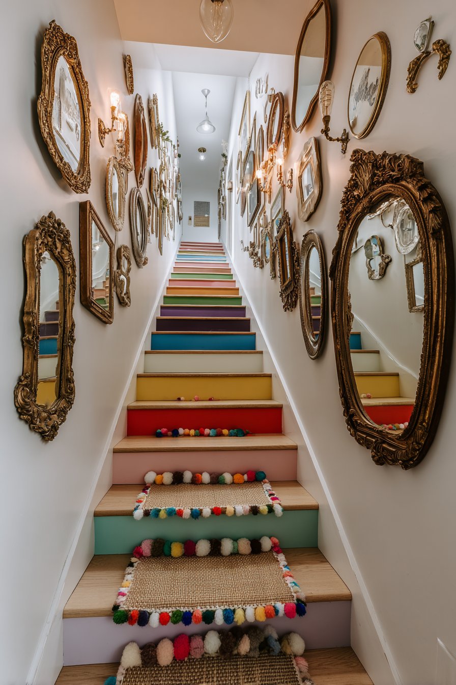
11. Rainbow Stairway Transformation
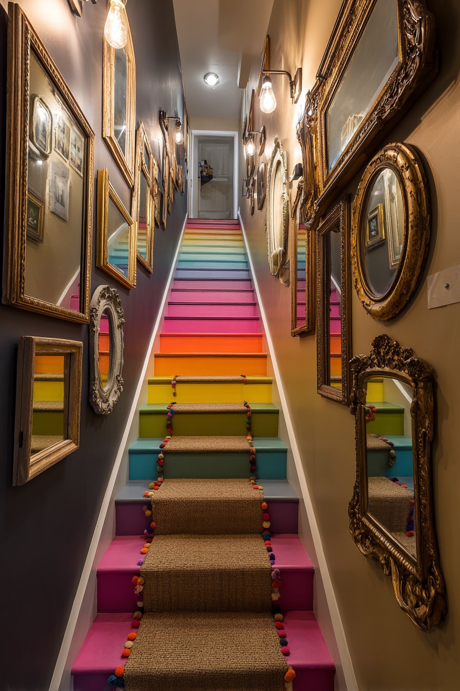
This stairway demonstrates how often-overlooked transitional spaces can become showstopping design features through fearless color application and creative wall treatments. Each stair riser receives its own bold color treatment, creating a vertical rainbow progression that transforms the act of moving between floors into a joyful, chromatic experience. The color sequence might flow from warm reds and oranges at the bottom through yellows and greens in the middle to cool blues and purples at the top, creating a gradient effect that draws the eye upward and makes the stairs feel like a functional art installation. This painted treatment requires careful preparation and durable floor paint suitable for high-traffic areas, but the resulting impact justifies the effort.
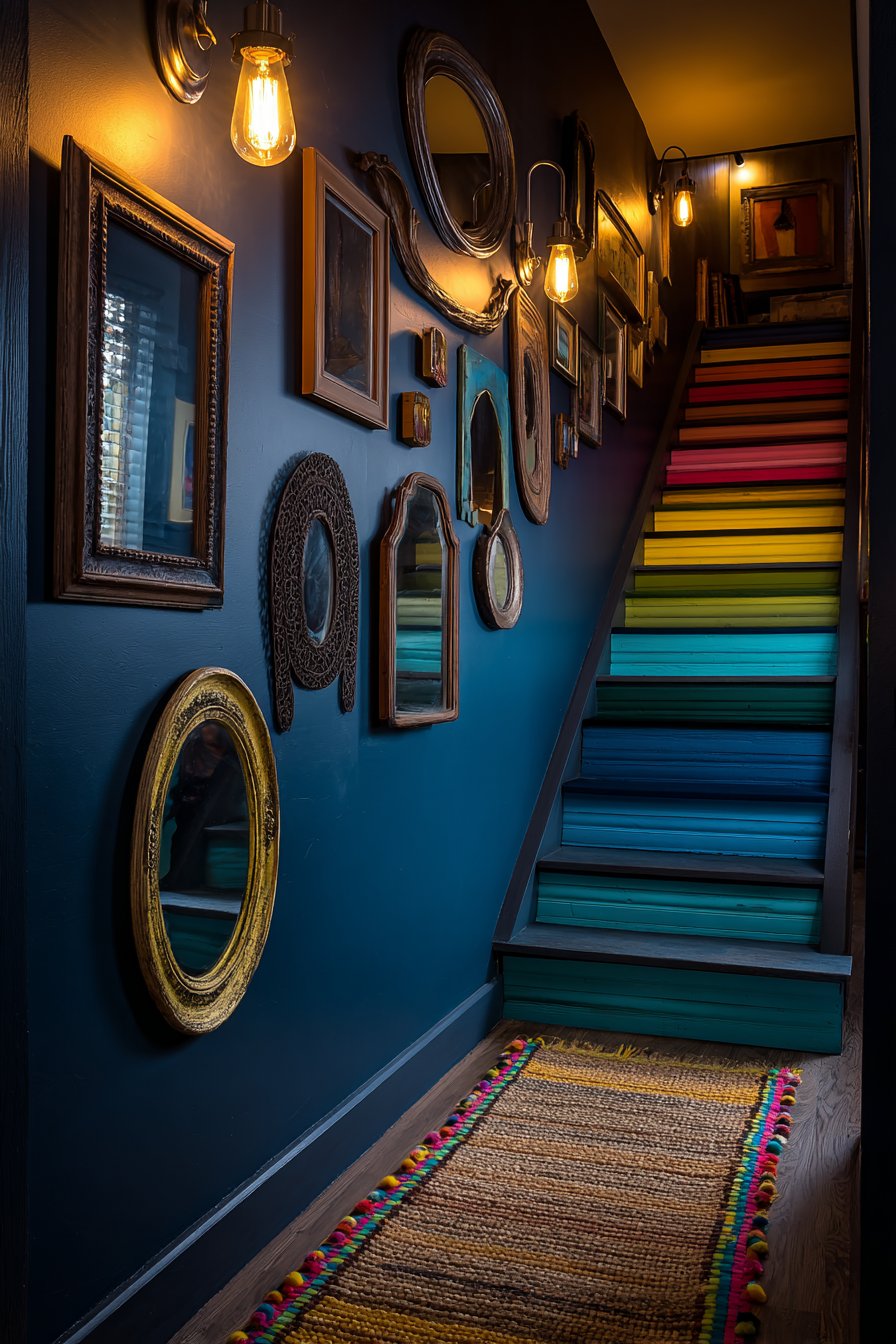
The wall alongside this colorful stairway features a salon-style arrangement of vintage mirrors in varying shapes, sizes, and frame finishes, creating a reflective gallery that multiplies light and creates visual complexity. Round mirrors with rope detail might hang beside ornate baroque rectangles in gilded frames, sleek mid-century modern squares with teak frames, and sunburst designs with brass rays extending outward. This collection serves multiple purposes: mirrors visually expand the typically narrow stairway space, reflect the colorful risers creating kaleidoscopic effects, and provide functional last-minute appearance checks while adding decorative impact. The varied frame finishes—from ornate baroque gold to simple modern brass to weathered painted wood—create textural and chromatic variety that complements the rainbow stairs.
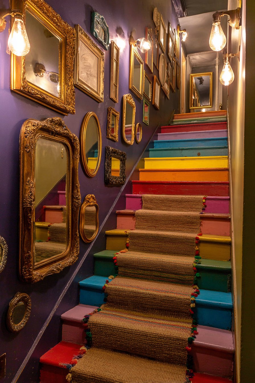
A jute runner with colorful pom-pom trim defines the stair treads, providing both safety (reducing slip risk) and additional pattern and texture. The natural jute fibers in neutral beige create visual relief from the bright colors while the cheerful pom-poms in rainbow hues tie back to the painted risers, creating cohesion between horizontal and vertical elements. Industrial wall sconces with Edison bulbs provide illumination that’s both functional for safety and atmospheric for ambiance, their exposed filaments and simple metal frames adding subtle industrial edge to the playful color scheme. Interior photography captures this vertical space with careful lighting that emphasizes the color progression and creates dynamic reflections in the mirror collection, showing how a purely functional space becomes an experiential journey through color.
Key Design Tips:
- Use high-quality floor paint rated for high-traffic areas on stair risers
- Apply multiple coats and seal with polyurethane for durability
- Maintain consistent spacing between mirrors despite size variations
- Secure mirrors with appropriate wall anchors rated for mirror weight
- Choose stair runners with non-slip backing or install runner pads
- Install sconces at consistent heights (approximately 60 inches from treads)
- Consider the view from both directions when planning color progression
- Use painter’s tape for crisp color divisions between risers
- Allow each color to fully dry before painting adjacent risers
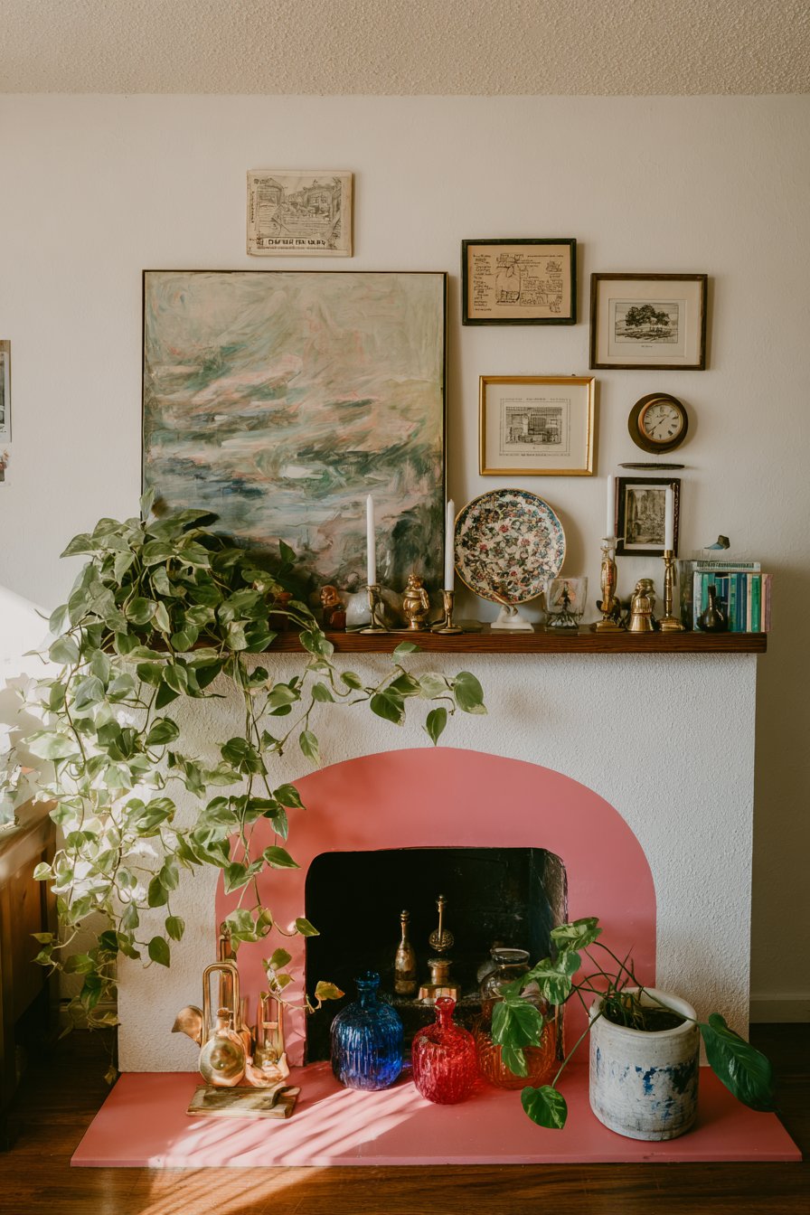
12. Layered Mantel Display Artistry
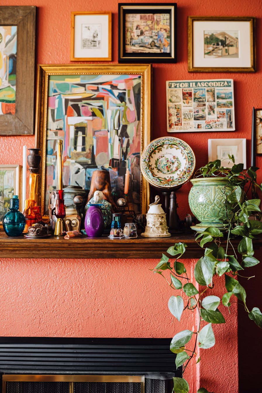
This mantel arrangement demonstrates the sophisticated art of layered styling, where multiple elements at varying depths create dimensional interest rather than flat, single-layer display. The composition begins with a large abstract painting featuring bold brushstrokes and a complementary color palette—perhaps turquoise, coral, and gold—leaning casually against the wall rather than hanging, creating a relaxed, effortless vibe that suggests the collection is still evolving. In front of this substantial backdrop, smaller framed prints in various sizes create middle layers—perhaps a botanical illustration, a vintage map, and a modern graphic print—their varied subject matter and frame styles adding visual complexity while maintaining the casual, collected aesthetic.
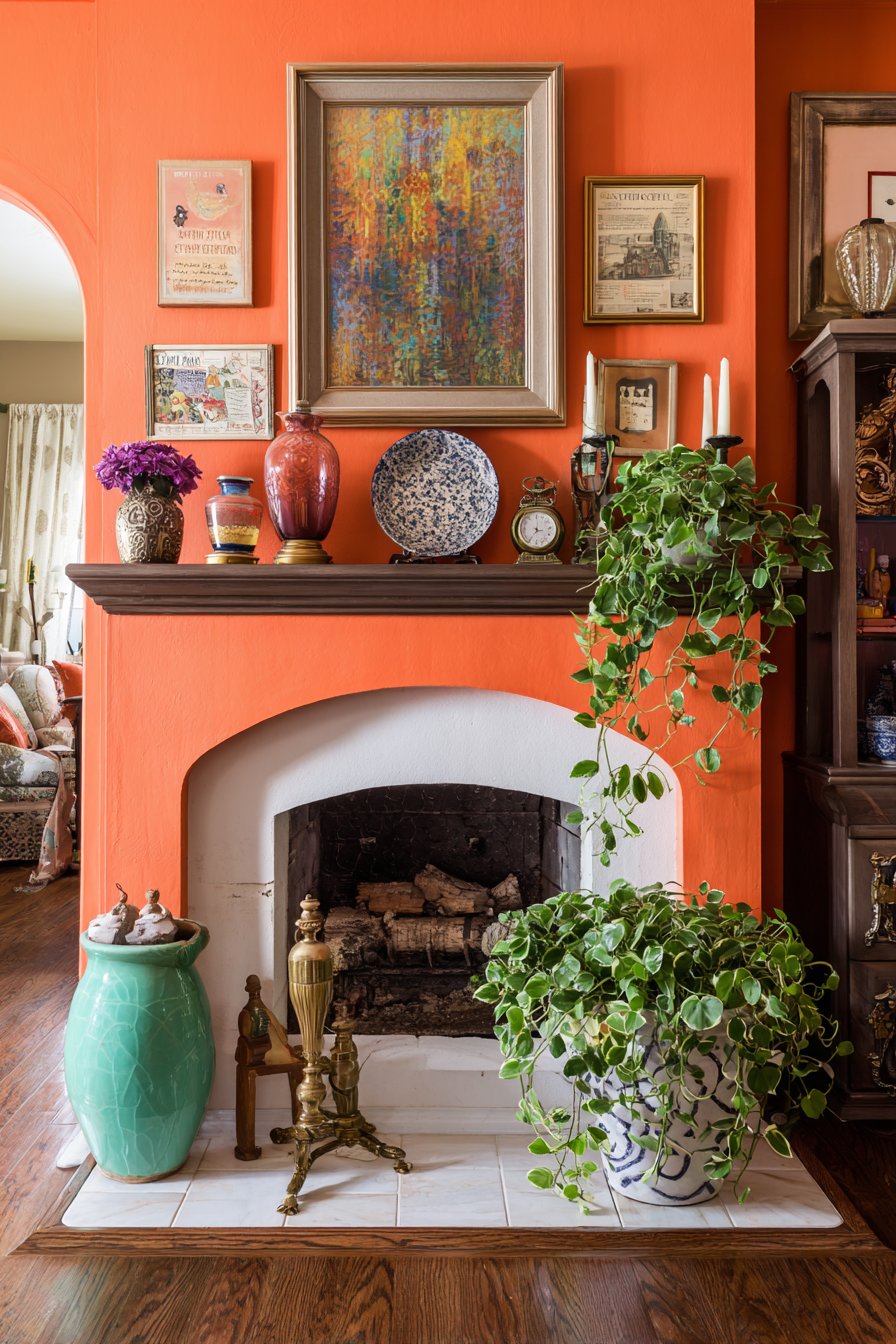
A decorative plate on a small easel or plate stand adds circular form to the predominant rectangles, perhaps featuring hand-painted florals, a commemorative design, or geometric patterns in complementary colors. The mantel surface itself holds a carefully curated collection of objects arranged in odd-number groupings following classic styling principles. A brass candlestick with taper candle adds height and vertical interest while introducing warm metallic finish. Colorful glass vases in varied heights—perhaps one tall and slender in cobalt blue, one round and squat in amber, and one medium cylinder in emerald green—create chromatic interest while their transparency adds lightness. A vintage clock with visible mechanics or antique face provides both function and conversation-starting detail.
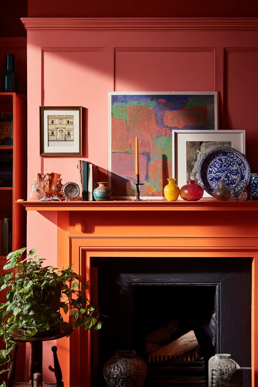
Small sculptures might include anything from abstract modern forms in polished metal to traditional figurines to found objects elevated to art status, each contributing personality and texture. Trailing pothos in a ceramic planter adds living greenery that softens the hard edges and creates organic movement, its vines cascading down the mantel face. The fireplace surround painted in bold coral provides a vibrant backdrop that makes the layered artwork and objects pop while adding contemporary edge to what might be a traditional architectural feature. Detail shot interior photography with soft natural side lighting creates dimension and highlights the curated collection, showing how proper styling creates visual interest from multiple angles and viewing distances, and how the careful layering creates depth that draws viewers closer to examine individual pieces.
Key Design Tips:
- Layer artwork from back to front in odd numbers
- Vary heights by at least 4-6 inches between grouped objects
- Use books as risers to create varied display heights
- Incorporate at least one living plant element
- Choose a cohesive color palette with 3-5 main colors
- Include varied shapes (vertical, horizontal, round) for balance
- Leave some negative space—don’t fill every inch
- Rotate seasonal objects to keep the display fresh
- Anchor arrangements with one substantial piece on each end
13. Pattern-Intensive Bedroom Retreat
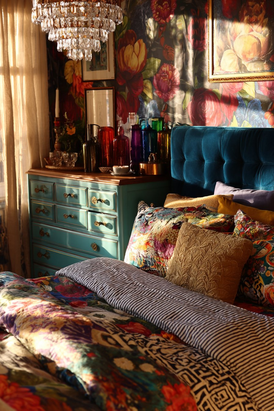
This bedroom creates an immersive pattern experience that feels luxurious rather than overwhelming through careful color coordination and scale variation. The walls feature vintage-inspired floral wallpaper with oversized blooms in jewel tones—perhaps deep magenta peonies, sapphire blue dahlias, and emerald green leaves against a neutral cream background. The large-scale pattern creates drama and sophistication, transforming the bedroom into a romantic, garden-like retreat. This bold wallpaper choice establishes the room’s color palette and sets the tone for all subsequent design decisions, proving that starting with a statement wallpaper can simplify rather than complicate decorating choices.
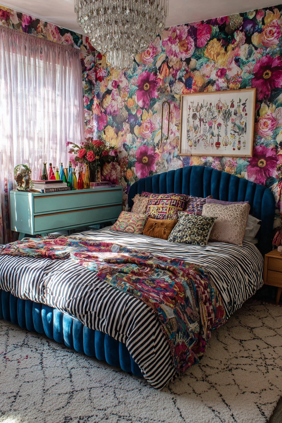
The upholstered headboard in velvet peacock blue provides a solid color anchor that grounds the busy wallpaper while introducing sumptuous texture and jewel-tone richness. The deep, saturated blue connects to colors within the wallpaper pattern while the smooth velvet pile creates tactile luxury and acoustic softening. The bedding demonstrates masterful pattern mixing, combining striped sheets in complementary colors—perhaps thin teal and white stripes—with a geometric duvet featuring modern triangular or hexagonal patterns in coordinating hues, and pillows in various prints including florals that echo the wallpaper, ikat patterns with their characteristic blurred edges, and textured solid velvets and linens that provide visual rest areas within the pattern abundance.
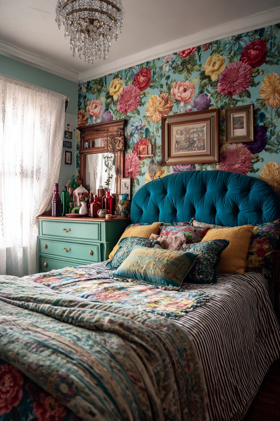
A vintage wooden dresser painted in cheerful teal serves double duty as functional storage and artistic statement, its updated color connecting to the wallpaper and bedding palette while its vintage form adds character and history. The dresser top displays a collection of colored glass bottles in varying heights and hues—cobalt blue apothecary bottles, amber medicine bottles, green wine bottles—creating a sculptural still life that catches light beautifully and adds vertical interest. A beaded chandelier suspended from the ceiling adds sparkle and glamour, its crystals or glass beads catching and refracting light while the fixture’s delicate construction contrasts with the room’s bold patterns. Interior design photography captures morning light filtering through sheer curtains, creating soft, diffused illumination that highlights the layered patterns and rich colors without creating harsh shadows that might make the busy room feel chaotic.
Key Design Tips:
- Choose wallpaper first and pull all other colors from it
- Mix pattern scales: large florals, medium geometrics, small stripes
- Include solid colors in approximately 30% of textiles for visual rest
- Paint furniture in colors that appear in the wallpaper
- Use glass and crystal accessories to add light and airiness
- Layer window treatments with sheers for light control
- Select velvet upholstery for richness and sound absorption
- Limit yourself to one bold pattern per category (one floral, one geometric, etc.)
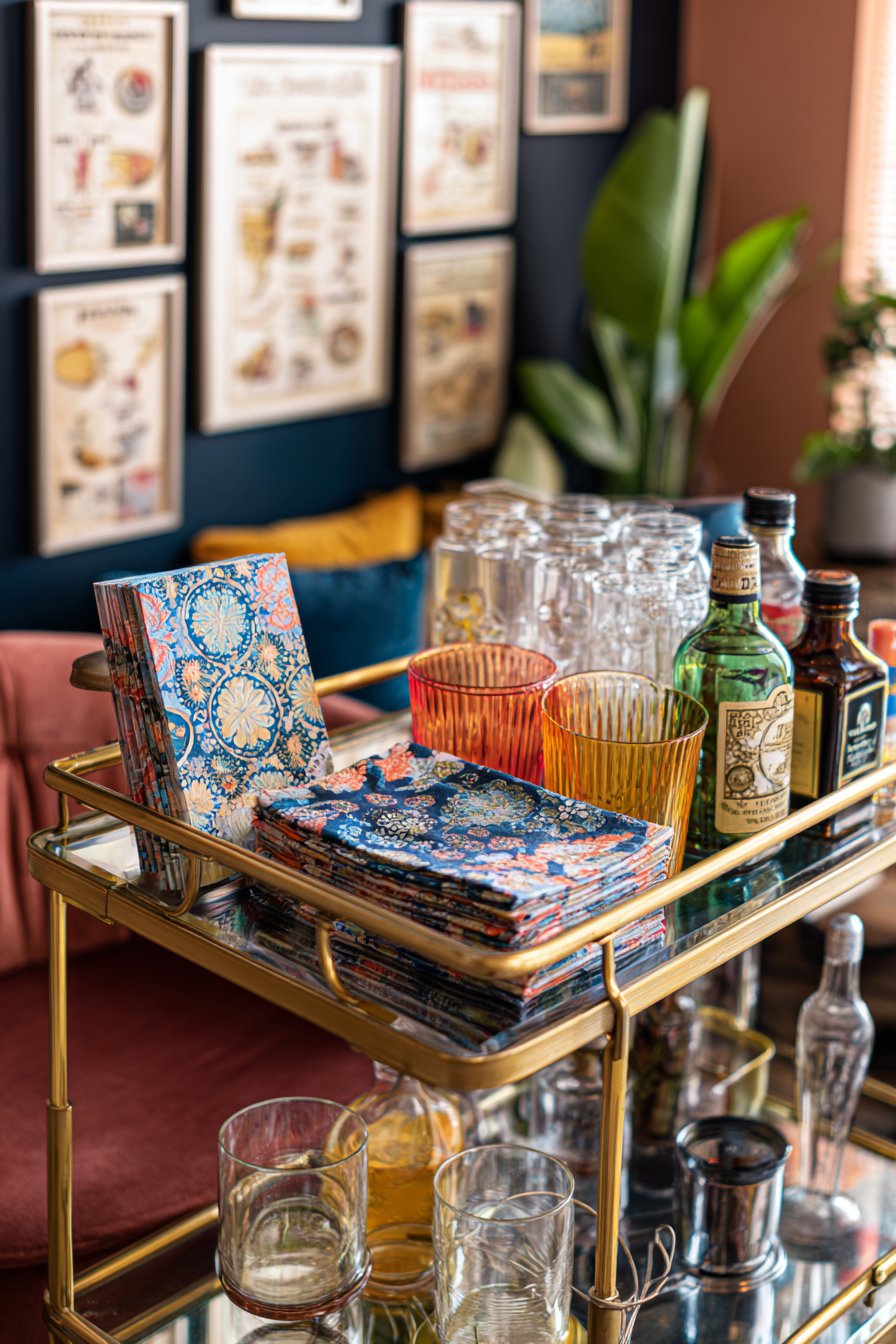
14. Curated Bar Cart Styling
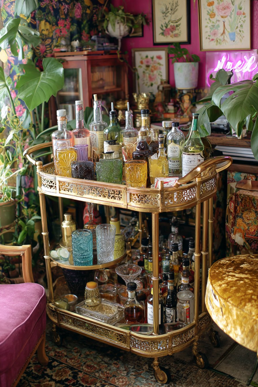
This bar cart arrangement transforms functional beverage service into an artful vignette that invites cocktail creation and entertaining. The vintage brass and glass cart itself provides the perfect foundation—the gleaming brass frame catching light and adding warm metallic luxury while the glass shelves create transparency and allow viewing of items on multiple levels simultaneously. The top shelf features colorful glassware representing various cocktail styles: perhaps vintage coupe glasses in pale pink, modern tumblers in cobalt blue, highball glasses in amber, and champagne flutes with gold rims. Patterned cocktail napkins in bold prints—perhaps geometric designs, tropical motifs, or vintage-inspired patterns—add practical function while contributing color and pattern to the composition.
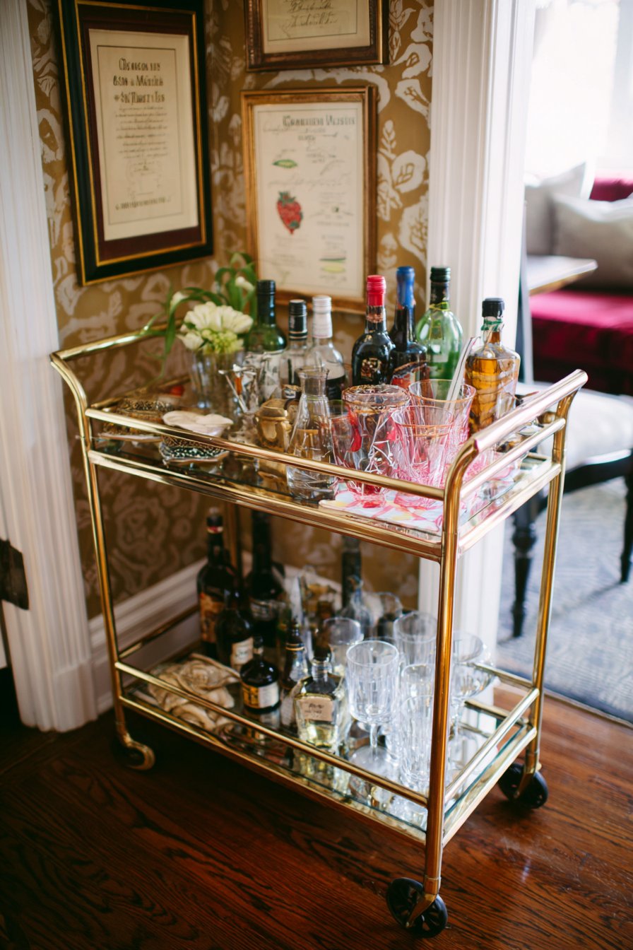
The collection of bitters bottles creates a still life of various heights, shapes, and label designs, their amber liquids and vintage typography adding both functional cocktail ingredients and decorative interest. Quirky bar accessories might include a brass pineapple ice bucket, a vintage cocktail shaker with art deco styling, colorful swizzle sticks in a small vase, and perhaps a small cocktail recipe book propped open to a classic preparation. Behind the cart, the wall displays vintage cocktail recipe prints in mismatched frames—perhaps including illustrated guides to classic drinks like the Old Fashioned, Manhattan, or Martini—their retro graphics and color palettes complementing the cart’s vintage aesthetic while providing both decoration and practical reference.
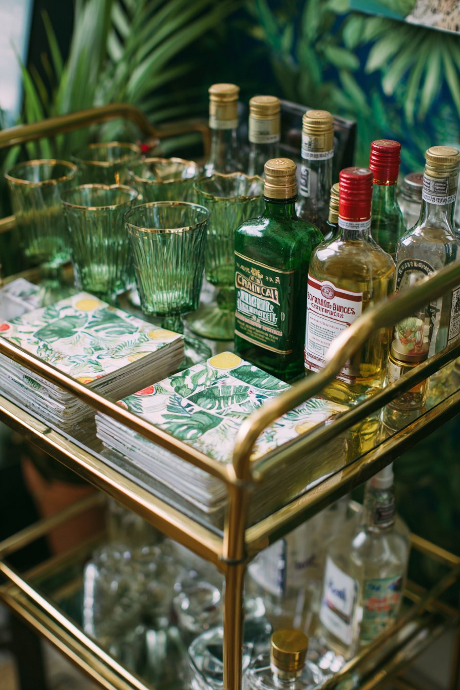
A neon sign adds contemporary edge and provides ambient lighting for evening entertaining, perhaps spelling out “Cheers,” “Cocktails,” or simply featuring an iconic cocktail glass shape. The warm neon glow creates atmosphere and highlights the glass surfaces and metallic finishes beautifully. Surrounding glimpses of the room reveal other eclectic elements—perhaps patterned wallpaper, velvet seating in jewel tones, and cascading houseplants—that contextualize the bar cart within a larger eclectic design scheme. Close-up interior photography captures the curated chaos with balanced lighting that shows glass reflections and metallic finishes while maintaining sharp detail on labels, patterns, and textures, demonstrating how a small vignette can pack enormous personality and become a conversation starter during gatherings.
Key Design Tips:
- Choose a cart with metallic finish for added glamour
- Organize bottles by type and height for visual order
- Include fresh elements like citrus or herbs for color and aroma
- Display cocktail recipe books or framed drink menus
- Use trays to corral small accessories and prevent visual clutter
- Rotate seasonal items and specialty spirits to keep displays fresh
- Add mood lighting with string lights or small lamps
- Include both decorative and functional bar tools
- Limit the cart to frequently used items—store backup stock elsewhere
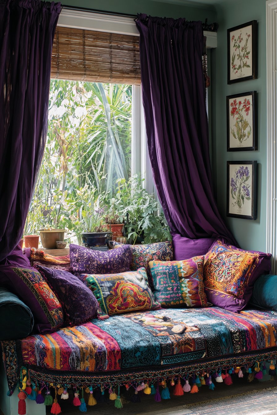
15. Textile-Layered Window Seat
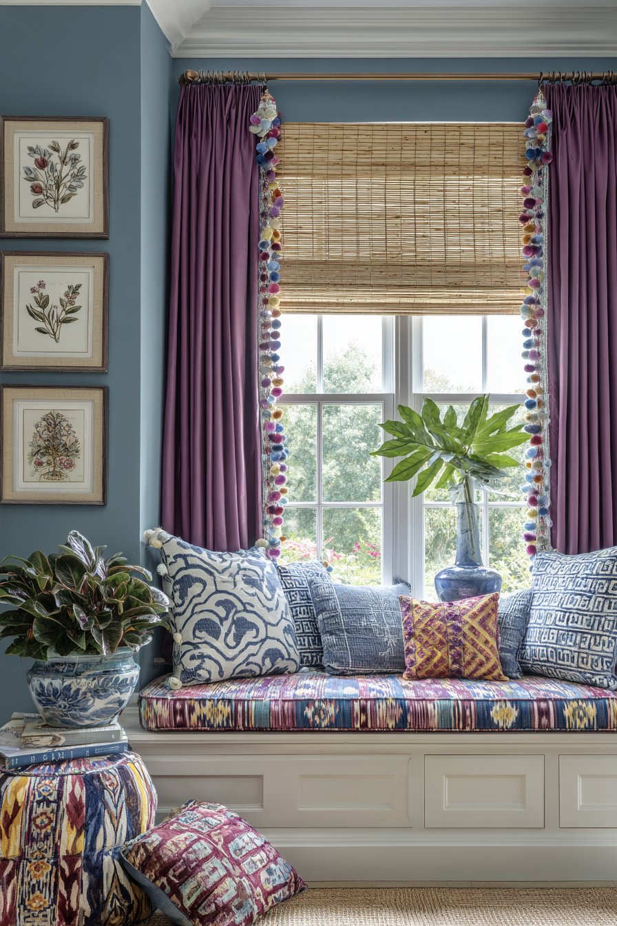
This window treatment and seating area demonstrates the power of textile layering to create a space that’s both visually compelling and supremely comfortable. The window itself features a carefully considered layering system beginning with a bamboo roman shade that provides privacy and light control while introducing natural material and organic texture. Its woven construction creates subtle pattern and allows filtered light to pass through when lowered. Over this practical foundation hang velvet curtains in deep purple, their heavy drape and lustrous pile creating luxurious softness and dramatic color impact. The velvet’s light-catching quality changes appearance throughout the day as natural illumination shifts, creating dynamic visual interest.
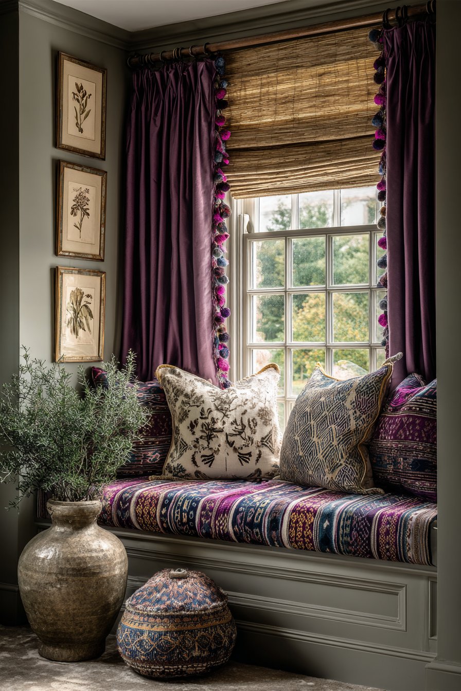
A colorful pom-pom trim along the leading edge and hem of the velvet curtains introduces playful, handcrafted detail and cheerful color that prevents the deep purple from feeling too serious or heavy. The pom-poms might graduate through a rainbow spectrum or feature colors that connect to other room elements, their three-dimensional texture adding touchable charm. The window seat below transforms the sill into functional seating through deep cushions covered in mixed patterns that demonstrate confident textile combining. An ikat pillow features the characteristic blurred, flame-like patterns in blues and creams, its ancient dyeing technique adding global sophistication. A suzani pillow contributes circular embroidered floral motifs in vibrant pinks and golds, its traditional Uzbek craftsmanship adding cultural richness. Modern geometric prints featuring triangles, hexagons, or abstract shapes in contemporary color palettes bridge traditional and modern aesthetics.
The surrounding walls painted in soft sage green provide a calming, nature-inspired backdrop that allows the vibrant window treatments and cushions to shine while creating a connection to the plant life visible through the window. Vintage botanical illustrations in varied frame styles create a vertical gallery on the adjacent wall, their scientific accuracy and delicate watercolor technique adding quiet sophistication that balances the bold textiles. Potted plants on the window sill add organic elements that benefit from the natural light while softening the hard edges of the window frame. Natural lighting streams through creating an ideal reading spot, captured with interior photography showing texture details and the successful interplay of patterns through careful composition and lighting that emphasizes the varied weaves, prints, and embellishments.
Key Design Tips:
- Layer window treatments from sheer to opaque for maximum control
- Choose one dominant color for curtains and coordinate trim
- Mix global textiles with contemporary patterns for eclectic style
- Vary pillow sizes from 16 to 24 inches for dimensional interest
- Use solid color cushion bases with patterned pillow covers
- Mount curtain rods high and wide to maximize light and height
- Include waterproof backing on window seat cushions
- Arrange plants by light requirements on sunny sills
- Select washable curtain fabrics for practical maintenance
16. Bold Powder Room Personality
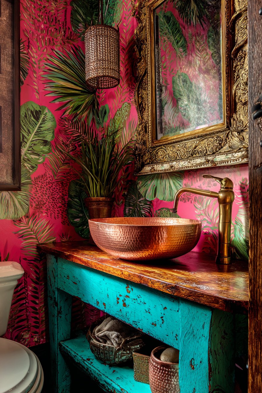
This compact powder room proves that small spaces provide perfect opportunities for bold design risks that might overwhelm larger rooms. The walls showcase oversized tropical leaf wallpaper featuring dramatic monstera, banana leaves, and philodendron in vibrant greens and pinks against a contrasting background—perhaps deep navy or crisp white. The large-scale botanical pattern creates an immersive jungle effect that transforms the small room into an exotic escape, demonstrating how oversized patterns can actually make small spaces feel more expansive by creating visual drama and reducing visible wall boundaries.
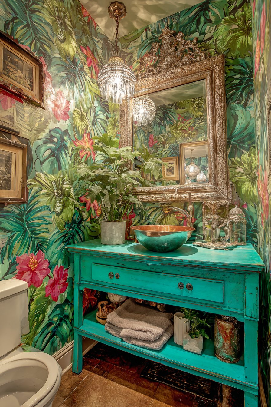
The vintage wooden vanity painted in glossy turquoise provides both practical function and artistic statement, its high-shine lacquer finish reflecting light and adding contemporary polish to the traditional furniture form. The bright color choice energizes the space while the vintage piece adds character and warmth that prevents the room from feeling generic. A vessel sink in hammered copper sits atop the vanity, its warm metallic finish and handcrafted texture creating beautiful contrast with the cool turquoise base. The visible hammer marks and natural patina celebrate artisanal craftsmanship while the copper’s antimicrobial properties provide practical benefits for a bathroom application.
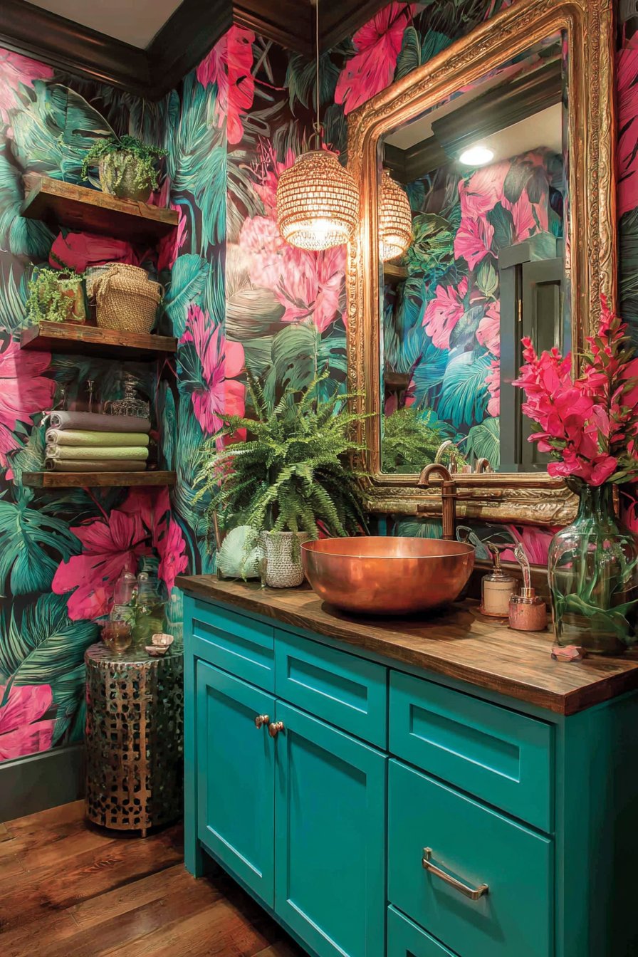
An ornate antique mirror with distressed gold finish hangs above the vanity, its elaborate carved or molded frame creating formal elegance that plays against the room’s tropical, casual wallpaper. The aged gold finish with deliberate distressing adds patina and prevents the ornate piece from feeling too precious or perfect. Open shelving displays colorful hand towels rolled and stacked by color—perhaps a rainbow progression or complementary color groups—alongside quirky decorative objects that might include brass pineapples, ceramic monkeys, vintage perfume bottles, or small sculptural pieces that reflect the homeowner’s personality and sense of humor. A pendant light features a beaded shade in multiple colors, perhaps natural wood beads mixed with painted or dyed beads creating pattern and texture while casting interesting shadows. Interior photography with soft overhead lighting highlights the small space’s big personality and varied textures without creating harsh shadows or reflections that might make the busy room feel chaotic.
Key Design Tips:
- Choose oversized patterns for small powder rooms to create impact
- Paint vintage furniture in high-gloss finishes for modern edge
- Mix metallic finishes (copper sink, gold mirror, brass accessories)
- Display practical items like towels as colorful decor
- Include personal, quirky objects that spark conversation
- Use ornate mirrors to add perceived space and grandeur
- Install pendant lighting for style and function
- Ensure adequate ventilation to protect wallpaper from humidity
- Keep vanity surface clear except for essential items
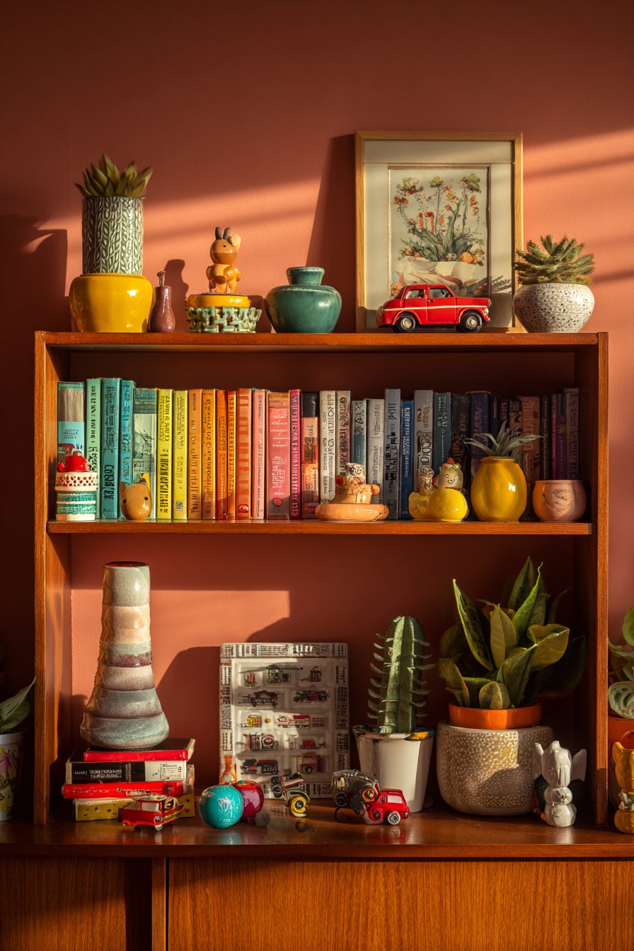
17. Rainbow-Organized Bookshelf Display
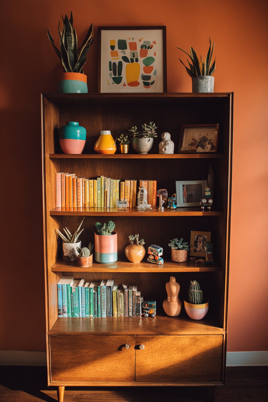
This bookshelf demonstrates how organization can become art through color-coding principles that transform a practical storage solution into a visually stunning focal point. The books themselves arrange in a progressive rainbow sequence—reds flowing to oranges, yellows to greens, blues to purples—creating a horizontal chromatic spectrum that brings order to what could be visual chaos while celebrating the varied colors of book spines as decorative elements. This organization method works particularly well for readers who remember books by cover color rather than title or author, while providing enormous visual satisfaction for those who appreciate color harmony and gradient effects.
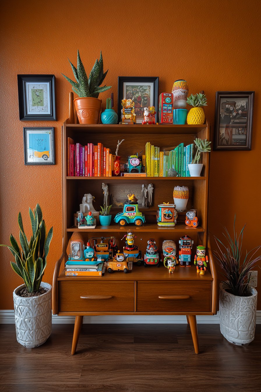
Interspersed throughout this rainbow of books are carefully selected decorative objects that break up the linear repetition while adding dimensional interest and personality. Vintage pottery in various glazes—perhaps a fat lava vase in orange, a celadon bowl, a cobalt blue pitcher—contributes handmade character and cultural history. Small sculptures might include anything from African wood carvings to modern abstract forms in brass or stone, each piece chosen for both aesthetic appeal and personal meaning. Framed miniature art leans against book spines, perhaps including vintage botanical prints, contemporary postcards from favorite artists, or small original artworks from local craftspeople.
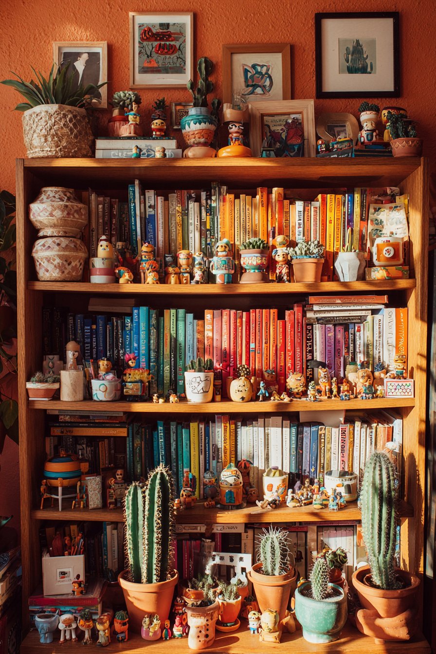
Plants in colorful pots add living greenery that softens the hard edges of books and objects while introducing organic forms to the structured grid. These might include trailing pothos that cascade down the shelf front, upright snake plants providing vertical interest, or small succulents in bright ceramic containers. Quirky collectibles reveal the inhabitant’s interests and travels—perhaps vintage toys, small souvenirs from different countries, miniature musical instruments, or found objects elevated to display-worthy status through thoughtful placement. The bookshelf itself appears to be a mid-century modern piece in warm walnut, its clean lines and quality craftsmanship providing a worthy foundation for the colorful display. The wall behind painted in warm terracotta creates a cohesive backdrop that makes both books and objects pop while adding earthy warmth. Detail-focused interior photography with natural side lighting creates depth and highlights the thoughtful yet playful curation, showing how each object casts small shadows and how the varied textures—smooth book spines, rough pottery, glossy ceramic, living plants—create tactile interest.
Key Design Tips:
- Remove dust jackets for cleaner color-coding effect
- Create smooth color transitions using neutral books
- Limit decorative objects to approximately 25% of shelf space
- Group similar objects (all pottery together, all plants together)
- Use books as risers to create varied display heights
- Include vertical and horizontal book stacks for rhythm variation
- Choose plants that tolerate lower light if shelves aren’t near windows
- Dust regularly to maintain the crisp, organized appearance
- Photograph shelves to ensure balanced color distribution before finalizing
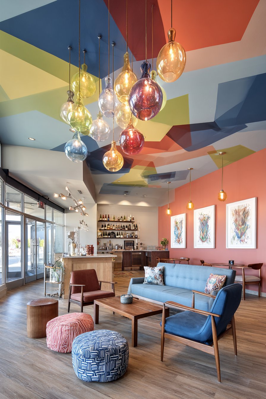
18. Dramatic Ceiling Treatment
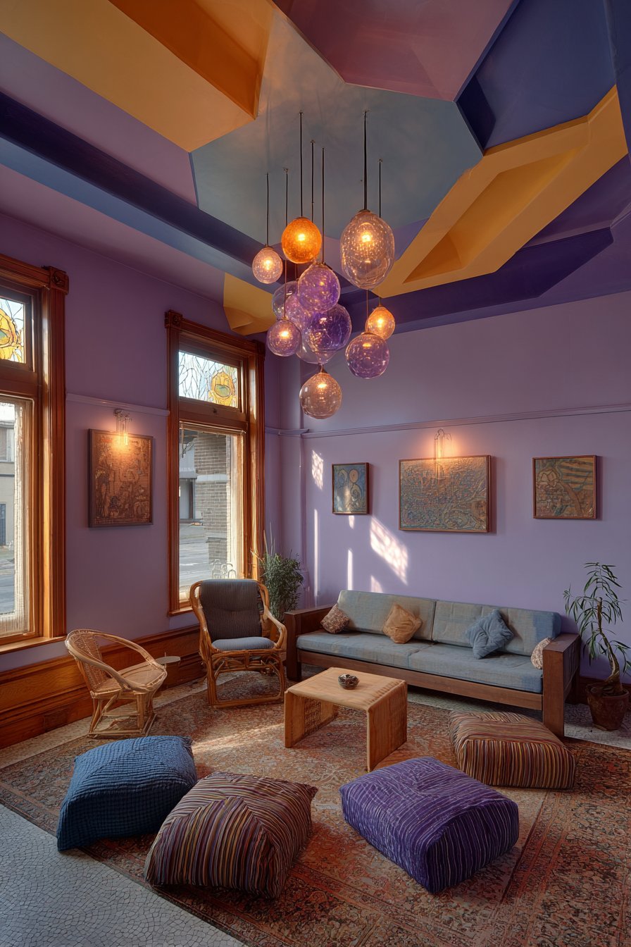
This room demonstrates the often-overlooked potential of the fifth wall—the ceiling—to become a significant design statement that influences the entire space below. The ceiling features an unexpected painted pattern of geometric shapes in multiple bold colors, perhaps overlapping circles in coral, teal, and mustard creating a Venn diagram effect, or angular triangles in jewel tones creating a kaleidoscopic mosaic. This overhead focal point draws the eye upward, making the room feel taller and more spacious while creating conversation-starting impact that guests notice immediately upon entering. The painted treatment requires careful planning, quality primer, and proper paint suitable for ceilings, but the transformative effect justifies the effort.
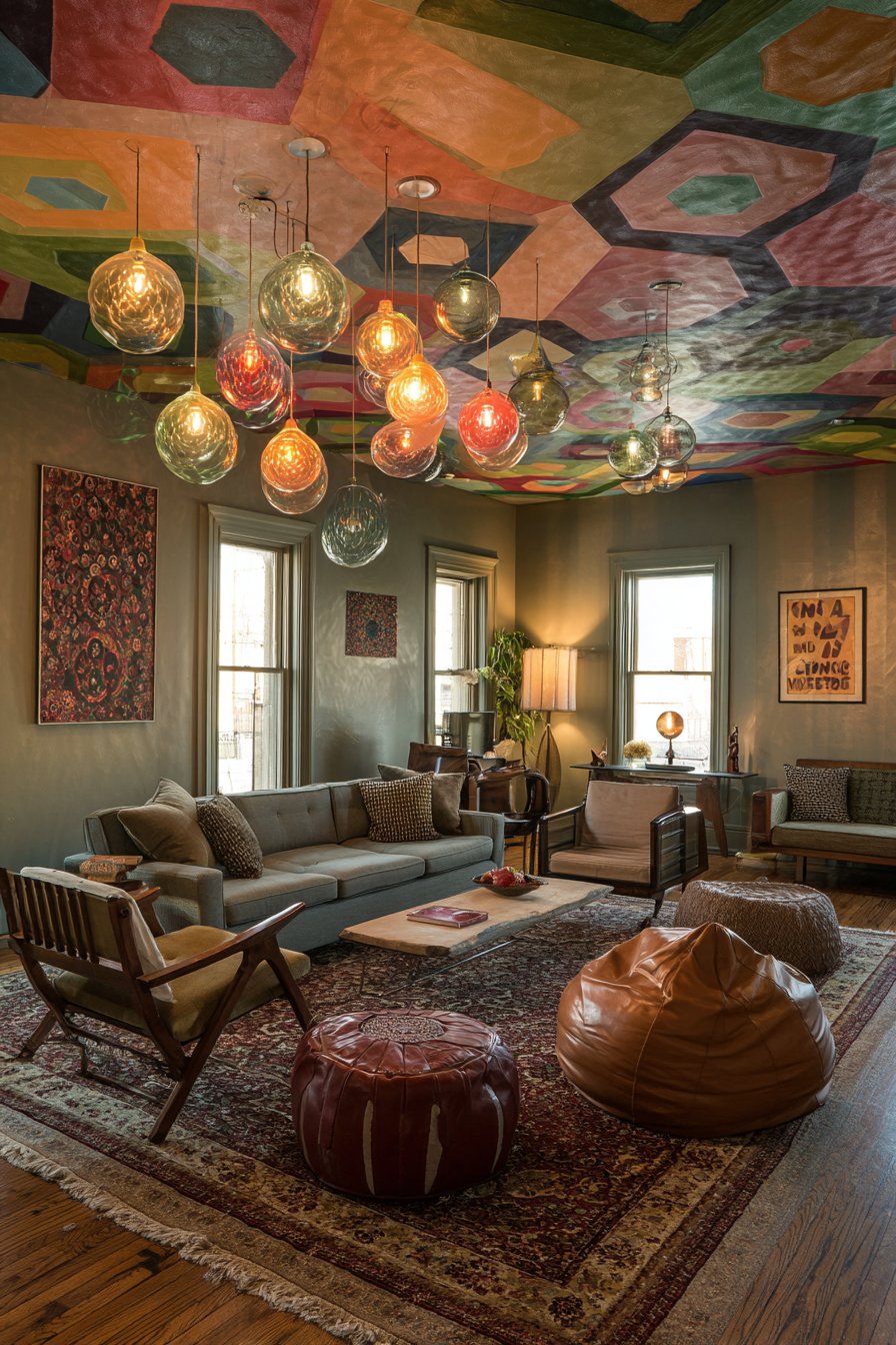
Below this dramatic overhead statement, the room features a thoughtfully curated mix of seating that demonstrates eclectic furnishing principles. A modern sofa in clean-lined contemporary form might be upholstered in neutral linen or gray fabric, providing substantial seating and visual grounding. A vintage armchair in contrasting style—perhaps a mid-century piece with angled legs and button tufting—adds historical character and creates style conversation with the modern sofa. Floor cushions in various sizes, patterns, and colors scattered casually provide flexible, informal seating perfect for gatherings while their low profiles maintain sightlines and create a relaxed, bohemian atmosphere.
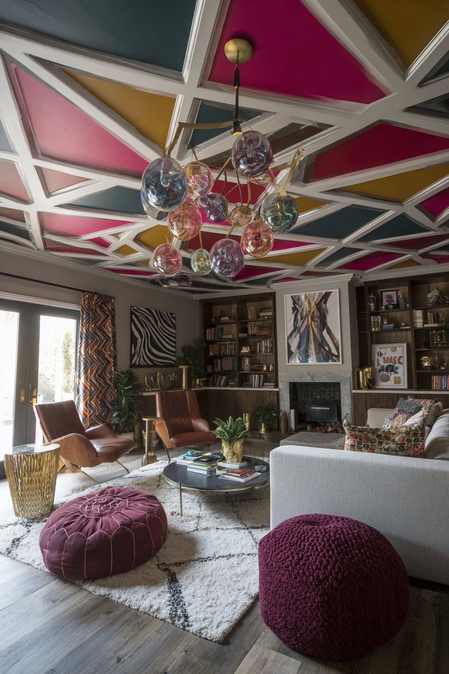
Walls display eclectic art that picks up colors from the painted ceiling, creating visual connections between horizontal and vertical surfaces. This art might include abstract paintings, vintage posters, contemporary photography, and textile pieces that together reflect the inhabitant’s diverse interests and aesthetic evolution. A statement light fixture with colorful glass pendants hanging at different heights creates a sculptural element that bridges the dramatic ceiling and the living space below. The pendants might be in colors that echo the ceiling pattern—coral, teal, and mustard spheres suspended at staggered heights creating a kinetic, dynamic quality. Wide-angle interior photography captures the full room including the dramatic ceiling with balanced exposure that shows how the overhead pattern influences color choices throughout the space, creating a cohesive design story that unfolds from top to bottom.
Key Design Tips:
- Test ceiling paint colors on large poster boards before committing
- Use painter’s tape and stencils for crisp geometric patterns
- Choose lighter ceiling colors in rooms with low ceilings
- Pull accent colors from ceiling pattern into art and accessories
- Balance bold ceilings with simpler walls to prevent overwhelm
- Install dimmer switches to control how ceiling colors appear
- Use semi-gloss paint on ceilings for subtle light reflection
- Consider ceiling color in relation to natural and artificial light
- Document the painting process in case touch-ups are needed
19. Masterful Textile Layering
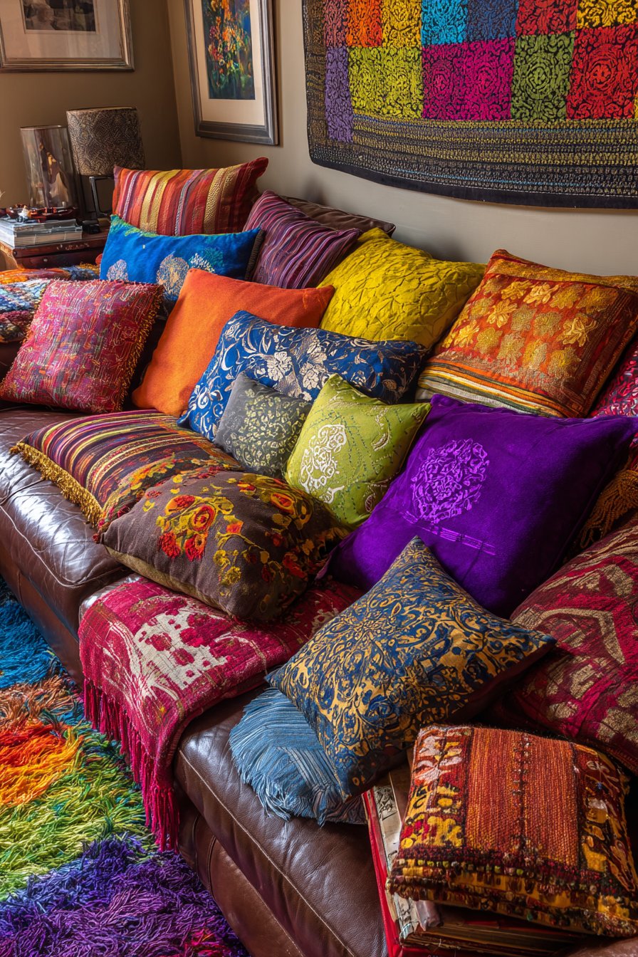
This living space demonstrates the pinnacle of textile layering, transforming a simple leather sofa into a cocoon of comfort through strategic pillow and throw placement. The leather sofa itself provides a substantial, neutral foundation—perhaps in rich cognac or deep chocolate brown—its smooth, slightly worn surface suggesting quality and longevity while providing a simpler backdrop that makes the textile layering possible without creating visual chaos. The pillow collection represents a masterclass in pattern, texture, and color mixing: velvet pillows in jewel tones provide luxurious softness and light-catching sheen, silk pillows in ikat or suzani patterns contribute global sophistication and smooth texture, linen pillows in natural tones offer casual, washable practicality, embroidered pillows showcase handcrafted detail and dimensional texture, printed pillows feature everything from geometric to floral to abstract patterns in various color palettes, and fringed pillows add playful trim detail and additional texture.
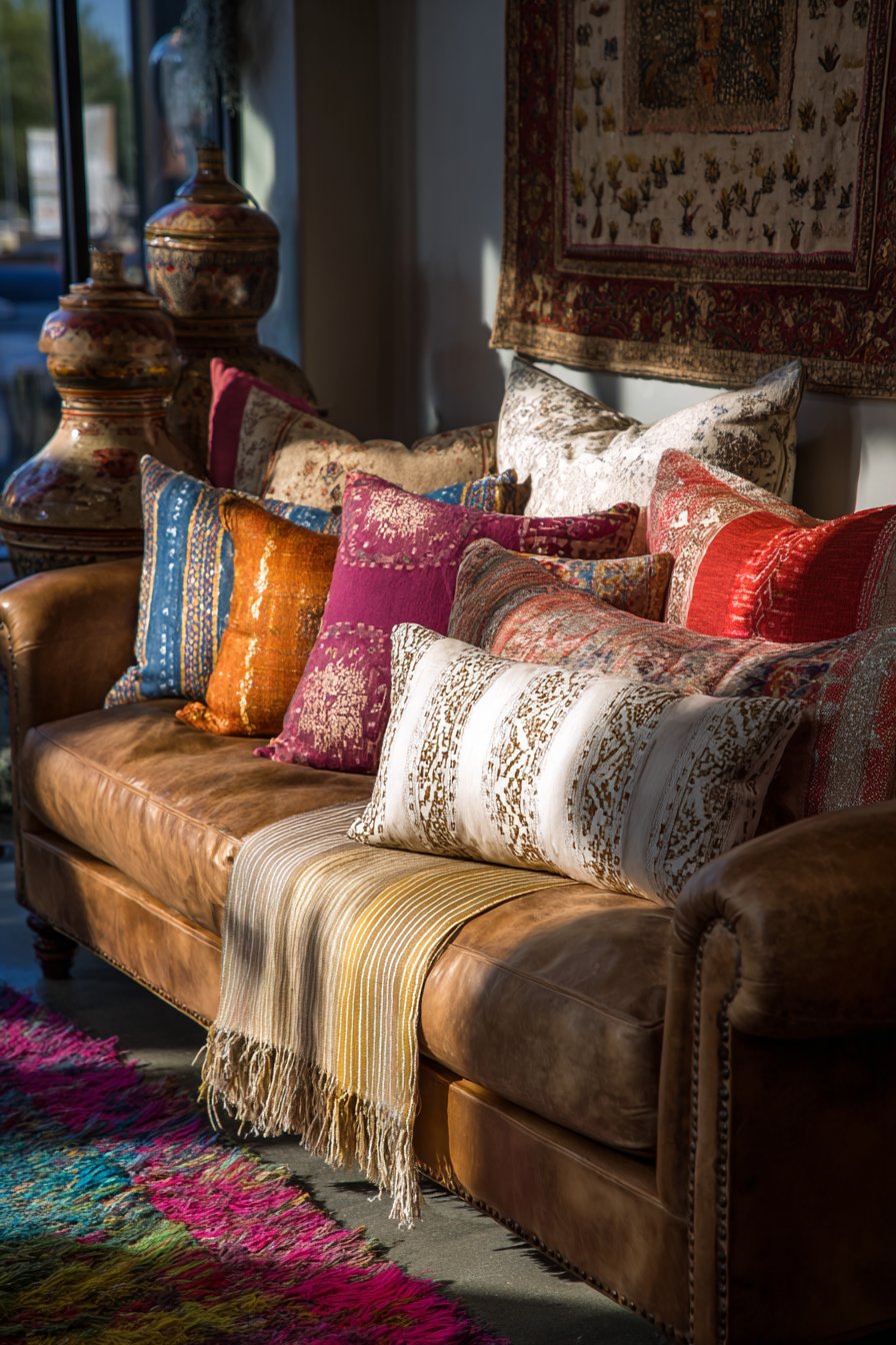
Multiple throws cascade over the sofa arm in apparently casual but actually carefully arranged draping. These might include a chunky cable-knit wool throw in cream providing cozy warmth and substantial texture, a lightweight cotton voile throw in vibrant color for summer use, a faux fur throw adding luxurious softness and dramatic texture, and perhaps a vintage quilt or suzani throw contributing pattern and history. Each throw features different weave, weight, and texture, creating a layered effect that invites touch and promises comfort while providing practical warmth and protection for the leather sofa.
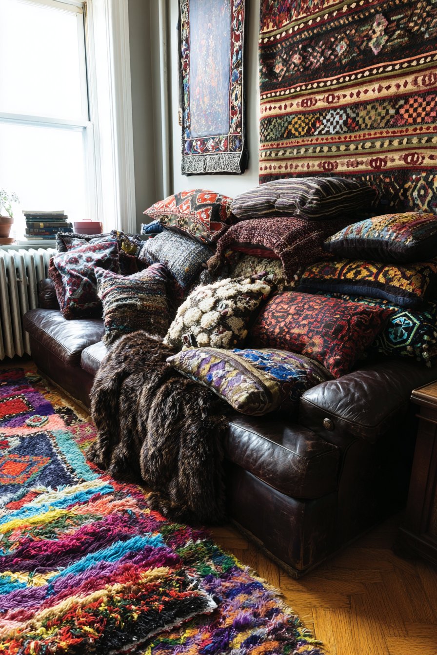
A shaggy rug in bright colors—perhaps a Moroccan-inspired style with geometric patterns in fuchsia, orange, and turquoise—anchors the seating area, its deep pile providing soft landings for bare feet and creating textural contrast with the smooth leather sofa and various woven throws. The nearby wall features tapestry art—perhaps a vintage textile piece or contemporary fiber art—that continues the textile theme vertically and adds cultural or artistic depth. Interior design photography with soft natural lighting emphasizes the tactile quality and richness of the layered fabrics and materials, showing how different textile weights, weaves, and textures create dimensional interest while maintaining a cohesive color story that prevents the abundance from feeling chaotic. The lighting catches the sheen of silk, the depth of velvet pile, the texture of embroidery, and the shadows within the shaggy rug, creating a composition that makes viewers want to reach out and touch.
Key Design Tips:
- Start with 5-7 pillows in varied sizes (from 16 to 24 inches)
- Mix smooth and textured fabrics for tactile interest
- Include at least three different pattern scales
- Choose one dominant color and two accent colors for cohesion
- Layer throws from heaviest on bottom to lightest on top
- Use pillow inserts 2 inches larger than covers for plump appearance
- Rotate pillow arrangements seasonally to refresh the look
- Combine expensive and affordable textiles for budget-friendly layering
- Remove and replace pillow covers more easily than entire pillows
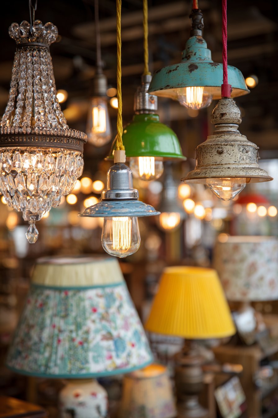
20. Multi-Source Lighting Design
This space showcases sophisticated lighting design that layers multiple fixture types, styles, and eras to create flexible, functional, and aesthetically compelling illumination. The mix begins with a vintage crystal chandelier serving as the room’s jewelry piece—perhaps a multi-tiered European antique with faceted glass drops that catch and refract light into rainbow prisms across walls and ceiling. This formal, traditional fixture establishes one lighting character and provides ambient illumination for the entire space. Contrasting this elegant centerpiece are industrial pendant lights with colored fabric cords—perhaps in mustard yellow, turquoise, and coral—that hang over a work surface or dining table. These pendants might feature simple metal shades with exposed Edison bulbs, their utilitarian aesthetic creating intentional style clash with the ornate chandelier.
A modern arc floor lamp with sleek metal construction and adjustable head provides targeted task lighting for reading or detailed work, its contemporary clean lines offering another style contrast while its functional arc design allows light placement without consuming floor space. Table lamps scattered throughout contribute additional lighting layers, each featuring quirky bases and patterned shades that add personality and decorative interest. These bases might include stacked vintage books, ceramic figures, turned wood with colorful paint, or repurposed objects elevated to lamp status. The shades feature various patterns and colors—perhaps one with geometric print, another with vintage floral fabric, a third with animal print—creating illuminated artworks when lights are on.
Each fixture differs dramatically in style, era, and finish, yet they work together cohesively because they share similar scale proportions and because the surrounding eclectic room provides context for their diversity. The room’s other elements visible in the frame—perhaps velvet seating, patterned wallpaper, collected artwork—demonstrate that the mismatched lighting fits within an intentionally curated eclectic aesthetic rather than appearing accidentally assembled. Interior photography taken during evening hours with all lights illuminated shows the warm ambient glow and how different lighting styles create layered illumination that can be adjusted for various activities and moods. The image captures how the crystal chandelier creates sparkle and elegance, the industrial pendants provide focused task lighting, the arc lamp offers flexible directional light, and the table lamps contribute cozy pools of warm illumination, together creating a lighting scheme that’s both practical and theatrical.
Key Design Tips:
- Include at least three lighting types: ambient, task, and accent
- Install dimmer switches on all fixtures for mood flexibility
- Choose LED bulbs in consistent color temperature (2700K-3000K warm white)
- Hang chandeliers 30-36 inches above dining tables
- Position floor lamps to eliminate reading shadows
- Use three-way bulbs in table lamps for brightness control
- Mix lighting heights from floor level to ceiling-mounted
- Consider how fixtures look both on and off
- Layer lighting to eliminate dark corners and create even illumination
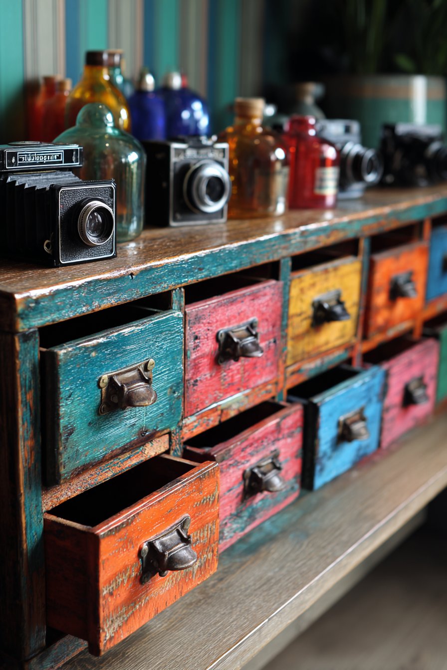
21. Colorful Storage Cabinet Display
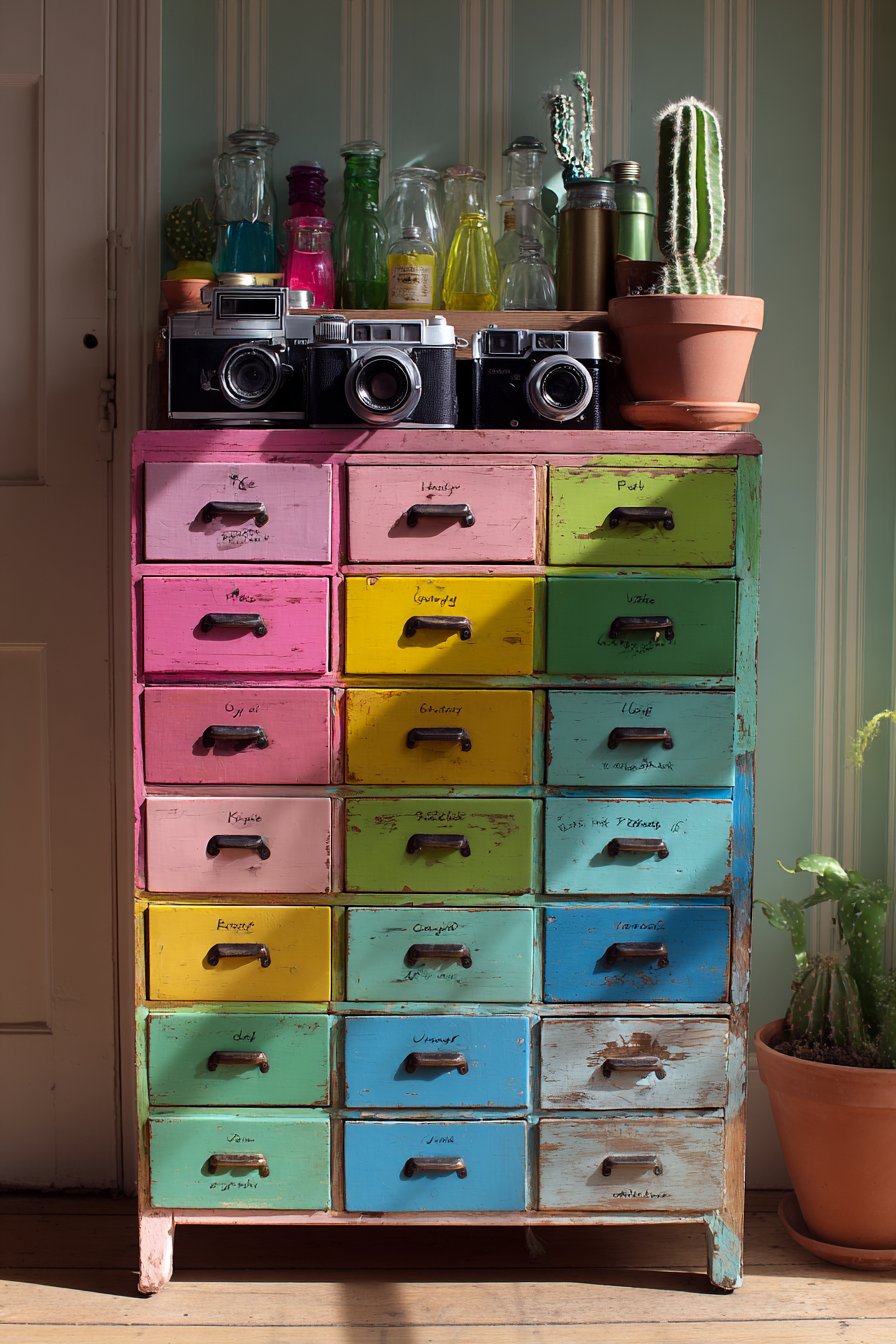
This storage solution proves that functional pieces can serve as sculptural focal points through bold color application and vintage character. The vintage apothecary cabinet features multiple small drawers—perhaps twenty or more—arranged in a grid formation, each drawer painted a different color creating a rainbow gradient effect that transitions smoothly from warm to cool tones. Reds at the top progress through oranges and yellows, transitioning to greens, blues, and finally purples at the bottom, creating a vertical chromatic spectrum that turns practical storage into functional art. Each drawer might feature original brass or glass pulls, their vintage hardware adding authentic period detail while maintaining functionality.
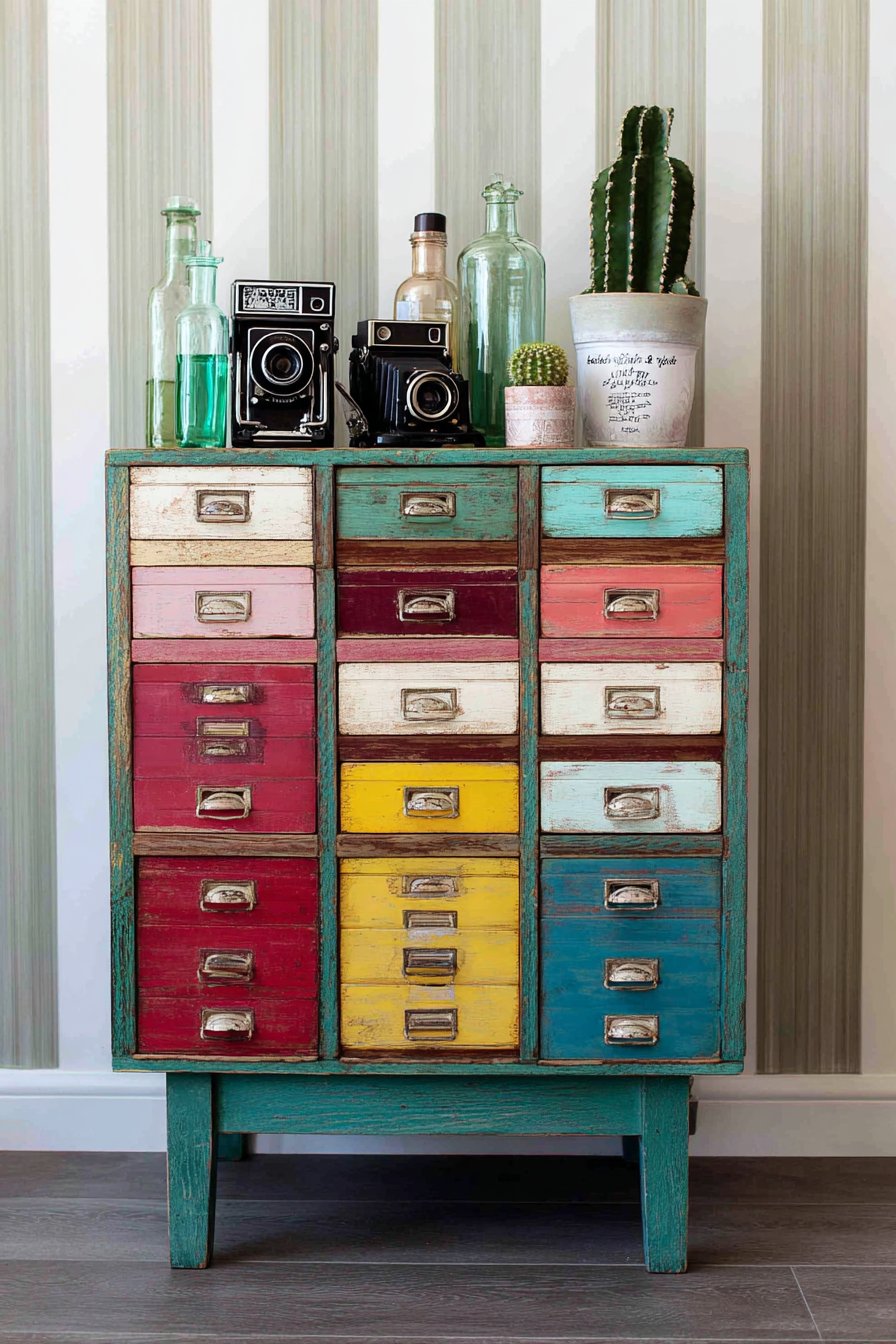
The cabinet top serves as a curated display platform for collections that reflect the inhabitant’s interests and aesthetic. Vintage cameras—perhaps including a Polaroid Land Camera, a twin-lens reflex, and a 35mm rangefinder—create a sculptural grouping celebrating analog photography’s mechanical beauty. Colorful glass bottles in various heights and hues catch light beautifully, perhaps including cobalt blue apothecary bottles, amber medicine bottles with embossed labels, and emerald green seltzer bottles. Potted cacti and succulents in small ceramic containers add living elements requiring minimal maintenance while their geometric forms and varied greens create organic contrast with the manufactured objects.
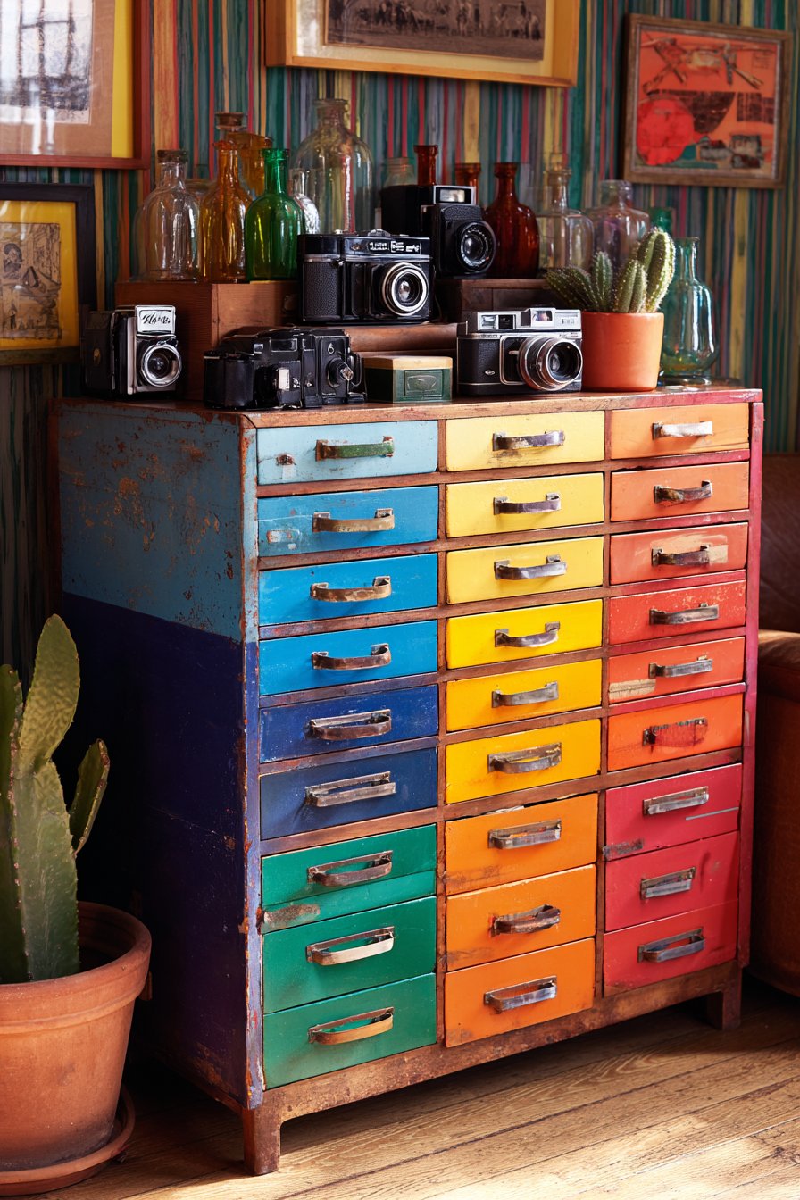
The wall behind features bold stripe wallpaper in complementary colors—perhaps vertical stripes in coral and teal that pick up colors from the cabinet’s rainbow drawers—creating a visually active backdrop that enhances rather than competes with the colorful furniture piece. The stripes might vary in width, creating rhythm and visual interest while the vertical orientation makes the wall feel taller. Detail shot interior photography with natural lighting highlights the gradient of drawer colors, showing smooth color transitions and how the painted cabinet creates practical beauty that organizes while displaying. The lighting emphasizes the varied textures—smooth painted wood, gleaming glass, rough ceramic, textured wallpaper—while showing how this piece serves triple duty as storage, display surface, and room-defining focal point.
Key Design Tips:
- Create smooth color gradients using paint samples to test transitions
- Label drawer interiors to remember contents despite exterior decoration
- Choose vintage pieces with solid wood construction for durability
- Seal painted surfaces with furniture wax or polyurethane
- Arrange display objects in odd-number groupings
- Vary heights of displayed objects using books or small risers
- Include living elements for organic contrast with vintage pieces
- Select wallpaper that complements rather than competes with furniture
- Use the cabinet top for frequently accessed items
- Rotate displayed collections seasonally to keep the vignette fresh
22. Eclectic Outdoor Patio Extension
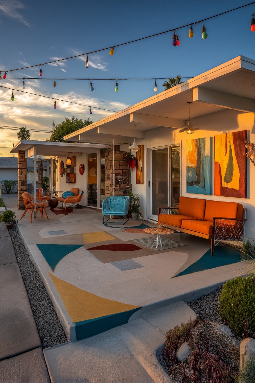
This outdoor patio proves that eclectic design principles translate beautifully beyond interior walls, creating an exterior living space with personality equal to any indoor room. The furniture collection deliberately mismatches styles, eras, and materials: a vintage metal glider painted cheerful turquoise provides nostalgic seating with gentle rocking motion, its powder-coated finish protecting the metal from weather while the bright color energizes the outdoor space. Modern molded plastic chairs in traffic-cone orange offer stackable, durable seating with mid-century modern silhouettes, their weather-resistant material and bold color providing contemporary contrast to the vintage glider. A hammock with colorful woven pattern—perhaps featuring traditional Mayan striping in rainbow hues or Mexican-style macramé with fringe—hangs between posts or trees, creating a relaxed lounging option that adds South American or Caribbean character.
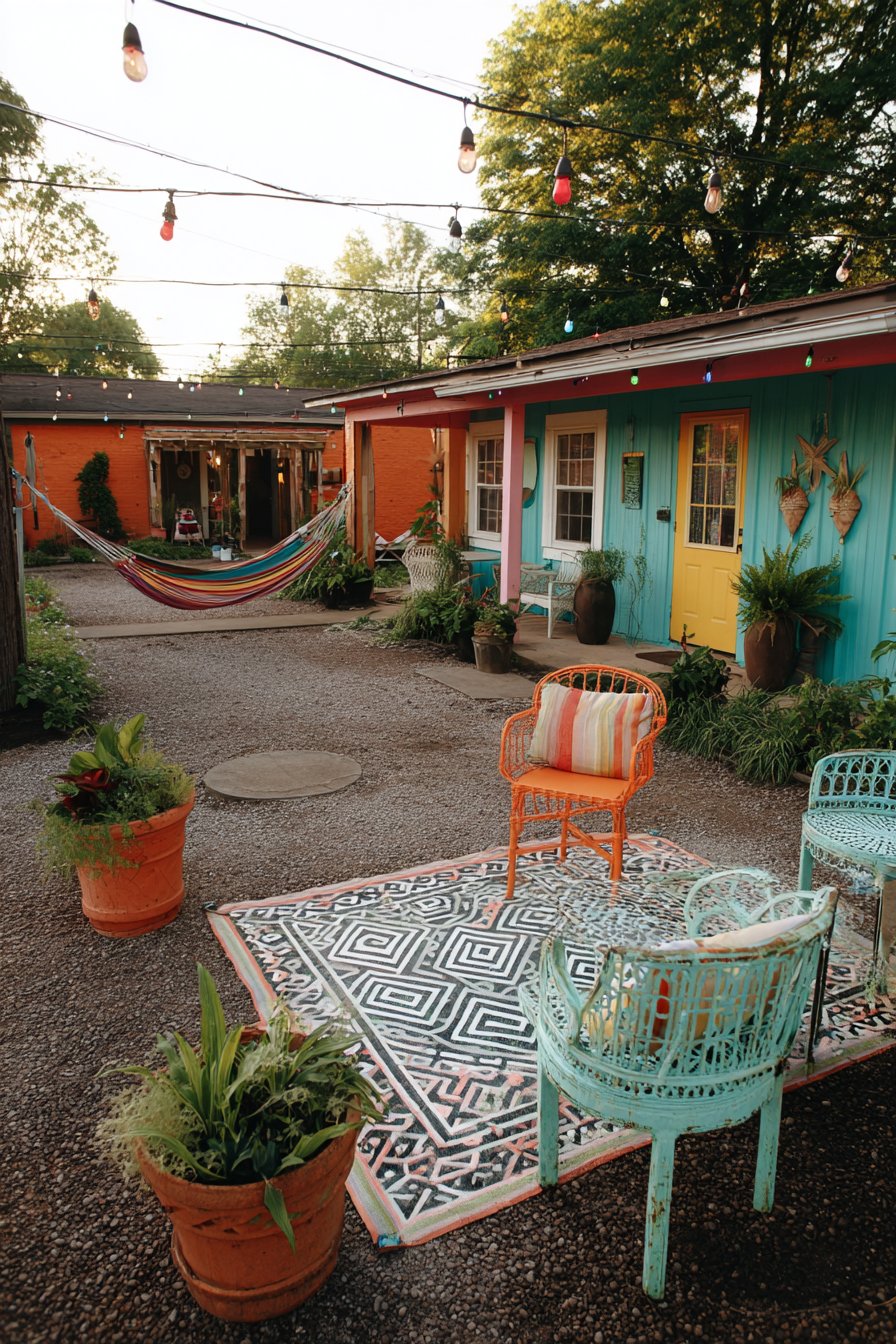
An outdoor rug in geometric pattern defines the seating area, creating an outdoor room feeling while protecting the patio surface and adding pattern and color. These specialized rugs withstand moisture, sun exposure, and heavy traffic while providing the decorative impact of indoor rugs—perhaps featuring bold triangles, chevrons, or medallions in weather-resistant polypropylene that can be hosed clean. The walls—perhaps a privacy fence, the house exterior, or a combination—display weather-resistant art including metal sculptures, ceramic tile murals, or outdoor-rated canvas prints, proving that art isn’t confined to indoor galleries. Colorful ceramic wall planters in various sizes and glazes hold trailing plants, succulents, or herbs, creating vertical gardens that maximize planting space while adding color and life to vertical surfaces.
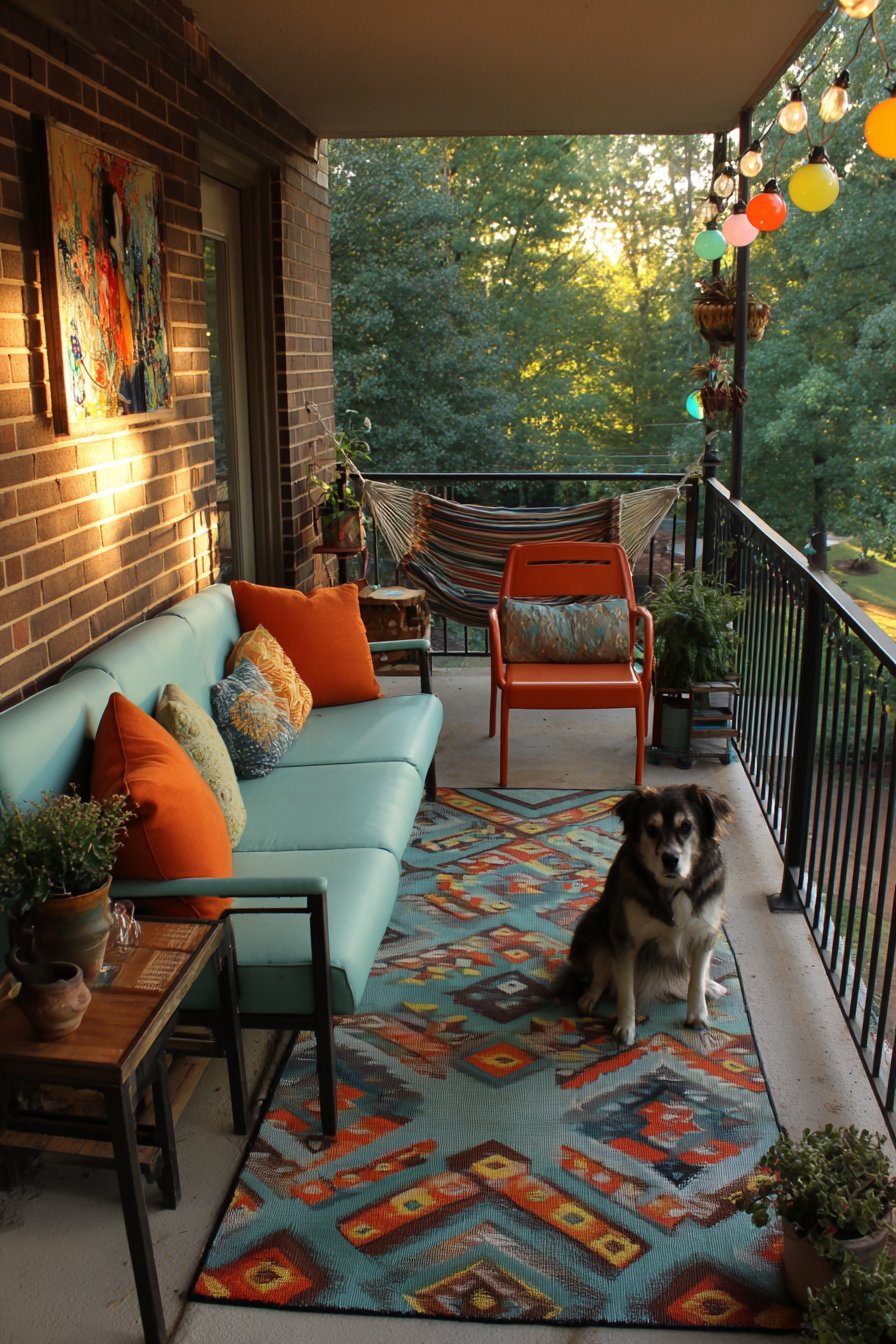
String lights with large colorful bulbs overhead transform the patio into magical evening space, their warm glow creating ambiance for outdoor dining and conversation while the colored bulbs—perhaps in red, orange, yellow, green, and blue—add playful character that feels festive without being juvenile. Wide-angle photography captures the space during golden hour, that magical time just before sunset when natural light takes on warm, honey-colored tones that make everything look beautiful. This lighting shows the cohesive outdoor room where furniture diversity creates energy rather than chaos, where bold colors feel appropriate in the outdoor context, and where the eclectic aesthetic extends seamlessly from indoor spaces to outdoor living areas, proving that personal style knows no boundaries.
Key Design Tips:
- Choose weather-resistant materials rated for outdoor use
- Paint metal furniture with rust-inhibiting primer before topcoat
- Select outdoor rugs made from polypropylene or recycled plastic
- Hang art using outdoor-rated hardware and weatherproof backing
- Use solar or battery-powered string lights for easy installation
- Include varied seating types for different activities
- Create shade with umbrellas, pergolas, or shade sails
- Bring cushions and textiles indoors during harsh weather
- Clean and inspect furniture seasonally to extend life
23. Corner Vignette with Repurposed Vintage
This thoughtfully composed corner demonstrates how small spaces can pack enormous personality through creative repurposing and fearless color application. A vintage wooden ladder—perhaps an old orchard ladder or painter’s ladder with authentic wear and patina—receives new life as a vertical blanket display, each rung holding throws in different patterns and colors. The top rung might feature a lightweight cotton throw in geometric pattern, the second a chunky cable-knit wool blanket in cream, the third a colorful Mexican serape with horizontal stripes, and the bottom a vintage quilt with traditional piecing patterns. This creative storage solution keeps blankets accessible for cozy evenings while creating a sculptural textile installation that adds color, pattern, and texture to the corner.
Beside this ladder arrangement stands a mid-century planter stand—perhaps a classic wire and wood design with angled legs and geometric form—holding a large, healthy fiddle leaf fig whose broad, violin-shaped leaves add dramatic organic presence. The plant’s height draws the eye upward while its substantial leaves create architectural impact and improve air quality. The corner walls meet at an angle painted in two different bold colors—mustard yellow on one side and teal on the other—creating a striking color-blocking effect that celebrates the architectural corner rather than trying to minimize it. This confident paint treatment transforms what might be an awkward dead corner into an intentional focal point.
Stacked vintage suitcases on the floor provide practical storage while adding nostalgic travel-inspired character. These might include a robin’s egg blue hard-shell case from the 1960s, a tan leather weekender with brass hardware and travel stickers, and a floral tapestry overnight bag, each contributing color, texture, and suggestion of adventure and journey. A floor lamp with beaded fringe shade—perhaps wooden beads or colorful glass beads creating a curtain effect—illuminates the corner with soft, diffused light while the fringe creates movement and shadow patterns. Interior photography with soft directional lighting emphasizes textures—the wood grain of the ladder, the woven blanket fibers, the smooth suitcase surfaces, the broad plant leaves—while showing the creative use of vintage pieces and the fearless color blocking that makes this small corner feel like its own destination within the larger room.
Key Design Tips:
- Secure leaning ladders to walls for safety
- Choose suitcases with intact hardware and clean interiors
- Paint corner walls in contrasting colors to celebrate rather than hide the angle
- Use substantial plants in corners to soften architectural angles
- Stack vintage luggage from largest to smallest
- Add weight to bottom suitcases if stacking more than three
- Rotate displayed blankets seasonally
- Position floor lamps to eliminate corner shadows
- Include at least one living element in each vignette
Why These Funky Eclectic Decor Ideas Work
These twenty-three distinctive approaches to funky eclectic decor succeed because they share fundamental design principles despite their surface diversity. Each space demonstrates thoughtful curation rather than random accumulation—every element appears chosen for specific reasons relating to color, form, texture, or personal meaning. The most successful eclectic interiors maintain underlying cohesion through consistent color palettes, repeated materials, or unified style threads that run through apparently disparate elements. For instance, a room might mix furniture from different eras, but if each piece features warm wood tones or brass hardware, those repetitions create subliminal connections that make the diversity feel intentional rather than accidental.
Color mastery defines exceptional eclectic design. These spaces prove that bold, saturated colors can coexist harmoniously when distributed thoughtfully throughout the space and repeated in varying proportions. The 60-30-10 color rule gets expanded and reimagined in eclectic interiors, where multiple accent colors might receive equal visual weight, creating balanced tension rather than hierarchy. Successful color blocking, gradient effects, and complementary pairings demonstrate sophisticated color theory understanding applied with creative freedom. Texture layering provides another critical success factor—mixing smooth and rough, glossy and matte, hard and soft, natural and manufactured surfaces creates tactile richness that engages multiple senses and prevents visual monotony even in pattern-heavy spaces.
Personal storytelling elevates these designs beyond mere aesthetic exercises into meaningful environments that reflect inhabitants’ lives, travels, interests, and evolution. The vintage cameras speak to photography passion, the collected pottery suggests market wanderings and global adventures, the mismatched furniture tells stories of thrift store discoveries and inherited treasures. These aren’t spaces that could be replicated through one shopping trip to a furniture store; they represent years of thoughtful accumulation, creative experimentation, and the confidence to trust personal taste over prescriptive design rules. This authentic personalization creates spaces that feel alive and evolving rather than static and staged.
The spaces also succeed through practical functionality married to aesthetic boldness. Every colorful element serves a purpose—the rainbow stair risers guide safe navigation while creating joy, the patterned cushions provide comfort while contributing beauty, the varied lighting fixtures illuminate tasks while creating atmosphere. This synthesis of form and function ensures that eclectic spaces remain livable rather than becoming impractical showpieces. The best funky eclectic interiors invite you to sit, read, cook, gather, and live fully rather than merely admire from a distance. They prove that beautiful spaces can also be comfortable, practical, and adaptable to real life’s messy realities.
Pattern mixing mastery appears consistently throughout these designs, demonstrating how different prints, scales, and motifs can coexist when united by color palette or balanced through proportion. Large-scale florals pair with small geometric prints, traditional ikats complement modern graphics, and ethnic textiles converse with contemporary patterns because each combination considers scale variation, color repetition, and visual weight distribution. These spaces teach that pattern mixing isn’t about following strict formulas but developing an eye for balance and the courage to trust your instincts while being willing to edit if combinations don’t work.
Finally, these eclectic designs succeed because they embrace imperfection and celebrate individuality rather than chasing magazine-perfect aesthetics. Vintage pieces show authentic wear, paint finishes might include deliberate distressing, and arrangements feel collected rather than coordinated. This acceptance of imperfection creates warmth and approachability while reducing the pressure for perfection that can make decorating feel stressful rather than joyful. The spaces invite experimentation, evolution, and personal expression, proving that the best homes reflect their inhabitants’ authentic selves rather than conforming to external standards or trends.
Conclusion
Funky eclectic decor represents more than an interior design style—it’s a philosophy of creative freedom, personal expression, and joyful living. Throughout these twenty-three distinctive approaches, we’ve explored how bold colors can energize spaces, how pattern mixing creates visual richness, how vintage and modern elements can coexist beautifully, and how thoughtful curation transforms collections into cohesive design statements. From rainbow stair risers that turn daily navigation into chromatic celebration to maximalist gallery walls that showcase art across eras and styles, these ideas prove that rules are meant to be creatively reinterpreted rather than rigidly followed.
The common thread uniting these diverse spaces is intentionality—each element appears chosen for specific reasons relating to color harmony, textural contrast, personal meaning, or functional necessity. This thoughtful selection process distinguishes curated eclectic design from chaotic clutter, creating spaces that feel both energizing and cohesive despite their surface diversity. Whether you’re drawn to jewel-tone velvet seating, global textile layering, vintage furniture repurposing, or botanical maximalism, the principles explored here provide foundation for developing your own eclectic aesthetic.
As you embark on your own funky eclectic design journey, remember that the best spaces evolve over time through gradual accumulation rather than instant completion. Start with pieces you genuinely love, build color palettes from cherished items, mix patterns with confidence while maintaining underlying cohesion, and trust your instincts while remaining open to unexpected combinations. Embrace the beauty of imperfection, celebrate objects with history and meaning, and create spaces that tell your unique story. Your home should make you smile when you walk through the door, inspire creativity and comfort, and genuinely reflect who you are rather than conforming to someone else’s aesthetic vision. With these funky eclectic ideas as inspiration, you’re equipped to transform your spaces into personal galleries of collected treasures, bold colors, and joyful self-expression that make every day a little more beautiful.