Creating a family picture wall is more than just hanging a few frames on your walls—it’s about curating a visual narrative that celebrates your most cherished memories and relationships. In today’s world of digital photos stored on devices, there’s something profoundly meaningful about seeing your family’s story displayed prominently in your living space. A well-designed picture wall becomes a focal point that sparks conversations, evokes emotions, and reminds us daily of the people and moments that matter most. Whether you’re drawn to sleek modern arrangements or prefer eclectic bohemian displays, the right picture wall can transform any room into a personalized gallery that reflects your family’s unique journey.
The beauty of family picture walls lies in their incredible versatility and the endless possibilities they offer for creative expression. From formal grid layouts that exude sophistication to organic salon-style arrangements bursting with personality, each approach tells a different story and suits different spaces and aesthetics. The strategic use of frames, lighting, placement, and composition can dramatically impact how your memories are perceived and appreciated. Understanding the principles of interior design—such as balance, scale, color coordination, and spatial flow—empowers you to create displays that are not only visually stunning but also deeply personal and emotionally resonant.
This comprehensive guide explores twenty-five distinctive family picture wall ideas, each offering unique perspectives on how to showcase your family photographs with style and intention. Whether you’re working with a grand two-story foyer, a cozy bedroom corner, or a functional mudroom, you’ll discover practical approaches that combine aesthetic appeal with meaningful storytelling. These designs range from traditional gallery walls to innovative mixed-media installations, providing inspiration for every home style, budget, and skill level. Let’s explore how you can transform blank walls into powerful expressions of family love and connection.
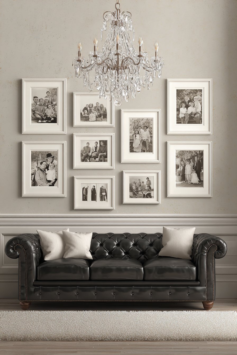
1. Classic Grid Gallery with Symmetrical Black Frames
The timeless appeal of a nine-frame grid arrangement creates instant visual harmony and sophistication in any living space. This approach features matching black frames arranged in perfect symmetry above a modern grey sofa, with each frame containing black and white family portraits in consistent sizes. The monochromatic color scheme—black frames against white walls with grey furniture—creates a cohesive, elegant aesthetic that never goes out of style. Soft diffused natural lighting from adjacent windows highlights the clean lines and balanced composition, while the uniformity of frame size and color creates a sense of order and intentionality.
The beauty of this design lies in its mathematical precision and the calming effect of symmetry. By choosing black and white photography for all images, you eliminate potential color clashes and create a unified gallery that functions as a single artistic statement rather than individual photos competing for attention. This approach works particularly well in contemporary and transitional spaces where clean lines and minimalist aesthetics are valued. The grid format also makes planning and installation straightforward—simply measure equal distances between frames both horizontally and vertically to achieve professional results.
When executing this design, consider the power of consistency in creating impact. All nine frames should be identical in size, style, and finish, typically ranging from 8×10 to 11×14 inches depending on your wall space. The photographs themselves should maintain similar tonal qualities and composition styles—perhaps all formal portraits, all candids, or all close-up shots—to strengthen the cohesive effect. Positioning this arrangement above a substantial piece of furniture like a sofa provides visual anchoring and creates a deliberate connection between the wall display and the room’s functional elements.
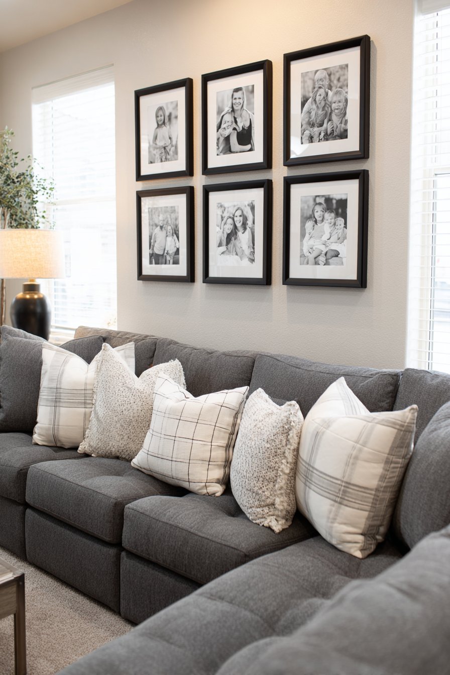
Key Design Tips: Choose frames with simple, clean profiles to maintain the minimalist aesthetic. Maintain exactly equal spacing between all frames—typically 2-4 inches works well for most arrangements. Convert all photos to black and white using consistent editing parameters to ensure uniform tonal quality. Use a level and measuring tape during installation to achieve perfect alignment, or create a paper template on the floor first to visualize the final arrangement. Consider matting all photos identically to add sophistication and create visual breathing room around each image.
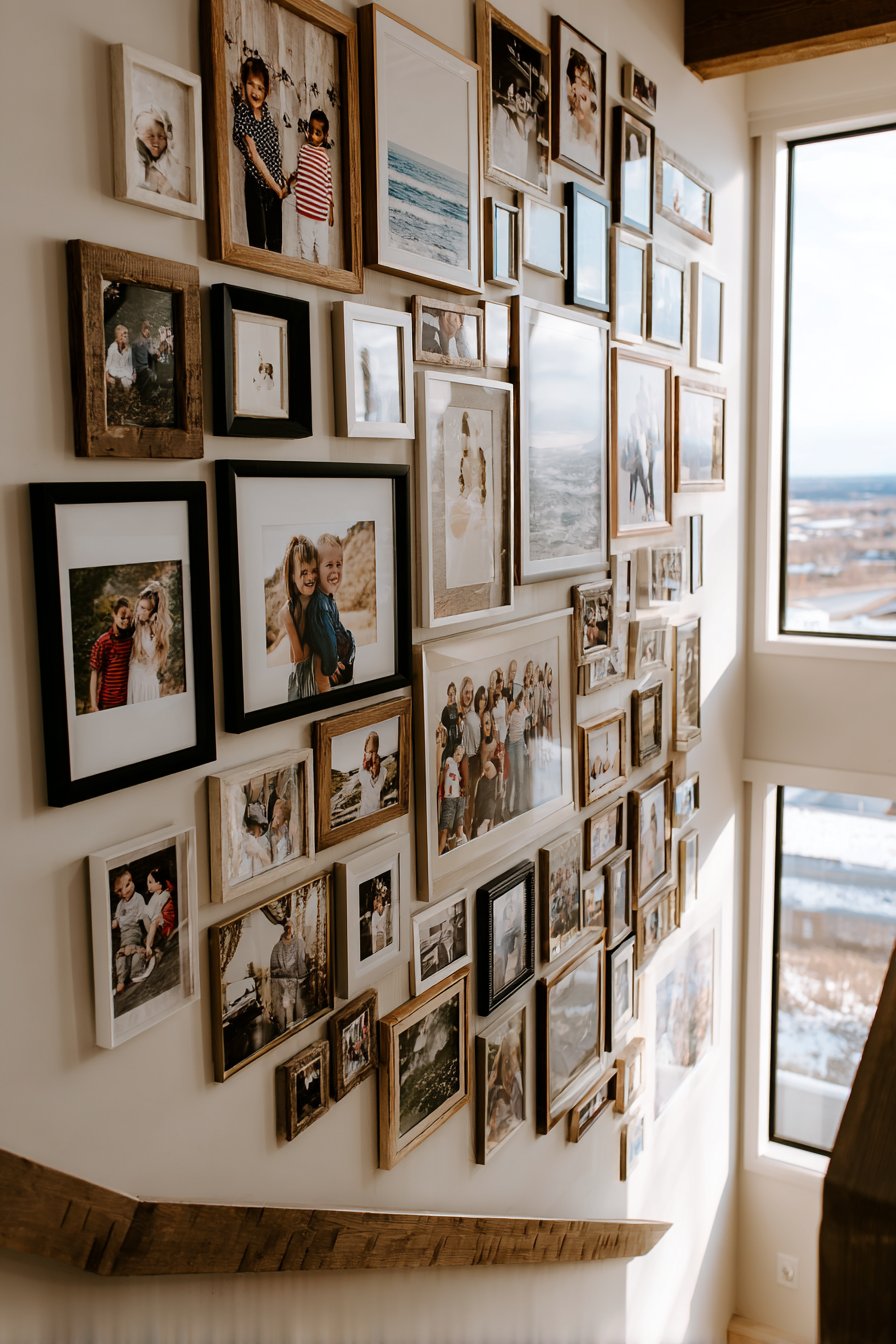
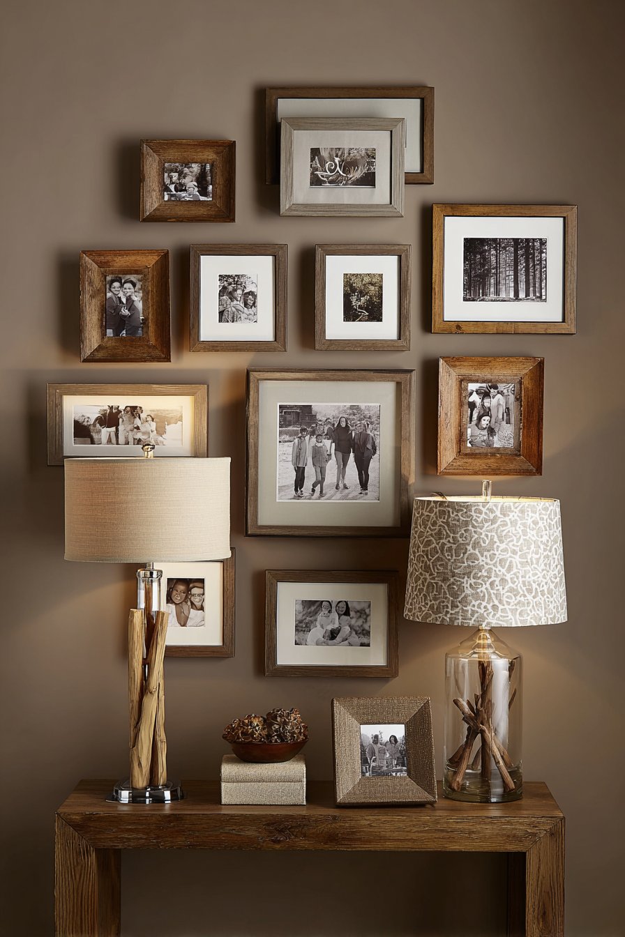
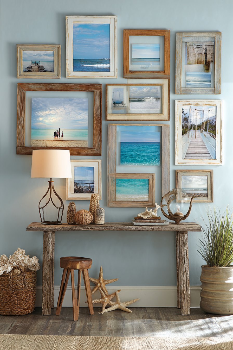
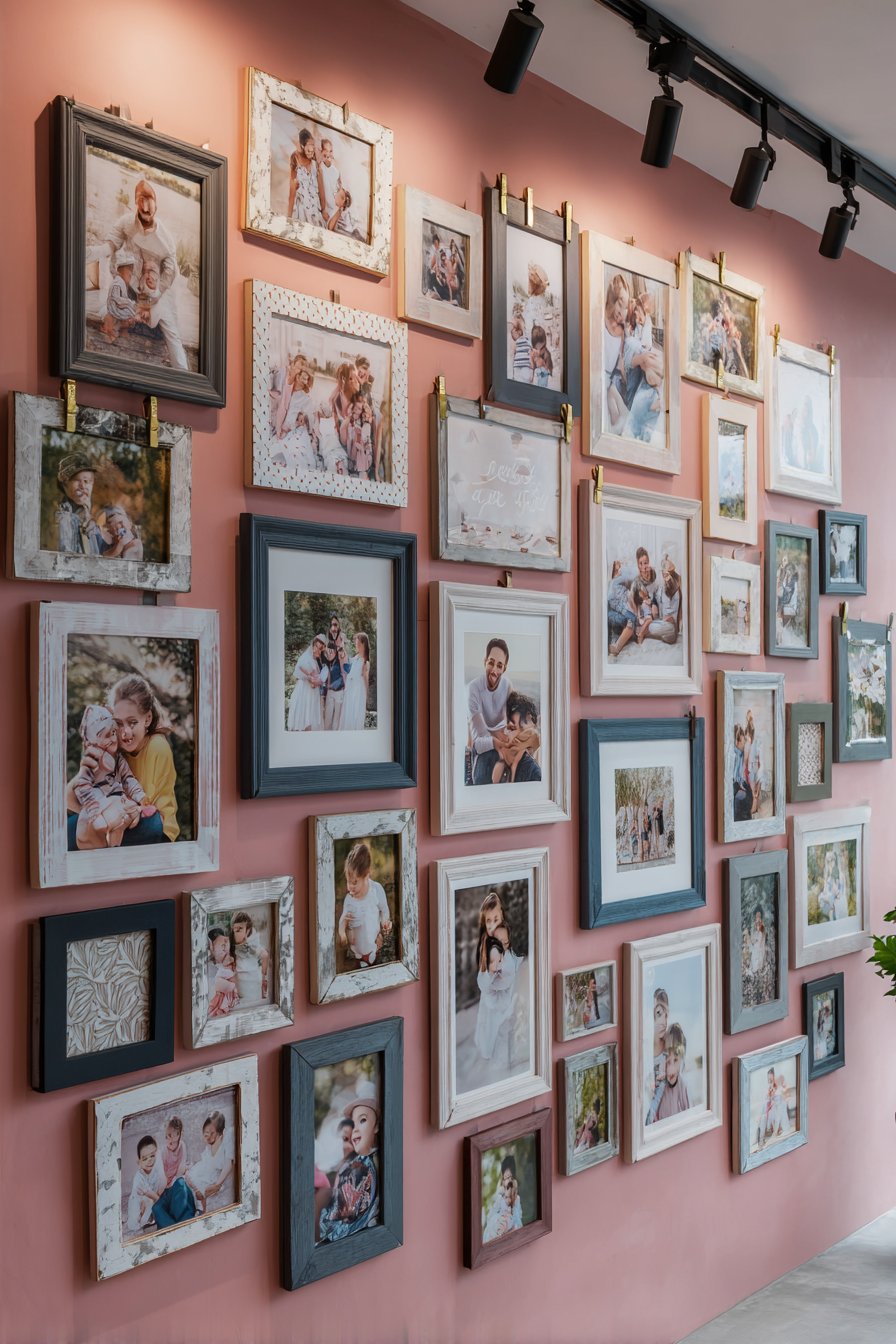
2. Organic Salon-Style Eclectic Arrangement
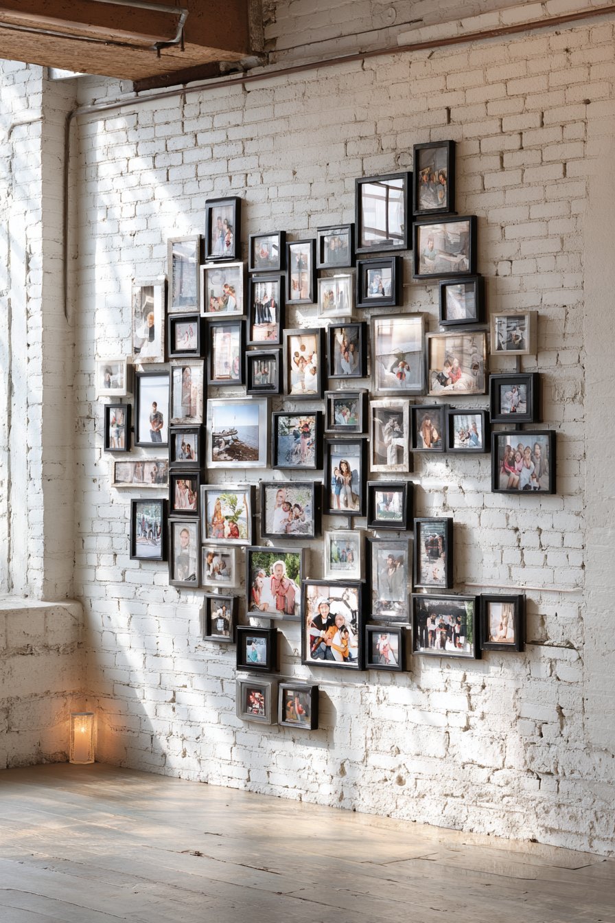
For those who embrace maximalism and eclectic design, a salon-style arrangement covering an entire accent wall creates dramatic visual impact and showcases your family’s story in all its complexity. This approach features mixed frame styles in gold, silver, and distressed wood finishes, creating a layered, collected-over-time aesthetic that feels both intentional and organic. The collection spans multiple generations with varying photo sizes and orientations, from small 4×6 prints to large 16×20 portraits, creating visual rhythm through variety rather than repetition. Warm ambient lighting from multiple sources creates subtle highlights on the diverse frame textures, adding dimension and depth to the three-dimensional display.
The salon-style approach originated in 18th and 19th-century art galleries where paintings of various sizes covered walls from floor to ceiling, and this historical precedent lends sophistication to what might otherwise feel chaotic. The key to success lies in finding balance within asymmetry—while frames vary in size, style, and placement, the overall composition should feel weighted evenly across the wall without heavy clusters in one area. This style particularly suits traditional, transitional, and bohemian interiors where layered, collected aesthetics are celebrated. The resulting wall becomes a conversation piece that invites close examination and tells your family’s story through both the images themselves and the curation of frames.
Creating this look requires patience and planning, despite its organic appearance. Start by laying out all frames on the floor in your desired arrangement, taking photos of the layout before transferring to the wall. Begin installation with the largest or most central piece, then work outward, maintaining relatively consistent spacing between frames (typically 2-3 inches). Don’t be afraid to include non-photo elements like mirrors, small artwork, or decorative objects to add texture and visual interest. The mixed metallics and wood tones create warmth and prevent the display from feeling too formal or precious.
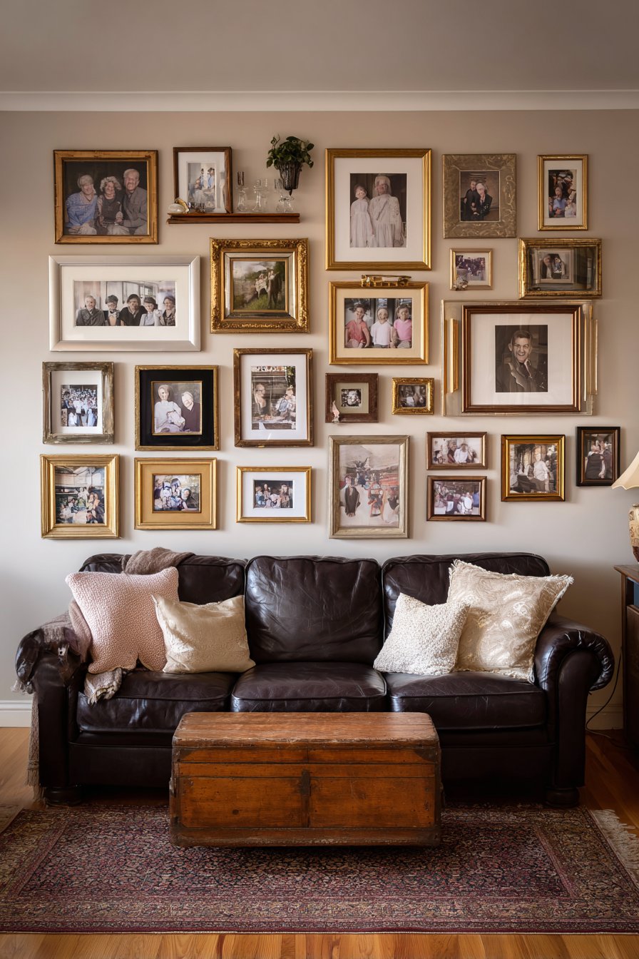
Key Design Tips: Collect frames gradually over time rather than purchasing a matching set for a more authentic curated look. Maintain consistent spacing between frames despite their varying sizes to create visual cohesion. Include at least three different frame finishes but limit yourself to a palette of complementary tones. Place your largest frames first as anchors, then fill in with progressively smaller pieces. Stand back frequently during installation to assess overall balance and make adjustments before committing all frames to the wall. Consider including some three-dimensional elements like shadow boxes or small shelves to add depth variation.
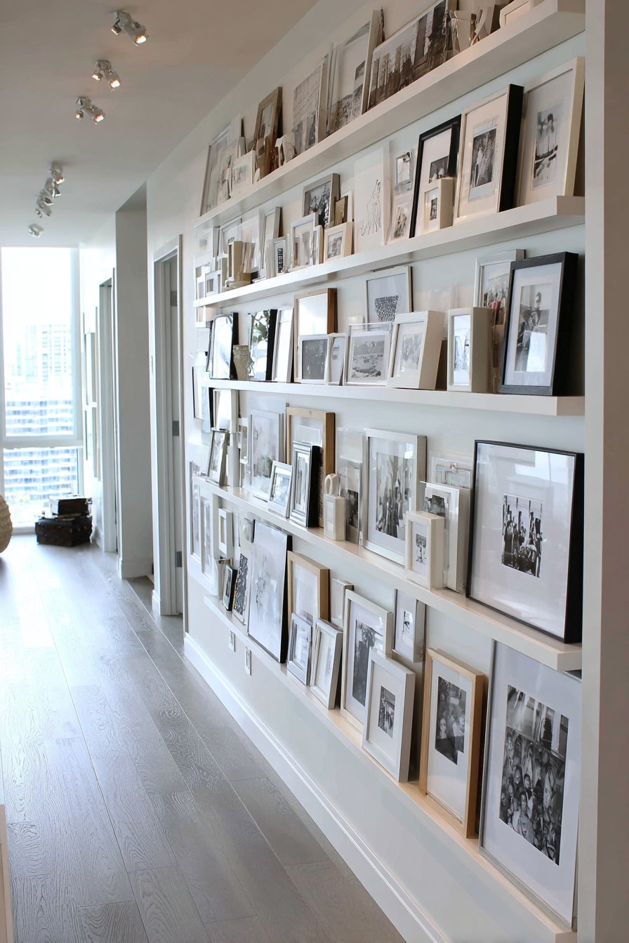
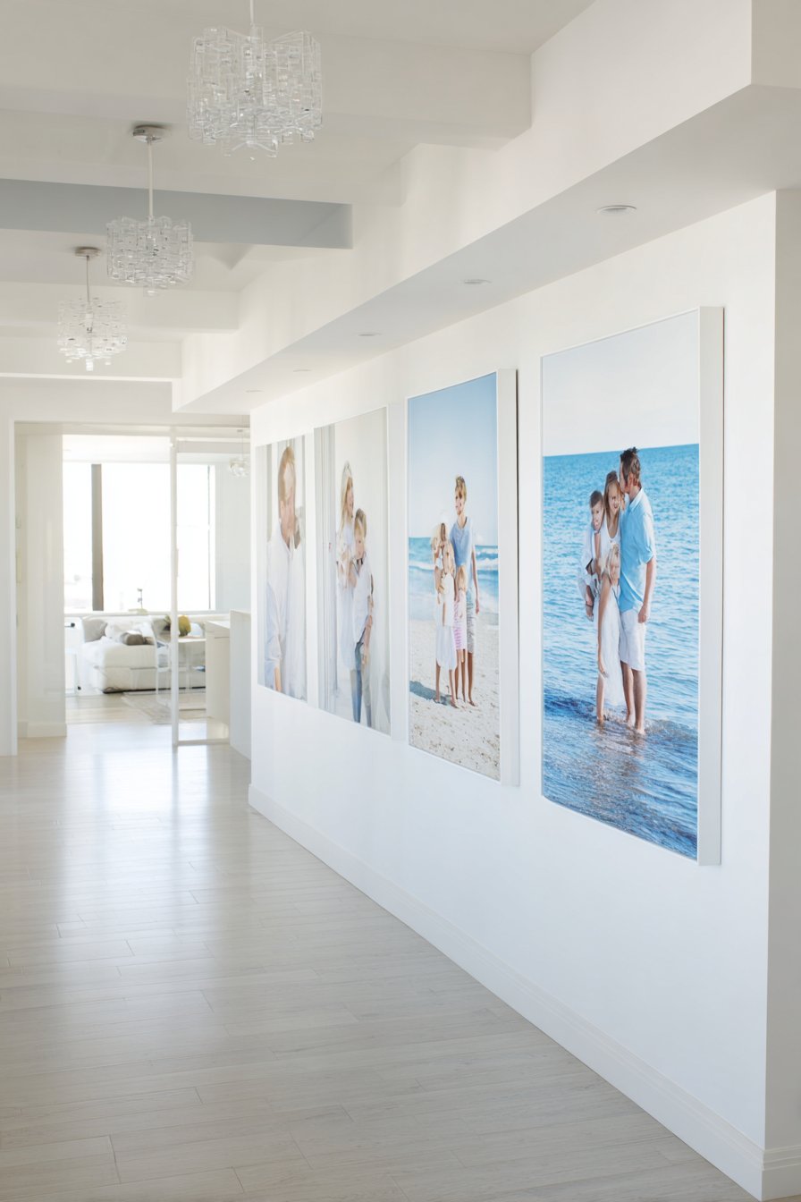
3. Linear Horizontal Minimalist Display
Sometimes restraint speaks louder than abundance, and a linear horizontal arrangement of five large-format family portraits demonstrates the power of simplicity. This design features matching white matted frames with thin black borders, creating a clean, gallery-quality presentation that allows the photographs themselves to be the stars. Positioned above a narrow console table with carefully selected decorative accessories, the arrangement creates visual anchoring while maintaining breathing room. Natural oak flooring and soft grey walls provide a neutral backdrop that ensures nothing competes with the family imagery, while professional interior photography principles guide the balanced exposure and thoughtful composition.
The horizontal lineup creates a strong visual flow that draws the eye across the wall, making it ideal for long, narrow spaces like hallways, above console tables, or in dining rooms. The generous white matting within each frame—typically 3-4 inches on all sides—creates a sophisticated gallery presentation while providing visual separation between the photos and their frames. This breathing room prevents the images from feeling crowded and lends a museum-quality aesthetic to everyday family photographs. The thin black frame borders add just enough definition without overwhelming the composition.
This approach works beautifully in modern, Scandinavian, and contemporary farmhouse interiors where clean lines and intentional simplicity are valued. The consistent sizing and spacing create a rhythm that’s pleasing to the eye and easy to achieve with basic measuring tools. Consider using this format for a specific photo series—perhaps annual family portraits taken in the same location, milestones from a single year, or a progression showing family growth over time. The linear format naturally suggests a timeline or narrative progression that enhances storytelling potential.
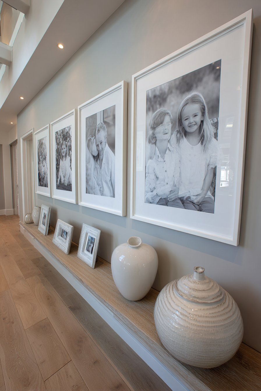
Key Design Tips: Choose large-format prints (11×14 or larger) to create impact with just five frames. Maintain precisely equal spacing between frames, typically 4-6 inches for this scale. Use custom matting to ensure consistency across all frames—ready-made frames often vary slightly in mat dimensions. Hang frames at eye level, with centers approximately 57-60 inches from the floor for optimal viewing. Select photos with similar tonal qualities and composition styles to maintain visual flow. Consider coordinating the console table styling beneath the frames with elements that echo colors or themes from the photographs above.
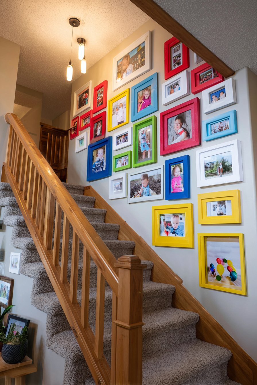
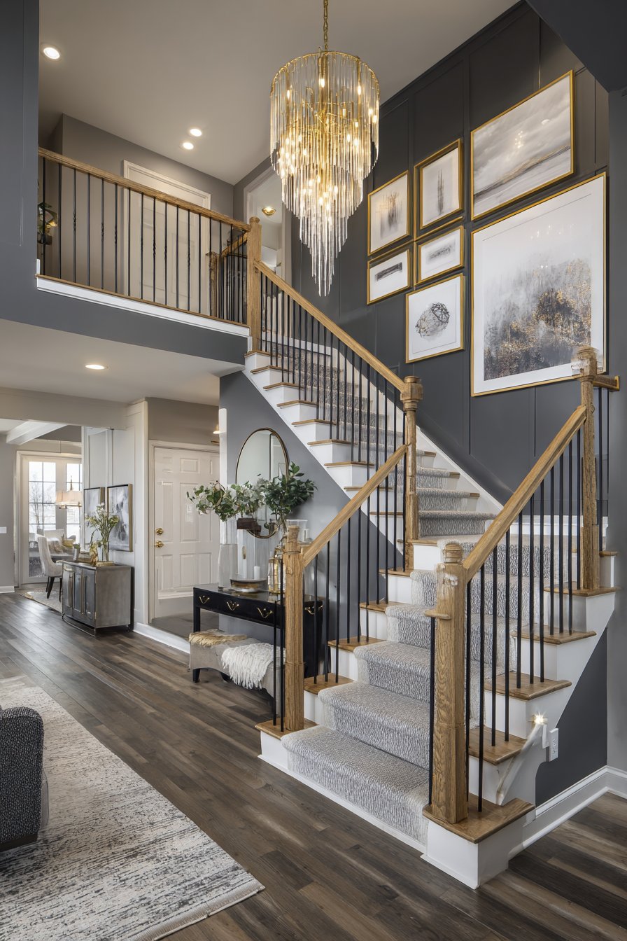
4. Vertical Staircase Story Progression
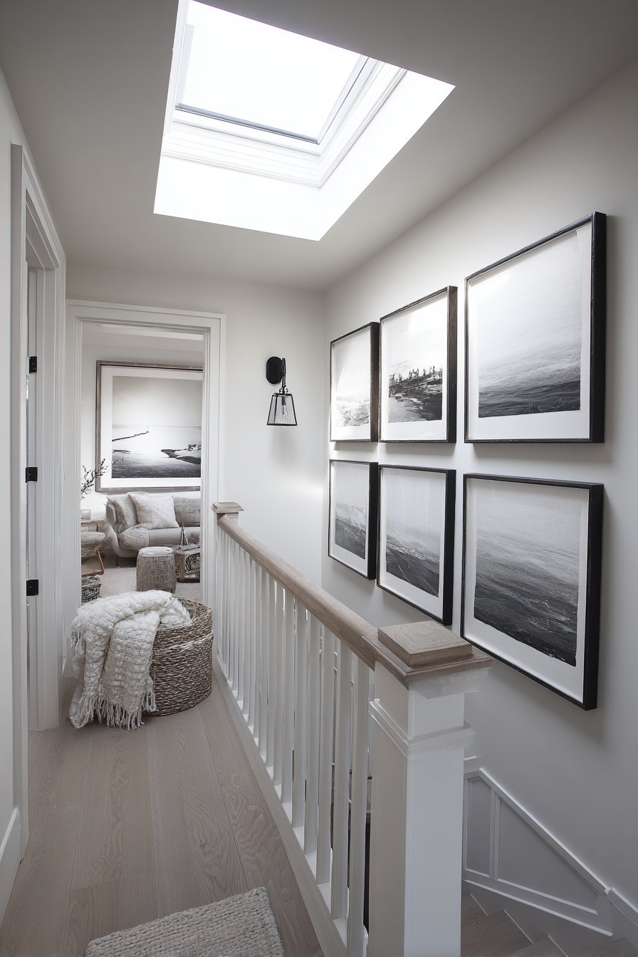
Staircases present unique opportunities for family picture walls, and a vertical stacked arrangement climbing alongside wooden stairs creates dynamic visual interest while making functional use of often-underutilized wall space. This design features frames alternating between portrait and landscape orientations in natural wood tones that complement the stair railing, with each step level featuring 2-3 coordinated photos that create a flowing visual narrative. Natural light from a skylight above creates gentle illumination that changes throughout the day, casting interesting shadows and highlights on the ascending arrangement. The progression upward naturally suggests the passage of time and family growth, making this placement particularly meaningful for documenting milestones and aging children.
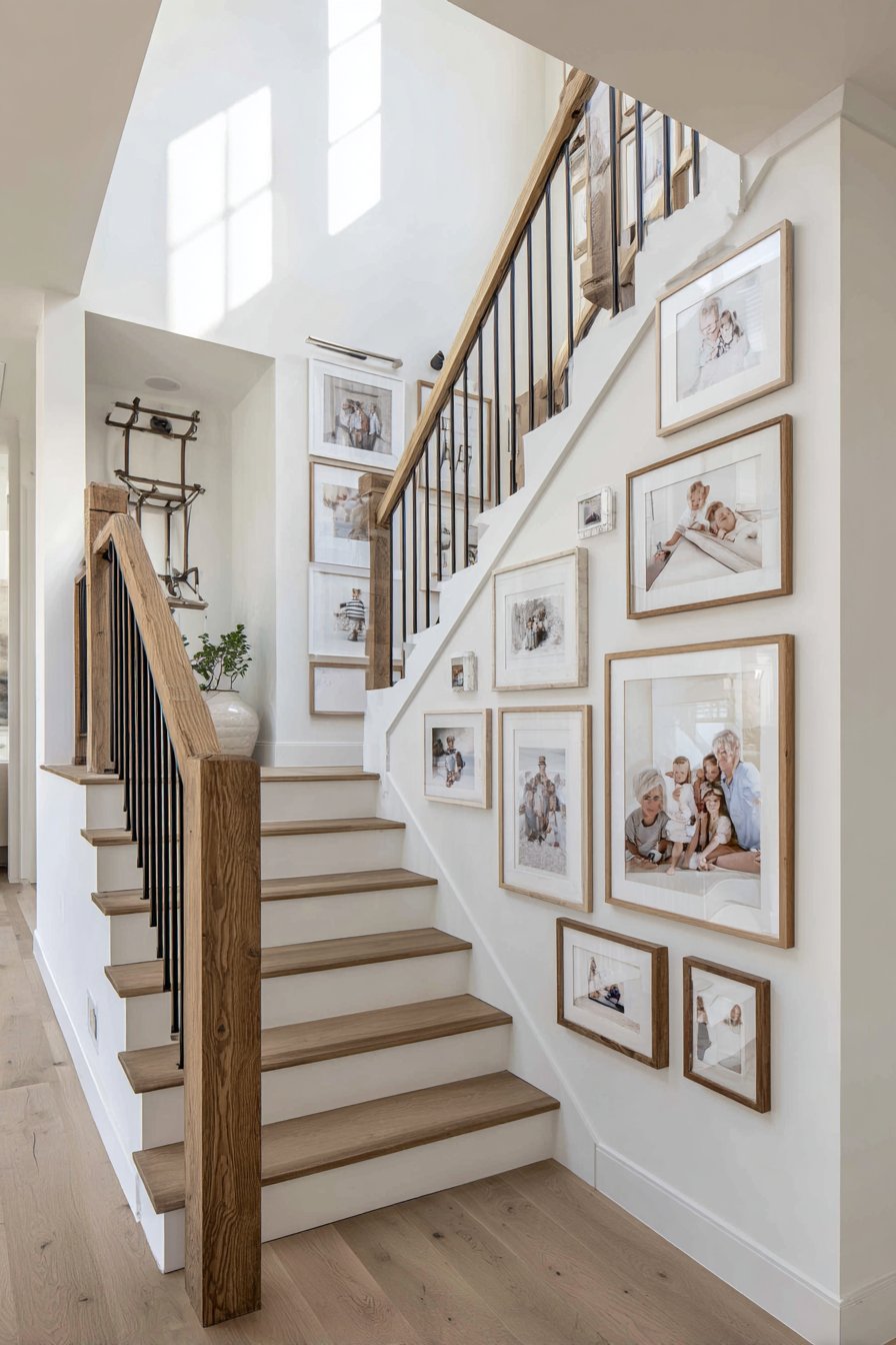
The staircase gallery wall requires careful planning to achieve proper flow and balance. Unlike flat walls where you can visualize the entire composition at once, staircase walls present themselves gradually as you ascend or descend, creating a sequential viewing experience. This characteristic makes them perfect for chronological arrangements or themed groupings that unfold as a story. The varying wall angles and the diagonal line created by the stairs add complexity to frame placement, requiring attention to ensure frames remain level while following the staircase pitch.
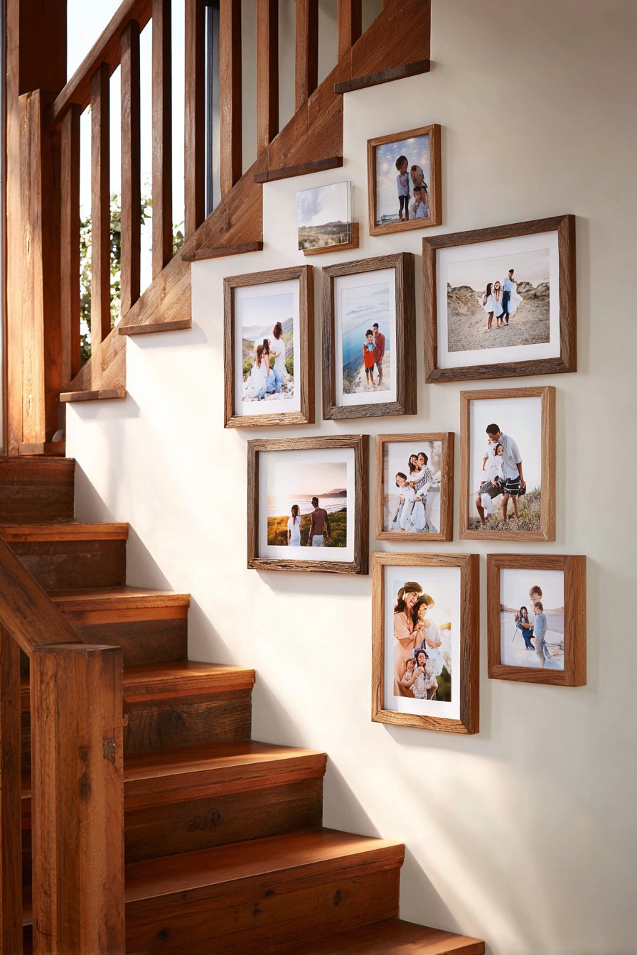
Natural wood frames in medium to light tones create warmth without overwhelming the space, and varying frame sizes prevents monotony along the potentially lengthy display area. Consider mixing frame depths as well—some thin profile frames, some with more substantial molding—to add dimensional interest to the vertical climb. The alternating orientations (portrait and landscape) create visual rhythm and accommodate different photograph compositions and subjects naturally. This approach allows you to include both individual portraits and group photos without forcing awkward cropping.
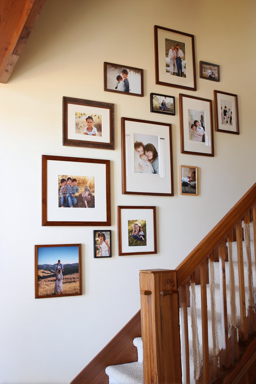
Key Design Tips: Follow the diagonal line of the stairs with your frame placement, keeping top edges roughly parallel to the stair angle. Space frames to align with stair risers or landings for visual cohesion with the architecture. Use a laser level or level app on your smartphone to ensure individual frames remain level despite the diagonal arrangement. Install frames at consistent heights relative to the stair treads—typically 5-7 steps apart for standard staircases. Choose lightweight frames and secure them with appropriate wall anchors rated for the increased gravitational pull on vertical walls. Create a paper template of your entire arrangement before drilling any holes, laying it along the stairs to visualize the flow.
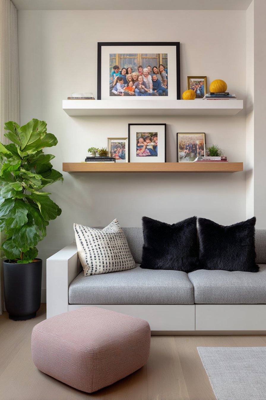
5. Contemporary Floating Shelf Layering System
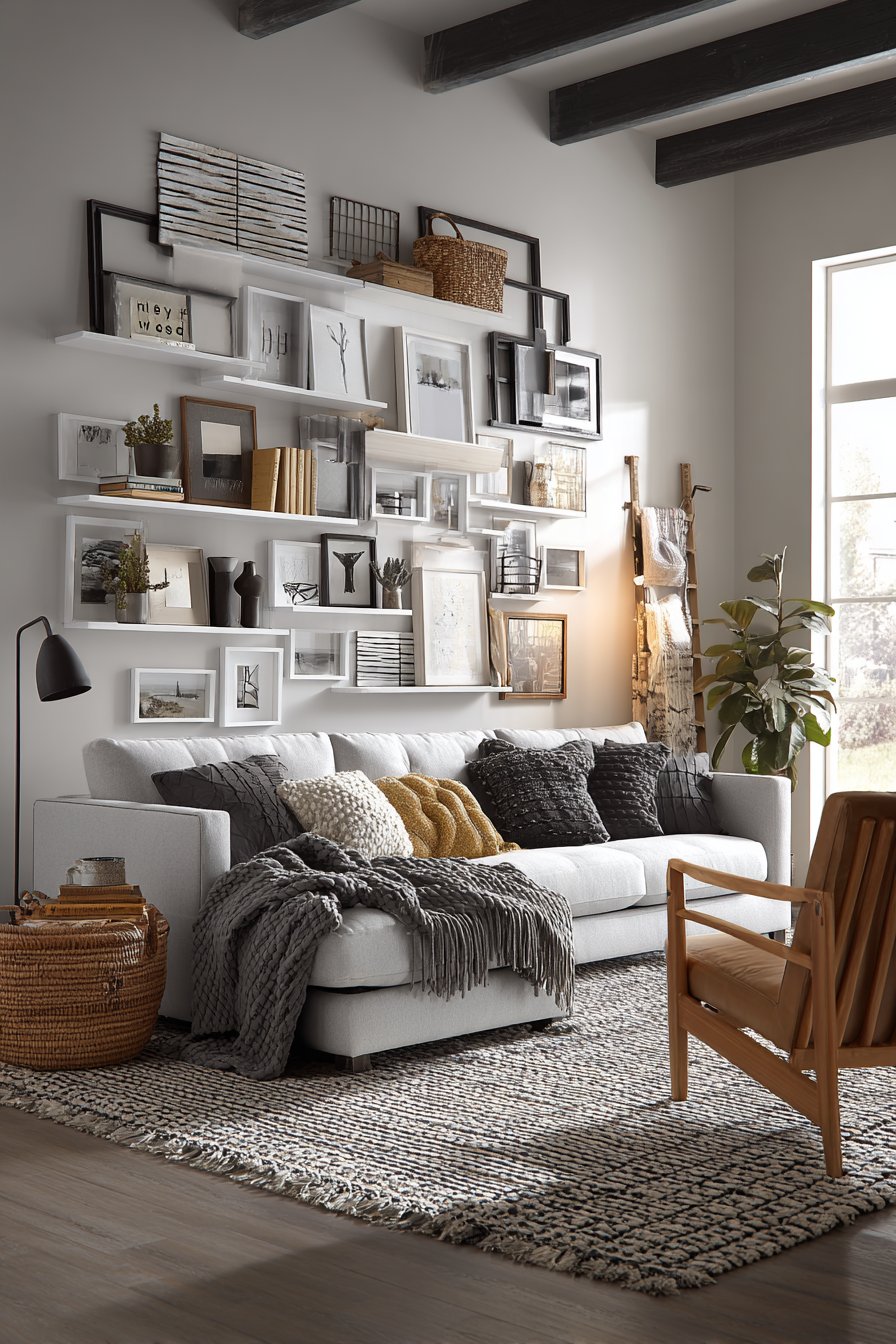
Modern flexibility meets timeless family memories in a floating shelf display system that allows for easy updates and seasonal rotations. This design features three white-painted wooden picture shelves mounted horizontally on the wall, with multiple frames leaning casually in layered arrangements rather than being individually hung. The mix of frame sizes and styles in black, white, and natural wood creates relaxed sophistication while maintaining cohesion through the limited color palette. Soft natural lighting highlights the dimensional depth created by overlapping frames, and the ability to simply swap out photos without tools makes this approach particularly appealing for growing families who frequently add new memories.
The genius of this system lies in its accessibility and adaptability. Unlike traditional gallery walls that require careful planning, measuring, and nail holes, picture ledges allow you to experiment with arrangements, change photos seasonally, or add new frames without commitment. This makes the system perfect for renters, frequent redecorators, or anyone who feels intimidated by permanent wall installations. The layered look—with frames overlapping and some leaning at slight angles—creates a collected, lived-in aesthetic that feels more personal and less formal than precision-hung arrangements.
Picture ledges typically range from 24 to 48 inches in length and feature a small lip at the front to prevent frames from sliding off. Installing multiple shelves at staggered heights creates visual interest and allows for varied groupings—perhaps family portraits on the top shelf, vacation photos on the middle, and smaller candid shots on the bottom. The white painted finish keeps the focus on the photographs while providing enough contrast to define the shelf edges. This system works beautifully in contemporary, Scandinavian, transitional, and modern farmhouse spaces.
Key Design Tips: Install shelves with proper wall anchors rated for the combined weight of multiple frames—ledges can become surprisingly heavy. Space shelves 12-18 inches apart vertically to allow room for taller frames and create balanced visual weight. Mix 2-3 frame colors maximum to maintain cohesion while allowing variety. Layer frames with larger pieces in back and smaller ones in front, leaning at natural angles rather than forcing perfect vertical alignment. Include one or two non-frame objects like small plants, candles, or decorative items to add textural interest. Leave some breathing room—don’t crowd every inch of shelf space—to maintain the relaxed, curated appearance.
6. Artistic Family Tree Wall Design
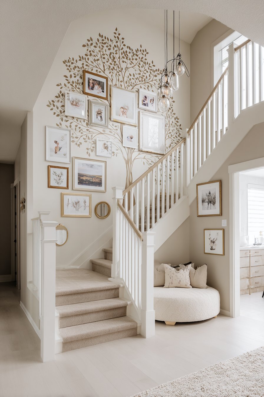
For a truly unique and deeply meaningful family picture wall, consider a painted family tree design that transforms genealogy into art. This creative approach features soft grey tree branches painted directly on a feature wall, extending outward to hold framed family photos in various circular and oval frames that represent different family members. The artistic wall treatment creates both decorative impact and meaningful storytelling, with the tree metaphor perfectly capturing family roots, growth, and interconnection. Warm Edison bulb lighting fixtures illuminate the creative display, casting a golden glow that enhances the handcrafted quality and creates inviting ambiance. This design works exceptionally well in family rooms, playrooms, or any space dedicated to togetherness and family heritage.
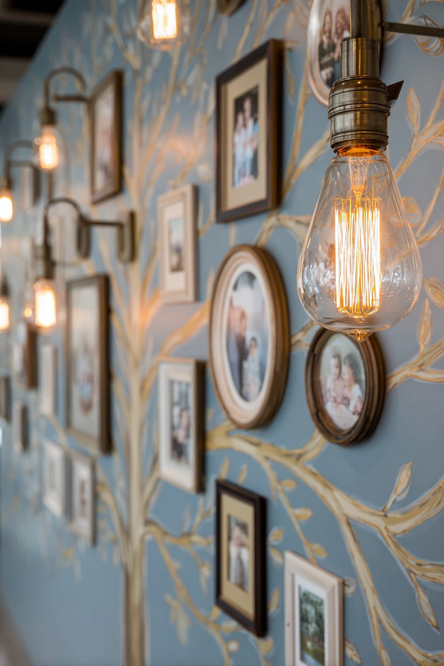
The family tree concept resonates across cultures and generations, making it universally meaningful while offering room for personal interpretation and style. The painted tree can range from realistic botanical accuracy to stylized, whimsical interpretations depending on your aesthetic preferences and artistic abilities. Consider hiring a local muralist or artistic friend if you’re not confident in your own painting skills, or use vinyl wall decals in tree shapes as an alternative to hand-painting. The grey tone suggested here creates subtle sophistication, but you could equally choose chocolate brown, sage green, or even white-on-white tone-on-tone for different effects.
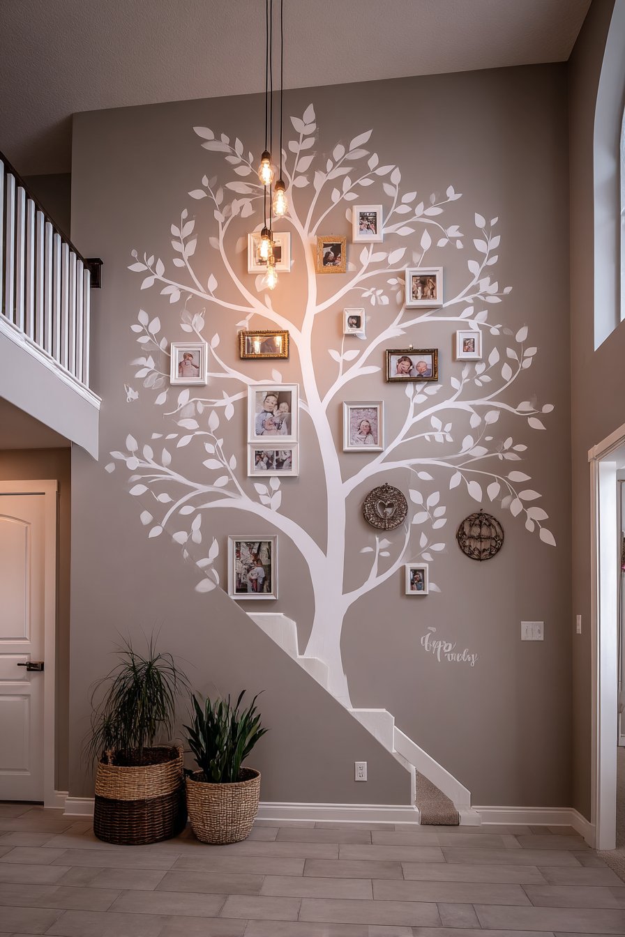
Circular and oval frames—rather than standard rectangular ones—add to the organic quality of the design and soften the overall composition. These frames can be actual wood or metal circles, or you could create the circular appearance by using round mats within square frames. Arranging photos to show generational progression—perhaps grandparents at the tree’s roots, parents on main branches, and children on smaller offshoots—adds narrative logic to the placement. Including names and dates on small plaques beneath each photo transforms the display into a genuine family tree that serves both decorative and documentary purposes.
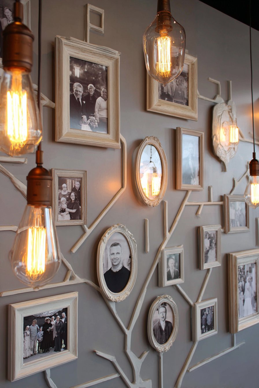
Key Design Tips: Sketch your tree design on paper first, planning branch placement to accommodate your specific number of photos. Use a projector to trace your design onto the wall for accuracy, or draw freehand for a more organic, handmade quality. Paint the tree in a color that’s slightly darker or lighter than your wall color rather than high contrast for sophisticated subtlety. Choose frames in 2-3 complementary finishes to add variety while maintaining cohesion. Include hooks or small nails painted to match the wall color along branches for hanging frames—these disappear visually while providing practical support. Consider adding painted leaves with family member names for those without photos, creating spaces for future additions as your family grows.
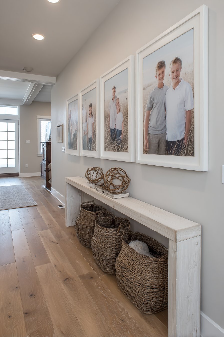
7. Minimalist Oversized Canvas Statement
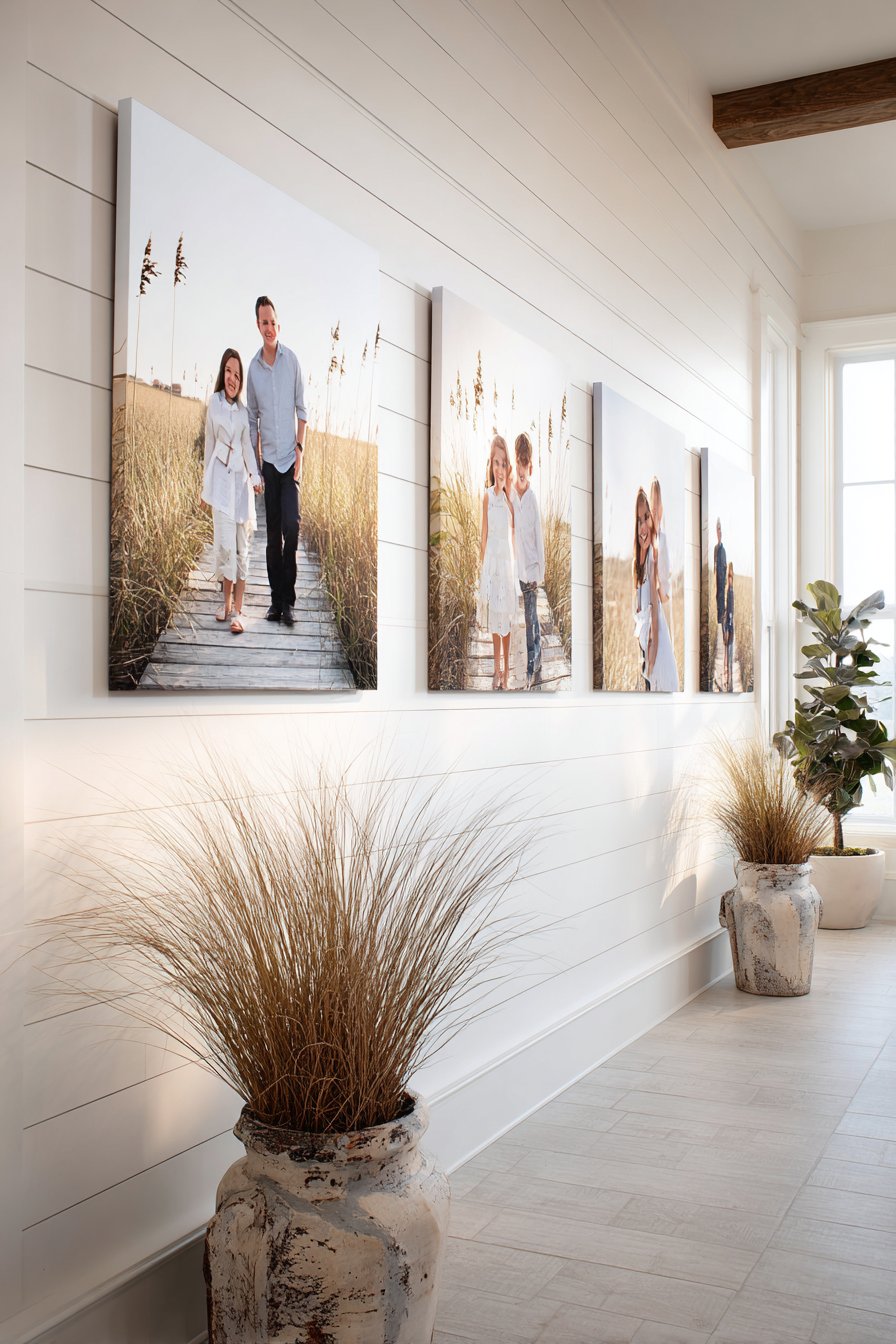
Less truly becomes more in this striking minimalist approach featuring five oversized canvas prints of family moments arranged in a simple horizontal line against a crisp white shiplap wall. The frameless presentation eliminates visual barriers between viewers and the images, allowing the photographs themselves to command full attention. Consistent spacing between each canvas—typically 3-6 inches—creates breathing room while maintaining connection between the pieces. Natural daylight from nearby windows creates even illumination that showcases the photographs’ color, detail, and emotional content without harsh shadows or glare. This contemporary clean aesthetic proves that powerful family displays need not be complex or ornate.
Oversized canvases—typically 16×20 inches or larger—create drama and impact that smaller prints simply cannot achieve. The scale allows you to appreciate photographic details like expressions, textures, and environmental elements that might be lost in smaller formats. Canvas printing offers several advantages over traditional framed photographs: the wrapped edges eliminate the need for frames, reducing both cost and visual clutter; the textile surface adds texture and depth; and the lightweight nature of stretched canvas makes installation simpler than heavy framed prints. The result feels more like fine art than family snapshots, elevating everyday moments to gallery-worthy status.
This minimalist approach works best with high-quality photographs that can withstand enlargement without losing clarity. Consider choosing images with similar color palettes or tonal qualities to create harmony across the five-piece display—perhaps all featuring outdoor settings with natural greens and blues, or all taken during golden hour with warm, glowing light. The white shiplap wall provides subtle texture without competing for attention, and its horizontal lines create pleasing contrast with the vertical orientation of the canvases. This design suits contemporary, Scandinavian, modern farmhouse, and coastal interiors where simplicity and clean lines prevail.
Key Design Tips: Invest in professional printing or use a reputable online service that specializes in large-format canvas prints. Select images with high resolution (at least 300 DPI at the printed size) to ensure clarity and sharpness. Use a laser level to mark canvas placement before hanging to ensure perfect horizontal alignment. Hang canvases at eye level, with centers approximately 57-60 inches from the floor. Choose images with consistent lighting quality and color temperature for visual cohesion. Consider a subtle vignette or border fade in post-processing to draw attention to the central subjects in each image. Space canvases evenly—measure precisely rather than eyeballing for professional results.
8. Corner Gallery Bedroom Sanctuary
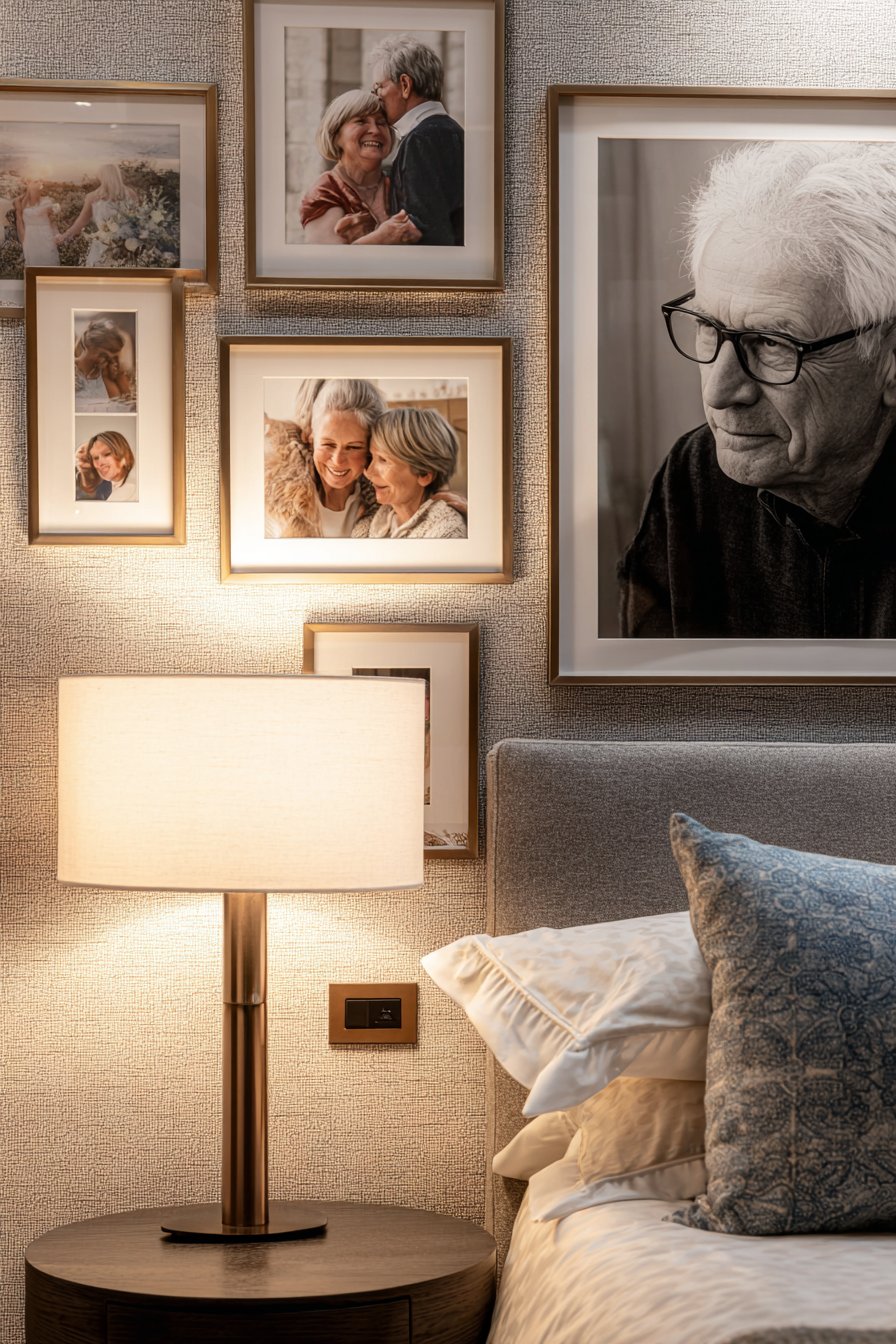
Why limit yourself to single walls when corners offer double the display space? This innovative design features a gallery wall that wraps around two adjacent walls in a master bedroom, creating an enveloping, personalized sanctuary. Mixed metallic frames in brushed brass and copper tones complement warm color palettes often found in bedrooms—think soft whites, creams, blushes, and warm greys. The collection includes intimate family moments and individual portraits in various sizes, with the corner placement creating a cozy, cocoon-like feeling that’s perfect for private spaces. Bedside lamp lighting creates warm evening ambiance that highlights the frame finishes and casts gentle shadows, transforming the photo wall into a softly glowing focal point during nighttime hours.
Corner galleries require thoughtful planning to maintain visual flow across the architectural transition. The key is treating the corner as a unified canvas rather than two separate walls. Start by placing a statement piece directly in or near the corner—this could be a large portrait or a particularly meaningful photo that serves as the visual anchor. Then build outward on both walls, maintaining roughly equal density and visual weight on each side. The wraparound effect creates immersion, making the bedroom feel truly personalized and intimate. This placement works particularly well for couples, with one wall potentially featuring more photos of one partner’s family and the adjacent wall featuring the other’s, symbolically joining in the corner.
Metallic frames in warm tones add sophistication and luxury to bedroom spaces without feeling overly formal or cold. Brushed brass and copper finishes catch and reflect light beautifully, creating subtle sparkle and adding warmth to the room’s overall ambiance. These finishes pair particularly well with warm-toned woods, soft textiles, and layered lighting—all elements commonly found in well-designed bedrooms. The varying sizes prevent monotony and allow you to accommodate different photograph compositions and subjects naturally, from intimate close-ups to wider family groupings.
Key Design Tips: Maintain relatively equal visual density on both walls to avoid lopsided appearance. Place your most important or largest piece at or near the corner to draw the eye to the transition point. Ensure adequate lighting on both walls—consider picture lights or adjustable wall sconces. Keep the overall color palette cohesive even if frame finishes vary, limiting yourself to warm metals only or cool metals only. Plan the layout on the floor first, including the corner angle, before transferring to the walls. Consider the view from the bed—arrange frames so the most meaningful images are visible from your typical vantage point. Use felt pads on frame backs to protect walls and prevent tilting over time.
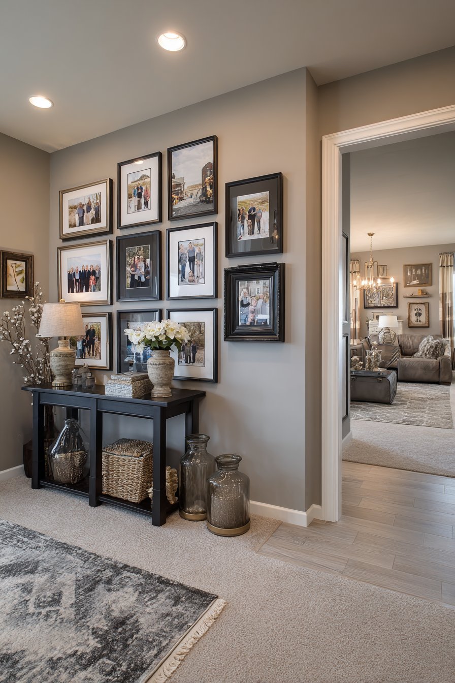
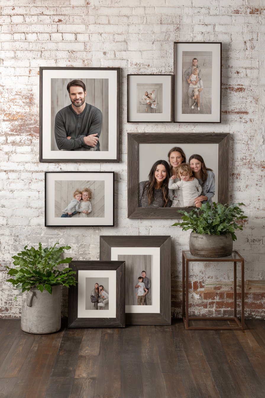
9. Symmetrical Statement with Rustic Frames
Classic symmetry meets rustic charm in this carefully balanced arrangement centered around a large statement family portrait flanked by smaller coordinating photos in descending sizes. All frames feature matching distressed wood finishes that add character and warmth while maintaining visual unity. The triangular composition—large center piece with progressively smaller frames radiating outward—creates a focal point that draws the eye and establishes clear visual hierarchy. Positioned above a farmhouse-style wooden bench with woven basket storage underneath, the display connects beautifully with the room’s functional elements while maintaining intentional negative space. Natural light streaming through sheer curtains creates soft highlights that enhance the wood grain and distressed character of the frames.
Symmetrical arrangements satisfy our inherent human preference for balance and order while creating a sense of calm and intentionality. This approach works particularly well in spaces where you want a polished, finished look without extensive planning or artistic risk-taking. The mathematical precision of symmetry also makes installation more straightforward—once you establish your center point and measurements, the placement becomes a matter of mirroring dimensions. The descending sizes create a pyramid or diamond shape that’s been used in art and design for centuries, automatically creating visual interest through scale variation while maintaining order through symmetry.
Distressed wood frames add character that new, perfect frames simply cannot replicate. The weathered finish suggests history, heritage, and timelessness—qualities that perfectly complement family photography. These frames work beautifully in farmhouse, rustic, transitional, and even eclectic bohemian spaces. The matching finish across all frames creates cohesion despite the size variation, ensuring the arrangement reads as a single unified installation rather than random photos that happen to share wall space. Consider choosing frames with similar distressing patterns—perhaps all featuring white paint with wood showing through, or all with grey weathering.
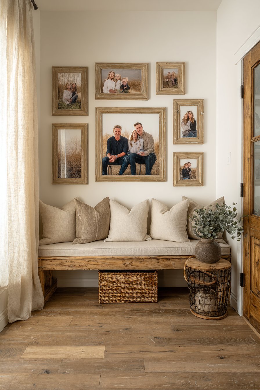
Key Design Tips: Begin with your center anchor piece and work outward symmetrically. Use a level and measuring tape to ensure perfect mirroring on both sides. Choose odd numbers of frames for most symmetrical arrangements—3, 5, 7, or 9 total—as odd numbers create more interesting compositions. Maintain consistent spacing between frames throughout the arrangement. Select photos with similar tones and lighting quality to strengthen cohesion. Position the center of your main focal image at eye level (57-60 inches from floor). Consider the furniture beneath—the arrangement should be roughly two-thirds the width of the furniture piece for proper proportional balance. Use distressed frames with similar levels of wear to avoid some looking shabby while others look deliberately styled.
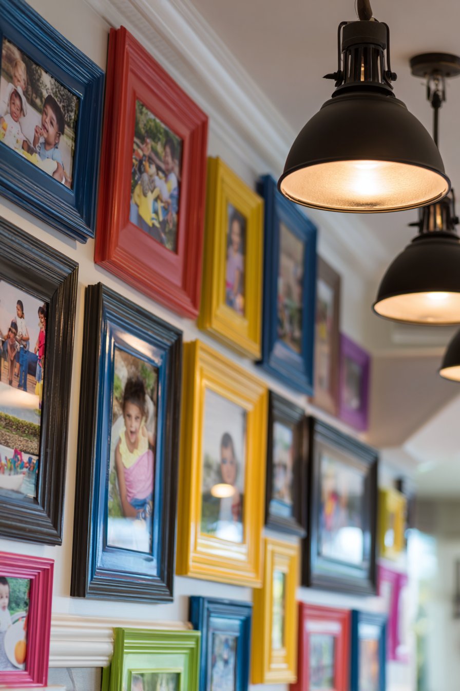
10. Playful Children’s Multicolored Display
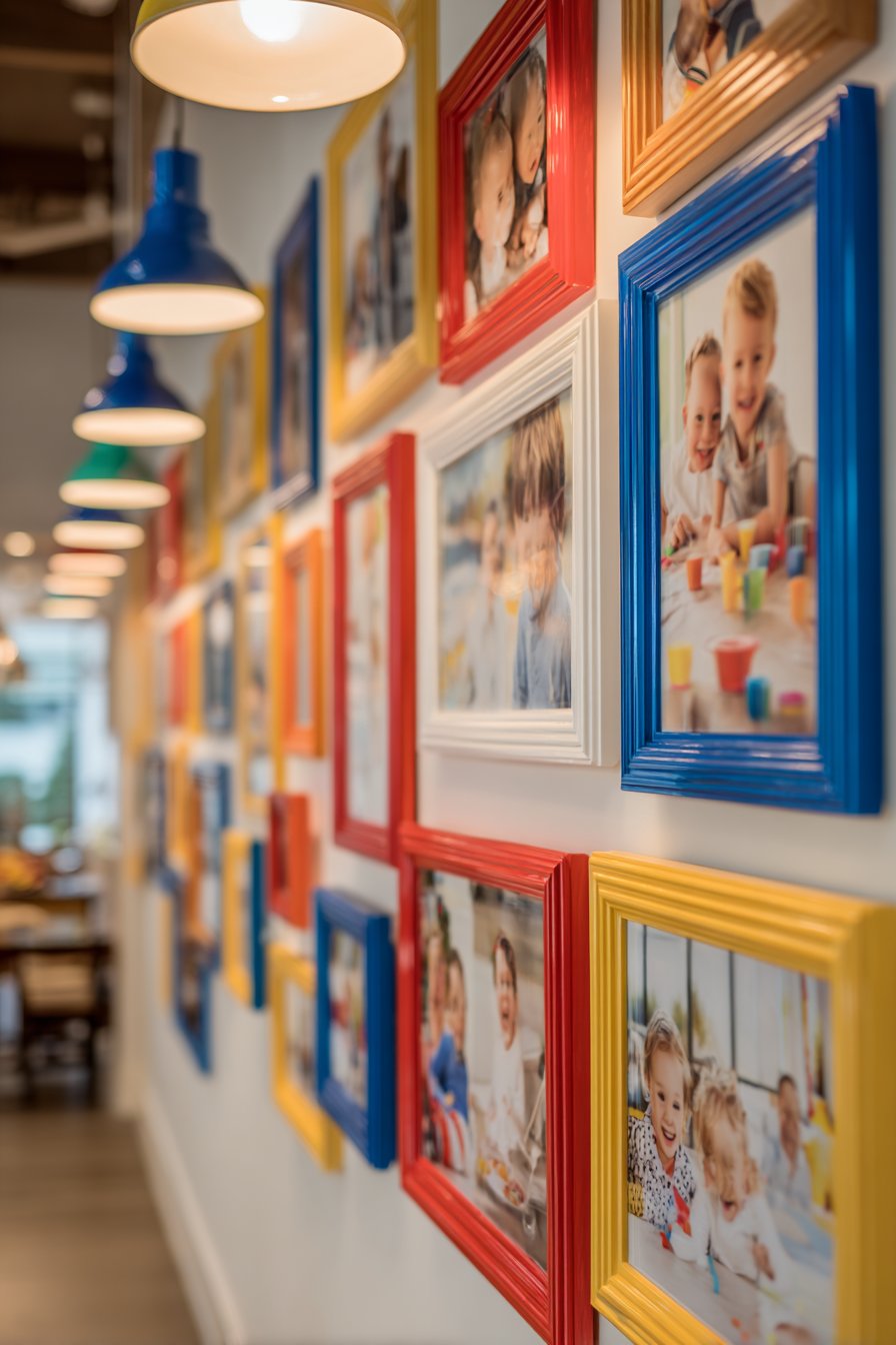
Inject joy and energy into family spaces with a children’s playroom display featuring bright multicolored frames in primary and secondary colors—red, blue, yellow, green, and more. This cheerful arrangement captures playful family moments and children’s milestone achievements, arranged in a casual organic layout positioned at child eye-level for engagement and interaction. The vibrant colors stimulate creativity and happiness while teaching color recognition, and the accessible height allows children to actively engage with family memories rather than simply viewing them from a distance. Overhead pendant lighting provides bright, even illumination that’s essential for playspaces while showcasing the rainbow of frame colors and the joyful moments they contain.
Designing picture walls specifically for children’s spaces requires different considerations than adult-oriented galleries. The primary difference is height—standard eye-level placement (57-60 inches to center) positions photos too high for young children to truly engage with. By lowering the arrangement so that frames center around 40-48 inches from the floor, you create an accessible gallery that children can point to, discuss, and enjoy independently. This placement transforms the picture wall from decoration into an interactive element that reinforces family bonds and helps young children develop memory and recognition skills.
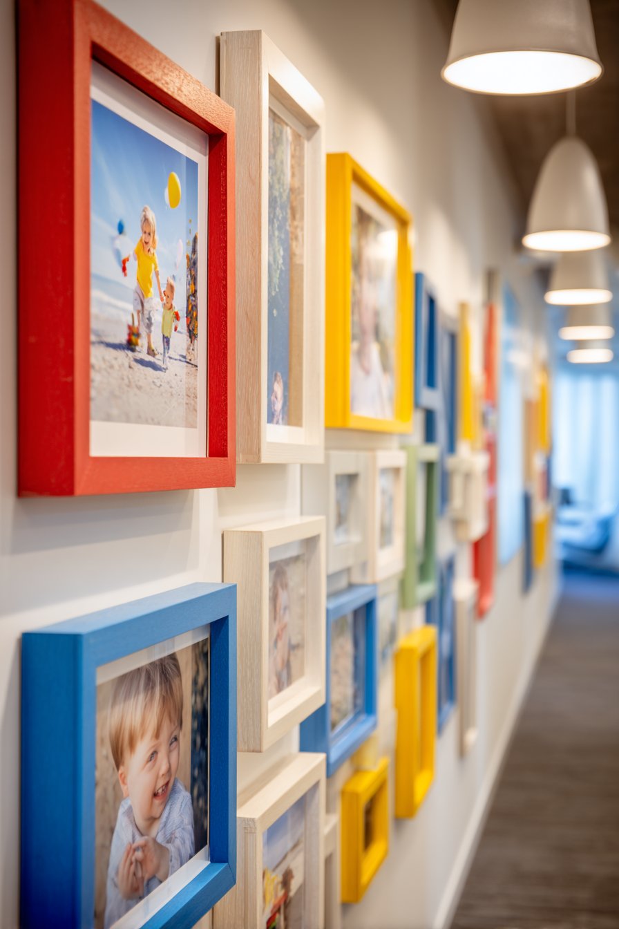
The multicolored frame approach celebrates childhood’s inherent vibrancy and creativity. Rather than coordinating subtle tones, embrace bold primary colors that energize the space and spark imagination. The casual organic layout—rather than rigid grids or symmetry—reflects children’s natural, playful approach to life while being more forgiving of less-than-perfect installation. Include photos that show children as active participants—playing, creating, exploring—rather than only formal portraits. Action shots, silly faces, and candid moments feel more authentic to childhood and create a gallery that celebrates kids as they truly are.
Key Design Tips: Install frames with centers 40-48 inches from the floor so children can easily view and interact with photos. Choose plastic or lightweight frames rather than heavy glass-covered options for safety. Use secure wall anchors and check regularly that frames remain firmly attached. Include photos of the children themselves, their friends, and special events they can remember and discuss. Update photos regularly to reflect current interests and recent memories. Use labels with children’s names or dates to help them learn recognition and sequencing. Consider including a few empty frames where children can display their own artwork, rotating pieces regularly. Ensure the layout is casual enough that adding or removing frames doesn’t disrupt the overall composition.
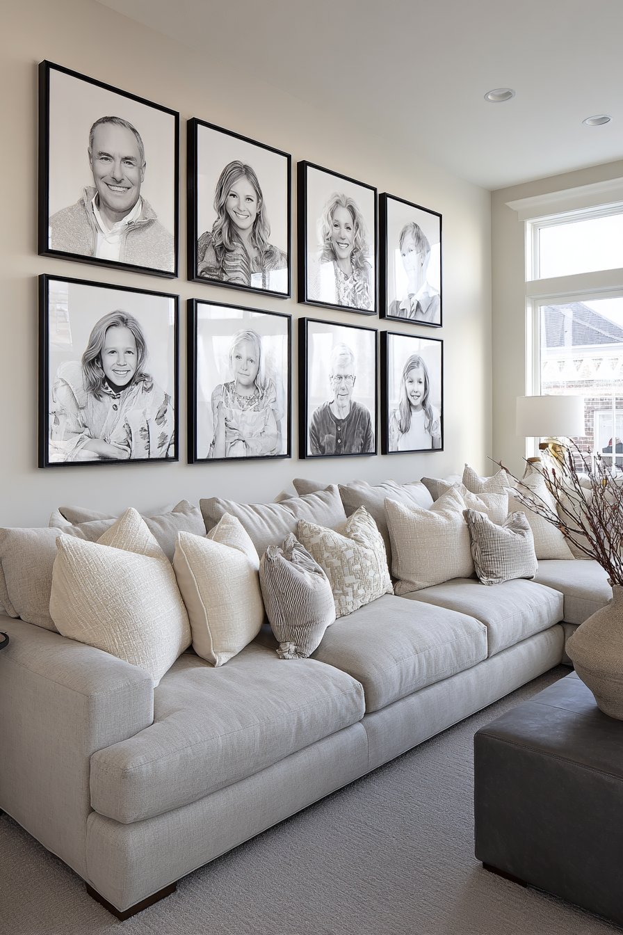
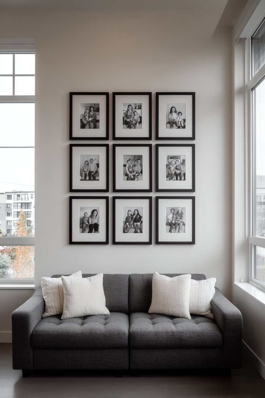
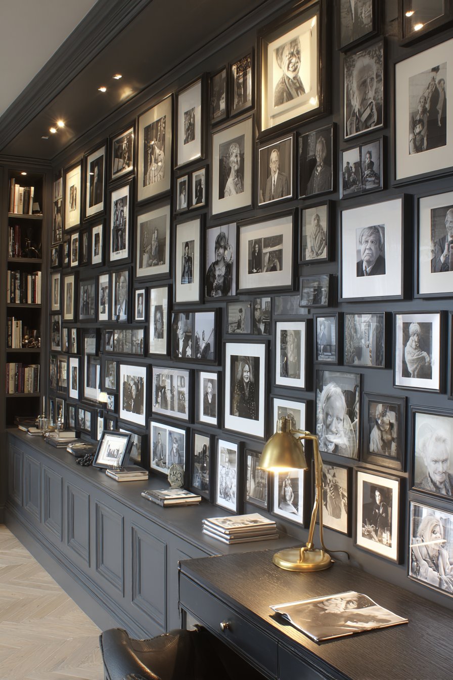
11. Monochromatic Black Frame Geometric Precision
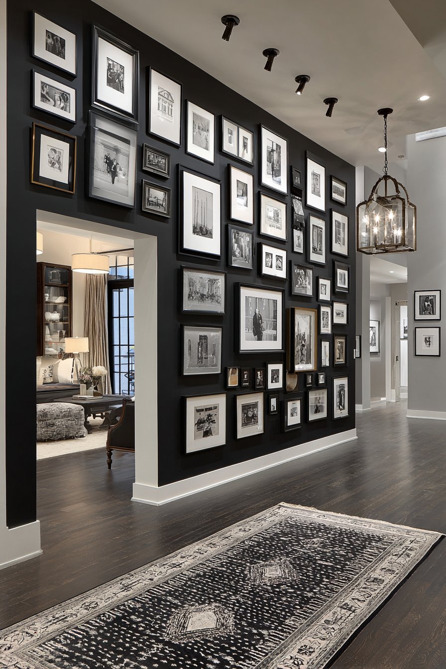
Sophisticated restraint defines this monochromatic approach featuring a collection of identical black frames arranged in a precise geometric pattern on a dove grey accent wall. The professional family portraits include both color and black-and-white photography, creating tonal variety within the unified frame style. Recessed LED lighting with adjustable spotlights highlights individual frames and creates subtle shadows that emphasize the three-dimensional quality of the framed arrangement. The mathematical precision of frame placement creates a sense of order and intentionality that suits formal living spaces, home offices, and areas where sophistication is paramount. This design proves that limitation—in this case, a single frame color and geometric arrangement—can actually enhance visual impact rather than constrain it.
The power of monochromatic design lies in its clarity and the way it directs attention to composition, pattern, and subtle variations rather than competing colors. By eliminating color variation in frames, you ensure that the photographs themselves become the source of visual interest and emotional connection. The dove grey wall color provides enough contrast to define the black frames without the stark harshness of black-on-white, creating a more sophisticated, nuanced presentation. This color combination works beautifully in contemporary, modern, transitional, and even traditional spaces where elegance is valued.
Geometric patterns can range from simple grids to more complex arrangements like honeycomb patterns, staggered rows, or modular compositions where frame sizes vary but placement follows mathematical logic. The precision required for these arrangements makes careful planning essential—even small measurement errors become visually obvious in geometric designs. However, the effort invested yields a finished product that looks professionally designed and intentional. The adjustable spotlighting adds a gallery-quality element, allowing you to control which photos receive emphasis and creating dramatic shadows that enhance the dimensional quality of the wall display.
Key Design Tips: Create a detailed scale drawing of your wall and frame arrangement before purchasing materials. Use identical frames in the same size, or if varying sizes, choose frames from the same manufacturer to ensure consistent profile and finish. Install recessed lighting during the planning phase if it requires electrical work—retrofitting is more challenging. Use a laser level and measuring tape for installation, checking alignment after every frame. Consider a grid where all frames are the same size for easiest installation and strongest geometric impact. Mix color and black-and-white photos to add tonal variation without introducing color competition. Mount the arrangement 57-60 inches to center on most walls for optimal viewing height. Dust frames regularly as black shows dust more readily than lighter colors, and keep the geometric precision visually crisp.
12. Industrial Loft Asymmetrical Texture
Raw architectural elements meet personal warmth in this industrial-inspired asymmetrical arrangement flowing across a textured white brick wall in a loft space. Mixed metal and reclaimed wood frames in various patinas complement exposed brick, concrete, and other industrial materials common in converted loft spaces. Candid family photos in varying sizes create dynamic visual movement that contrasts pleasingly with the static, heavy architectural elements. Natural warehouse-style windows—typically oversized and numerous in industrial spaces—flood the display with abundant daylight that emphasizes texture and creates ever-changing shadow patterns throughout the day. This design celebrates the intersection of industrial design’s raw authenticity and the deeply personal nature of family photography.
Industrial spaces present unique design challenges with their exposed materials, high ceilings, and often sparse architectural detail. A family picture wall helps humanize these potentially cold spaces by introducing warmth, personality, and scale-appropriate focal points on expansive walls. The key is embracing rather than fighting the industrial aesthetic—choose frames with metal finishes like aged steel, brushed nickel, or weathered iron, and incorporate reclaimed wood that shows authentic wear and patina. These materials complement rather than contrast with exposed brick, concrete floors, steel beams, and other industrial hallmarks.
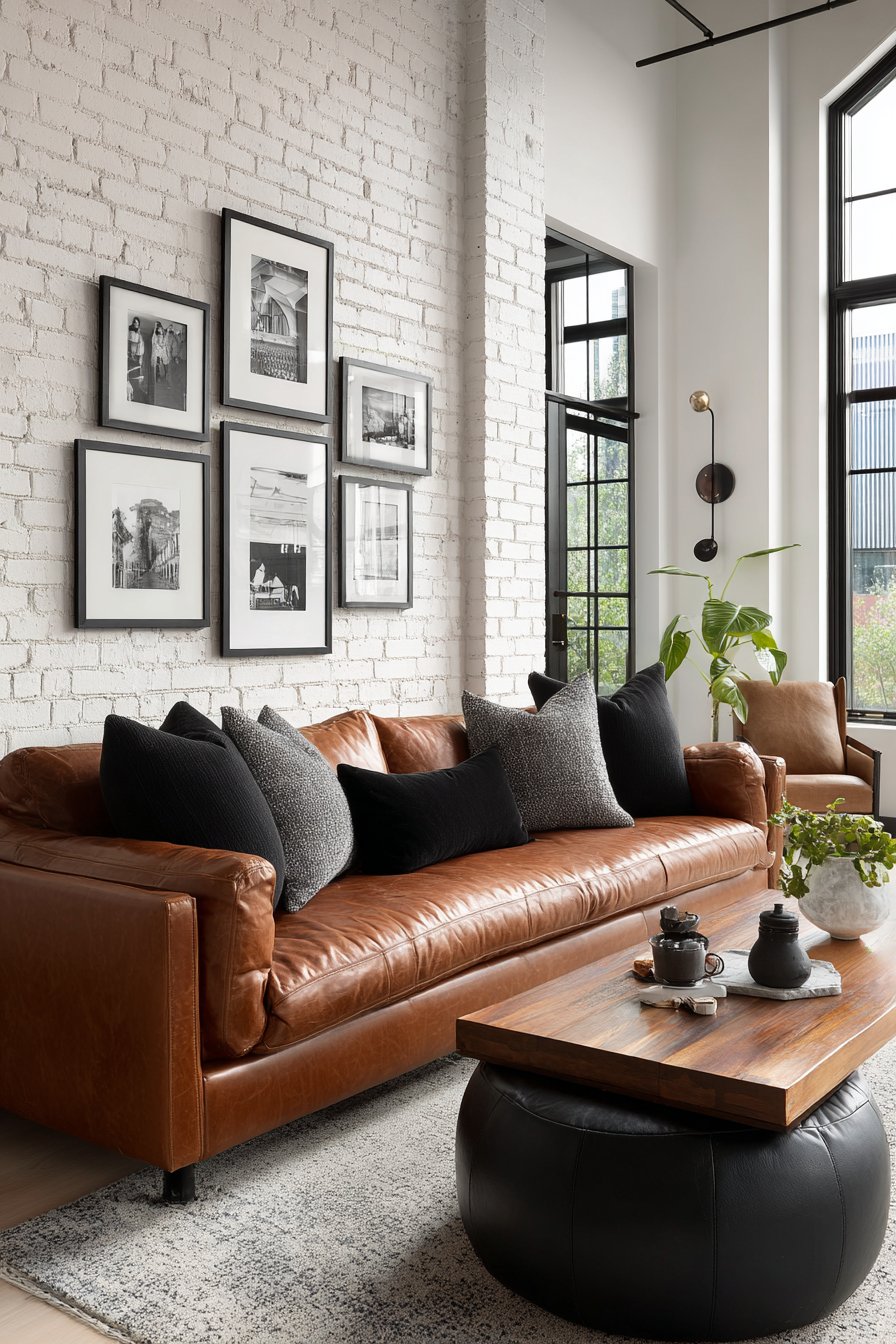
The asymmetrical arrangement suits the organic, evolved nature of industrial spaces, which often feature irregular floor plans and architectural quirks. Rather than imposing rigid symmetry or geometric precision, allow the photo arrangement to flow organically across the wall, responding to architectural features like windows, pipes, or electrical conduits. The white-painted brick (rather than raw red brick) provides enough contrast to make dark metal and wood frames visible while maintaining the industrial character. This approach works in true industrial lofts as well as homes incorporating industrial-inspired design elements.
Key Design Tips: Choose frames with authentic patina rather than artificially aged finishes for genuine industrial character. Incorporate at least one oversized statement piece to anchor the arrangement and provide scale against tall ceilings. Work with rather than against existing architectural features—frame around windows, pipes, or exposed elements instead of trying to hide them. Use appropriate anchors for brick or concrete walls—standard drywall anchors won’t work. Consider the view from multiple vantage points in open-plan loft spaces. Include candid, informal photos that match the relaxed, authentic vibe of industrial design rather than formal posed portraits. Maintain 2-3 inch spacing between frames despite asymmetrical placement to create cohesion. Add Edison bulb fixtures or industrial-style picture lights to enhance the aesthetic during evening hours.
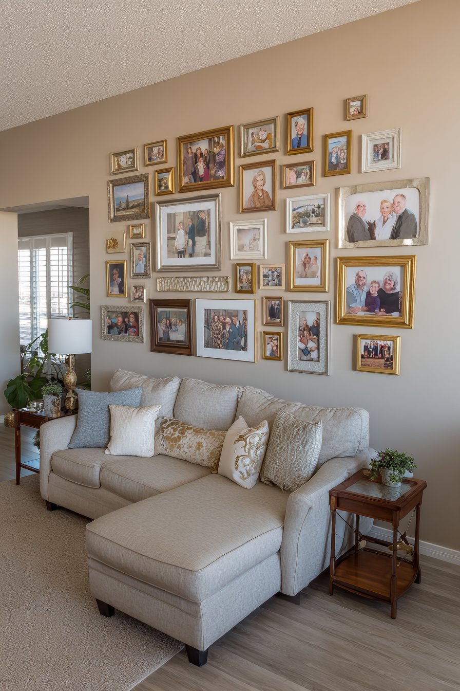
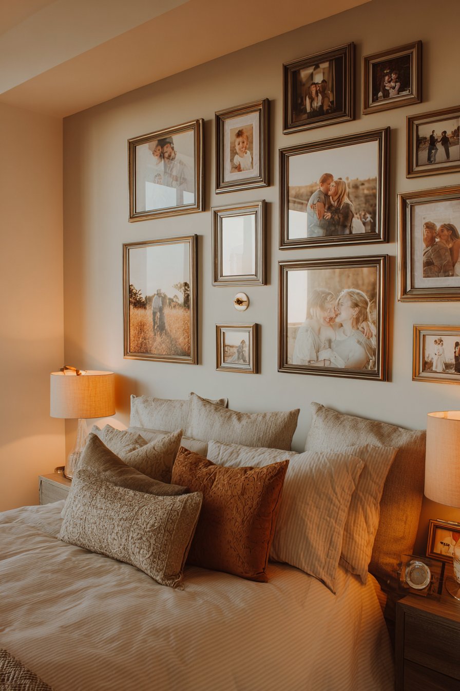
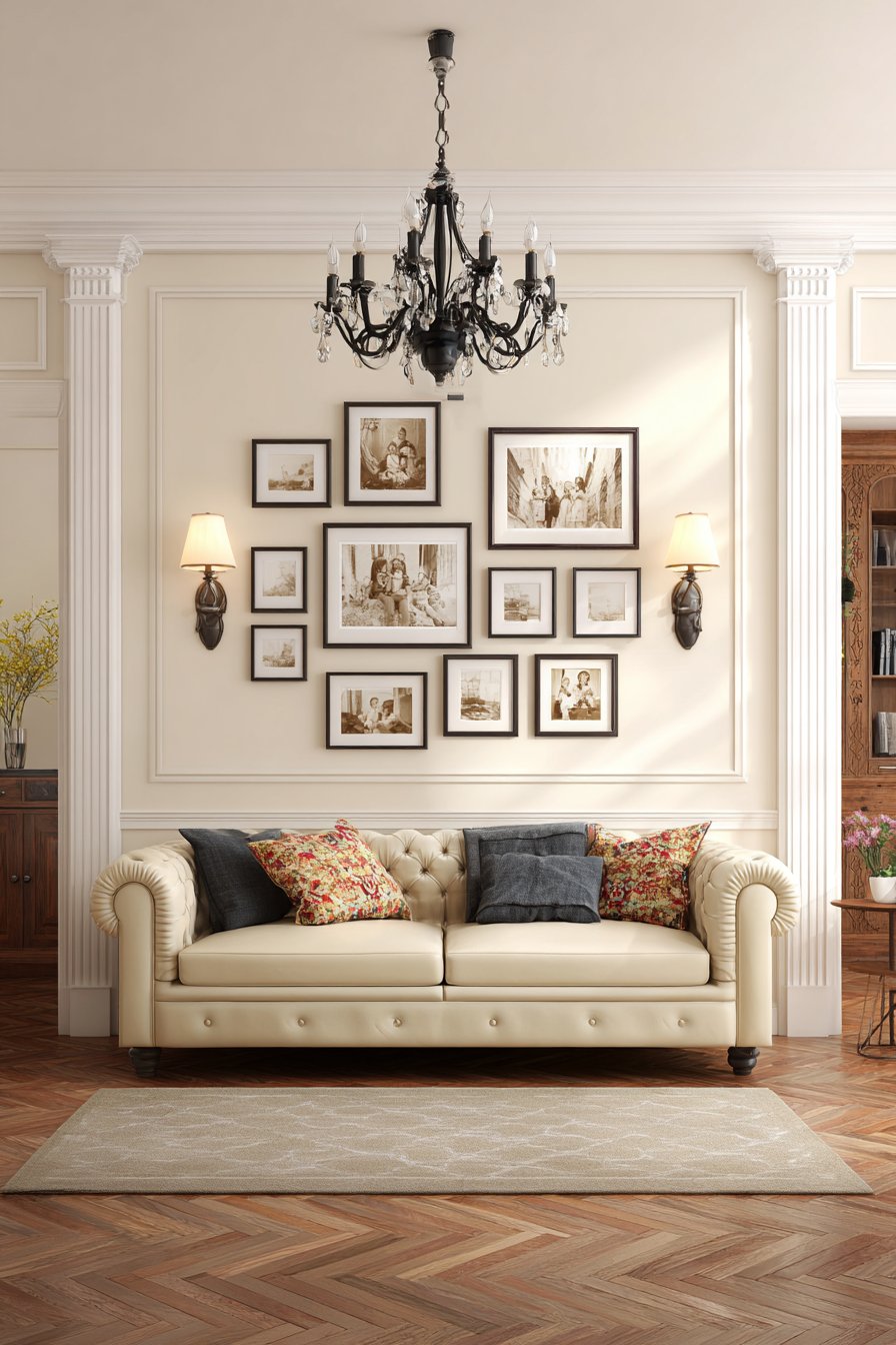
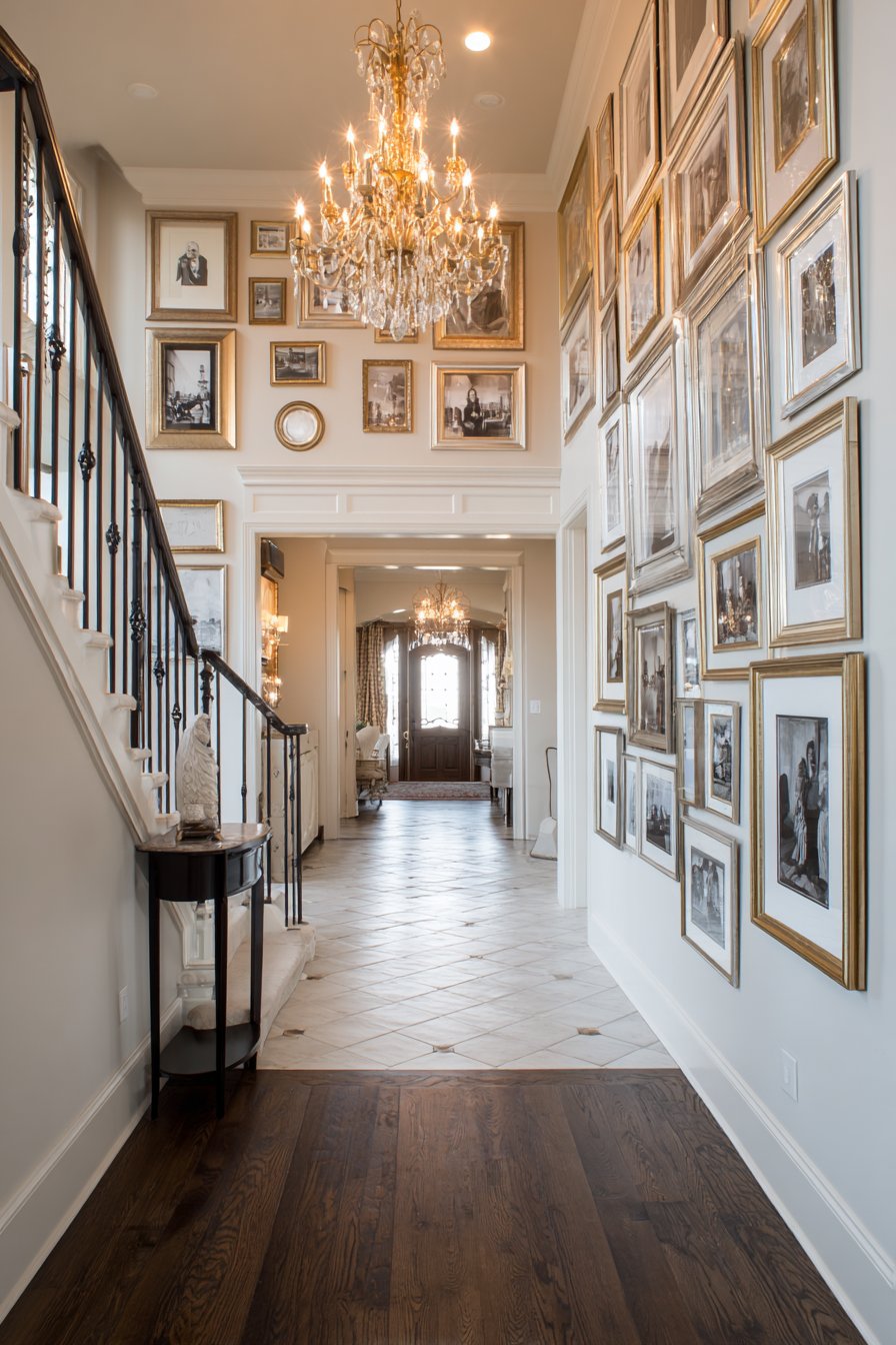
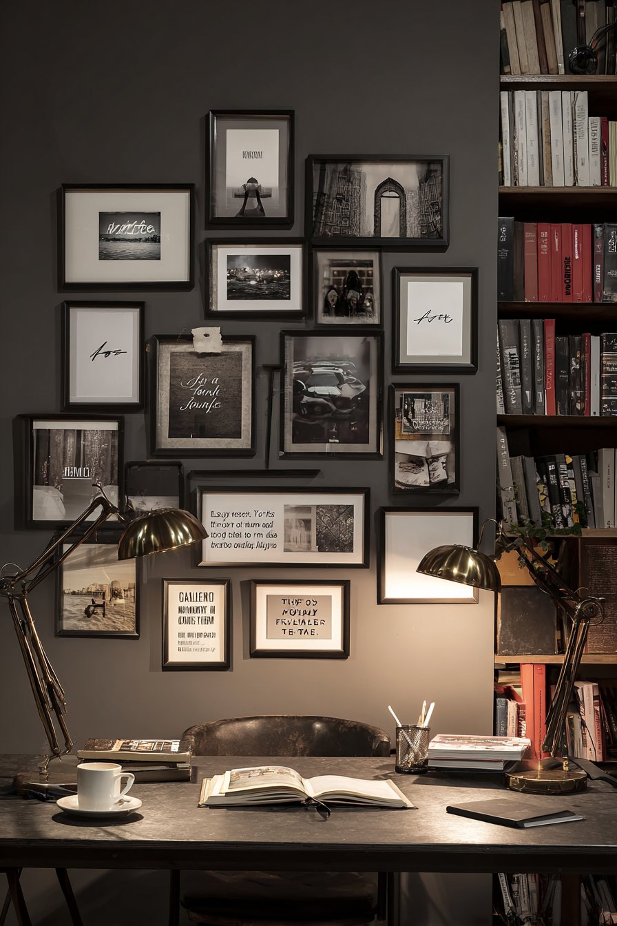
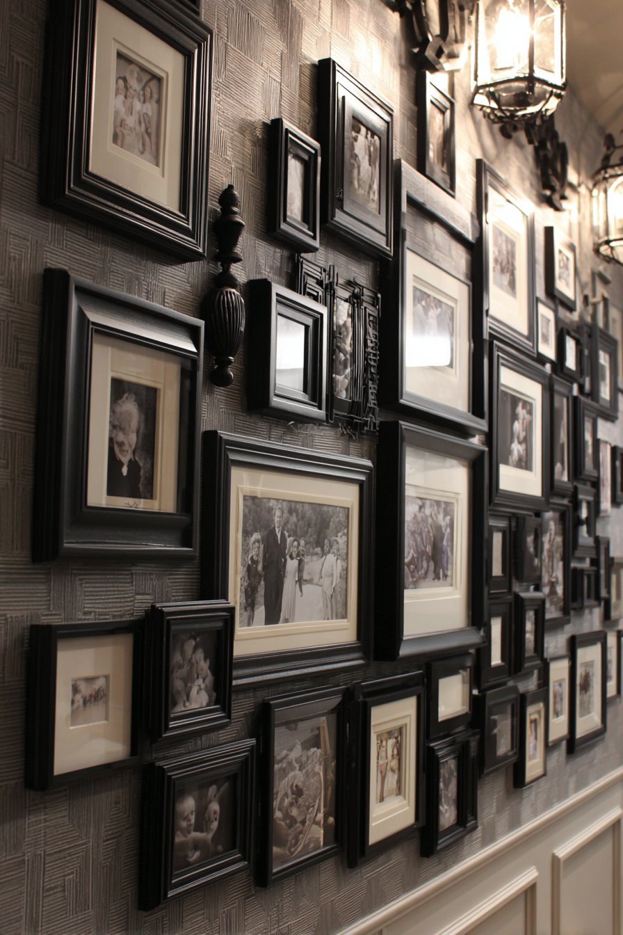
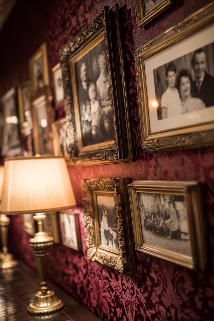
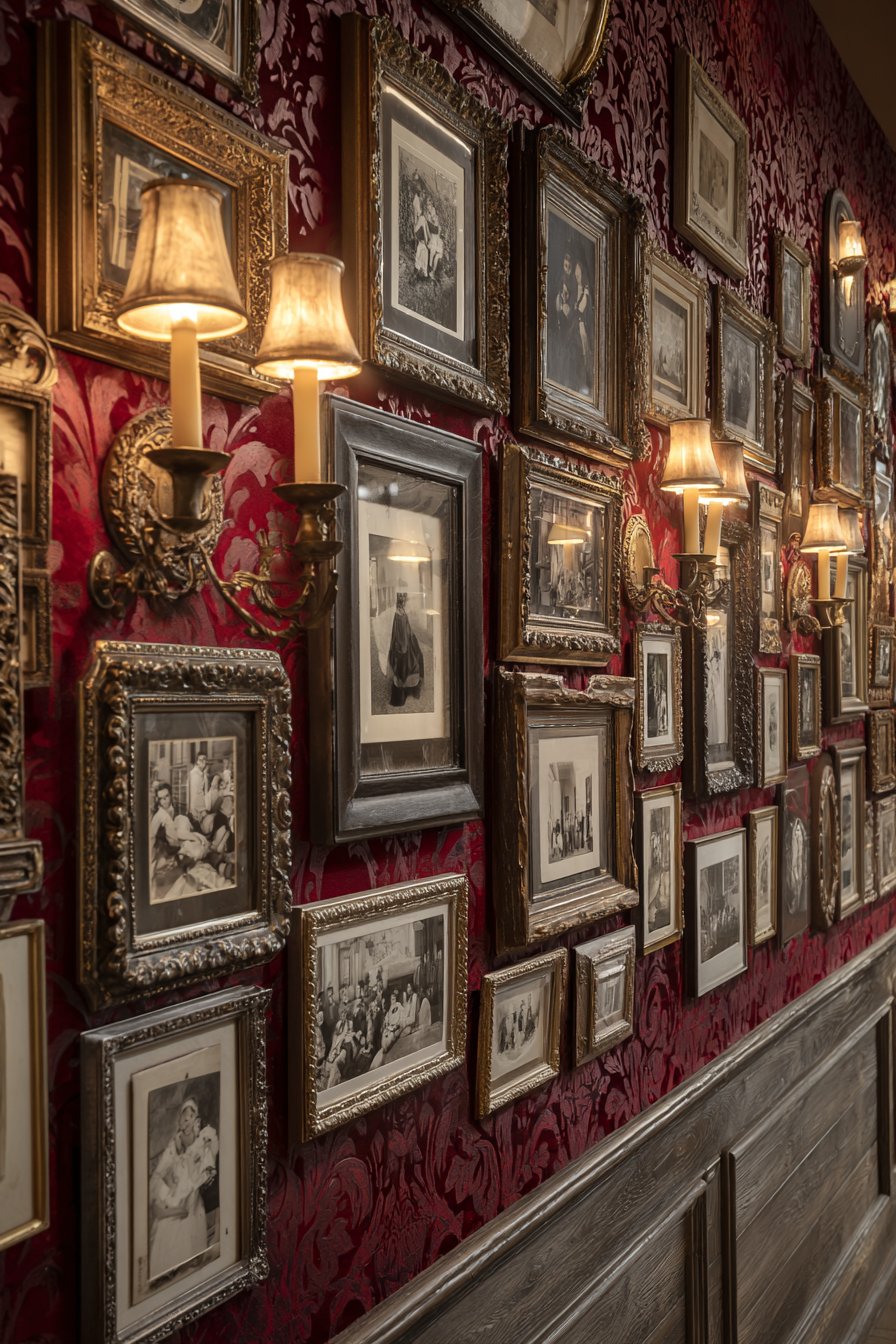
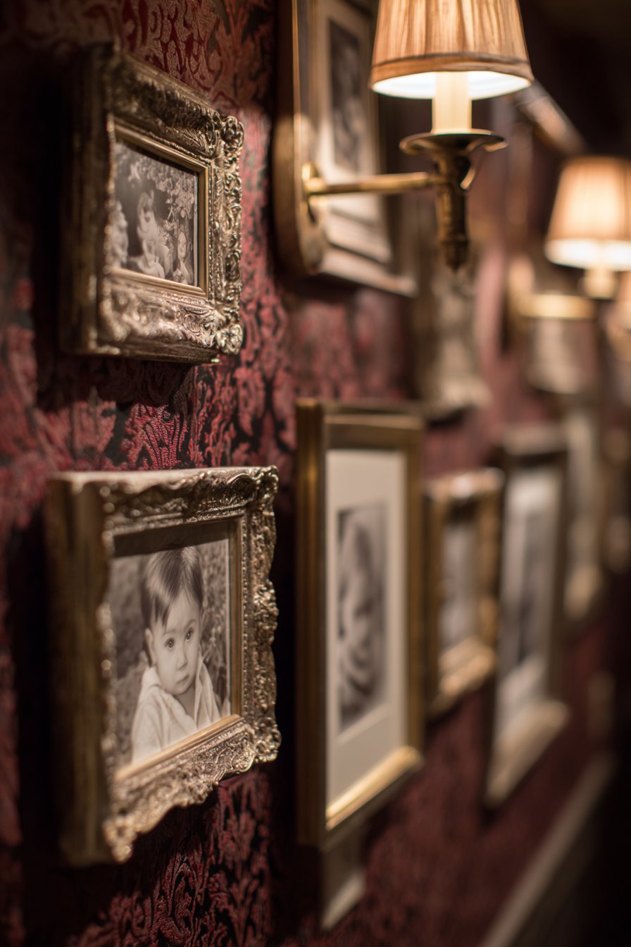
13. Traditional Salon with White Shaker Frames
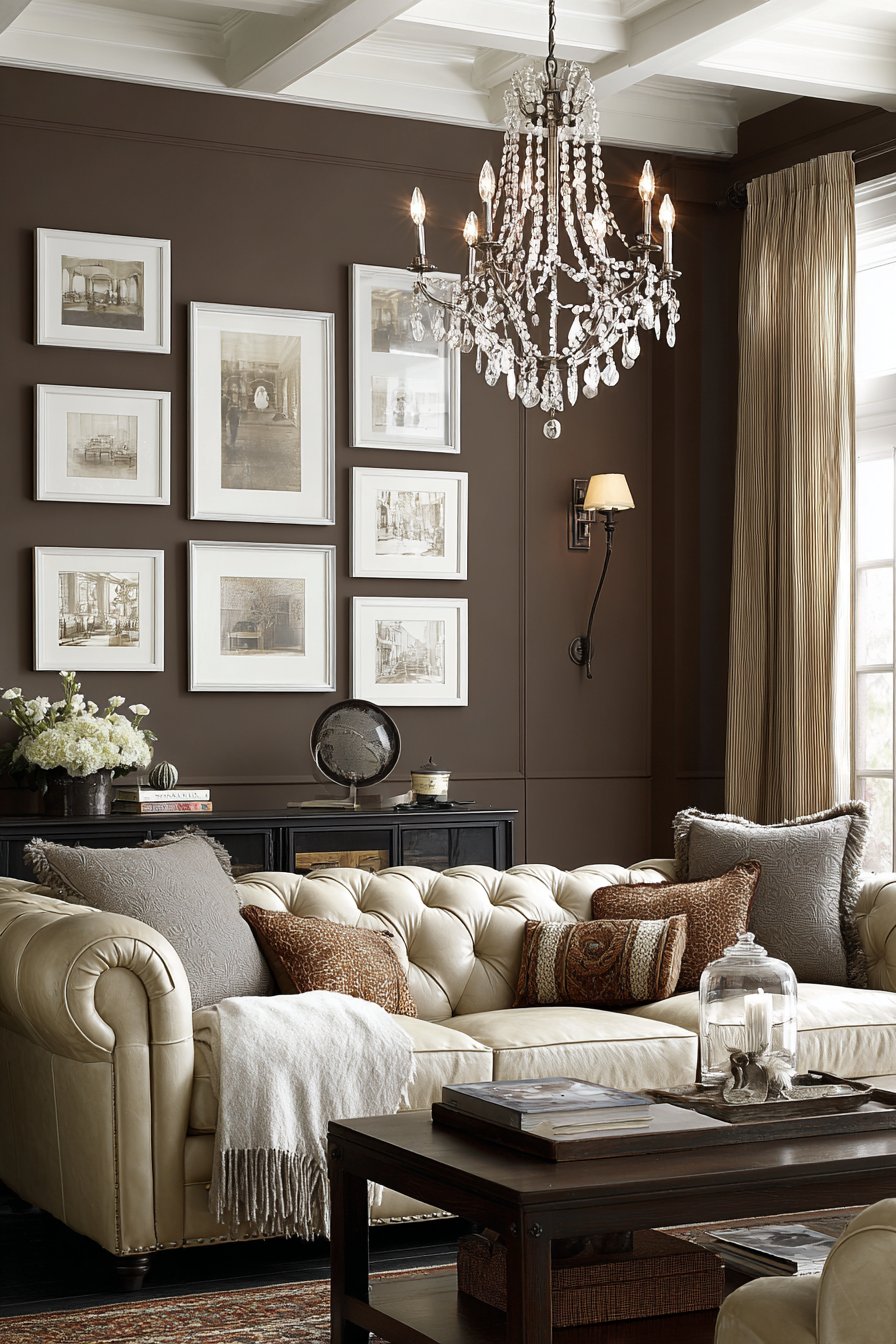
Timeless elegance characterizes this traditional salon-style arrangement featuring matching white shaker-style frames with wide mats creating gallery-quality presentation. Arranged above a Chesterfield sofa in a formal living room, the collection spans generations with consistent sepia-toned processing that creates unified sophistication across varying image ages and qualities. Crystal chandelier lighting creates refined ambiance and catches beautifully on the white frames, adding sparkle and dimension to the traditional space. This approach bridges the gap between historical salon walls and contemporary sensibilities, creating a collected look that feels both established and fresh. The formal presentation suits traditional, traditional transitional, and classic interiors where heritage and sophistication are valued design principles.
White shaker-style frames—characterized by their clean profiles, simple lines, and lack of ornate detail—offer versatility that works across multiple design styles while maintaining a traditional foundation. The wide white matting (typically 3-4 inches) creates breathing room around each photograph and lends a custom framing quality to the presentation. This generous matting also allows you to use various photo sizes within the same frame dimensions, making it easier to incorporate existing family photos without expensive reprinting. The consistent sepia processing unifies photos taken across different decades, cameras, and lighting conditions, solving the common challenge of integrating old family photos with newer images.
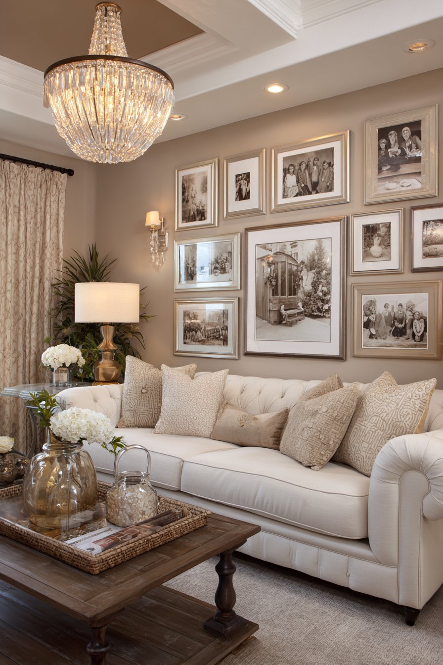
The salon-style arrangement—with frames of varying sizes covering the wall from near the ceiling to just above furniture height—creates visual richness and the sense of a carefully curated collection developed over time. Unlike rigid grids that announce themselves as deliberate design choices, salon walls feel more organic and collected, as though the family has been gradually adding meaningful images over generations. Positioning this arrangement above a classic Chesterfield sofa creates a layered, sophisticated vignette that anchors the formal living room and establishes it as a space for gathering, conversation, and family connection.
Key Design Tips: Choose shaker frames with identical profiles from the same manufacturer to ensure consistency even across varying sizes. Use custom matting services to get exactly matching mat widths across all frames. Consider sepia or black-and-white processing for all photos to create cohesion across different quality levels and time periods. Start with your largest piece positioned slightly off-center (not dead center) and build outward maintaining organic spacing. Keep the bottom edge of the arrangement roughly level, about 6-12 inches above the furniture. Vary frame sizes substantially—include some very small (5×7) and some quite large (16×20) for maximum visual interest. Use picture lights or a crystal chandelier with adequate wattage to illuminate the display properly. Polish frames seasonally to maintain the fresh white finish and prevent yellowing over time.
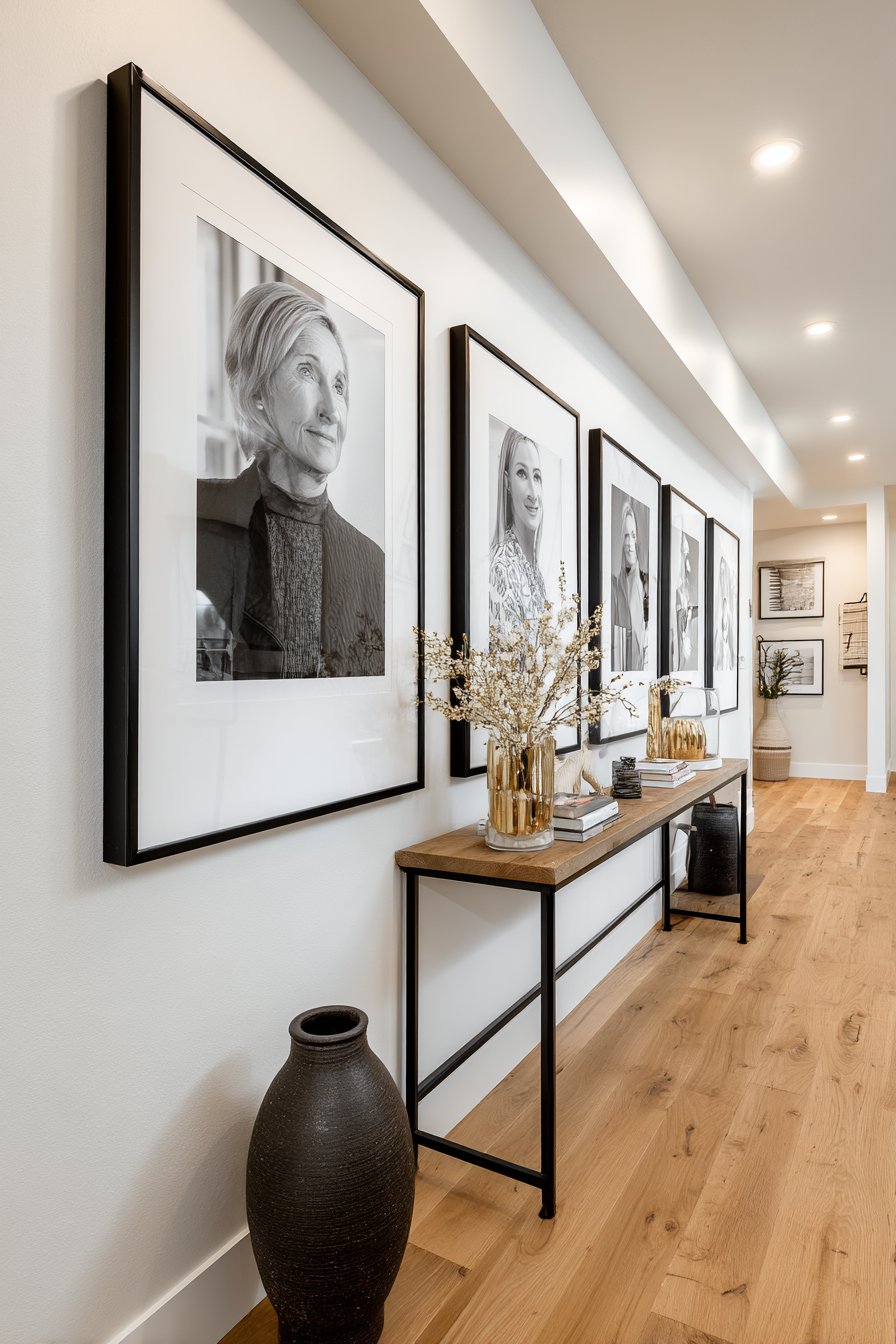
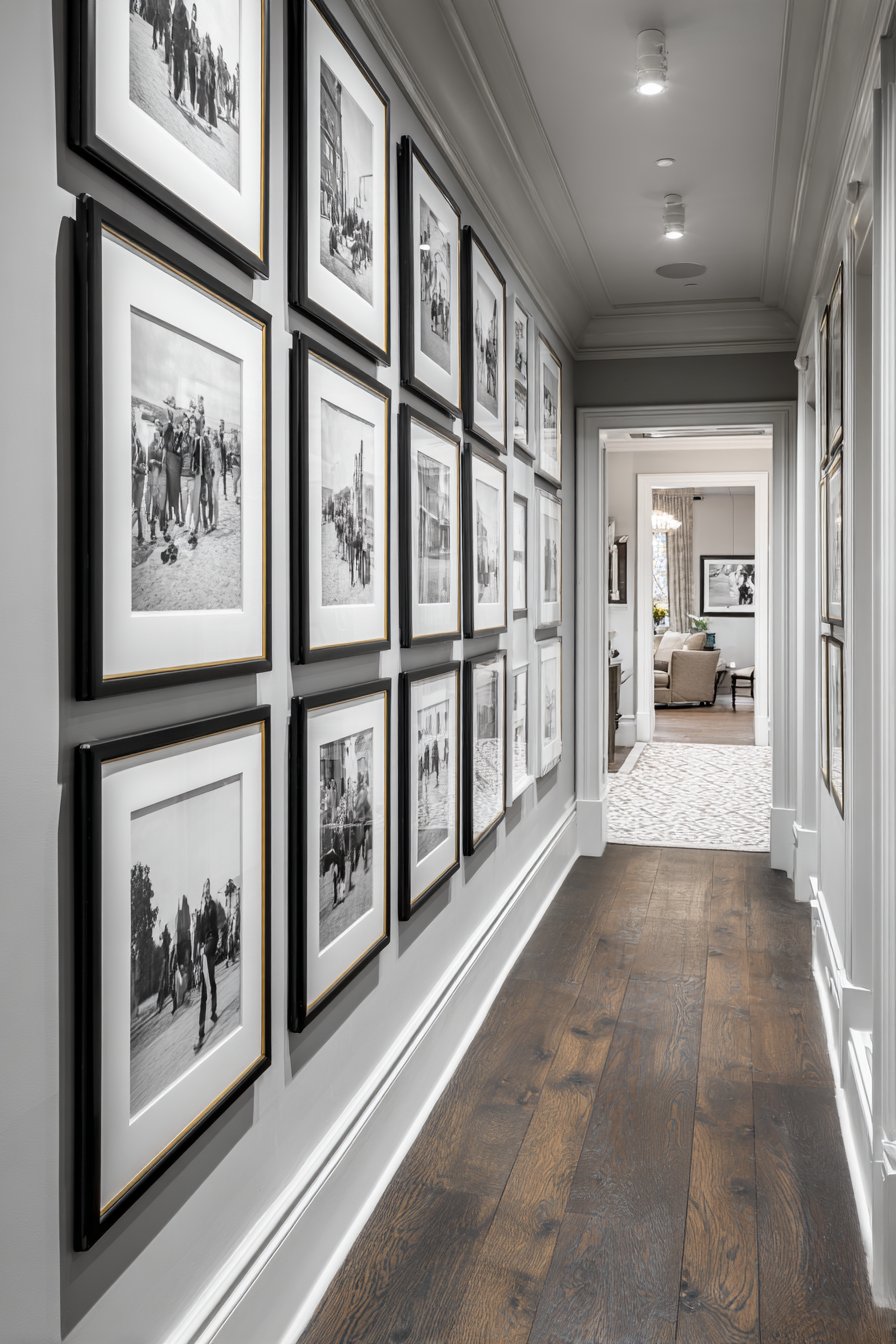
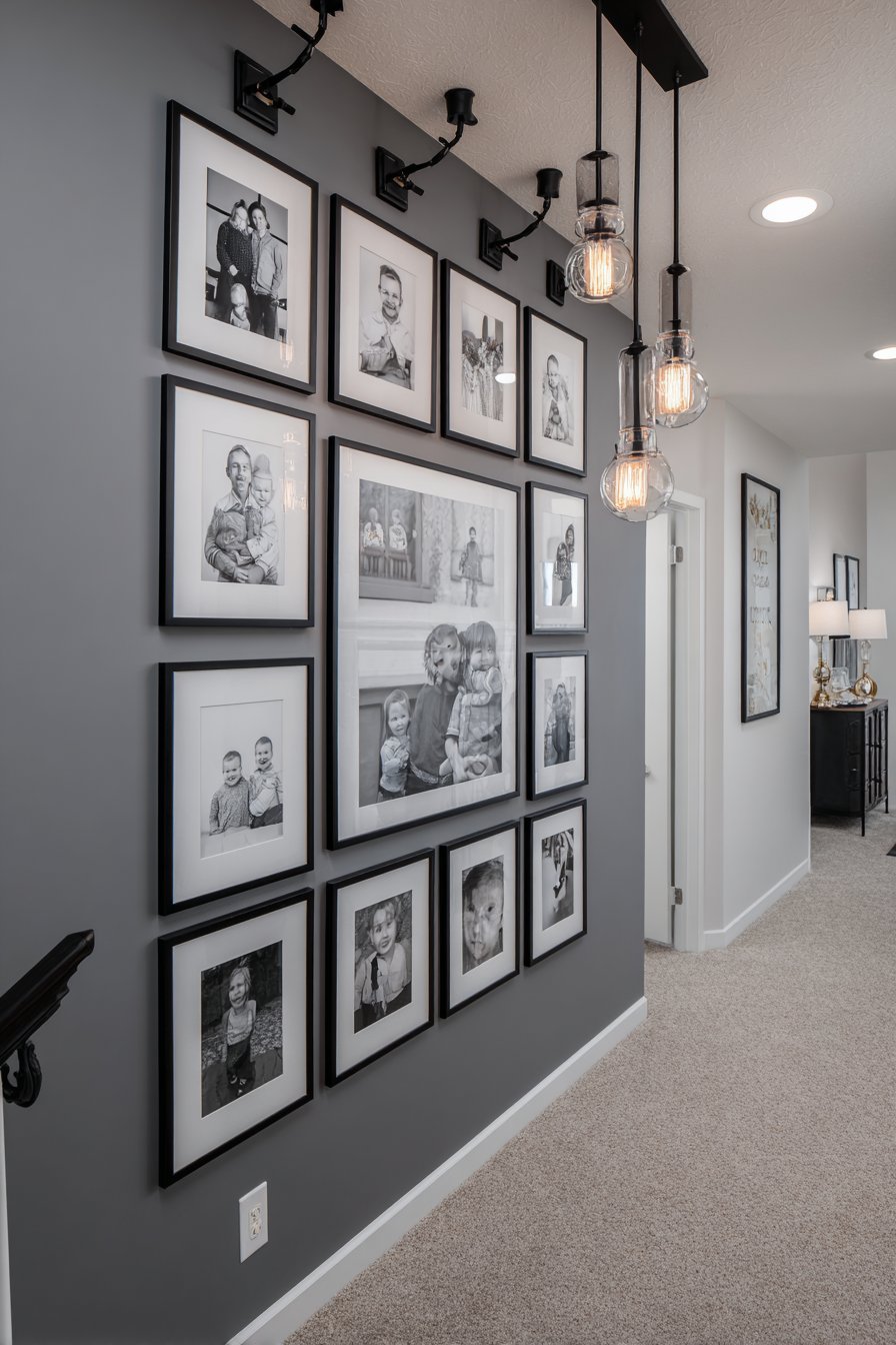
14. Modern Timeline Chronological Narrative
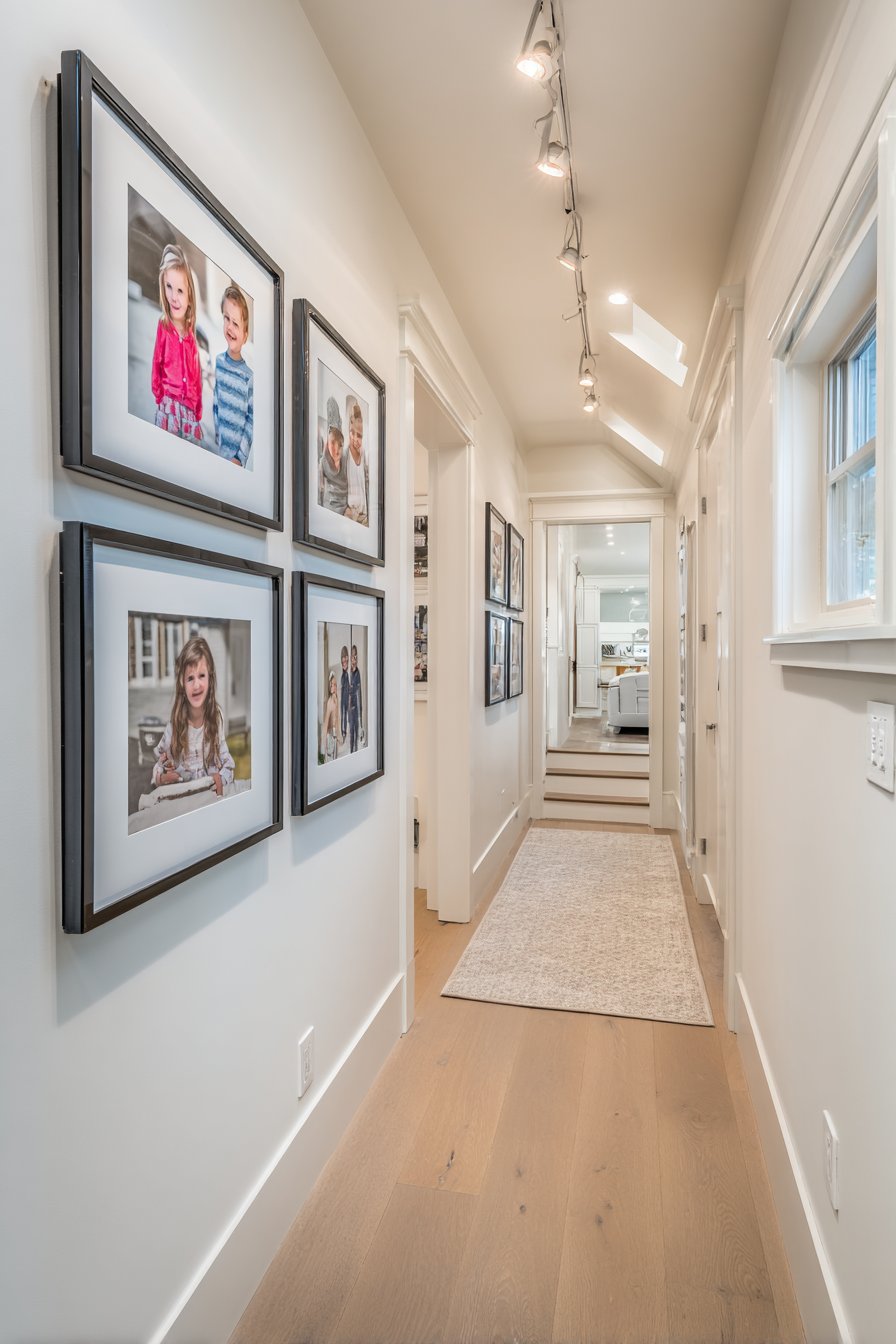
Transform family history into visual storytelling with a modern timeline concept where frames are arranged chronologically from left to right, documenting family growth, milestones, and evolution over time. Sleek black aluminum frames with thin profiles maintain contemporary aesthetic while their uniformity creates cohesion across potentially diverse photographs spanning years or decades. Mounted on a clean white wall in a hallway with consistent spacing creating visual rhythm, the arrangement invites viewers to walk along the timeline, experiencing family history as a progressive narrative. Warm LED track lighting emphasizes the linear progression and can be adjusted to highlight specific photos or time periods. This approach transforms the functional necessity of hallway walls into meaningful storytelling space that family members pass daily, creating repeated touchpoints with family history.
The chronological arrangement offers several advantages beyond aesthetic appeal. It creates natural organization that makes it easy to add new photos without disrupting the overall design—simply continue the timeline at the end. It teaches children about family history, aging, and the passage of time in concrete, visual terms. It celebrates growth and change rather than trying to present a static, unchanging family portrait. And it creates a built-in conversation framework—”this was when we lived in Boston, and this was after we moved to Denver”—that helps preserve family stories and memories for future generations.
Hallways present ideal locations for timeline galleries because they’re inherently transitional spaces that people move through rather than occupy statically. The linear nature of hallway architecture naturally supports linear narrative flow. The passage down the hall literally mirrors movement through time, creating metaphorical resonance between physical space and temporal progression. Consistent spacing between frames creates rhythm that guides viewers along the timeline while the clean white background and uniform black frames maintain clarity and prevent visual overwhelm in potentially narrow spaces.
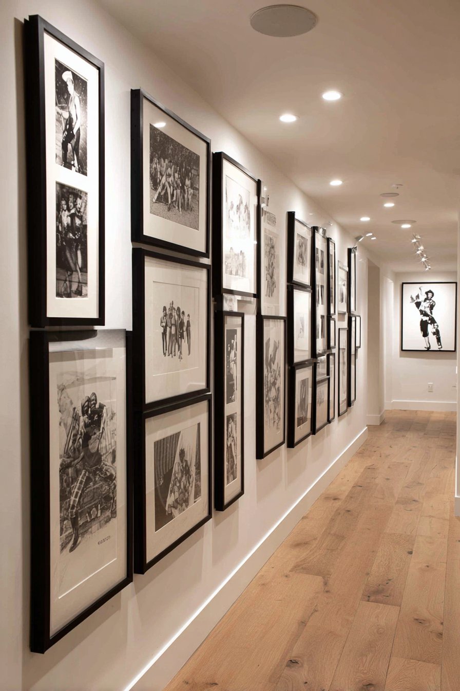
Key Design Tips: Establish a clear starting point and ending point for your timeline before installation. Maintain precisely equal spacing between all frames regardless of size—2-3 inches typically works well. Consider including dates or ages on small labels beneath each frame to reinforce the chronological narrative. Choose a consistent frame size for primary photos with optional smaller frames for supplementary images. Hang at consistent height with centers 57-60 inches from floor—this uniformity reinforces the timeline concept. Leave space at the end for future additions so you don’t need to rearrange the entire wall as years pass. Use lightweight frames appropriate for the thinner walls often found in hallways. Consider starting with earliest photos at the entrance to the space and progressing forward in time, or reverse this for dramatic effect where you walk “backward” through family history.
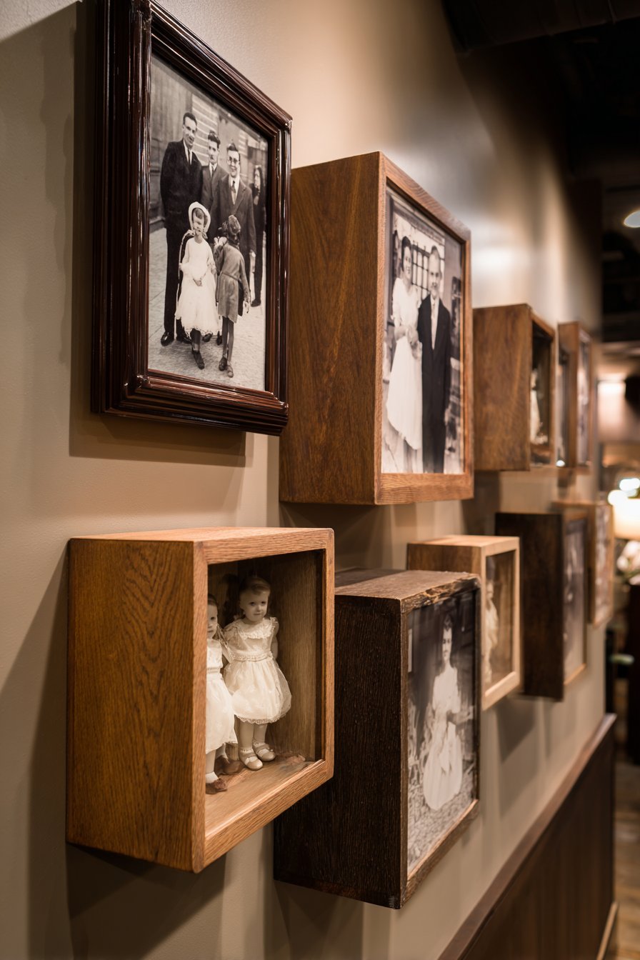
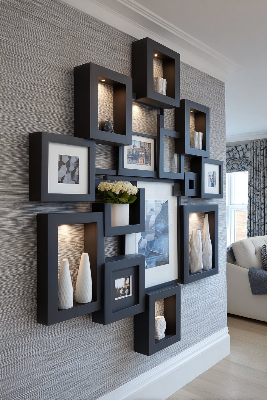
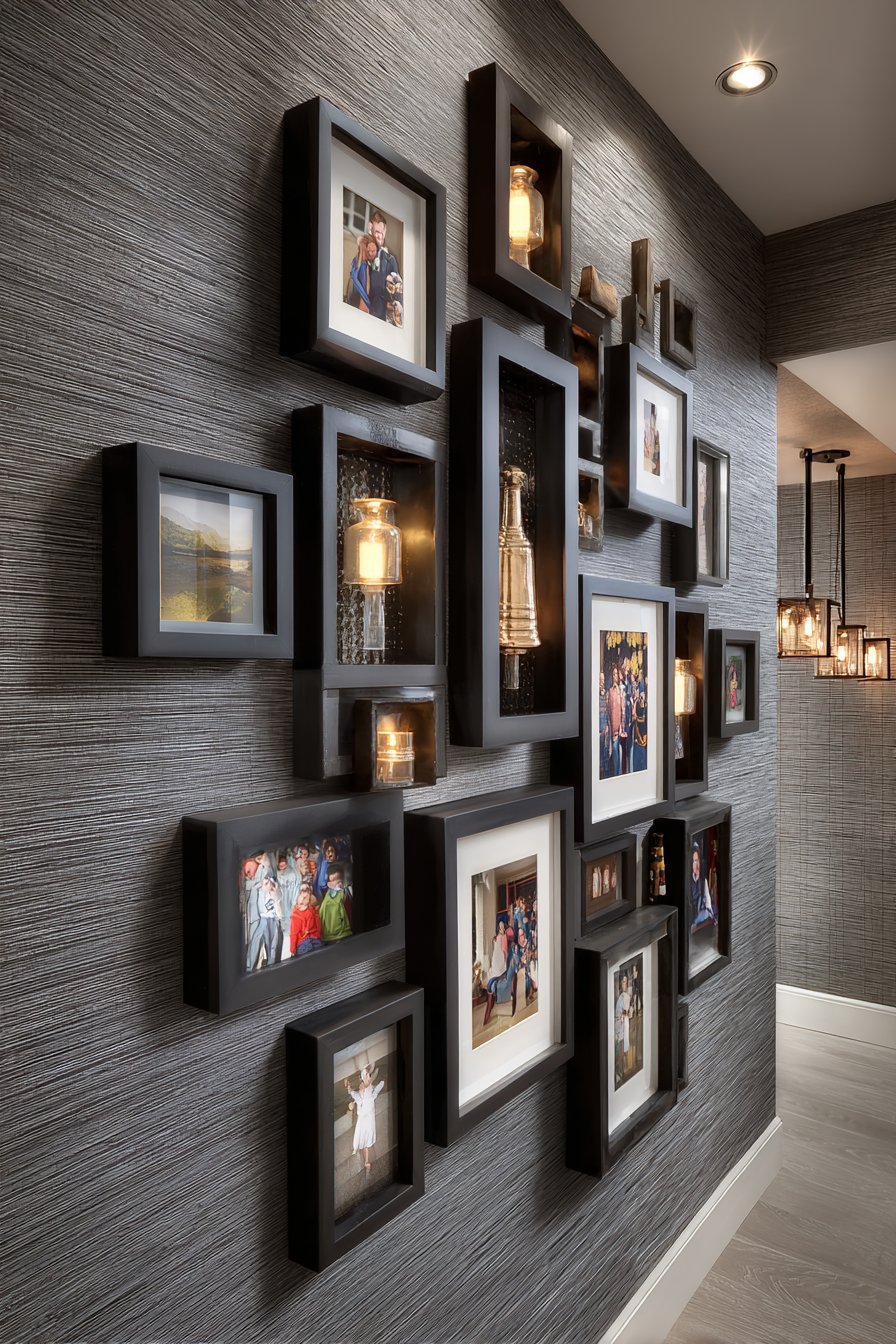
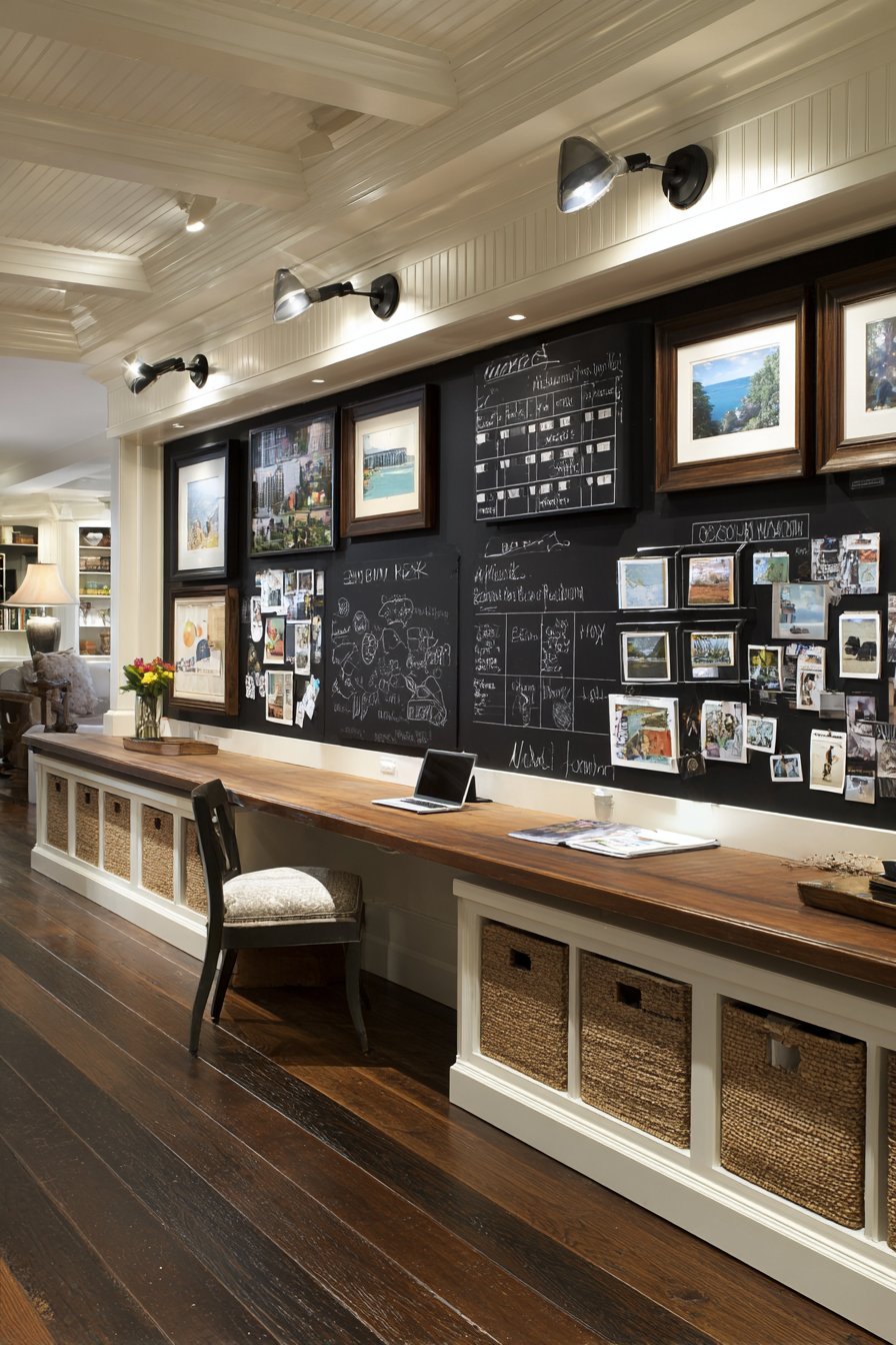
15. Mixed Media Memory Shadow Boxes
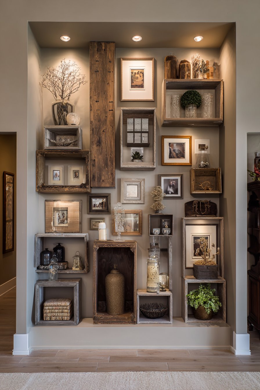
Elevate beyond traditional framed photographs with a mixed media approach combining standard photo frames with dimensional shadow boxes displaying family memorabilia and treasured objects. Natural wood shadow box frames coordinate with traditional photo frames in various wood tones, creating warmth and textural interest across the display. Arranged on a warm taupe accent wall that provides neutral backdrop without the starkness of white, the three-dimensional elements add literal and visual depth. Adjustable picture lights illuminate both flat photographs and dimensional objects, with careful positioning preventing harsh shadows on raised elements while highlighting texture and form. This approach transforms a picture wall into a memory wall that engages multiple senses and tells richer, more complex family stories.
Shadow boxes allow you to display objects that standard frames cannot accommodate—baby shoes, wedding invitations, military medals, vintage jewelry, ticket stubs from memorable trips, children’s artwork, handwritten letters, or any meaningful three-dimensional item. These objects add narrative depth that photographs alone cannot provide, giving viewers tangible connections to family history and specific moments. The dimensional variation creates visual interest and encourages closer examination—viewers naturally want to lean in to see what objects are displayed, creating more intimate engagement with family memories than flat photographs might inspire.
Successful mixed media walls require planning to maintain cohesion despite variation in frame depth, materials, and content type. The key is treating the wall as a unified composition where some elements (shadow boxes) naturally protrude while others (standard frames) remain flush, creating a sculptural quality. The wood tones provide unifying thread across different frame types, while the warm taupe wall color offers enough contrast to define edges without competing for attention. This approach works beautifully in family rooms, home offices, living rooms, and any space where family stories are valued and personal history is celebrated.
Key Design Tips: Limit shadow boxes to 20-30% of total frames to maintain balance between dimensional and flat elements. Choose shadow boxes with adequate depth (at least 2 inches) for most objects while ensuring they’re not so deep they protrude awkwardly from the wall. Carefully light dimensional elements to avoid harsh shadows that obscure objects—adjustable picture lights offer most control. Secure shadow box contents using museum putty, pins, or fabric backing to prevent items from shifting. Arrange larger shadow boxes as anchor points with standard frames filling in around them. Include labels or small cards identifying objects and their significance to preserve family stories. Choose wood tones in warm ranges—walnut, oak, pine—rather than mixing warm and cool woods. Install shadow boxes with appropriate heavy-duty anchors rated for their combined weight (frame plus contents).
16. Bohemian Eclectic Integration
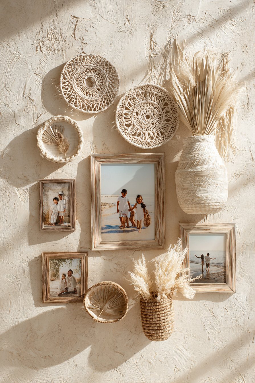
Embrace free-spirited artistry with a bohemian-inspired arrangement where family photos integrate seamlessly with macramé wall hangings, woven baskets, dried botanical elements, and natural rattan or light wood frames. This approach treats the wall as a canvas for self-expression where family photographs become part of a larger artistic composition celebrating natural materials, handcrafted elements, and organic beauty. Family photos capture outdoor adventures and casual moments that align with the relaxed, nature-connected aesthetic bohemian style celebrates. Arranged on textured cream plaster walls with organic spacing that eschews rigid structure, the composition feels collected, traveled, and personally meaningful. Soft natural light creates gentle shadows that highlight dimensional elements like macramé knots and woven textures, adding depth and visual interest throughout the day.
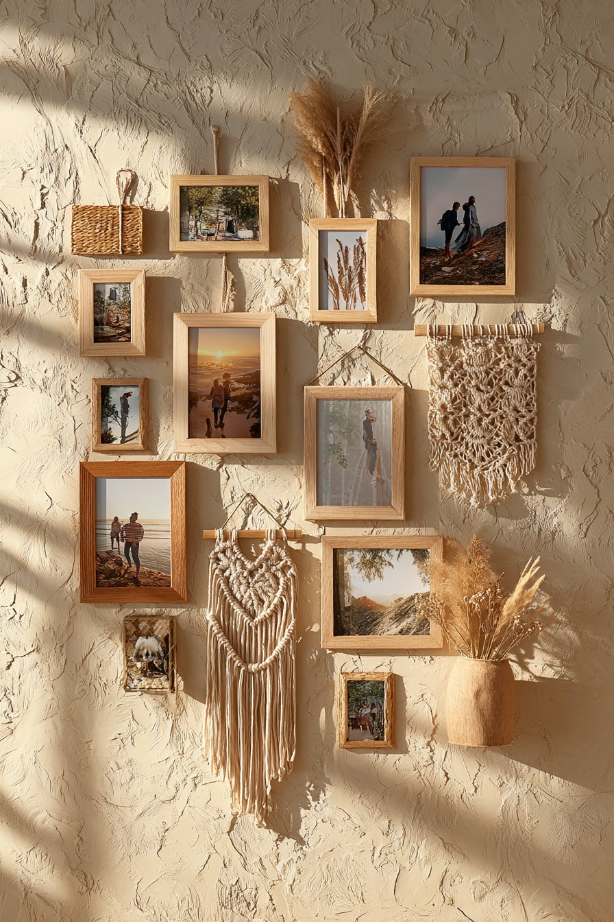
Bohemian style celebrates eclecticism, global influences, and personal expression over matchy-matchy perfection or adherence to rules. This philosophical approach extends to picture wall design, where “more is more” and layering creates richness. The integration of non-photo elements transforms what might otherwise be a standard gallery wall into something more akin to installation art—a three-dimensional composition that engages texture, form, and multiple creative disciplines. Macramé adds softness and handcrafted warmth, dried botanicals bring organic shapes and neutral tones, woven baskets add practical storage while contributing texture, and natural frame materials ensure the photographs themselves don’t feel out of place in this artful arrangement.
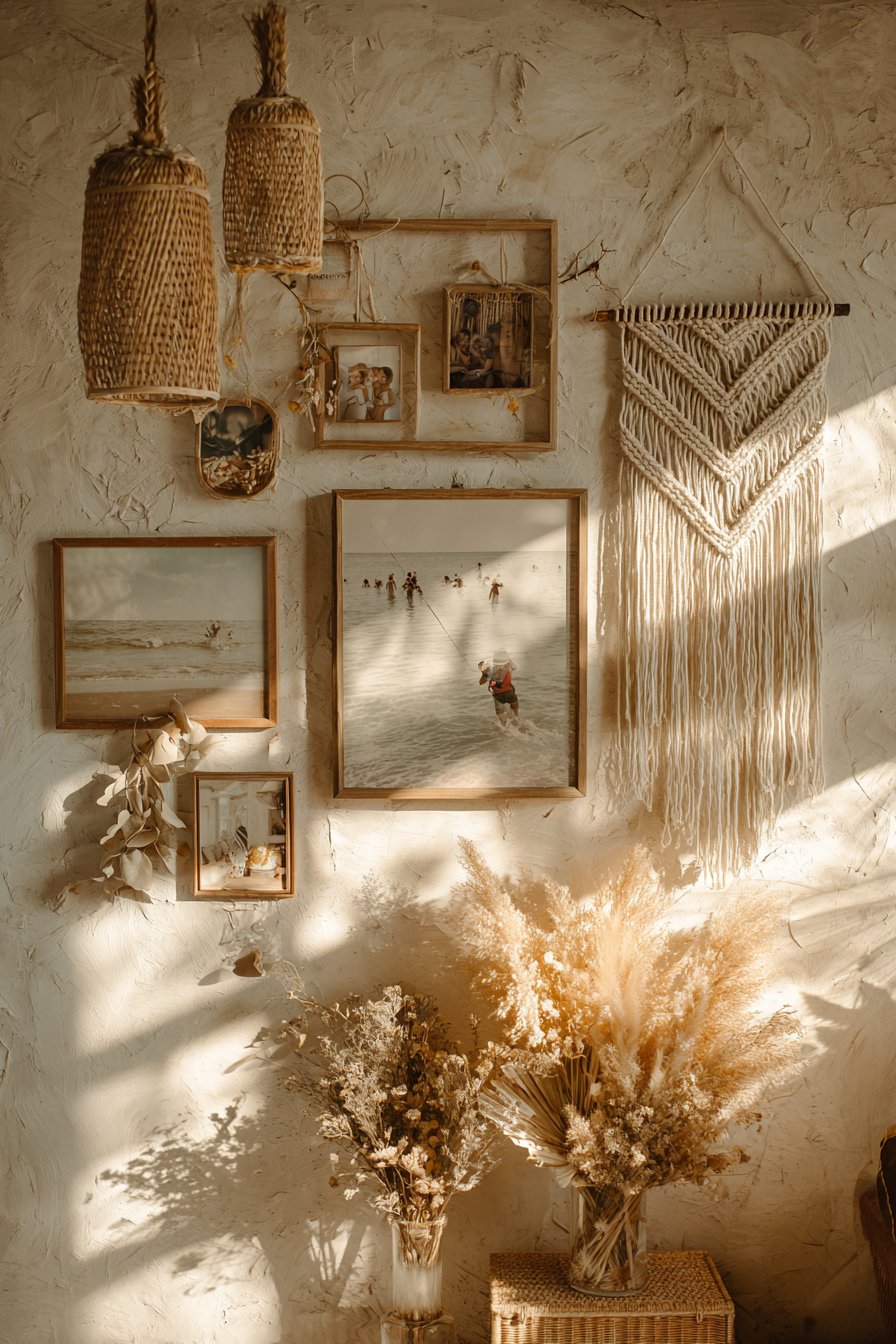
The key to successful bohemian integration is maintaining organic flow rather than forcing rigid organization. Allow frames and objects to be placed where they naturally seem to belong, trusting your instincts about balance and visual weight. Vary heights, overlap some elements, allow negative space in unexpected places, and embrace the slightly undone aesthetic that makes bohemian style so inviting and comfortable. This approach particularly suits creative individuals, free spirits, and those who value self-expression and authenticity over following design trends or maintaining formal appearances.
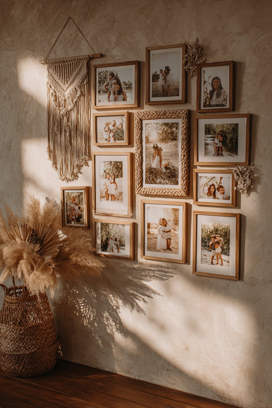
Key Design Tips: Start with macramé or other large textile pieces as anchors, then add frames and smaller objects around them. Mix at least four different material types—wood, fiber, metal, botanicals—for authentic bohemian eclecticism. Hang frames at varying heights rather than maintaining consistent baselines. Include travel photos, outdoor adventures, and candid moments rather than formal portraits for authentic bohemian spirit. Use natural, sustainable materials—rattan, bamboo, seagrass, jute—rather than synthetic alternatives. Allow some frames to hang from leather straps or rope for added textural interest. Embrace asymmetry and organic placement over mathematical precision. Layer dimensional elements with some objects overlapping others to create depth. Rotate dried botanicals seasonally to keep the display feeling fresh and connected to natural cycles.
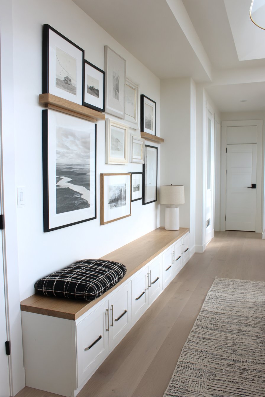
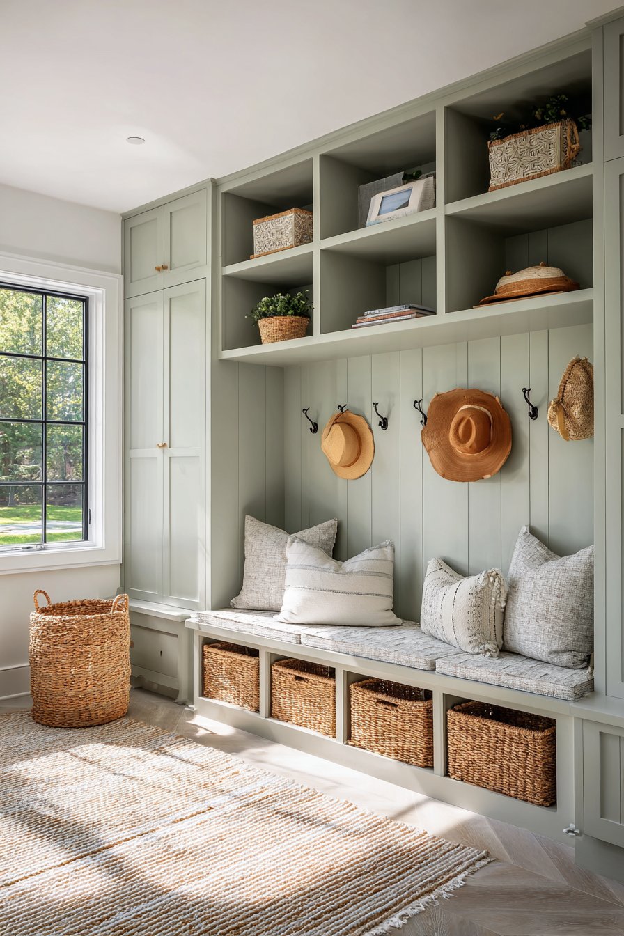
17. Practical Mudroom Family Organization
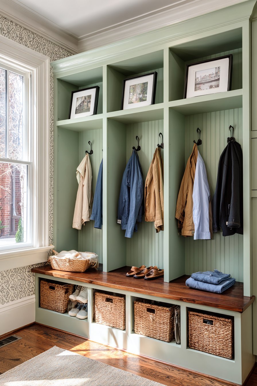
Merge function with personalization in a practical mudroom installation where individual family member sections feature framed photos above dedicated coat hooks and storage cubbies. Matching black frames with white mats create cohesive organization while each family member’s photo provides clear ownership and personalization of their designated storage area. Positioned on shiplap paneling painted soft sage green, the system creates order while maintaining warmth and welcoming character. Natural light from a side window illuminates the functional family organization system, and the photo identification helps younger children independently locate their belongings. This approach demonstrates how picture walls can serve practical purposes beyond pure decoration, creating systems that enhance daily life while celebrating family identity.
Mudrooms face unique challenges as high-traffic transition zones between outdoors and indoors. They must handle messy boots, wet coats, school backpacks, and sports equipment while maintaining some degree of aesthetic appeal. By incorporating family photos directly into the organizational system, you transform purely functional elements into personalized spaces that feel intentional and welcoming rather than purely utilitarian. The photo above each station accomplishes several goals: it clearly designates ownership, it adds warmth and personality to what could otherwise feel like garage storage, it teaches young children recognition and independence, and it reminds family members daily that this home values organization as an expression of care for one another.
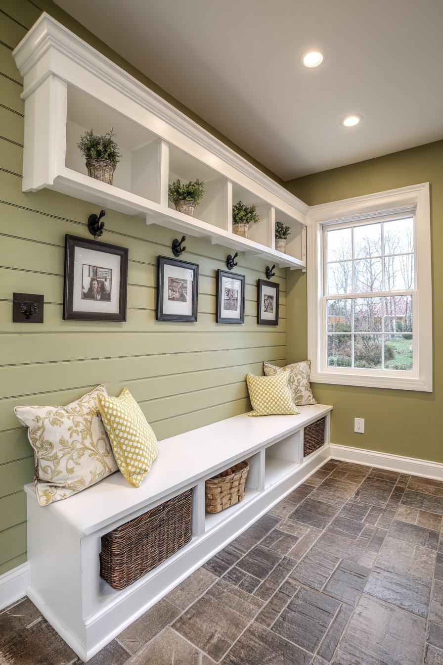
The matching black frames with white mats create cohesion across multiple family member stations while the consistent styling prevents the space from feeling chaotic despite potentially varied photo styles and subjects. The shiplap paneling provides durable, washable wall surface appropriate for mudroom use while adding architectural interest. Soft sage green offers a refresh alternative to basic white while maintaining neutral versatility that coordinates with varied coat colors, backpack styles, and seasonal accessories. The incorporation of hooks directly beneath each photo and cubbies below creates a complete three-tier system: visual identification (photo), medium-term hanging storage (hooks), and enclosed storage (cubbies).
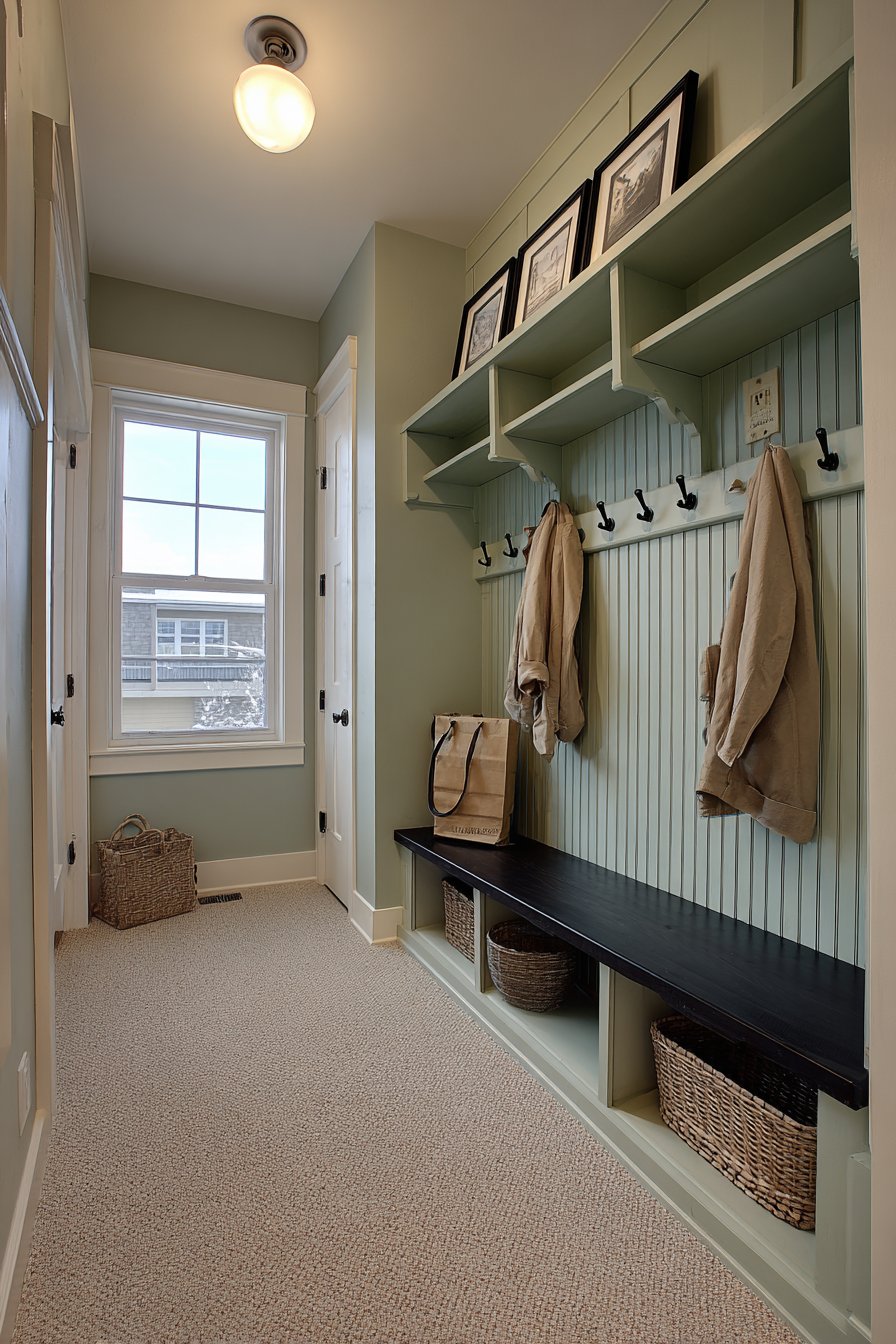
Key Design Tips: Size frames appropriately for the space—8×10 typically works well above storage stations. Install frames high enough to avoid contact with hanging coats and bags. Use matching frames across all family members to create cohesion and fairness (avoiding “favorites”). Include individual names on or beneath frames for children learning to read. Choose photos showing each person’s face clearly for easy identification. Install hooks rated for heavy loads—winter coats can be surprisingly heavy. Consider including a few extra hooks and empty frame spots for guests or future family additions. Use wipeable frame materials or add protective glass that can be cleaned easily. Refresh photos annually or when family members’ appearances change significantly to maintain recognition utility. Consider adding small chalkboards or dry-erase boards beneath each station for notes, schedules, or reminders specific to that family member.
18. Dramatic Two-Story Foyer Gallery
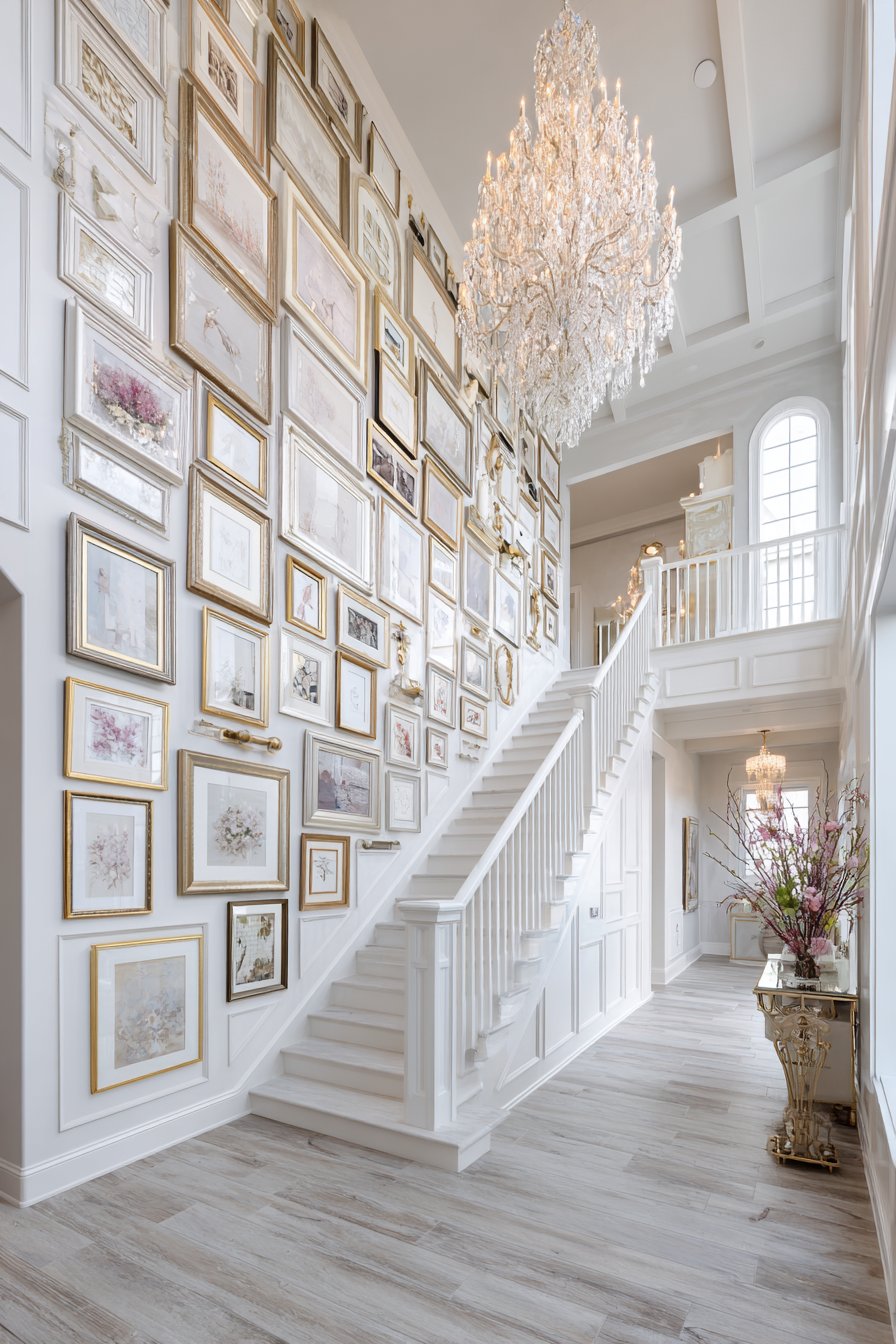
Make a grand entrance with a floor-to-ceiling gallery wall in a two-story foyer where frames extend up the full height of the architectural space, creating impressive vertical impact. This professional installation features graduating frame sizes that create proper scale proportion—larger frames at eye level transitioning to progressively smaller pieces as the wall ascends. Mixed gold and silver metallic frames add luxury and sophistication while the variety prevents monotony across the substantial wall space. A grand chandelier provides elegant illumination from above, supplemented by wall sconces at intervals that ensure even lighting coverage across the entire vertical span. This dramatic approach suits homes with significant architectural presence and transforms the foyer into an impressive family portrait gallery that announces the home’s personality from the moment guests enter.
Two-story spaces present both opportunity and challenge for picture wall design. The opportunity lies in the dramatic scale and visual impact achievable with such height—few design elements create more immediate “wow factor” than a well-executed two-story gallery wall. The challenge involves practical installation difficulties, ensuring proper scale proportion (photos sized for viewing from floor level can appear tiny from upper floor perspectives), and maintaining visual cohesion across such substantial square footage. Professional installation often makes sense for these projects given the ladder work, precise planning, and safety considerations involved.
The graduating frame sizes solve a critical challenge of tall gallery walls: maintaining appropriate visual weight distribution. Larger frames (16×20, 20×24, or even larger) positioned at primary eye level (6-8 feet up from floor) provide substantial visual anchors while progressively smaller frames scaling upward prevent top-heavy appearance and create natural visual flow. The mixed metallics add richness and reflect light beautifully—important considerations in foyers that often lack natural window light and rely primarily on artificial illumination. The grand chandelier becomes not just lighting but a design element that crowns the gallery wall, creating a cohesive architectural statement.
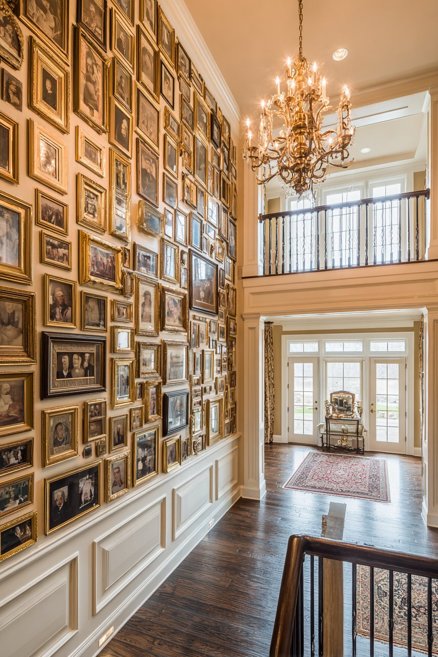
Key Design Tips: Hire professional installers for safety and proper execution of tall installations. Use a telescoping platform or scaffolding rather than ladders for safe access during planning and installation. Create a full-scale paper template on the floor to visualize the complete arrangement before drilling any holes. Start installation from the middle of the wall (at primary eye level) and work both up and down from there. Include at least one very large anchor piece (24×36 or larger) near the center to establish strong visual foundation. Ensure adequate lighting at multiple heights—foyer chandeliers typically don’t illuminate lower portions effectively. Use museum-quality hanging systems rated for the combined weight of large frames. Consider the view from both first floor and second floor balconies—the wall should look intentional from both perspectives. Include some larger-scale images at upper reaches so they remain visible from the first floor. Maintain consistent spacing despite varying sizes for visual cohesion across the grand scale.
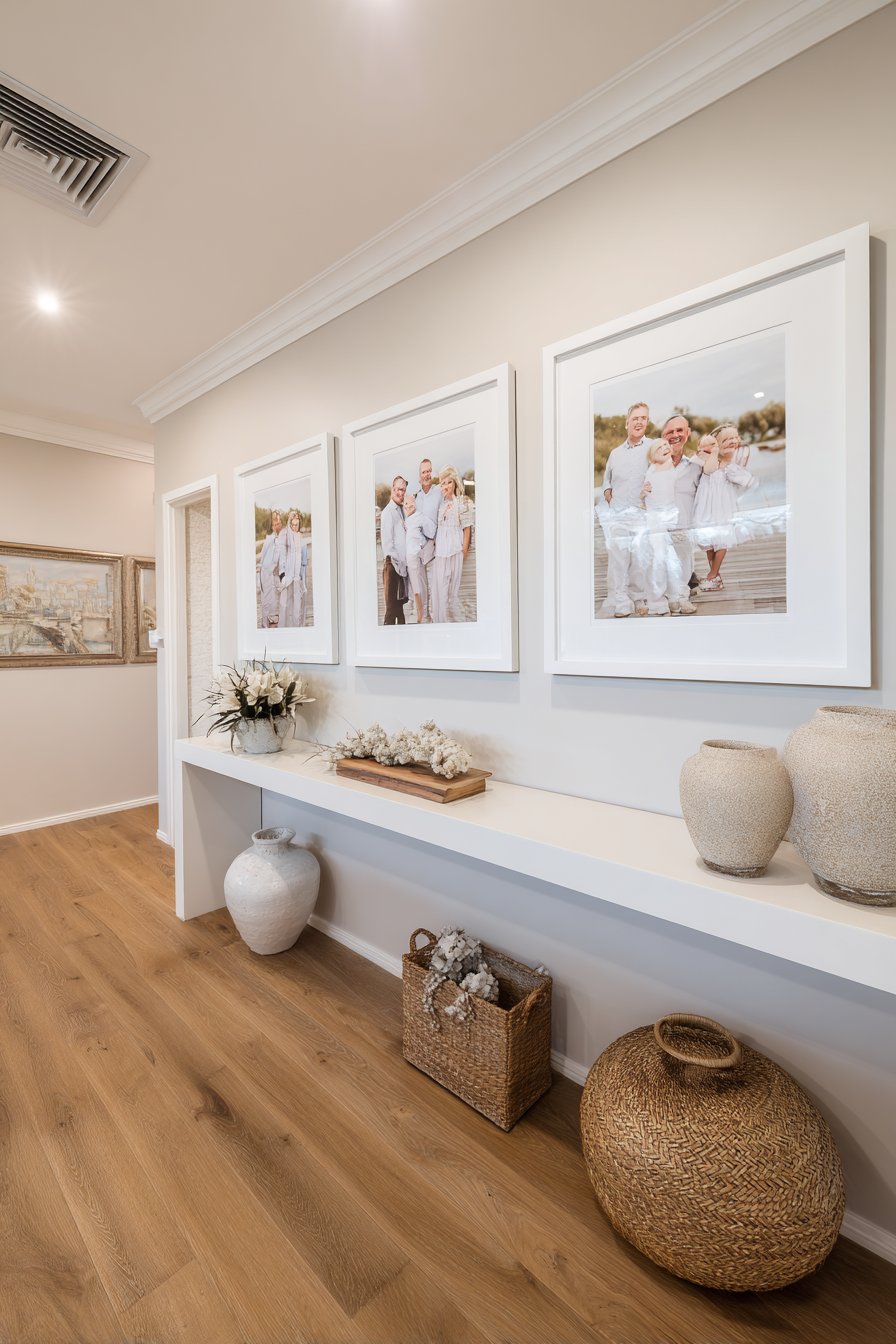
19. Coastal Vacation Memory Display
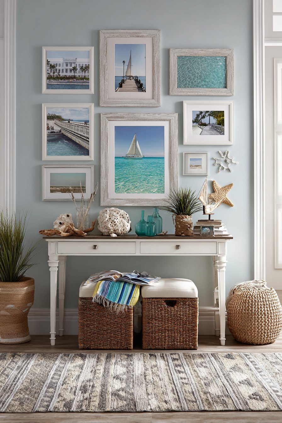
Capture beachy tranquility with a coastal-inspired collection featuring weathered white and driftwood-finish frames arranged above a console table styled with beach elements like coral, shells, and sea glass. Family vacation photos and seaside memories create thematic cohesion that transports viewers to favorite beach destinations with every glance. Displayed against soft blue-grey walls that evoke oceanic calm without literal wave patterns or nautical clichés, the arrangement creates relaxed sophistication appropriate for any room in the home. Natural daylight with the quality of sea-breeze brightness streams through nearby windows, creating the airy, fresh atmosphere characteristic of coastal design. This approach works beautifully in beach houses, coastal homes, or anywhere you want to evoke vacation serenity in daily life.
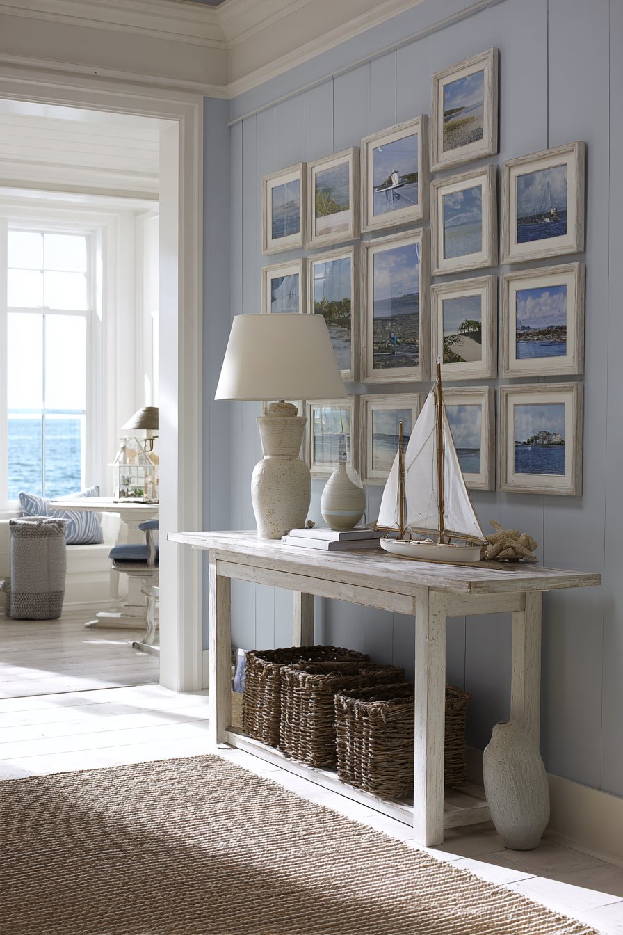
Coastal style has evolved significantly from the heavy-handed nautical themes of past decades. Contemporary coastal design emphasizes natural materials, weathered textures, soft color palettes, and organic elements over literal anchors, ships wheels, and navy stripes. The weathered white frames—which can be actual driftwood, painted wood with distressed finish, or new frames treated to look aged—reference beach-combed treasures without feeling literal or themed. These frames work beautifully with the soft blue-grey walls, creating a palette inspired by sand, sea, weathered dock wood, and sea glass rather than primary blue and white.
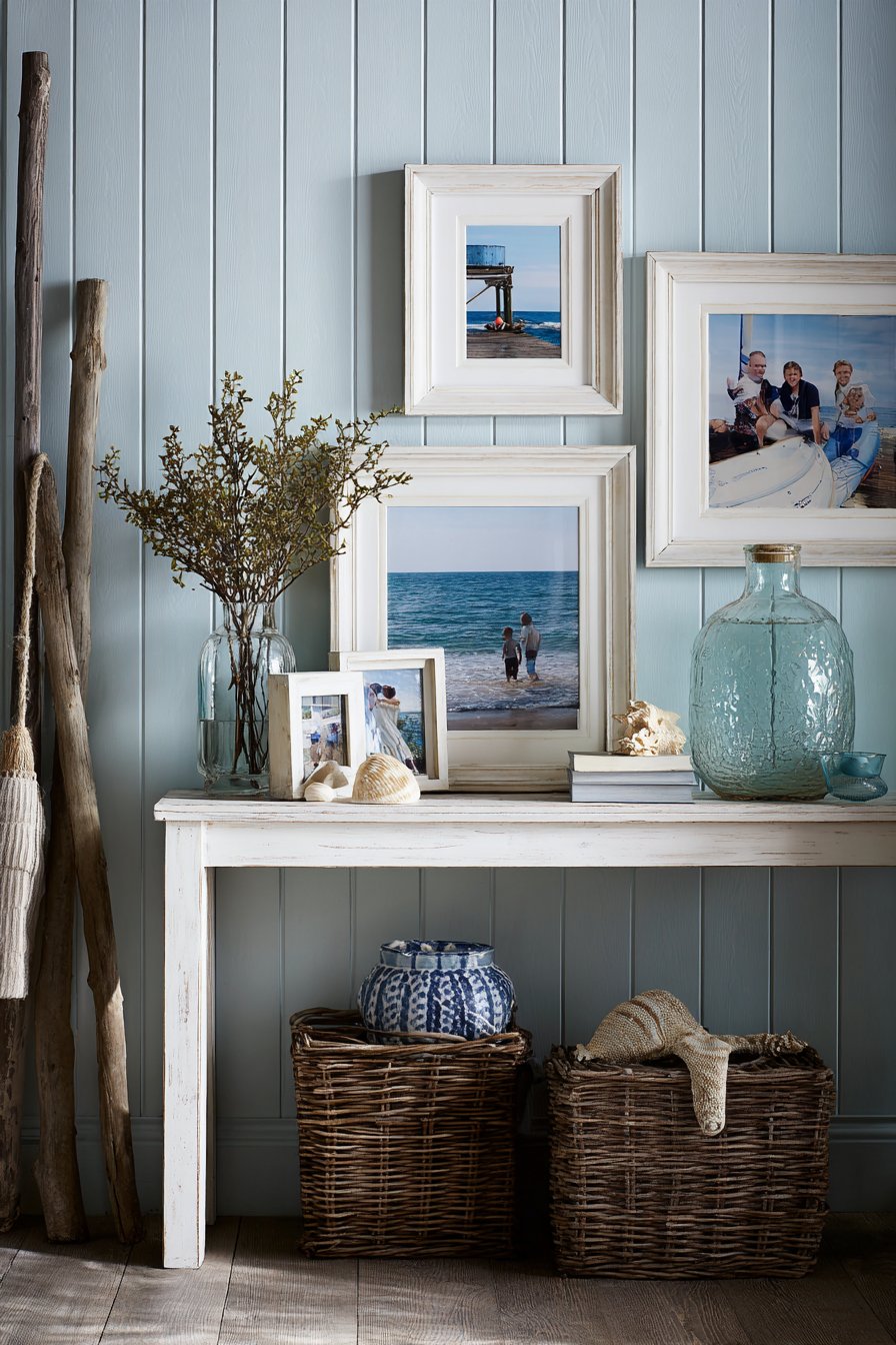
The console table styling beneath the frames extends the coastal theme three-dimensionally, but restraint remains important. A few carefully selected pieces—perhaps a piece of coral in a hurricane glass, a collected shell displayed on a small stand, or a glass vessel filled with sand from favorite beaches—suffice to reinforce the theme without overwhelming the space. The family vacation photos themselves provide the strongest thematic connection, capturing beach days, sunset walks, sandcastle building, and seaside explorations. These images naturally coordinate through shared environments, lighting quality, and casual clothing that beach vacations inspire.
Key Design Tips: Choose frames with authentic weathering rather than obviously artificial distressing. Limit your palette to coastal neutrals—whites, creams, weathered greys, soft blues, sandy beiges. Display only family photos taken at beaches or coastal locations for authentic thematic coherence. Style the console table beneath sparingly with natural beach elements rather than manufactured nautical décor. Use soft, diffused lighting that mimics the quality of natural light near water. Include photos showing the beach environment—waves, dunes, sunsets—not just people at the beach to capture the full sense of place. Consider adding a subtle coastal scent—sea salt or beach linen—to engage multiple senses. Replace photos seasonally if desired, rotating between different beach vacation years to keep the display feeling fresh. Choose photos with similar color temperatures (warm golden hour versus cool overcast) to maintain cohesive mood across images.
20. Modern Farmhouse Barnwood Statement
Embrace modern farmhouse aesthetics with oversized barnwood frames in natural reclaimed wood finishes displaying large family portraits in a simple three-frame horizontal lineup. Positioned above a rustic wooden mantel with cotton stem arrangements and farmhouse-style decorative objects, the arrangement creates substantial visual presence without complexity. Crisp white shiplap walls provide clean backdrop that allows the natural wood tones and family images to shine without competition. Soft natural light from plantation shutters creates gentle striped shadow patterns that add architectural interest and enhance the relaxed, approachable quality characteristic of modern farmhouse design. This approach proves that sometimes three perfectly chosen pieces create more impact than thirty smaller ones.
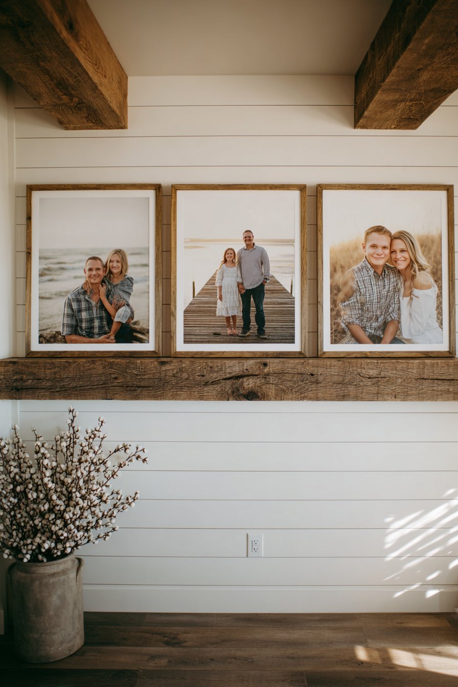
Modern farmhouse style has dominated residential interior design for good reason—it successfully marries rustic charm with contemporary cleanliness, creating spaces that feel both collected and curated, relaxed and intentional. The style embraces natural materials like reclaimed wood while favoring clean lines and simplified compositions over ornate details. Oversized barnwood frames exemplify this balance perfectly: the reclaimed wood adds authentic character, history, and texture while the large scale and simple three-frame composition maintain contemporary sensibility. The frames themselves become design elements equal to the photographs they contain.
The mantel placement grounds the arrangement and creates a complete vignette where wall art, architectural element (mantel), and styling (cotton stems and décor objects) work together as unified composition. Mantels naturally draw the eye as architectural focal points, making them ideal locations for important family displays. The three-frame approach—rather than overwhelming gallery walls—maintains the restrained quality that distinguishes modern farmhouse from more maximalist styles. Each photograph can be truly large format (20×24 or even 24×36) without overwhelming the space, creating powerful presence through scale rather than quantity.
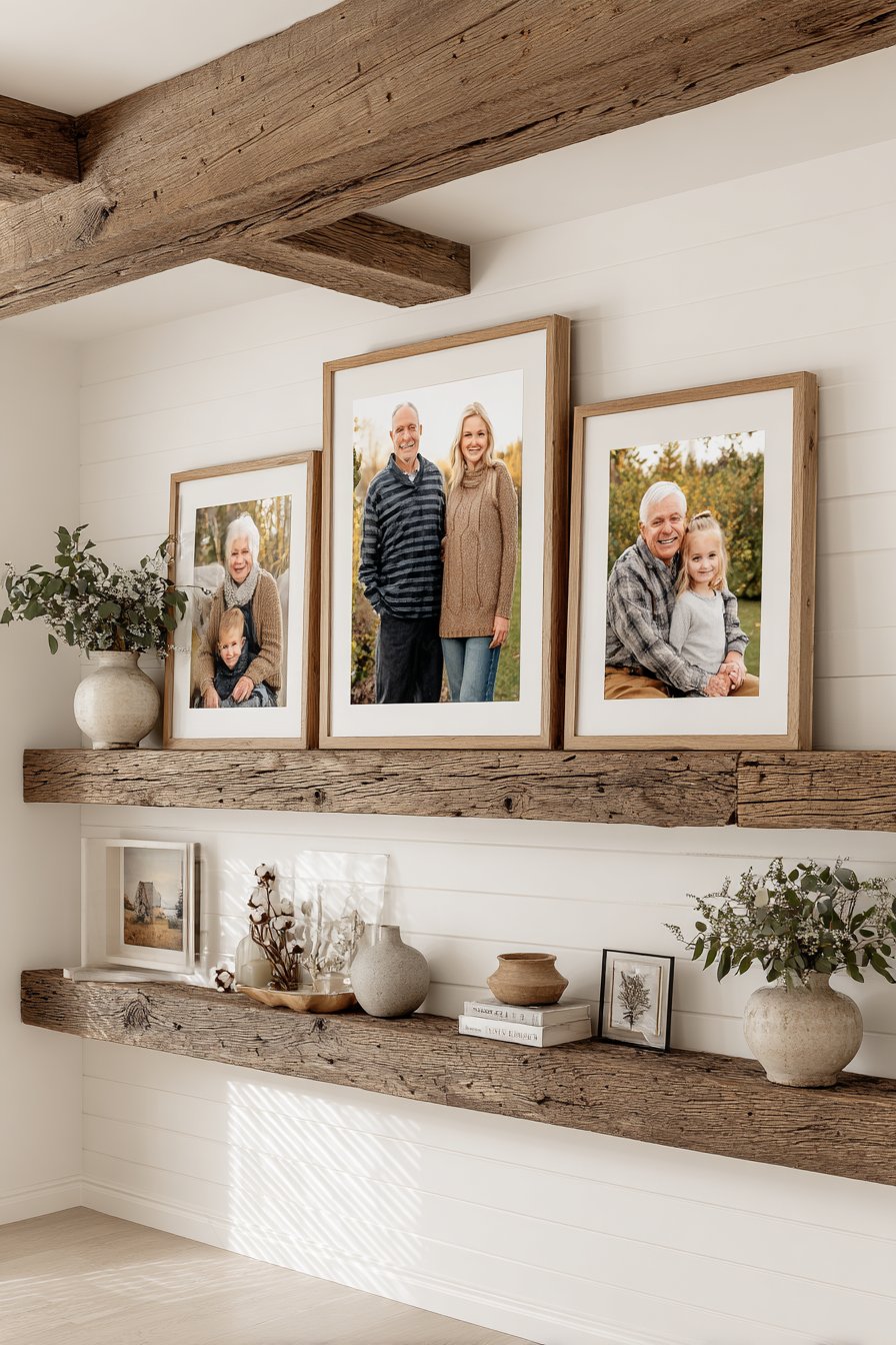
Key Design Tips: Invest in authentic reclaimed barnwood frames or high-quality reproductions that accurately replicate weathered wood characteristics. Size frames substantially—at least 20×24 inches each for proper impact at this scale. Maintain equal spacing between the three frames, typically 4-8 inches depending on overall wall width. Choose photos with similar tonal qualities and lighting—perhaps all taken outdoors during golden hour, or all in similar interior settings. Hang frames so the bottom edges align rather than centering each frame individually for clean horizontal baseline. Style the mantel beneath with restraint—modern farmhouse favors edited collections over crowded surfaces. Use plantation shutters or simple white curtains that filter light softly rather than heavy drapes that block natural light. Include some greenery—cotton stems, eucalyptus, or simple branches—to soften the composition and add organic elements. Consider seasonal updates to mantel styling while keeping frames constant for flexibility without commitment to complete redesign.
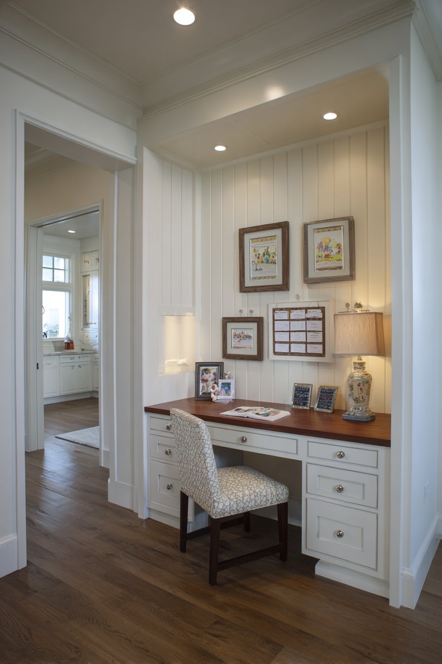
21. Professional Office Integration

Balance professionalism with personality in a home office or study wall arrangement combining professional family portraits with inspirational quotes in matching thin black frames with generous white matting. The grid-based layout creates formal organization appropriate for professional environments where clients might visit or video calls occur regularly, while the family content maintains warmth and personal connection. Positioned on charcoal grey walls that add sophistication without the severity of pure black, the display works equally well behind a desk or on an adjacent wall within camera frame. Brass desk lamp lighting creates focused illumination with warm undertones that prevent the space from feeling cold or corporate despite its professional presentation. This approach demonstrates how family picture walls can adapt to various functional needs while maintaining aesthetic integrity.
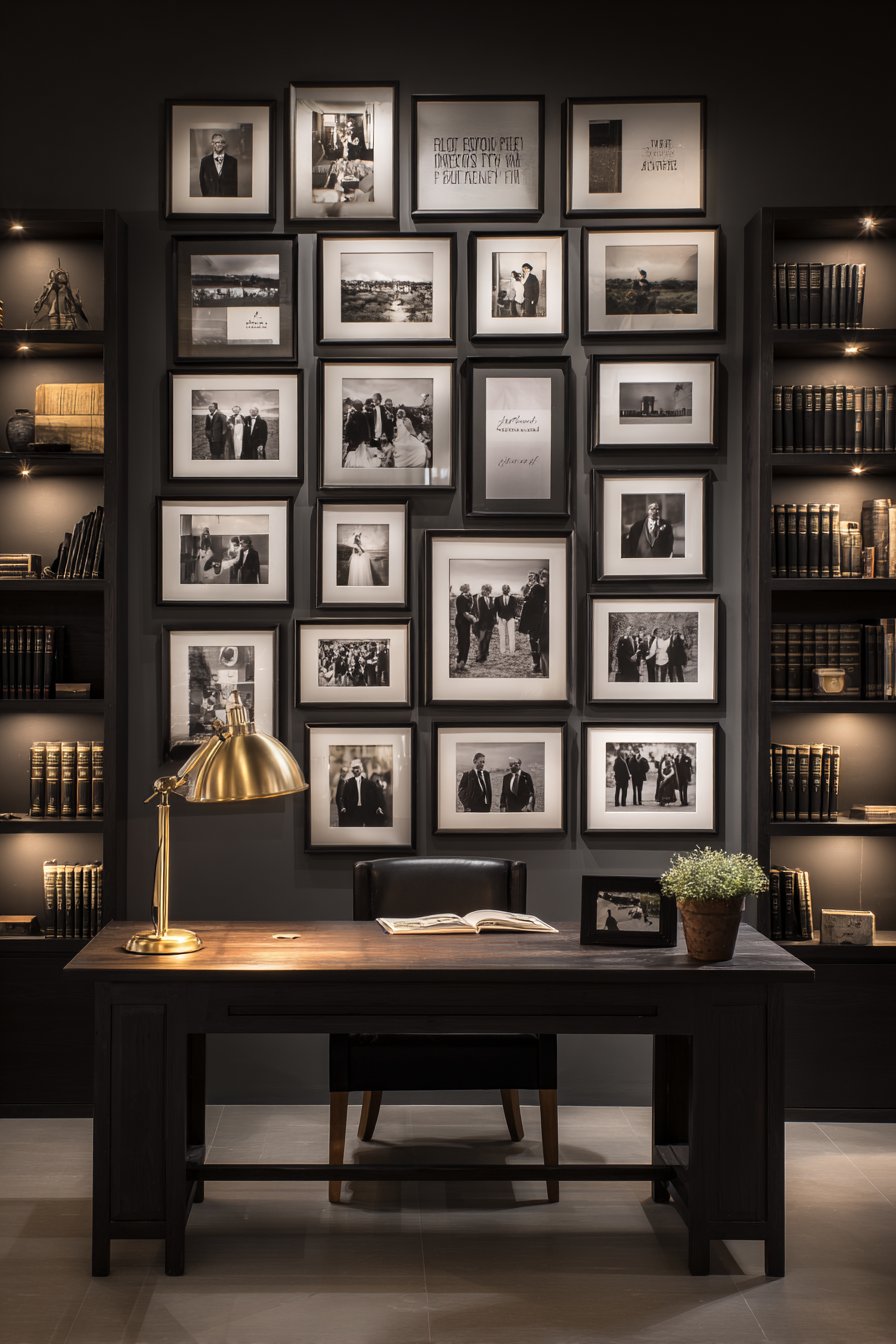
Home offices occupy an interesting position in residential design—they’re private spaces within our homes yet public-facing when we conduct video calls, meet with clients, or photograph our work environments for professional purposes. The picture wall in a home office must therefore balance personal expression with professional presentation. Family photos establish warmth and humanity—showing that a real person with relationships and a life outside work occupies this space—while the formal grid arrangement and quote integration maintain professional polish. The inspirational quotes add motivational value while creating visual variety without introducing unrelated imagery.
The thin black frames with generous white matting create gallery-quality presentation that elevates family snapshots to art-worthy display. This treatment communicates that these aren’t casual photos thumbtacked to bulletin boards but carefully curated, professionally presented images worthy of prominent display. The charcoal grey wall provides sophisticated neutrality that works with various furniture finishes and remains appropriate for professional contexts. Unlike bright or heavily patterned walls that might distract in video calls, charcoal grey provides subtle depth without competing for attention.
Key Design Tips: Choose professional or semi-formal family portraits rather than casual snapshots for work environments. Include inspirational quotes that genuinely resonate rather than generic phrases—authenticity matters even more in professional contexts. Maintain strict grid alignment with equal spacing throughout—precision signals professionalism. Size frames appropriately for desk scale—typically 8×10 or 11×14 works well in home office environments. Position the arrangement to appear tastefully in video call backgrounds without dominating the frame. Use non-glare glass or acrylic in frames to prevent reflections during video calls. Choose quotes that are professionally appropriate—avoid overly personal, religious, or potentially controversial content. Consider the view from your working position at the desk—you should be able to see and enjoy these images during long work sessions. Update photos occasionally but maintain consistent framing to avoid the expense of complete replacements.
22. Budget-Friendly Washi Tape Frames
Embrace creativity and flexibility with a budget-friendly approach using decorative washi tape in coordinating patterns to create faux frames directly on the wall. Family photos attach with brass clips creating an easily changeable display perfect for renters, frequent redecorators, or anyone who loves regularly refreshing their spaces. Arranged in a playful scattered layout on a blush pink accent wall in a teen room, craft room, or creative space, the design celebrates personality and adaptability. Overhead track lighting provides even illumination across the display while the removable nature of washi tape means damage-free installation and unlimited revision possibilities. This innovative approach proves that meaningful family picture walls need not require significant investment or permanent commitment.
Washi tape—decorative paper-based masking tape originating in Japan—has revolutionized temporary design applications. Available in countless colors, patterns, and widths, it adheres securely to walls without damaging paint upon removal, making it ideal for renters, dorm rooms, temporary spaces, or anyone hesitant to commit to permanent installations. The tape creates instant “frames” in any size or shape—traditional rectangles, fun geometric shapes, or even irregular organic forms. Multiple tape patterns can combine within a single display, and changing the look requires only new tape, not new frames.
The brass clip attachment method adds dimension and creates an industrial-chic aesthetic while maintaining the flexibility that makes this approach so appealing. Clips allow you to swap photos instantly—perfect for documenting rapidly changing children, rotating seasonal photos, or simply keeping the display fresh. The playful scattered layout embraces the casual, experimental nature of the technique while the blush pink accent wall provides soft, trendy backdrop. This approach particularly resonates with teens and young adults who value self-expression, frequent change, and budget-conscious solutions.
Key Design Tips: Choose high-quality washi tape designed for wall application—cheap varieties may not adhere properly or could damage paint. Test tape on an inconspicuous wall area before applying to visible surfaces. Create tape frames slightly larger than photos to ensure adequate border on all sides. Coordinate 2-3 tape patterns that share colors or styles for cohesion without monotony. Use brass or copper clips for warm metallic accent or silver clips for cooler aesthetic. Print photos in consistent sizes for easier arrangement and better visual flow. Press tape firmly during application to ensure proper adhesion and clean edges. Remove tape carefully at an angle to minimize any potential paint pulling. Consider applying a fresh coat of paint to the accent wall before adding tape for easiest eventual removal. Replace tape every 6-12 months as even high-quality tape can lose adhesion or collect dust over time. Involve children or teens in the arrangement process for authentic self-expression and ownership of the space.
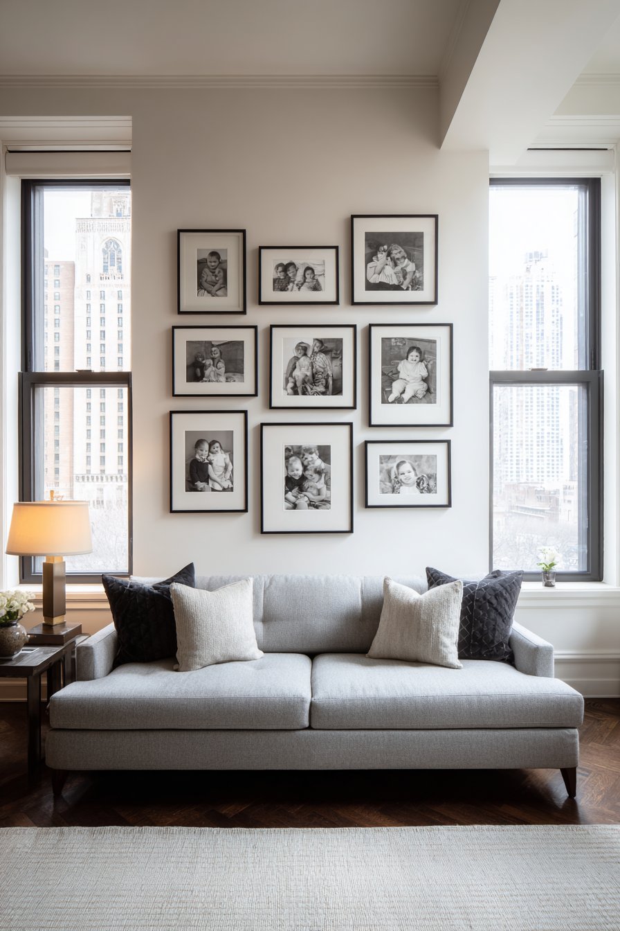
23. Dimensional Shadow Box Gallery
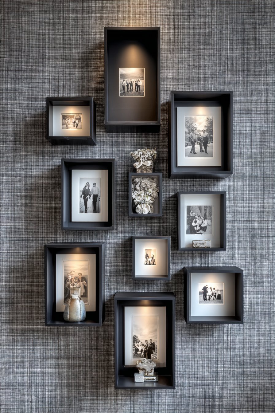
Create museum-quality presentation with dimensional shadow-box style installation featuring deep frames in matte black finish that create literal gallery depth. Family photos float on contrasting background mats within each frame, creating a layered effect that adds sophistication and visual interest beyond standard flat framing. Arranged in a structured geometric pattern on textured grey grasscloth wallpaper, the display achieves refined elegance appropriate for formal living spaces, dining rooms, or master bedrooms. Adjustable gallery lighting creates dramatic shadows that emphasize the dimensional depth while highlighting the photographs themselves—particularly effective for black and white photography where light and shadow play crucial roles in visual impact. This approach elevates family photography to fine art status through professional-grade presentation techniques.
Shadow box frames differ from standard frames in their substantial depth—typically 1.5 to 3 inches—which allows photographs to float within the frame space rather than sitting flush against the glass. This floating effect creates actual shadows within each frame, adding three-dimensionality that makes photographs appear to hover. The technique has been used in museum and gallery settings for decades to present valuable artwork with appropriate gravitas. Applying this treatment to family photographs signals that these images hold equivalent value—they’re treasured visual documents of family history worthy of the finest presentation methods available.
The matte black frames provide sophisticated neutrality that works across diverse interior styles while the structured geometric arrangement creates intentional, curated appearance. Grasscloth wallpaper adds subtle texture that provides visual interest without competing with the photographs—its linear texture complements the geometric frame arrangement while the grey color maintains neutrality. The adjustable gallery lighting allows you to control emphasis and mood, creating dramatic effects during evening hours while perhaps using natural light during daytime. This level of lighting control mirrors professional gallery practices and allows the display to function differently depending on time of day and desired ambiance.
Key Design Tips: Invest in true shadow box frames with adequate depth rather than standard deep frames—the difference in effect is substantial. Choose frames with museum-quality materials including UV-protective glass and acid-free mats. Mount photos on contrasting mat colors that show beneath the photograph edges—cream photos on grey mats, black and white on cream mats. Install frames precisely level and with equal spacing to maintain the geometric pattern’s integrity. Use track lighting or adjustable picture lights that allow you to control beam angle and intensity. Consider black and white photography specifically for this treatment—the dramatic lighting enhances the monochromatic aesthetic. Clean glass regularly as smudges and dust are more visible with dramatic side lighting. Install grasscloth wallpaper professionally as it’s challenging to work with and mistakes are difficult to hide. Consider starting with 4-6 shadow boxes rather than covering an entire wall—the technique is powerful enough that less can be more.
24. Functional Command Center Display
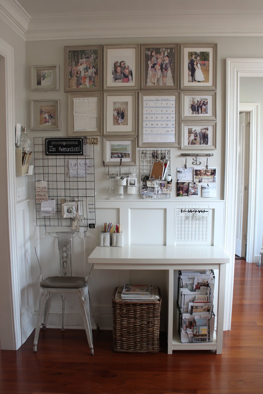
Maximize utility while maintaining beauty in a practical command center integration combining calendar, mail organizer, key hooks, and framed family photos in matching wood frames with small chalkboard labels. Organized in a functional grid layout above a compact desk or console area, the system creates comprehensive household management that’s both practical and personalized. Mounted on white beadboard wainscoting that adds cottage charm while providing durable surface, the arrangement keeps family life organized while celebrating family relationships. Task lighting from above provides functional illumination for writing on calendars and chalkboards while highlighting the photographs and creating warm ambiance. This innovative approach demonstrates how family picture walls can integrate seamlessly with household management systems, proving that function and beauty need not be mutually exclusive.
Modern family life requires significant organization—calendars tracking activities, mail sorting systems preventing paper pile-up, designated key storage preventing morning searches, and reminder systems keeping everyone informed. Rather than treating these necessities as purely utilitarian eyesores to hide away, this approach integrates them into an attractive, cohesive wall display where family photos humanize the organizational elements. The result is a command center that family members actually want to use because it’s visually appealing rather than purely functional. The family photos serve as gentle reminders of why we organize our lives—to spend more quality time with the people we love.
The matching wood frames create visual connection between photos and functional elements like chalkboard sections and calendar holders. The small chalkboard labels allow flexible identification—”Mom’s Calendar,” “Soccer Schedule,” “Permission Slips”—that can change as family needs evolve. The white beadboard wainscoting provides cottage warmth while being practically durable and easy to clean. The grid organization ensures everything has a designated place, making it easy to maintain the system long-term. This approach works beautifully in mudrooms, kitchens, home offices, or anywhere family members naturally congregate and check schedules.
Key Design Tips: Choose frames in consistent wood tone and style to unify photos and functional elements. Size components appropriately for your family’s needs—larger families need bigger calendars and more key hooks. Mount the system at heights accessible to all family members who’ll use it including children. Include pockets or small baskets for mail sorting and paper management. Use dry-erase or chalkboard paint sections for frequently changing information rather than permanent labels. Install task lighting bright enough for writing and reading calendars comfortably. Position the system near the door family members use most frequently for maximum utility. Update family photos seasonally or annually to keep the display feeling current. Consider including a small charging station if space permits for phones and tablets. Establish simple maintenance routines like weekly calendar reviews and monthly inbox clearing to keep the system functional long-term. Involve all family members in system use to build organizational habits and shared responsibility.
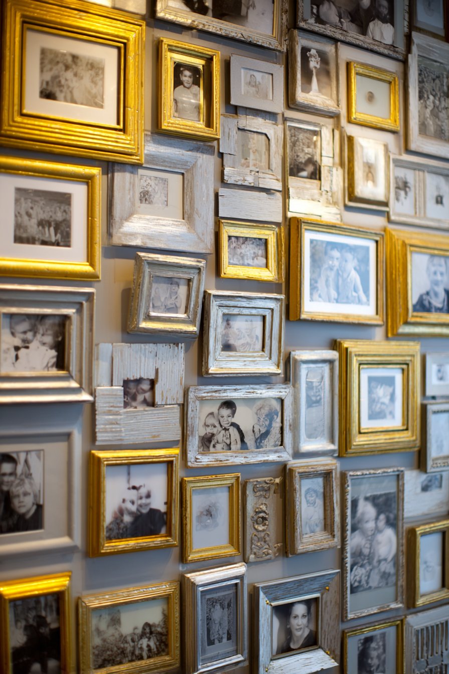
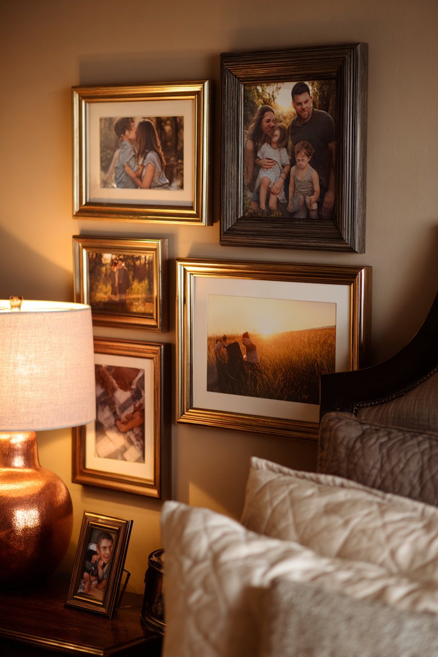
25. Vintage Ornate Elegance
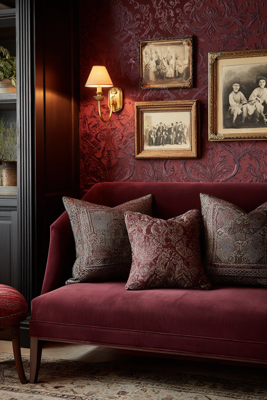
Conclude with timeless sophistication in a curated vintage-inspired collection featuring ornate antique frames in mixed metals and aged finishes arranged in traditional salon style. Black and white family photos processed with vintage techniques—perhaps sepia toning, vignetting, or aged effects—create authentic period aesthetic that honors family history and heritage. Positioned against rich burgundy damask wallpaper that provides dramatic backdrop, the arrangement creates opulent, museum-quality presentation. Antique brass picture lights cast warm, focused illumination that emphasizes the ornate frame details and creates intimate ambiance. This approach celebrates family history not just through the photographs themselves but through presentation methods that honor the past and treat family memories as genuine treasures worthy of the finest display techniques.
Vintage and antique frames—whether authentic pieces sourced from estate sales and antique shops or high-quality reproductions—add instant gravitas and visual interest that new frames simply cannot replicate. The ornate details—carved corners, gilded edges, distressed finishes, varied patinas—tell their own stories while elevating the photographs they contain. Mixed metals and finishes prevent the collection from feeling matchy-matchy while maintaining cohesion through shared vintage character. The salon-style arrangement honors historical gallery traditions while creating the layered, collected appearance of a family that values heritage.
The rich burgundy damask wallpaper makes a bold statement that might overwhelm in large doses but creates perfect dramatic backdrop in contained applications. The formal pattern and saturated color provide luxurious foundation that makes even simple family snapshots appear significant and valuable. The vintage photo processing—achieved through digital filters or actual darkroom techniques—creates visual cohesion across potentially varied photograph ages and qualities while strengthening the nostalgic, heritage-focused aesthetic. Antique brass picture lights complete the period-appropriate presentation, creating golden pools of light that emphasize frame details and photograph subjects while creating dramatic shadows.
Key Design Tips: Source authentic vintage frames from estate sales, antique shops, and online marketplaces for genuine patina and character. Mix frame sizes substantially—from very small oval portraits to large rectangular pieces—for authentic salon-style variety. Apply vintage processing consistently across all photos even if originals were modern digital captures. Limit burgundy wallpaper to a single accent wall to prevent overwhelm—the remaining walls should be neutral. Install brass picture lights at appropriate heights to illuminate without creating harsh shadows or glare. Clean antique frames gently with appropriate products—harsh chemicals can damage authentic finishes. Use museum-quality hanging hardware appropriate for potentially heavy antique frames. Consider including actual antique family photographs if available to strengthen the heritage connection. Layer frames densely as traditional salon walls did, maintaining 2-3 inch spacing but covering substantial wall area. Polish brass fixtures regularly to maintain warm glow and prevent tarnishing that might appear neglected rather than authentically aged.
Why These Family Picture Wall Ideas Represent the Best in Home Design
The twenty-five family picture wall ideas presented in this comprehensive guide represent the pinnacle of how personal photography can transform residential spaces into meaningful, beautiful environments that celebrate family bonds while demonstrating sophisticated design principles. Each approach has been carefully selected to showcase different aesthetic philosophies, functional considerations, spatial requirements, and style preferences, ensuring that every reader can find inspiration relevant to their unique circumstances. From minimalist modern arrangements to maximalist bohemian compositions, from budget-conscious temporary installations to investment-worthy museum-quality displays, these ideas demonstrate the remarkable versatility and emotional power of family picture walls in contemporary home design.
The classic grid gallery arrangement exemplifies timeless design principles that never go out of style—symmetry, repetition, restraint, and mathematical precision creating visual calm and sophisticated presentation. This approach works universally well because it honors fundamental human preferences for balance and order while allowing family photographs to take center stage without distraction. The salon-style arrangements, conversely, celebrate abundance and eclecticism, creating layered, collected aesthetics that suggest family histories developed gradually over generations. These displays work beautifully in traditional and transitional homes where heritage and accumulation are valued design narratives.
Modern minimalist approaches like the oversized canvas display and linear horizontal arrangements demonstrate how powerful restraint can be—fewer frames of larger scale creating more impact than numerous small pieces competing for attention. These designs suit contemporary lifestyles where visual calm and intentional curation are prioritized over maximum display density. The modern farmhouse and rustic approaches bridge contemporary and traditional sensibilities, using reclaimed materials and distressed finishes to add character while maintaining clean compositions and simplified arrangements that feel current rather than dated.
Innovative approaches like the family tree wall art, washi tape frames, and mixed media shadow boxes demonstrate how family picture walls can transcend traditional framing conventions entirely. These creative interpretations push boundaries and encourage personalization, showing that rules exist to guide rather than constrain. The family tree visualization adds narrative structure that helps children understand family relationships and heritage. The washi tape method democratizes gallery walls by eliminating cost barriers and installation permanence concerns. The shadow box integration adds three-dimensional storytelling capacity that flat photographs cannot provide alone.
Functionally integrated designs like the mudroom organization system and command center display prove that family picture walls need not be purely decorative—they can serve practical purposes while maintaining aesthetic appeal. These solutions address real family life needs for organization, identification, and household management while keeping family relationships visually present in daily routines. The office integration demonstrates how picture walls adapt to professional contexts without sacrificing personality. The staircase progression makes brilliant use of challenging architectural features that often remain blank or poorly utilized.
Location-specific designs like the corner gallery, two-story foyer display, and hallway timeline demonstrate sophisticated understanding of architectural opportunities and constraints. These approaches transform potentially challenging spaces into showpiece focal points that maximize visual impact through strategic placement and scale consideration. The bedroom corner gallery creates intimate sanctuaries, the dramatic foyer display makes powerful first impressions, and the hallway timeline transforms transitional space into meaningful narrative journey.
Style-specific approaches like the industrial loft arrangement, bohemian eclectic integration, coastal vacation display, and vintage ornate collection demonstrate how picture walls can reinforce and celebrate specific design aesthetics. These installations don’t fight against existing room styles but rather amplify and complement them, creating cohesive environments where every element works together toward unified vision. The industrial approach embraces raw materials and asymmetry, the bohemian celebrates artistic freedom and natural elements, the coastal evokes vacation serenity, and the vintage honors historical traditions.
Technical considerations like lighting, frame selection, matting choices, spacing precision, and installation methods receive appropriate attention throughout these ideas, demonstrating that successful picture walls require understanding both aesthetic principles and practical execution. Professional interior photography principles guide optimal viewing conditions, color theory informs palette selections, spatial design rules ensure appropriate scale and proportion, and material science considerations promote longevity and preservation of precious family photographs.
The color-focused and material-specific considerations ensure that picture walls don’t exist in isolation but rather integrate seamlessly with wall colors, furniture finishes, lighting fixtures, and other room elements. The monochromatic black frame arrangement demonstrates restraint’s power, the multicolored children’s display celebrates vibrancy, the metallic frame options add luxury, and the natural wood finishes provide warmth. Each material choice and color selection impacts overall room aesthetic and emotional tone.
Perhaps most importantly, these ideas recognize that family picture walls serve purposes beyond decoration—they’re physical manifestations of love, memory, heritage, and connection. They remind us daily of relationships that matter, moments worth cherishing, and stories worth preserving. In our increasingly digital world where thousands of photos live on devices rarely viewed, the deliberate act of selecting, printing, framing, and displaying family photographs represents meaningful investment in tangible memory preservation. These walls become family heirlooms themselves, providing future generations with visual documentation of their heritage and inspiring them to continue the tradition.
The best family picture wall ideas balance aesthetic excellence with emotional resonance, technical precision with creative freedom, trend awareness with timeless principles, and personal expression with universal appeal. They adapt to diverse spaces, budgets, skill levels, and style preferences while maintaining core commitment to celebrating family bonds through beautiful, intentional design. Whether you’re creating your first picture wall or redesigning an existing one, these ideas provide inspiration, guidance, and permission to experiment with approaches that authentically represent your family’s unique story and aesthetic vision.
Conclusion
Creating a meaningful family picture wall represents one of the most rewarding design projects you can undertake in your home. Unlike purely decorative elements that serve aesthetic purposes alone, picture walls combine visual beauty with deep emotional significance, transforming blank walls into daily reminders of love, connection, and cherished memories. The twenty-five diverse approaches explored in this guide demonstrate that there’s no single “right” way to create a family picture wall—instead, the best approach is the one that authentically reflects your family’s personality, honors your home’s architectural character, and aligns with your aesthetic preferences and practical needs.
Whether you’re drawn to the clean precision of geometric grid arrangements, the abundant richness of salon-style displays, the creative freedom of mixed media installations, or the functional integration of organizational systems, remember that successful picture walls begin with intentionality. Take time to consider which photographs truly matter most, what story you want your display to tell, and how the arrangement will function within your daily life. Don’t rush the process—the best displays often evolve gradually as you source frames, edit photographs, and experiment with arrangements.
As you embark on your own family picture wall journey, embrace both the design principles shared throughout this guide and the freedom to adapt them to your unique circumstances. Mix different approaches if desired, scale ideas up or down based on available space, modify color palettes to suit your preferences, and most importantly, trust your instincts about what feels right for your family and your home. The most successful picture walls are those that bring joy every time you see them, spark conversations and memories, and create spaces that truly feel like home. Let these ideas inspire you to celebrate your family’s story through beautiful, meaningful displays that will be treasured for generations to come.