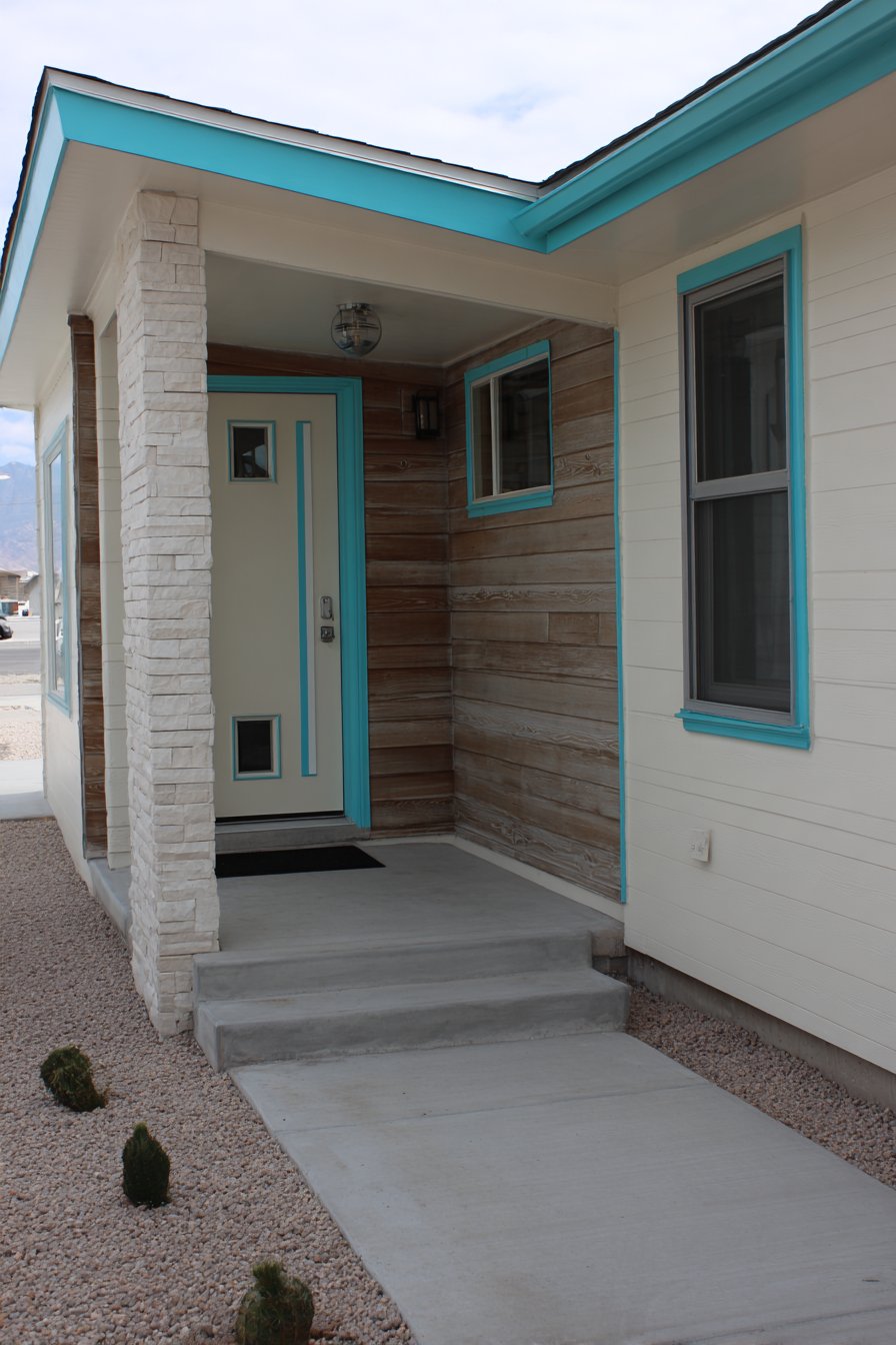
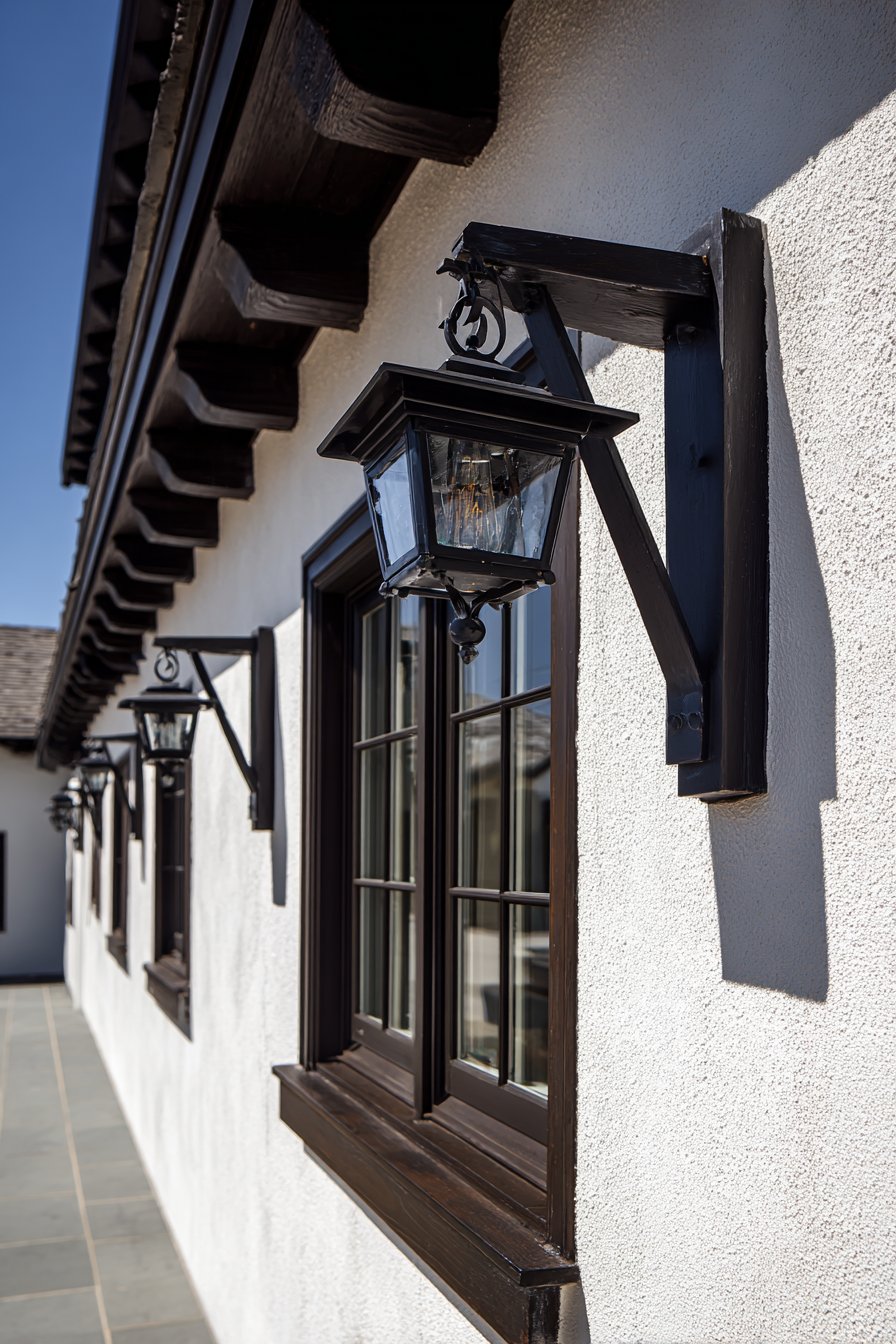
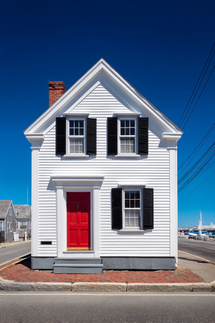
The exterior of your home serves as its first impression, a visual handshake that welcomes guests and passersby while reflecting your personal style and attention to detail. Few home improvement projects offer the transformative power and return on investment that exterior wall painting provides. Whether you’re looking to refresh a tired facade, increase your property value, or simply express your design sensibilities, the right paint choices can completely reimagine your home’s character. From classic color combinations that have stood the test of time to bold contemporary palettes that make architectural statements, exterior wall painting represents one of the most accessible yet impactful ways to elevate your home’s aesthetic presence.
In today’s design landscape, homeowners are moving beyond safe, neutral choices and embracing exterior wall painting ideas that showcase personality while maintaining broad appeal. The key lies in understanding how color interacts with architectural style, natural lighting conditions, surrounding landscape elements, and neighborhood context. Professional designers consider factors like climate, material surfaces, historical accuracy for period homes, and the psychological impact of color when developing exterior painting schemes. This comprehensive guide explores twenty-one distinctive exterior wall painting ideas, each demonstrating how thoughtful color selection, proper material consideration, and attention to architectural detail can transform ordinary homes into extraordinary expressions of style and sophistication.
These curated exterior wall painting ideas span multiple architectural styles and design philosophies, from the time-honored elegance of traditional colonial palettes to the crisp minimalism of contemporary facades. Each approach offers unique advantages and addresses different aesthetic goals, whether you’re drawn to the warmth of earth tones, the drama of high-contrast combinations, or the serenity of monochromatic schemes. As you explore these concepts, consider how each palette might complement your home’s existing architecture, enhance its distinctive features, and create the emotional response you desire every time you pull into your driveway.
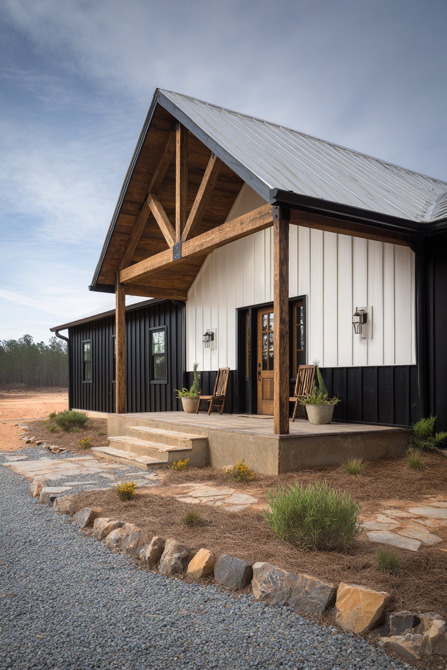
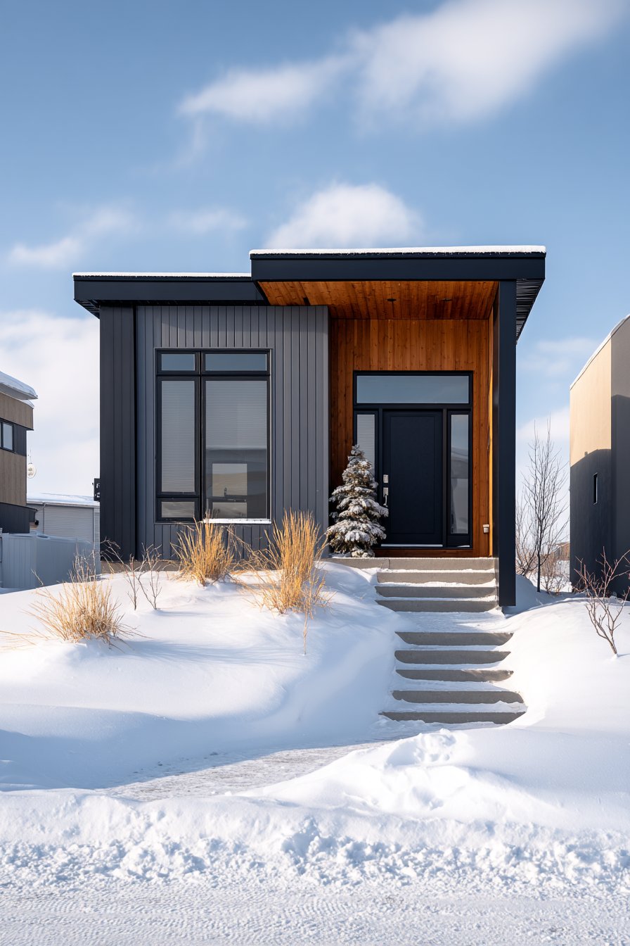
1. Modern Farmhouse Sage and White Elegance
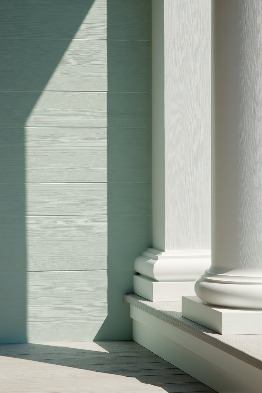
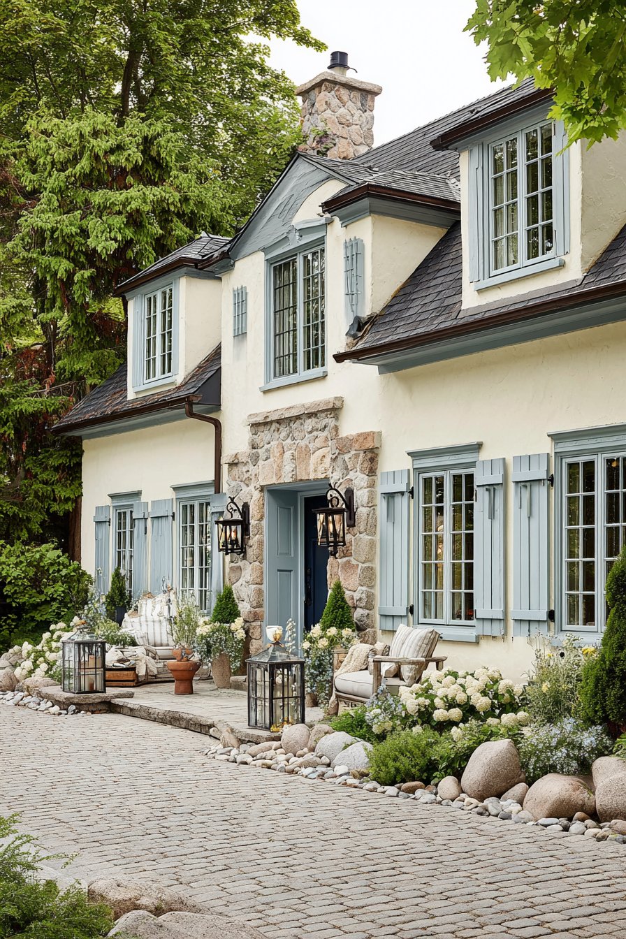
The modern farmhouse aesthetic has captured the hearts of homeowners nationwide, and this exterior wall painting idea demonstrates why the style remains so compelling. Featuring horizontal board-and-batten siding painted in a sophisticated sage green, this approach brings natural serenity to residential architecture while maintaining the clean lines that define contemporary design. The soft, muted green evokes the peaceful qualities of countryside landscapes while offering a fresh alternative to the ubiquitous gray that has dominated exterior palettes in recent years. When paired with crisp white trim on porch columns, window casings, and eaves, the sage creates a harmony that feels both timeless and distinctly current.
The foundation receives special attention with warm gray paint that anchors the lighter tones above while creating visual weight at the base of the structure. This three-color approach demonstrates sophisticated color theory in practice—the sage walls provide the dominant hue, white trim offers contrast and definition, and the gray foundation grounds the composition. Professional architectural photography captured during morning’s soft light reveals how this color combination changes throughout the day, with shadows creating depth along the wall planes and highlighting the dimensional quality of board-and-batten siding. The texture of the wood siding becomes part of the design narrative, with paint application preserving and accentuating rather than obscuring the material’s inherent character.
What makes this exterior wall painting idea particularly successful is its versatility across different home sizes and lot conditions. The sage green reads as substantial and sophisticated on larger farmhouses while bringing cottage charm to smaller bungalows. The color performs well in various lighting conditions, appearing slightly cooler in bright midday sun and revealing warmer undertones during golden hour. From a practical standpoint, sage green shows less dirt and weathering than stark white while offering better longevity than darker colors that absorb heat and fade more rapidly in intense sunlight. The paint finish itself deserves consideration—a satin or low-luster sheen on the siding provides subtle reflection while being easier to maintain than flat finishes that show every imperfection.
Key design tips for achieving this look: Select a sage green with gray undertones rather than yellow-based versions for a more sophisticated appearance. Ensure white trim paint has a slightly higher sheen than wall color to emphasize architectural details. Test paint samples on multiple sides of your home to see how different exposures affect color perception. Consider extending the white trim color to porch ceilings for traditional haint blue alternative. Schedule painting during mild weather when temperatures allow proper paint curing. Use premium exterior paint with built-in primer for better coverage and longevity. Apply foundation color only after walls are complete to ensure proper color coordination.
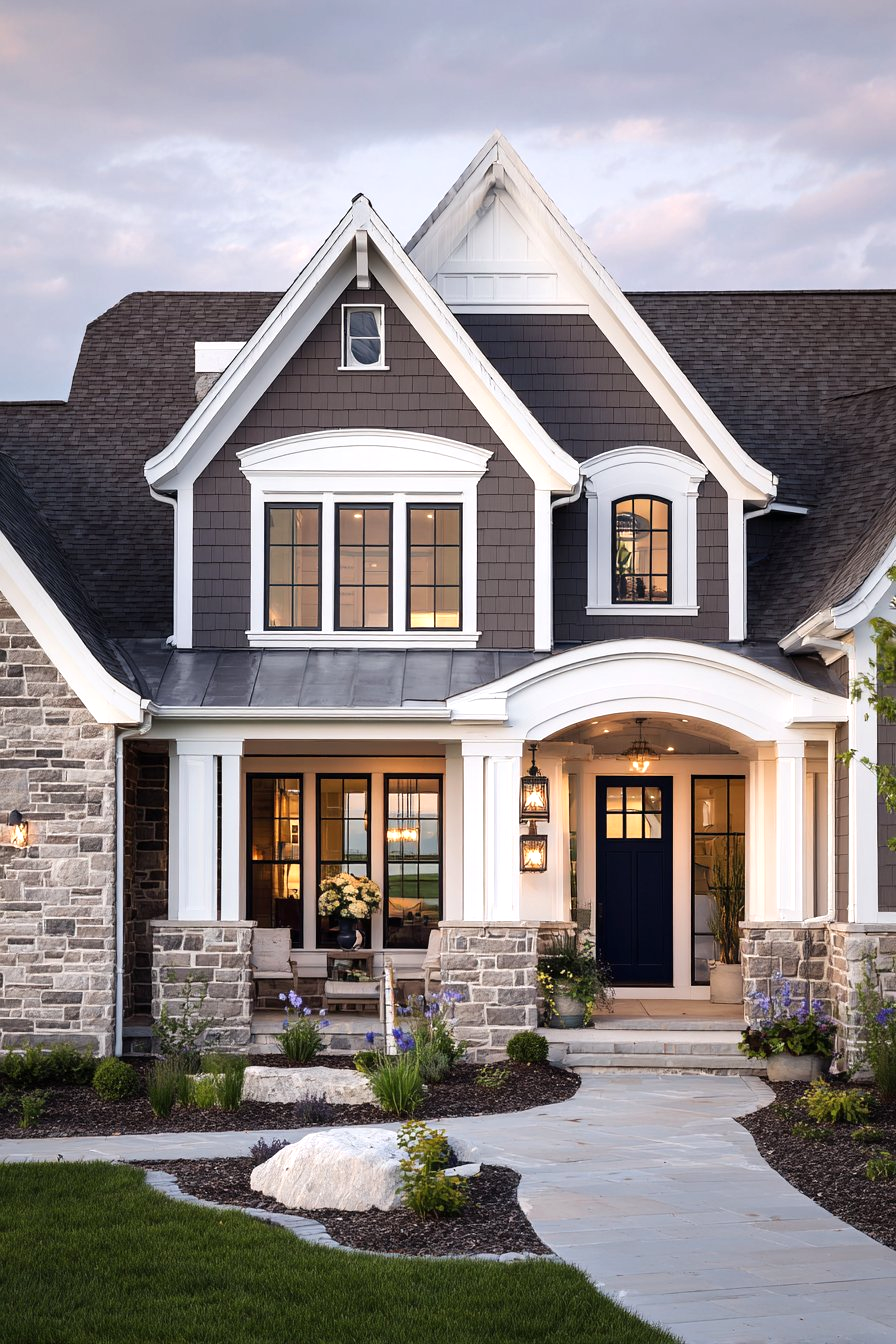
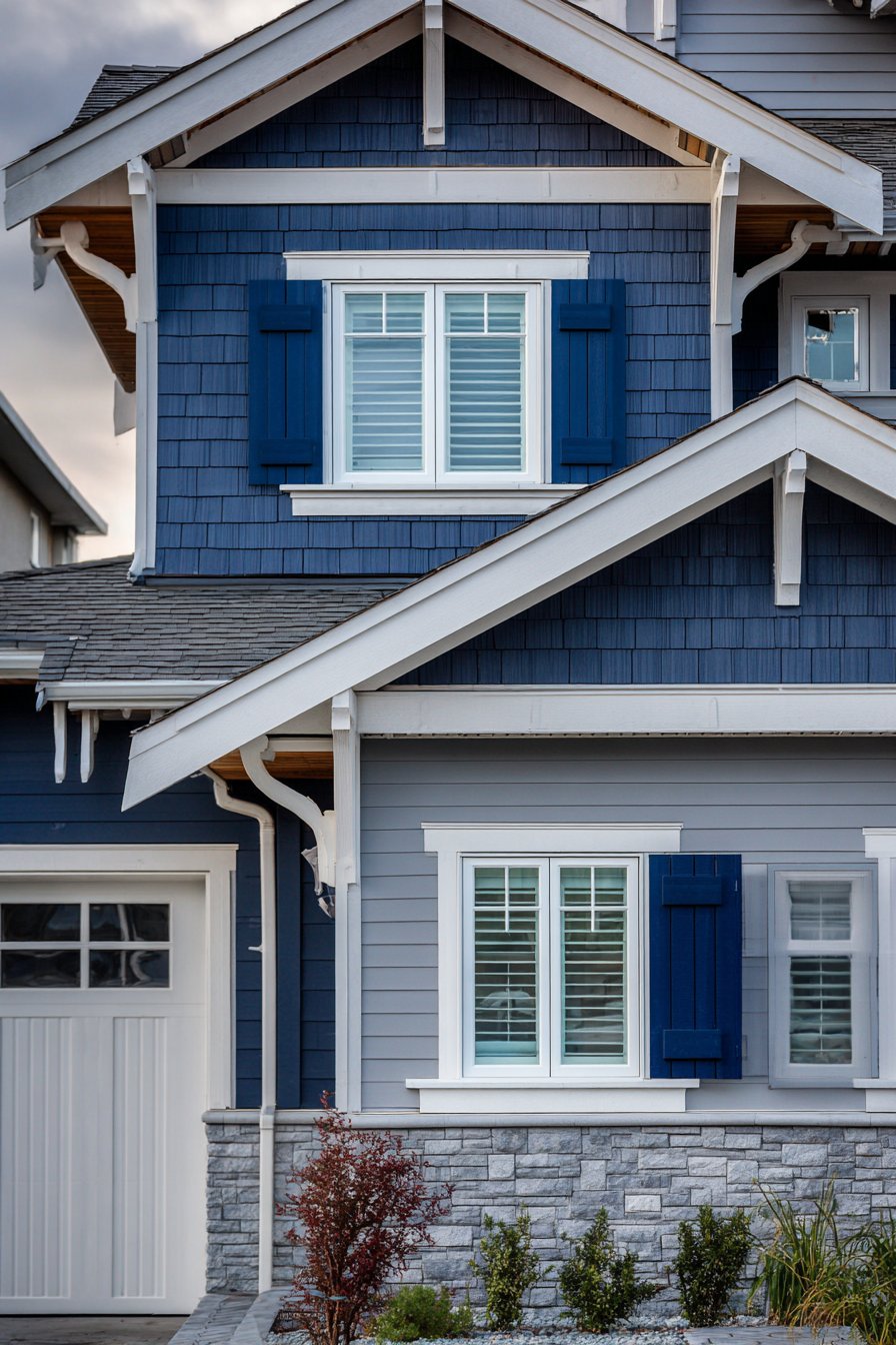
2. Coastal Blue-Gray Serenity
Drawing inspiration from seaside cottages and waterfront retreats, this exterior wall painting idea embraces the calming influence of coastal color palettes while maintaining year-round appeal regardless of proximity to actual shorelines. The light blue-gray walls evoke the meeting point of ocean and sky, that ethereal horizon line that creates instant tranquility. This particular shade—neither definitively blue nor strictly gray—offers the chameleon-like quality of shifting appearance based on surrounding light, weather conditions, and adjacent landscape elements. White architectural trim provides the crisp definition essential to coastal aesthetics, creating the visual clarity associated with sun-bleached driftwood and weathered beach structures.
The garage door receives the same blue-gray treatment as the main walls, creating cohesion while window shutters introduce depth through a carefully considered navy blue accent. This darker blue serves multiple purposes: it grounds the lighter overall palette, draws attention to windows as important architectural features, and references traditional coastal color relationships where navy has long accompanied lighter blues in maritime settings. The decision to leave natural cedar shake details on gable ends unpainted demonstrates design restraint and material honesty, allowing the warm wood tones to provide organic contrast against the cooler painted surfaces. Professional exterior photography reveals how balanced exposure captures subtle variations in the painted surface texture under natural daylight, showing that even uniform color application creates visual interest through light and shadow play.
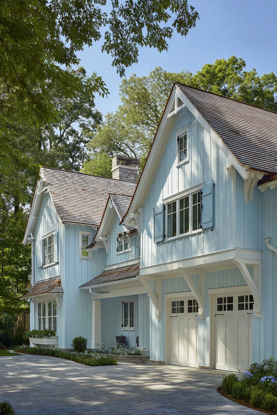
This coastal-inspired exterior wall painting idea succeeds because it translates vacation aesthetics into everyday livability. Unlike overtly themed approaches that can feel costume-like, this palette achieves coastal feeling through sophisticated color relationships rather than literal beach references. The blue-gray responds beautifully to changing seasons—appearing crisp and refreshing against summer’s green landscapes, harmonizing with autumn’s golden tones, standing resilient against winter’s starkness, and welcoming spring with renewed brightness. The color psychology supports wellbeing, as blue tones are documented to reduce stress and create feelings of calm, making your home a daily sanctuary rather than simply a structure.
Key design tips for achieving this look: Choose a blue-gray with enough gray content to avoid appearing juvenile or overly saturated. Sample multiple navy blues for shutters to find one that complements rather than clashes with the wall color. Preserve natural wood elements through proper sealing rather than painting to maintain material diversity. Consider the color of your roof—this palette works best with gray, charcoal, or natural wood shake roofing. Ensure white trim has slight blue undertones rather than warm cream bases for color harmony. Plan for regular maintenance as lighter colors show dirt more readily than medium tones. Use mildew-resistant paint formulations in humid climates where coastal colors are most popular.
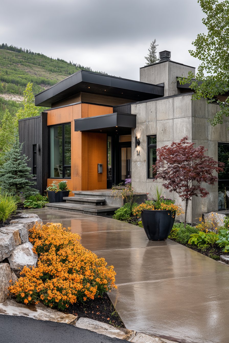
3. Contemporary Stucco with Bold Accents
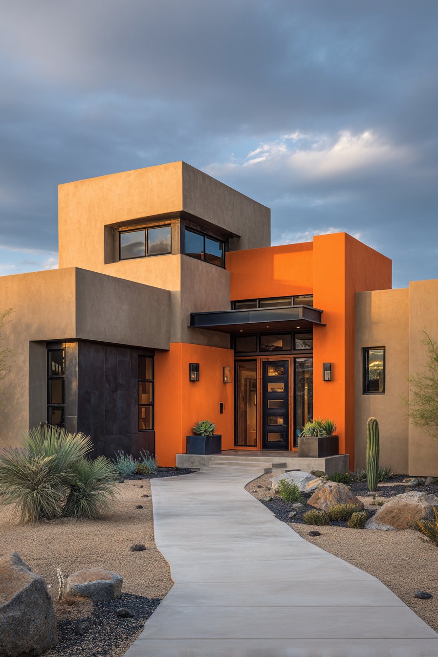
Modern architecture demands exterior wall painting ideas that embrace simplicity while making confident design statements, and this contemporary approach delivers both through strategic color blocking and material contrast. Smooth stucco walls in warm beige establish a neutral foundation that allows architectural form to take precedence, letting clean lines, geometric relationships, and spatial volumes speak without color competition. The beige selected here leans toward sand rather than yellow undertones, creating warmth without appearing dated or trending toward the peachy tones that can cheapen contemporary design. Dramatic black window frames and trim provide the sharp contrast essential to modern aesthetics, creating graphic definition that emphasizes the home’s geometric precision.
The true design courage emerges in the burnt orange accent wall at the entryway, a bold choice that transforms a functional element into a focal point and demonstrates how strategic color placement can direct attention and create visual hierarchy. This warm, earthy orange doesn’t fight for attention across the entire facade but rather serves as an intentional exclamation point, welcoming visitors while showcasing the homeowners’ design confidence. Professional architectural photography captured in afternoon sunlight reveals how the paint colors interact with natural illumination—the beige appears warm and inviting, the black creates crisp shadows that emphasize depth, and the burnt orange glows with particular intensity, justifying its role as the accent element.
What distinguishes this exterior wall painting idea is its demonstration that contemporary doesn’t require cold minimalism or sterile neutrality. The warm beige and burnt orange bring human-scaled comfort to modern architecture while the black elements provide the graphic clarity that defines the style. The smooth stucco texture contributes significantly to the contemporary reading, as the uninterrupted surface quality allows color and form to dominate without competing patterns or textures. This approach works particularly well in warm climates and contemporary neighborhoods where modern architecture feels contextually appropriate, though it can also create striking contrast in more traditional settings for homeowners willing to make a statement.
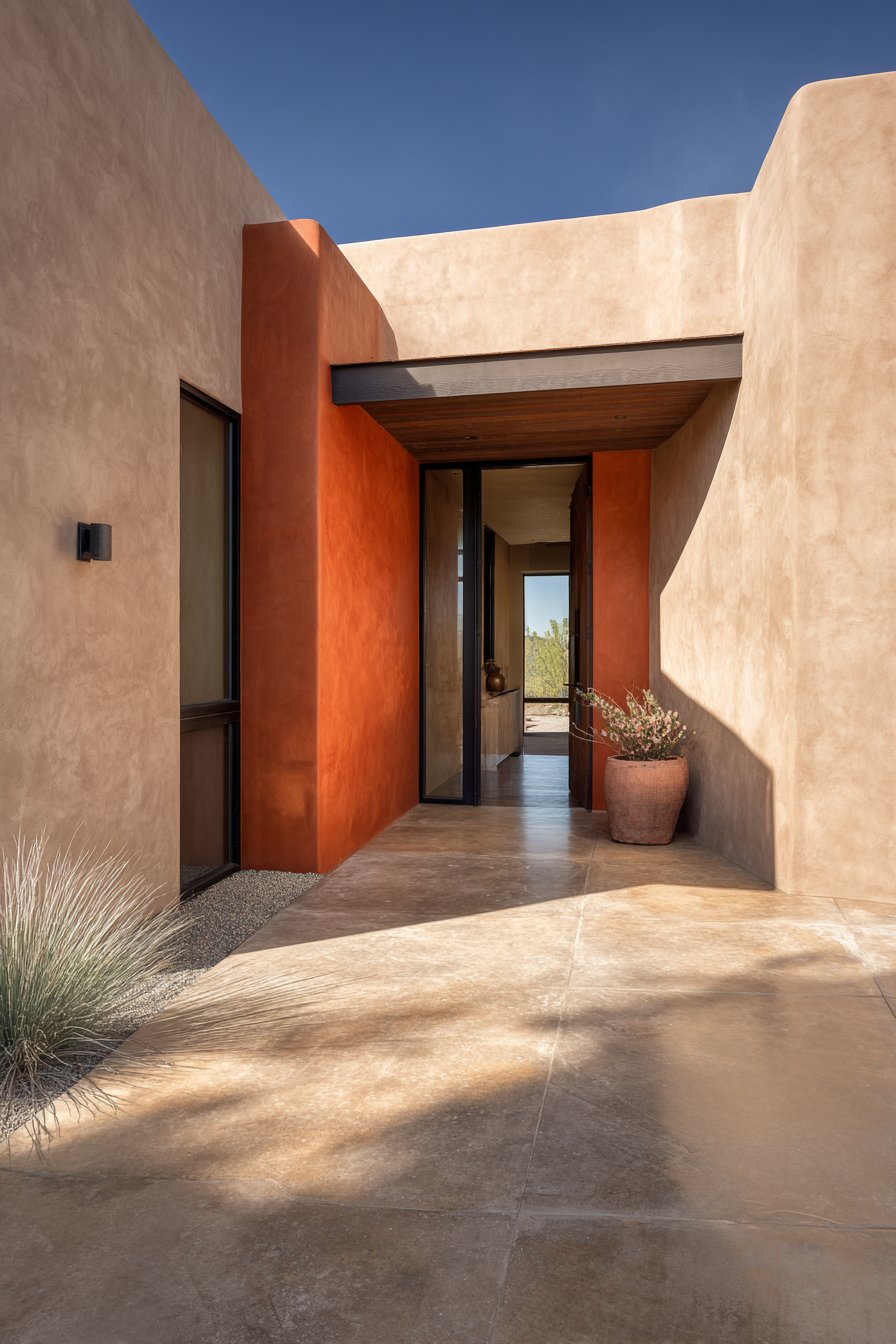
Key design tips for achieving this look: Ensure stucco surface is properly prepared and primed before painting for even color application. Select beige with warm but not yellow undertones to avoid dated appearance. Choose true black for windows and trim rather than charcoal for maximum contemporary impact. Limit orange accent to a single wall or element to maintain sophistication. Consider matte or flat finish on stucco for authentic contemporary appearance. Coordinate exterior colors with interior visible through windows for design continuity. Install modern house numbers and light fixtures in black to reinforce the color scheme. Maintain clean stucco edges where different colors meet for professional appearance.
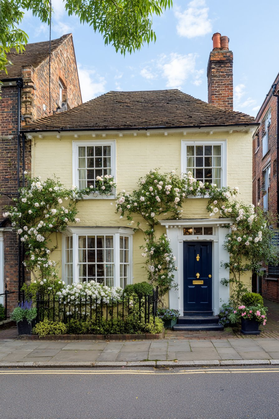
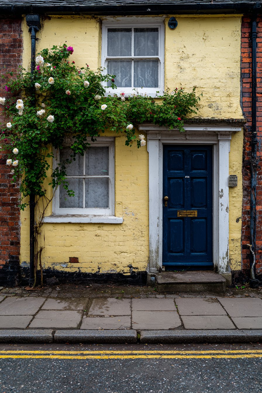
4. Traditional Colonial Yellow and Green
Classic American architecture finds perfect expression in this exterior wall painting idea that honors colonial heritage while maintaining relevance for contemporary living. Butter yellow walls establish immediate warmth and welcome, a color choice rooted in centuries of architectural tradition when yellow ochre pigments were among the most readily available and economical exterior paints. This particular shade avoids the harsh brightness of primary yellow while offering more character than pale cream, striking that ideal balance between visibility and subtlety. Forest green shutters provide the traditional contrast that defines colonial color relationships, a pairing so historically rooted that it appears in countless preserved homes throughout New England and the mid-Atlantic regions.
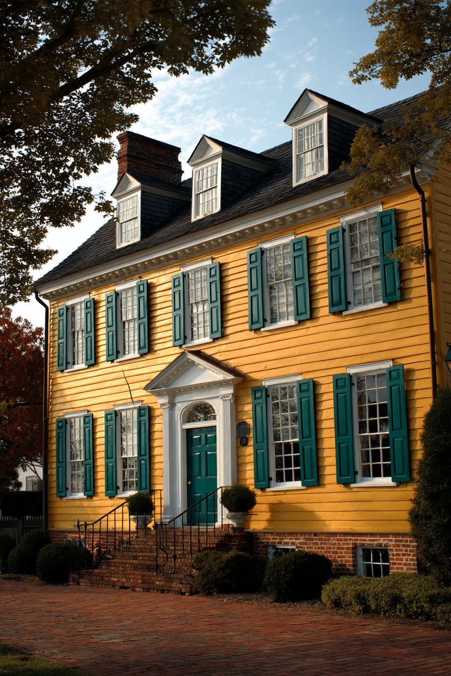
White trim around windows, doors, and eaves delivers the crisp definition that colonial architecture demands, creating the visual clarity essential to the style’s proportioned formality. The decision to leave the brick foundation in its natural state demonstrates design wisdom, as the warm earthy tones of brick complement rather than compete with the yellow walls while providing textural variety and historical authenticity. Wide-angle architectural photography captured during golden hour showcases how the paint colors appear in natural lighting with subtle shadows adding depth to architectural details—the yellow glows with particular warmth, the green shutters appear richly saturated, and the white trim provides brilliant highlights that emphasize the home’s classical proportions.
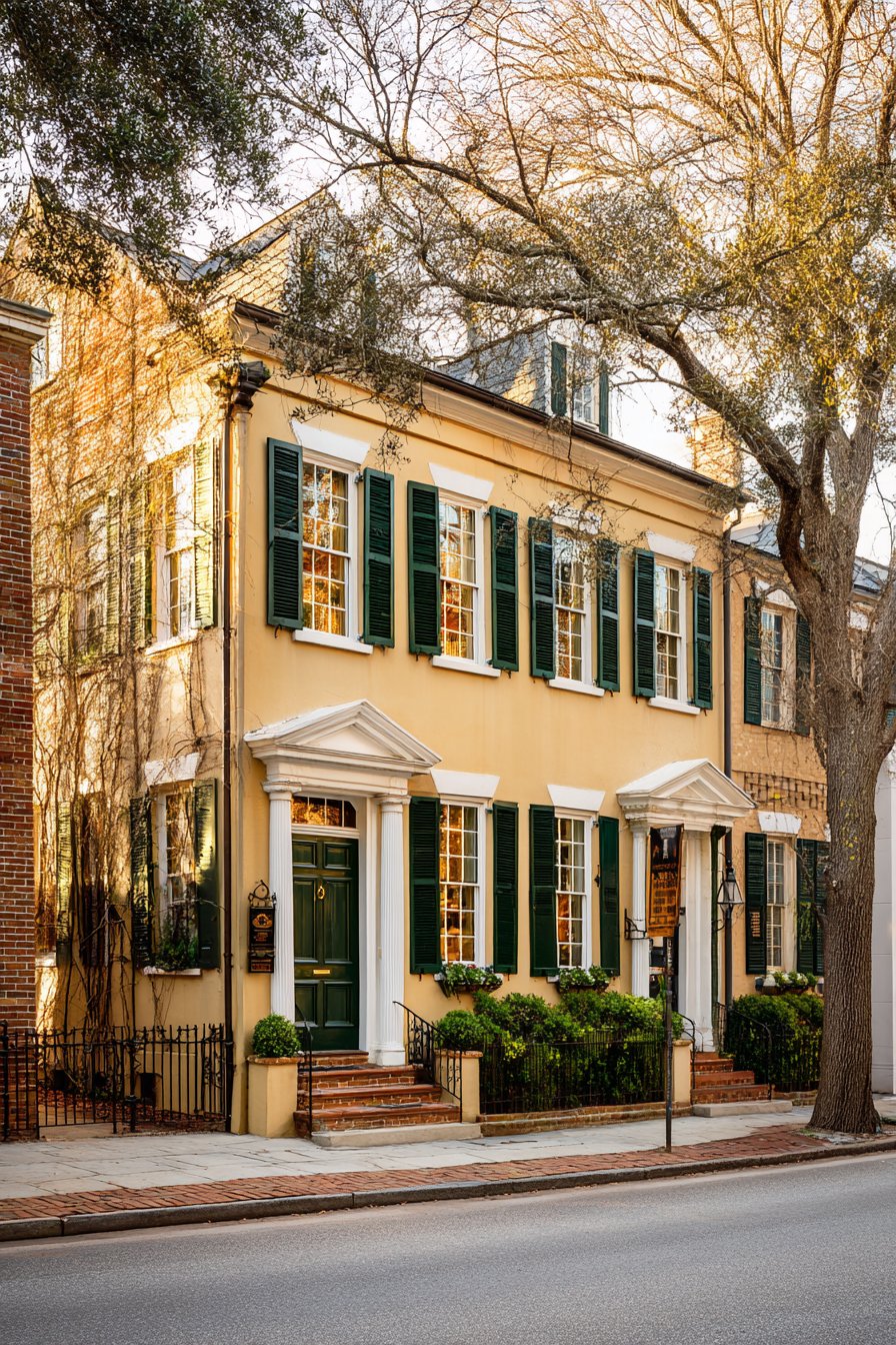
This exterior wall painting idea succeeds across multiple architectural scales, from modest colonials to grand Georgian manors, because the color relationships remain appropriate regardless of size. The yellow and green combination communicates established tradition, neighborhood stability, and attention to historical propriety without feeling museum-like or overly formal. From a practical perspective, these colors have proven their durability over centuries of use—yellow hides minor imperfections while maintaining brightness, forest green ages gracefully without appearing faded, and white trim can be easily refreshed as needed. The color psychology supports home identity, as yellow conveys optimism and hospitality while green suggests growth, harmony, and connection to natural surroundings.
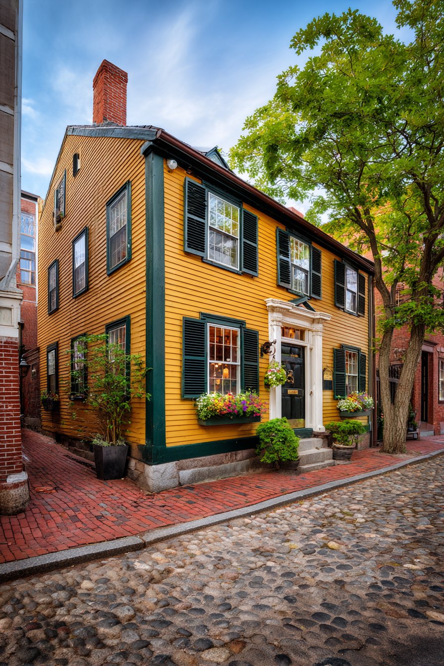
Key design tips for achieving this look: Select butter yellow rather than bright or pale versions for authentic colonial appearance. Choose forest green with brown undertones rather than blue-based greens for historical accuracy. Use oil-based paint on trim for maximum durability and authentic finish quality. Preserve natural brick through cleaning and sealing rather than painting. Consider black or dark green for front door as period-appropriate accent. Apply yellow in multiple thin coats rather than one thick application for even coverage. Research historical color combinations specific to your home’s architectural period for authenticity. Maintain proportionally sized shutters that could actually cover windows for architectural correctness.
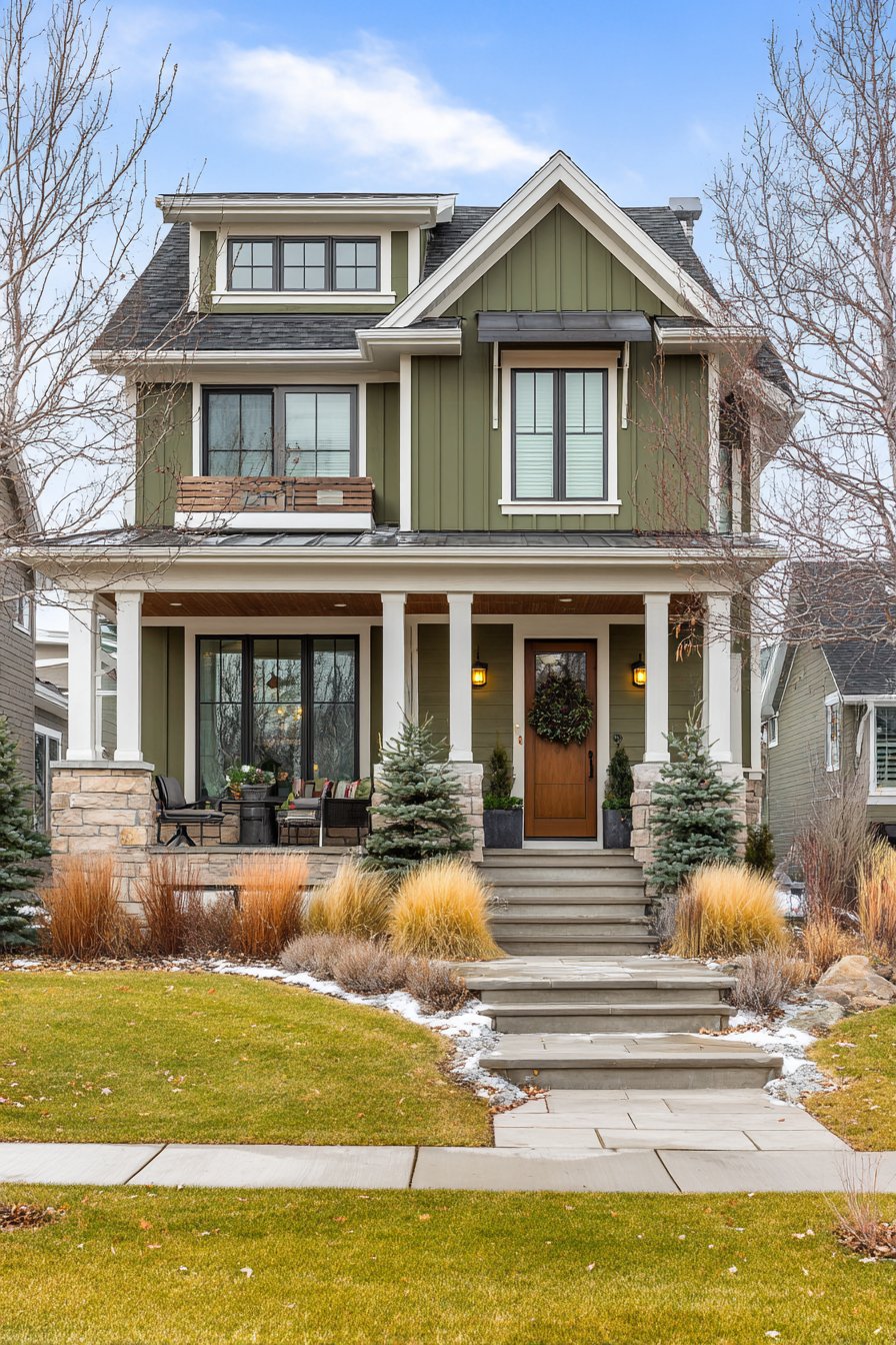
5. Craftsman Olive Green with Natural Wood
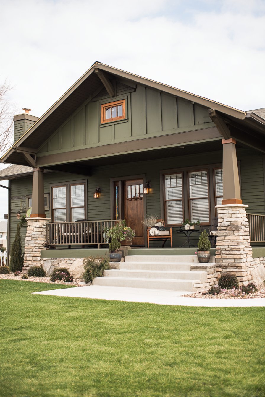
The Arts and Crafts movement’s influence on American residential architecture continues through exterior wall painting ideas like this one, which honors craftsman principles of honest materials, natural colors, and integration with landscape. Rich olive green walls establish immediate connection to natural environments, echoing the forest understories and native plant palettes that craftsman architects sought to complement rather than dominate. This particular green demonstrates the sophistication of earth tones—complex, layered, and infinitely more interesting than the simplified primaries that dominate mass-market color choices. The decision to combine painted walls with natural wood trim stained in dark walnut represents the quintessential craftsman approach of celebrating rather than concealing material character.
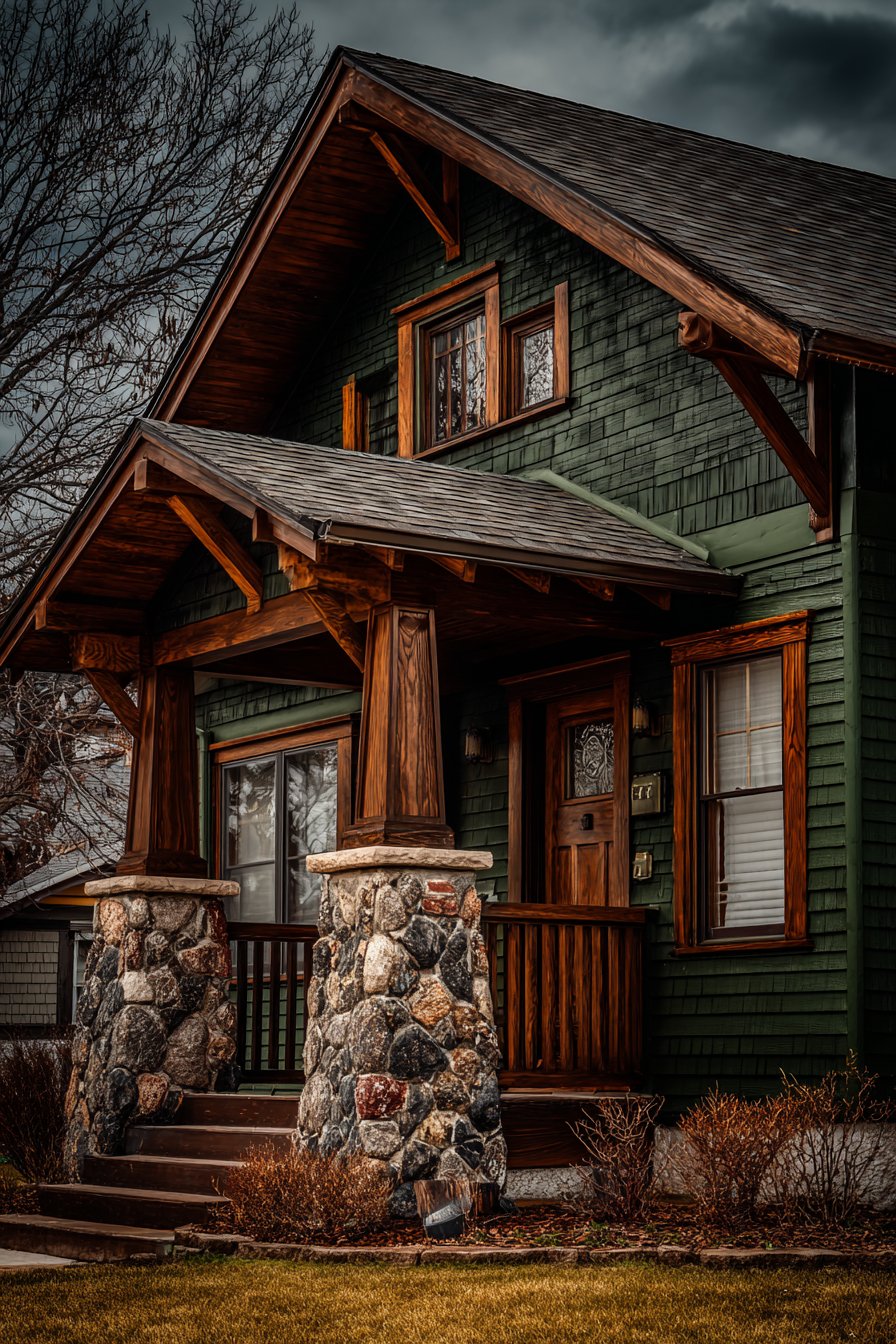
Stone accents on porch columns and foundation provide textural contrast that painted surfaces alone cannot achieve, creating the material diversity essential to craftsman aesthetics. These stone elements remain in their natural state, their varied colors and textures providing organic counterpoint to the uniform green walls. Professional photography captured in soft overcast lighting conditions reveals the true paint color without harsh shadows, showing the interplay between painted and natural material surfaces with particular attention to the horizontal siding texture that contributes its own subtle pattern to the composition. This lighting situation actually benefits craftsman colors, as the diffused illumination prevents the olive green from appearing too dark while allowing the wood grain details to remain visible.
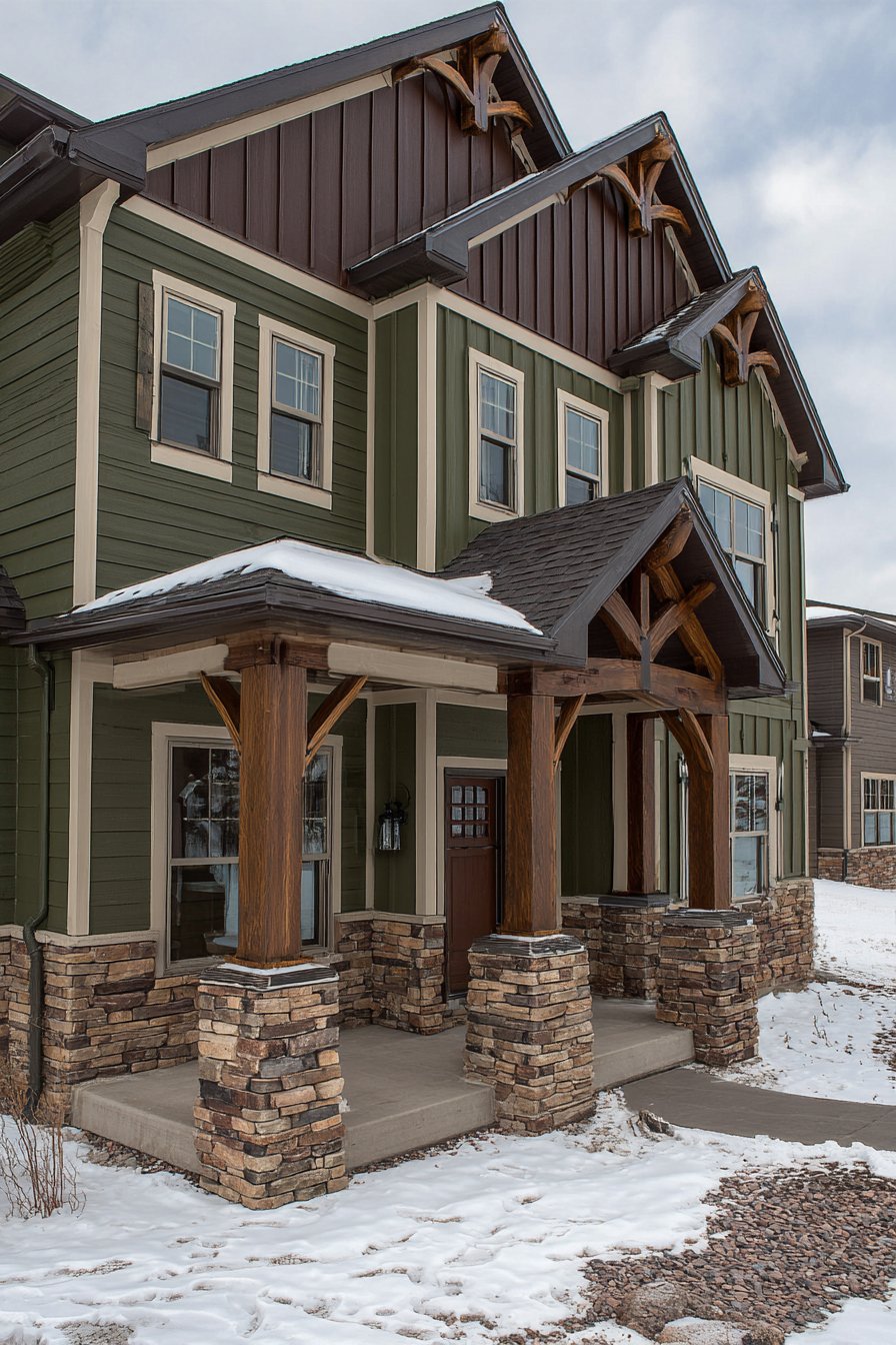
What makes this exterior wall painting idea particularly authentic is its acknowledgment that craftsman design emerged as a reaction against Victorian excess, prioritizing simplicity, honest construction, and harmonious color relationships over ornamentation and color contrast. The olive green walls don’t fight for attention but rather provide a contemplative backdrop that allows architectural details—exposed rafter tails, decorative brackets, grouped windows, tapered columns—to communicate the design philosophy. From a practical standpoint, olive green performs exceptionally well in wooded lots and established neighborhoods with mature landscaping, as the color creates visual continuity between built structure and natural surroundings. The dark wood trim requires more maintenance than painted alternatives but delivers incomparable warmth and authenticity that painted trim cannot replicate.
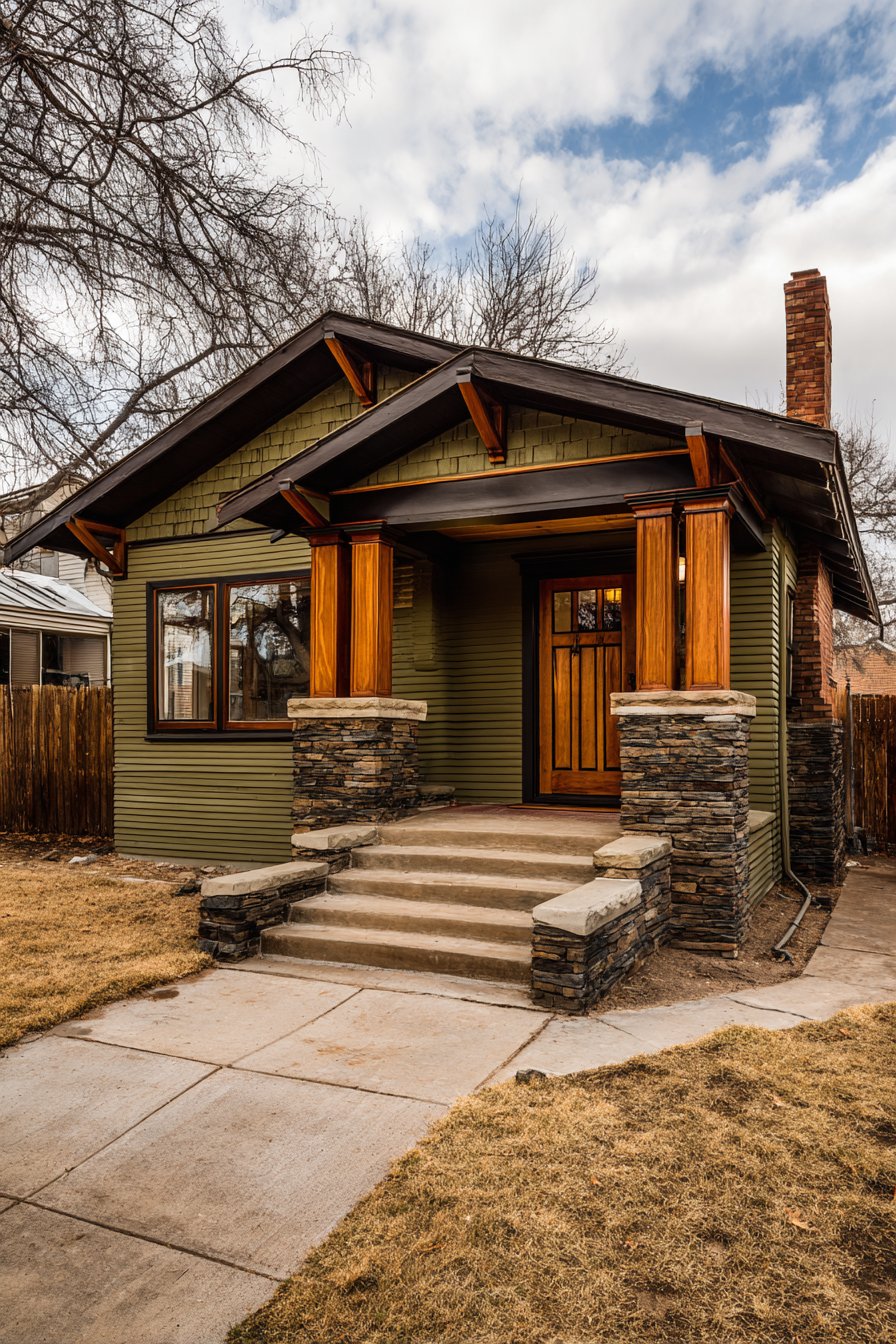
Key design tips for achieving this look: Select olive green with brown rather than yellow undertones for sophisticated earthiness. Use high-quality exterior wood stain on trim rather than attempting to match color with paint. Ensure proper wood preparation and sealing before staining to prevent uneven absorption. Consider leaving some structural elements like brackets and rafter tails in natural wood finish. Choose stone or brick foundation materials in warm earth tones to complement the green walls. Apply green paint in direction of wood grain when working with horizontal siding. Research regional craftsman color traditions as preferences varied by geography. Include period-appropriate lighting fixtures in copper or bronze finishes to complete the aesthetic. Maintain clear finish on wood elements annually to prevent weathering and gray oxidation.
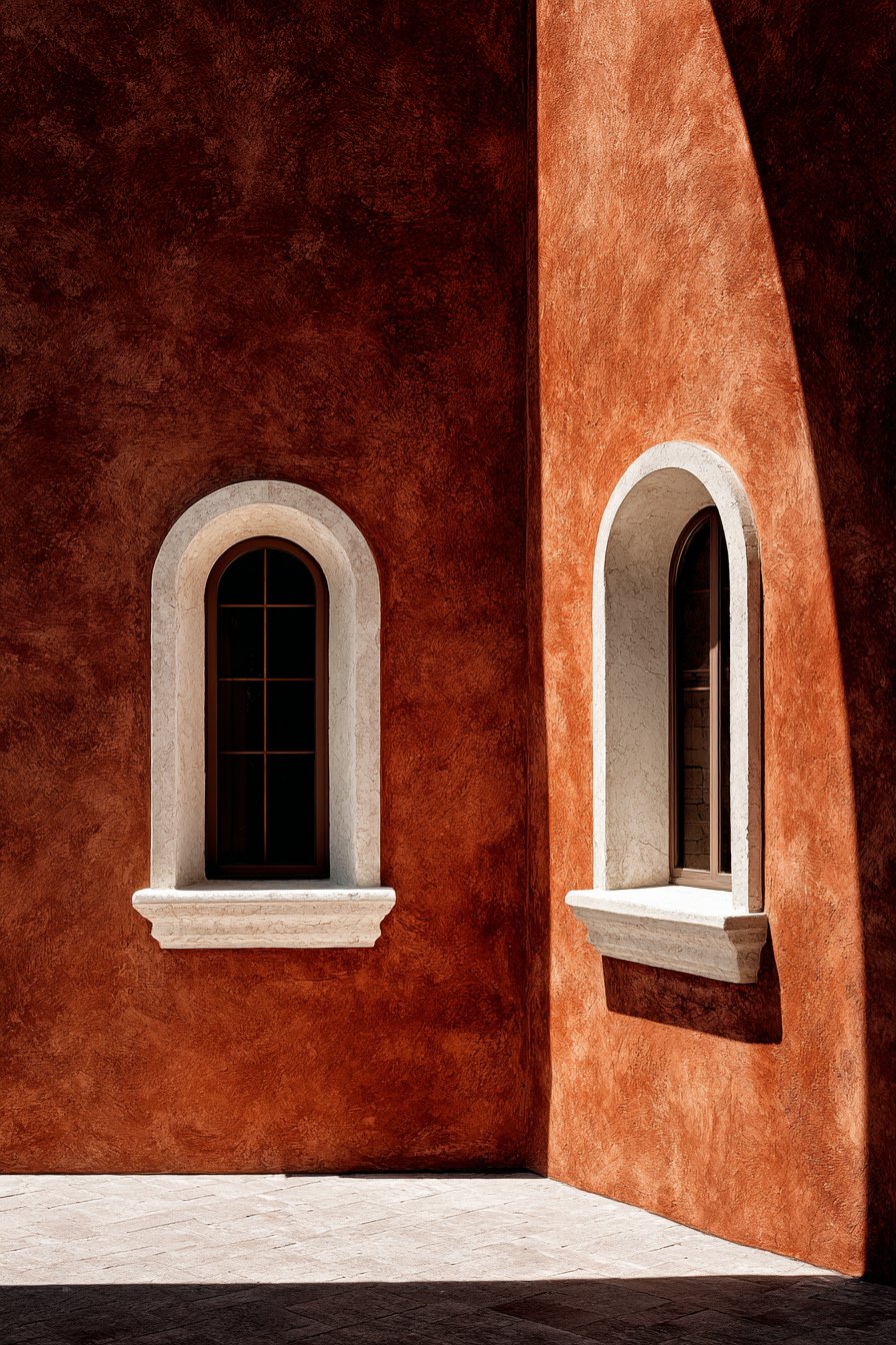
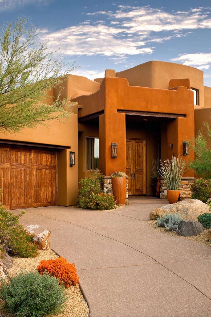
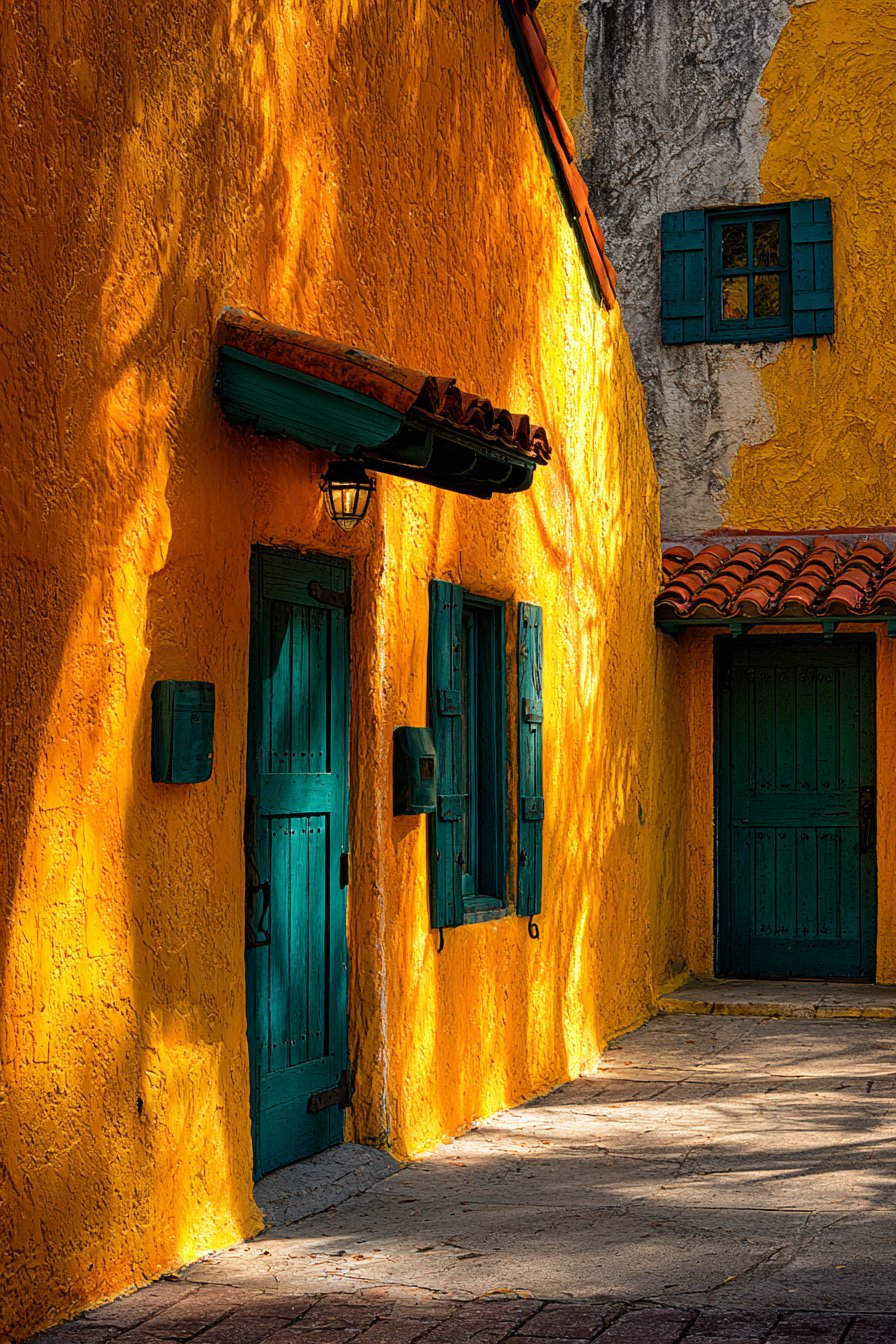
6. Mediterranean Terracotta Warmth
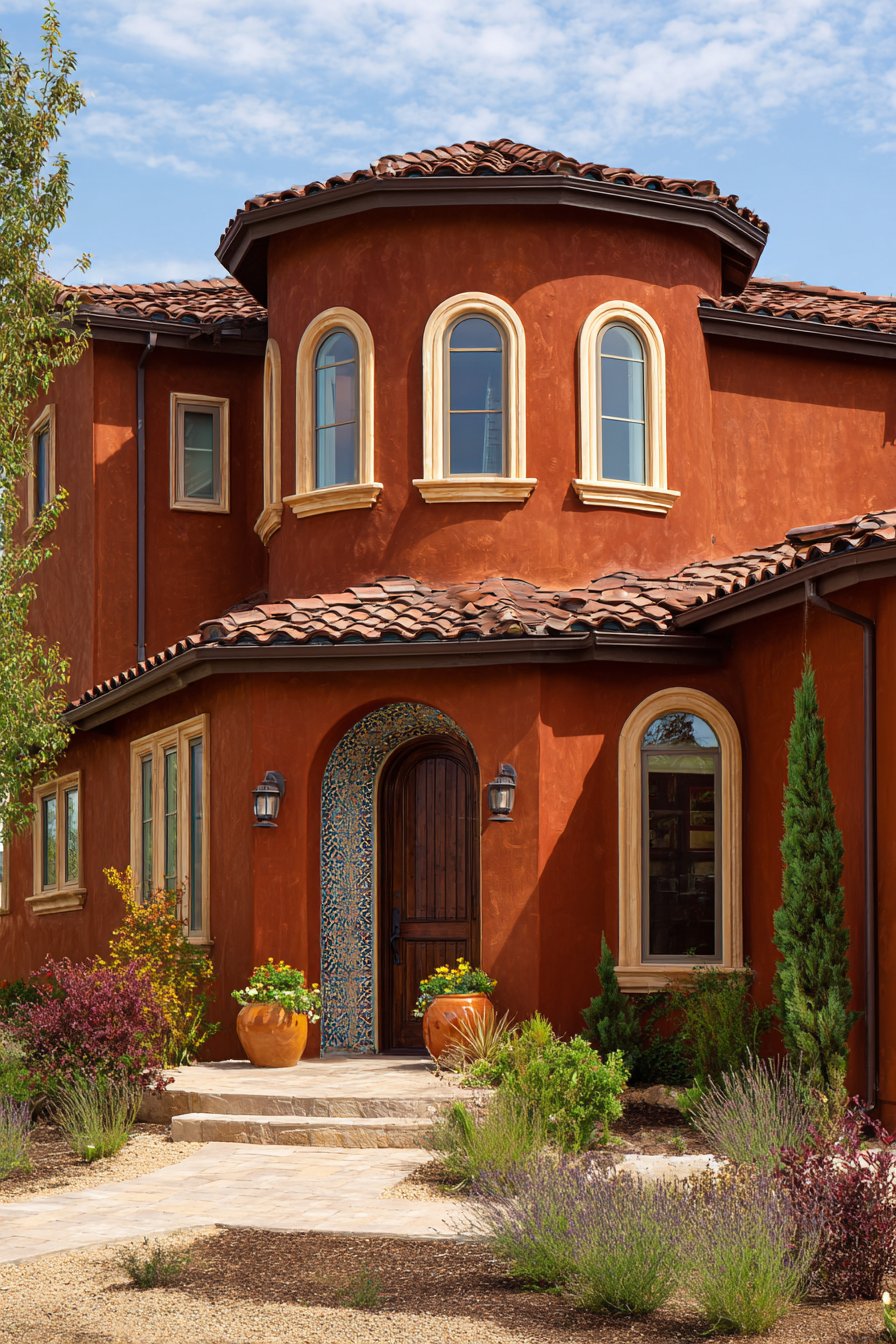
European architectural traditions find expression in this exterior wall painting idea that transports homeowners to sun-drenched coastal villages through authentic color selection and material treatment. Terracotta-toned walls immediately establish Mediterranean identity, evoking the clay earth, sunset skies, and ancient pottery that define the region’s visual character. This warm, earthy orange-pink represents one of humanity’s oldest architectural colors, derived from natural clay pigments that have adorned structures around the Mediterranean basin for millennia. Cream-colored trim around arched windows and doorways provides the soft contrast appropriate to Mediterranean aesthetics, avoiding the harsh white that would feel too stark against the warm wall color.
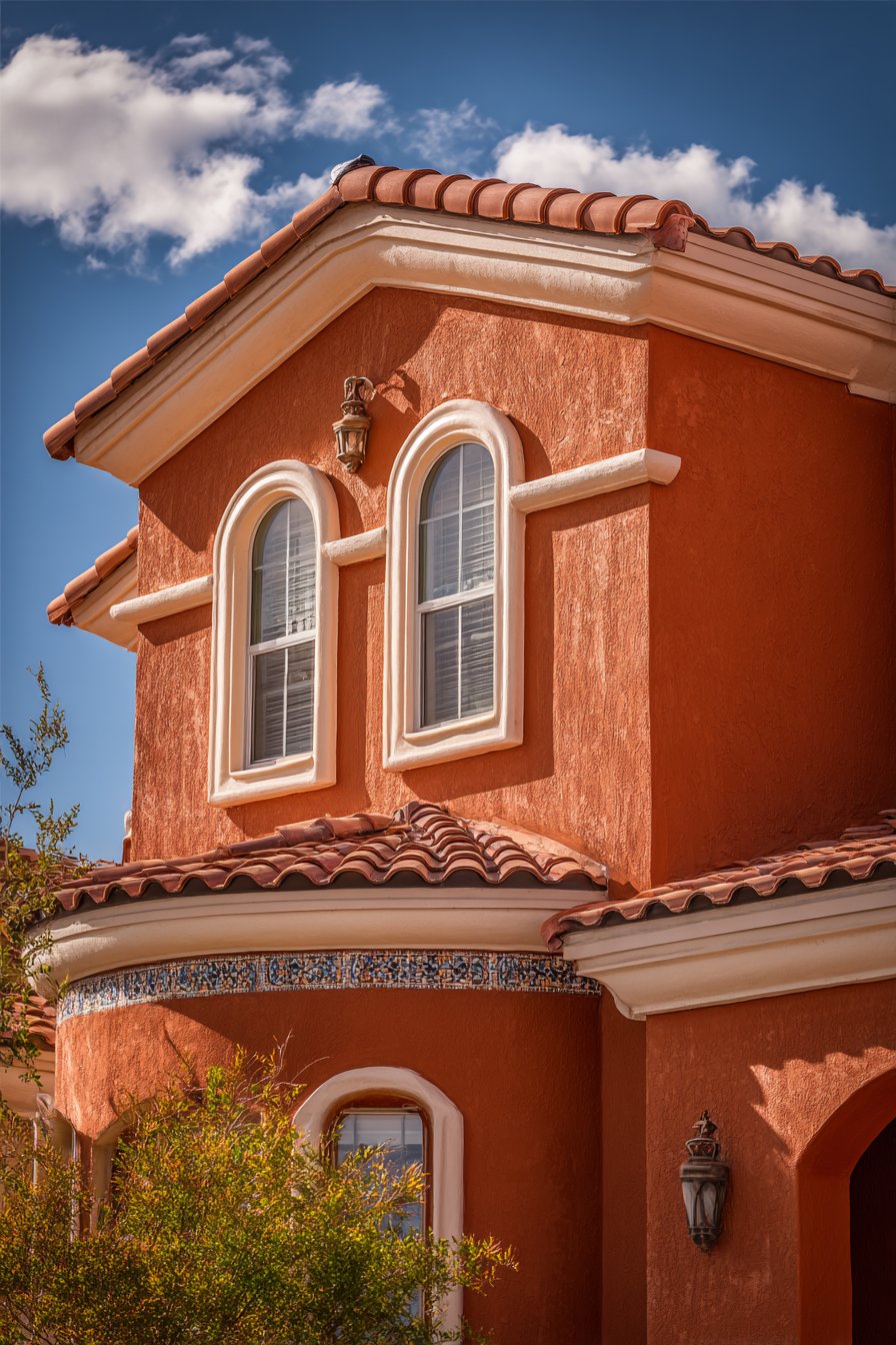
A decorative tile accent band at waist height adds visual interest while referencing the ceramic traditions central to Mediterranean decorative arts. This horizontal element breaks up the wall plane, creates human-scaled detail, and introduces pattern without overwhelming the composition. Professional architectural photography captured during midday sun highlights the warm paint tones and textured stucco finish with natural shadows defining the architectural curves and details—the terracotta walls appear to glow from within, the cream trim provides gentle highlights, and the tile band creates a distinct horizontal line that emphasizes the home’s proportions. The strong sunlight actually enhances this color scheme rather than washing it out, as terracotta pigments were developed in high-light environments and perform optimally in bright conditions.
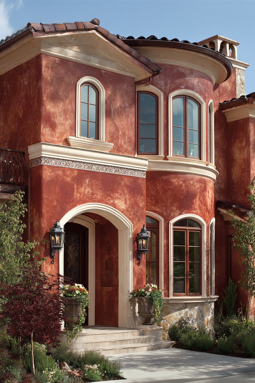
This exterior wall painting idea succeeds because it authentically represents Mediterranean architectural principles rather than applying superficial decorative elements to incompatible building forms. The terracotta walls work specifically with stucco surfaces, arched openings, tile roofing, and the horizontal emphasis characteristic of Mediterranean residential design. The color psychology supports the home’s identity as a retreat and gathering place, as terracotta tones convey warmth, earthiness, hospitality, and connection to ancient traditions. From a practical perspective, terracotta hides dust and minor imperfections while maintaining its visual impact across seasons—the color appears particularly beautiful during fall when landscape colors echo the walls’ warmth, but remains inviting even against winter’s starkness or spring’s fresh greens.
Key design tips for achieving this look: Select terracotta with pink rather than orange undertones for sophisticated appearance. Apply textured stucco finish before painting to achieve authentic Mediterranean surface quality. Choose cream trim rather than stark white for historically appropriate contrast. Install decorative tile band while walls are being painted for proper integration. Consider using lime-based paint for authentic finish and superior breathability on stucco. Ensure arched openings have properly radiused forms rather than approximated curves. Coordinate roof tile color with wall terracotta for harmonious relationship. Add wrought iron details on windows and doors to complete Mediterranean aesthetic. Paint during warm, dry weather as stucco surfaces require proper curing conditions.
7. Mid-Century Modern Gray and Turquoise
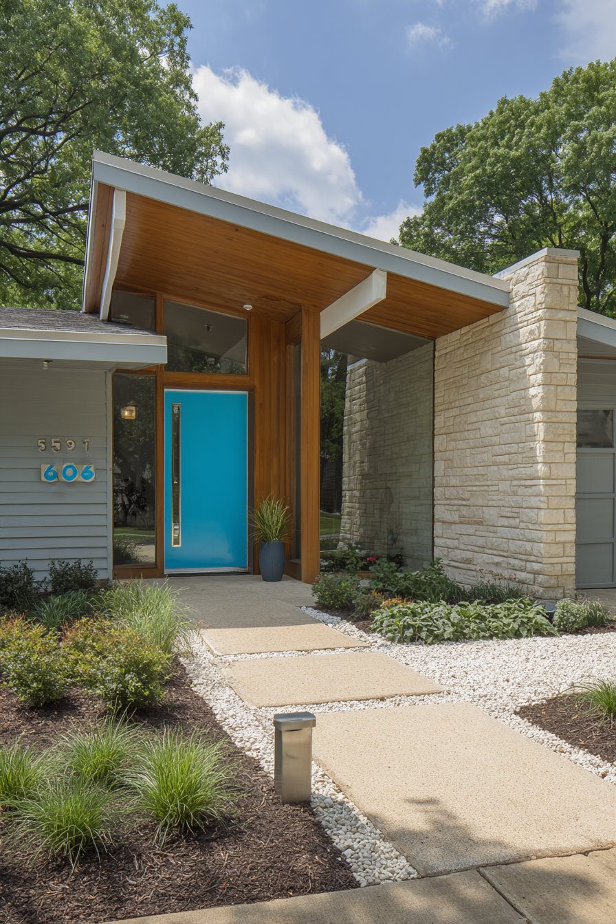
Post-war optimism and design innovation characterize this exterior wall painting idea that celebrates mid-century modern’s enduring appeal through period-appropriate color relationships and material honesty. Horizontal wood siding painted in warm gray establishes the clean, unornamented backdrop essential to mid-century aesthetics, allowing architectural form and spatial relationships to communicate design intent without color distraction. This particular gray leans warm rather than cool, avoiding the sterile quality that can make gray appear institutional while maintaining the sophisticated neutrality that defines the palette. Vibrant turquoise on the front door and window trim introduces the era’s characteristic optimism and willingness to embrace saturated color in controlled doses.
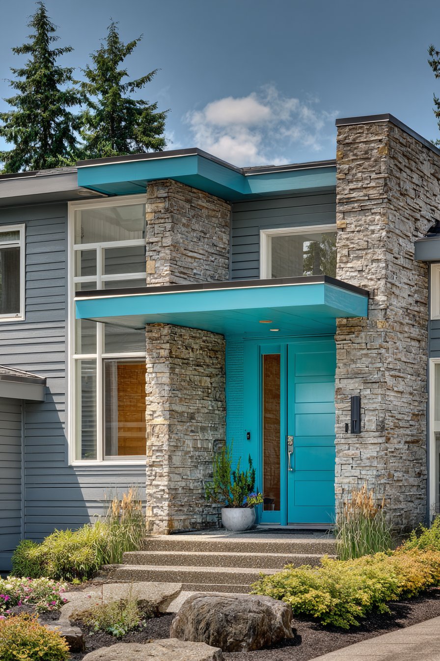
Natural stone veneer on one exterior wall provides material contrast that mid-century architects championed, demonstrating their philosophy that different materials should be expressed honestly rather than concealed or made to appear uniform. Wide-angle architectural photography captures the full facade with balanced exposure, revealing how the paint colors work with period-appropriate design elements and clean geometric lines—the warm gray appears substantial and modern, the turquoise accents create focal points that draw the eye, and the natural stone contributes textural richness that painted surfaces alone cannot achieve. The horizontal siding emphasizes the era’s preference for horizontal lines that connect buildings to landscape and create visual calm through repetition.
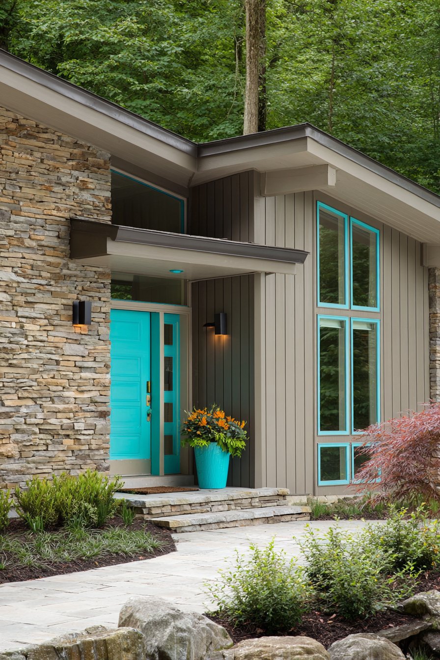
What distinguishes this exterior wall painting idea is its authentic representation of mid-century color philosophy, which embraced both restrained neutrals and bold accents without the timidity that characterizes many contemporary interpretations. The warm gray walls provide visual quiet that allows the architecture’s clean lines to communicate, while the turquoise accents inject personality and period-appropriate optimism. This color combination works particularly well on ranch houses, split-levels, and other mid-century forms, though it can also update older structures when combined with appropriate architectural modifications. From a practical standpoint, the gray walls hide minor imperfections while the turquoise accents are easy to refresh when desired, allowing homeowners to update the look every few years with minimal investment.
Key design tips for achieving this look: Select warm gray with slight brown undertones rather than cool blue-grays for period authenticity. Choose turquoise with equal parts blue and green rather than versions that lean heavily toward either. Paint horizontal siding in direction of boards to minimize visible brush marks. Leave natural materials like stone in their authentic state rather than painting. Consider charcoal or black for house numbers and light fixtures to complete mid-century aesthetic. Use flat or satin paint finish on siding rather than high-gloss for period-appropriate appearance. Coordinate landscape design with architectural color scheme for integrated approach. Replace or paint existing shutters to match wall color as mid-century design typically avoided shutters. Ensure turquoise accents receive UV-resistant paint as saturated colors fade faster than neutrals.
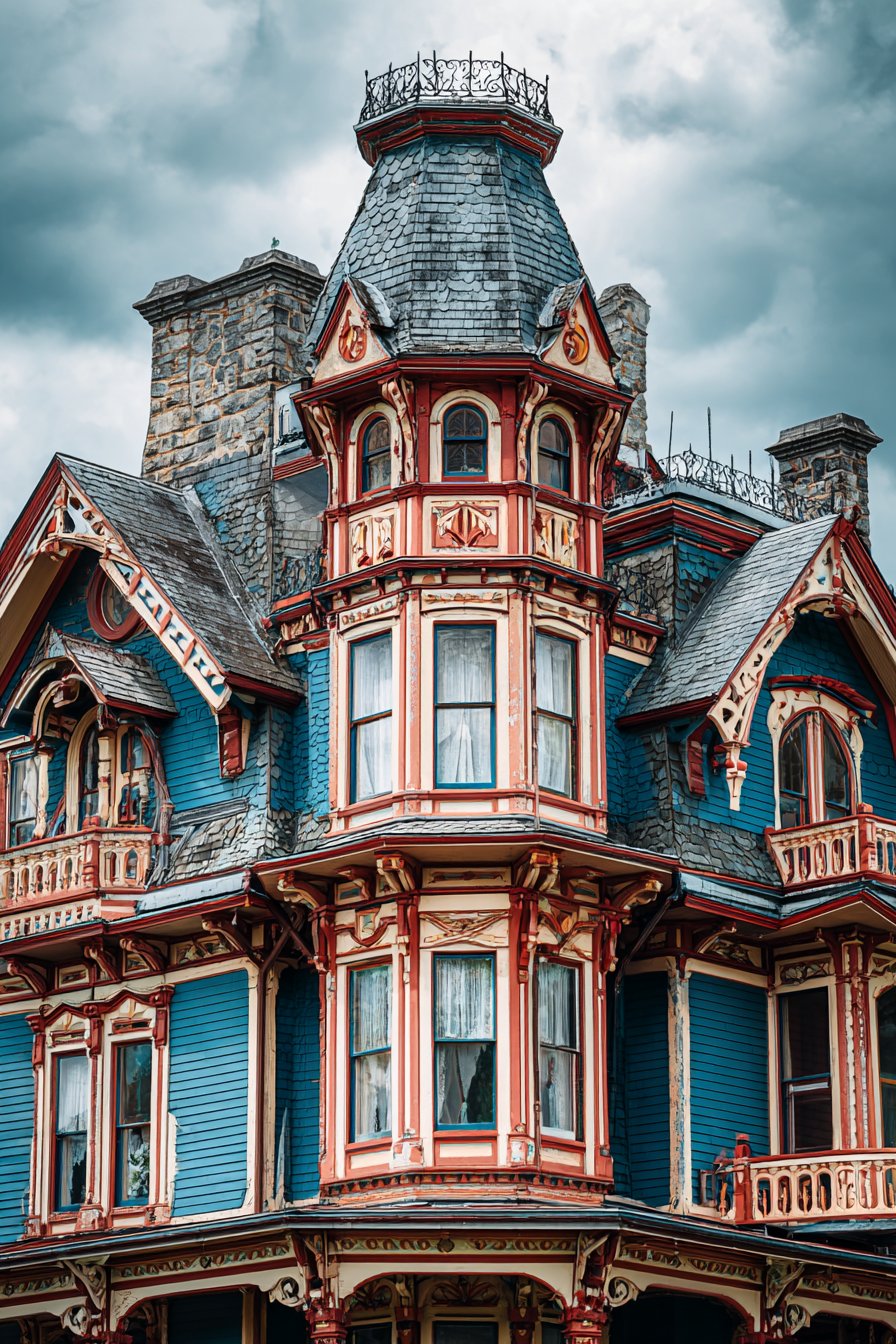
8. Victorian Three-Color Sophistication
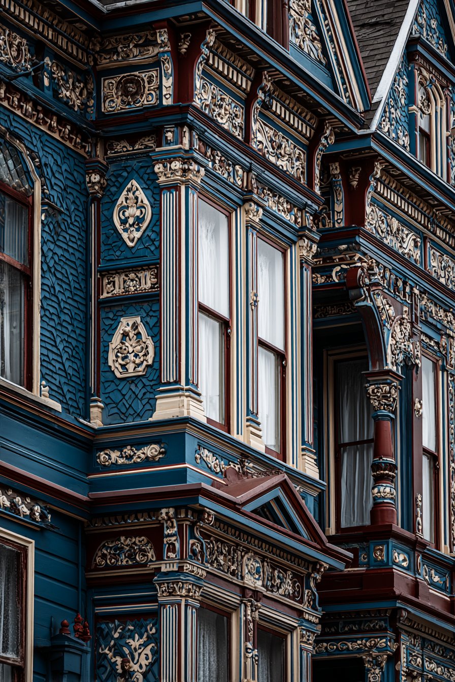
Historical architecture demands exterior wall painting ideas that honor period authenticity while creating visual interest through sophisticated color relationships, and this Victorian approach delivers both through careful three-color coordination. Slate blue walls establish the foundation of this color scheme, a sophisticated choice rooted in Victorian-era paint technology when Prussian blue pigments allowed for rich, complex blues unavailable in earlier periods. Cream trim provides the definition essential to Victorian architecture’s ornate detailing, creating visual separation between different architectural elements while highlighting the craftsmanship evident in gingerbread details, turned porch posts, and decorative brackets. Burgundy accents on decorative elements introduce the third color that transforms a simple two-tone scheme into the complex polychromatic approach favored during the Victorian era.
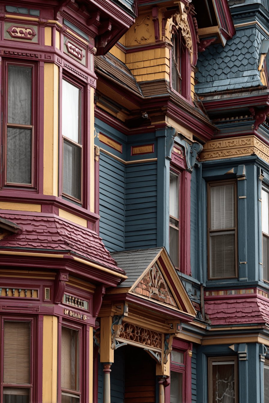
The varied textures of wood siding, shingles, and ornamental elements each showcase the paint differently, creating visual richness through surface variation rather than relying solely on color contrast. Professional photography captured during soft afternoon light reveals the complexity of the color scheme and how illumination plays across the ornate architectural features—the slate blue appears rich and dimensional, the cream trim creates bright highlights that emphasize detail, and the burgundy accents provide jewel-like focal points that reward close observation. Victorian architects understood that buildings would be viewed from multiple distances and designed color schemes that worked both from afar, where overall impact mattered most, and up close, where ornamental details deserved attention.
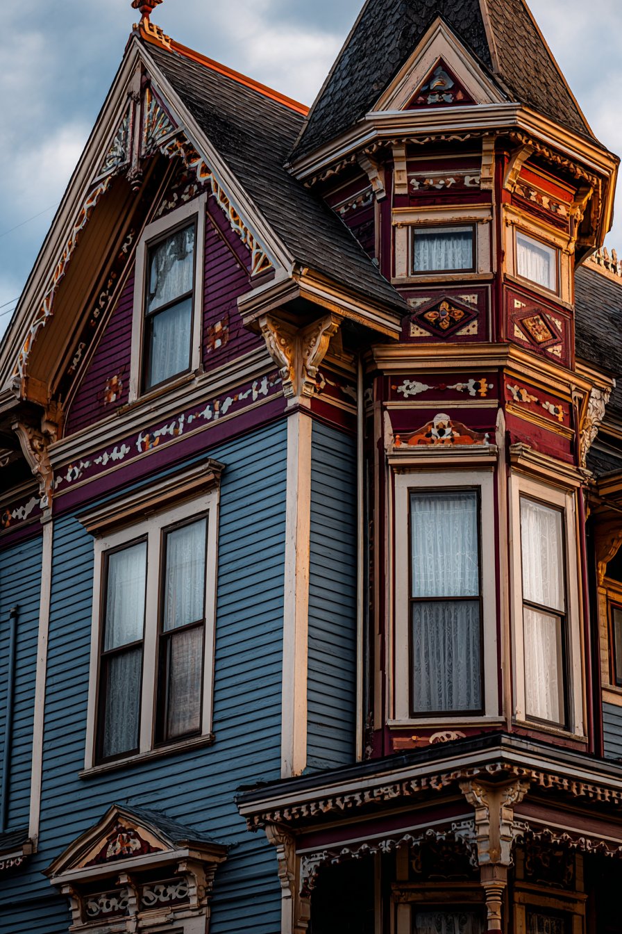
This exterior wall painting idea succeeds because it respects Victorian design principles while avoiding the excessive ornamentation that can make period homes appear cartoonish or theme-park-like. The slate blue, cream, and burgundy combination represents historically appropriate sophistication rather than the garish rainbow schemes sometimes applied to Victorian structures. The color psychology supports the home’s identity as a substantial, established residence with historical pedigree and attention to period correctness. From a practical perspective, the three-color approach requires careful planning and execution but rewards homeowners with a distinctive appearance that immediately distinguishes their home from generic-painted neighbors. The multiple colors actually simplify future maintenance, as touch-ups can address individual elements without requiring complete repainting.
Key design tips for achieving this look: Research historical Victorian paint colors specific to your home’s construction period for authenticity. Apply cream trim to all architectural details including brackets, spindles, and decorative elements to create definition. Use burgundy sparingly on select ornamental features rather than large surfaces. Consider hiring professional painters experienced with Victorian restoration for best results. Test color combinations on inconspicuous areas before committing to entire facade. Use quality brushes rather than sprayers for detailed ornamental work requiring precision. Document color locations and paint formulas for future touch-up and maintenance. Consider fourth accent color in gold or terra cotta for bay windows or tower elements if appropriate. Ensure proper wood repair and preparation before painting as ornamental details deteriorate faster than flat surfaces.
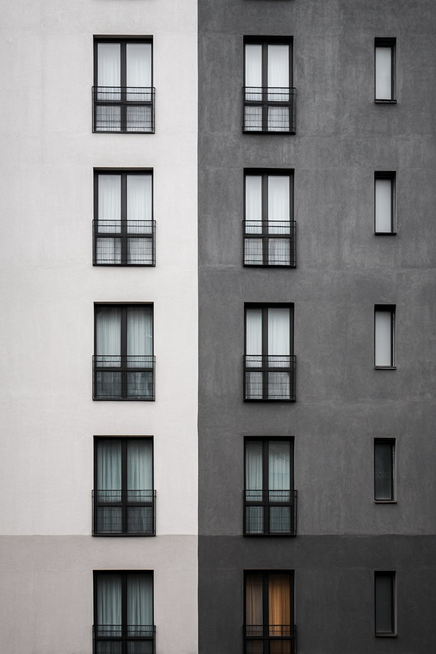
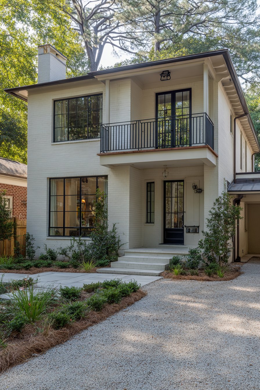
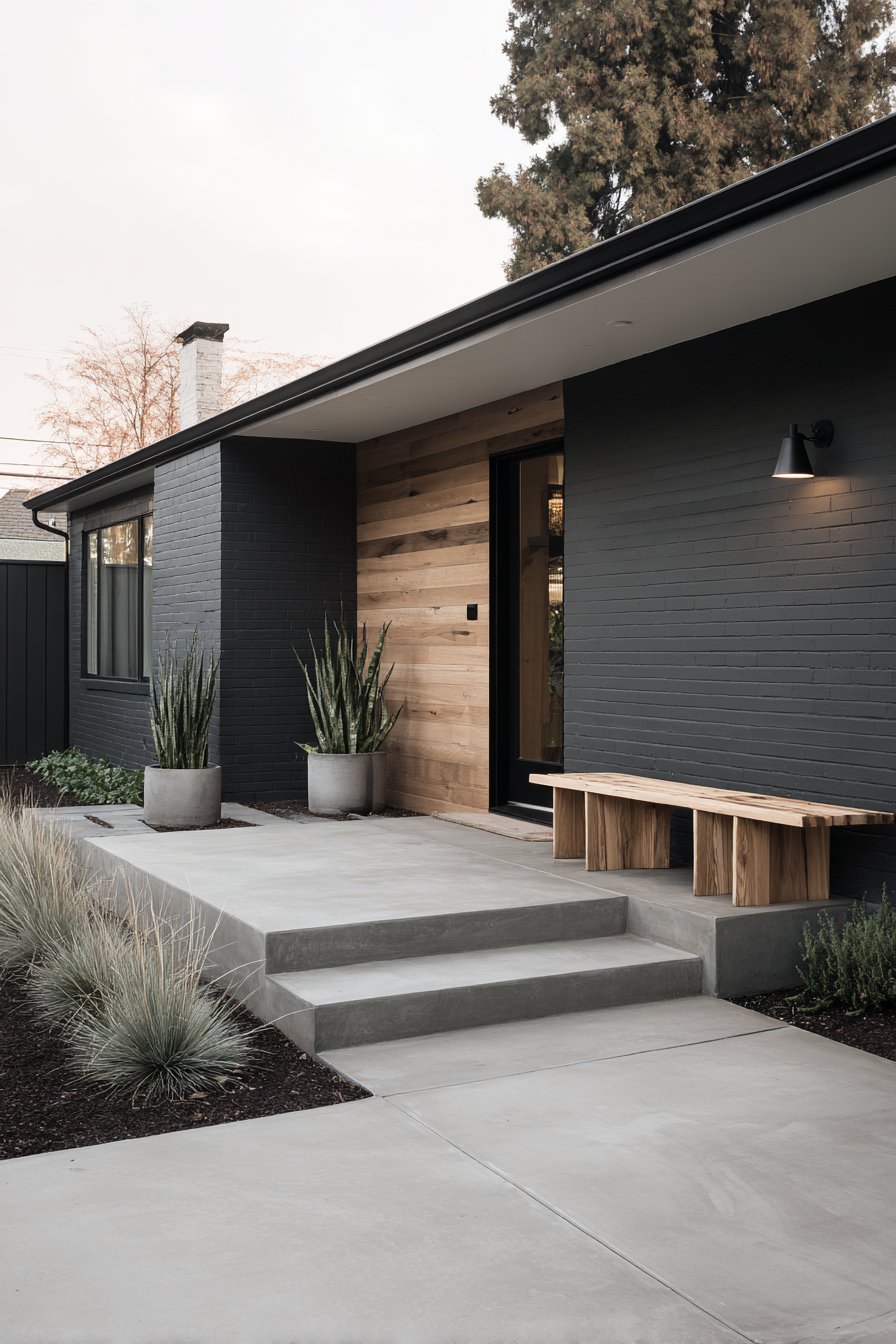
9. Minimalist Charcoal and White
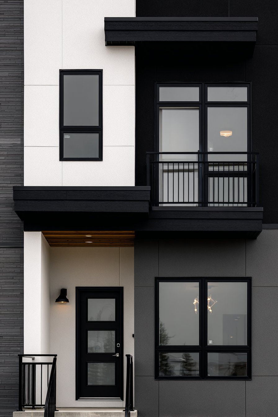
Contemporary minimalism finds expression in this exterior wall painting idea that embraces monochromatic sophistication through strategic color placement and material restraint. Smooth fiber cement panels in matte charcoal gray establish the dominant tone, a neutral that reads as substantial and intentional rather than merely the absence of color. This particular gray approaches near-black without quite reaching that extreme, maintaining enough lightness to reveal surface quality and shadow play while projecting unmistakable contemporary sensibility. Select walls in crisp white provide contrast essential to minimalist composition, creating visual tension through the stark meeting of light and dark while allowing architectural form to emerge as the primary design element.
Black aluminum window frames integrate seamlessly with the monochromatic palette, disappearing into the charcoal walls on dark surfaces while creating graphic definition against white sections. Architectural photography with balanced exposure shows the clean lines and how different gray tones define separate planes of the modern facade, captured in even daylight conditions that prevent harsh shadows from obscuring the subtle interplay between dark and light surfaces. The smooth fiber cement contributes significantly to minimalist reading, as any surface texture would compete with the purity of form and color relationships. This material choice also supports the environmental principles often associated with contemporary design, as fiber cement offers durability and low maintenance that reduces long-term resource consumption.
What makes this exterior wall painting idea particularly successful is its demonstration that minimalism requires maximum attention to proportion, detail, and execution quality. The charcoal and white combination appears simple but demands perfect application, clean color transitions, and careful attention to architectural details. Any imperfection in paint application, trim installation, or surface preparation becomes immediately visible against the unforgiving palette. The color psychology supports the home’s identity as a sophisticated, design-forward residence for occupants who value restraint over decoration and quality over quantity. From a practical perspective, both charcoal and white require regular maintenance—white shows dirt readily while charcoal can fade in intense sunlight—but both colors allow for straightforward touch-ups and cleaning.
Key design tips for achieving this look: Select charcoal gray rather than true black to maintain some surface variation and shadow depth. Use crisp white without cream or gray undertones for maximum contrast. Ensure perfectly smooth surface preparation as matte finishes reveal every imperfection. Apply fiber cement panels with minimal reveal between panels for clean contemporary appearance. Choose black window frames in matte rather than glossy finish for sophisticated look. Consider concealing or minimizing visible gutters and downspouts for cleaner facade. Install modern house numbers and lighting fixtures in black to maintain monochromatic theme. Plan white surfaces on elevations receiving less direct sun to minimize cleaning requirements. Use masonry paint or specialized fiber cement coatings for best adhesion and durability.
10. Cottage Lavender-Gray Romance
Storybook charm emerges in this exterior wall painting idea that embraces softer romanticism through unexpected color choices and thoughtful accent selection. Soft lavender-gray walls create immediate distinction while maintaining subtlety, a sophisticated color that reads as gray in some lighting conditions and reveals its purple undertones in others. This chameleonic quality adds interest without committing to overtly colorful expression, allowing the home to feel special without appearing eccentric. White trim provides clean definition around windows, doors, and eaves while a cheerful coral-pink front door introduces the unexpected accent that elevates the scheme from merely pleasant to genuinely memorable.
Natural wood details on porch railings and posts are stained rather than painted, demonstrating design restraint that allows material character to contribute visual warmth and textural contrast. Professional exterior photography captured during golden hour reveals the romantic color scheme and shows how paint interacts with natural light, highlighting the texture of wood siding and charming architectural details—the lavender-gray appears soft and inviting, the white trim creates crisp highlights, and the coral-pink door glows with particular warmth in evening light. The combination of painted and stained surfaces creates material diversity essential to cottage aesthetics, preventing the uniform appearance that can make homes appear flat or one-dimensional.
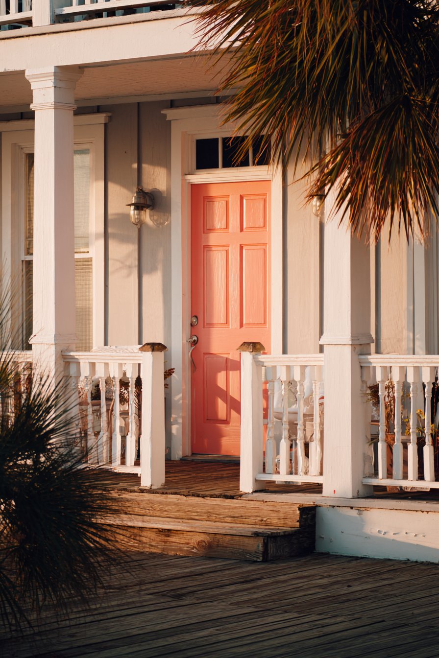
This exterior wall painting idea succeeds because it balances whimsy with sophistication, creating a home that appears approachable and friendly without seeming childish or theme-like. The lavender-gray walls ground the composition with sufficient neutrality to maintain broad appeal, while the coral-pink door provides personality and welcome. The color psychology supports the home’s identity as a retreat and sanctuary, as lavender conveys calm and creativity while pink suggests warmth and nurturing. From a practical perspective, the lavender-gray hides minor imperfections better than pure gray while offering more character than beige. The coral-pink door can be easily repainted in a different accent color should tastes change, allowing for periodic updates without major investment.
Key design tips for achieving this look: Select lavender-gray with sufficient gray content to avoid appearing overtly purple. Choose coral-pink with peachy undertones rather than bright fuchsia for sophisticated cottage appearance. Leave natural wood elements properly sealed rather than painted to maintain material diversity. Consider purple or lavender flowering plants in foundation plantings to echo wall color. Use white paint with slight warm undertones rather than stark white for softer cottage aesthetic. Apply coral-pink to front door and potentially shutters if present for coordinated accents. Test lavender-gray on multiple exposures as color appears different in varying light conditions. Consider cream or antique white for trim on shaded sides to prevent stark contrast. Ensure wood stain has warm brown tones rather than gray or cool finishes.
11. Ranch Style Warm Tan and Brown
Mid-century ranch architecture finds appropriate expression in this exterior wall painting idea that honors the style’s horizontal emphasis and connection to natural landscapes. Warm tan walls establish earth-toned foundation that allows the architecture’s clean lines to communicate without color distraction, echoing the desert landscapes and natural materials that influenced ranch house development. This particular tan maintains enough warmth to feel inviting while avoiding the yellow cast that can make tan appear dated. Chocolate brown trim around windows and fascia boards provides definition while maintaining the earth-tone relationship, creating contrast through value differences rather than color opposition.
A stone accent wall on one section provides textural variety against the painted surfaces, demonstrating the ranch aesthetic’s appreciation for mixed materials and connection to natural elements. Wide-angle architectural photography shows the horizontal emphasis of the design with natural lighting revealing the paint texture on aluminum siding and subtle color variations across the facade—the tan appears warm and grounded, the brown trim creates shadow lines that emphasize horizontal details, and the natural stone contributes dimensional depth that flat surfaces cannot achieve. The horizontal siding reinforces the architectural style’s defining characteristic, with paint application following the lines to create visual continuity and emphasize the home’s connection to the landscape.
What distinguishes this exterior wall painting idea is its authentic representation of ranch house color philosophy, which favored earthy, understated tones that allowed homes to settle into their surroundings rather than dominate them. The tan and brown combination communicates established stability, connection to nature, and timeless restraint rather than trendy expression. From a practical perspective, these earth tones hide dust and minor weathering far better than light colors while avoiding the heat absorption and fading issues associated with darker hues. The colors perform well across seasons, appearing warm and inviting against winter snow, harmonizing with autumn foliage, complementing spring’s fresh greens, and providing cooling visual relief against summer’s bright sun.
Key design tips for achieving this look: Select warm tan with brown rather than yellow or pink undertones for sophisticated earthiness. Choose chocolate brown that coordinates with roof color for visual harmony. Apply stone veneer to foundation or chimney rather than creating mid-wall accent for architectural appropriateness. Consider extending brown to garage door for cohesive appearance. Use satin or semi-gloss finish on trim to differentiate from flatter wall finish. Ensure aluminum siding is properly cleaned and primed before painting for best adhesion. Coordinate exterior colors with interior visible through windows for design continuity. Include period-appropriate brass or bronze light fixtures to complete ranch aesthetic. Maintain consistent paint color on all elevations rather than varying by exposure. Plan landscaping with low horizontal plantings that reinforce architectural emphasis.
12. Transitional Revere Pewter Versatility
Design flexibility meets sophisticated neutrality in this exterior wall painting idea that showcases one of the most celebrated paint colors in residential design. Benjamin Moore’s Revere Pewter on main walls delivers the greige (gray-beige) tone that has dominated interior design and now proves equally successful on exteriors. This complex neutral reads as warm gray in some conditions and soft beige in others, providing visual interest through its chameleonic quality rather than relying on saturated color. Pure white trim creates the crisp definition essential to making neutrals appear intentional rather than indecisive, while a statement black front door introduces the contrast necessary to prevent the overall scheme from appearing washed out.
Mixed materials including painted brick on the lower portion and fiber cement siding above demonstrate transitional design’s comfort with material variety and architectural complexity. Professional photography with balanced exposure captures how the greige paint tone appears in natural light conditions, showing subtle warmth and the interplay between painted and unpainted surfaces—the Revere Pewter appears sophisticated and changeable depending on lighting, the white trim provides bright highlights, and the black door creates a strong focal point that anchors the composition. The painted brick section maintains some textural interest while the smooth siding above creates contrast through surface quality rather than color alone.
This exterior wall painting idea succeeds because it represents the transitional aesthetic’s core principle: creating spaces that feel current without committing to any single design philosophy. The Revere Pewter provides enough warmth to feel inviting while maintaining sufficient neutrality to allow personal expression through landscaping, seasonal decor, and architectural details. The color psychology supports the home’s identity as sophisticated and established without appearing stuffy or overly formal. From a practical perspective, this greige tone hides imperfections exceptionally well while maintaining enough visual interest to avoid appearing flat. The color has proven its staying power across changing trends, suggesting it will remain attractive far longer than more trendy choices.
Key design tips for achieving this look: Test Revere Pewter on multiple exposures as it reads differently in varying light conditions. Use pure white trim without cream or gray undertones for crisp definition. Consider black for front door, shutters, and garage door for consistent accent color. Apply greige over properly primed surface for true color representation. Choose fiber cement siding over painted brick section for material contrast. Ensure white trim receives higher quality paint for maximum durability on high-wear surfaces. Coordinate exterior greige with interior wall colors visible through windows. Install modern lighting fixtures in black or oil-rubbed bronze to complement color scheme. Plan for regular white trim maintenance as it shows dirt more readily than greige walls. Consider slightly lighter or darker greige for shutters if present to create subtle tonal variation.
13. French Country Ivory Elegance
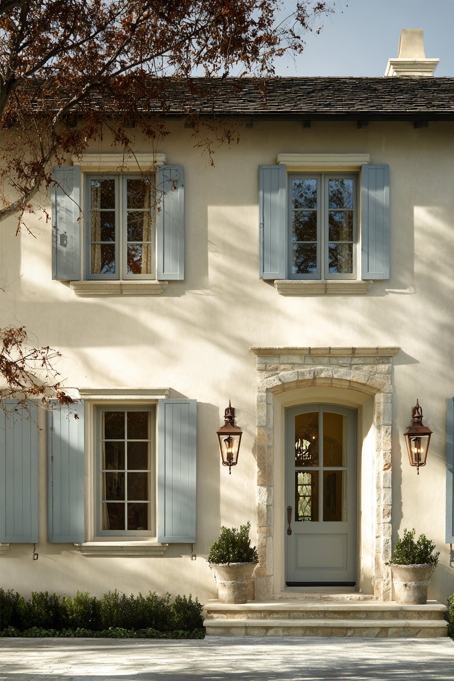
European sophistication manifests in this exterior wall painting idea that captures French country estate aesthetics through refined color selection and material restraint. Creamy ivory walls establish the soft, romantic foundation essential to French country design, evoking the limestone buildings and sun-washed plaster that characterize rural French architecture. This particular ivory maintains enough warmth to feel inviting while avoiding the yellow cast that can make cream appear dated. Soft gray-blue shutters and trim provide the gentle contrast appropriate to French aesthetics, avoiding harsh definition in favor of subtle sophistication that rewards close observation.
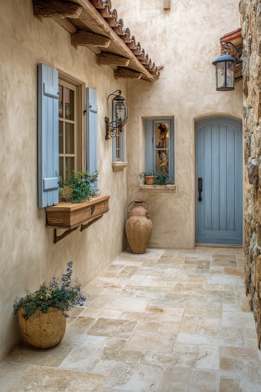
Natural stone accents around the entryway remain unpainted, providing rustic contrast that grounds the refined painted surfaces and references the agricultural origins of country house design. Professional architectural photography captured during soft morning light shows the elegant paint combination and how smooth stucco texture catches light differently than dimensional trim elements—the ivory appears luminous and soft, the gray-blue creates gentle definition without harsh contrast, and the natural stone contributes earthy authenticity. The morning light particularly flatters this color scheme, as the soft illumination prevents the ivory from appearing too bright while allowing the gray-blue to reveal its complex undertones.
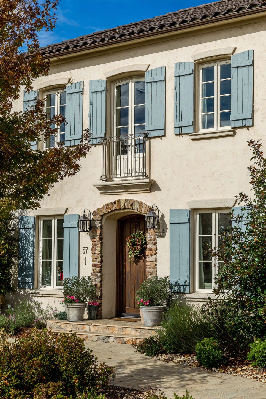
What makes this exterior wall painting idea particularly successful is its authentic representation of French country principles: refined simplicity, material honesty, and connection to agricultural heritage. The ivory and gray-blue combination communicates established elegance without ostentation, creating homes that appear collected over time rather than recently constructed. The color psychology supports the home’s identity as a sophisticated retreat that values quality, tradition, and understated beauty. From a practical perspective, ivory requires more maintenance than darker neutrals but rewards homeowners with a distinctive appearance that immediately elevates their home’s perceived value. The gray-blue shutters can be real functioning elements or decorative accents, though French country purists insist on properly sized, functional shutters.
Key design tips for achieving this look: Select creamy ivory rather than stark white or yellow-cream for authentic French country appearance. Choose gray-blue with sufficient gray content to avoid appearing too saturated or cottage-like. Leave natural stone elements in their authentic state with appropriate sealing rather than painting. Ensure smooth stucco finish on walls before painting for proper French country aesthetic. Consider real wood shutters stained or painted gray-blue rather than vinyl alternatives. Use soft sheen paint finish on stucco for authentic appearance rather than high-gloss. Install period-appropriate lighting fixtures in iron or aged metal finishes. Coordinate roof material with wall color—clay tile or slate work best with ivory. Plan for more frequent cleaning of ivory surfaces to maintain pristine appearance. Consider extending gray-blue to window boxes and doors for coordinated accents throughout.
14. Contemporary Farmhouse Black and White Drama
Bold contemporary expression meets farmhouse comfort in this exterior wall painting idea that embraces high-contrast color blocking for maximum visual impact. Black painted board-and-batten on the lower third establishes strong visual weight and grounds the composition, creating dramatic foundation that draws attention and communicates design confidence. White smooth siding on the upper portion provides striking contrast while maintaining the farmhouse aesthetic’s connection to agricultural architecture and rural simplicity. Natural wood accents on the front porch ceiling add warmth that prevents the black and white scheme from appearing too stark or institutional.
Wide-angle architectural photography captures the striking contrast and shows the different textures of painted surfaces with professional lighting that highlights material details and clean modern lines—the black board-and-batten appears bold and substantial, the white siding creates bright, expansive visual relief, and the natural wood introduces organic warmth. The horizontal line where black meets white creates powerful visual division that emphasizes the home’s proportions and allows each color zone to maintain its impact. This color blocking strategy demonstrates sophisticated understanding of how color placement affects perceived scale and architectural emphasis, with the dark lower section making the home appear grounded while the white upper section prevents the overall composition from appearing heavy.
This exterior wall painting idea succeeds because it represents contemporary farmhouse style’s evolution beyond safe neutrals toward bolder expression while maintaining the accessibility and warmth that define the aesthetic. The black and white combination communicates modernity and design sophistication without abandoning farmhouse principles of simple materials and honest construction. The color psychology creates interesting tension—black conveys power, sophistication, and modernity while white suggests purity, simplicity, and traditional values. From a practical perspective, the two-tone approach requires careful planning and execution but creates a maintenance advantage, as black and white can be touched up independently and show different types of wear, allowing strategic refresh rather than complete repainting.
Key design tips for achieving this look: Ensure perfectly straight horizontal line where black and white meet for professional appearance. Apply black paint on lower third to establish proper visual weight and grounding. Use true black rather than charcoal for maximum contemporary impact and contrast. Choose pure white without cream undertones for crisp farmhouse aesthetic. Include board-and-batten texture on black section to maintain farmhouse material character. Leave porch ceiling wood in natural finish or paint haint blue for traditional touch. Consider black for front door or maintain wood tone for accent variation. Install modern farmhouse-style lighting fixtures in black to reinforce color scheme. Ensure proper primer application where drastically different colors meet on same substrate. Plan black section on lower walls to minimize heat absorption issues while maximizing visual impact.
15. Tudor Brown and White Heritage
Historical architecture demands exterior wall painting ideas that honor period authenticity while creating the dramatic contrast essential to Tudor styling. Traditional white stucco walls between structural timber framing establish the authentic Tudor aesthetic that has captivated homeowners since the style’s revival in early twentieth-century America. This bright white plaster creates clean backdrop that allows the dark timber framing to emerge as the defining architectural feature, replicating the construction method where infill panels filled between structural wooden posts and beams. Dark brown painted timber framing provides the dramatic contrast essential to Tudor identity, creating the graphic pattern that makes the style immediately recognizable and historically significant.
Window trim and doors painted in matching dark brown create authentic period appearance while emphasizing the home’s connections to medieval English manor houses and their half-timbered construction. Professional photography captured in overcast conditions provides even lighting to show the dramatic contrast and the texture of the stucco finish against the painted wood structural elements—the white plaster appears bright and clean, the dark brown creates bold definition, and the overcast sky prevents harsh shadows that might obscure the timber pattern’s complexity. The even lighting actually benefits Tudor colors, as direct sunlight can create shadows that compete with the deliberate dark-and-light pattern.
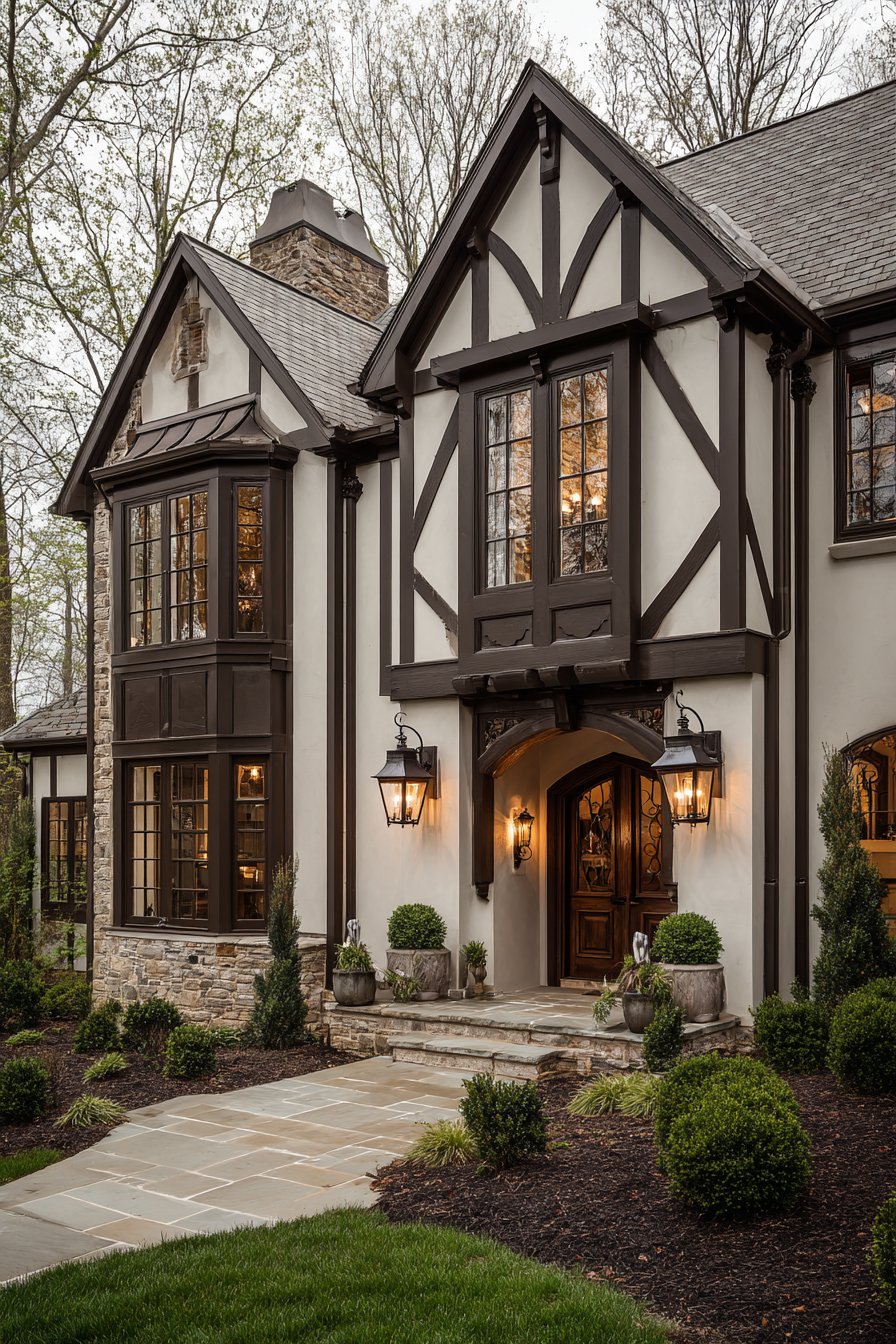
What distinguishes this exterior wall painting idea is its commitment to Tudor authenticity rather than superficial application of decorative half-timbering to incompatible building forms. True Tudor styling requires that timber elements follow structural logic rather than random decorative placement, with diagonal bracing, vertical posts, and horizontal beams creating patterns that reflect actual construction methods. The color psychology supports the home’s identity as substantial, established, and connected to architectural heritage spanning centuries. From a practical perspective, the high contrast between white and dark brown requires regular maintenance to keep both colors looking fresh, as the white shows dirt readily while the brown may fade in intense sunlight, but the dramatic visual impact justifies the maintenance investment.
Key design tips for achieving this look: Research authentic Tudor timber patterns specific to your home’s scale and proportion. Apply white stucco or paint to infill panels while leaving timber elements in dark brown or black. Choose dark brown with black undertones rather than reddish-brown for period authenticity. Ensure timber elements follow structural logic rather than arbitrary decorative placement. Consider actual timber or high-quality synthetic alternatives rather than applied trim that appears fake. Use oil-based paint on timber elements for authentic appearance and maximum durability. Include diamond-pane windows if architecturally appropriate for complete Tudor aesthetic. Coordinate roof material with Tudor styling—slate or composite slate works best. Maintain clean edges where white stucco meets dark timber for professional appearance. Plan for more frequent maintenance of white surfaces to preserve the dramatic contrast.
16. Desert Modern Beige and Rust
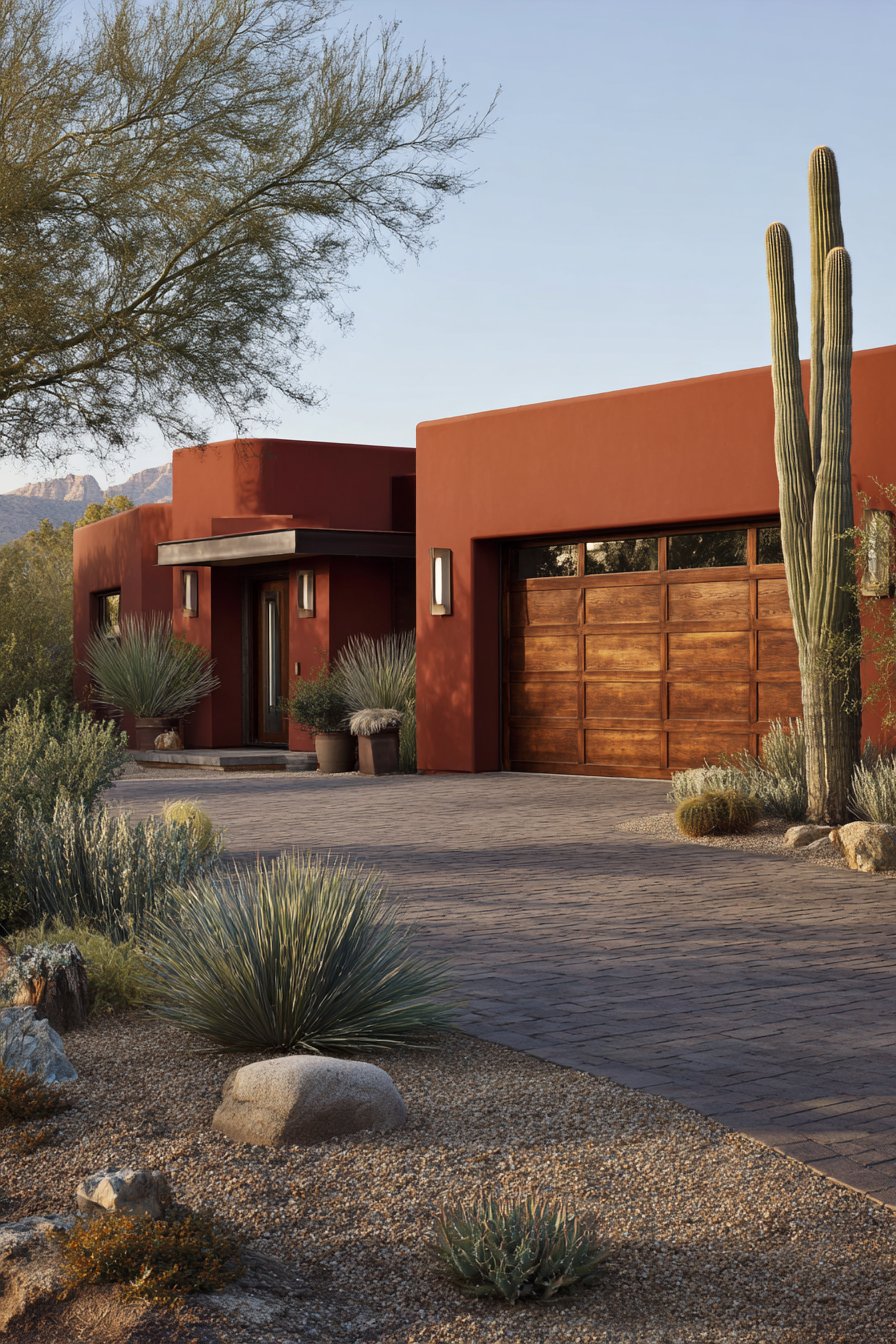
Regional architecture finds authentic expression in this exterior wall painting idea that responds directly to desert environments through color selection inspired by natural surroundings. Sandy beige walls establish immediate connection to desert landscapes, echoing the earth, rock formations, and arid terrain that characterize Southwestern environments. This particular beige maintains warm undertones that complement rather than fight desert light’s intensity, creating harmony between built structure and natural setting. A rust-colored accent wall at the entrance introduces the deeper tones found in desert rock formations and sunset skies, creating focal point that welcomes visitors while demonstrating regional color sensitivity.
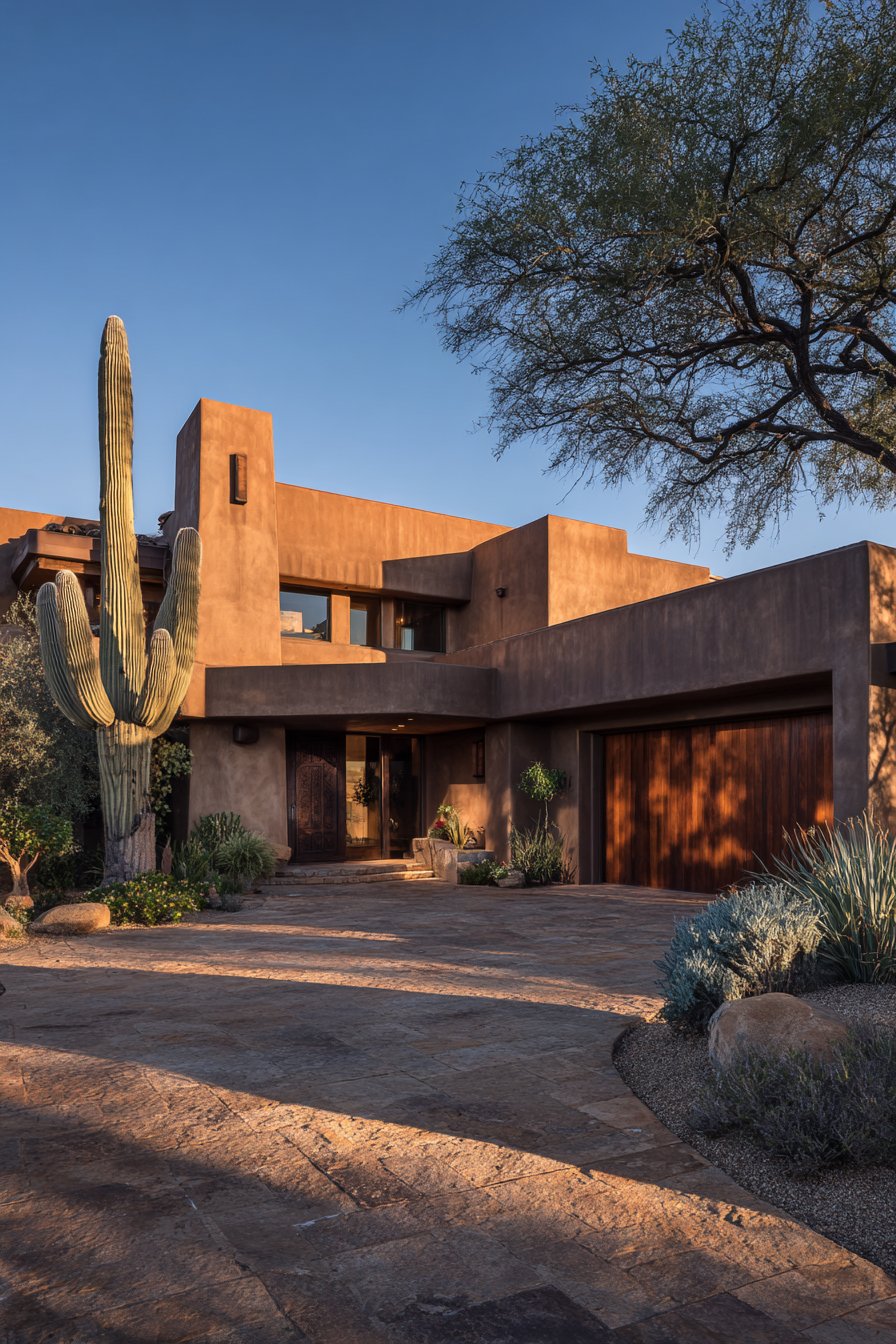
Natural wood garage door in weathered cedar finish complements the warm paint tones while introducing material variety essential to desert modern aesthetics. Architectural photography during late afternoon sun shows how the paint colors echo the desert landscape, with attention to the smooth stucco texture and subtle shadows cast by minimal architectural projections—the sandy beige appears warm and compatible with surroundings, the rust accent glows with particular intensity in desert light, and the weathered wood contributes organic character. The late afternoon timing proves crucial for desert architecture photography, as the lower sun angle creates longer shadows that reveal surface quality while the warm light enhances rather than overwhelms the already-warm color palette.
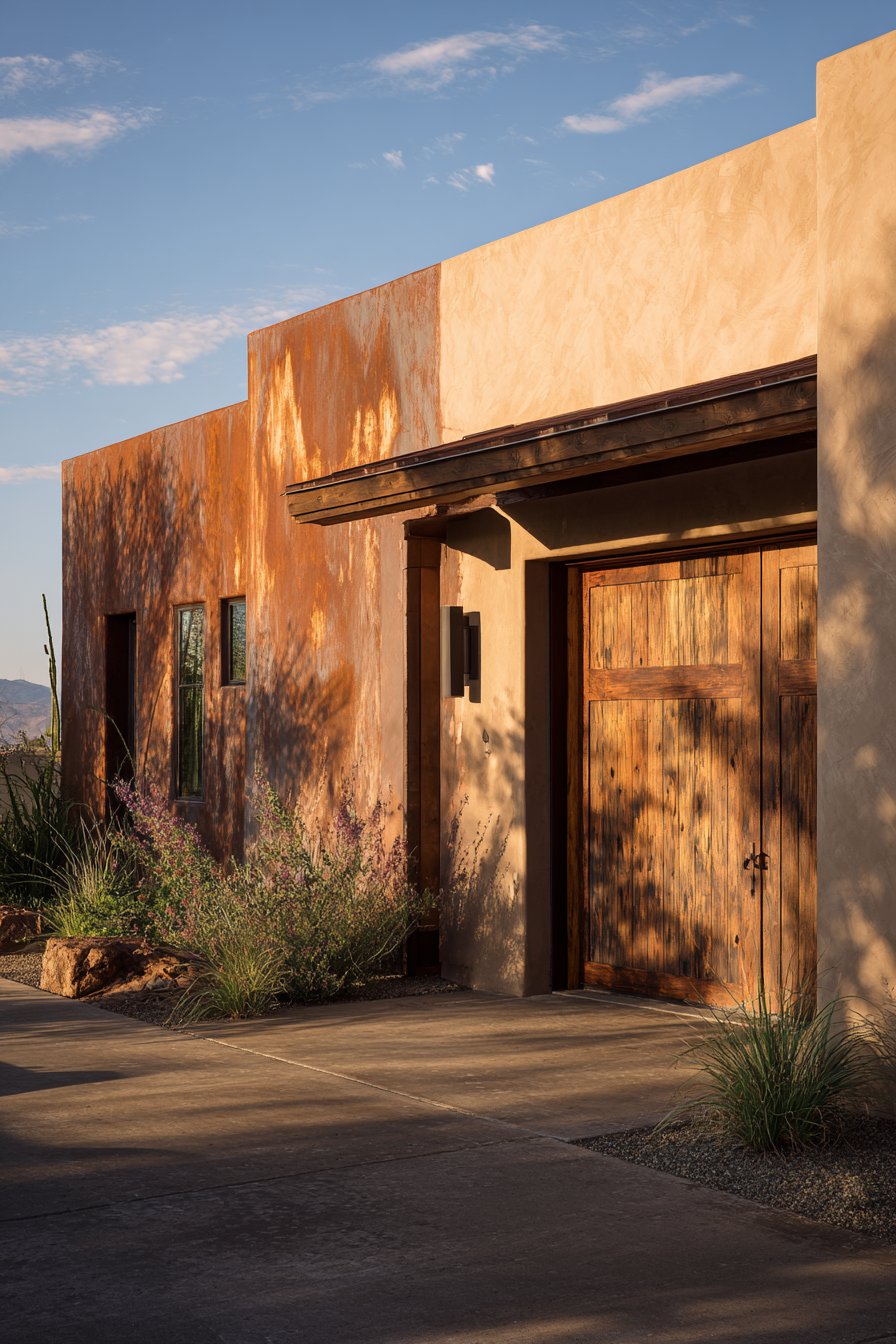
This exterior wall painting idea succeeds because it demonstrates regional appropriateness rather than imposing alien aesthetics on specific climate conditions. The sandy beige and rust combination responds directly to desert light quality, temperature extremes, and landscape colors, creating homes that appear to emerge from their settings rather than being imposed upon them. The color psychology supports the home’s identity as connected to place and responsive to environmental conditions. From a practical perspective, these earth tones hide the dust and sand that inevitably accumulate in desert environments while the light beige helps reflect solar heat rather than absorbing it. The colors also age gracefully in intense sunlight, maintaining their appearance longer than cooler tones that can fade or shift under UV exposure.
Key design tips for achieving this look: Select sandy beige inspired by local soil and rock colors for regional authenticity. Choose rust accent with sufficient orange content to read as warm rather than brown. Apply smooth stucco finish before painting to achieve authentic Southwestern surface quality. Leave garage door in natural weathered wood or apply transparent stain to maintain grain visibility. Consider flat or matte paint finish to avoid reflective glare in intense desert sun. Ensure rust accent wall receives UV-resistant paint as warm colors fade faster in direct sunlight. Coordinate exterior colors with desert landscape plantings of succulents and native species. Install period-appropriate lighting fixtures in copper or rusted metal finishes. Plan minimal roof overhang typical of desert modern design to maintain clean architectural lines. Use heat-reflective paint technology in beige color to reduce cooling costs in extreme climates.
17. Cape Cod White and Black Coastal Classic
New England architectural heritage shines through this exterior wall painting idea that honors Cape Cod traditions while maintaining timeless appeal that transcends regional boundaries. Classic white clapboard siding establishes the clean, bright foundation essential to Cape Cod aesthetics, evoking the weathered-wood cottages and lighthouse-keepers’ homes that line Atlantic coastlines. This brilliant white creates maximum contrast against dark elements while reflecting the beach environments and maritime culture that influenced the style’s development. Black shutters provide the traditional contrast that defines Cape Cod color relationships, a pairing rooted in functional necessity—black tar-based paints were among the most durable and affordable options for coastal environments.
A red front door introduces the traditional charm essential to Cape Cod identity, referencing the welcoming beacon that red doors historically provided in coastal communities. Gray-painted foundation and trim details maintain the coastal aesthetic while introducing subtle tonal variation that prevents the black and white from appearing too stark. Professional architectural photography captured during bright midday conditions shows the crisp paint finish on wood siding, revealing slight texture variations and how the high-contrast color scheme defines the simple architectural form—the white clapboard appears fresh and clean, the black shutters create bold definition, and the red door provides the warm accent that humanizes the composition.
What makes this exterior wall painting idea particularly successful is its authentic representation of Cape Cod principles: weather-resistant simplicity, maritime heritage, and adaptation to harsh coastal conditions. The white and black combination communicates established tradition, neighborhood appropriateness, and connection to New England’s architectural legacy. The color psychology supports the home’s identity as a coastal retreat, whether actually located near water or simply referencing beach cottage aesthetics in suburban settings. From a practical perspective, white clapboard requires regular maintenance in any environment but especially in coastal areas where salt air accelerates weathering, though modern paint formulations provide far better durability than historical options. The black shutters, if functioning, protect windows during storms while providing the functional beauty that Cape Cod style celebrates.
Key design tips for achieving this look: Select brilliant white without cream or gray undertones for authentic Cape Cod appearance. Choose true black for shutters rather than charcoal or dark gray for traditional contrast. Apply red to front door using historical paint colors like Williamsburg red or barn red. Paint gray foundation in medium tone to bridge between white walls and black shutters. Ensure clapboard siding is properly prepared with all loose paint removed before repainting. Use high-quality exterior paint with mildew resistance for coastal environments. Install properly sized shutters that could actually cover windows for architectural correctness. Consider black or dark green for window sashes to complement shutter color. Plan for regular repainting on three-to-five-year cycle typical of white exteriors. Include period-appropriate nautical lighting fixtures and house numbers to complete coastal aesthetic.
18. Scandinavian Soft Gray Minimalism
Nordic design principles find expression in this exterior wall painting idea that embraces the restraint, material honesty, and connection to nature that define Scandinavian aesthetics. Soft gray walls establish the neutral foundation essential to Nordic minimalism, creating visual calm that allows architectural form and natural materials to communicate design intent. This particular gray maintains warm undertones that prevent the cold, institutional quality sometimes associated with Nordic interiors while honoring the style’s preference for muted, nature-inspired tones. Natural wood accents left unpainted around the entrance and window trim demonstrate Scandinavian design’s fundamental principle of material honesty, celebrating wood’s inherent beauty rather than concealing it beneath paint.
A single charcoal black accent wall creates depth at the front facade, providing subtle contrast while maintaining the monochromatic palette essential to Nordic restraint. Wide-angle photography with balanced exposure captures the minimalist color palette and shows how the matte paint finish on smooth fiber cement siding creates a calm, understated appearance in natural Nordic-style lighting—the soft gray appears serene and contemporary, the natural wood provides organic warmth, and the charcoal accent adds sophistication without drama. The even, diffused lighting typical of Nordic regions actually flatters this color scheme, as harsh shadows would compete with the intentional simplicity that defines the aesthetic.
This exterior wall painting idea succeeds because it authentically represents Scandinavian design philosophy rather than simply applying light colors to any architectural form. The soft gray walls, natural wood accents, and charcoal black element create the layered neutrality that characterizes Nordic interiors and exteriors, where interest emerges through material quality and tonal variation rather than saturated color. The color psychology supports the home’s identity as a serene retreat that values simplicity, functionality, and connection to natural materials. From a practical perspective, this palette requires quality materials and expert execution, as any imperfection becomes visible against the unforgiving simplicity. The matte finish on gray walls hides some minor issues but shows texture variations, while the natural wood requires proper sealing and maintenance to prevent weathering.
Key design tips for achieving this look: Select soft gray with warm undertones to avoid cold, institutional appearance. Leave wood trim in natural finish with clear sealer rather than paint or stain. Apply charcoal black to single accent wall or architectural element rather than multiple surfaces. Ensure smooth fiber cement siding installation with minimal reveals for authentic Nordic appearance. Use matte or flat finish on gray walls for sophisticated contemporary look. Choose simple, functional hardware and fixtures in black or brushed stainless steel. Coordinate exterior palette with interior visible through large windows for Nordic design continuity. Include planters with simple greenery to bring natural elements to the facade. Plan proper wood maintenance schedule to prevent gray weathering of natural elements. Consider extending soft gray to garage door while maintaining wood accent on front door.
19. Spanish Revival Ochre and Teal
Mediterranean romance meets New World interpretation in this exterior wall painting idea that celebrates Spanish Colonial Revival’s enduring appeal through authentic color relationships and material expression. Warm ochre yellow walls establish immediate connection to Spanish architectural heritage, echoing the sun-baked earth, clay, and natural pigments that characterize Mediterranean building traditions. This particular yellow maintains sufficient depth to appear sophisticated rather than bright, creating warmth that complements rather than competes with the terracotta tile roof that defines Spanish Revival architecture. Dark teal painted wooden details on doors and window frames provide the unexpected contrast that elevates the scheme beyond predictable Spanish color combinations.
Natural stone veneer accents remain unpainted, providing textural richness and material variety essential to Spanish Revival’s celebration of craft traditions and regional materials. Professional architectural photography during golden hour highlights the Mediterranean-inspired paint colors and shows how light creates rich shadows on the textured stucco surface, emphasizing the romantic architectural curves—the ochre walls glow with particular warmth in evening light, the teal details appear jewel-like and sophisticated, and the natural stone contributes earthy authenticity. The golden hour timing proves essential for Spanish Revival architecture, as the warm, angled light enhances the already-warm color palette while creating the dramatic shadows that reveal the style’s characteristic curves, arches, and dimensional details.
What distinguishes this exterior wall painting idea is its willingness to move beyond the obvious terracotta-and-cream combinations often applied to Spanish Revival homes, instead introducing teal as an historically appropriate accent that references both Moorish tile traditions and the painted woodwork found in authentic Spanish Colonial structures. The ochre and teal combination creates visual interest while maintaining period appropriateness. The color psychology supports the home’s identity as a romantic retreat with connections to Old World craftsmanship and Mediterranean leisure. From a practical perspective, ochre yellow hides dust and minor weathering while the darker teal requires less frequent touch-ups than lighter trim colors. Both colors perform well in warm climates, maintaining their appearance despite intense sun exposure.
Key design tips for achieving this look: Select ochre yellow with brown undertones rather than bright or lemony versions for authentic Spanish appearance. Choose dark teal with sufficient depth to read as sophisticated rather than bright turquoise. Apply textured stucco finish before painting to achieve authentic Mediterranean surface quality. Leave natural stone elements in their authentic state with appropriate sealing. Consider extending teal to decorative tile accents around doors and windows. Use wrought iron details on windows and doors in black or dark bronze finishes. Coordinate roof tile color with ochre walls for harmonious Spanish Revival palette. Install period-appropriate lighting fixtures in iron or copper finishes. Plan curved architectural details where appropriate to enhance Spanish Revival identity. Ensure arched openings have properly radiused forms rather than approximated curves for authentic appearance.
20. Industrial Urban Gray and Orange
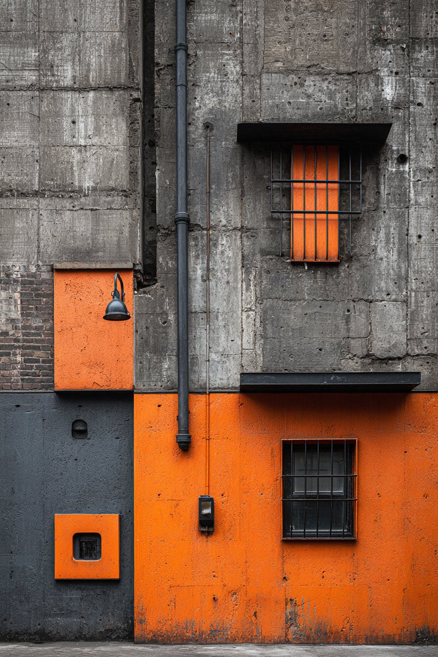
Contemporary urban aesthetics find expression in this exterior wall painting idea that celebrates raw materials and bold color accents characteristic of industrial design adapted for residential use. Exposed concrete walls left in natural gray establish the foundation of this urban-inspired scheme, celebrating material honesty and industrial heritage rather than concealing structural elements beneath applied finishes. Select accent panels painted in deep charcoal introduce tonal variation while maintaining the industrial palette, creating visual interest through subtle value changes rather than color contrast. Burnt orange accent panels provide the bold color moment essential to preventing the gray palette from appearing lifeless or institutional.
Black metal window frames and fixtures integrate seamlessly with the urban aesthetic, reinforcing industrial design’s preference for honest materials and utilitarian details over decorative embellishment. Architectural photography with professional lighting captures the raw material textures alongside painted surfaces, showing how the industrial color palette works in contemporary residential design with attention to material authenticity—the natural concrete appears substantial and textured, the charcoal panels create subtle definition, the burnt orange injects warmth and personality, and the black metal elements provide graphic definition. The even, professional lighting prevents harsh shadows while revealing the varied surface textures essential to industrial aesthetic’s visual interest.
This exterior wall painting idea succeeds because it authentically translates commercial industrial design principles to residential application, creating homes that feel urban and contemporary without appearing cold or unwelcoming. The exposed concrete, charcoal, and burnt orange combination communicates design sophistication and urban sensibility while the orange accent prevents the overall scheme from feeling too austere. The color psychology supports the home’s identity as a modern, design-forward residence for occupants who appreciate industrial heritage and contemporary minimalism. From a practical perspective, concrete surfaces require sealing rather than painting, reducing maintenance while celebrating material character. The burnt orange accent can be easily updated or changed as tastes evolve, allowing for refreshed appearance without complete renovation.
Key design tips for achieving this look: Seal exposed concrete surfaces with clear industrial sealer rather than painting to maintain authentic appearance. Apply charcoal paint to fiber cement or metal panels for industrial material compatibility. Choose burnt orange with sufficient depth to read as sophisticated rather than bright. Install black metal window frames and fixtures throughout for consistent industrial aesthetic. Consider leaving some structural elements like steel beams exposed if architecturally appropriate. Use matte or flat finish on painted panels to match concrete’s natural sheen. Coordinate exterior palette with exposed materials visible through windows for design continuity. Include industrial-style house numbers and lighting fixtures in black metal. Plan minimal roof overhang and clean architectural lines typical of industrial design. Ensure proper surface preparation on concrete before sealing to prevent moisture issues.
21. English Country Cream and Navy Heritage
Traditional English architecture finds expression in this exterior wall painting idea that honors centuries of country house design through time-tested color relationships and attention to livability. Soft yellow-cream walls establish the warm, welcoming foundation essential to English country aesthetics, evoking the limestone manor houses and plastered cottages that characterize the British countryside. This particular cream maintains sufficient yellow content to feel warm and inviting while avoiding the harsh brightness that would feel incompatible with English country’s gentle restraint. A classic navy blue front door provides the traditional contrast rooted in British architectural heritage, where dark doors signaled formality and permanence.
Climbing roses frame the painted surfaces, integrating living plant materials with architectural elements in the quintessentially English manner that blurs boundaries between garden and structure. Natural brick chimney provides textural contrast while grounding the composition with earthy, permanent materials that communicate establishment and tradition. Professional exterior photography captured during soft afternoon light shows the gentle paint colors and reveals the slightly weathered texture of the painted masonry, creating an authentic lived-in appearance with subtle imperfections that add character—the yellow-cream appears soft and aged, the navy door provides bold but appropriate accent, and the natural brick contributes warmth and texture. The slightly weathered appearance proves essential to English country authenticity, as overly perfect surfaces would contradict the style’s celebration of patina and time’s graceful effects.
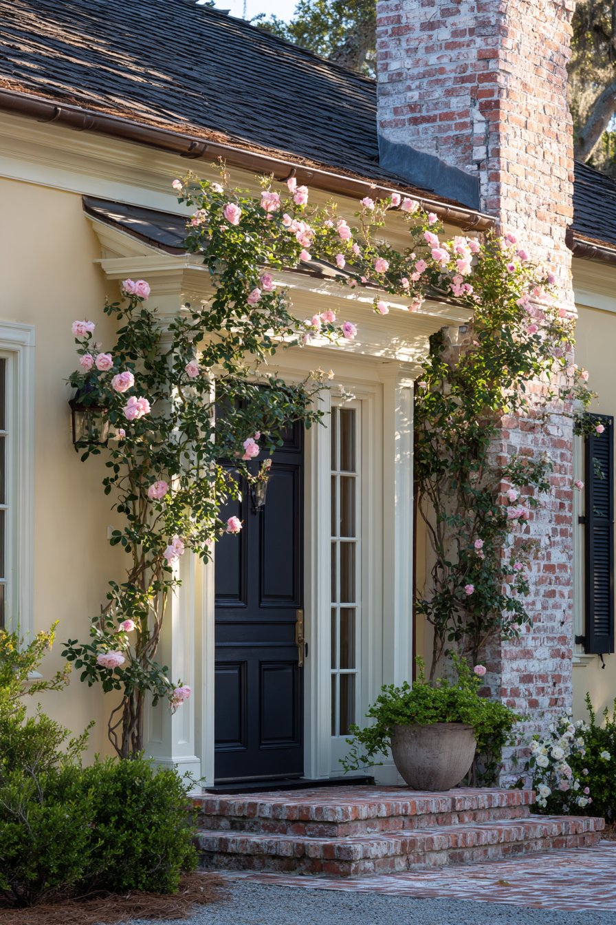
What makes this exterior wall painting idea particularly successful is its understanding that English country style values comfort and livability over perfection, embracing the gentle weathering and aging that give homes character and history. The yellow-cream and navy combination communicates established tradition without stuffiness, creating homes that appear loved and lived-in rather than recently constructed. The color psychology supports the home’s identity as a family gathering place with connections to gardens, hospitality, and pastoral traditions. From a practical perspective, the slightly weathered appearance means less pressure to maintain perfect paint surfaces, as minor imperfections contribute to rather than detract from the authentic English country aesthetic. The cream color requires periodic cleaning but rewards homeowners with distinctive warmth that immediately distinguishes their home from stark white alternatives.
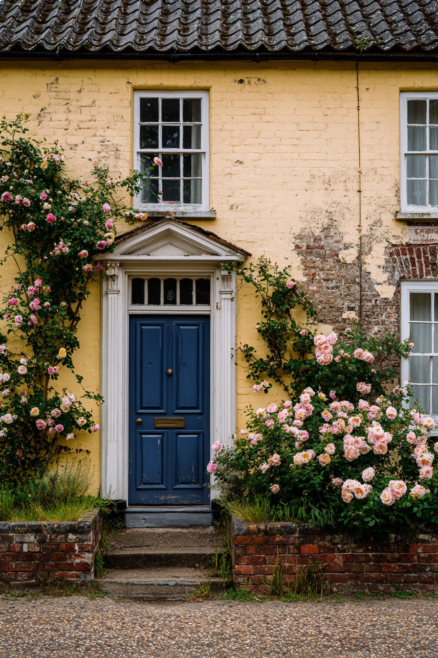
Key design tips for achieving this look: Select yellow-cream rather than bright yellow or stark cream for authentic English country appearance. Choose classic navy blue for front door in historically appropriate paint colors. Allow painted masonry to show slight weathering and imperfection for authentic aged appearance. Incorporate climbing roses or other vines around entrance for integrated garden effect. Leave natural brick elements exposed with appropriate cleaning and sealing. Consider extending cream to outbuildings and walls for estate-like cohesion. Use traditional hardware on front door in brass or black iron finishes. Install period-appropriate lighting fixtures in traditional lantern style. Plan for gentler maintenance approach that accepts minor weathering as character enhancement. Include cottage garden plantings with roses, lavender, and traditional English perennials to complete the aesthetic.
Why These Exterior Wall Painting Ideas Represent the Best in Home Design
These twenty-one exterior wall painting ideas represent the pinnacle of residential color design because they honor fundamental principles that transcend temporary trends while offering sufficient variety to accommodate diverse architectural styles, regional conditions, and personal preferences. Each approach demonstrates sophisticated understanding of color theory, material compatibility, architectural appropriateness, and practical performance requirements that determine long-term satisfaction with exterior paint choices.
The modern farmhouse sage and white combination excels because it balances contemporary sensibility with traditional warmth, creating homes that feel current without appearing trendy or destined for rapid obsolescence. The coastal blue-gray succeeds across geographic regions because it translates vacation aesthetics into everyday livability through sophisticated color relationships rather than literal beach references. Contemporary stucco with bold accents demonstrates how strategic color placement can transform simple architectural forms into confident design statements. Traditional colonial yellow and green honors centuries of architectural heritage while maintaining relevance for contemporary homeowners who value historical continuity. Craftsman olive green with natural wood celebrates honest materials and earth-toned restraint essential to Arts and Crafts philosophy.
Mediterranean terracotta warmth transports homeowners to sun-drenched coastal villages through authentic color selection rooted in ancient pigment traditions and regional building practices. Mid-century modern gray and turquoise captures post-war optimism and design innovation through period-appropriate color relationships that honor the era’s distinctive aesthetic contributions. Victorian three-color sophistication demonstrates how complex polychromatic schemes can create visual interest while respecting historical paint technology and ornamental architecture. Minimalist charcoal and white proves that contemporary restraint requires maximum attention to proportion and execution quality rather than simply adopting neutral palettes. Cottage lavender-gray romance balances whimsy with sophistication, creating homes that appear approachable without seeming childish.
Ranch style warm tan and brown honors mid-century horizontal emphasis while providing earth-toned neutrality that allows homes to settle into their surroundings. Transitional Revere Pewter versatility showcases sophisticated greige that adapts to multiple architectural styles while maintaining enough character to avoid appearing indecisive. French country ivory elegance captures refined simplicity and material honesty essential to European country house traditions. Contemporary farmhouse black and white drama embraces high-contrast color blocking that communicates design confidence while maintaining accessibility and warmth. Tudor brown and white heritage honors medieval construction methods through dramatic contrast and authentic timber pattern logic.
Desert modern beige and rust demonstrates regional appropriateness by responding directly to climate conditions and landscape colors rather than imposing alien aesthetics. Cape Cod white and black represents New England architectural heritage through weather-resistant simplicity and maritime cultural connections. Scandinavian soft gray minimalism embraces Nordic restraint and material honesty while creating serene retreats that value functionality and natural materials. Spanish revival ochre and teal celebrates Mediterranean romance through warm earth tones and jewel-like accents rooted in Moorish tile traditions. Industrial urban gray and orange translates commercial design principles to residential application through raw materials and bold color accents. English country cream and navy honors pastoral traditions through gentle colors and embraced weathering that communicate establishment and livability.
These exterior wall painting ideas succeed because they address the complete range of considerations that determine paint scheme effectiveness: architectural compatibility ensures colors enhance rather than fight existing design; climate appropriateness recognizes that colors perform differently in various environmental conditions; material compatibility acknowledges that different substrates affect color appearance and longevity; maintenance requirements balance aesthetic goals with practical realities of ongoing care; neighborhood context considers how individual homes relate to surrounding properties; resale considerations recognize that some color choices maintain broader appeal than others; personal expression allows homeowners to communicate their values and aesthetic preferences through color selection.
The psychological impact of exterior colors extends beyond mere aesthetic preference to affect emotional responses, neighborhood perceptions, and property values in measurable ways. Warm earth tones convey stability and connection to natural surroundings while cool blues and grays suggest calm and contemporary sensibility. Bold accent colors communicate design confidence and personality while neutrals provide sophisticated backdrop for architectural form. Historical color schemes honor heritage and tradition while contemporary palettes embrace innovation and forward-thinking design.
Technical considerations including paint quality, surface preparation, application methods, and maintenance schedules determine whether even the most carefully chosen colors deliver expected results over time. Premium paint formulations offer superior color retention, mildew resistance, and coverage compared to economy options, making the initial investment worthwhile for long-term performance. Proper surface preparation including cleaning, scraping, priming, and repairs ensures paint adheres correctly and performs as intended. Professional application techniques minimize visible brush marks, lap lines, and coverage variations that compromise even the best color choices. Regular maintenance including periodic cleaning, prompt touch-ups, and eventual repainting preserves appearance and protects underlying materials from weather damage.
These exterior wall painting ideas demonstrate that successful color schemes result from careful consideration of multiple factors rather than simply selecting attractive colors from paint chips. The integration of color with architecture, materials, climate, and context creates cohesive designs that enhance property value while expressing personal style. Whether drawn to historical authenticity, contemporary minimalism, or eclectic expression, these approaches offer proven strategies for transforming home exteriors through thoughtful paint selection and expert application.
Conclusion
Exterior wall painting represents one of the most impactful home improvement investments, offering dramatic transformation potential while providing practical protection for underlying materials and structures. These twenty-one exterior wall painting ideas demonstrate the remarkable range of aesthetic expressions possible through thoughtful color selection, material consideration, and attention to architectural compatibility. From the gentle sophistication of French country ivory and English country cream to the bold confidence of contemporary black and white or industrial gray and orange, each approach offers unique advantages while addressing different design goals and personal preferences.
The key to successful exterior painting lies in understanding that color choices should enhance rather than fight existing architecture, respond appropriately to climate and environmental conditions, and reflect authentic personal style rather than temporary trends. Whether honoring historical precedent through Victorian three-color schemes or traditional colonial combinations, embracing regional character through desert modern or Spanish revival palettes, or expressing contemporary sensibility through minimalist monochromes or mid-century accents, the most successful exterior paint schemes demonstrate sophisticated understanding of color theory, architectural principles, and practical performance requirements.
As you consider these exterior wall painting ideas for your own home, remember that the best color choices balance aesthetic goals with practical realities including maintenance requirements, climate considerations, neighborhood context, and long-term satisfaction. Test samples on multiple exposures, observe how colors change throughout the day and across seasons, and don’t hesitate to consult professional color consultants or painters for expert guidance. Your home’s exterior represents its public face and your personal expression—invest the time and attention required to select colors that will bring daily satisfaction while enhancing property value and neighborhood character for years to come.