Wall painting represents one of the most accessible and impactful ways to transform any room in your home. Whether you’re a seasoned DIY enthusiast or a complete beginner, the right painting technique can breathe new life into tired spaces, create stunning focal points, and express your personal style—all without breaking the bank or requiring professional expertise. The beauty of wall painting lies in its versatility; with just a few supplies, some painter’s tape, and a weekend afternoon, you can achieve results that rival expensive wallpaper or architectural renovations. From subtle geometric patterns to bold color-blocking designs, the possibilities are limited only by your imagination.
In today’s world of home improvement, easy wall painting ideas have become increasingly popular as homeowners seek budget-friendly ways to refresh their living spaces. The techniques we’ll explore range from simple two-tone treatments that anyone can master to more creative approaches like ombré gradients, hand-painted patterns, and architectural illusions that add depth and character to flat walls. What makes these ideas particularly appealing is their forgiving nature—many embrace imperfection as part of their charm, making them perfect for first-time painters who might feel intimidated by more complex projects.
This comprehensive guide will walk you through twenty-five inspiring wall painting ideas, each designed to be achievable within a weekend while delivering professional-looking results. We’ll explore techniques suitable for every room in your home, from serene bedrooms and energizing home offices to playful children’s spaces and sophisticated living areas. Each design emphasizes practical application, realistic materials, and accessible methods that empower you to take control of your home’s aesthetic without the need for expensive contractors or specialized tools.
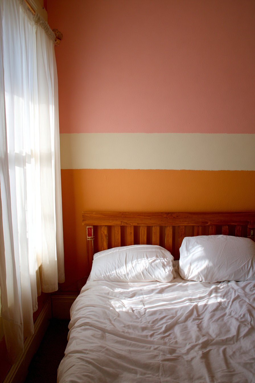
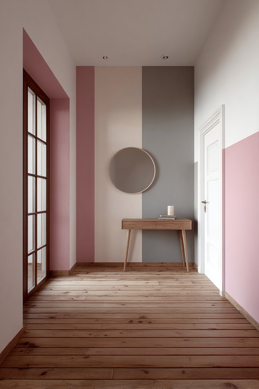
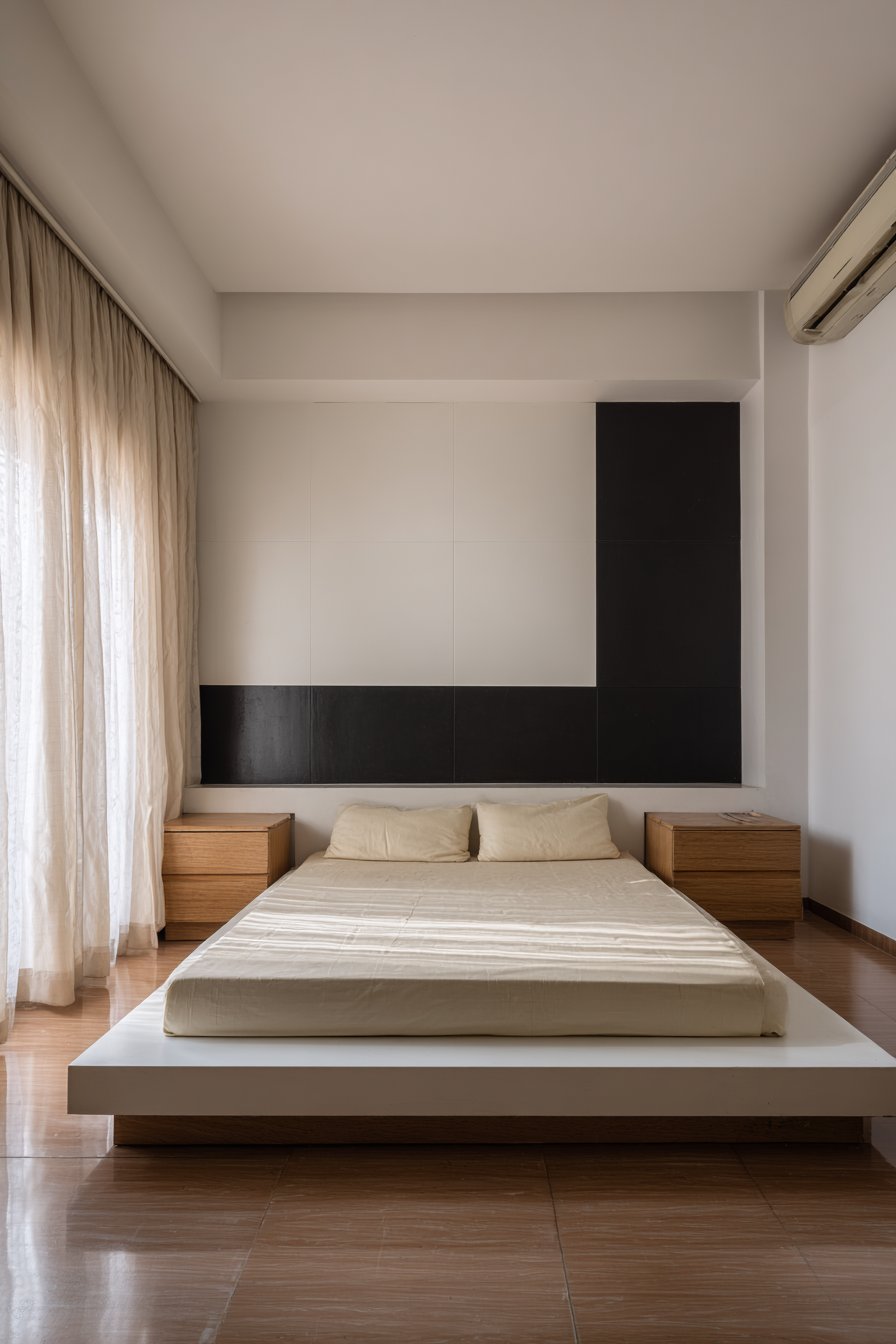
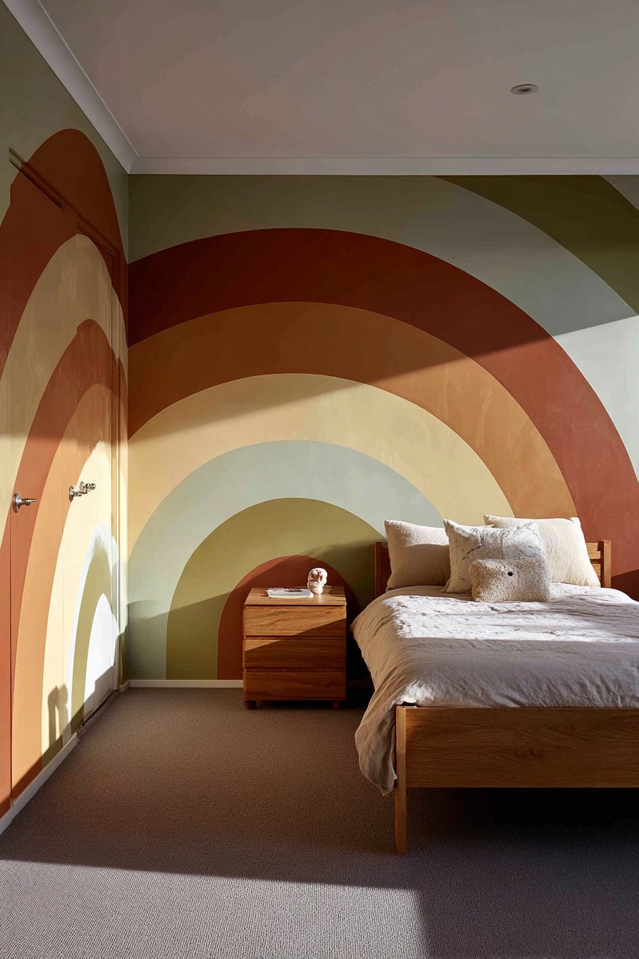
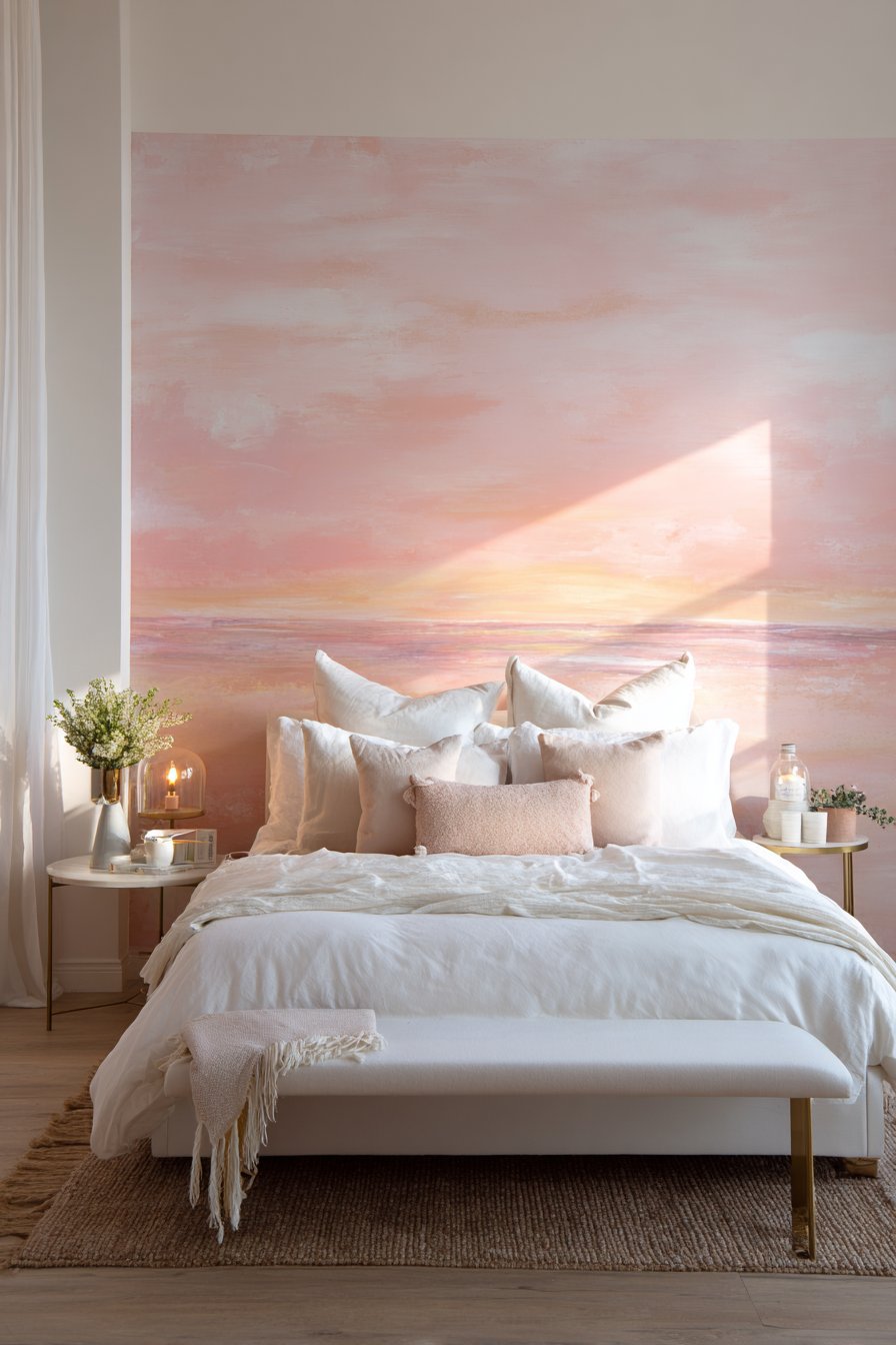
1. Blush Pink and Cream Color Block Bedroom
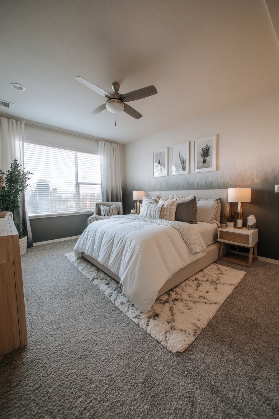
The two-tone color block design represents one of the most elegant yet achievable wall painting ideas for transforming a bedroom into a serene sanctuary. This technique divides the wall horizontally at chair rail height, with soft blush pink adorning the upper portion and warm cream painting the lower section. The clean division creates visual interest without overwhelming the space, making it ideal for those who want to introduce color gradually into their homes. The beauty of this approach lies in its simplicity—requiring only painter’s tape to mark the division line and two complementary paint colors to execute.
When implemented in a bedroom setting, this color-blocking technique serves multiple purposes beyond pure aesthetics. The lower cream section provides a neutral foundation that grounds the space and makes it feel larger, while the blush pink upper portion draws the eye upward, creating the illusion of higher ceilings. This design works exceptionally well behind a simple wooden bed frame with white linens, as the painted wall becomes a soft, romantic backdrop that doesn’t compete with furniture or décor. The matte finish recommended for both colors ensures a sophisticated look while hiding minor wall imperfections that might be highlighted by glossier paints.
Natural morning light plays a crucial role in bringing this easy wall painting idea to life. As sunlight filters through sheer curtains, it interacts beautifully with the blush pink, creating subtle variations in tone throughout the day—from peachy warmth in the morning to cooler rose tones in the afternoon. The smooth transition between the two colors, achieved through careful taping and patient painting, demonstrates that professional-looking results don’t require professional skills. This accessible technique proves that sometimes the most impactful designs are also the simplest to execute.
Key Design Tips:
- Use painter’s tape rated for delicate surfaces to ensure clean lines without damaging existing paint
- Apply two coats of each color for optimal coverage and richness of tone
- Remove the painter’s tape while the final coat is still slightly tacky to prevent peeling
- Choose a matte or eggshell finish to create a soft, sophisticated appearance
- Test paint colors on poster boards and view them at different times of day before committing
- Measure carefully to ensure your division line is level across the entire wall
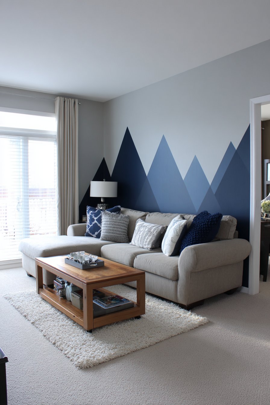
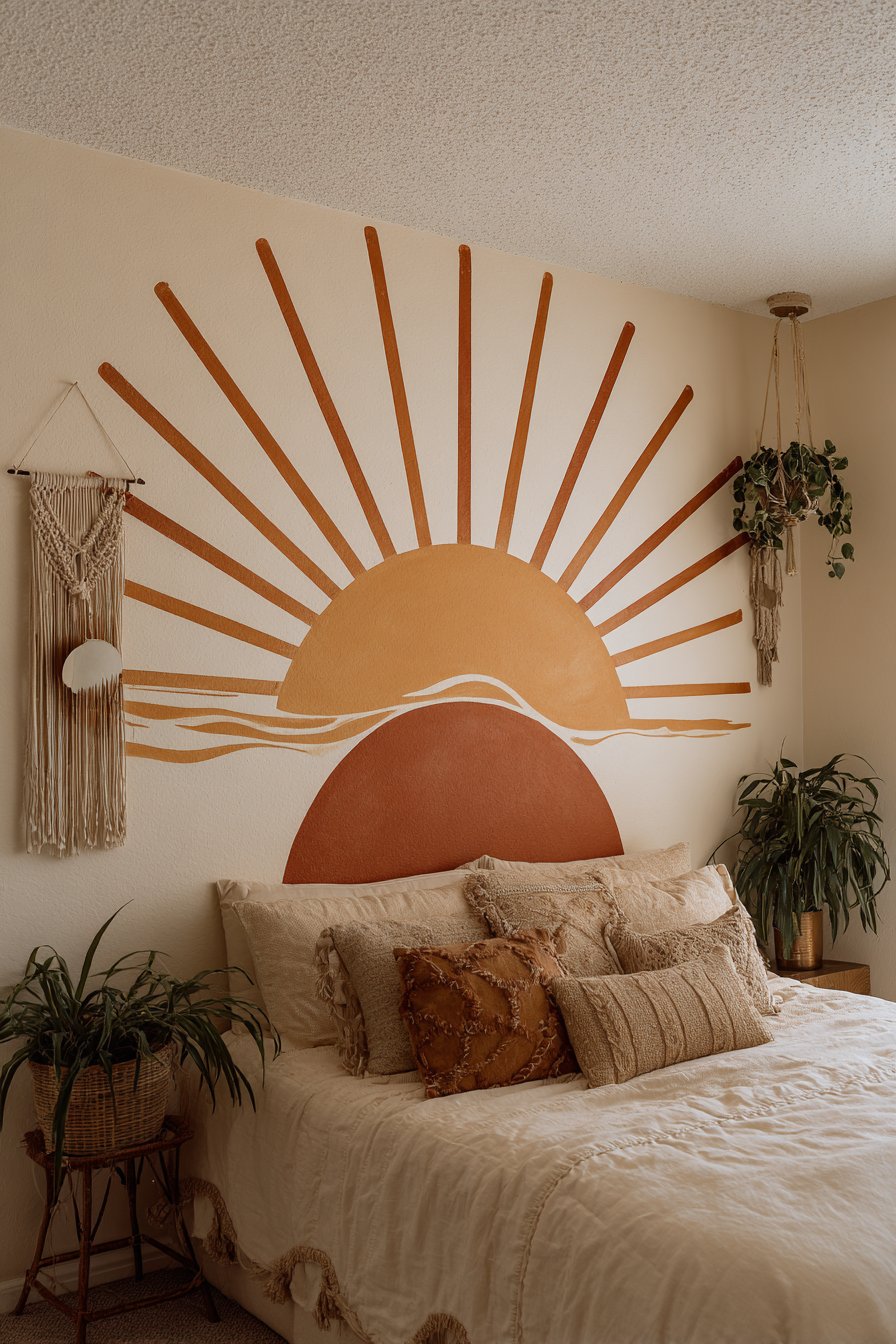
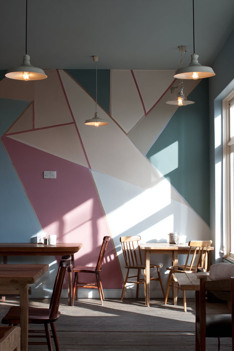
2. Navy Blue Mountain Range Silhouette
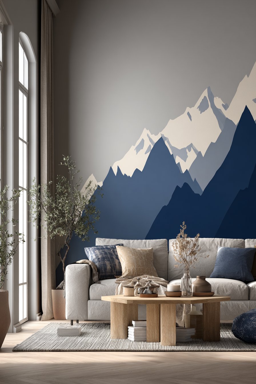
Creating a minimalist mountain range silhouette against a light gray background represents one of the most artistic yet approachable easy wall painting ideas for modern living spaces. This geometric interpretation of natural landscapes brings the outdoors inside through carefully planned peaks and valleys painted in navy blue. The technique relies on painter’s tape to create sharp, clean lines that form abstract mountain shapes, proving that impressive wall art doesn’t require freehand painting skills or artistic training. The contrast between the deep navy and soft gray creates a focal point that anchors the room without overwhelming the overall design scheme.
This accent wall treatment works particularly well in living rooms where you want to establish a conversation piece that reflects personality and style. The geometric peaks add three-dimensional visual interest to what would otherwise be a flat surface, and the monochromatic color scheme ensures the design remains sophisticated rather than juvenile. When paired with a neutral sofa and natural wood coffee table, the painted mountains become the undisputed star of the space while maintaining harmony with the room’s other elements. The beauty of this design lies in its customizability—you can create dramatic jagged peaks for a bold statement or gentle rolling hills for a more subtle effect.
The execution of this wall painting idea requires careful planning but delivers impressive results that belie its simple technique. Soft diffused daylight from adjacent windows illuminates the clean lines and crisp edges, emphasizing the precision achievable through proper taping methods. The matte finish in both colors prevents glare and creates a contemporary aesthetic that aligns with current interior design trends. This project demonstrates how strategic use of painter’s tape can transform basic painting supplies into tools for creating custom artwork that would cost hundreds of dollars if commissioned from a professional muralist.
Key Design Tips:
- Sketch your mountain range design on paper first to determine the most pleasing composition
- Use a level and pencil to lightly mark the mountain peaks before applying tape
- Apply a base coat of gray across the entire wall before taping and adding the navy mountains
- Press down firmly on all tape edges to prevent paint bleed and ensure crisp lines
- Use a small foam roller for the mountain areas to achieve smooth, even coverage
- Consider varying the height and width of peaks to create a more natural, organic appearance
- Allow the base coat to dry completely before taping to prevent tape from pulling up the underlying paint
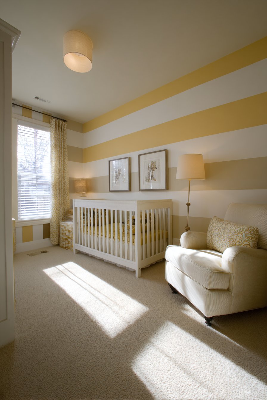
3. Gentle Horizontal Stripes in Pale Yellow and White
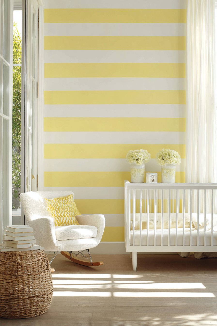
Horizontal stripes offer a timeless easy wall painting idea that adds subtle visual rhythm to nurseries and children’s spaces without overwhelming developing sensibilities. This particular application features gentle alternating bands of pale yellow and white, each measuring approximately twelve inches wide, creating a soothing pattern that promotes calm and comfort. The technique is remarkably forgiving, as slight variations in stripe width only add to the handcrafted charm of the finished wall. Unlike vertical stripes that can make a room feel taller, horizontal stripes create a sense of width and flow, making them particularly effective in smaller nurseries where you want to maximize the perception of space.
The soft color palette chosen for this design—pale yellow and white—creates an uplifting yet peaceful environment perfect for a baby’s room. The yellow brings warmth and cheerfulness without being overstimulating, while the white stripes provide visual breaks that prevent the pattern from becoming too busy. When a white crib sits against the striped wall with a comfortable rocking chair in the corner, the painted background creates cohesion without competing for attention with the room’s functional elements. Natural light filtering through windows creates soft shadows that enhance the stripe pattern, adding subtle dimension throughout the day as the sun’s angle changes.
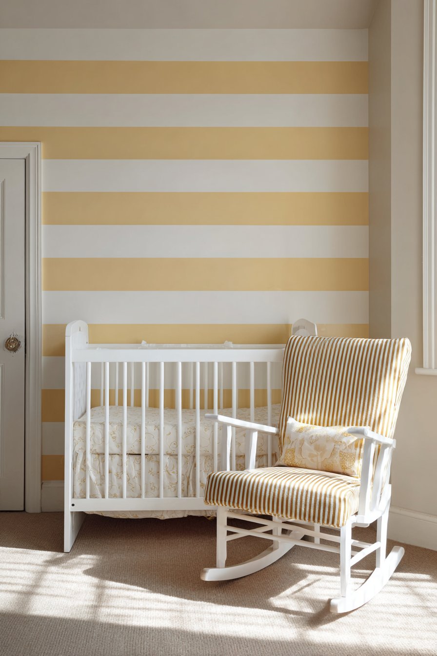
Executing this horizontal stripe design requires patience but minimal artistic skill, making it an ideal first painting project for new parents or DIY beginners. The key to success lies in careful measurement and consistent stripe width, achieved through precise marking and methodical taping. The wide stripe width—twelve inches—means you’ll complete the wall faster than with thinner stripes while still achieving significant visual impact. This easy wall painting idea proves that simple repetition of basic shapes can create sophisticated results, and that the most nurturing nursery environments often embrace gentle, uncomplicated design elements.
Key Design Tips:
- Measure from ceiling to floor and divide by twelve to determine how many stripes will fit evenly
- Start with a white stripe at the ceiling to create a clean transition
- Use a long level to ensure each stripe line remains perfectly horizontal across the wall
- Alternate painting direction with each stripe to ensure even coverage and texture
- Apply painter’s tape to the edges of each yellow stripe before painting to maintain crisp divisions
- Use low-VOC or zero-VOC paint formulated for nurseries to ensure air quality safety
- Consider painting just one accent wall with stripes and keeping other walls solid white to prevent visual overwhelm
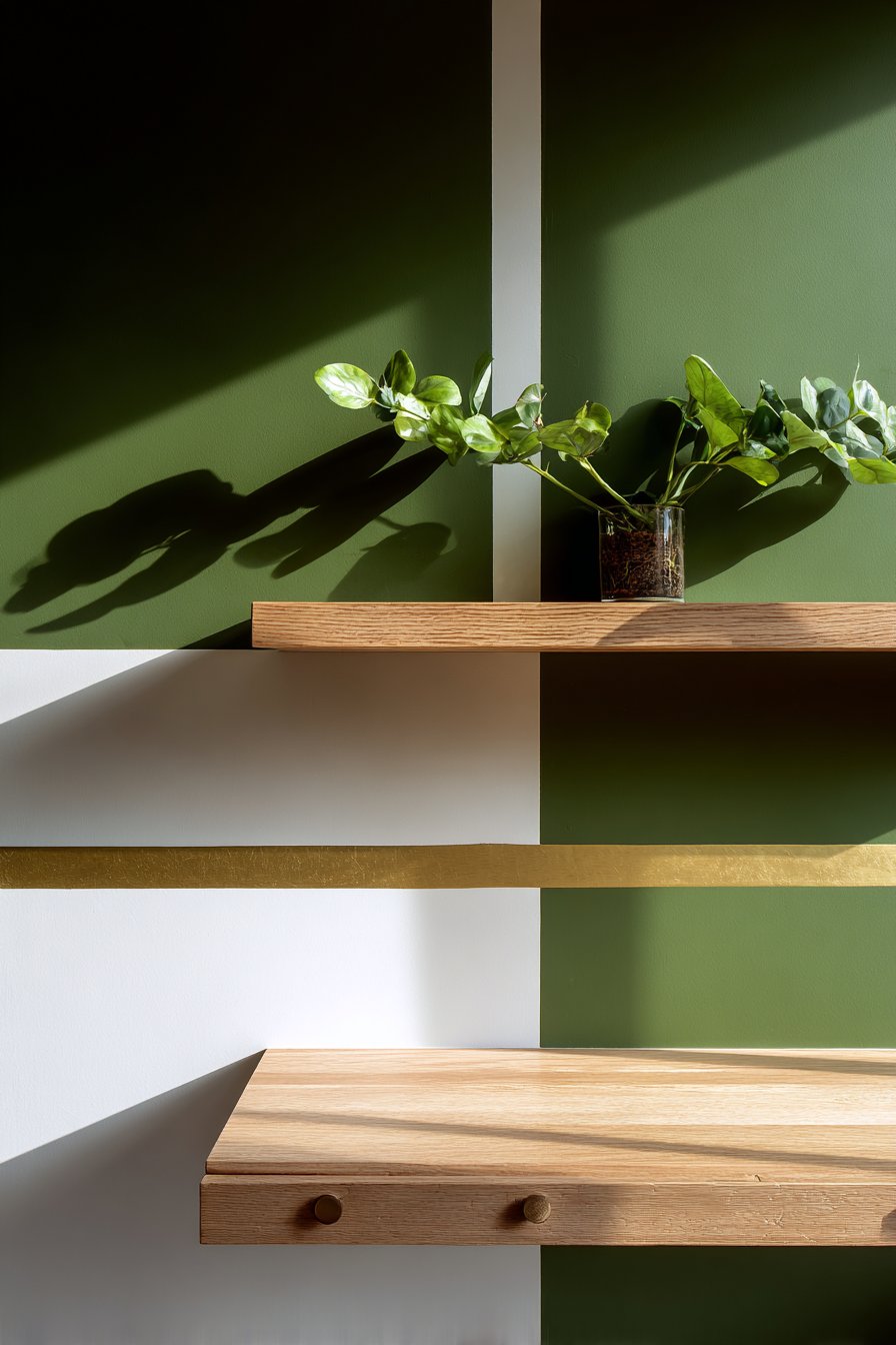
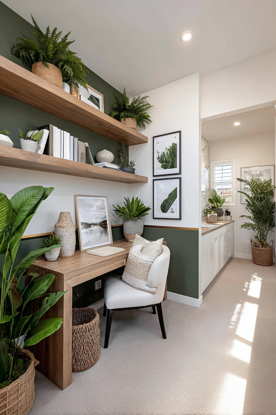
4. Deep Forest Green and White Half-Wall Treatment
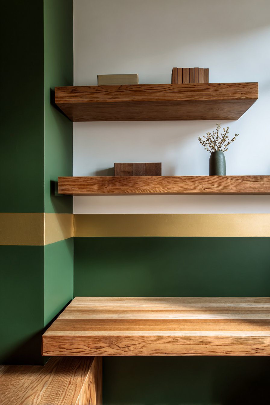
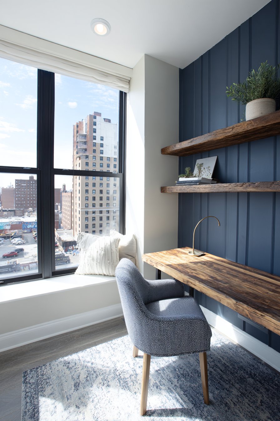
The half-wall painting technique represents a sophisticated easy wall painting idea that creates the illusion of wainscoting or paneling without the expense and complexity of installing actual molding. This design features deep forest green on the lower portion of the wall and crisp white above, separated by a thin gold painted stripe that adds a touch of luxury and definition. The contrast between the rich, grounding green and the bright, airy white creates visual interest while maintaining a sense of balance and proportion. This approach works exceptionally well in home offices where you want to create a professional, focused environment that still feels warm and inviting.
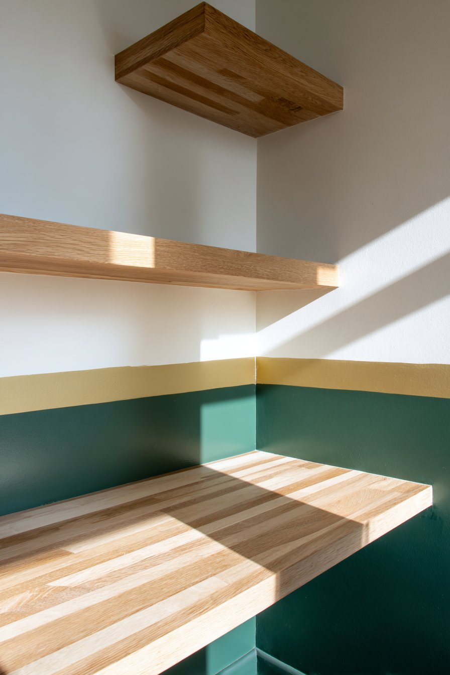
The deep forest green chosen for the lower wall section brings nature-inspired calm to the workspace while anchoring the room with substantial visual weight. This darker lower portion also serves a practical purpose—hiding scuffs and marks that might occur from desk chairs or storage boxes more effectively than lighter colors would. The crisp white upper section keeps the room feeling bright and open, preventing the darker green from making the space feel closed in or cave-like. The thin gold stripe painted at the division point elevates the entire design from simple to sophisticated, demonstrating how small metallic accents can dramatically enhance an otherwise straightforward painting project.
Natural afternoon light streaming through windows emphasizes the rich color contrast and smooth transitions between the three distinct painted areas. When a simple wooden desk and floating shelves are mounted against this painted wall, they benefit from the visual interest created behind them without clashing with the backdrop. The precision required for this easy wall painting idea—measuring the exact midpoint, creating perfectly straight lines, and maintaining a consistent thin gold stripe—teaches valuable skills that can be applied to future painting projects. The result is a home office that feels custom-designed rather than simply painted, proving that thoughtful color placement can transform ordinary walls into architectural features.
Key Design Tips:
- Determine the half-wall height by measuring 36-42 inches from the floor, depending on ceiling height
- Paint the entire wall white first, then tape off and paint the lower green section
- Use metallic gold paint specifically formulated for small detail work to create the dividing stripe
- Apply the gold stripe using a small artist’s brush and a straight edge for precision
- Consider using painter’s tape on both sides of where the gold stripe will go for ultra-crisp edges
- Choose a semi-gloss finish for the green lower section to make it more durable and wipeable
- Maintain matte or eggshell finish on the white upper section to prevent glare during computer work
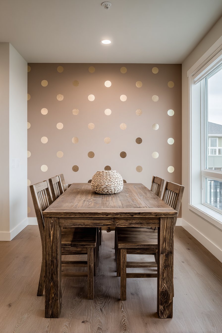
5. Large-Scale Polka Dot Pattern in Metallic Gold
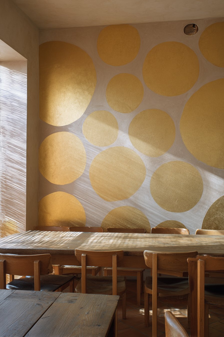
Hand-stamped polka dots create one of the most playful yet elegant easy wall painting ideas, combining whimsy with sophistication through strategic color and placement choices. This technique uses a circular sponge stamp dipped in metallic gold paint to create large-scale dots across a warm taupe base color, with irregular spacing that lends an organic, handcrafted quality to the pattern. Unlike precisely measured and perfectly aligned dots that can feel rigid and manufactured, these loosely arranged circles embrace artistic imperfection and create visual movement across the wall. The metallic gold adds subtle glamour that catches and reflects light, transforming throughout the day as natural lighting conditions change.
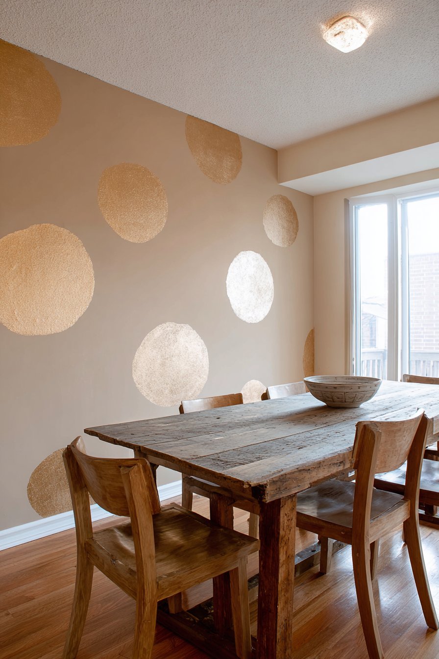
When implemented in a dining room setting, this polka dot accent wall brings unexpected personality to a space often reserved for more traditional treatments. The warm taupe background provides a neutral, sophisticated foundation that prevents the metallic dots from appearing too juvenile or overwhelming, while the gold elements add festive energy appropriate for a room dedicated to gathering and celebration. A rustic wooden dining table and simple chairs complement the playful wall treatment, creating an interesting juxtaposition between casual furniture and the more decorative painted surface. This balance ensures the room remains welcoming and comfortable rather than too precious or formal.
The execution of this easy wall painting idea requires minimal investment in supplies—just a circular sponge or stamp, metallic gold craft paint, and steady patience. The irregular spacing of dots is actually easier to achieve than perfect alignment, making this technique surprisingly forgiving for beginners. Soft natural lighting highlights the subtle shimmer of the metallic dots without creating harsh glare, and the varied placement ensures no two viewing angles present the exact same pattern. This project demonstrates how simple stamping techniques can create custom wall treatments that would be prohibitively expensive to achieve through wallpaper or decals while allowing for complete creative control over dot size, spacing, and density.
Key Design Tips:
- Cut a natural sponge into a circle or purchase pre-made circular foam stamps for consistency
- Practice your stamping technique on poster board to perfect pressure and paint amount
- Work from top to bottom to avoid accidentally brushing against wet paint
- Vary the spacing between dots organically—aim for 8-14 inches between centers
- Use metallic acrylic craft paint rather than wall paint for better shimmer effect
- Allow each dot to dry completely before stamping nearby to prevent smudging
- Consider creating a few “kiss” dots where circles barely touch for added visual interest
- Step back frequently to assess overall pattern distribution and adjust remaining placement
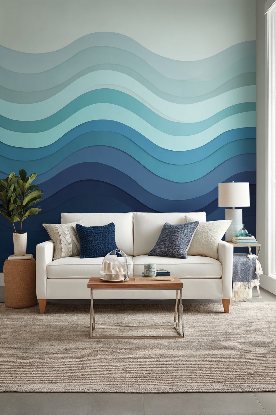
6. Charcoal to Silver Ombré Gradient
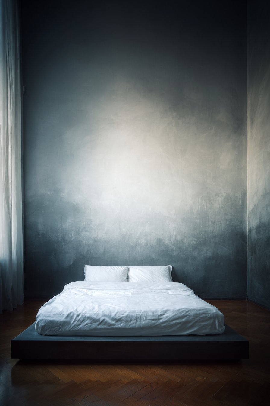
The ombré gradient effect represents one of the most impressive yet achievable easy wall painting ideas, creating a dramatic vertical fade that transforms a simple wall into a work of art. This particular application transitions from deep charcoal gray at the floor to light silver at the ceiling, creating a sophisticated monochromatic statement that adds depth and atmosphere to a master bedroom. The smooth color fade, achieved through careful blending while paint remains wet, creates a calming visual flow that draws the eye upward and makes ceilings appear higher. Unlike harsh color divisions, the gradual transition feels organic and serene, making it particularly appropriate for sleeping spaces where tranquility is paramount.
The technical execution of this gradient requires working in horizontal sections and blending where each shade meets the next, but the results justify the effort involved. Starting with the darkest charcoal at the bottom provides visual grounding, while the progression to lighter silver tones prevents the dark color from making the room feel cave-like or oppressive. When positioned behind a platform bed with white bedding, the ombré wall creates a stunning backdrop that eliminates the need for additional headboard or artwork. Natural light from nearby windows accentuates the gradual color transition, and the effect changes subtly as daylight shifts from morning through evening.
This easy wall painting idea teaches valuable color blending skills while producing a custom finish that cannot be replicated with wallpaper or purchased materials. The key to success lies in working with wet paint and moving quickly enough to blend sections before they dry, which may require two people for larger walls. The monochromatic gray palette ensures the bold technique remains sophisticated rather than overwhelming, and the vertical nature of the gradient creates elongation that benefits rooms with standard ceiling heights. This project proves that with patience and proper technique, DIY painters can achieve results that rival professional specialty finishes.
Key Design Tips:
- Purchase paint in at least four graduated shades from dark to light for smoother transitions
- Work on one wall only to avoid overwhelming the space with too much gradient
- Use a large foam roller and work in 18-24 inch horizontal sections
- Keep paint wet while blending by working quickly and in humid conditions if possible
- Use a dry brush or blending tool to soften the lines where each color meets the next
- Consider having two people work together—one applying paint, one blending
- Start with the darkest color and work upward, cleaning tools between shades
- Apply a base coat of medium gray first to create a unified undertone
7. Vertical Rainbow Stripes in Muted Pastels
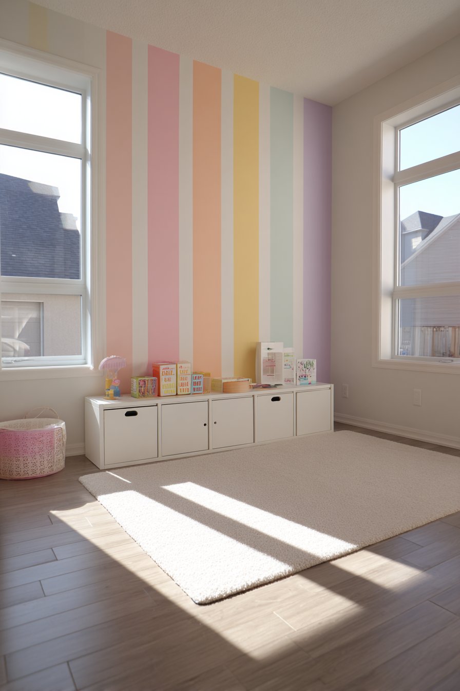
Introducing color into children’s spaces requires balancing playfulness with longevity, and vertical rainbow stripes in muted pastel tones achieve this delicate equilibrium beautifully. This easy wall painting idea features crisp vertical bands of soft pink, peach, yellow, mint, and lavender, each approximately eight inches wide, creating a cheerful yet sophisticated rainbow effect. Unlike bold primary colors that can feel overstimulating or quickly become dated, these muted pastels create a gentle, soothing environment that grows with the child while still providing the whimsy appropriate for a playroom. The vertical orientation of the stripes draws the eye upward, making the room feel taller and more spacious—an important consideration in playrooms that often contain substantial furniture and toy storage.
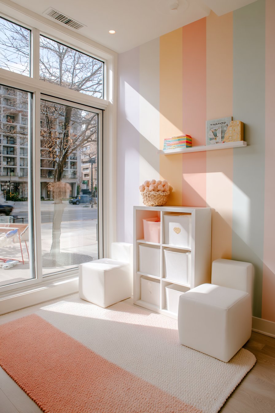
The execution of this multi-colored striping project requires careful planning and methodical painting, but the clear divisions between colors mean you’re essentially completing five separate painting tasks rather than one complex project. Each crisp painted edge, achieved through proper taping technique, contributes to the overall polished appearance that distinguishes this easy wall painting idea from amateur paint jobs. When simple white storage cubes and a neutral play mat furnish the room, they allow the striped wall to serve as the primary source of color and energy without creating visual chaos. Natural daylight streaming through windows highlights the clean stripe divisions and brings out the subtle variations in each pastel tone.
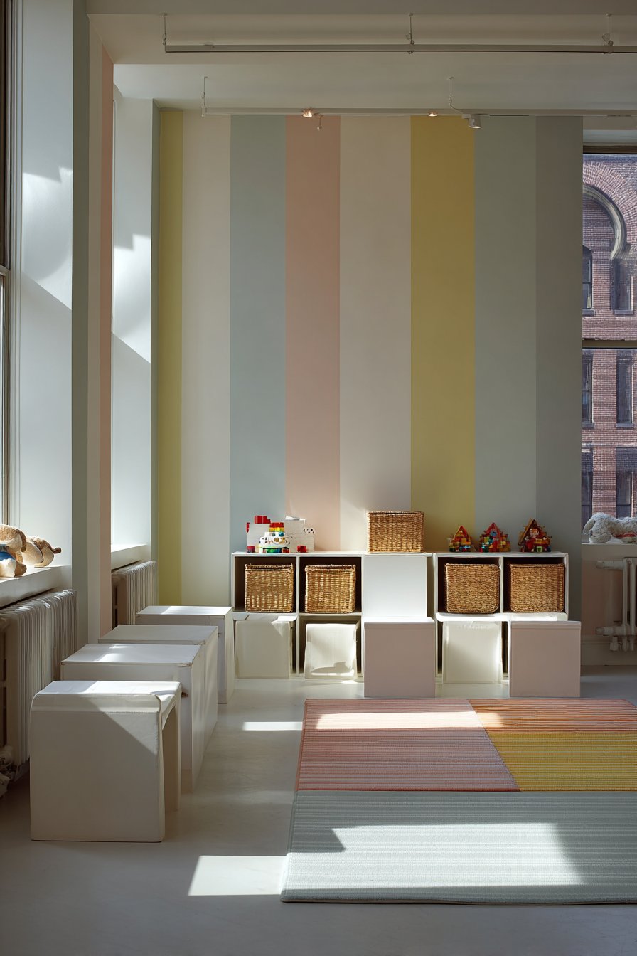
This rainbow stripe treatment demonstrates how pattern and color can coexist harmoniously when executed with restraint and thoughtfulness. The muted quality of the chosen pastels ensures the multiple colors work together rather than competing for attention, creating a cohesive whole that feels intentional rather than busy. The smooth matte finish recommended for all colors creates consistency across the stripes and prevents distracting shine or glare during playtime. This project teaches valuable lessons about color theory, precise measurement, and patient execution while creating a playroom environment that stimulates creativity without overwhelming young minds.
Key Design Tips:
- Calculate stripe quantity by dividing wall width by eight inches to determine how many will fit
- Start with a full stripe at one corner rather than partial stripes at both edges
- Paint all stripes in the lightest color (yellow) first, then tape and paint progressively darker shades
- Use low-adhesive painter’s tape to prevent pulling up previously painted stripes
- Maintain the same paint finish across all colors for visual consistency
- Apply two coats of each color for saturated, even coverage
- Remove tape at a 45-degree angle while paint is still slightly tacky
- Consider painting just one accent wall with stripes and keeping remaining walls in the lightest pastel
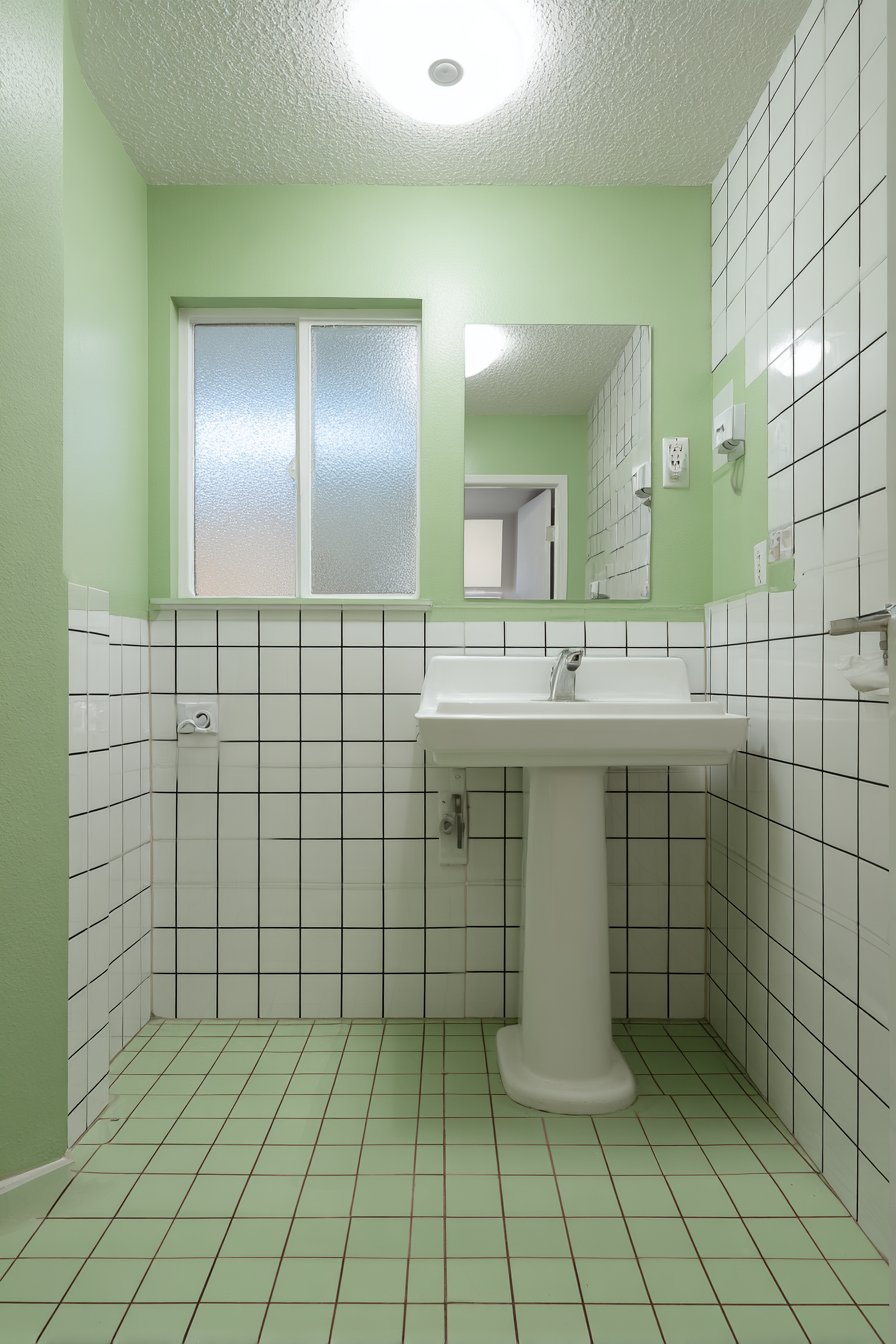
8. Geometric Grid Pattern in Black on Sage Green
Creating the illusion of tilework through painted geometric patterns represents one of the most budget-friendly easy wall painting ideas for bathroom renovations. This technique features thin matte black lines painted in a careful grid pattern over a soft sage green base, creating the visual interest of tile without the expense, permanence, or installation complexity of actual ceramic or porcelain. The hand-painted grid brings artisanal character to the space, with slight imperfections in line work adding charm rather than detracting from the overall effect. This approach works particularly well in small bathrooms where real tile installation costs can be prohibitive but where visual texture remains desirable.
The soft sage green chosen as the base color brings natural, spa-like calm to the bathroom environment while providing a soothing backdrop for the geometric grid overlay. The matte black lines create strong contrast that defines the “tile” shapes clearly without the harshness that glossy black might introduce. When complemented by a white pedestal sink and simple frameless mirror, the painted grid wall becomes the bathroom’s focal point while maintaining the clean, uncluttered aesthetic essential in small spaces. Soft diffused lighting from a frosted window emphasizes the hand-painted grid lines, revealing their slightly irregular nature that proves this is custom artwork rather than manufactured material.
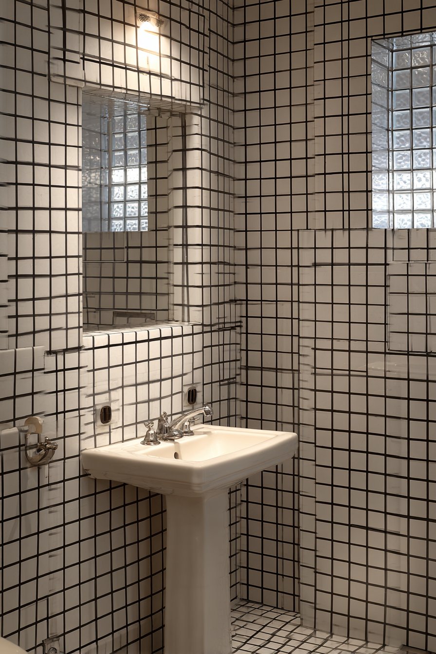
Executing this easy wall painting idea requires steady hands and patience but no specialized artistic ability. The grid pattern provides built-in guidelines that make measuring and marking straightforward, and the thin lines mean mistakes can be easily corrected with a small brush and base color touch-up paint. The forgiving nature of the sage green base color helps hide minor variations in line width or straightness, making this project more achievable than it might initially appear. This technique demonstrates how simple geometric repetition can create sophisticated visual effects, and how strategic paint application can mimic expensive materials at a fraction of the cost.
Key Design Tips:
- Use a laser level or chalk line to create perfectly straight horizontal and vertical guidelines
- Mark grid intersections with small pencil dots before painting
- Choose a square or rectangular “tile” size between 4-6 inches for best visual effect
- Use a small artist’s brush or paint pen for crisp, thin black lines
- Work systematically, completing all horizontal lines before starting verticals
- Keep a damp cloth nearby to immediately correct any mistakes
- Apply a clear matte sealer over the finished grid in humid bathroom environments
- Consider creating “grout” lines of varying thickness to enhance the handcrafted appearance
9. Large-Scale Color Blocking in Three Vertical Panels
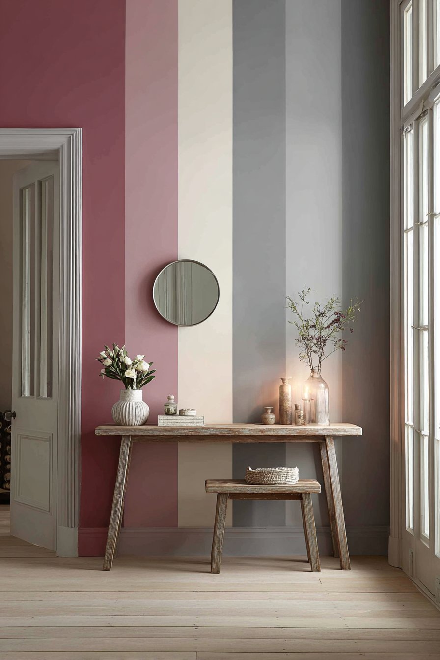
Vertical color blocking creates bold, architectural impact through one of the most straightforward easy wall painting ideas available to DIY enthusiasts. This design divides the wall into three distinct vertical panels—dusty rose on the left third, warm cream in the middle, and soft gray on the right—creating a modern, gallery-like effect in an entryway or living space. The beauty of this technique lies in its simplicity: three colors, two division lines, and careful taping produce a sophisticated result that appears far more complex than the actual execution. Each color section acts as its own entity while contributing to the cohesive whole, demonstrating how thoughtful color selection can create harmony even among contrasting tones.
When implemented in an entryway, this vertical color blocking serves multiple functions beyond pure decoration. The three distinct sections create visual zones that can help organize the space mentally and physically—perhaps the dusty rose section anchors coat hooks, the cream section highlights a console table, and the gray section frames a mirror. The vertical orientation draws the eye upward, making standard ceiling heights appear more generous and creating a sense of grandeur appropriate for the home’s first impression area. Natural light from the front door glass emphasizes the clean divisions between color blocks, and the varied tones ensure the wall maintains visual interest from multiple viewing angles throughout the day.
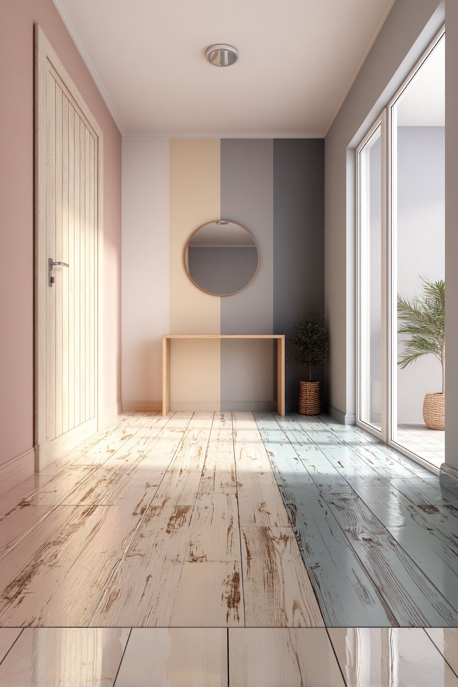
The execution of this project requires accurate measurement to ensure equal panel widths and careful taping to achieve crisp divisions, but no artistic skill or specialized equipment. The bold nature of the design means you’re making a statement, so confidence in color selection is essential—testing samples in the actual space before committing helps ensure you’ll love the result. This easy wall painting idea proves that sometimes the most impactful designs embrace simplicity rather than complexity, and that careful planning can make even dramatic transformations achievable for beginners. The finished wall becomes a conversation piece that demonstrates how strategic color placement can transform architecture without physical alteration.
Key Design Tips:
- Divide wall width by three to determine equal panel widths, adjusting slightly if needed to avoid awkward measurements
- Mark vertical division lines using a level or plumb line for perfect straightness
- Paint the entire wall in the lightest color (cream) first as your base coat
- Tape off and paint the medium-toned panel (dusty rose) second
- Complete the darkest panel (gray) last to minimize visible tape lines
- Use high-quality painter’s tape and press edges firmly to prevent color bleeding
- Remove tape while the final coat is still wet for the cleanest lines
- Consider extending color blocks slightly onto adjacent walls to create a wraparound effect
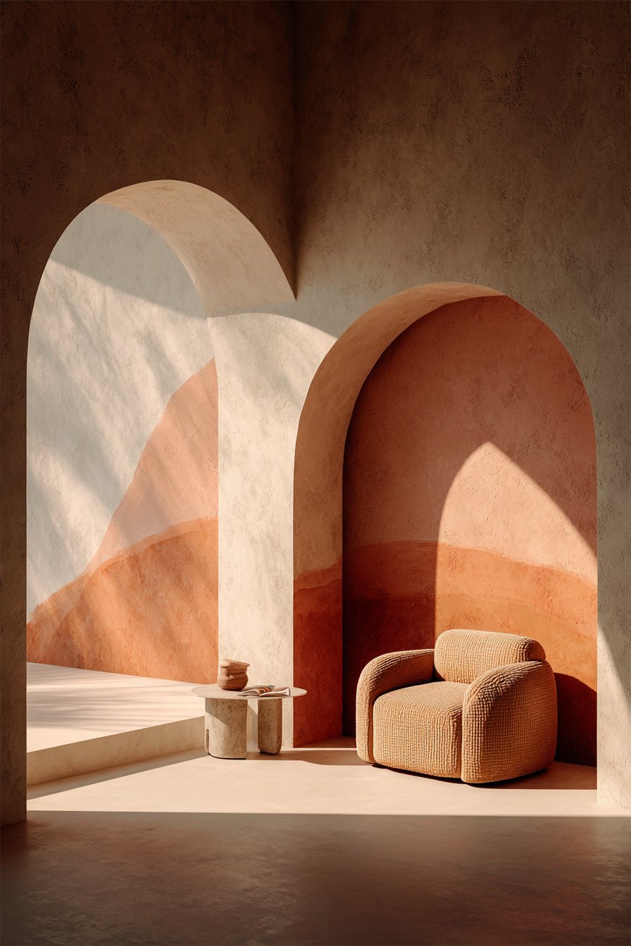
10. Painted Arch Frame in Terracotta
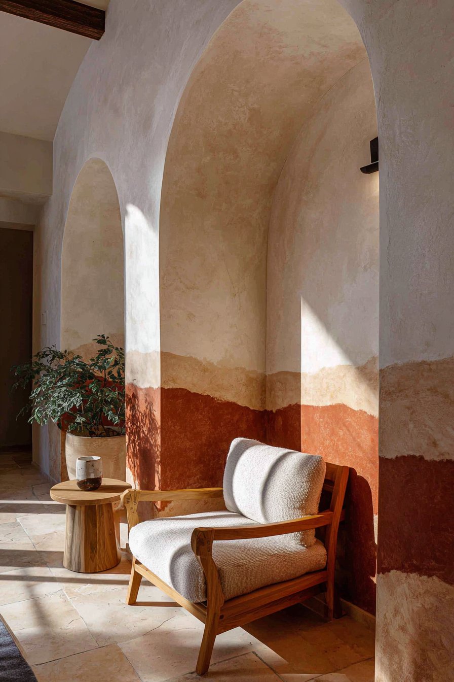
Creating architectural details through paint rather than construction represents one of the most creative easy wall painting ideas for adding character to modern homes built without ornamental molding. This technique uses terracotta-colored paint to create an arch shape on a cream wall, forming a painted frame that suggests architectural depth without actual three-dimensional construction. The arch becomes a focal point that draws the eye and creates a designated zone within a larger room—perfect for defining a reading nook, framing a bed, or highlighting a special furniture piece. This approach demonstrates how two-dimensional paint application can create the illusion of three-dimensional architecture through strategic shape and color placement.
When positioned to frame a comfortable armchair and small side table in a cozy reading nook, the painted terracotta arch creates intimacy within a larger room without the need for physical partitions or dividers. The warm, earthy terracotta color brings Mediterranean charm and creates a sense of enclosure that makes the reading spot feel special and intentional. The contrast against the cream wall ensures the arch reads clearly from across the room while maintaining a soft, organic quality that prevents it from appearing too rigid or formal. Soft afternoon light creates gentle shadows that enhance the painted architectural detail, adding subtle dimension that reinforces the illusion of an actual archway.
Executing this easy wall painting idea requires careful planning and steady hands but rewards patient painters with a custom architectural feature at minimal cost. The key lies in creating a symmetrical, pleasing arch shape—achieved through templates, string and pencil compass methods, or careful freehand sketching guided by reference images. The width of the painted “frame” (typically 3-6 inches) should remain consistent around the entire arch to maintain the architectural illusion. This project teaches valuable skills in planning, marking, and painting curved lines while producing a result that fundamentally transforms the room’s character and demonstrates how imagination can overcome limited budgets or rental restrictions against physical alterations.
Key Design Tips:
- Create an arch template from cardboard or poster board to ensure symmetry
- Mark the arch outline lightly in pencil before painting
- Use a small foam roller for large areas and a brush for edges
- Paint the interior arch first, then carefully outline the frame edges
- Consider painting a thin shadow line on one side of the arch for enhanced dimension
- Keep the frame width between 3-6 inches for proper scale in most rooms
- Apply two coats for saturated color that reads clearly from distance
- Extend the arch sides to baseboard level to create a complete frame effect
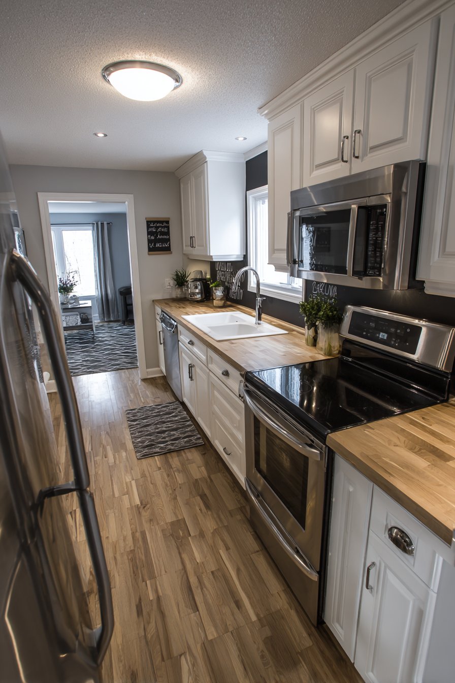
11. Chalkboard Paint Functional Section
Integrating functional paint finishes into kitchen design represents one of the most practical easy wall painting ideas for busy households. This application features a section of chalkboard paint between upper cabinets and countertops, creating a dedicated space for grocery lists, menu planning, family messages, or children’s artwork. The matte black surface contrasts beautifully with white shaker cabinets above and warm butcher block countertops below, creating visual interest while serving a genuine purpose in daily life. This approach demonstrates how paint selection extends beyond color to include functional finishes that enhance how spaces are used, not just how they look.
The strategic placement of the chalkboard section—in the traditionally underutilized wall space between cabinets and counter—maximizes utility without sacrificing valuable cabinet or counter storage. The smooth chalkboard surface becomes an ever-changing element in the kitchen, allowing the space to adapt to current needs and seasons. When white shaker cabinets and natural butcher block surround the black chalkboard area, they provide clean, simple framing that allows the functional painted section to stand out without overwhelming the overall kitchen aesthetic. Natural light from windows illuminates the matte chalkboard surface without creating glare that would make chalk writing difficult to read.
Creating this practical wall treatment requires only special chalkboard paint and careful application, making it one of the most accessible easy wall painting ideas while delivering disproportionate utility. The forgiving nature of chalkboard paint means minor application imperfections won’t show once the surface is seasoned and used. This project teaches that not all wall painting aims purely for decoration—some of the best applications combine aesthetic appeal with functional benefit. The finished chalkboard section becomes a hardworking element that earns its place in the kitchen through daily use while contributing visual contrast that breaks up expanses of white cabinetry.
Key Design Tips:
- Measure the full width between cabinets and counter to determine section size
- Apply painter’s tape carefully to protect cabinets and countertops during painting
- Use chalkboard paint specifically formulated for high-moisture environments like kitchens
- Apply at least two coats following manufacturer’s drying time recommendations
- Season the chalkboard by rubbing chalk over the entire surface and erasing before first use
- Consider applying a clear edge or frame with paint to define the chalkboard section
- Keep the chalkboard section at least 4 inches from countertop to protect from splashes
- Maintain the chalkboard with proper erasers and occasional damp cleaning
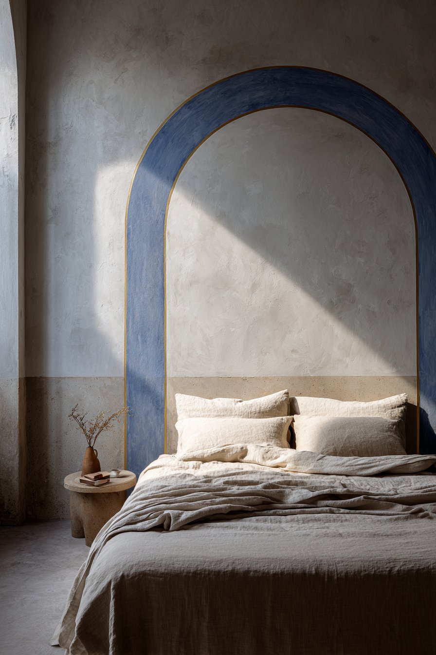
12. Painted Headboard Design in Indigo Blue
Creating a faux headboard through paint represents one of the most budget-friendly easy wall painting ideas for bedroom design. This technique features a simple arched shape painted directly on the wall in muted indigo blue, outlined with a thin gold painted line against soft gray walls. The painted headboard eliminates the need for actual furniture while providing all the visual benefits of a traditional headboard—defining the bed’s position, creating a focal point, and adding color and interest to the wall behind the sleeping area. This approach particularly appeals to renters who cannot install wall-mounted headboards or those who want headboard aesthetics without the dust-collecting, space-consuming reality of actual furniture.
The muted indigo blue chosen for this painted headboard brings depth and sophistication to the bedroom without the heaviness of true navy or black. The soft gray walls provide a neutral, calming backdrop that allows the indigo shape to read clearly while maintaining the serene atmosphere essential in sleeping spaces. The thin gold outline adds definition and a touch of luxury that elevates the simple painted shape into intentional design. When the bed centers beneath the painted headboard shape with neutral bedding, the cohesive composition demonstrates how paint can create visual anchoring equivalent to actual furniture. Natural morning light highlights the painted architectural detail, creating subtle shadows that enhance the dimensional appearance of the flat painted surface.
Executing this easy wall painting idea requires planning the headboard dimensions to properly scale with the bed size and room proportions. The painted headboard should extend slightly wider than the mattress (typically 4-8 inches on each side) and rise 24-36 inches above the mattress top for proper visual weight. The simple arched shape remains straightforward to execute using a string compass or template method, and the thin gold outline—painted freehand or with tape guides—adds polish that distinguishes this from amateur decoration. This project demonstrates how strategic paint placement can replace furniture, reduce costs, simplify cleaning, and create flexibility for future room redesigns that would be complicated by heavy headboards.
Key Design Tips:
- Measure bed width and add 8-16 inches total to determine painted headboard width
- Position the painted headboard so its top edge sits 24-36 inches above mattress height
- Create a symmetrical arch template using cardboard before painting
- Paint the main indigo shape first using small rollers and brushes
- Add the gold outline after the indigo fully dries, using a small artist’s brush
- Consider painting a thin shadow line on one side for enhanced three-dimensionality
- Use low-VOC paint formulated for bedrooms to protect indoor air quality
- Test the indigo color at different times of day as blue tones shift significantly in changing light
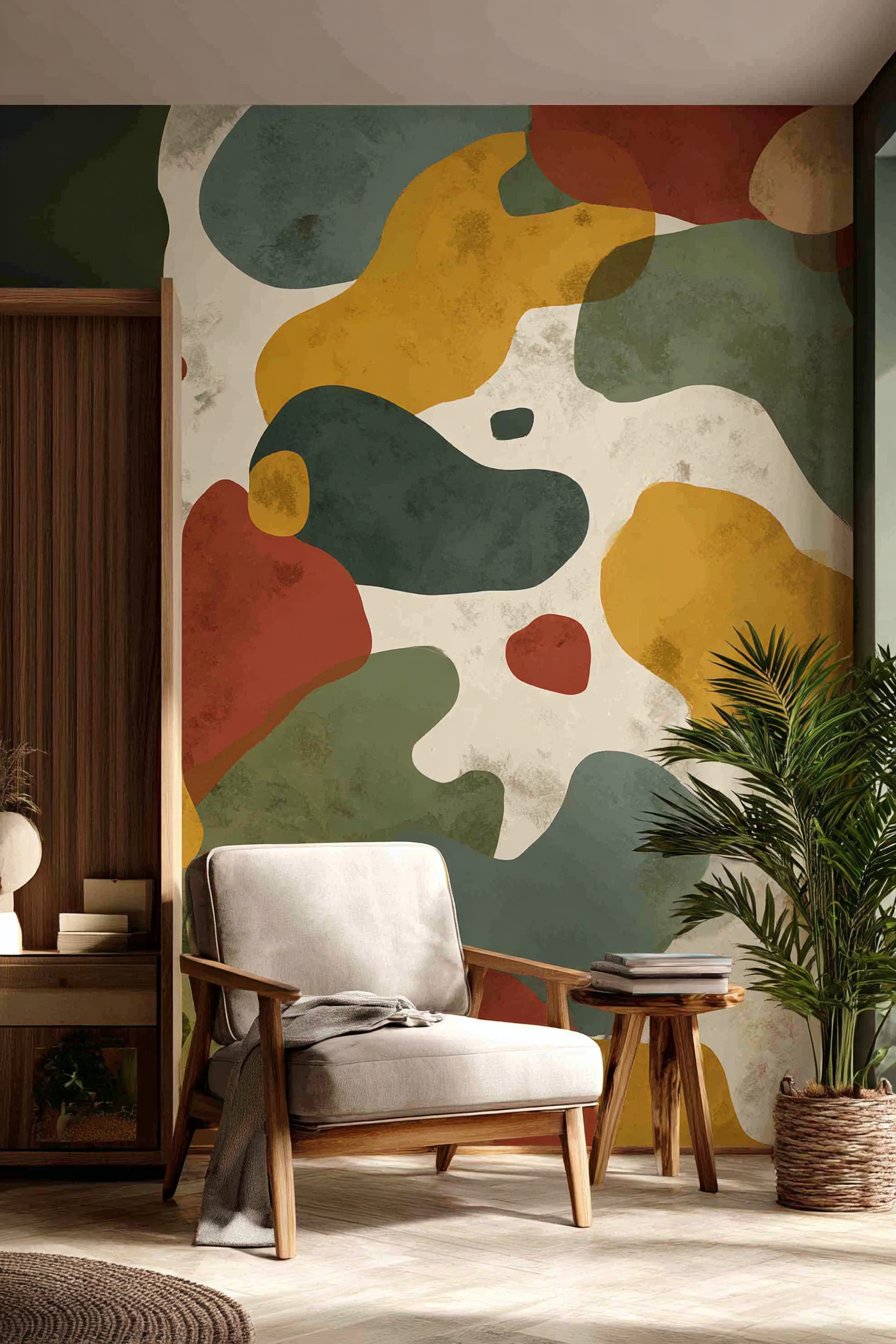
13. Hand-Painted Organic Shapes in Earth Tones
Abstract modern art becomes accessible through one of the most forgiving easy wall painting ideas—hand-painted organic shapes in a limited color palette. This technique features loosely painted shapes in terracotta, sage green, and mustard yellow scattered across a cream background, creating a contemporary art installation directly on the wall. The freeform nature of the organic shapes means perfection isn’t the goal; rather, the slightly irregular edges and varied paint application add to the handcrafted, artisanal quality that makes this treatment special. This approach works particularly well for those who want original artwork but lack confidence in their artistic abilities, as the abstract nature means there are no “wrong” shapes or placements.
When implemented in a living room corner, these hand-painted organic forms create a focal point that reflects personality and brings color into the space without the commitment of permanent wallpaper or the expense of commissioned art. The earth-tone palette—terracotta, sage, and mustard—creates warmth and visual interest while remaining sophisticated enough for adult living spaces. A mid-century modern chair and potted plant positioned near the painted wall complement the artistic treatment, creating a curated vignette that looks intentionally designed. Soft natural lighting emphasizes the matte finish and organic forms, revealing the subtle variations in paint application that prove this is genuine handwork rather than printed decoration.
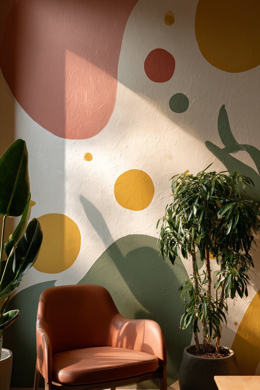
Creating this easy wall painting idea requires confidence and willingness to embrace imperfection as aesthetic virtue. The organic shapes can be painted freehand with brushes or applied using torn sponge pieces for varied textures and edges. The limited three-color palette plus cream background ensures cohesion even with random shape placement, and the scale of shapes (ranging from fist-sized to dinner-plate-sized) creates visual hierarchy without requiring precision. This project demonstrates that artistic wall treatments don’t require artistic training, and that sometimes the most compelling designs emerge from playful experimentation rather than rigid planning.
Key Design Tips:
- Paint the entire wall cream first to create a clean, unified background
- Plan your color distribution loosely—roughly equal amounts of each earth tone
- Vary the size of organic shapes from small accent pieces to larger focal shapes
- Allow shapes to overlap slightly for added visual interest and layering
- Use different application methods—brushes, sponges, rags—for varied textures
- Step back frequently to assess overall balance and add shapes where needed
- Embrace irregularity in shape edges as part of the handcrafted aesthetic
- Allow each color to dry before adding overlapping shapes in different colors
14. Single Horizontal Line in Matte Black
Minimalism reaches its pinnacle in one of the simplest yet most impactful easy wall painting ideas—a single horizontal line painted in matte black running the length of a wall at eye level. This understated treatment creates subtle division and visual interest on soft warm white walls without adding pattern, color, or texture that might overwhelm minimalist sensibilities. The thin painted line serves multiple purposes: it creates horizontal movement that makes walls appear wider, provides a subtle focal point that draws the eye without demanding attention, and demonstrates that powerful design doesn’t require complexity or abundance. This approach particularly appeals to those who appreciate restraint and find beauty in carefully considered negative space.
When implemented in a minimalist bedroom with a low platform bed and simple nightstand, the horizontal line provides just enough visual interest to prevent the space from feeling stark or incomplete while maintaining the serene, uncluttered atmosphere essential to minimalist philosophy. The painted line creates an invisible division that can guide furniture placement or artwork hanging while remaining subtle enough to disappear into the background when not specifically observed. The contrast between the matte black line and soft warm white walls ensures the treatment reads clearly without creating harsh visual disruption. Natural diffused light from sheer curtains highlights the crisp painted line, emphasizing the precision and intentionality of this seemingly simple addition.
Executing this easy wall painting idea requires more planning than painting—the challenge lies in ensuring the line remains perfectly level and consistent in width across its entire length. The actual painting takes mere minutes, but the careful measuring, marking, and taping determine whether the result appears intentionally minimalist or accidentally incomplete. The line width (typically 1/4 to 1/2 inch) should remain consistent and the height (usually 36-48 inches from the floor) should align with natural sight lines and furniture proportions. This project teaches that sometimes less truly is more, and that thoughtful restraint can create more impactful results than abundant decoration.
Key Design Tips:
- Use a laser level to mark the line position before taping
- Choose a line height that relates to furniture heights for visual coherence
- Maintain consistent line width by using precision painter’s tape
- Apply thin, even coats of matte black paint to prevent drips or thickness variations
- Remove tape immediately after painting while paint is still wet
- Consider the line’s start and end points—wrapping corners or stopping at natural breaks
- Use high-quality matte black paint for the deepest, most non-reflective finish
- Keep the line between 1/4 and 1/2 inch wide for proper scale in residential spaces
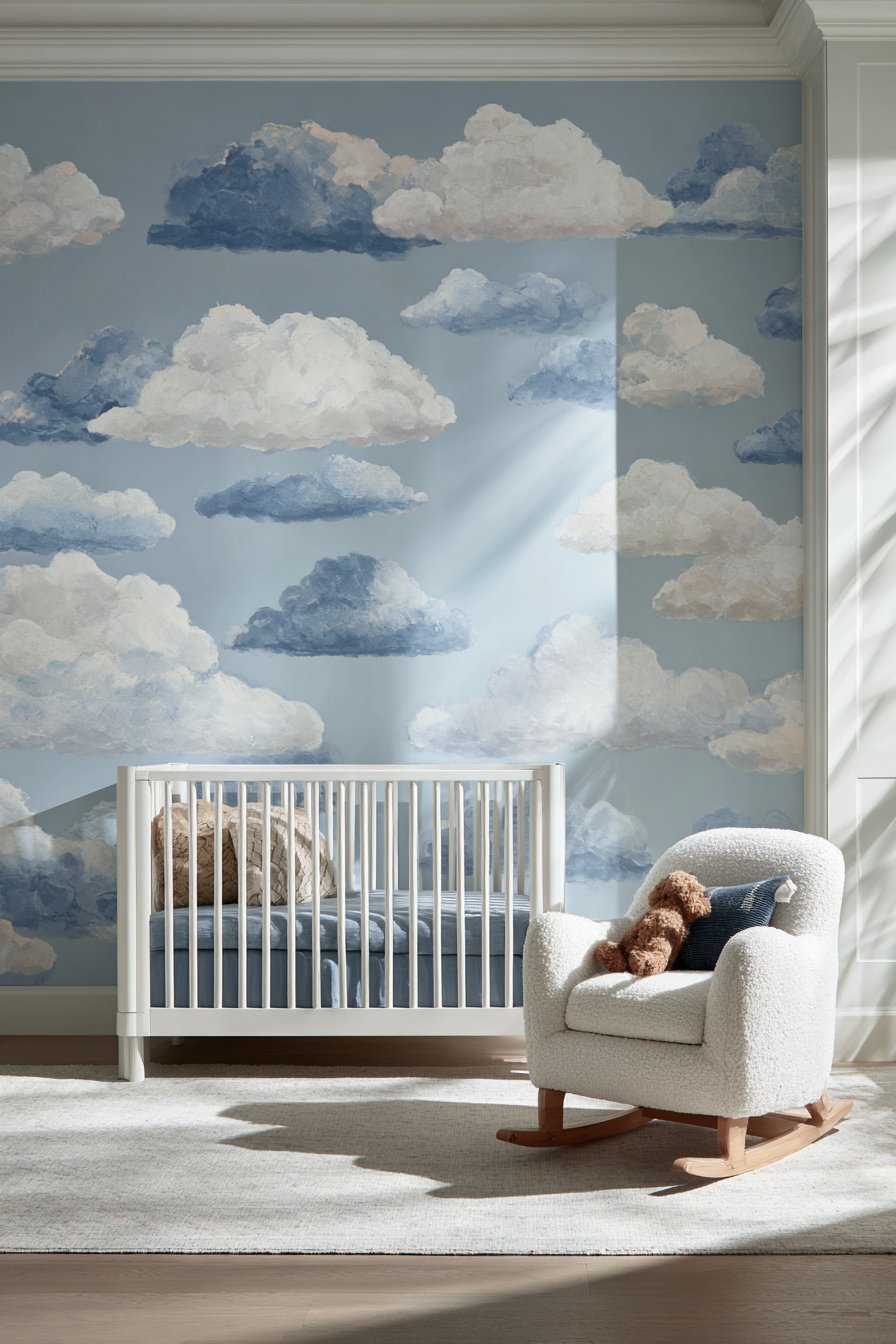
15. Scattered Painted Clouds in Blue Variations
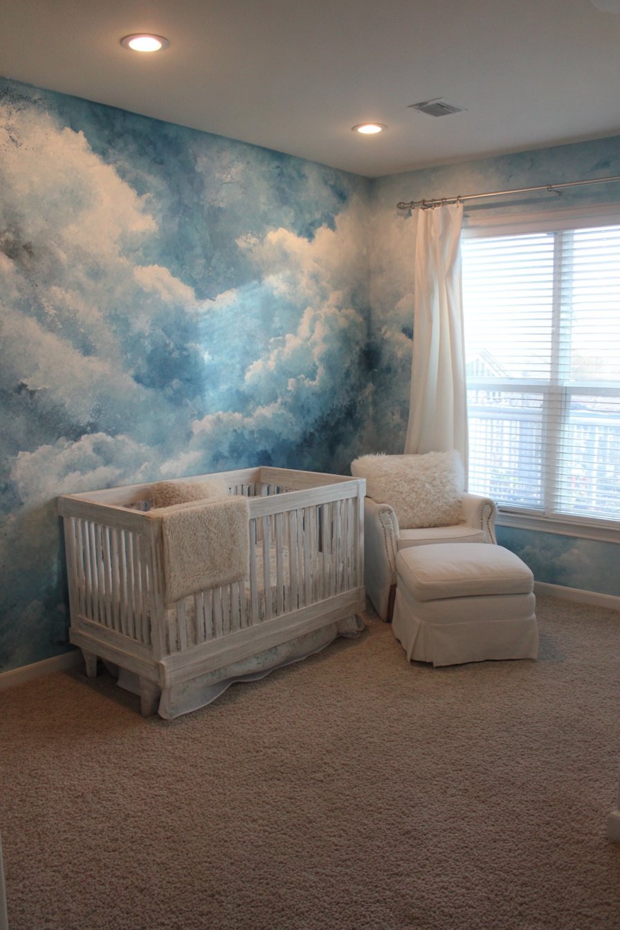
Whimsical ceiling and wall treatments create magical environments in children’s spaces, and scattered painted clouds represent one of the most enchanting easy wall painting ideas for nurseries. This technique features clouds painted in various shades of blue and white against a light sky blue background, creating a dreamy, peaceful atmosphere perfect for the youngest members of the family. The varied cloud shapes and colors add visual interest while maintaining the soft, soothing quality essential in spaces designed for rest and calm. Unlike precise geometric patterns, these organic cloud shapes embrace imperfection and irregularity, making them forgiving for painters who might worry about their artistic abilities.
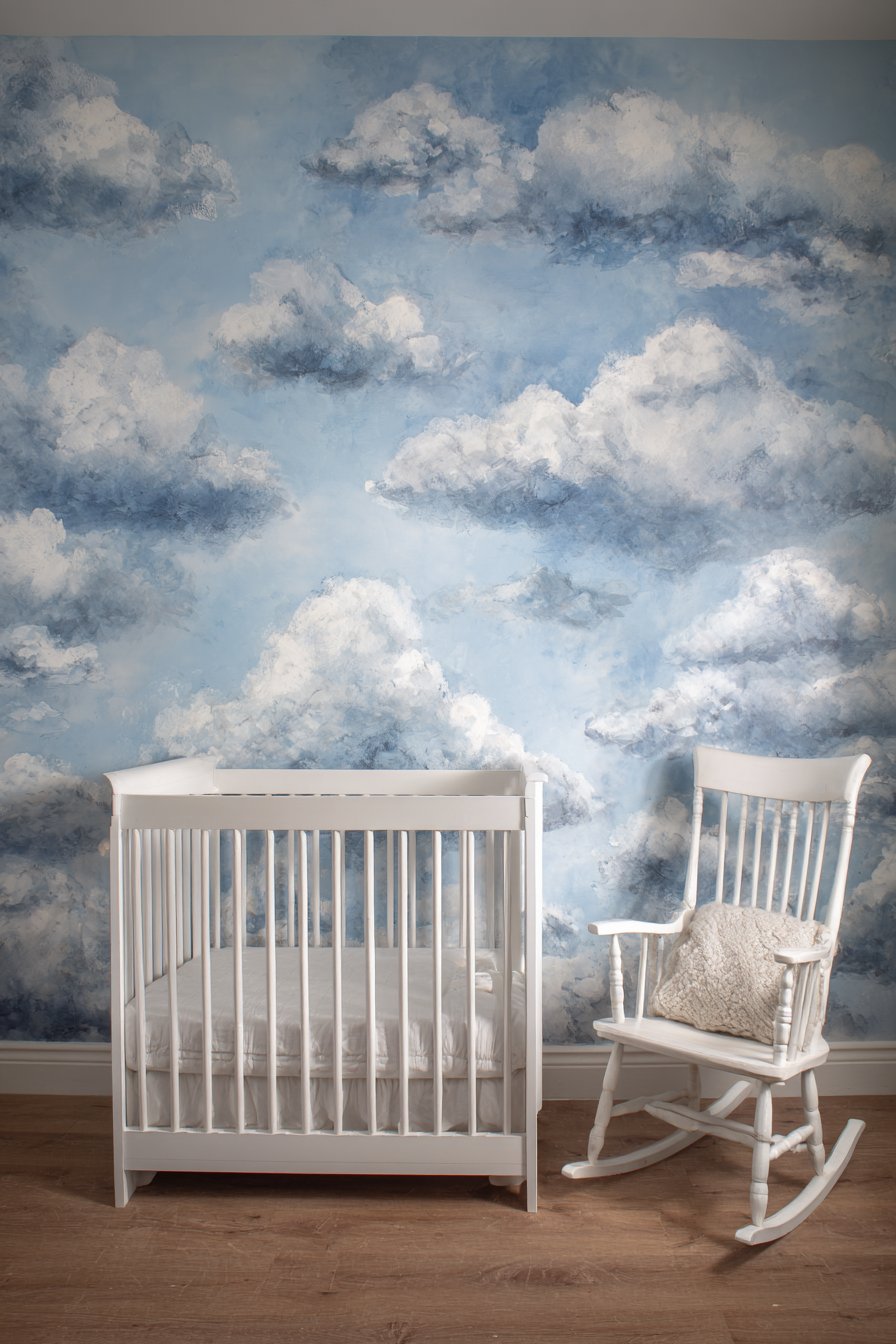
The soft color palette—ranging from deep sky blue through powder blue to pure white—creates depth and dimension that makes the clouds appear to float at different distances from the viewer. When a white crib and rocking chair sit against the cloud-painted wall, they maintain their presence without competing with the gentle background treatment. The painted clouds serve as both decoration and focal point, eliminating the need for additional wall art or busy pattern wallpaper that might overstimulate babies and young children. Soft natural lighting creates gentle shadows that add depth to the painted clouds, and the varied blue tones shift subtly as daylight changes throughout the day.
Creating this easy wall painting idea requires only basic sponging or stippling techniques to achieve the soft, fluffy appearance characteristic of clouds. The forgiving nature of cloud shapes means there’s no “correct” form to replicate, allowing complete creative freedom in size, shape, and placement. The layering of different blue tones—starting with the lightest background and progressively adding darker clouds with white highlights—creates a three-dimensional effect that belies the simple application method. This project demonstrates how organic, nature-inspired subjects can be more forgiving and achievable than geometric precision, and how gentle color and form can create nurturing environments for children.
Key Design Tips:
- Paint the entire wall in the lightest sky blue as your base coat
- Use natural sponges for the most realistic cloud texture and irregular edges
- Start with the darkest blue clouds first, working toward lighter tones
- Dab and stipple rather than wiping to create soft, fluffy cloud edges
- Vary cloud sizes from small wisps to larger cumulus forms
- Layer white highlights on some clouds for enhanced dimension
- Space clouds irregularly to maintain natural, organic appearance
- Consider extending some clouds onto the ceiling for immersive effect
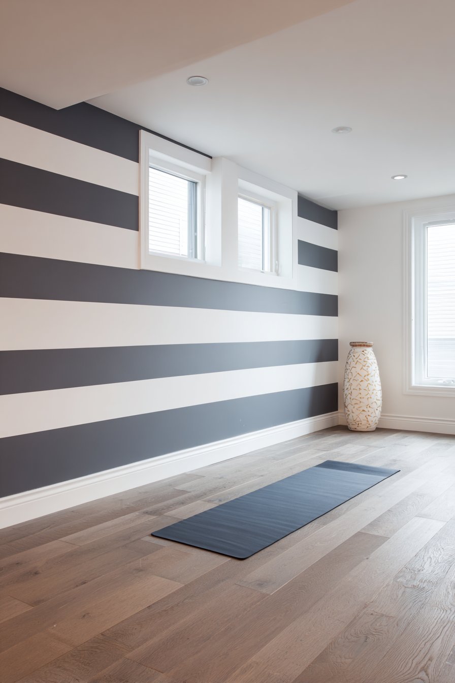
16. Bold Horizontal Stripes in Charcoal and White
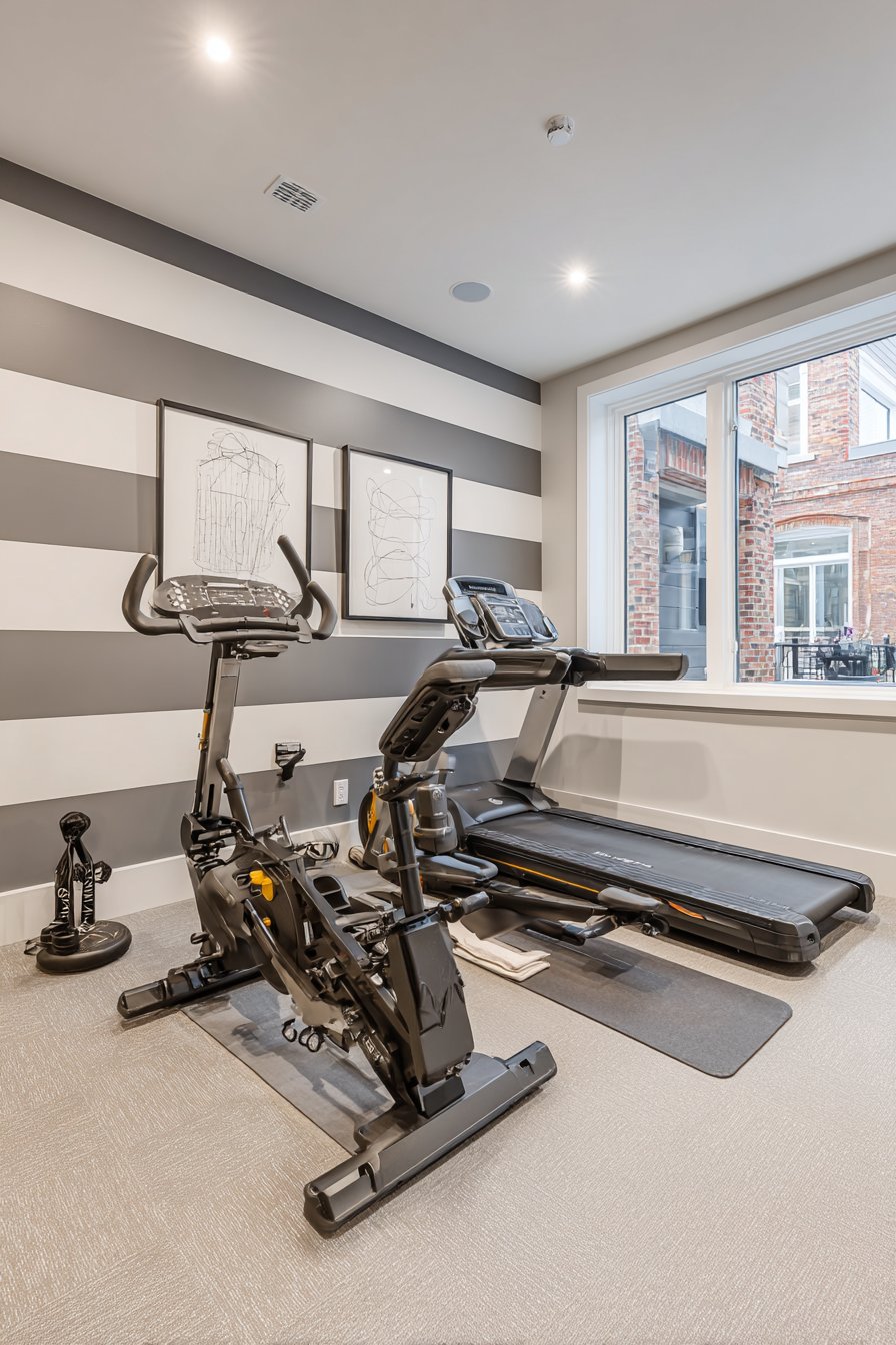
Energizing spaces benefit from dynamic easy wall painting ideas, and bold horizontal stripes in charcoal gray and white create visual rhythm perfect for home gyms and workout areas. This design features wide stripes—approximately sixteen inches each—that create strong horizontal movement and visual energy without the overwhelming busyness of thinner stripes. The high-contrast color combination of charcoal and white ensures the pattern reads clearly even from across the room during exercise, while the horizontal orientation creates the perception of wider space important in often-compact home gym areas. This approach demonstrates how strategic pattern application can enhance a room’s intended purpose rather than just decorating it.
The sixteen-inch stripe width strikes an ideal balance between visual impact and achievable execution—wide enough to paint quickly without excessive tape applications, yet narrow enough to create genuine pattern rather than simple color blocking. When simple exercise equipment and a yoga mat complement the striped accent wall, the space takes on a cohesive, intentional quality that transforms a spare room into a dedicated fitness environment. The bold stripes create visual interest that makes workout sessions more engaging while the monochromatic color scheme prevents the pattern from becoming distracting during exercise. Natural light from high windows emphasizes the clean stripe edges and matte finish, creating shadows that enhance the three-dimensional perception of the flat painted surface.
Executing this easy wall painting idea requires careful measurement to ensure stripes remain level and consistent in width, but the bold scale makes the actual painting process straightforward and relatively quick. The high-contrast nature means precision in edges becomes especially important—any wavy lines or uneven width will read clearly in the finished result. The matte finish recommended for both colors prevents distracting shine or glare during workouts and creates a contemporary aesthetic aligned with current home gym design trends. This project proves that pattern can serve functional purposes beyond pure decoration, and that the right wall treatment can actually enhance the activities performed in a space.
Key Design Tips:
- Measure wall height and divide by sixteen to determine stripe quantity
- Begin with either charcoal or white stripe at the ceiling depending on which creates even stripe count
- Paint the entire wall in the lighter color first, then tape and paint charcoal stripes
- Use wide painter’s tape to protect white stripes while painting charcoal
- Apply two coats of charcoal for solid, opaque coverage that matches the white
- Remove tape while the final coat is still tacky to prevent paint pulling
- Consider painting the striped wall opposite mirrors to prevent visual overwhelm during workouts
- Use semi-gloss or satin finish in high-traffic gyms for easier cleaning and durability
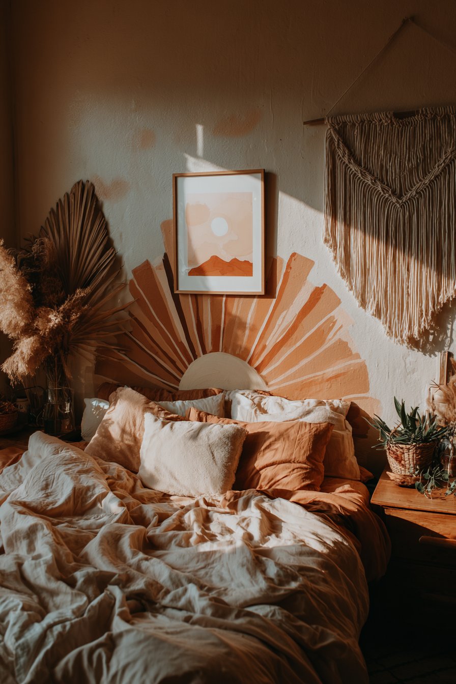
17. Corner Sun Burst in Warm Ochre and Orange
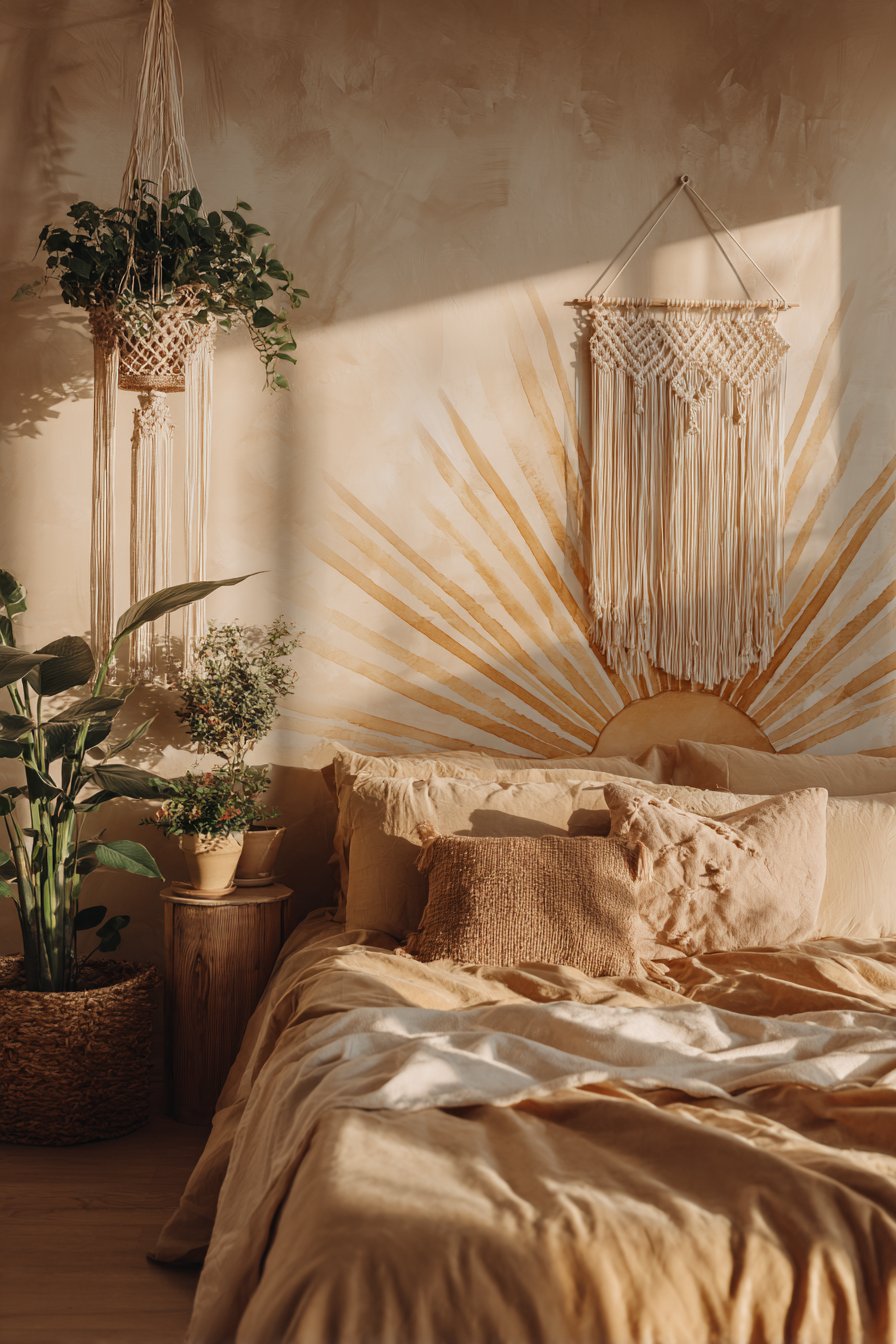
Bohemian design embraces asymmetry and artistic expression, making hand-painted radiating designs one of the most characterful easy wall painting ideas for free-spirited spaces. This technique features a sun burst painted in warm ochre and burnt orange radiating from one corner of the wall against a cream background, creating a focal point that feels both intentional and organic. The radiating lines—painted freehand rather than measured with precision—embrace the imperfect, handcrafted aesthetic central to bohemian style. This approach demonstrates how breaking traditional design rules (centered focal points, symmetrical patterns) can create more interesting, personalized spaces that reflect individual creativity rather than catalog conformity.
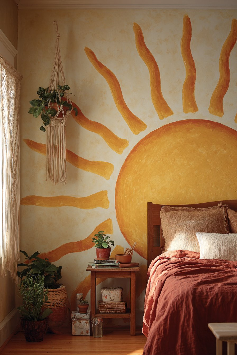
When implemented in a bohemian bedroom with macramé wall hangings and abundant plants, the corner sun burst enhances the eclectic, collected-over-time aesthetic while providing a unifying warm color element. The positioning in the corner rather than center creates visual surprise and draws the eye to an often-ignored area of the room, making the entire space feel more dynamic and intentional. The warm ochre and burnt orange tones bring earthy energy that complements natural materials and greenery typical of bohemian interiors while adding warmth that makes the space feel welcoming and cozy. Soft golden hour lighting enhances the warm tones of the painted design, creating a glowing effect that amplifies the sun burst concept.
Creating this easy wall painting idea requires confidence in freehand painting and willingness to embrace slight irregularities in the radiating lines. The technique is remarkably simple—painting straight lines emanating from a corner point using a long brush or small roller—but the artistic freedom can feel intimidating to those accustomed to precise, measured painting projects. The varying lengths and slight curves in the radiating lines add to the organic, hand-drawn quality that makes this treatment special. This project teaches that perfection can be the enemy of personality in design, and that sometimes the most memorable walls are those that clearly show the human hand behind their creation.
Key Design Tips:
- Lightly mark the corner origin point and draw guide lines for the general radiating direction
- Paint the longest rays first to establish the overall sun burst size and shape
- Vary ray lengths for more natural, organic appearance
- Allow slight curves and irregularities in the rays to enhance handcrafted quality
- Use a long-handled brush or small roller for smoother, more confident strokes
- Paint some rays in ochre and others in burnt orange for color variation
- Consider fading the rays (thicker near the corner, thinner at the tips) for additional dimension
- Step back frequently to assess overall balance and add rays where needed
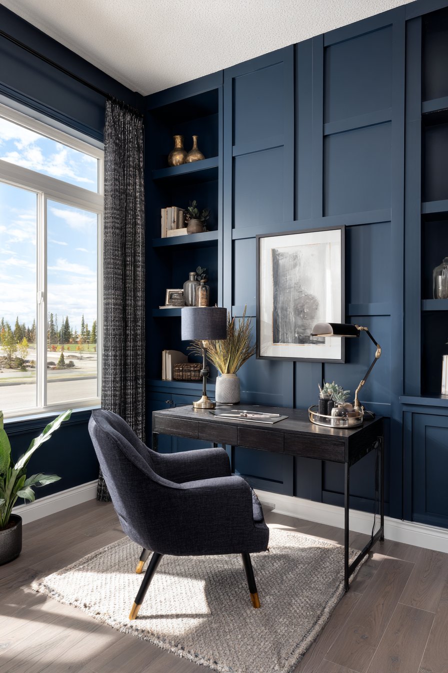
18. Painted Frame Effect with Navy Blue
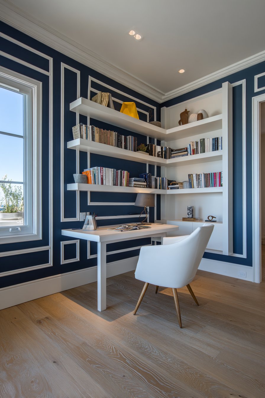
Creating architectural illusion through paint represents some of the most sophisticated easy wall painting ideas available to DIY enthusiasts. This technique uses navy blue paint to outline wall edges, creating the illusion of wall paneling or picture frame molding without installing actual three-dimensional materials. The painted frame effect adds visual structure and definition to walls while maintaining the smooth surface essential in small spaces where actual molding might feel overwhelming. This approach demonstrates how careful paint application can mimic architectural features at a fraction of the cost and installation complexity, making high-end details accessible to renters and budget-conscious homeowners.
When implemented in a small home office with a simple desk and floating shelves arranged within the painted frame, the treatment creates a designated work zone that feels intentional and professional. The navy blue frame provides crisp definition that draws the eye and creates focus, while the negative space within the frame remains neutral and calm—ideal for concentration and productivity. The painted frame technique adds depth through visual suggestion rather than physical protrusion, making it perfect for smaller offices where every inch of space matters. Natural daylight emphasizes the crisp painted edges and the depth created by the frame effect, and the architectural quality elevates what might otherwise be a simple spare room into a proper home office.
Executing this easy wall painting idea requires precision in measurement and taping to ensure the frame remains consistent in width and perfectly level on all sides. The frame width (typically 3-6 inches) should remain constant around the entire perimeter, and the frame should maintain consistent distance from ceiling, baseboards, and corners to create proper proportion. The key to success lies in careful planning—measuring, marking with pencil, and applying high-quality painter’s tape before beginning any paint application. This project teaches valuable skills in precision and patience while creating a sophisticated architectural effect that transforms simple walls into designed elements worthy of traditional homes with actual molding.
Key Design Tips:
- Measure and mark frame width (typically 4-6 inches from wall edges) with pencil before taping
- Use a level to ensure all frame edges remain perfectly straight
- Maintain equal distance from ceiling, baseboards, and corners for proper symmetry
- Apply tape carefully to create crisp inner and outer frame edges
- Paint the frame in two thin coats rather than one thick coat for smoothest finish
- Consider adding corner details (painted blocks or decorative elements) for enhanced authenticity
- Remove tape while paint is still slightly wet for cleanest edges
- Use semi-gloss or satin finish for the frame to distinguish it from matte wall paint
19. Painted Horizontal Wave Patterns in Blue Gradients
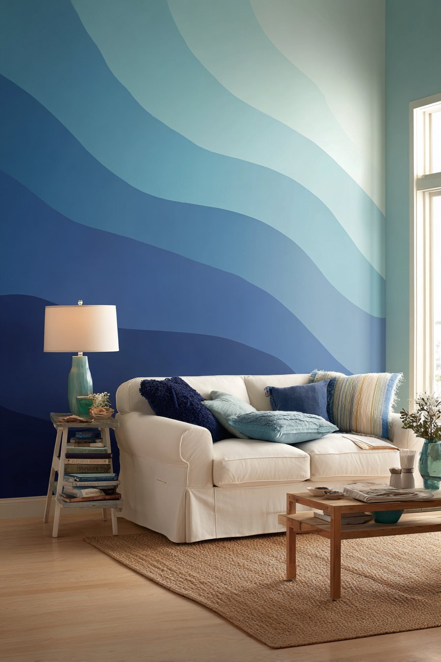
Coastal-inspired interiors benefit from organic, nature-based easy wall painting ideas, and horizontal wave patterns in varying shades of blue create ocean atmosphere without literal beach imagery. This technique features flowing horizontal waves painted in graduated blue tones—from pale aqua through medium blue to deep navy—creating a dynamic gradient effect that suggests water movement and coastal calm. Unlike rigid geometric patterns, these curved wave shapes bring organic fluidity to the space while maintaining the horizontal orientation that creates width perception. This approach demonstrates how nature-inspired forms can be abstracted and simplified for achievable execution while maintaining their essence and atmospheric effect.
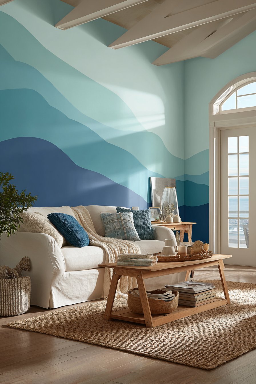
The graduated blue palette creates depth and visual interest while maintaining the cohesive color story essential to coastal design. When a white slipcovered sofa and natural fiber rug complement the wavy painted accent wall, the room achieves the relaxed, beachy aesthetic many homeowners desire without resorting to obvious shell motifs or nautical clichés. The flowing wave transitions bring movement and energy to what would otherwise be a static vertical surface, and the varying blue tones ensure the wall maintains interest from multiple viewing angles. Soft natural light highlights the flowing wave transitions, creating subtle shadows in the curves that enhance the dimensional quality of the painted surface.
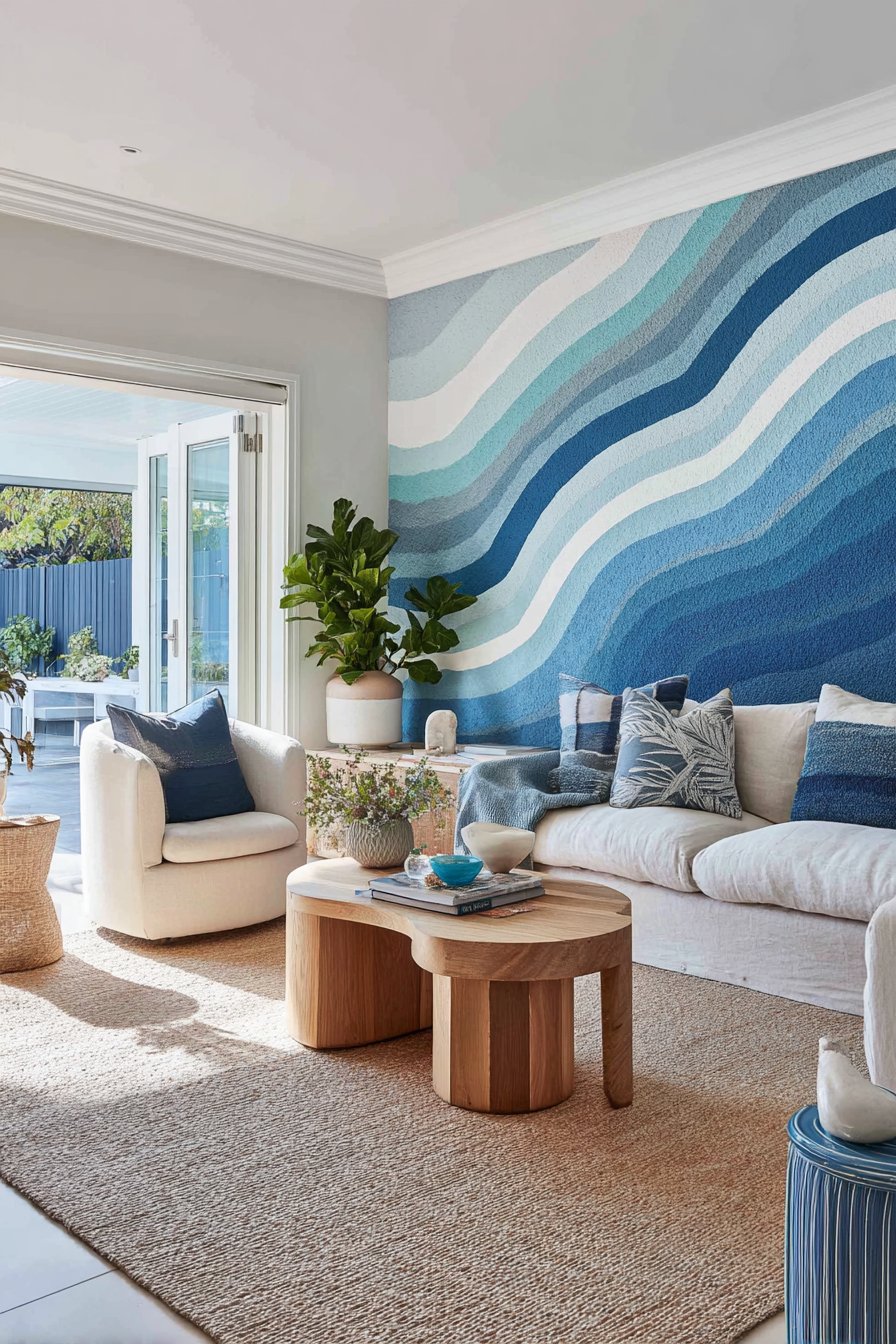
Creating this easy wall painting idea requires working with wet paint and smooth, confident strokes to achieve the flowing wave shapes characteristic of water. The technique is forgiving because waves naturally vary in size and spacing—no two need to be identical. Starting with the lightest aqua at the bottom or top and progressively adding darker blues creates the gradient effect while the curved lines create the wave illusion. The keys to success include working quickly while paint remains blendable, using long horizontal strokes for smoothness, and embracing the organic nature of waves rather than striving for perfection. This project teaches that nature-inspired designs often work best when they embrace irregularity rather than fight it.
Key Design Tips:
- Paint the entire wall in the lightest blue as your base coat
- Work in horizontal sections, completing one wave section before moving to the next
- Use a small roller for smooth application of the wave curves
- Create waves of varying heights and spacing for more natural appearance
- Blend where wave colors meet while paint is still wet using a dry brush
- Consider starting with wider waves at the bottom and narrower waves toward the top
- Allow the wave pattern to extend slightly onto adjacent walls for immersive effect
- Use at least three blue shades plus white for proper gradient depth
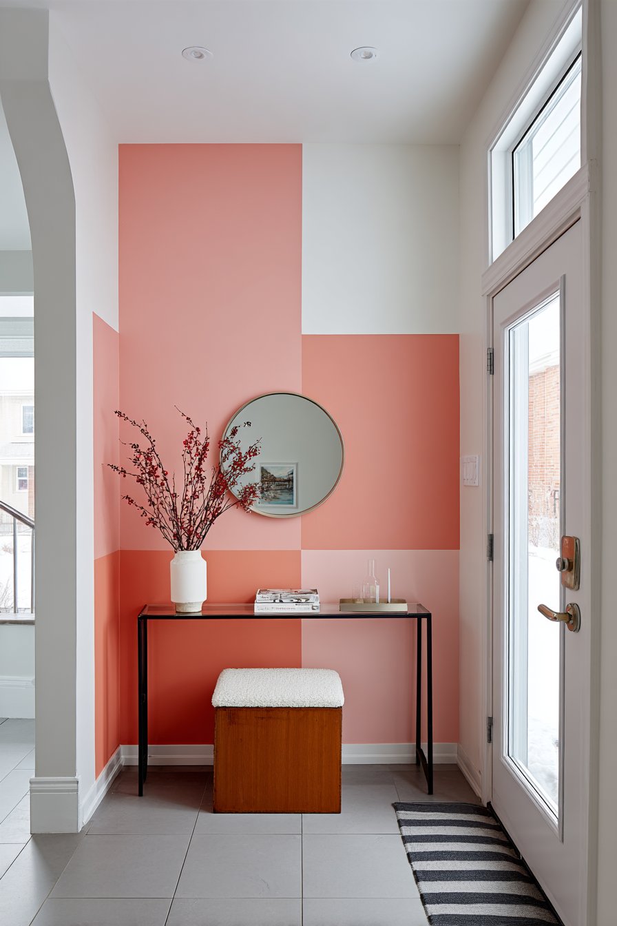
20. Geometric Triangle Pattern in Complementary Colors
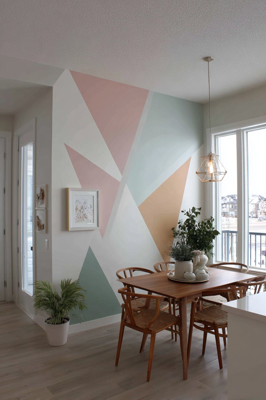
Modern geometric designs offer bold visual impact through one of the most structured easy wall painting ideas available. This technique features an alternating triangle pattern using three complementary colors—blush pink, sage green, and cream—arranged across an accent wall in a dining area. The geometric precision creates contemporary sophistication while the soft, complementary color palette prevents the pattern from becoming overwhelming or too energetic for a space designed for meals and conversation. This approach demonstrates how geometric patterns can feel modern and fresh rather than retro or traditional when executed with current color palettes and proper scale.
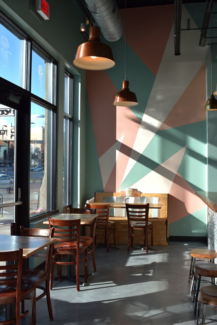
The three-color triangle pattern creates complex visual interest through simple shape repetition, proving that sophisticated design doesn’t require complicated execution. When a simple dining table with wooden chairs sits against the painted wall, the geometric backdrop becomes conversation-worthy without overwhelming the functional dining furniture. The alternating colors ensure no two adjacent triangles share the same hue, creating visual rhythm that guides the eye across the entire wall surface. Natural light from pendant fixtures and windows highlights the sharp geometric edges created through careful masking, and the matte finish prevents glare that might be distracting during meals.
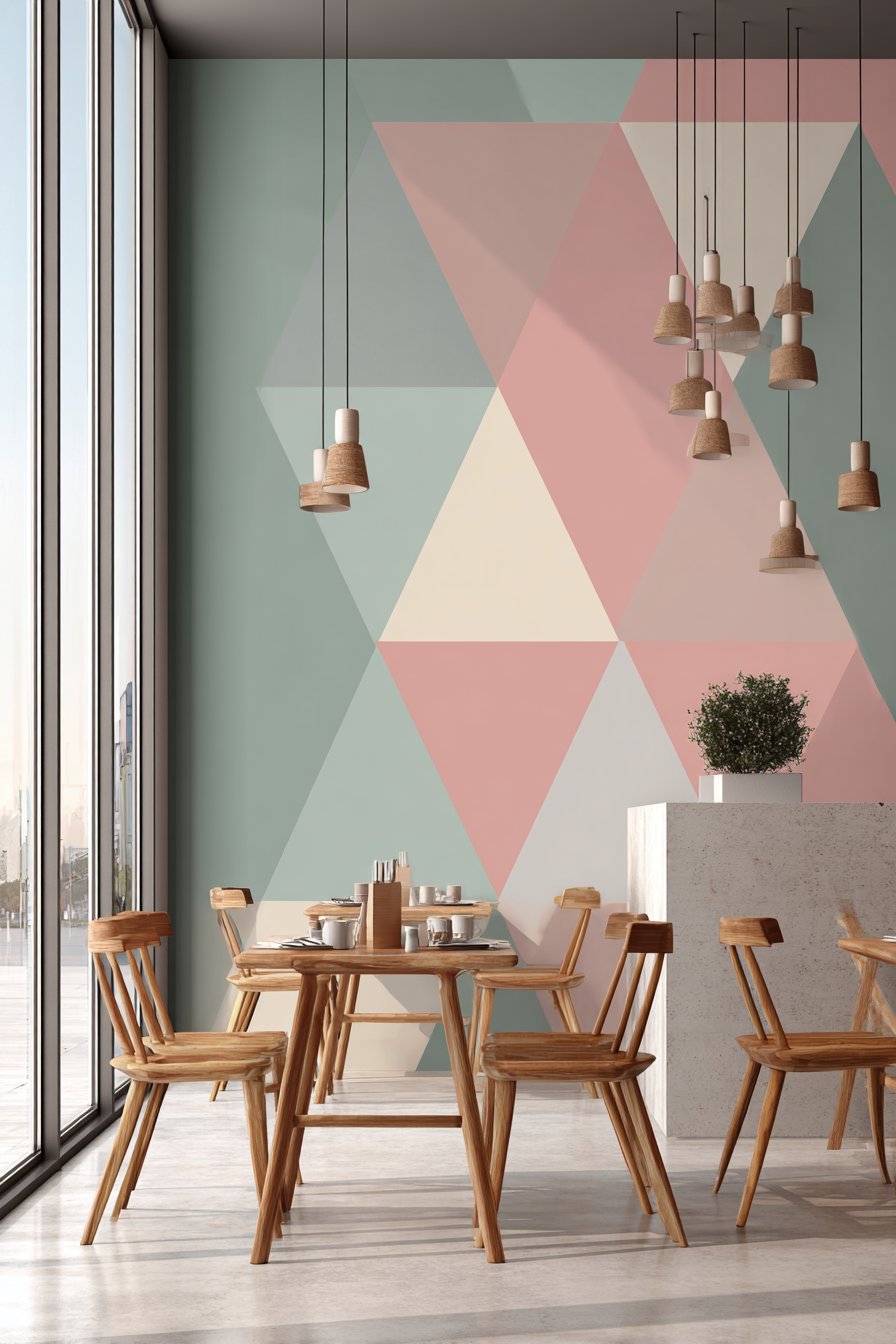
Executing this easy wall painting idea requires patient, methodical approach to measuring, marking, and masking the triangle pattern. The keys to success include choosing a triangle size that creates appropriate scale (typically 8-12 inch sides for residential spaces), using high-quality painter’s tape for crisp edges, and painting colors in strategic order to minimize tape applications. The organized yet creative nature of this project—half mathematical precision, half artistic color play—appeals to those who want impressive results through careful planning rather than artistic talent. This proves that geometric precision can be beautiful and that careful execution elevates simple shapes into sophisticated design.
Key Design Tips:
- Plan your triangle pattern on graph paper before beginning to ensure even distribution
- Choose a triangle size appropriate to wall dimensions (usually 8-12 inch sides)
- Create a cardboard template to ensure consistent triangle shape throughout
- Mark all triangle outlines lightly in pencil before any painting begins
- Paint the lightest color (cream) across all cream triangles first
- Progress through medium and dark tones, allowing each to dry before taping adjacent triangles
- Use low-tack painter’s tape to prevent pulling up previously painted sections
- Remove tape at 45-degree angles while paint is still slightly wet for cleanest edges
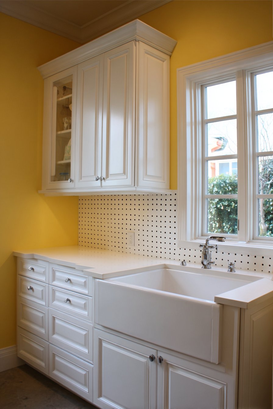
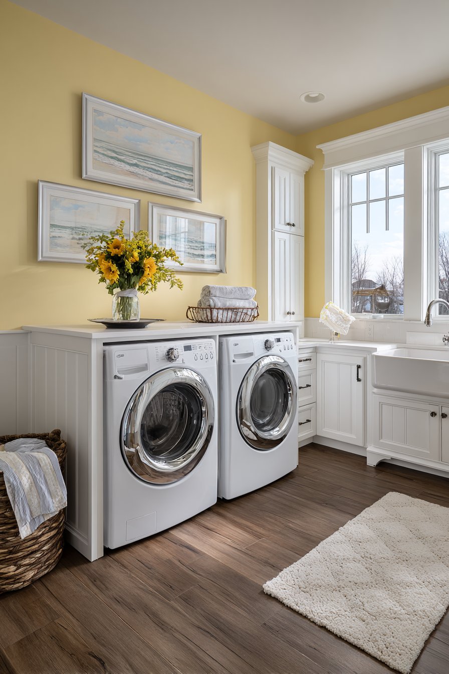
21. Painted Pegboard Grid in Yellow with White Lines
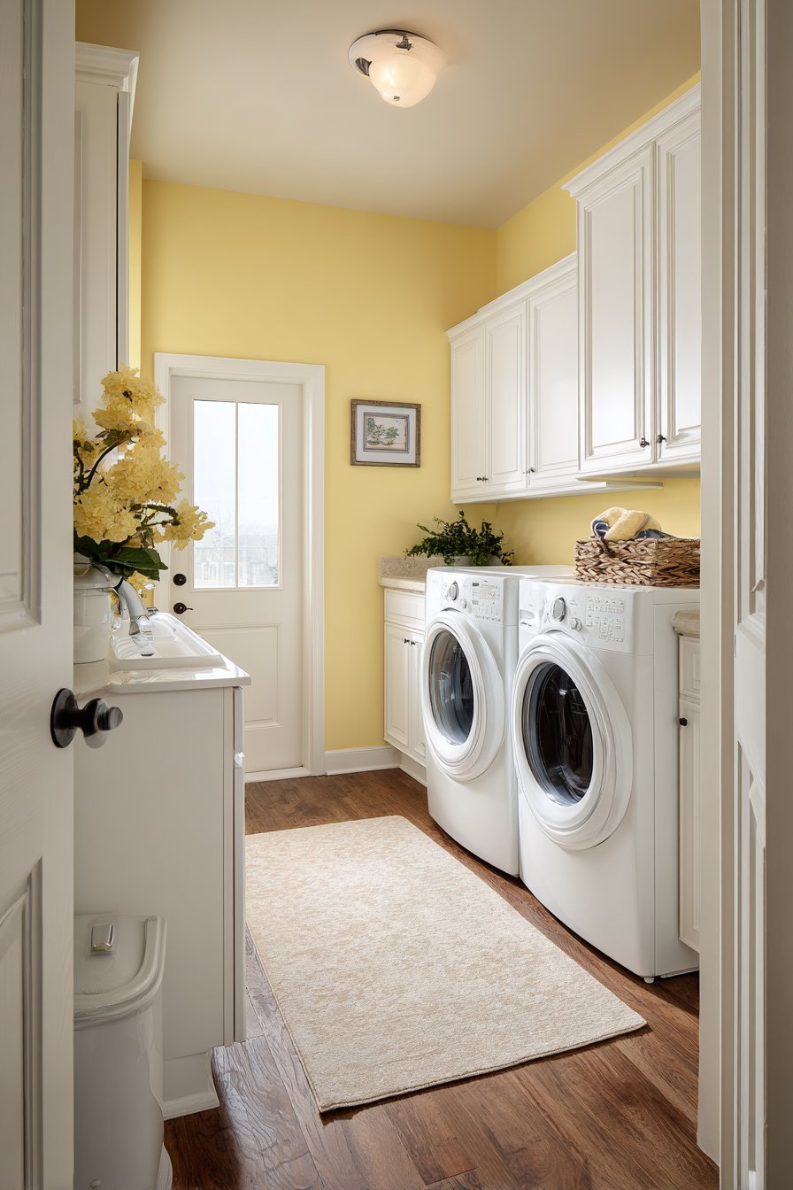
Combining decoration with function represents one of the most practical easy wall painting ideas, and a painted pegboard grid pattern serves both purposes beautifully. This technique features a white grid painted over cheerful butter yellow to suggest a pegboard pattern, creating visual interest while indicating where actual hooks or organizers might be added to the wall in the future. The simple grid pattern brings structure and energy to functional spaces like laundry rooms without requiring the actual installation of pegboard material. This approach demonstrates how paint can suggest organizational possibilities while maintaining the smooth wall surface that’s easier to clean and maintain than actual perforated materials.
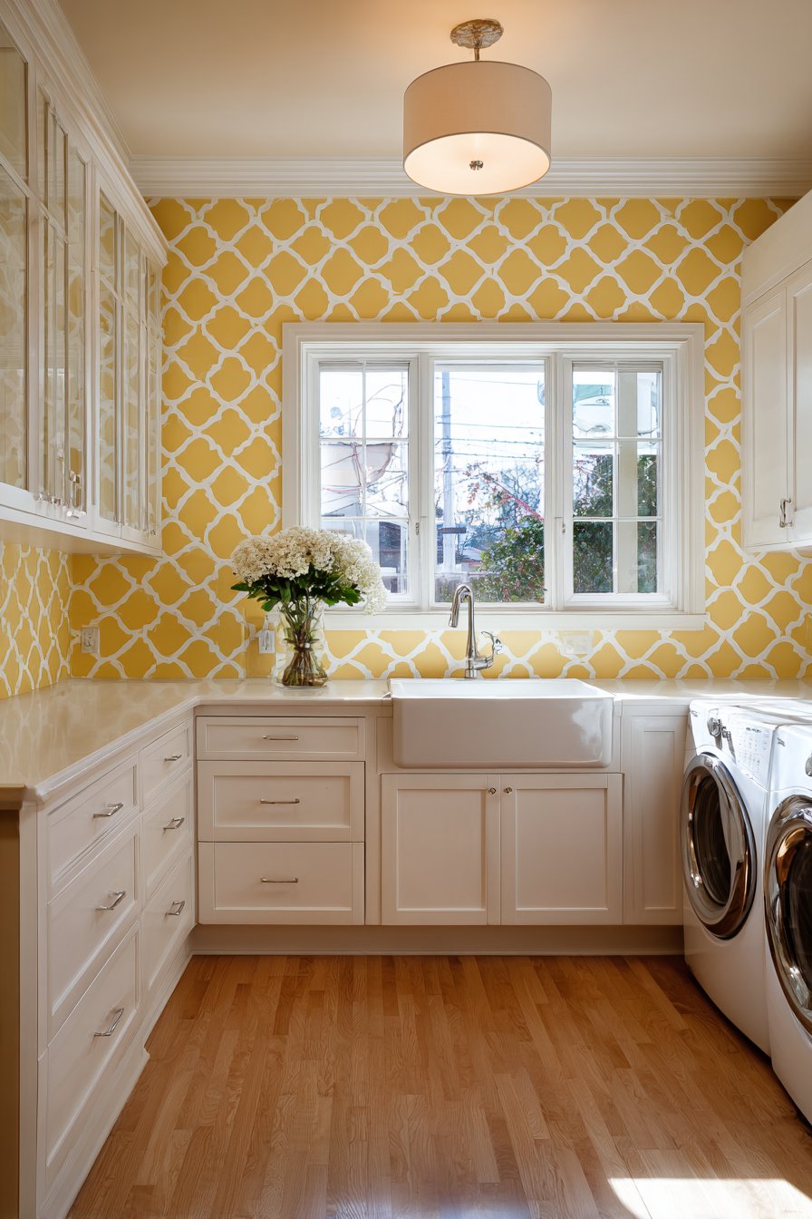
When implemented in a laundry room with white cabinets and a farmhouse sink, the yellow painted wall with white grid brings unexpected cheerfulness to a space often relegated to purely utilitarian status. The butter yellow creates warmth and energy that makes laundry tasks feel less tedious, while the white grid adds visual structure that organizes the space mentally even before physical organization systems are installed. The painted grid suggests where hooks, baskets, or organizing tools might eventually hang, creating a built-in planning guide for future functional additions. Soft natural lighting emphasizes the hand-painted grid details and highlights the smooth matte finish that stands up well to the humidity and temperature variations common in laundry spaces.
Creating this easy wall painting idea requires steady hands and patient grid marking, but the functional nature of the pattern makes slight imperfections less noticeable than they might be in purely decorative applications. The grid spacing (typically 1-2 inch squares) should align with standard pegboard dimensions if you plan to eventually add functional hooks, or can be arbitrary if the grid remains purely decorative. The white lines painted over the yellow base can be applied freehand for an artisanal quality or taped for precision depending on your skill level and desired aesthetic. This project teaches that some of the best wall treatments combine beauty with utility, and that function doesn’t have to compromise style.
Key Design Tips:
- Paint the entire wall in butter yellow as your base coat
- Use a level and ruler to mark grid intersections before painting lines
- Consider 1-2 inch square spacing for visual interest without overwhelming busyness
- Use a small brush or paint pen for the white grid lines
- Work systematically, completing all horizontal lines before starting verticals
- Apply clear matte sealer over the finished grid in moisture-prone laundry rooms
- Consider actually adding pegboard hooks at some intersections for functional accent
- Keep grid lines thin (1/8 to 1/4 inch) for subtle suggestion rather than bold statement
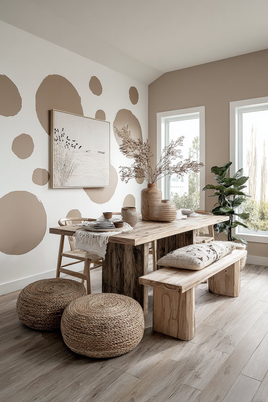
22. Large Painted Rainbow Arc in Muted Earth Tones
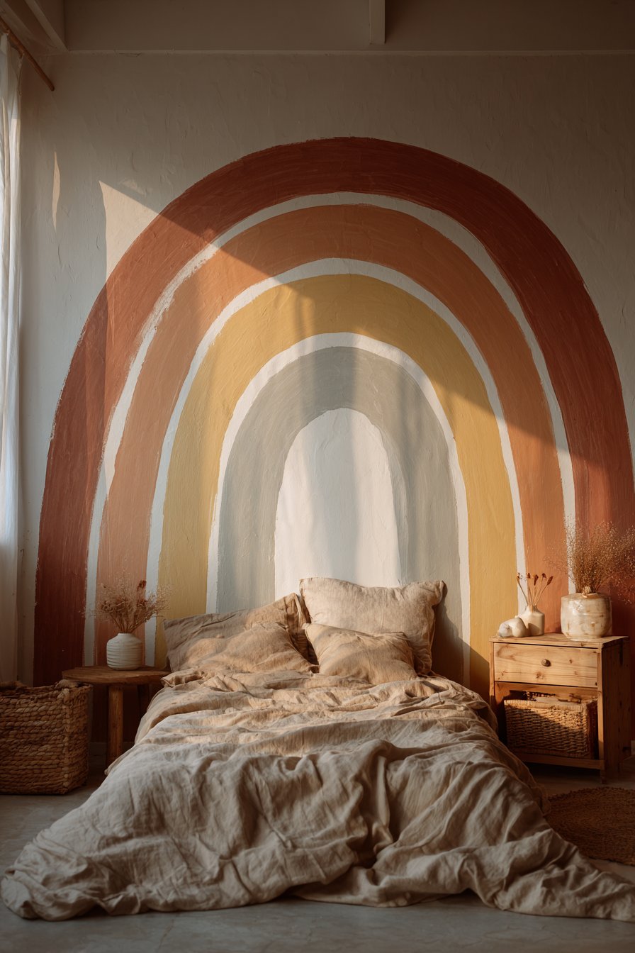
Rainbow motifs find sophisticated expression through one of the most popular easy wall painting ideas for children’s spaces—a large painted rainbow arc in muted earth tones. This design features a spanning rainbow in terracotta, ochre, sage, and cream painted above a bed, creating a focal point that feels contemporary rather than childish. The muted earth-tone palette distinguishes this from primary-colored rainbows, creating a soothing, nature-inspired color story that grows with the child and doesn’t require repainting as tastes mature. The large scale of the rainbow creates impressive impact through simple repeated curved shapes, demonstrating how basic geometric forms can create sophisticated results when executed thoughtfully.
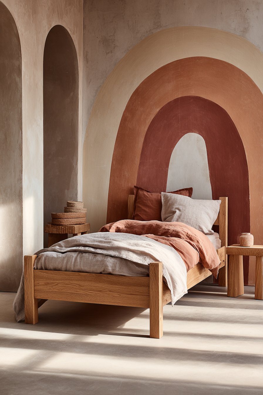
The arched rainbow format creates natural visual flow that draws the eye across the wall, and the positioning above the bed makes it the room’s undisputed focal point without overwhelming the entire space. Simple wooden furniture and neutral bedding allow the painted rainbow to provide all the room’s color and personality, creating a calm environment that doesn’t overstimulate at bedtime. The earth tones—terracotta, ochre, sage, cream—bring warmth and connection to nature while maintaining the playfulness appropriate for children’s spaces. Natural morning light creates soft shadows that add dimension to the painted arcs, and the muted colors shift subtly as daylight changes throughout the day.
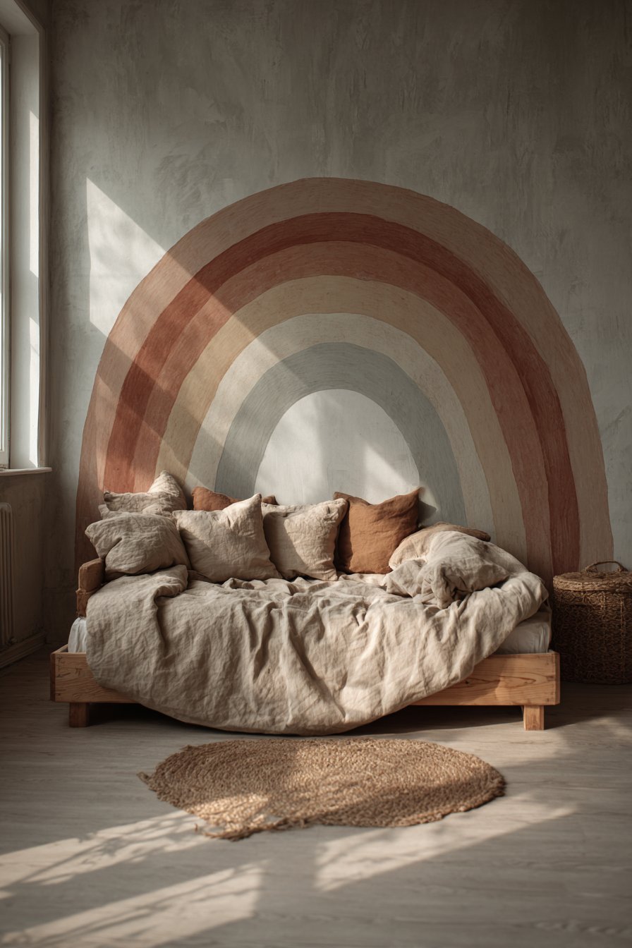
Executing this easy wall painting idea requires creating consistent curved arcs—achievable through string compass methods, large templates, or careful freehand painting guided by pencil marks. The keys to success include maintaining consistent arc spacing (typically 2-4 inches between colors) and keeping each color band uniform in width across its entire length. The forgiving nature of the curved shapes means slight imperfections actually enhance the handcrafted quality rather than appearing as mistakes. This project teaches valuable skills in curve painting and color progression while creating a room centerpiece that demonstrates how restrained color palettes can create both sophistication and whimsy simultaneously.
Key Design Tips:
- Find the wall’s horizontal center and mark it as the rainbow’s center point
- Use a string tied to a pencil as a compass to draw consistent curved arcs
- Start with the innermost (smallest) arc and work outward to larger arcs
- Maintain 2-4 inch spacing between color bands for proper visual weight
- Paint the lightest color (cream) first, then progress through medium to dark tones
- Use a small roller for smooth, even application along the curves
- Consider where the rainbow ends—at furniture level, baseboard, or fading into the wall
- Apply two coats of each color for saturated, even coverage
23. Abstract Vertical Lines in Olive and Sage Greens
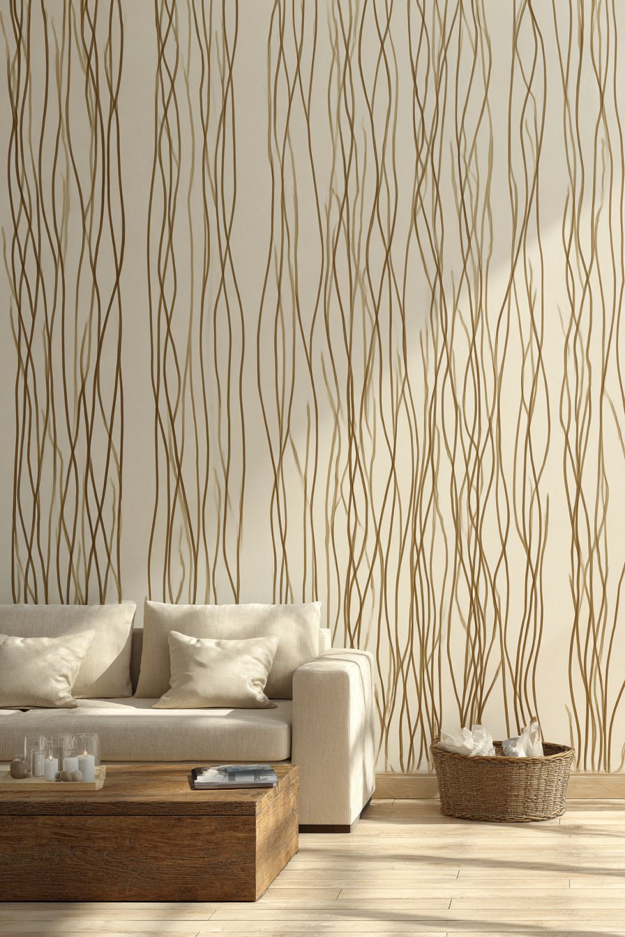
Nature-inspired abstraction creates calm through one of the most organic easy wall painting ideas—painted vertical lines in varying thicknesses and heights resembling abstract grass blades. This technique features muted olive and sage greens painted in loose vertical strokes against a cream background, creating a botanical impression without literal representation. The varied line weights and heights bring natural irregularity that prevents the pattern from reading as rigid or manufactured, while the limited green palette creates cohesion and calm. This approach demonstrates how abstract interpretation of natural elements can create soothing environments without resorting to obvious floral or botanical wallpaper patterns.
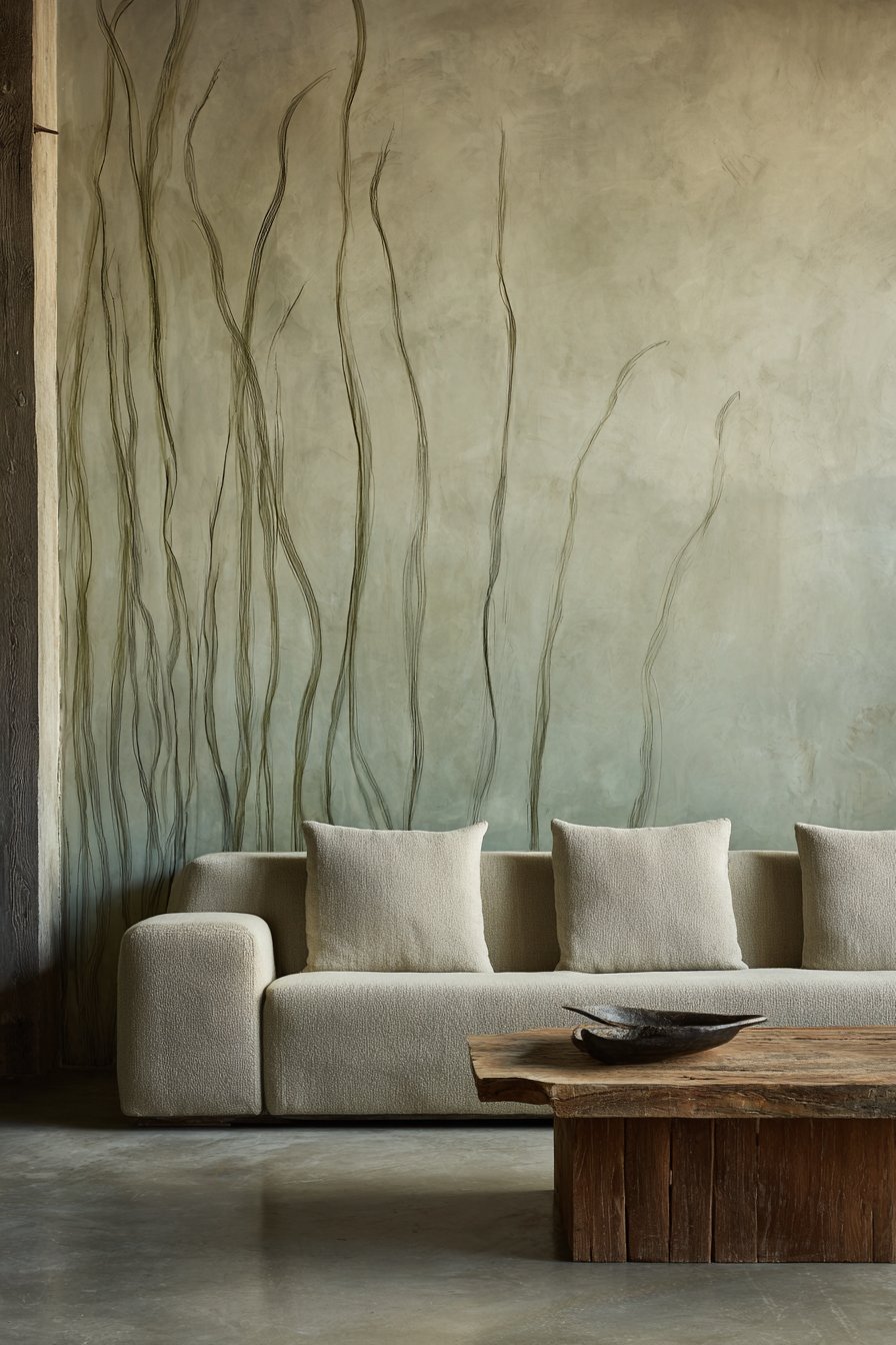
When implemented in a minimalist living room with a low-profile sofa and natural wood coffee table, the organic painted wall provides visual interest that doesn’t conflict with the room’s restrained aesthetic. The vertical orientation of the grass-like lines draws the eye upward, creating height perception while the organic nature of the strokes brings softness that balances the angular furniture typical of minimalist spaces. The muted greens create subtle color presence that enlivens the space without demanding attention or creating visual competition with furniture or accessories. Soft diffused daylight highlights the varied line weights and matte finish, creating subtle shadows that enhance the three-dimensional perception of the flat painted surface.
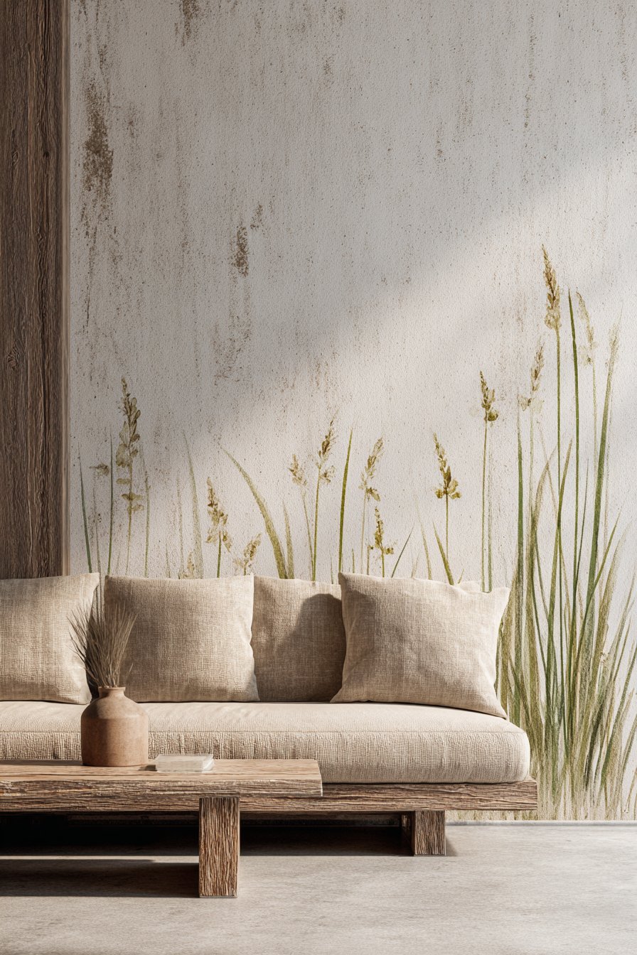
Creating this easy wall painting idea requires letting go of precision and embracing organic, imperfect strokes that mimic natural grass growth. The technique is remarkably forgiving because grass naturally varies in height, thickness, and spacing—making every stroke appropriate rather than requiring correction. Using different brush sizes creates the varied line weights naturally, and lifting the brush mid-stroke creates the tapered tips characteristic of grass blades. The keys to success include working loosely and quickly, varying line heights significantly, and resisting the urge to make lines too uniform or evenly spaced. This project teaches that sometimes the best results come from releasing control rather than exercising it, and that nature-inspired designs work best when they embrace nature’s inherent irregularity.
Key Design Tips:
- Paint the entire wall cream first to create a clean background
- Use at least two shades of green (olive and sage) for depth and variation
- Work with different brush sizes—thin for delicate blades, wider for substantial strokes
- Vary line heights dramatically, from baseboard to mid-wall to near-ceiling
- Create clusters of lines with gaps between for more natural grass-like grouping
- Lift brushes mid-stroke to create tapered, pointed tips
- Allow some lines to be bolder and more opaque while others are nearly transparent
- Step back frequently to assess overall distribution and add lines where needed
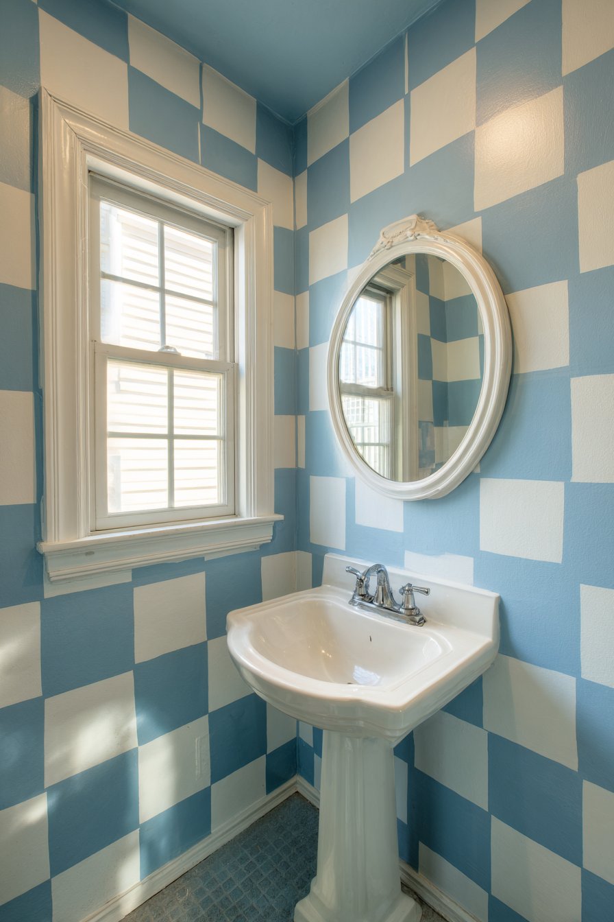
24. Soft Gray and White Checkerboard Pattern
Classic patterns find fresh expression through timeless easy wall painting ideas, and a checkerboard pattern in soft gray and white creates elegant geometry perfect for powder rooms. This technique features carefully measured and painted squares alternating between the two tones, creating a sophisticated grid that references traditional design while feeling current through its soft, modern color palette. The small scale appropriate for powder rooms makes this project manageable while delivering impressive visual impact in a space where guests linger and notice details. This approach demonstrates how traditional patterns remain relevant when executed with contemporary color sensibilities and precise technique.
The soft gray and white palette brings classic elegance without the high contrast of black and white checkerboard patterns, creating visual interest that remains soothing rather than energetic. When a white pedestal sink and simple round mirror complement the checkered wall, the space achieves a cohesive, intentionally designed quality despite its small size. The geometric pattern adds architectural interest that makes the small powder room feel considered and special rather than merely functional. Natural light from a small window emphasizes the clean squares and crisp edges, and the consistent matte finish across both colors ensures the pattern reads as unified design rather than contrasting elements.
Executing this easy wall painting idea requires meticulous measurement and careful taping to achieve perfectly aligned squares with crisp edges. The square size (typically 4-8 inches depending on wall dimensions) should divide evenly into both wall height and width to avoid awkward partial squares at edges. The keys to success include painting the entire wall in the lighter color first, then carefully measuring and taping off the gray squares. This project teaches valuable lessons in precision, patience, and planning while creating a timeless pattern that demonstrates how classic designs remain classic precisely because they continue to work across changing style trends.
Key Design Tips:
- Calculate square size by finding a measurement that divides evenly into both wall height and width
- Paint the entire wall white first as your base coat
- Mark all square outlines lightly in pencil using a level and ruler before taping
- Tape off every other square in a checkerboard pattern for painting gray
- Use a small foam roller for smooth, even coverage within each square
- Remove tape while the gray paint is still slightly wet for crisp edges
- Apply two coats of gray for solid coverage that matches the white opacity
- Consider starting with a white square at the top corner for visual balance
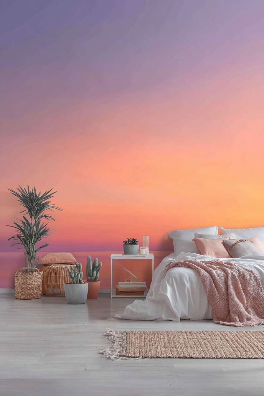
25. Painted Sunset Gradient Behind Bed
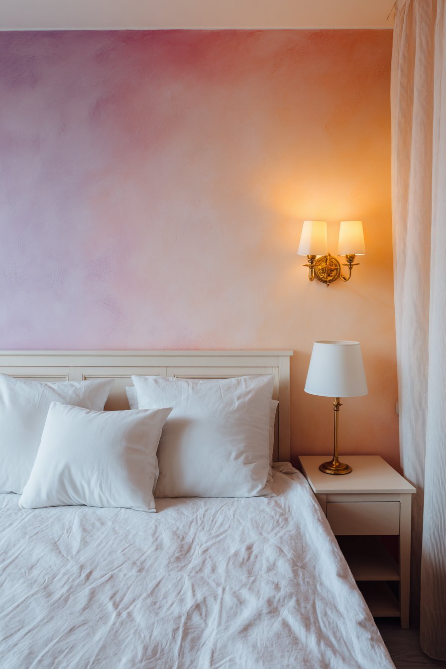
Ombré techniques reach their most dramatic expression in sunset-inspired gradients that represent one of the most atmospheric easy wall painting ideas. This design features a painted gradient transitioning from deep coral at a mid-wall horizon line through peachy pink to soft lavender at the ceiling, creating a perpetual sunset effect behind the bed. The warm-to-cool color progression mimics actual sunset color transitions while the horizontal gradient creates width perception and dramatic impact. This approach demonstrates how multiple color blending can create custom wall treatments that would be impossible to achieve through wallpaper or other manufactured materials, making painted walls the only option for truly personalized sunset effects.
The sunset gradient creates an inherently romantic, dreamy atmosphere perfect for bedrooms where relaxation and escape from daily stress are paramount. Simple white bedding and minimal furniture allow the painted gradient to provide all the room’s color and drama, creating a cohesive design where the wall becomes both backdrop and focal point simultaneously. The positioning behind the bed makes the gradient the first thing visible upon entering and the last thing seen before sleep, maximizing its atmospheric impact. Golden hour natural light enhances the warm sunset tones, creating a glowing effect that amplifies the gradient concept and makes the room feel bathed in perpetual sunset light.
Creating this easy wall painting idea requires working with multiple colors wet-on-wet and blending while paint remains workable. The technique starts with establishing the horizon line (typically mid-wall or slightly lower) where the deepest coral appears, then blending upward through progressively cooler tones. The keys to success include working quickly to maintain wet edges for blending, using foam rollers for smooth application, and having adequate paint in all tones prepared before beginning. This project teaches advanced color blending skills while producing a truly unique wall treatment that demonstrates how patient technique can create custom finishes rivaling professional specialty painters’ work.
Key Design Tips:
- Work with at least four graduated colors from deep coral through peach and pink to lavender
- Establish a horizontal horizon line approximately mid-wall where colors transition
- Paint the deepest coral first, then work upward blending each successive color
- Use large foam rollers and work quickly to maintain wet edges for blending
- Have two people work together if possible—one applying paint, one blending
- Create the most gradual transition in the middle tones where eye naturally focuses
- Work in humid conditions or use paint extender to slow drying time
- Consider painting the wall behind the bed only to focus the gradient impact
Why These Easy Wall Painting Ideas Transform Spaces
The twenty-five wall painting techniques explored in this comprehensive guide represent the sweet spot between ambitious design aspirations and realistic execution capabilities. Each approach has been carefully selected for its accessibility—requiring only basic painting supplies, patience, and willingness to follow instructions rather than advanced artistic training or specialized equipment. What makes these ideas particularly valuable is their proven track record of transforming ordinary rooms into distinctive spaces that reflect personal style while remaining within typical homeowner budgets and skill levels.
The variety of techniques covered ensures there’s an appropriate wall painting idea for every room function, design style, and skill level. From the gentle horizontal stripes perfect for nurseries to bold geometric patterns suited for dining rooms, from minimalist single-line treatments to complex ombré gradients, these approaches span the full spectrum of aesthetic preferences. The emphasis throughout has been on realistic execution—acknowledging that most people painting their own walls work within time constraints, budget limitations, and varying levels of prior experience. By focusing on achievable techniques that deliver professional-looking results, these ideas empower homeowners to take control of their spaces rather than relying entirely on professional painters or expensive wallcoverings.
What distinguishes truly successful easy wall painting ideas from merely trendy techniques is their foundation in solid design principles. Each approach in this guide considers color theory, spatial perception, functional requirements, and long-term livability rather than just creating temporary visual impact. The two-tone color blocking teaches valuable lessons about proportion and balance. The geometric patterns demonstrate how repetition creates rhythm. The gradient techniques show how color transition affects mood and atmosphere. The architectural illusions prove how paint can suggest three-dimensional features on flat surfaces. These aren’t just decoration projects—they’re educational experiences that build design understanding and painting skills with each completed wall.
The practical nature of these wall painting ideas extends beyond their execution to their maintenance and eventual modification. Unlike permanent architectural changes or expensive wallpaper installations, painted walls can be refreshed, adjusted, or completely changed as tastes evolve or life circumstances shift. The techniques using painter’s tape and basic brushes require no specialized tools that gather dust after single use. The paint finishes recommended—primarily matte and eggshell—hide minor wall imperfections while creating sophisticated appearances suitable for adult spaces. The forgiving nature of many techniques—particularly the organic shapes and hand-painted elements—means slight imperfections enhance rather than detract from the handcrafted quality.
The color palettes emphasized throughout these wall painting ideas reflect current design trends while maintaining classic sensibilities that won’t feel dated within a few years. The prevalence of muted earth tones, soft pastels, and sophisticated neutrals ensures these treatments remain relevant through changing style trends. The strategic use of bold contrast—navy and white, charcoal and cream, terracotta and sage—creates impact without relying on intense primary colors that can feel overwhelming or juvenile. The emphasis on monochromatic schemes and limited color palettes teaches restraint and cohesion, valuable lessons that extend beyond wall painting to overall interior design understanding.
Perhaps most importantly, these easy wall painting ideas demonstrate that impressive results don’t require impressive budgets. The materials needed—quality paint, painter’s tape, brushes, and rollers—represent modest investments that deliver transformative results exceeding their cost. Compare the expense of the painted checkerboard powder room to installing actual tile, or the cost of the sunset gradient bedroom to commissioning a professional muralist, and the value proposition becomes clear. These techniques democratize good design, making sophisticated, personalized spaces accessible to renters, first-time homeowners, and anyone working within typical household budgets.
The emphasis on natural lighting throughout these descriptions isn’t accidental—understanding how light interacts with painted surfaces represents crucial knowledge for successful wall treatments. The soft diffused daylight recommended for showcasing texture details, the golden hour lighting that enhances warm tones, the strategic window placement that prevents glare—these considerations elevate painting projects from simple color application to thoughtful environmental design. Each wall painting idea has been presented with attention to how changing natural light affects appearance throughout the day, helping readers anticipate how their chosen technique will perform in real-world conditions rather than just in perfectly lit photographs.
The range of room applications covered—from nurseries and children’s playrooms to home offices and dining rooms, from minimalist bedrooms to bohemian living spaces—demonstrates how wall painting adapts to serve different functional needs. The chalkboard paint kitchen application shows how paint finishes can add utility beyond decoration. The pegboard grid laundry room proves that functional spaces deserve design attention. The energizing gym stripes demonstrate how pattern can enhance activity rather than just beautify passivity. These varied applications teach that wall painting should respond to how spaces are used, not just how they look.
Conclusion
The journey through these twenty-five easy wall painting ideas reveals a fundamental truth about home design: transformation doesn’t require professional expertise, unlimited budgets, or perfect execution. What it requires is willingness to try, patience to work through the process, and confidence that your own hands can create spaces that reflect your personality and meet your needs. Each technique presented here—from simple color blocking to complex gradients, from geometric precision to organic abstraction—has been chosen specifically because it balances impressive visual impact with achievable execution.
The beauty of wall painting as a home improvement approach lies in its inherent flexibility and forgiveness. Unlike permanent architectural changes or expensive furnishings, painted walls can evolve with your tastes, adapt to changing life circumstances, and be refreshed or completely reimagined whenever inspiration strikes. The skills developed through these projects—measuring accurately, taping precisely, blending colors smoothly, embracing imperfection in hand-painted elements—transfer to countless future home improvement endeavors and build confidence in your ability to shape your environment.
As you consider which easy wall painting ideas might transform your own spaces, remember that the most successful projects balance aspiration with realism. Choose techniques that match your available time, skill level, and budget while pushing slightly beyond your comfort zone. Start with simpler approaches like color blocking or horizontal stripes to build skills and confidence before attempting more complex gradients or intricate patterns. Test colors in actual lighting conditions before committing to full walls. Invest in quality supplies that make execution easier and results more professional.
Most importantly, approach these projects with the understanding that your home should reflect your life, your style, and your story. The painted walls you create become the backdrop for memories, the setting for daily rituals, and the foundation for the life you build within your spaces. Whether you choose the serene blush and cream bedroom, the energizing striped gym, the whimsical cloud nursery, or the sophisticated painted paneling, you’re not just applying paint to walls—you’re actively shaping the environment that shapes you in return. So gather your supplies, choose your technique, protect your floors, and begin transforming your spaces one painted wall at a time.