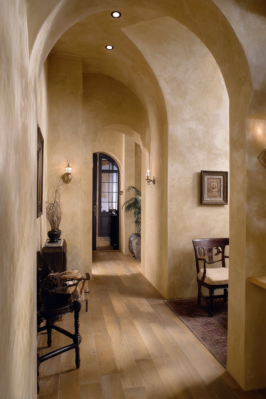
Walls are the canvas of your home, offering endless possibilities to express your personal style while enhancing the functionality and atmosphere of every room. Whether you’re looking to create a dramatic focal point, add architectural interest, or simply refresh a tired space, the right wall design can completely transform your interior. From textured panels and gallery walls to bold paint choices and innovative materials, today’s wall treatments go far beyond basic paint colors to create depth, character, and visual intrigue.
The beauty of modern wall design lies in its accessibility and versatility. Homeowners no longer need to rely solely on contractors or expensive renovations to achieve stunning results. With options ranging from temporary peel-and-stick solutions to permanent architectural installations, there’s a wall design approach for every skill level, budget, and commitment level. Whether you’re renting and need reversible options or you’re ready to invest in custom millwork, the possibilities are limitless.
In this comprehensive guide, we’ll explore twenty-seven distinct wall design ideas that span multiple styles, techniques, and applications. From the organic warmth of natural wood to the sleek sophistication of geometric panels, from practical storage solutions to purely decorative statements, each concept offers unique opportunities to elevate your interior spaces. These ideas demonstrate how thoughtful wall treatments can solve design challenges, reflect your personality, and create the ambiance you’ve always envisioned for your home.
1. Modern Vertical Wood Slat Accent Wall
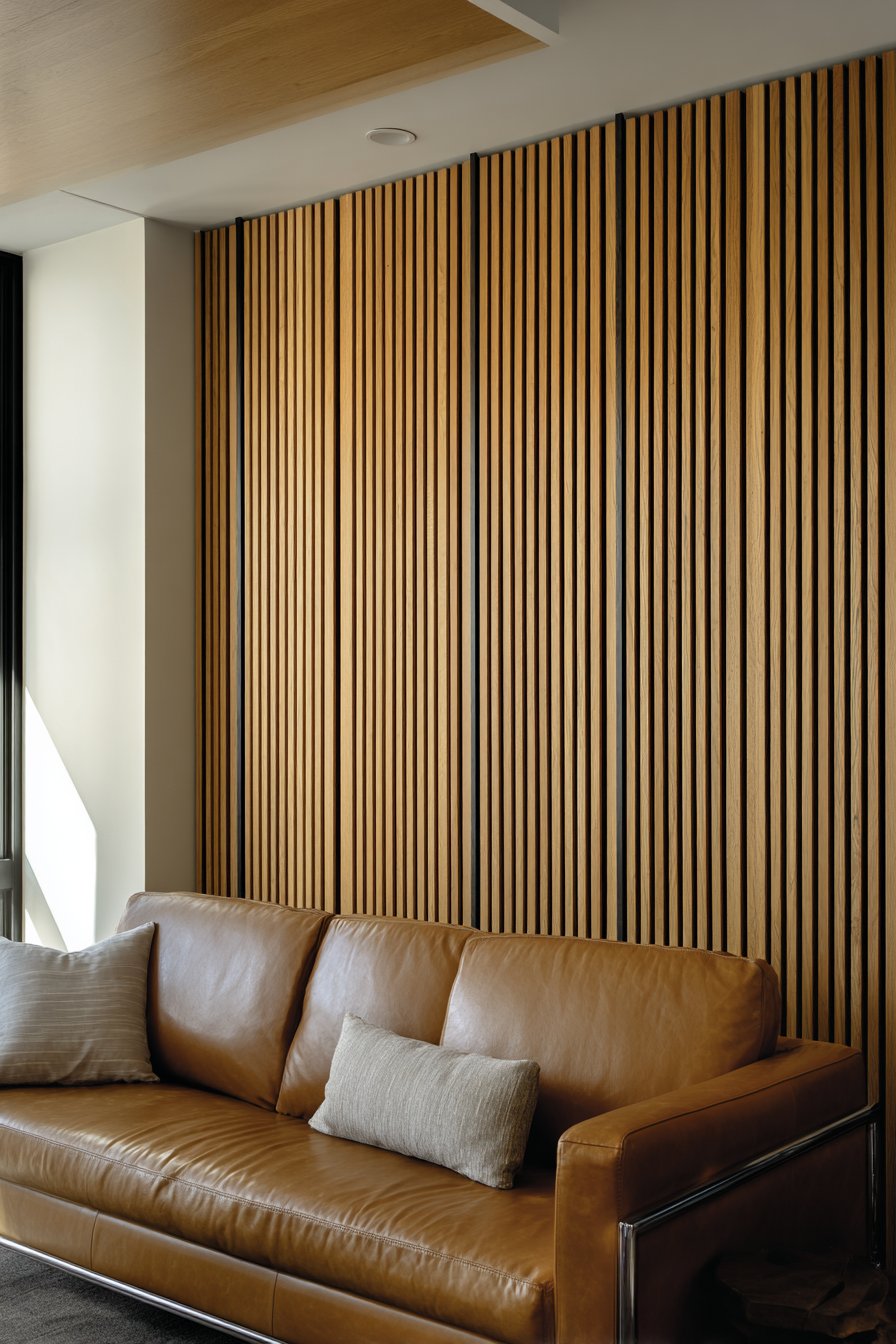
The vertical wood slat accent wall represents a perfect marriage of contemporary aesthetics and natural warmth. This design features evenly spaced oak slats with visible grain texture, mounted with sleek black metal brackets that create clean architectural lines. The dimensional quality of this treatment adds sophisticated depth to any living space, transforming a flat wall into a dynamic focal point that catches the eye and invites closer inspection.
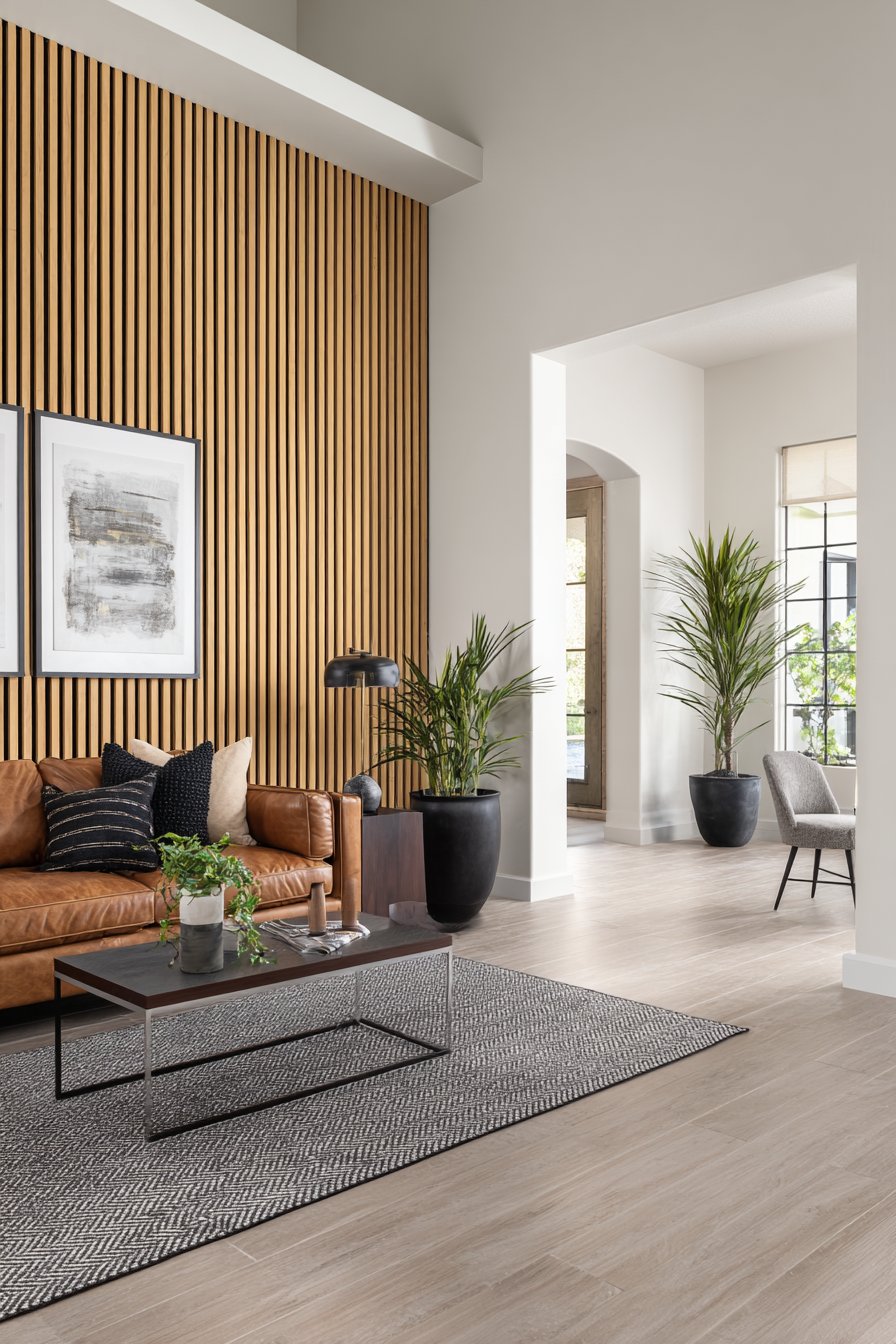
What makes this design particularly effective is its ability to create visual interest through rhythm and repetition. The vertical orientation draws the eye upward, making ceilings appear higher while the spacing between slats creates subtle shadow play that changes throughout the day as natural light shifts. The warm honey tones of natural oak provide an organic counterpoint to modern furnishings, while the black metal hardware introduces an industrial edge that keeps the look contemporary rather than rustic.
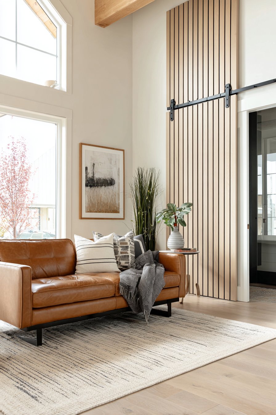
The practical benefits of this wall treatment extend beyond aesthetics. The slats can help with acoustic dampening in open-concept spaces, and the vertical lines can visually correct awkward room proportions. When positioned behind a seating area, this feature wall creates a sense of enclosure and coziness without requiring structural changes. The natural wood also introduces biophilic design elements that research shows can reduce stress and improve wellbeing.
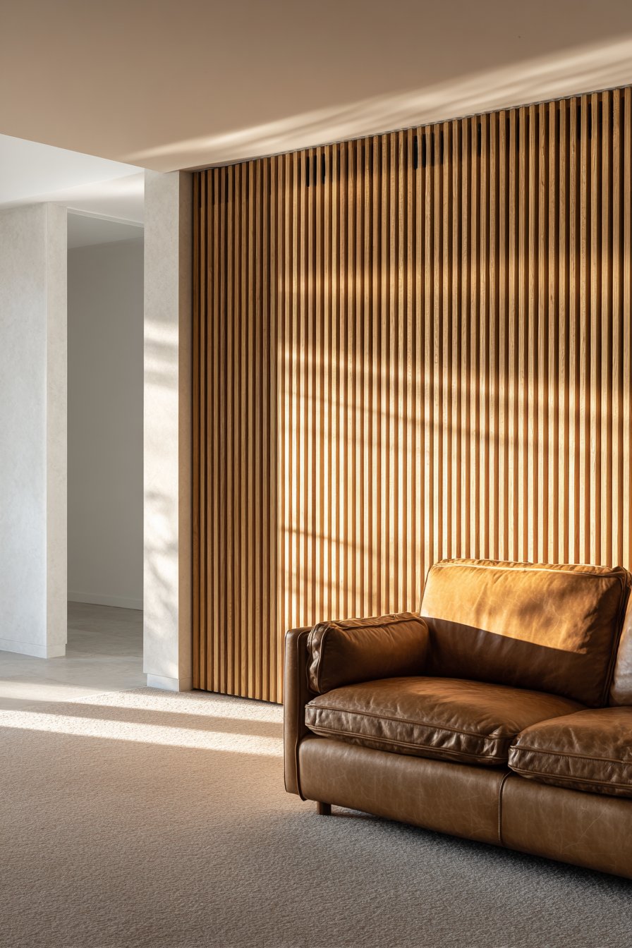
Key Design Tips: Choose slats with consistent grain patterns for a refined look, or embrace natural variations for more character. Space slats 2-3 inches apart for optimal shadow effect without excessive material costs. Mount slats on a painted backing board in a contrasting color to enhance the dimensional effect. Consider adding integrated LED strip lighting behind slats for dramatic evening ambiance. Seal wood with a clear matte finish to protect against moisture while maintaining natural appearance.
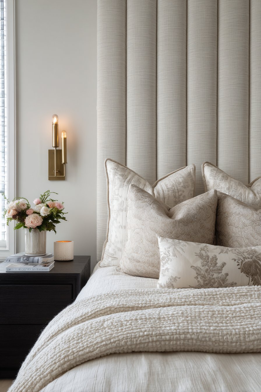
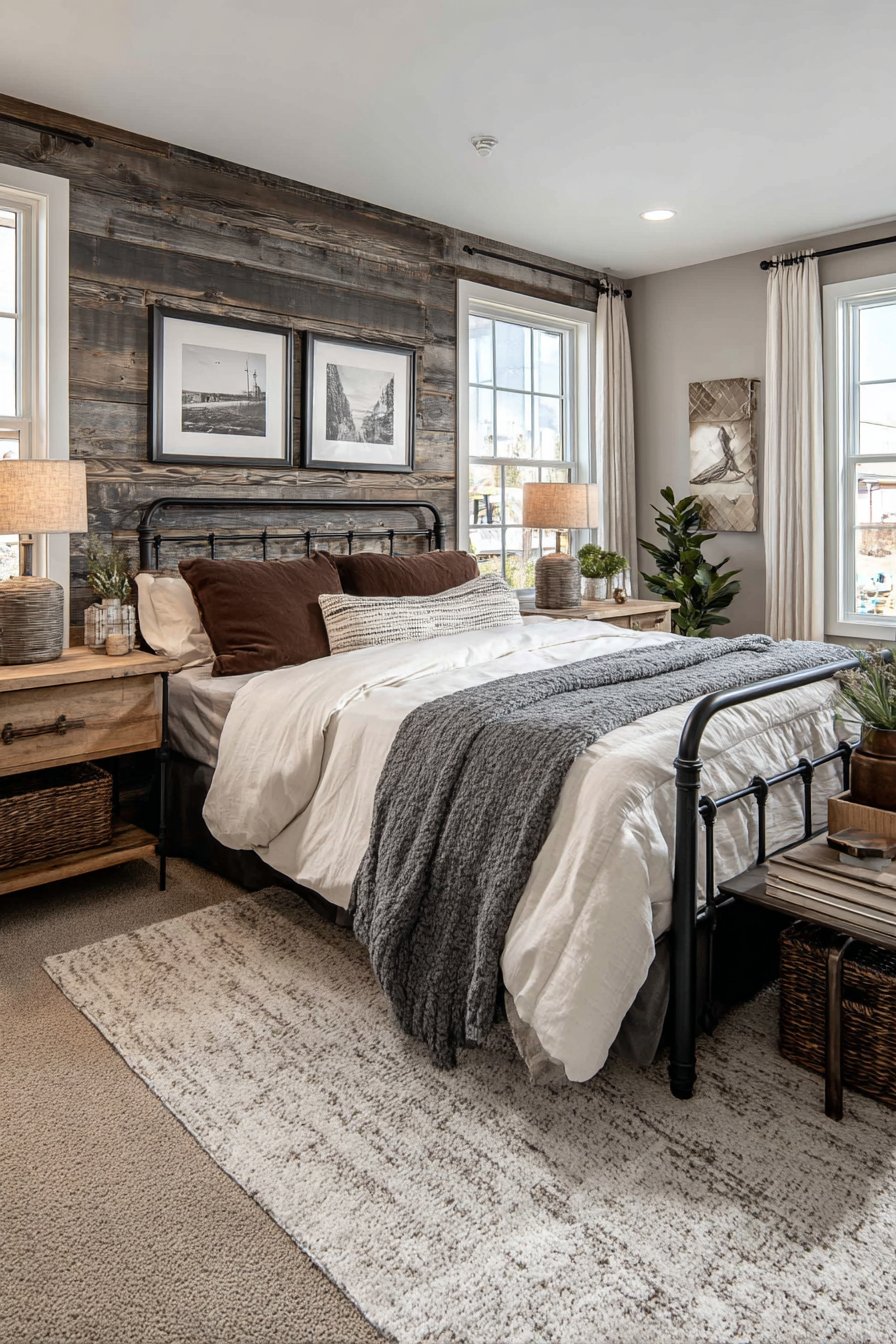
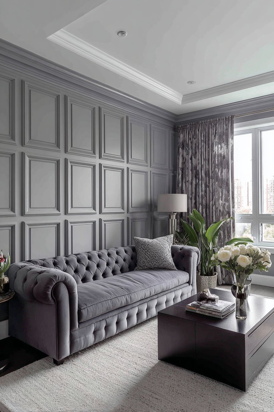
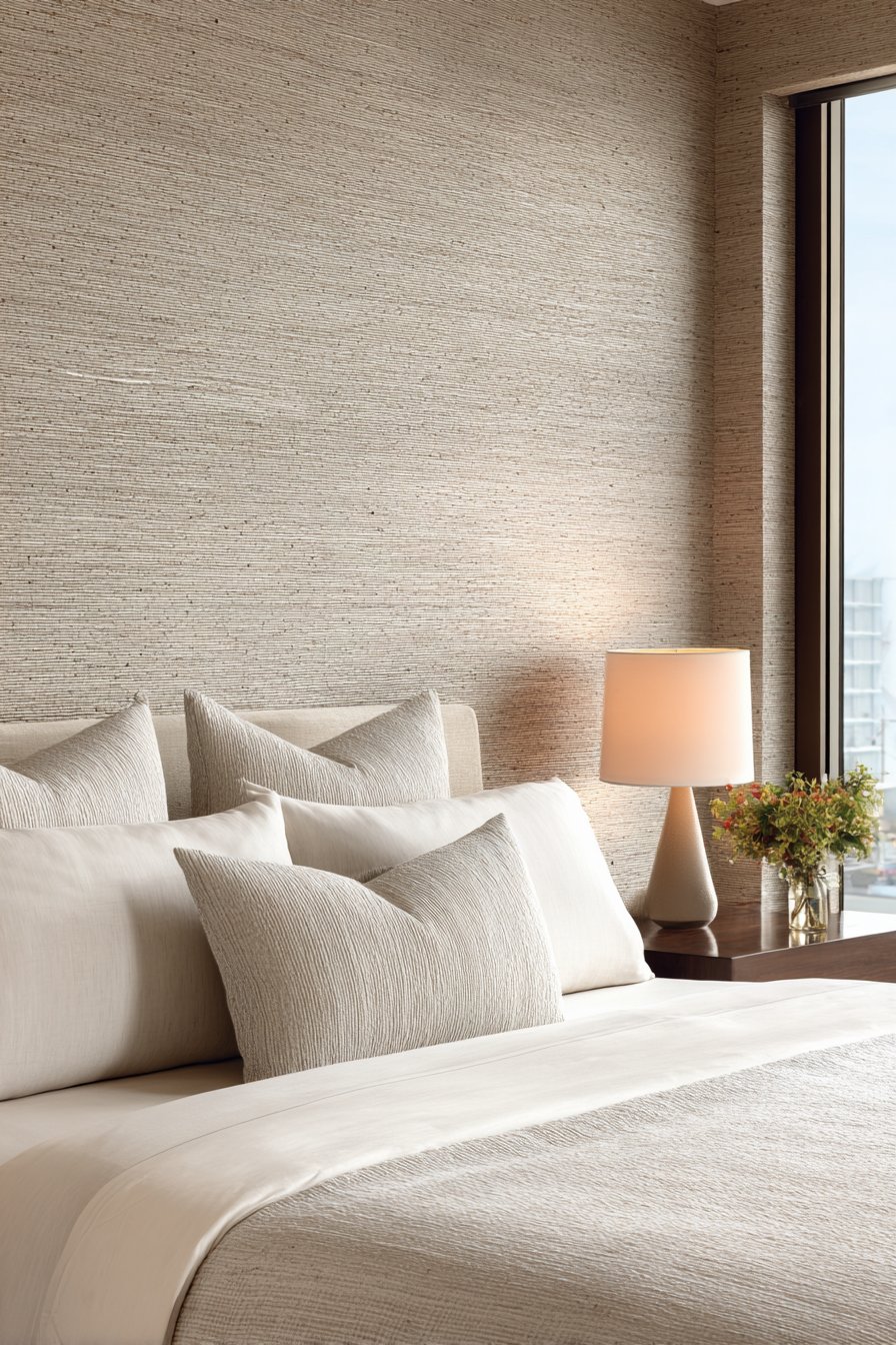
2. Elegant Upholstered Fabric Headboard Wall
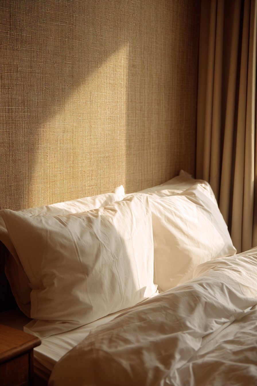
Floor-to-ceiling upholstered walls represent the pinnacle of bedroom luxury, transforming the entire headboard wall into a soft, enveloping surface. This design features dove gray linen with visible weave texture, enhanced by vertical channel tufting that creates subtle dimensional patterns catching light throughout the day. The extended height of the upholstery, reaching from floor to ceiling, creates dramatic impact while making the room feel more intimate and cocooning.
The tactile quality of fabric-covered walls introduces an element of sensory luxury that paint or wallpaper simply cannot match. The linen’s natural texture and slight irregularities in the weave add organic authenticity, while the channel tufting introduces architectural precision. Brass wall sconces mounted directly onto the upholstered surface provide functional task lighting while their metallic finish creates elegant contrast against the soft gray textile.
Beyond aesthetics, upholstered walls offer significant practical benefits. The fabric and padding provide excellent sound absorption, creating a quieter, more peaceful sleeping environment—particularly valuable in homes with thin walls or noisy surroundings. The soft surface also adds warmth, both visual and actual, making the room feel more comfortable during colder months. This treatment works especially well in primary bedrooms where creating a restful, spa-like retreat is the primary goal.
Key Design Tips: Select performance fabrics with stain-resistant treatments for easier maintenance in bedroom settings. Use high-density foam padding (at least 1 inch thick) for professional appearance and acoustic benefits. Ensure proper wall preparation with smooth surface before installation to avoid visible imperfections. Consider darker colors in smaller bedrooms to create intimate jewel-box effect. Install the upholstery on removable panels for easier cleaning or future updates. Add decorative nailhead trim along edges for traditional elegance or keep edges clean for modern simplicity.
3. Classic Board and Batten Wall Treatment
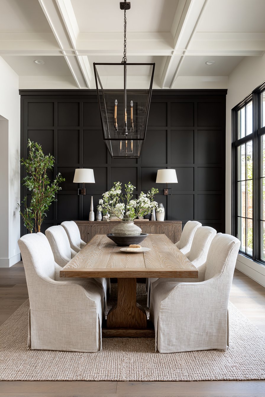
Board and batten wall treatments bring timeless architectural character to any dining space, creating the impression of craftsmanship and attention to detail. This design features vertical battens in deep charcoal gray, precisely spaced to create rhythmic vertical elements that add sophisticated dimension. The crisp white crown molding at the top provides classic contrast while defining the upper boundary of the treatment and connecting it visually to the ceiling plane.
The beauty of board and batten lies in its versatility and the way it can adapt to both traditional and contemporary interiors. While the technique itself is centuries old, the color choice and proportion of the battens can dramatically shift the aesthetic. Deep charcoal creates a modern, dramatic backdrop particularly effective in dining rooms where you want to establish a sense of occasion and formality. The vertical emphasis makes walls appear taller while adding architectural interest that makes even new construction feel more established and thoughtfully designed.
This wall treatment excels at concealing imperfect walls while adding perceived value to your home. The dimensional quality creates sophisticated shadows that give flat walls depth and character. When positioned in a dining room, the formal nature of board and batten provides an elegant backdrop for gatherings and celebrations, elevating everyday meals into special occasions. The treatment also serves as an excellent foundation for displaying artwork or mirrors, as the structured background provides visual organization.
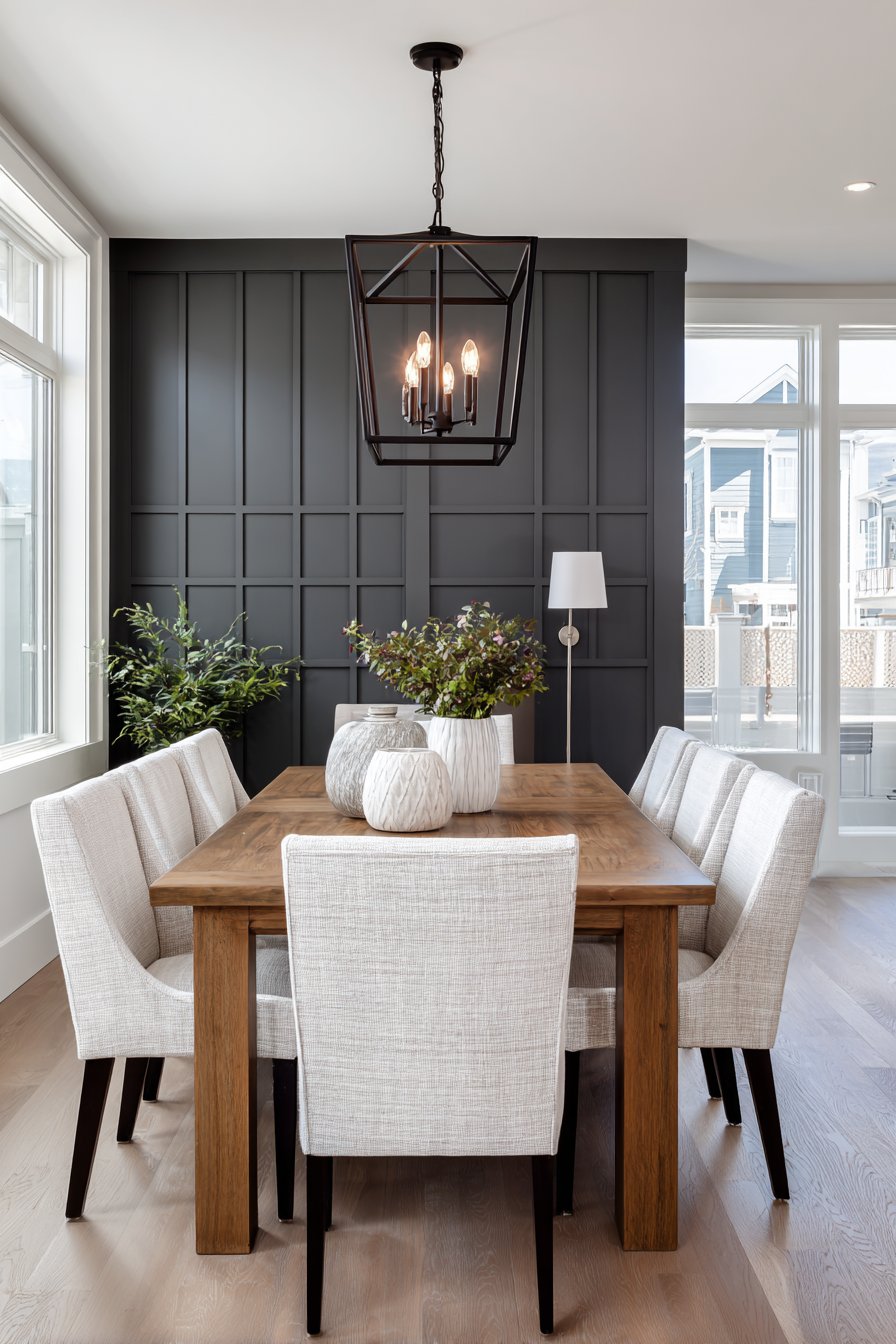
Key Design Tips: Plan batten spacing based on wall dimensions to ensure even distribution without awkward gaps at corners. Use 1×3 or 1×4 boards for battens depending on ceiling height—wider boards for taller walls. Paint all elements including the base wall in the same color for monochromatic sophistication. Install chair rail or baseboard first to establish clean top and bottom boundaries. Use wood filler and caulk generously before painting for seamless professional finish. Consider wainscoting-height board and batten (36-42 inches high) for traditional look or full-height for contemporary drama.
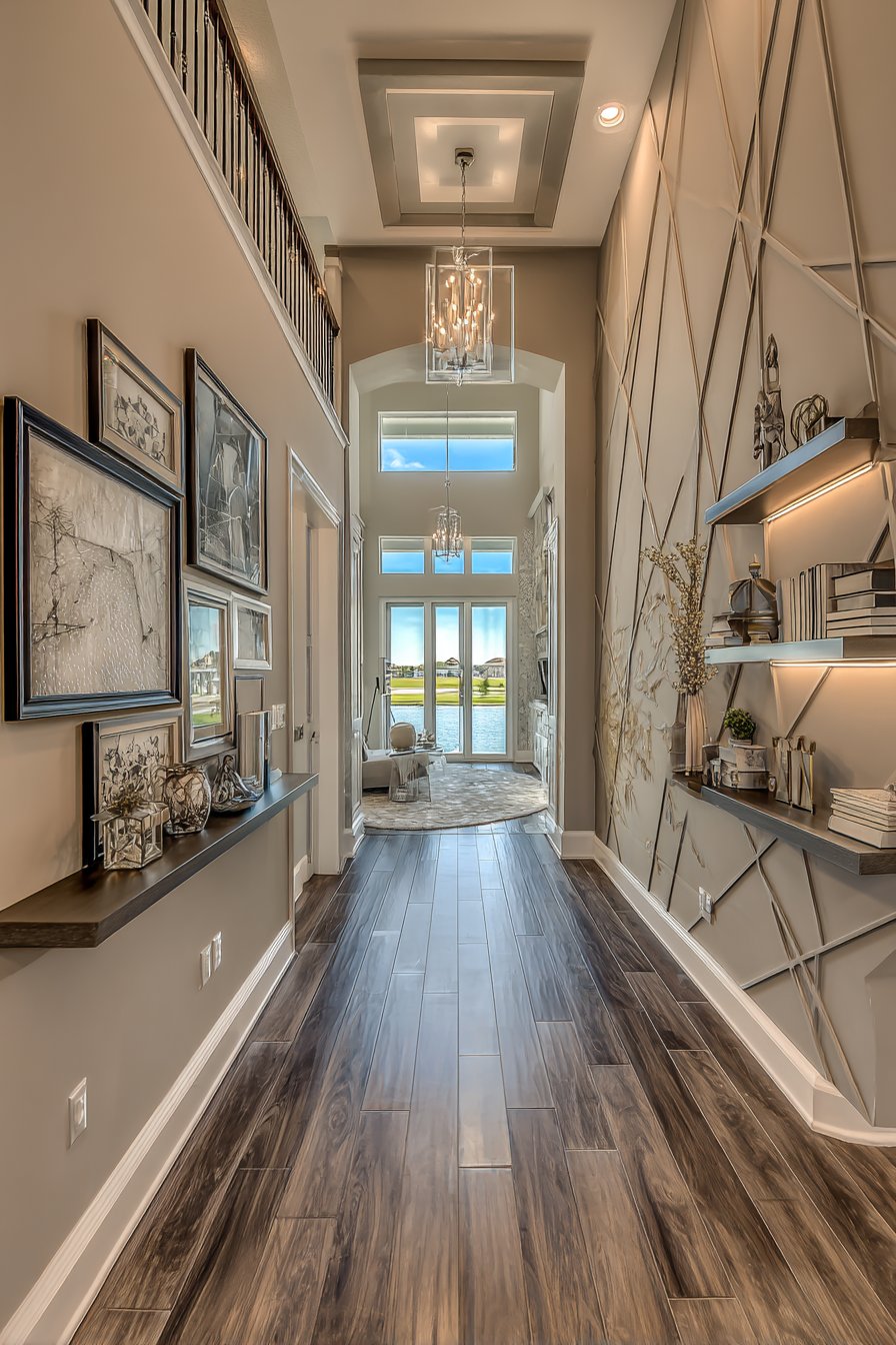
4. Curated Gallery Wall Arrangement
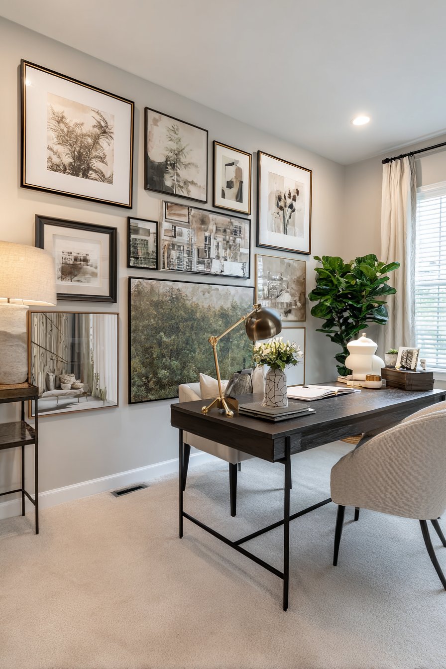
The gallery wall represents a highly personal form of wall design, transforming a blank surface into a visual autobiography that reflects your interests, travels, and aesthetic sensibilities. This design features mixed media artwork in coordinating black frames of varying sizes, arranged in an intentional asymmetrical layout that creates visual interest while maintaining overall balance. The light greige painted background provides neutral canvas that allows the artwork to command attention without competing backgrounds.
Creating a successful gallery wall requires understanding principles of visual weight, spacing, and composition. Unlike symmetrical arrangements that create formal order, asymmetrical gallery walls feel more organic and collected-over-time, suggesting personality and curatorial confidence. The varying frame sizes create rhythm and movement, with larger pieces anchoring the composition while smaller works fill gaps and create visual connections. Maintaining consistent frame color and style—in this case, black—provides cohesion that prevents the arrangement from feeling chaotic despite the varied artwork.
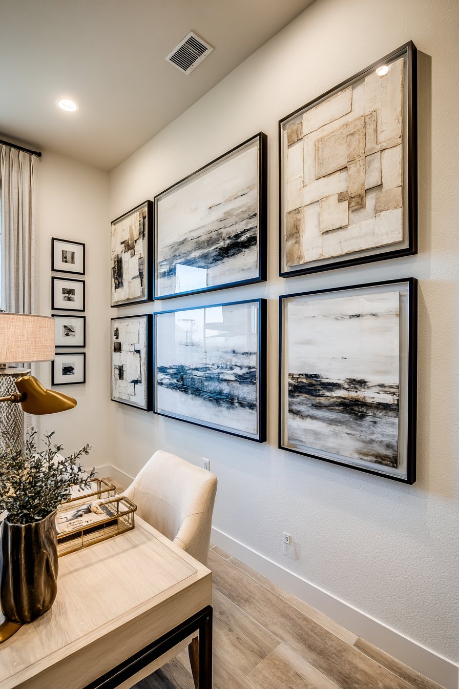
The practical beauty of gallery walls lies in their flexibility and accessibility. This approach works equally well with valuable original art, affordable prints, family photographs, or personal collections. The arrangement can evolve over time, with pieces being swapped or added as your collection grows. When positioned above a desk in a home office, a gallery wall creates an inspiring backdrop that personalizes the workspace and provides visual interest during video calls.
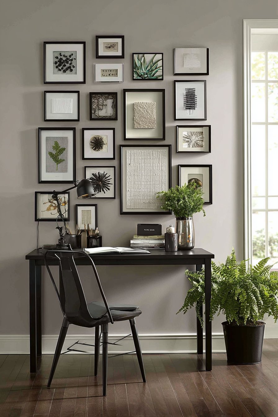
Key Design Tips: Create a paper template of your arrangement on the floor before committing to wall holes. Maintain 2-3 inches of consistent spacing between all frames for professional appearance. Include one or two larger anchor pieces (at least 16×20 inches) to ground the composition. Vary frame sizes but limit yourself to 3-4 size categories to maintain cohesion. Hang the center of your arrangement at eye level (approximately 57-60 inches from floor). Use picture-hanging strips for rental-friendly installation. Consider creating a grid template on the wall with painter’s tape to ensure level alignment.
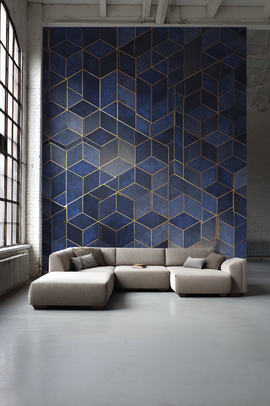
5. Geometric Removable Wallpaper Statement
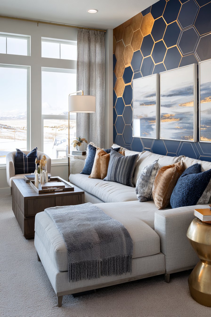
Modern removable wallpaper has revolutionized wall design, offering dramatic visual impact without permanent commitment. This design features contemporary hexagonal patterns in navy blue with gold metallic accents, creating a sophisticated geometric statement on a single accent wall. The remaining walls stay clean white, allowing the patterned wall to command attention as the room’s undeniable focal point while preventing visual overwhelm in the space.
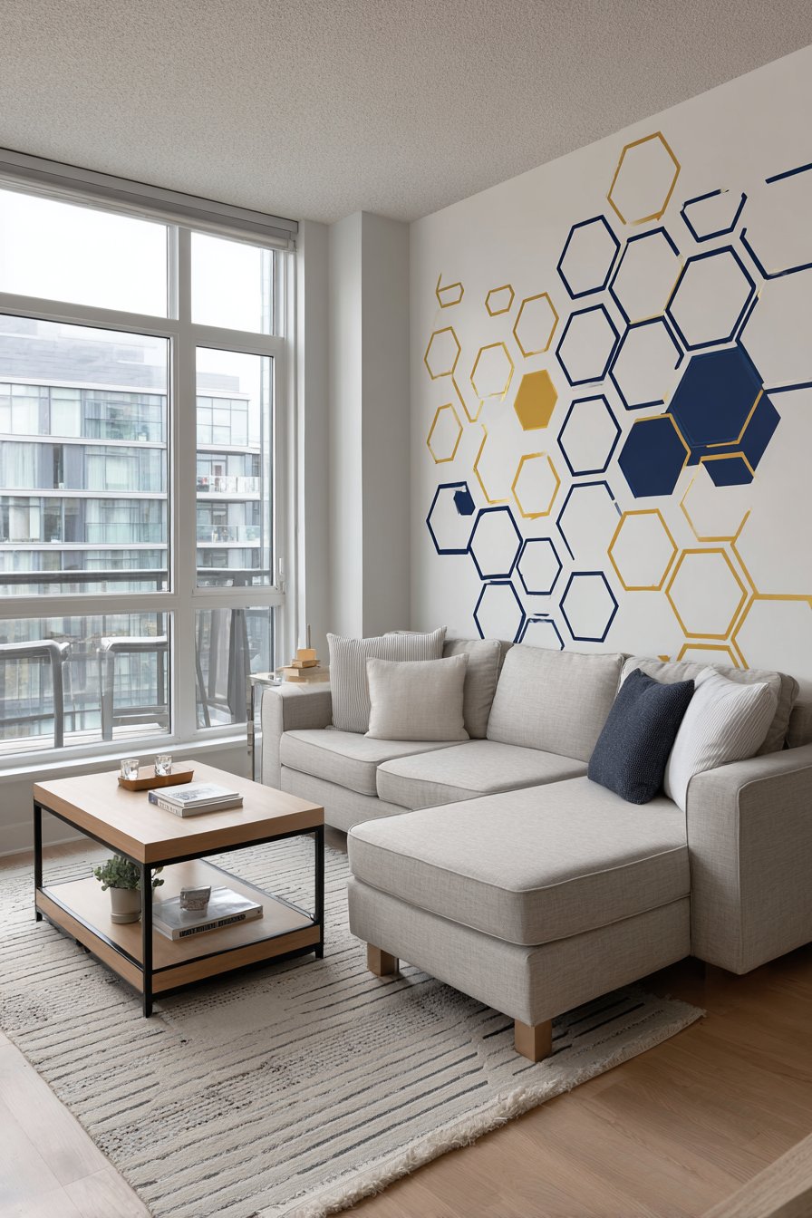
The hexagonal pattern provides several layers of visual interest—the geometric shape itself creates modern sophistication, the navy blue introduces bold color that anchors the room, and the gold metallic elements catch light dynamically throughout the day, adding subtle glamour and movement. This combination works particularly well in living spaces where you want to establish a contemporary aesthetic with luxurious undertones. The pattern’s medium scale prevents it from feeling too busy while remaining visually significant from across the room.
The removable nature of modern peel-and-stick wallpaper makes this high-impact solution surprisingly accessible. Unlike traditional wallpaper that requires paste, professional installation, and creates commitment anxiety, removable options allow for experimentation and change. This proves especially valuable for renters or those who enjoy updating their decor regularly. The quality of removable wallpaper has improved dramatically, now offering textures, patterns, and finishes that rival traditional wallpaper.
Key Design Tips: Prepare walls by cleaning thoroughly and allowing to dry completely before application. Start application in the least visible corner to hide seams. Use a smoothing tool or credit card to remove air bubbles as you apply. Trim excess with sharp utility knife for clean edges. Choose one accent wall rather than entire room for bold patterns. Consider scale of pattern relative to room size—larger patterns work better in bigger spaces. Order extra to account for pattern matching and potential mistakes. Remove bubbles immediately as they’re harder to fix once wallpaper sets.
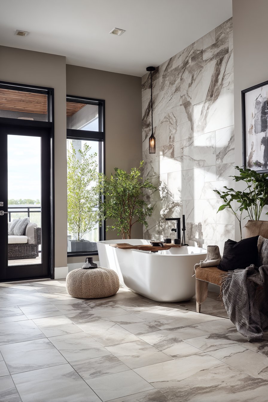
6. Luxurious Large-Format Tile Feature Wall
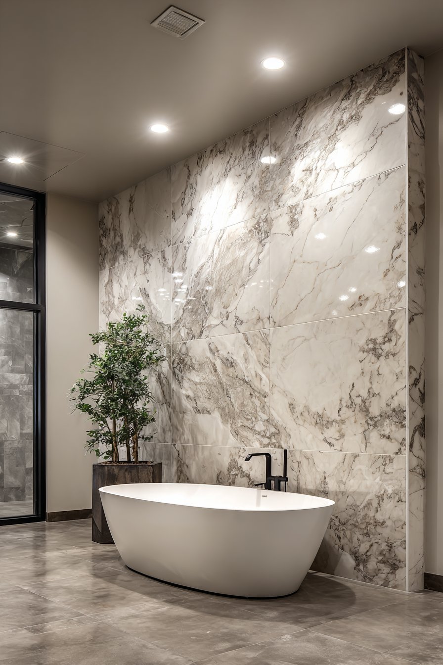
Large-format porcelain tiles in book-matched marble patterns bring spa-like luxury to bathroom spaces, creating dramatic focal walls that elevate the entire room. This design features tiles arranged to mirror their veining patterns, creating the illusion of continuous natural stone slabs with gray and white veining flowing seamlessly across the wall surface. The floor-to-ceiling installation behind a freestanding soaking tub creates a statement backdrop that transforms an everyday bathroom into a personal sanctuary.
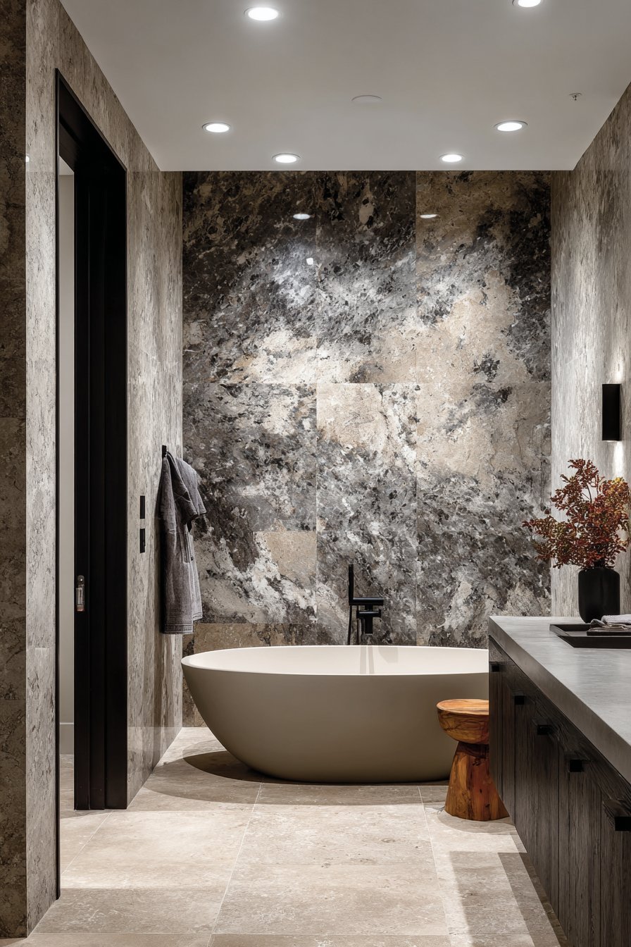
Book-matching—the technique of arranging tiles to create mirror-image patterns—amplifies the natural beauty of the stone-look porcelain while demonstrating attention to detail and design sophistication. The gray and white veining provides organic visual interest that never feels repetitive, as the natural variations in the pattern create unique character in every section. When properly installed with minimal grout lines, large-format tiles (typically 24×48 inches or larger) can create the impression of actual stone slabs at a fraction of the cost and with superior durability.
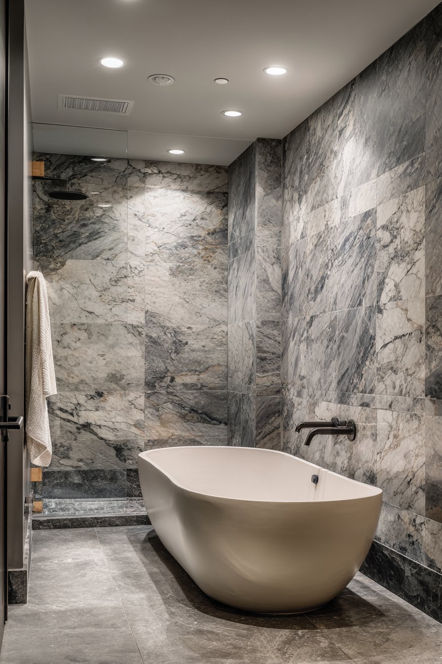
The practical benefits of porcelain tiles make them ideal for wet environments. Unlike natural marble which requires sealing and careful maintenance, porcelain offers the same visual appeal with superior water resistance, stain resistance, and durability. The large format also means fewer grout lines, which translates to easier cleaning and more hygienic surfaces. Matte black fixtures provide striking contrast against the light stone pattern while maintaining the sophisticated monochromatic palette.
Key Design Tips: Use professional installation for large-format tiles to ensure proper support and prevent lippage. Select rectified tiles with precise edges for tightest grout lines. Match grout color to lightest tone in tile pattern for seamless appearance. Install tiles vertically for book-matched effect that draws eye upward. Ensure proper waterproofing membrane behind tiles in wet areas. Plan layout to feature most dramatic veining in primary viewing areas. Consider heated flooring system installation simultaneously if renovating. Use leveling systems during installation to achieve perfectly flat surface across large tiles.
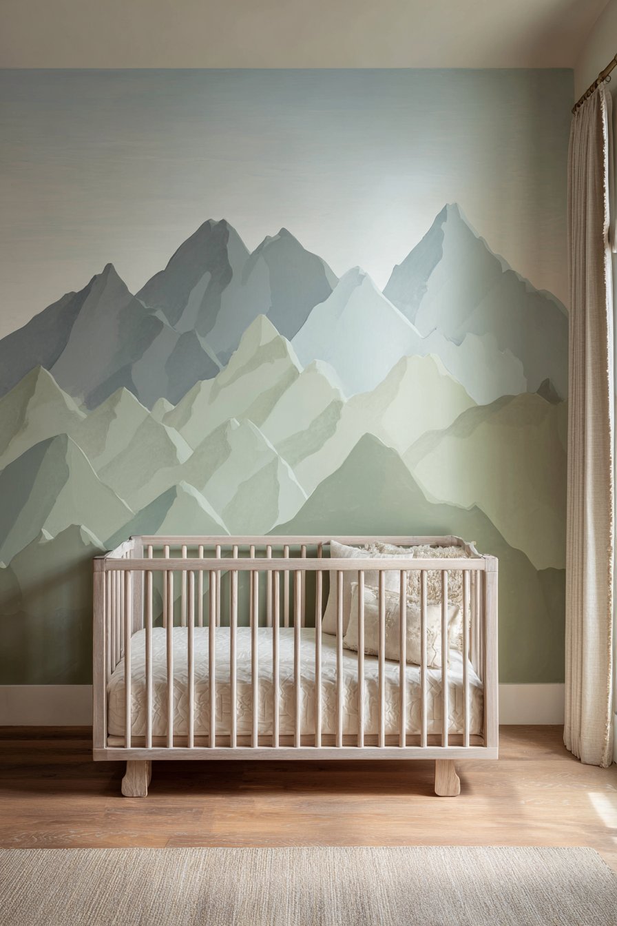
7. Serene Hand-Painted Mountain Mural
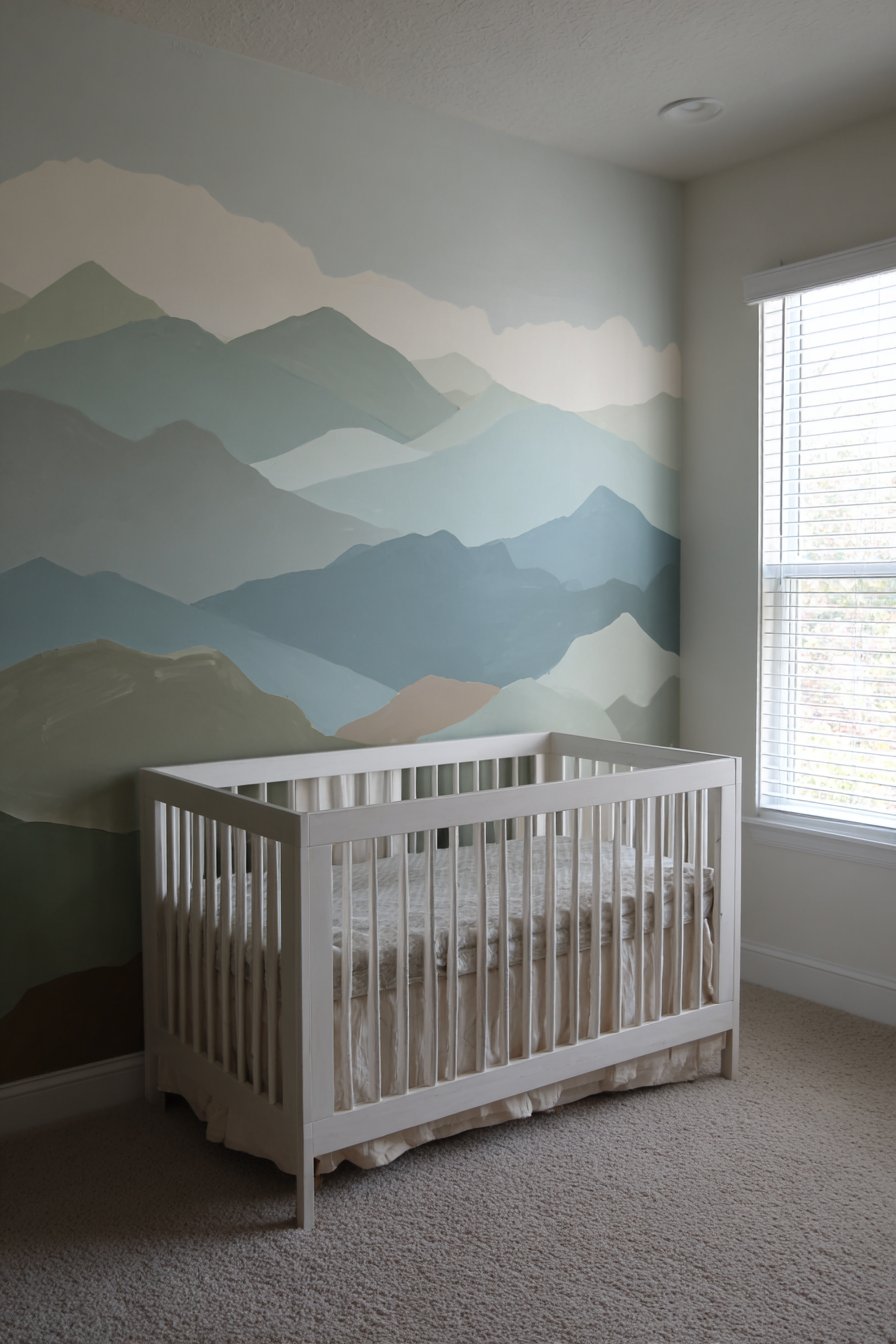
Artistic wall murals offer unique opportunities to introduce personality and whimsy into children’s spaces while maintaining sophisticated aesthetics that parents appreciate. This design features a hand-painted mountain landscape in soft sage green, dusty blue, and warm taupe tones, creating gentle peaks with subtle color gradients that evoke nature without overwhelming the senses. The painterly quality and muted palette ensure the mural reads as artistic rather than cartoonish, creating a serene environment conducive to rest and imagination.
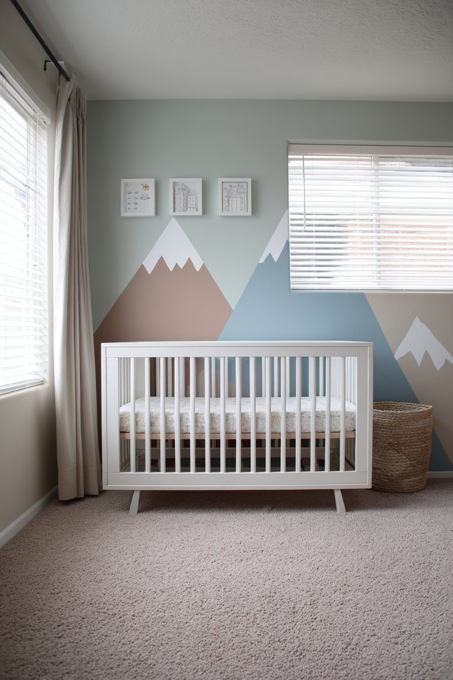
The mountain motif works particularly well in nurseries and children’s rooms because it introduces visual interest and storytelling elements while maintaining calming qualities essential for sleep spaces. The gentle peaks create natural focal points that draw the eye without demanding attention, while the soft color palette promotes tranquility. The hand-painted approach, even when executed by skilled DIYers rather than professional muralists, adds authentic character and uniqueness that can’t be replicated with decals or wallpaper.
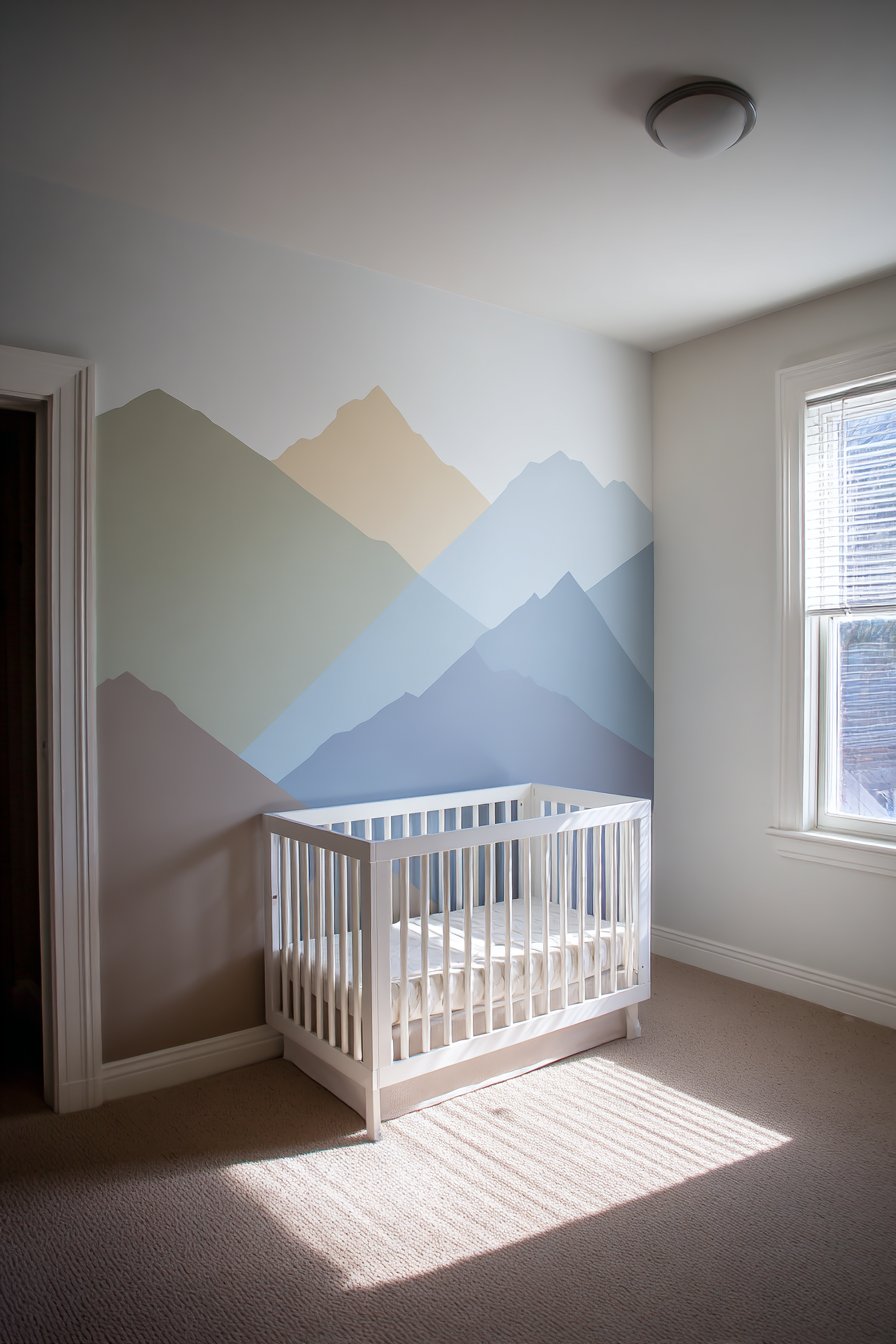
This type of artistic wall treatment grows with the child, remaining appropriate from infancy through the toddler years and beyond. Unlike character-themed walls that children quickly outgrow, abstract nature-inspired murals maintain their appeal while providing a creative backdrop that stimulates imagination without dictating specific play scenarios. The centered positioning behind the crib creates a natural focal point that grounds the room’s design while leaving other walls available for practical elements like shelving and closet storage.
Key Design Tips: Start with a light pencil sketch to establish mountain proportions and positioning. Use a sea sponge or stippling brush to create soft, blended color transitions. Layer colors gradually from light to dark for depth and dimension. Practice painting technique on poster board before committing to walls. Use low-VOC or zero-VOC paints in nurseries and children’s rooms. Consider adding subtle details like tiny trees or clouds with fine brushes. Apply matte finish paint to avoid distracting reflections. Create template mountains on cardboard to test composition before painting. Extend mural slightly beyond crib wall for wraparound effect if desired.
8. Practical Floating Shelf Display Wall
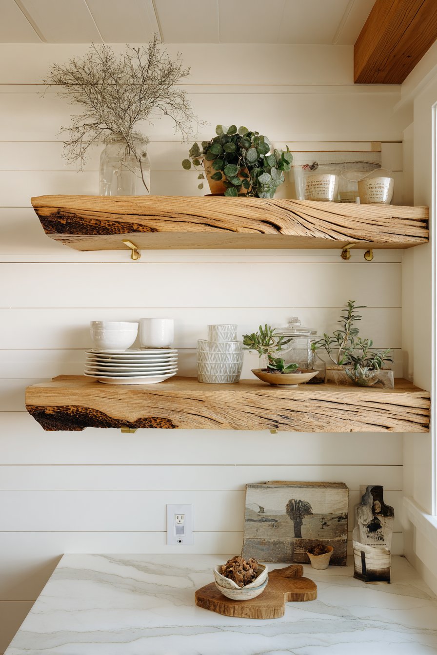
Open shelving transforms walls into functional art displays while providing practical storage solutions. This design features floating shelves crafted from reclaimed wood with natural edge detail, mounted on white shiplap accent walls that provide textured backdrop. The shelves display coordinated dishware, potted plants, and curated decorative objects in organized arrangements that balance aesthetics with accessibility. Brass shelf brackets add industrial-chic accent while providing necessary structural support.
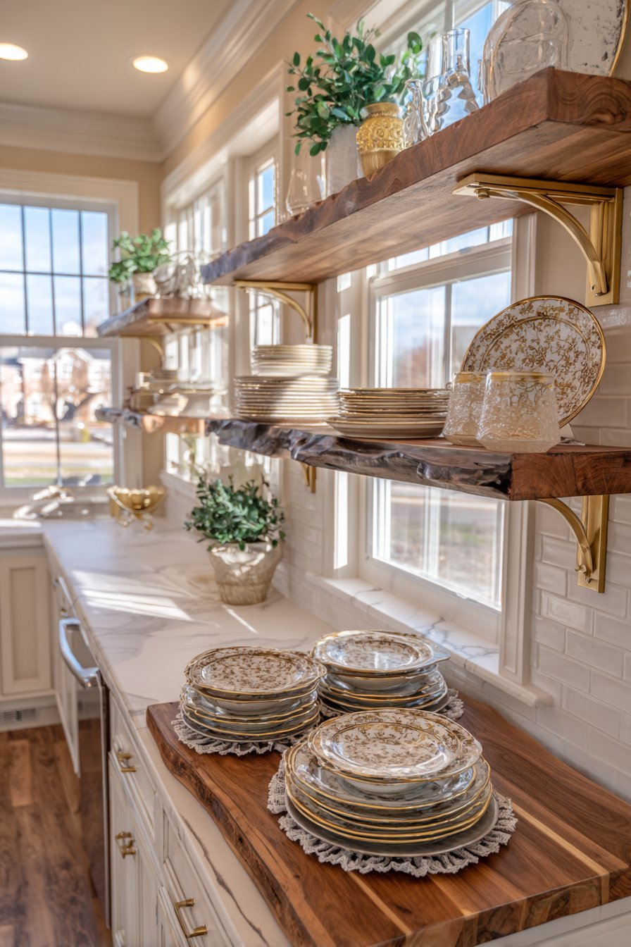
The layered approach—shiplap background plus floating shelves—creates dimensional depth that transforms a functional kitchen wall into a design feature. The horizontal lines of the shiplap provide visual rhythm that complements rather than competes with the shelves, while the white paint keeps the background neutral enough that displayed items remain the stars. The reclaimed wood shelves introduce organic warmth and character through natural grain patterns, knots, and color variations that make each shelf unique.
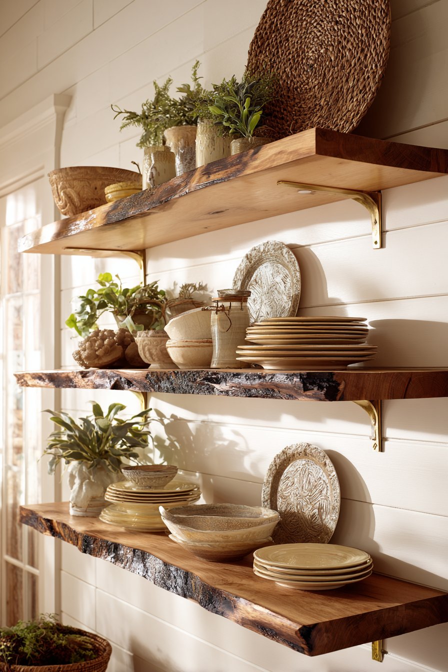
This wall treatment excels at solving the common kitchen challenge of combining storage with style. Unlike closed cabinetry that hides everything, open shelving keeps frequently used items accessible while encouraging you to maintain attractive displays. The approach works particularly well in smaller kitchens where upper cabinets can feel heavy and oppressive. The visual lightness of floating shelves makes the space feel more open and airy while the carefully curated displays add personality and warmth.
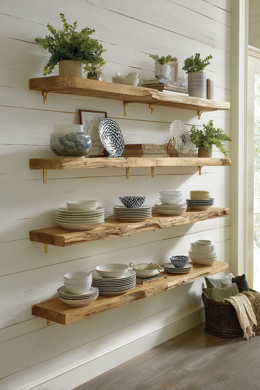
Key Design Tips: Install shelves into wall studs for maximum weight capacity, especially for heavy dishware. Group displayed items in odd numbers (3, 5, 7) for most pleasing visual arrangement. Vary heights of objects to create visual interest and avoid horizontal monotony. Include negative space in displays to prevent cluttered appearance. Use shelf liner or museum putty to secure objects and prevent shifting. Limit color palette of displayed items for cohesive, intentional look. Incorporate living plants to add freshness and soften hard surfaces. Plan for 12-15 inches of vertical space between shelves for functionality. Clean shelves regularly as open storage collects dust more readily than closed cabinetry.
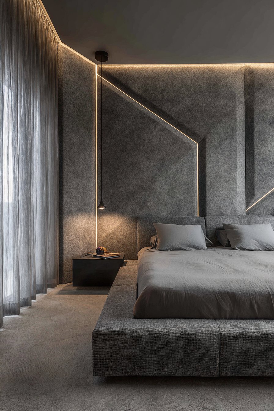
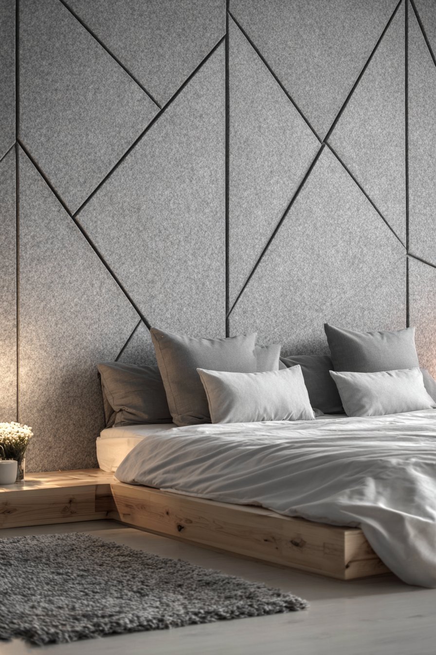
9. Sculptural 3D Textured Panel Wall
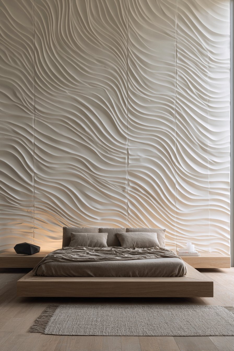
Three-dimensional wall panels represent the cutting edge of wall design, transforming flat surfaces into sculptural installations that create ever-changing shadow patterns throughout the day. This design features geometric wave-pattern panels in matte white, creating dimensional ripples across the entire headboard wall. The panels cast subtle shadows that shift with natural light movement, adding dynamic visual interest that painted or wallpapered surfaces cannot achieve.
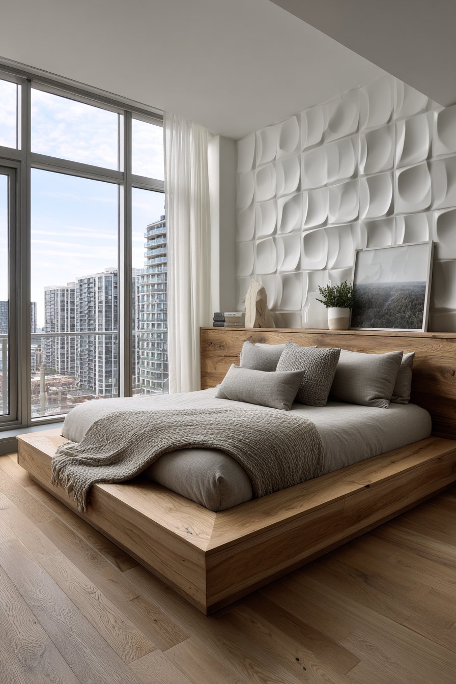
The all-white color scheme allows the three-dimensional forms to take center stage, with light and shadow creating the visual interest rather than color or pattern. This monochromatic approach feels sophisticated and spa-like, particularly appropriate for bedroom applications where creating a restful environment is paramount. The geometric wave pattern strikes a balance between organic flow and architectural precision, feeling neither too rigid nor too random.
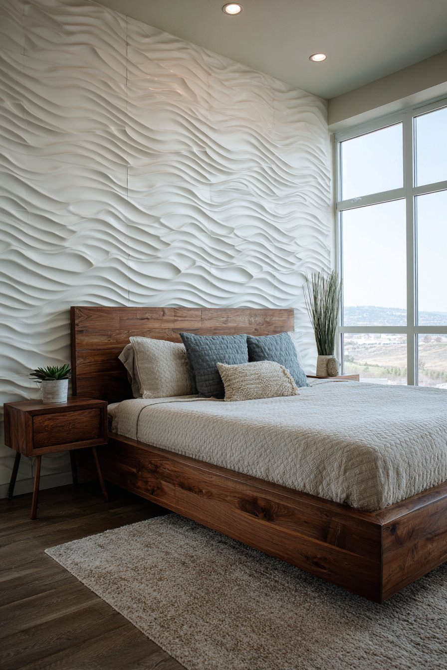
The sculptural quality of 3D panels adds architectural significance to rooms that lack interesting architectural features. In newer homes with flat, featureless walls, these panels introduce the kind of dimensional detail typically found only in custom homes or historical buildings. The panels work particularly well behind beds where their visual drama is fully appreciated but their textured surface doesn’t interfere with furniture placement or practical use of the wall.
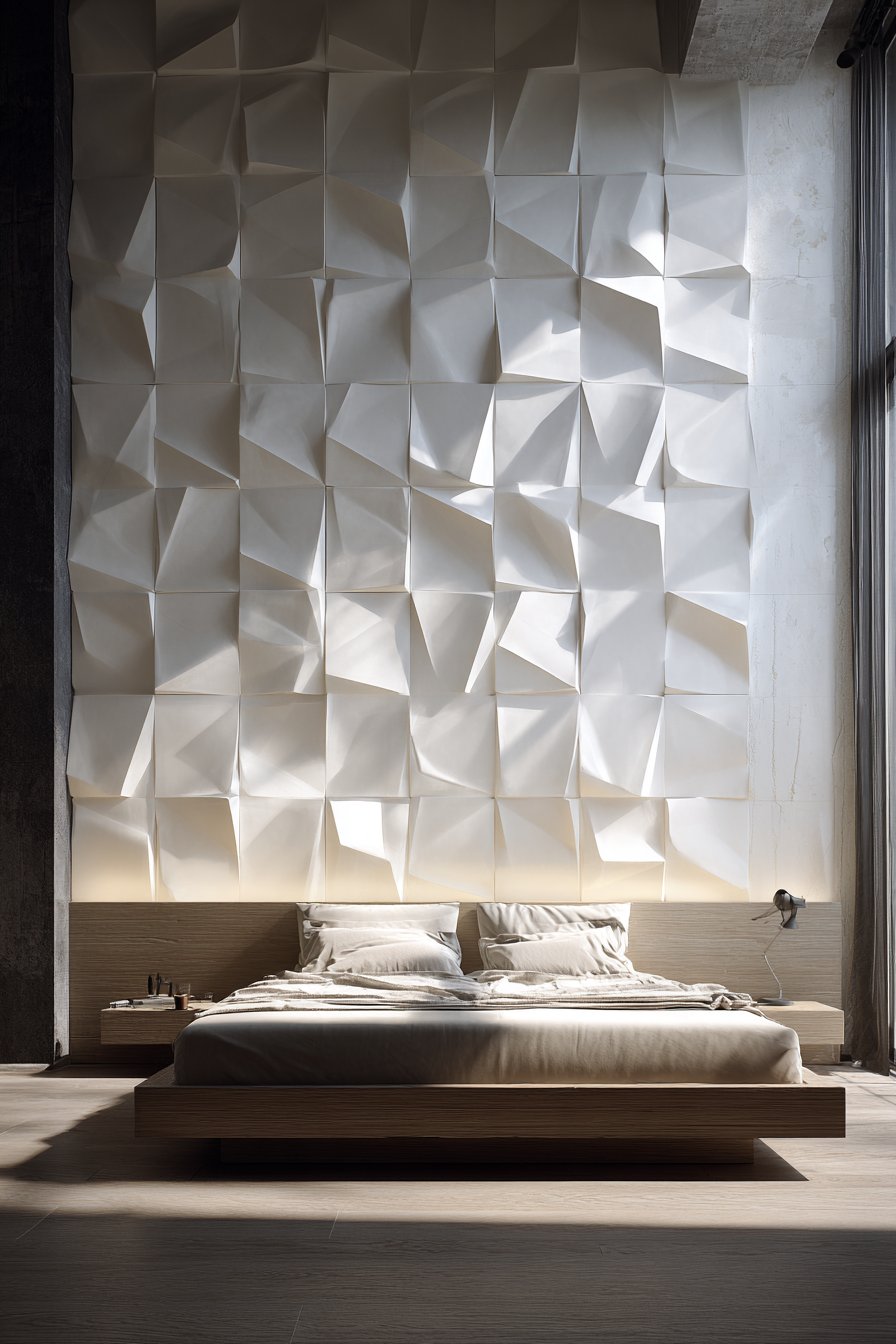
Key Design Tips: Calculate panel quantity carefully including waste factor for cuts and pattern matching. Start installation from room center and work outward for balanced pattern. Use strong adhesive specifically designed for three-dimensional panels. Maintain consistent seam alignment for professional appearance. Paint panels before or after installation depending on panel material and paint type. Consider impact of room lighting when choosing panel depth—deeper relief requires stronger light for shadow effects. Use level frequently during installation to prevent crooked patterns. Plan electrical outlet locations before installation to minimize cutting. Clean panels with soft, dry cloth to preserve finish and texture.
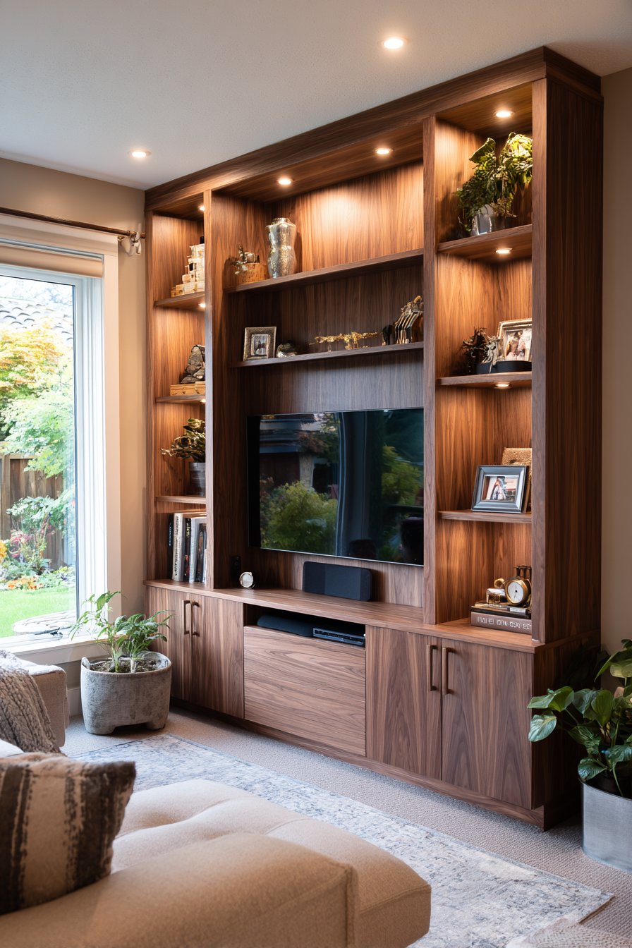
10. Integrated Built-In Media Wall
Custom built-in media walls represent significant investments that pay dividends in both functionality and aesthetics. This design features warm walnut wood veneer millwork with integrated shelving, concealed storage, and carefully planned wire management systems. The custom cabinetry includes open display niches for books and decorative objects, creating visual variety within the unified design. LED strip lighting within shelves provides subtle ambient glow that highlights displayed items while reducing harsh contrast in dark rooms during media viewing.
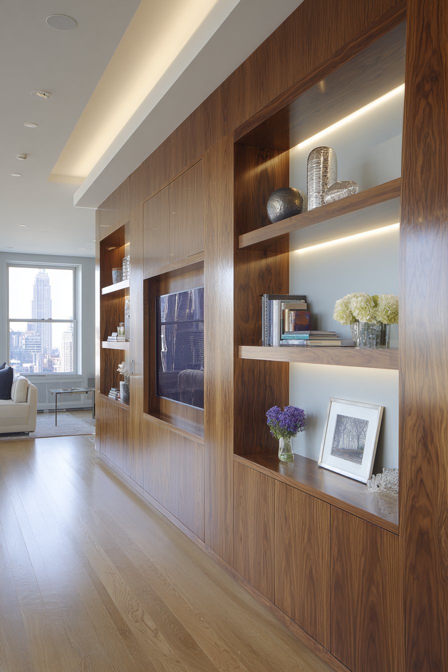
The built-in approach solves multiple challenges simultaneously—it accommodates large-screen televisions while minimizing their visual dominance, provides storage for electronics and media, displays personal collections, and creates architectural interest through custom proportions and materials. The walnut veneer introduces natural warmth and organic grain patterns that prevent the wall system from feeling too mechanical or technology-focused. The seamless integration makes all components feel intentional and permanent rather than assembled or afterthought.
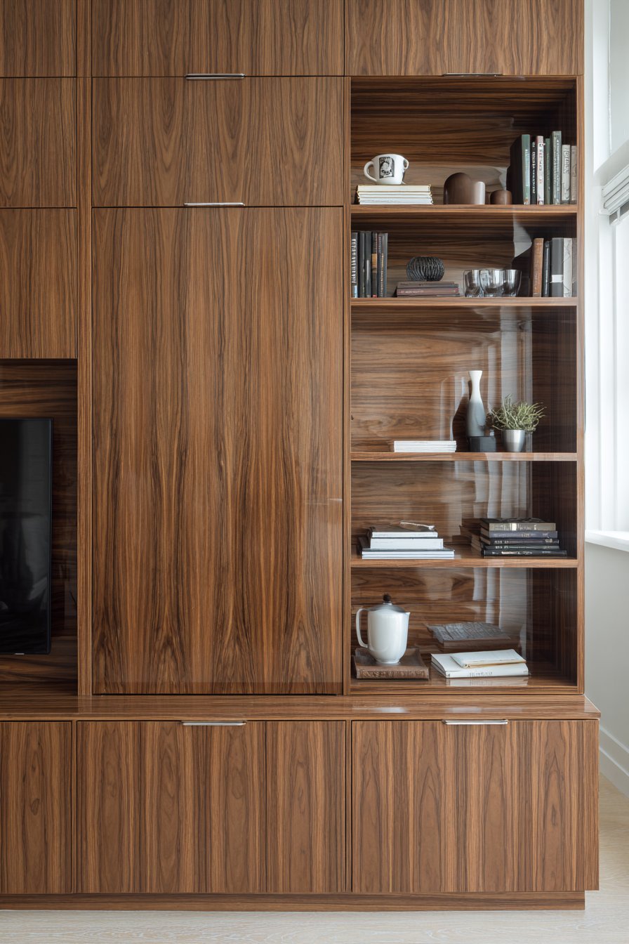
Wire management capabilities distinguish custom built-ins from furniture-based entertainment centers. Channels within the millwork route cables invisibly from components to the television and throughout the system, eliminating the visual chaos of exposed wires. This attention to detail creates the clean, sophisticated appearance that characterizes high-end interior design. The combination of open and closed storage allows you to display attractive items while hiding less photogenic necessities like cable boxes and remote controls.
Key Design Tips: Plan system dimensions around television size plus 6-12 inches on all sides for proper framing. Include ventilation space behind electronic components to prevent overheating. Specify soft-close hardware for doors and drawers for luxury feel and quiet operation. Choose LED lighting with dimmer controls for ambient lighting flexibility. Plan outlet locations during design phase for optimal placement and concealment. Select materials that complement existing trim and flooring for cohesive design. Include adjustable shelving to accommodate changing needs and collection sizes. Consider adding backing boards in contrasting color or texture within display niches for added depth. Finish interior of cabinets for polished appearance when doors open.
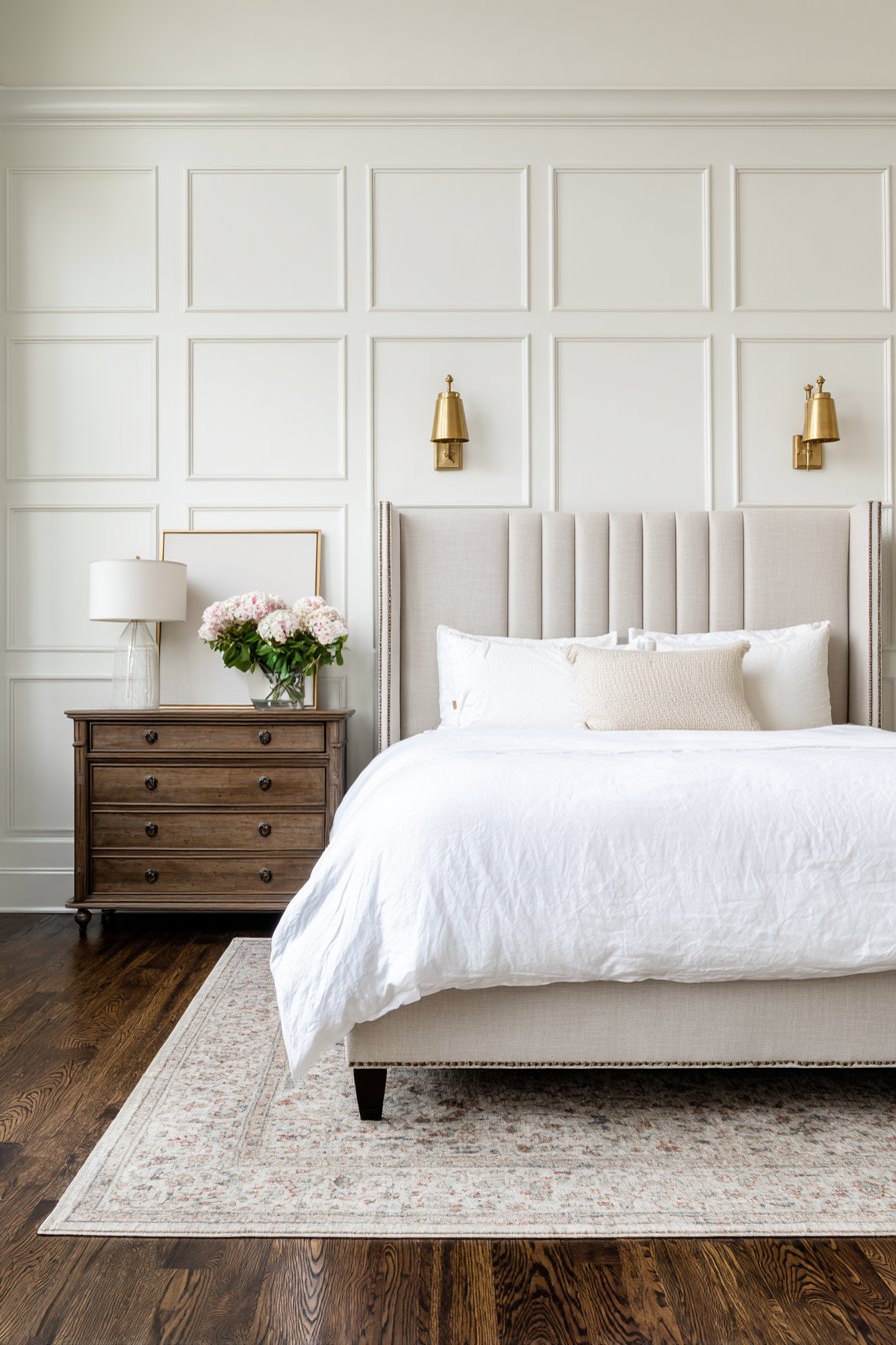
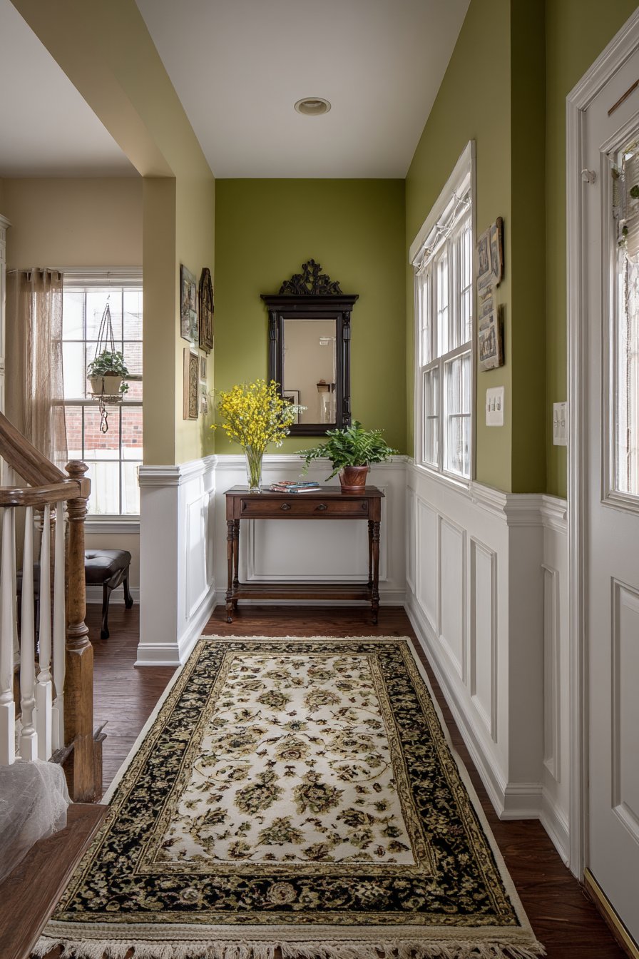
11. Traditional Wainscoting with Two-Tone Paint
Classic wainscoting demonstrates how traditional architectural details remain relevant in contemporary homes when executed with thoughtful color choices and proper proportions. This design features crisp white panel molding extending three feet from the floor, topped with chair rail detail and sage green paint above. The traditional panel detailing creates dimensional interest through raised frames that catch light and create subtle shadows, adding craftsmanship character to even the narrowest entryway.
The two-tone paint approach—white below, sage green above—creates visual sophistication while serving practical purposes. The darker upper wall hides scuffs and marks better than all-white walls, while the white wainscoting reflects light in typically darker entryway spaces. The chair rail creates a clear delineation between the two colors, preventing the transition from feeling arbitrary. The sage green introduces on-trend color while remaining neutral enough to work with various decor styles and color schemes.
Wainscoting proves particularly effective in entryways and hallways where narrow spaces can feel cramped or boring. The horizontal division created by the chair rail makes walls appear wider while the vertical panel details add visual interest to what would otherwise be featureless surfaces. The traditional detailing also suggests quality construction and attention to detail, creating strong first impressions as guests enter your home.
Key Design Tips: Follow the rule of thirds for wainscoting height—one-third of wall height is traditional, though you can adjust based on ceiling height and desired proportions. Install chair rail 32-36 inches from floor for standard 8-foot ceilings. Use MDF for painted wainscoting to save cost versus solid wood while achieving same appearance. Apply thin bead of caulk along all seams before painting for seamless finish. Sand lightly between paint coats for professional smooth finish. Consider picture frame molding style (raised rectangles) for formal spaces or board and batten for more casual aesthetics. Extend wainscoting into adjacent rooms for cohesive flow. Paint ceilings white to maximize light reflection in entryways.
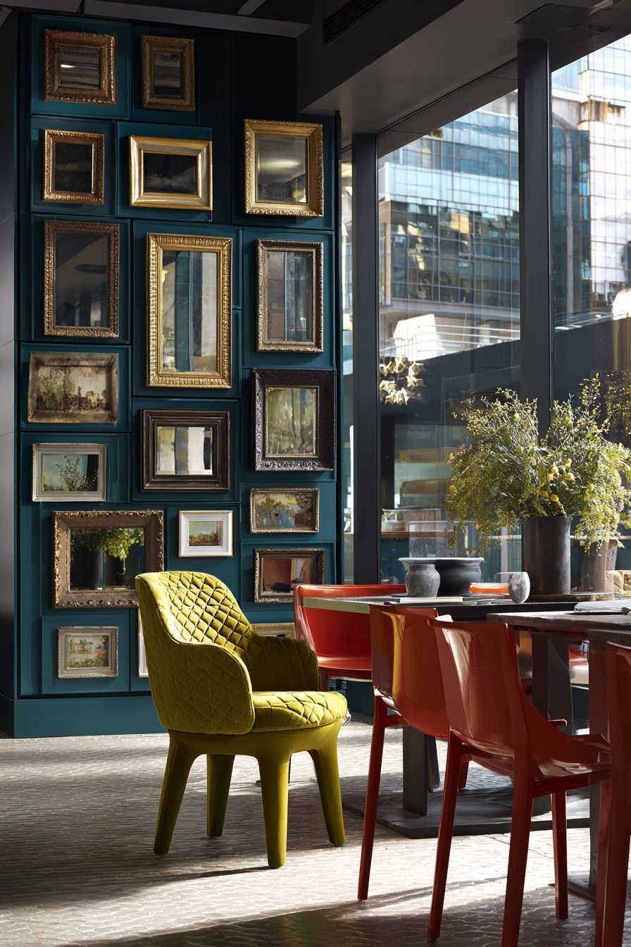
12. Eclectic Mirror Gallery Wall
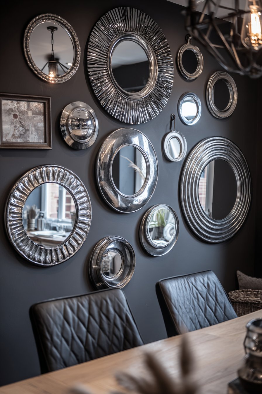
Mirror gallery walls offer unique opportunities to enhance light, expand perceived space, and create focal points with sculptural dimension. This design features various vintage and modern mirrors in mixed metal finishes—brass, silver, bronze, and black—arranged in an eclectic composition that functions as wall art while serving the practical purpose of reflecting light throughout the space. The deep charcoal wall color provides dramatic backdrop that makes the metallic frames pop while creating sophisticated depth.
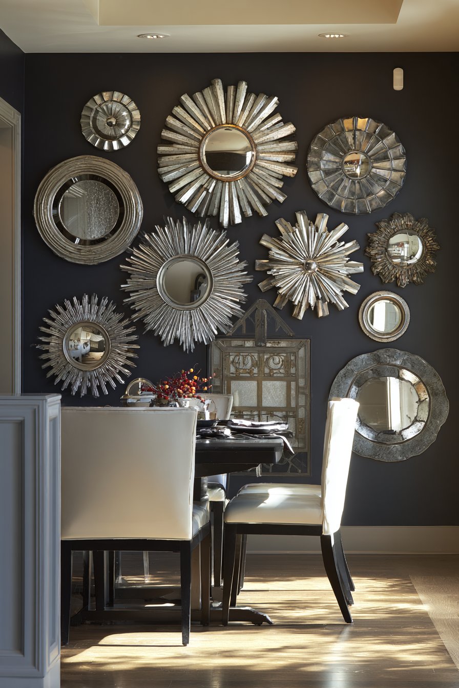
The beauty of mirror galleries lies in their layered functionality. The reflective surfaces bounce natural and artificial light around the room, brightening spaces that might otherwise feel dark or enclosed. The varied frame styles and finishes create visual interest similar to artwork galleries while the reflections add an extra dimension of movement and life. The arrangement works particularly well in dining areas where mirrors can reflect candlelight and create a sense of spaciousness during gatherings.
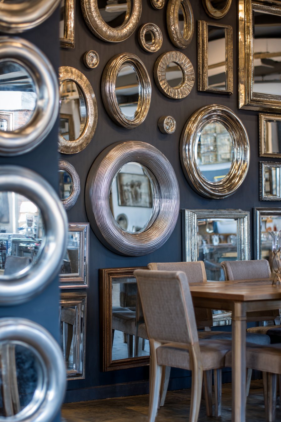
Selecting mirrors in various shapes—round, rectangular, oval, sunburst—creates dynamic composition that feels collected over time rather than purchased as a matching set. The mixed metal finishes add to this organic, curated aesthetic while providing opportunities to tie together various metal finishes used elsewhere in the room. The mirrors should vary in size with at least one large anchor piece, but avoid extreme size differences that create imbalance.
Key Design Tips: Create paper templates of each mirror and arrange on floor before hanging to test composition. Vary mirror sizes but include at least one large piece (24 inches or larger) to anchor arrangement. Space mirrors closer together than traditional gallery wall artwork to create more unified installation. Hang mirrors at varying depths (some flat, some on standoffs) for additional dimension. Consider reflections carefully—avoid positioning mirrors where they reflect unflattering views or create awkward sight lines. Use appropriate hanging hardware for mirror weight to ensure safety. Group mirror styles loosely—cluster vintage pieces together, modern pieces together—for organized eclecticism. Include convex or concave mirrors for additional visual interest and unique reflections.
13. Rustic DIY Pallet Wood Accent Wall
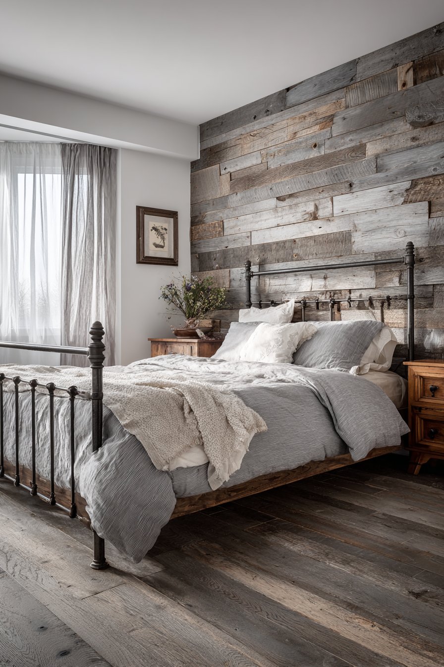
Reclaimed pallet wood accent walls bring authentic rustic character and sustainability to modern interiors while remaining accessible to DIY enthusiasts. This design features horizontal planks in mixed gray-washed and natural wood tones, creating organic texture through natural grain variations and weathered character. The authentic imperfections—nail holes, saw marks, color inconsistencies—tell stories and add the kind of character that new materials simply cannot replicate.
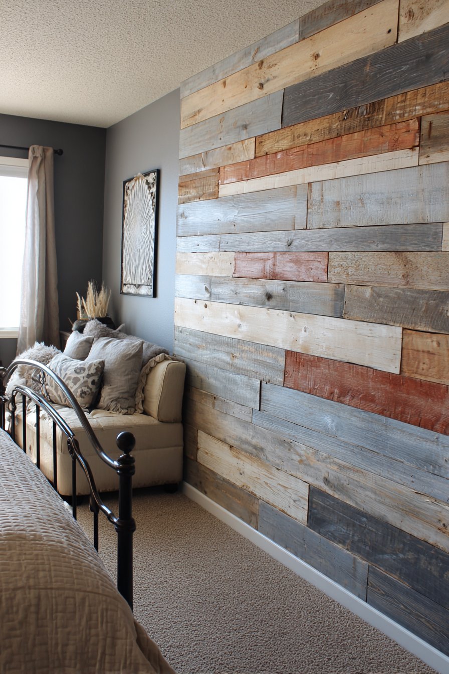
The horizontal installation creates visual flow that makes walls appear wider while the varied plank widths prevent monotonous repetition. The mixed finish approach—some planks gray-washed, others left natural—adds depth and visual interest while preventing the wall from feeling too uniform or manufactured. The rustic modern aesthetic pairs beautifully with both industrial elements like metal bed frames and softer touches like linen bedding, making it remarkably versatile for various design directions.
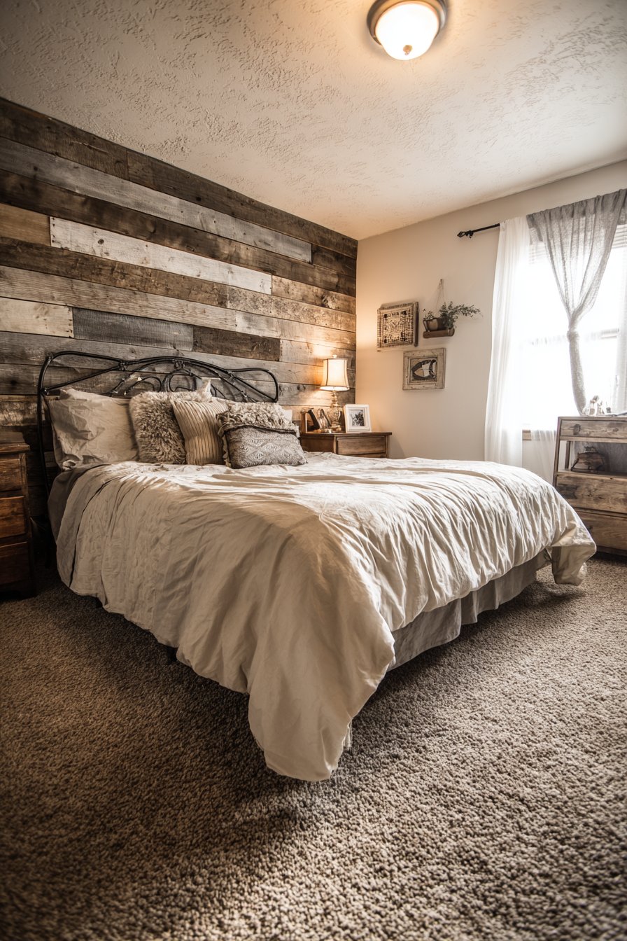
The DIY-friendly nature of pallet wood walls makes dramatic transformations accessible to homeowners with basic tool skills and modest budgets. Reclaimed pallets can often be sourced free or inexpensively from businesses, making this one of the most cost-effective accent wall options. The project requires patience and proper preparation—pallets must be disassembled, nails removed, and wood sanded—but the unique, one-of-a-kind results justify the effort invested.
Key Design Tips: Source heat-treated (HT stamped) pallets only, avoiding chemically treated (MB stamped) pallets for indoor use. Disassemble pallets carefully to preserve maximum usable wood. Sand all surfaces thoroughly to remove splinters and rough areas. Apply wood conditioner before staining to ensure even absorption. Vary plank widths and lengths randomly for organic appearance. Leave small gaps between planks for dimensional shadow lines. Attach planks to furring strips or directly to studs for secure installation. Apply clear sealer to protect wood and facilitate cleaning. Consider wire-brushing technique to emphasize grain texture. Allow wood to acclimate to indoor humidity for several days before installation to prevent warping.
14. Refined Picture Frame Molding
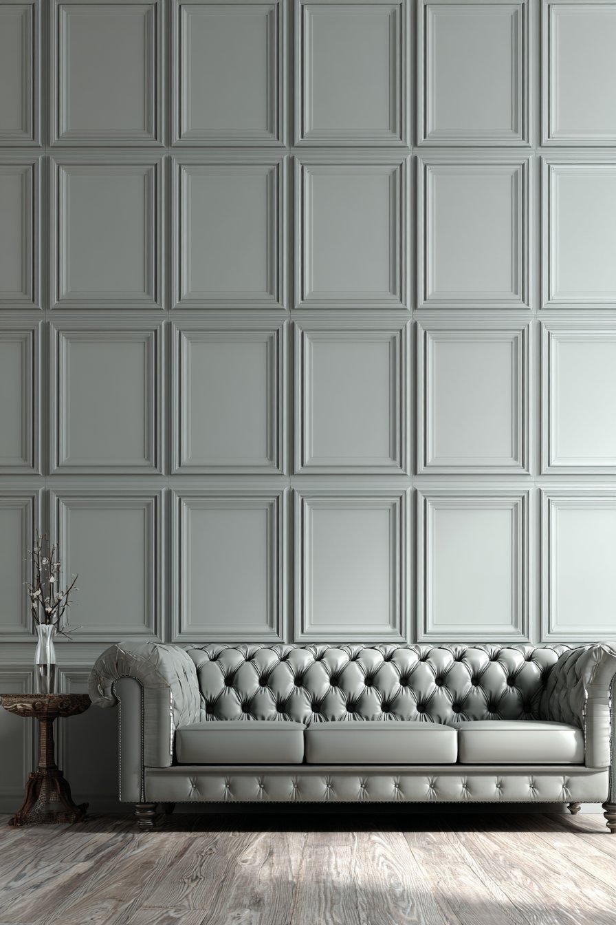
Picture frame molding represents understated elegance, creating architectural sophistication through carefully proportioned raised rectangles that add dimension without overwhelming spaces. This design features raised frames painted in the same soft gray as the base wall, allowing shadow and light to create the visual interest rather than color contrast. The monochromatic approach feels refined and timeless, working beautifully with both traditional furnishings and contemporary pieces.
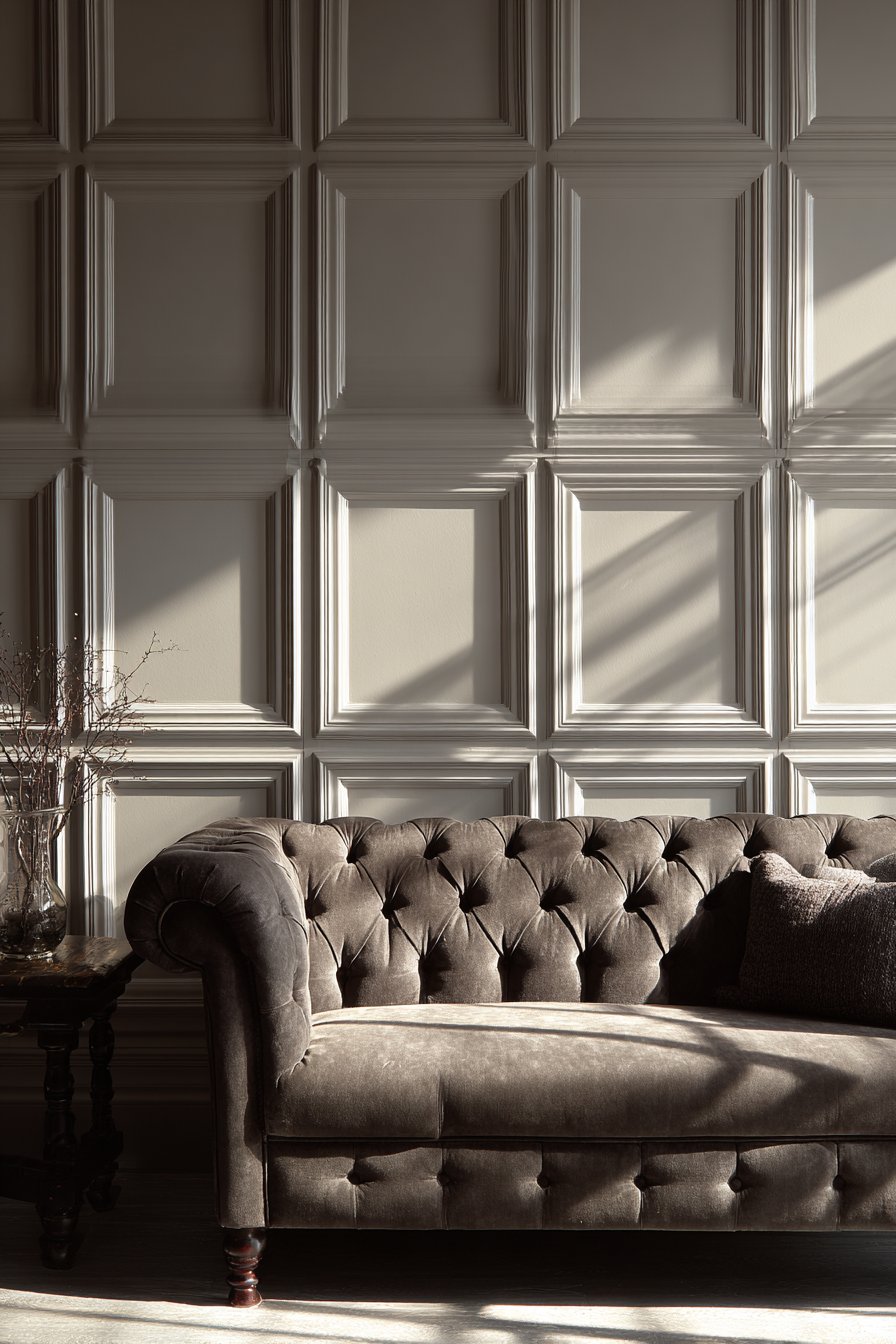
The grid pattern created by picture frame molding adds mathematical precision and order to rooms, creating a sense of intentional design even in otherwise simple spaces. Each frame becomes a distinct panel that adds visual interest to large, blank walls while maintaining overall calm and cohesion. The technique works particularly well in living rooms where sophisticated, grown-up aesthetics are desired without introducing bold colors or busy patterns.
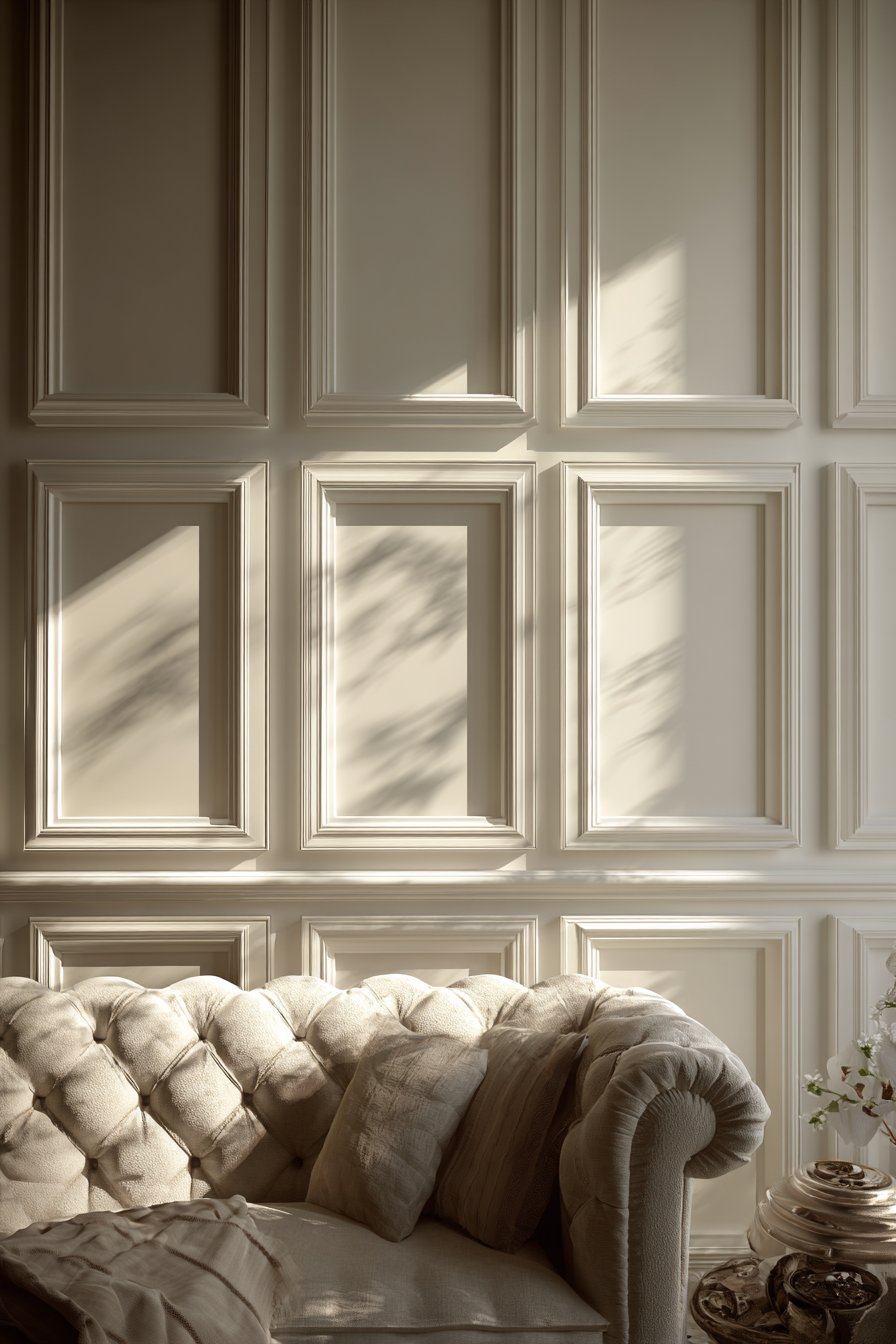
Picture frame molding creates the impression of quality construction and classical architecture even in newer homes with flat walls. The dimensional quality catches natural light throughout the day, creating subtle changes in how the wall appears—more pronounced shadows in strong light, softer and more uniform in diffused light. This living quality adds richness to spaces that static flat walls cannot achieve.
Key Design Tips: Plan frame proportions based on golden ratio (approximately 1:1.6) for most pleasing rectangles. Space frames consistently across wall with equal margins on all sides. Use wider molding (2-3 inches) for larger walls, narrower (1-1.5 inches) for smaller spaces. Install base and cap molding first to establish clean boundaries before adding vertical and horizontal frame pieces. Miter corners precisely at 45 degrees for professional appearance. Fill nail holes and caulk seams thoroughly before painting. Paint molding same color as wall for subtle sophistication or use contrasting color for more traditional look. Maintain same frame proportions throughout the room for consistency. Consider placing frame centers at standard picture-hanging height (57-60 inches) for optimal visual placement.
15. Functional Full-Wall Mirror System
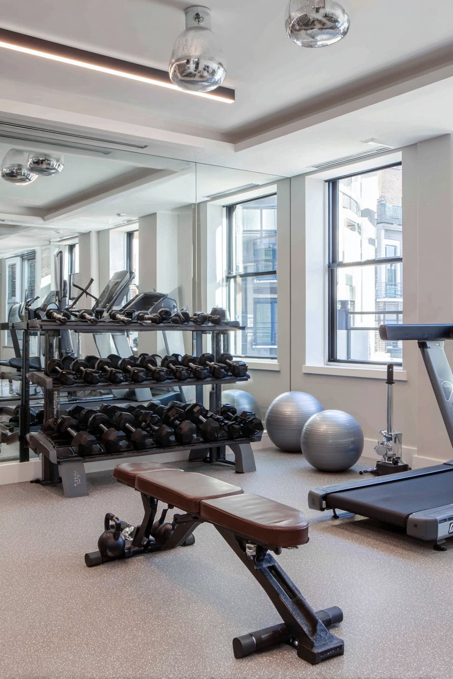
Wall-to-wall mirrors serve dual purposes in home gym environments—they provide essential functionality for monitoring exercise form while visually doubling the perceived space. This design features professionally installed mirror panels mounted edge-to-edge with minimal seams, creating expansive reflective surfaces that make even compact workout spaces feel larger and brighter. The strategic placement allows users to view themselves from multiple angles, essential for proper form and injury prevention during exercise.
The practical considerations in gym mirror installations extend beyond basic mounting. The mirrors must be secured with appropriate adhesive and mechanical fasteners to handle the weight and ensure safety during vigorous activity. The positioning should account for the height range of different exercises—low enough to see floor work like pushups and stretches, high enough to monitor overhead movements. The seamless edge-to-edge installation creates sleek, unified appearance rather than the fragmented look of separate mirror panels with wide gaps.
The reflective surfaces interact carefully with lighting design. Overhead LED fixtures provide even illumination without creating harsh glare on the mirrors that would be distracting or visually uncomfortable during workouts. The increased light reflection from the mirrors also means the room requires less artificial lighting to achieve adequate brightness, creating energy efficiency alongside the aesthetic and functional benefits.
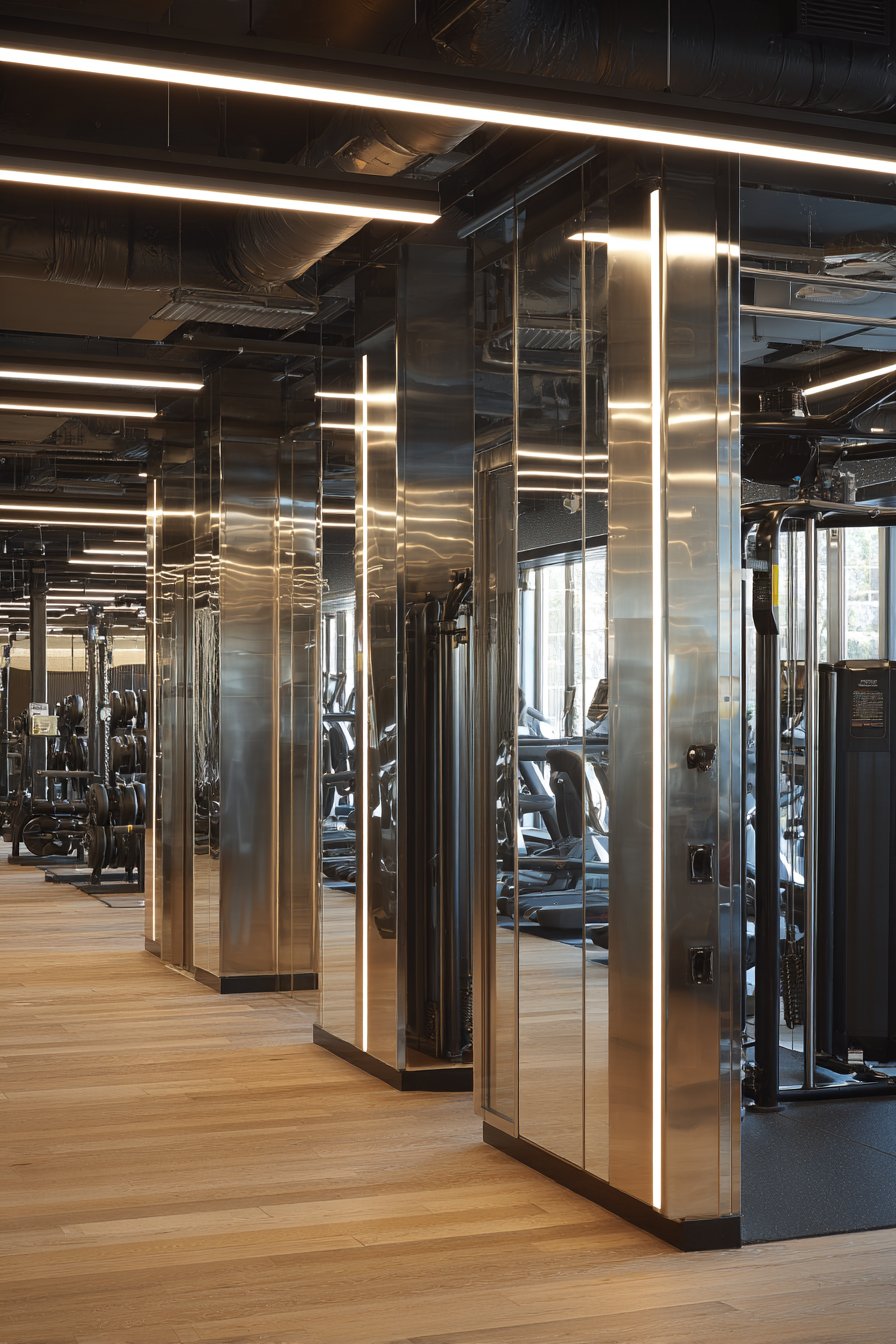
Key Design Tips: Hire professional installers for large mirror installations to ensure safety and proper adhesion. Use 1/4-inch thick mirrors minimum for durability and reduced distortion. Mount mirrors slightly away from wall (using J-bar or clips) to prevent moisture damage and allow airflow. Position bottom edge 6-12 inches above floor to protect from feet and equipment. Coat mirror backs with safety film to prevent shattering if broken. Clean with glass cleaner and microfiber cloth to maintain clarity. Avoid mounting mirrors where direct sunlight creates glare. Include one non-mirrored wall to prevent visual disorientation during balance exercises. Plan mirror layout to minimize seams at eye level where they’re most noticeable.
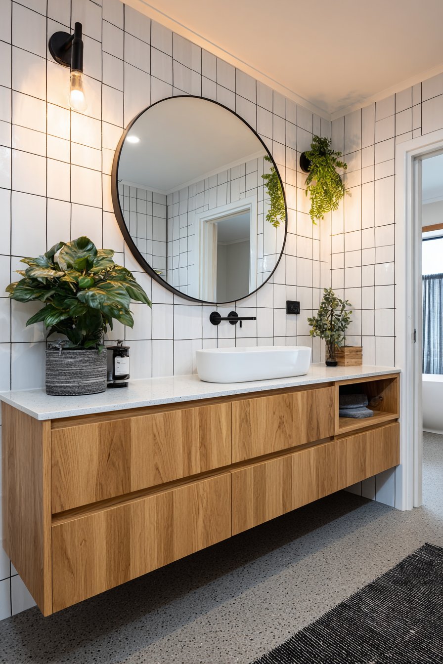
16. Modern Vertical Stack Subway Tile
Classic materials can feel fresh and contemporary through unexpected installation patterns, as demonstrated in this vertical stack subway tile design. Rather than traditional brick-pattern offset installation, these white tiles are stacked directly above one another, creating clean vertical lines that draw the eye upward and emphasize ceiling height. The light gray grout provides subtle definition while maintaining the overall bright, clean aesthetic that makes this approach feel modern and intentional.
The vertical orientation creates visual rhythm different from the familiar horizontal brick pattern, immediately signaling design sophistication and contemporary sensibility. The stack bond pattern also highlights the rectangular proportions of subway tiles, emphasizing their clean geometry. This creates a more architectural, deliberate appearance compared to the more organic, traditional brick pattern. The floor-to-ceiling installation maximizes the verticality while creating a water-resistant, easy-to-clean surface ideal for bathroom applications.
The contrast elements—matte black fixtures and floating natural oak vanity—provide warmth and visual punctuation against the white tile canvas. These darker accents prevent the bright white surfaces from feeling sterile or clinical, instead creating balanced composition with the white tiles as a neutral foundation. The recessed lighting casts subtle shadows along the vertical grout lines, emphasizing the geometric pattern and adding dimensional interest.
Key Design Tips: Use tile spacers consistently for perfectly aligned vertical lines—any deviation will be highly visible. Purchase at least 10% extra tile to account for cuts and potential breakage. Start layout from most visible corner or centered on prominent feature like vanity. Choose rectified tiles with precisely cut edges for tightest, most professional-looking grout lines. Mix tiles from multiple boxes during installation to blend any color variations. Use high-quality polymer-modified thinset for superior adhesion in wet areas. Allow thinset to cure fully before grouting (typically 24-48 hours). Seal grout in shower areas to prevent staining and mildew. Consider subway tile format beyond standard 3×6—larger formats like 4×12 or 6×12 create more dramatic vertical effect.
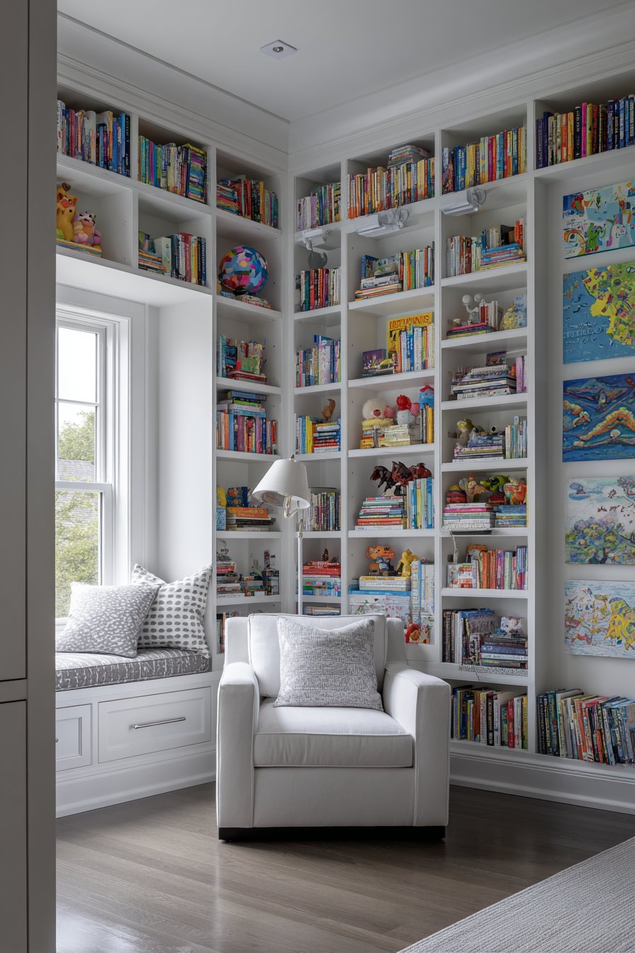
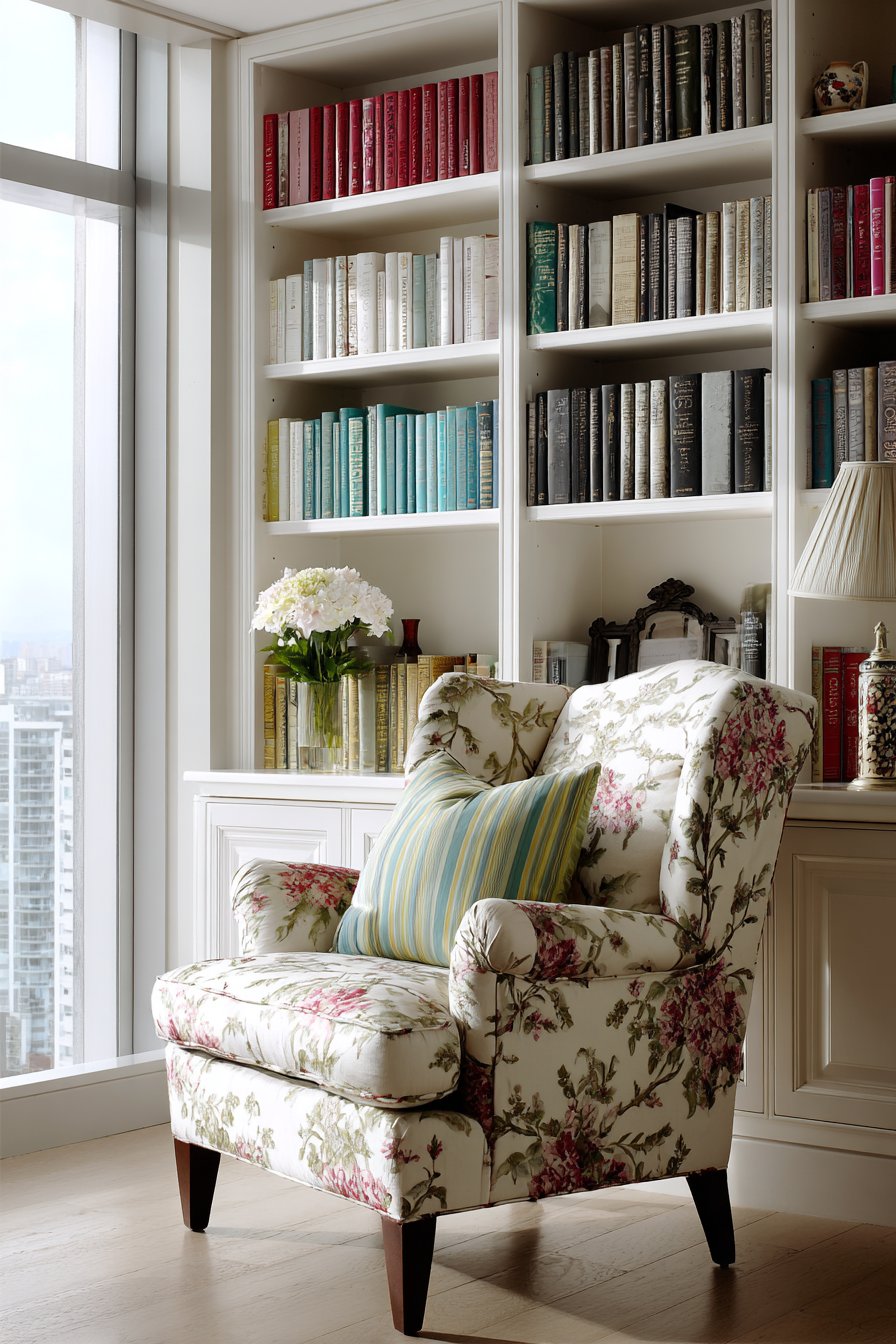
17. Comprehensive Floor-to-Ceiling Bookshelf Wall
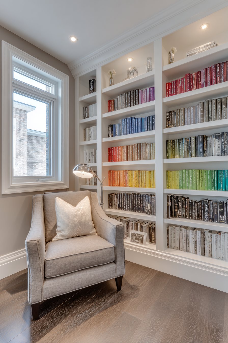
Built-in bookshelf walls transform entire wall surfaces into functional libraries while creating sophisticated backdrop for daily living. This design features custom white shelving spanning floor to ceiling with adjustable shelves that accommodate books of varying heights and decorative objects. The color-coordinated book spine arrangement—organizing volumes by color rather than author or subject—creates rainbow effect that doubles as visual art while maintaining the practical function of book storage.
The comprehensive approach—dedicating entire walls to book storage—makes strong design statement about priorities and lifestyle, immediately communicating that reading and learning hold importance in the household. The built-in nature suggests permanence and investment, creating architectural feature rather than furniture-based solution. The white painted finish keeps the substantial storage from feeling heavy or overwhelming, instead maintaining light, airy quality even when shelves are fully loaded.
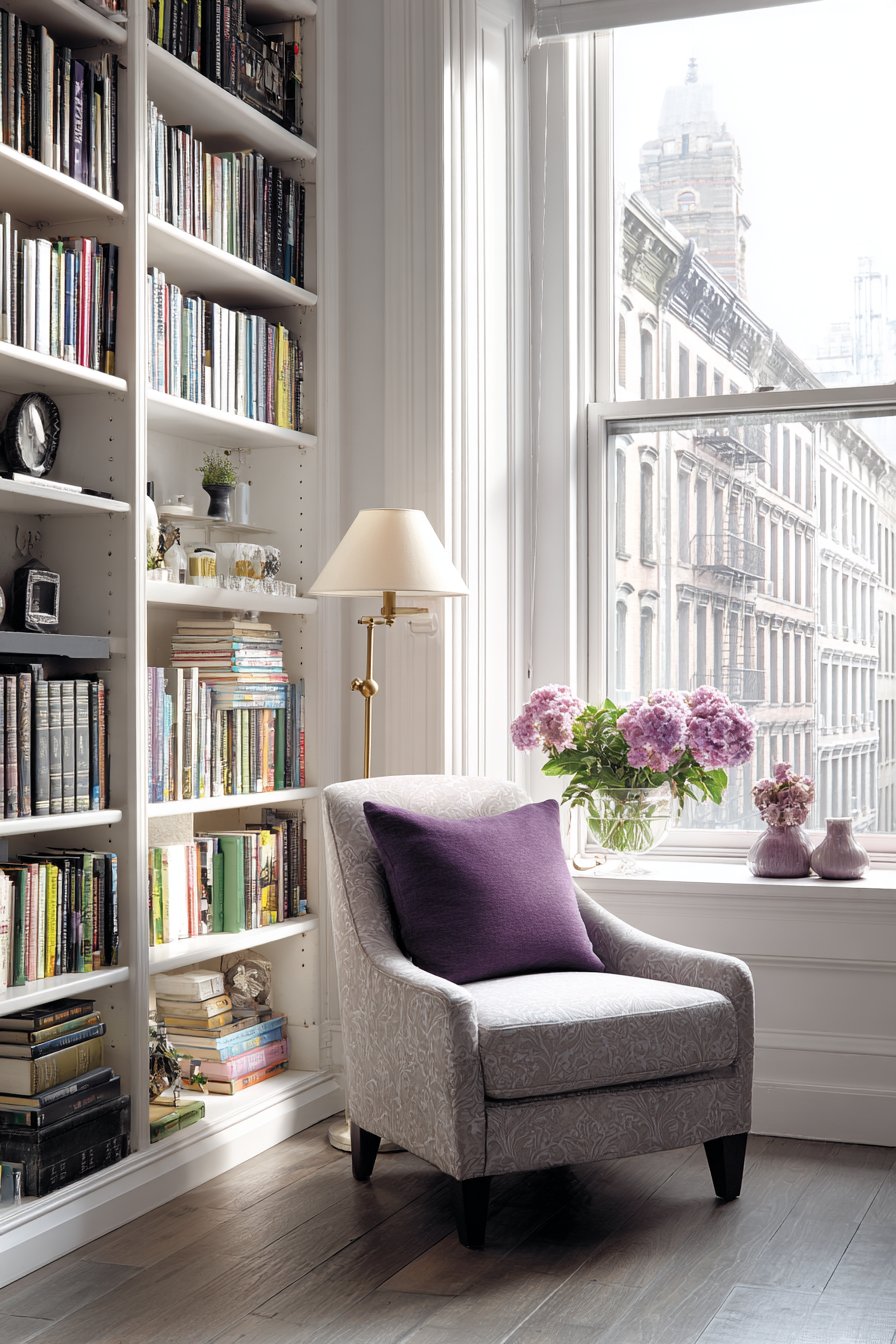
The dual functionality—storage plus display—allows the bookshelf wall to showcase more than just books. Decorative objects, family photographs, plants, and collected treasures intersperse among volumes create visual variety and personal character. The adjustable shelving provides flexibility as collections grow and change, ensuring the system remains functional for years. When positioned in a reading nook with comfortable seating and good lighting nearby, the comprehensive shelving creates a personal library atmosphere.
Key Design Tips: Build shelves with 3/4-inch plywood or solid wood to prevent sagging under book weight. Limit shelf spans to 36 inches maximum without center support to maintain structural integrity. Install adjustable shelf standards for maximum flexibility in shelf configuration. Include toe-kick at bottom matching room baseboards for built-in appearance. Paint interior back panels in contrasting color or wallpaper pattern for added depth. Arrange books by color, size, or subject based on personal preference and aesthetic goals. Incorporate LED strip lighting under shelves to illuminate books and create ambient glow. Include decorative objects in groups of odd numbers for most pleasing visual arrangement. Leave some empty shelf space to prevent cluttered appearance—aim for 70-80% full.
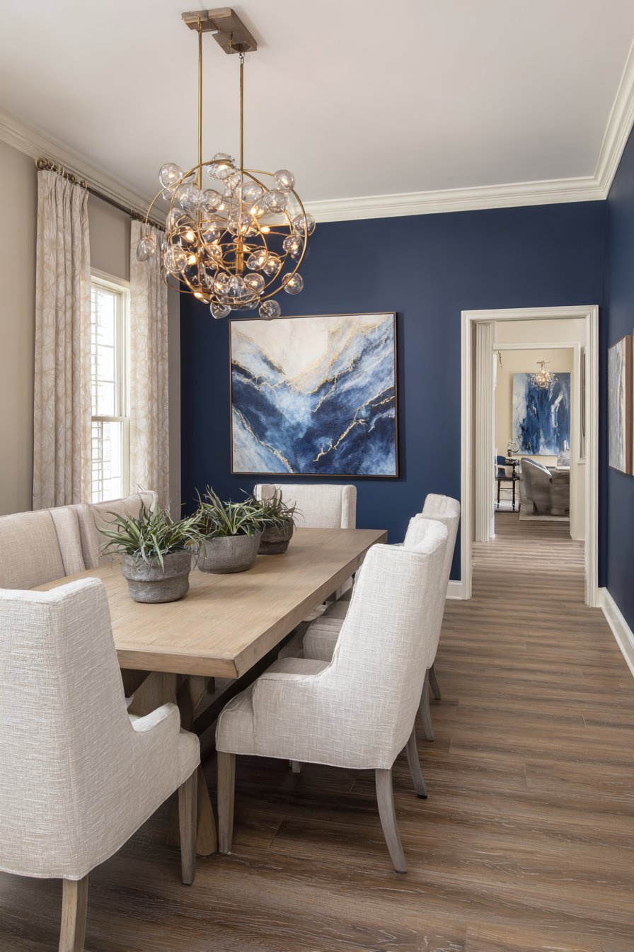
18. Dramatic Dark Accent Wall
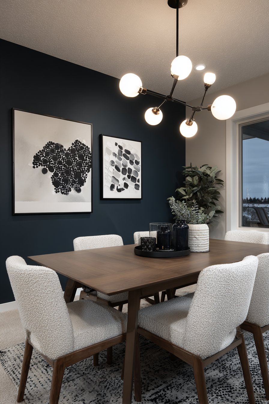
Bold dark accent walls create immediate drama and sophistication in dining spaces, demonstrating that dark colors can add depth and elegance rather than making rooms feel smaller or gloomier. This design features deep navy blue paint on a single wall, creating moody backdrop that serves multiple purposes—it grounds the space visually, provides contrast for artwork and lighting fixtures, and establishes intimate ambiance perfect for dinner gatherings.
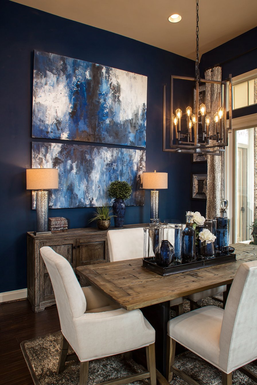
The psychology of dark colors in dining rooms is particularly interesting. Navy blue creates feelings of sophistication and formality that elevate meals from routine necessity to special occasion. The dark background also makes metallic fixtures like chandeliers sparkle more brilliantly, as the contrast between dark wall and bright light creates more dramatic effect. Light wood furniture provides essential contrast, preventing the room from feeling too dark while introducing warmth that balances the cool blue tones.
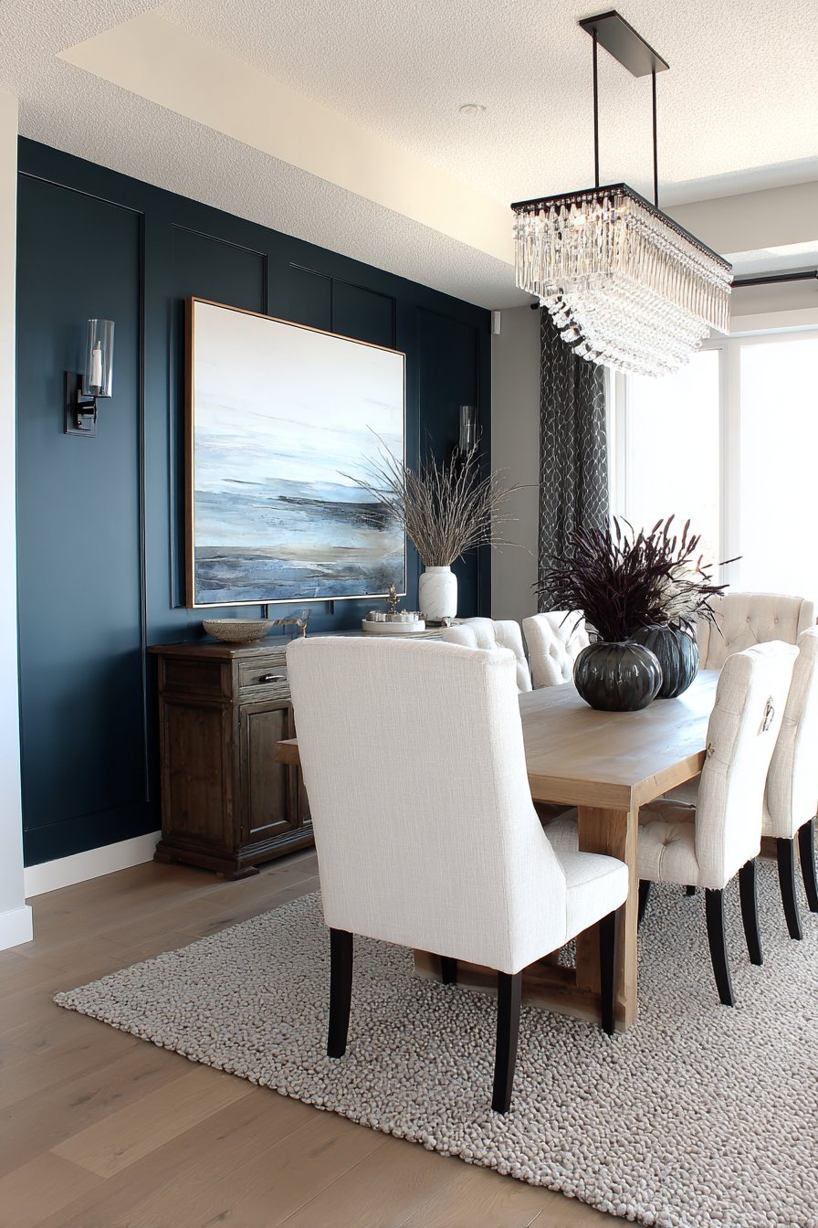
The single-wall approach prevents the dark color from overwhelming the space. By keeping remaining walls in lighter neutral tones, you maintain adequate brightness while focusing dramatic impact on the feature wall. This technique works particularly well when the accent wall is opposite the room’s main entrance, creating immediate visual destination and focal point that draws people into the space. The dark color also shows fewer marks and scuffs than lighter walls, making it practical for high-traffic areas.
Key Design Tips: Test paint colors on large sample boards (at least 2×2 feet) and view in different lighting conditions before committing. Apply primer specifically formulated for dark colors to ensure even coverage and true color. Use premium paint with good coverage to minimize coats needed—quality dark paints often cover in two coats. Consider slightly higher sheen (eggshell or satin) rather than flat for easier cleaning and subtle light reflection. Paint accent wall first, then use it as guide for selecting complementary colors for remaining walls. Install artwork and fixtures on accent wall in contrasting light tones for maximum impact. Ensure adequate lighting in rooms with dark walls—add ambient and task lighting as needed. Consider coordinating textiles like curtains or tablecloths that incorporate the accent wall color to create cohesive design.
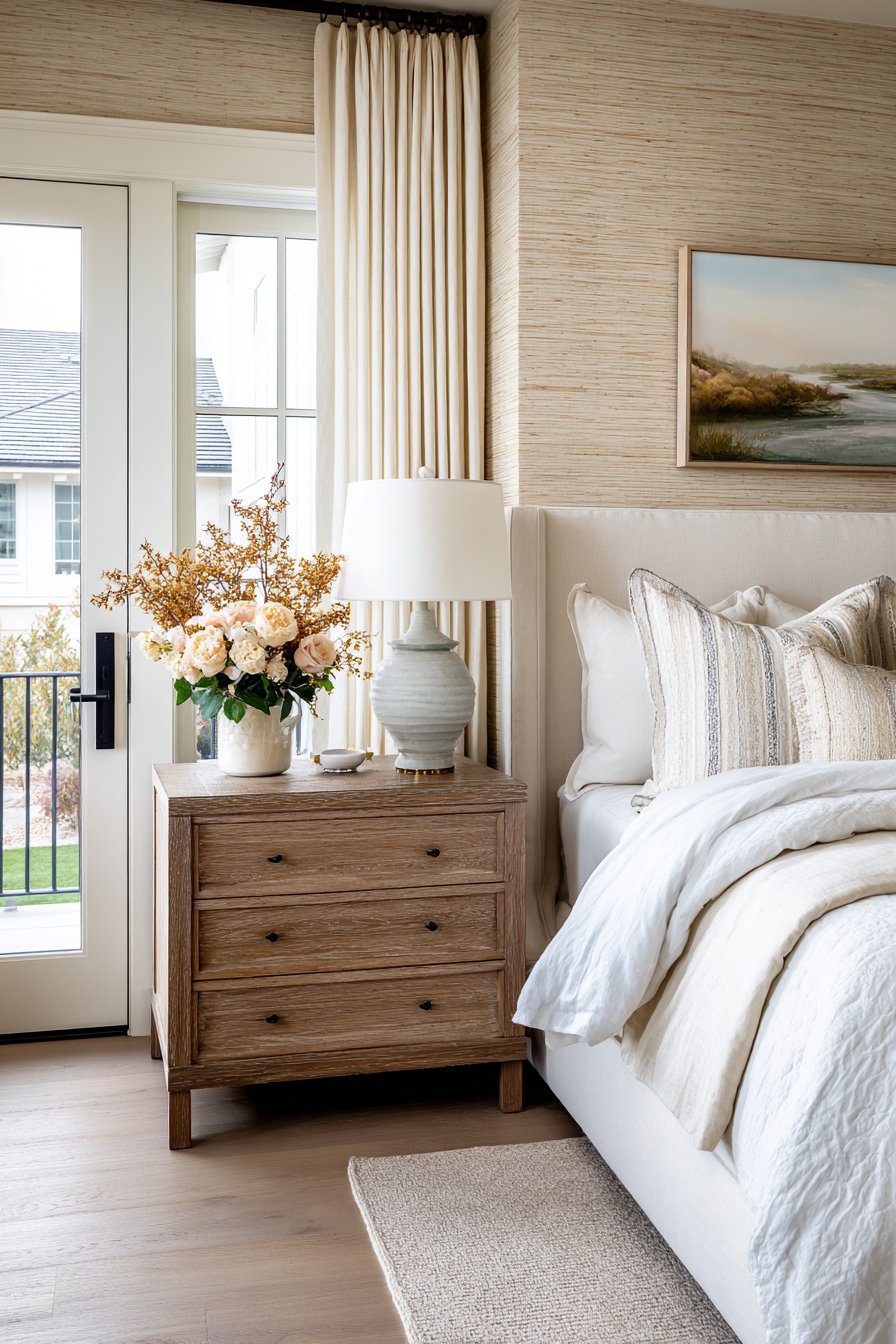
19. Natural Grasscloth Wallpaper Texture
Grasscloth wallpaper brings organic texture and subtle luxury to bedrooms while offering the advantage of temporary installation through modern peel-and-stick technology. This design features natural beige tones with authentic woven fiber visible in the material, creating dimensional texture that adds warmth and interest without pattern or color competition. The natural variations in the weaving—slight irregularities and color shifts—add authentic character that synthetic materials cannot replicate.
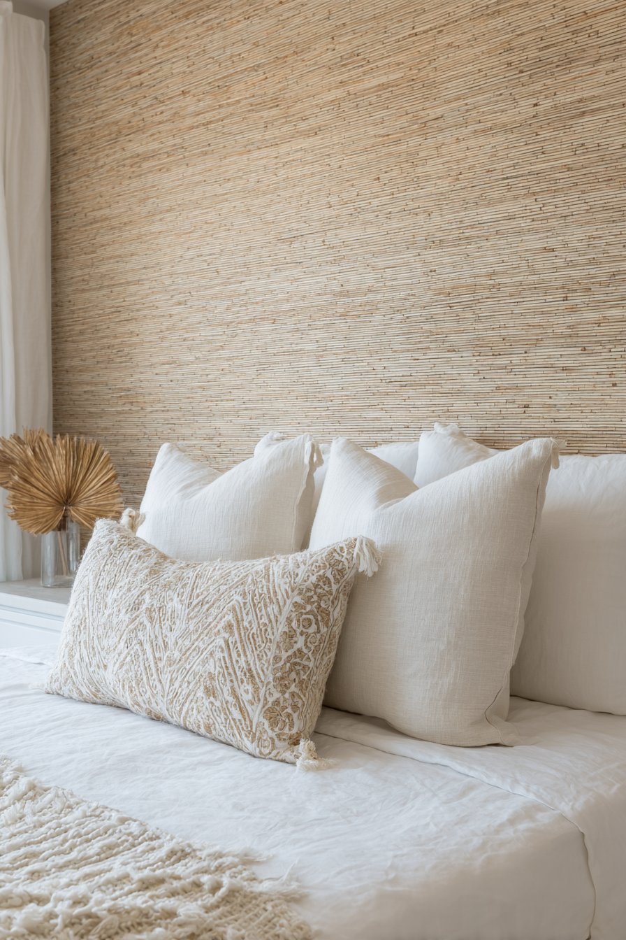
The organic nature of grasscloth introduces biophilic design elements that research shows can reduce stress and improve sleep quality. The neutral beige tones create calming backdrop perfect for bedroom applications where restful atmosphere is paramount. The textural interest provides visual engagement without being stimulating or demanding, allowing the room to feel sophisticated yet peaceful. The material’s natural properties also provide subtle sound absorption, contributing to quieter sleeping environment.
The peel-and-stick application makes grasscloth accessible to renters and those hesitant to commit to permanent wall treatments. The temporary nature allows for experimentation and updates as tastes change, while the installation process requires no special tools or professional expertise. Despite being removable, modern peel-and-stick grasscloth offers authentic appearance and quality comparable to traditional wallpaper, making it practical choice for headboard accent walls where its texture and warmth can be fully appreciated.
Key Design Tips: Allow wallpaper to acclimate to room temperature and humidity for 24 hours before installation. Clean walls thoroughly and allow to dry completely before application. Use level and pencil to mark straight vertical line for first panel placement. Overlap seams slightly then trim with sharp knife for invisible seam. Smooth panels gently from center outward to avoid crushing natural fibers. Avoid over-handling edges which can separate with repeated adjustment. Consider professional installation for entire rooms but DIY for single accent walls. Understand that natural grasscloth will have color and texture variations which add to its authentic character. Avoid hanging in high-humidity areas like bathrooms where moisture can affect natural materials. Use soft brush or vacuum with brush attachment for cleaning rather than wiping which can snag fibers.
20. Industrial Exposed Brick Feature Wall
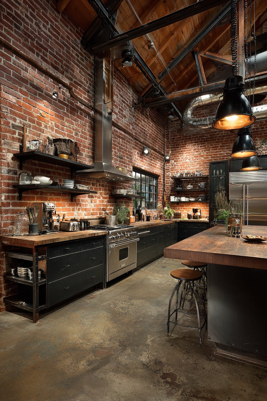
Authentic exposed brick walls bring historical character and industrial-chic aesthetics to modern kitchens, creating the kind of character and patina that cannot be manufactured. This design features original red clay brick left in its natural state, simply cleaned and sealed to preserve the surface while protecting against moisture and staining. The brick shows natural color variations, authentic mortar texture, and slight surface irregularities that tell stories of the building’s history and age.
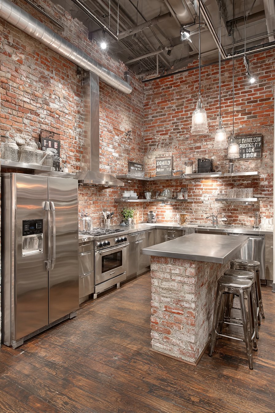
The juxtaposition of rough, historical brick against sleek modern appliances and contemporary cabinetry creates dynamic tension that defines industrial design. The warm red-orange tones of traditional brick add color and warmth to spaces that might otherwise feel cold with an abundance of stainless steel and white surfaces. The texture provides visual and tactile interest that contrasts beautifully with smooth countertops and flat cabinet faces.
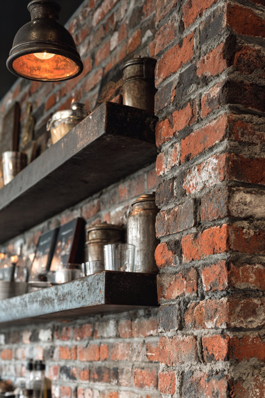
Incorporating exposed brick involves working with what’s already present in your home’s structure, making it sustainable design choice that celebrates existing architecture rather than covering it with new materials. When original brick walls are not available, brick veneer or thin brick tiles can create similar aesthetic, though authentic exposed brick from the building’s original construction carries unique historical significance. The irregular surfaces and aged patina cannot be perfectly replicated, giving genuine exposed brick special character.
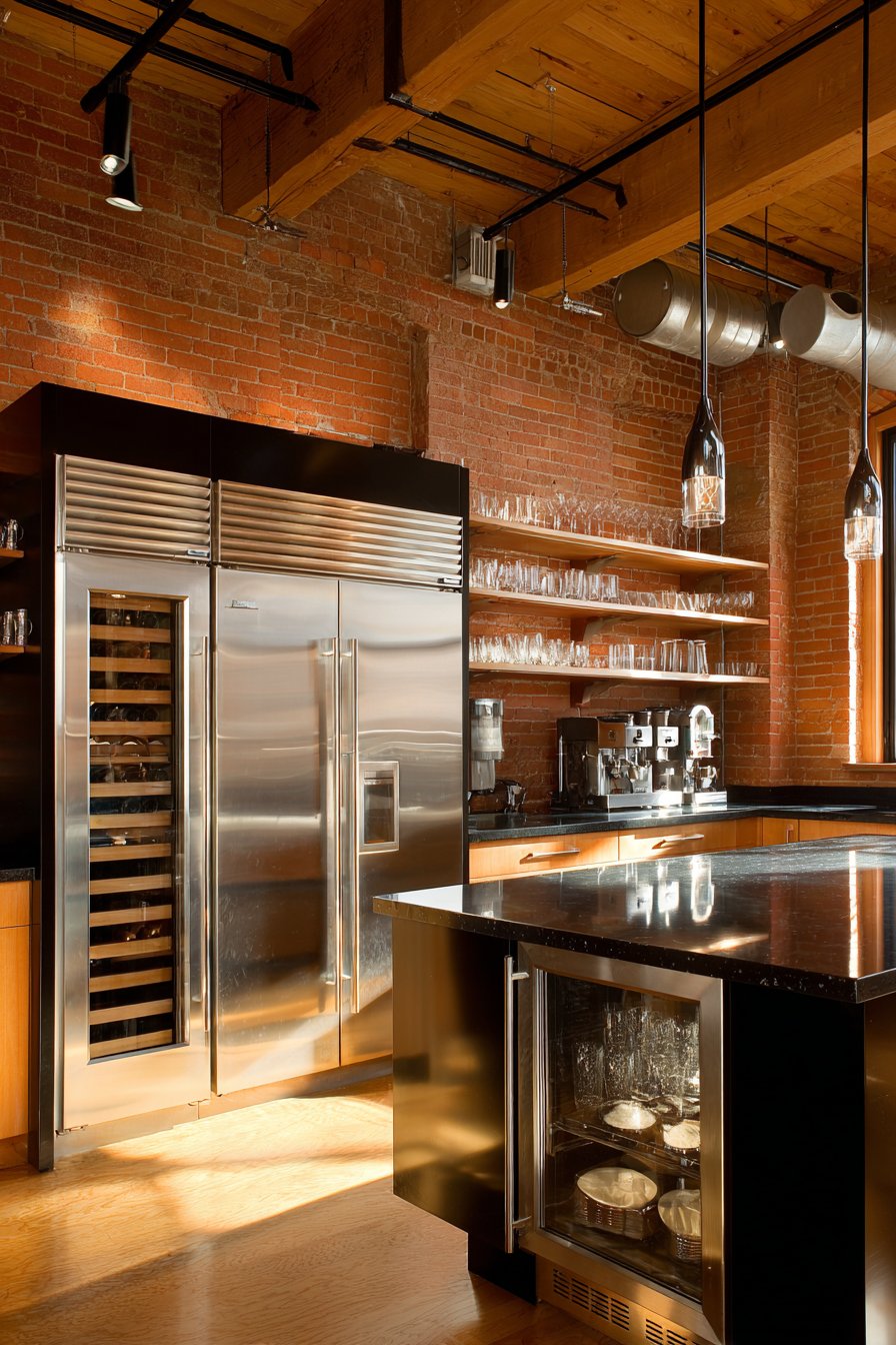
Key Design Tips: Clean historical brick gently with wire brush and mild detergent solution before sealing. Apply breathable penetrating sealer designed for interior brick to protect against moisture while allowing natural vapor transmission. Leave mortar texture visible rather than repointing unless structural integrity is compromised. Consider whitewashing or painting brick if full color feels too intense, though this is permanent decision. Install open shelving or minimal upper cabinets against brick walls to showcase the texture rather than covering it. Use spotlighting or track lighting to highlight brick texture and create dramatic shadows. Understand that brick is porous and may show staining in kitchen environments—seal thoroughly and plan for periodic resealing. Consider heating and cooling implications as brick walls affect thermal properties differently than insulated conventional walls.
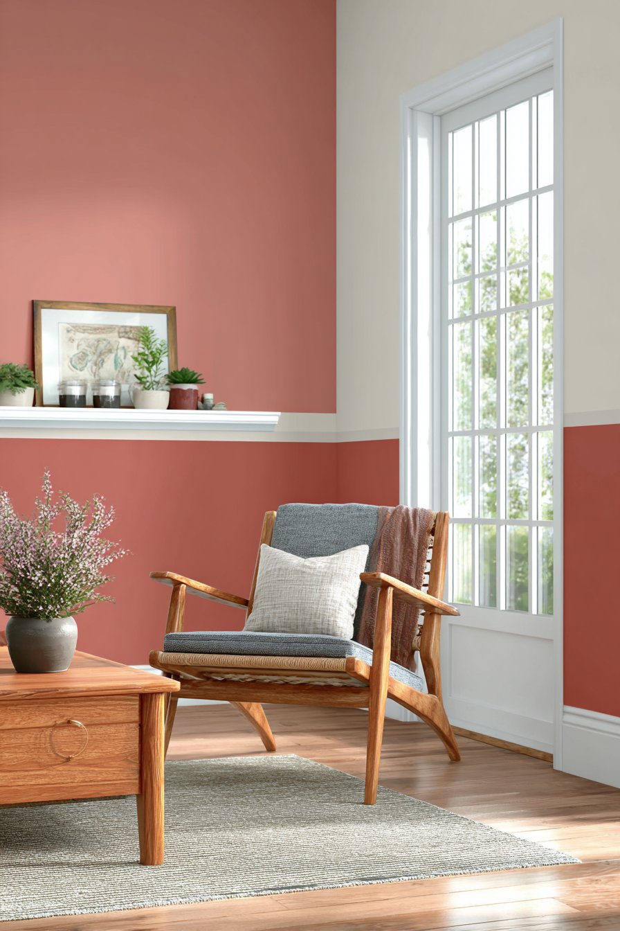
21. Contemporary Color Blocking Paint Technique
Modern color blocking represents accessible, high-impact wall design that requires only paint, painter’s tape, and careful execution. This design features two complementary colors divided horizontally with warm terracotta occupying the lower two-thirds of the wall and soft cream on the upper third. The clean, straight transition line creates bold contemporary statement that introduces color drama without additional materials or complex installation.
The color division creates several design benefits simultaneously. The darker lower section provides visual weight that grounds the room while being more forgiving of scuffs and marks. The lighter upper section maintains brightness and prevents the bold color from overwhelming the space. The horizontal division makes ceilings appear higher while adding visual interest to otherwise plain walls. The technique works particularly well with on-trend colors like terracotta that might feel too intense covering entire rooms but create perfect impact as feature elements.
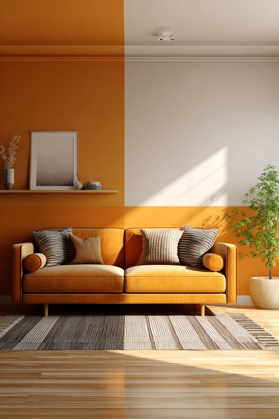
The beauty of color blocking lies in its flexibility and accessibility. The technique works with any color combination and division—vertical blocking, diagonal blocking, or geometric shapes—allowing for complete customization based on personal taste and room requirements. The paint-only approach makes it cost-effective and easily changeable if tastes evolve. Mid-century modern furniture complements the bold geometric approach particularly well, though the clean lines work with many design styles.
Key Design Tips: Use high-quality painter’s tape and press edges firmly to prevent paint bleeding. Measure carefully and use level to ensure straight, even lines. Paint lighter color first over entire wall, then tape and apply darker color over it. Remove tape while paint is still slightly wet for cleanest lines. Consider color proportions carefully—60/40 or 70/30 splits generally look more intentional than 50/50. Test color combinations with large samples to ensure they complement rather than clash. Use same paint sheen for both colors to maintain visual consistency. Consider room proportions when deciding on horizontal versus vertical blocking. Extend color blocking to adjacent walls at corners for wrapped, cohesive effect. Use small artist’s brush to clean up any imperfect lines after tape removal.
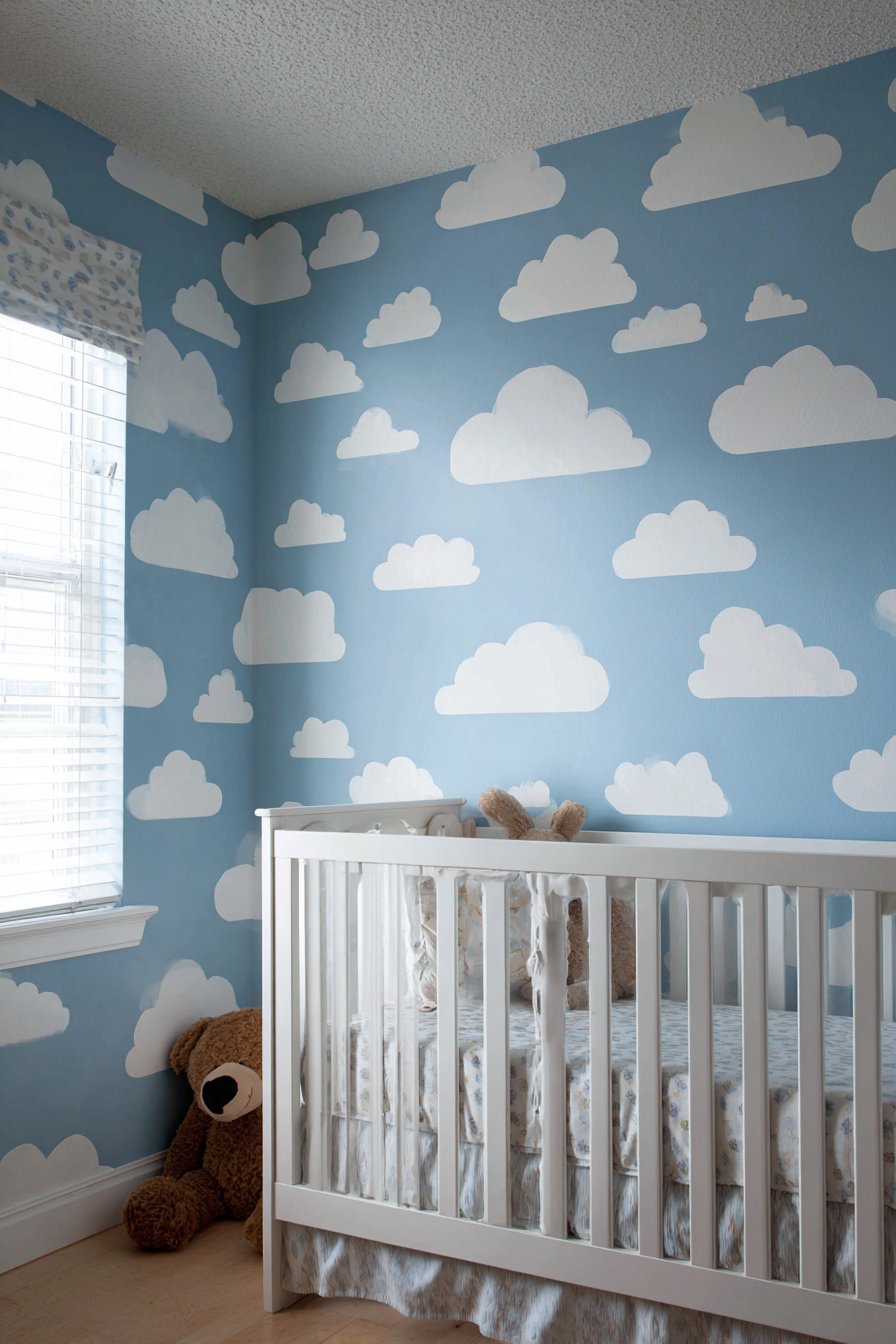
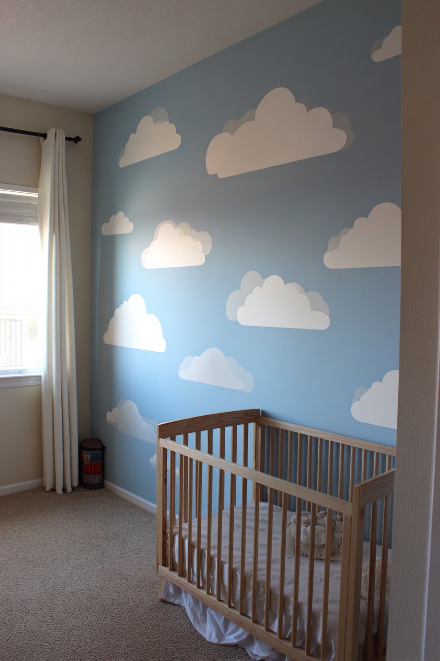
22. Whimsical Nursery Cloud Decals
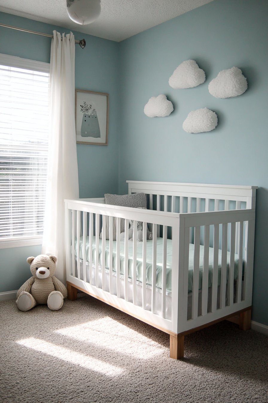
Removable wall decals offer nursery customization that grows with children while respecting rental agreements and future flexibility. This design features whimsical cloud shapes in soft white and gray tones arranged in organic floating pattern above the crib area against pale blue painted walls. The simple shapes create dreamy, peaceful atmosphere without overwhelming the space with intense colors or complex patterns appropriate for infant and toddler spaces.
The beauty of quality wall decals lies in their ability to provide visual interest and theme without permanent commitment. Parents can create enchanting environments for their children knowing that when tastes or needs change, the decals remove cleanly without damaging walls or leaving residue. This proves particularly valuable in nurseries where design needs evolve rapidly as children grow from infants to toddlers to young children.
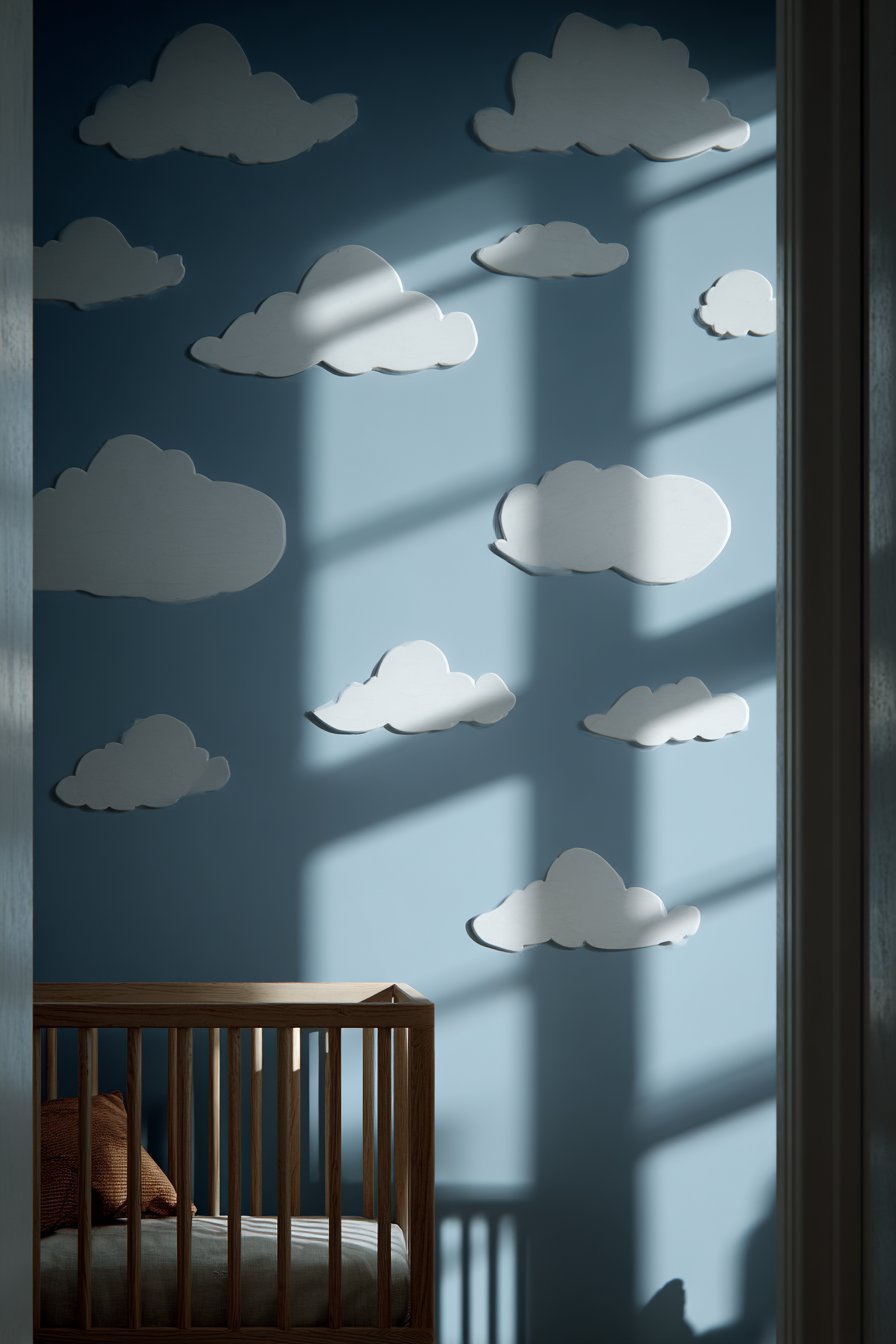
The cloud motif specifically creates gentle, calming atmosphere perfect for sleep spaces. The soft colors and simple shapes avoid overstimulation while providing visual engagement during quiet moments. The organic arrangement—clouds appearing to drift across the wall—introduces movement and life without demanding attention or creating distraction. The positioning above the crib ensures the decals are visible to the baby while lying down, providing focal points that can aid in settling and sleep.
Key Design Tips: Clean walls thoroughly before application to ensure good adhesion. Plan arrangement by cutting cloud shapes from paper first and testing placement with painter’s tape. Apply decals to smooth, painted walls rather than textured surfaces for best adhesion. Use credit card or squeegee to remove air bubbles during application. Avoid placing decals where direct sunlight hits as UV exposure can affect adhesion over time. Choose matte finish decals rather than glossy for more authentic painted appearance. Understand that some paint may lift during removal even with “removable” decals—test in inconspicuous area first. Consider adding small star or moon decals to enhance nighttime sky theme. Remove decals gently by peeling slowly at low angle rather than pulling straight away from wall.
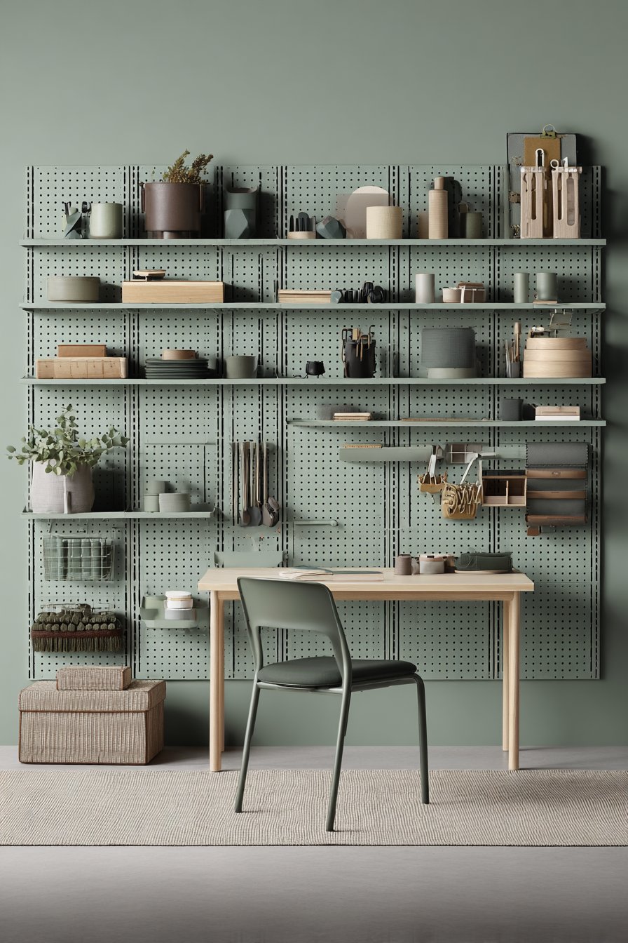
23. Functional Pegboard Organization Wall
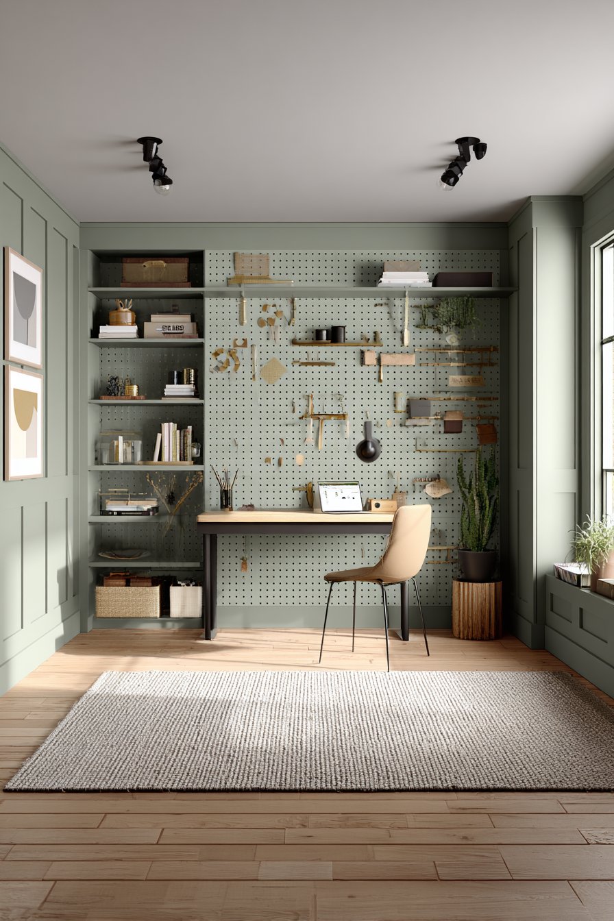
Pegboard systems bring retro-modern functionality to home offices, transforming walls into customizable organizational command centers. This design features floor-to-ceiling pegboard painted in muted sage green, creating visually cohesive backdrop for shelves, hooks, and accessories in coordinated wood and metal finishes. The modular nature allows complete customization and easy rearrangement as work needs and preferences change over time.
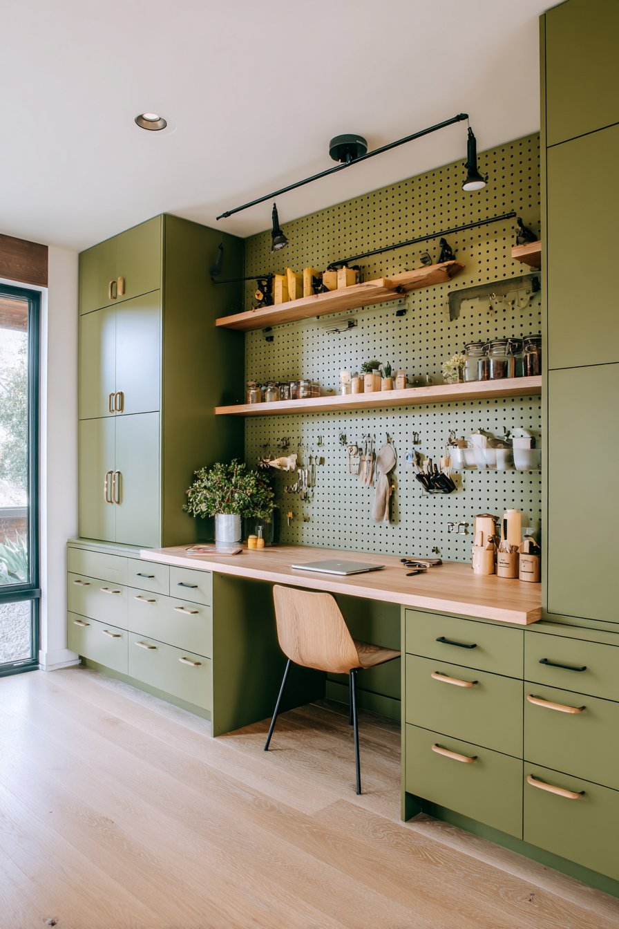
The resurgence of pegboard in contemporary design represents appreciation for functional, honest materials that celebrate utility rather than hiding it. The evenly spaced holes create subtle pattern that adds visual interest even without accessories, while the countless attachment options provide organizational flexibility impossible with traditional shelving. The sage green paint updates the utilitarian material, making it feel intentional and designed rather than garage-workshop afterthought.
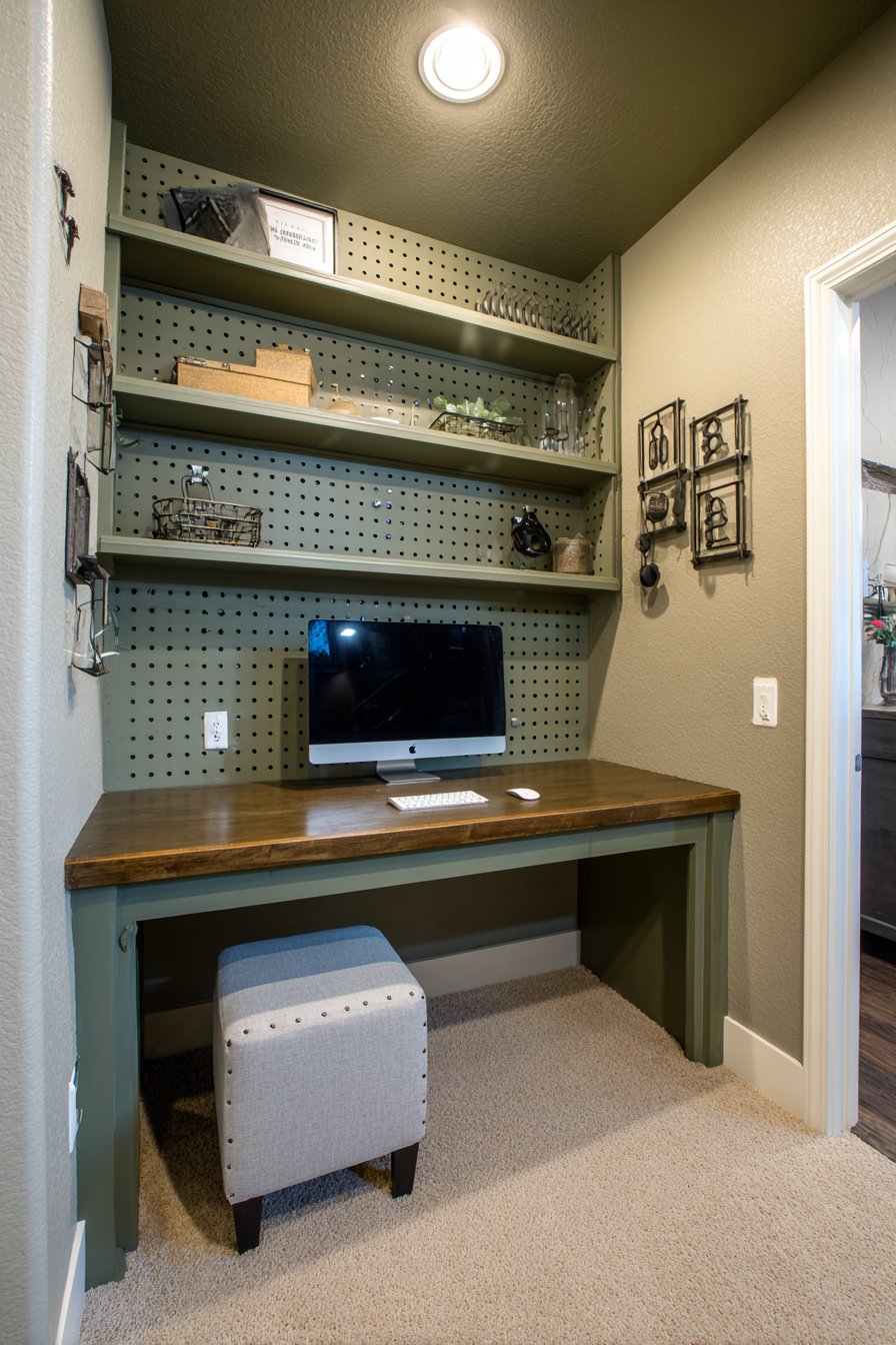
The wall-mounted organizational approach keeps desk surfaces clear and maximizes vertical space in home offices where square footage is limited. Frequently used supplies remain visible and accessible without cluttering horizontal surfaces. The system accommodates various work styles—pegboard hooks for hanging tools and supplies, shelves for books and reference materials, bins for small items, and clips for papers and inspiration boards. The modular nature means the system evolves easily as work requirements change.
Key Design Tips: Use 1/4-inch pegboard for standard hooks and accessories with proper weight capacity. Mount pegboard on furring strips or spacers to create necessary gap behind panel for hook insertion. Paint pegboard with primer first for smooth finish and better paint adhesion. Plan accessory placement before drilling into walls to avoid creating unnecessary holes. Choose commercial pegboard accessories with proper grip designed for 1/4-inch holes. Install pegboard across entire wall rather than small section for maximum functionality and visual impact. Coordinate accessory colors and materials for cohesive appearance. Include task lighting above or beside pegboard to eliminate shadows when working. Consider magnetic accessories for steel pegboard for maximum organizational flexibility. Use pegboard in closets, laundry rooms, and garages beyond just office spaces.
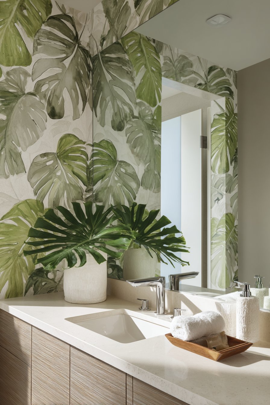
24. Botanical Statement Wallpaper
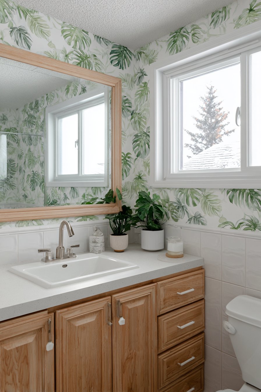
Large-scale botanical wallpaper brings nature indoors while creating dramatic focal points in bathrooms and powder rooms. This design features watercolor-style oversized monstera leaves in soft greens and grays on white background, creating tropical yet sophisticated atmosphere that feels fresh and contemporary. The artful rendering—painterly rather than photographic—adds artistic quality that elevates the wallpaper from decoration to artwork.
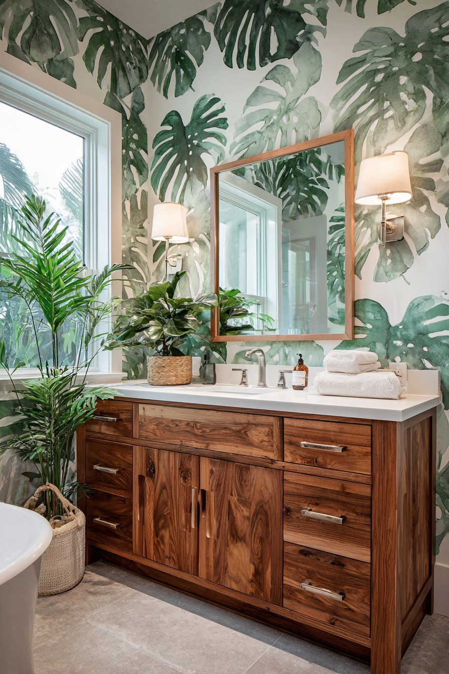
The scale of the botanical elements proves critical to the design’s success. Oversized leaves create drama and visual impact while maintaining sophistication. Smaller-scale botanical prints can feel busy or dated, while these large-scale leaves make bold statement that feels confident and contemporary. The limited color palette—soft greens and grays rather than bright tropical colors—keeps the botanical theme feeling refined and suitable for adult spaces rather than overly playful or casual.
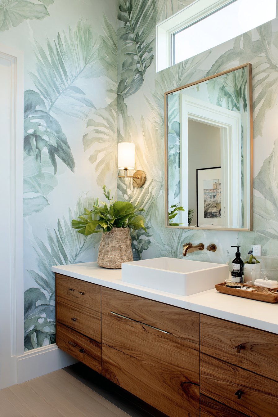
The single accent wall application prevents the bold pattern from overwhelming small bathroom spaces. By keeping other walls and surfaces in coordinating solids—white fixtures, natural wood elements—the wallpapered wall becomes clear focal point without creating visual chaos. The nature-inspired theme pairs naturally with plants, natural materials, and organic textures, creating cohesive design that feels intentional and harmonious.
Key Design Tips: Choose wallpaper specifically rated for bathroom use with moisture-resistant properties. Apply in powder rooms or away from direct shower spray for longest lifespan. Use wallpaper primer on walls before application for better adhesion and easier eventual removal. Match patterns carefully at seams for seamless appearance with large-scale designs. Order extra wallpaper to account for pattern matching and potential mistakes. Consider starting pattern at most visible point like behind mirror or opposite entrance. Use plastic smoothing tool rather than cloth to avoid scratching or tearing wallpaper during installation. Ensure adequate ventilation in bathroom to prevent moisture buildup that can affect wallpaper adhesion. Consider complementing wallpaper with simple, streamlined fixtures and accessories that don’t compete for attention.
25. Ascending Stairway Gallery Wall
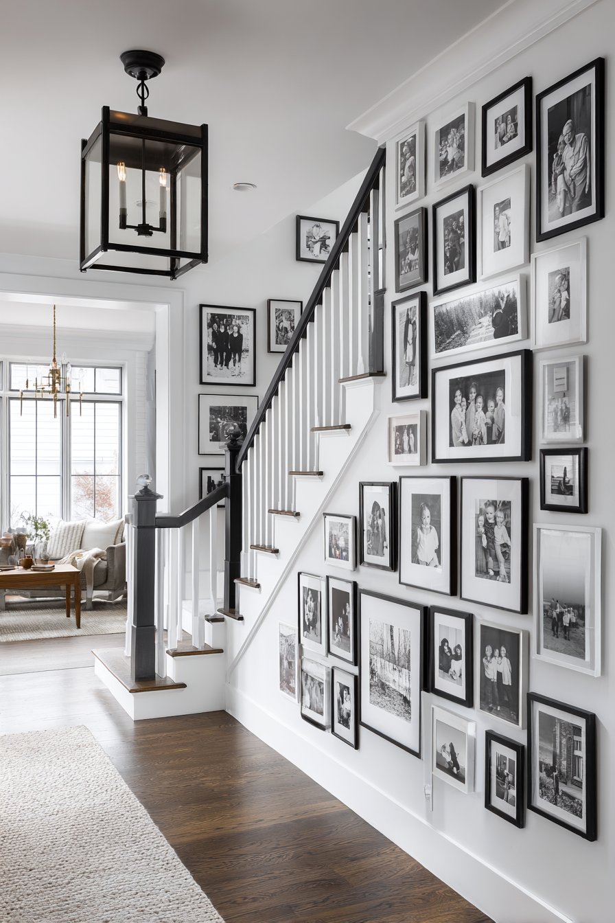
Stairway gallery walls present unique design challenges and opportunities, requiring careful planning to create arrangements that follow the ascending angle naturally. This design features family photographs in matching black frames of identical size, arranged in systematic layout that follows the staircase line while maintaining consistent relationships between frames. The uniform frame sizes and colors create cohesive, intentional appearance despite the angled installation.
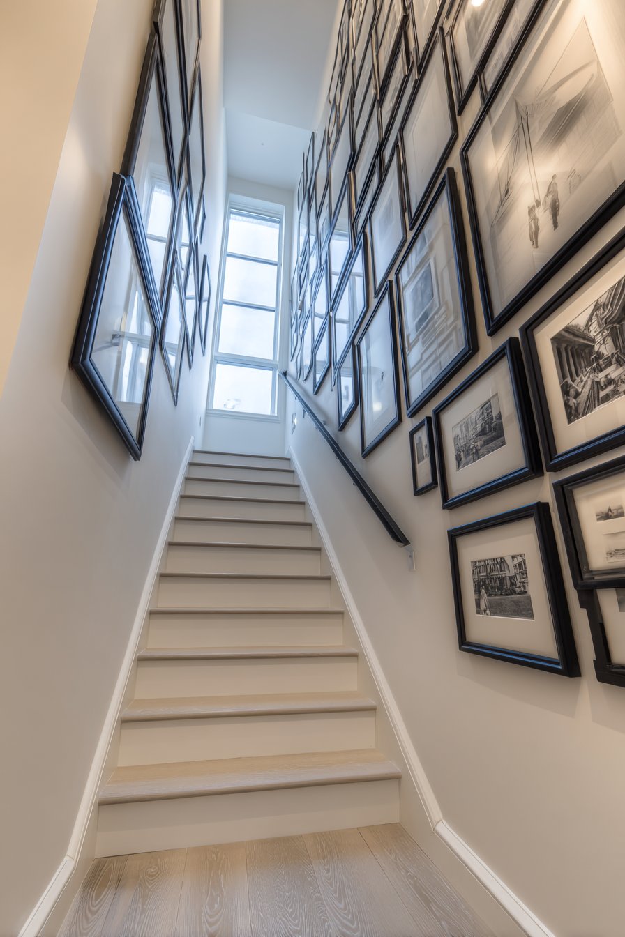
The ascending arrangement creates visual rhythm that guides the eye upward, making the climb feel less monotonous while personalizing the transitional space. Unlike traditional horizontal gallery walls, stairway installations must account for the diagonal sightline created by the stairs themselves. The matching frames and systematic spacing prevent the angled arrangement from feeling chaotic or disorganized, instead creating visual order that complements the architectural lines of the staircase.
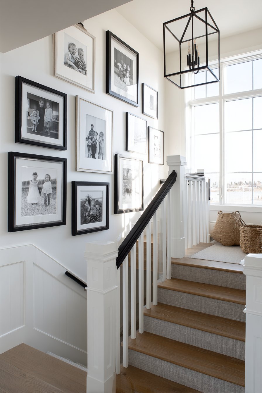
Stairway walls offer excellent opportunities for storytelling through imagery—chronological family photos showing growth over time, travel memories from various adventures, or curated collections that reflect family interests. The transitional nature of stairways means viewers encounter these images multiple times daily, making them perfect locations for meaningful personal photography that strengthens family connection and identity.
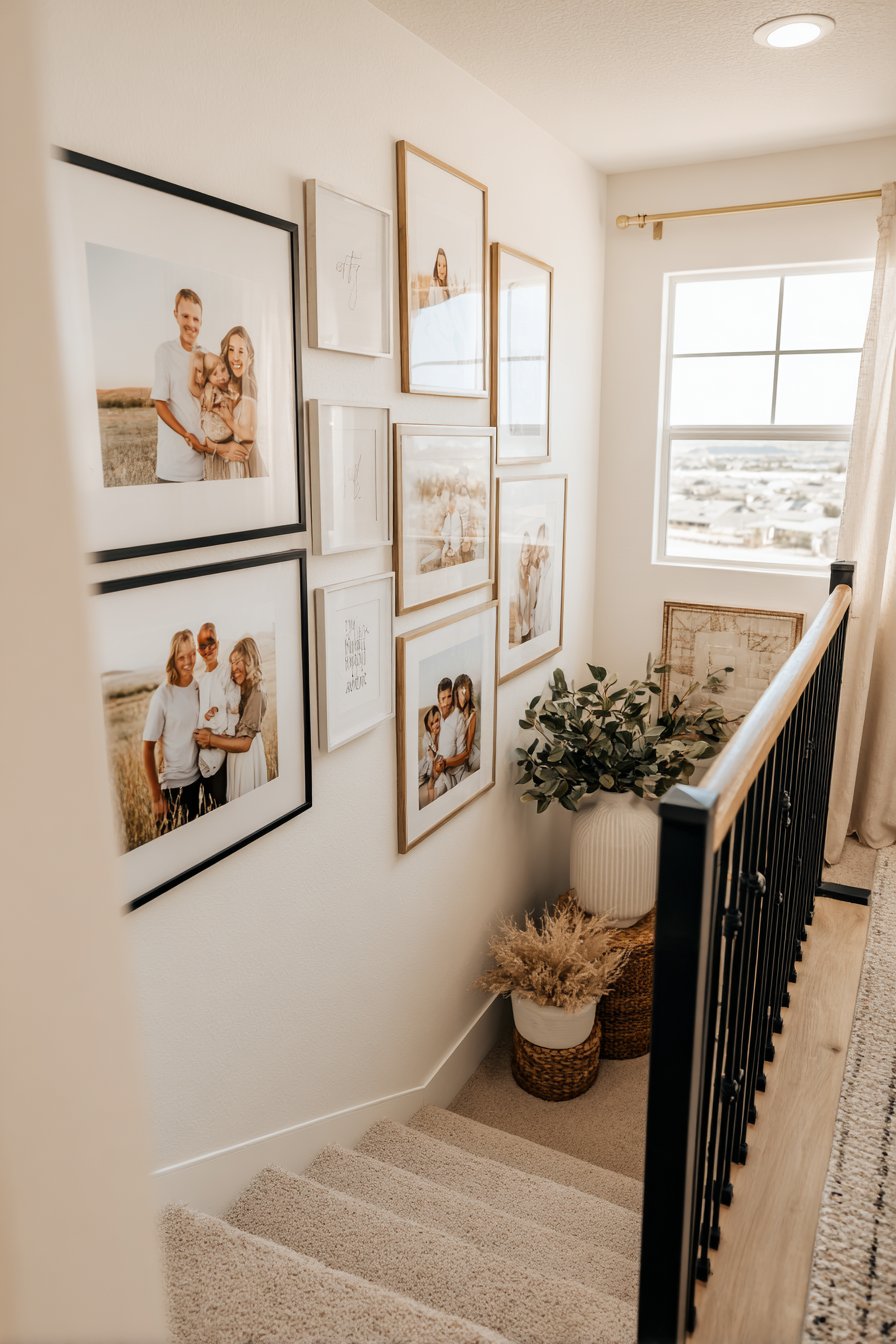
Key Design Tips: Use paper templates to plan arrangement on stairs before committing to nail holes. Follow the angle of the stair railing when positioning frames for natural, harmonious alignment. Maintain 2-3 inches consistent spacing between all frames regardless of stair angle. Hang frames so centers align along an imaginary diagonal line parallel to stairs. Use picture-hanging wire on all frames to allow for minor angle adjustments. Install proper anchors in walls as stairway wall studs may be irregularly spaced. Consider starting from bottom and working up for easier level checking. Use laser level or long straightedge to establish proper diagonal alignment line. Include landing walls in gallery arrangement for comprehensive installation. Avoid placing frames too low where they might be bumped or too high where they’re difficult to appreciate.
26. Luxurious Venetian Plaster Wall
Venetian plaster represents artisanal wall finishing technique that creates subtle luxury through layered application and careful troweling. This design features warm ivory tones applied in multiple thin coats, creating mottled finish with organic variations and soft sheen that catches light throughout the day. The subtle color shifts and dimensional quality add Old World elegance and sophistication impossible to achieve with standard paint.
The technique involves applying multiple thin layers of specialized plaster compound, burnishing between coats to create smooth, almost marble-like surface with depth and movement. The hand-applied nature means no two sections are identical, creating unique character throughout the wall. The subtle sheen comes from the burnishing process rather than surface coating, creating natural-looking luster that shifts with viewing angle and lighting conditions.
The investment in Venetian plaster—whether DIY or professionally applied—pays dividends in creating truly distinctive interiors that suggest quality and craftsmanship. The technique works particularly well in formal spaces like living rooms and dining rooms where sophisticated surfaces contribute to elevated atmosphere. The neutral ivory tones provide elegant backdrop that complements both traditional and contemporary furnishings while adding textural interest and depth.
Key Design Tips: Start with smooth, well-prepared walls as imperfections will telegraph through plaster. Apply plaster in very thin coats—multiple thin layers create better depth than few thick layers. Use flexible trowel and varying stroke directions for organic, natural-looking variation. Burnish each layer after initial set by pressing firmly with clean trowel blade. Consider tinting plaster base to achieve custom colors beyond standard offerings. Work in small sections at a time to maintain control over appearance and finish. Apply protective wax or sealer as final step for easier cleaning and enhanced sheen. Practice technique on sample boards before tackling large wall areas. Hire experienced plasterers for entire rooms unless you’re committed to significant practice and skill development. Maintain consistent room humidity during application and curing for best results.
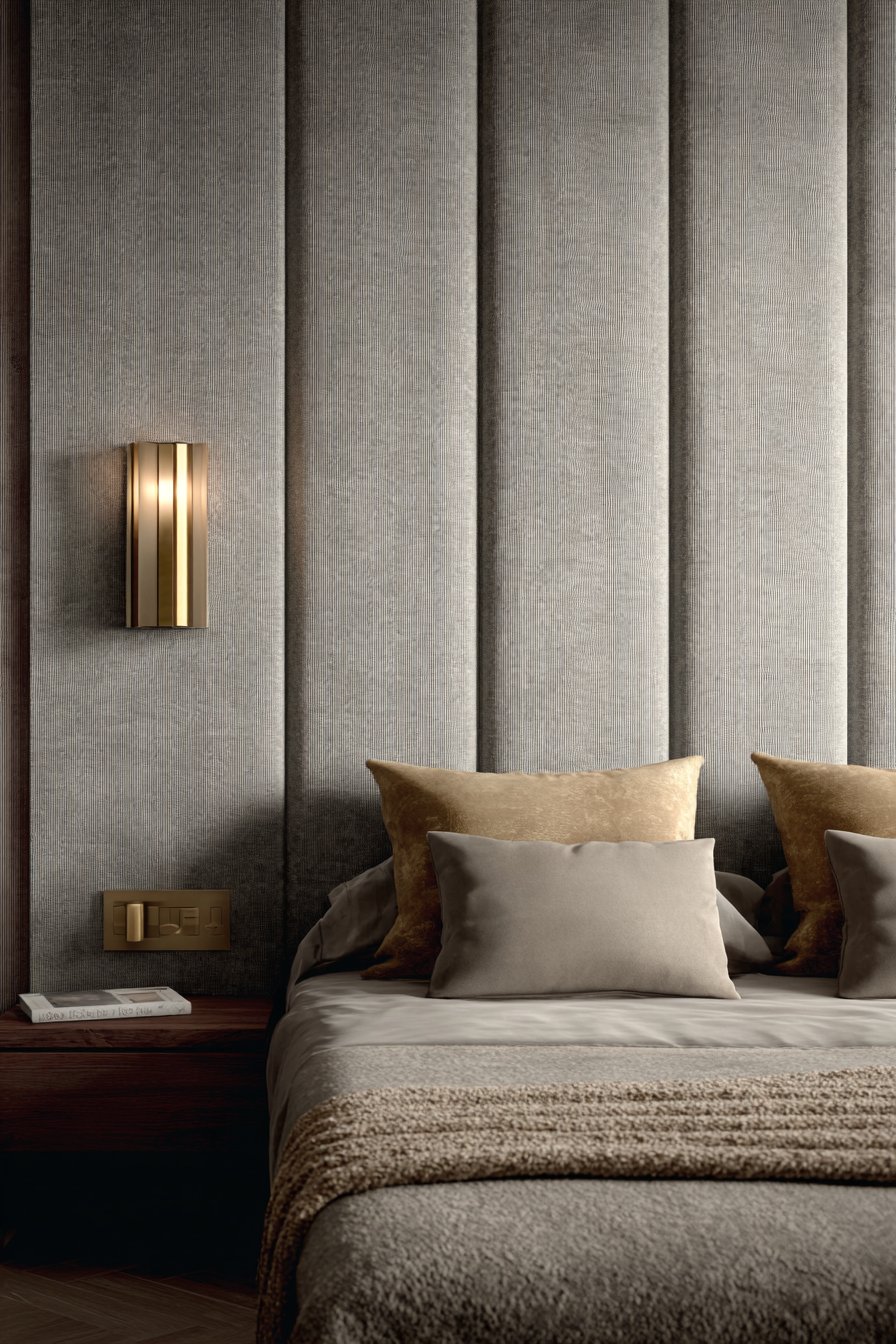
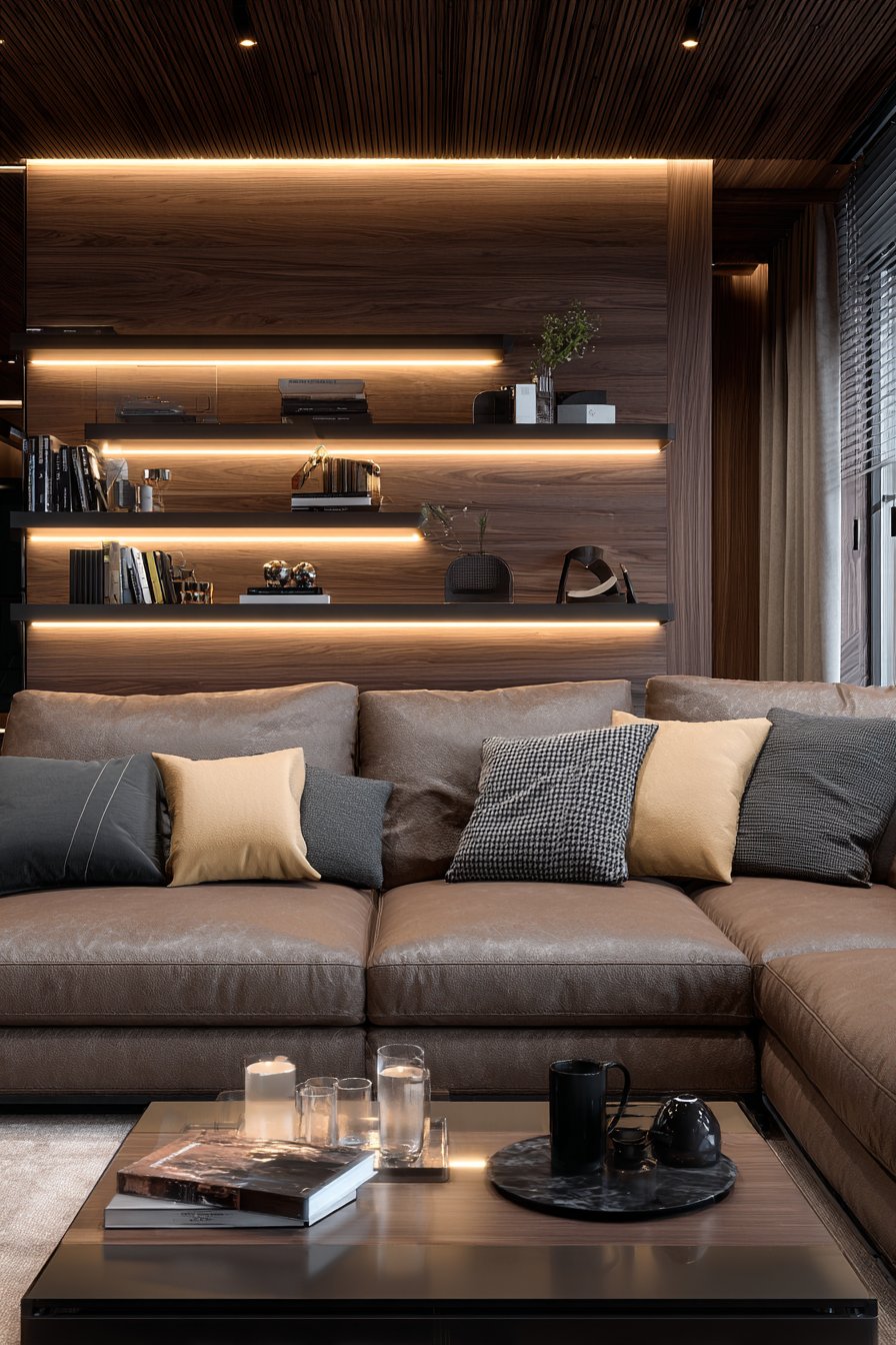
27. Functional Acoustic Fabric Panel Wall
Acoustic panels represent the convergence of form and function, solving sound quality issues while serving as intentional design elements. This design features charcoal gray wool felt panels arranged in geometric pattern on the bedroom wall behind the bed. The practical panels, mounted with minimal visible hardware, provide sound dampening that reduces echo and ambient noise while creating modern artistic installation that enhances rather than detracts from the room’s aesthetic.
The dual functionality makes acoustic panels particularly valuable in bedrooms where sound quality directly affects sleep quality. The dense felt material absorbs sound waves, reducing echo and outside noise that can disrupt rest. In homes with thin walls or noisy environments, this practical improvement in acoustics can significantly enhance quality of life. The charcoal gray color creates sophisticated, masculine aesthetic while the geometric arrangement adds visual interest and intentional design quality.
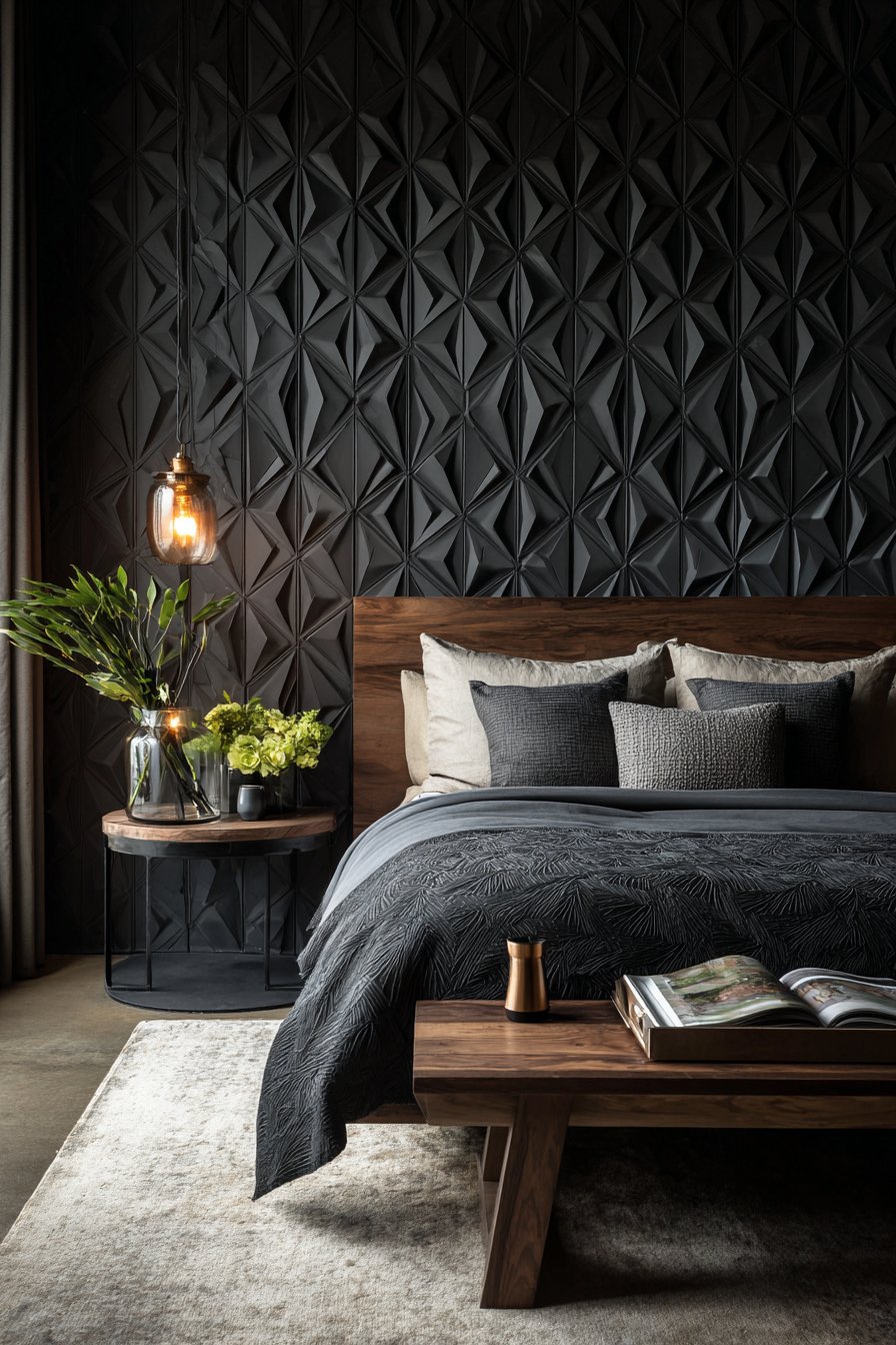
The modular nature of acoustic panels allows for creative arrangements that function as wall art while maintaining practical benefits. Unlike sound-absorbing foam that looks utilitarian and unattractive, high-quality fabric panels offer refined appearance suitable for visible bedroom installation. The geometric pattern created by the panel arrangement adds architectural interest and modern sophistication while clearly signaling design intentionality rather than afterthought problem-solving.
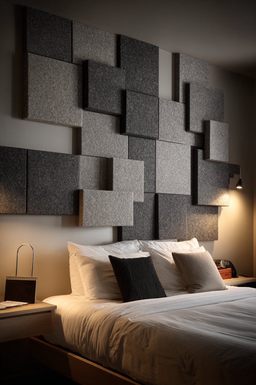
Key Design Tips: Calculate room volume and reverberation time to determine number of panels needed for effective acoustic treatment. Mount panels on wall studs or use appropriate anchors for secure installation. Leave 1-2 inches space between wall and panels for maximum sound absorption. Arrange panels in geometric patterns rather than covering entire walls for balanced acoustics and visual interest. Choose fabric colors that coordinate with room palette but provide some contrast for visibility. Consider panels in various sizes to create more interesting geometric compositions. Test acoustics before and after installation to confirm improvement. Position panels at primary reflection points—typically at ear level on walls adjacent to bed or desk. Clean panels periodically with vacuum brush attachment as fabric collects dust. Consider professional acoustic consultation for home theaters or music rooms requiring precise sound control.
Why These Wall Design Ideas Represent the Best Solutions for Modern Homes
These twenty-seven wall design ideas represent comprehensive exploration of contemporary wall treatments because they address the full spectrum of homeowner needs, design preferences, and practical considerations. From temporary solutions perfect for renters to permanent architectural installations that add lasting value, these concepts demonstrate that effective wall design requires balancing aesthetics with functionality, personal expression with broad appeal, and investment with accessibility.
The diversity of styles represented—from rustic reclaimed materials to sleek modern geometric forms, from bold color statements to subtle textural variations—ensures that homeowners with different tastes and living in different architectural contexts can find appropriate inspiration. The inclusion of both high-investment custom solutions and accessible DIY approaches acknowledges that great design exists at every budget level. Wall design ideas that feature removable elements like peel-and-stick wallpaper and decals respect the reality that many people rent their homes or prefer flexibility to experiment with evolving tastes without permanent commitment.
These wall treatments excel because they solve common design challenges while introducing aesthetic improvements. The vertical wood slat wall adds warmth and dimension to modern spaces that can feel cold. The board and batten treatment brings architectural interest to characterless walls in newer construction. The gallery wall solutions transform collections into curated displays that personalize spaces. The acoustic panels address functional sound issues while serving as modern art installations. The mirror walls expand small spaces while providing essential functionality. Each design concept offers clear value proposition beyond mere decoration.
The technical approaches represented—from traditional craftsmanship techniques like Venetian plaster and picture frame molding to contemporary innovations like 3D textured panels and LED-integrated shelving—demonstrate how wall design continues evolving. These ideas respect historical methods while embracing new materials and installation techniques that make dramatic results more accessible. The combination of timeless principles with current trends ensures these designs remain relevant rather than quickly dated.
Material diversity plays crucial role in this collection’s comprehensiveness. Natural materials like reclaimed wood, grasscloth, and authentic brick bring organic warmth and sustainability. Manufactured materials like porcelain tile, acoustic panels, and removable wallpaper offer practical benefits including durability, ease of maintenance, and flexibility. The variety of finishes—matte, glossy, textured, smooth—provides options for different lighting conditions and design requirements. The inclusion of both monochromatic approaches and bold color applications acknowledges that some homeowners prefer subtle sophistication while others embrace dramatic statements.
The functional considerations embedded in these designs demonstrate understanding of how people actually live in their homes. The kitchen open shelving combines storage with display. The home office pegboard system provides flexible organization. The gym mirrors serve essential functional purpose while expanding space perception. The bathroom tile installations create water-resistant surfaces with style. The nursery designs use removable solutions appropriate for rapidly changing needs. These practical considerations ensure the designs serve real life rather than existing purely for aesthetic impact.
The scale diversity—from comprehensive floor-to-ceiling built-ins to focused accent walls, from small-scale decorative details to room-encompassing treatments—provides options for different commitment levels and project scopes. Homeowners can choose transformative whole-room approaches or start with manageable single-wall projects. The variety of installation complexity levels means some designs suit weekend DIY projects while others require professional expertise and represent long-term investments.
Color psychology and theory underpin many of these design recommendations. The soft sage greens create calming bedroom environments. The deep navy dining room walls establish sophisticated dinner ambiance. The warm terracotta adds energy and warmth to living spaces. The neutral grays provide sophisticated monochromatic backdrops. The careful color selection in each design concept demonstrates understanding of how color affects mood, perceived space dimensions, and overall atmosphere.
Lighting consideration appears throughout these wall design concepts, recognizing that how walls interact with light determines much of their visual impact. The 3D panels create shadow play. The Venetian plaster catches light with subtle sheen. The mirrors reflect and amplify illumination. The LED-integrated shelving provides both task and ambient lighting. The white-painted surfaces maximize light reflection. This attention to lighting ensures these wall treatments function properly in real spaces with varying natural light conditions and artificial lighting installations.
The sustainability aspects embedded in several designs—reclaimed pallet wood, preserved exposed brick, long-lasting built-in solutions, removable temporary options that prevent renovation waste—reflect growing awareness of environmental considerations in design decisions. These approaches demonstrate that sustainable choices need not sacrifice aesthetics and can even enhance character through authentic aged materials and thoughtful resource use.
The personalization opportunities these designs provide allow homeowners to express individual identity rather than following prescriptive templates. The gallery walls accommodate personal photography and art collections. The open shelving displays curated objects meaningful to occupants. The pegboard systems organize according to individual work styles. The paint color blocking allows custom color combinations. The botanical wallpaper patterns reflect personal aesthetic preferences. This customization potential ensures results feel authentic rather than generic.
The design principles underlying these concepts—proportion, balance, rhythm, emphasis, unity—demonstrate sophisticated understanding of composition. The board and batten creates rhythmic vertical elements. The color blocking establishes clear emphasis. The gallery arrangements achieve balance despite asymmetry. The built-in systems create unified comprehensive solutions. The wainscoting respects classical proportions. These fundamental design principles ensure these treatments create visually successful results rather than awkward or unresolved compositions.
The accessibility of information and step-by-step guidance embedded in the design tips empowers homeowners to achieve professional-quality results through careful planning and execution. The specific recommendations—proper paint preparation, appropriate spacing measurements, material selection criteria, installation sequences—remove mystery from processes that might otherwise seem intimidating. This democratization of design knowledge helps more people create beautiful, personalized spaces.
Conclusion
Wall design represents one of the most impactful and accessible ways to transform your living spaces, offering opportunities to express personal style, solve functional challenges, and create the atmosphere you envision for your home. From dramatic focal points to subtle textural enhancements, from permanent architectural installations to flexible temporary solutions, the variety of approaches available ensures every homeowner can find strategies appropriate for their situation, skill level, and design goals.
The twenty-seven ideas explored in this comprehensive guide demonstrate the remarkable range of possibilities available in contemporary wall design. Whether you’re drawn to the organic warmth of natural materials, the sleek precision of geometric patterns, the personal narrative of gallery walls, or the bold confidence of statement colors, each approach offers unique opportunities to elevate your interiors beyond basic painted surfaces.
The key to successful wall design lies in thoughtful consideration of multiple factors—your space’s architectural characteristics, natural lighting conditions, functional requirements, personal aesthetic preferences, maintenance expectations, and budget parameters. By carefully evaluating these considerations and choosing approaches that address your specific needs, you can create wall treatments that feel both personally meaningful and professionally executed.
Don’t hesitate to experiment with these ideas, adapting them to suit your unique circumstances and combining elements from different approaches to create custom solutions. Start with manageable projects like accent walls or gallery arrangements to build confidence before tackling more ambitious comprehensive installations. Remember that even small changes—a carefully chosen wallpaper, a painted color block, or a curated display—can significantly impact how you experience your space daily.
Your walls are waiting to tell your story, reflect your personality, and create the atmosphere you’ve always envisioned. Use these ideas as inspiration and launching points for your own creative explorations, and transform those blank surfaces into compelling, beautiful, and functional elements of your home that you’ll enjoy for years to come.