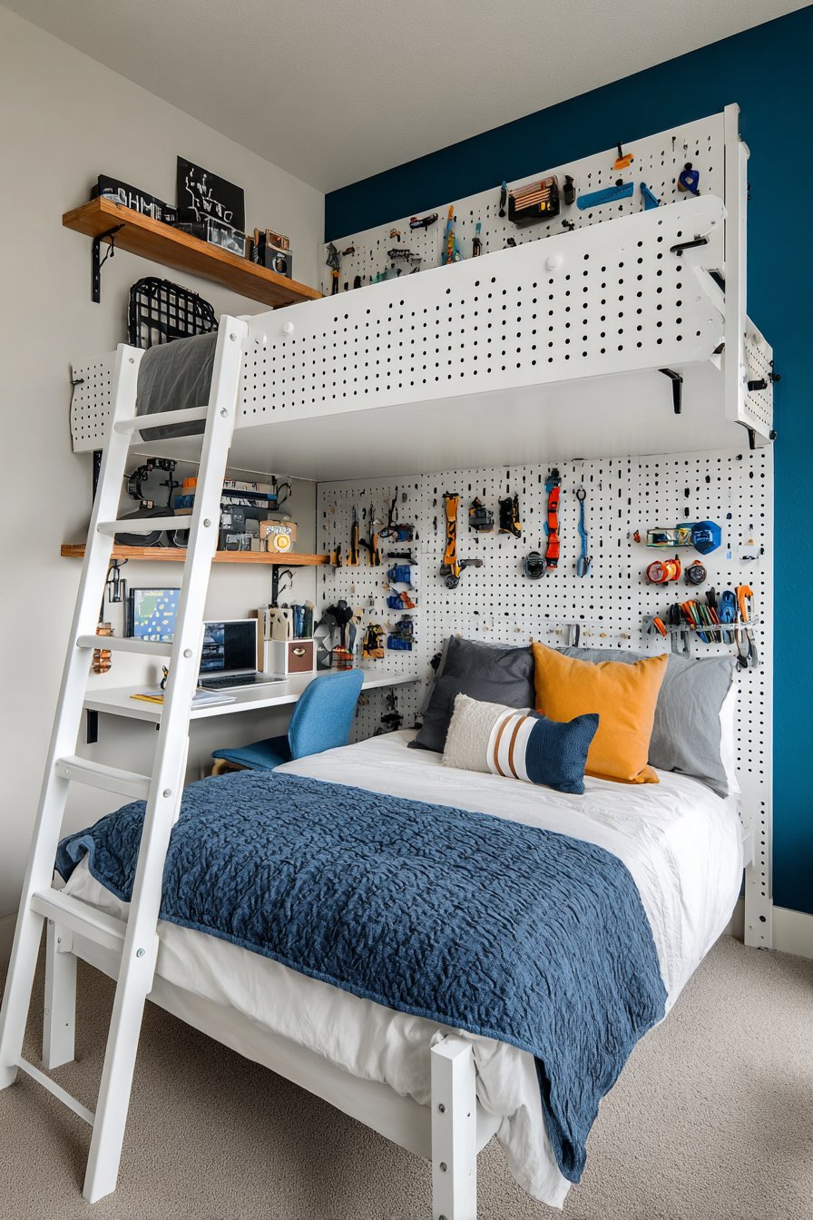
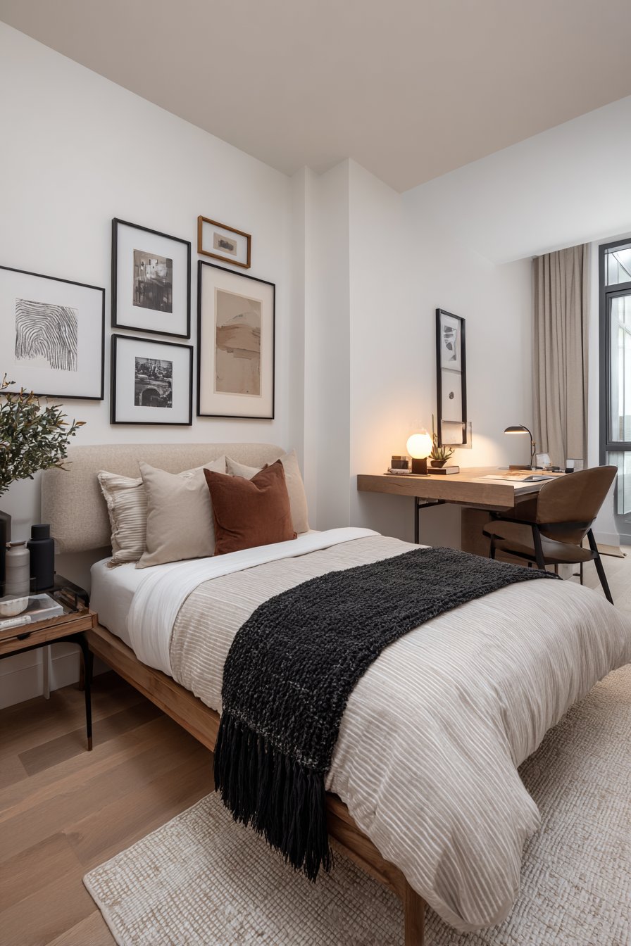
Choosing the right paint colors for a small living room can feel like navigating a minefield of design decisions. The wrong shade might make your cozy space feel cramped and claustrophobic, while the perfect hue can transform even the most modest square footage into an airy, inviting sanctuary. Paint is one of the most powerful and cost-effective tools in your interior design arsenal, capable of completely reimagining the perception of space, light, and atmosphere in your home. With countless color options available and new trends emerging every season, selecting the ideal paint scheme for your small living room requires a thoughtful blend of personal style, practical considerations, and design expertise.
The beauty of working with paint in small living rooms lies in its transformative potential and accessibility. Unlike major renovations or expensive furniture investments, paint allows you to experiment with dramatic changes while maintaining budget-friendliness and flexibility. Whether you’re drawn to serene neutrals that create a calming backdrop, bold jewel tones that make a sophisticated statement, or soft pastels that add personality without overwhelming, the right color choice can enhance natural light, create visual interest, and reflect your unique aesthetic. The key is understanding how different colors interact with your space’s specific characteristics—its natural lighting, ceiling height, architectural features, and existing furnishings.
In this comprehensive guide, we’ll explore twenty-three expertly curated paint color ideas specifically designed for small living rooms. From classic two-tone approaches and dramatic accent walls to unexpected color combinations and traditional treatments, each concept demonstrates how strategic paint selection can maximize your space’s potential. You’ll discover practical techniques for using color to create depth, height, and visual flow, along with actionable design tips that will help you confidently transform your compact living area into a beautifully balanced space that feels both spacious and personally yours.
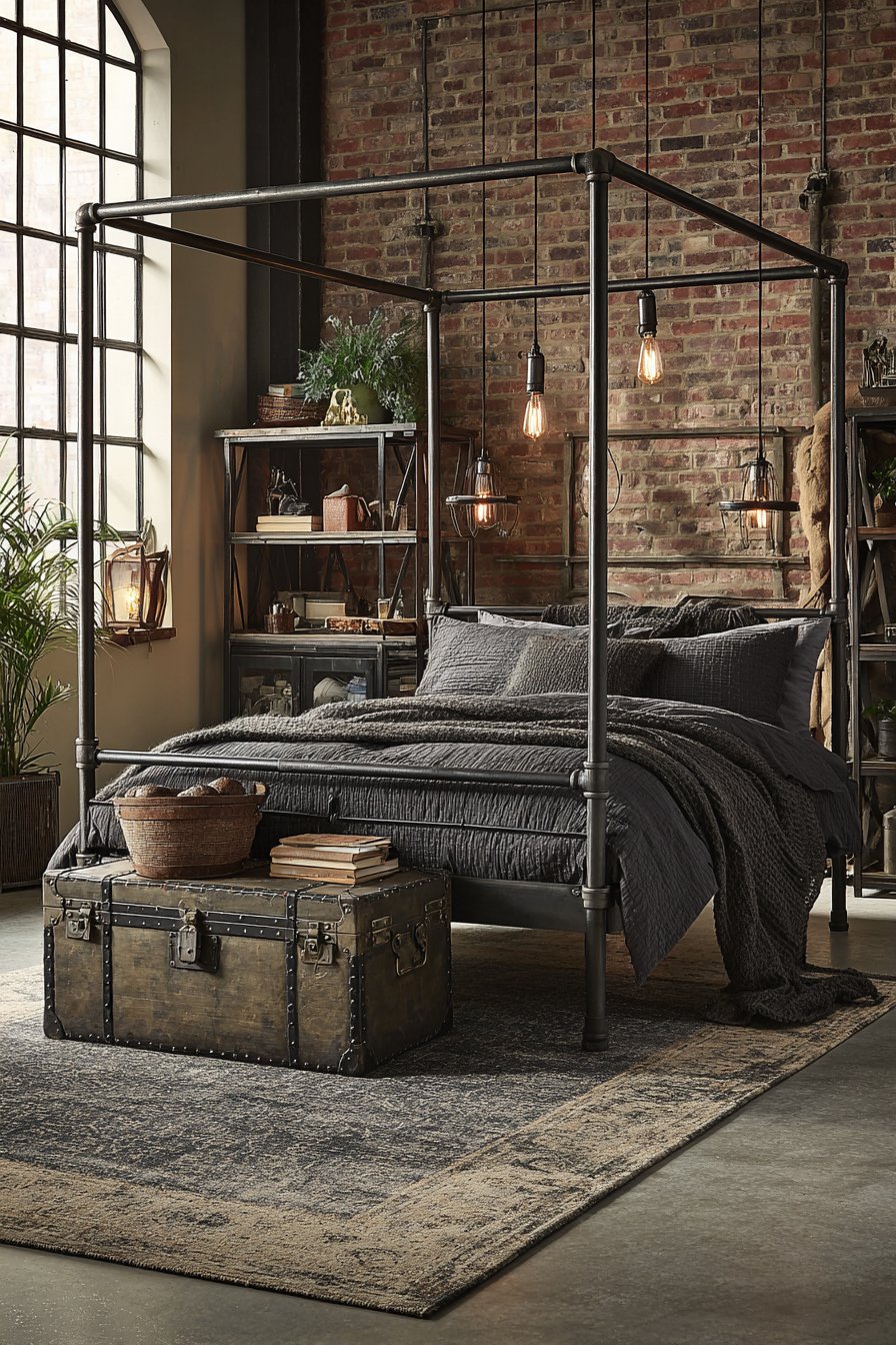
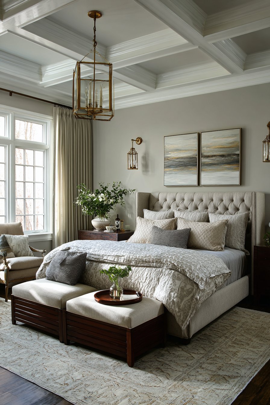
1. Sophisticated Navy and Greige Two-Tone Harmony
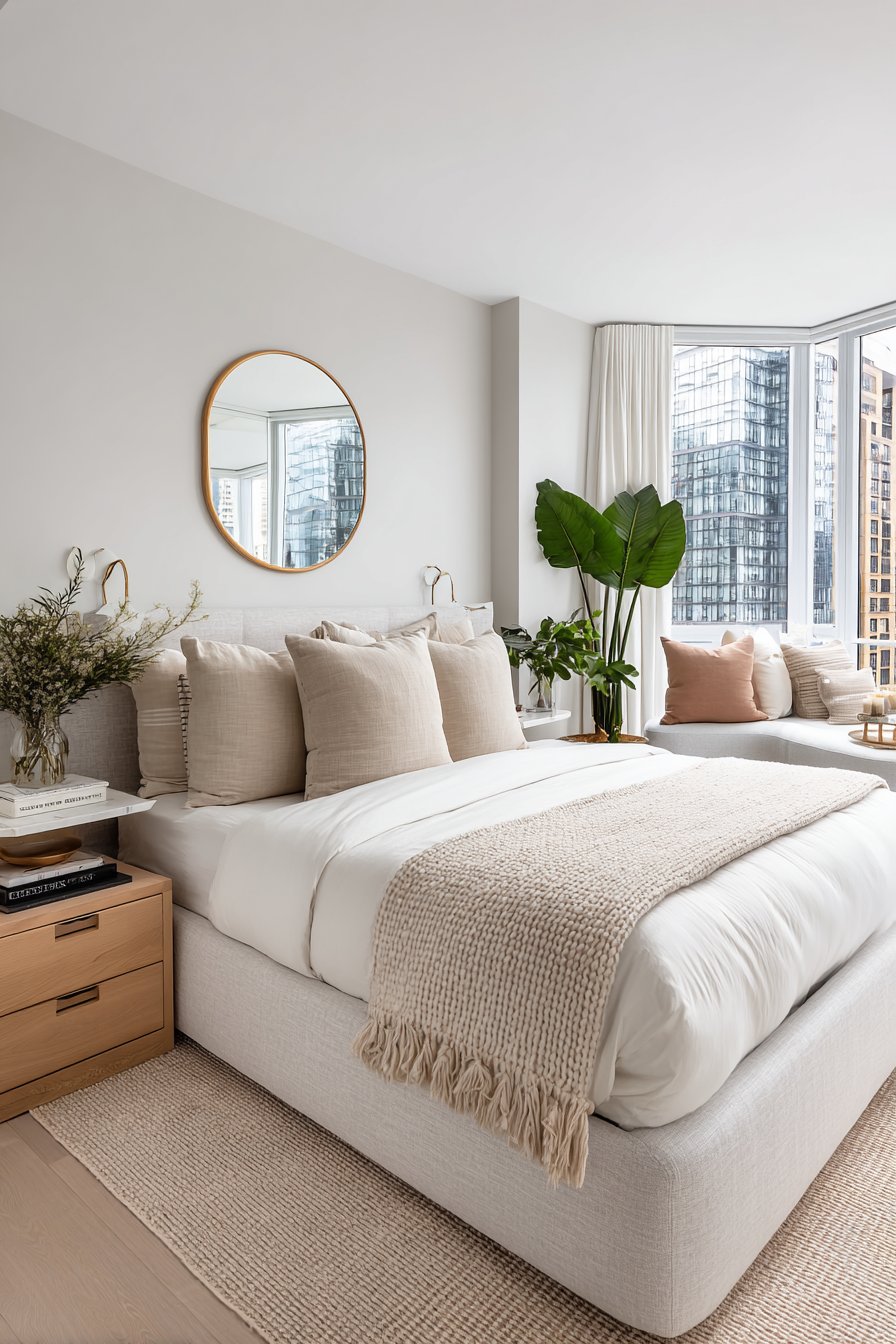
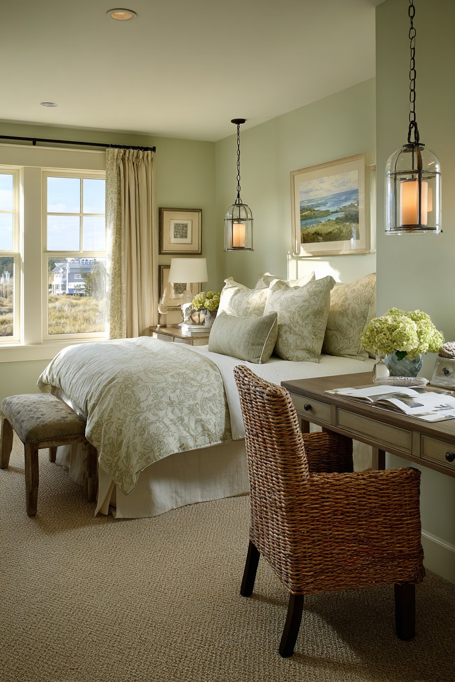
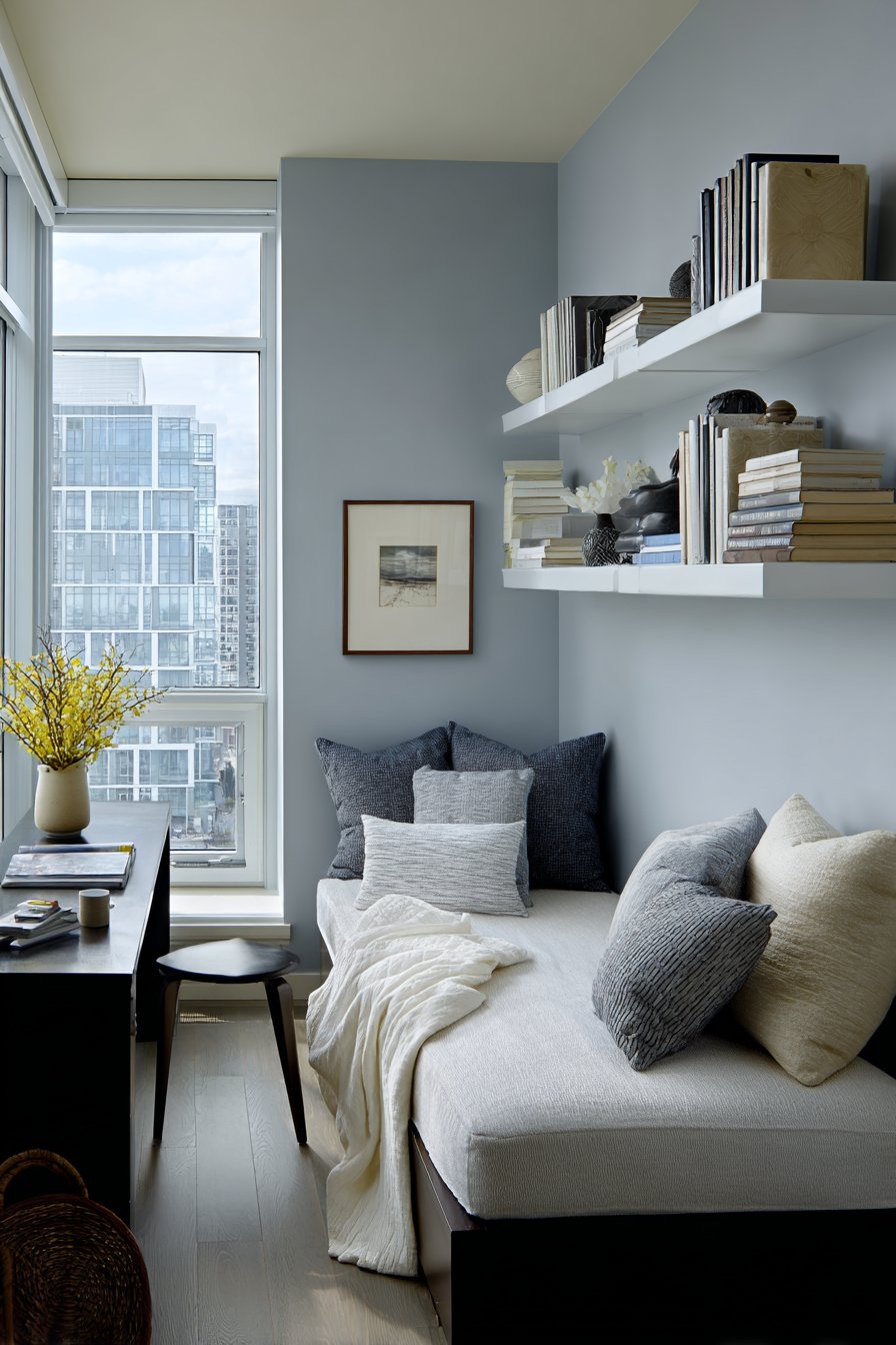
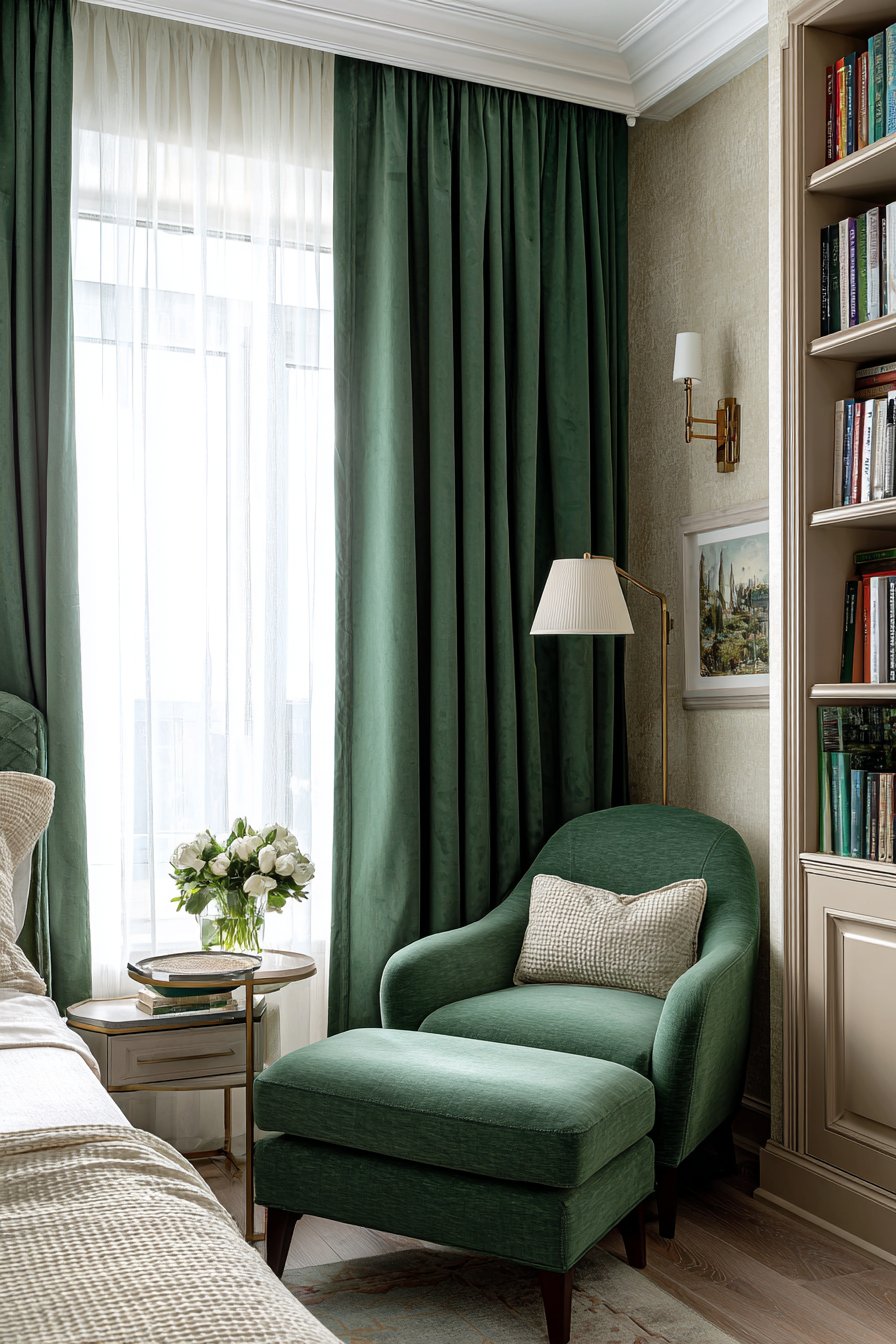
Step into a thoughtfully designed small living room where the strategic use of warm greige on three walls creates an expansive, welcoming foundation, while a deep navy blue accent wall behind the seating area adds dramatic depth and visual interest. This sophisticated two-tone approach demonstrates how contrasting values can work together to define zones within a compact space without relying on physical dividers. The warm greige—a perfect hybrid of grey and beige—reflects natural light beautifully, making the room feel larger and more open, while the navy accent wall anchors the seating arrangement and creates a cozy focal point that draws the eye and adds personality.
The compact beige linen sectional sofa fits perfectly along the navy wall, its neutral tone serving as a bridge between the two paint colors. Gold-accented side tables introduce a touch of glamour and warmth, their metallic finish catching and reflecting light throughout the space. Natural oak hardwood flooring provides a grounding element with its organic texture and warm undertones, while soft afternoon light streaming through a medium-sized window illuminates the space, revealing how the navy wall deepens in richness while the greige walls maintain their airy quality. This interplay of light and shadow throughout the day keeps the space feeling dynamic and alive.
The success of this color scheme lies in its careful balance of warm and cool tones, creating a sophisticated palette that feels both contemporary and timeless. The navy blue, while bold, doesn’t overwhelm the compact dimensions because it’s strategically limited to a single wall, allowing it to make a statement without dominating. The greige surrounding walls prevent the room from feeling too cold or too warm, achieving that perfect neutral temperature that works with various decorating styles and seasons. Professional interior photography captures how the darker accent wall actually adds perceived depth to the room, creating the illusion of a recessed alcove that makes the space feel more architecturally interesting and intentionally designed.
Key Design Tips: Select your accent wall based on the room’s focal point—typically the wall behind the sofa or entertainment center. Test paint samples in different lighting conditions throughout the day, as natural and artificial light dramatically affect how colors appear. Use the 60-30-10 rule: 60% greige (main walls), 30% navy (accent wall and textiles), and 10% gold (accessories and accents). Consider painting the ceiling in a lighter version of your main wall color to create seamless vertical flow. Choose furniture in neutral tones that complement both paint colors, allowing the walls to be the statement. Add texture through fabrics, rugs, and decorative elements to prevent the space from feeling flat.
2. Serene Powder Blue Urban Retreat
A small urban apartment living room transforms into a tranquil oasis through the application of soft powder blue walls that evoke clear skies and peaceful waters. This cool, airy hue immediately expands the perceived dimensions of the compact space, creating an atmosphere of openness and serenity that counteracts the bustling city energy outside. The powder blue acts as a neutral backdrop that’s far more interesting than standard white or beige, offering personality and mood while maintaining the light-reflective qualities essential for small spaces. White trim and ceiling enhance this airy feeling, creating crisp architectural definition that makes walls appear taller and the room more polished and intentional.
The furnishing choices complement the powder blue perfectly, with a cream-colored loveseat providing warmth and contrast against the cool wall tone. A natural jute rug introduces organic texture and earthy grounding that prevents the blue from feeling too cold or sterile. Floating white shelves display minimal decor against the blue backdrop, maintaining the clean, uncluttered aesthetic while providing functional storage that doesn’t consume valuable floor space. Large windows dressed with light-filtering shades allow natural illumination to flood the room, making the powder blue appear to shift subtly throughout the day—sometimes appearing more grey, sometimes more blue, always maintaining its calming influence.
This color choice demonstrates sophisticated understanding of how cool colors can actually make small spaces feel larger by visually receding, creating the illusion of walls that are further away than they actually are. The powder blue works particularly well in urban settings where outdoor views might be limited or unappealing, as the color brings a sense of sky and openness indoors. The monochromatic approach to the walls creates seamless visual flow without interruption, allowing the eye to travel smoothly around the perimeter and perceive the space as more expansive than its actual square footage.
Key Design Tips: Choose powder blue shades with grey undertones for sophistication and versatility, avoiding overly bright or baby blues that can feel juvenile. Paint all walls the same color to create uninterrupted flow and maximize the space-expanding effect. Balance the cool blue with warm-toned furniture and natural materials like wood, jute, and linen. Use white or cream for large furniture pieces to maintain lightness and prevent visual weight. Incorporate metallic accents in brass or gold to add warmth and prevent the space from feeling too cold. Layer different shades of blue in accessories and textiles to create depth without introducing competing colors. Keep window treatments minimal and light-colored to maximize natural light reflection.
3. Warm Terracotta and Cream Earth-Toned Sanctuary
Experience the embracing warmth of a small living room where a terracotta-painted focal wall creates an instant connection to earth and nature, paired beautifully with soft cream on the remaining surfaces. This warm, earthy palette brings the organic comfort of sun-baked clay and desert landscapes indoors, creating a cozy atmosphere that feels both grounding and energizing. The terracotta wall serves as a bold statement that adds depth and personality without the severity of darker colors, while the cream walls maintain brightness and spaciousness, preventing the warm tones from overwhelming the compact dimensions.
Compact mid-century modern furniture selections complement this earth-toned palette perfectly, with a walnut credenza providing rich wood tones that echo the warmth of the terracotta, and a cognac leather armchair introducing another layer of organic, aged beauty. The combination of these warm browns with the terracotta creates a harmonious family of related hues that feels cohesive and intentional. A woven pendant light fixture hangs overhead, its natural fiber construction adding textural interest and continuing the organic theme, while potted plants introduce fresh greenery that beautifully contrasts with and enhances the warm wall colors.
Professional interior photography captures how this strategic warm color placement creates a cozy yet spacious feel, proving that warm colors don’t necessarily make spaces feel smaller when applied thoughtfully. The terracotta wall becomes a beautiful backdrop for displaying artwork, mirrors, or floating shelves, its rich color making decorative elements pop. Natural lighting emphasizes the paint’s depth and richness, revealing subtle variations in the terracotta that give the wall dimension and character throughout different times of day.
Key Design Tips: Apply terracotta to the wall you want to highlight as the room’s focal point, typically opposite the entrance or behind key furniture. Choose cream shades with warm undertones to harmonize with the terracotta rather than creating stark contrast. Incorporate natural materials like wood, leather, and woven fibers to enhance the organic, earthy aesthetic. Add greenery through plants to create beautiful contrast against the warm wall colors. Use layered lighting including ambient, task, and accent sources to highlight the richness of the terracotta at different times. Consider the room’s natural light exposure—terracotta works beautifully in north-facing rooms that need warming up. Accessorize with ceramics, clay pots, and natural stone to reinforce the earthy theme.
4. Sophisticated Layered Grey Monochromatic Scheme
Discover the refined elegance of a small living room executed in a sophisticated monochromatic grey scheme, featuring light dove grey walls transitioning to darker charcoal on lower wall panels, creating architectural interest through color rather than expensive molding or wainscoting. This layered grey approach demonstrates how a single color family can create depth, dimension, and visual intrigue when applied with intentional variation. The light upper walls maintain ceiling height and overall brightness, while the darker lower panels add grounding weight and create horizontal emphasis that makes the room feel wider and more substantial.
A compact grey velvet sofa with brass legs centers the space on a geometric patterned rug that incorporates multiple grey tones, creating cohesive visual flow while adding pattern interest. The velvet upholstery introduces luxurious texture that catches light differently than flat wall paint, adding another dimension to the monochromatic scheme. White oak floating shelves strategically placed on the walls break up the grey expanse, providing practical storage and display space while introducing warm wood tones that prevent the grey from feeling cold or sterile. Soft diffused natural light from frosted windows highlights the subtle tonal variations between the different grey applications, revealing the sophisticated complexity of what might initially appear as a simple color scheme.
This monochromatic approach works particularly well in small living rooms because it eliminates visual fragmentation caused by multiple competing colors, instead creating a seamless, cohesive environment where the eye flows smoothly without interruption. The variation in grey tones prevents monotony while maintaining the calming, unified effect that makes spaces feel larger and more serene. The addition of brass hardware and white oak introduces just enough warmth to keep the space from feeling too cool or industrial, achieving that perfect balance between modern sophistication and livable comfort.
Key Design Tips: Use at least three different grey tones to create depth—light for upper walls, medium for accents, dark for lower panels or single accent wall. Ensure all greys have the same undertone (cool, warm, or neutral) to maintain harmony. Incorporate varied textures through fabrics, rugs, and materials to prevent a flat, one-dimensional appearance. Add metallic accents in brass, copper, or gold to introduce warmth without competing colors. Include white or cream elements to provide contrast points and prevent the space from feeling too dark. Layer lighting sources to highlight the different grey tones and create atmosphere. Consider the room’s natural light—rooms with abundant natural light can handle darker greys more successfully.
5. Classic White with Bold Emerald Green Architectural Feature
Transform a small living room into a fresh, sophisticated space where classic white walls provide a crisp, clean foundation while a bold emerald green painted built-in bookshelf alcove creates a stunning architectural focal point. This approach demonstrates how strategic color placement on specific features rather than entire walls can add dramatic impact and personality without overwhelming compact dimensions. The white walls maximize light reflection and create that essential sense of spaciousness, while the emerald green bookshelf becomes a jewel-box moment that draws the eye and adds luxurious depth.
A compact cream bouclé sofa positioned to maximize floor space offers textural richness and comfortable seating while maintaining the light, airy palette established by the white walls. The bouclé fabric’s nubby texture adds visual interest and warmth, preventing the white-dominated space from feeling too stark or clinical. A round marble coffee table introduces another layer of luxury through its veining and smooth, reflective surface, while natural wood elements and brass accents warm the crisp white backdrop, preventing any sense of coldness. The brass particularly creates beautiful contrast against both the white walls and emerald green shelving, adding warm metallic sparkle.
Golden hour sunlight streaming through sheer curtains creates soft shadows and highlights, making the emerald green appear to glow with inner richness while keeping the white walls luminous and expansive. Professional interior photography with detail focus reveals how this strategic color placement adds character and personality without compromising the room’s perceived size. The emerald green becomes a beautiful backdrop for displaying books, decorative objects, and personal collections, making the built-in feature feel intentional and curated rather than simply painted for paint’s sake.

Key Design Tips: Reserve bold colors like emerald green for architectural features, built-ins, or alcoves rather than full walls to add impact without overwhelming. Paint the interior back wall of bookshelves or alcoves for maximum dramatic effect while keeping sides white or neutral. Use high-quality paint in a satin or semi-gloss finish on featured elements to create subtle sheen that enhances richness. Keep surrounding walls white or cream to provide breathing room and contrast. Incorporate brass, gold, or copper hardware and accents that complement emerald green beautifully. Style shelves thoughtfully with objects that either coordinate with or contrast beautifully against the green. Ensure adequate lighting to showcase the featured color, including internal shelf lighting if possible.
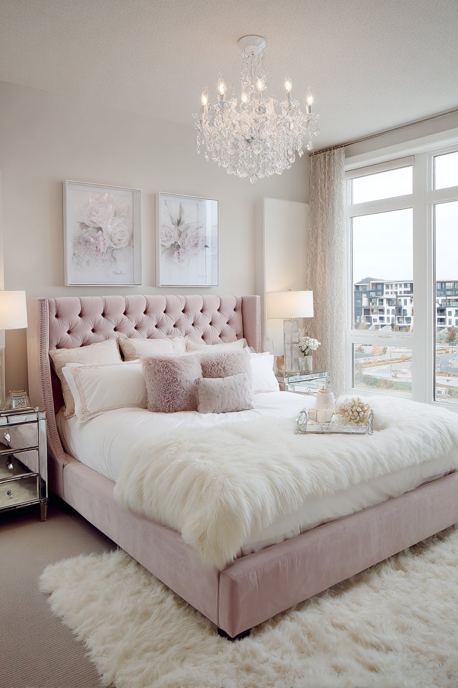
6. Contemporary Soft Blush Pink Sophisticated Warmth
Challenge conventional color wisdom with a small living room featuring soft blush pink walls that create an unexpectedly sophisticated and contemporary atmosphere. Far from feeling juvenile or overly feminine, this carefully selected blush tone—with its subtle grey undertones—achieves a mature, elegant warmth that envelops the space in gentle, flattering light. The blush walls add personality and distinct character while maintaining the light-reflective qualities essential for making small spaces feel open and airy, proving that you don’t have to default to white or beige for a neutral, versatile backdrop.
A compact grey linen sofa grounds the space with cool-toned neutrality, creating beautiful contrast against the warm blush walls while pink and cream throw pillows echo the wall color in varied tones and textures. White built-in storage maximizes vertical space and provides essential organization without visual bulk, its crisp whiteness creating architectural definition against the blush background. A light wood coffee table adds natural warmth and organic texture, its pale finish bridging between the cool grey sofa and warm pink walls. A large mirror strategically placed amplifies natural light and creates the illusion of expanded space, while its frame might incorporate both warm and cool metallic tones to tie the color scheme together.
Interior design photography with balanced exposure demonstrates how this soft pink paint adds warmth and dimension while maintaining an open, airy feeling that’s crucial in tight quarters. The blush tone has a chameleon quality, appearing slightly different throughout the day as natural light shifts—sometimes reading more pink, sometimes more beige, always maintaining its sophisticated, subtle presence. This adaptability makes it an excellent choice for spaces that serve multiple functions or need to work with changing light conditions.
Key Design Tips: Choose blush pink with grey or beige undertones for sophistication, avoiding pure pink or shades with orange undertones. Test samples extensively as pink can appear very different under natural versus artificial lighting. Balance the warmth with cool-toned furniture in greys, whites, or soft blues to prevent the space from feeling too warm or overwhelming. Incorporate white built-ins, trim, or furniture to create crisp contrast and architectural definition. Add metallic accents in rose gold, brass, or mixed metals that complement the pink beautifully. Layer different shades of pink and cream in textiles and accessories to create tonal depth. Keep the ceiling white to maintain maximum light reflection and height perception.
7. Traditional White Dove and Mushroom Beige Horizontal Division
Embrace classical interior design principles in a small living room featuring Benjamin Moore’s beloved White Dove on upper walls with darker mushroom beige on the lower third, separated by elegant picture rail molding that adds architectural character. This traditional two-tone treatment creates visual interest and sophistication while using the horizontal color division to strategically manipulate the room’s proportions. The lighter upper portion draws the eye upward and makes ceilings appear higher, while the darker lower section provides grounding and protects high-traffic areas from showing wear.
A compact caramel leather sofa introduces rich, aged warmth that complements the mushroom beige beautifully, its patina and texture adding lived-in comfort and classic appeal. A vintage Persian rug in complementary warm tones anchors the seating area, its intricate patterns and aged colors creating a foundation that ties the two-tone walls together harmoniously. A brass floor lamp provides both functional task lighting and decorative elegance, its warm metallic finish enhanced by the traditional color palette, while a wooden side table adds another natural element that bridges the wall colors through its medium-toned finish.
Natural afternoon light highlights the paint transition line created by the picture rail molding, emphasizing the architectural detail and creating subtle shadow play that adds dimension. Professional interior photography demonstrates how this horizontal color blocking technique can make low ceilings appear higher by drawing the eye upward along the lighter portion. The mushroom beige lower section, typically extending about one-third up the wall, creates a comfortable, grounded feeling while the White Dove upper walls maintain airiness and light reflection essential in compact spaces.
Key Design Tips: Position the color division at one-third wall height (typically 36-40 inches from the floor) for balanced proportions. Install picture rail, chair rail, or simple molding at the division line to create crisp architectural definition. Choose your upper color several shades lighter than the lower to create the ceiling-height illusion. Ensure both colors share undertones (both warm or both cool) for harmonious transition. Paint trim, molding, and baseboards in your lightest color for maximum contrast and definition. Incorporate furniture and accessories that bridge both wall colors to create visual flow. Use this technique particularly in rooms with lower ceilings (under 8 feet) to add perceived height.
8. Versatile Sea Salt Blue-Green Chameleon
Experience the magical color-shifting properties of Sherwin-Williams Sea Salt, a sophisticated blue-green paint that transforms throughout the day with changing natural light conditions. This versatile hue demonstrates why certain colors become designer favorites—its complex undertones allow it to read as soft blue in morning light, gentle green in afternoon sun, and silvery grey in evening hours, creating a dynamic, ever-changing backdrop that keeps the space feeling fresh and interesting. For small living rooms, this adaptability means the color works beautifully with various lighting conditions and times of day without feeling static or one-dimensional.
A compact white slipcovered sofa maximizes seating in the small footprint while maintaining the light, airy aesthetic established by the Sea Salt walls. The washable white slipcover offers practical elegance, while natural woven baskets provide attractive storage that enhances the coastal-inspired palette. Light blonde wood flooring contributes warmth and natural texture without competing with the wall color, its pale finish reflecting light and contributing to the overall brightness. A white shiplap accent wall introduces architectural texture and coastal character while providing a crisp white contrast point that makes the Sea Salt appear more saturated and intentional.
Wide-angle interior design photography captures how this versatile paint color creates depth and tranquility, its soft hue receding visually to make walls appear further away than they actually are. The subtle complexity of Sea Salt prevents it from reading as flat or boring, while its generally light value maintains the spacious, open feeling essential in compact rooms. Soft natural lighting demonstrates the paint’s chameleon quality throughout the day, showing how this single color choice provides the visual variety that might typically require multiple colors or frequent repainting.
Key Design Tips: Choose Sea Salt for rooms with good natural light where its color-shifting properties can be fully appreciated. Pair with crisp white trim, furniture, or accents to make the color appear more saturated and defined. Incorporate natural materials like wood, wicker, and linen that complement its organic, coastal qualities. Test the color in your specific room before committing, as it can read differently based on light exposure and surrounding colors. Use it throughout all walls for cohesive flow, avoiding accent walls that might interrupt its subtle beauty. Add texture through fabrics and materials to prevent the space from feeling flat. Consider continuing the color into adjacent spaces for open-concept flow.
9. Dramatic Charcoal and Greige Anchored Luxury
Make a bold statement in a small living room through the strategic use of a dramatic charcoal grey accent wall behind a compact ivory bouclé sofa, while remaining walls in soft greige maintain brightness and prevent the dark accent from overwhelming the space. This sophisticated approach demonstrates that small rooms can absolutely handle dark, dramatic colors when applied strategically and balanced with lighter surrounding tones. The charcoal wall creates instant depth and architectural interest, anchoring the seating arrangement and providing a stunning backdrop that makes the ivory sofa appear to float in luminous contrast.
Gold-framed artwork adorning the charcoal wall pops dramatically against the dark background, proving how deeper walls can actually showcase decorative elements more effectively than lighter ones. Brass table lamps introduce warm, reflective metallic elements that create points of light and visual interest, their warm glow particularly beautiful against the charcoal during evening hours. A natural oak floating media console provides essential storage and display space without consuming floor area, its warm wood tone bridging between the cool charcoal accent and warm greige surrounding walls.
Recessed lighting and strategically placed table lamps create warm ambient glow that prevents the charcoal wall from feeling cave-like or oppressive. Professional interior photography with balanced exposure reveals how the dark accent wall can anchor small spaces without shrinking them when paired with lighter surrounding colors and adequate illumination. The greige walls maintain their space-expanding properties while the charcoal adds that element of sophisticated drama and personality that prevents the room from feeling bland or safe. The key to success lies in the careful balance—approximately 70% lighter greige, 30% dramatic charcoal—that maintains overall brightness while delivering visual impact.
Key Design Tips: Limit dark accent walls to a single wall, typically the one behind the sofa or entertainment center. Ensure surrounding walls are at least 4-5 shades lighter to maintain balance and prevent the space from feeling too dark. Install multiple light sources including recessed, task, and accent lighting to properly illuminate the dark wall. Choose furniture in light or bright colors to create contrast and prevent visual merging with the dark wall. Add metallic elements in brass, gold, or copper that warm and brighten the overall palette. Keep the ceiling white or very light to maintain vertical openness. Use the dark wall as a dramatic backdrop for displaying art, mirrors, or floating shelves.
10. Fresh White with Sage Green Fireplace Feature
Breathe fresh, organic life into a small living room with crisp white walls and ceiling complemented by a sage green painted fireplace surround that becomes an instant architectural focal point. This approach demonstrates the power of painting architectural features rather than full walls, adding color interest and personality while preserving the open, airy feeling that white walls provide in small spaces. The sage green—a sophisticated grey-green that evokes nature and tranquility—creates beautiful contrast against the white backdrop while maintaining an overall light, fresh aesthetic that makes the room feel spacious and serene.
A compact linen sectional in neutral oat color provides comfortable seating positioned for optimal traffic flow, its warm neutral tone bridging between the cool white walls and organic sage green fireplace. Whitewashed oak floors contribute natural texture and gentle warmth without darkening the space, their light finish reflecting illumination and contributing to the overall brightness. A natural fiber rug defines the seating area and adds another layer of organic texture that complements the nature-inspired sage green. Large windows provide abundant natural light that makes the white walls glow and brings out the subtle complexity of the sage green, which may appear slightly different throughout the day.
Architectural photography style captures how painting specific features rather than full walls allows you to add color interest while preserving the open feel essential in small living rooms. The sage green fireplace becomes a statement piece that draws the eye and creates a defined gathering point, while the surrounding white walls provide visual breathing room and maintain spaciousness. This technique works particularly well when you want color but are hesitant to commit to painting entire walls, or when the room’s small size makes you nervous about darker or more saturated hues.
Key Design Tips: Choose architectural features with interesting detail or profile to paint in accent colors—fireplaces, built-in bookcases, window frames, or alcoves work beautifully. Use paint with slight sheen (satin or semi-gloss) on features to create subtle contrast with flat or eggshell walls. Keep surrounding walls white or very light neutral to provide maximum contrast and breathing room. Coordinate accent color with one or two accessories or textile elements to tie the look together without overwhelming. Ensure the featured element is genuinely architecturally interesting enough to warrant highlighting. Consider the feature’s location—it should be visible from the main entrance or primary seating area. Test the accent color in different lighting conditions before committing to ensure it works throughout the day.
11. Energizing Butter Yellow Contemporary Warmth
Challenge expectations with a small city apartment living room featuring warm butter yellow walls that create an energizing yet sophisticated space defying the conventional wisdom that small rooms require cool, receding colors. This cheerful, saturated warm tone demonstrates that bold color choices can feel expansive rather than confining when properly balanced and supported by sufficient natural light and thoughtful furnishing choices. The butter yellow brings instant warmth, optimism, and personality, transforming what might be a standard small apartment into a distinctive, memorable space full of sunshine and positive energy.
A compact grey velvet loveseat and coordinating chairs provide cool-toned contrast against the warm walls, their sophisticated grey creating visual relief and preventing the yellow from feeling overwhelming. The velvet upholstery introduces luxurious texture that elevates the overall design from cheerful to genuinely sophisticated. Arranged for intimate conversation on a cream wool rug that softens the floor and provides textural warmth, the seating creates a welcoming gathering spot. White built-in bookcases flank the window, maintaining visual flow and providing essential storage while their crisp whiteness creates architectural definition against the yellow walls.
Natural light flooding through large windows emphasizes the sunny wall color while preventing it from appearing too intense or artificial. Interior design photography demonstrates how saturated warm paint colors can feel expansive rather than closing in when balanced with ample white trim and abundant natural illumination. The key lies in the supporting elements—the cooling grey furniture, crisp white built-ins and trim, and generous natural light—that allow the bold yellow walls to make their statement without overwhelming the compact dimensions. The cream wool rug provides another neutral grounding element that bridges the warm walls and cool furnishings.
Key Design Tips: Choose butter yellow or warm golden yellows over bright or neon yellows for sophisticated warmth. Ensure the room receives good natural light, as yellow in dim spaces can appear dingy or sallow. Paint all trim, molding, and built-ins in crisp white to create definition and visual breathing room. Incorporate cool-toned furniture in greys, blues, or soft greens to prevent the yellow from feeling too warm or overwhelming. Use cream or beige rugs and accessories to bridge warm walls and cool furnishings. Add plants and greenery that look beautiful against yellow walls. Keep the ceiling white to maintain maximum light reflection and prevent the room from feeling too enclosed.
12. Moody Railings Blue-Black Sophisticated Drama
Embrace sophisticated drama in a small living room through Farrow & Ball’s Railings, a complex blue-black paint that adds depth and luxury on one accent wall while soft white on remaining surfaces maintains essential brightness and spaciousness. This deep, moody hue demonstrates exceptional sophistication, reading as nearly black in dim light but revealing rich blue undertones in natural illumination. The single accent wall application provides all the dramatic impact of dark paint without the risk of making the small space feel oppressive or cave-like, proving that compact rooms can absolutely handle bold, saturated colors with strategic application.
A compact tan leather sofa provides warm, organic contrast against the dramatic wall, its aged patina and natural texture creating comfortable, lived-in elegance. A round walnut coffee table introduces another warm, natural element with its rich wood grain and curved form that softens the geometric space. A curated gallery wall adorns the dark Railings accent, the mixed frame finishes—combining black, brass, and natural wood—creating visual interest while the dark background makes artwork appear to float and glow. Large windows dressed with minimal white Roman shades maximize natural light entry, essential for preventing the dark accent from dominating the space.
Professional interior photography with detail shots reveals how deep, moody paint colors add drama and sophisticated depth to small living rooms without overwhelming when properly balanced. The Railings wall becomes the undisputed focal point, creating instant architectural interest and personality, while the surrounding white walls provide visual relief and maintain overall brightness. The complex blue-black color shifts throughout the day, sometimes appearing more blue, sometimes more charcoal, always maintaining its refined, sophisticated presence. This approach works particularly well in rooms with good natural light where the color’s complexity can be appreciated.
Key Design Tips: Reserve very dark colors like Railings for a single accent wall, never more than 25-30% of wall space. Choose the wall with the best natural light or architectural interest to feature the dark color. Paint all other walls, trim, and ceiling in white or very light neutral to maximize contrast and brightness. Ensure multiple light sources including table lamps, floor lamps, and overhead lighting to properly illuminate the space. Select furniture in warm, natural materials like leather and wood to prevent the space from feeling too cold or stark. Create a gallery wall or display shelving on the dark wall to maximize its dramatic backdrop potential. Consider the room’s orientation—south-facing rooms with abundant light handle dark colors better than north-facing spaces.
13. Perfect Greige Neutral Foundation
Discover the perfect neutral foundation with Benjamin Moore’s Revere Pewter, a beloved greige that creates ideal balance between grey and beige undertones in a small living room. This versatile, complex neutral has achieved cult status among designers because it adapts beautifully to different lighting conditions while providing a warm yet sophisticated backdrop that works with virtually any decorating style. For small spaces, Revere Pewter offers the best of both worlds—the space-expanding properties of grey combined with the warmth and comfort of beige, creating a cohesive, calming environment that feels neither too cool nor too warm.
A compact cream linen sofa centers the space with textured throw pillows in complementary neutral tones, creating layers of subtle color and pattern that add interest without competing with the walls. The cream sofa maintains lightness and reflects natural light while the varied pillow textures—perhaps incorporating velvet, bouclé, and woven materials—prevent the neutral-on-neutral scheme from feeling flat. A natural jute rug grounds the seating area with organic texture and earthy warmth, its hand-woven construction adding artisanal character. A white built-in window seat with storage maximizes functionality by transforming an architectural feature into practical seating and organization, while a brass and glass coffee table maintains visual lightness through its transparent surface and warm metallic frame.
Soft diffused natural lighting through sheer curtains creates gentle illumination that showcases Revere Pewter’s adaptability, revealing how this versatile neutral shifts slightly throughout the day—appearing warmer in morning light, more grey in afternoon shadows, always maintaining its balanced, sophisticated presence. Wide-angle interior photography captures how this complex neutral creates cohesive flow and makes small living rooms feel larger through seamless wall-to-wall color continuity. The greige eliminates the harsh contrast that pure white or grey might create, instead offering a forgiving, flattering backdrop that makes furniture and decorative elements appear intentionally curated.
Key Design Tips: Choose true greige colors (balanced grey-beige hybrids) rather than greys with slight beige undertones or beiges with grey undertones for maximum versatility. Test extensively in your specific lighting conditions as greige can read differently in north-facing versus south-facing rooms. Paint all walls the same color to create seamless flow and maximize space-expanding effect. Incorporate varied textures through fabrics, rugs, and materials to prevent the neutral palette from appearing flat or boring. Add warmth through wood tones and natural materials if the greige reads too cool, or cool elements if it appears too warm. Use white trim for subtle definition or paint trim the same color for ultra-modern seamlessness. Layer different neutral tones in accessories to create sophisticated tonal depth.
14. Sophisticated Dusty Mauve Modern Elegance
Challenge color conventions with a small living room showcasing sophisticated dusty mauve walls—a subtle purple-grey that creates intimate yet spacious feeling through careful color temperature selection. This unexpected soft tone demonstrates how moving beyond traditional neutrals can add personality and distinctiveness while maintaining the versatility and livability essential for main living spaces. The dusty mauve, with its perfect balance of purple and grey undertones, reads as a refined neutral that’s far more interesting than beige or grey while remaining sophisticated enough for daily living and flexible enough to accommodate changing decor.
A compact charcoal grey sofa with sumptuous velvet texture provides rich contrast against the mauve walls, its cool grey preventing the purple tones from feeling too warm or overwhelming. Blush accent pillows pick up the pink undertones in the mauve walls, creating cohesive color flow while adding another layer of soft, approachable warmth. Light oak herringbone flooring introduces geometric pattern and natural warmth without competing with the wall color, its chevron installation creating visual interest underfoot while the light wood tone maintains overall brightness. A modern brass chandelier serves as both functional illumination and sculptural statement piece, its warm metallic finish creating beautiful contrast against both the mauve walls and grey sofa.
Professional interior photography demonstrates how unexpected soft purple-grey paint tones can create intimate yet spacious feeling in compact living rooms through careful color temperature selection and supporting elements. The dusty mauve appears soft and receding rather than bold or advancing, creating that essential sense of expanded space while adding distinctive character. Crisp white crown molding and baseboards frame the mauve walls, creating architectural definition and visual breathing room. The overall effect feels both contemporary and timeless, sophisticated yet approachable—proving that moving beyond standard neutrals can deliver exceptional results when color selection is thoughtful and execution is refined.
Key Design Tips: Choose mauve or purple-grey shades with significant grey content to maintain sophistication and versatility. Test extensively as these colors can appear very different in various lighting conditions. Balance purple undertones with cool-toned furniture in greys or soft blues to prevent the space from feeling too warm. Incorporate white trim, molding, and architectural details to create definition and breathing room. Add warm metallic accents in brass, rose gold, or copper that complement mauve beautifully. Layer varied textures to add dimension and prevent the unusual color from feeling flat. Use natural light oak or light wood flooring to maintain brightness and warmth. Consider adjacent rooms when selecting this distinctive color to ensure cohesive flow.
15. Traditional Accessible Beige Two-Tone Classic
Embrace timeless traditional design in a small living room featuring the classic two-tone treatment of Sherwin-Williams Accessible Beige on the upper wall portion with crisp white wainscoting below the chair rail. This conventional approach demonstrates enduring appeal and practical elegance, using the horizontal division to add architectural character while the warm beige provides comfort and the white wainscoting protects high-traffic areas. For small rooms with traditional styling, this treatment creates visual interest and perceived height without requiring expensive architectural modifications or millwork installation.
A compact camel-colored sofa suits the traditional aesthetic with its warm neutral tone and classic silhouette, while a vintage wood coffee table introduces aged character and natural texture. The rich wood grain and possibly slightly distressed finish add history and authenticity to the space. A Persian-style rug in complementary warm tones—perhaps incorporating rust, cream, and soft blue—grounds the seating area while adding pattern complexity and traditional elegance. Natural light flooding through double-hung windows—a classic window style that reinforces the traditional aesthetic—illuminates the space while highlighting the two-tone wall treatment.
Interior design photography shows how traditional paint treatments with horizontal division create perceived height and architectural interest in small living rooms with standard ceiling heights. The lighter Accessible Beige on the upper portion draws the eye upward, while the white wainscoting adds crisp architectural detail and practical protection. This approach works particularly well in older homes or spaces where you want to honor traditional architectural character, or in newer constructions where you want to add classic detailing through paint rather than expensive millwork. The warm beige prevents the space from feeling cold despite the white lower portion, creating inviting comfort that encourages gathering and relaxation.
Key Design Tips: Install chair rail molding 32-36 inches from the floor for proper traditional proportion. Paint wainscoting and trim in the same white for cohesive architectural detail. Choose warm beige shades with yellow or pink undertones for traditional warmth and comfort. Ensure wainscoting panels are properly constructed with top rail, bottom rail, and panel details for authentic appearance. Incorporate traditional furniture styles and Persian or Oriental rugs that suit the classic aesthetic. Add crown molding painted white to complete the traditional architectural package. Consider continuing the treatment into adjacent spaces for consistency. Use brass or oil-rubbed bronze hardware and light fixtures that complement the traditional style.
16. Jewel-Tone Hague Blue Modern Statement
Make a bold, sophisticated statement in a small living room with Farrow & Ball’s Hague Blue on the main wall behind the entertainment center, balanced by warm white on remaining walls. This rich, complex blue—reading as deep teal-blue with subtle green undertones—demonstrates how jewel tones can create luxurious sophistication in compact spaces when applied strategically. The Hague Blue wall provides dramatic depth and personality, transforming a simple entertainment wall into an architectural focal point while the warm white surrounding walls maintain brightness and prevent the dark accent from overwhelming the small dimensions.
A compact white linen sectional maximizes seating without visual bulk, its crisp white upholstery creating striking contrast against the rich blue wall while maintaining the light, airy quality essential in small spaces. Natural wood floating shelves flanking the television provide practical storage and display space while introducing warmth that prevents the blue and white scheme from feeling too cool. Indoor plants in varied sizes add organic life and fresh greenery that looks particularly stunning against the deep blue backdrop. A large window dressed with light linen curtains ensures abundant natural light that prevents the bold blue from dominating while revealing its complex, shifting character throughout the day.
Balanced interior photography captures how jewel-tone accent walls paired with white furniture and abundant natural light create sophisticated depth in small living rooms without sacrificing spaciousness. The Hague Blue appears rich and saturated in direct light, deeper and more mysterious in shadow, always maintaining its distinctive, sophisticated presence. The key to success lies in the supporting elements—crisp white sectional, white surrounding walls, natural wood warmth, and generous illumination—that allow the bold blue to make its dramatic statement while maintaining overall brightness and livability.
Key Design Tips: Reserve jewel tones like Hague Blue for walls with architectural significance—behind media centers, fireplaces, or bed headboards. Paint surrounding walls in white or very light neutral to provide maximum contrast and brightness. Choose furniture in white, cream, or very light colors to prevent visual merging with the dark wall. Ensure excellent natural light or install multiple artificial light sources to properly illuminate the space. Add natural wood elements through shelving, furniture, or flooring to warm the overall palette. Incorporate plants and organic elements that pop beautifully against rich blue backgrounds. Use the dark wall as a dramatic backdrop for displaying favorite objects or collections. Consider the room’s function—media rooms and entertainment areas particularly suit this dramatic treatment.
17. Enveloping Pale Pink Monochromatic Calm
Create a serene, enveloping sanctuary in a small living room with soft pale pink walls throughout, demonstrating how monochromatic color schemes can make compact spaces feel larger through seamless wall-to-wall color flow and minimal visual interruption. This gentle, sophisticated pink—far from juvenile or overly sweet—creates a calming atmosphere that feels both contemporary and timeless, wrapping the space in flattering, warm light. The continuous color application eliminates the visual stops that accent walls or multiple colors create, allowing the eye to travel smoothly around the perimeter and perceive the space as more expansive than its actual dimensions.
A compact grey linen loveseat provides cool-toned grounding against the warm pink walls, while a blush velvet armchair picks up and intensifies the wall color through its richer saturation and luxurious texture. This combination of grey and blush in the upholstery creates beautiful tonal variation while maintaining the overall soft, sophisticated palette. White built-in shelving maximizes vertical storage without consuming floor space, its crisp whiteness creating architectural definition and providing visual breathing room against the pink walls. Brass and marble accents throughout the space—perhaps in a coffee table, lamp bases, or decorative accessories—add touches of elegance and luxury that elevate the soft palette from sweet to sophisticated.
Natural afternoon light filtering through gauzy white curtains creates gentle, diffused illumination that makes the pink walls glow softly without appearing too intense or saturated. Professional interior photography demonstrates how monochromatic soft color schemes can make small living rooms feel larger through seamless color flow and minimal interruption. The pale pink creates an intimate, cocooning effect that feels comforting rather than confining, wrapping the space in gentle warmth. This approach works particularly well for spaces dedicated to relaxation and unwinding, where the calming color psychology of soft pink can enhance the room’s restorative function.
Key Design Tips: Choose pale pink with slight grey or beige undertones for sophistication and versatility. Paint all walls, doors, and possibly trim in the same color to maximize seamless flow. Incorporate cool-toned furniture in greys or soft blues to prevent the pink from feeling too warm or overwhelming. Add white built-ins, shelving, or large furniture pieces to create breathing room and architectural definition. Use varied textures in similar tones to create depth and prevent flatness—combine matte walls with velvet upholstery, smooth marble, and nubby textiles. Keep window treatments light and minimal to maximize natural light. Add metallic accents in brass, rose gold, or mixed metals that enhance the pink without introducing competing colors. Consider the room’s natural light exposure—pink can appear very different in north versus south-facing rooms.
18. Contemporary Ombré Grey Gradient Innovation
Push creative boundaries in a small living room with a contemporary ombré paint effect featuring light grey at the ceiling gradually deepening to medium grey at floor level. This innovative gradient technique demonstrates how artistic paint application can add visual interest and create the illusion of higher ceilings through vertical color progression that draws the eye upward. The ombré effect transforms ordinary walls into an artistic feature, creating dimension and movement that make the space feel more dynamic and architecturally interesting than solid single-color walls could achieve.
Compact modern white furniture maintains minimalist aesthetic with clean lines and simple forms, the stark white creating beautiful contrast against the varying grey tones while ensuring the space doesn’t feel too dark despite the darker lower portions. A glass coffee table provides essential function without visual weight, its transparent surface allowing light to pass through and maintaining the open, airy quality important in small spaces. Polished concrete floors introduce industrial edge while their reflective surface bounces light upward, helping illuminate the darker lower wall sections. A large window wall provides abundant natural illumination essential for showcasing the subtle gradient and preventing the darker tones from overwhelming.
Architectural digest style photography captures the gradient paint technique that creates the illusion of higher ceilings through vertical color progression. The gradual transition from light to medium grey—executed through careful blending and feathering rather than distinct color bands—creates a seamless wash of color that appears almost like a natural shadow effect. This sophisticated application requires more skill than standard painting but delivers unique results impossible to achieve with single colors or standard two-tone treatments. The contemporary aesthetic suits modern, minimalist spaces where artistic treatments can take center stage.
Key Design Tips: Hire professional painters experienced in ombré techniques for best results—this effect requires blending skill. Start with lightest color at ceiling, transitioning to darkest at floor through gradual blending in the middle third of the wall. Use colors within the same family (all greys, all blues, all greens) for cohesive gradation. Keep furniture minimal and light-colored to showcase the wall treatment without competition. Ensure excellent natural light to properly reveal the gradient effect. Paint all walls with the same gradient for consistency, or feature one wall with the effect and others in the lightest gradient color. Consider the room’s proportions—ombré works particularly well for making low ceilings appear higher through upward color progression.
19. Earthy Terracotta and Cream Southwestern Warmth
Infuse southwestern character into a small living room through a warm terracotta orange accent wall paired with soft cream on three remaining walls, creating an earthy, sun-drenched atmosphere inspired by desert landscapes. The terracotta—reminiscent of clay pottery and adobe architecture—adds bold personality and warmth without the darkness of deeper earth tones, while the cream walls provide essential brightness and prevent the warm accent from overwhelming. This color combination evokes sunset skies, ancient pottery, and natural landscapes, bringing organic beauty and distinctive regional character indoors.
A compact cognac leather sofa introduces another layer of warm, aged beauty, its rich brown tone creating harmonious connection with the terracotta while adding textural interest through natural leather grain and patina. A natural wood media console continues the warm, organic material palette, its simple lines and honest construction complementing the southwestern aesthetic. Woven wall hangings add artisanal texture and cultural authenticity, while potted cacti and succulents introduce living elements perfectly suited to the desert-inspired color scheme. A large south-facing window provides bright natural light that makes the terracotta glow with inner warmth while preventing the space from feeling too dark or enclosed.
Interior design photography shows how earthy terracotta paint adds personality and warmth to small living rooms while cream walls prevent the space from feeling cramped or overwhelmed by color. The terracotta creates an instant focal point and conversation piece, transforming an ordinary wall into a statement that reflects the homeowner’s appreciation for natural materials and southwestern aesthetics. The warm color family—terracotta, cognac, natural wood—creates cohesive flow where each element enhances the others, while the cream walls provide visual breathing room and maintain overall brightness essential in compact dimensions.
Key Design Tips: Choose terracotta shades with orange-red tones rather than pure orange for authenticity and sophistication. Limit terracotta to a single accent wall to maximize impact without overwhelming small spaces. Paint remaining walls in warm cream or soft white to provide contrast and maintain brightness. Incorporate natural materials like leather, wood, clay, and woven textiles that enhance the earthy aesthetic. Add southwestern or bohemian accessories like woven wall hangings, pottery, and desert plants. Ensure good natural light exposure to properly showcase terracotta’s warmth and prevent it from appearing flat. Use the terracotta wall as backdrop for displaying collections of pottery, baskets, or southwestern art. Consider wooden beam treatments or other architectural elements that reinforce the southwestern character.
20. Versatile Repose Gray True Neutral Foundation
Establish a perfect neutral foundation with Sherwin-Williams Repose Gray, a true grey paint that creates versatile backdrop in a compact modern apartment. This genuine grey—without significant blue, green, or beige undertones—demonstrates the power of pure neutrals to provide clean, contemporary foundation that adapts to changing decor and personal style evolution. For small living rooms, Repose Gray offers the space-expanding properties of light colors while maintaining more interest and character than white, creating a sophisticated modern aesthetic that works with virtually any accent color or design direction.
A compact sectional in oatmeal linen fits snugly in corner configuration, maximizing seating within the limited footprint while the warm neutral upholstery provides gentle contrast against the cool grey walls. White oak floating console and round coffee table introduce natural warmth through their light wood tones and organic grain patterns, preventing the grey walls from feeling too cold or institutional. Black metal accents in light fixtures, picture frames, and possibly hardware provide crisp contrast and modern edge that reinforces the contemporary aesthetic. Abundant natural light through floor-to-ceiling windows floods the space, making the grey walls appear light and bright rather than dark or dreary.
Professional interior photography demonstrates how true grey paint colors provide versatile foundation allowing small living rooms to adapt to changing decor while maintaining spacious feel. The Repose Gray serves as perfect backdrop for displaying artwork, accommodating various furniture styles, and incorporating seasonal decorative changes—making it ideal for renters or those who like to frequently refresh their spaces. The genuine grey reads consistently in various lighting conditions, maintaining its true color without shifting toward blue, green, or beige as many “greys” do. This reliability and versatility explain its enduring popularity in contemporary interiors.
Key Design Tips: Choose true greys without significant color undertones for maximum versatility and modern aesthetic. Test extensively as lighting dramatically affects how grey appears—samples that look perfect in the store can appear too dark or too blue in your space. Paint all walls the same color for seamless contemporary flow. Incorporate both warm and cool accent colors to prevent the grey from feeling too cold or one-dimensional. Add natural wood elements to introduce essential warmth and prevent institutional feeling. Use black accents sparingly for modern contrast and definition. Ensure excellent natural light or quality artificial lighting to prevent grey from appearing flat or dreary. Layer varied textures in neutral tones to create depth and interest. Consider using slightly lighter grey on the ceiling to maintain maximum brightness and height perception.
21. Coastal Navy Shiplap Feature Wall
Bring coastal character to a small living room through a classic navy blue painted shiplap accent wall that adds both color and architectural texture, paired with warm white walls throughout. This approach demonstrates how combining paint color with material texture creates more visual interest than either element alone could achieve, the horizontal shiplap lines adding dimension and movement while the navy blue provides rich color depth. The nautical-inspired color choice and shiplap application create instant coastal cottage character perfect for beach houses, lakeside retreats, or landlocked spaces seeking seaside serenity.
A compact white slipcovered sofa maintains the light, breezy coastal aesthetic with its washable, casual elegance, while striped blue and white pillows reinforce the nautical theme through classic maritime pattern. A natural jute rug grounds the seating area with organic coastal texture, its sandy tone evoking beach grasses and natural fibers. A driftwood coffee table introduces sculptural organic form and weathered texture that perfectly suits the coastal palette, its silvered finish creating beautiful contrast against both the white sofa and navy wall. A large window dressed with white plantation shutters provides light control while maintaining the crisp, coastal architectural character.
Wide-angle interior design photography captures how navy blue adds depth and anchors small living rooms while maintaining brightness through surrounding white surfaces and natural materials. The shiplap installation creates horizontal visual movement that makes the room appear wider, while the navy color creates focus and depth. The combination of navy and white—perhaps the most classic coastal color pairing—feels timeless and versatile, working with various coastal styles from Cape Cod traditional to California casual. The natural materials like jute and driftwood prevent the color scheme from feeling too stark or nautical-themed rather than genuinely coastal-inspired.
Key Design Tips: Install shiplap boards horizontally to create the illusion of wider walls. Paint shiplap in navy or other rich accent colors while keeping remaining walls white for maximum contrast. Use nickel gap (small space between boards) for authentic shiplap appearance and shadow lines. Choose white or very light furniture to maintain brightness and prevent visual weight against the dark wall. Incorporate natural materials like jute, rope, driftwood, and linen that enhance coastal aesthetic. Add nautical-inspired accents sparingly to suggest theme without becoming literal or kitschy. Ensure good natural light to prevent navy from overwhelming the space. Consider white ceiling planks or beadboard to continue the coastal architectural character. Use brass or nickel hardware and light fixtures that suit the coastal style.
22. Rich Forest Green Jewel-Box Intimacy
Embrace luxurious intimacy in a small urban apartment living room through saturated forest green walls that create a sophisticated jewel-box effect. This deep, rich green demonstrates how bold, saturated colors can make small living rooms feel cozy and luxurious rather than cramped when combined with careful lighting and metallic accent integration. The forest green evokes nature’s richest tones—deep pine forests, emerald gems, lush gardens—bringing organic sophistication and dramatic personality that transforms a standard small apartment into a distinctive, memorable space.
A compact tan velvet sofa with brass legs provides warm, luxurious contrast against the rich wall color, the velvet’s light-catching pile creating textural dimension while the tan tone prevents the space from feeling too dark. Emerald accent pillows intensify the green theme through deeper saturation while introducing another layer of velvet luxury. White built-in bookcases create essential architectural contrast and provide storage without consuming floor space, their crisp whiteness making the forest green appear more saturated and intentional. Antique brass wall sconces and coordinating table lamps create warm ambient lighting that becomes particularly magical in evening hours, their warm glow preventing the green from appearing too dark or cold.
Professional interior photography shows how saturated deep green paint can make small living rooms feel cozy and luxurious rather than small through careful lighting and metallic accent integration. The forest green creates an enveloping, intimate atmosphere perfect for reading, conversation, and relaxation—proving that not all small spaces need to feel open and airy. Sometimes creating a deliberate jewel-box effect with rich color delivers more impact and personality than attempting to make a small space appear larger. The key lies in balancing the deep green with white architectural elements, warm lighting, and reflective metallic surfaces that add light and prevent the space from feeling cave-like.
Key Design Tips: Reserve saturated deep greens for rooms with good natural light during the day and excellent artificial lighting for evenings. Paint built-ins, trim, and shelving in white to create essential contrast and breathing room. Install multiple light sources including ambient, task, and accent lighting—deep colors require more illumination than light ones. Add brass, copper, or antique gold accents that warm and complement green beautifully. Incorporate velvet, silk, or other luxurious fabrics that enhance the jewel-box aesthetic. Use mirrors strategically to reflect light and create depth. Choose warm-toned wood or light-colored flooring to prevent the space from feeling too dark overall. Consider the room’s function—intimate spaces for conversation, reading, or relaxation suit this cocooning treatment better than active family rooms.
23. Classic Honey Beige Traditional Comfort
Create timeless warmth in a small traditional living room through warm honey beige walls paired with crisp white trim, establishing a classic foundation that feels both welcoming and sophisticated. This approach demonstrates how warm neutral paint colors create inviting atmosphere while lighter furniture choices prevent the warm walls from making small spaces feel confined or heavy. The honey beige—a warm neutral with golden undertones—brings instant comfort and hospitality, creating the kind of space that welcomes guests and encourages relaxation.
A compact rolled-arm sofa upholstered in cream linen provides classic traditional form while maintaining lightness through its pale color, the rolled arms and possibly turned legs adding conventional detailing. A Persian rug in warm tones—perhaps incorporating rust, cream, navy, and soft gold—anchors the seating area while adding pattern complexity and traditional elegance that suits the honey beige walls. A dark wood coffee table introduces rich contrast and traditional substance, its deeper finish creating visual anchor without overwhelming through its compact proportions. White built-in bookcases flank a bay window, their crisp whiteness creating architectural definition against the honey beige while maximizing storage and display in an often underutilized space.
Natural light streaming through the bay window illuminates the space, revealing how warm neutral paint colors create welcoming atmosphere while light furniture maintains openness and prevents visual heaviness. Interior design photography demonstrates the enduring appeal of warm beiges paired with white trim—a combination that has remained popular for generations because it simply works. The honey beige provides enough color interest to prevent blandness while remaining neutral enough to work with various furniture styles and decorative choices. The warm undertones create inviting comfort that makes people want to settle in and stay awhile.
Key Design Tips: Choose honey beige or warm beige shades with golden or yellow undertones for maximum warmth and hospitality. Paint trim, molding, and built-ins in crisp white to create definition and architectural character. Incorporate traditional furniture styles with classic details like rolled arms, turned legs, and refined proportions. Add Persian or Oriental rugs that incorporate warm tones from the wall color. Use dark wood accents for grounding and traditional substance without overwhelming. Ensure good natural light to prevent warm beiges from appearing dingy—they need illumination to glow properly. Layer warm-toned accessories in golds, rusts, and deeper beiges to create tonal richness. Consider crown molding and other architectural details painted white to enhance the traditional character.
Why These Paint Color Ideas Work Best for Small Living Rooms
The twenty-three paint color concepts presented above represent carefully curated approaches to one of the most challenging design dilemmas—making small living rooms feel both spacious and personally expressive. Each design demonstrates specific color theory principles and practical application techniques that address the unique constraints and opportunities inherent in compact living spaces. Understanding why these particular approaches succeed can help you make confident decisions for your own small living room paint colors ideas implementation.
Light-reflective colors like powder blue, soft blush pink, and warm white work beautifully in small living rooms because they maximize natural light reflection, creating the optical illusion of expanded space. These lighter hues don’t absorb light the way darker colors do, instead bouncing illumination around the room and making walls appear to recede. When you’re working with limited square footage, this light-reflective quality becomes essential for preventing that closed-in feeling. The successful examples above demonstrate how these lighter colors can still deliver personality and character—the powder blue adds serene color interest, the blush pink provides warm sophistication, and carefully selected warm whites create inviting comfort rather than stark coldness.
Strategic accent wall applications, as seen in the navy and greige, charcoal and greige, emerald green bookshelf, and Hague blue designs, prove that small living rooms can absolutely handle bold, saturated colors when applied thoughtfully. The key lies in limiting intense colors to approximately 25-30% of wall space, allowing them to create dramatic impact and focal points without overwhelming the compact dimensions. These accent wall approaches work because they provide visual depth—the darker or more saturated wall appears to recede, creating the perception of layered space rather than a single flat plane. When balanced with lighter surrounding walls and adequate lighting, bold accent colors add sophistication and personality that elevate small living rooms beyond boring or safe design.
Warm earth tones like terracotta, honey beige, and butter yellow demonstrate how temperature-appropriate color selection can make small spaces feel cozy rather than cramped. These warm hues create enveloping, welcoming atmospheres perfect for living rooms where comfort and hospitality are priorities. The successful implementations above show how warm colors work best when balanced with sufficient natural light, white or cream trim for definition, and cooler-toned or neutral furnishings that prevent the warmth from becoming overwhelming. Understanding your room’s natural light exposure becomes crucial here—south-facing rooms with abundant sunlight can handle saturated warm colors beautifully, while north-facing spaces might need lighter, more subdued warm tones.
Monochromatic approaches, including the layered grey and enveloping pale pink designs, succeed in small living rooms by eliminating visual fragmentation and creating seamless flow. When all walls share the same color family, the eye travels smoothly around the space without interruption, perceiving it as more cohesive and potentially larger than reality. The key to preventing monotony in monochromatic schemes lies in introducing significant textural variety through fabrics, materials, and finishes—the layered grey example incorporates velvet, oak, and brass to create interest, while the pale pink uses varied textiles and marble to achieve dimension. These approaches work particularly well for renters or those who prefer subtle sophistication over bold statements.
Two-tone treatments, as demonstrated in the White Dove and mushroom beige, Accessible Beige and white wainscoting, and contemporary ombré designs, use horizontal color division to manipulate perceived proportions. The lighter upper portions draw the eye upward, creating the illusion of higher ceilings, while darker lower sections provide grounding and practical wear-resistance. Traditional two-tone applications with chair rails or picture rails add architectural character that makes small rooms feel more finished and intentionally designed. The contemporary ombré approach takes this concept further, using gradual color progression to create artistic interest and vertical visual movement.
Complex neutrals like Revere Pewter greige, Repose Gray, and Sea Salt demonstrate the value of selecting neutral foundations with enough character to remain interesting over time. These sophisticated neutrals provide the versatility to accommodate changing decor preferences while offering more personality than basic white or builder beige. Their success in small living rooms stems from their adaptability—they work with multiple furniture styles, accent colors, and decorative approaches while maintaining the space-expanding properties essential for compact dimensions. The Sea Salt example particularly demonstrates how a single complex color can provide the visual variety typically requiring multiple hues through its chameleon qualities.
The inclusion of architectural feature painting, seen in the sage green fireplace and emerald green bookshelf designs, offers an innovative middle path between full wall color and all-white spaces. This approach allows homeowners to introduce color personality without committing to painting entire walls—ideal for those uncertain about bold color or working in rental spaces. By focusing color on specific architectural elements, you create instant focal points and visual interest while preserving the overall light, open feeling that white or cream walls provide. This technique works particularly well when highlighting genuinely interesting architectural features worth emphasizing.
Bold jewel tones including forest green, Hague blue, and Railings blue-black prove that luxury and drama aren’t reserved for large spaces. When properly supported with excellent lighting, light-colored furnishings, and strategic application, these rich saturated colors can make small living rooms feel like sophisticated jewel boxes rather than cramped quarters. The success of these approaches depends heavily on embracing rather than fighting the room’s compact nature—creating intentional intimacy and cozy luxury instead of attempting to make the space appear larger. This psychological shift in approach can be liberating for small-space dwellers tired of always trying to visually expand their rooms.
Coastal and regional color schemes, including the navy shiplap and terracotta southwestern designs, demonstrate how location-inspired palettes can add character and personality while maintaining practical livability. These approaches succeed because they draw from established design traditions with proven color combinations and material palettes. The coastal navy and white combination has worked for generations because it balances bold color with crisp freshness, while southwestern terracotta brings warmth without darkness. Regional or style-based color schemes provide helpful frameworks for decision-making when the endless paint options feel overwhelming.
Traditional warm neutrals like honey beige and Accessible Beige demonstrate enduring appeal and universal livability. These colors work across generations and design preferences because they provide gentle warmth and welcoming comfort without demanding attention or making bold statements. For small living rooms in traditional homes or for homeowners preferring classic rather than trendy aesthetics, these warm neutrals create timeless foundations that age gracefully and accommodate life changes. Their success lies in their flexibility and proven track record—these are the colors that consistently make spaces feel like home.
Conclusion
Selecting paint colors for small living rooms requires balancing multiple considerations—maximizing perceived space, reflecting personal style, enhancing natural light, and creating desired atmosphere. The twenty-three design concepts explored above demonstrate that compact dimensions shouldn’t limit your color ambitions or force you into safe, boring choices. Whether you’re drawn to serene light blues, dramatic dark accent walls, warm earth tones, sophisticated neutrals, or bold jewel tones, successful small living room paint colors ideas exist across the entire color spectrum.
The key to success lies in understanding fundamental principles rather than following rigid rules. Light colors generally expand space by reflecting illumination, but strategic dark accents can add luxurious depth. Warm colors create cozy comfort, but they need balancing with sufficient light and cooler elements. Monochromatic schemes create seamless flow, but they require textural variety to avoid flatness. Bold colors add personality, but they work best when limited to focal walls or architectural features. Armed with these principles and inspired by the detailed examples above, you can confidently select paint colors that transform your small living room into a beautiful, functional space that truly feels like home.
Remember that paint remains one of the most affordable and changeable design elements—if your first choice doesn’t work as expected, you can always repaint. Don’t let fear of making mistakes prevent you from experimenting with color in your small living room. Test samples extensively, observe them in different lighting conditions throughout the day, trust your instincts, and embrace the transformative power of paint to reimagine your compact space. Your perfect small living room paint colors ideas await discovery, ready to turn your modest square footage into a beautifully designed sanctuary that reflects your personal style and enhances your daily life.