In the world of interior design, it’s often the smallest details that make the biggest impact. Small wall paintings have emerged as one of the most versatile and accessible ways to infuse personality, color, and sophistication into any room. Unlike large-scale art installations that require significant wall space and budget, small paintings offer flexibility, affordability, and the freedom to experiment with different styles, arrangements, and themes. Whether you’re working with a compact apartment, looking to refresh a specific corner, or simply want to add visual interest without overwhelming your space, small wall painting ideas provide endless possibilities for creative expression.
The beauty of incorporating small paintings into your home décor lies in their adaptability. A collection of miniature artworks can be arranged and rearranged to suit changing tastes, seasons, or moods. They work equally well in traditional salon-style gallery walls, minimalist single-piece displays, or eclectic clustered arrangements. From abstract compositions that add modern flair to botanical watercolors that bring nature indoors, small paintings allow you to curate a personalized art collection that reflects your unique aesthetic sensibilities while remaining budget-friendly and manageable.
This comprehensive guide explores 23 inspiring small wall painting ideas that demonstrate how thoughtfully selected and arranged miniature artworks can transform every room in your home. From cozy reading nooks to sophisticated dining areas, contemporary offices to playful children’s rooms, you’ll discover practical approaches to displaying small paintings that maximize visual impact while maintaining the character and functionality of each space. Let’s explore how these compact canvases can create major transformations in your living environment.
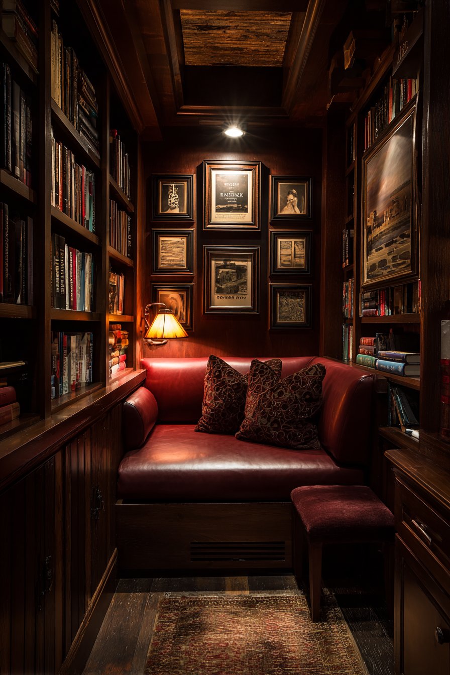
1. Cozy Reading Corner Sanctuary
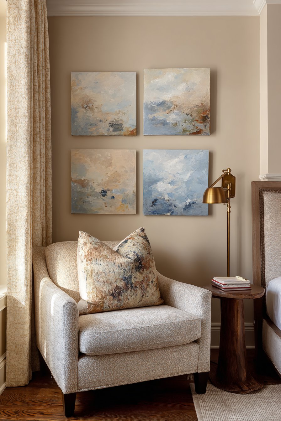
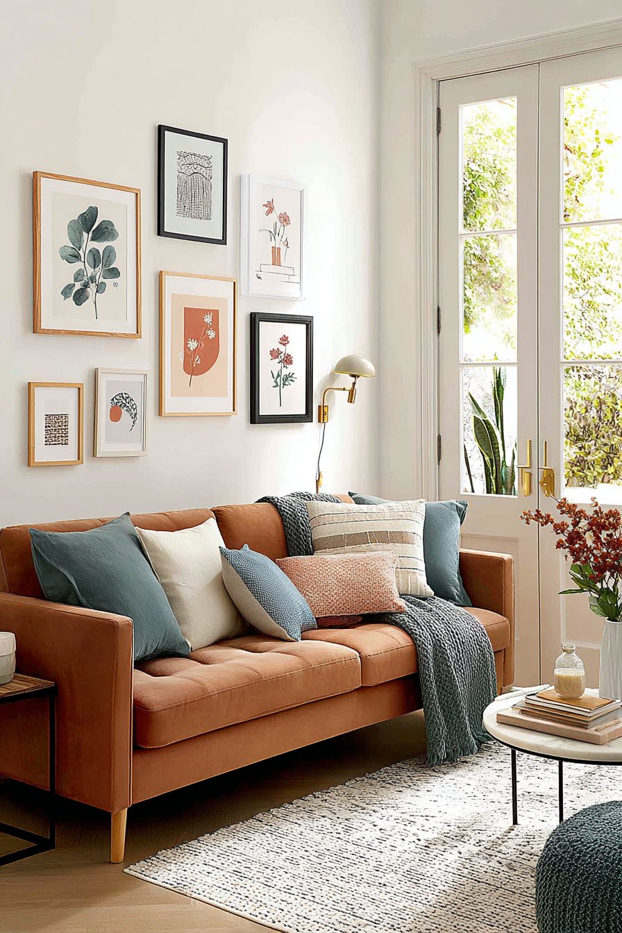
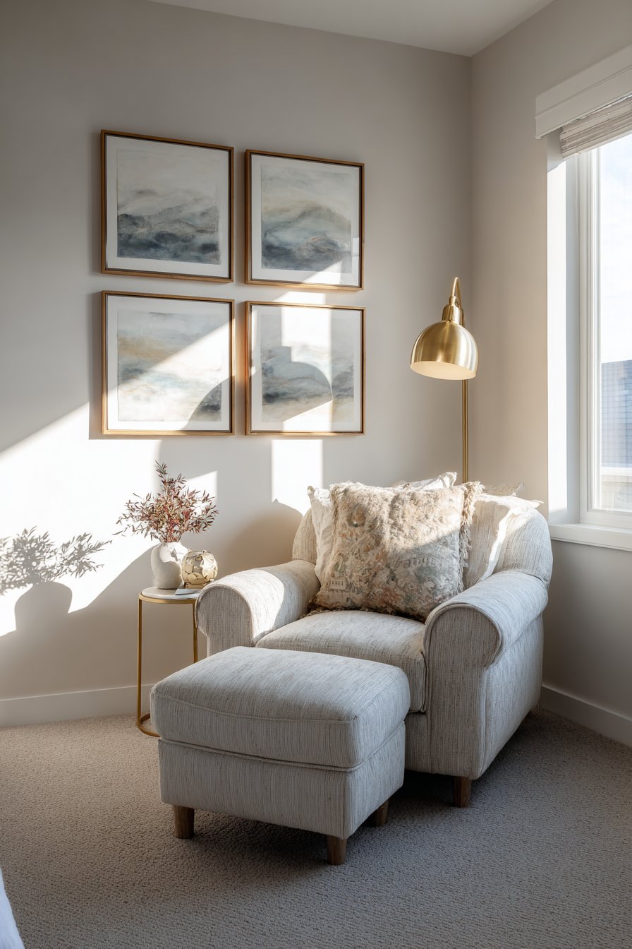
A thoughtfully designed reading nook becomes infinitely more inviting when adorned with small wall paintings that create a personal gallery above your favorite armchair. The arrangement of three 12×12 inch abstract paintings in soft blues and grays, positioned horizontally at eye level, establishes a calming focal point that enhances the contemplative nature of the space. The subtle texture and visible brushwork in each piece adds depth and interest, rewarding closer inspection during quiet reading moments. Natural lighting streaming through nearby windows highlights the nuanced color variations within each painting, creating an ever-changing display as daylight shifts throughout the day.
The intimate scale of this arrangement perfectly complements the cozy proportions of a reading nook, avoiding the overwhelming effect that larger artworks might create in a small, dedicated space. The cool color palette of blues and grays promotes relaxation and focus, making it easier to settle into a good book for extended periods. The horizontal line created by the trio of paintings guides the eye across the wall, creating visual movement that feels dynamic yet peaceful.
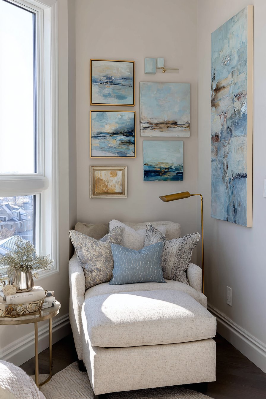
What makes this approach particularly effective is how the paintings dialogue with the other elements in the space. A comfortable armchair positioned directly below provides the perfect vantage point for appreciating the artwork, while a brass floor lamp nearby ensures adequate reading light that also illuminates the paintings during evening hours. The cohesive color story between the paintings and surrounding textiles creates a harmonious environment that feels intentionally designed rather than accidentally assembled.
Key Design Tips:
- Position paintings at seated eye level for optimal viewing from your reading chair
- Select artwork with calming colors that promote concentration and relaxation
- Use consistent frame styles to create visual unity across multiple small pieces
- Ensure adequate lighting that serves both reading and art appreciation purposes
- Leave appropriate spacing between paintings—typically 2-3 inches for a cohesive grouping
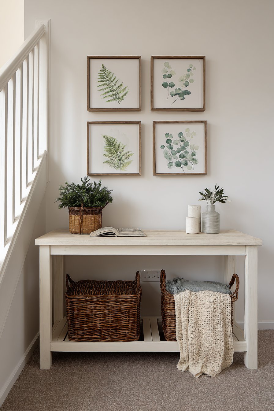
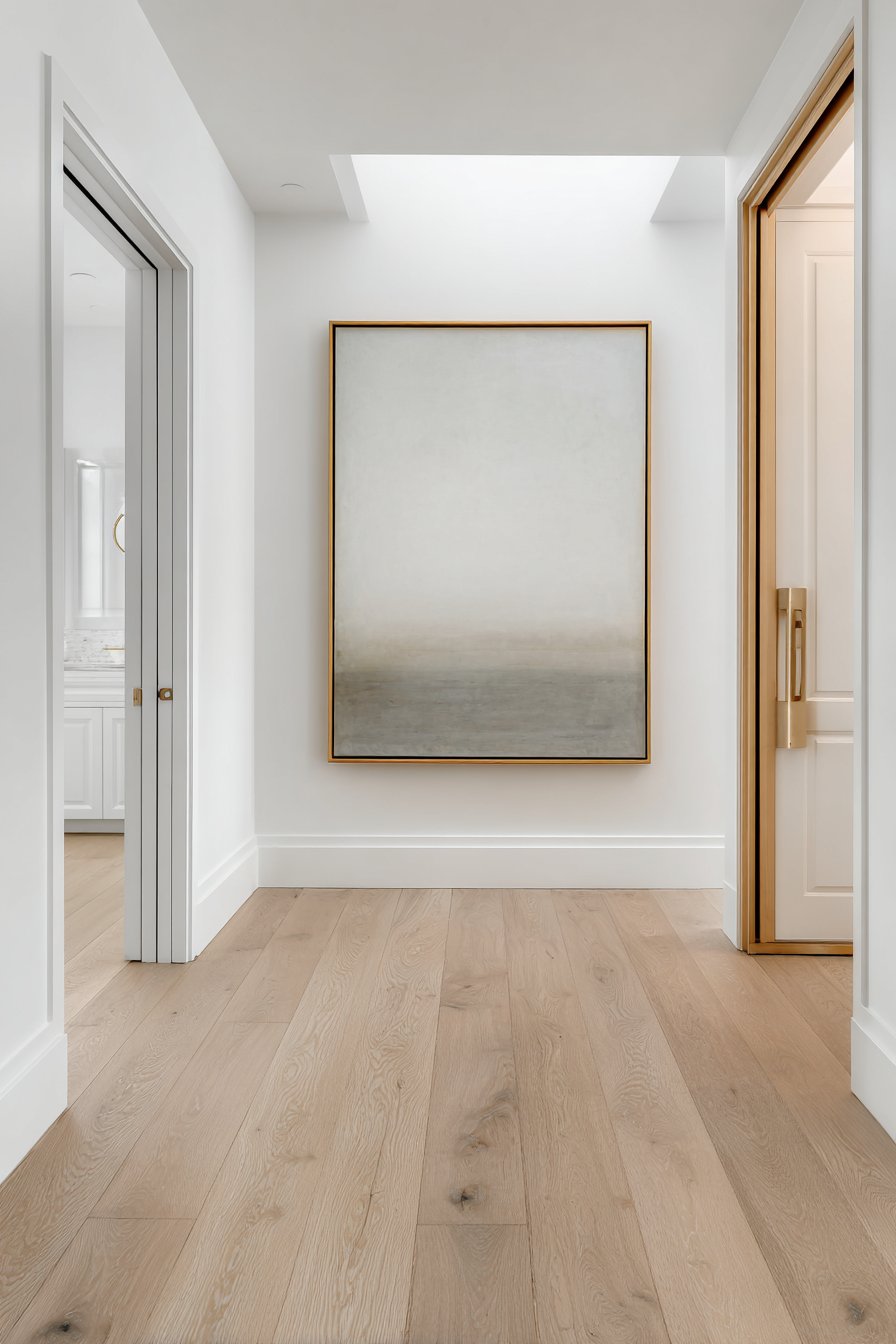
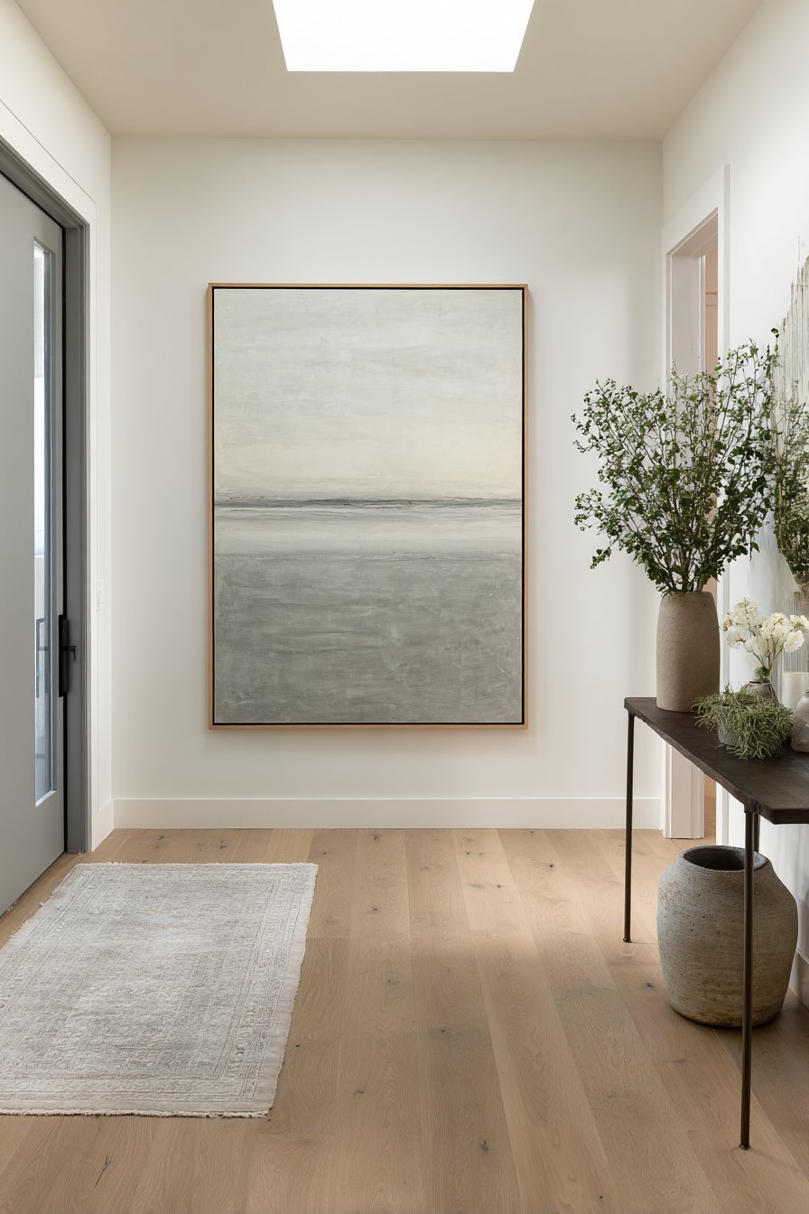
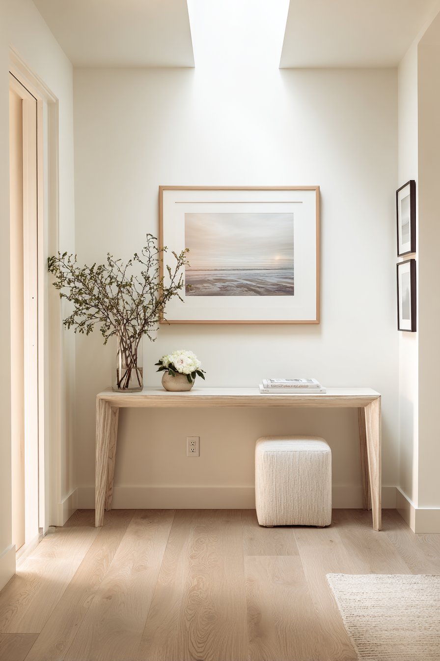
2. Welcoming Entryway Vertical Display
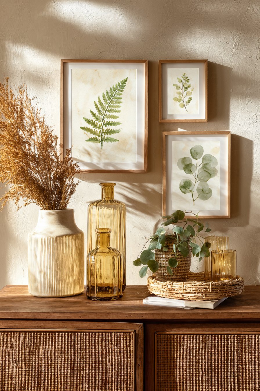
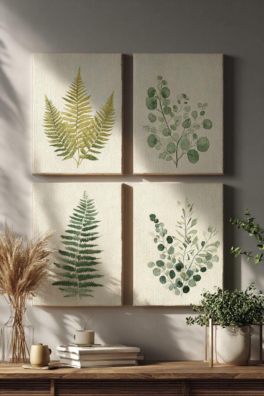
The entryway sets the tone for your entire home, and a vertical arrangement of small botanical watercolor paintings creates an immediate sense of natural elegance. Three 10×10 inch paintings featuring delicate fern and eucalyptus leaves in muted green tones establish a refreshing, organic welcome that transitions visitors from the outside world into your carefully curated interior space. The simple white frames provide clean visual boundaries that allow the subtle watercolor work to shine without distraction, while their uniform size and vertical stacking creates a sense of upward movement that draws the eye and makes ceiling heights feel more pronounced.
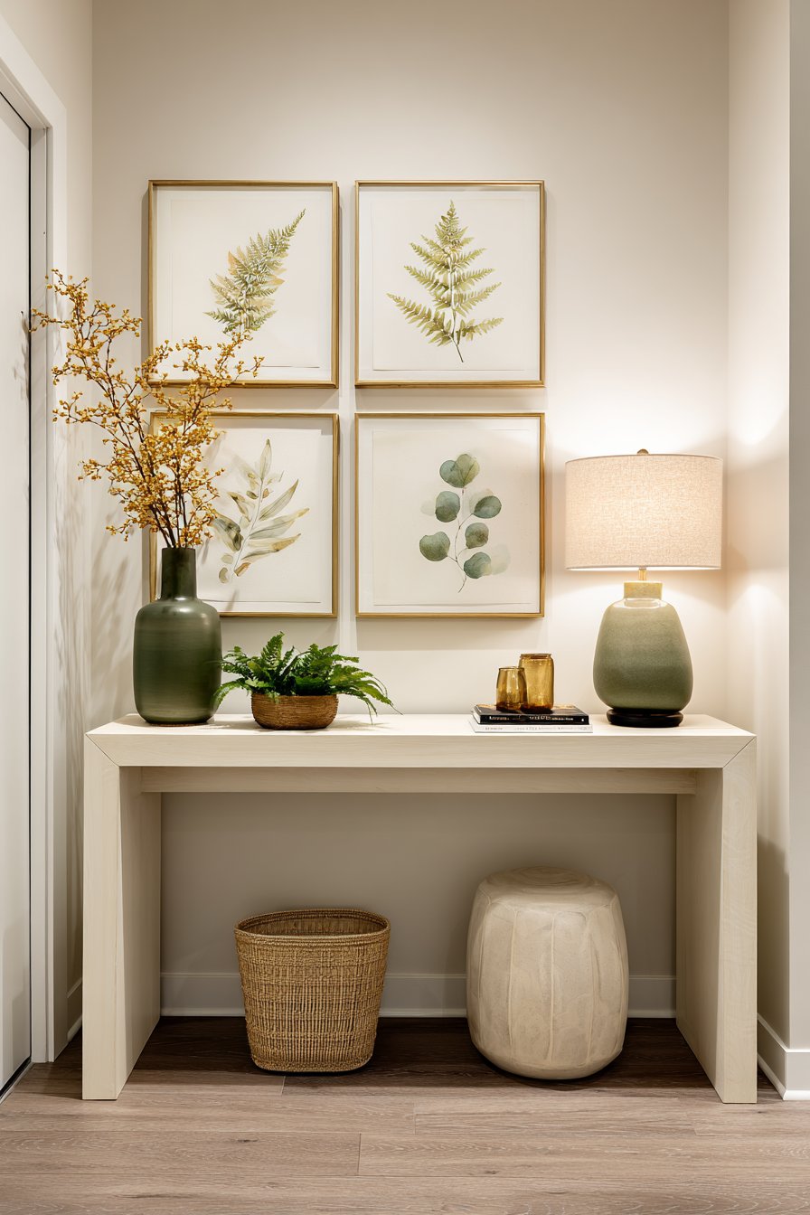
Watercolor paintings are particularly well-suited for entryway displays because their translucent, airy quality doesn’t overwhelm narrow or transitional spaces. The soft diffused daylight that often characterizes entry areas enhances the delicate nature of watercolor pigments, revealing the subtle gradations and water blooms that give each piece its distinctive character. The botanical subject matter connects interior spaces with the natural world beyond your doorway, creating a symbolic threshold that feels both welcoming and intentional.
Below the paintings, a narrow console table maintains the vertical emphasis without crowding the space. Minimal styling—perhaps a simple catchall dish and a single small plant—ensures the wall art remains the focal point while providing functional surface area for keys and mail. This restraint in styling demonstrates an important principle of small painting displays: sometimes less is more, and allowing breathing room around your artwork increases its visual impact.
Key Design Tips:
- Vertical arrangements work especially well in narrow spaces like entryways and hallways
- Botanical subjects create universal appeal and connect interiors with nature
- White frames offer versatility and keep focus on the artwork rather than the framing
- Maintain proportion—wall art should not exceed two-thirds the width of furniture below
- Consider sight lines from the doorway to ensure paintings are immediately visible upon entry
3. Scandinavian Dining Room Asymmetry
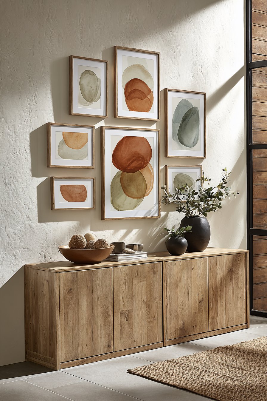
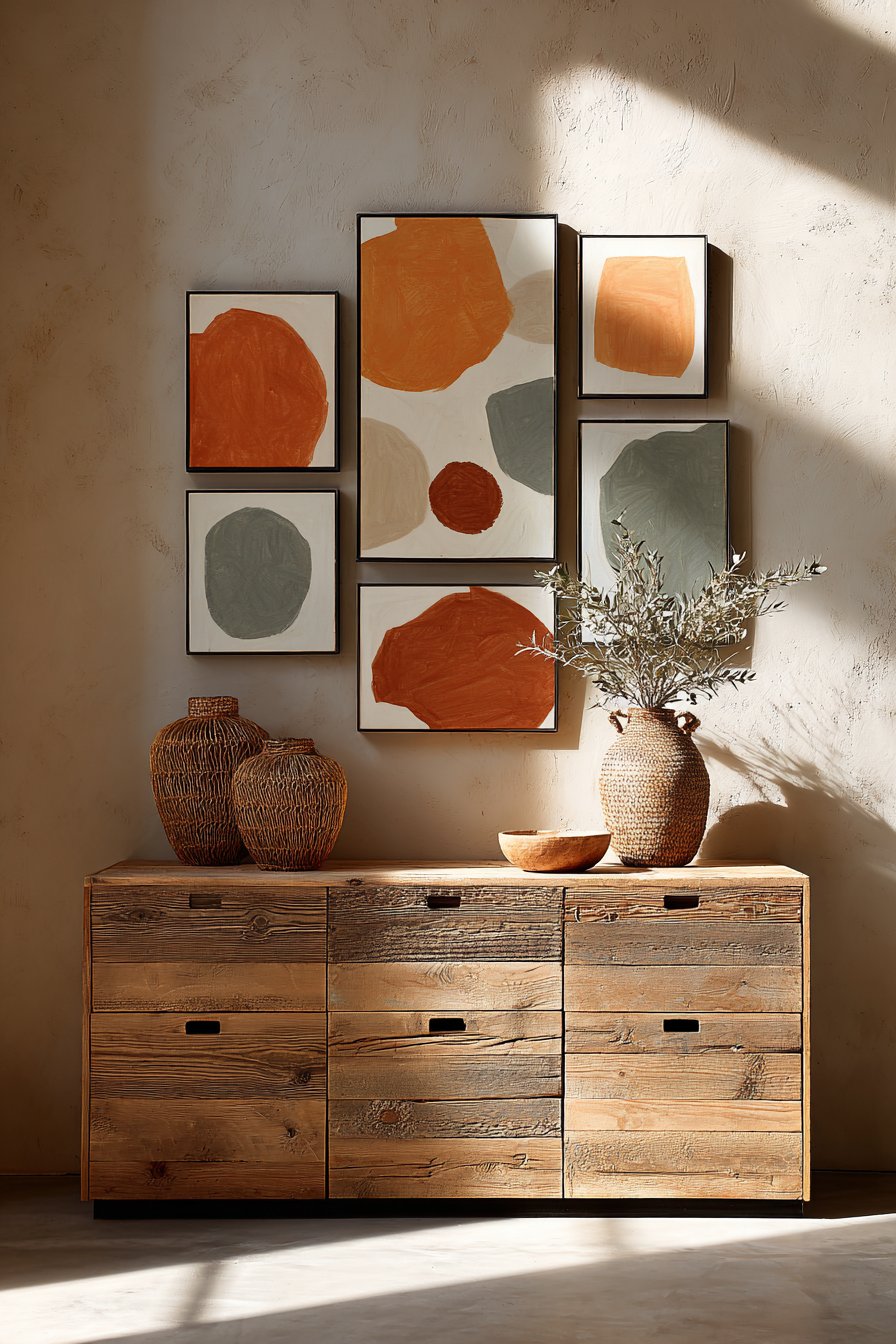
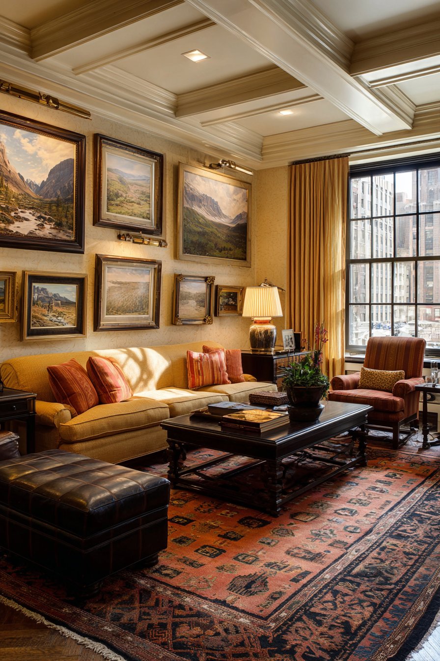
The Scandinavian design philosophy of “lagom”—meaning “just the right amount”—finds perfect expression in an asymmetrical cluster of small paintings above a wooden sideboard. Five paintings ranging from 8×10 to 12×16 inches in natural wood frames create visual interest through varied sizes while maintaining cohesion through consistent framing materials and a curated color palette of terracotta, sage, and cream. This organic arrangement feels collected over time rather than purchased as a matching set, adding authenticity and personality to the dining space.
The abstract organic shapes within each painting echo the natural materials prevalent in Scandinavian design—wood, linen, and stone—creating thematic continuity throughout the room. The warm terracotta tones introduce subtle color without disrupting the characteristically neutral Scandinavian palette, while sage green adds an herbal freshness that feels both contemporary and timeless. The varying sizes prevent the arrangement from feeling too rigid or formal, encouraging a relaxed dining atmosphere where conversation flows as freely as the artwork arrangement.
Wide-angle interior photography would capture how this small painting display balances with other elements in the room—perhaps the clean lines of modern dining chairs, the grain patterns in a solid wood table, and the gentle folds of natural linen curtains. The careful interplay of simplicity and warmth demonstrates why Scandinavian design remains so popular: it achieves beauty through restraint rather than excess, creating spaces that feel both sophisticated and comfortable.
Key Design Tips:
- Asymmetrical arrangements feel more dynamic and personal than rigid grids
- Vary painting sizes by at least 2-4 inches to create meaningful visual contrast
- Limit your color palette to 3-4 hues for cohesion across multiple pieces
- Natural wood frames complement Scandinavian aesthetics and add warmth
- Start with the largest piece and build around it, creating visual balance through intuitive placement
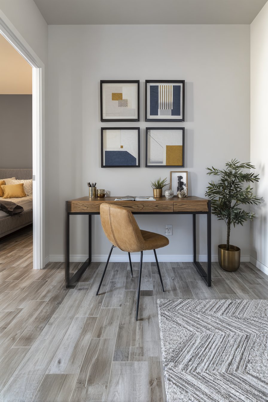
4. Minimalist Office Grid Precision
In a home office where focus and productivity are paramount, a precise grid of small paintings provides visual structure that reinforces organizational thinking. Six 8×8 inch square paintings in matching black frames create a symmetrical arrangement above a clean-lined desk, their geometric designs in navy, gold, and white offering subtle visual interest without distraction. The uniformity of size and spacing creates a sense of order that aligns perfectly with the minimalist office aesthetic, while the sophisticated color palette adds just enough personality to prevent the space from feeling sterile or impersonal.
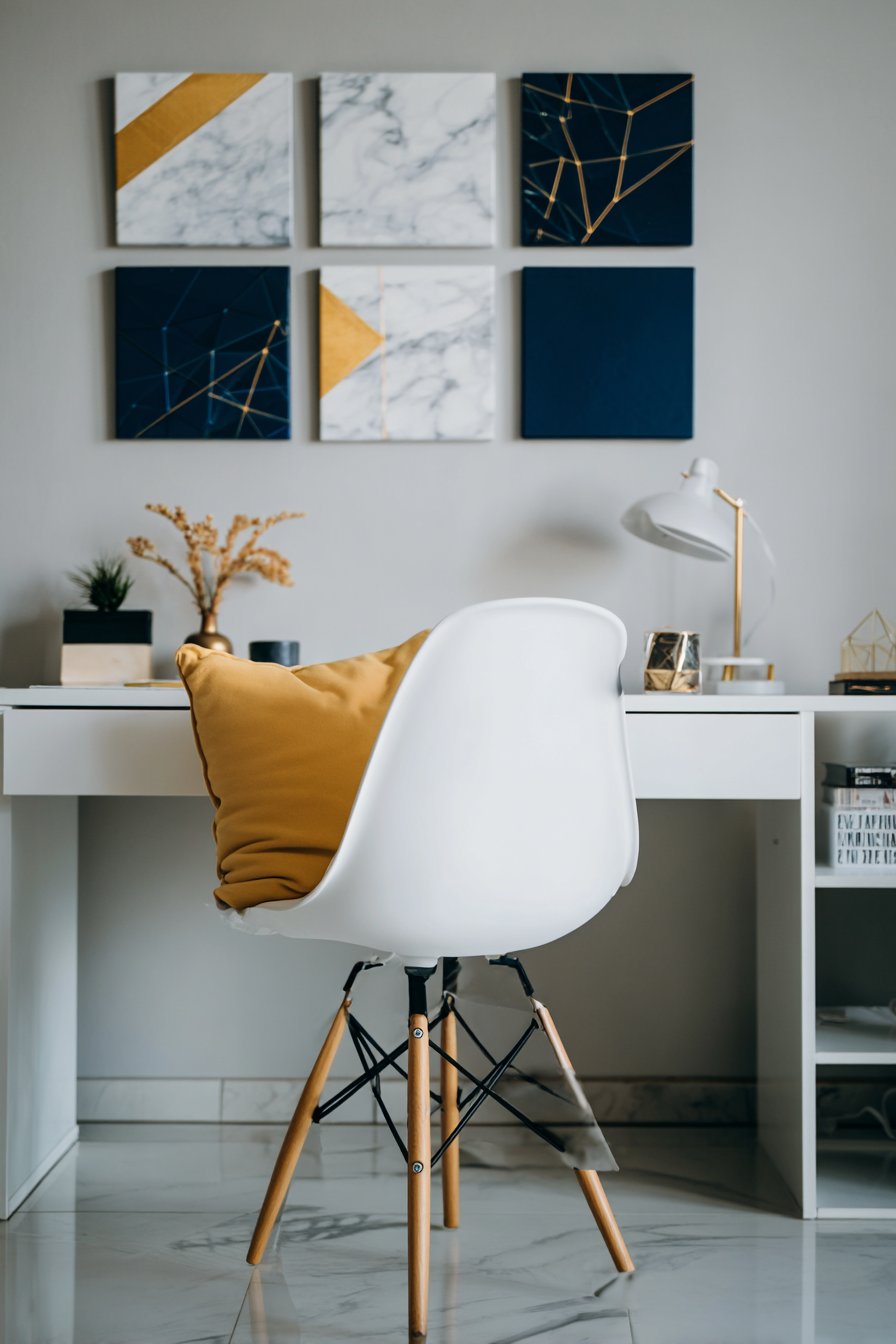
The geometric patterns within each painting—perhaps intersecting lines, nested shapes, or tessellating forms—engage the mind without demanding attention, providing occasional visual breaks during long work sessions without derailing concentration. The gold accents catch and reflect light throughout the day, adding a touch of luxury and refinement to the practical workspace. Black frames create strong visual boundaries that give each piece definition and prevent the white walls from overwhelming the small-scale artworks.
Balanced exposure in professional photography would highlight how this arrangement contributes to the overall workspace functionality. The grid placement ensures no single painting draws disproportionate attention, maintaining the egalitarian principles of minimalist design where each element serves the whole. The subtle material textures—perhaps canvas weave visible beneath the geometric patterns—add tactile interest that rewards closer inspection during contemplative moments.
Key Design Tips:
- Grid arrangements work best with identical frame sizes and consistent spacing
- Measure and mark placement carefully using painter’s tape before hanging
- In offices, choose artwork with structured compositions that complement focused work
- Metallic accents in artwork can reflect natural light and add dimension
- Maintain 2-3 inches of spacing between frames for a cohesive grid appearance
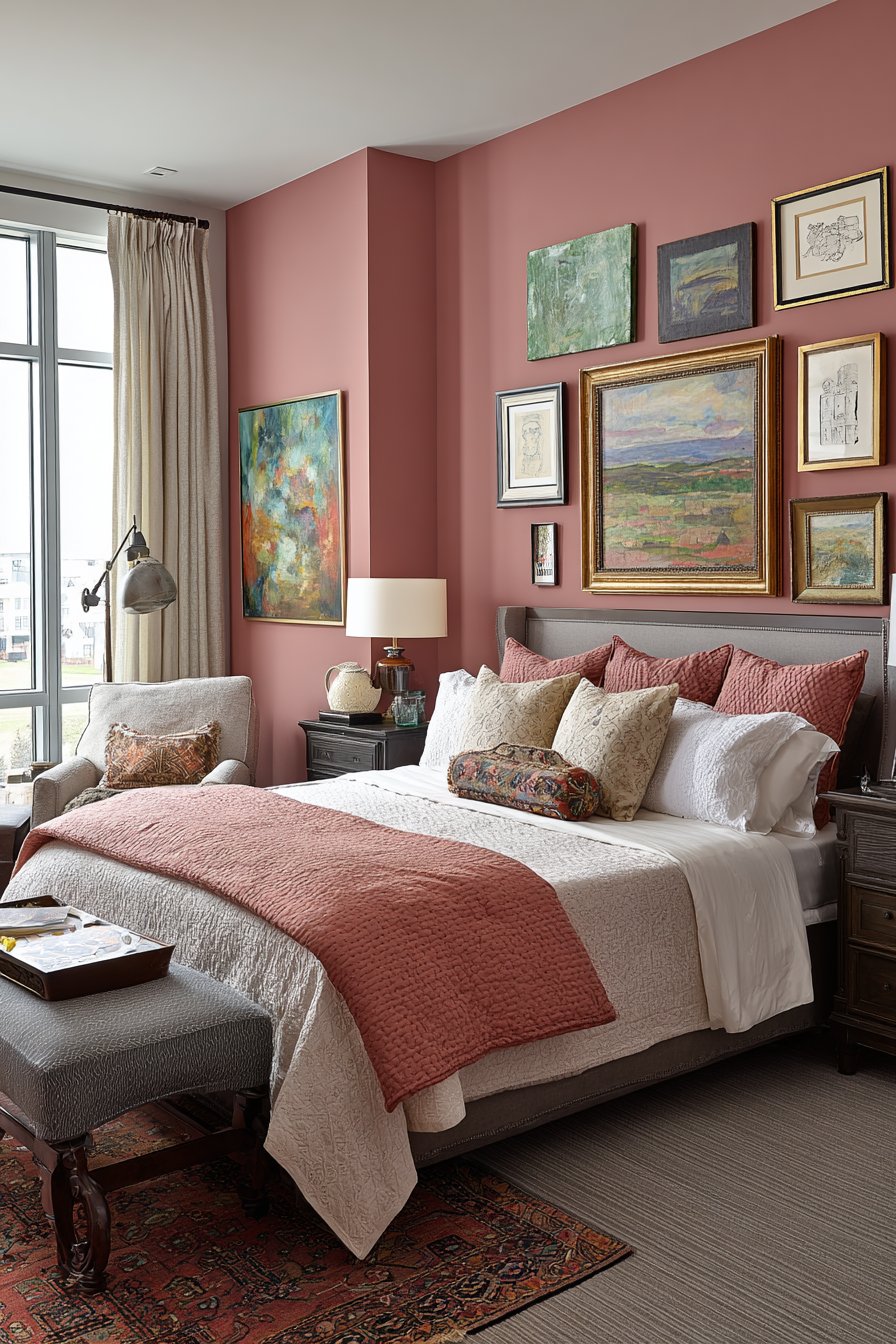
5. Bohemian Bedroom Eclectic Collection
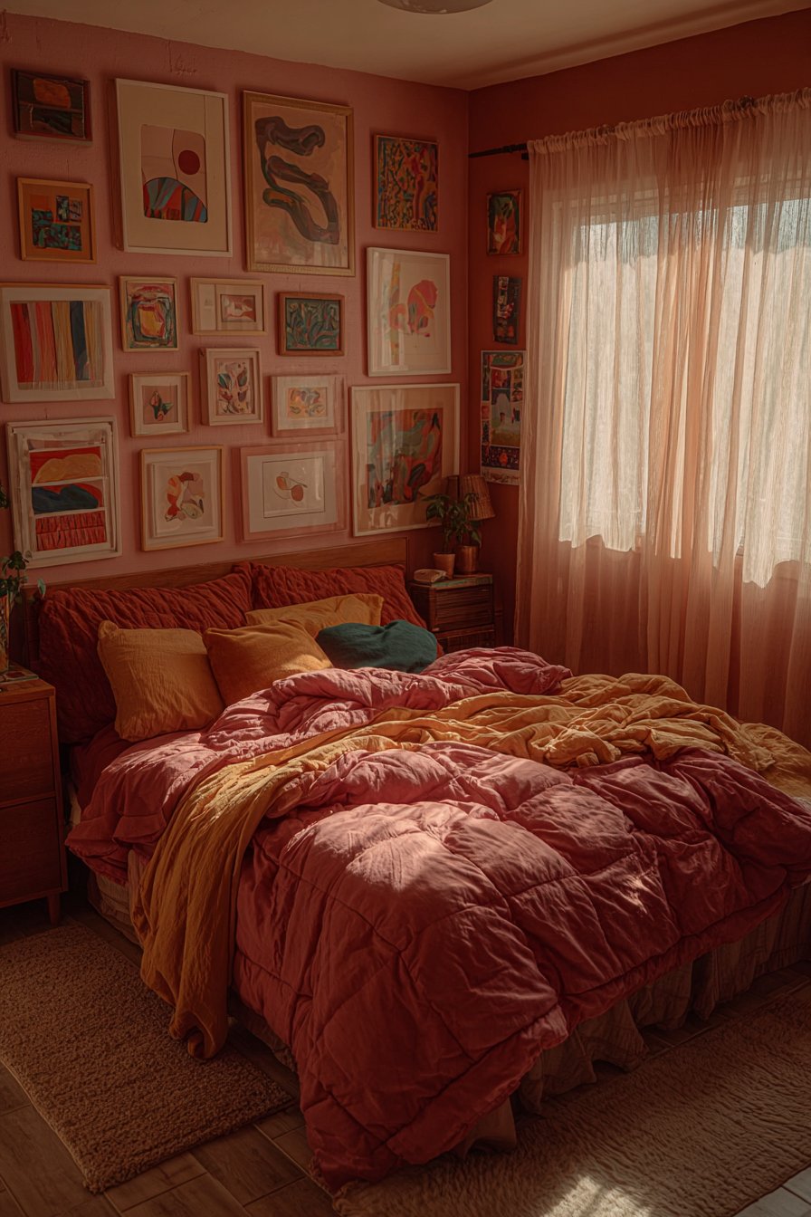
Above the headboard in a bohemian bedroom, an eclectic gallery arrangement of small paintings creates a collected, worldly aesthetic that speaks to artistic sensibilities and wanderlust. Various sized paintings from 10×10 to 14×18 inches mix abstract expressionist pieces with simple line drawings, each in mismatched vintage frames that tell their own story. The warm color palette of ochre, dusty rose, and deep teal establishes a cozy, intimate atmosphere perfect for a bedroom retreat, while the variety in artistic styles prevents any single piece from dominating the visual conversation.
Natural morning light filtering through sheer curtains illuminates the collection with a soft, romantic glow that changes character throughout the day. The visible brushstrokes in expressionist pieces add energetic texture, while delicate line drawings provide visual rest points that balance the composition. Vintage frames in various finishes—perhaps distressed gold, weathered wood, and ornate silver—contribute additional layers of visual interest and reinforce the collected-over-time narrative central to bohemian style.
This arrangement type works particularly well in bedrooms because it creates a highly personalized environment that reflects the inhabitant’s unique taste and life experiences. Unlike more structured arrangements, the eclectic approach allows for ongoing evolution as new pieces are discovered and added, making the wall display a living, growing element of the room’s design. The organic, asymmetrical placement feels spontaneous and artistic rather than calculated, contributing to the relaxed, creative energy that defines bohemian interiors.
Key Design Tips:
- Start with 3-5 anchor pieces and build your collection gradually over time
- Mix artistic styles but maintain color palette cohesion for unity
- Embrace vintage and thrift store frame finds for authentic bohemian character
- Arrange pieces on the floor first to experiment with composition before hanging
- Include meaningful pieces with personal significance to enhance the collected aesthetic
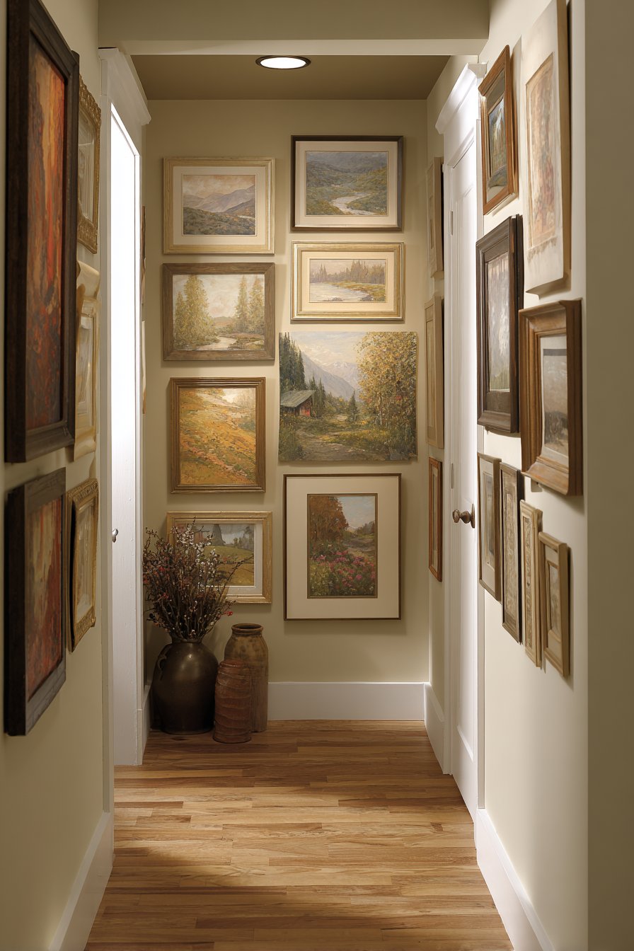
6. Hallway Gallery Transformation
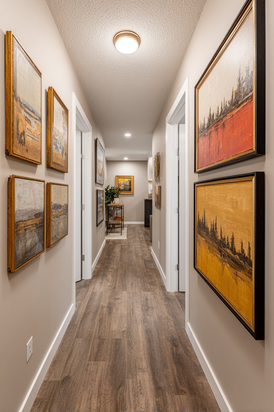
A narrow hallway transforms from overlooked transitional space to intimate art gallery when lined with small paintings displayed salon-style on both walls. Multiple 8×10 and 11×14 inch paintings in coordinating frames create a mini museum effect that encourages slower passage and closer inspection. The paintings feature diverse subjects—landscapes, abstracts, and still life compositions—united by a cohesive neutral color scheme that prevents the dense arrangement from feeling chaotic or overwhelming. Soft overhead lighting creates gentle shadows that add depth and dimension to each piece.
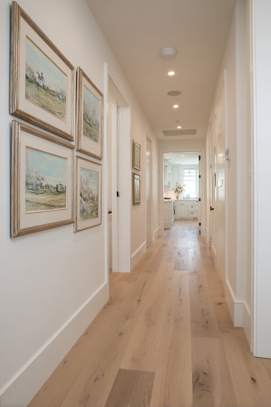
The salon-style hanging approach, with paintings arranged edge-to-edge covering significant wall area, has historical precedent in European art galleries where maximizing display space was essential. This traditional approach feels fresh and intentional in residential hallways where it turns otherwise wasted wall space into a curated viewing experience. The varied subject matter keeps the journey down the hallway interesting, with each painting offering something new to discover even after multiple passes.
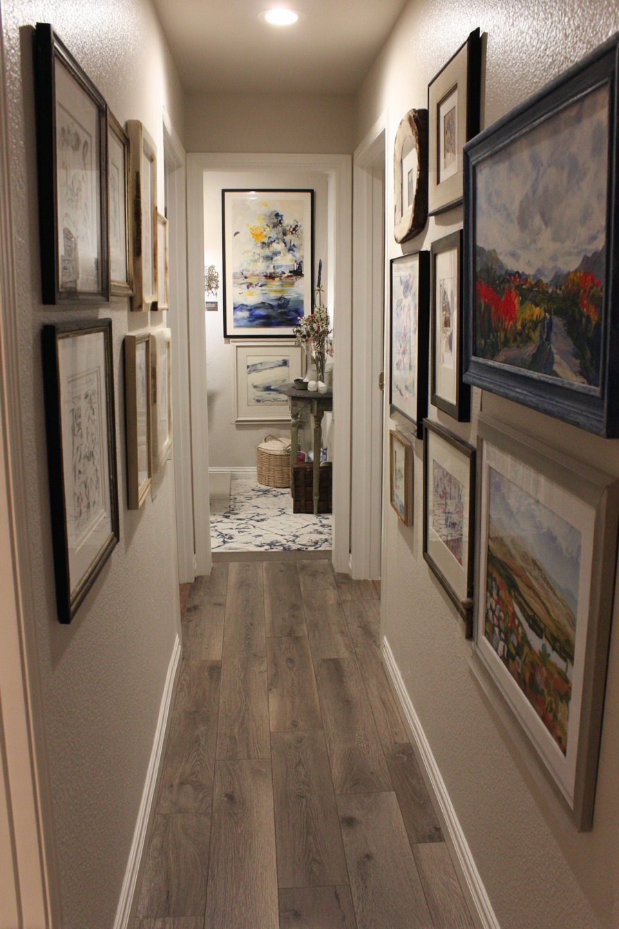
Wide-angle interior photography would capture how this treatment transforms a functional corridor into a destination within the home, a space with its own identity and purpose rather than merely a path between rooms. The strategic use of coordinating but not identical frames maintains visual interest while preventing the arrangement from appearing haphazard. The neutral color scheme across the varied paintings creates cohesion, demonstrating that subject diversity can coexist with visual harmony when color provides the unifying thread.
Key Design Tips:
- In hallways, hang paintings at a consistent height relative to the floor for visual flow
- Salon-style arrangements should maintain 1-2 inches between frames
- Use a template or craft paper cutouts to plan complex arrangements before making holes
- Install picture rail molding to allow flexibility in rearranging pieces over time
- Ensure adequate hallway lighting to properly illuminate the gallery
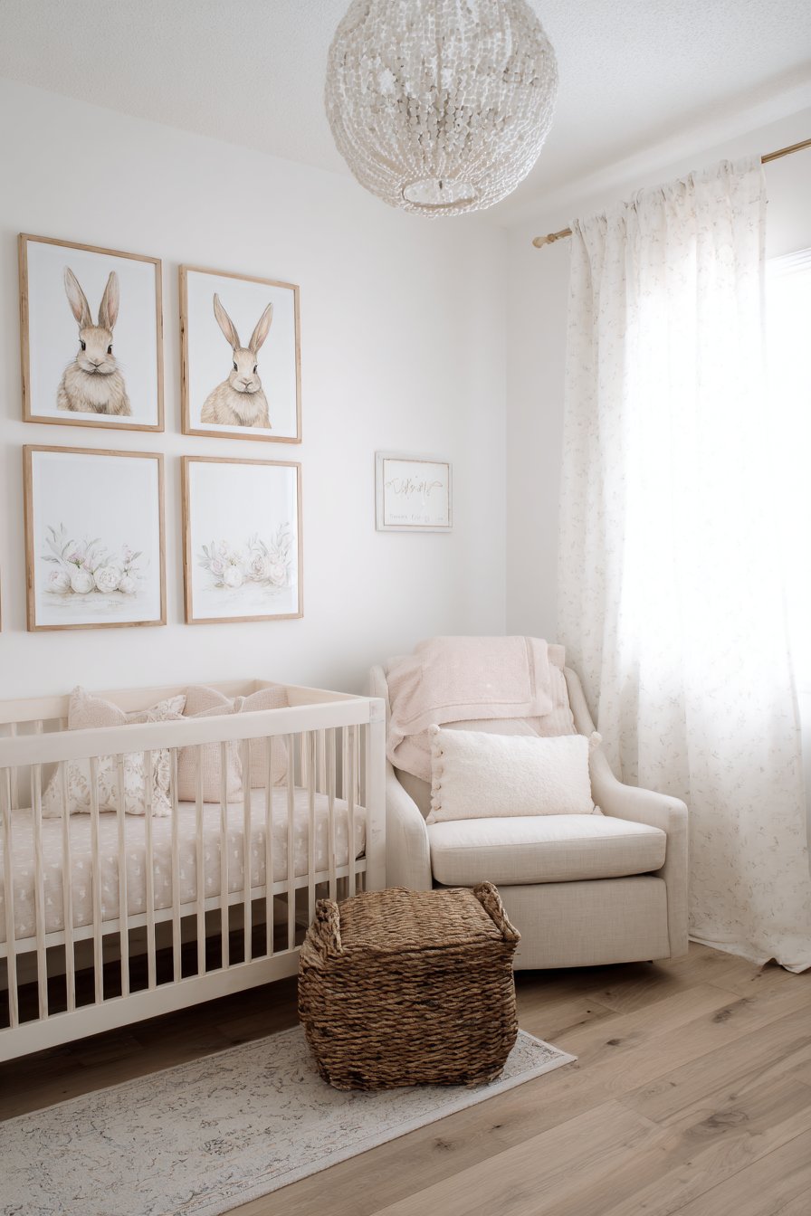
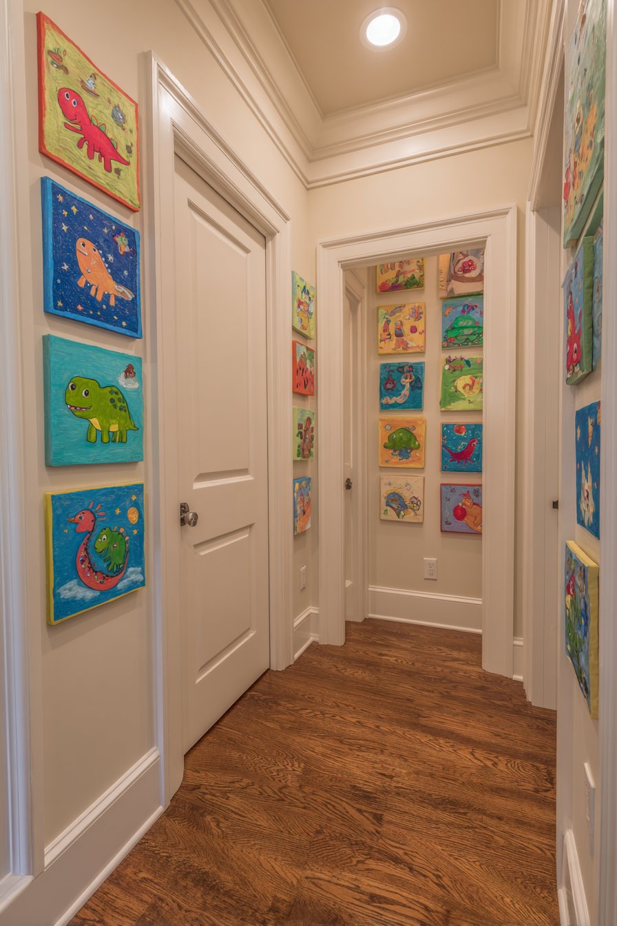
7. Nursery Child-Height Display
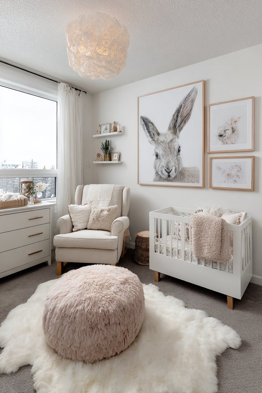
In a contemporary nursery, small paintings arranged low on the wall at child’s eye level demonstrate thoughtful design that considers the room’s smallest occupant. Four 12×12 inch whimsical animal paintings in soft pastels—perhaps a gentle elephant, dreaming bear, curious fox, and sleeping owl—create a focal point designed for a baby’s developing vision and eventual toddler curiosity. White matting and natural wood frames provide a clean, modern aesthetic that appeals to adult sensibilities while the tender imagery engages young minds.
The decision to hang artwork at child height rather than adult eye level represents a fundamental shift in perspective that prioritizes the child’s experience of their own space. This thoughtful placement allows babies in cribs and young children playing on the floor to engage with the artwork, fostering early appreciation for visual art and color. The soft pastel palette—likely including pale peach, mint green, buttery yellow, and dusty lavender—creates a soothing environment conducive to rest while providing enough visual interest to engage during wake times.
Natural diffused lighting from a window, perhaps filtered through gauze curtains, illuminates the paintings with gentle, non-stimulating light appropriate for a nursery environment. The subtle brushwork and calming imagery avoid the overly bright, busy patterns that can overstimulate young children, instead offering simplified forms and peaceful subjects that nurture rather than excite. This approach to nursery wall art grows with the child, maintaining appeal through various developmental stages rather than appearing babyish after the first year.
Key Design Tips:
- Hang nursery art at 24-30 inches from the floor for child-level viewing
- Choose soft, muted color palettes that promote calm rather than stimulation
- Select frames without glass or use safety acrylic to prevent breakage hazards
- Secure all wall hangings properly to withstand curious hands as children grow
- Avoid overly busy or high-contrast images that may overstimulate infants
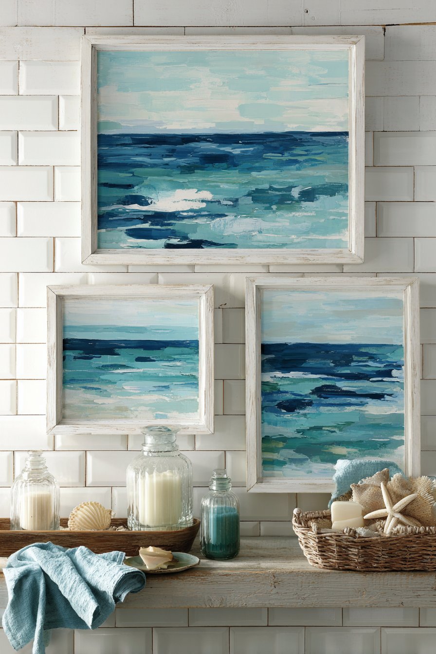
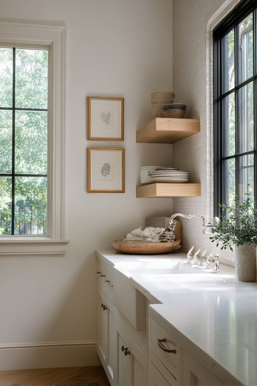
8. Coastal Bathroom Serenity
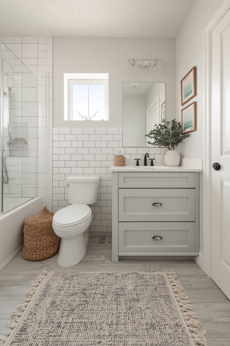
A coastal bathroom achieves spa-like tranquility through three small ocean-inspired paintings that evoke the calming presence of water. The 10×14 inch paintings feature abstract seascapes in varying shades of blue and seafoam green, their fluid compositions suggesting wave movements, tidal patterns, and coastal horizons. Hung above white subway tile backsplash, the paintings introduce organic movement that beautifully contrasts with the grid precision of the tilework below, creating dynamic visual tension that keeps the space interesting.
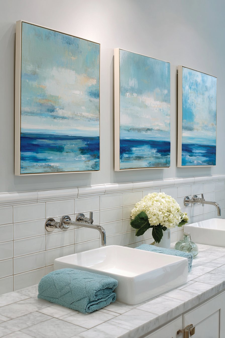
Simple white frames ensure the focus remains on the oceanic colors and fluid compositions within each painting, while also maintaining the fresh, clean aesthetic central to coastal design. The layered blues—from deep navy depths to pale aqua shallows—create tonal variation that mimics the natural gradations found in ocean water. Natural bathroom lighting reflects softly on the glass-covered paintings, adding a subtle shimmer that reinforces the aquatic theme and brings the artwork to life.
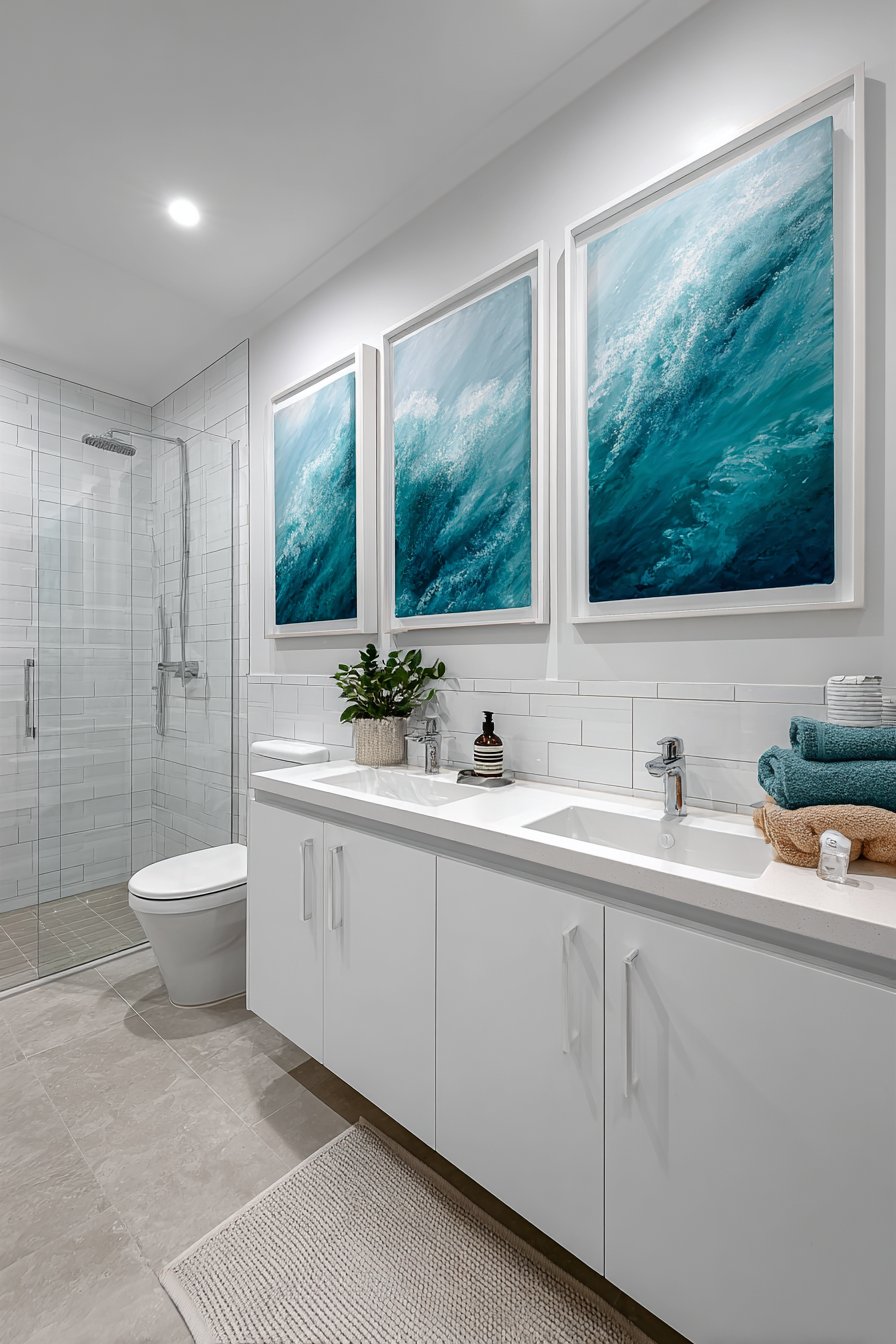
Professional interior photography would capture the serene, spa-like atmosphere these small paintings create, demonstrating how art choices significantly impact a room’s emotional resonance. The abstract rather than literal approach to ocean imagery feels sophisticated and timeless, avoiding the kitschy seaside clichés of anchors and starfish in favor of more nuanced interpretation. This restraint characterizes the difference between coastal-inspired design and beach-themed decoration, with the former achieving lasting elegance while the latter often feels trendy and temporary.
Key Design Tips:
- In bathrooms, ensure paintings are properly sealed or behind glass to protect from humidity
- Abstract interpretations of themes often age better than literal representations
- Coordinate artwork colors with tile, fixtures, and textiles for cohesive design
- Consider the reflective properties of bathroom surfaces when selecting frame finishes
- Limit bathroom art to 2-3 pieces to maintain the serene, uncluttered spa aesthetic
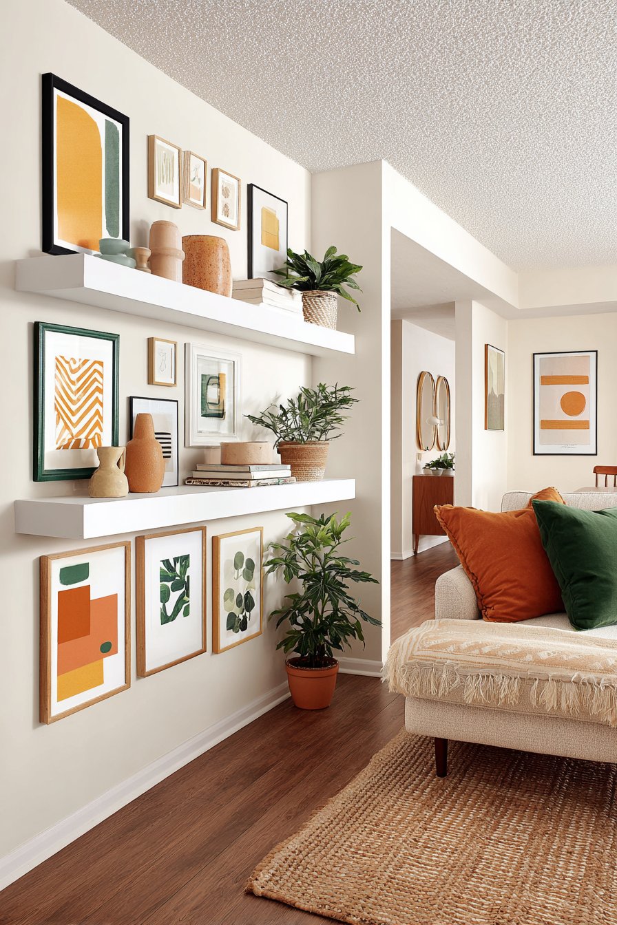
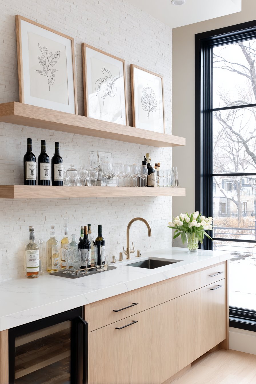
9. Mid-Century Modern Layered Display
A mid-century modern living room embraces the era’s innovative approach to art display through a picture ledge shelf system that allows for flexible arrangement and easy rotation. The 15-inch deep shelf holds five to seven paintings ranging from 8×10 to 11×14 inches, some overlapping and layered to create depth and visual interest. The small paintings feature retro geometric patterns and atomic age abstracts in characteristic mid-century colors—orange, teal, and mustard yellow—that celebrate the optimistic, forward-looking spirit of the 1950s and 60s.
This display method offers significant advantages over traditional hanging, particularly for renters or those who enjoy frequently refreshing their spaces. The ability to lean paintings against the wall and layer them creates a casual, collected aesthetic that feels less permanent and precious than nail-hung arrangements, encouraging experimentation with different compositions. The shelf itself becomes part of the display, its clean lines and modest profile embodying mid-century design principles of form following function.
Interior design photography with balanced exposure would showcase how this flexible system allows the art collection to evolve with changing tastes and seasons. Small sculptural objects or vintage finds might share shelf space with the paintings, creating a curated vignette that tells a broader aesthetic story. The retro geometric patterns within the paintings—perhaps starburst motifs, boomerang shapes, and atomic orbitals—connect contemporary living spaces with design history, demonstrating how mid-century aesthetics continue to influence modern interiors.
Key Design Tips:
- Install picture ledge shelves with proper wall anchors to support combined weight of multiple frames
- Vary painting sizes and overlap pieces for dynamic, layered compositions
- Rotate artwork seasonally to keep the display fresh and responsive to your evolving tastes
- Mix framed paintings with small sculptural objects for dimensional interest
- Ensure shelf is deep enough (12-15 inches) to securely hold layered frames
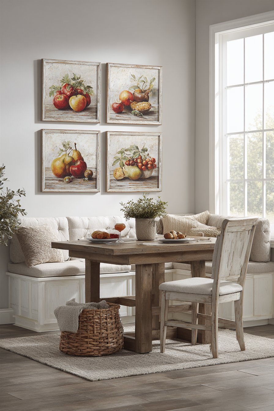
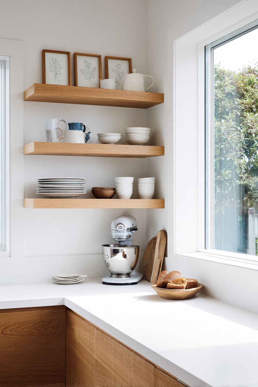
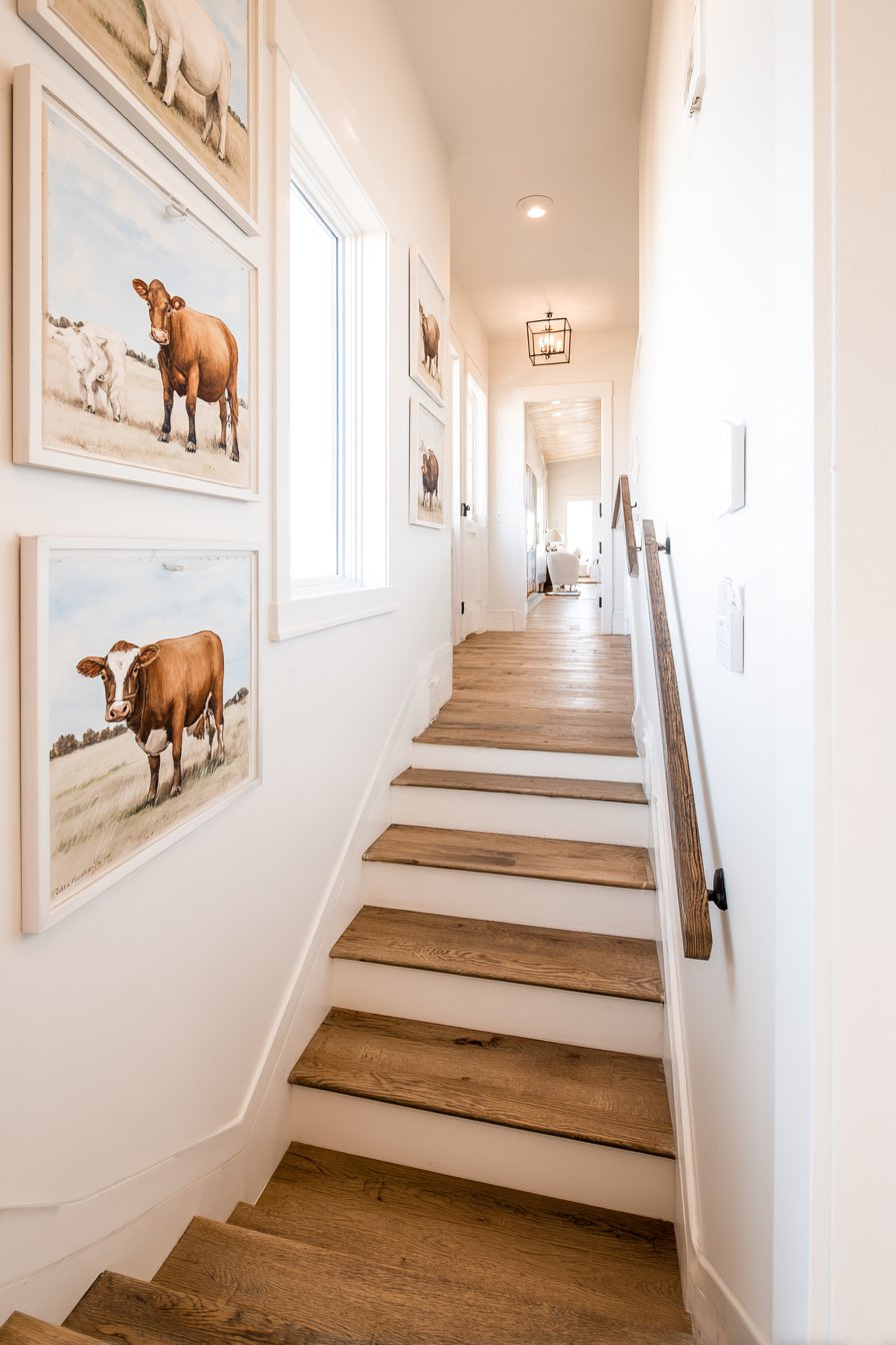
10. Rustic Farmhouse Kitchen Cluster
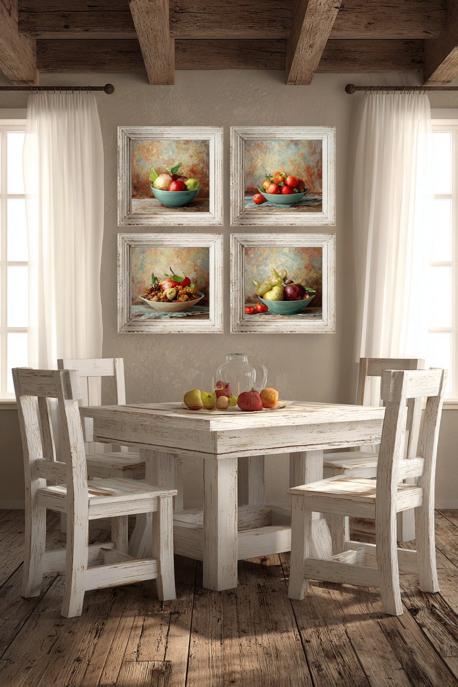
Near the breakfast nook in a rustic farmhouse kitchen, a cluster of four vintage-style still life paintings brings nostalgic charm and homespun appeal. Each 9×12 inch painting depicts fruits and vegetables with visible brushstrokes and muted, authentic color palettes that evoke folk art traditions and country living. Distressed white frames with gentle wear patterns add to the vintage narrative, suggesting these pieces have been cherished through generations. The loose square arrangement creates an approachable, informal composition that suits the relaxed farmhouse aesthetic.
The subject matter connects directly to the kitchen’s purpose, celebrating the raw ingredients that become nourishing meals and the agricultural roots of farmhouse style. Perhaps one painting depicts ripe tomatoes on the vine, another showcases heritage apples, a third features summer squash, and the fourth presents clustered grapes—each celebrating seasonal abundance and simple pleasures. The painterly quality, with brushstrokes left visible rather than smoothed away, adds handcrafted character that aligns with farmhouse values of authenticity and craftsmanship.
Soft natural light from nearby windows illuminates the paintings’ textural surfaces, highlighting the dimensional quality of oil or acrylic paint applied with generous brushwork. The distressed white frames show gentle aging—perhaps slight chipping at the corners or a softened finish—that contributes to the farmhouse aesthetic without appearing artificially antiqued or contrived. This attention to authentic detail separates thoughtfully designed farmhouse spaces from generic country-themed rooms, creating environments that feel genuinely lived-in and loved.
Key Design Tips:
- Choose art subjects that connect thematically with room function for cohesive design
- Distress or age new frames using gentle sanding for authentic vintage appearance
- Group similar-subject paintings in informal clusters rather than strict grids
- Position kitchen artwork away from cooking areas to prevent grease or moisture damage
- Embrace visible brushwork and painterly techniques for handcrafted character
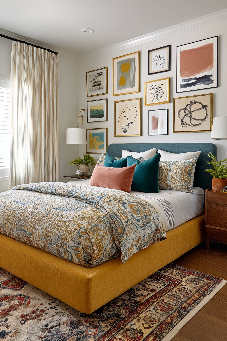
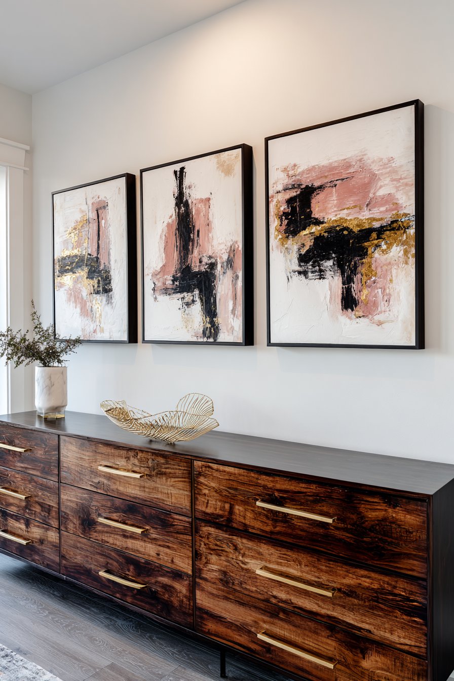
11. Urban Apartment Asymmetrical Composition
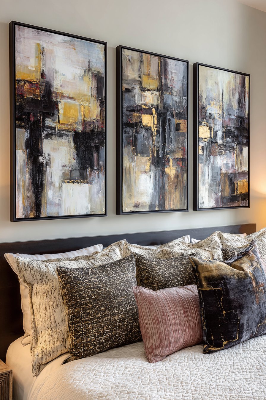
In a modern apartment bedroom, an asymmetrical composition of small paintings above a low dresser creates sophisticated visual interest through dynamic arrangement and bold artistic choices. Three abstract paintings in sizes 10×10, 12×14, and 14×18 inches feature expressive brushstrokes in charcoal, blush, and gold, their varied dimensions creating visual rhythm that feels intentionally composed yet spontaneous. Sleek black frames provide contemporary definition while allowing the artwork’s colors and gestures to command attention.
The asymmetrical placement—perhaps with the largest piece positioned off-center and the smaller pieces clustered to balance visual weight—demonstrates advanced compositional thinking that elevates this arrangement beyond simple wall decoration into thoughtful artistic curation. The limited but sophisticated color palette works effectively in compact urban spaces where visual coherence prevents small rooms from feeling cluttered or chaotic. The bold brushstrokes within each painting add energetic movement that animates the bedroom without overwhelming its primary function as a restful retreat.
Professional interior photography with natural lighting would reveal how this arrangement creates focal interest in a multifunctional bedroom that serves as both sleeping quarters and personal sanctuary. The low dresser placement allows the paintings to be appreciated from various positions—lying in bed, sitting at a vanity, or moving through the space—demonstrating how sight lines influence effective art placement. This approach to small wall paintings makes a sophisticated statement appropriate for urban living where space efficiency and aesthetic impact must work in tandem.
Key Design Tips:
- Create visual balance in asymmetrical arrangements by distributing visual weight carefully
- Use the rule of thirds as a compositional guide when placing artwork off-center
- Limit bold abstract art to 2-3 pieces to maintain bedroom tranquility
- Ensure adequate wall space around arrangements—avoid crowding paintings into corners
- Consider multiple viewing angles when determining optimal placement height
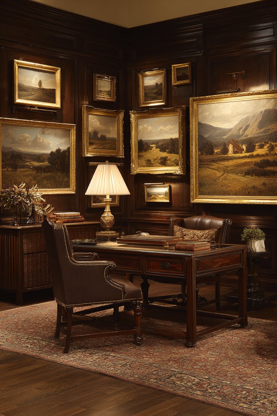
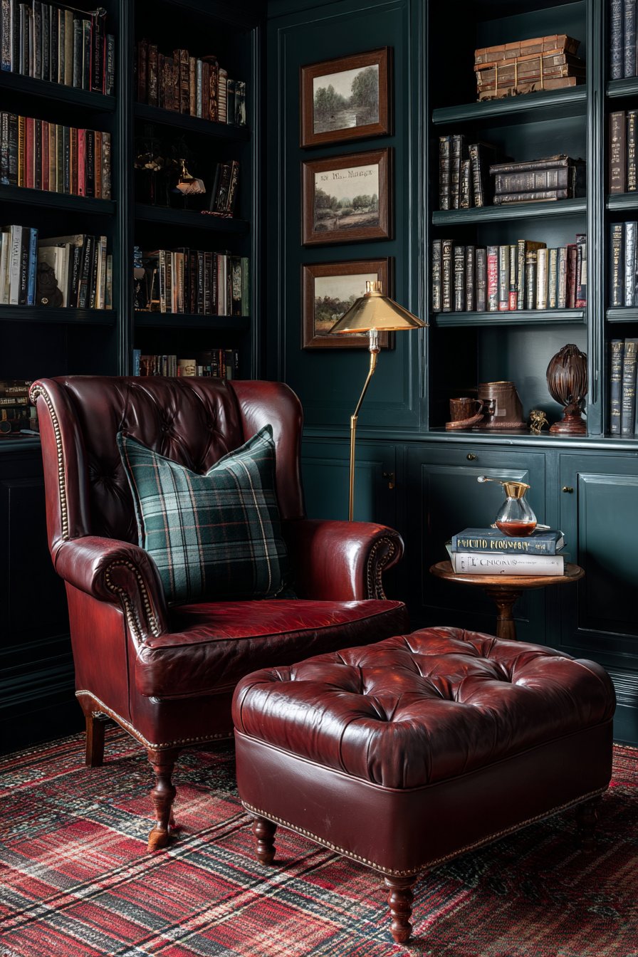
12. Traditional Study Symmetrical Elegance
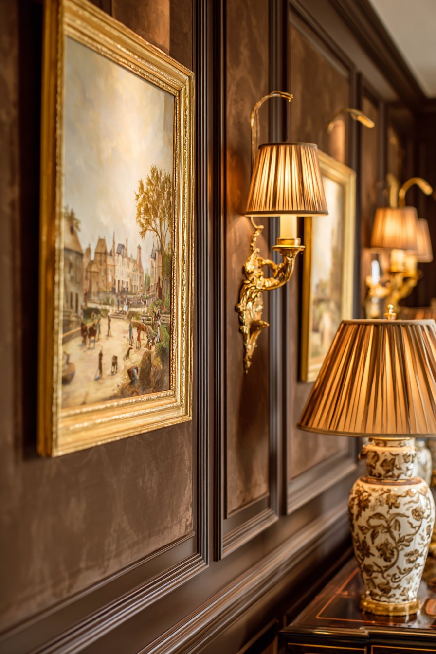
A traditional study achieves formal elegance through symmetrical placement of small landscape paintings on dark paneled walls. Twin 11×14 inch landscape paintings in ornate gold frames flank a central 12×16 inch portrait-oriented piece, creating a balanced tripartite composition that reflects classical design principles. The paintings depict countryside scenes in rich earth tones—perhaps rolling hills at golden hour, forest paths in autumn, or pastoral meadows—that reinforce the study’s contemplative purpose and connection to literary tradition.
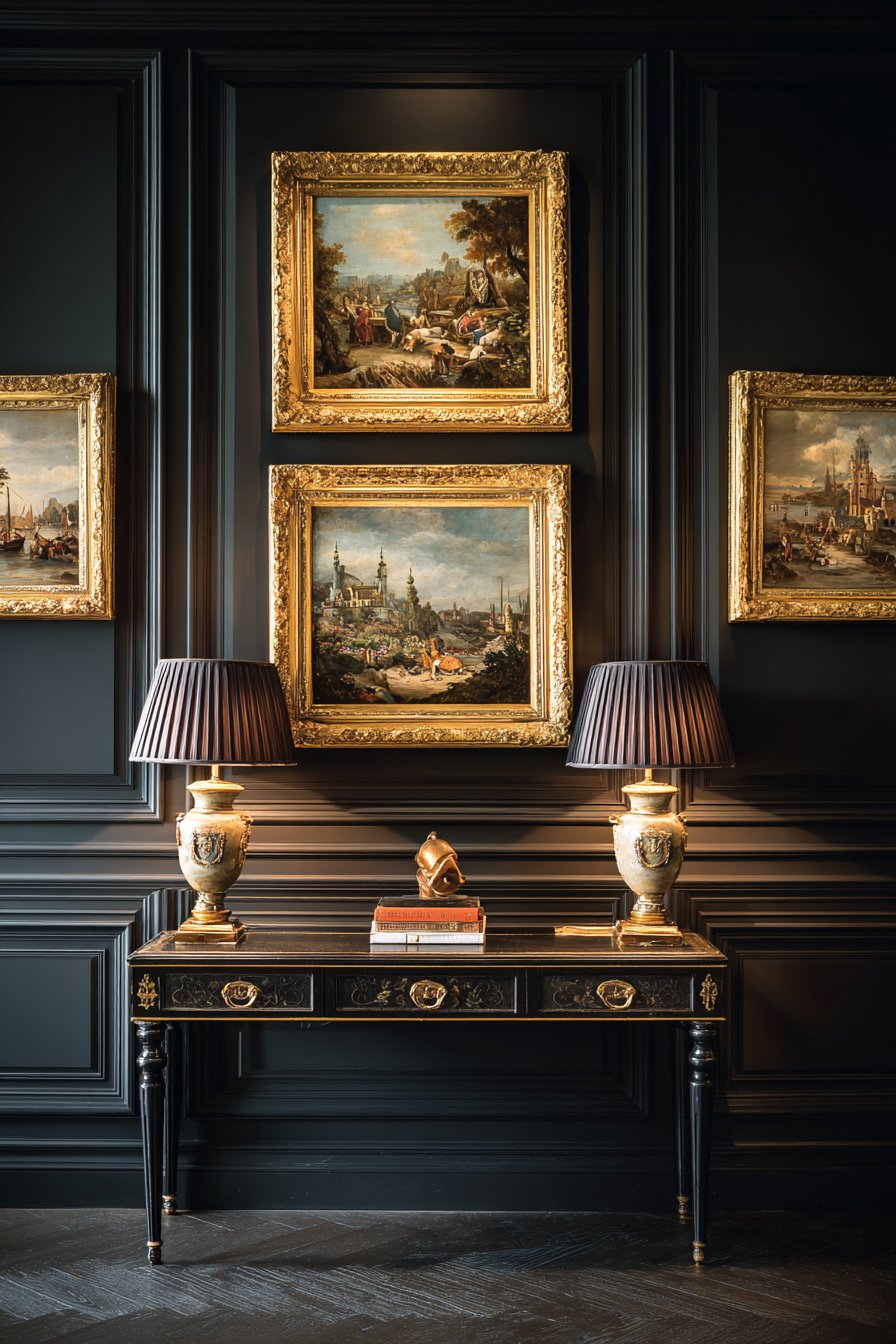
The dark paneled walls provide dramatic contrast that makes the gilded frames and landscape imagery visually pop, creating depth and richness characteristic of traditional interiors. Warm lamp lighting from a desk lamp or wall sconces creates subtle highlights on the ornate gold frames, adding dimension and luxury to the display. This type of formal symmetry communicates stability, order, and timeless sophistication—qualities often sought in dedicated study spaces where serious work and intellectual pursuits occur.
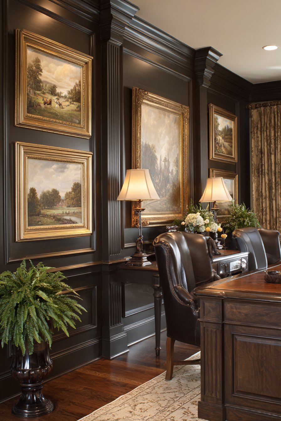
The careful selection of coordinating but not identical landscape scenes demonstrates refined curatorial judgment—the paintings share similar color palettes and compositional approaches while offering subtle variations in subject matter and season. This prevents the monotony of identical pieces while maintaining the visual cohesion necessary for successful symmetrical arrangements. The portrait orientation of the central piece creates vertical emphasis that draws the eye upward, making the ceiling feel higher and the room more grand despite the modest size of the individual paintings.
Key Design Tips:
- Symmetrical arrangements require precise measurement—use a level and measuring tape
- Dark wall colors demand adequate lighting to properly showcase artwork
- Ornate frames suit traditional interiors but should complement rather than overwhelm artwork
- Group paintings with similar subjects and color palettes for cohesive symmetrical displays
- Center the arrangement on the wall or above furniture for proper visual balance
13. Playful Kids’ Room Interactive Display
A playful children’s room transforms into an engaging learning environment through small paintings displayed at various heights that encourage interaction and discovery. Six to eight colorful 8×10 inch paintings featuring space themes, dinosaurs, and nature scenes dot the walls in bright primary-colored frames—red, blue, yellow, and green—creating visual excitement appropriate for childhood energy and curiosity. The varied placement heights allow the display to grow with the child, with some pieces positioned low for toddler engagement and others higher for older children.
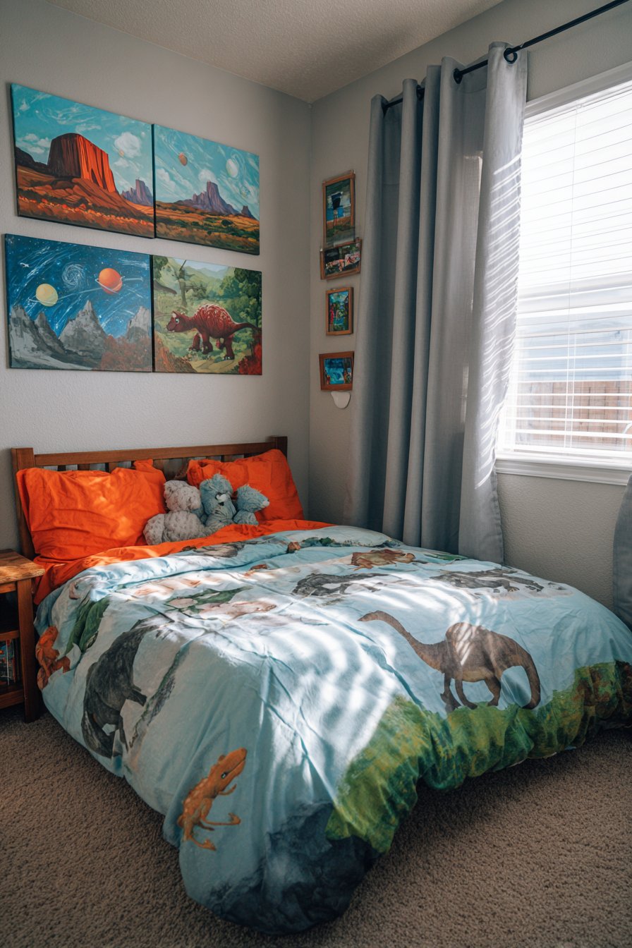
The visible texture within each painting—perhaps thick impasto paint creating dimensional surfaces or collaged elements adding tactile interest—appeals to children’s sensory exploration and developing artistic awareness. Child-friendly imagery sparks imagination and supports learning, with space paintings introducing planetary concepts, dinosaur art fostering prehistoric interest, and nature scenes encouraging environmental awareness. The bright, saturated colors typical of children’s art energize the space while supporting color recognition and visual development.
Soft diffused daylight makes colors appear vibrant without harsh glare, creating an inviting environment for play and rest. The flexibility of this display approach allows parents to rotate paintings as children’s interests evolve—replacing toddler-appropriate imagery with increasingly sophisticated subject matter as the child matures. This adaptability makes small paintings particularly practical for children’s rooms, avoiding the expense and permanence of themed wall murals that quickly become outdated as children grow.
Key Design Tips:
- Use unbreakable acrylic instead of glass in children’s room frames for safety
- Rotate artwork as children’s interests develop to keep the space relevant and engaging
- Involve children in selecting and arranging their wall art to encourage ownership
- Secure all hanging hardware properly to withstand climbing or pulling
- Choose washable frames and surfaces for easy cleaning of inevitable fingerprints
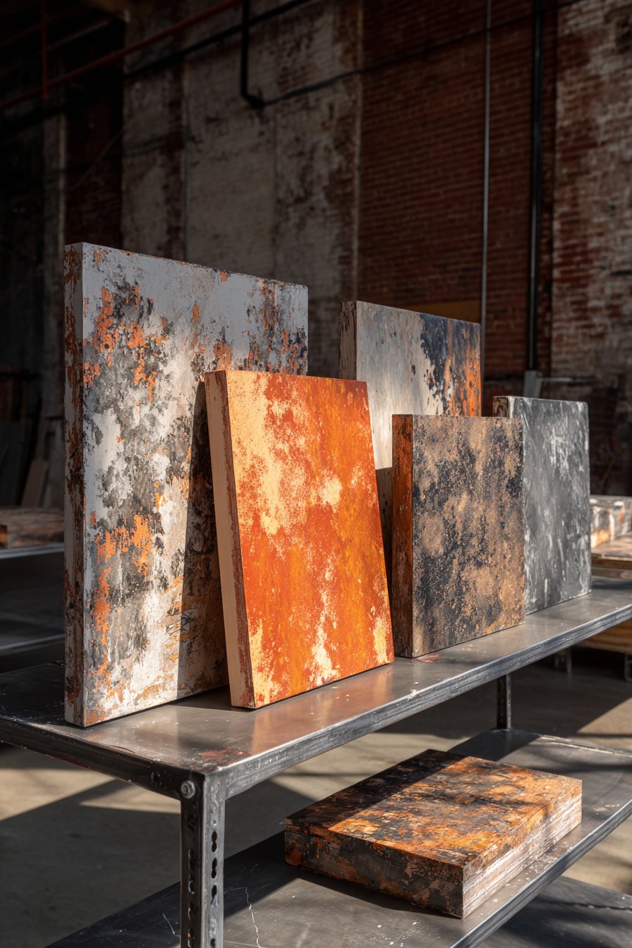
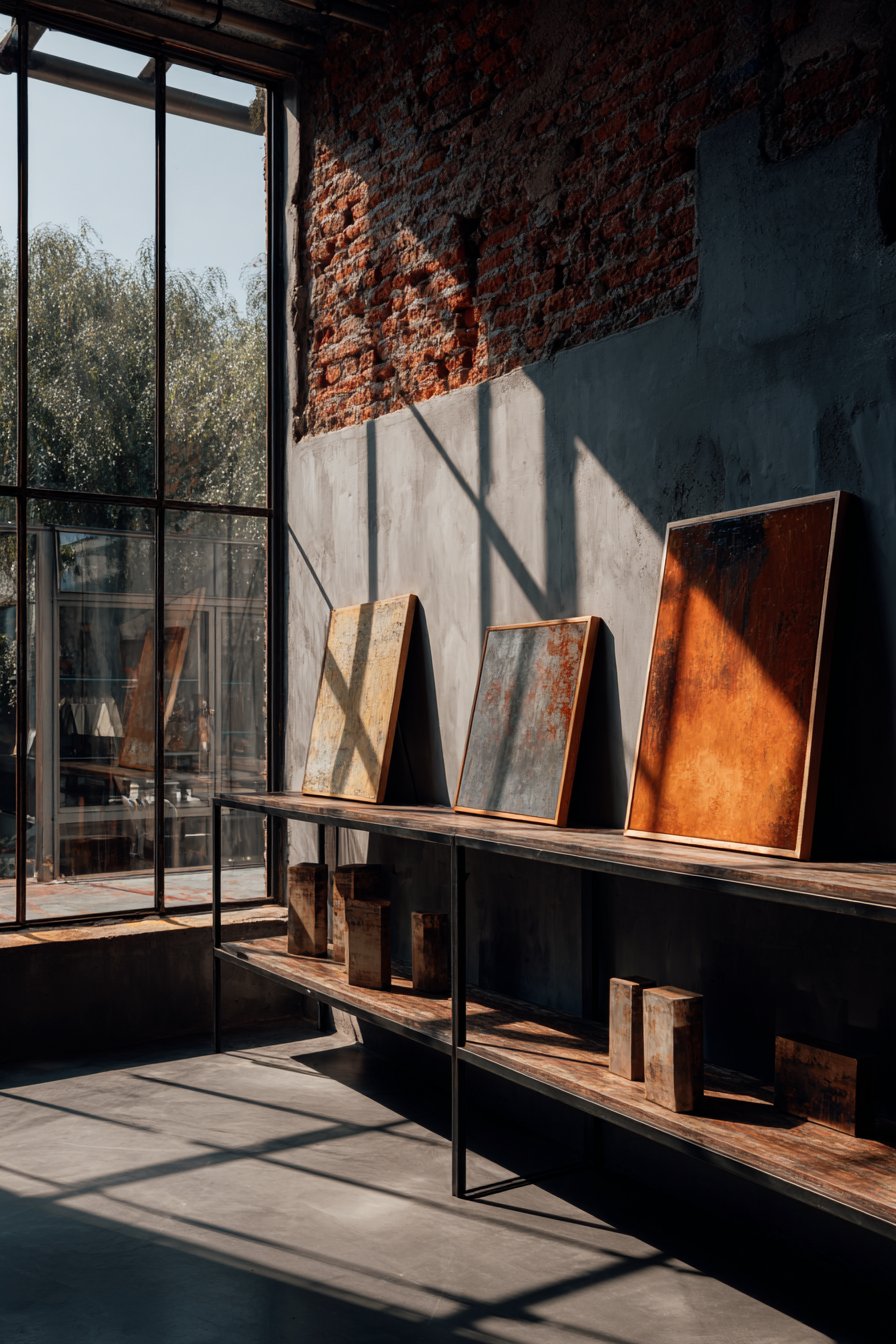
14. Industrial Loft Casual Display

An industrial loft embraces unstructured sophistication through small paintings displayed against exposed brick walls, casually leaning on a metal shelf rather than formally hung. Four 12×16 inch abstract paintings with heavy impasto texture sit in raw wood frames, their thick paint applications creating sculptural surfaces that cast subtle shadows. The urban-inspired color palette of concrete gray, rust orange, and matte black connects with the loft’s architectural character while the relaxed display method reinforces the effortless, authentic aesthetic central to industrial design.
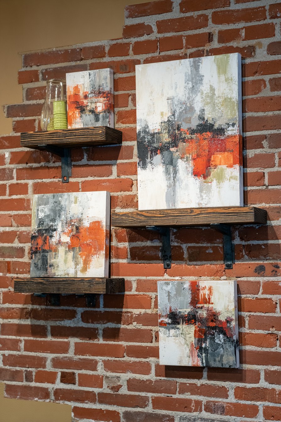
The exposed brick wall provides rich texture and historical character that beautifully contrasts with the contemporary abstract imagery within the paintings. The casual leaning arrangement—rather than precise hanging—suggests a collected, curated environment where art is appreciated but not precious, displayed with confident informality. Natural warehouse-style lighting from large windows creates dramatic shadows that emphasize the dimensional quality of impasto paint and the raw texture of brick, adding depth and visual interest throughout the day.
This display approach particularly suits loft environments where high ceilings and open spaces can make wall-hung art feel small or lost. By bringing paintings down to shelf level and allowing them to lean, the art feels more accessible and integrated with the living space rather than distant and formal. The ability to easily move and rearrange pieces supports the dynamic, evolving nature of loft living where spaces often serve multiple functions and aesthetic choices reflect current creative interests.
Key Design Tips:
- Ensure shelves are sturdy and level before leaning valuable artwork
- Use small rubber or felt pads behind frames to prevent shifting
- Mix leaning artwork with standing objects for varied heights and visual rhythm
- Raw wood or metal frames complement industrial aesthetics better than ornate options
- Embrace imperfection—slightly uneven arrangements often look more authentic than perfect precision
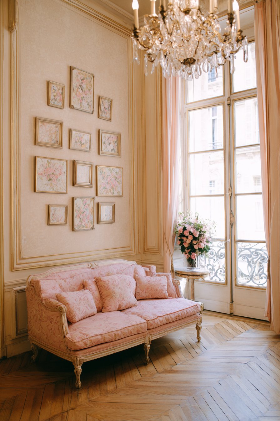
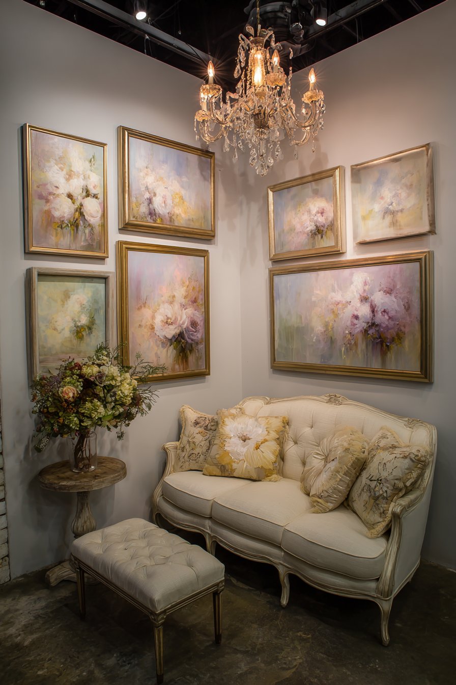
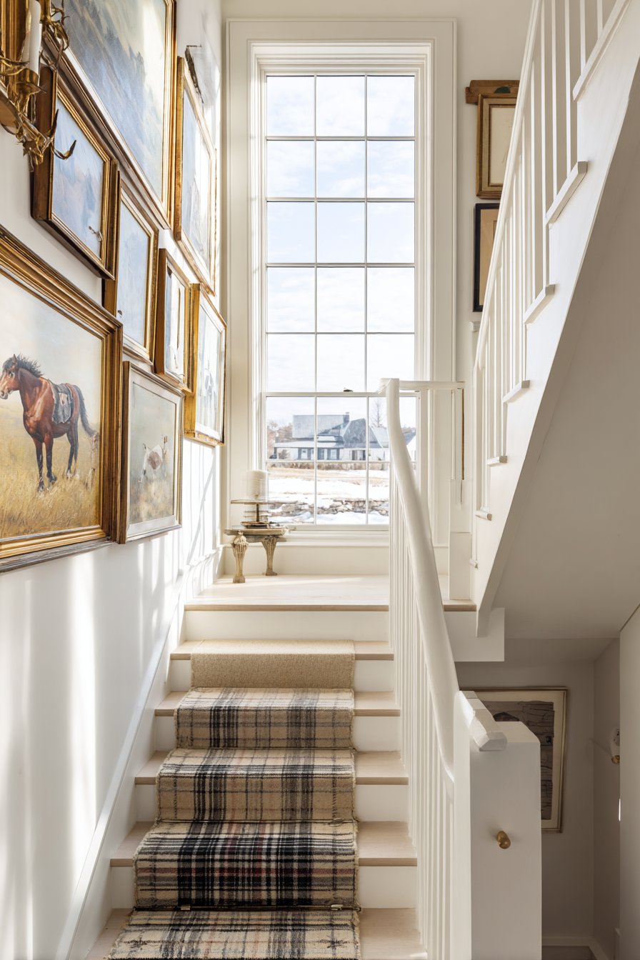
15. Parisian-Inspired Salon Wall
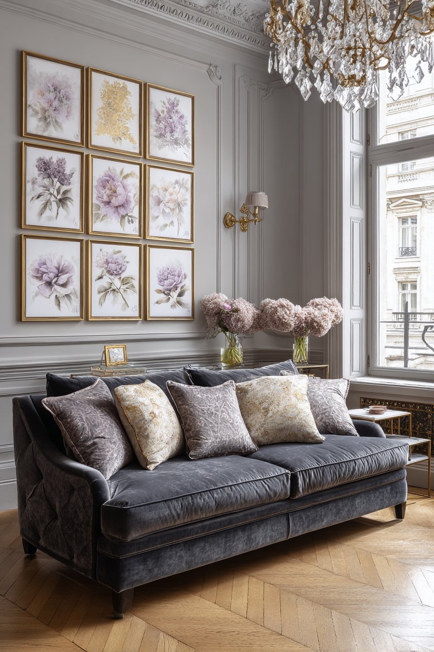
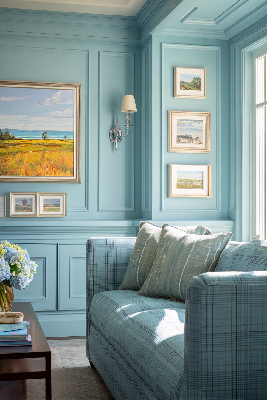
A Parisian-inspired apartment achieves European elegance through nine small paintings arranged en masse above a velvet settee in the classic salon wall tradition. The paintings range from 8×8 to 10×12 inches in mixed metallic frames—some in antique gold, others in brushed silver or rose gold—creating a collected-over-time aesthetic that suggests sophisticated curatorial taste. The impressionist-style florals and abstracts feature soft lavender, cream, and gold tones that evoke the romantic elegance of Parisian apartments, where art appreciation forms an integral part of daily life.
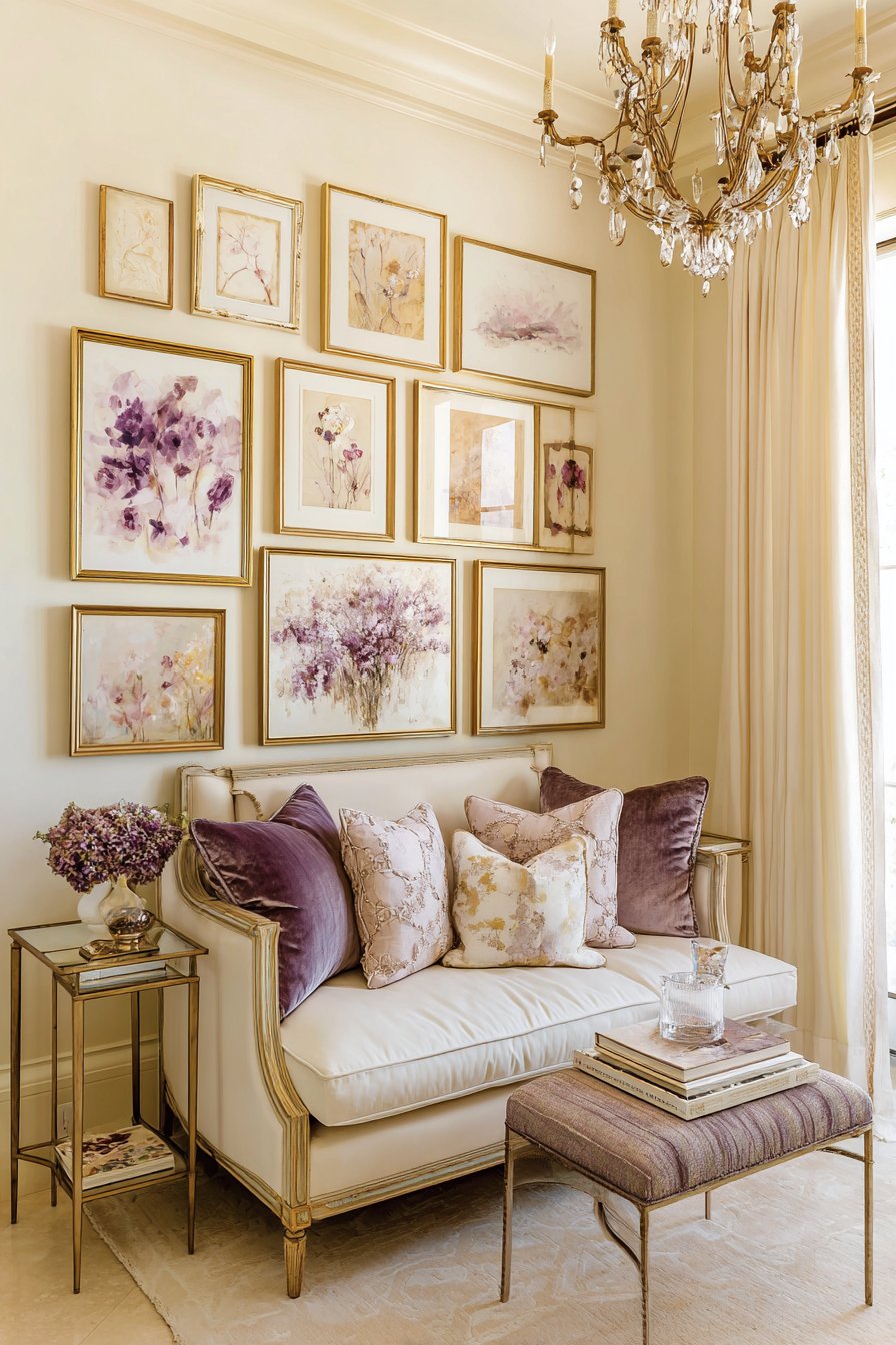
Delicate chandelier lighting adds romance and refinement, casting a warm glow that enhances the metallic frames and illuminates the subtle color work within each painting. The dense, edge-to-edge arrangement maximizes visual impact, transforming a single wall into an artistic statement that serves as the room’s focal point. The varied frame finishes prevent the arrangement from appearing too matchy or commercial, instead suggesting a carefully curated collection assembled over years of gallery visits and antique market discoveries.
The impressionist painting styles—with their characteristic loose brushwork, emphasis on light, and often ethereal color palettes—create cohesion across the varied pieces despite differences in specific subject matter. Some paintings might capture single blooms in soft focus, others suggest garden scenes, and still others explore pure abstract color relationships, yet all share an artistic sensibility that unifies the salon wall. This curated diversity exemplifies sophisticated art collecting where individual pieces are selected for both their standalone merit and their contribution to a cohesive whole.
Key Design Tips:
- Create a paper template of your entire arrangement on the floor before hanging
- Mix frame finishes within a common metal family (all golds or all silvers) for cohesion
- Maintain relatively consistent spacing (2-3 inches) between paintings for unified appearance
- Position the visual center of the grouping at eye level (approximately 57-60 inches)
- Include paintings in various orientations (portrait and landscape) for dynamic composition
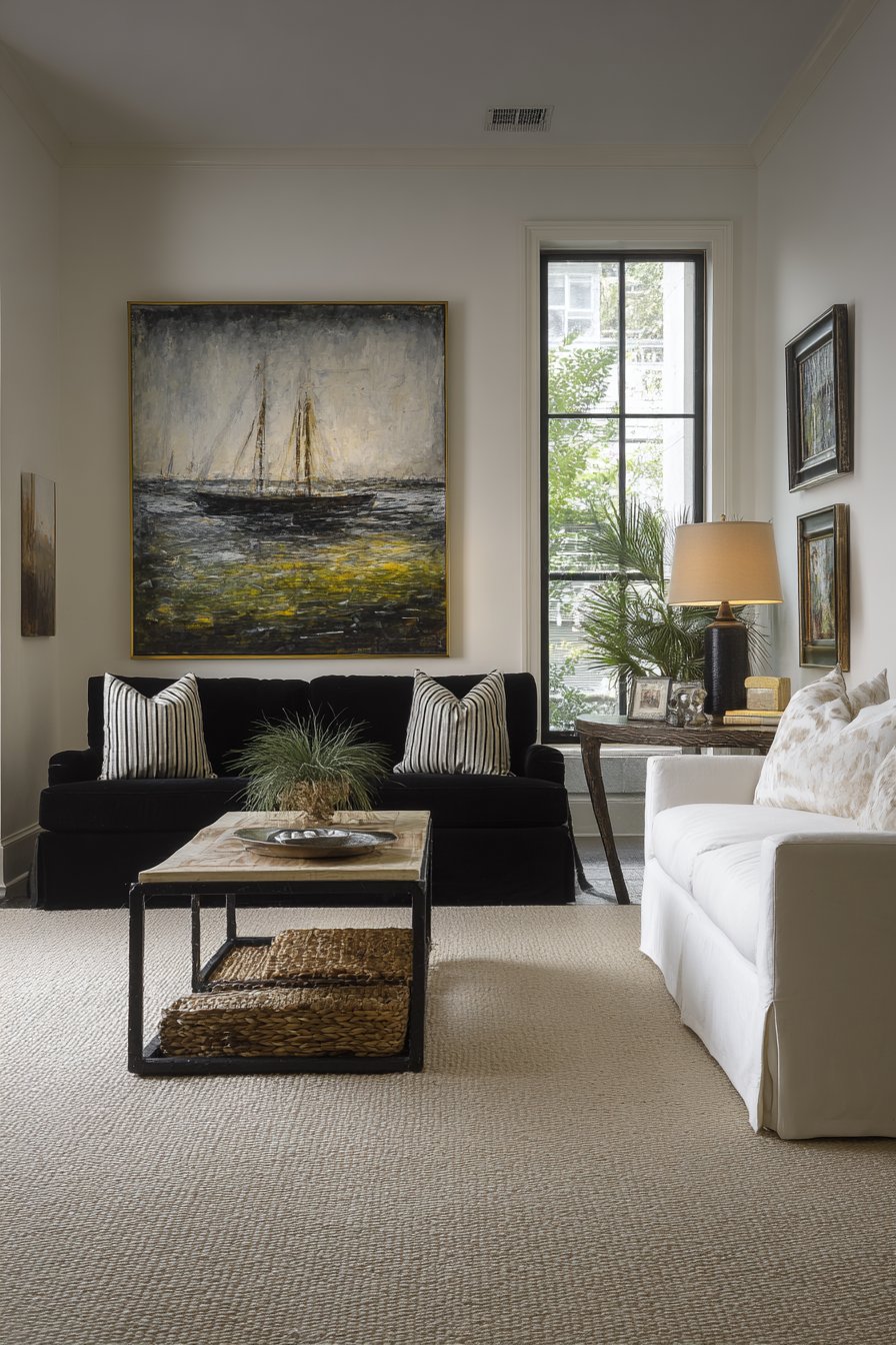
16. Minimalist Statement Piece
A minimalist entryway demonstrates the power of restraint through a single 16×20 inch abstract painting that serves as the sole wall decoration. The painting features subtle color gradation from ivory to soft gray with visible canvas texture, offering visual interest through nuance rather than bold statement. A simple maple frame provides warm contrast against white walls without competing for attention, allowing the painting’s quiet sophistication to shine. Natural light from a skylight creates gentle, even illumination that reveals the subtle tonal shifts within the artwork.
This approach to wall art exemplifies core minimalist principles: quality over quantity, intentional negative space, and carefully considered focal points. By choosing one substantial piece rather than multiple smaller ones, the entryway achieves visual calm that allows the painting to be truly seen and appreciated rather than competing with surrounding elements for attention. The neutral color palette supports rather than dominates the space, creating a serene first impression that sets a tranquil tone for the entire home.
The visible canvas texture adds tactile dimension that rewards closer inspection, demonstrating that minimalism need not mean boring or sparse—instead, it encourages appreciation of subtle details often overlooked in busier spaces. The painting’s abstract nature avoids representational imagery that might date or limit interpretation, instead offering a meditative visual experience that complements the minimalist lifestyle philosophy. This single-painting approach works particularly well in entryways where visual simplicity creates a sense of arrival and transition between outside chaos and interior calm.
Key Design Tips:
- In minimalist spaces, invest in one high-quality piece rather than multiple lesser works
- Choose artwork with subtle complexity that reveals itself over time
- Frame simply—let the artwork speak without ornate distraction
- Position with generous negative space on all sides to enhance presence
- Consider how natural light changes throughout the day when selecting placement
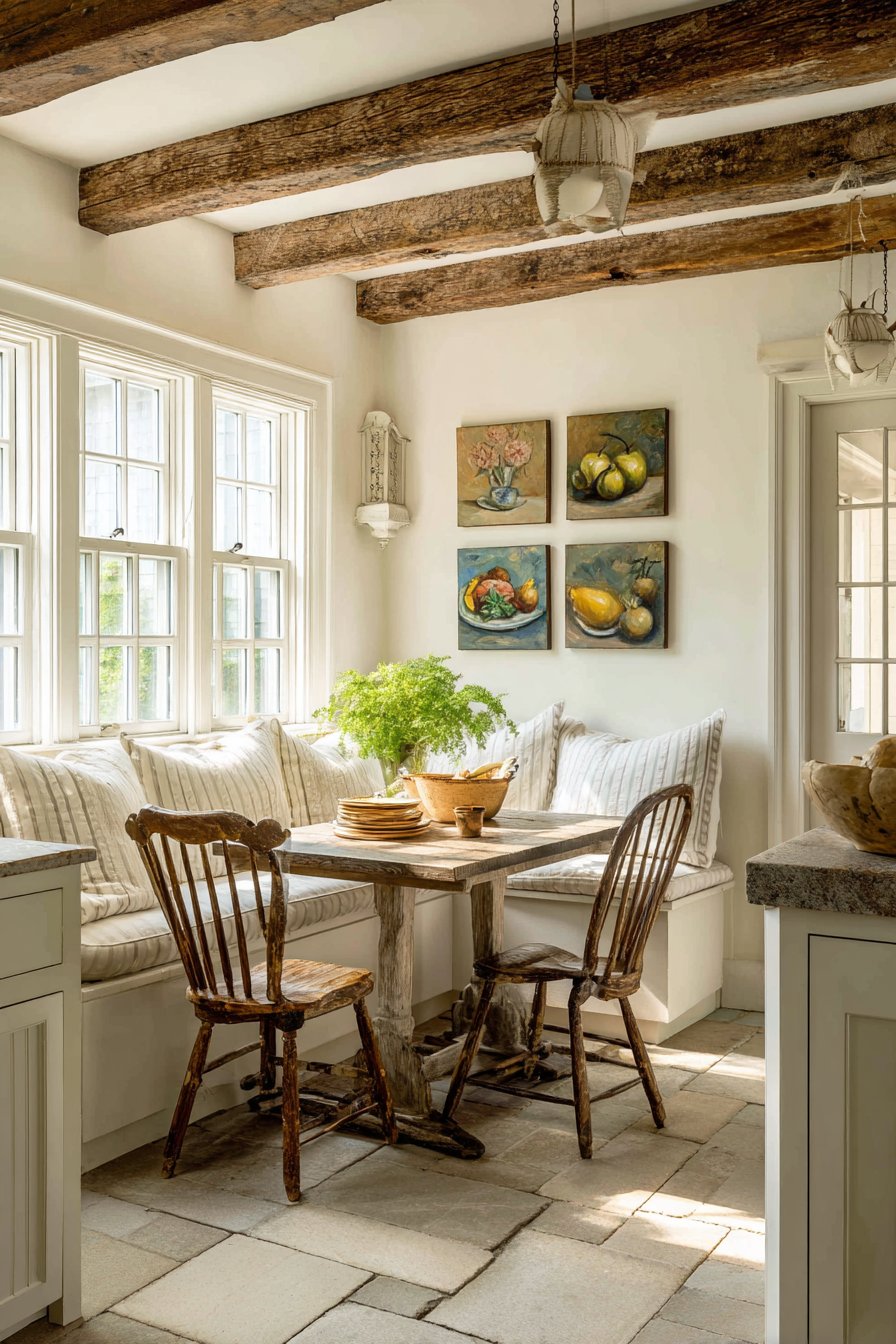
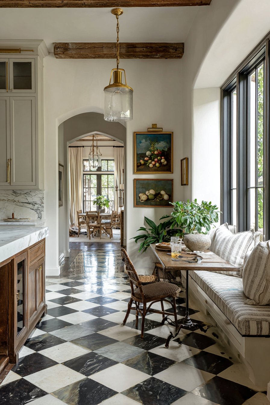
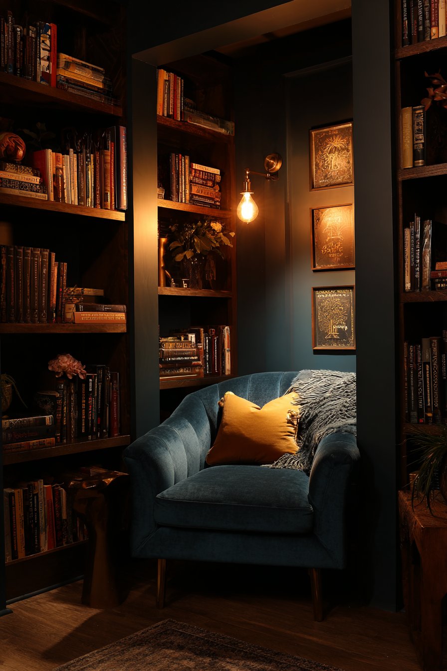
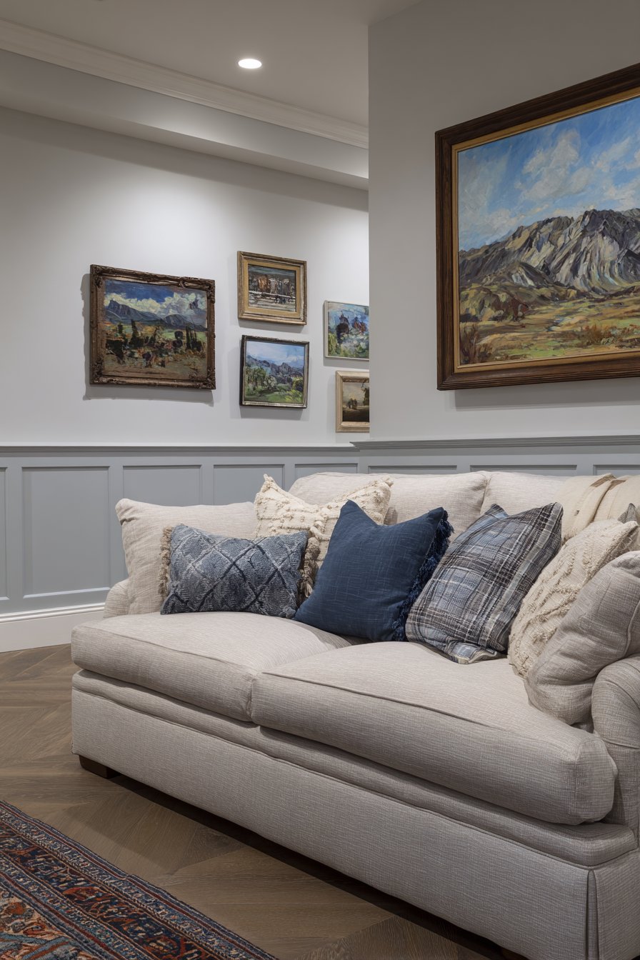
17. Library Nook Thematic Display
A cozy library nook achieves thematic cohesion through six 10×10 inch square paintings that celebrate literary culture and reading life. The paintings feature book-related imagery and meaningful literary quotes in dark wood frames, their square format creating visual order that complements the linear forms of surrounding bookshelves. Deep jewel tones of burgundy, forest green, and navy echo the rich colors often found in leather-bound books and traditional library settings, creating an immersive environment dedicated to the literary arts.
The paintings fill the wall space between built-in bookshelves, transforming what might otherwise be dead space into an integral part of the library aesthetic. Warm reading lamp light highlights the intimate scale of the paintings and their connection to the surrounding books, creating a cohesive environment where visual art and literature engage in meaningful dialogue. The thematic approach—with each painting relating to books, reading, or literary themes—demonstrates how art selection can reinforce a room’s purpose and enhance its dedicated function.
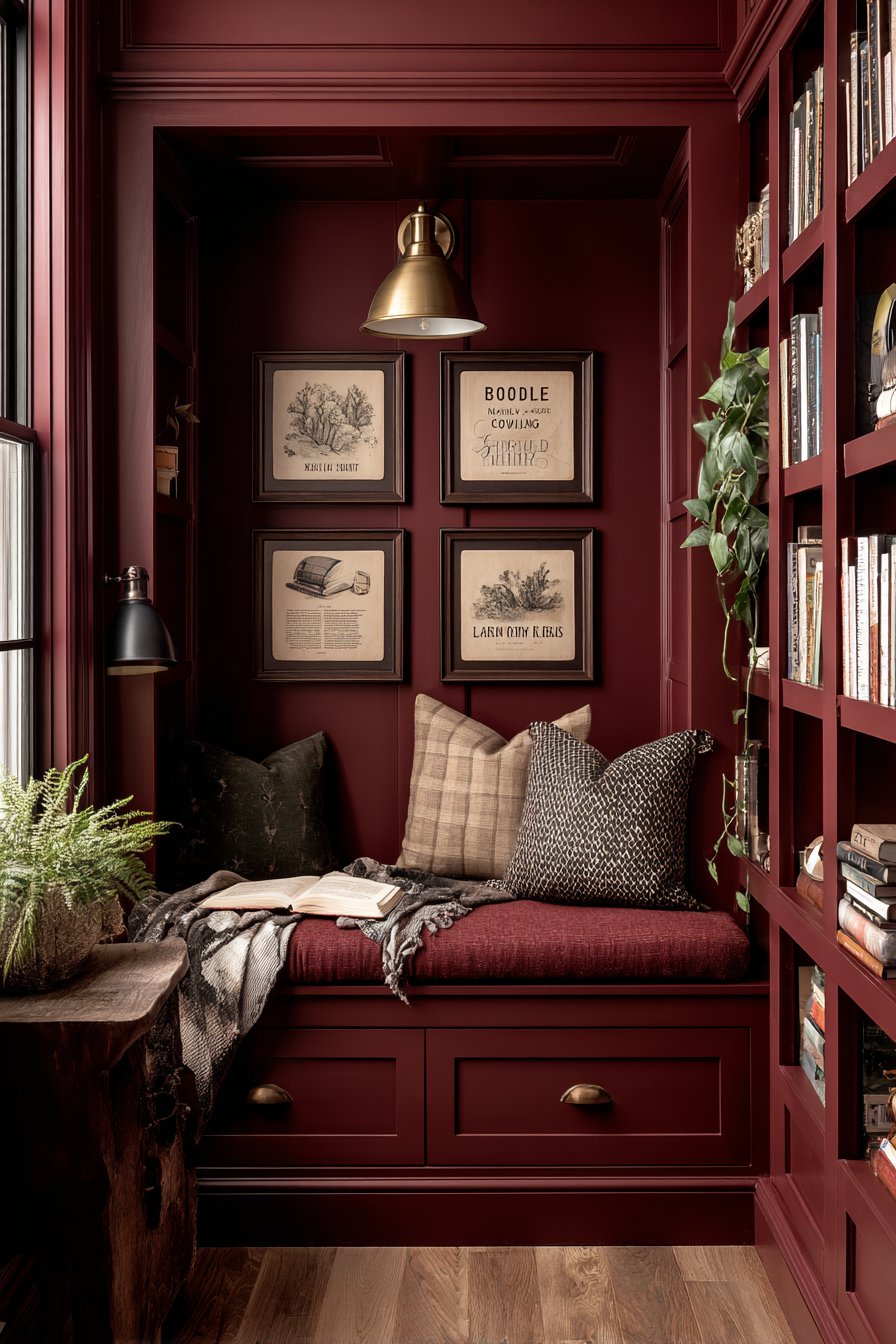
Some paintings might feature stacked vintage books rendered in rich, painterly style, others could showcase meaningful quotes in beautiful calligraphy, while additional pieces might depict reading glasses, fountain pens, or other literary accessories. This variety within a unified theme creates visual interest while maintaining the focused, contemplative atmosphere appropriate for a reading space. The dark wood frames connect with traditional library furniture and architectural details, suggesting the timeless quality of books and reading culture that transcends temporary trends.
Key Design Tips:
- Select art themes that reinforce and celebrate room function
- Dark frames suit library and study settings, adding gravitas and tradition
- Square formats create order and structure appropriate for book-filled spaces
- Position artwork to fill gaps between bookshelves for integrated appearance
- Choose reading lamp placement that illuminates both books and artwork effectively
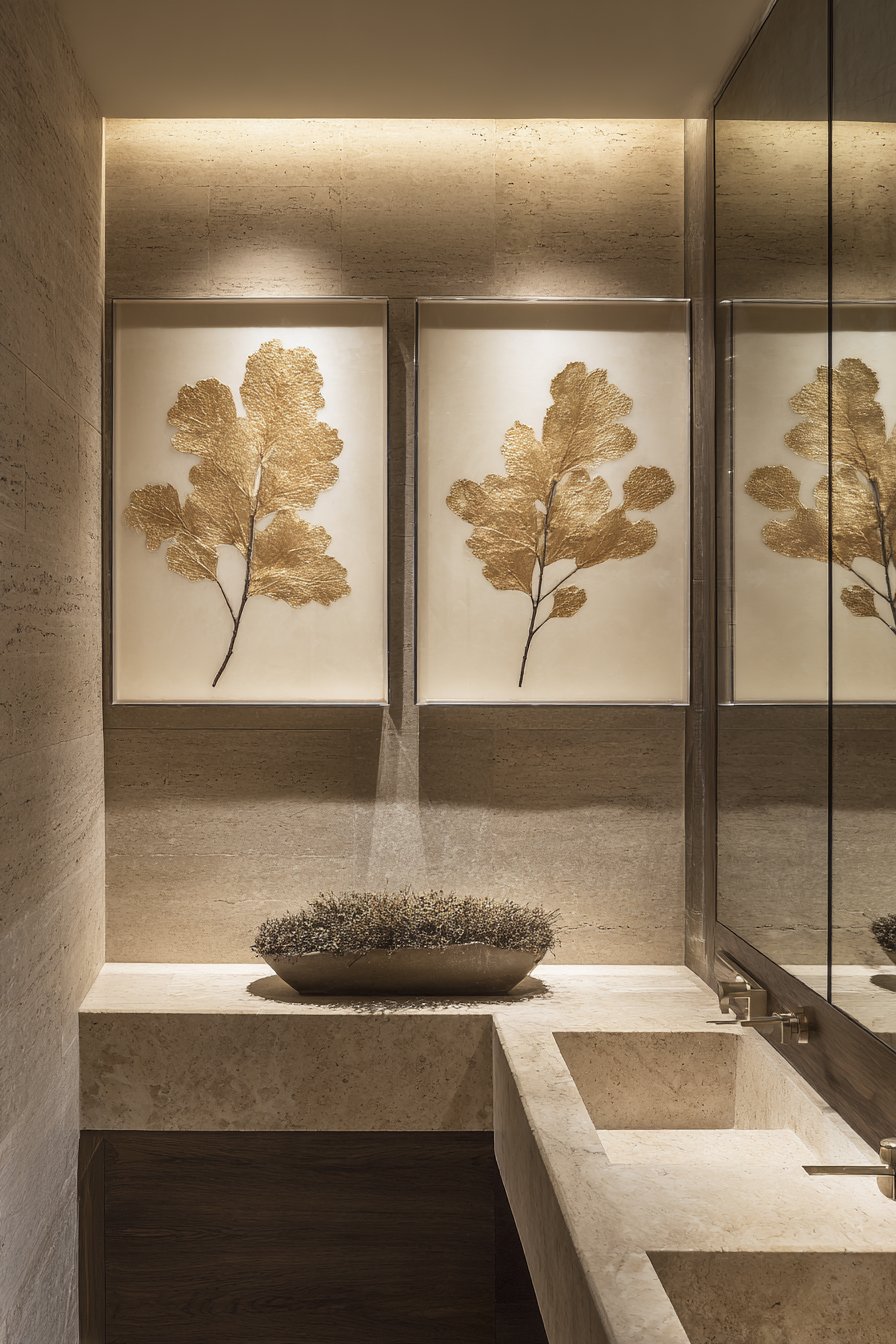
18. Luxury Powder Room Floating Display
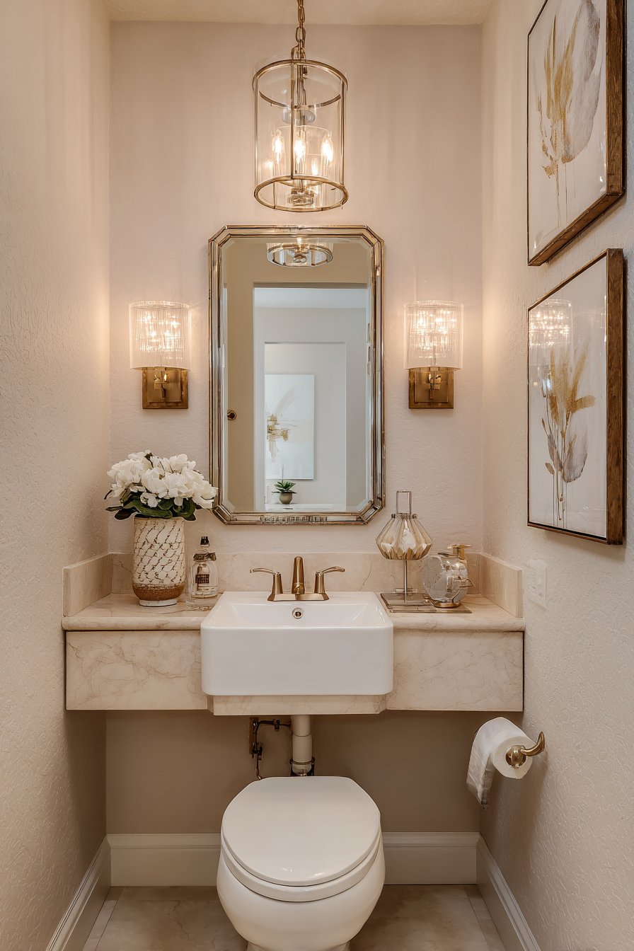
A contemporary powder room achieves maximum impact in minimal space through two small paintings that appear to float on the wall beside an elegant mirror. The 8×10 inch abstract paintings in lucite shadow box frames feature metallic gold leaf accents on cream backgrounds, their transparent frames creating a sophisticated floating effect that adds luxury without visual weight. Soft vanity lighting creates a gentle glow that illuminates the gold leaf, causing it to shimmer subtly and add movement to the small space.
The lucite frames represent a contemporary approach to art display that suits small bathrooms where traditional frames might feel heavy or overwhelming. The transparency allows wall color to show through, maintaining visual continuity while the shadow box depth creates dimension and architectural interest. The cream backgrounds with gold accents complement typical powder room finishes—perhaps marble countertops, polished chrome fixtures, or contemporary wallpaper—while adding artistic refinement appropriate for a space meant to impress guests.
Despite the powder room’s compact dimensions, the inclusion of carefully selected artwork demonstrates attention to design detail throughout the home. These small paintings transform a purely functional space into an aesthetic experience, suggesting that even the smallest rooms deserve artistic consideration. The abstract nature of the paintings with metallic accents feels appropriately sophisticated for a semi-public guest space, offering visual interest without personal revelations or controversial subject matter.
Key Design Tips:
- Lucite or acrylic frames create contemporary elegance in small spaces
- Metallic accents in artwork reflect light and add perceived spaciousness
- Limit powder room art to 1-2 pieces to avoid visual clutter
- Position artwork away from sink splash zones to prevent water damage
- Choose subjects and styles appropriate for semi-public guest viewing
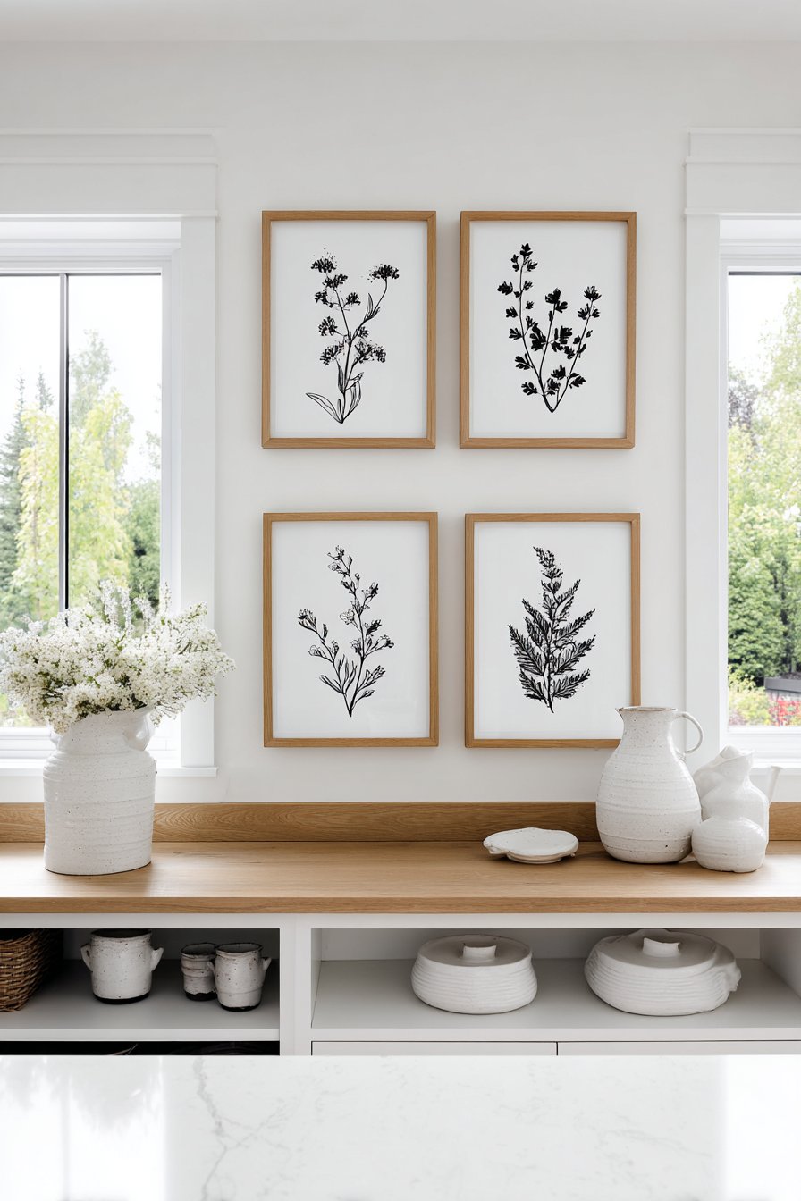
19. Scandinavian Kitchen Linear Arrangement
A Scandinavian kitchen maintains its characteristic uncluttered aesthetic while incorporating artistic expression through three small paintings arranged in a clean, linear composition. The 11×14 inch paintings feature minimalist botanical line drawings in blonde wood frames, their horizontal arrangement above open shelving creating visual rhythm without disrupting the kitchen’s functional clarity. The paintings use only black ink on textured white paper, embracing the Scandinavian preference for simplicity, natural materials, and restrained decoration.
Natural morning light streaming through windows emphasizes the simplicity and elegance of the line drawings, creating subtle shadows that add depth without complexity. The botanical subjects—perhaps single stems of eucalyptus, delicate fern fronds, or simple herb sprigs—connect the kitchen with nature while avoiding the busy florals or food imagery that might feel expected or clichéd in kitchen spaces. The blonde wood frames echo the light wood cabinetry and flooring typical in Scandinavian kitchens, creating material cohesion throughout the space.
This restrained approach to kitchen artwork demonstrates how art can enhance without overwhelming functional spaces. The three-painting limit prevents visual clutter while the linear arrangement creates order and calm. The black-on-white minimalism ensures the paintings don’t compete with kitchen activities or distract from food preparation, instead providing subtle visual interest during quiet morning coffee moments or evening clean-up routines.
Key Design Tips:
- Limit kitchen artwork to simple subjects that won’t clash with food or meal activities
- Light wood frames complement Scandinavian aesthetics and natural material palettes
- Horizontal arrangements above counters or shelving create visual flow
- Choose moisture-resistant materials or seal artwork properly for kitchen humidity
- Position away from cooking areas to prevent grease accumulation or heat damage
20. Transitional Living Room Flexible Rail System
A transitional living room embraces decorating flexibility through a picture rail molding system that allows paintings to sit on a ledge rather than hang directly on walls. Four to five paintings ranging from 9×12 to 12×16 inches rest on the rail, creating an easily changeable display that suits evolving tastes and seasonal updates. The small paintings mix traditional landscapes with modern abstracts in coordinating frames, their varied subjects reflecting the transitional style’s blend of classic and contemporary elements.
Balanced natural and artificial lighting creates even illumination throughout the day, ensuring the paintings remain visible and appreciated in all conditions. The rail system eliminates the commitment and wall damage of traditional hanging, making it ideal for renters, indecisive decorators, or those who enjoy regularly refreshing their spaces. The ability to slide paintings along the rail, add new pieces, or remove others encourages experimentation and keeps the living room feeling current and personally curated.
The transitional style’s hallmark flexibility finds perfect expression in this display method—just as transitional design bridges traditional and contemporary aesthetics, the rail system bridges permanent wall hanging and temporary propping. The mix of landscape and abstract subjects similarly straddles traditional and modern art preferences, creating a collection that appeals to multiple tastes and avoids committing to a single stylistic direction. This adaptability makes the arrangement feel both comfortable and fresh, familiar yet contemporary.
Key Design Tips:
- Install picture rail molding with proper wall anchors to support multiple frames
- Choose a rail depth (4-6 inches) that securely holds frames without tipping
- Experiment with overlapping paintings slightly for added dimension
- Include frames in various finishes that coordinate without perfectly matching
- Refresh the arrangement seasonally to keep your living space feeling current
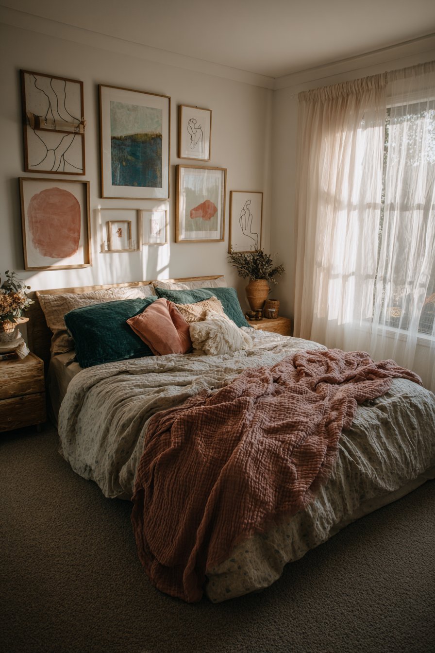
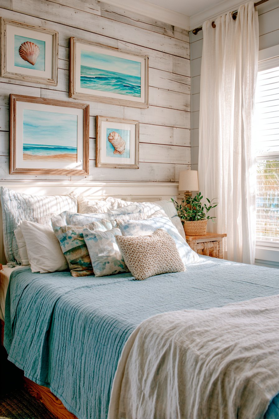
21. Beachy Bedroom Watercolor Waves
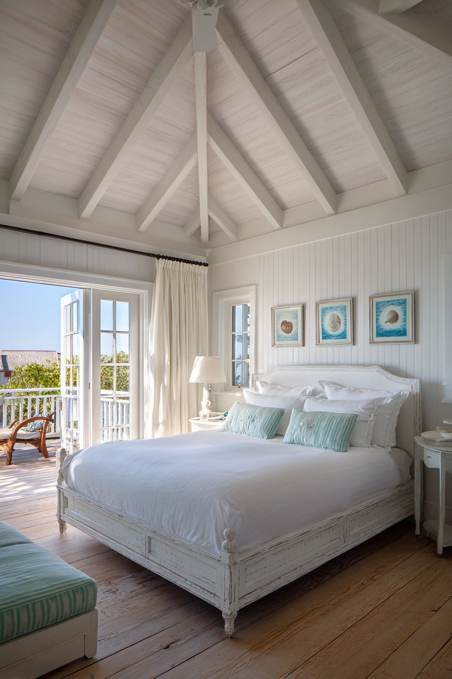
A bedroom infused with coastal tranquility features five small watercolor paintings that evoke beachside serenity through soft, translucent imagery. The paintings range from 8×10 to 12×12 inches and depict various coastal subjects—delicate shells, gentle waves, sandy beaches, weathered driftwood, and sea grass swaying in breezes. Weathered white frames suggest driftwood and beach cottage charm while the translucent watercolor techniques display visible paper texture and pigment blooms that capture water’s fluid, ephemeral nature.
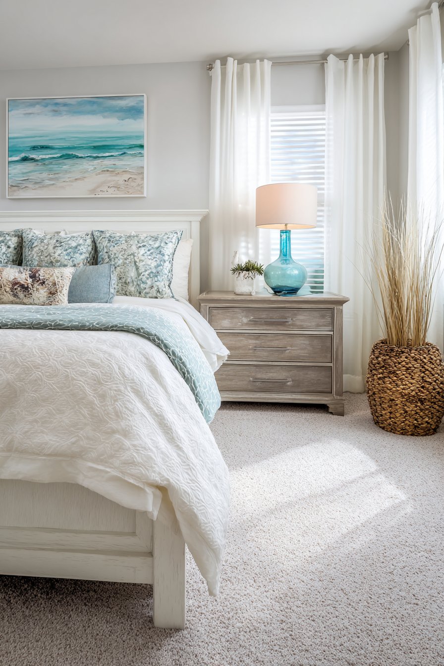
Breezy natural light through gauze curtains enhances the airy, vacation-home feeling, creating an environment that promotes rest and relaxation. The watercolor medium’s characteristic translucency and subtle color gradations feel particularly appropriate for bedroom spaces where gentle visual stimulation supports sleep and dreaming. The varied coastal subjects prevent the theme from feeling one-note while maintaining cohesive subject matter that reinforces the overall aesthetic direction.
The weathered white frames add textural interest and reinforce the beachside aesthetic without appearing artificially themed or heavy-handed. Unlike bright, bold beach-themed décor that can feel juvenile or kitschy, this sophisticated approach to coastal design uses subtle color palettes and artistic interpretation to create a mature, restful environment. The paintings work together to suggest the beach experience—the sound of waves, the feel of sand, the peaceful rhythm of tides—without literally depicting crowded beaches or tourism imagery.
Key Design Tips:
- Watercolor paintings suit bedrooms with their soft, calming visual qualities
- White or weathered frames enhance coastal themes without appearing overly thematic
- Group beach-related subjects for cohesive storytelling across multiple pieces
- Choose muted, natural color palettes rather than bright, saturated beach colors
- Position coastal bedroom art where morning light can illuminate translucent watercolors
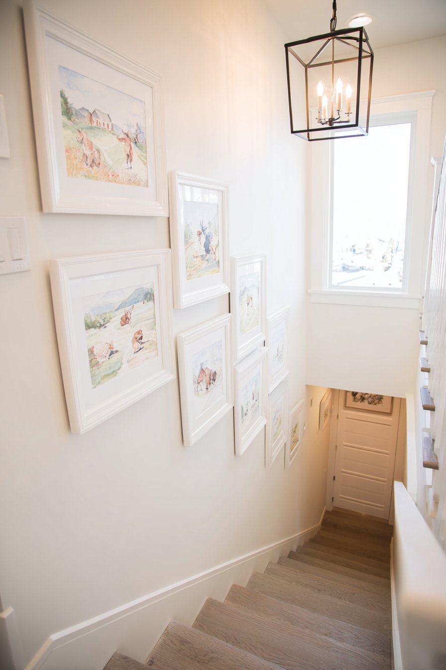
22. Farmhouse Stairwell Ascending Display
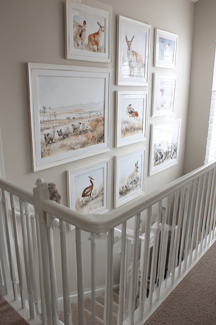
A modern farmhouse stairwell becomes an artistic journey through small paintings that climb the wall alongside the ascending stairs. Seven 10×10 inch paintings in matching white frames create visual movement that complements the staircase’s upward progression, each painting positioned at eye level for optimal viewing as you climb. The paintings depict farm animals and pastoral scenes in a gentle palette of sage, cream, and soft gray, celebrating rural life with tender, nostalgic imagery appropriate for farmhouse style.
Natural stairwell lighting from a window highlights each piece progressively as you ascend, creating a sequential viewing experience that engages inhabitants and guests throughout their vertical journey. The consistent square format and white frames create visual cohesion across the series while varied subject matter within each painting provides ongoing interest—perhaps a gentle cow in morning mist, chickens pecking in a yard, a distant barn under soft skies, sheep grazing on rolling hills, a weathered fence post, wildflowers in a meadow, and a farmhouse at golden hour.
This ascending arrangement demonstrates creative use of vertical space in areas often overlooked for art display. The stairwell’s transitional nature makes it perfect for a connected series of images that tell a visual story as you move through the space. The farm imagery reinforces the farmhouse aesthetic throughout the home while the soft, muted palette prevents the rural theme from feeling overly literal or themed, instead suggesting a refined, contemporary interpretation of country living.
Key Design Tips:
- Stairwell art should follow the angle of the stairs for proper visual flow
- Maintain consistent eye-level placement by measuring from each stair tread
- Use identical frames and sizes for series displays to create cohesive narrative
- Ensure adequate stairwell lighting to properly illuminate ascending artwork
- Secure frames exceptionally well in high-traffic vertical spaces
23. Art Deco Glamour and Geometry
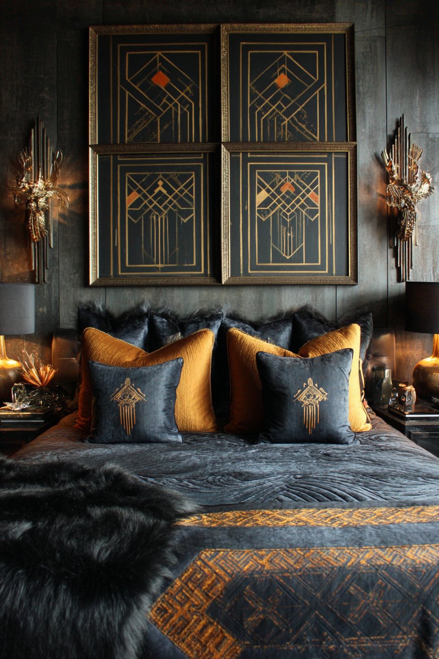
An art deco-inspired bedroom achieves period glamour through four small paintings featuring the era’s characteristic geometric and streamlined designs. The 12×14 inch paintings in stepped gilt frames display bold art deco motifs in black, gold, and peacock blue—perhaps sunburst patterns, zigzag geometries, stylized florals, and architectural elements that celebrate the machine age aesthetic. The stepped frame profile itself references art deco’s signature layered, architectural approach to ornamentation.
Subtle metallic elements within the paintings catch ambient lighting from period-appropriate sconces, creating dramatic highlights that add dimension and luxury. The bold color combination of black, gold, and peacock blue represents quintessential art deco palette choices, evoking the era’s love of contrast, opulence, and exotic influences. The geometric precision within each painting reflects the mathematical order and modern optimism that characterized 1920s and 30s design.
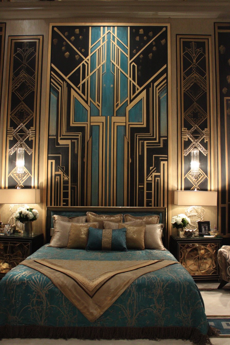
Professional interior photography with balanced exposure would capture the glamorous sophistication of this carefully curated display, demonstrating how small paintings can anchor a themed interior when subject matter and framing align perfectly with the design period. The art deco style’s emphasis on luxury, geometry, and bold visual statements finds perfect expression in this focused collection that transforms a bedroom wall into a celebration of one of design history’s most distinctive eras.
Key Design Tips:
- Period-specific artwork should match frame styles to the era for authenticity
- Art deco frames often feature stepped profiles, geometric details, and metallic finishes
- Bold color contrasts suit art deco aesthetics—avoid pastel or muted palettes
- Position deco artwork where artificial lighting can create dramatic shadows
- Include metallic elements in artwork to catch and reflect available light
Why These Small Wall Painting Ideas Create Lasting Impact
The diverse small wall painting ideas presented throughout this article demonstrate why miniature artworks have become increasingly popular in contemporary interior design. Unlike large statement pieces that require significant wall space, substantial financial investment, and long-term commitment, small paintings offer unparalleled flexibility and accessibility. They allow homeowners to experiment with color, style, and arrangement without the intimidation or expense of major art purchases, making sophisticated interior design achievable for various budgets and skill levels.
The versatility of small paintings addresses one of interior design’s greatest challenges: creating personalized spaces that evolve with changing tastes, lifestyles, and trends. A carefully curated collection of small artworks can be rearranged seasonally, rotated to reflect current interests, or gradually expanded as budget allows. This adaptability proves particularly valuable in rental situations or for young homeowners whose aesthetic preferences continue developing. The ability to refresh wall displays without paint, major furniture changes, or renovation expenses makes small paintings an especially practical design tool.
From a practical standpoint, small paintings work exceptionally well in modern homes where open floor plans and multipurpose rooms have replaced traditional single-function spaces. Their modest scale suits the compact dimensions of contemporary apartments, condos, and efficiently designed homes where every square foot must be maximized. Small paintings can enhance intimate spaces—powder rooms, reading nooks, hallways, and closets—that larger artworks would overwhelm, extending thoughtful design throughout the entire home rather than limiting artistic expression to primary living areas.
The psychological impact of thoughtfully selected and displayed artwork should not be underestimated. Small paintings create focal points that guide the eye, establish color palettes, communicate personal taste, and contribute emotional resonance to living spaces. Whether calming abstracts in a bedroom promote rest, playful pieces in a children’s room encourage creativity, or sophisticated displays in public areas demonstrate cultural refinement, artwork profoundly influences how we experience and feel within our homes. The accessibility of small paintings democratizes this benefit, making art’s positive effects available regardless of budget constraints.
From technical and compositional perspectives, working with multiple small paintings develops valuable design skills including color coordination, spatial balance, and asymmetrical composition. The process of selecting, arranging, and displaying small artworks teaches fundamental design principles that transfer to other decorating decisions. Learning to create visual balance through varied sizes, establish rhythm through repetition, and build cohesive color stories across multiple pieces builds confidence in personal aesthetic judgment and decision-making.
Small wall paintings also support sustainable and economical approaches to interior design. Rather than purchasing mass-produced art prints or inexpensive posters, investing in small original paintings—whether from emerging artists, student exhibitions, online marketplaces, or personal creative efforts—supports artistic communities while acquiring unique pieces with lasting value. The modest price points of small original works make art collecting accessible to middle-income households, fostering cultural engagement and appreciation for visual arts beyond museum visits and gallery viewings.
The specific examples throughout this article—from Scandinavian dining rooms to art deco bedrooms, coastal bathrooms to industrial lofts—demonstrate that small painting displays successfully enhance every major design style. Whether your aesthetic leans minimalist or maximalist, traditional or contemporary, rustic or refined, small artworks can be selected and arranged to complement and reinforce your chosen direction. The key lies in thoughtful curation: selecting pieces with appropriate subject matter, coordinating color palettes, and employing arrangement strategies that align with your overall design vision.
For those hesitant about commitment or concerned about making mistakes, small paintings offer an ideal entry point into art collecting and display. Their modest investment allows experimentation without significant financial risk, while their manageable size makes repositioning and rearranging simple. This low-stakes environment encourages creative risk-taking, helping develop personal style through trial and error rather than relying solely on professional design services or trend-following.
The technical considerations addressed throughout this guide—proper hanging heights, appropriate lighting, frame selection, and arrangement strategies—provide practical frameworks for successful implementation. These guidelines prevent common pitfalls while encouraging personal interpretation and creative expression. The combination of structured principles and artistic freedom characterizes effective interior design: understanding rules provides foundation while knowing when to break them enables innovation and individuality.
Finally, small wall paintings create opportunities for meaningful storytelling within your home. A collection accumulated over time—vacation souvenirs, local artist discoveries, inherited pieces, personal creative experiments—narrates your life journey in visual form. Each painting becomes a memory marker, conversation starter, or reflection of a particular moment, interest, or relationship. This narrative quality transforms houses into homes, creating environments rich with personal significance that transcends mere aesthetic appeal.
The accessibility, versatility, and impact of small wall paintings make them essential tools in the modern interior designer’s repertoire. Whether you’re furnishing your first apartment, refreshing an established home, or seeking ways to express evolving aesthetic sensibilities, the strategic use of miniature artworks offers solutions that balance beauty, practicality, and personal expression. The ideas explored throughout this comprehensive guide provide starting points for your own creative journey, demonstrating that transformative interior design need not require lavish budgets or extensive square footage—sometimes the smallest canvases create the most significant impact.
Conclusion
Small wall painting ideas offer an accessible, flexible, and impactful approach to personalizing your living spaces. Throughout this comprehensive exploration of 23 diverse display strategies, we’ve seen how miniature artworks adapt to every room, aesthetic, and functional need. From the serene watercolors in coastal bedrooms to bold geometric compositions in art deco spaces, from salon-style gallery walls in Parisian apartments to minimalist single-piece statements in contemporary entryways, small paintings prove that size doesn’t limit artistic impact.
The beauty of working with small paintings lies in their inherent flexibility. Unlike major furniture purchases or permanent architectural changes, small artworks allow you to experiment with color, style, and arrangement without significant financial investment or long-term commitment. They democratize art collecting, making original works accessible while supporting emerging artists and local creative communities. Whether you’re a renter seeking non-permanent solutions, a homeowner building a collection gradually, or simply someone who enjoys refreshing their spaces seasonally, small paintings provide the perfect medium for evolving expression.
As you embark on your own small wall painting journey, remember that successful art display combines practical guidelines with personal intuition. Consider sight lines, lighting conditions, and functional requirements, but don’t let rules override your instincts. Your home should reflect your unique story, interests, and aesthetic sensibilities. Start with pieces that genuinely resonate with you, experiment with different arrangements, and allow your collection to grow organically over time. The most compelling gallery walls aren’t purchased all at once but curated gradually, creating visual narratives that deepen with each thoughtful addition. Transform your walls from blank canvases into personal galleries that inspire, comfort, and delight daily.