The living room stands as the heart of every home—a space where families gather, conversations flow, and memories are made. Yet, despite its importance, choosing the right color scheme for this central space can feel overwhelming. The colors you select don’t merely coat your walls; they set the mood, define the atmosphere, and reflect your personal style. From serene neutrals that create calm retreats to bold jewel tones that make powerful statements, the right living room color ideas can completely transform how you experience your space.
Color has an extraordinary ability to influence our emotions and perceptions. A carefully chosen palette can make a small living room feel spacious and airy, or transform a large, cold room into an intimate gathering space. Whether you’re drawn to the timeless elegance of monochromatic schemes, the energy of complementary colors, or the sophistication of analogous palettes, understanding how different hues work together is essential to creating a living room that feels both beautiful and functional.
In this comprehensive guide, we’ll explore twenty-five inspiring living room color ideas that span the spectrum from subtle and sophisticated to bold and dramatic. Each approach offers unique possibilities for transforming your space, whether you’re working with abundant natural light or creating ambiance in a cozy setting. These carefully curated color schemes cater to diverse design styles—from coastal-inspired tranquility to glamorous metallic accents, rustic warmth to modern minimalism. Let’s discover how the perfect color palette can breathe new life into your living room and create a space that truly feels like home.
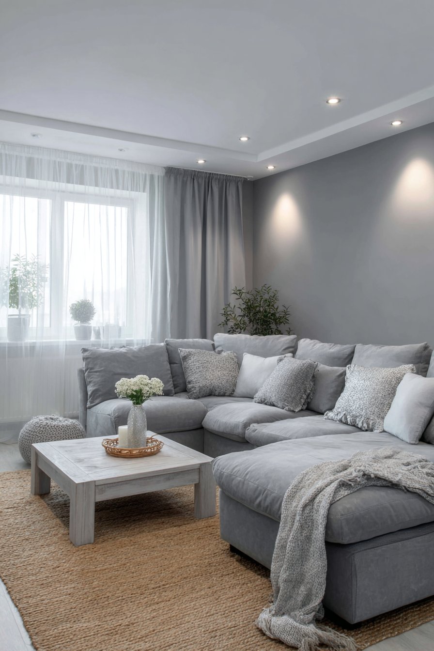
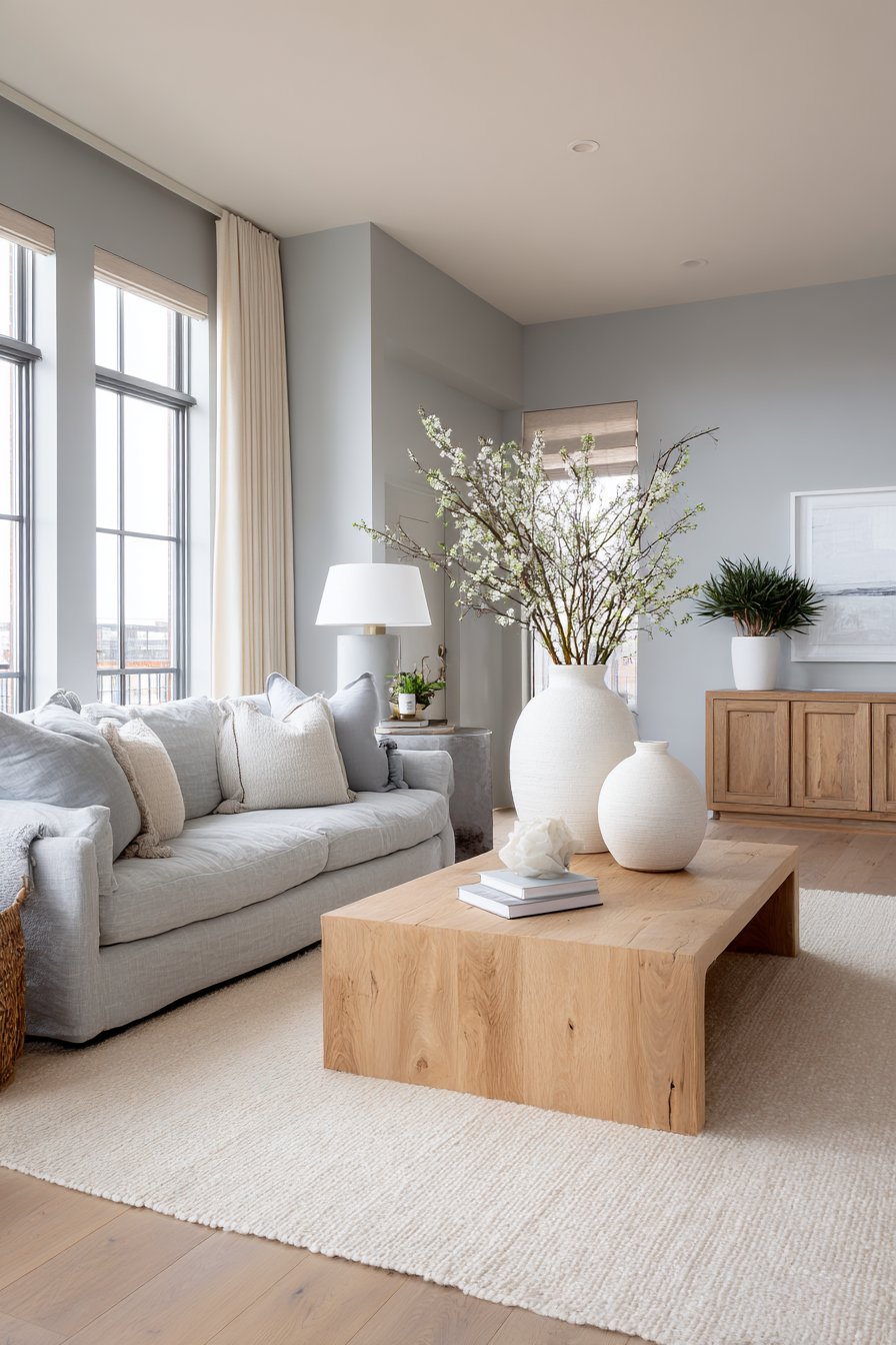
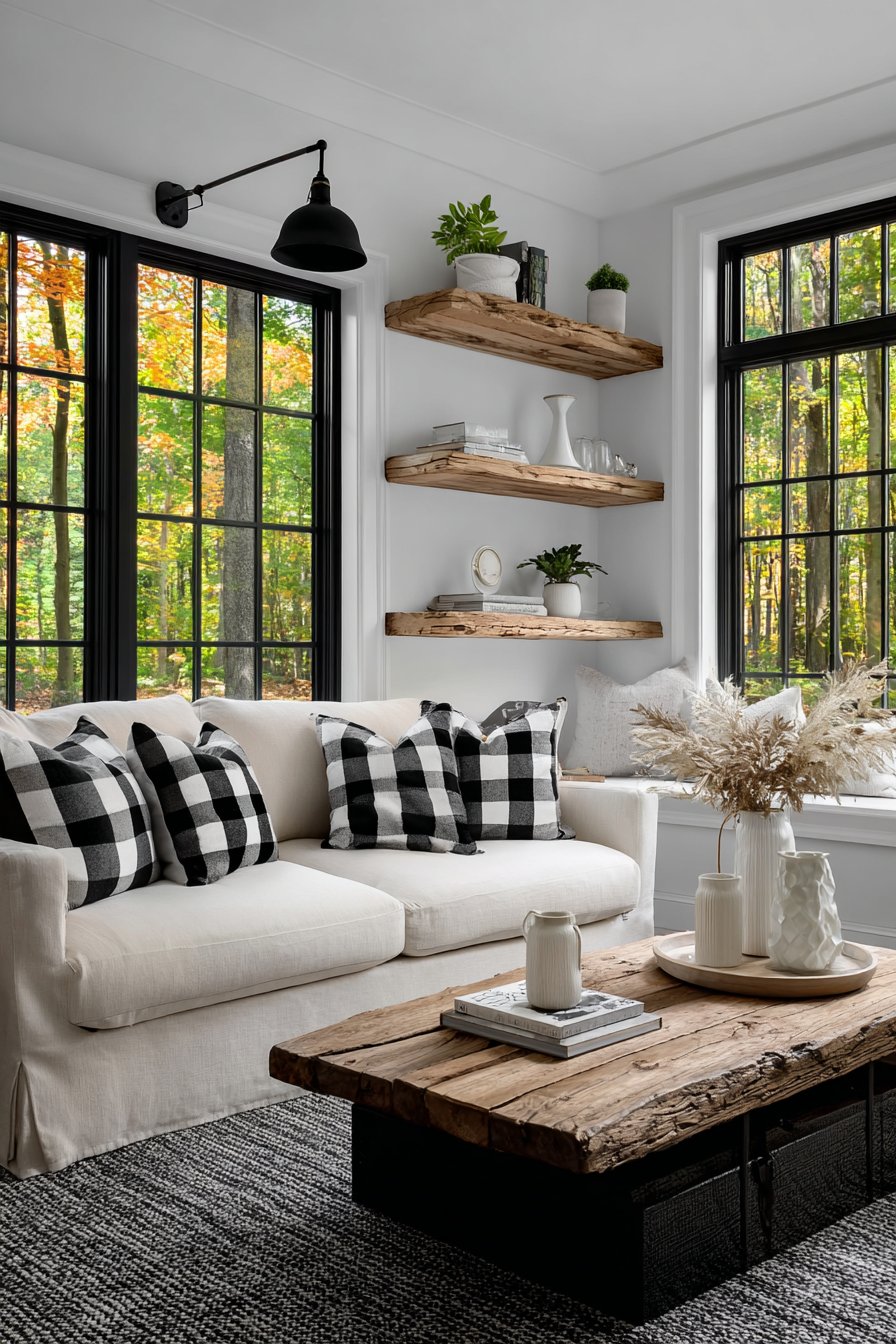
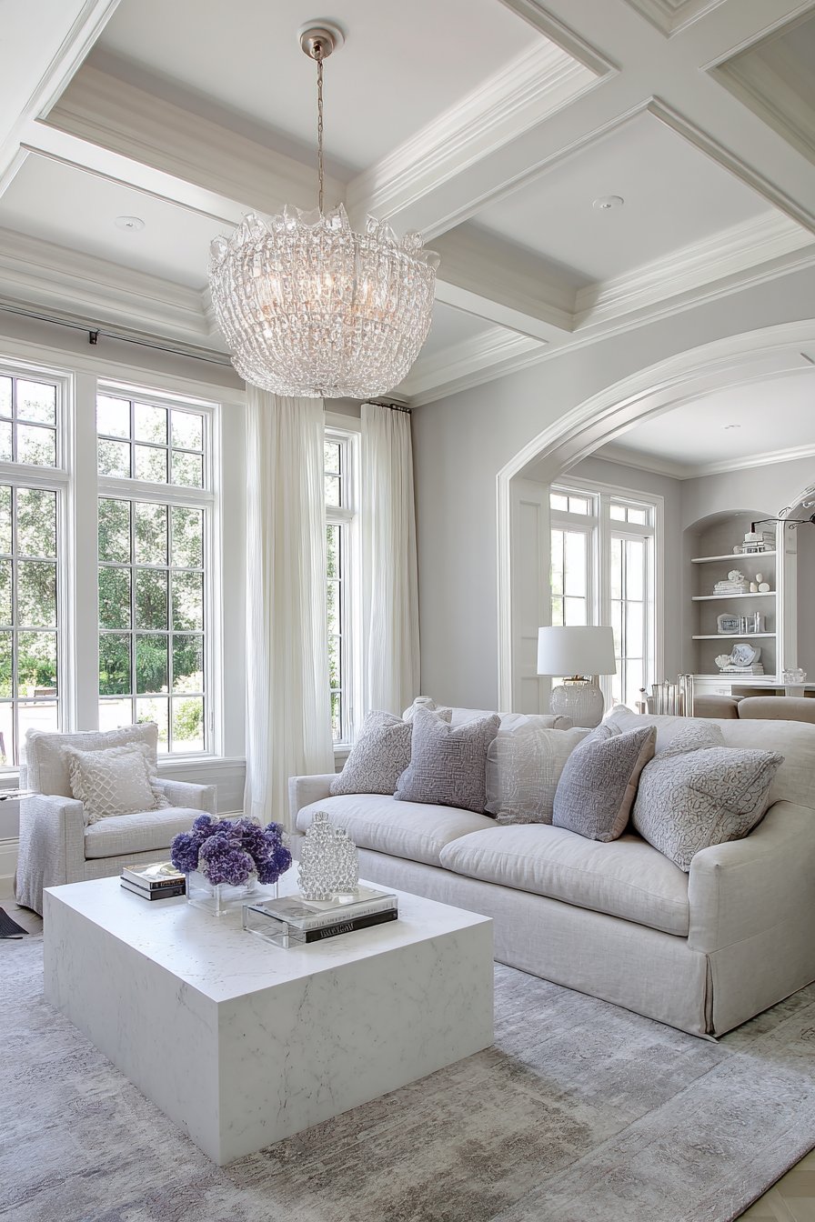
1. Serene Monochromatic Grey Sanctuary
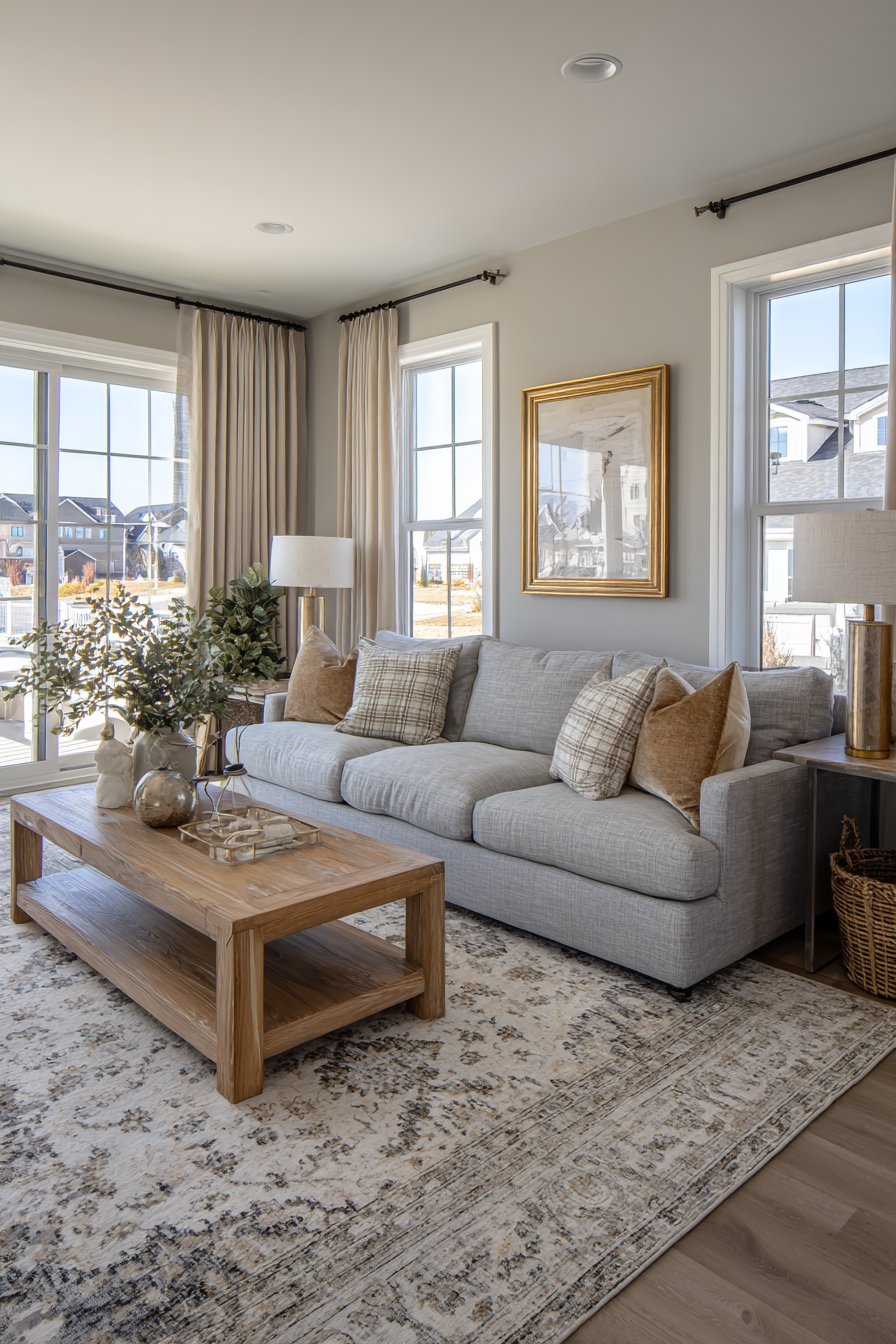
A living room designed around varying shades of grey creates an unexpectedly sophisticated and calming environment that proves neutrals are anything but boring. This monochromatic approach to living room color ideas demonstrates how a single color family, when thoughtfully layered, can produce remarkable depth and visual interest. The space features a plush grey sectional sofa that anchors the room, upholstered in a textured fabric that catches light differently throughout the day. Textured throw pillows in silver and pewter add subtle variation while maintaining the cohesive color story.
The walls showcase the true artistry of this approach, with an accent wall in sophisticated darker grey providing dramatic contrast against remaining walls painted in a lighter, warmer grey tone. This tonal variation creates dimension without introducing competing colors, allowing the eye to appreciate the interplay of light and shadow across different surfaces. The subtle texture on the darker accent wall adds tactile interest that prevents the space from feeling flat or monotonous.
Natural materials ground this grey living room color idea and prevent it from feeling cold or sterile. A natural jute area rug introduces organic texture underfoot, while a whitewashed oak coffee table brings warmth through its blonde wood tones and visible grain patterns. Floor-to-ceiling sheer curtains filter natural light beautifully, creating soft shadows that emphasize the tonal depth of the grey palette throughout the day. The way sunlight moves across these varied grey surfaces creates an ever-changing landscape of subtle color variations.
When implementing this living room color idea, consider the undertones of your grey selections carefully—cool greys with blue undertones create crisp, modern spaces while warm greys with beige undertones feel more inviting and cozy. Layer at least five different shades of grey throughout the space, from charcoal to dove grey, to achieve proper depth and prevent the room from appearing one-dimensional. Introduce varied textures through fabrics, area rugs, and accessories to add visual interest without breaking the monochromatic scheme. Pay special attention to lighting, as grey can appear dramatically different under warm versus cool light sources—test your paint colors at different times of day before committing. Finally, incorporate small amounts of white or cream to provide visual resting points and prevent the space from feeling too heavy or enclosed.
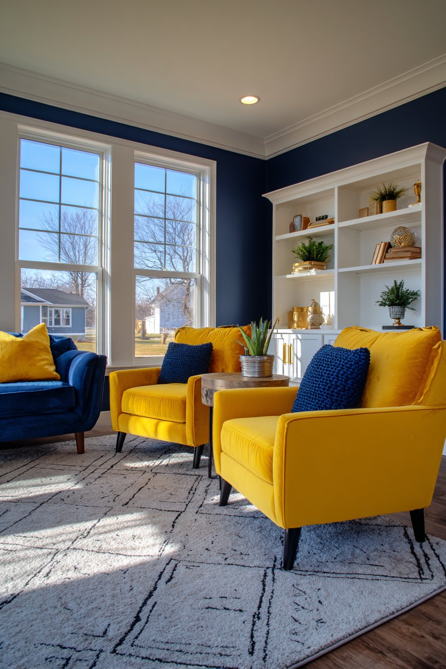
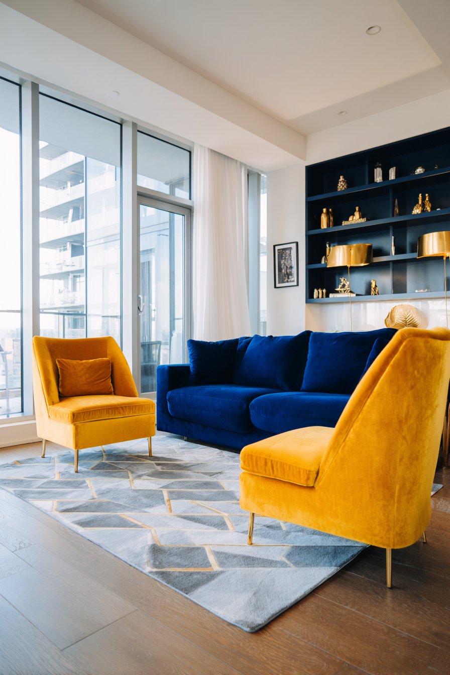
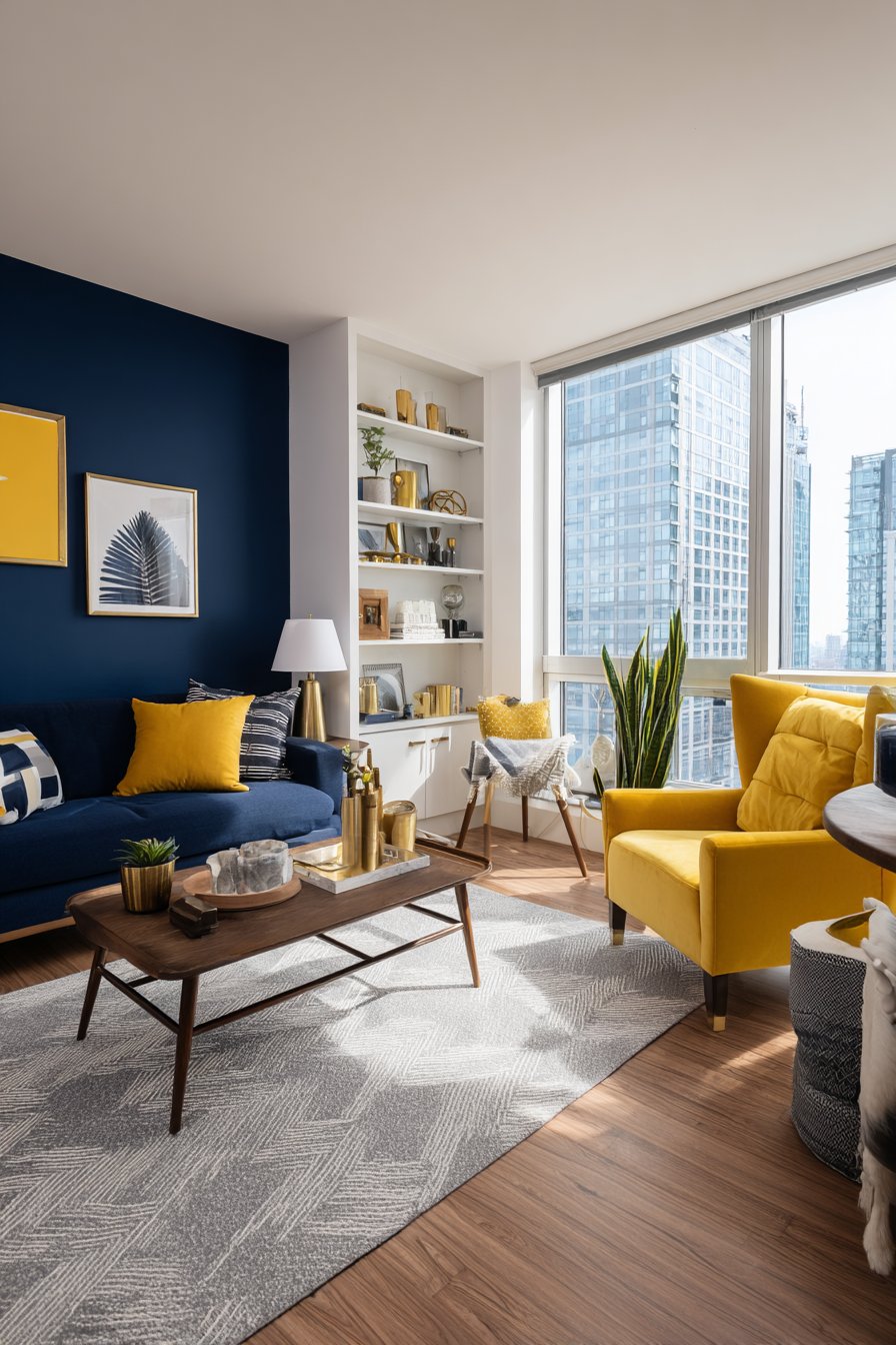
2. Vibrant Navy and Mustard Yellow Energy
Bold living room color ideas that pair deep navy blue with vibrant mustard yellow create spaces filled with personality and dynamic visual interest. This complementary color scheme draws on classic color theory while feeling fresh and contemporary, proving that courage in color selection pays dividends in creating memorable interiors. The navy blue sofa, with its contemporary clean lines, serves as a substantial anchor against crisp white walls, providing a sophisticated foundation that allows the accent colors to truly shine.
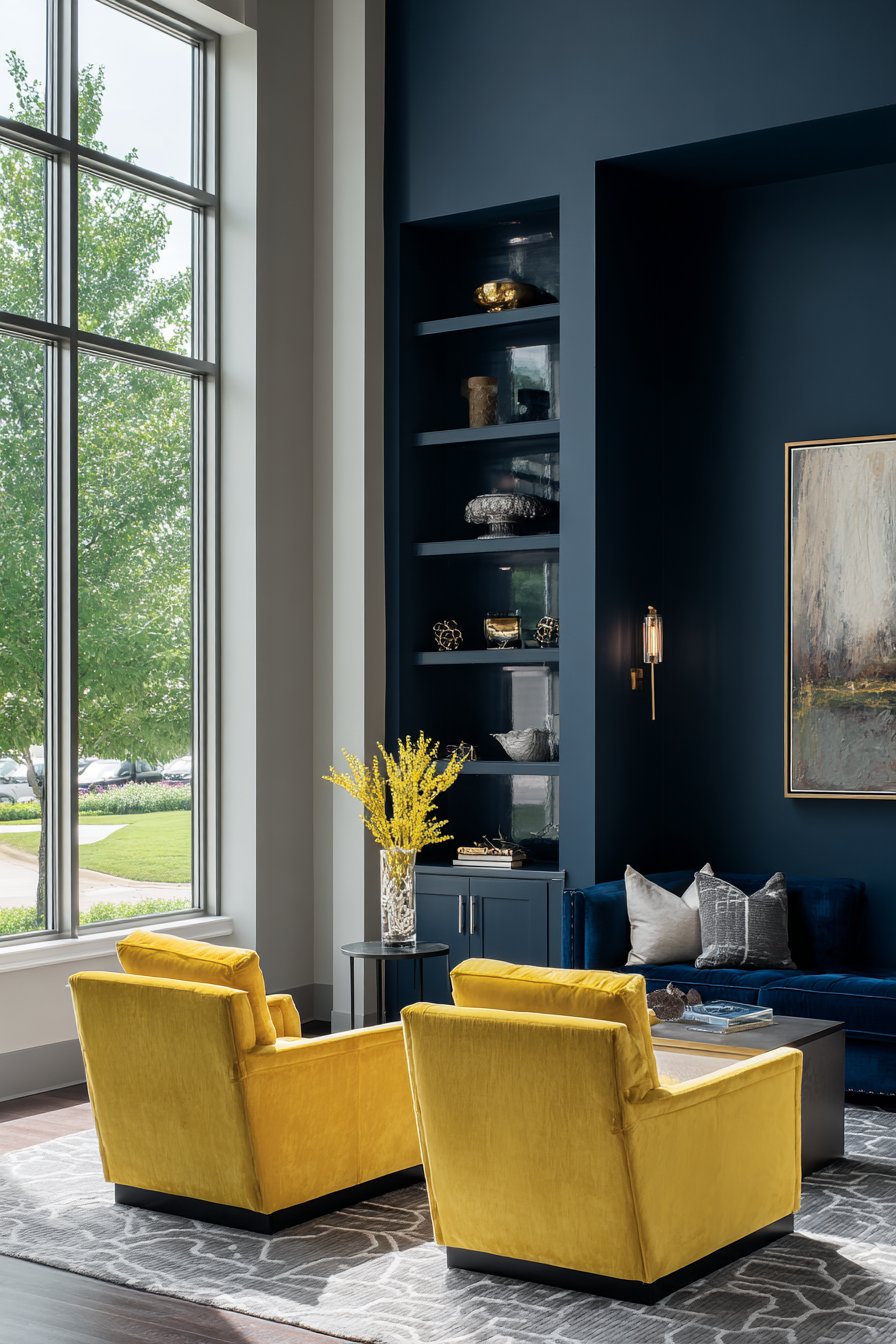
The mustard yellow velvet armchairs positioned at strategic angles inject warmth and energy into the space, their rich texture catching light beautifully and creating focal points that draw the eye. The statement navy accent wall behind built-in shelving creates architectural depth while providing the perfect backdrop for displaying curated accessories in complementary brass and yellow tones. This combination of navy and mustard represents one of the most dynamic living room color ideas for those seeking to make a bold statement without sacrificing sophistication.
The light grey area rug with geometric patterns grounds the seating arrangement while providing a neutral bridge between the bold color choices, preventing visual overwhelm. Natural light flooding through large windows plays a crucial role in this color scheme, as it highlights the interaction between the deep, rich navy and the bright, saturated yellow. Throughout the day, as light shifts and changes, the relationship between these colors evolves, creating different moods and atmospheres within the same space.
To successfully execute this living room color idea, maintain a roughly 60-30-10 color distribution—use navy as your dominant color, mustard yellow as your secondary accent, and white or neutral tones as your foundation. Introduce metallic accents in brass or gold to complement the warm yellow tones while adding a layer of sophistication and light reflection. Balance the boldness of these saturated colors by keeping walls neutral, which prevents the space from feeling overwhelming or claustrophobic. Consider the room’s natural light when selecting your specific shades—rooms with abundant natural light can handle deeper, more saturated versions of these colors, while spaces with limited light benefit from slightly lighter variations. Use patterns strategically, perhaps in throw pillows or artwork, that incorporate both colors to create visual cohesion throughout the space.
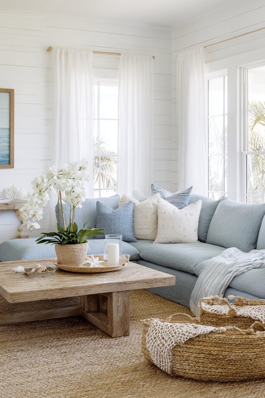
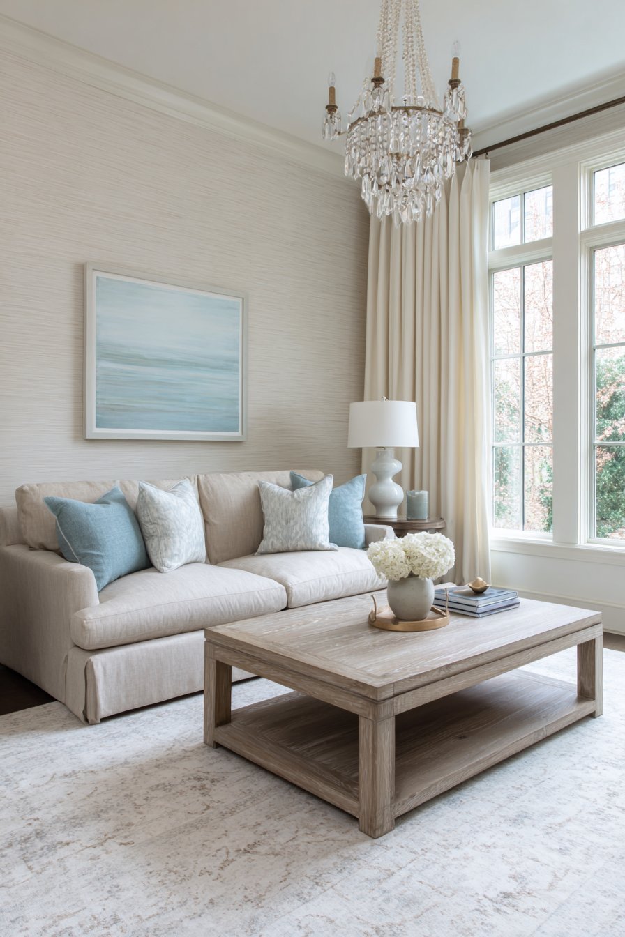
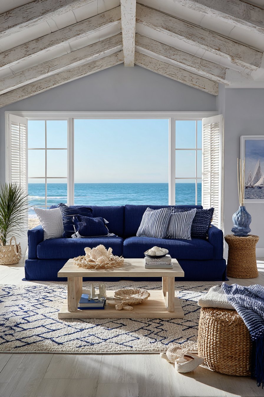
3. Coastal Serenity in Blues and Beiges
Coastal-inspired living room color ideas evoke the tranquility of seaside living through a carefully balanced palette of soft blues and sandy beiges. This approach creates spaces that feel like permanent vacations, offering respite from daily stress through colors psychologically associated with relaxation and natural beauty. The pale blue-grey linen sofa faces whitewashed shiplap walls that immediately establish the coastal aesthetic, their horizontal lines creating subtle texture and visual rhythm.
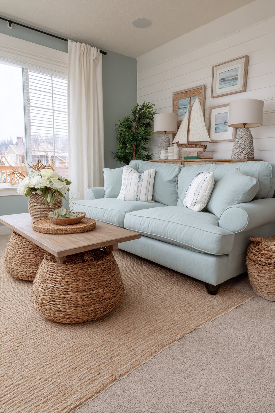
The deeper ocean blue accent wall serves as the room’s focal point, providing enough color saturation to create interest without overwhelming the otherwise light and airy palette. This strategic use of a darker blue demonstrates how accent walls can anchor coastal living room color ideas while maintaining the overall sense of openness. Driftwood coffee table and woven seagrass baskets introduce natural, ocean-inspired textures that reinforce the coastal theme through material choices rather than literal beach motifs.
Coral and white decorative pillows reference beach elements with sophistication, avoiding cliché while still celebrating the coastal inspiration. The sisal area rug in natural tan grounds the space while contributing additional organic texture that echoes sand and natural fibers. Sheer white curtains filter sunlight beautifully, creating the bright, sun-washed atmosphere characteristic of beachside homes where indoor and outdoor living blend seamlessly.
When creating coastal living room color ideas, draw inspiration from actual beach environments rather than stereotypical beach house décor—observe how sand appears in different lighting, how water shifts from deep navy to pale aqua, and how driftwood weathers to beautiful grey tones. Keep the overall palette light and bright to maximize the airy, open feeling essential to coastal design, using your deeper blue tones sparingly as accents rather than dominant colors. Incorporate natural materials like jute, sisal, rattan, and weathered wood to add authentic coastal character without relying on nautical clichés like anchors or seashells. Layer different textures extensively—smooth linen against rough sisal, weathered wood against polished ceramic—to create visual interest within a limited color palette. Finally, prioritize natural light and keep window treatments minimal and light-filtering to maintain the sun-drenched atmosphere that makes coastal living room color ideas so appealing.
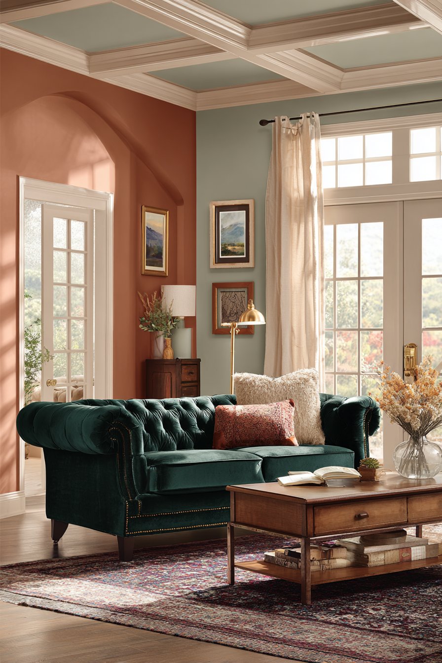
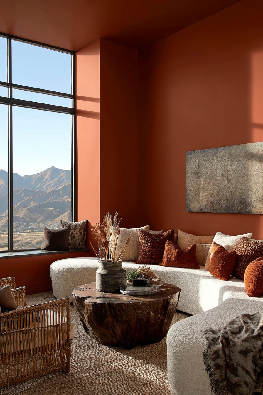
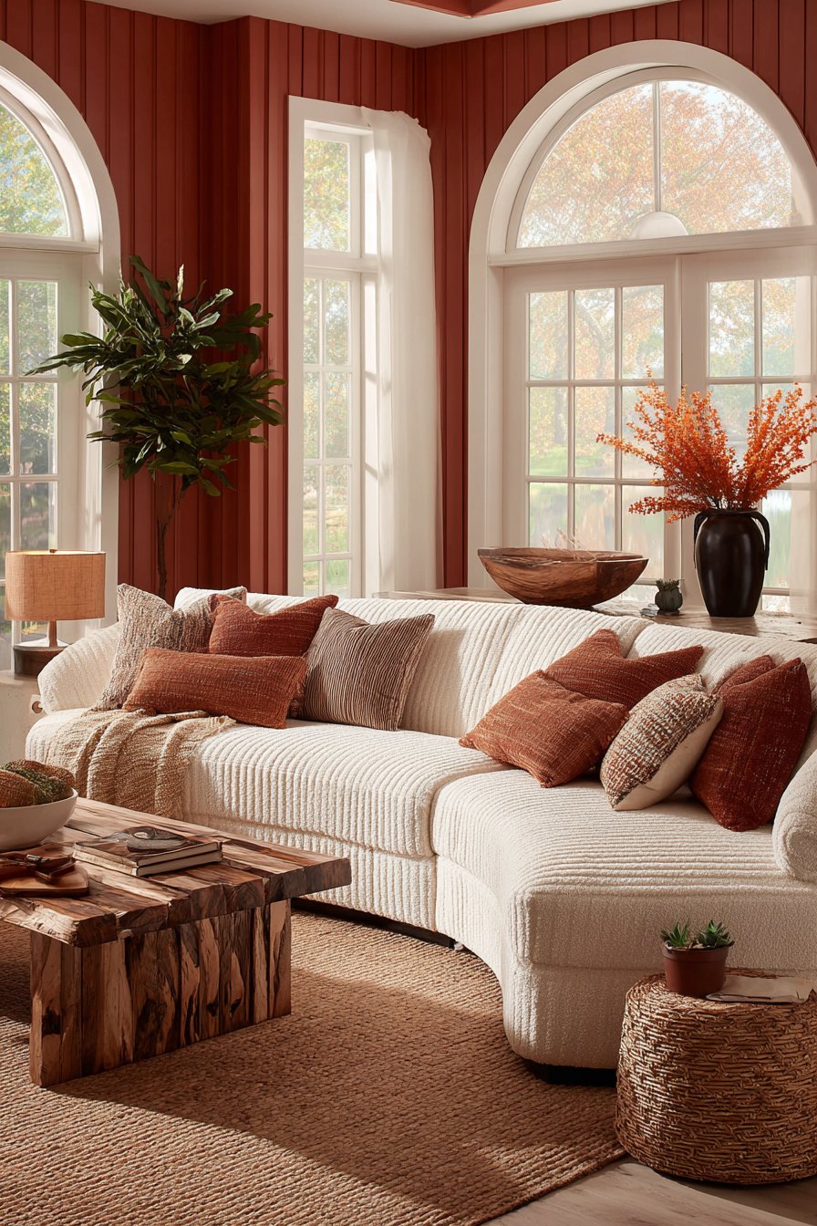
4. Warm Terracotta and Cream Embrace
Earth-toned living room color ideas featuring terracotta and cream create spaces that feel inherently warm and welcoming, tapping into our innate connection to natural clay colors and organic materials. The rich terracotta painted accent wall serves as a stunning focal point, its subtle texture adding depth while the warm orange-red tones create an immediately inviting atmosphere. Against this bold backdrop, a curved sectional in rich cream bouclé fabric provides luxurious seating that balances the terracotta’s intensity with soft, neutral sophistication.
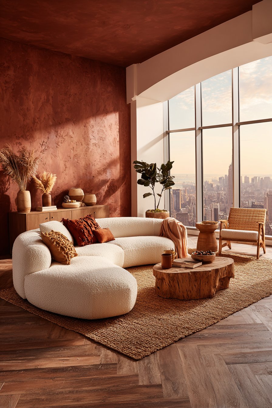
The remaining walls in warm off-white create breathing room and prevent the space from feeling too saturated, demonstrating the importance of balance in living room color ideas that incorporate strong earth tones. Natural rattan accent chairs and a live-edge wood coffee table introduce organic elements that feel perfectly at home within this warm palette, their natural materials echoing the earthiness of terracotta. These wooden elements add varied brown tones that create additional depth within the overall warm color scheme.
Burnt orange and rust-colored throw pillows layer additional warmth and tonal variation, while a handwoven jute rug in caramel tones anchors the seating area with natural texture underfoot. Golden hour lighting through large windows transforms this space into something truly magical, as the warm sunlight intensifies the terracotta tones and creates a glowing ambiance that exemplifies why this ranks among the most comforting living room color ideas.
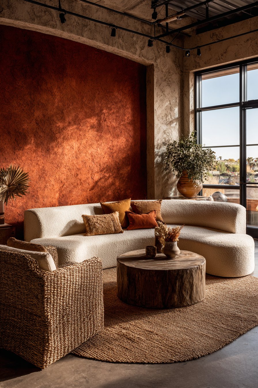
To successfully implement terracotta in your living room color ideas, pair it with plenty of cream, beige, or warm white to prevent the space from feeling too dark or cave-like—terracotta works best as an accent rather than the dominant color throughout. Choose terracotta shades carefully, as they range from pale peachy-orange to deep rust-red; select a tone that complements your natural lighting conditions and desired mood. Incorporate natural materials extensively—wood, rattan, jute, linen, and clay pottery all enhance the organic, earthy feeling of terracotta-based color schemes. Add greenery through plants, as the combination of terracotta and living green creates a naturally harmonious palette found in Mediterranean landscapes. Consider the undertones in your cream and white selections, ensuring they lean warm rather than cool to maintain color harmony throughout the space.
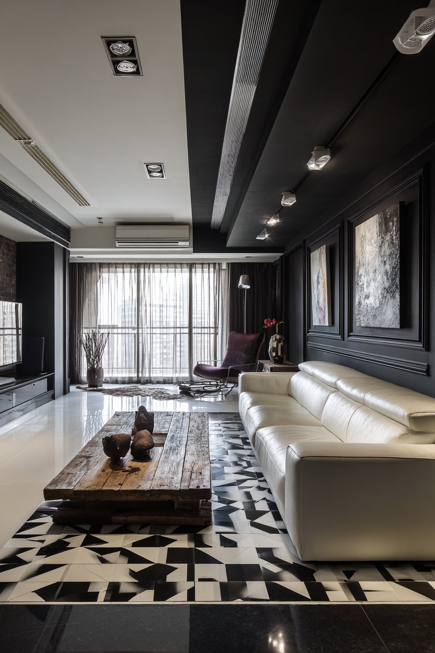
5. Bold Black and White Contrast
Modern living room color ideas that embrace stark black and white create spaces of graphic sophistication and timeless appeal. This high-contrast approach proves that you don’t need a rainbow of colors to create visual drama—sometimes the most powerful statements come from the simplest palettes. The low-profile white leather sofa provides clean, contemporary seating that contrasts beautifully against a matte black accent wall featuring vertical paneling that adds architectural interest and textural depth.
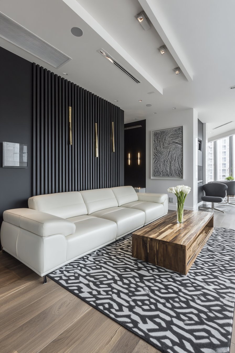
Black and white abstract art reinforces the color scheme while adding artistic sophistication, transforming the walls into gallery-like spaces. The introduction of natural wood through a reclaimed wood media console and coffee table proves essential in preventing this black and white living room color idea from feeling too stark or cold. These warm wood tones bridge the extreme contrast and add organic warmth that makes the space feel livable rather than purely aesthetic.
The black and white geometric area rug defines the seating zone while introducing pattern that energizes the space without disrupting the strict color discipline. Chrome and brass mixed metal accents add subtle shine and contemporary edge, demonstrating how metallic finishes can enhance black and white living room color ideas. The combination of recessed lighting and large windows ensures balanced illumination crucial for spaces working with such high contrast—insufficient lighting can make black walls feel oppressive rather than sophisticated.
When creating black and white living room color ideas, maintain approximately 60% white to 40% black distribution to prevent the space from feeling too dark or enclosed, adjusting based on natural light availability. Use black strategically on a single accent wall or specific furniture pieces rather than throughout the entire room to maintain brightness and openness. Introduce varied textures extensively—matte and glossy finishes, smooth leather against rough wood—to create visual interest that prevents the space from appearing flat despite the limited color palette. Add warmth through natural wood tones in medium to light finishes, which prevents the stark contrast from feeling cold or institutional. Consider adding one metallic finish (brass, chrome, or copper) consistently throughout the space in small doses through lighting, hardware, and accessories to add subtle color variation and light reflection.
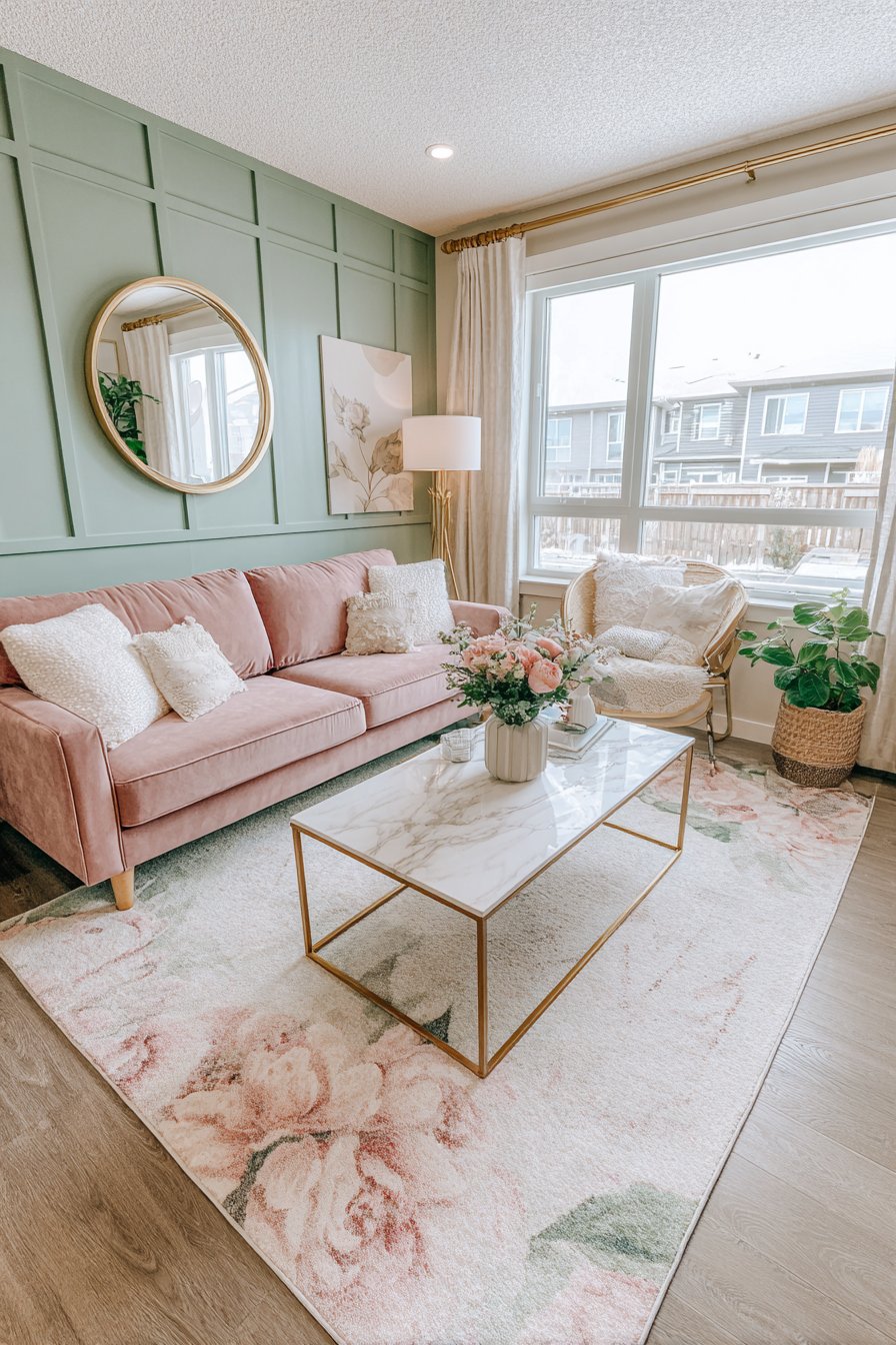
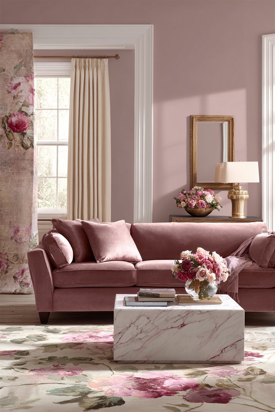
6. Romantic Blush Pink and Sage Green
Feminine yet sophisticated living room color ideas that combine blush pink and sage green create spaces that feel both contemporary and romantically timeless. This unexpected color pairing has gained popularity for its ability to create soft, welcoming environments without feeling overly sweet or juvenile. The dusty rose pink velvet sofa anchors the space with luxurious texture and substantial presence against walls painted in the softest sage green, a color known for its calming properties and versatility.
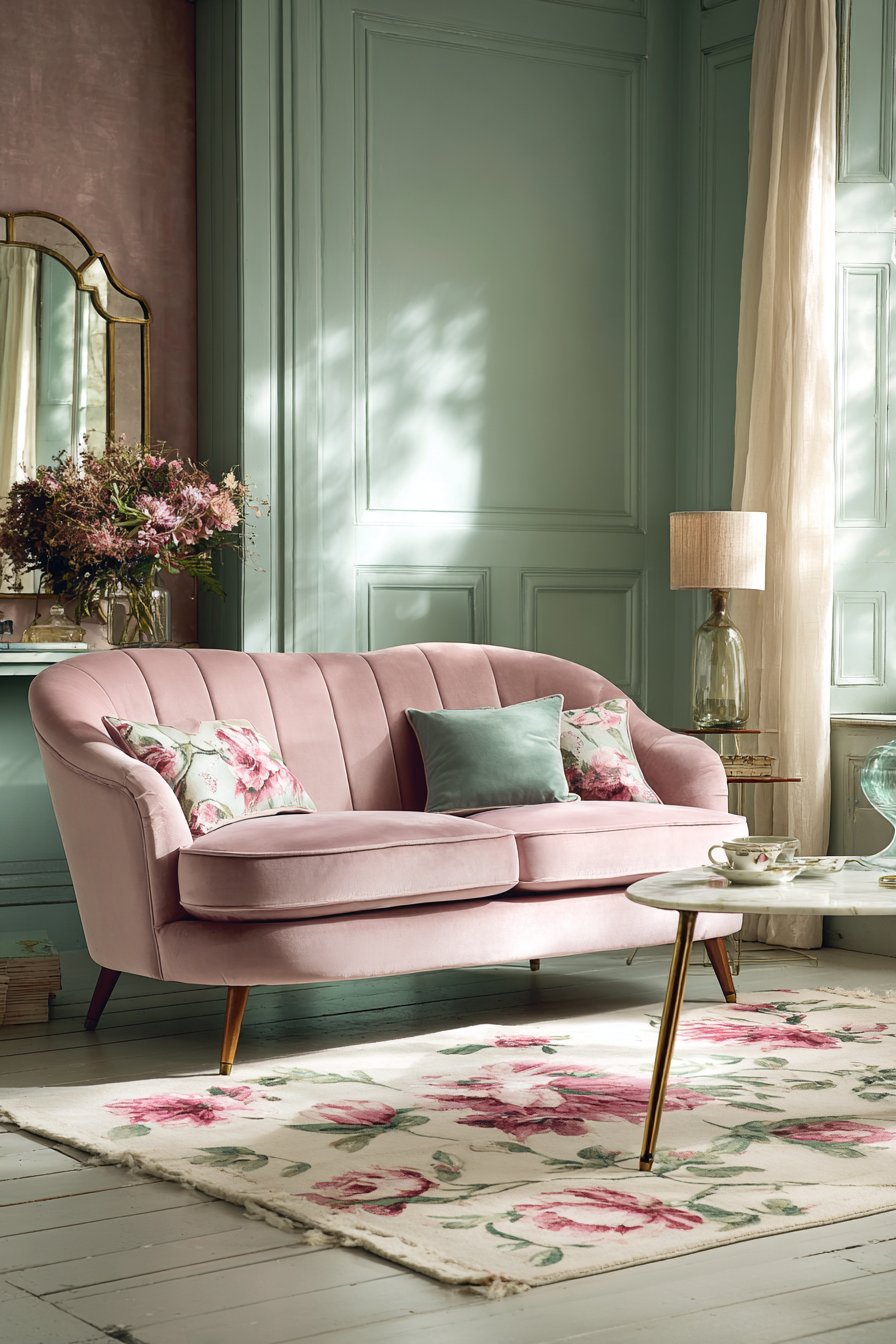
The blush pink accent wall behind the sofa features subtle grasscloth wallpaper texture, adding tactile dimension while intensifying the pink tones in a sophisticated way. Gold-framed mirror and brass table lamp introduce metallic warmth that complements both the pink and green tones beautifully, demonstrating how metallic accents can unify living room color ideas built around complementary pastels. The cream area rug with pink and green floral motifs ties the palette together while grounding the space with neutral foundation.
Natural linen curtains in ivory allow filtered daylight that brings out the subtle nuances in both the blush pink and sage green tones, as these soft colors can appear quite different under various lighting conditions. The marble coffee table with pink veining represents a masterful detail that reinforces the color story through natural stone patterns, showing how material choices can echo and enhance your chosen living room color ideas.
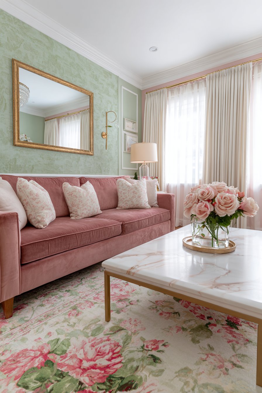
To execute blush pink and sage green living room color ideas successfully, choose muted, dusty versions of both colors rather than bright, saturated tones to maintain sophistication and prevent the space from feeling too sweet or childlike. Use one color as the dominant shade (typically sage green for walls) and the other as substantial accents (blush pink sofa and accent wall) to create proper balance. Incorporate cream, ivory, or soft white as a neutral foundation in rugs, curtains, and secondary furniture to prevent color overwhelm. Add metallic accents in warm finishes like brass, gold, or rose gold rather than cool silvers to complement the warm undertones in blush pink. Include natural materials like marble, linen, and light wood that bridge these soft colors and add organic authenticity to the space.
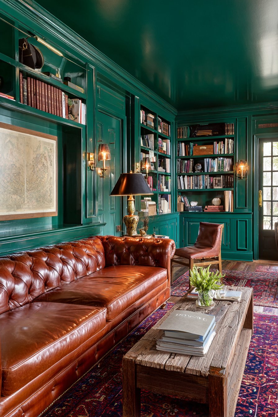
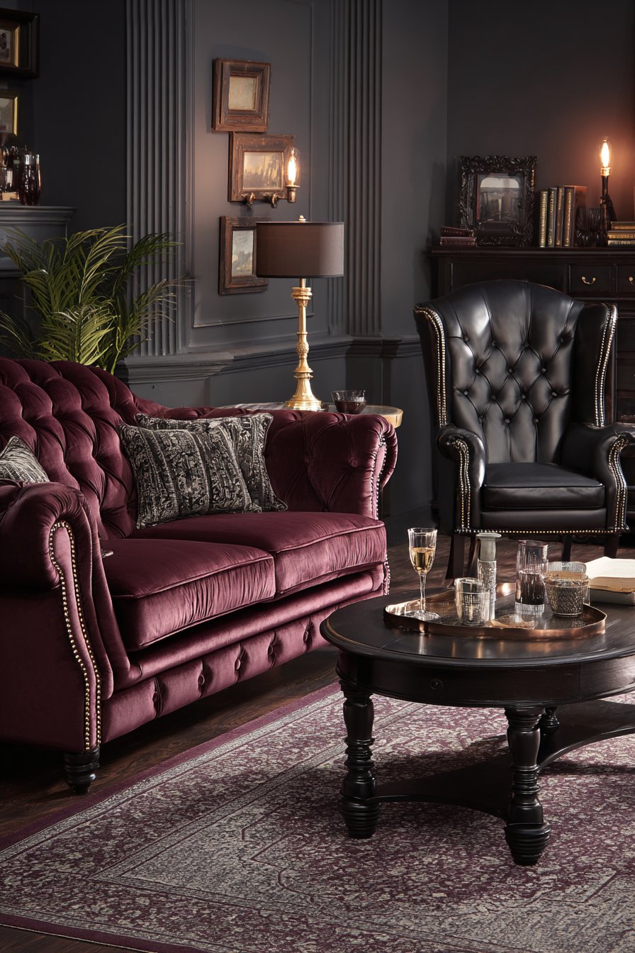
7. Dramatic Forest Green Sophistication
Deep, saturated living room color ideas featuring forest green walls create moody, sophisticated spaces that envelope you in rich color. This bold approach challenges the conventional wisdom that living rooms must be light and bright, instead embracing the intimacy and drama that dark colors can provide. The cognac leather Chesterfield sofa offers rich contrast against the forest green backdrop, its warm brown tones and traditional silhouette creating a classic pairing that feels both masculine and refined.
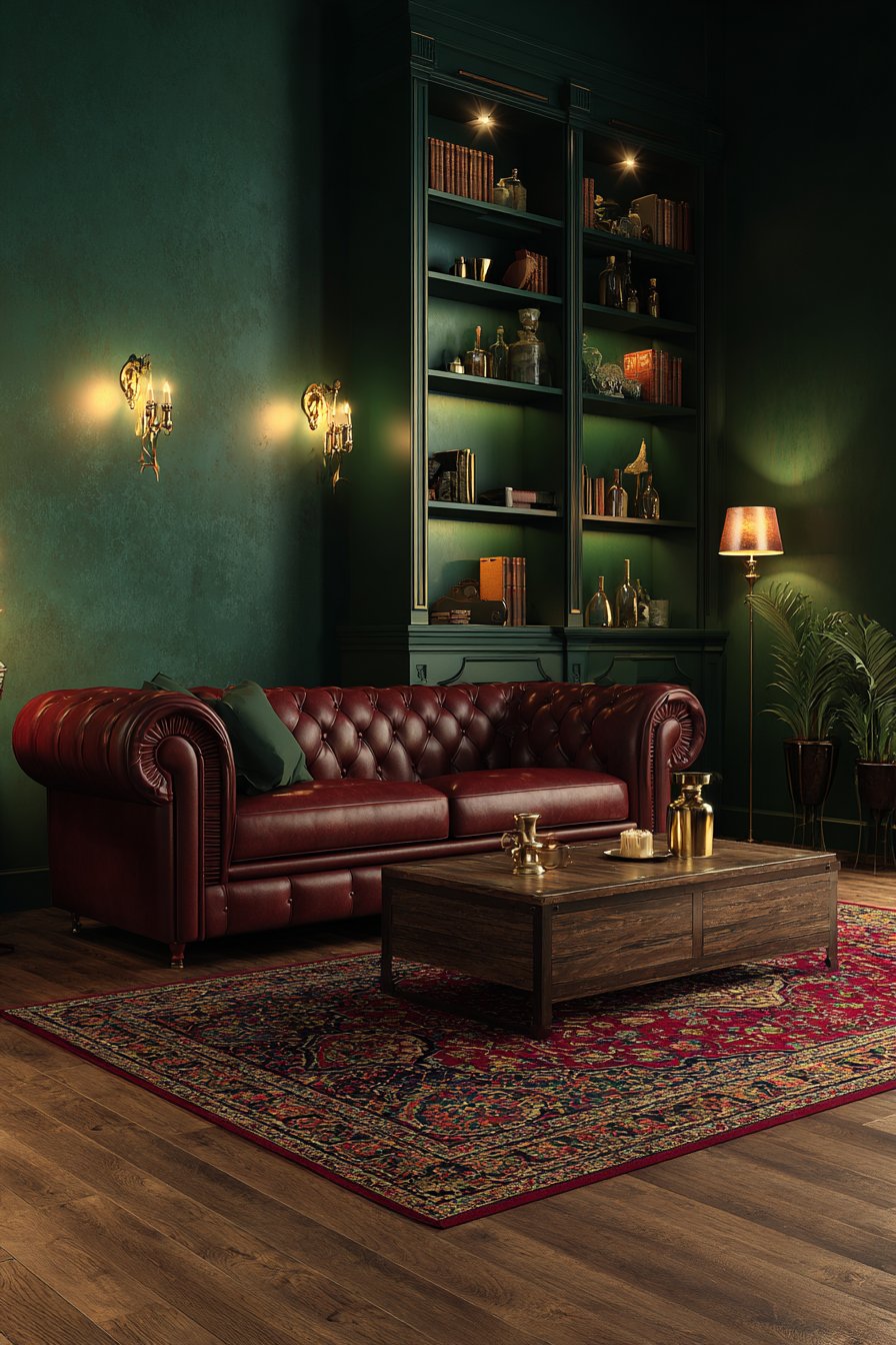
Built-in shelving painted the same forest green creates an immersive color experience while displaying books and brass accessories that pop beautifully against the dark background. This monochromatic approach to the architectural elements demonstrates confidence in the chosen living room color idea, fully committing to the moody aesthetic. The antique Persian rug in burgundy, gold, and navy grounds the space while introducing complementary jewel tones that enhance the richness of the forest green.
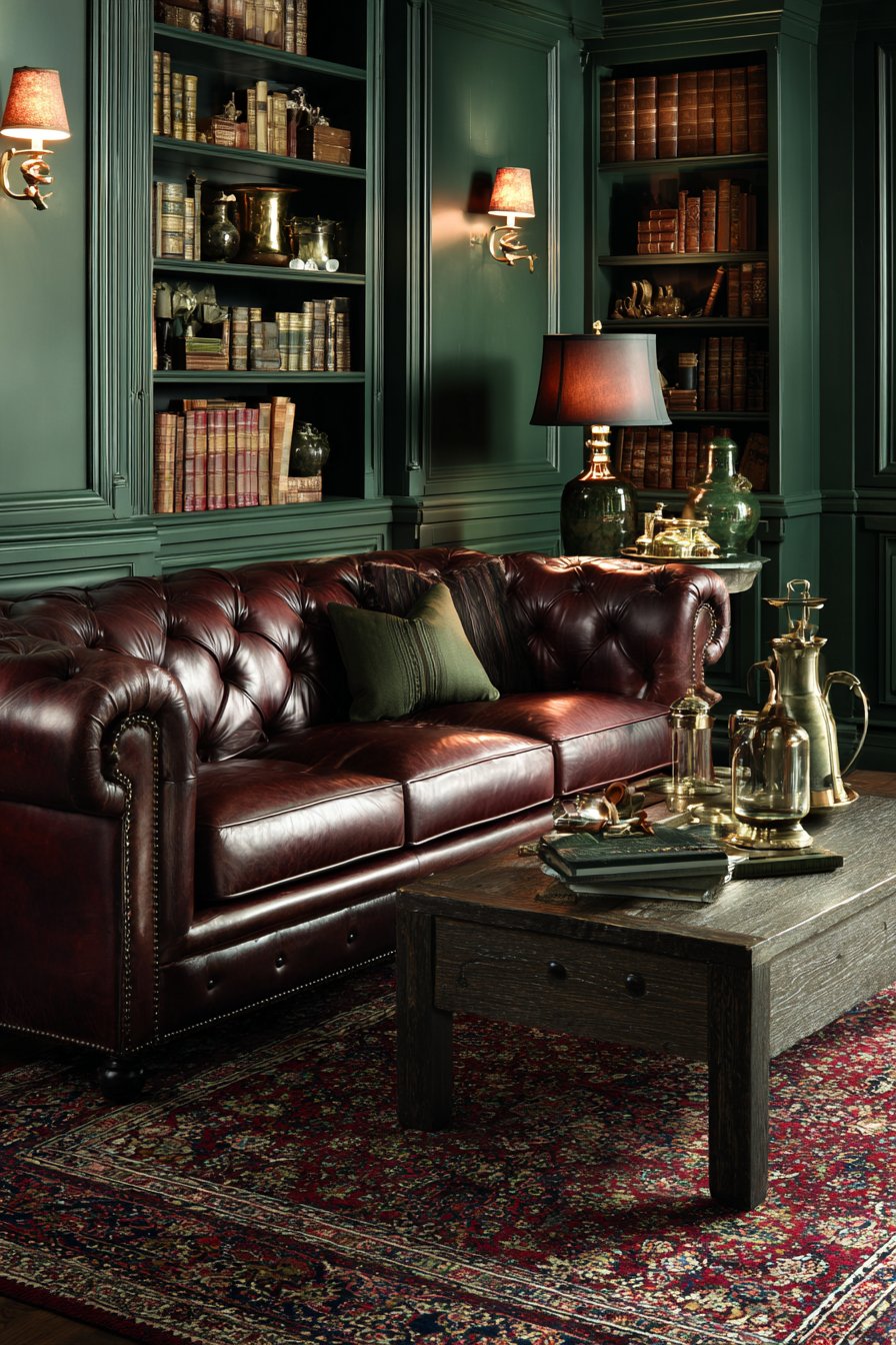
Natural oak flooring and a rustic wood coffee table provide essential warmth and prevent the deep green from feeling too oppressive. These natural wood elements in lighter finishes create visual relief and grounding within this dramatic color scheme. Strategically placed warm ambient lighting from table lamps and wall sconces becomes crucial in spaces using dark living room color ideas—proper lighting creates atmosphere rather than gloom, highlighting the depth and sophistication of the forest green rather than making the space feel like a cave.
When implementing forest green in your living room color ideas, ensure adequate lighting through a combination of ambient, task, and accent lighting to prevent the dark walls from making the space feel dim or oppressive. Choose furniture in rich, warm tones like cognac leather, warm woods, or jewel-toned fabrics that complement rather than compete with the deep green. Keep ceilings and trim in white or cream to maintain some brightness and provide visual relief from the saturated wall color. Add metallic accents in brass, gold, or bronze which warm beautifully against forest green and add essential light reflection. Test your specific green shade extensively, as forest green can range from blue-green to yellow-green undertones—choose one that complements your lighting and desired mood.
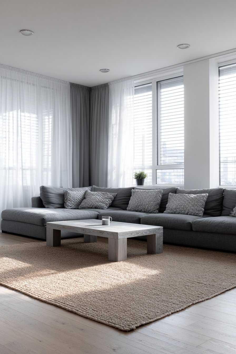
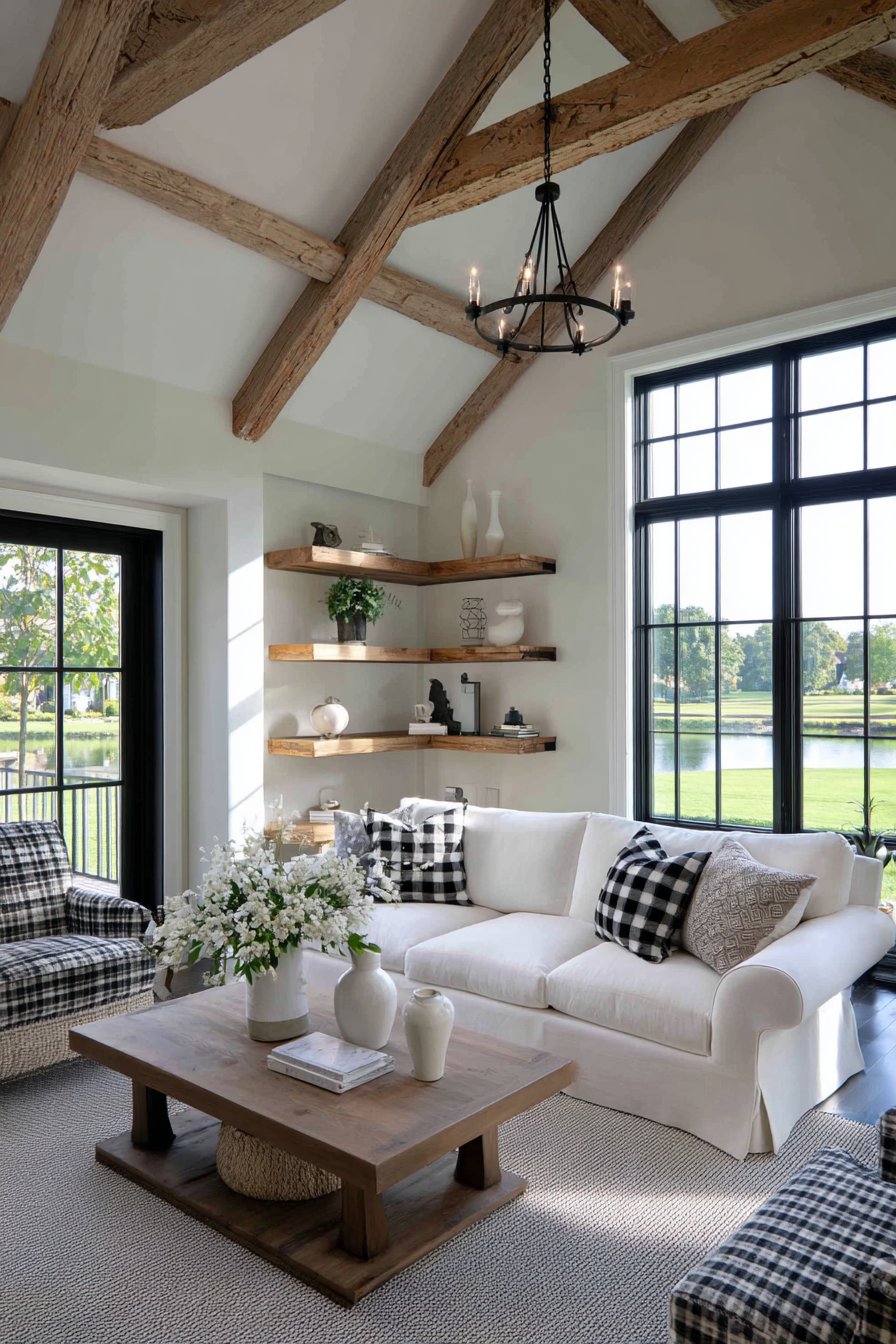
8. Serene Scandinavian Grey and White Minimalism
Scandinavian-inspired living room color ideas embrace a calming palette of soft greys and warm whites with natural wood, creating spaces that embody hygge principles of comfort and contentment. This approach to color proves that restraint and subtlety can create powerful impacts—the beauty lies in nuance and quality rather than boldness. The light grey linen sofa sits centered on a cream wool area rug against walls painted in the palest warm grey, creating a foundation of gentle, soothing tones.
One accent wall in slightly deeper cool grey adds subtle dimension without creating harsh contrast, demonstrating the sophisticated approach to variation within Scandinavian living room color ideas. The blonde oak coffee table and media console bring organic warmth essential to preventing Nordic minimalism from feeling cold or sterile. These natural wood elements in light finishes connect the space to nature while maintaining the overall light, airy aesthetic.
White ceramic vases and accessories maintain the clean aesthetic while adding sculptural interest through form rather than color. Large windows with minimal white Roman shades maximize natural light, which plays a crucial role in Scandinavian living room color ideas—the design philosophy developed in regions with limited daylight emphasizes maximizing and celebrating available natural light. The overall effect creates spaces that feel serene, uncluttered, and infinitely calming.
To create authentic Scandinavian living room color ideas, prioritize warm greys over cool greys to maintain the cozy, inviting feeling central to hygge despite the minimal color palette—look for greige tones that blend grey and beige. Incorporate natural wood in light finishes (birch, ash, blonde oak) extensively to add essential warmth and organic connection. Keep the space uncluttered and functional, as Scandinavian design emphasizes quality over quantity and purposeful design over decoration. Maximize natural light through minimal window treatments and strategic mirror placement that reflects and multiplies available daylight. Add texture through natural materials like wool, linen, sheepskin, and cotton to create visual interest within the limited color range and enhance the tactile comfort central to Scandinavian living.
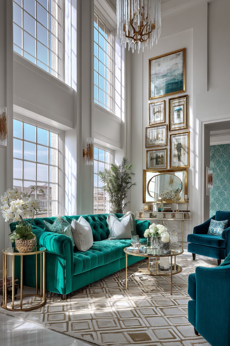
9. Opulent Jewel Tone Luxury
Luxurious living room color ideas featuring rich jewel tones of emerald green and deep sapphire blue create spaces of unabashed glamour and sophistication. This bold approach to color embraces the drama and intensity of saturated hues, creating living rooms that feel like jewel boxes. The emerald green velvet sofa with tufted back detail serves as the undisputed statement piece against crisp white walls, its rich texture and saturated color commanding attention while providing sumptuous seating.
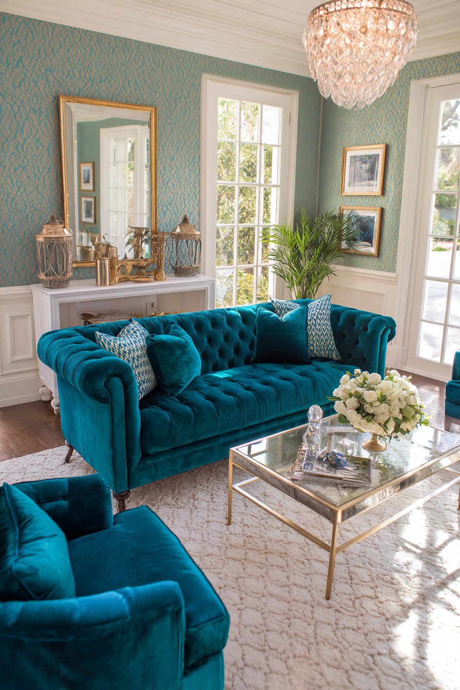
Two sapphire blue velvet accent chairs flank a brass and glass coffee table, creating a sophisticated color combination that demonstrates the power of pairing multiple jewel tones within living room color ideas. The emerald wallpaper with subtle damask pattern on one accent wall adds luxurious depth without overwhelming, its tone-on-tone pattern creating sophisticated texture. Gold picture frames, mirror, and light fixtures add glamorous touches that complement jewel tones beautifully, as warm metallics enhance the richness of these saturated colors.
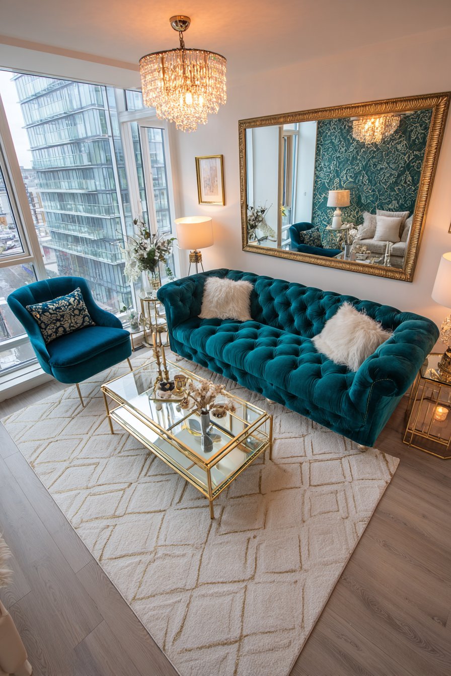
The cream area rug with geometric pattern incorporating the jewel tones unifies the palette while providing neutral foundation that prevents sensory overwhelm. A crystal chandelier and natural light from tall windows create essential sparkle and light play, as jewel-toned living room color ideas require abundant light to showcase their depth and prevent them from appearing murky or dark.
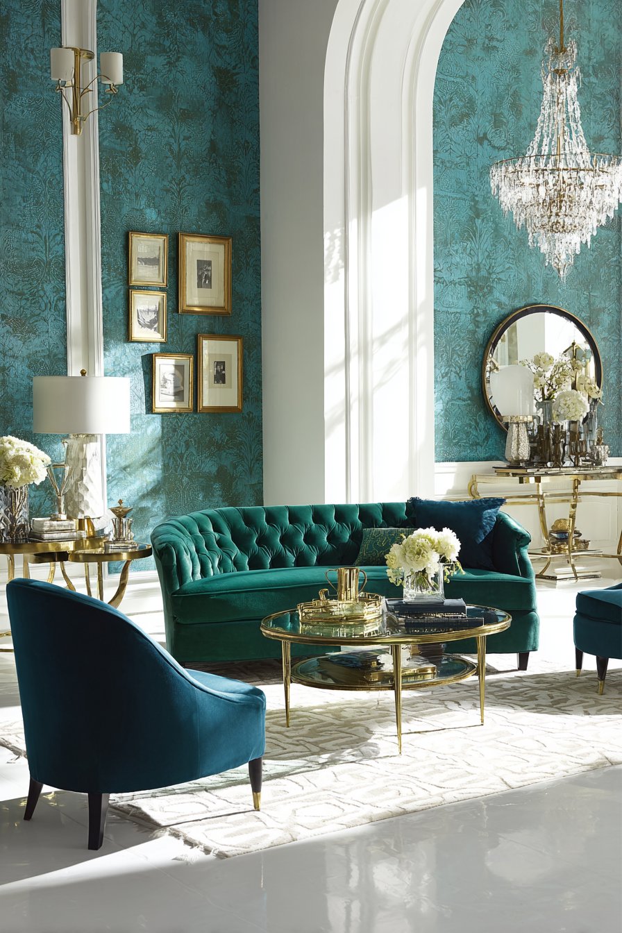
For successful jewel tone living room color ideas, pair saturated jewel tones with plenty of white or cream walls to prevent the space from feeling too dark or overwhelming—use jewel tones primarily in furniture and one accent wall. Choose high-quality fabrics with sheen like velvet, silk, or satin that catch light beautifully and enhance the gemstone quality of jewel tones. Incorporate metallic accents generously in warm finishes (gold, brass, bronze) which complement jewel tones more successfully than cool metals. Ensure excellent lighting from multiple sources—jewel tones absorb light and require bright illumination to showcase their true beauty and prevent them from appearing muddy. Limit your jewel tone palette to two or three colors maximum to maintain sophistication rather than creating rainbow chaos.
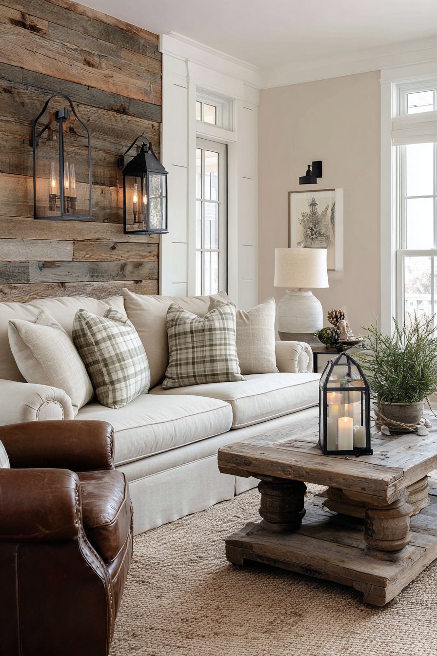
10. Rustic Brown and Cream Farmhouse Warmth
Warm, rustic living room color ideas featuring browns, tans, and cream create authentic farmhouse aesthetics that feel lived-in and welcoming from the moment you enter. This approach embraces natural imperfection and the beauty of aged materials, creating spaces with genuine character and soul. The tan linen sofa with rolled arms sits against shiplap walls painted in soft cream, immediately establishing the farmhouse foundation through both color and architectural detail.
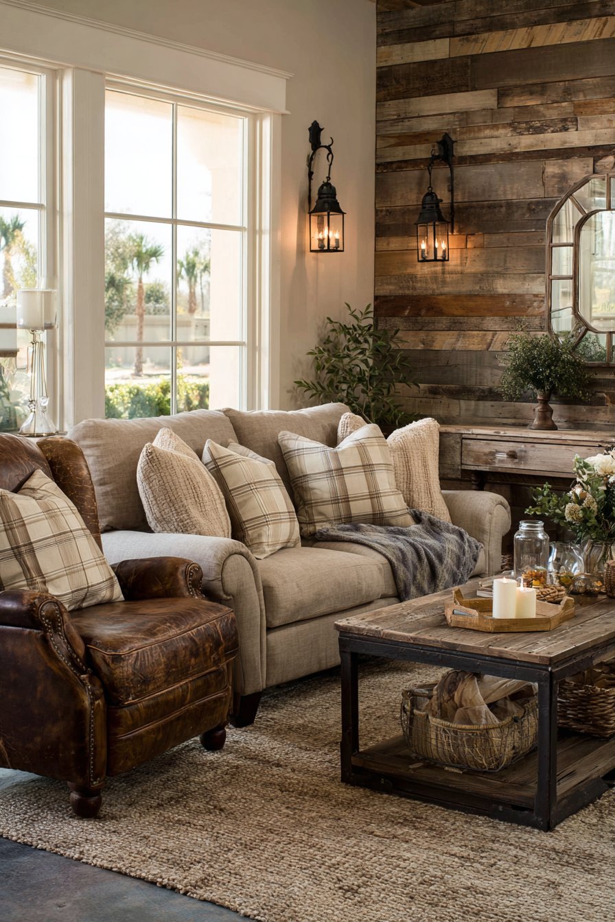
The reclaimed barn wood accent wall adds textural depth in natural brown tones, bringing authentic rustic character that can’t be replicated through paint alone. These weathered boards with their varied patina and natural aging demonstrate how material choices reinforce living room color ideas. The distressed leather armchair in cognac and weathered wood coffee table enhance the rustic palette while adding essential worn character that makes farmhouse style feel genuine rather than staged.
Cream and tan plaid throw pillows and a braided jute rug in natural tones layer the neutral scheme with pattern and texture that create visual interest without bright colors. Wrought iron and bronze light fixtures complement the earthy living room color ideas while adding authentic period-appropriate details. The overall effect creates spaces that feel warm, welcoming, and comfortably imperfect—celebrating natural materials and honest construction.
To create authentic rustic farmhouse living room color ideas, embrace natural variation and imperfection in materials rather than seeking perfect uniformity—weathered wood, worn leather, and natural fibers with their inherent irregularities add authentic character. Layer multiple shades of brown, tan, and cream throughout the space to create depth within this neutral palette—from deep chocolate to pale cream, variation prevents monotony. Incorporate genuine vintage or antique pieces when possible, as authentic aged items contribute character that reproductions cannot match. Choose natural, unfinished, or minimally processed materials that celebrate their organic origins—raw wood, natural linen, undyed cotton, and untreated leather all enhance rustic authenticity. Add warmth through ambient lighting from multiple sources, as rustic spaces benefit from soft, warm light rather than bright, cool illumination.
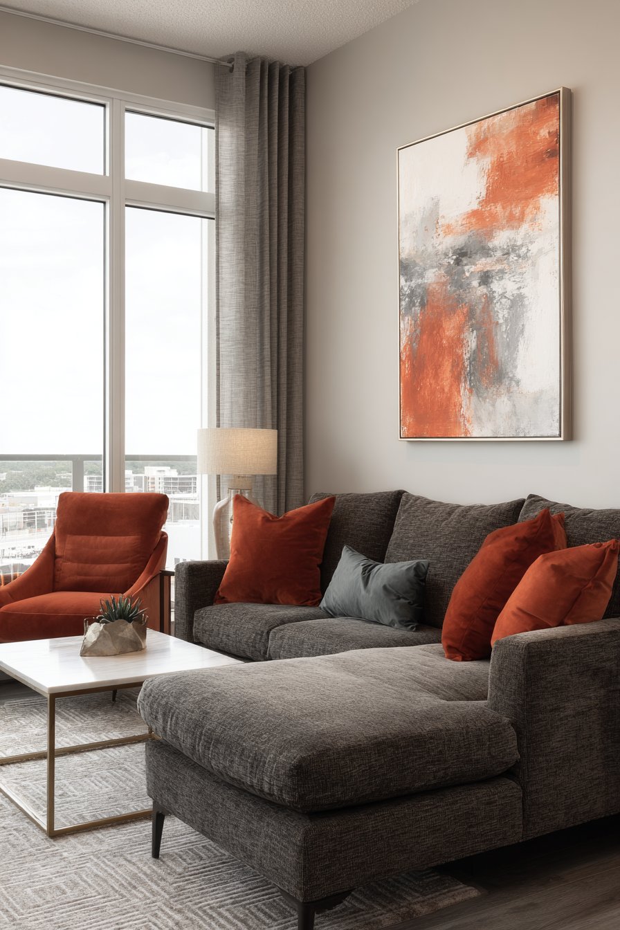
11. Contemporary Charcoal with Coral and Teal Accents
Modern living room color ideas that pair a neutral charcoal base with vibrant coral and teal accents create sophisticated spaces with controlled pops of energizing color. This approach demonstrates the power of the 60-30-10 color rule, using neutral charcoal as the foundation while carefully introducing bold accent colors for impact. The charcoal grey sectional with clean, contemporary lines anchors the space against light grey walls, creating a layered neutral foundation that prevents the accent colors from overwhelming.
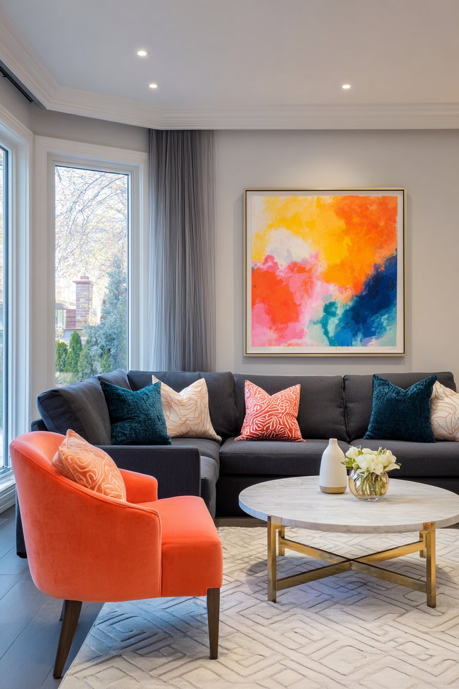
The coral velvet accent chair creates a warm, vibrant focal point while the teal throw pillows introduce cool color balance, demonstrating how living room color ideas can successfully incorporate both warm and cool accent tones when grounded by neutral foundations. Abstract art above the sofa incorporates all three colors in bold brushstrokes, serving as the color story’s blueprint and tying the scheme together visually. The white marble coffee table with brass legs adds elegance and light reflection while maintaining the contemporary aesthetic.
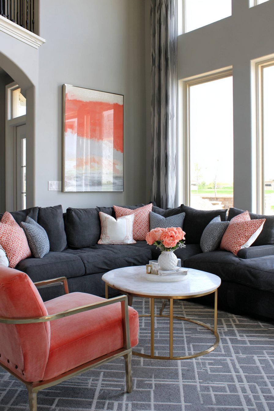
The charcoal and white geometric area rug grounds the seating arrangement while reinforcing the modern design through pattern choice. Large windows with sheer grey curtains provide natural light that keeps the space from feeling too dark despite the substantial charcoal elements. This balance of neutral foundation with strategic color placement represents sophisticated living room color ideas that create visual interest without chaos.
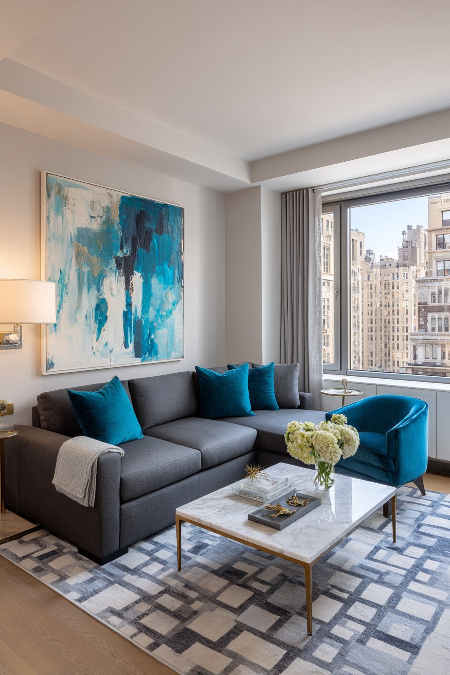
When creating charcoal-based living room color ideas with accent colors, maintain strict color discipline by limiting accent colors to two maximum and distributing them in roughly equal amounts throughout the space to create balance. Use your neutral charcoal on large surfaces (sofas, major walls) while reserving bright accent colors for smaller elements (single chairs, pillows, artwork) to prevent overwhelming the space. Choose accent colors that are complementary or analogous on the color wheel to ensure they work harmoniously together—coral (warm) and teal (cool) create pleasing balance. Incorporate white or cream elements liberally to provide visual resting points and prevent the space from feeling too heavy with the charcoal base. Add metallic accents in finishes that complement your accent colors—brass warms beautifully with coral while chrome or silver can cool with teal.
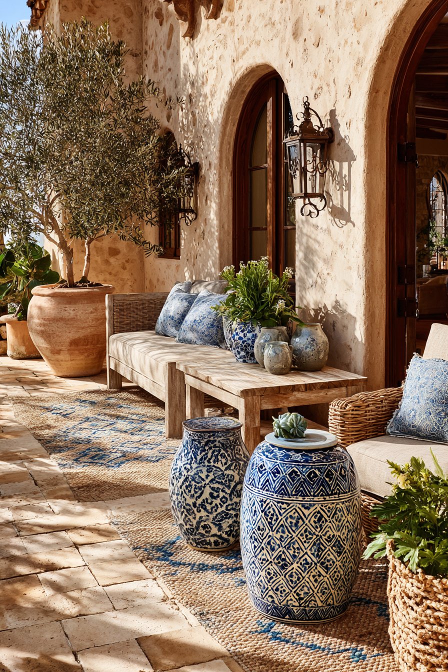
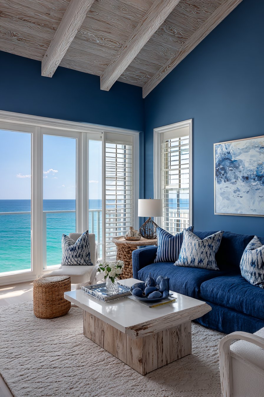
12. Mediterranean Terracotta and Azure Blue
Sun-soaked living room color ideas inspired by Mediterranean palettes combine warm terracotta, azure blue, and sandy beige to evoke coastal European villas. This color combination captures the essence of Mediterranean living—warm, welcoming, and intimately connected to natural landscapes and seascapes. Textured walls in warm beige serve as the perfect backdrop for a terracotta-colored linen sofa with weathered wood frame, immediately establishing the Mediterranean foundation through both color and material choices.
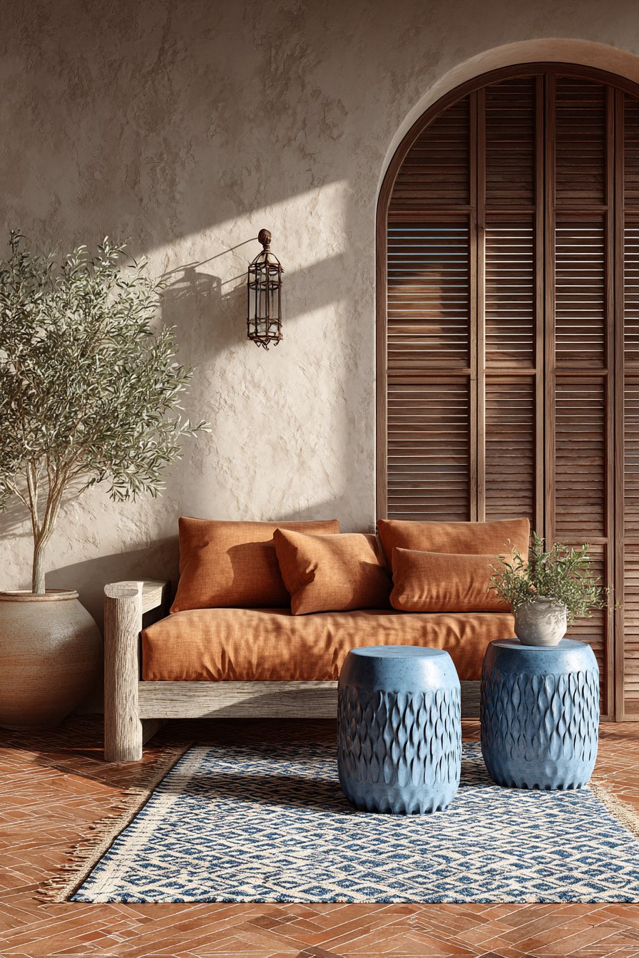
Azure blue ceramic garden stools serving as side tables make a bold statement while echoing traditional Mediterranean tiles and pottery. These vibrant blue accents against the warm terracotta and beige create the characteristic color contrast found throughout Mediterranean regions. The woven area rug in natural fibers with blue and terracotta geometric patterns anchors the space while reinforcing the color story through traditional Mediterranean motifs.
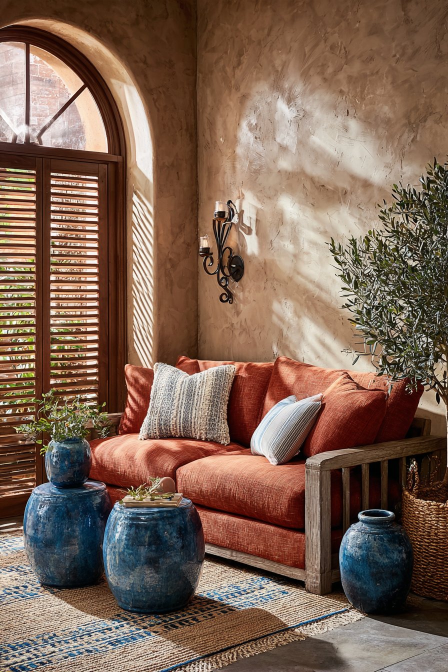
Arched doorway and wrought iron wall sconces add essential architectural and decorative details that enhance the Mediterranean character beyond just color choices. Potted olive tree and ceramic vases in blue and terracotta reinforce the connection to Mediterranean landscapes where these elements occur naturally. Natural sunlight through wooden shutters creates dappled shadows that add to the sun-drenched atmosphere central to Mediterranean living room color ideas.
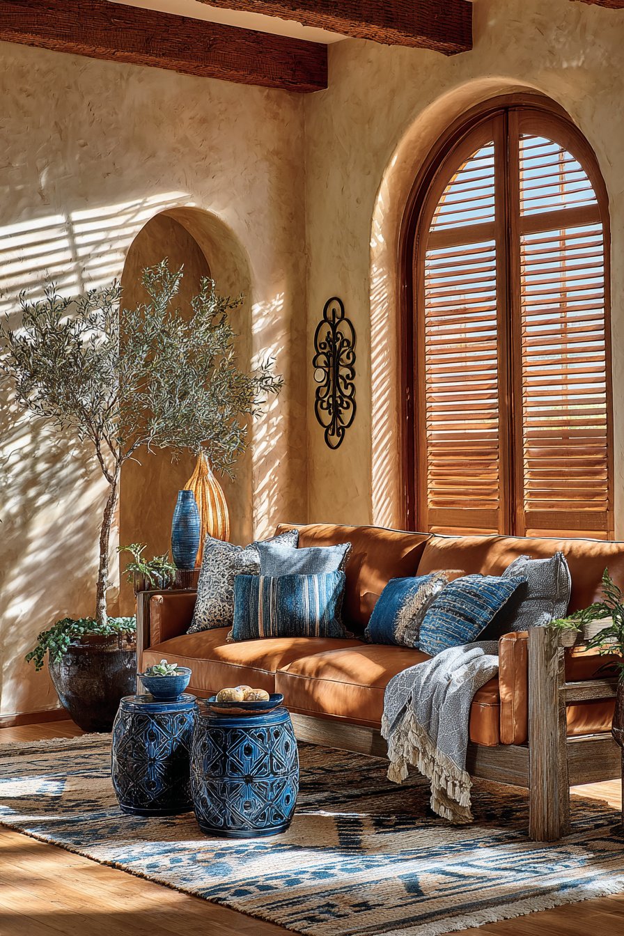
To successfully create Mediterranean living room color ideas, embrace warm, sun-baked versions of terracotta and sandy beige rather than cool, muted tones—these colors should feel warm and inviting like Mediterranean sunshine. Add azure or cobalt blue in substantial but strategic amounts (15-20% of the overall palette) to create the characteristic Mediterranean contrast without overwhelming the warm foundation. Incorporate natural materials extensively—terracotta tiles or pottery, woven natural fiber rugs, weathered wood, wrought iron—that authentically represent Mediterranean craftsmanship and design traditions. Maximize natural light and create indoor-outdoor connections where possible, as Mediterranean design celebrates sunny climates and blurred boundaries between interior and exterior spaces. Add plants common to Mediterranean regions (olive trees, lavender, rosemary, citrus) to enhance authenticity and bring living green elements into the color scheme.
13. Fresh Modern Farmhouse Black and White
Clean, contemporary farmhouse living room color ideas featuring soft white with black accents and natural wood create spaces that feel both fresh and timeless. This updated take on farmhouse style proves that traditional aesthetics can evolve to feel modern and relevant. Walls painted in warm white provide a bright backdrop for a cream-colored slipcovered sofa that embodies relaxed farmhouse comfort while maintaining contemporary simplicity.
Black window frames and black metal pendant lights create striking graphic contrast that gives this farmhouse living room color idea contemporary edge. This confident use of black as accent rather than just supporting detail distinguishes modern farmhouse from purely traditional country style. The chunky reclaimed wood coffee table and floating shelves in natural oak add essential warmth and organic texture that prevents the black and white palette from feeling too stark.
Black and white buffalo check pillows and a vintage-inspired black and cream area rug reinforce the palette through pattern while maintaining farmhouse character. Galvanized metal accents and white ceramic accessories complete the look with authentic farmhouse details. Large windows flooding the space with natural light prove essential to this living room color idea, as the fresh, airy atmosphere depends on abundant brightness to balance the bold black elements.
When creating modern farmhouse living room color ideas in black and white, choose warm whites with cream or ivory undertones rather than stark cool whites to maintain the welcoming character essential to farmhouse style. Use black strategically in architectural elements (windows, doors, hardware) and lighting fixtures rather than furniture to create contemporary contrast while keeping the space feeling open. Incorporate substantial natural wood elements in medium to light finishes to add essential warmth and prevent the black and white from feeling too sterile or contemporary. Add texture extensively through natural materials—linen, cotton, jute, reclaimed wood—to create the lived-in, tactile quality that makes farmhouse design appealing. Balance shiplap, vintage elements, and farmhouse motifs with clean lines and uncluttered spaces to achieve the “modern” in modern farmhouse rather than purely traditional country style.
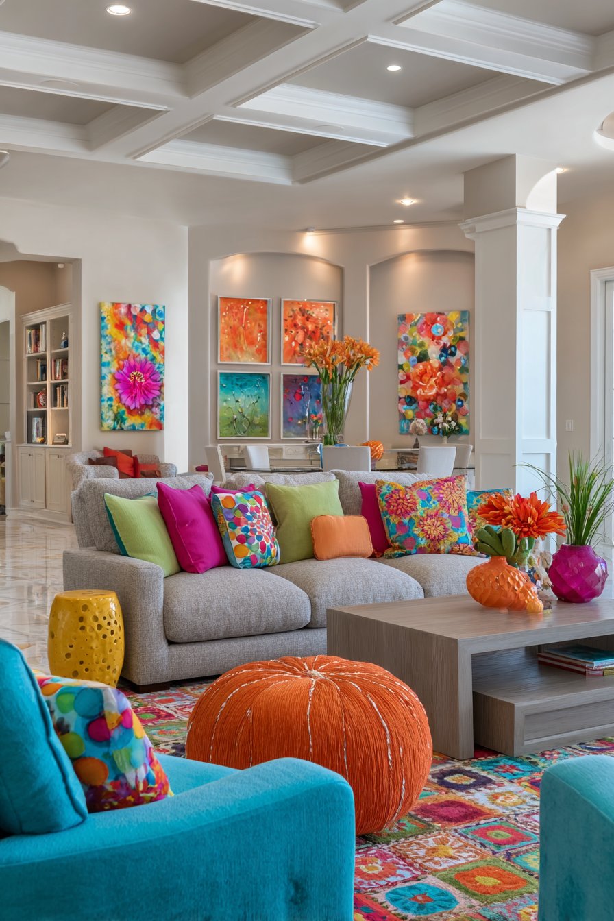
14. Joyful Maximalist Multi-Color Energy
Bold, exuberant living room color ideas embracing maximalist multi-color palettes prove that more can indeed be more when executed with intention and confidence. This approach celebrates color in all its glory, creating spaces that radiate joy and personality. A neutral oatmeal linen sofa serves as the perfect canvas for an explosion of colorful throw pillows in fuchsia, orange, turquoise, and yellow, demonstrating how neutral foundations enable bold color experimentation.
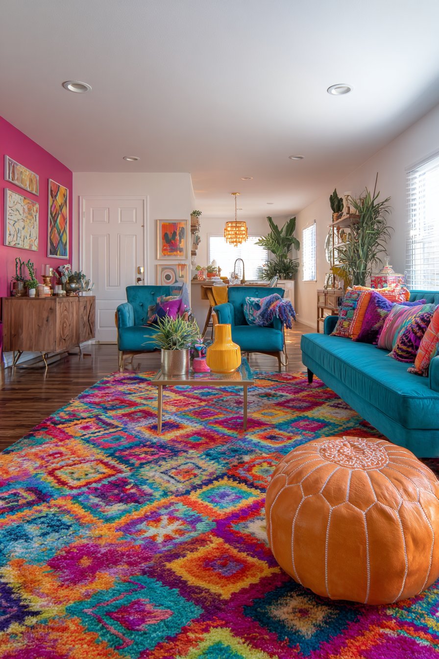
Turquoise velvet armchairs flank the seating area while a fuchsia accent wall creates an unapologetically bold backdrop. The orange Moroccan-style pouf and yellow ceramic side table add playful global-inspired elements that enhance the maximalist spirit. An eclectic gallery wall features artwork incorporating all the vibrant hues, serving as the visual anchor that makes sense of the diverse color palette.
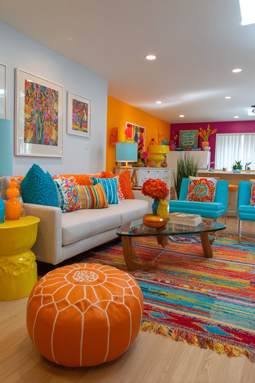
The multi-colored kilim rug layers pattern and color while grounding the space, its traditional geometric patterns providing structure within the colorful abundance. White walls on three sides prevent overwhelming and provide visual breathing room essential to maximalist living room color ideas. Natural light and warm artificial lighting work together to showcase the joyful color interactions, as good lighting prevents vibrant spaces from feeling chaotic or garish.
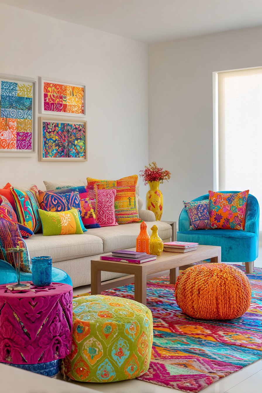
To successfully execute maximalist living room color ideas, start with a neutral foundation (sofa, major walls) that provides visual rest and allows accent colors to shine without creating visual fatigue. Choose 4-6 accent colors that share some relationship—either analogous colors from one section of the color wheel or complementary pairs—to create cohesion within abundance. Distribute your accent colors throughout the space rather than clustering them in one area to create balanced visual weight and prevent any section from overwhelming. Incorporate pattern and solid colors in roughly equal measure to create rhythm and prevent either from dominating. Ensure excellent lighting from multiple sources to showcase your colors properly and prevent the space from feeling dark despite the visual abundance.
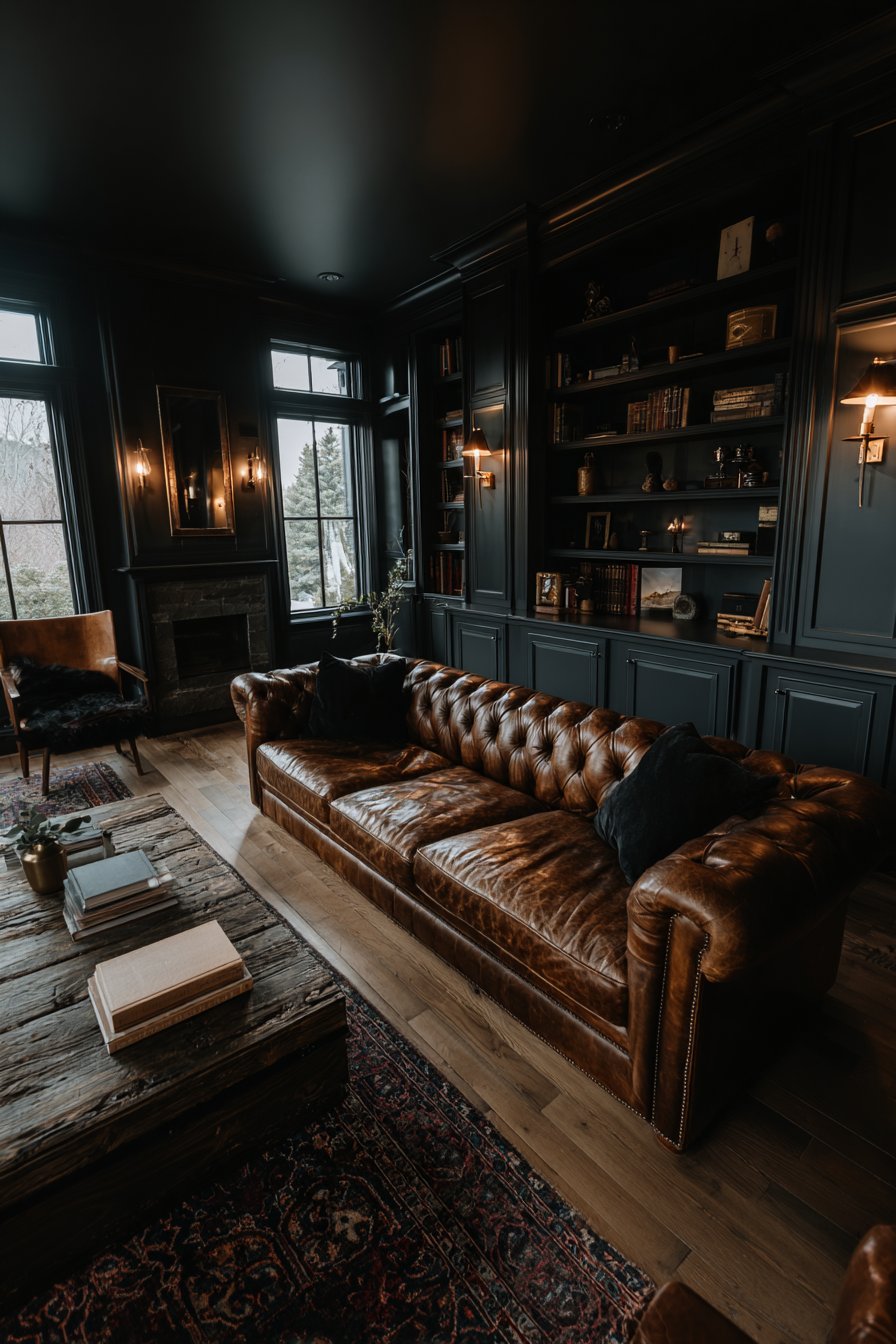
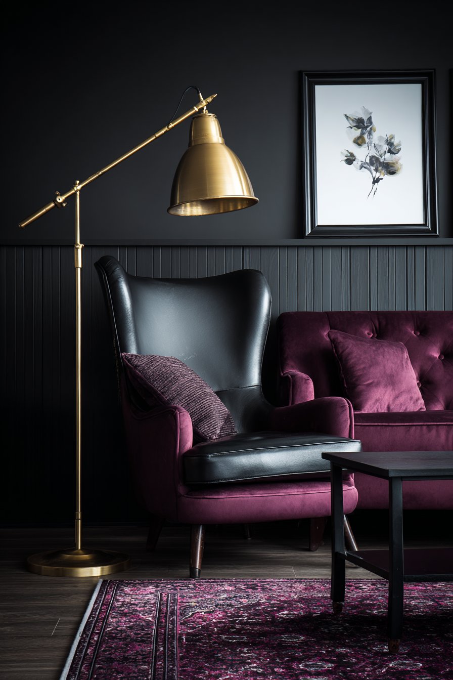
15. Sophisticated Charcoal and Plum Drama
Moody, luxurious living room color ideas featuring deep charcoal and plum with brass accents create intimate spaces of dramatic sophistication. This dark, rich palette challenges conventional design wisdom while creating rooms of unmatched atmosphere and elegance. Walls painted in sophisticated charcoal create an enveloping backdrop for a plum velvet sofa with deep button tufting, its jewel tone and luxurious texture standing beautifully against the dark walls.
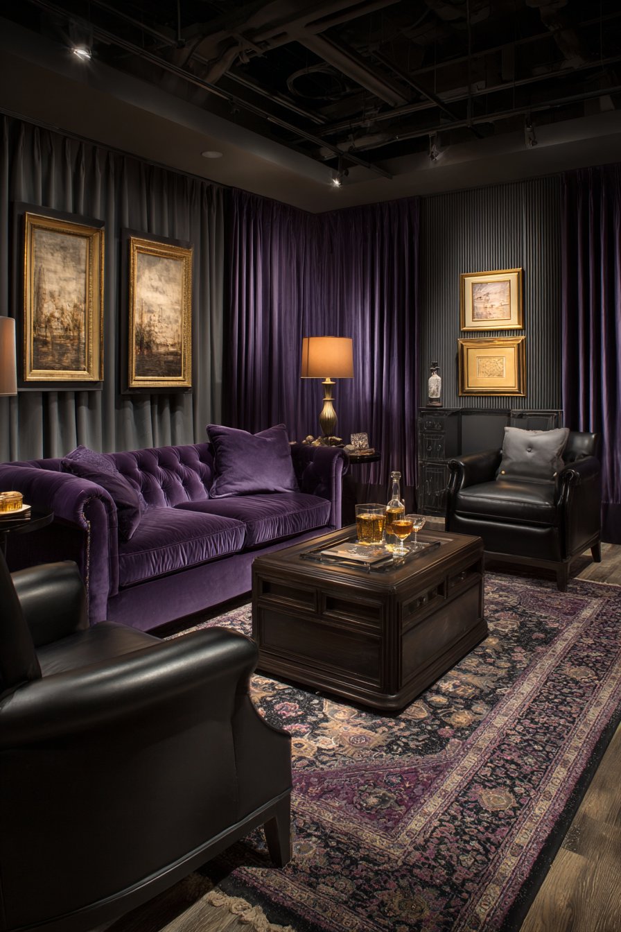
The charcoal accent wall with subtle vertical texture adds dimension while maintaining the moody aesthetic, proving that texture becomes even more important in dark living room color ideas where light plays across surfaces differently. Black leather armchair and dark stained walnut coffee table enhance the dramatic palette while adding varied dark tones that create depth. Brass floor lamp, side table, and picture frames add essential warm metallic contrast that prevents the space from feeling too heavy.
The deep purple and grey area rug with traditional pattern grounds the space while introducing complementary tones that bridge the charcoal and plum. Strategically placed lighting from multiple sources becomes absolutely crucial in dark living room color ideas—proper illumination creates ambiance and sophistication rather than gloom, highlighting the rich colors rather than obscuring them in shadow.
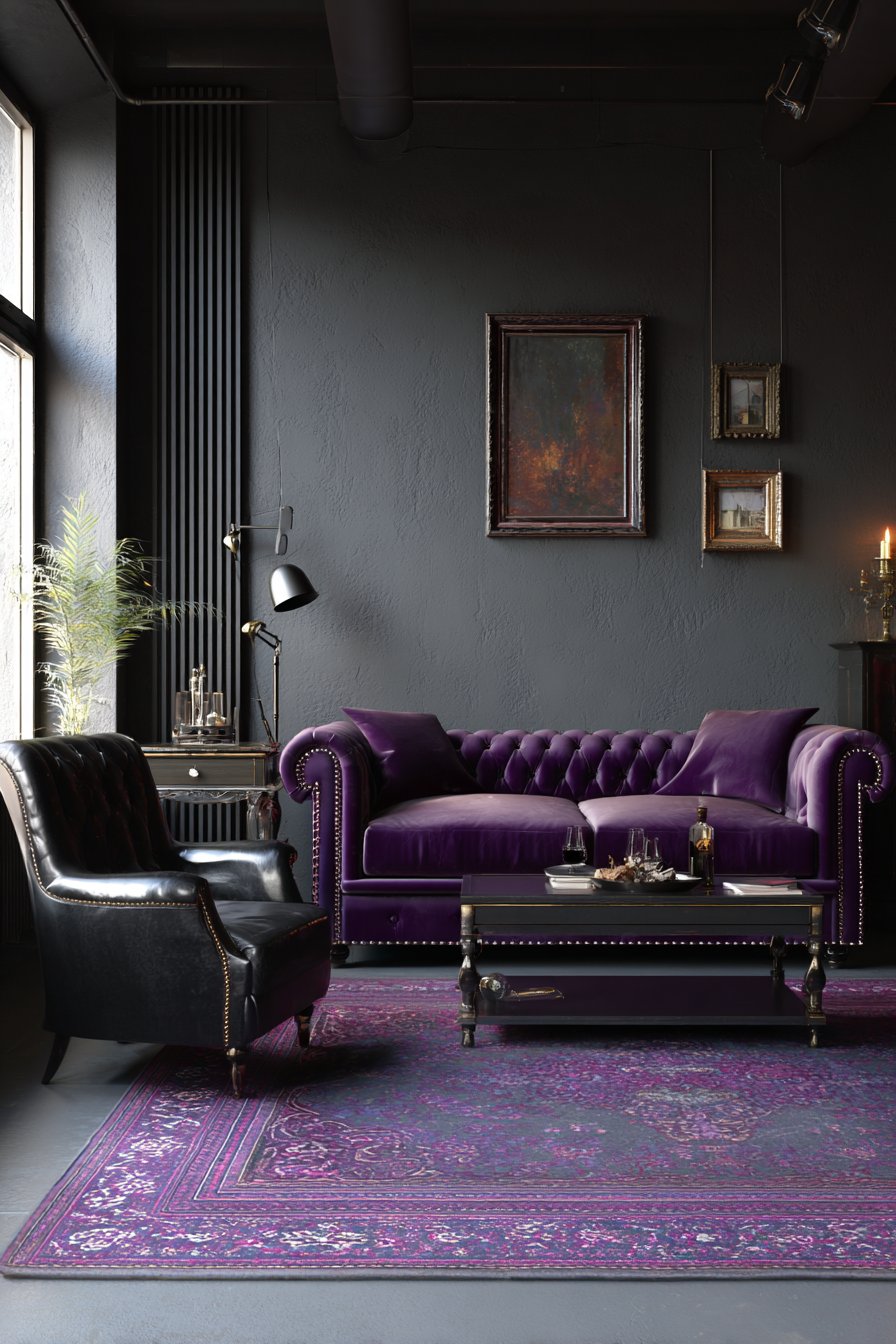
When implementing dark living room color ideas like charcoal and plum, invest heavily in lighting design with multiple layered sources (ambient, task, accent) at various heights to prevent the dark colors from making the space feel oppressive or cave-like. Choose one jewel tone (like plum) to pair with your neutral dark base rather than multiple competing colors to maintain sophistication and cohesion. Add substantial metallic elements in warm finishes (brass, bronze, copper, gold) which provide essential light reflection and warmth against dark backgrounds. Keep window treatments minimal or sheer to maximize any available natural light, as dark colors absorb rather than reflect light. Test your dark paint colors extensively on large sample boards in your actual room, as dark colors can appear dramatically different under various lighting conditions and against different adjacent surfaces.
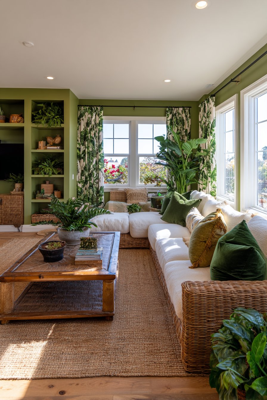
16. Tropical Green Paradise with Natural Materials
Nature-inspired living room color ideas featuring lush green tones with natural materials create indoor sanctuaries that celebrate botanical beauty and organic living. This approach brings the outdoors in through both color choices and material selections. Walls painted in soft sage green provide a soothing backdrop for a rattan sofa with cream cushions, immediately establishing the tropical foundation through both color and natural material.
The deeper jungle green accent wall behind built-in shelving creates dramatic depth while providing the perfect backdrop for displaying tropical plants and natural accessories. This layering of green tones from soft sage to deep jungle demonstrates sophisticated use of analogous living room color ideas. Bamboo coffee table and woven seagrass area rug add essential textural interest while reinforcing the natural, tropical theme.
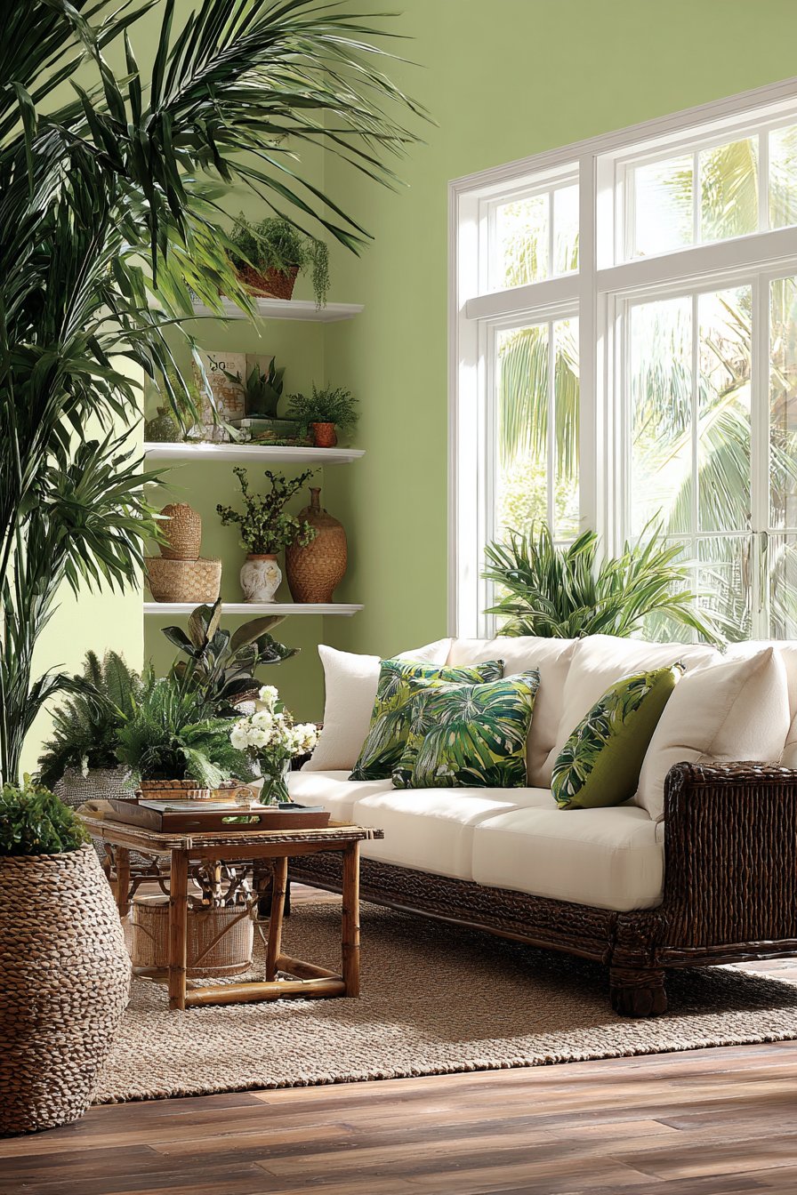
Emerald green velvet throw pillows and palm-print curtain panels reinforce the botanical theme with richness and pattern. Natural wood flooring in warm honey tones grounds the space and prevents the abundance of green from feeling overwhelming. Abundant natural light through large windows plays a crucial role in green living room color ideas, as natural light brings out the life and vibrancy in green tones while connecting the space to the outdoor landscapes that inspired the palette.
To create successful tropical green living room color ideas, layer multiple shades of green from pale sage to deep forest to create depth and prevent monotony within this analogous color scheme. Incorporate abundant natural materials—rattan, bamboo, jute, seagrass, natural wood—that authentically represent tropical environments and enhance the organic feeling. Add actual living plants generously throughout the space to reinforce the botanical theme and bring authentic green tones that shift with seasons and lighting. Balance the green dominance with warm neutral tones in natural materials (honey-toned wood, cream fabrics, natural fiber rugs) to prevent the space from feeling too saturated or artificial. Maximize natural light to keep the greens feeling fresh and vibrant rather than murky or dark, as green can appear quite different under natural versus artificial lighting.
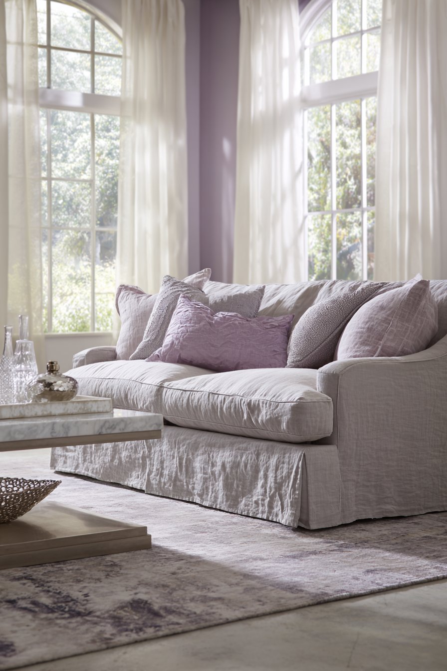
17. Timeless Taupe and Ivory Elegance
Refined living room color ideas featuring taupe and ivory with subtle blue accents create spaces of quiet sophistication that transcend passing trends. This transitional approach bridges traditional and contemporary aesthetics through restrained, elegant color choices. A tailored sofa in warm taupe linen centers the space against ivory walls with subtle texture, creating a foundation of sophisticated neutrals that never goes out of style.
The light blue-grey accent wall adds gentle color interest without overwhelming, demonstrating how living room color ideas can incorporate subtle color while maintaining overall neutrality. Ivory area rug with delicate taupe pattern defines the seating zone while adding soft pattern that enhances rather than dominates. Weathered oak coffee table and side tables introduce natural warmth essential to preventing taupe and ivory schemes from feeling too formal or hotel-like.
Soft blue throw pillows and ceramic table lamp provide restrained color pops that add personality without disrupting the serene palette. Brushed nickel and crystal chandelier adds elegance and light reflection while maintaining the refined aesthetic. Flowing ivory curtains frame windows allowing filtered natural light that brings out the subtle warmth in taupe tones.
When creating taupe and ivory living room color ideas, choose warm taupe with beige undertones rather than cool grey-taupe to maintain inviting warmth despite the neutral palette. Layer multiple shades of taupe from pale putty to deeper greige throughout the space to create depth and prevent the scheme from appearing flat or one-dimensional. Introduce one subtle accent color (like soft blue, pale green, or warm blush) in limited amounts to add personality without disrupting the sophisticated neutral foundation. Incorporate varied textures extensively—linen, velvet, weathered wood, brushed metal—to create visual interest within the limited color range. Choose warm-toned woods and warm metallic finishes (brass, bronze, or warm-toned nickel) that complement taupe’s warm undertones rather than fighting against them.
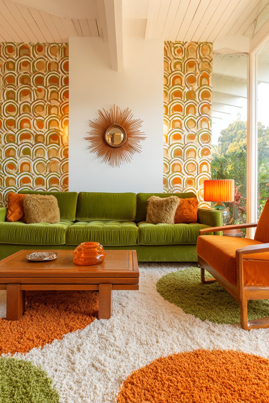
18. Retro Avocado and Burnt Orange Revival
Nostalgic living room color ideas showcasing 1970s-inspired avocado green and burnt orange create spaces with personality and vintage charm. This retro palette has experienced a revival as designers rediscover the sophisticated earthiness of these historically popular colors. A low-profile sofa in warm avocado green velvet serves as the statement piece against crisp white walls, its retro silhouette and saturated color immediately establishing the vintage inspiration.
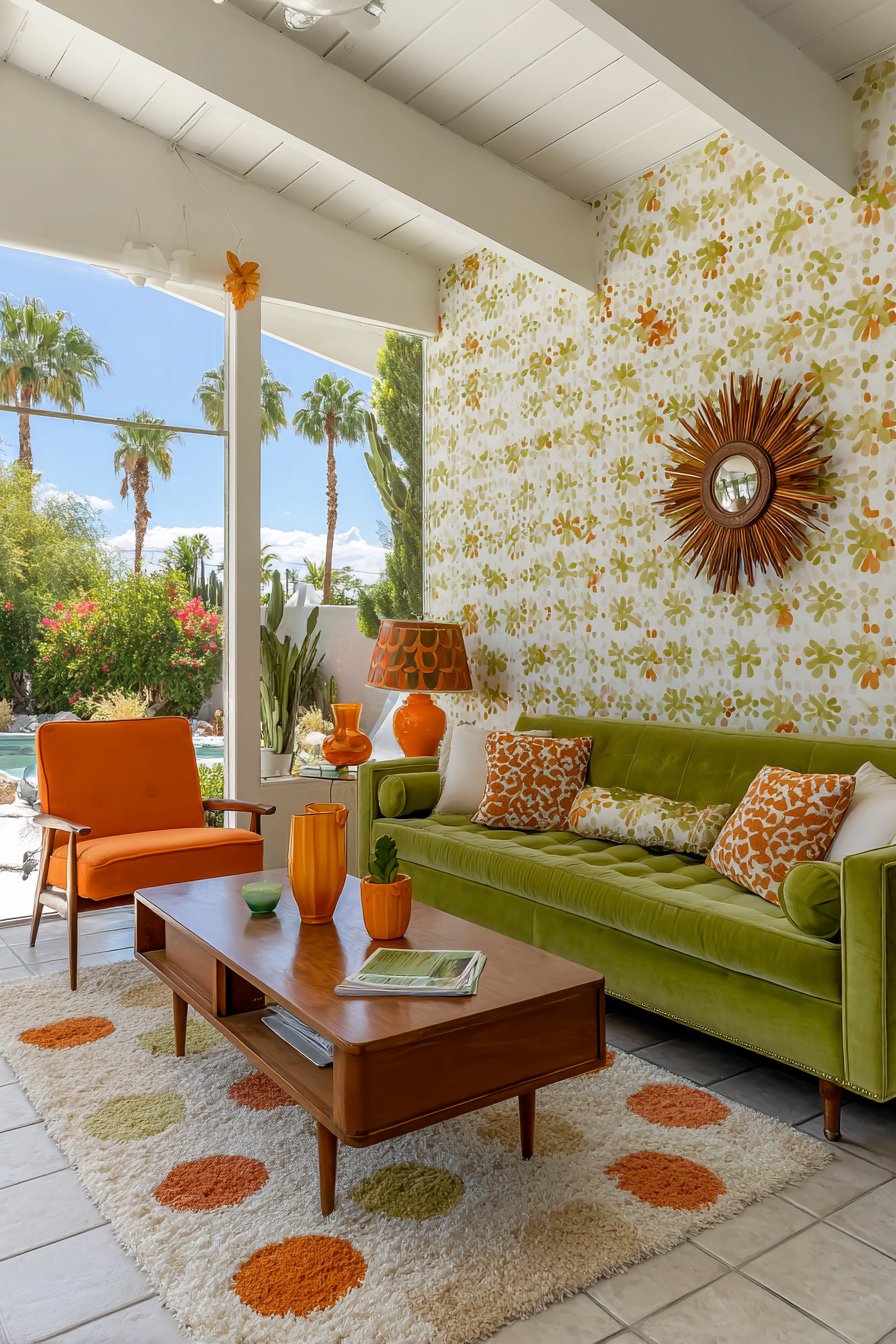
Burnt orange accent chairs with wooden arms flank a teak wood coffee table, creating an authentic period color combination that feels both nostalgic and fresh again. One accent wall features geometric wallpaper incorporating both colors against a cream background, adding pattern and intensifying the retro aesthetic. Shag area rug in cream with orange and green accents grounds the vintage palette while contributing classic 70s texture.
Brass sunburst mirror and amber glass table lamps add period-appropriate metallic touches that complement the warm earth tones beautifully. Natural light from large windows highlights the nostalgic living room color ideas while preventing the saturated colors from appearing too dark or heavy. The overall effect creates spaces that celebrate vintage design with confidence and joy.
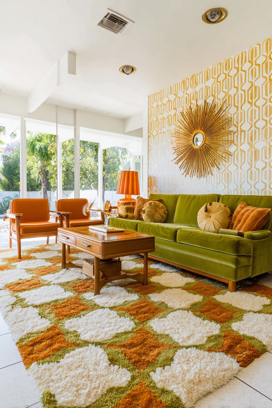
To successfully execute retro living room color ideas with avocado and orange, embrace the saturated, earthy versions of these colors rather than pale or neon interpretations—the richness and depth distinguish sophisticated retro from costume-like recreation. Keep walls primarily white or cream to prevent the bold vintage colors from overwhelming and to maintain adequate brightness essential to livability. Incorporate authentic period materials and finishes (teak wood, brass, amber glass, shag textures) that enhance the retro authenticity beyond just color matching. Balance the vintage colors with contemporary comfort and functionality—retro aesthetics shouldn’t compromise livability or modern convenience. Add one or two genuine vintage pieces if possible, as authentic period items contribute character and legitimacy that reproductions cannot fully capture.
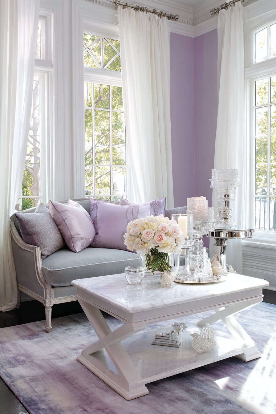
19. Calming Lavender and Grey Tranquility
Soothing living room color ideas featuring soft lavender and grey tones create serene sanctuaries that promote relaxation and peace. This gentle palette combines the calming properties of grey with lavender’s subtle color interest for spaces that feel like visual spa retreats. Walls painted in the palest lavender-grey create a serene backdrop for a dove grey linen sofa with relaxed silhouette, establishing a foundation of gentle, harmonious tones.
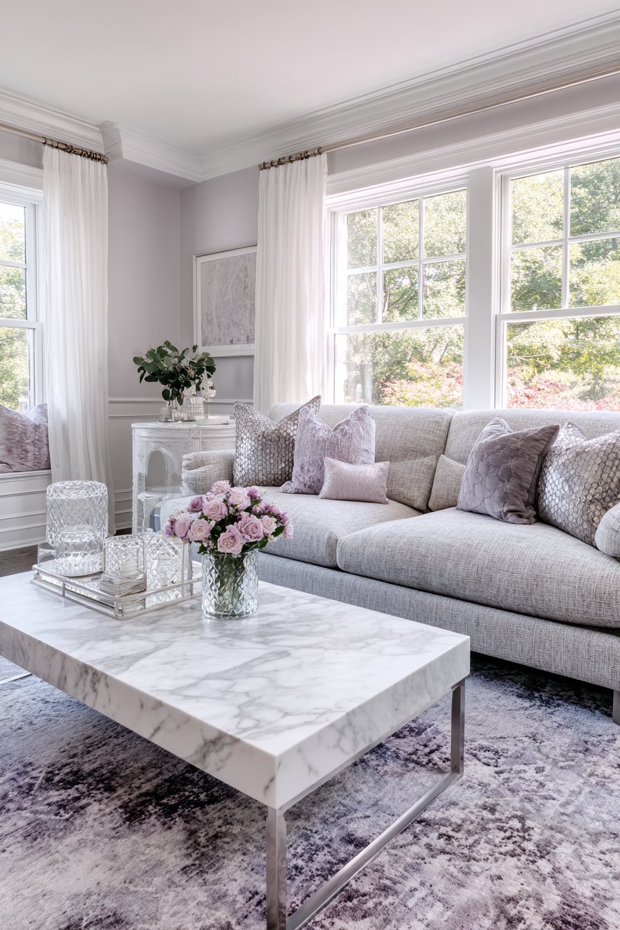
The deeper lavender accent wall behind the sofa adds gentle color saturation without creating harsh contrast, demonstrating restraint central to calming living room color ideas. White marble coffee table and light grey area rug with subtle lavender undertones maintain the soothing palette while adding sophisticated materials. Lavender and grey throw pillows in varied textures add depth and tactile interest within the limited color range.
Silver and crystal accessories provide understated sparkle that catches light without disrupting the peaceful atmosphere. Sheer white curtains diffuse natural light creating an ethereal glow that enhances the dreamy quality of lavender-grey living room color ideas. The overall effect creates spaces that feel like gentle clouds—soft, peaceful, and infinitely restful.
When creating lavender and grey living room color ideas, choose very soft, pale versions of lavender with substantial grey mixed in to maintain sophistication and prevent the space from feeling too sweet or juvenile. Keep the distribution heavily weighted toward grey (70-80%) with lavender as subtle accent to prevent overwhelming and maintain the calming effect. Incorporate white liberally through trim, ceiling, and accessories to provide brightness and prevent the soft colors from appearing muddy or dull. Add texture extensively through varied fabrics and materials to create visual interest within this quiet color palette—velvet, linen, marble, crystal all enhance sophistication. Ensure excellent natural light or warm artificial lighting, as lavender can appear quite different and sometimes muddy under poor lighting conditions.
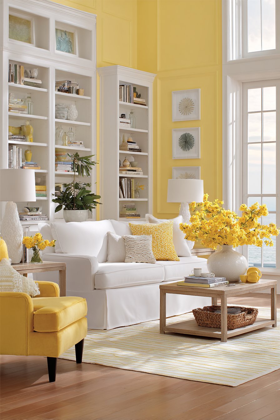
20. Energizing Sunny Yellow and White Brightness
Cheerful living room color ideas featuring sunny yellow and crisp white create uplifting spaces that radiate positivity and energy. This optimistic palette taps into yellow’s psychological properties as a mood-elevating color while maintaining sophistication through careful application. A white slipcovered sofa provides clean foundation against walls painted in soft butter yellow, establishing the bright, cheerful tone while maintaining livability through the neutral sofa.
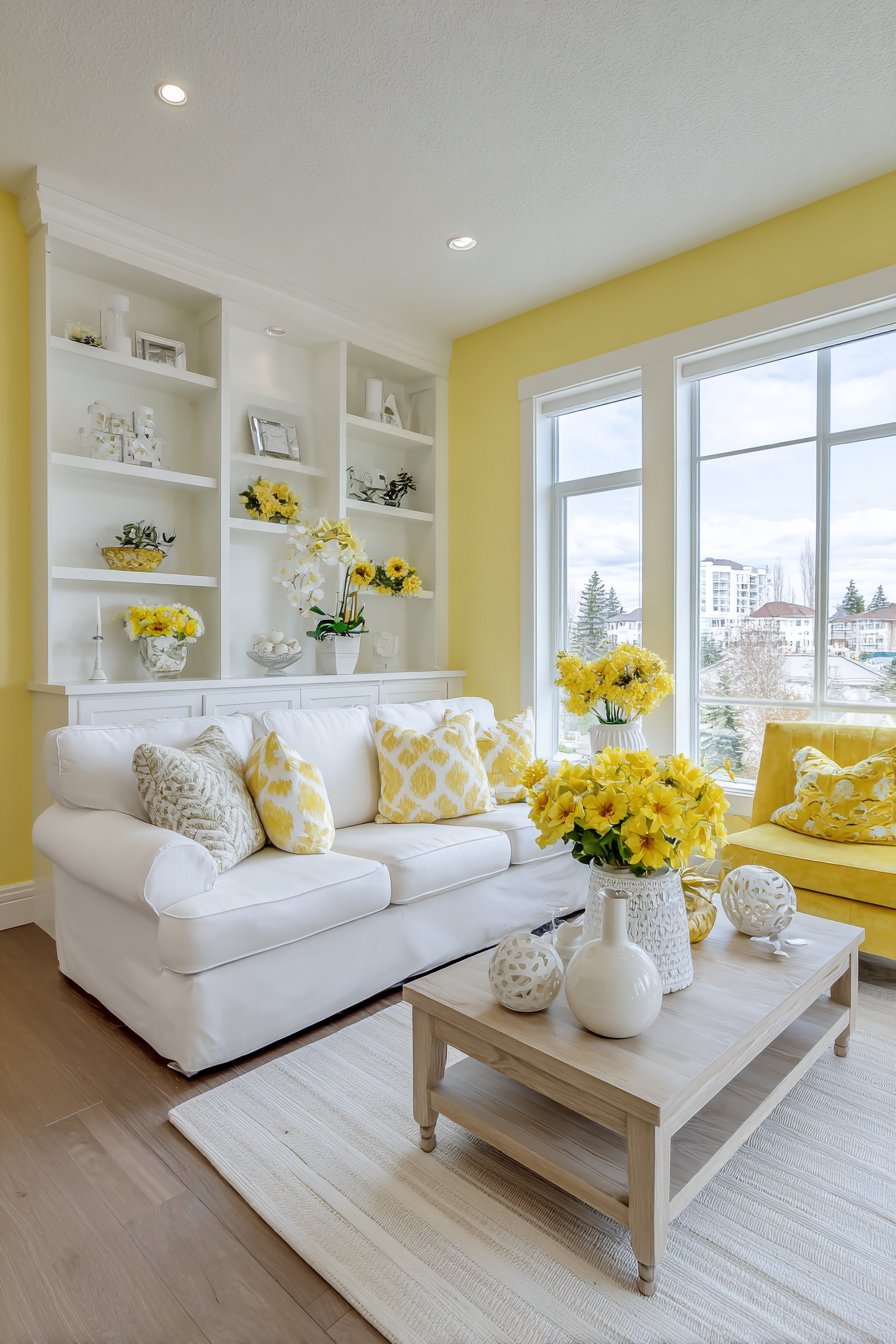
One statement wall in vibrant sunny yellow creates an energizing focal point behind white built-in shelving, demonstrating how accent walls can intensify living room color ideas while preventing overwhelming saturation. White and yellow striped area rug defines the space with graphic pattern that reinforces the color story playfully. Natural wood coffee table in light oak and yellow velvet accent chair add warmth and color reinforcement without introducing competing hues.
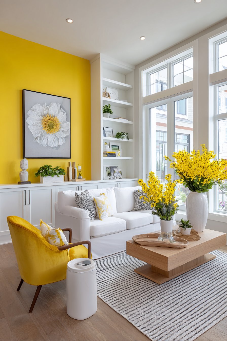
White ceramic accessories and yellow fresh flowers in clear vases accessorize the space with freshness and natural beauty. Large windows maximize natural light which amplifies the bright living room color ideas, as yellow works best in naturally bright spaces where its cheerful qualities can fully shine. The overall effect creates spaces that feel like permanent sunshine—uplifting, warm, and endlessly optimistic.
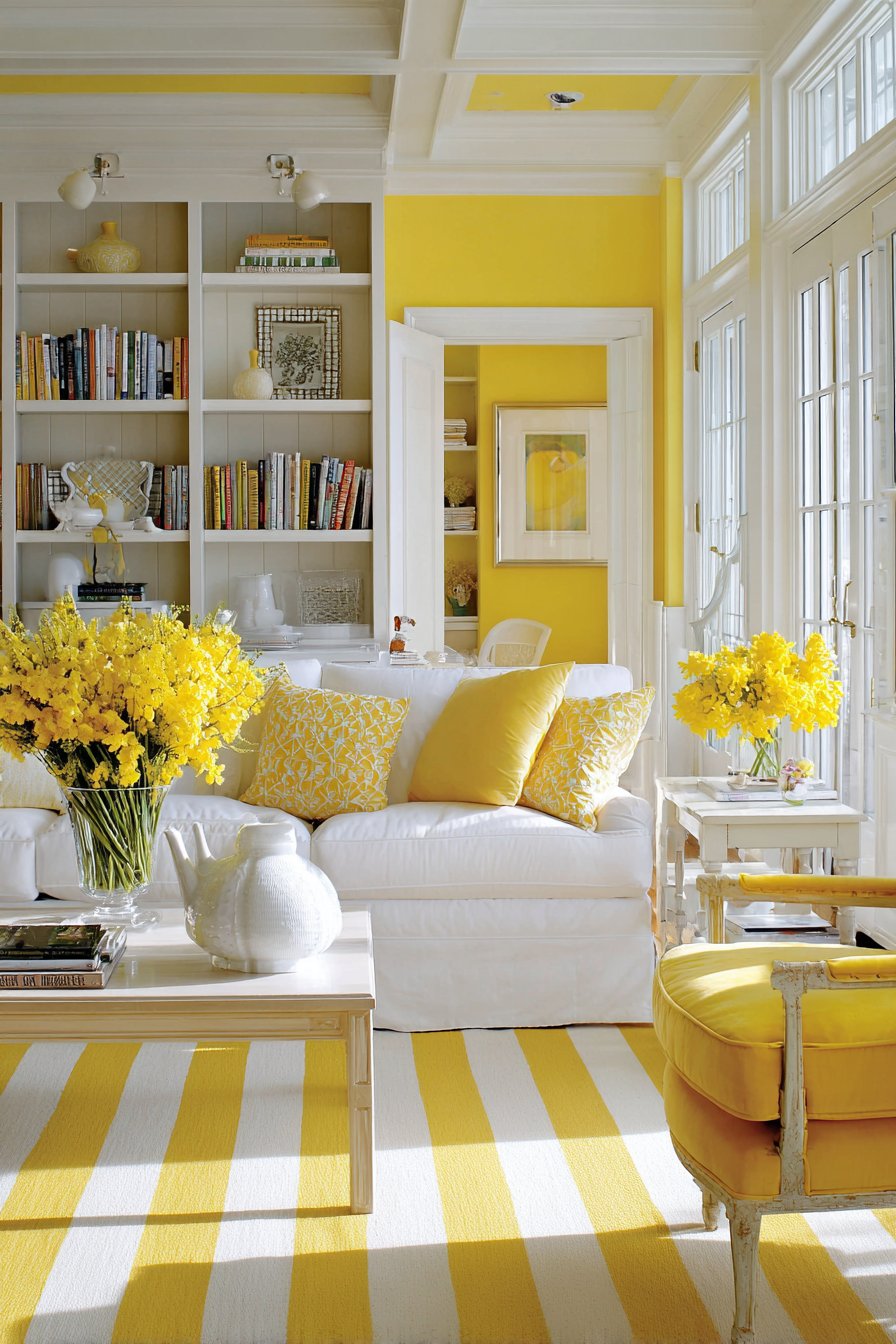
To successfully implement yellow in living room color ideas, choose the right yellow shade carefully—warm, soft yellows feel inviting while cool, bright yellows can feel harsh; test extensively before committing. Keep yellow primarily on walls (one or two) rather than large furniture pieces to allow flexibility if your taste changes, as yellow can be polarizing and may not have long-term appeal for everyone. Balance yellow’s intensity with substantial amounts of crisp white (at least 50% of the space) to prevent sensory overwhelm and maintain freshness. Incorporate warm wood tones that complement yellow’s warmth rather than cool greys which can clash with yellow’s inherent warmth. Ensure the room receives excellent natural light, as yellow can appear sickly or dingy in poorly lit spaces—this color thrives in bright, sunny rooms.
21. Luxurious Camel and Cream with Black Accents
Sophisticated living room color ideas featuring camel and cream with black accents create spaces of refined elegance and timeless appeal. This palette combines warm neutral tones with graphic black contrast for contemporary sophistication. A luxurious camel-colored leather sofa with modern silhouette anchors the space against warm cream walls, the rich leather providing both substantial presence and sophisticated warmth.
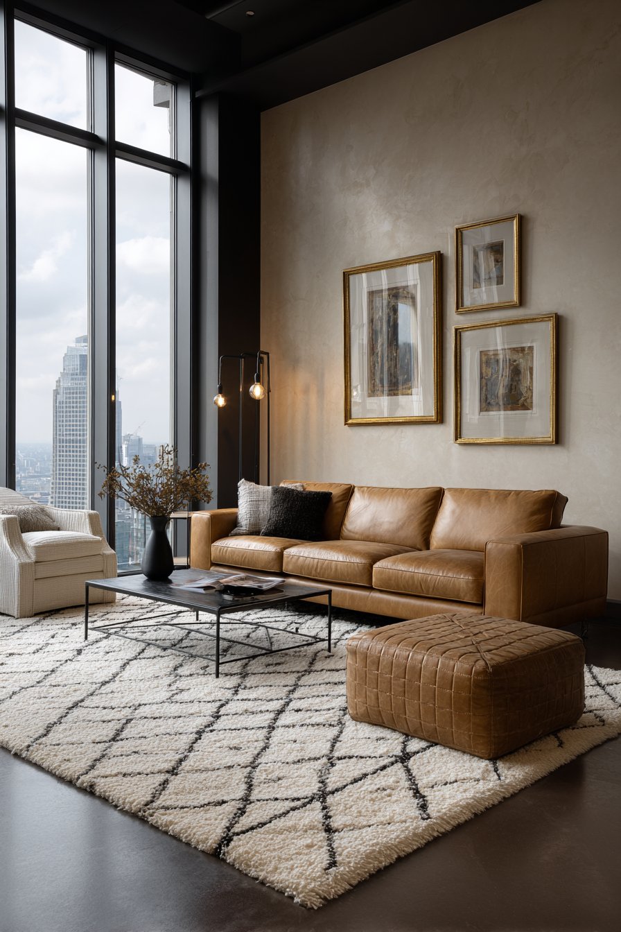
Black accent wall with subtle texture creates dramatic backdrop for gold-framed artwork, demonstrating how black can serve as a powerful supporting player in living room color ideas dominated by warm neutrals. Cream area rug with geometric black pattern grounds the seating area while introducing graphic interest. Black metal and glass coffee table adds contemporary edge that prevents the warm palette from feeling too traditional or safe.
Camel leather ottoman and cream linen armchair provide additional seating while reinforcing the warm neutral foundation. Black and brass floor lamp and black window frames add graphic contrast that gives this palette contemporary sophistication. Natural light through tall windows highlights the rich living room color ideas, as natural light brings out the warmth and depth in camel leather while emphasizing the dramatic black accents.
When creating camel and cream living room color ideas with black accents, choose rich, warm versions of camel and cream rather than cool, greyish versions to maintain the sophisticated warmth central to this palette’s appeal. Use black strategically (15-20% of the space) in graphic elements like window frames, one accent wall, and furniture frames to create contemporary contrast without overwhelming the warm foundation. Invest in high-quality leather or leather-look fabrics for camel-colored pieces, as this color shows quality differences dramatically—cheap versions look dingy while quality materials look luxurious. Add metallic accents in mixed finishes (brass with black metal, chrome with bronze) that bridge the warm neutrals and cool black elements. Incorporate varied textures within the neutral palette to prevent the space from appearing flat despite the limited color range.
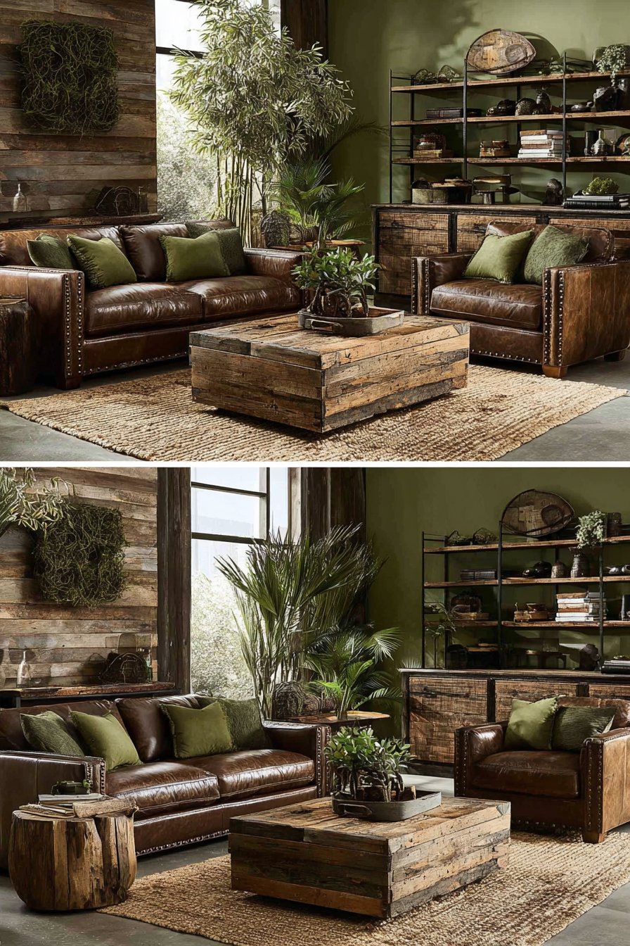
22. Organic Moss Green and Brown Earthiness
Nature-connected living room color ideas featuring moss green and warm brown tones create grounding spaces that celebrate organic materials and earth colors. This palette draws directly from forest floors and natural landscapes for inherently calming, connected environments. Textured walls in soft moss green create an organic backdrop for a chocolate brown leather sofa with nailhead trim, establishing the earth-toned foundation through complementary natural colors.
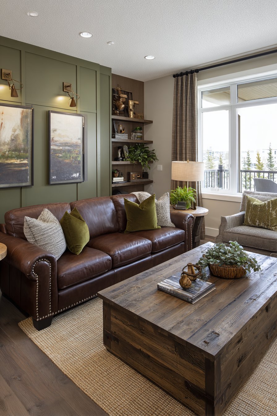
Deeper forest green accent wall behind rustic wooden shelving displays natural accessories and plants, intensifying the green tones while creating architectural depth. This layering of green from soft moss to deep forest demonstrates sophisticated use of analogous living room color ideas within the green family. Area rug in natural jute with brown and green accents anchors the space while contributing additional organic texture.
Reclaimed wood coffee table and side tables in varied brown tones add essential depth and prevent the brown elements from appearing monotonous. Moss green velvet throw pillows and olive green curtains reinforce the earthy palette with varied green tones and rich textures. Warm ambient lighting from bronze fixtures creates cozy atmosphere essential to earth-toned living room color ideas, as warm light enhances the organic quality of these natural colors.
To create successful moss green and brown living room color ideas, layer multiple shades of both green (from pale sage to deep forest) and brown (from tan to chocolate) to create depth and prevent the palette from appearing flat or one-dimensional. Incorporate abundant natural materials—leather, wood, jute, linen, plants—that authentically represent the natural environments that inspired the color palette. Add living plants generously throughout the space to reinforce the organic connection and introduce authentic green tones that shift with seasons. Choose warm, amber-toned lighting rather than cool, white light to enhance the earthy warmth of this palette and create the cozy atmosphere these colors deserve. Balance the organic elements with some contemporary structure or modern pieces to prevent the space from feeling too rustic or dated.
23. Glamorous Champagne Gold and Blush Luxury
Opulent living room color ideas featuring champagne gold and blush with ivory create spaces of sophisticated glamour and feminine elegance. This luxurious palette combines metallic shimmer with soft color for rooms that feel like jewelry boxes. Walls painted in soft ivory provide an elegant canvas for a blush pink velvet sofa with gold legs, the combination of soft color and metallic detail immediately establishing the glamorous aesthetic.
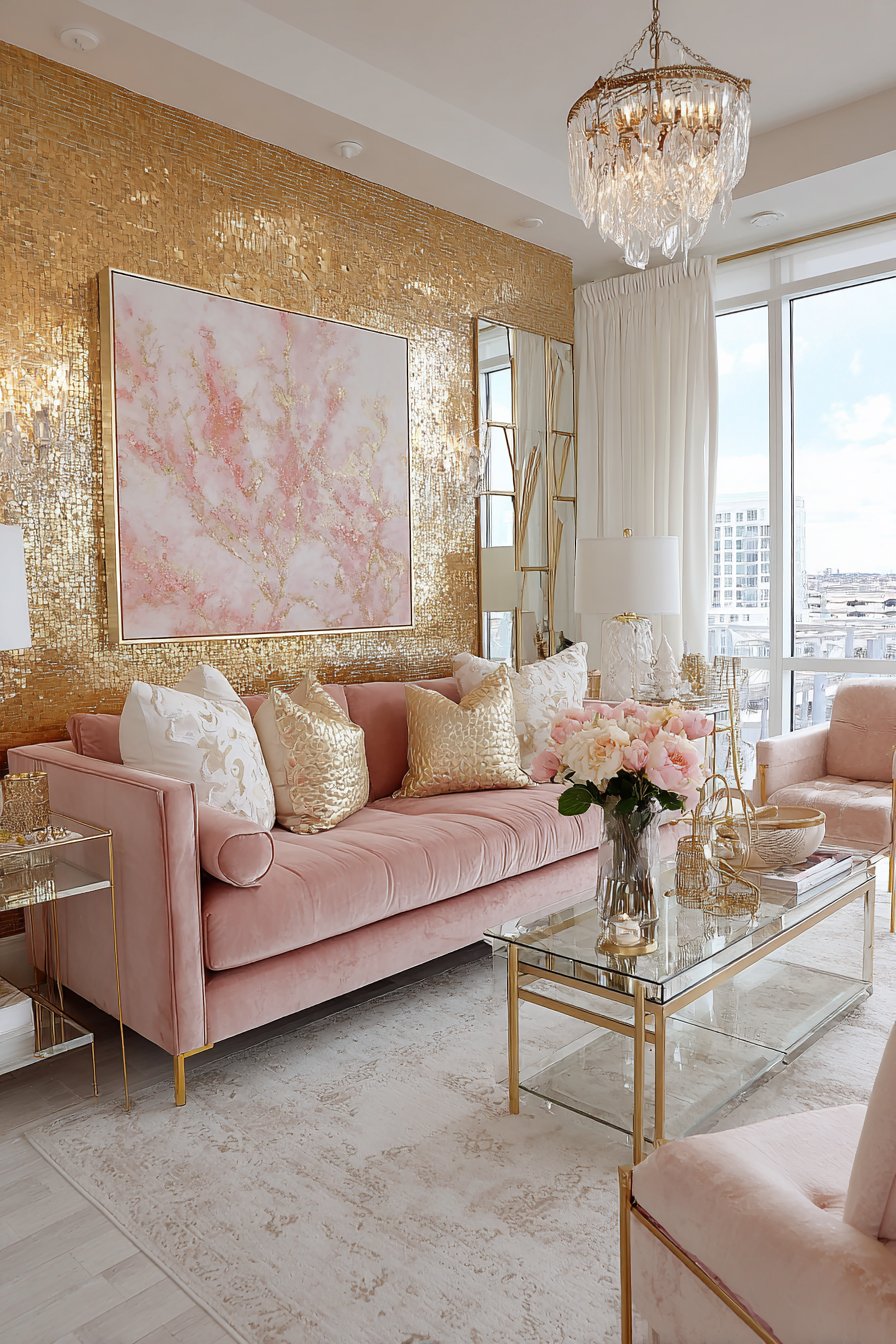
Champagne gold accent wall with metallic grasscloth wallpaper creates a stunning focal point that literally catches and reflects light, demonstrating how metallic surfaces transform living room color ideas through their light-reflective properties. Ivory area rug with subtle gold and blush pattern defines the space while maintaining the cohesive luxury palette. Gold and glass coffee table and side tables add essential sparkle and contemporary sophistication.
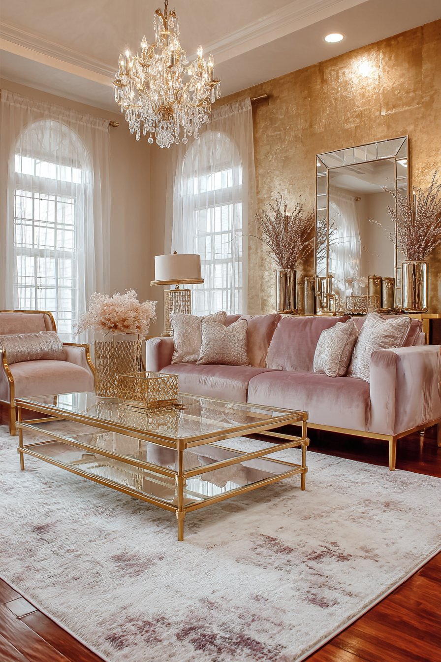
Blush velvet accent chairs with gold frames complete the seating arrangement while reinforcing the pink and gold color story. Crystal chandelier and gold-framed mirrors amplify light and luxury through reflection and sparkle. Flowing ivory silk curtains frame windows allowing natural light to enhance the metallic elements, as champagne gold living room color ideas rely on excellent lighting to showcase the metallic shimmer properly.
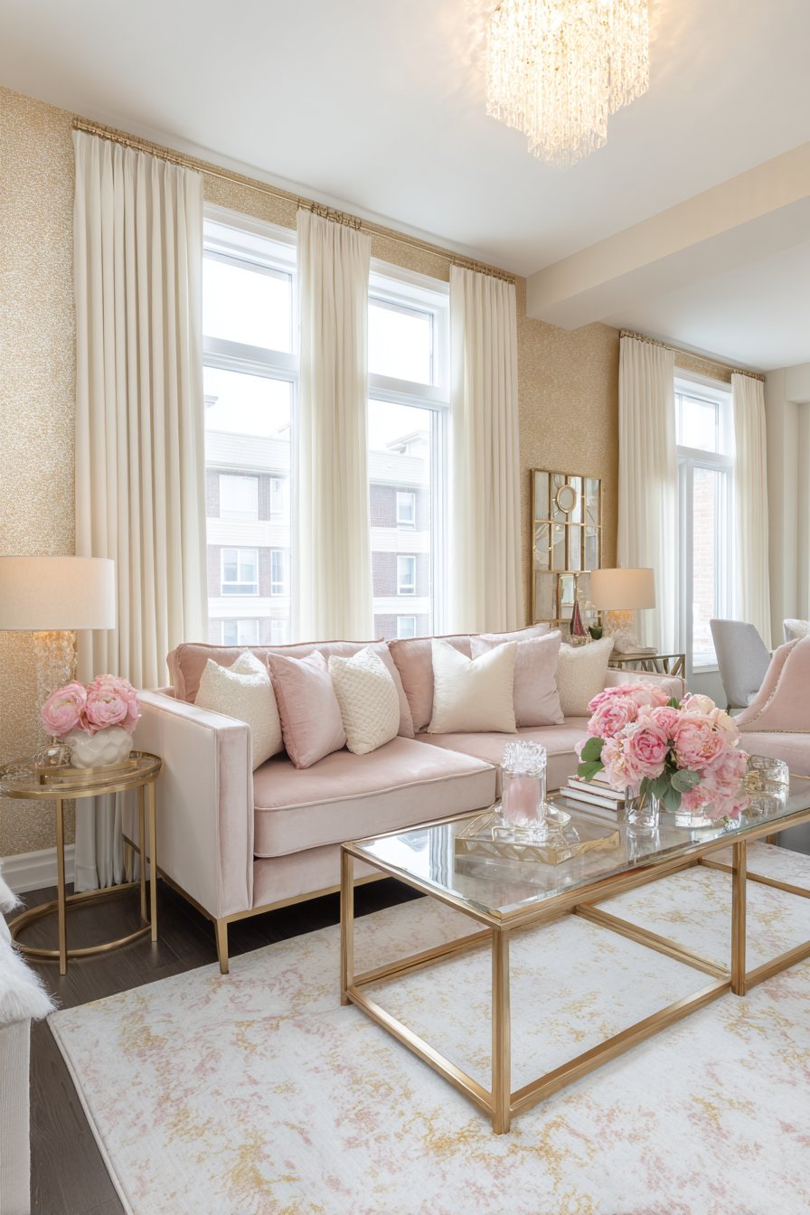
When creating champagne gold and blush living room color ideas, use metallic elements generously but not overwhelmingly (25-30% of the space) to achieve glamour without garishness—balance is essential. Choose soft, dusty versions of blush rather than bright pink to maintain sophisticated femininity and prevent the space from feeling too sweet or juvenile. Incorporate substantial amounts of ivory or cream to provide visual rest and prevent the metallic and pink elements from creating sensory overwhelm. Invest in quality metallic finishes that genuinely reflect light rather than flat gold paint that reads as yellow—true metallic shimmer is essential to this palette’s success. Ensure excellent lighting from multiple sources including natural light, as metallics require light to showcase their reflective properties and create the glamorous atmosphere.

24. Breezy Coastal Driftwood Grey and Ocean Blue
Seaside-inspired living room color ideas featuring driftwood grey and ocean blue create relaxed spaces that evoke coastal living and beachside tranquility. This palette captures the essence of coastal environments through colors that occur naturally in beach landscapes. Walls in warm driftwood grey provide a neutral base for a navy blue linen sofa with relaxed coastal style, the combination immediately establishing the beach-inspired aesthetic.
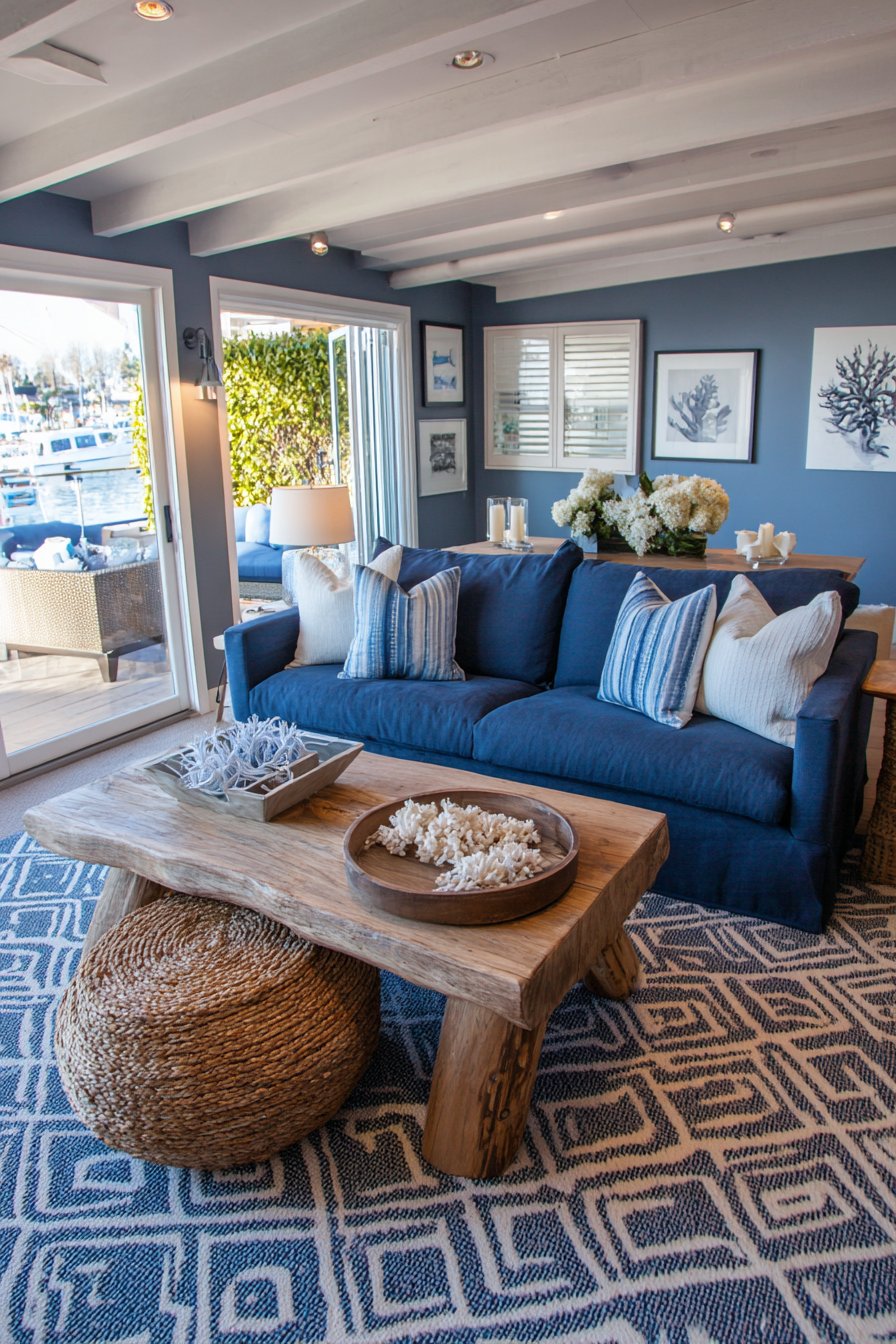
Lighter sky blue accent wall adds depth and oceanic color variation without competing with the navy sofa, demonstrating sophisticated layering within blue living room color ideas. Whitewashed wood coffee table and natural rope-wrapped side table introduce organic coastal textures that feel authentically beach-inspired. Area rug in cream with blue and grey geometric pattern grounds the space while reinforcing the coastal color story.
Blue and white striped throw pillows and sea glass accessories reinforce the nautical living room color ideas without resorting to literal beach clichés like anchors or shells. White painted wood ceiling beams add architectural interest that enhances the coastal cottage feeling. Large windows with white shutters maximize ocean views and natural light essential to coastal living room color ideas that celebrate connection to beach environments.
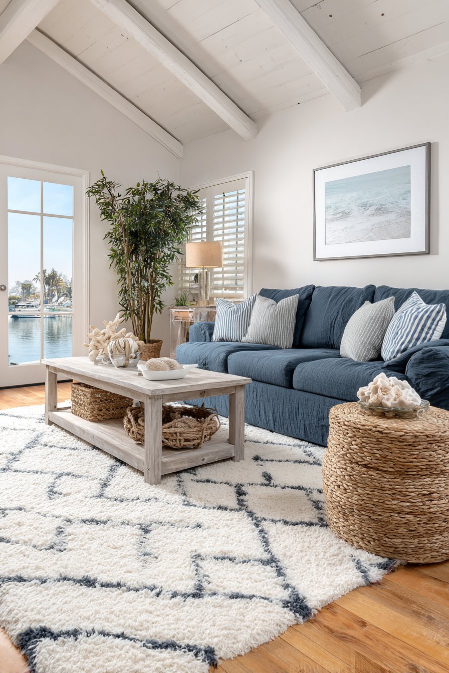
To successfully create coastal living room color ideas with driftwood grey and ocean blue, choose weathered, warm greys that evoke actual driftwood rather than cool, modern greys that feel more urban than coastal. Layer multiple shades of blue from deep navy to pale sky to create oceanic depth and prevent monotony within the blue family. Incorporate natural, weathered materials—whitewashed wood, rope, jute, linen—that authentically represent coastal environments and craftsmanship. Keep the overall palette light and bright to maintain the airy, open feeling essential to coastal design—dark or saturated coastal colors should be used sparingly as accents. Maximize natural light and create visual connections to outdoor spaces where possible, as coastal design celebrates the relationship between interior and exterior environments.
25. Versatile Greige and Soft Gold Sophistication
Transitional living room color ideas featuring warm greige and soft gold accents create timelessly sophisticated spaces that bridge traditional and contemporary design. Greige—that perfect blend of grey and beige—has become a designer favorite for its ability to work with virtually any accent color while feeling neither too warm nor too cool. Walls painted in sophisticated greige create a versatile backdrop for a greige linen sofa with track arms, the monochromatic approach establishing calm sophistication.
Slightly darker greige accent wall adds subtle dimension without creating contrast, demonstrating restraint and nuance central to sophisticated living room color ideas. Cream and gold area rug with traditional pattern grounds the elegant space while introducing metallic shimmer. White oak coffee table and console add natural warmth essential to preventing greige from feeling sterile despite its neutral nature.
Soft gold velvet throw pillows and brushed gold table lamps provide refined metallic touches that warm beautifully against greige’s balanced neutral tone. Gold-framed mirror above the sofa reflects natural light while adding another layer of subtle metallic accent. Cream linen curtains with subtle sheen frame large windows, allowing natural light that brings out greige’s complex undertones—this color appears quite different under various lighting conditions and truly comes alive with abundant natural light.
When creating greige living room color ideas, test your specific greige extensively in your actual space at different times of day, as this complex color can read more grey, more beige, or even slightly purple depending on lighting and adjacent colors. Ensure all your greige selections share the same undertones (all warm or all cool) to maintain cohesion, as mixing greige with different undertones creates subtle but noticeable discord. Add one warm metallic accent (gold, brass, bronze) or one soft accent color (blush, sage, soft blue) consistently throughout to add personality without disrupting the sophisticated neutral foundation. Incorporate varied textures extensively—velvet, linen, natural wood, brushed metal—to create visual interest within this subtle color palette. Choose warm wood tones and warm lighting to enhance greige’s warmth and prevent the space from feeling cold or institutional despite its neutral nature.

Why These Living Room Color Ideas Work: The Psychology and Design Principles Behind Successful Palettes
Understanding why certain living room color ideas resonate requires examining both the psychological impact of color and fundamental design principles that govern successful interiors. Each of the twenty-five approaches presented offers distinct advantages depending on your space, lifestyle, and personal preferences. Monochromatic schemes like the serene grey sanctuary create calm through chromatic harmony, reducing visual noise and promoting relaxation—ideal for those seeking peaceful retreats from busy lives. The psychological research supporting color’s impact on mood validates these design choices beyond mere aesthetics.
Complementary color schemes like navy and mustard yellow or coral and teal create visual energy through color wheel opposition, stimulating the eye while maintaining balance. These living room color ideas work particularly well in spaces where you want to encourage conversation and activity rather than quiet contemplation. The bold contrast creates focal points naturally, guiding the eye through the space and creating memorable impressions. Similarly, jewel tone combinations tap into our associations with precious gems—emerald, sapphire, and ruby evoke luxury and richness that transform ordinary living rooms into extraordinary spaces.
Analogous color schemes using colors adjacent on the color wheel—like the various green tones in the tropical and moss green examples—create harmonious, cohesive environments that feel inherently balanced. These living room color ideas work because they mirror color relationships found in nature, where sky blue transitions to ocean teal, or forest green shifts to sage and moss. Our brains process these gradual color transitions as naturally pleasing, reducing visual stress while maintaining interest through subtle variation.
The neutral-based approaches—greige and gold, taupe and ivory, camel and cream—prove timelessly popular because they provide sophisticated foundations that accommodate changing accent colors and evolving tastes. These living room color ideas offer longevity and flexibility that bold color schemes cannot match, making them practical choices for those who tire of colors quickly or who want their investment in major furniture and paint to last beyond current trends. The strategic addition of one accent color or metallic finish prevents these neutral schemes from becoming boring while maintaining their fundamental versatility.
Earth-toned living room color ideas like terracotta and cream or moss green and brown connect us to natural environments in ways that support wellbeing. Biophilic design research demonstrates that humans experience reduced stress and improved mood when surrounded by colors and materials that reference nature. These palettes work not just aesthetically but physiologically, creating spaces that support our fundamental need for connection to the natural world even within urban environments.
The coastal and Mediterranean approaches succeed because they transport us mentally to specific environments associated with relaxation and vacation. The psychological power of these living room color ideas extends beyond the colors themselves—they evoke memories and aspirations, creating emotional connections that purely aesthetic choices cannot achieve. When you see ocean blues and sandy beiges, your brain recalls beach experiences and their associated positive emotions, effectively bringing vacation feelings into everyday life.
Dramatic dark color schemes like forest green or charcoal and plum challenge conventional wisdom but create spaces of unparalleled intimacy and sophistication. These living room color ideas work in specific contexts—for those who value atmosphere over brightness, who have excellent artificial lighting, or who use their living rooms primarily in evening hours. The enveloping quality of dark colors creates cocooning effects that lighter palettes cannot replicate, making rooms feel protective and secure rather than exposed and sparse.
The retro and maximalist approaches succeed because they embrace personality and joy over perfection. In an era of neutral minimalism, these living room color ideas offer permission to celebrate color, pattern, and personal expression. They work psychologically by creating environments that spark happiness and reflect individuality—your living room becomes a genuine expression of who you are rather than a showcase for resale value or design trends.
Successful implementation of any of these living room color ideas requires understanding your specific space’s characteristics. Rooms with abundant natural light can handle darker, more saturated colors that would feel oppressive in dim spaces. Large rooms benefit from bold colors that create intimacy, while small rooms often work best with lighter palettes that enhance perceived spaciousness. The architectural features, ceiling height, natural light quality and quantity, existing furniture, and surrounding rooms all influence which color approaches will work best in your specific situation.
Material choices significantly impact how living room color ideas manifest in reality. The same green appears completely different on matte plaster versus glossy ceramic versus velvet fabric. Understanding how materials interact with color prevents disappointing results and explains why professional designers focus so heavily on samples and mockups. The interplay between color, material, and light creates the final effect—all three elements must work together to achieve successful results.
Lighting design cannot be separated from color selection in successful living room color ideas. Warm LED bulbs enhance warm color palettes while making cool colors appear muddy. Cool daylight bulbs flatter cool palettes but can make warm colors appear garish. Natural light changes throughout the day, shifting how colors appear from morning to afternoon to evening. Professional designers always test color selections under the actual lighting conditions where they’ll exist, at multiple times of day, because this dramatically impacts final results.
The 60-30-10 rule underlying many of these living room color ideas—60% dominant color, 30% secondary color, 10% accent color—provides structure that prevents color chaos while allowing sufficient variation to create interest. This proportion feels balanced to human perception and prevents any single element from overwhelming while ensuring adequate diversity. Whether you’re working with monochromatic variations or complementary contrasts, this fundamental distribution principle guides successful execution.
Conclusion: Finding Your Perfect Living Room Color Palette
The journey through these twenty-five diverse living room color ideas demonstrates that successful interior design isn’t about following rigid rules but understanding principles and applying them thoughtfully to your unique situation. From serene monochromatic grey to exuberant maximalist rainbow, from sophisticated jewel tones to calming coastal palettes, each approach offers distinct advantages and creates specific atmospheres. The key lies in honest self-assessment—understanding not just what looks beautiful in magazine photos but what will support your daily life, reflect your personality, and bring you joy over the long term.
Begin your color journey by considering how you actually use your living room. Do you entertain frequently and need energizing colors that stimulate conversation? Do you seek refuge from stressful work and need calming, restorative tones? Do you have young children requiring colors that hide inevitable wear, or are you empty nesters free to embrace delicate light palettes? Your lifestyle should guide your color choices as much as your aesthetic preferences, ensuring your beautiful living room also functions beautifully for your real life.
Don’t fear experimentation, but do test thoroughly before committing to expensive and time-consuming changes. Paint large sample boards and observe them at different times of day under your actual lighting conditions. Gather fabric swatches, material samples, and inspiration images to build a physical mood board showing how your colors will interact. Trust the process of refinement—your first instinct might not be your best solution, and thoughtful iteration leads to results you’ll love for years rather than months.
Remember that your living room color ideas can evolve over time. Start with a neutral foundation if you’re uncertain, adding bolder accent colors through easily changed elements like pillows, artwork, and accessories. As your confidence grows and your understanding of what works in your space deepens, you can commit to bolder choices in paint and larger furniture. The beauty of thoughtful design lies not in perfection but in creating spaces that genuinely reflect who you are and support how you want to live. Your perfect living room color palette exists—it simply requires the courage to discover it and the patience to implement it thoughtfully.