Creating a gallery wall is one of the most rewarding and personalized ways to transform any room in your home. More than just a collection of frames on a wall, a well-curated gallery wall tells your story, reflects your personality, and serves as a dynamic focal point that can completely alter the mood and character of a space. Whether you’re drawn to minimalist arrangements with clean lines, eclectic salon-style displays bursting with personality, or carefully coordinated collections that speak to specific themes, the possibilities are truly endless.
The beauty of gallery walls lies in their versatility and accessibility. Unlike major renovations or expensive furniture investments, creating a gallery wall allows you to make a significant visual impact with relatively modest resources. From contemporary urban lofts to cozy farmhouse kitchens, from sophisticated traditional parlors to cheerful children’s rooms, gallery walls adapt seamlessly to any architectural style and design aesthetic. They offer the unique advantage of being both permanent enough to serve as a defining design feature and flexible enough to evolve as your tastes change or your collection grows.
In this comprehensive guide, we’ll explore twenty-nine distinctive approaches to gallery wall design, each offering unique insights into how art, photography, and decorative objects can be arranged to create stunning visual statements. Whether you’re working with expansive blank walls that cry out for drama, narrow hallways that need thoughtful attention, or awkward corner spaces that present design challenges, you’ll discover practical strategies, expert tips, and inspiring ideas to help you create a gallery wall that’s uniquely yours. From understanding frame selection and spacing principles to mastering lighting techniques and color coordination, we’ll cover everything you need to know to transform your walls into captivating displays that rival professional galleries.
1. Modern Grid Gallery Wall with Minimalist Symmetry
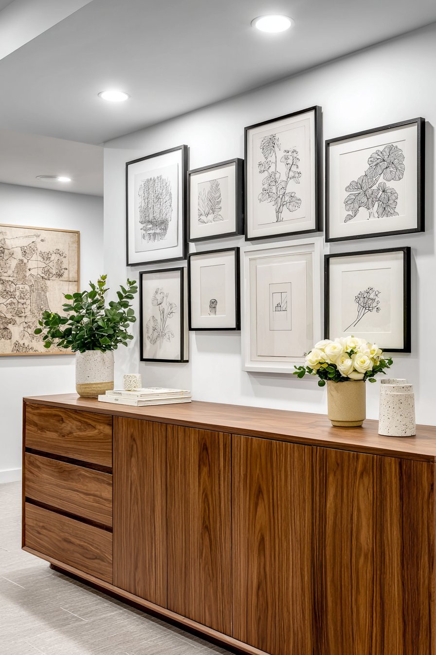
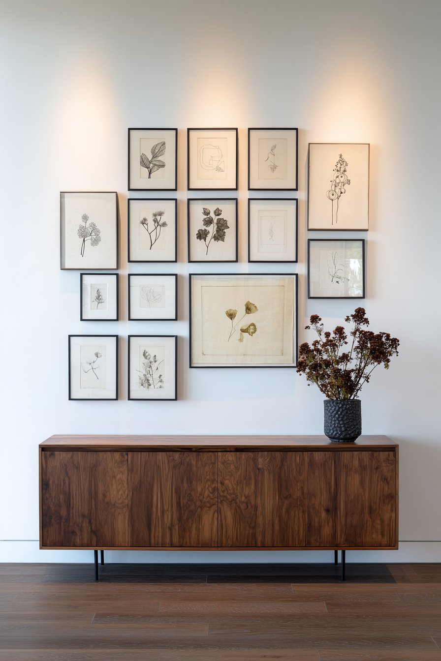
The power of precision meets contemporary aesthetics in this sophisticated gallery wall approach that transforms order into art. Featuring twelve identically-sized black frames arranged in a perfect grid of three rows and four columns, this design exemplifies the beauty of restraint and mathematical balance. Each frame contains minimalist line art or botanical prints that share a common visual language, creating a cohesive statement that feels both intentional and effortlessly chic. The frames hang above a mid-century modern credenza in rich walnut finish, establishing a dialogue between the geometric precision above and the organic wood tones below.
What makes this arrangement particularly striking is its commitment to uniformity. The consistent frame size and spacing create a rhythm that’s deeply satisfying to the eye, while the black frames against white walls generate maximum contrast that makes each piece pop. The subjects within the frames—whether delicate line drawings, abstract geometric shapes, or simplified botanical studies—maintain a visual consistency that reinforces the overall aesthetic. Recessed lighting positioned to cast even illumination across the entire display ensures that each piece receives equal attention, preventing any single element from dominating the composition.
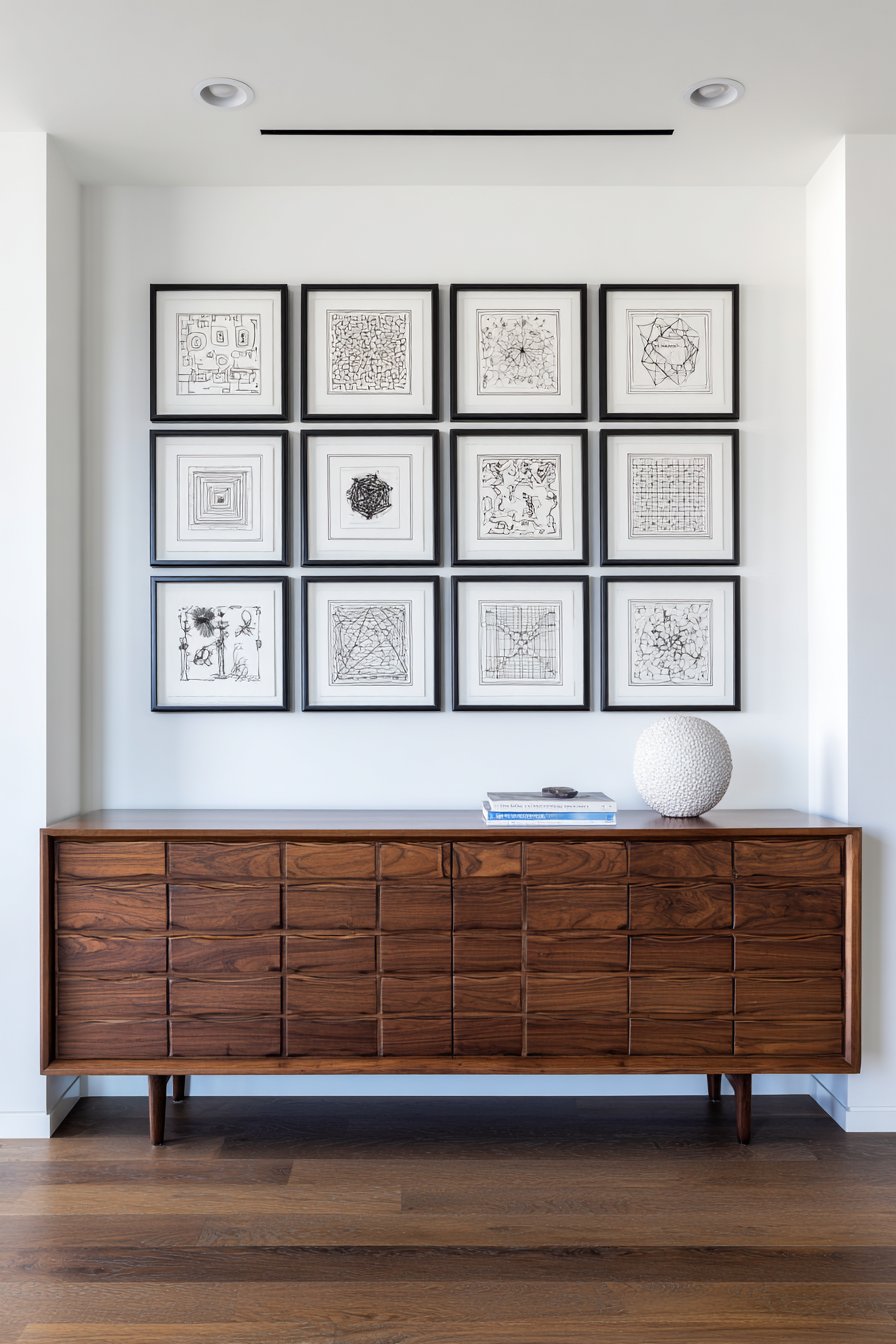
This style of gallery wall works exceptionally well in spaces that embrace modern or contemporary design principles. The clean lines and structured approach complement minimalist interiors, open-concept living spaces, and rooms with strong architectural features. The grid arrangement also has practical advantages: it’s relatively straightforward to plan and install, as the mathematical precision means less guesswork about placement. For those who appreciate order and find peace in symmetry, this approach offers a gallery wall solution that feels organized, intentional, and thoroughly modern.
Key Design Tips:
- Measure carefully and use a level to ensure perfect alignment—even slight variations will be noticeable in grid arrangements
- Choose artwork with similar visual weight and style to maintain cohesion across all twelve frames
- Consider using matching mats within frames to create additional visual consistency and help standardize different artwork sizes
- Install the entire arrangement at eye level, with the center point approximately 57-60 inches from the floor
- Use quality hanging hardware that can support the weight of multiple frames without sagging over time
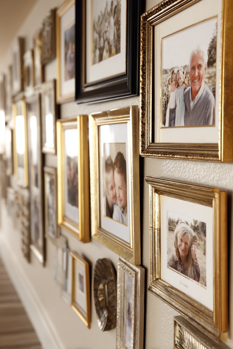
2. Vintage Family Heritage Gallery Wall
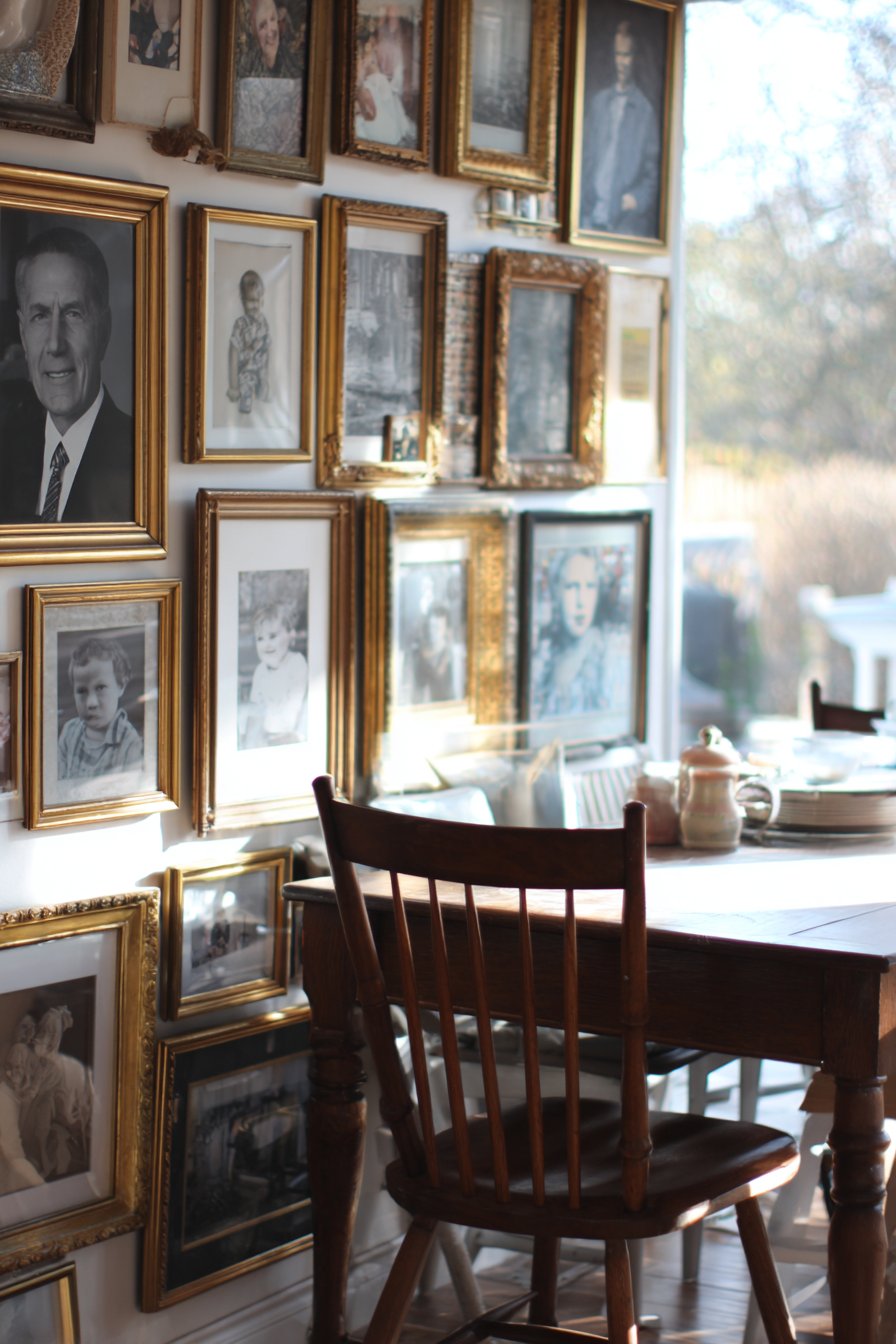
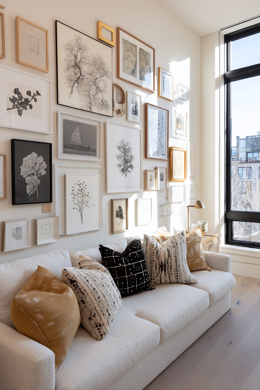
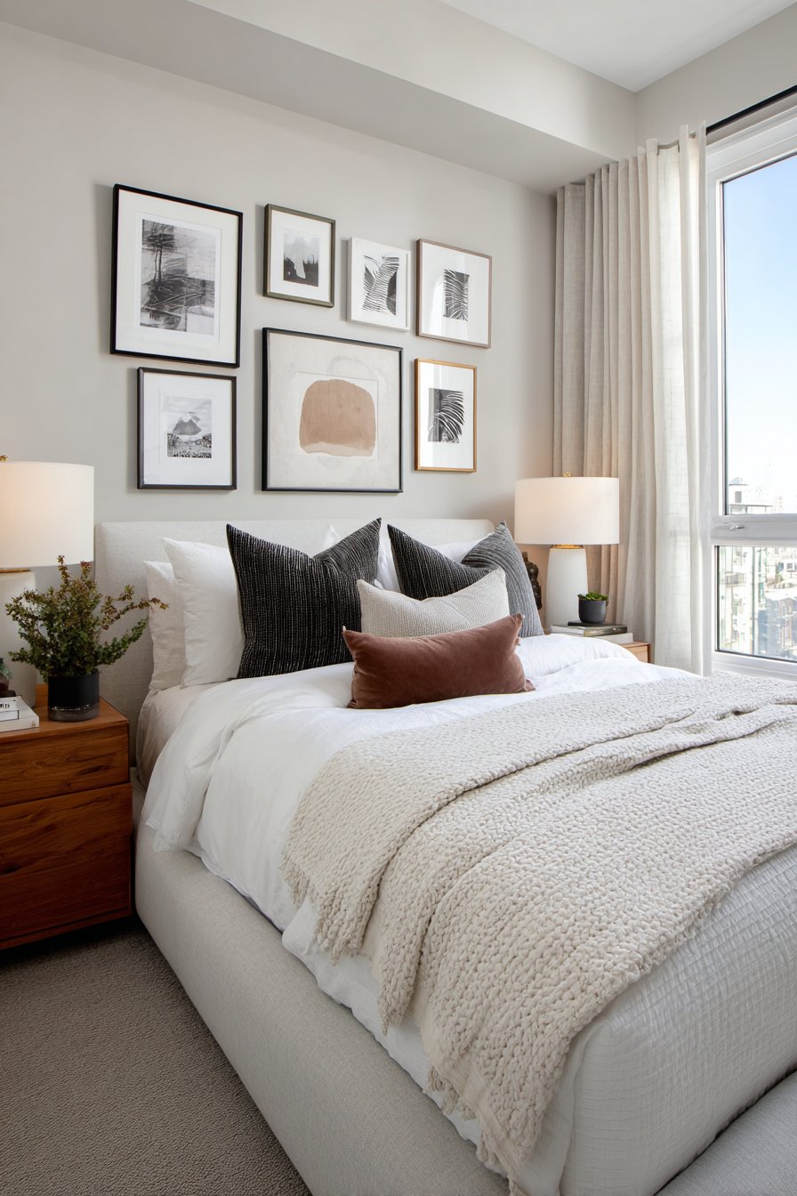
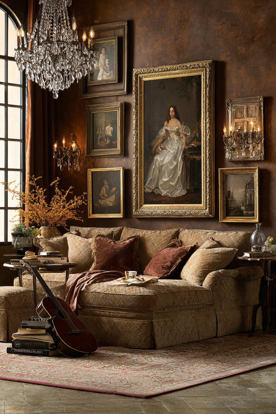
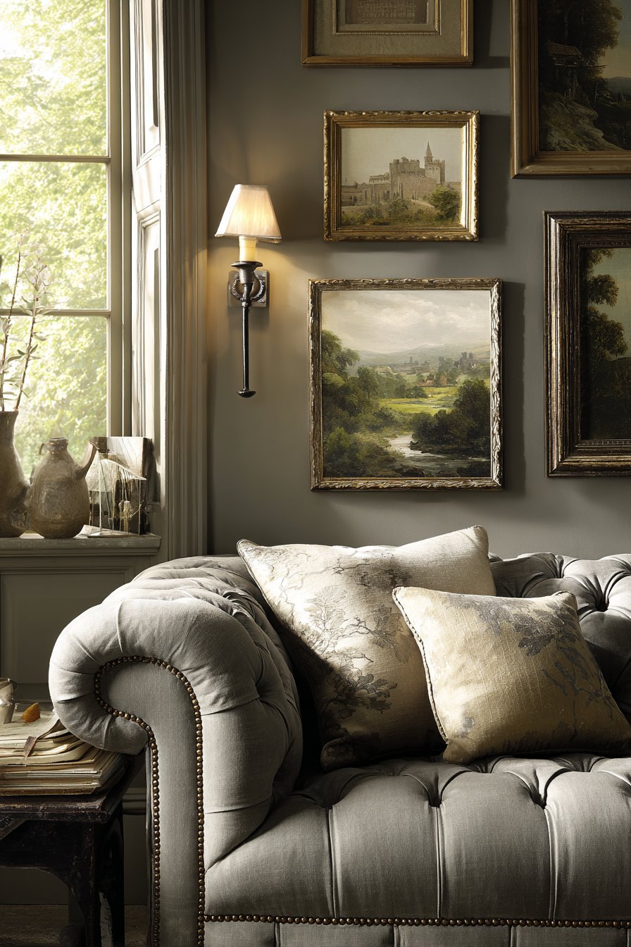
There’s something profoundly moving about a gallery wall that celebrates family history and personal legacy. This salon-style arrangement brings together vintage family photographs spanning three generations, each housed in ornate gold and antique brass frames that vary dramatically in size, shape, and decorative detail. The eclectic collection creates a visual journey through time, transforming a dining room wall into a living family archive. Unlike rigid grid arrangements, this approach embraces organic clustering, with frames occasionally overlapping to create depth and visual intrigue.
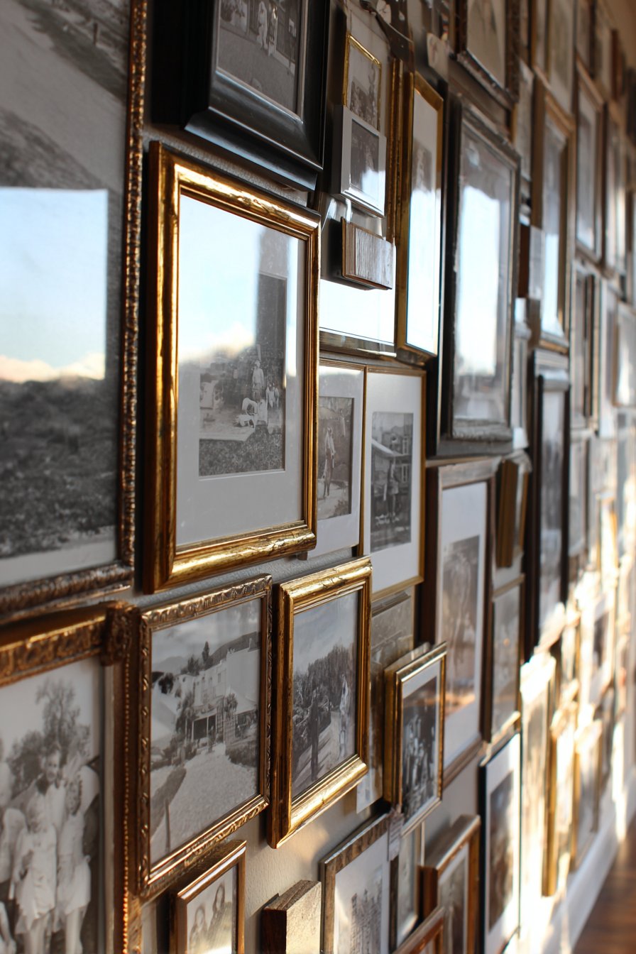
The metallic frames themselves become part of the art, their varied patinas and ornamental details reflecting different eras and styles collected over decades. Some frames feature baroque flourishes with elaborate corner details, while others showcase art deco geometry or Victorian filigree. This diversity in frame styles actually strengthens the overall composition, suggesting authenticity and the genuine accumulation of treasured items rather than a one-day shopping trip. The warm glow from adjacent windows bathes the collection in natural light that catches the metallic surfaces, creating subtle reflections and highlights that change throughout the day.
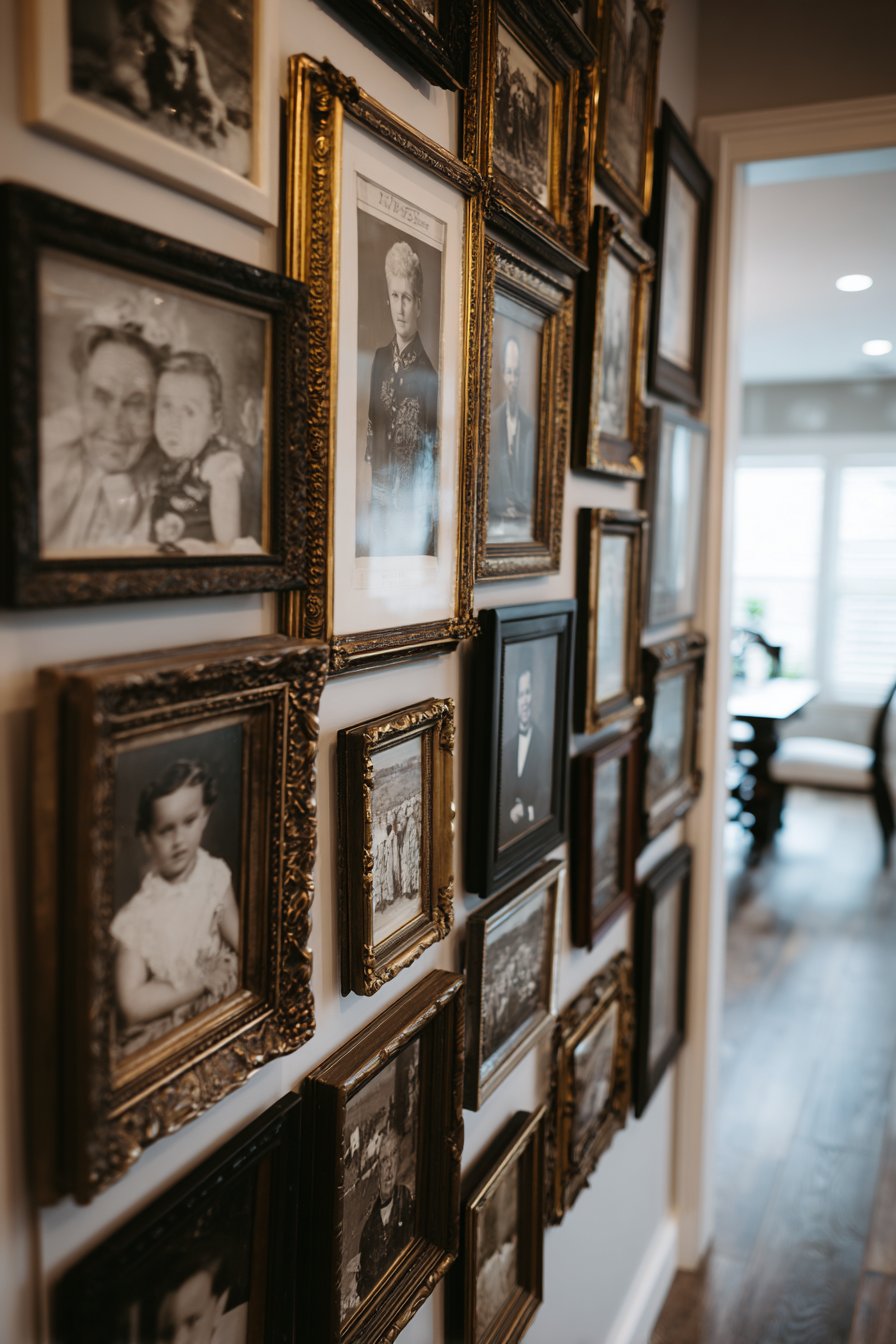
What elevates this design beyond mere nostalgia is its thoughtful curation and placement. While the arrangement appears casual, successful salon-style galleries require careful planning to balance visual weight, ensure proper spacing, and create a cohesive whole from disparate elements. The intimate setting of a dining room proves ideal for this type of personal gallery, as it encourages closer viewing and provides natural opportunities for storytelling during family gatherings. This is gallery wall design at its most emotionally resonant, where every frame holds not just an image but a memory, a story, and a connection to the past.
Key Design Tips:
- Start with your largest or most ornate frame as an anchor piece, then build outward
- Mix portrait and landscape orientations to create visual variety and solve spacing challenges
- Keep spacing relatively consistent between frames—typically 2-3 inches works well for salon-style arrangements
- Create a paper template layout on the floor first to experiment with arrangements before committing to wall placement
- Consider the color and patina of frames as part of your overall color scheme, ensuring they complement rather than clash with room decor
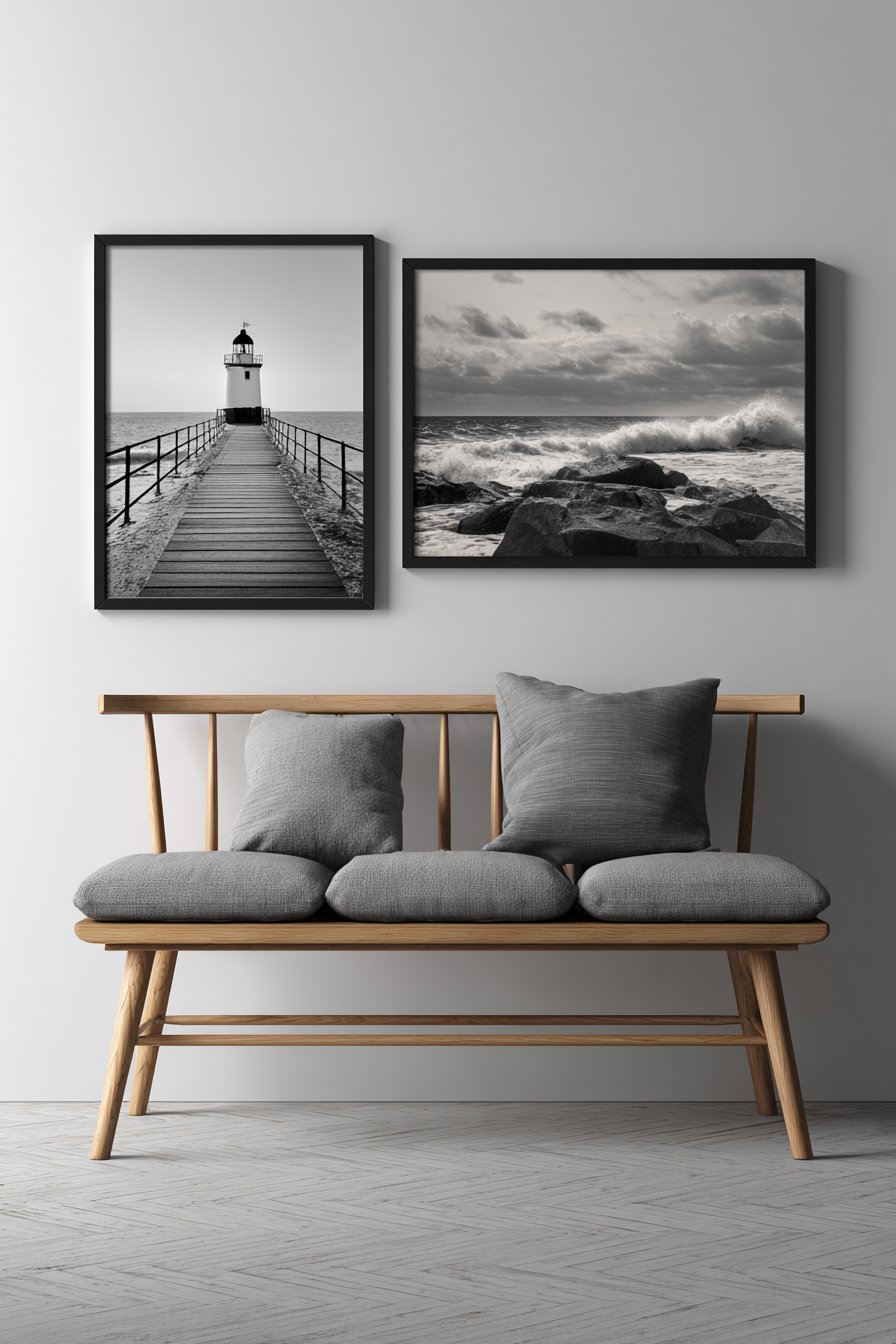
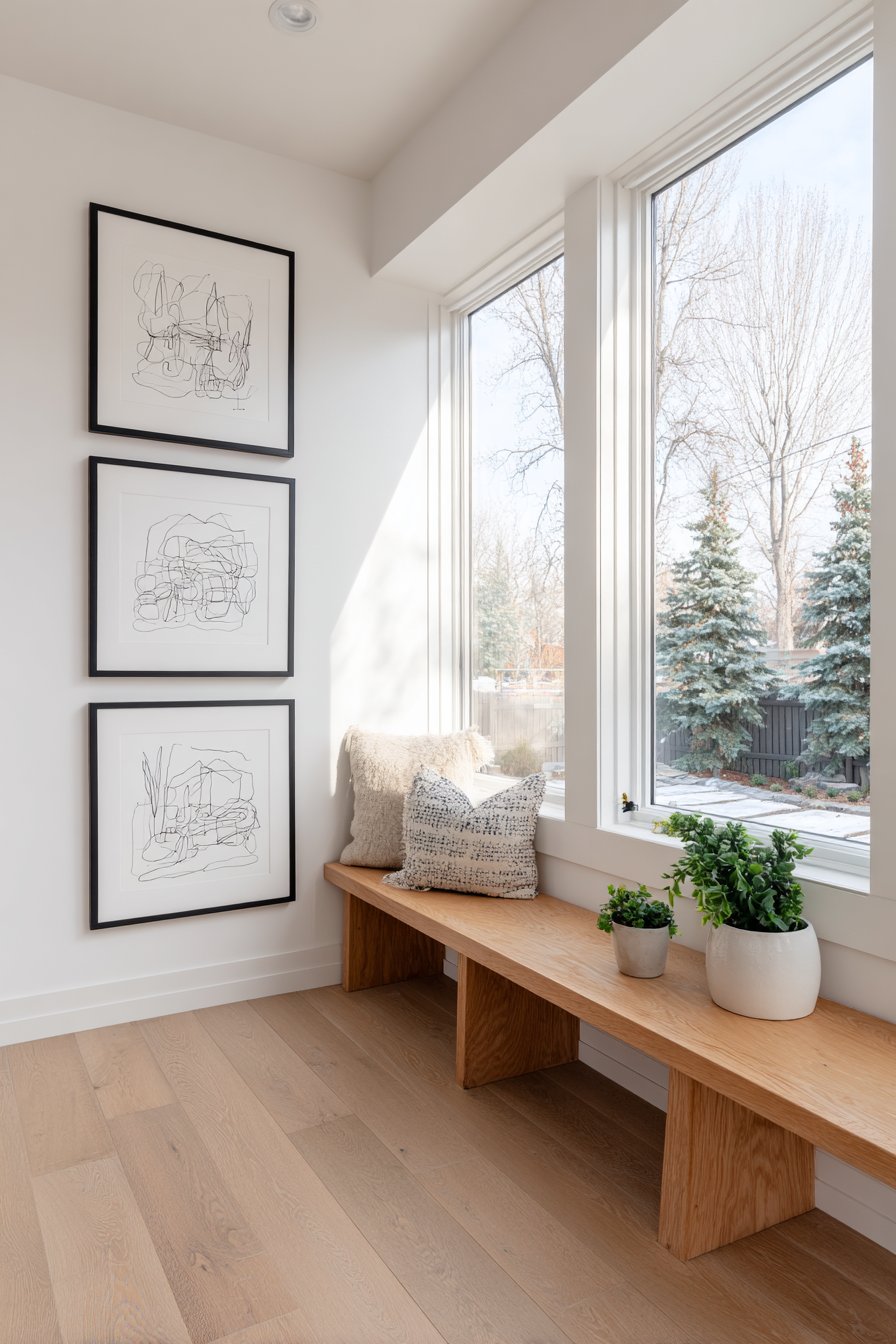
3. Contemporary Black and White Photography Gallery
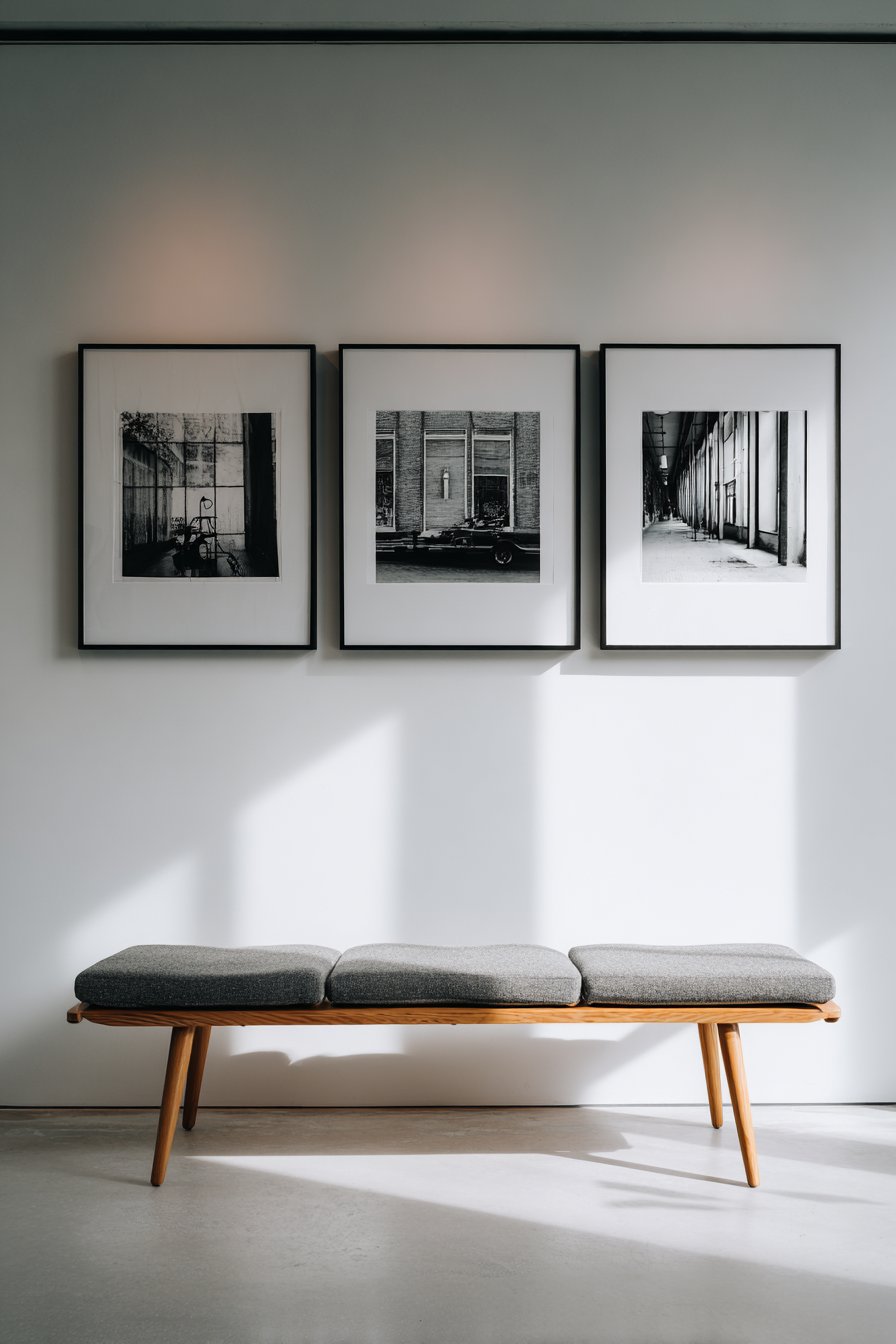
Minimalism achieves maximum impact in this striking gallery wall featuring oversized black-and-white photography prints housed in sleek, thin black aluminum frames. The arrangement of three large-scale images positioned horizontally above a Scandinavian-style bench demonstrates how fewer pieces can sometimes make a stronger statement than cluttered collections. Each photograph commands attention, whether capturing dramatic landscapes, architectural details, or artistic abstracts, and the generous sizing allows viewers to appreciate subtle tonal gradations and compositional nuances.
The frames themselves nearly disappear, their minimal profiles serving merely as refined edges that define each image without competing for attention. This restraint allows the photography to shine while maintaining professional presentation standards. The horizontal arrangement creates a strong visual line that draws the eye across the wall, while the white backdrop provides pristine contrast that makes the black-and-white imagery even more dramatic. Below, a light oak bench with a gray cushion offers both functional seating and visual balance, its simple form echoing the gallery wall’s commitment to uncluttered aesthetics.
Lighting plays a crucial role in this installation. Soft, diffused natural light prevents harsh glare on the glass while illuminating the photographs with the kind of even, balanced exposure that professional galleries strive to achieve. The subtle shadows cast behind the frames add dimension and prevent the arrangement from appearing flat against the wall. This approach to gallery wall design suits modern, contemporary, and Scandinavian interiors perfectly, and works especially well in spaces where you want art to be a focal point without overwhelming the room’s overall sense of calm and order.
Key Design Tips:
- Choose photography with consistent tonal qualities—all high contrast, all moody and atmospheric, or all bright and airy
- Mount large prints at eye level for optimal viewing, ensuring the center of the arrangement sits around 57-60 inches from the floor
- Allow significant negative space between frames—at least 4-6 inches for large-scale pieces
- Use museum-quality glass or acrylic to protect prints while minimizing reflections
- Consider the viewing distance when selecting print sizes; larger rooms can accommodate more dramatic scaling
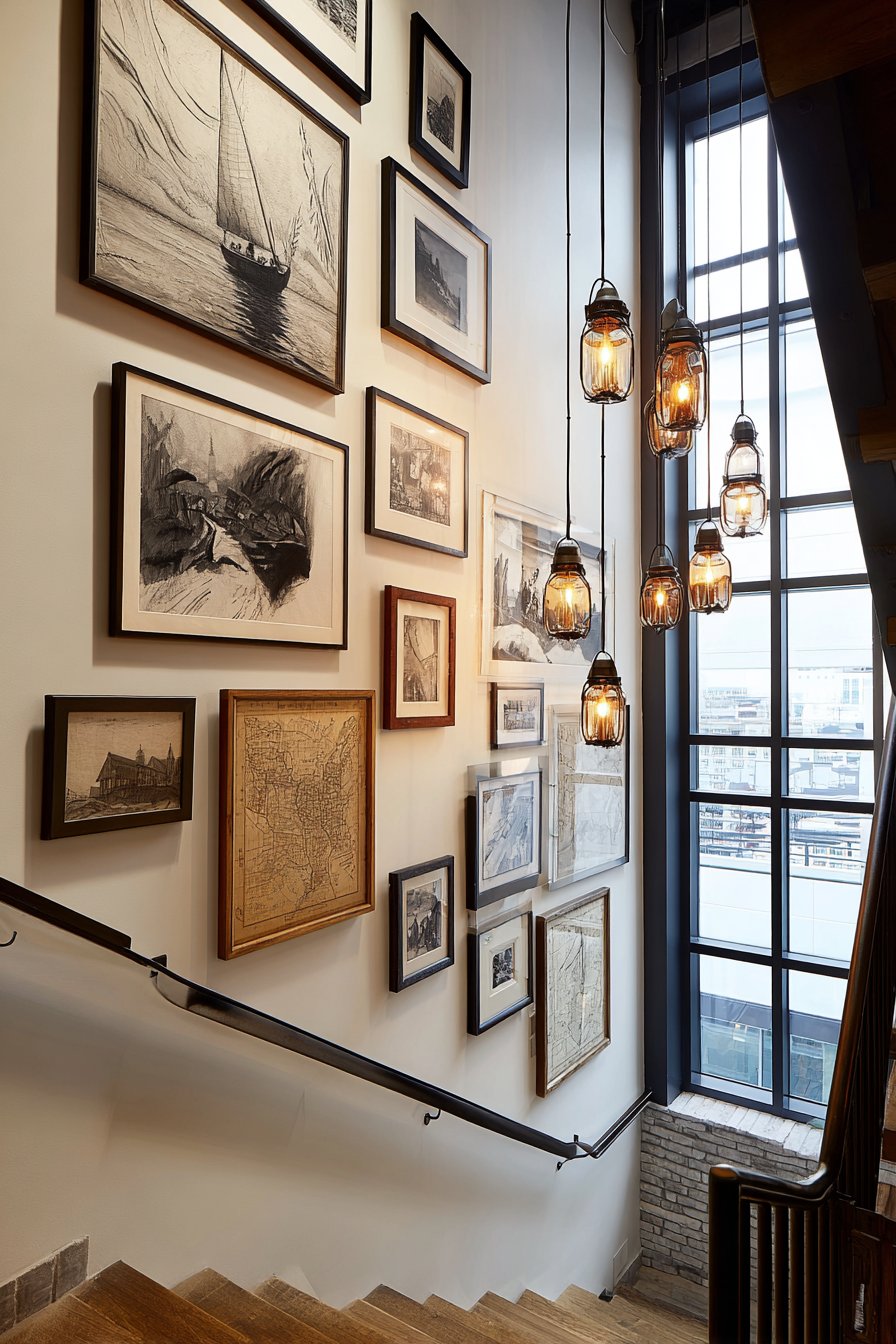
4. Dynamic Staircase Gallery Wall
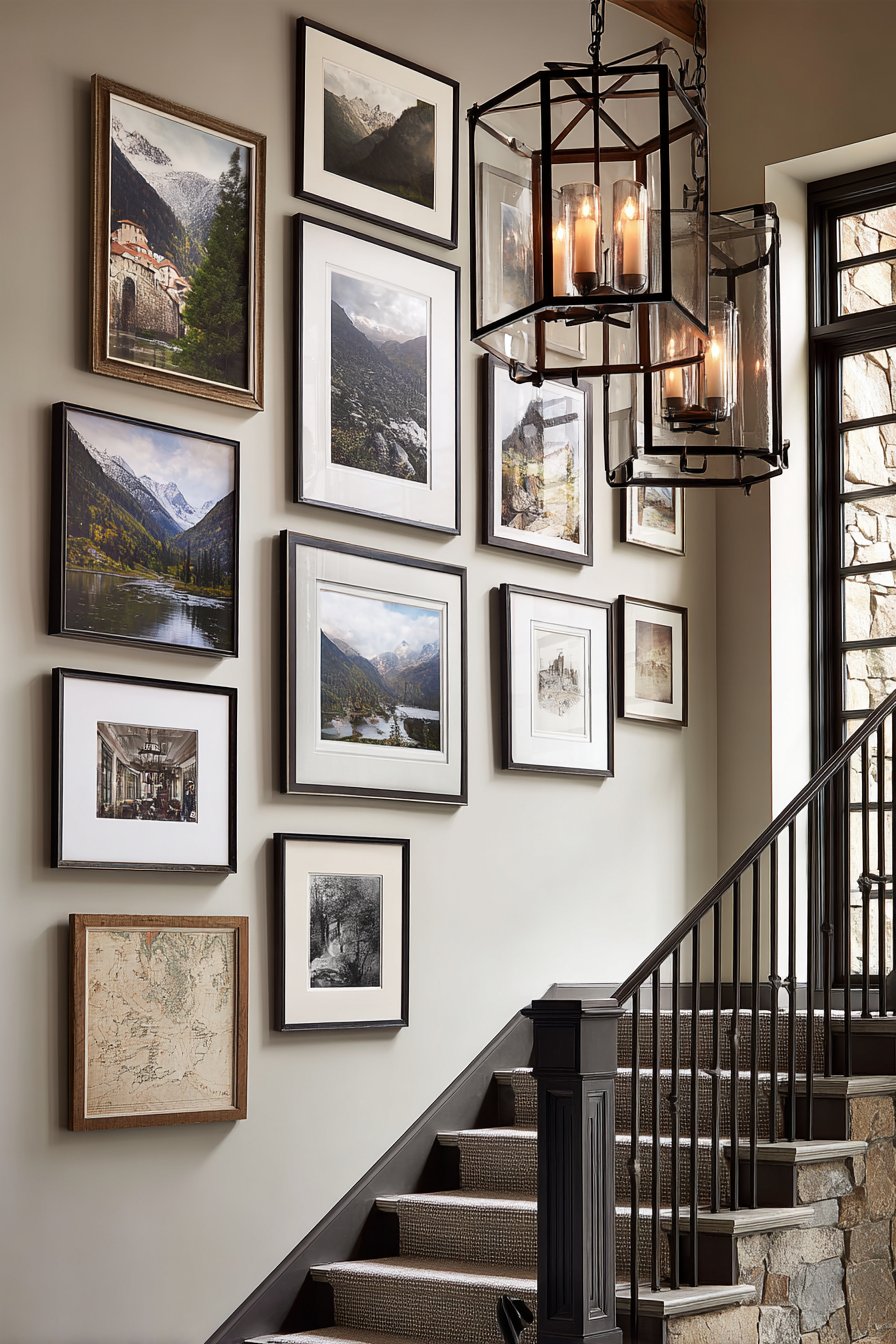
Transforming a stairwell into a vertical gallery creates one of the most visually dynamic applications of this design concept. This arrangement follows the ascending angle of the stairs, with each framed piece positioned to create a diagonal flow that guides the eye upward. The collection mixes diverse subject matter—landscape photography, abstract art, and vintage maps—all united by a carefully coordinated frame selection in black, white, and natural wood finishes. This variety in content prevents monotony while the frame coordination maintains visual cohesion.
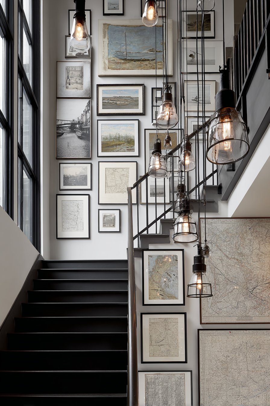
The architectural challenge of staircase walls—their awkward angles and varying heights—actually becomes an asset in this design. The ascending arrangement feels natural and intentional rather than forced, using the architectural feature to create movement and energy. Strategic placement ensures that each piece can be appreciated as you climb the stairs, with the arrangement essentially creating a journey rather than a single viewing moment. Pendant lights illuminate individual pieces while a natural light source from a landing window contributes ambient illumination that changes with the time of day.
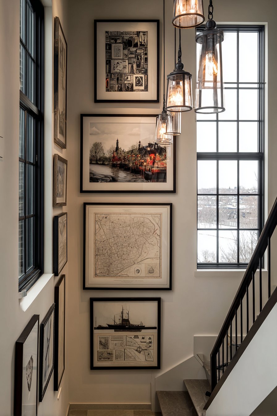
What makes this application particularly successful is how it solves a common design problem: the vast, awkward wall space that staircases often present. Rather than leaving it bare or attempting a single oversized piece that might feel out of scale, the progressive gallery arrangement embraces the architecture and turns a potential challenge into a showcase feature. The varied frame styles and artwork subjects create visual interest that rewards multiple viewings, ensuring that this frequently-traveled space never becomes boring or invisible.
Key Design Tips:
- Use a consistent spacing measurement between frames to maintain order despite the diagonal arrangement
- Position the center of each frame approximately 60 inches from the stair tread it aligns with
- Create a consistent visual line by aligning either the center, top, or bottom of frames with the stair angle
- Mix frame sizes strategically, using larger pieces at the bottom and smaller ones toward the top to maintain proper visual weight
- Install adequate lighting at multiple points to ensure the entire arrangement remains visible even in the evening
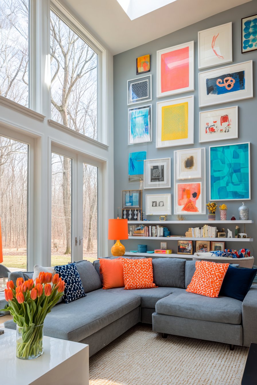
5. Vibrant Abstract Art Collection
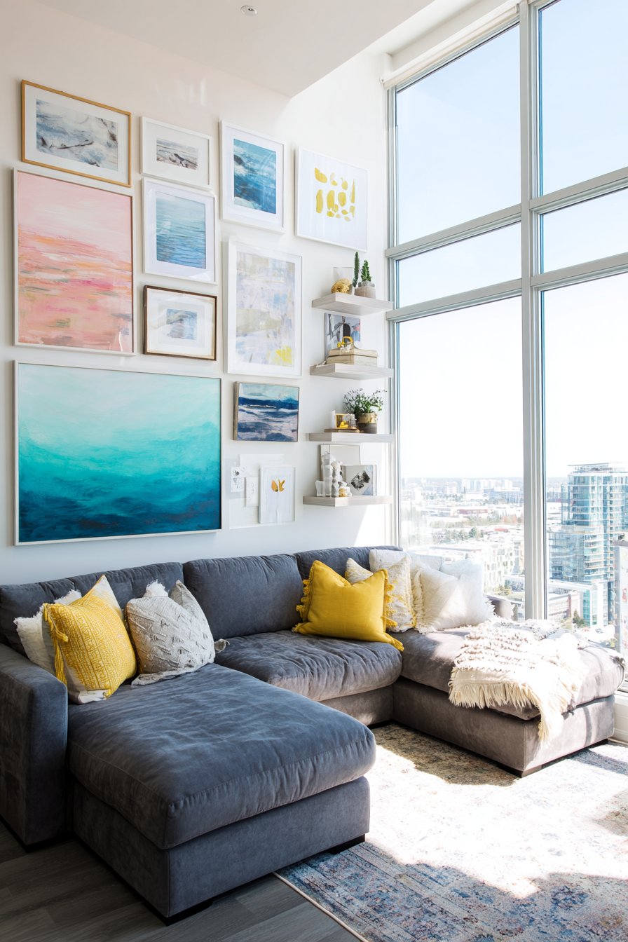
Bold, unapologetic color takes center stage in this energetic gallery wall that transforms a neutral living room into a vibrant, personality-filled space. The asymmetrical arrangement features abstract paintings and prints in a carefully curated palette of coral, teal, mustard yellow, and navy blue, all housed in clean white gallery frames that let the artwork’s colors shine without competition. Positioned above a modern gray sectional sofa, the collection creates an exciting focal point that immediately draws the eye and sets the room’s energetic tone.
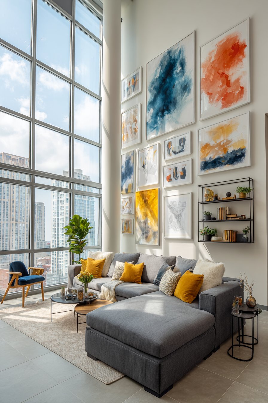
The white frames serve a critical function in this design, acting as visual breathing room between the intensely colorful artworks. Without this neutral buffer, the various hues might clash or overwhelm, but the consistent white framing creates unity while allowing each piece’s individual color story to remain distinct. The asymmetrical arrangement adds to the dynamic energy, with larger pieces anchoring the composition while smaller works fill in around them in an organic, flowing pattern. Floating shelves integrated into the arrangement introduce dimensional variety, displaying small sculptural objects that extend the color palette into three-dimensional space.
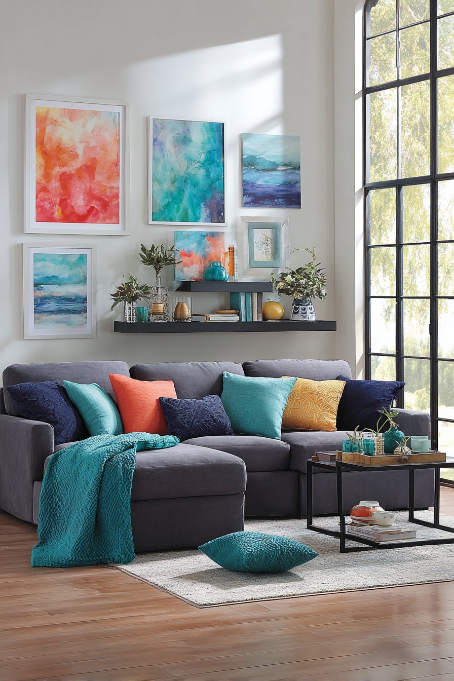
Natural light flooding through floor-to-ceiling windows proves essential to this design’s success, illuminating the vibrant colors with the kind of bright, clear light that makes them truly glow. The contrast between the bold artwork and the restrained gray sofa demonstrates sophisticated design thinking—using neutral furnishings as a canvas for colorful art creates balance and prevents the room from feeling chaotic. This approach works beautifully for homeowners who love color but may hesitate to commit to bold paint colors or vibrant furniture, as artwork can be changed more easily than major furnishings.
Key Design Tips:
- Establish a limited color palette of 3-5 hues that appear across multiple pieces to create cohesion
- Use white or light neutral frames as unifying elements when displaying colorful, diverse artwork
- Balance visual weight by positioning the largest or most color-saturated pieces first, then building around them
- Consider how natural light at different times of day will affect color appearance
- Include at least one piece with all or most of your chosen colors to tie the entire palette together
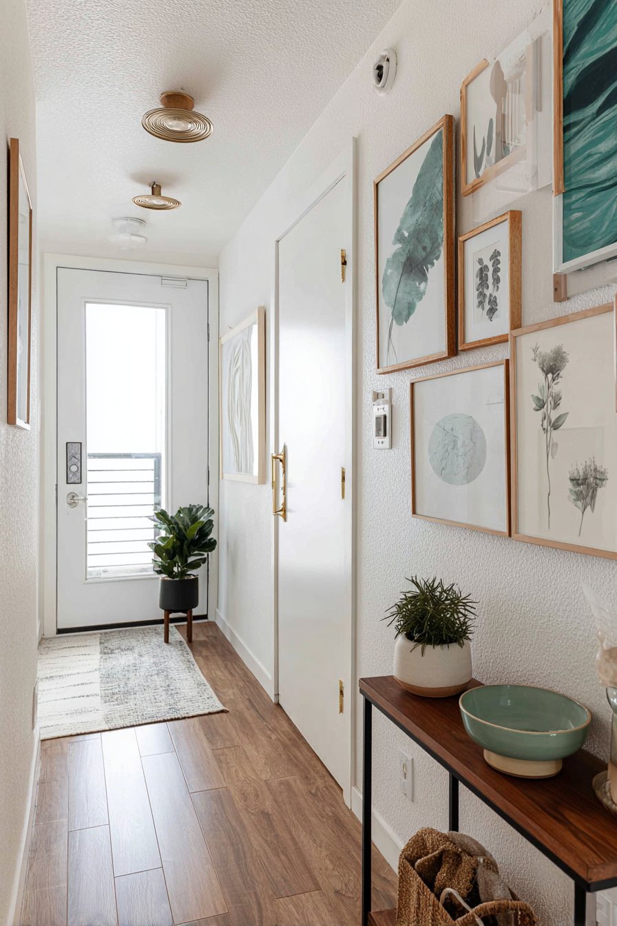
6. Space-Smart Entryway Gallery
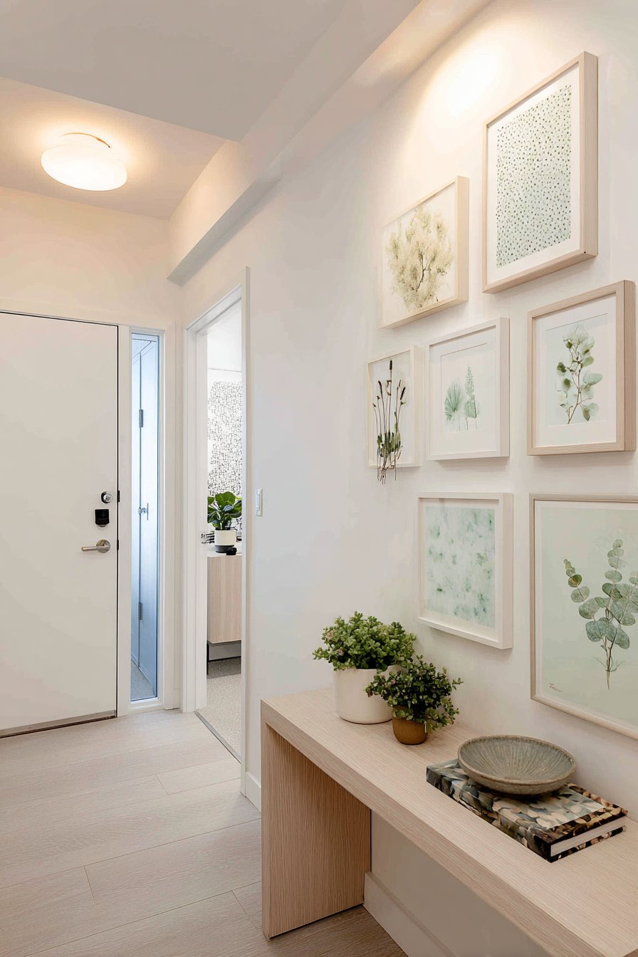
Small spaces demand creative solutions, and this compact gallery wall proves that limited square footage doesn’t mean sacrificing style or impact. Featuring six medium-sized frames in matching natural oak finish, the arrangement transforms a narrow apartment entryway into a welcoming, personality-filled space. The botanical prints and watercolor illustrations in soft greens and blues create a nature-inspired theme that feels fresh and calming—an ideal first impression for guests entering the home.
The consistent oak frames provide cohesion despite the varied artwork subjects, demonstrating how frame coordination can unify diverse content. Below the gallery, a narrow console table serves double duty, offering practical storage for keys and mail while extending the display opportunity with a small potted plant and ceramic bowl that echo the gallery’s organic theme. This vertical integration of wall display and functional furniture maximizes the design impact of limited space, creating a complete vignette rather than isolated elements.
Lighting in small entryways often presents challenges, but this design addresses them thoughtfully with a combination of soft overhead lighting and natural light from a nearby door. The illumination ensures the gallery remains visible and welcoming rather than disappearing into shadow. The scale proves perfectly calibrated for the space—neither so small that it seems insignificant nor so large that it overwhelms the narrow area. This approach offers valuable lessons for anyone dealing with challenging small spaces: thoughtful curation, consistent framing, and careful scale selection can create significant impact even in the most modest square footage.
Key Design Tips:
- In small spaces, use matching frames to create cohesion and prevent visual clutter
- Choose a vertical arrangement over horizontal to draw the eye upward and make the space feel taller
- Limit your color palette in both artwork and frames to maintain a sense of calm in tight quarters
- Integrate functional furniture below the gallery to maximize the design value of limited wall space
- Consider the viewing distance—in entryways, you’ll see the gallery up close, so detail work and quality matter
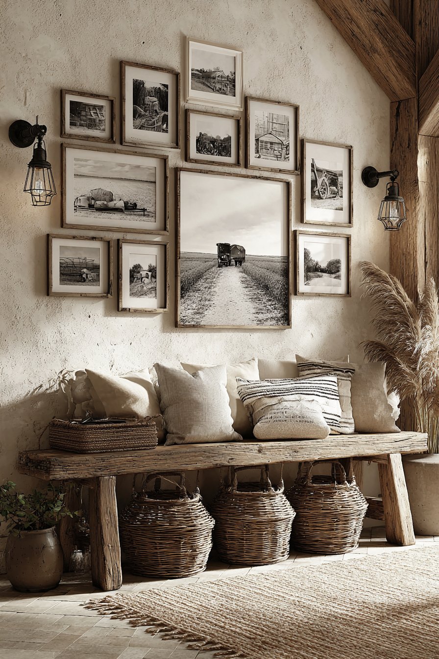
7. Rustic Farmhouse Photography Display
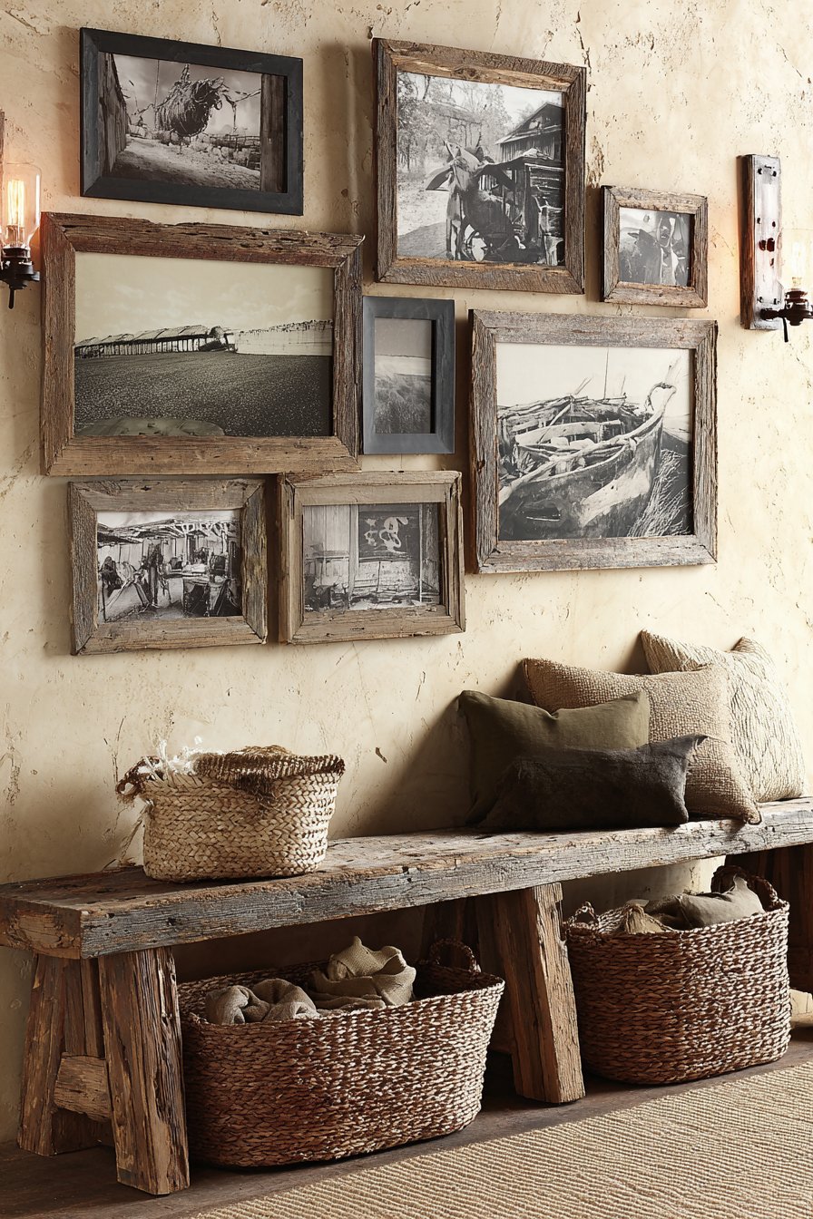
Authentic rustic charm defines this gallery wall where weathered reclaimed wood frames in various distressed finishes house a collection of black-and-white farm photography and vintage agricultural prints. The aesthetic feels genuinely collected over time rather than assembled from a single shopping trip, with each frame showing unique patina and character marks that speak to age and use. The collection hangs above a distressed wooden bench whose rough-hewn texture and visible wear marks echo the frames’ rustic qualities.
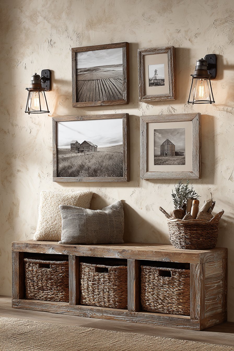
The subject matter—pastoral scenes, vintage farming equipment, barn architecture, and agricultural landscapes—creates a coherent narrative that celebrates rural heritage and simpler times. This thematic consistency prevents the varied frame styles from feeling disjointed, as the content itself provides strong unifying threads. The black-and-white photography adds another layer of cohesion while evoking nostalgia and timelessness. Below the gallery, woven baskets tucked under the bench add practical storage while reinforcing the natural, handcrafted aesthetic.
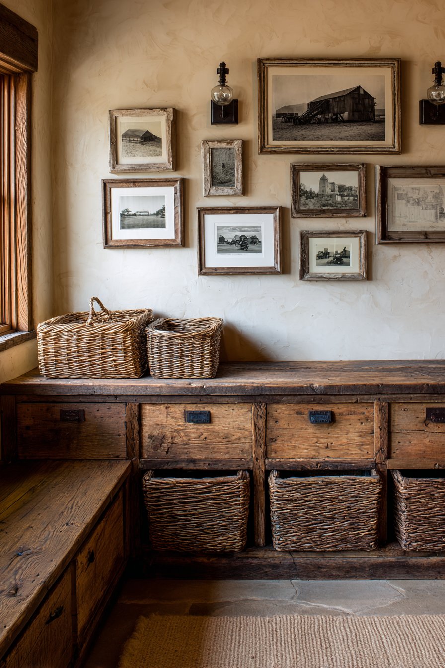
Edison bulb wall sconces flanking the arrangement provide warm, amber-toned lighting that enhances the rustic atmosphere while the textured cream plaster walls offer an authentic, slightly imperfect backdrop that suits the overall aesthetic perfectly. This approach works beautifully in farmhouse-style homes, rustic cabins, or any space seeking to evoke countryside simplicity and heritage. The slightly rough, unpolished quality feels intentional and authentic, rejecting the pristine perfection of more contemporary styles in favor of character, history, and genuine warmth.
Key Design Tips:
- Seek out actual vintage or reclaimed frames from antique shops and salvage yards for authentic character
- Embrace imperfections in frames—chips, scratches, and worn finishes add to rather than detract from rustic aesthetics
- Choose photography or artwork that shares a thematic connection to create narrative cohesion
- Add dimensional interest with non-framed elements like small wall-mounted shelves or rustic hardware
- Consider warm-toned lighting to enhance the cozy, nostalgic atmosphere rustic styles evoke
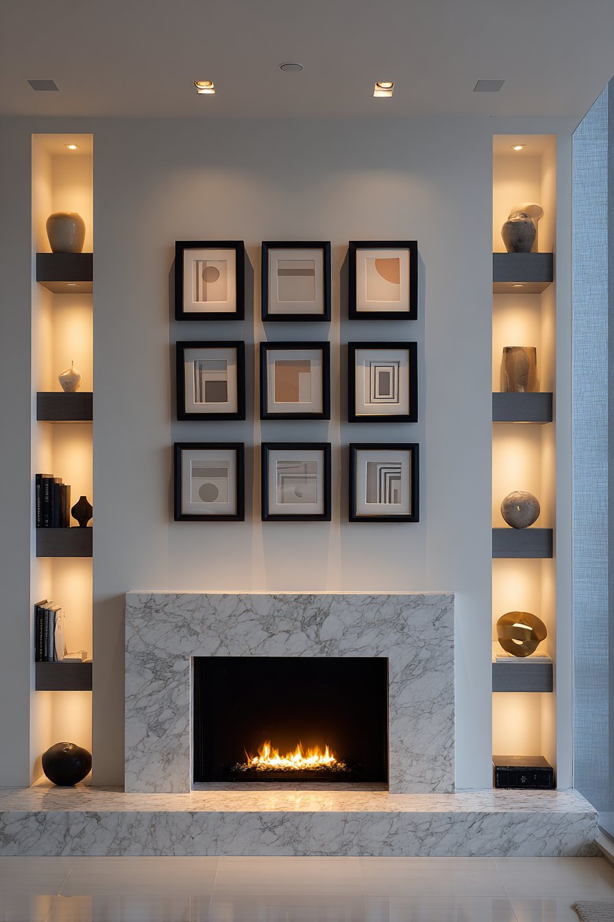
8. Architectural Symmetry Gallery
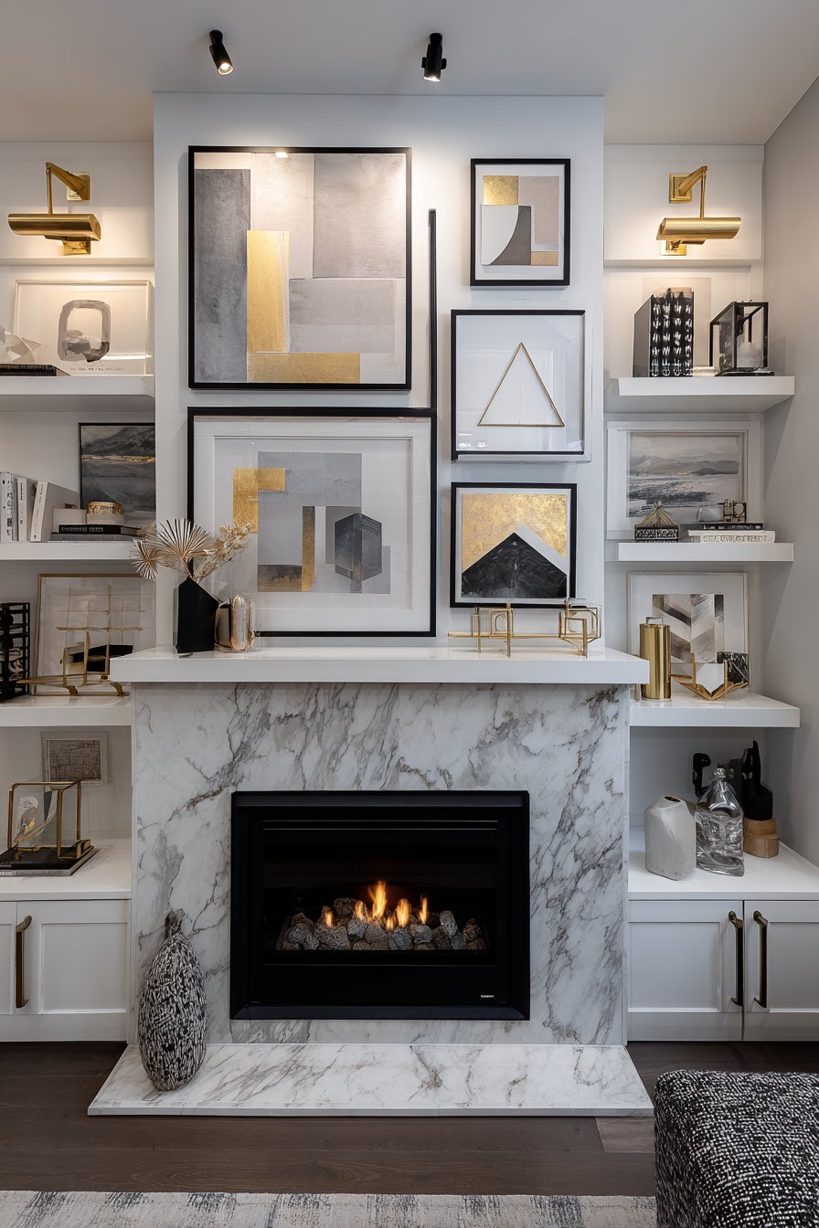
Mathematical precision meets artistic curation in this perfectly symmetrical gallery wall featuring nine square frames in identical matte black finish. Each frame contains minimalist geometric art that shares a cohesive color palette of gray, blush pink, and gold, creating a unified visual statement. The perfect grid alignment—three rows of three frames—generates architectural interest and feels almost like built-in wall paneling, especially when positioned above a contemporary fireplace mantel with sleek marble surround.
The symmetry creates an immediate sense of order and intentionality that appeals to those who find beauty in balance and structure. Unlike more organic, asymmetrical arrangements, this approach leaves nothing to chance—every element has been calculated and positioned with precise measurements. Built-in shelving flanking the fireplace extends the sense of architectural completeness, with decorative objects displayed in quantities and arrangements that mirror the gallery’s attention to balance. Recessed lighting provides even, consistent illumination across all nine pieces, while the fireplace below adds warmth and ambient glow that softens the geometric precision.
This style of gallery wall serves multiple design purposes simultaneously. It creates a strong focal point in the room, establishes architectural interest on what might otherwise be a blank wall, and demonstrates sophisticated design sensibility through its restraint and precision. The limited color palette prevents the geometric artwork from becoming visually chaotic, instead creating harmony and allowing the eye to move comfortably across the entire composition. For modern, contemporary, or transitional interiors, this approach offers a gallery solution that feels permanent, professional, and thoroughly considered.
Key Design Tips:
- Use a template and precise measurements to ensure perfect spacing—typically 2-3 inches between frames works well
- Select artwork with similar visual density and complexity to maintain balance across all nine pieces
- Mount the entire grid at a height that relates well to surrounding furniture—above a fireplace mantel, the bottom row should clear the mantel by 6-12 inches
- Consider having all frames professionally matted with identical mat widths for maximum cohesion
- Ensure your wall can support the weight of multiple frames—use appropriate anchors and distribute weight evenly
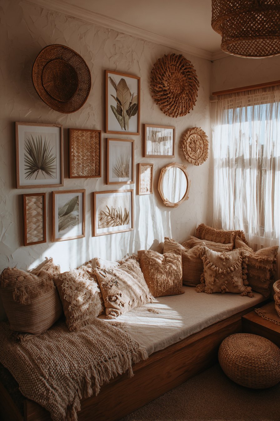
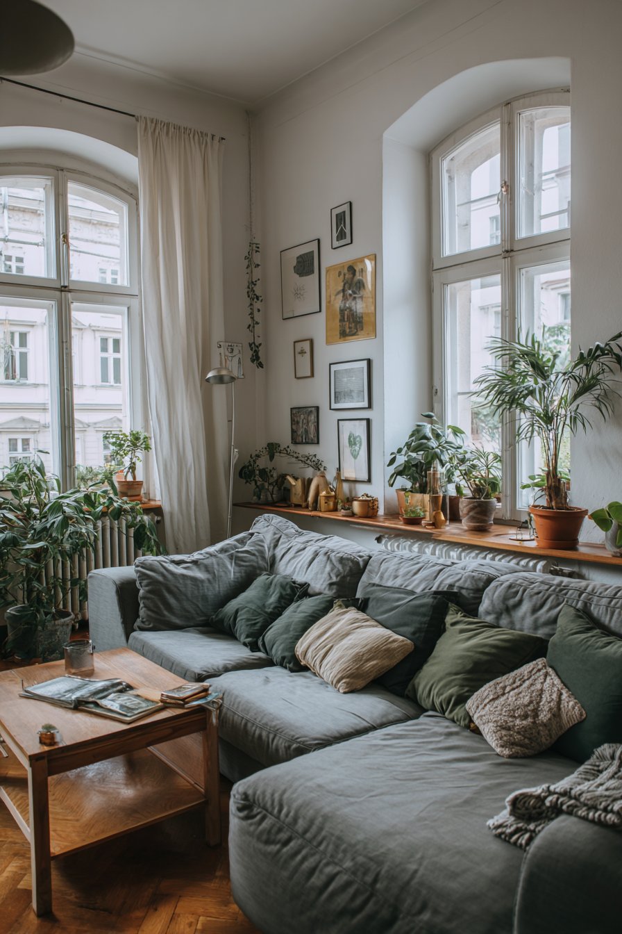
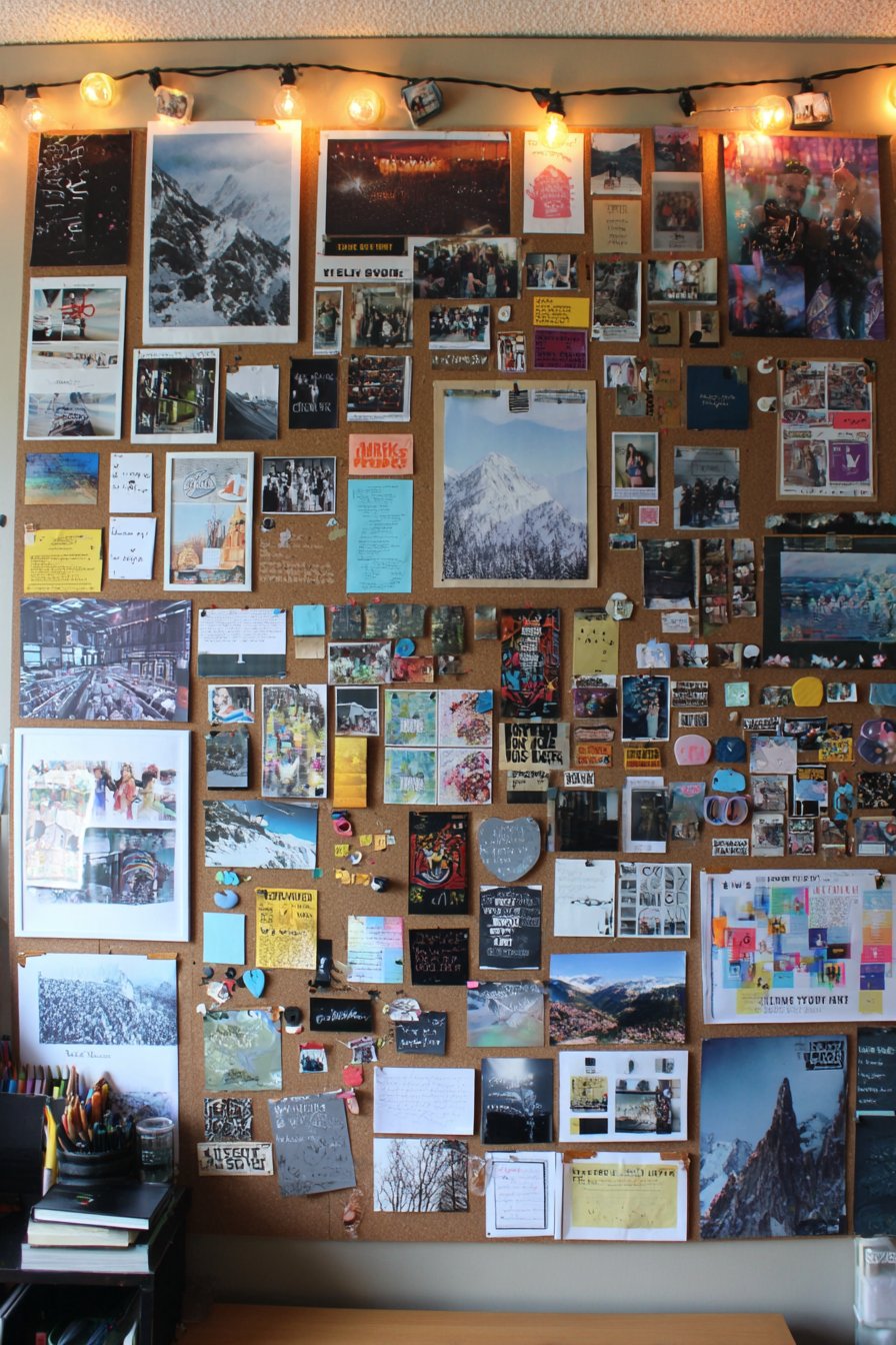
9. Bohemian Textile and Art Mix
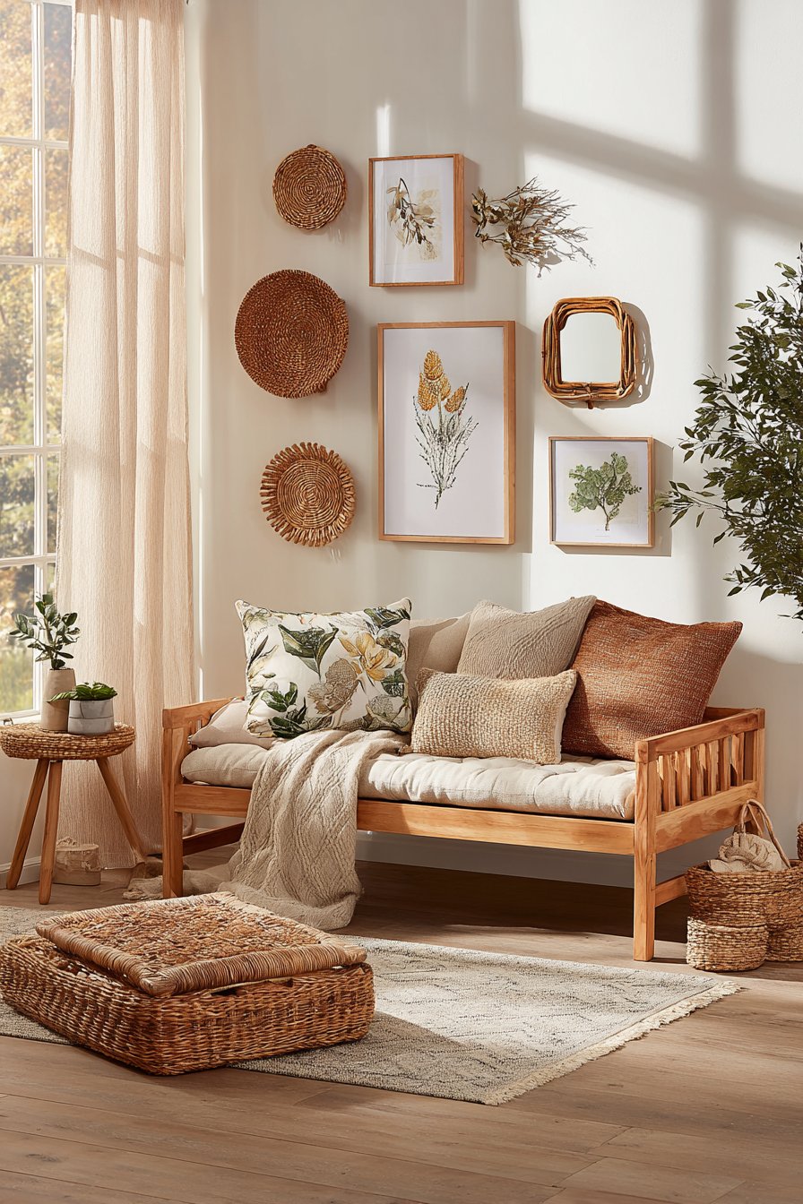
Texture becomes the star in this eclectic bohemian gallery wall that transcends traditional framing to incorporate woven wall hangings, macramé pieces, framed botanical prints, and small mirrors with natural rattan frames. The organic arrangement embraces asymmetry and varied dimensions, creating visual interest through the interplay of different materials, textures, and depths. Positioned above a low-profile daybed laden with layered pillows and textured throws, the gallery wall contributes to an overall atmosphere of relaxed, artisanal comfort.
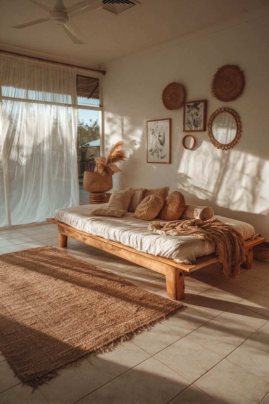
The earth-tone palette—ranging from cream and tan through terracotta, sage green, and warm browns—creates cohesion despite the diverse media. Natural fiber elements dominate, with jute, cotton, and rattan providing tactile richness that two-dimensional framed art alone couldn’t achieve. The varied depths of the pieces create literal dimension, with woven hangings projecting several inches from the wall while flat prints sit flush, generating subtle shadows that change with the light throughout the day.
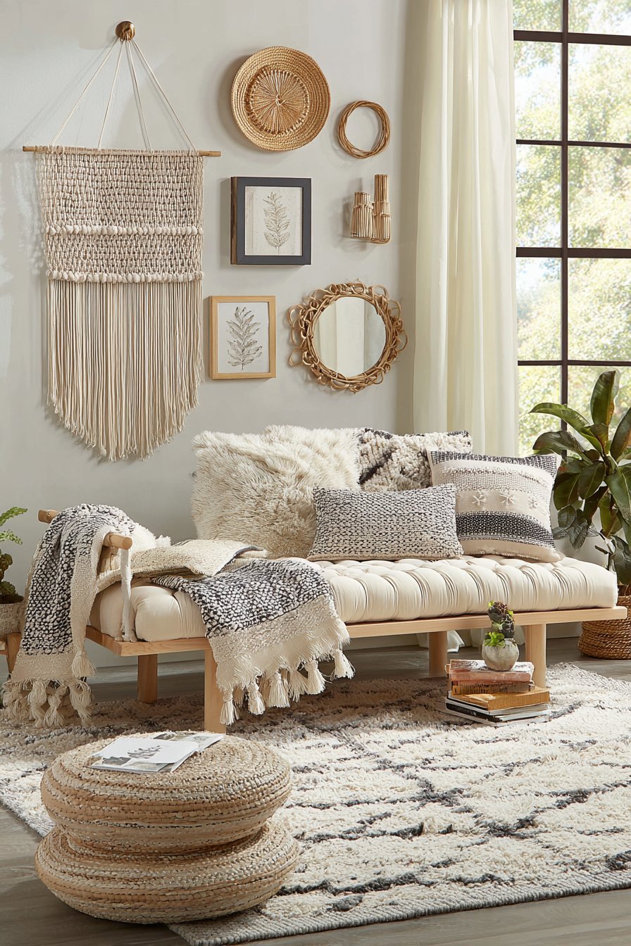
This approach to gallery wall design suits those who appreciate handcrafted items, global influences, and layered, collected aesthetics. The soft natural lighting filtering through sheer curtains provides gentle illumination that doesn’t create harsh shadows or compete with the pieces’ inherent textures. Unlike more formal gallery walls that feel precious and untouchable, this bohemian collection invites closer inspection and tactile engagement. It’s a perfect solution for bedrooms, meditation spaces, or any room seeking a relaxed, travel-inspired atmosphere rich with personality and craftsmanship.
Key Design Tips:
- Mix dimensions boldly—combine flat, framed pieces with three-dimensional woven and sculptural elements
- Establish a color story using natural, earth-toned hues to unify diverse materials and styles
- Consider the weight and hanging requirements of textile pieces, which may need different hardware than standard frames
- Layer pieces with varying depths to create genuine dimension and visual interest
- Include at least one or two mirrors to reflect light and add functional utility to the decorative display
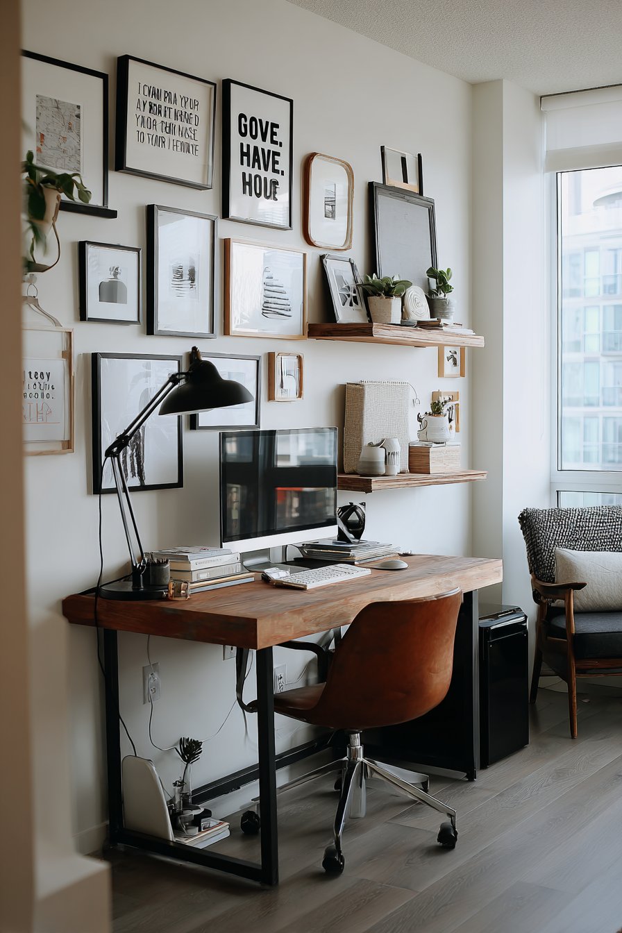
10. Professional Home Office Inspiration
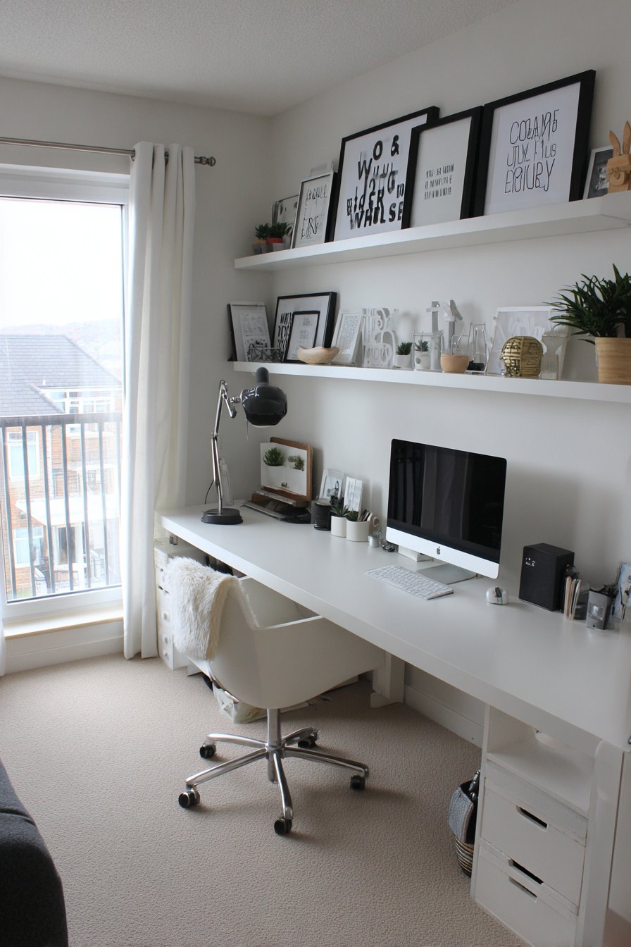
Functionality meets motivation in this streamlined gallery wall designed specifically for a home office environment. The horizontal arrangement of motivational typography prints in sleek black frames maintains a professional appearance while providing daily inspiration. The carefully selected quotes use modern sans-serif typefaces that feel clean and business-appropriate rather than overly decorative or casual. Positioned at eye level above a modern desk, the gallery provides uplifting messages without becoming distracting or visually overwhelming.
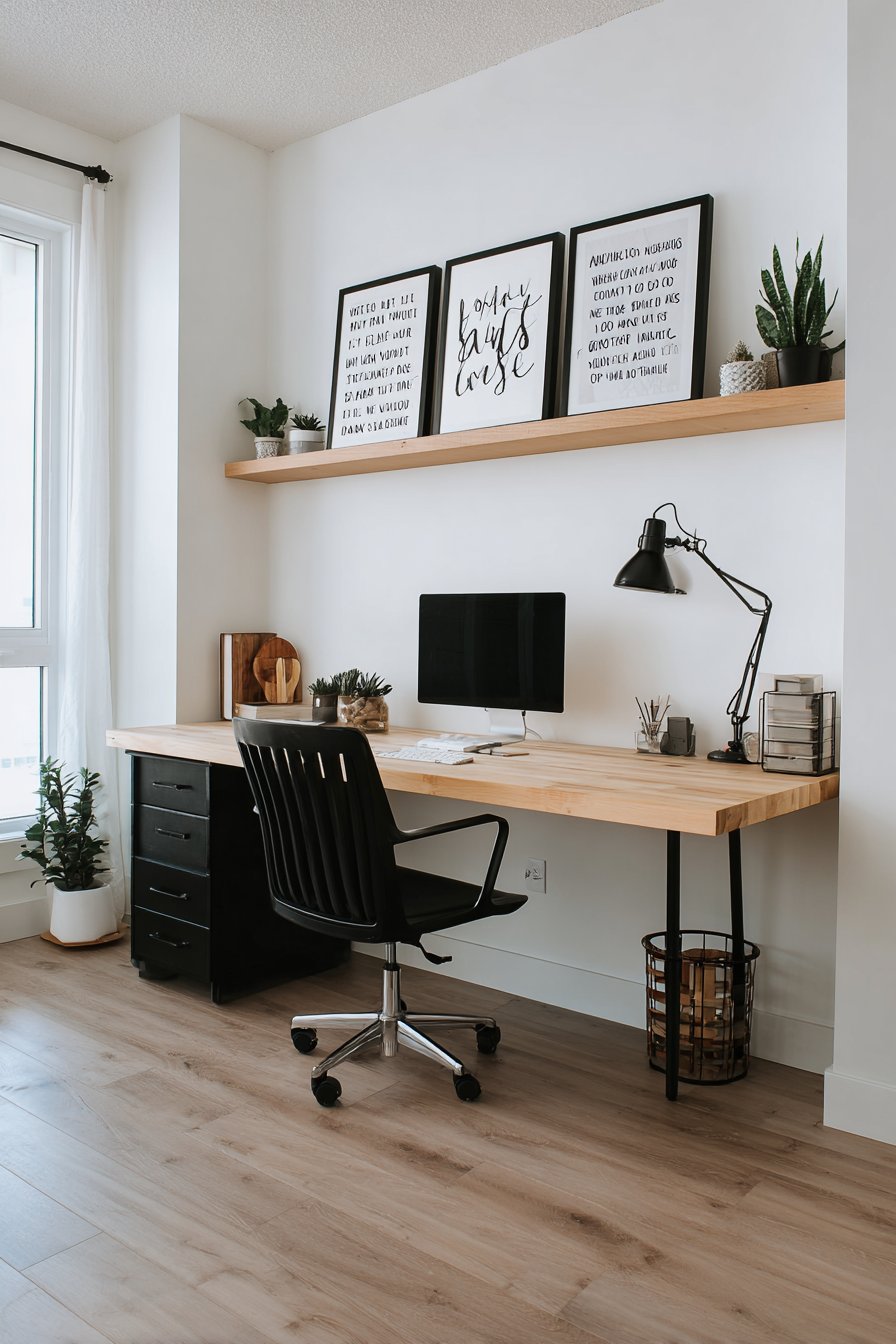
A floating shelf integrated below the frames serves dual purposes, holding small succulents that add life and color while providing space for frequently-accessed desk accessories. This practical consideration distinguishes office galleries from purely decorative ones—every element should support productivity and workflow rather than merely looking attractive. The white walls maximize brightness and create a focused atmosphere, while the combination of adjustable desk lamp and natural window light ensures adequate illumination for both work tasks and art appreciation.
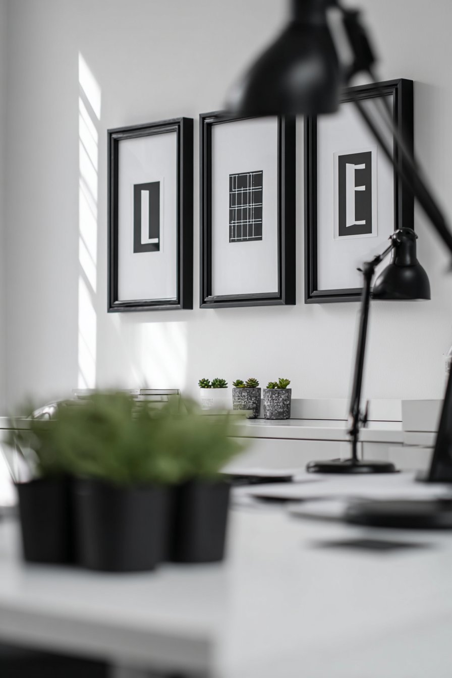
The minimalist aesthetic prevents the workspace from feeling cluttered or chaotic, which research suggests can negatively impact concentration and productivity. By limiting the gallery to a single horizontal row of similar-sized frames, the design creates visual interest and personality without competing for attention with work materials. This approach demonstrates sophisticated understanding of how environment influences performance, creating a space that’s both professionally appropriate and personally meaningful—a balance many home offices struggle to achieve.
Key Design Tips:
- Choose motivational content carefully—select messages that genuinely inspire you rather than generic platitudes
- Limit the number of pieces to prevent visual overwhelm in a workspace where focus is essential
- Position the gallery within your sight line when seated at your desk, but not directly in front of you where it might distract
- Use consistent, simple frames that read as professional and intentional
- Consider adding functional elements like shelves or cork boards that blend utility with aesthetics
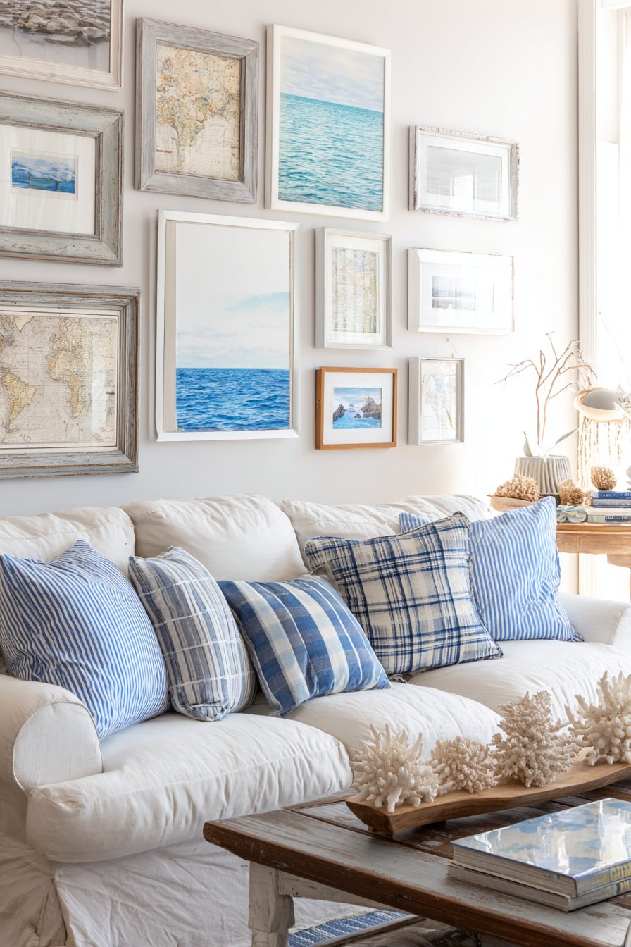
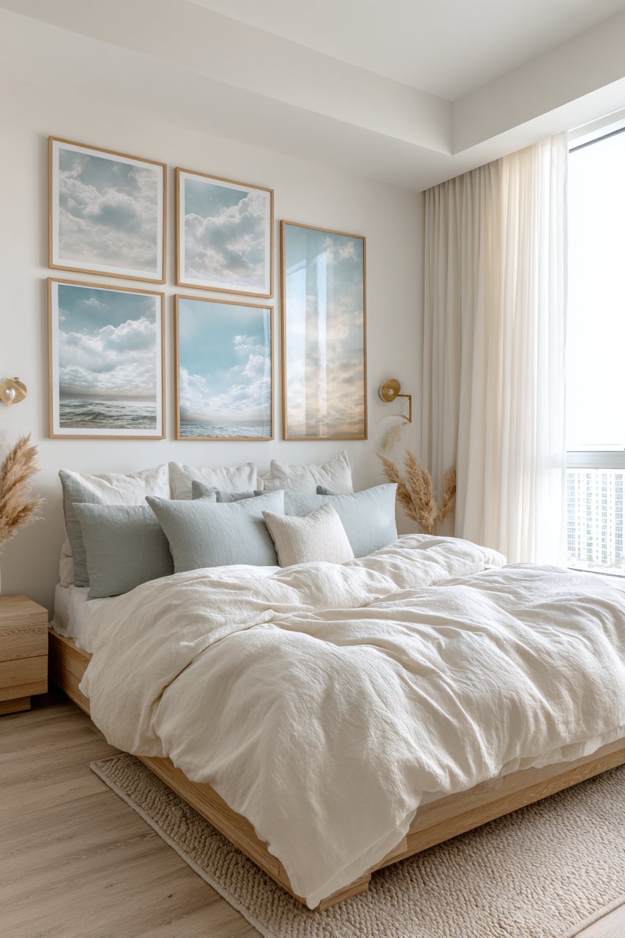
11. Coastal Serenity Collection
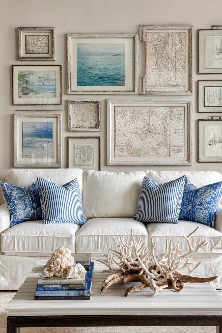
Ocean-inspired tranquility defines this gallery wall where beach photography, watercolor seascapes, and framed vintage nautical maps come together in distressed white and weathered gray frames. The collection evokes the relaxed elegance of seaside living, transforming a living room into a coastal retreat. Positioned above a slipcovered sofa in natural linen, the gallery extends the beachy aesthetic while blue and white striped pillows reinforce the maritime theme through coordinated accent colors.
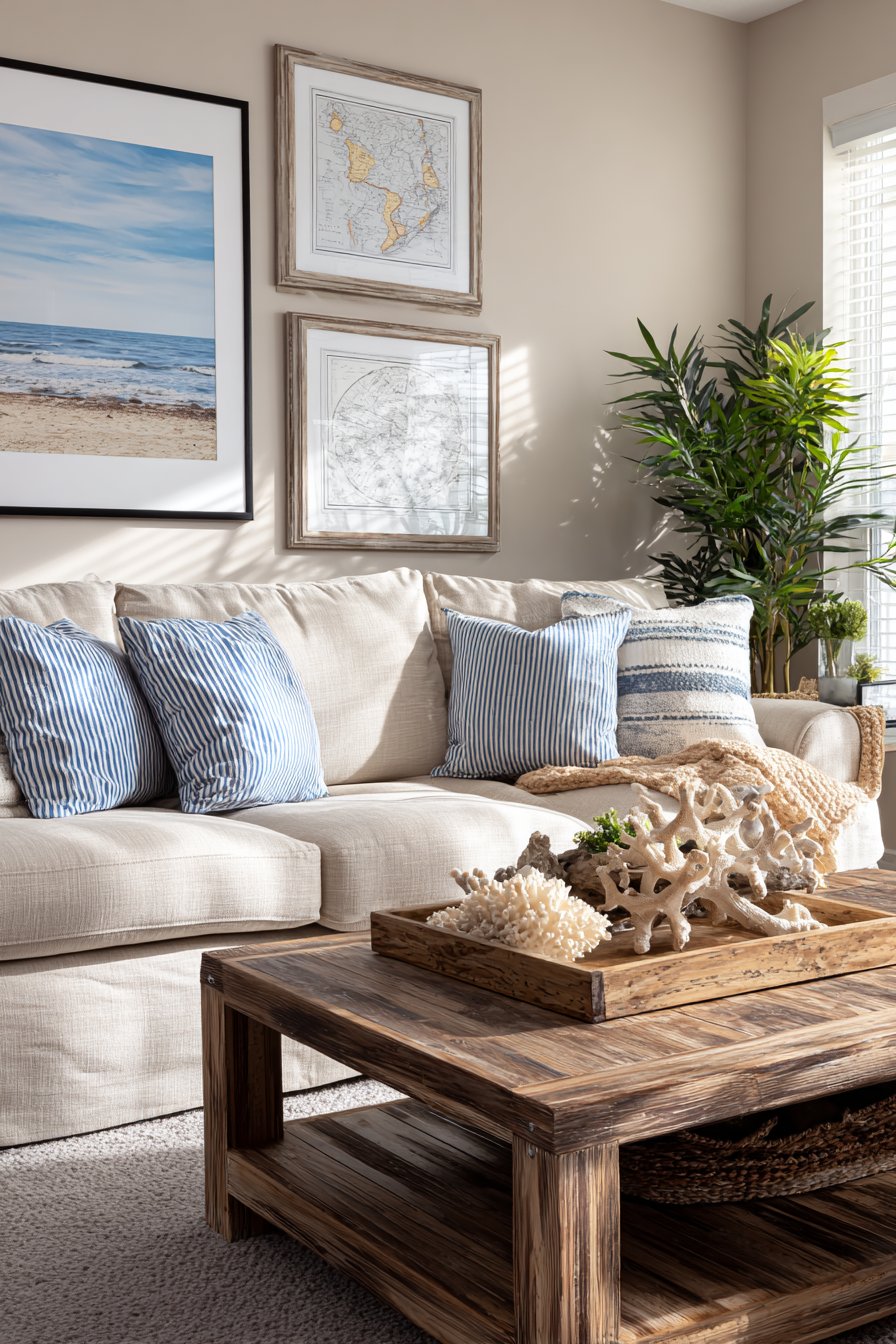
The frame selection proves critical to the overall effect—pristine white frames would feel too formal and polished for coastal style, but the distressed, weathered finishes suggest salt air, sun exposure, and the gentle aging that beach environments naturally create. This subtle detail adds authenticity that elevates the design beyond generic “beach themed” decoration into something that feels genuinely collected from coastal living. The artwork subjects vary from serene seascape photography to detailed vintage navigational charts, creating visual variety while maintaining thematic cohesion.
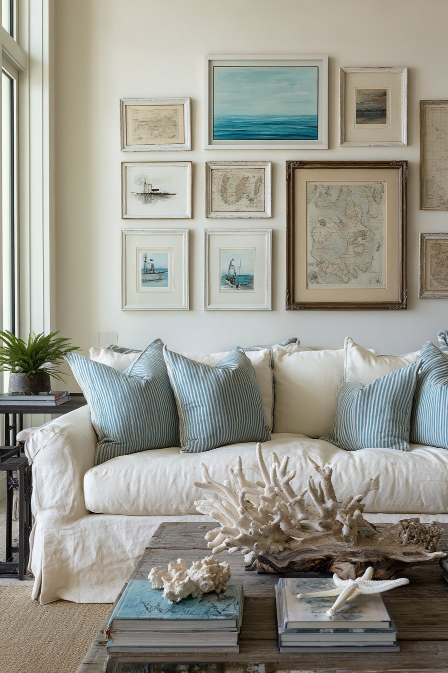
Complementary decorative elements extend the theme beyond the wall—driftwood pieces and coral specimens displayed on the coffee table echo organic coastal forms while maintaining the neutral color palette. Bright natural daylight flooding the space mimics the quality of seaside light, making colors appear clear and saturated rather than muddy or dim. This comprehensive approach to coastal design, where the gallery wall serves as anchor but every element contributes to the overall atmosphere, demonstrates how effective gallery walls integrate into rather than simply decorate spaces.
Key Design Tips:
- Choose frames with visible wear, weathering, or distressed finishes to capture authentic coastal character
- Mix artwork subjects—combine seascapes, coastal wildlife, shells, and vintage maritime maps for variety
- Coordinate your color palette with blue tones found naturally at the beach—navy, aqua, seafoam, and sand
- Include at least one or two pieces with actual ocean imagery to anchor the coastal theme clearly
- Consider the light quality in your room—coastal galleries work best in naturally bright spaces
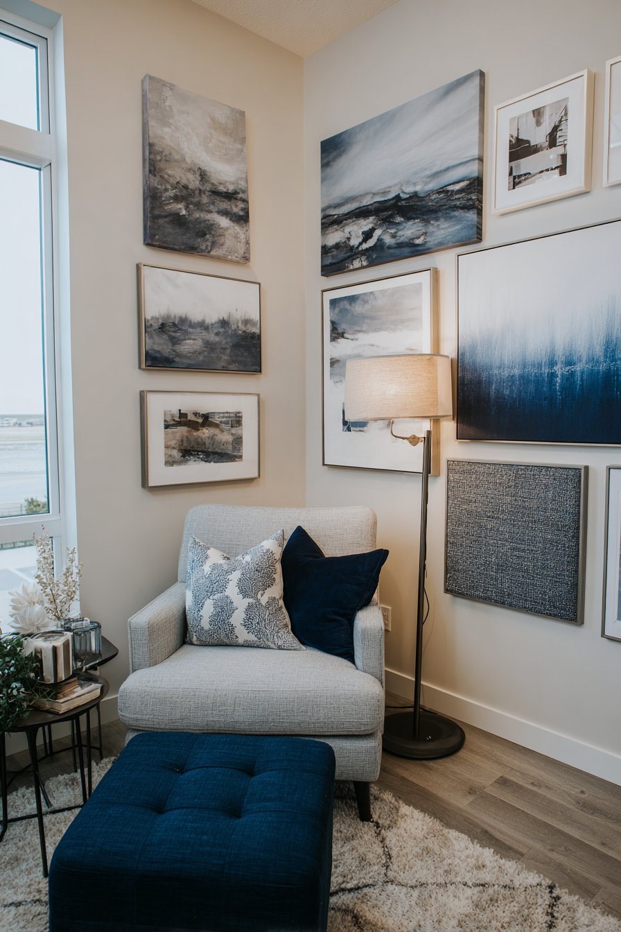
12. Innovative Corner Configuration
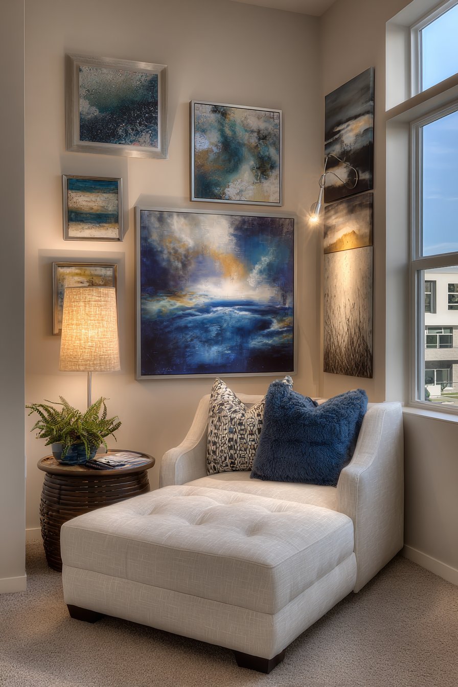
Strategic thinking transforms awkward corner spaces into design assets with this L-shaped gallery wall that wraps around two adjacent walls. The mixed media collection creates continuous visual flow that envelops a cozy reading chair positioned in the corner, effectively creating an art-surrounded retreat within the larger room. The arrangement includes abstract art, photography, and textile pieces unified by a palette of warm neutrals and deep blues that create cohesion despite the varied media.
What makes this approach particularly clever is how it solves a common design challenge—corners often feel like dead space, neither fully part of one wall nor the other. By treating the corner as an opportunity rather than a problem, this gallery wall creates an intimate, enveloping atmosphere that makes the reading nook feel intentionally carved out and special. The varied artwork sizes and styles prevent the long, wrapped arrangement from feeling monotonous, while natural light from nearby windows combines with targeted picture lighting to ensure even illumination throughout.
The reading chair becomes an integral part of the design rather than an afterthought, with the gallery wall creating a visual cocoon that defines the space as a dedicated zone for relaxation and contemplation. A floor lamp positioned beside the chair provides reading light while its placement emphasizes the corner’s designation as a distinct area. This approach works beautifully in open-concept spaces where defining separate zones within larger rooms presents challenges, or in bedrooms and studies where creating cozy, purpose-specific areas enhances functionality.
Key Design Tips:
- Plan both walls together to ensure visual flow and balanced spacing around the corner
- Start with a strong anchor piece in the corner itself to visually connect the two walls
- Maintain consistent spacing and visual rhythm as the arrangement turns the corner
- Consider the viewing angles—you’ll see both walls simultaneously from most positions in the room
- Use the corner arrangement to define and emphasize a functional space like a reading nook or conversation area
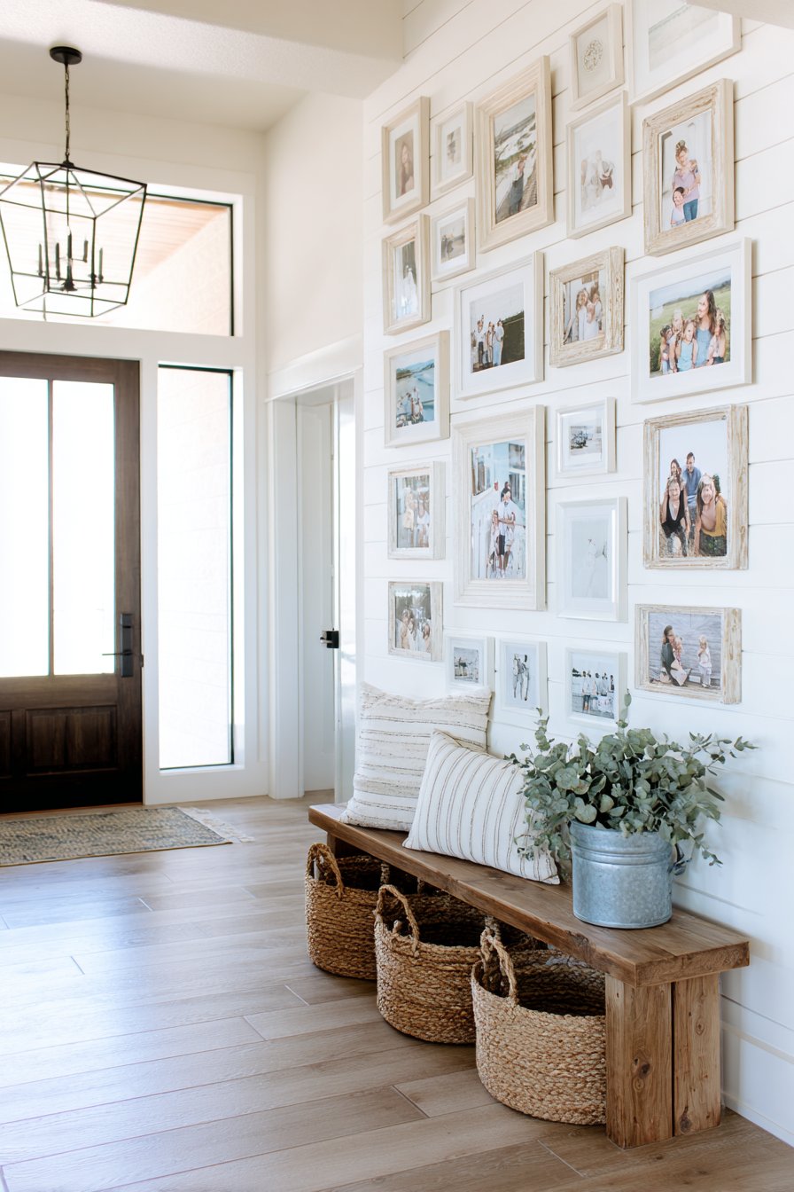
13. Modern Farmhouse Family Gallery
Nostalgic warmth meets contemporary sensibility in this modern farmhouse gallery wall where family photographs housed in mismatched vintage frames painted in coordinating whites, creams, and soft grays create collected-over-time charm. The casual arrangement against a shiplap accent wall reinforces the farmhouse aesthetic while the varied frame styles suggest genuine accumulation rather than matched sets. Below, a rustic wooden bench holds galvanized metal baskets and fresh greenery that extend the farmhouse theme through complementary textures and materials.
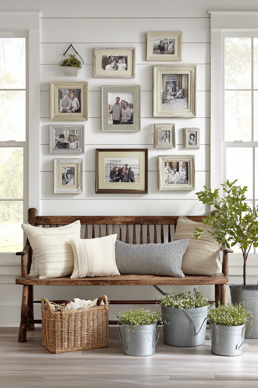
The beauty of this approach lies in its approachability and flexibility. Unlike galleries requiring identical frames or perfect spacing, the mismatched frame aesthetic forgives imperfection and actually benefits from it. The subtle variations in white and cream paint allow the frames to coordinate without matching exactly, creating visual interest while maintaining cohesion. The shiplap backdrop adds textural interest and reinforces the farmhouse style without competing with the photographs for attention.
Natural light from transom windows creates an airy, bright atmosphere that perfectly suits the white and cream palette, preventing it from feeling heavy or dull. The photographs themselves—presumably family moments, celebrations, and everyday life—transform the gallery into a deeply personal element that makes the house feel like home. This style works particularly well for young families who want spaces that feel welcoming and lived-in rather than formal or precious, and for anyone who appreciates the marriage of rustic elements with clean, contemporary sensibility.
Key Design Tips:
- Collect frames gradually from various sources for authentic mismatched appeal
- Limit your color variation to 2-3 closely related neutrals to maintain cohesion
- Mix frame sizes and orientations freely—don’t worry about perfect symmetry
- Consider painting mismatched frames yourself in coordinating colors to achieve the look on a budget
- Include both formal portraits and casual snapshots for a lived-in, authentic feel
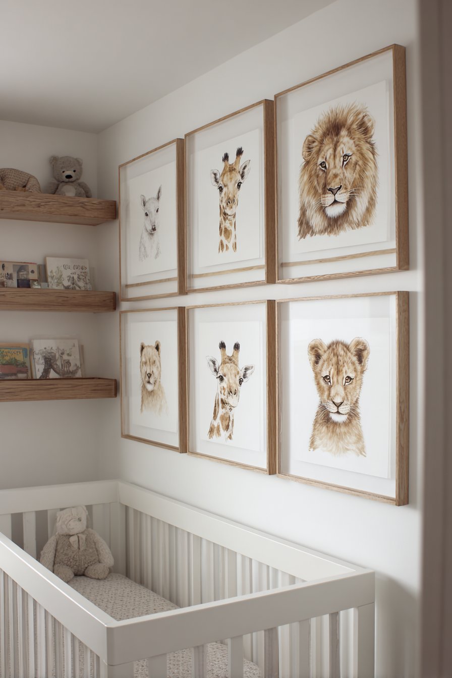
14. Whimsical Nursery Art Collection
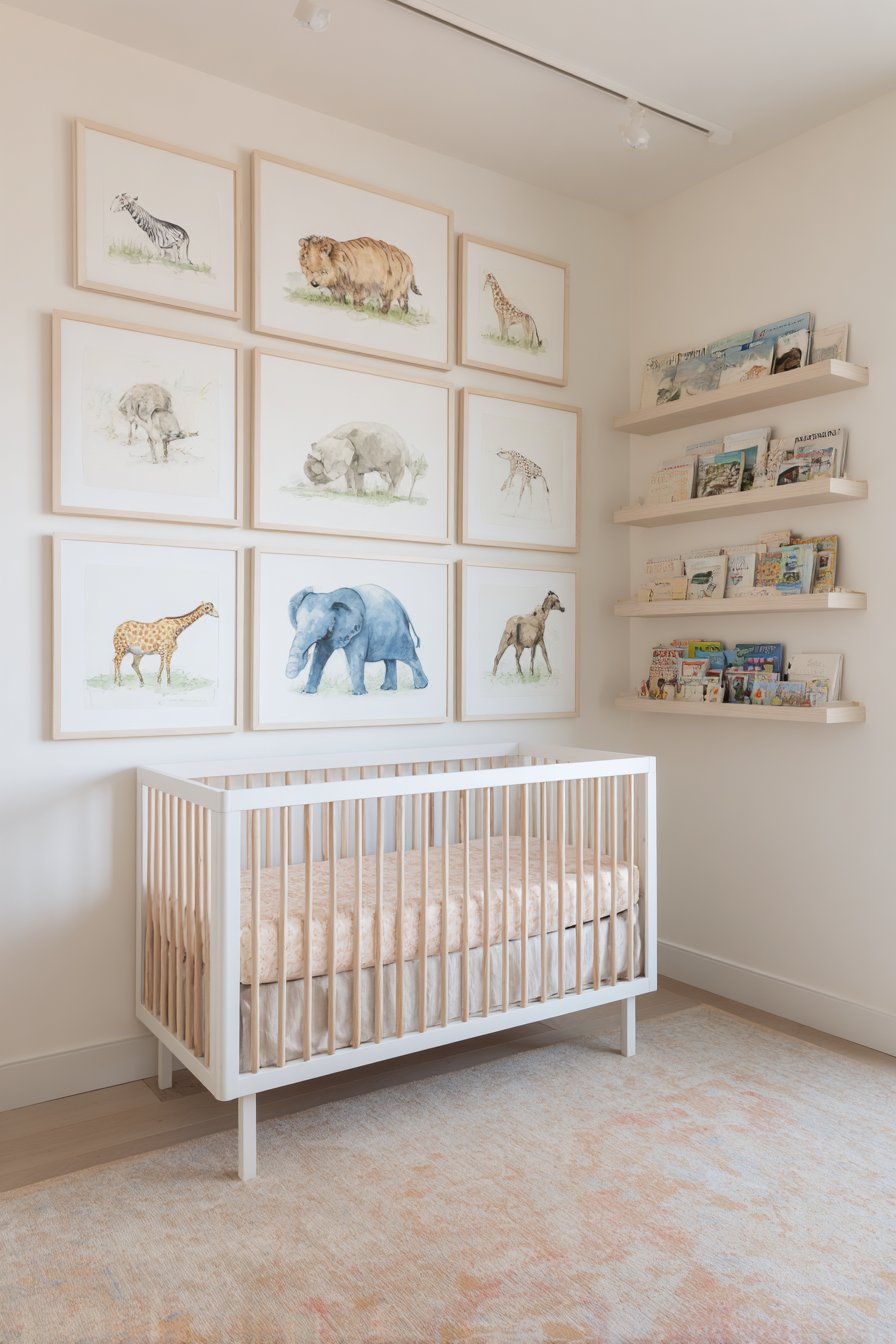
Gentle, age-appropriate design creates a nurturing environment in this playful nursery gallery wall featuring whimsical animal illustrations in white frames with natural wood matting. The soft watercolor style and pastel palette create a calming atmosphere essential for infant sleep and development, while the subject matter—friendly animals, gentle landscapes, and simple shapes—provides visual interest without overstimulation. Positioned above a modern crib, the gallery serves as a focal point that’s both decorative and developmentally appropriate.
A floating shelf integrated into the arrangement demonstrates thoughtful design that considers both form and function. The shelf displays board books and small decorative items at a height perfect for parents to access during bedtime routines, while maintaining visual integration with the gallery above. The white frames with natural wood matting create warmth and softness that suits a nursery environment, avoiding the stark contrast of black frames while maintaining structure and definition around the artwork.
Lighting receives careful consideration with both diffused natural light and a dimmer-controlled overhead fixture providing flexibility for different times of day and activities. The ability to adjust light levels proves essential in nurseries, where bright illumination assists with diaper changes and play while dimmed lighting facilitates sleep. The overall scale remains appropriate for viewing from the nursing chair or crib level, with artwork sizes that provide visual interest without overwhelming the small space or its smallest occupant.
Key Design Tips:
- Choose artwork with soft colors and gentle subjects to create a calming environment
- Mount the gallery high enough to remain safely out of reach as children grow and become mobile
- Consider developmental appropriateness—high contrast for newborns, more detailed images as vision develops
- Include a mix of educational elements (animals, shapes, letters) and purely decorative pieces
- Use secure, baby-safe hardware and ensure frames are shatterproof or behind protective acrylic rather than glass
15. Frameless Contemporary Statement
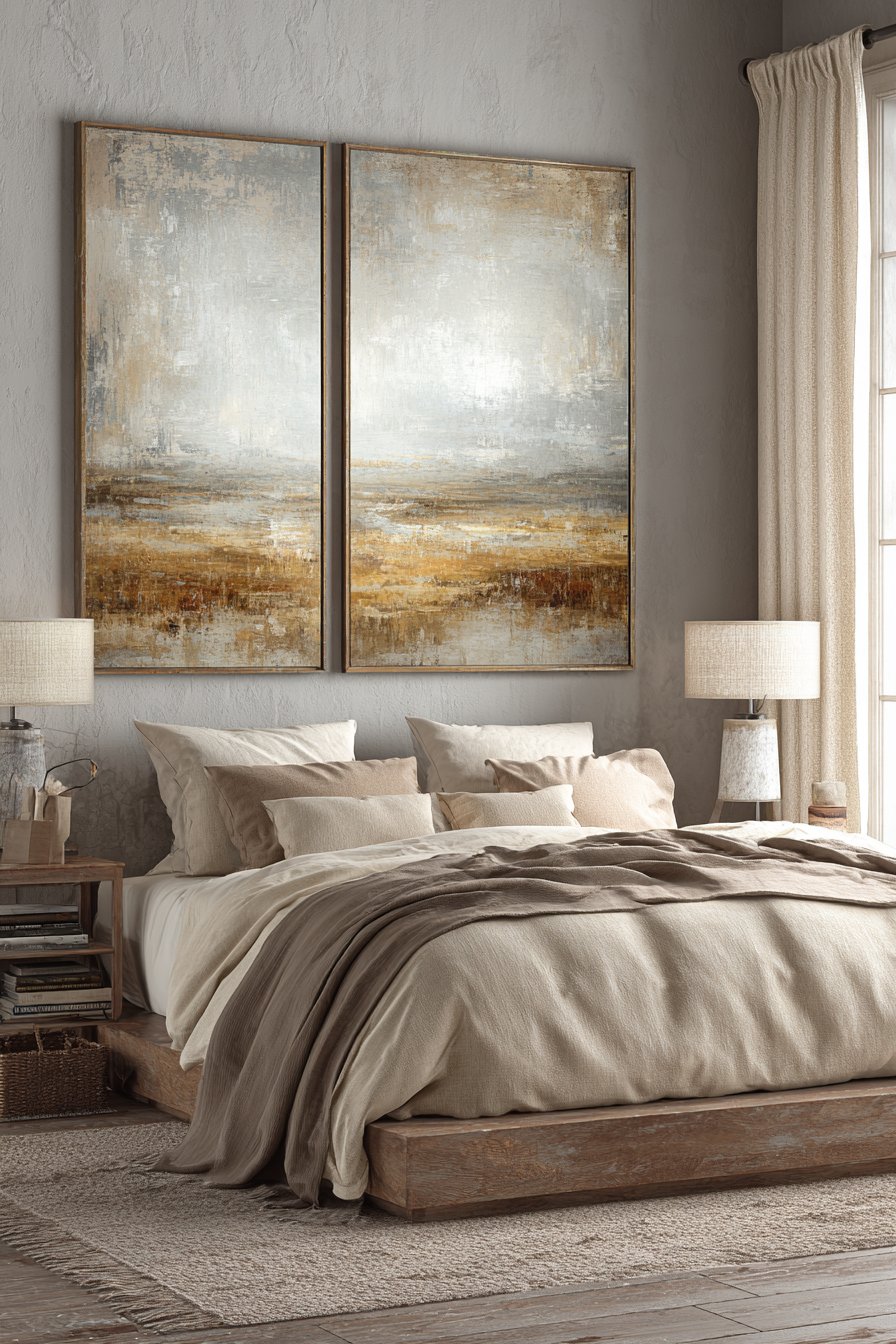
Sophisticated minimalism defines this frameless gallery wall where oversized canvas prints without traditional frames create a sleek, streamlined look. Positioned above a low-profile platform bed, the abstract art in muted earth tones maintains the bedroom’s minimalist aesthetic while providing substantial visual presence. The absence of frames allows the artwork itself to become sculptural objects, with their edges serving as definition while eliminating visual barriers between art and space.
This approach requires careful artwork selection, as the prints must have finished edges suitable for viewing without frame coverage. Gallery-wrapped canvases, where the image continues around the sides, work particularly well for this treatment. The careful spacing between pieces allows each to maintain its individual integrity while forming a cohesive whole—neither so close that they read as a single triptych nor so far apart that they feel unrelated. The muted earth tones—likely including shades of taupe, sage, rust, and cream—create harmony with the bedroom’s calming atmosphere.
Lighting plays a subtle but essential role, with soft bedside table lamps and filtered morning light through linen curtains providing gentle, non-glaring illumination. The absence of glass to create reflections or metal frames to catch light means the artwork appears particularly pure and unmediated. This design suits those who appreciate contemporary art, embrace minimalist principles, and want their bedrooms to serve as serene, uncluttered retreats. The result feels grown-up and sophisticated without sacrificing warmth or personality.
Key Design Tips:
- Select high-quality canvas prints with professionally finished edges since there’s no frame to hide imperfections
- Ensure adequate spacing between pieces—typically 4-8 inches for large canvases—to prevent them from blending together visually
- Choose abstract or non-representational artwork that works well without the formal presentation frames provide
- Consider hanging height carefully, as large frameless pieces can feel heavy if positioned too low
- Limit your color palette across all pieces to maintain cohesion without the unifying element of matching frames
16. Casual Ledge Display
Flexibility and low commitment define this refreshing approach to gallery walls where frames rest on narrow ledge shelves rather than hanging directly on walls. The casual arrangement in a Scandinavian-style living room embraces changeability, with art prints, family photos, and small potted plants layered and interspersed across a natural oak ledge. The beauty lies in the ease of rearrangement—no nail holes to patch, no precise measurements needed, just intuitive placement that can be adjusted seasonally or on a whim.
The layered approach creates natural depth as smaller frames lean in front of larger ones, with occasional plants or decorative objects breaking up the frames and adding organic elements. This treatment feels particularly current and suited to minimalist or Scandinavian aesthetics that prioritize flexibility and understated charm over permanent, formal arrangements. The natural oak ledge contrasts beautifully against white walls while large windows flood the space with natural light that prevents the arrangement from casting heavy shadows.
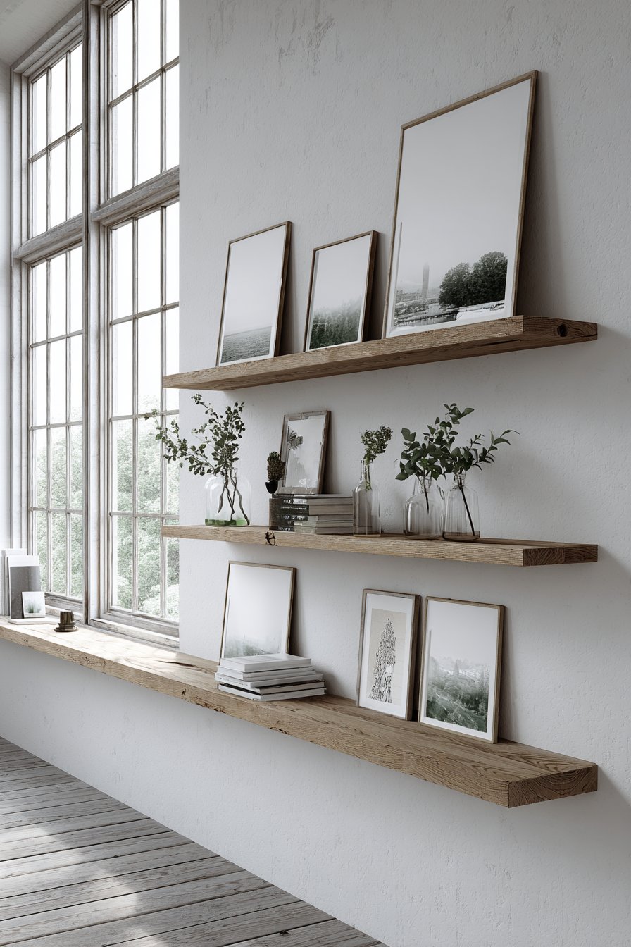
This solution offers particular appeal to renters, commitment-phobic decorators, or anyone who likes to frequently refresh their décor. It’s also practical for displaying various sizes of artwork and objects without the constraint of trying to make everything work in a single hanging arrangement. The casual, almost casual appearance belies the thoughtful curation required to make ledge arrangements feel intentional rather than haphazard, demonstrating that successful gallery walls don’t necessarily require hammers and nails.
Key Design Tips:
- Choose picture ledges with a small lip to prevent frames from sliding forward
- Layer frames deliberately—place larger pieces in back, smaller ones in front
- Include variety in both size and orientation to create visual interest
- Add non-frame elements like plants, small sculptures, or books to break up the composition
- Refresh and rearrange regularly to take advantage of this approach’s flexibility
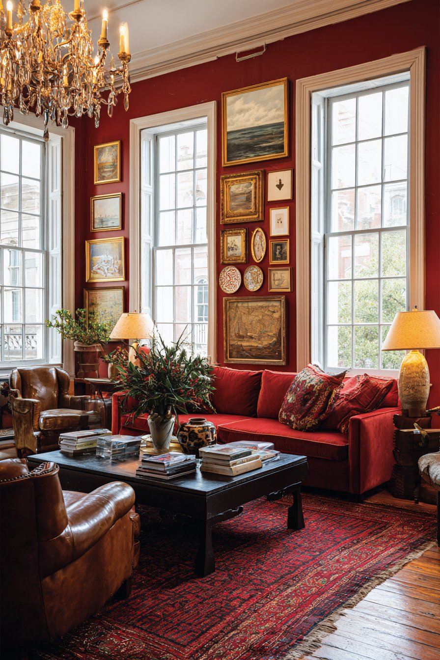
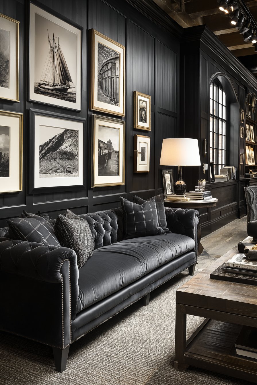
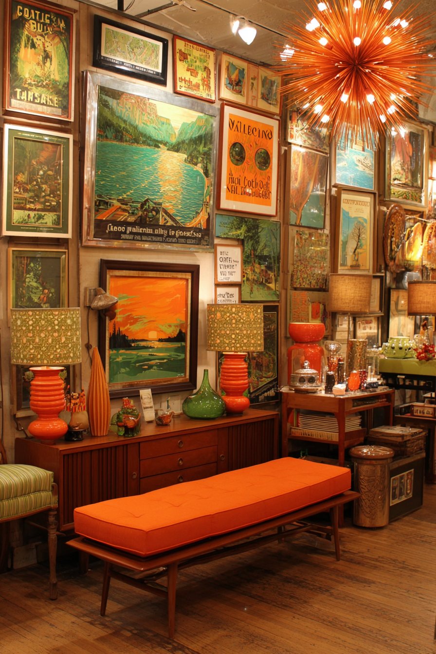
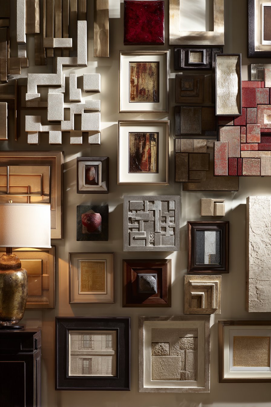
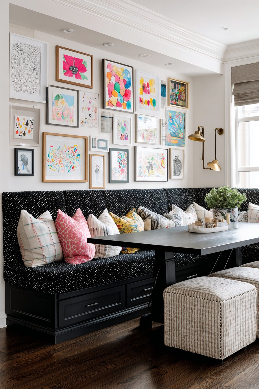
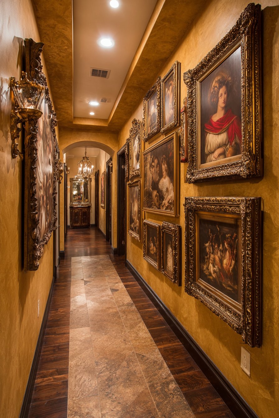
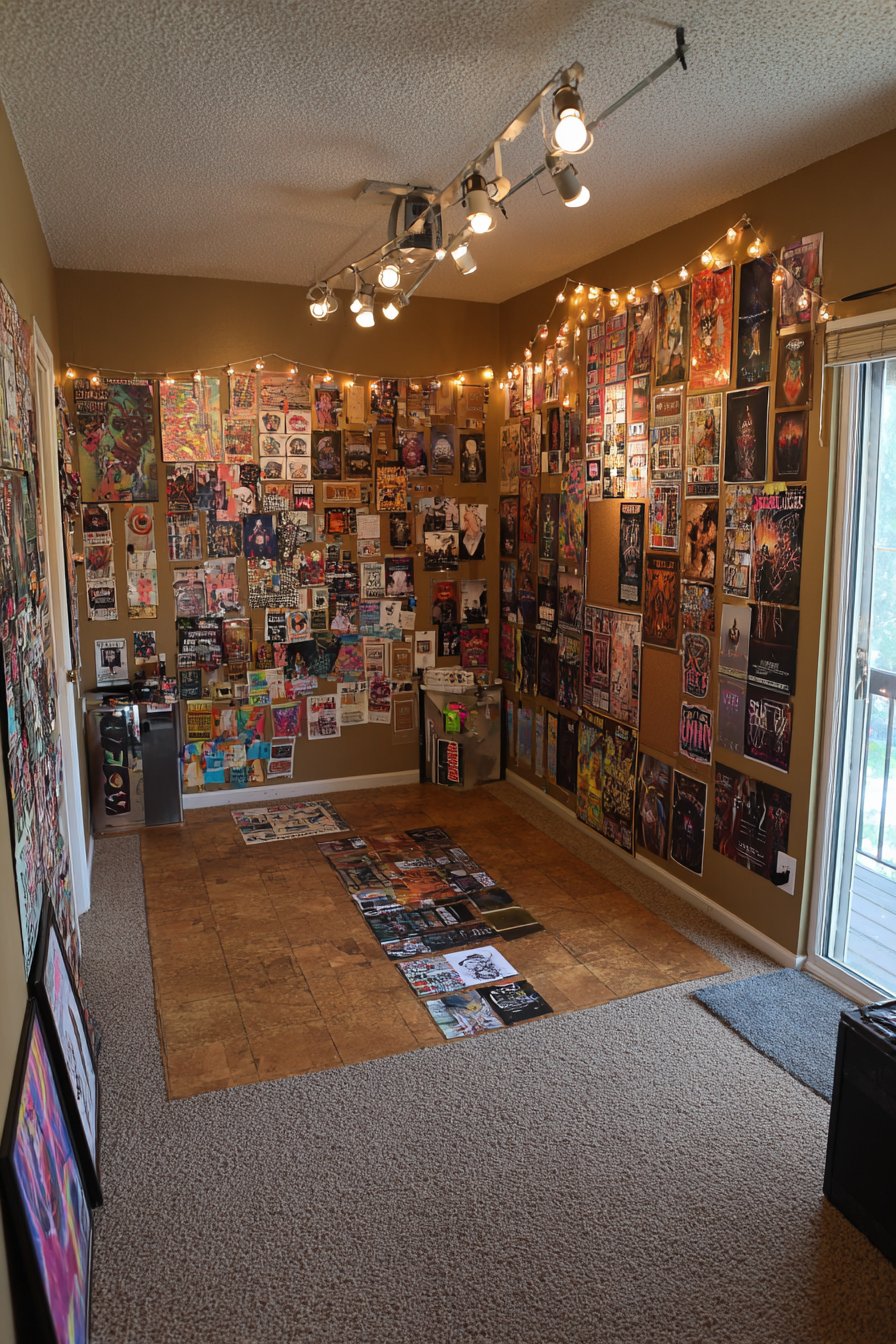
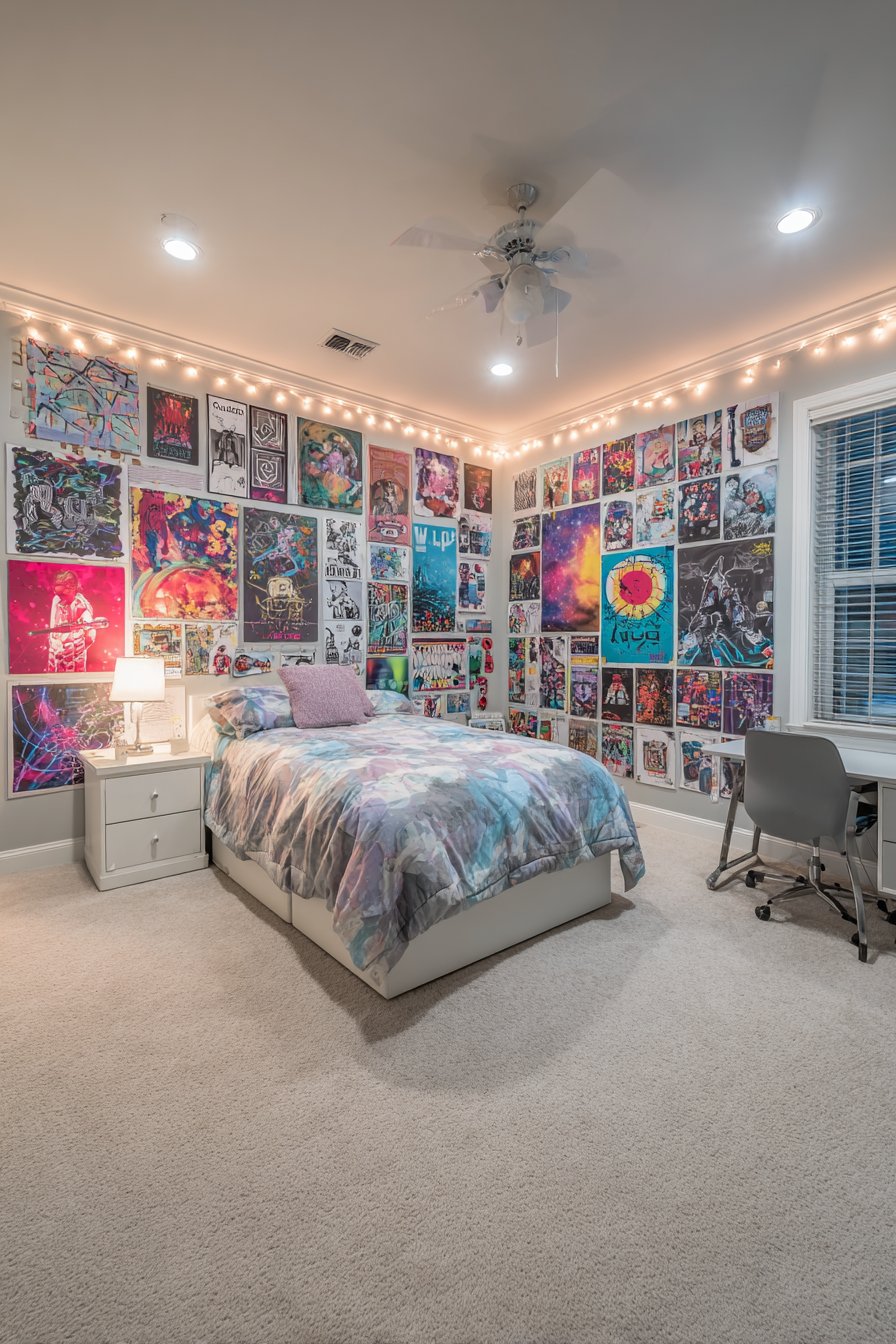
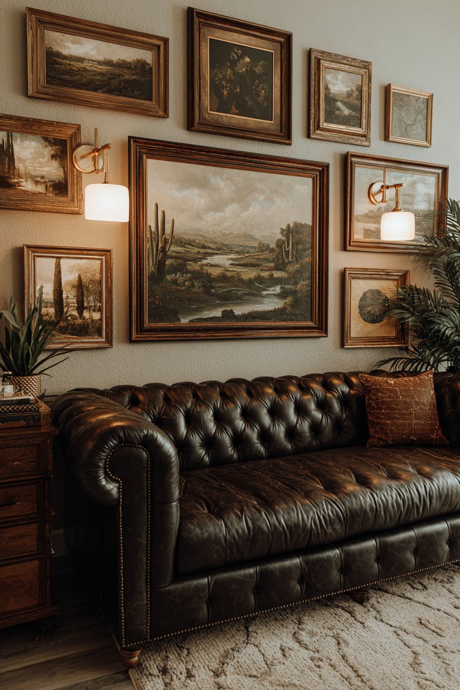
17. Maximalist Salon Wall
Opulence and abundance characterize this dramatic gallery wall that covers an entire wall from floor to ceiling with densely arranged artwork, mirrors, decorative plates, and three-dimensional objects in ornate vintage frames. This European salon aesthetic embraces maximalism, where more truly becomes more, creating a visually rich environment that rewards extended viewing and discovery. The eclectic collection in a traditional parlor setting features rich jewel tones and heavily gilded frames that evoke old-world elegance and collecting passion.
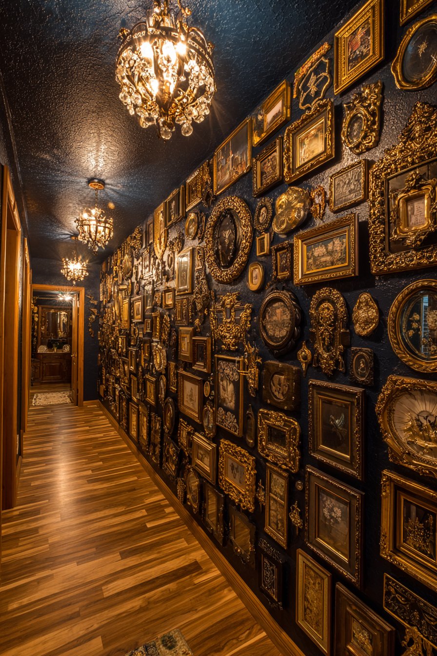
The density of the arrangement means virtually no wall shows through, creating an immersive experience where art completely dominates the space. Frames practically touch, with spacing measured in inches rather than the generous gaps contemporary galleries prefer. This approach requires substantial collections and significant wall space, making it unsuitable for small rooms or modest collections, but for those with the resources and inclination, it creates unmatched drama and personality. Crystal chandelier lighting and multiple wall sconces provide adequate illumination to prevent the dense arrangement from disappearing into shadow.
This style appeals to collectors, antique enthusiasts, and anyone who rejects minimalist principles in favor of abundance and decorative richness. The varied frame styles, sizes, and subjects create a sense of discovery—there’s always something new to notice upon each viewing. While challenging to execute successfully, when done well, salon-style walls become showstopping architectural features that define spaces and announce the owner’s sophisticated taste and collecting passion. It’s gallery wall design as bold statement, rejecting subtlety in favor of unapologetic visual impact.
Key Design Tips:
- Start with the largest, most ornate pieces first, using them as anchors around which to build
- Embrace variety in both frame styles and artwork subjects—uniformity works against salon style success
- Plan carefully despite the casual appearance—create a floor layout before committing to wall placement
- Ensure adequate lighting across the entire wall, as dense arrangements create numerous shadows
- Consider the room’s scale—salon walls overwhelm small spaces but create appropriate drama in large, high-ceilinged rooms
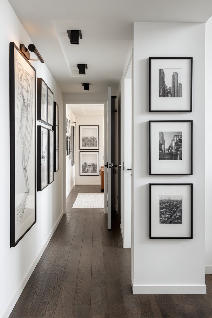
18. Linear Hallway Solution
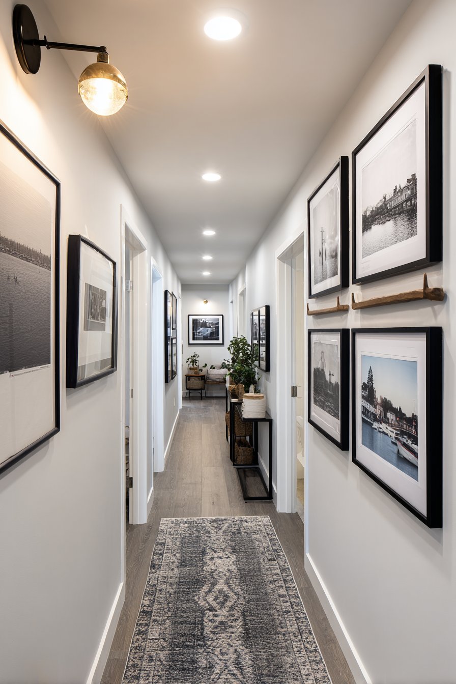
Strategic design transforms the challenge of narrow hallway walls into an asset with this streamlined vertical gallery consisting of six identically-sized frames in matching slim black profiles. The single-file arrangement maximizes impact while respecting the limited width, creating a vertical journey through travel photography from various destinations. The uniform sizing and spacing create visual rhythm that guides movement through the hallway while the personal photographic content creates narrative interest.
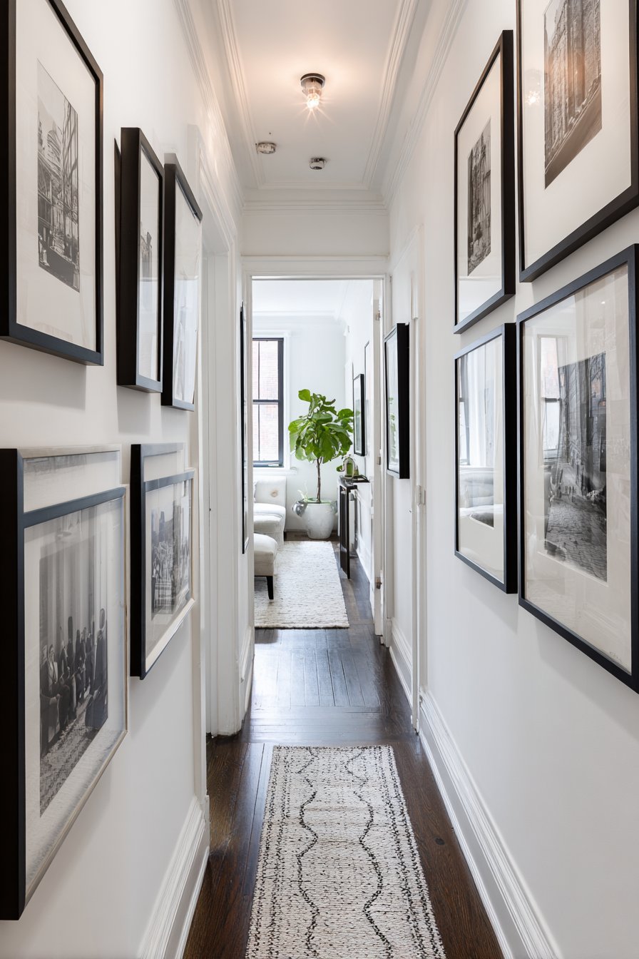
The slim frame profiles prove essential to the success of this design—bulky frames would encroach on the already limited hallway width, making the space feel cramped and claustrophobic. The vertical orientation draws the eye upward, making the hallway feel taller and more spacious rather than simply long and narrow. Evenly spaced picture lights mounted above each frame provide gallery-quality illumination that ensures the photographs remain visible even in the typically dim lighting conditions hallways present.
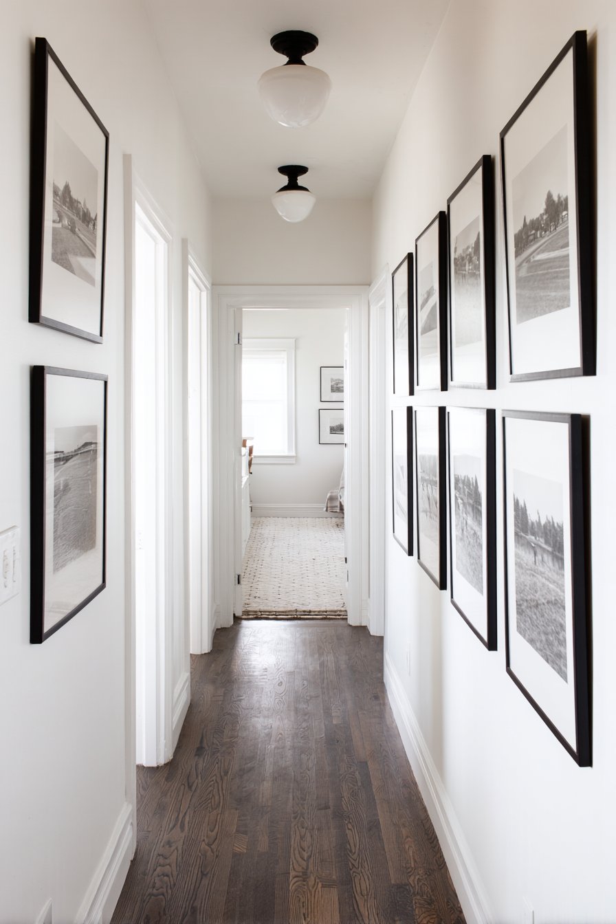
This approach demonstrates sophisticated problem-solving, recognizing that hallways shouldn’t be treated as miniature versions of larger wall arrangements but rather as spaces requiring specifically adapted solutions. The travel photography theme creates a journey within a journey—physical movement through the hallway parallels the visual journey through various destinations. This works particularly well for hallways leading to bedrooms or private spaces, where the gallery provides interest during multiple daily passages without feeling repetitive or intrusive.
Key Design Tips:
- Measure carefully to ensure adequate clearance on both sides—frames shouldn’t make the hallway feel narrower
- Use vertical orientation exclusively in narrow hallways to emphasize height rather than width
- Install adequate lighting, as hallways often lack natural light sources
- Choose a cohesive theme or subject matter to create visual flow along the length of the hallway
- Consider the viewing experience—people will see each piece individually as they walk rather than viewing the entire arrangement at once
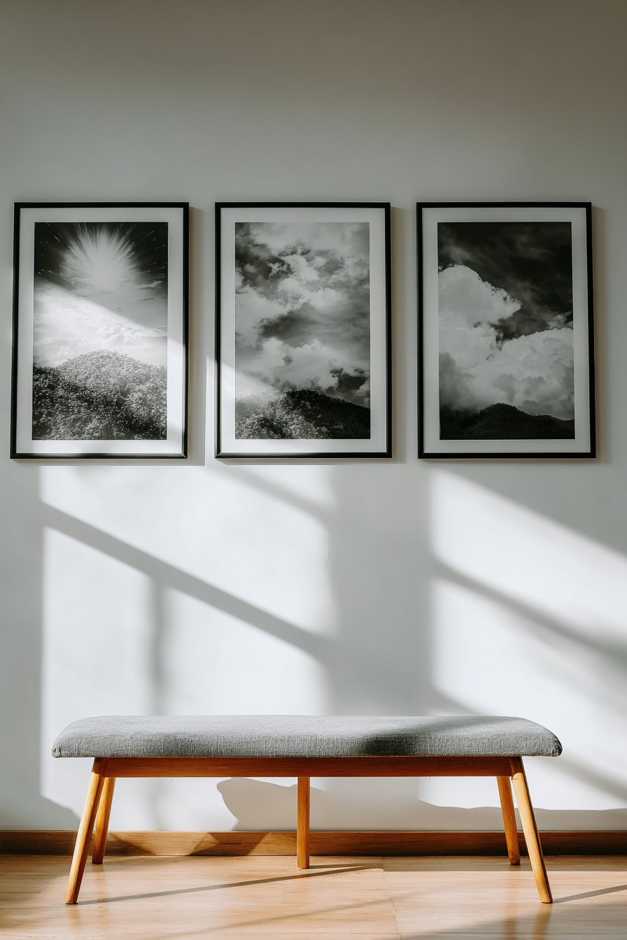
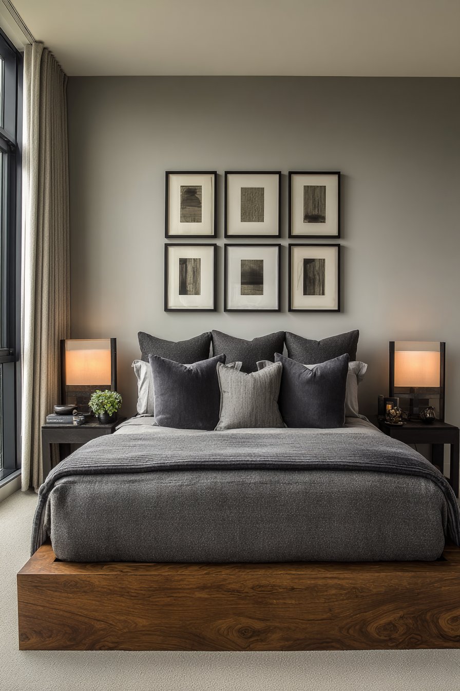
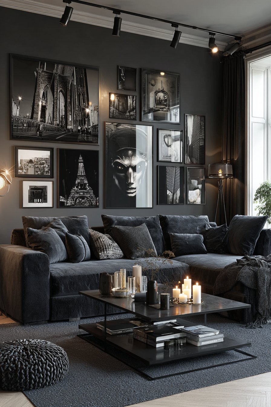
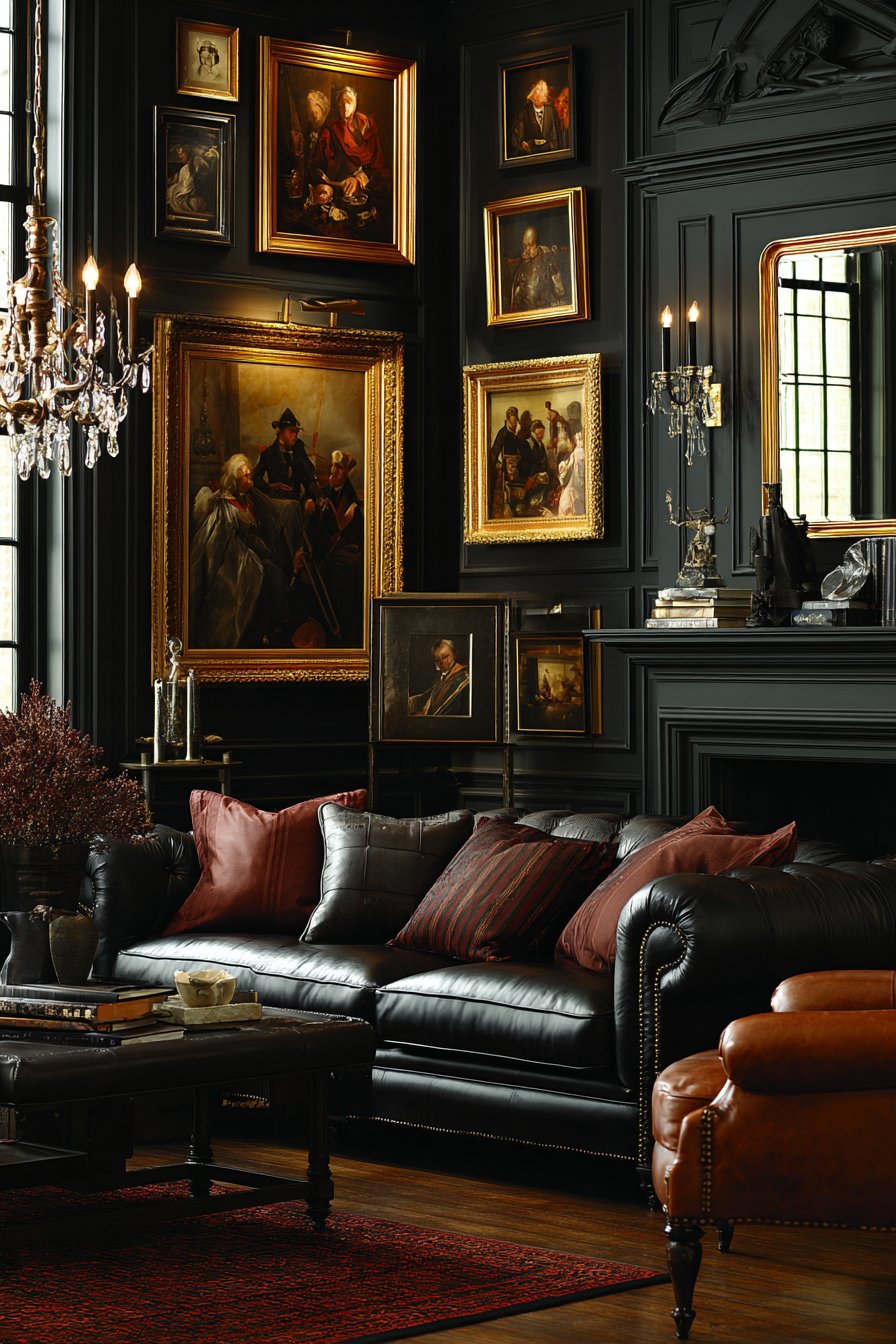
19. Monochromatic Black and White Drama
Sophisticated restraint creates powerful visual impact in this monochromatic gallery wall featuring exclusively black-and-white photography in various matte black frames. The self-imposed limitation on color actually intensifies the design’s impact, allowing viewers to focus on composition, subject matter, and tonal qualities without the distraction of color. Positioned above a charcoal velvet sofa, the collection ranges from architectural studies to portraiture, demonstrating the versatility and timeless appeal of black-and-white imagery.
The frame selection reinforces the monochromatic commitment, with all frames in matching matte black finish creating stark contrast against white walls. Different frame depths and matting techniques introduce subtle variation within the restrained palette—some pieces feature deep shadow boxes, others use double mats, while a few sit flush with minimal profiles. Track lighting provides museum-quality, adjustable illumination that can be focused on individual pieces or spread evenly across the entire arrangement, essential for properly viewing black-and-white photography’s subtle tonal gradations.
This approach suits those who appreciate photography as art form, admire timeless elegance over trendy color schemes, and want spaces that feel sophisticated and considered. The monochromatic palette creates cohesion that would be difficult to achieve with color photography, as even carefully coordinated color schemes rarely achieve this level of visual unity. For modern, contemporary, or transitional interiors, this gallery solution offers drama without relying on bold colors, proving that sometimes what you leave out matters as much as what you include.
Key Design Tips:
- Select black-and-white images with varied subject matter to prevent monotony despite the limited palette
- Use different matting treatments—single mat, double mat, no mat—to create subtle variation
- Ensure your space has adequate lighting, as black-and-white photography requires proper illumination to appreciate tonal subtleties
- Consider the tonal distribution across your entire arrangement—mix high-contrast images with softer, more atmospheric ones
- Choose professional-quality prints to showcase the full tonal range black-and-white photography offers
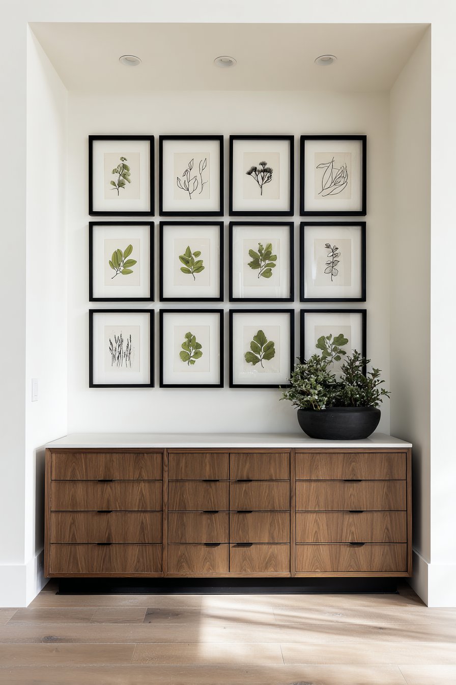
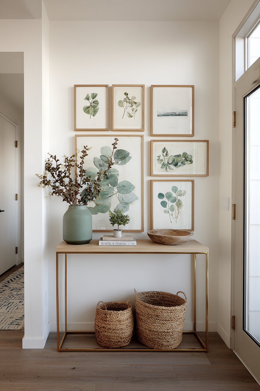
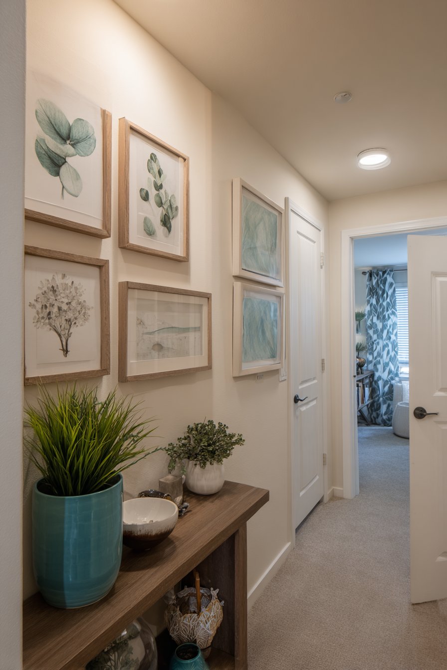
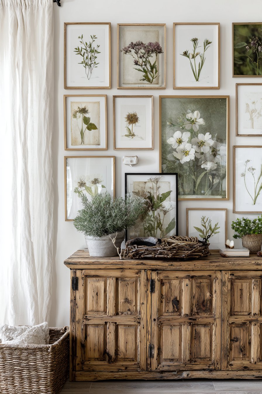
20. Nature-Inspired Botanical Collection
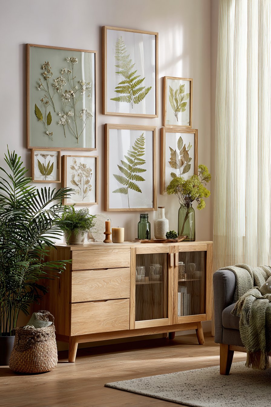
Organic beauty and biophilic design principles unite in this nature-inspired gallery wall featuring pressed botanical specimens in glass frames, watercolor florals, and nature photography. The frames in natural wood tones and sage green create harmony with the organic subject matter, establishing visual consistency across diverse media and artistic styles. Positioned above a vintage wooden sideboard, the collection brings the outdoors inside, creating a calming, nature-connected atmosphere that research suggests benefits mental health and wellbeing.
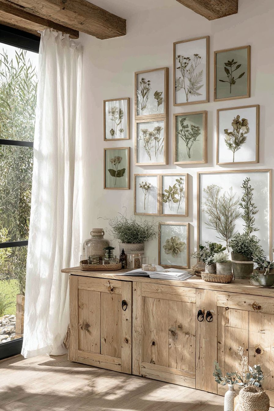
The variety of natural representations—from scientific botanical pressings to impressionistic watercolors to realistic photography—prevents the theme from feeling one-note or predictable. Glass frames showcasing actual pressed plants add dimensional interest and authenticity that reproductions can’t match, while watercolor florals contribute artistic interpretation and soft color. Small potted plants and natural objects displayed on the sideboard below extend the botanical theme into three-dimensional space, creating a complete nature-focused vignette.
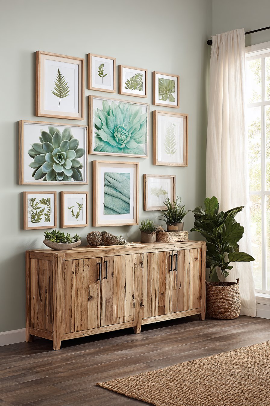
Lighting proves particularly important for this collection, as soft natural daylight filtering through sheer-curtained windows provides the kind of gentle, diffused illumination that suits botanical subjects. Harsh lighting would create unwanted glare on the glass frames containing pressed specimens, while dim lighting would fail to showcase the delicate details and subtle colors. This design approach suits anyone seeking to create more nature-connected interiors, from urban dwellers craving green space to suburban homeowners wanting to emphasize their gardens and natural surroundings.
Key Design Tips:
- Mix different types of botanical representation—pressed specimens, illustrations, photography—for variety
- Choose frames that reference natural materials like wood, bamboo, or colors found in nature
- Include actual plants in the display area to reinforce the biophilic design principles
- Consider preservation carefully for pressed botanicals—use UV-protective glass and avoid direct sunlight
- Arrange botanicals by type, color, or season to create subcategories within the larger theme
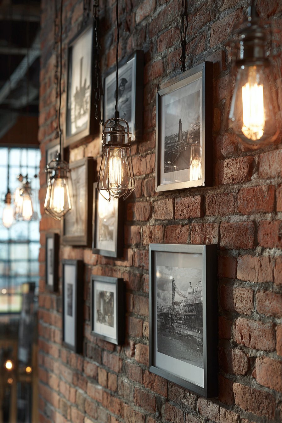
21. Industrial Urban Photography
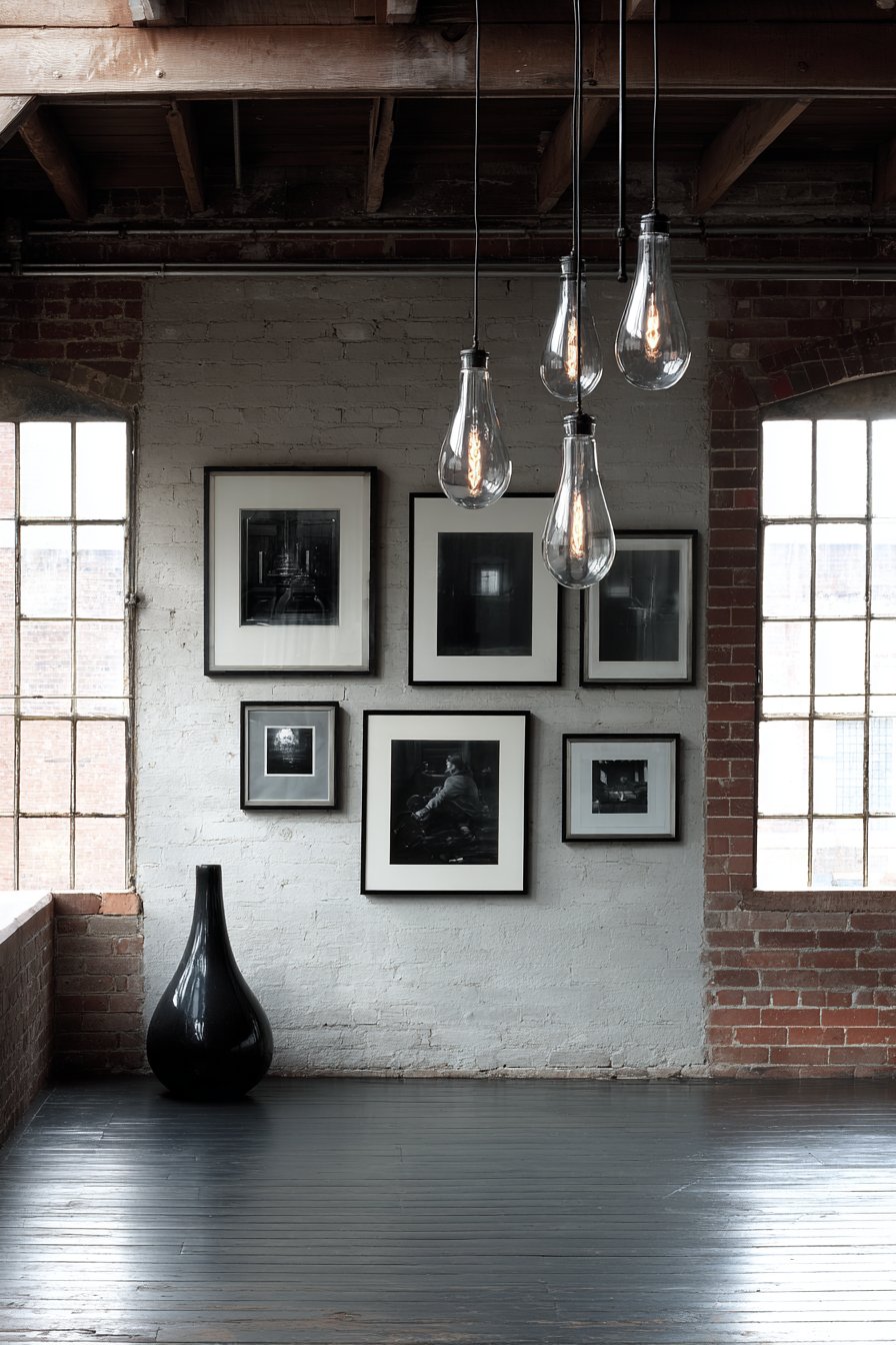
Raw, unpolished aesthetics define this industrial gallery wall featuring black-and-white urban photography in simple metal frames with exposed hardware and wire hanging systems. The intentionally unrefined presentation suits the exposed brick wall in a loft conversion, where polished frames would feel out of place and overly precious. The photography subjects—architectural details, street scenes, urban landscapes—embrace gritty reality rather than sanitized beauty, creating authentic urban atmosphere.
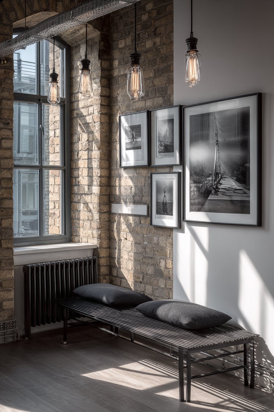
The minimal frame profiles keep focus squarely on the photography while the visible hanging mechanisms contribute to the industrial aesthetic rather than hiding apologetically. Edison bulb pendant lights and natural light from large industrial windows create moody illumination with strong shadows and dramatic highlights that suit the photography’s subject matter. The entire composition rejects conventional notions of gallery presentation, instead embracing the raw, authentic aesthetic that defines genuine loft living.
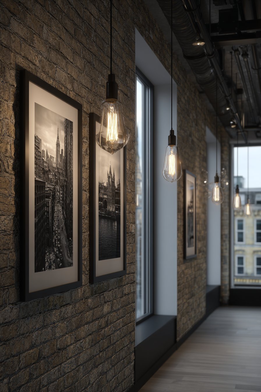
This approach works best in spaces with existing industrial features—exposed brick, concrete floors, visible ductwork, metal fixtures—where highly finished, traditional gallery presentations would create jarring style conflicts. The photography selection matters enormously, as the industrial theme demands images with appropriate subject matter and aesthetic. Soft landscapes or delicate still lifes would undermine the design’s intentional toughness, while bold architectural studies and urban documentation reinforce it. For urban dwellers in converted industrial spaces, this gallery wall style creates authentic atmosphere that honors the building’s history.
Key Design Tips:
- Embrace visible hanging hardware as part of the industrial aesthetic rather than trying to hide it
- Choose photography with appropriate urban or industrial subject matter
- Work with existing architectural features like brick or concrete rather than fighting them
- Use simple metal frames that reference industrial materials without being overly decorative
- Consider lighting carefully—industrial spaces often have dramatic light quality that should be preserved
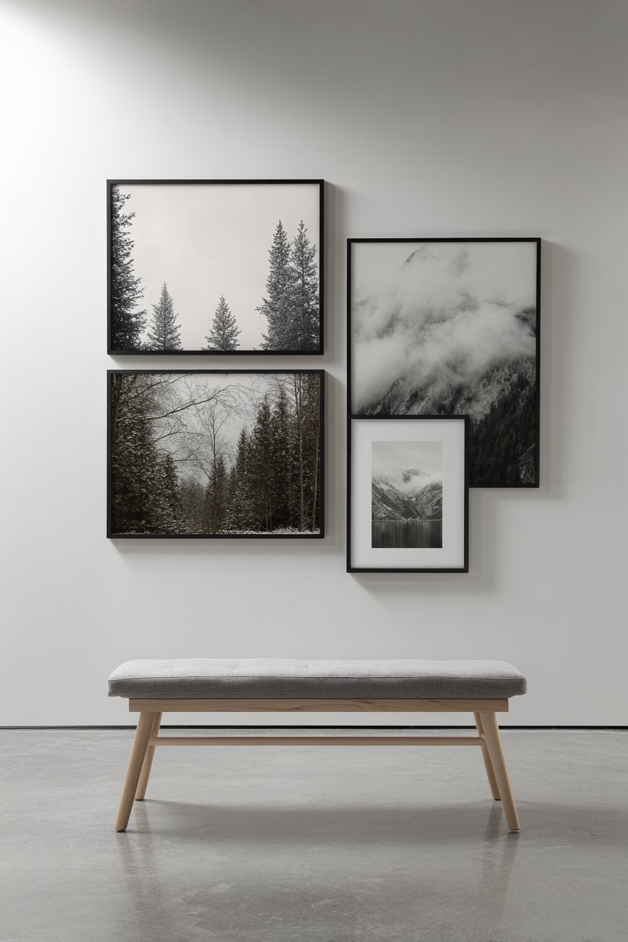
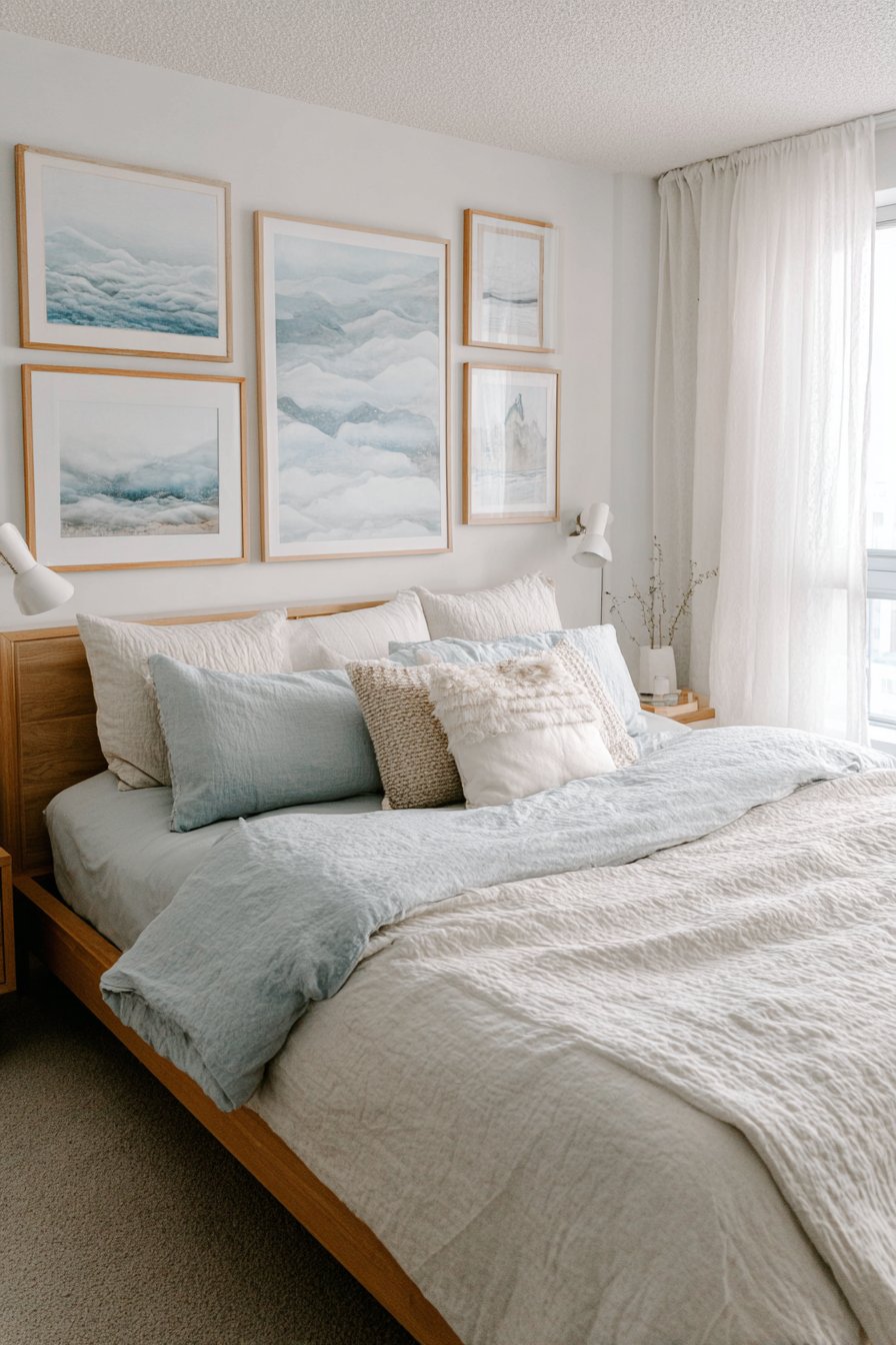
22. Serene Bedroom Cloudscape
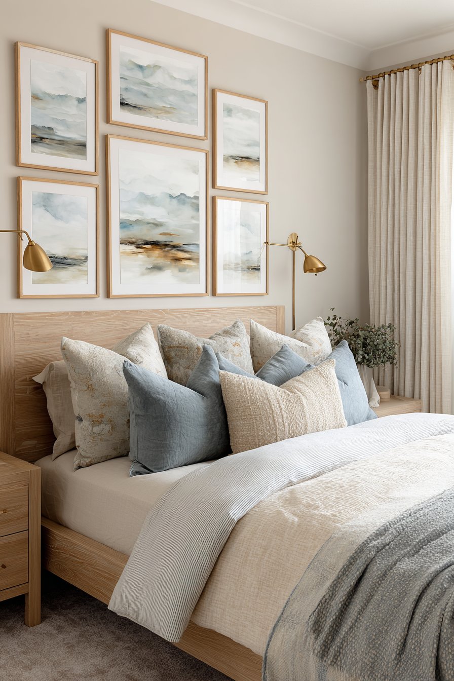
Peaceful, sleep-conducive design guides this bedroom gallery wall featuring five large canvas prints of soft, dreamy landscapes and abstract cloudscapes. The light wooden floating frames in blonde oak provide subtle definition without harsh contrast, while the calming palette of sky blues, soft grays, and cream actively promotes the relaxation essential for sleep quality. Positioned above a bed headboard, the collection creates a focal point that encourages mental calm rather than stimulation.
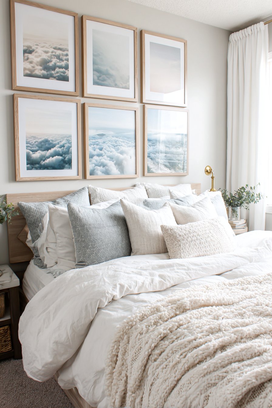
The subject matter selection proves critical—abstract cloudscapes and soft landscapes lack the visual complexity that might distract from sleep. The dreamy, atmospheric quality creates the kind of visual calm that meditation spaces and spas deliberately cultivate. Mounted reading lights flanking the bed provide practical task lighting while sheer curtains filter morning light, preventing harsh awakening and maintaining the room’s soft, peaceful atmosphere throughout the day.
This thoughtful approach to bedroom gallery walls recognizes that sleep spaces require different design considerations than social areas. While living room galleries might embrace bold colors and complex imagery, bedroom collections should prioritize serenity and simplicity. The scale remains appropriate for the typical viewing distance from bed, with prints large enough to create presence without overwhelming the intimate space. For anyone struggling with sleep quality or seeking to create truly restful bedroom environments, this design approach offers gallery wall beauty that supports rather than undermines the room’s primary function.
Key Design Tips:
- Choose calming subjects like clouds, water, soft landscapes, or abstract atmospheric pieces
- Limit your color palette to cool or neutral tones that promote relaxation rather than stimulation
- Consider the view from bed—you’ll see this gallery while lying down, so mount it at appropriate height
- Avoid highly detailed or complex imagery that might prevent mental quiet
- Use soft, warm-toned wood frames rather than stark black or white for gentler visual impact
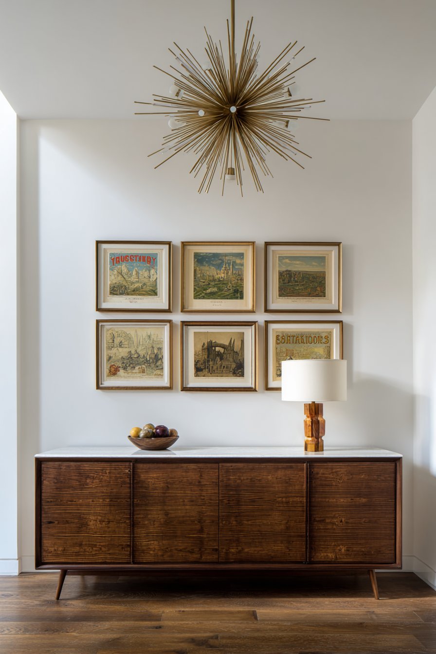
23. Mid-Century Modern Vintage Collection
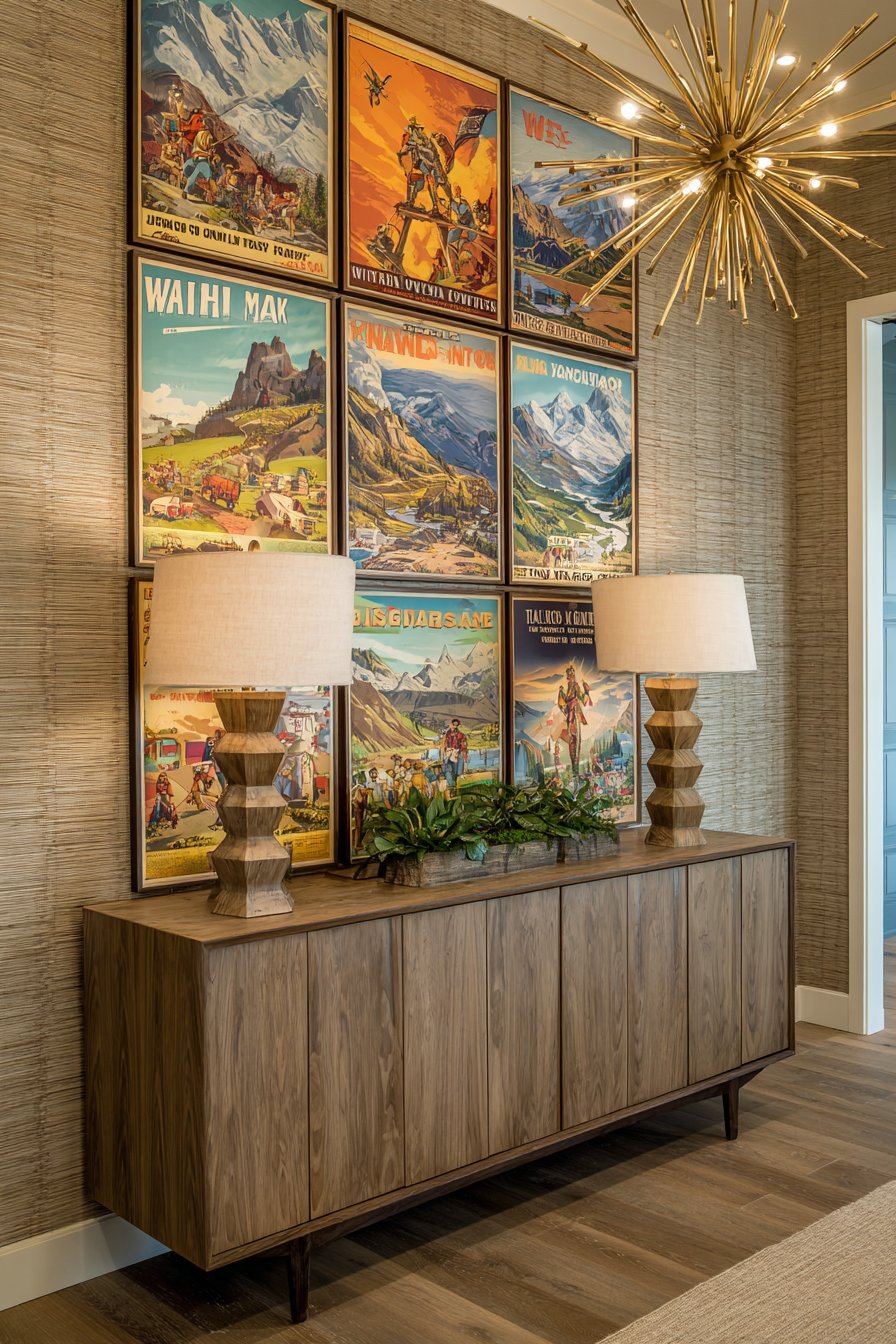
Nostalgic charm meets sophisticated design in this mid-century modern gallery wall featuring vintage travel posters and retro advertisements in teak and walnut frames. The collection creates an authentic 1960s atmosphere, with each piece showcasing the distinctive graphic design, typography, and color palettes that defined that era. Positioned above a low credenza with characteristic tapered legs, the gallery pays homage to mid-century design’s continuing influence on contemporary interiors.
The frame selection in teak and walnut references the wood tones that dominated mid-century furniture design, creating seamless integration between the gallery and the surrounding décor. The warm color palette—featuring period-appropriate shades of orange, avocado green, and chocolate brown—further reinforces the temporal specificity. A sputnik chandelier overhead and table lamps with sculptural bases complete the cohesive period aesthetic, demonstrating how gallery walls should integrate with rather than merely decorate spaces.
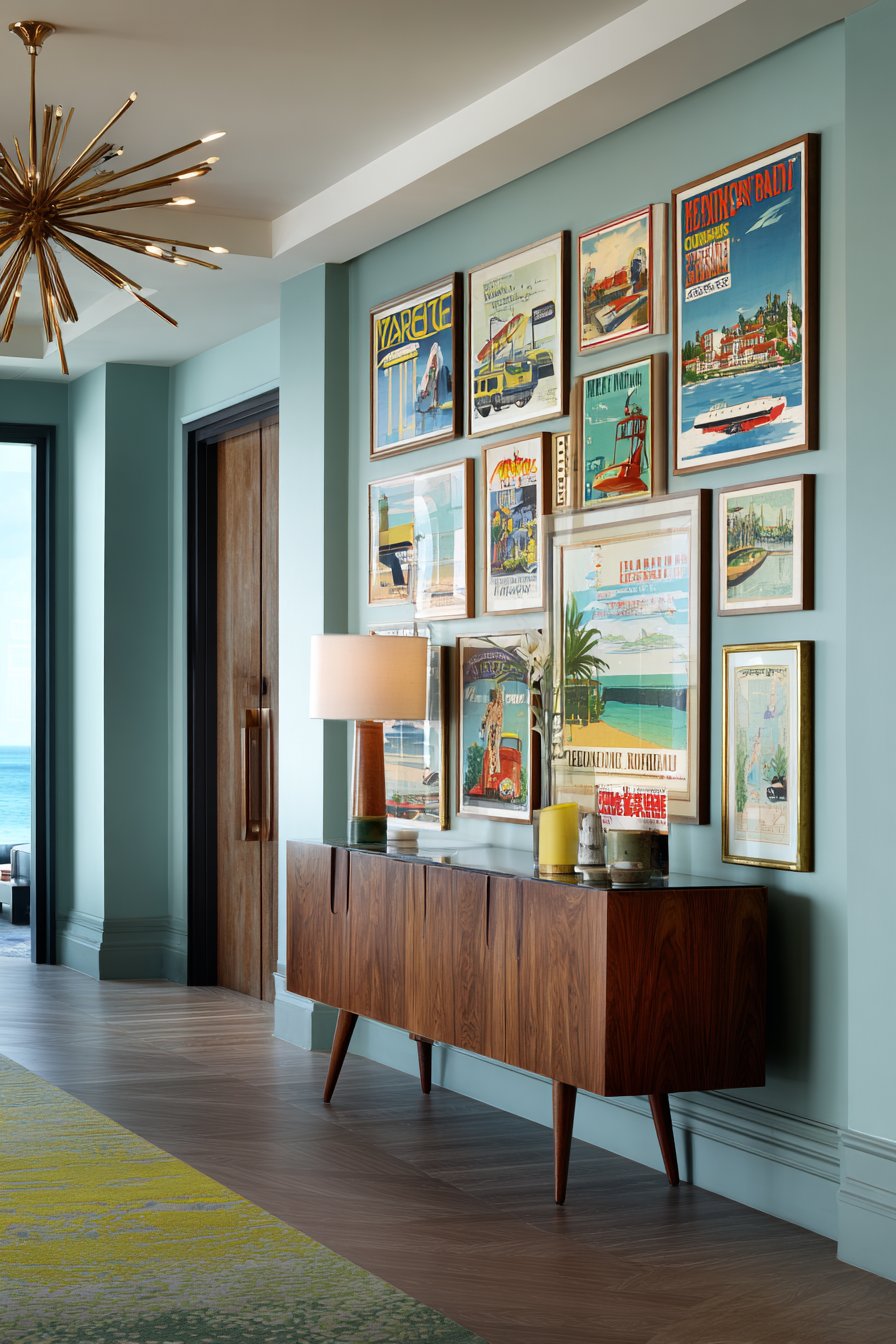
This approach appeals to mid-century modern enthusiasts, vintage collectors, and anyone who appreciates the optimistic, forward-looking design aesthetic that characterized post-war American design. The travel poster format creates inherent visual interest through varied destinations and graphic treatments, while the advertising elements offer glimpses into period culture and consumer aesthetics. For those committed to authentic mid-century interiors, this gallery wall demonstrates how art and décor choices can transport spaces to specific eras through careful curation and presentation.
Key Design Tips:
- Source authentic vintage posters when possible, or invest in high-quality reproductions from reputable sellers
- Choose frames in wood species and finishes common to the mid-century period—teak, walnut, rosewood
- Consider the condition—slight aging and patina add authenticity to vintage collections
- Coordinate the gallery’s color palette with your room’s furnishings and accessories
- Include period-appropriate lighting fixtures to complete the cohesive mid-century atmosphere
24. Dimensional Mixed-Media Display
Innovative thinking expands traditional gallery wall concepts in this dimensional arrangement combining shadow boxes, floating shelves displaying small objects, and traditional framed art to create varied depth. The mixed-media approach transforms a flat wall into a sculptural installation where objects project at different distances, creating genuine dimension and visual complexity. The neutral palette with metallic accents maintains sophistication despite the diverse display methods.
Shadow boxes allow three-dimensional objects—small sculptures, collections, memorabilia—to receive the same reverent display treatment traditionally reserved for flat artwork. Floating shelves provide both practical display space and visual breaks in the composition, their horizontal lines creating rhythm and structure. Traditional framed art anchors the arrangement, providing familiar gallery wall elements that prevent the mixed approach from feeling too experimental or chaotic. Adjustable track lighting proves essential, as the varied depths create numerous shadows that can either enhance or obscure elements depending on light direction and intensity.
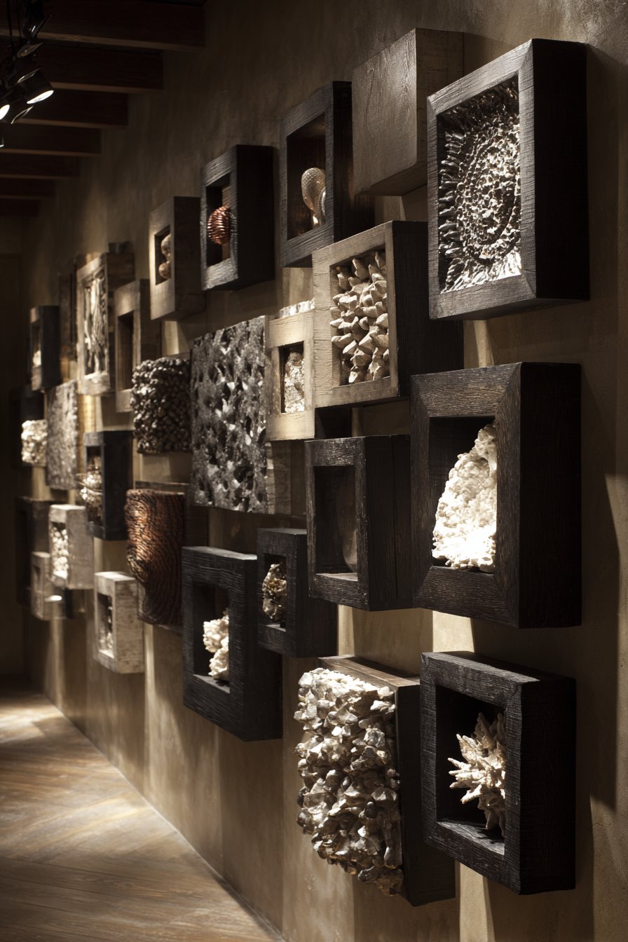
This approach suits collectors of three-dimensional objects who want to display treasured items with the same care and prominence typically given to art. It works beautifully in dining rooms, where serving pieces and decorative objects can become part of the display, or in living spaces where collections of small objects need showcasing beyond china cabinets or curio cases. The dimensional variety creates constant visual interest that rewards multiple viewings from different angles, as the changing perspective reveals different relationships between elements.
Key Design Tips:
- Plan for varied depths deliberately—include elements at multiple projection distances from the wall
- Use lighting strategically to highlight dimensional elements and create interesting shadows
- Balance three-dimensional objects with flat artwork to prevent the arrangement from becoming too busy
- Consider the viewing angles—dimensional arrangements look different from various positions in the room
- Ensure secure installation for heavier shadow boxes and shelves, using appropriate wall anchors
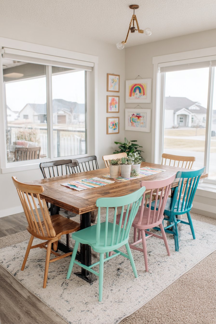
25. Rotating Family Art Gallery
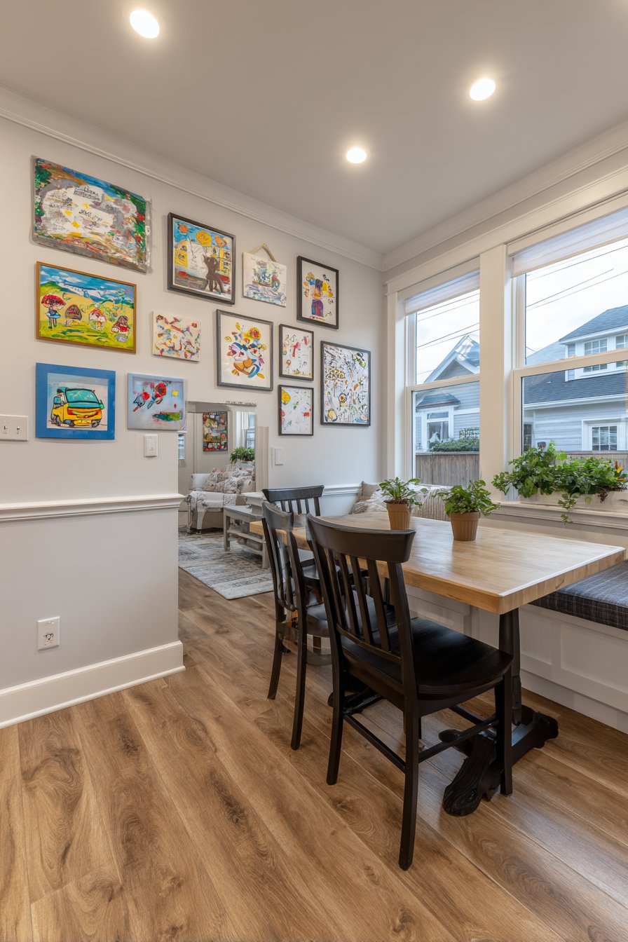
Practical flexibility meets heartfelt sentiment in this family-focused gallery wall designed to showcase children’s artwork in colorful, mismatched frames that celebrate creativity over perfection. Rather than demanding museum-quality presentation, this approach embraces the joyful chaos of family life, creating a rotating exhibition space where new masterpieces can replace older ones as children create. Positioned in a family kitchen, the gallery becomes part of daily life rather than a formal display in lesser-used rooms.
The colorful, mismatched frame selection reinforces the celebration of creativity—there’s no wrong choice, no perfect aesthetic, just proud display of children’s efforts and imagination. Simple clip frames allow artwork updates without requiring reframing or remounting, while a magnetic paint strip provides additional hanging flexibility for pieces that don’t fit standard frame sizes. Bright overhead lighting and natural light from kitchen windows showcase vibrant crayon and paint colors, while the high-traffic location ensures the gallery receives regular viewing and appreciation.
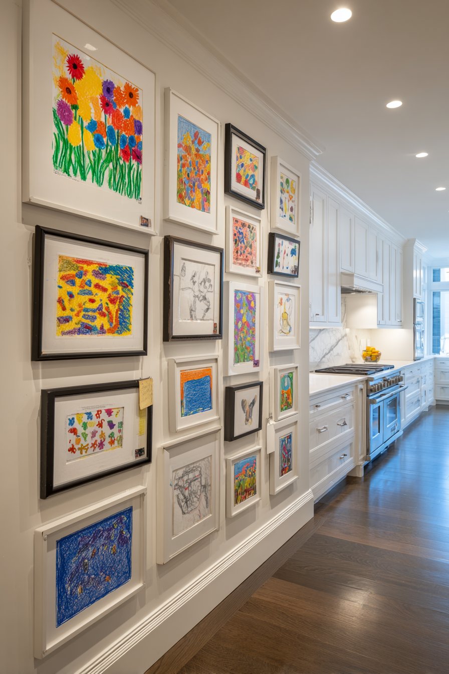
This design philosophy recognizes that gallery walls serve different purposes in different homes and life stages. For young families, a pristine, unchanging art collection matters less than creating spaces that honor children’s creativity and make them feel valued. The practical considerations—easy updates, forgiving aesthetics, durable frames that survive kitchen splatters—demonstrate thoughtful adaptation of gallery wall concepts to real life. As children grow and their artistic abilities develop, this gallery documents their journey while remaining flexible enough to accommodate changing interests and skills.
Key Design Tips:
- Use clip frames or other easy-change formats to facilitate regular artwork rotation
- Position the gallery at a height where children can help select and change pieces
- Embrace imperfection—this gallery celebrates effort and creativity, not professional presentation
- Consider durability and cleanability in kitchen installations where splatters and moisture occur
- Create more hanging spots than you currently need to accommodate multiple children or prolific artists
26. Formal Traditional Gallery
Classical elegance defines this formal symmetrical gallery wall featuring matching ornate gold frames containing classical art prints and museum-quality reproductions. The sophisticated arrangement flanks a central architectural mirror, creating perfect balance that appeals to traditionalists and those who appreciate historical interior design principles. Positioned in a formal living room against deep jewel-tone walls, the collection creates refined atmosphere suitable for elegant entertaining and sophisticated daily living.
The ornate gold frames reference historical framing traditions, with baroque or rococo details that complement the classical artwork subjects—likely including landscape paintings, still lifes, and portraiture in traditional styles. Picture lights mounted above each frame provide focused, gallery-standard illumination that highlights the artwork while crystal wall sconces contribute ambient sparkle and elegance. The deep wall color—perhaps burgundy, forest green, or navy—creates dramatic backdrop that makes the gilded frames glow and adds visual weight appropriate for formal spaces.
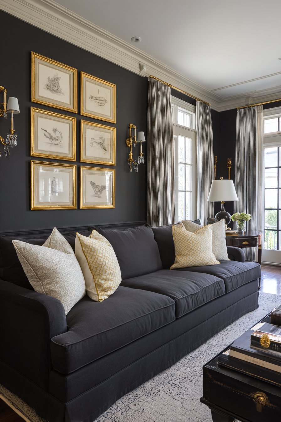
This approach suits traditional homes, those furnished with antiques or reproduction pieces, and anyone who appreciates historical decorating principles over contemporary trends. The symmetrical arrangement creates immediate sense of order and intentionality, while the classical subject matter provides timeless rather than trendy appeal. For formal dining rooms, traditional living rooms, or libraries, this gallery wall style offers sophistication and refinement that’s been appreciated across centuries rather than decades.
Key Design Tips:
- Invest in quality frames with substantial weight and genuine detail—cheap reproductions undermine traditional aesthetics
- Plan symmetry carefully, measuring precisely to ensure perfect balance
- Choose classical artwork subjects that reflect your personal interests while maintaining formal appropriateness
- Consider your wall color carefully—traditional galleries often benefit from rich, deep backgrounds
- Use proper picture lighting to create the gallery atmosphere formal presentations deserve
27. Nordic Minimalist Simplicity
Scandinavian design principles achieve refined expression in this gallery wall featuring simple line drawings and minimalist prints in identical white frames with generous white matting. The clean, uncluttered arrangement emphasizes negative space and breathing room between pieces, creating calm rather than visual excitement. Positioned above a light wood bench, the gallery exemplifies Nordic design’s commitment to functionality, beauty, and the principle that less truly can be more.
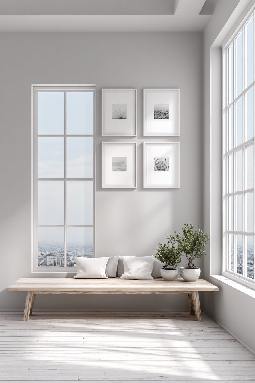
The white frames and mats create almost no visual separation from the pale gray wall, allowing the minimal artwork itself to provide the only strong visual elements. This restraint requires confidence—fighting the urge to add more frames, introduce color, or fill every inch of wall space. The generous white matting serves multiple purposes: it creates visual breathing room around each piece, provides consistency despite varied image sizes, and contributes to the overall sense of calm spaciousness. Small potted plants on the bench below add organic elements without disrupting the aesthetic purity.
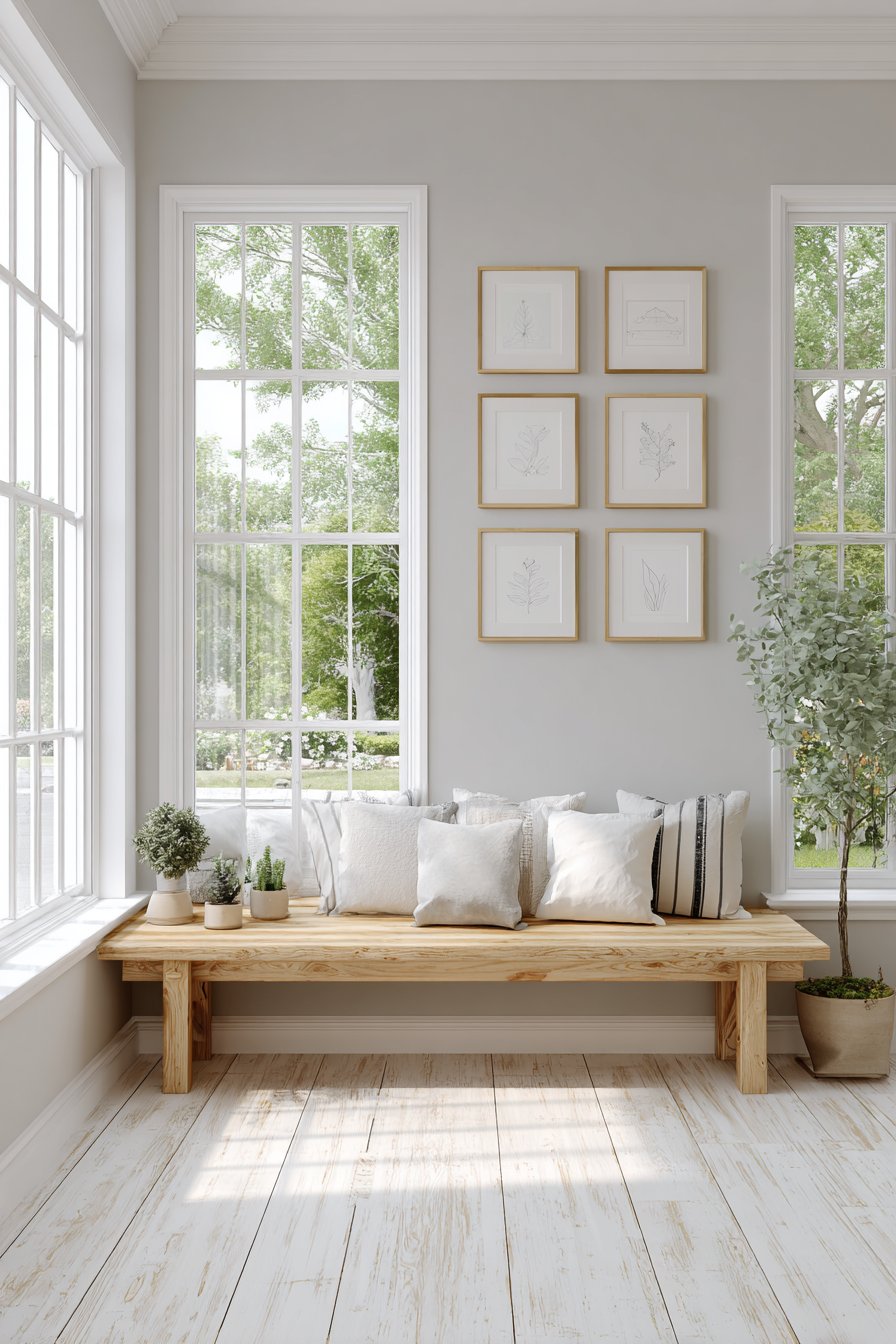
Natural light from large windows proves essential to this design’s success, as Scandinavian interiors depend on maximizing limited northern light. The bright, airy atmosphere prevents the minimal palette from feeling cold or austere, instead creating the kind of serene, contemplative environment that Nordic design consistently achieves. For those who find peace in simplicity, appreciate quality over quantity, and want spaces that promote mental calm, this gallery wall approach offers beauty through restraint rather than abundance.
Key Design Tips:
- Embrace negative space—minimal galleries need generous room between and around frames
- Use consistent framing throughout to maintain visual calm and cohesion
- Choose simple, line-based artwork that suits minimalist aesthetics
- Ensure adequate natural light to prevent minimal palettes from feeling cold
- Resist the urge to add more—Nordic design succeeds through intentional restraint
28. Adaptable Teen Expression Space
Flexibility meets self-expression in this teen-focused gallery wall featuring cork boards, magnetic boards, and frame clips that accommodate constant updates of photos, concert tickets, artwork, and other ephemera. Rather than creating a fixed display, this approach recognizes teenagers’ rapidly changing interests and need for personal space control. The adaptable collection creates an evolving self-expression space that honors adolescent development and identity formation.
String lights and LED strip lighting add youthful energy while providing practical illumination for homework or other activities. Colorful pushpins, washi tape, and other customization options allow personal aesthetic expression without requiring parental approval or assistance for each change. The flexible format means the display can transition from middle school interests to high school priorities to college preparation without requiring complete redesign—just fresh content on existing display surfaces.
This design philosophy recognizes that teen spaces serve different purposes than adult rooms. Rather than imposing adult aesthetic preferences, successful teen gallery walls offer structure and boundaries while allowing maximum personal control within those parameters. The ability to constantly update content means the space remains relevant and personally meaningful rather than becoming a time capsule of outgrown interests. For parents seeking to honor teenage autonomy while maintaining some design coherence, this approach offers practical compromise.
Key Design Tips:
- Provide diverse display options—cork, magnetic, clips—to accommodate various item types
- Position elements at heights teenagers can easily reach and update independently
- Choose durable materials that survive frequent updates and teenage room wear
- Incorporate adequate lighting, as teen rooms serve multiple functions from sleep to study
- Resist imposing adult aesthetic preferences—this is their space for self-expression
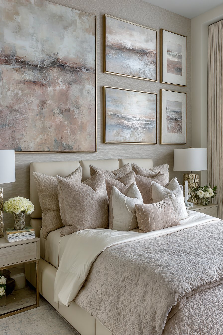
29. Transitional Eclectic Harmony
Sophisticated curation bridges design eras in this transitional gallery wall successfully blending traditional and contemporary elements. Ornate vintage frames coexist peacefully with sleek modern profiles, creating visual interest through contrast while maintaining overall cohesion. Positioned above a classic Chesterfield sofa updated with neutral fabric, the collection demonstrates how seemingly contradictory design elements can achieve harmony through thoughtful arrangement and shared qualities.
The artwork subjects range from classical landscape paintings to abstract contemporary prints, spanning centuries and styles while finding common ground in quality, scale, and color relationships. What makes this eclectic approach successful is the underlying structure—varied elements are arranged with careful attention to visual weight, color distribution, and spacing that creates order despite diversity. Picture lights and natural window light provide versatile illumination that suits both traditional oil paintings and modern prints.
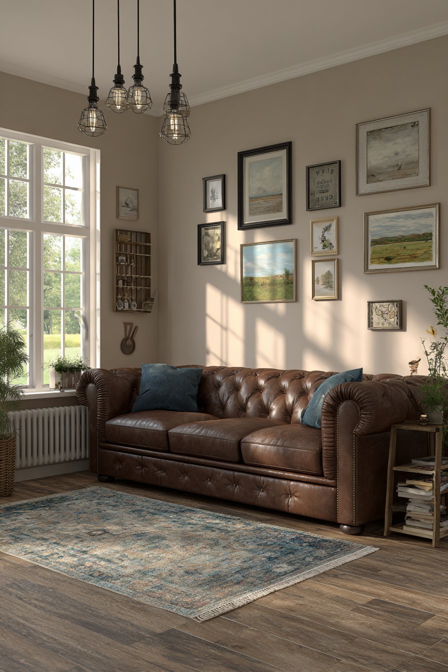
This approach appeals to those who resist being confined to single design styles, appreciate both historical and contemporary aesthetics, and want spaces that feel collected and personal rather than showroom-perfect. The transitional style allows homeowners to incorporate inherited pieces alongside new purchases, vintage finds alongside contemporary art, creating layers of meaning and personal history. For those with diverse tastes and varied collections, this gallery wall demonstrates that eclecticism succeeds when guided by strong curation and thoughtful arrangement.
Key Design Tips:
- Establish common threads—shared colors, similar scales, or thematic connections—to unify diverse elements
- Balance ornate and simple frames throughout the arrangement rather than clustering all traditional or modern pieces together
- Consider the overall visual weight, ensuring no section feels significantly heavier than others
- Choose a neutral wall color that works with both traditional and contemporary elements
- Arrange and rearrange on the floor before committing to wall placement, as eclectic galleries require more planning than uniform ones
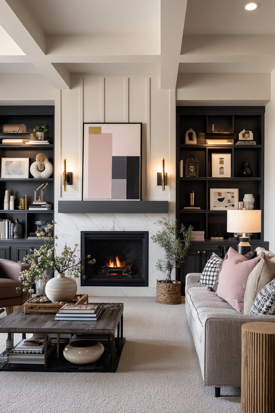
Why These Gallery Wall Ideas Represent the Best in Contemporary Interior Design
Gallery walls have evolved from simple picture arrangements into sophisticated design statements that transform spaces and express personal identity. The twenty-nine approaches presented here represent the pinnacle of contemporary gallery wall design, each addressing specific aesthetic preferences, practical constraints, and lifestyle needs while demonstrating universal principles of successful art display and spatial design.
What distinguishes exceptional gallery walls from merely adequate ones is their integration of multiple design considerations simultaneously. The best gallery walls demonstrate mastery of scale and proportion, ensuring that frame sizes and arrangement scope suit the available wall space without overwhelming or underwhelming. They exhibit sophisticated understanding of color theory, whether through monochromatic restraint, carefully curated palettes, or bold chromatic statements. They reveal awareness of lighting’s critical role, utilizing natural and artificial illumination to showcase rather than obscure artwork. Perhaps most importantly, they reflect authentic personal taste rather than generic trends, creating spaces that feel genuine and meaningful rather than derivative.
The variety presented—from minimalist grids to maximalist salon walls, from formal traditional displays to casual leaning arrangements—demonstrates that successful gallery wall design accommodates diverse aesthetics and living situations. Urban loft dwellers, suburban families, traditional homeowners, and contemporary apartment residents can all create compelling gallery walls by selecting approaches that honor their spaces’ architectural character and their personal design preferences. The key lies in thoughtful curation, careful planning, and willingness to invest the time and attention that truly successful gallery installations require.
These gallery wall ideas also address practical realities that theoretical design discussions often ignore. Rental-friendly ledge arrangements acknowledge housing realities where permanent installations aren’t possible. Rotating children’s art galleries honor family life’s beautiful chaos. Teen adaptation spaces respect adolescent development needs. Staircase solutions transform architectural challenges into opportunities. This practical wisdom distinguishes genuinely useful design guidance from purely aspirational imagery that fails to address real-world constraints.
Material quality, frame selection, artwork curation, lighting design, spacing decisions, and installation execution all contribute to gallery wall success. The featured designs excel because they demonstrate mastery across all these dimensions rather than succeeding in isolation. A beautiful frame selection can’t overcome poor spacing; perfect measurements can’t compensate for inappropriate lighting; expensive artwork can’t elevate an arrangement that lacks cohesive vision. Excellence requires comprehensive attention to every element, from initial concept through final installation.
The enduring appeal of gallery walls lies in their accessibility and personalization potential. Unlike many design elements requiring professional expertise or substantial budgets, gallery walls welcome DIY execution and can be created at virtually any price point. Thrift store frame finds can create compelling displays when thoughtfully arranged. Family photographs carry emotional value that expensive art can’t match. Children’s artwork provides meaning that professional prints can’t replicate. The best gallery walls reflect their creators’ lives, interests, and stories, transforming walls into personal narratives rather than generic decoration.
Conclusion
Gallery walls represent one of interior design’s most versatile and personally meaningful elements, offering endless opportunities for creative expression while solving practical display needs. The twenty-nine approaches explored in this comprehensive guide demonstrate the remarkable range of possibilities available to anyone willing to invest thought, planning, and creativity into transforming blank walls into captivating displays. From the mathematical precision of modern grid arrangements to the organic abundance of maximalist salon walls, from space-smart solutions for narrow hallways to innovative corner configurations that embrace architectural challenges, these ideas prove that successful gallery wall design accommodates every aesthetic preference and spatial constraint.
The key to gallery wall success lies in thoughtful integration of multiple design principles: appropriate scale and proportion, cohesive color stories, effective lighting, careful spacing, quality materials, and authentic personal expression. Whether you gravitate toward minimalist restraint or eclectic abundance, formal symmetry or casual arrangement, traditional elegance or contemporary edge, the fundamental principles remain constant. Start with clear vision, plan carefully, invest in quality materials and execution, and remain true to your personal aesthetic preferences rather than chasing trends that don’t resonate with your genuine taste.
As you embark on creating your own gallery wall, remember that perfection isn’t the goal—personal meaning is. The most successful gallery walls reflect their creators’ lives, passions, and stories, creating spaces that feel authentic and meaningful rather than merely decorative. Start small if the prospect feels overwhelming, perhaps with a modest arrangement in a hallway or above a console table. As your confidence grows, expand to more ambitious projects that transform entire walls into stunning showcases. Embrace the flexibility that gallery walls offer, knowing that arrangements can evolve as your collection grows, your tastes develop, or your life circumstances change. Your walls await transformation—let these ideas inspire you to create gallery displays that bring daily joy, express your unique personality, and transform your house into a home that truly reflects who you are.