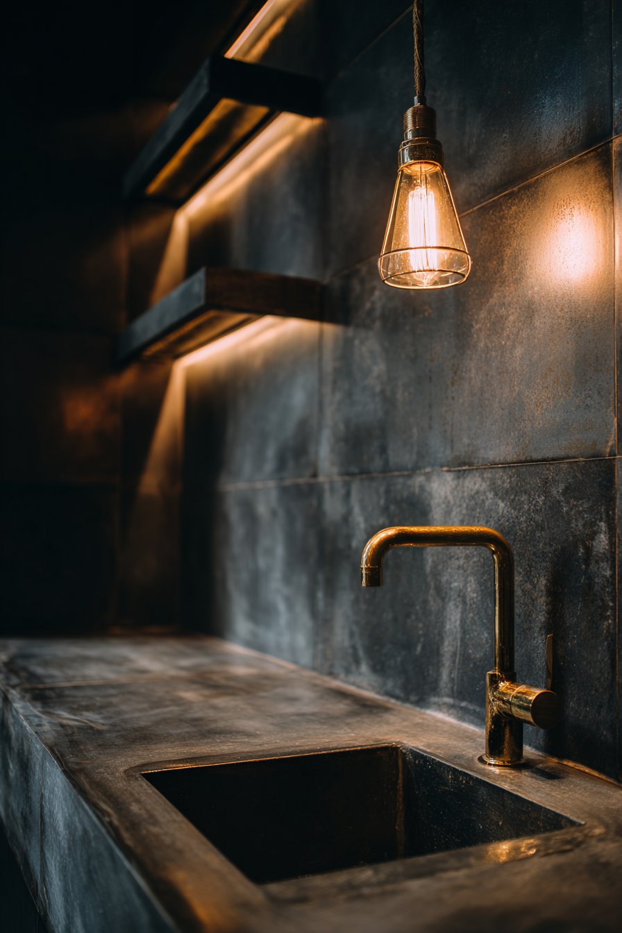
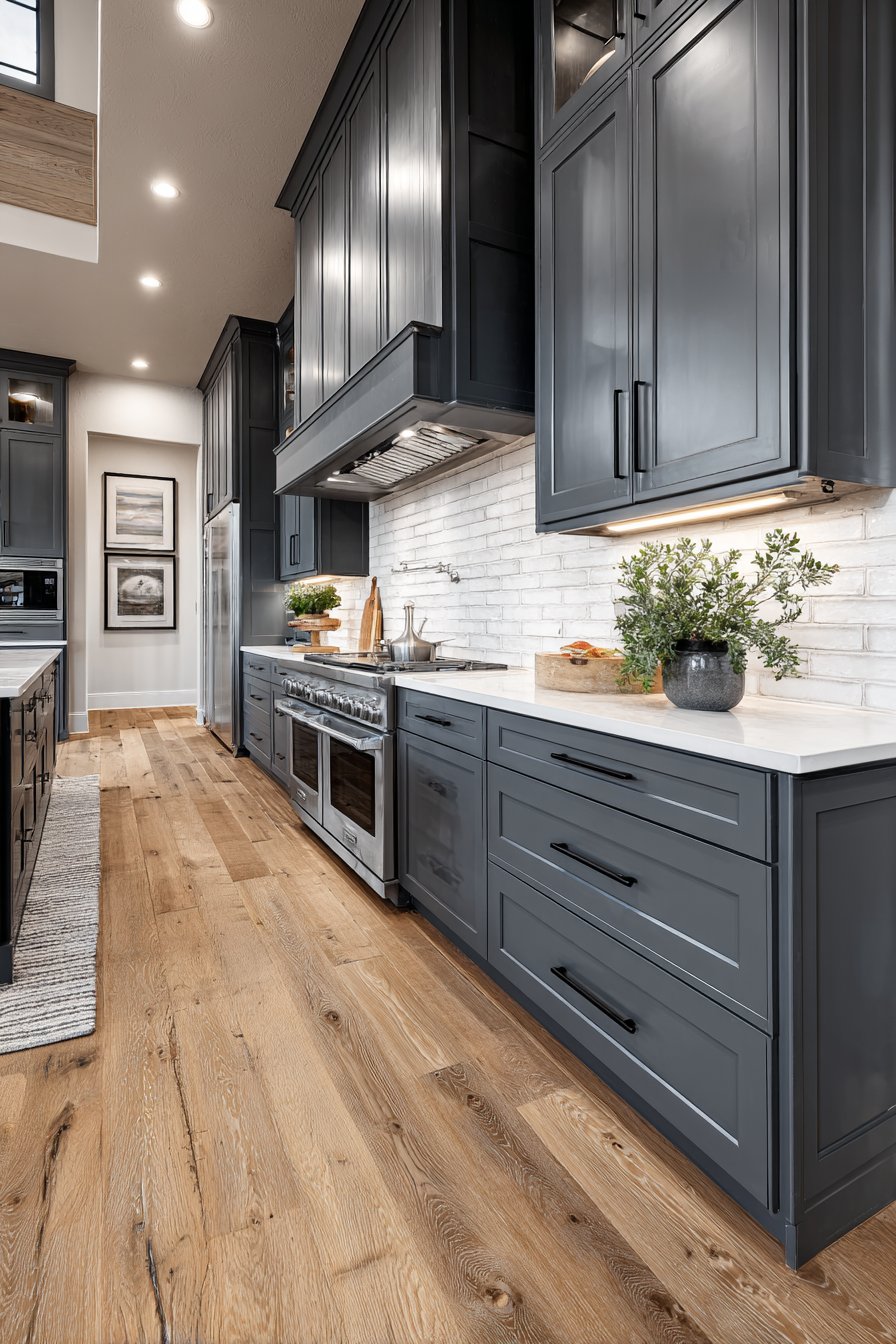
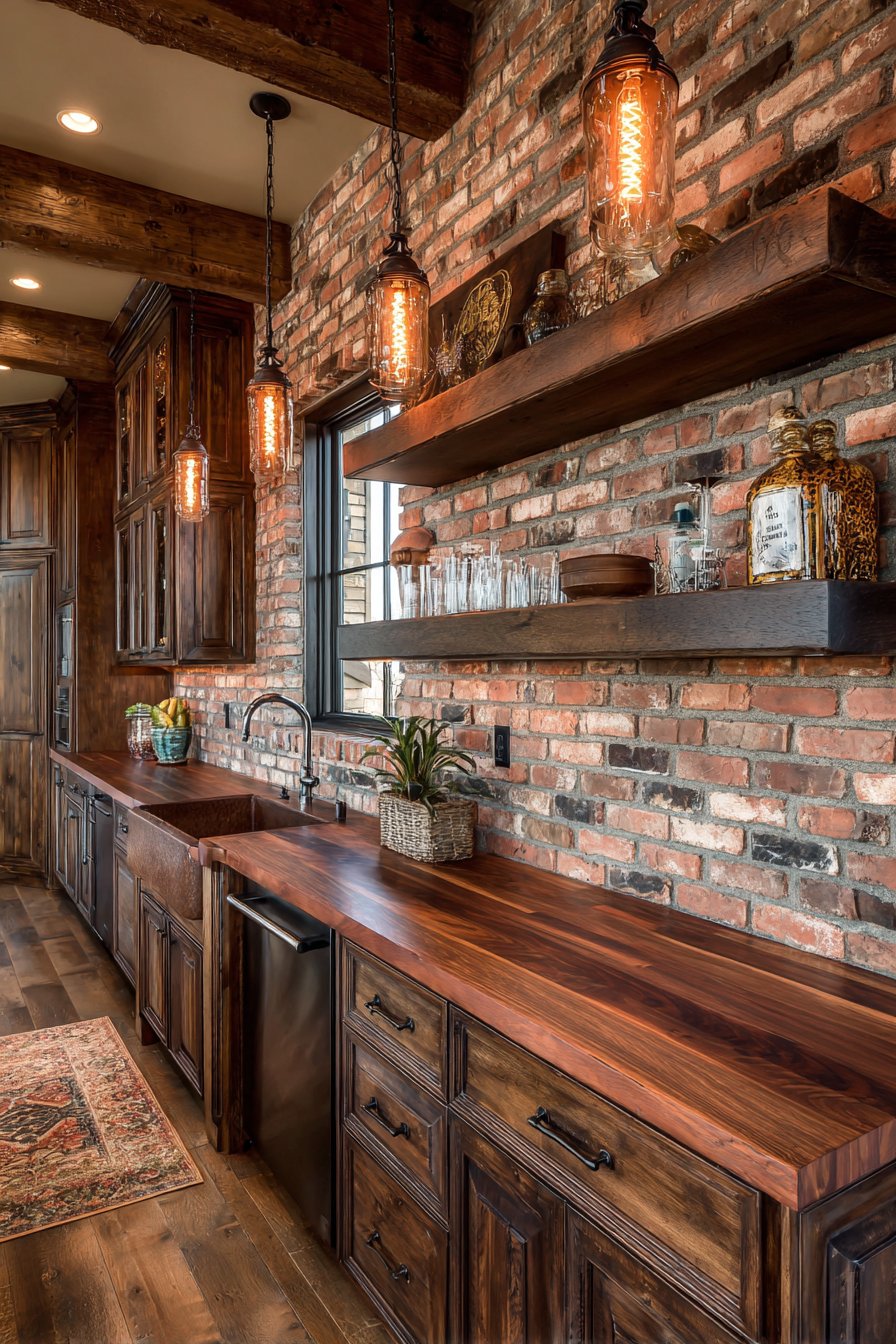
The kitchen backsplash is far more than a protective surface—it’s the jewelry of your culinary space, the design element that can transform a functional cooking area into a stunning visual masterpiece. In today’s homes, where kitchens serve as gathering spaces, entertainment hubs, and the heart of daily life, the backsplash has evolved from a simple utilitarian feature to a powerful design statement that reflects personal style, enhances functionality, and adds measurable value to your home. Whether you’re renovating an outdated kitchen or building your dream culinary space from scratch, the backsplash offers an unparalleled opportunity to infuse personality, texture, and visual interest into one of your home’s most important rooms.
The beauty of kitchen tile backsplash ideas lies in their remarkable versatility and the endless possibilities they present. From timeless subway tiles that have graced kitchens for over a century to contemporary geometric patterns that push the boundaries of design, from handcrafted artisan ceramics that tell a story to sleek glass installations that play with light—each option brings its own character, mood, and practical benefits. The right backsplash choice considers not only aesthetic preferences but also lifestyle needs, maintenance requirements, budget constraints, and the overall design narrative of your home. It’s about finding that perfect intersection where form meets function, where beauty serves purpose, and where your kitchen truly becomes a reflection of who you are.
This comprehensive guide explores twenty-seven distinctive kitchen tile backsplash ideas, each offering unique design solutions for different styles, spaces, and sensibilities. We’ll journey through classic approaches that stand the test of time, bold contemporary statements that command attention, nature-inspired designs that bring organic warmth, and cultural influences that add worldly sophistication. You’ll discover how different materials behave, how patterns affect spatial perception, how colors influence mood, and how installation techniques can dramatically alter the final appearance. Whether you’re drawn to minimalist Scandinavian simplicity, rustic farmhouse charm, luxurious Mediterranean elegance, or cutting-edge modern design, you’ll find inspiration, practical guidance, and expert insights to help you create a kitchen backsplash that not only protects your walls but elevates your entire culinary experience.
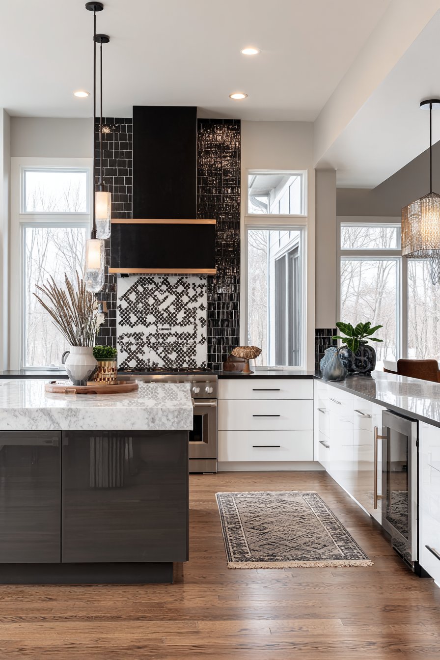
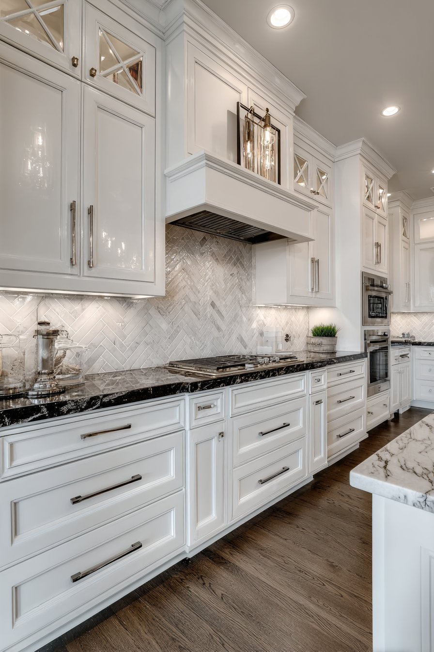
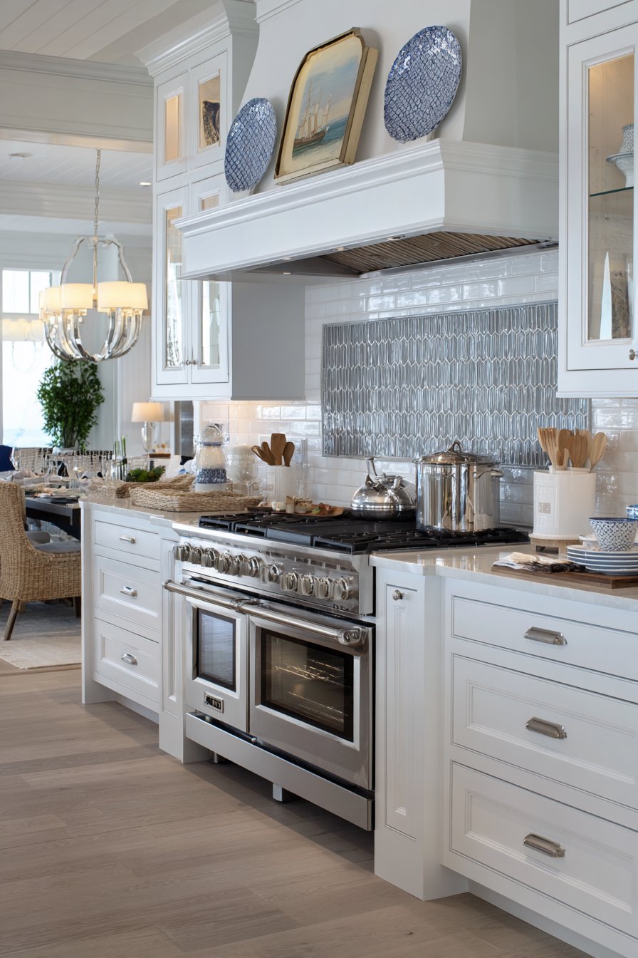
1. Classic White Subway Tile with Contrasting Grout
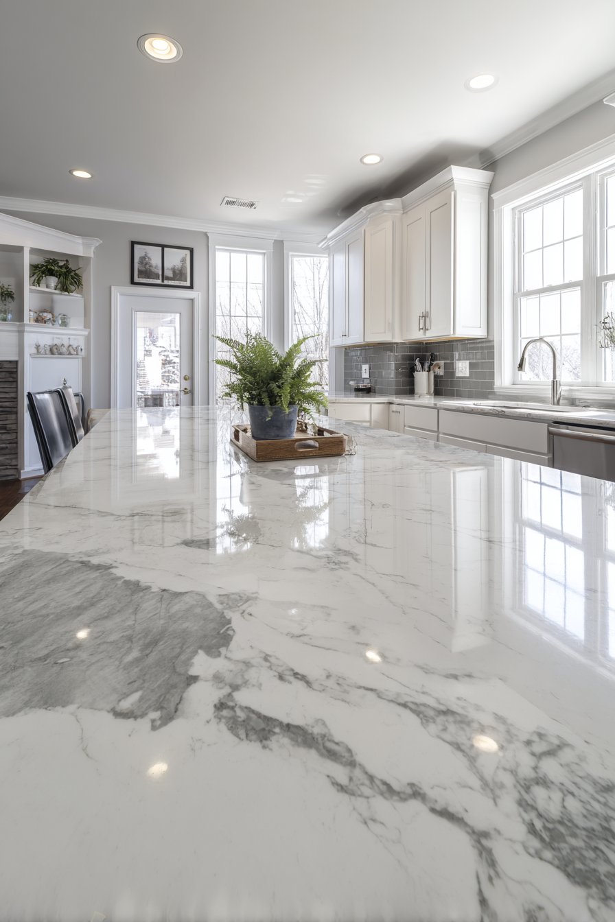
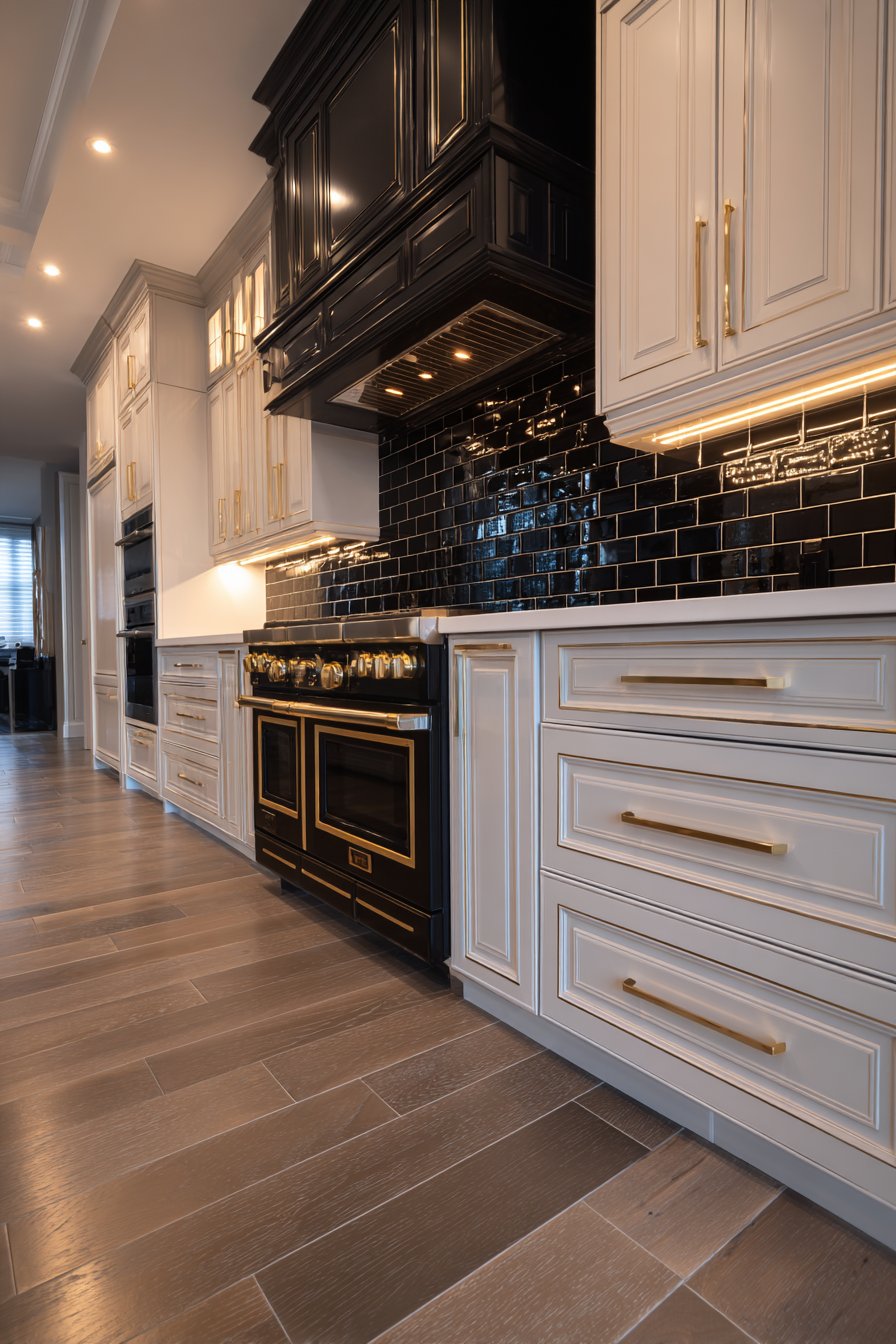
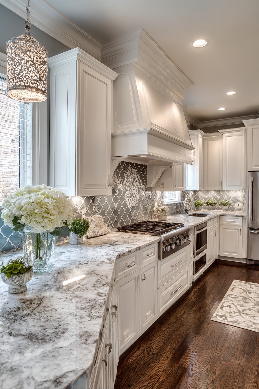
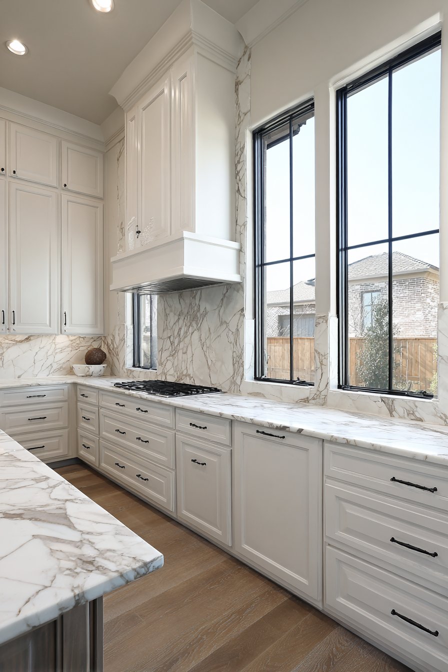
The enduring appeal of white subway tile backsplash lies in its perfect balance of simplicity and sophistication, a combination that has made it a staple in kitchen design for over a century. This kitchen tile backsplash idea features traditional 3×6 inch ceramic tiles installed in the classic brick layout pattern, creating a timeless grid that works beautifully in both traditional and contemporary settings. What elevates this particular interpretation is the strategic use of dark grey grout lines, which transform what could be a plain white surface into a graphic statement with clear definition and visual structure. The contrast between the pristine white tiles and the darker grout creates a framework that draws the eye and adds architectural interest without overwhelming the space.
The beauty of this approach extends beyond aesthetics to practical considerations that make it ideal for busy kitchens. The glossy ceramic finish reflects light beautifully, helping to brighten the workspace and make smaller kitchens feel more spacious and open. This reflective quality is particularly valuable in kitchens with limited natural light, where every surface that bounces light around contributes to a more pleasant cooking environment. The tiles extend from the quartz countertop all the way to the bottom edge of white shaker cabinets, creating a clean, cohesive transition between these major kitchen elements. Stainless steel appliances and brushed nickel fixtures complement the clean aesthetic, their metallic surfaces adding subtle visual interest without competing with the backsplash’s graphic quality.
Natural daylight streaming through nearby windows activates the glossy tile surface, creating subtle reflections and highlights that change throughout the day, giving the kitchen a living, dynamic quality rather than a static appearance. The wide-angle perspective captures the full installation, showing how the systematic repetition of the brick pattern creates rhythm and visual movement across the wall. Professional lighting techniques ensure balanced exposure that reveals both the pristine white of the tiles and the subtle shadows created where tiles meet, adding dimensionality to what might otherwise appear flat.
Key Design Tips: Choose high-quality ceramic tiles with consistent sizing to ensure straight grout lines and professional appearance. Select grout color carefully—dark grey provides strong contrast while remaining neutral enough to work with various design schemes. Consider the grout joint width; narrower joints (1/8 inch) create a more refined look while wider joints (1/4 inch) emphasize the grid pattern. Seal grout lines properly to prevent staining in high-splash areas near the sink and stove. When working with white tiles and dark grout, take extra care during installation to clean tile surfaces immediately, as dark grout can be challenging to remove once dried. Consider extending the backsplash higher than standard to create more visual impact, especially in kitchens with shorter upper cabinets.
2. Sophisticated Herringbone Marble Pattern
The herringbone pattern represents one of the most elegant and timeless arrangements in tile design, and when executed with narrow rectangular marble tiles in soft grey and white tones, it creates a kitchen tile backsplash that exudes sophisticated luxury. This particular interpretation showcases the diagonal arrangement that is the hallmark of herringbone patterning, where each tile is laid at a 90-degree angle to the next, creating a distinctive V-shaped weaving pattern that draws the eye and adds dynamic visual movement to the kitchen wall. The natural stone variations inherent in marble—with its subtle veining, organic color shifts, and unique character in each tile—ensure that no two installations look exactly alike, giving your kitchen a truly custom appearance.
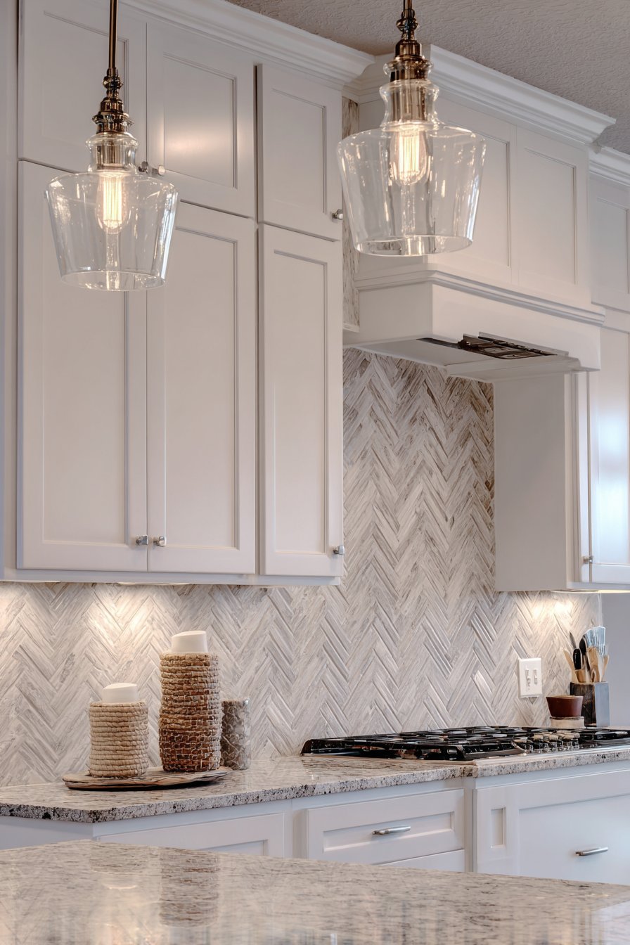
The interplay between the soft grey and white tones in the marble creates depth and visual interest that solid-color tiles simply cannot match. As light moves across the surface throughout the day, different veins catch the illumination, creating an ever-changing display that keeps the backsplash from ever appearing monotonous. This natural variation also has practical benefits, as it tends to camouflage minor splashes and spots better than pure white surfaces, making maintenance between deep cleanings more forgiving. The herringbone pattern’s diagonal orientation creates the optical illusion of expanded space, making it an excellent choice for smaller kitchens or galley layouts where every visual trick to enhance spaciousness counts.
Dark granite countertops provide grounding contrast, anchoring the lighter marble backsplash and creating clear horizontal definition in the kitchen’s visual hierarchy. This contrast prevents the marble from appearing to float without context while the white cabinetry keeps the overall space feeling bright and open. Pendant lighting strategically positioned above the countertop casts gentle shadows that emphasize the dimensional quality of the herringbone pattern, highlighting where each tile’s edge creates subtle relief against its neighbor. The professional interior photography captures this interplay of light and shadow while maintaining focus on the material textures and the precision required to execute such a pattern successfully.
Key Design Tips: Herringbone patterns require careful planning and precise cutting at edges and corners; budget for additional material to account for waste. Work with a skilled tile installer experienced in pattern work to ensure consistent angles and alignment. Consider the scale of your herringbone pattern relative to your space—smaller tiles create busier patterns suitable for larger areas, while larger tiles create bolder, more contemporary interpretations. When using natural stone like marble, seal the surface properly and reseal periodically to protect against staining from cooking oils and acidic foods. The V-pattern naturally draws the eye in the direction it points, so consider orientation carefully—vertical herringbone makes ceilings appear higher, while horizontal orientation can make narrow kitchens appear wider.
3. Modern Geometric Hexagonal Honeycomb
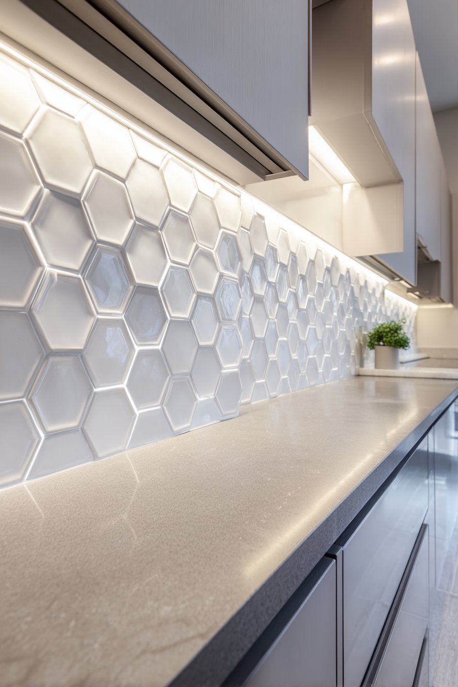
Contemporary kitchen design often embraces geometric forms, and this kitchen tile backsplash idea exemplifies how shape can become the star of the show. The hexagonal porcelain tiles arranged in a precise honeycomb pattern bring an element of mathematical beauty to the kitchen, their six-sided forms fitting together in perfect tessellation that has fascinated designers and architects for centuries. The matte white finish of these hex tiles creates a soft, sophisticated surface that doesn’t compete for attention but instead provides a subtle textured backdrop that enhances rather than overwhelms the kitchen’s overall design. The perfectly aligned grout lines in light grey trace the geometric pattern with precision, creating a network of lines that adds visual complexity while maintaining the clean, modern aesthetic.
What makes hexagonal tiles particularly compelling is their three-dimensional quality—even though the tiles themselves are flat, the pattern creates the optical impression of depth and dimension as the eye follows the interlocking shapes. This perceptual depth adds visual interest without requiring actual dimensional elements or relief patterns. The backsplash sits elegantly between sleek grey quartz countertops below and minimalist flat-panel cabinets above, creating a harmonious transition between these horizontal planes. The neutral color palette—whites, greys, and the natural tones of the quartz—allows the geometric form to take center stage, proving that dramatic design impact doesn’t require bold colors or busy patterns.
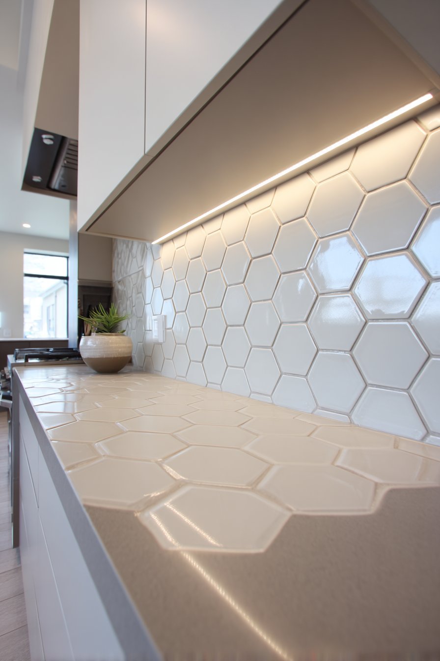
Under-cabinet LED lighting plays a crucial role in activating this design, illuminating the tile surface from above and creating subtle shadows at each grout line that emphasize the geometric precision of the installation. This top-down lighting also serves the practical purpose of illuminating the countertop workspace, making food preparation safer and more pleasant. The wide-angle interior design photography captures the full pattern while maintaining correct spatial proportions, showing how the repetitive hexagonal forms create rhythm and visual movement across the entire backsplash surface. The balanced exposure ensures that both the tiles’ surface texture and the shadowing that gives the pattern depth are clearly visible.
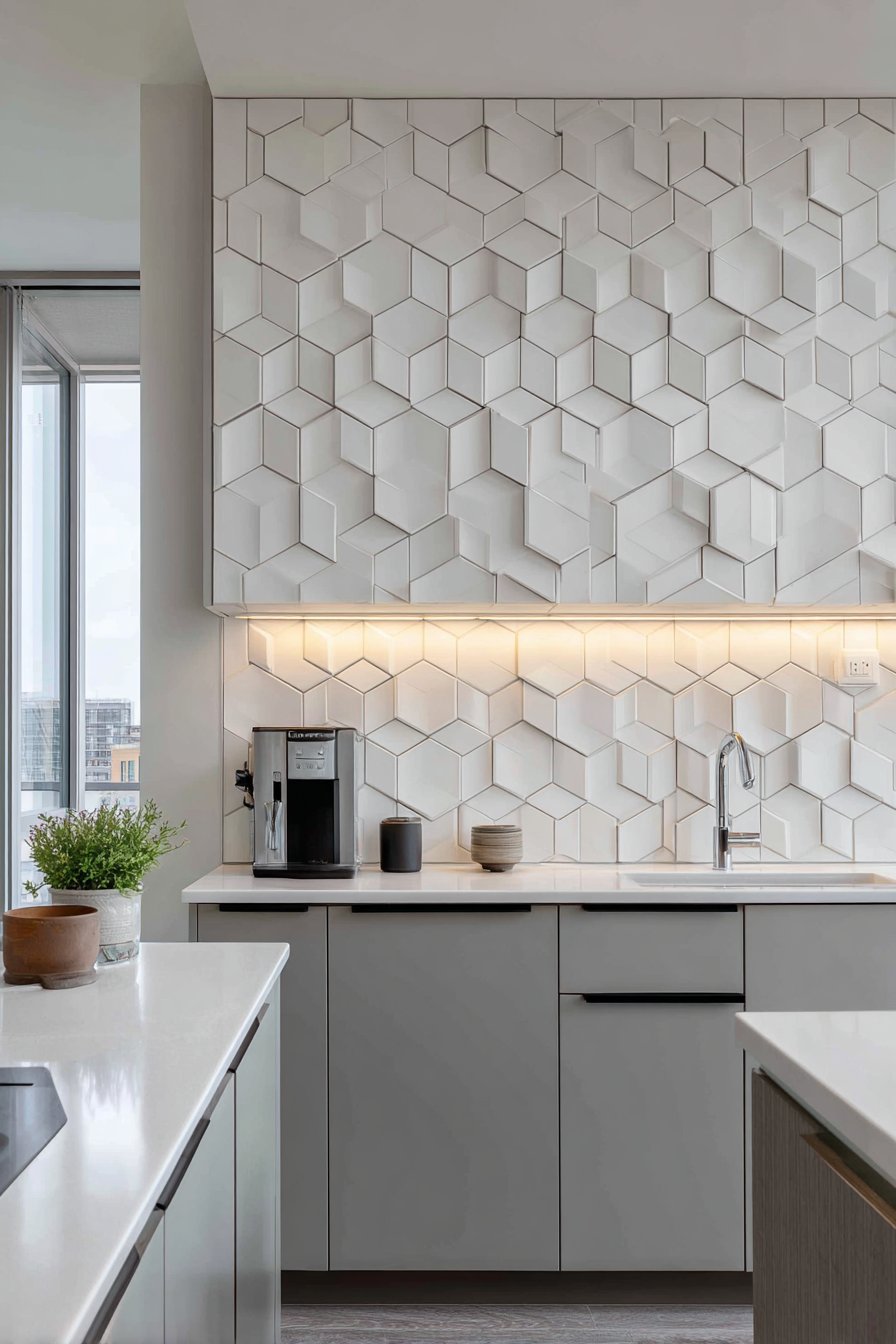
Key Design Tips: Hexagonal tiles require more complex installation than rectangular formats; ensure your installer has experience with geometric patterns. The honeycomb pattern creates visual density, so it works best in kitchens with relatively simple cabinetry and minimal upper cabinet decoration. Consider the grout color carefully—it can either blend to minimize the pattern’s visual weight or contrast to emphasize the geometric structure. When planning your layout, create a detailed drawing showing how the pattern will meet corners, outlets, and cabinet edges to avoid awkward partial tiles. Hexagonal tiles are available in various sizes; smaller hexagons create busier, more textured appearances while larger formats make bolder contemporary statements. Pair geometric backsplashes with simple, streamlined fixtures and hardware to maintain visual balance.
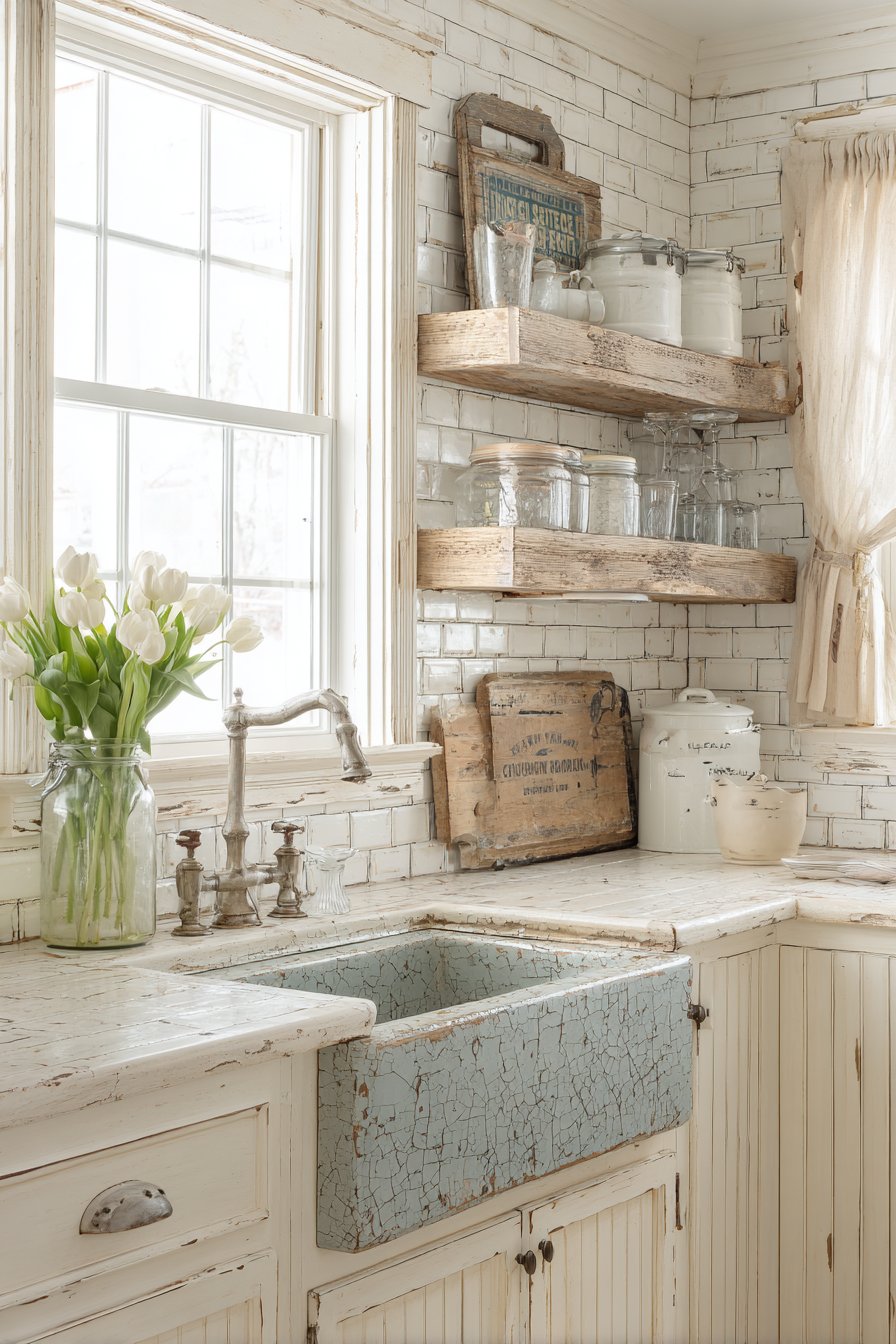
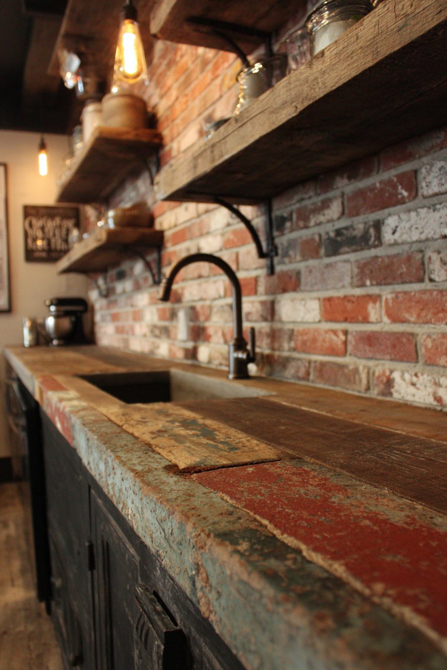
4. Rustic Handmade Terracotta Warmth
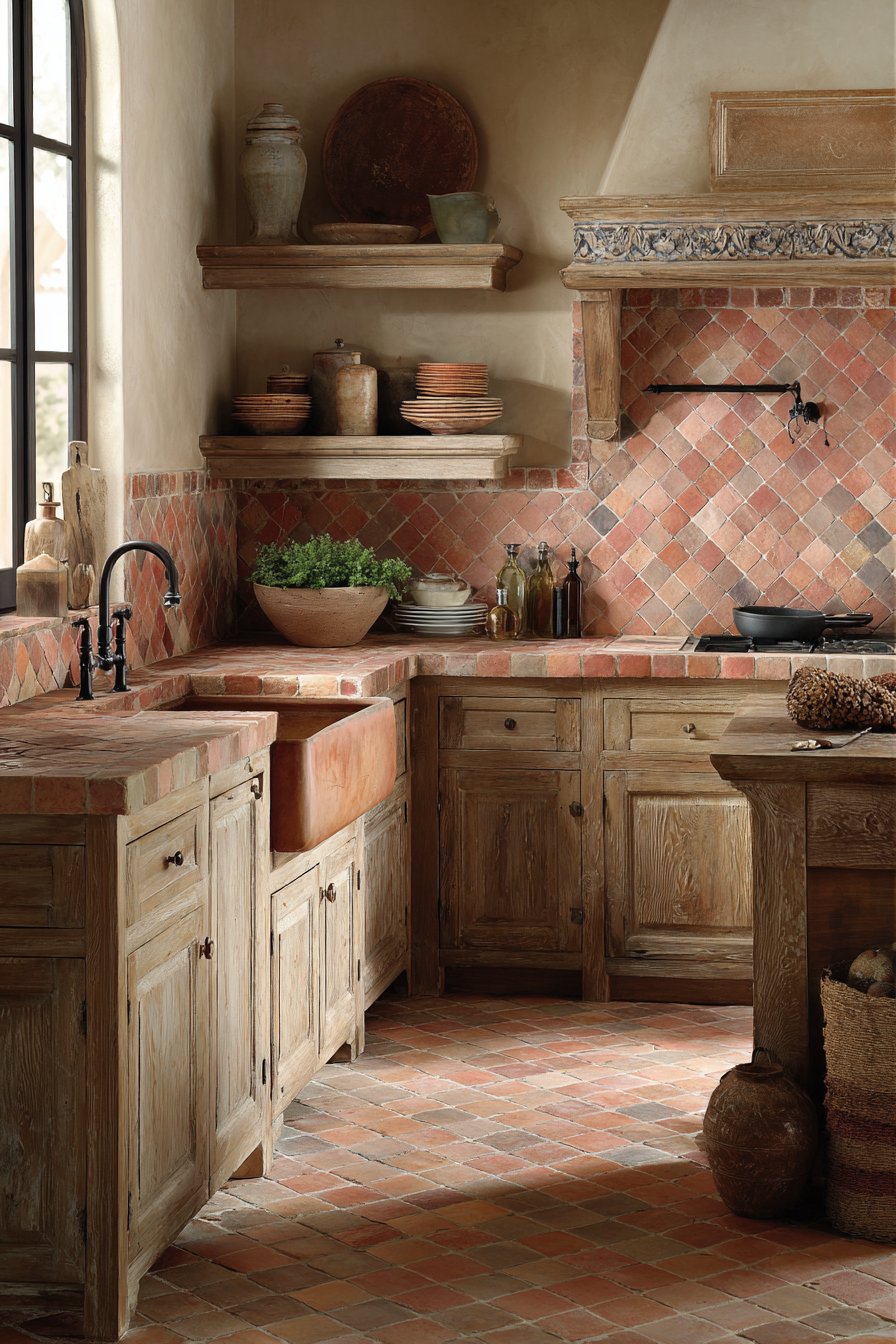
There’s something deeply appealing about handcrafted elements in kitchen design, and this kitchen tile backsplash idea celebrates artisan craftsmanship through handmade terracotta tiles that bring organic warmth and authentic character to the cooking space. Each tile displays natural color variations ranging from pale coral to deep rust, a spectrum of warm earth tones that reflects the natural variation in clay and firing processes rather than industrial uniformity. These subtle differences—along with slight surface irregularities and gentle undulations—mark each tile as genuinely handcrafted, creating a backsplash installation where every tile contributes its own unique character to the overall composition. This kitchen tile backsplash approach particularly suits homes where cooking is viewed not just as a task but as a craft, where the kitchen itself celebrates handmade traditions and artisanal values.
The terracotta’s warm, earthy palette creates an immediate sense of coziness and approachability, transforming the kitchen from a sterile workspace into a welcoming hearth. This warmth is amplified by the pairing with butcher block countertops, whose natural wood grain and honey tones complement the clay tiles beautifully, creating a material conversation between two natural, organic surfaces. Natural wood cabinetry continues this theme, establishing a kitchen environment where natural materials predominate and synthetic surfaces take a back seat. This material honesty—showing wood grain, clay texture, and honest construction—creates spaces that feel grounded and authentic rather than slick and manufactured.
Warm ambient lighting enhances the terracotta’s inherent richness, casting a golden glow across the textured tile surface that emphasizes the handcrafted qualities. As light moves across the varied surface, it catches subtle ridges and dips, creating micro-shadows that give each tile dimensionality and presence. The interior photography approach emphasizes material authenticity, capturing the natural imperfections—slight warping, color variation, surface texture—as assets rather than flaws, celebrating the beauty of the handmade in an increasingly mass-produced world. This honest presentation shows potential homeowners how embracing imperfection can lead to more characterful, personalized kitchen spaces.
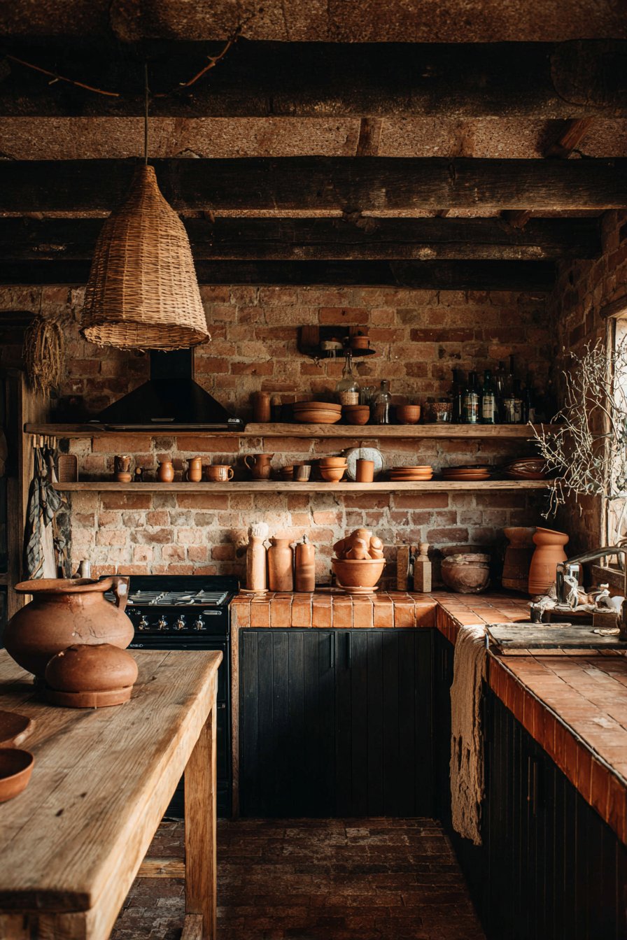
Key Design Tips: Handmade terracotta tiles are porous and must be sealed properly before installation and periodically thereafter to protect against staining and moisture absorption. Embrace the natural variation in color and surface texture as part of the tiles’ charm rather than seeking uniformity. These tiles work particularly well in Mediterranean, Spanish Colonial, Tuscan, and Southwest design schemes where their authentic earthiness feels contextually appropriate. Consider leaving grout lines slightly wider than standard to accommodate the slight size variations common in handmade tiles. When cleaning terracotta, avoid harsh chemicals that can damage the sealant and affect the tile’s natural patina development. Pair with other natural materials—wood, stone, copper, iron—to create cohesive material stories throughout the kitchen.
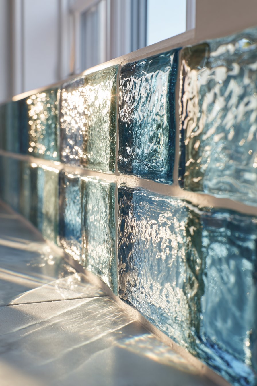
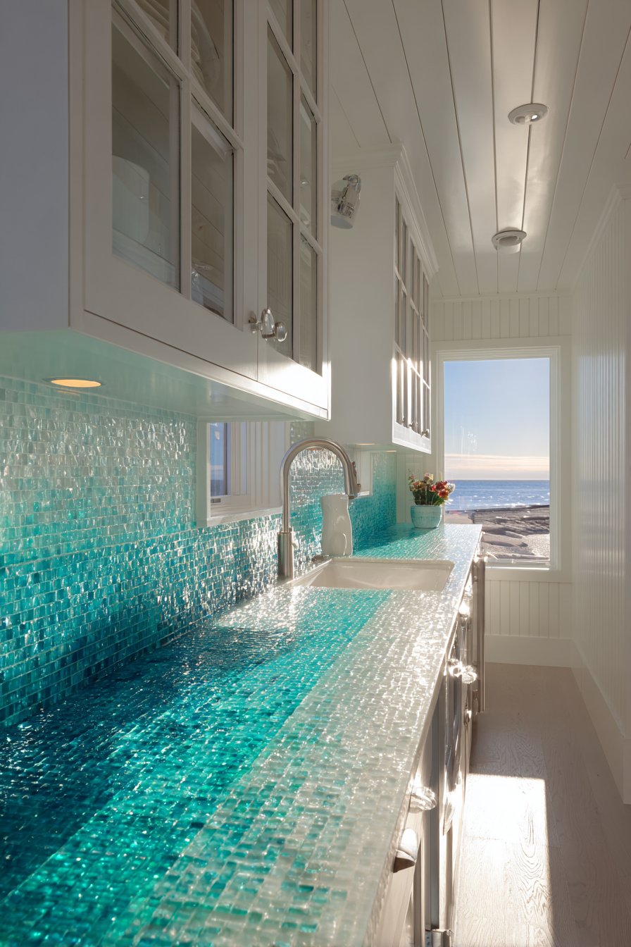
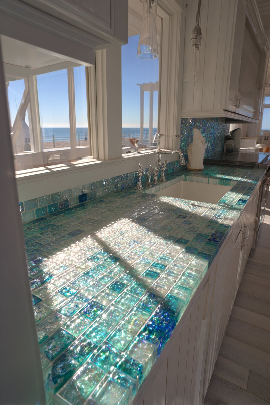
5. Sleek Reflective Glass Subway in Ocean Blue
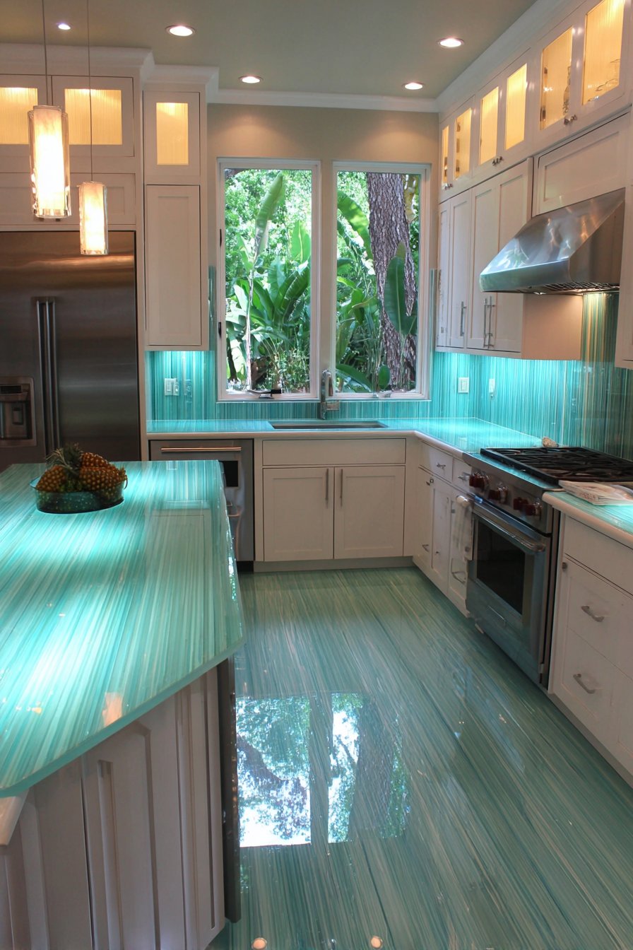
Glass tiles bring unique properties to kitchen backsplash design—properties that this ocean blue interpretation exploits beautifully to create a kitchen tile backsplash that feels luminous, dynamic, and refreshingly different from traditional ceramic options. The 2×4 inch glass subway tiles in varying shades of blue create a cohesive yet subtly varied color field reminiscent of shallow tropical waters, where depth perception shifts with changing light conditions. Each tile’s subtle rippled texture catches and refracts light in complex ways, creating an ever-changing play of highlights and reflections that gives the backsplash a living quality. Unlike opaque tiles that simply reflect light from their surface, these translucent glass tiles allow light to penetrate slightly before reflecting back, creating a sense of depth and luminosity impossible to achieve with standard materials.
The color choice proves both bold and versatile—blue brings associations with water, cleanliness, tranquility, and freshness, making it psychologically appropriate for kitchen environments while providing a striking counterpoint to the neutral tones that dominate many kitchens. Against white quartz countertops and crisp white cabinetry, the blue backsplash becomes the kitchen’s clear focal point, the element that draws the eye and gives the space its distinctive character. This demonstrates an important design principle: when most surfaces remain neutral, a single colorful element can transform the entire room’s personality without overwhelming.

Natural window light performs magic with glass tiles, creating dancing reflections that move as the sun’s angle changes throughout the day and as people move through the space. This dynamic quality means the backsplash never appears static or boring—it’s constantly creating new patterns of light and color. The professional interior photography captures this interplay between light and transparent material, showing how the tiles’ edges glow when backlit, how reflections create bright spots against the blue field, and how the overall effect creates depth rather than appearing as a flat colored surface. The translucent quality allows light to pass through partially, creating a sense that the backsplash has dimension beyond its actual physical depth.
Key Design Tips: Glass tiles are more expensive than ceramic options but offer unique aesthetic qualities that justify the investment for feature areas. The translucent nature of glass makes the adhesive and substrate visible through the tile, so white thinset and smooth substrate preparation are essential for clean appearance. Glass tiles can be more challenging to cut than ceramic, requiring proper scoring tools and techniques to prevent chipping. The reflective surface shows fingerprints, water spots, and splashes easily, requiring more frequent cleaning to maintain the pristine appearance. Consider glass tiles’ light-reflecting properties when planning kitchen lighting—they can help bounce light around darker spaces. Pair glass backsplashes with simple cabinetry and minimal upper cabinet decoration to let the tiles’ special qualities shine without visual competition.
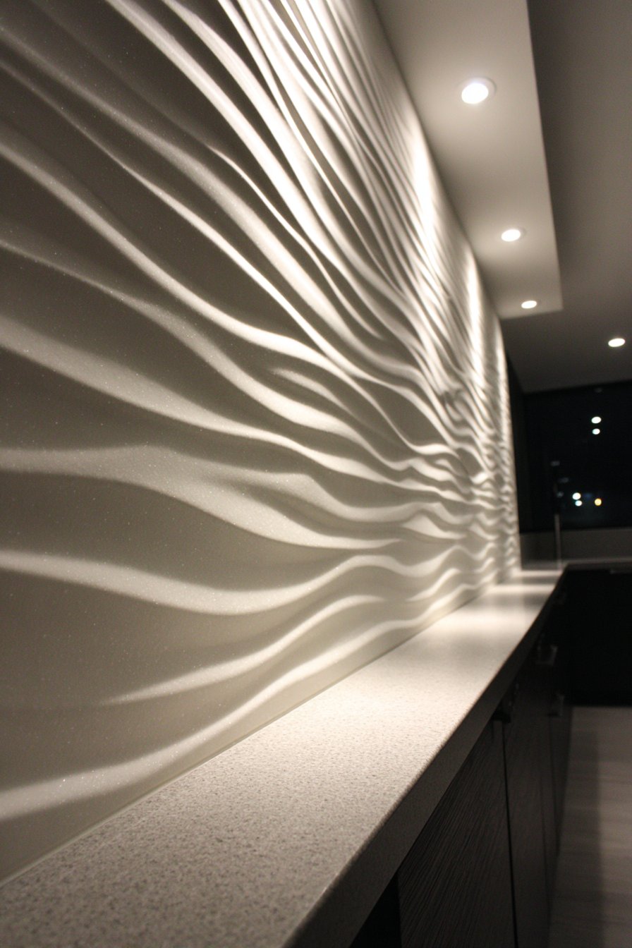
6. Dramatic 3D Textured Wave Pattern
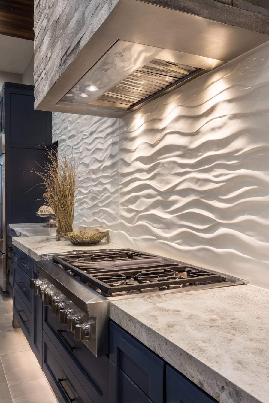
Texture adds a dimension to design that flat surfaces cannot match, and this kitchen tile backsplash idea demonstrates how three-dimensional relief can transform a wall treatment from background element to sculptural focal point. The raised wave-pattern ceramic tiles in matte white create undulating surfaces that catch light and cast shadows, their dimensional quality adding dramatic visual interest despite the monochromatic color scheme. Each tile features a carefully molded surface that rises and falls in rhythmic waves, and when installed in sequence, these individual elements combine to create larger patterns of light and shadow that flow across the entire backsplash installation. This sculptural quality brings an artistic, almost gallery-like sophistication to the kitchen, elevating it beyond simple function into the realm of considered design.
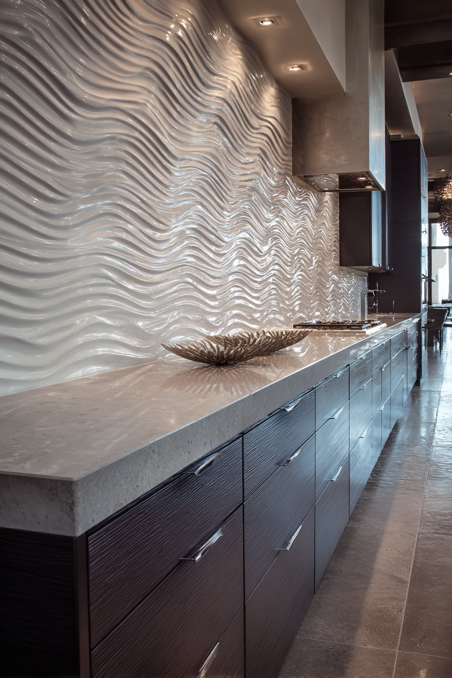
The matte white finish proves essential to the design’s success—it provides enough surface contrast to make the relief pattern clearly visible without the distracting reflections that glossy finishes would introduce. The shadows become the design element here, dark lines and patches that shift position and intensity as lighting conditions change. During bright morning light, the shadows might be sharp and dramatic; in softer afternoon light, they become gentler and more subtle. Evening artificial lighting creates yet another shadow pattern, especially when the recessed lighting is strategically positioned to graze across the textured surface at an angle. This changing shadow play means the backsplash offers visual variety throughout the day without any change to the physical installation.
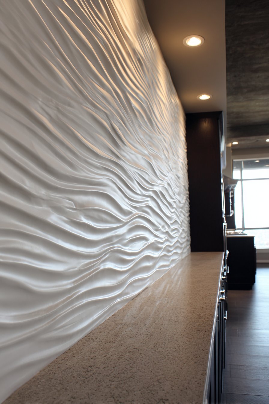
Grey stone countertops provide grounding weight below the lighter backsplash, while dark navy cabinetry creates sophisticated contrast that makes the white tiles appear even more luminous and sculptural. This dark-light pairing creates strong visual hierarchy and prevents the white backsplash from appearing to float without context. The recessed lighting positioned specifically to emphasize the relief pattern deserves special mention—lighting directed perpendicular to the wall would minimize shadows and flatten the appearance, but grazing light that skims across at an angle maximizes shadow depth and emphasizes the dimensional quality that makes this backsplash special. The interior design photography focuses particularly on dimensional texture and shadow detail, capturing the interplay between light and form that defines this installation.
Key Design Tips: Three-dimensional tiles require careful consideration of lighting placement to achieve maximum dramatic effect—plan lighting angles during the design phase rather than as an afterthought. These dimensional tiles tend to be more expensive than flat alternatives and may require more complex installation, particularly around outlets and corners where the relief pattern complicates cutting. The textured surface creates more crevices where grease and grime can accumulate, so consider whether you’re willing to invest extra cleaning time for the aesthetic impact. Use 3D tiles judiciously—they make powerful statements but can overwhelm if overused throughout large kitchen installations. Consider installing dimensional tiles on a feature wall or in the range area while using simpler tiles in less visible locations to balance impact with budget. Avoid busy patterns on adjacent surfaces; let the textured backsplash be the star.
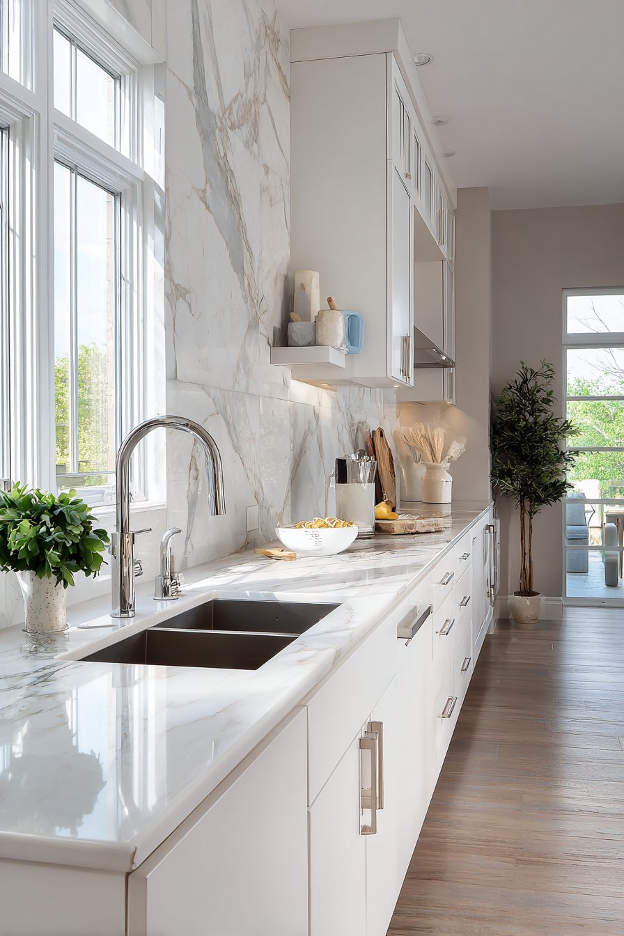
7. Contemporary Large-Format Marble Slabs
Modern kitchen design increasingly embraces the minimalist aesthetic of fewer grout lines, and this kitchen tile backsplash idea takes that principle to its logical conclusion with large-format porcelain slabs that create nearly continuous surface. These expansive panels feature realistic marble veining in sophisticated grey and white tones, their generous size dramatically reducing grout lines and creating seamless visual flow that traditional smaller tiles cannot match. The book-matched pattern—where two consecutive slabs from the same production are installed as mirror images—creates symmetrical veining that draws the eye to the center seam and adds formal elegance to the installation. This mirror-image effect occurs naturally when book-matching stone, where consecutive slabs are opened like a book to reveal matching patterns on facing pages.
The minimal grout lines serve multiple purposes beyond aesthetics—they create a more hygienic surface with fewer crevices where bacteria and mold can develop, they simplify cleaning by reducing grout maintenance, and they create more convincing stone appearance since natural stone in slab form wouldn’t show tile patterns. The veining patterns flow across the large surfaces in naturalistic arrangements that mimic how veins actually appear in quarried stone rather than the repetitive patterns that small tiles inevitably create. This authenticity matters particularly in luxury kitchen installations where the goal is to create the impression of natural stone rather than obviously replicated tile patterns.
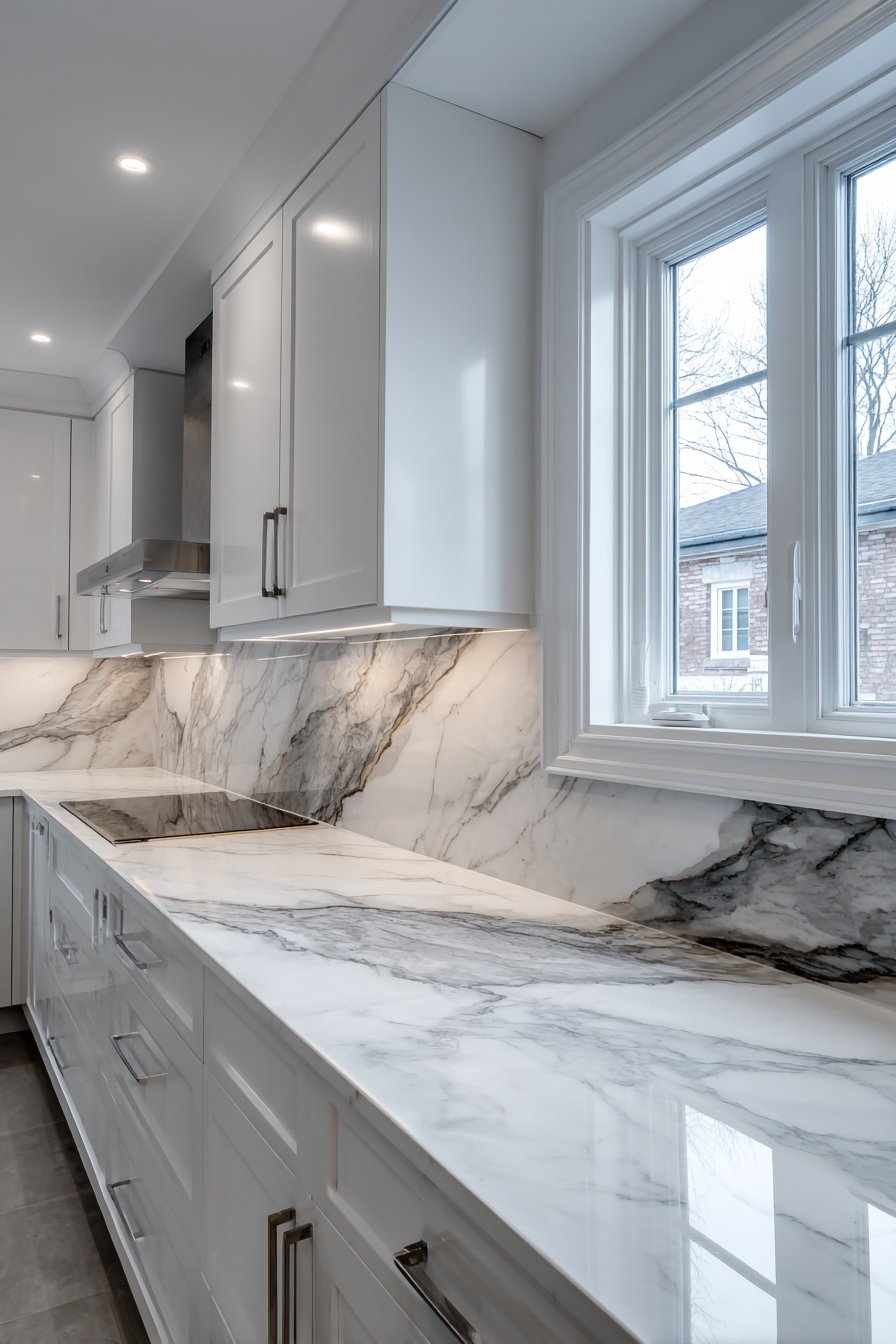
White shaker cabinets and marble-look quartz countertops extend the material continuity throughout the kitchen, creating a cohesive design narrative where surfaces relate to each other through shared material vocabulary. This repetition with variation—marble on the wall, marble-look on the horizontal surfaces—creates visual unity without monotony. Soft diffused natural lighting highlights the authentic stone appearance and subtle variations within the porcelain’s surface, where slight color shifts and vein density changes mirror the way natural stone actually forms. The wide-angle interior photography with balanced exposure shows how the large-format approach creates clean, uninterrupted visual fields that contribute to the kitchen’s serene, sophisticated atmosphere.
Key Design Tips: Large-format tiles require experienced installers with specialized equipment for handling and supporting the weight during installation. The substrate must be perfectly flat as large tiles don’t conform to uneven surfaces the way smaller tiles can. These slabs are significantly more expensive than standard tiles, though the reduced installation time due to fewer pieces may offset some cost difference. Plan carefully for electrical outlets and other wall penetrations—cuts in large slabs are more visible and more costly to correct if errors occur. When book-matching, work with your tile supplier to select consecutive slabs with veining patterns you find appealing, as not all matches create equally attractive symmetry. Consider using large-format tiles on prominent backsplash areas while employing standard tiles in less visible locations to balance aesthetics with budget constraints.
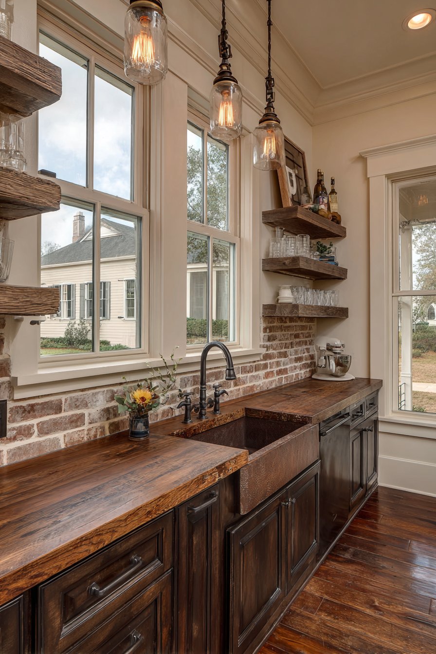
8. Charming Vintage Farmhouse Crackle Glaze
The farmhouse aesthetic has enjoyed renewed popularity in recent years, and this kitchen tile backsplash idea captures that style’s essence through distressed white ceramic tiles with intentional aging effects. The crackle glaze finish creates networks of fine lines across each tile’s surface, mimicking the natural crazing that develops in old glazed ceramics over decades of use and temperature cycling. This manufactured vintage effect delivers instant character and history, making new construction or renovated kitchens feel as though they’ve been loved and used for generations. The subtle color variations within the white palette—some tiles leaning toward cream, others staying crisp white, some showing slight discoloration in corners—add to the authentic aged appearance that defines successful farmhouse design.
The tiles are installed in classic subway pattern with creamy off-white grout that blends rather than contrasts, creating gentle definition without harsh graphic lines. This softer grout choice contributes to the vintage feeling, as historical installations rarely featured the stark white grout and bright white tiles common in contemporary interpretations. The overall effect suggests tiles that have been in place for years, perhaps decades, witnessing countless family meals and holiday gatherings. Reclaimed wood open shelving and a traditional farmhouse sink complement the rustic aesthetic, their own aged surfaces and honest construction methods creating material harmony with the backsplash’s vintage character.
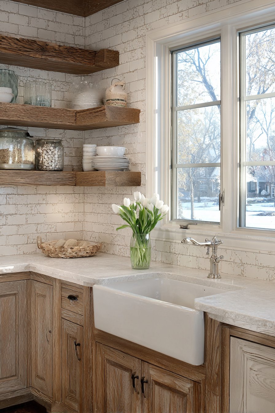
Natural light filtering through cafe curtains creates a warm, lived-in atmosphere that enhances the authentic vintage character. The soft, diffused quality of light through fabric curtains—as opposed to harsh direct sunlight or cool artificial light—adds to the nostalgic feeling. The interior photography approach emphasizes authentic vintage character and material patina, capturing the crackle glaze detail and subtle color variations rather than trying to make the surface appear pristine and new. This honest presentation shows how embracing aged aesthetics can create spaces with soul and personality that sterile new installations often lack.
Key Design Tips: When selecting crackle glaze tiles, examine samples carefully as the aging effects vary significantly between manufacturers—some appear subtly vintage while others look artificially distressed. These tiles work best in farmhouse, cottage, country, and vintage-inspired kitchens where their aged character feels contextually appropriate. The crackle glaze creates additional surface texture where dirt can accumulate, so seal tiles properly and plan for regular cleaning. Pair with other vintage-inspired elements—vintage light fixtures, reclaimed wood, apron-front sinks, oil-rubbed bronze hardware—to create cohesive period-appropriate design. Consider the overall color tone—pure white crackle glaze reads more contemporary, while cream or off-white versions feel more authentically aged. Install with slightly irregular spacing and alignment if you want maximum vintage authenticity, as historical installations rarely achieved the precision of modern tile work.
9. Bold Moroccan-Inspired Cement Patterns
Pattern brings immediate visual energy to any space, and this kitchen tile backsplash idea harnesses that power through Moroccan-inspired cement tiles in sophisticated navy blue, white, and grey geometric designs. Each tile features intricate repeating patterns with perfectly aligned edges, combining to create a complex visual tapestry that transforms the backsplash from simple wall protection to striking artwork. The geometric precision required to create these patterns—where each tile must align exactly with its neighbors for the pattern to read correctly—represents centuries-old tile-making traditions from Morocco and other Mediterranean regions. The matte finish characteristic of authentic cement tiles shows subtle color depth and the slightly irregular surface texture that distinguishes handmade cement tiles from mass-produced ceramic alternatives.
The pattern density and color vibrancy make these tiles statement-makers that naturally become the kitchen’s focal point, commanding attention and giving the space distinctive personality. This bold choice requires confidence and commitment—cement tile patterns announce themselves rather than receding quietly into the background. White countertops and simple white cabinetry provide the necessary neutral backdrop that allows the decorative backsplash to shine without visual competition. This demonstrates an important design principle: when using bold patterns, surrounding elements should remain relatively simple to avoid visual chaos. The restraint shown in the cabinet style, hardware selection, and countertop choice allows the patterned tiles to be fully appreciated.
Balanced ambient lighting ensures pattern details remain clearly visible without harsh shadows that might obscure the intricate designs. The professional interior photography captures pattern precision and color vibrancy, showing how the geometric forms interlock and repeat across the installation. The careful alignment required for these patterns to succeed becomes evident—even slight misalignment would break the visual illusion and reveal the individual tile boundaries rather than creating the unified pattern field. The color combination of navy, grey, and white provides visual impact while remaining sophisticated enough to avoid appearing overly busy or childish.
Key Design Tips: Cement tiles require sealing before and after installation to protect their porous surface from staining—this is non-negotiable in kitchen environments. These tiles are significantly more expensive than standard ceramics due to handcrafted production methods and imported origins. Pattern alignment is critical; hire experienced installers familiar with cement tile installation to ensure proper placement. The porous nature means acidic foods and oils can stain if spills aren’t cleaned promptly, so consider whether your cooking style and maintenance commitment match these tiles’ requirements. When planning your layout, order extra tiles to ensure pattern continuity and to have replacements available if damage occurs. Consider using patterned cement tiles in a smaller feature area—perhaps just behind the range—rather than the entire backsplash to balance impact with budget and maintenance concerns.
10. Minimalist Sage Green Serenity
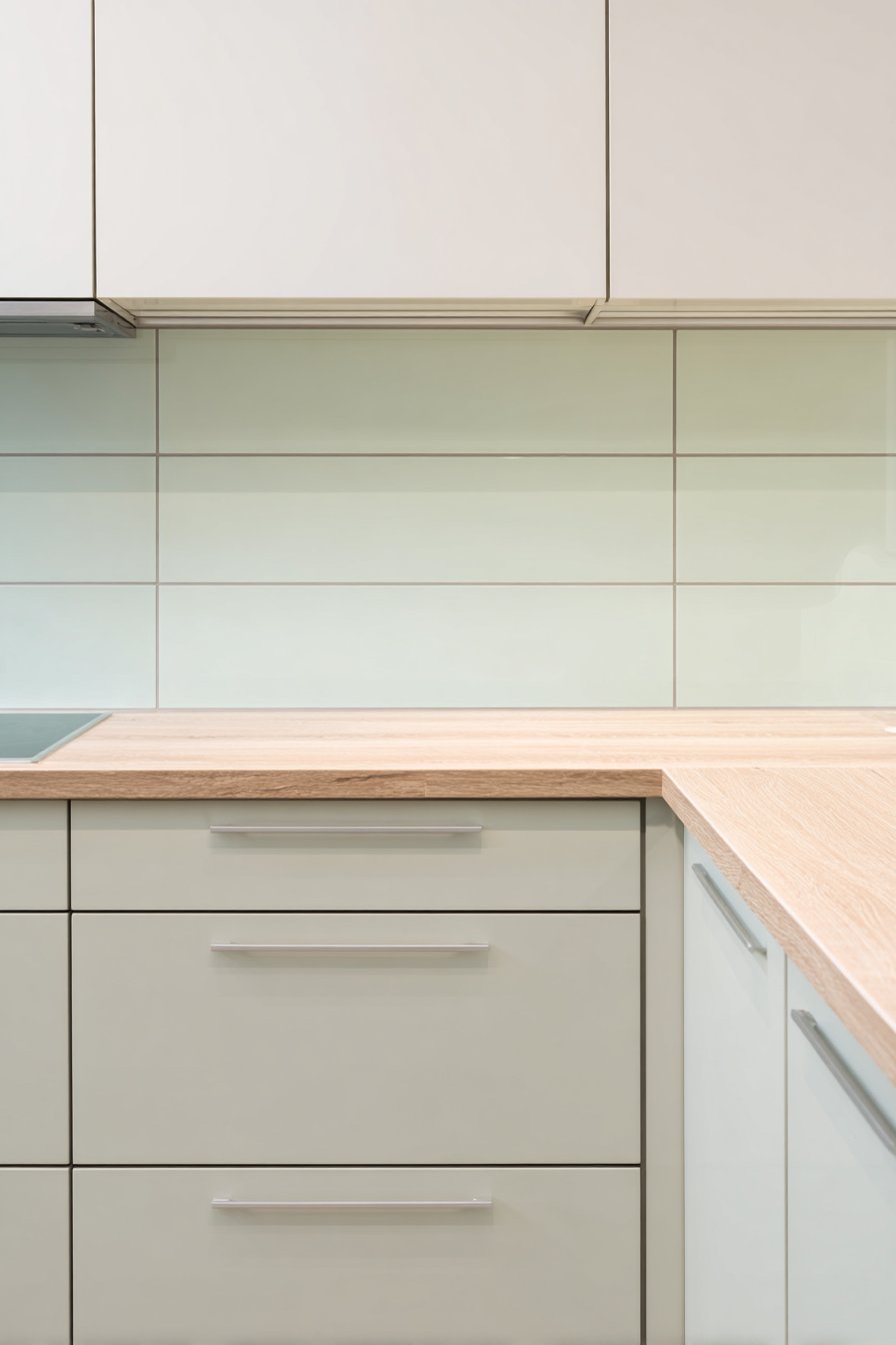
Sometimes the most effective design statements come from restraint and simplicity, and this kitchen tile backsplash idea exemplifies minimalist principles through large rectangular tiles in soft sage green. The clean horizontal lines created by oversized 4×12 inch tiles with thin light grey grout create visual calm and spatial expansion, the elongated format emphasizing the horizontal dimension and making the kitchen feel wider and more open. The monochromatic green palette delivers a soothing, nature-inspired atmosphere that transforms the kitchen into a serene retreat rather than a purely functional workspace. The matte finish provides sophisticated surface quality that avoids the harsh reflections of glossy tiles while still offering smooth surfaces for easy cleaning.
The sage green colorway represents a trend toward organic, nature-connected color palettes in interior design, moving away from the stark white-and-grey combinations that dominated kitchens for the past decade. This gentle green brings associations with growth, renewal, and natural environments—psychological benefits that make time spent in the kitchen more pleasant and restorative. Light wood countertops and pale wood cabinetry maintain the serene Scandinavian aesthetic, their natural tones and simple forms creating harmony with the minimalist tile installation. This material consistency—where wood tones, soft green, and natural light combine—creates a kitchen environment that feels organic and cohesive rather than assembled from disparate elements.
Gentle natural daylight emphasizes the smooth tile surface and even color distribution, showing how the matte finish diffuses light softly rather than creating hot spots of reflection. The wide-angle interior design photography with soft shadows and balanced exposure captures the peaceful atmosphere that minimalist design strives to achieve. The image shows how color can create mood and character without pattern, texture, or embellishment—proof that simplicity, when executed with attention to proportion and color selection, creates powerful and memorable spaces. The thin grout lines almost disappear, allowing the tiles to read as continuous planes of soft color rather than a grid of individual elements.
Key Design Tips: Large-format tiles require flat, well-prepared substrates as any waves or irregularities will telegraph through to the finished surface. The minimal grout lines mean proper initial installation is critical—corrections become more visible with less grout to hide minor imperfections. When selecting colored tiles, view large samples in your actual kitchen lighting at different times of day, as color perception shifts dramatically with changing light conditions. Matte finishes show water spots and fingerprints less readily than glossy surfaces but may require more frequent wiping in heavy-use areas near the sink. The minimalist approach works best when all elements maintain consistency—avoid ornate hardware, busy countertop patterns, or decorative elements that would conflict with the tiles’ simplicity. Consider the psychological impact of color choices; cooler tones like sage green create calm but may feel cold in kitchens with limited natural light.
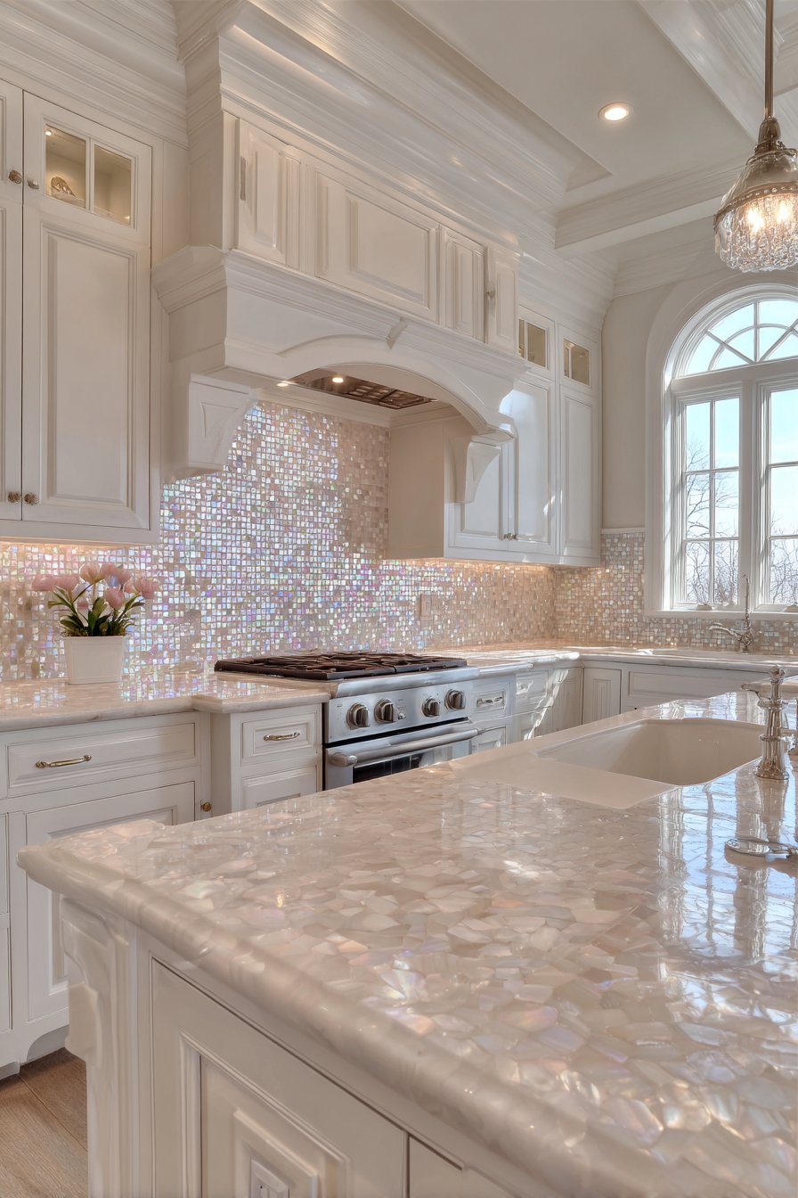
11. Luxurious Mother-of-Pearl Iridescence
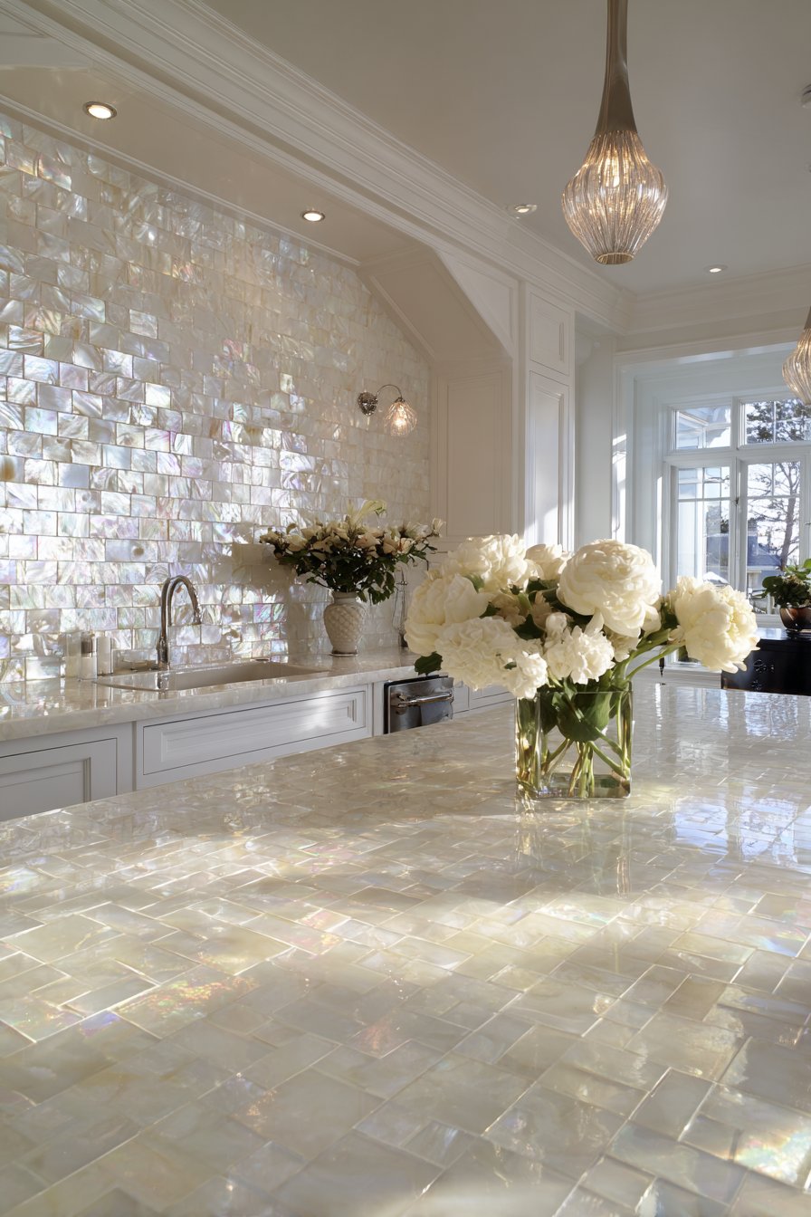
Natural materials bring inherent beauty that manufactured alternatives struggle to replicate, and this kitchen tile backsplash idea showcases nature’s artistry through mother-of-pearl shell tiles that create iridescent shimmer effects. These natural shell mosaic tiles in whites and creams display organic color variations that shift as viewing angles change, their nacreous surfaces reflecting light in rainbow hues that seem to glow from within rather than simply bouncing light back. The small square tiles are precisely arranged in a uniform grid, their careful alignment creating order and structure that allows the shells’ natural beauty to shine without competing with chaotic pattern arrangements. This marriage of natural material and geometric order creates sophisticated elegance that feels both organic and refined.
What makes mother-of-pearl particularly compelling for kitchen applications is how it catches and multiplies available light, functioning almost like tiny mirrors but with far more visual interest than reflective glass or metal. Each shell tile’s surface shows natural growth lines and organic texture that machine-made materials cannot duplicate—these are actual shell pieces, each with its own unique formation history. Polished white marble countertops and glossy white cabinetry enhance the elegant aesthetic, their smooth, reflective surfaces creating material conversation with the pearlescent tiles. This repetition of luminous, light-catching surfaces throughout the kitchen creates an overall brightness and sense of luxury that more matte materials couldn’t achieve.
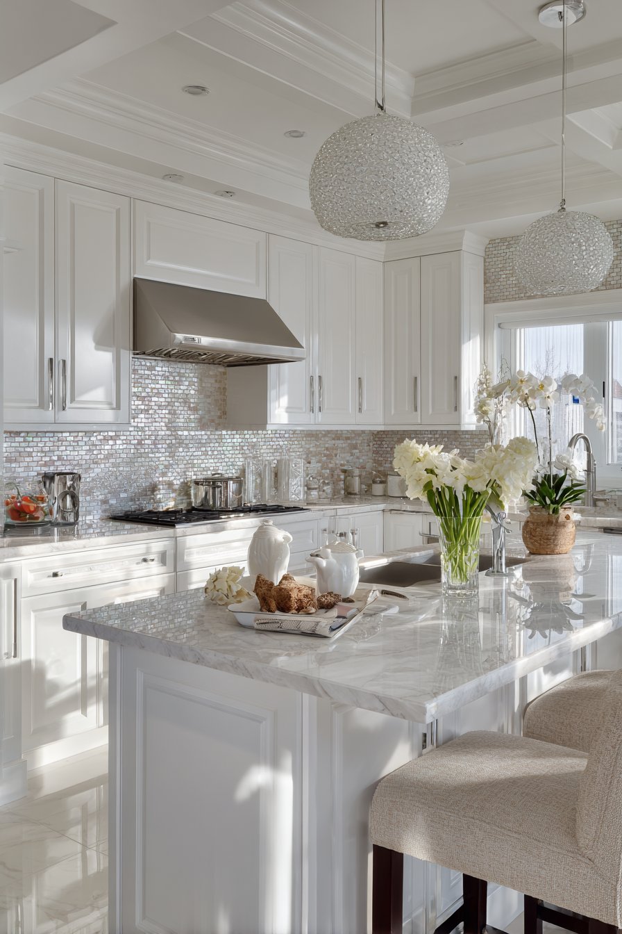
Natural and pendant lighting create multiple light sources that activate the pearlescent quality from different angles simultaneously, maximizing the iridescent effect. A single light source would create lovely shimmer, but multiple sources multiply that effect, creating complex patterns of rainbow highlights across the backsplash surface. The interior photography captures the luminous material properties and light reflection, though still photography can only hint at how dramatically these tiles change appearance as you move through the space and see them from different angles. The authentic shell material provides visual interest that remains engaging over time rather than becoming familiar and ignored.
Key Design Tips: Mother-of-pearl tiles are among the most expensive backsplash options due to their natural material and labor-intensive production, so budget accordingly. The natural material shows variation between tiles and even within individual tiles—this is a feature, not a flaw, but requires accepting that the installation won’t appear perfectly uniform. Shell tiles are more delicate than ceramic or porcelain and can crack if subjected to impact, so position carefully in relation to high-activity areas. The organic material requires gentler cleaning products than manufactured tiles—harsh chemicals can damage the nacre surface. Plan lighting carefully to maximize the iridescent effect; the tiles’ special qualities are wasted in poorly lit kitchens. Consider using mother-of-pearl tiles as accent bands or in small feature areas rather than entire backsplash installations to balance luxury impact with budget realities.
12. Transitional Two-Tile Combination Design
Sophisticated design often comes from successfully combining multiple elements, and this kitchen tile backsplash idea demonstrates that principle through a divided layout featuring two complementary tile types. The main wall area features white beveled subway tiles—classic elements that provide clean background and subtle dimensional interest through their angled edges—while a decorative border of small hexagonal mosaic tiles in mixed grey tones creates visual punctuation and adds pattern interest. This two-tile approach allows for creative expression through the decorative border while maintaining the practical simplicity of larger tiles for the main field, which proves easier to clean and maintain than small mosaics throughout.
The beveled edge on the subway tiles deserves mention—this detail adds subtle shadow lines where each tile’s edge catches light, creating more visual interest than flat tiles without the maintenance challenges of deeply textured relief patterns. These gentle shadows give the backsplash dimensionality and prevent it from appearing completely flat and one-dimensional. The transition between the two tile types is handled with clean lines and careful planning, ensuring the mosaic border reads as intentional design feature rather than appearing as an afterthought or correction. Grey quartz countertops and white cabinetry with brushed nickel hardware complete the transitional style, which seeks to bridge traditional and contemporary aesthetics by combining elements from both vocabularies.
Layered lighting from both natural and recessed sources ensures the backsplash appears properly illuminated throughout the day, with artificial lighting supplementing natural daylight to maintain consistent visibility during evening hours. The professional interior photography shows the successful integration of multiple tile styles, capturing how the two different tile types and scales work together to create a cohesive whole rather than appearing as separate, disconnected elements. The color coordination—whites and greys throughout—unifies the different patterns and scales, proving that variety in form can coexist with consistency in color.
Key Design Tips: When combining tile types, plan the layout carefully before installation to ensure proper proportions and alignment between different elements. Order all tiles simultaneously to ensure color matching between different tile types from potentially different manufacturers. The transitional point between tile types requires careful execution—consider using trim pieces or careful cutting to create clean edges rather than awkward meet-ups. Limit combinations to two or at most three different tile types; more variety typically creates visual chaos rather than interesting complexity. When mixing tile scales, ensure proper proportion—tiny mosaics with huge slabs rarely works, but combining subway tiles with somewhat smaller mosaic borders creates successful scale relationships. Consider maintenance implications; intricate mosaic sections require more cleaning effort than larger field tiles, so use decorative elements strategically rather than extensively.
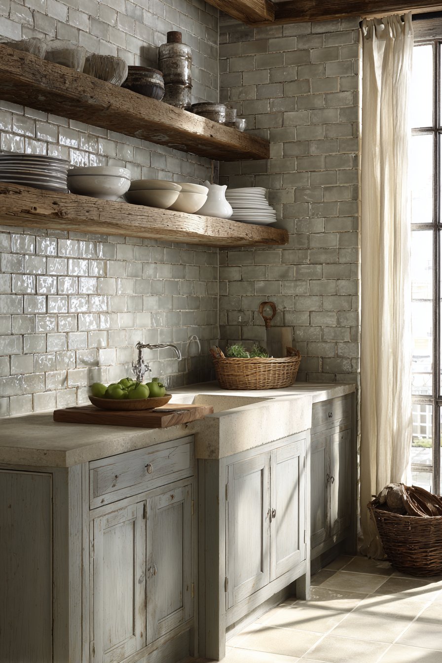
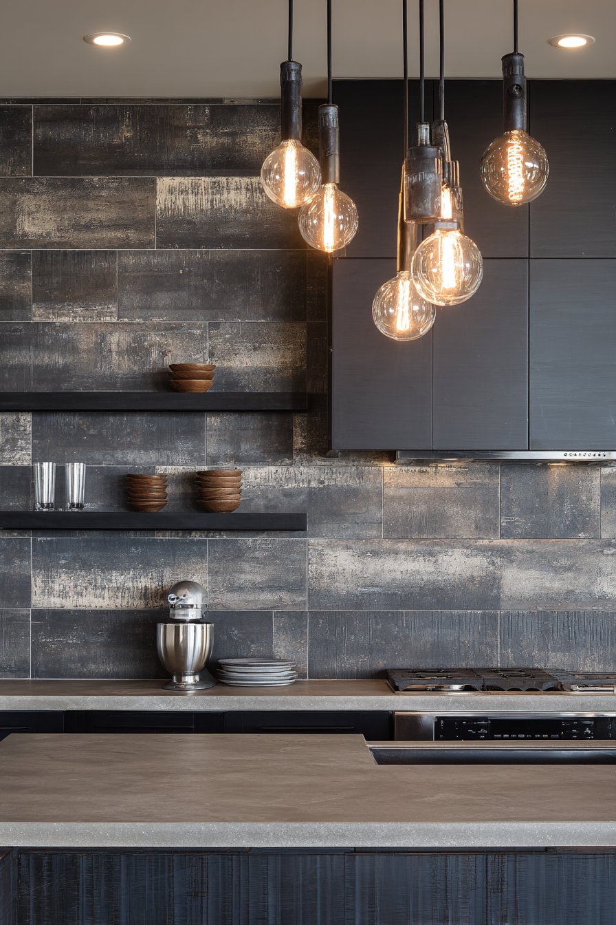
13. Industrial Charcoal Concrete Aesthetic
Industrial design aesthetics have moved from commercial lofts into mainstream residential kitchens, and this kitchen tile backsplash idea captures that urban edge through dark charcoal porcelain tiles with concrete-look texture. The matte-finish rectangular tiles display subtle surface variation that mimics poured concrete’s natural appearance—slight tonal shifts, faint texture patterns, and understated aggregate effects that reference industrial materials without their impracticality. The stacked bond pattern, where tiles align vertically in columns rather than offsetting in brick pattern, creates strong horizontal emphasis that makes the kitchen feel wider and more expansive while reinforcing the industrial aesthetic’s preference for honest, straightforward construction methods.
Dark grout lines emphasize the horizontal stacking arrangement, creating strong linear definition that becomes a design element in itself rather than trying to disappear. This graphic quality suits the industrial style’s embrace of structural honesty and functional beauty—why hide the grout lines when they can contribute to the overall aesthetic? Concrete countertops and metal open shelving reinforce the industrial theme through material choices that reference warehouse and factory environments. These raw materials—concrete, metal, dark tile suggesting poured floors—create authentic industrial character rather than superficial styling. The rough, matte surfaces throughout absorb light rather than reflecting it, contributing to the moody, sophisticated atmosphere.
Edison bulb pendant lighting casts warm light on the dark tile surface, creating dramatic contrast between the illuminated areas and shadowed sections. This lighting choice proves essential—industrial spaces with their typically darker palettes require strategic lighting to remain inviting rather than oppressive. The warm incandescent glow softens what could otherwise feel too hard or cold, while the vintage Edison bulb style references industrial-era lighting technology. The interior design photography with moody lighting emphasizes texture and urban sophistication, capturing the atmospheric quality that defines successful industrial interiors—spaces that feel edgy and unconventional while remaining comfortable and livable.
Key Design Tips: Dark tiles show dust, fingerprints, and water spots readily, requiring frequent maintenance to maintain their dramatic appearance—consider whether your cleaning habits match these demands. Industrial aesthetics work best with appropriate architectural context; they can feel out of place in traditional homes with formal detailing. Balance dark surfaces with adequate lighting—both natural and artificial—to prevent spaces from feeling cave-like. The concrete-look tiles provide industrial character without concrete’s porosity and staining issues, making them more practical for kitchen applications. When creating industrial kitchens, mix hard materials (concrete, metal, dark tile) with warm elements (wood, warm lighting, textiles) to prevent excessively cold atmospheres. Consider using dark dramatic tiles on a single feature wall rather than throughout large spaces to maintain visual impact without overwhelming the room.
14. Coastal Aqua Glass Gradient
Color gradients bring dynamic visual interest that solid colors cannot match, and this kitchen tile backsplash idea employs that technique through aqua and turquoise glass tiles that create an ocean-inspired color transition. Small square glass mosaic tiles shift gradually from light seafoam at the countertop to deeper turquoise near the cabinets, mimicking how water color deepens with increasing depth. This vertical gradient creates natural upward visual movement, drawing the eye from the work surface toward the cabinets and creating the impression of greater height. The translucent tiles capture and reflect light beautifully, their glass composition allowing light to pass partially through before bouncing back, creating luminous depth that opaque tiles cannot achieve.
The ocean-inspired color palette brings psychological benefits beyond mere aesthetics—blues and blue-greens are widely recognized as calming colors that reduce stress and create peaceful environments. In kitchens, which can become hectic and stressful during meal preparation, this color-induced calm provides tangible benefits. White beadboard cabinetry and light grey countertops maintain the beach house aesthetic, their casual, coastal-appropriate styles and neutral tones providing perfect backdrop for the colorful gradient backsplash. The beadboard’s vertical lines create textural interest and regional character without competing with the tiles’ color show.
Natural sunlight streaming through nearby windows creates sparkling reflections across the glass surface, activating the tiles’ special light-catching properties. Glass tiles in these bright colors seem to glow when backlit, creating almost jewelry-like beauty. The interior photography emphasizes the color gradient and luminous glass properties, capturing how the color shift occurs smoothly across multiple tile rows rather than in abrupt steps. The translucent quality means the tiles don’t just sit on the wall surface—they seem to have depth, as though you could see into them, creating visual richness that adds perceived value and sophistication.
Key Design Tips: Creating smooth gradients requires careful color selection and planning before installation—lay out the color progression before adhering tiles to ensure satisfying transitions. Glass mosaic tiles typically come in sheets with mesh backing for easier installation, but you may need to custom-order specific color sequences for gradient effects. The small tile size means extensive grout lines; ensure thorough sealing as glass tiles themselves are impervious but grout remains vulnerable to staining. Colored glass tiles fade if exposed to direct, intense sunlight over years, so consider window treatments if large windows face the backsplash. When designing gradients, odd numbers of color steps typically create more pleasing progressions than even numbers. Consider the gradient direction carefully—vertical gradients create height while horizontal transitions can make narrow kitchens appear wider.
15. Contemporary Vertical Subway Orientation
Sometimes the most effective innovations come from simply changing perspective on familiar elements, and this kitchen tile backsplash idea demonstrates that principle through vertically installed subway tiles in a stacked vertical pattern. The same classic white ceramic subway tiles that have graced kitchen walls for over a century gain contemporary edge when rotated 90 degrees and stacked in columns rather than offset in traditional brick pattern. This orientation change creates strong vertical lines that draw the eye upward, making standard-height ceilings appear taller and compact kitchens feel more spacious. The glossy finish with bright white grout creates crisp vertical lines that become graphic elements in their own right, transforming familiar materials into fresh contemporary statements.
The vertical orientation also affects how light interacts with the tiles—instead of horizontal rows creating horizontal shadow lines, the vertical arrangement produces vertical shadow patterns that change throughout the day as light angles shift. This creates different visual texture than horizontal installations while using identical tile materials. Dark grey shaker cabinets provide modern contrast that makes the white backsplash appear even more luminous and emphasizes the vertical rhythm. This dark-light pairing creates strong visual hierarchy and contemporary sophistication that moves the kitchen aesthetic firmly into current design territory rather than traditional interpretations.
Under-cabinet lighting illuminates the tile surface from above, creating subtle shadows between tiles that emphasize the vertical stacking pattern. This top-down lighting proves essential for bringing out the installation’s dimensional qualities—without it, the pattern might appear flatter and less interesting. The wide-angle interior photography captures the full vertical rhythm and spatial proportion, showing how the repeated vertical elements create visual movement that carries the eye upward. The professional lighting ensures balanced exposure that reveals both the pristine white tiles and the subtle shadows that give the installation depth and character.
Key Design Tips: Vertical tile orientation works particularly well in kitchens with low ceilings where every height-emphasizing trick contributes to better spatial proportion. Ensure tiles are truly vertical by using a level during installation—slight deviation from perfect vertical will be obvious with this orientation. Consider the practical implications of vertical orientation near sinks and ranges where water and grease tend to run downward; vertical grout lines may show staining patterns differently than horizontal arrangements. The contemporary look requires appropriate context; vertical subway tiles may appear out of place in traditional or period homes. When using vertical orientation, maintain simplicity in surrounding elements to let the orientation itself provide the visual interest. Consider extending the vertical tile installation to ceiling height rather than stopping at standard backsplash height to maximize the ceiling-heightening effect.
16. Vibrant Hand-Painted Talavera Folk Art
Cultural influences add richness and personality to kitchen design, and this kitchen tile backsplash idea celebrates Mexican artisan traditions through hand-painted Talavera-style ceramic tiles. Each tile features colorful folk art patterns in blues, yellows, and greens against terracotta backgrounds, the traditional color palette and design motifs referencing centuries-old pottery traditions from Puebla, Mexico. The hand-painted nature means each tile displays unique variations and authentic artisan quality—slight differences in line weight, color intensity, and pattern placement that mark each tile as individually crafted rather than mass-produced. This handmade authenticity brings warmth and humanity to kitchen spaces, reminding us that real people with real skills created these beautiful objects.
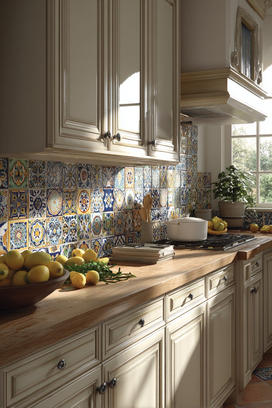
The vibrant colors and intricate patterns transform the backsplash from mere wall protection into genuine artwork that gives the kitchen distinctive cultural character. This bold choice suits homeowners who appreciate traditional crafts, cultural authenticity, and the courage to embrace color and pattern rather than playing it safe with neutral minimalism. Natural wood countertops and cream-colored cabinetry complement the vibrant tile work without competing for attention, their neutral tones and simple forms providing the visual rest areas that allow the patterned tiles to shine. The warm wood tones also harmonize with the terracotta backgrounds, creating color relationships that unify the kitchen’s various elements.
Natural daylight highlights the glossy glaze and hand-painted details, the light catching variations in the thick glaze where pigments pool slightly deeper in recessed areas and thin to paler tones on raised surfaces. The interior photography focuses on individual tile artistry and overall pattern composition, capturing both the micro-level detail of hand-painted motifs and the macro-level effect of multiple patterned tiles combining to create a complex, visually rich surface. The authentic folk art aesthetic brings joy and cultural depth that manufactured patterns cannot replicate, creating kitchens with soul and distinctive personality.
Key Design Tips: Authentic hand-painted Talavera tiles are significantly more expensive than printed pattern tiles due to artisan labor and imported origins from Mexico. Each tile’s uniqueness means accepting variation as part of the design—perfectionists seeking uniformity should look elsewhere. The busy patterns work best as accent areas or in smaller kitchens where the visual density doesn’t overwhelm; consider featuring them behind the range or on a single wall rather than throughout large kitchen installations. The glossy traditional glazing creates reflective surfaces that catch grease and show fingerprints, requiring regular cleaning. When working with hand-painted tiles, select from available stock rather than expecting to reorder exact matches later, as artisan production means tiles from different batches may vary. Pair patterned tiles with simple cabinetry, minimal hardware, and understated countertops to let the tiles’ artistry take center stage.
17. Dramatic Glossy Black Contemporary
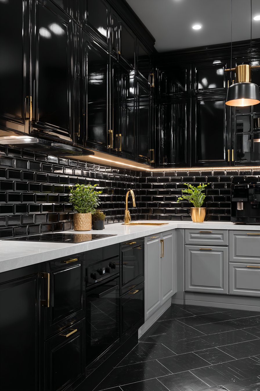
Bold design choices require confidence, and this kitchen tile backsplash idea makes an unmistakable statement through glossy ceramic subway tiles in deep black. The dark backsplash creates dramatic modern elegance, the high-gloss reflective surface catching and multiplying available light while maintaining its sophisticated darkness. Thin black grout lines nearly disappear against the black tiles, creating a seamless appearance that reads as continuous surface rather than individual tile elements. This unity makes the backsplash appear as a single plane of reflective black, creating strong visual impact without the distraction of visible grout networks. The reflective quality proves essential—matte black tiles would absorb light and potentially make the kitchen feel dark and oppressive, while glossy black reflects light and adds depth and dimension.
The dramatic dark backsplash gains full impact through strategic contrast—white quartz countertops create sharp horizontal definition that prevents the black from overtaking the entire visual field, while light grey cabinetry maintains brightness and prevents the kitchen from feeling cave-like. Gold hardware and fixtures add luxurious accents that pop dramatically against the black background, their warm metallic glow creating jewel-like moments throughout the kitchen. This demonstrates sophisticated color theory: metallic gold reads most richly against dark backgrounds, making the hardware selection an integral part of the design concept rather than merely functional necessity.
Strategic lighting including under-cabinet LEDs creates highlights on the glossy black surface, producing dramatic light reflections that emphasize the tiles’ reflective properties. Without proper lighting, dark surfaces can appear flat and dreary; with thoughtful illumination, they become luminous and sophisticated. The professional interior photography emphasizes reflective qualities and sophisticated contrast, capturing how the black tiles reflect cabinet edges, lighting fixtures, and surrounding elements while maintaining their essential darkness. The image shows that black kitchens can feel dramatic and sophisticated rather than gloomy when contrast, lighting, and reflective surfaces are properly deployed.
Key Design Tips: Glossy black tiles show every water spot, fingerprint, and splash, requiring daily maintenance to maintain their pristine appearance—honestly assess whether your housekeeping habits match this demand. Dark colors make spaces feel smaller, so use black tiles judiciously in compact kitchens or balance with ample white and metallic elements. The dramatic look requires appropriate context; black tile backsplashes may overwhelm traditional or cottage-style kitchens but shine in contemporary, modern, or glamorous designs. Ensure excellent lighting—both natural and artificial—when using dark tiles; inadequate light makes these spaces feel oppressive. Consider using high-gloss black tiles on a single feature wall or in the range area rather than throughout the entire kitchen to maintain drama without overwhelming. Pair black tiles with lighter floors and ceilings to maintain spatial balance and prevent the kitchen from feeling too heavy or enclosed.
18. Organic Stone-Look Mixed Earth Tones
Nature provides an endless palette of beautiful colors and textures, and this kitchen tile backsplash idea captures that organic beauty through stone-look porcelain tiles in mixed earth tones. The realistic stone appearance displays natural color variations including beiges, taupes, and soft greys, the shifting tones mimicking how actual quarried stone contains color variations within individual pieces and across different sections. The randomly sized rectangular tiles—some larger, some smaller, arranged in non-repeating patterns—create organic visual flow that references dry-stack stone walls rather than uniform manufactured tile grids. This size variation adds visual interest while maintaining natural authenticity, as stone in nature doesn’t come in standardized dimensions.
The varied tile sizes serve practical purposes beyond aesthetics—they allow for more organic layouts that avoid the repetitive appearance that same-size tiles inevitably create, and they allow installers to work around outlets, corners, and other obstacles more naturally. Warm wood cabinetry and granite countertops enhance the natural material palette, creating a kitchen environment where organic materials predominate and synthetic surfaces remain minimal. This material honesty—celebrating wood grain, stone texture, and authentic construction—creates spaces that feel grounded and connected to natural world rather than appearing entirely manufactured and artificial.
Warm ambient lighting emphasizes the stone texture and color depth, the light grazing across the varied surfaces and creating micro-shadows in texture variations that emphasize the dimensional quality. As light moves across the surface throughout the day, different tiles catch illumination and create shifting patterns of highlight and shadow, giving the backsplash living quality that changes with light conditions. The interior design photography shows attention to authentic stone characteristics and natural variation, capturing how the different tones and textures combine to create a cohesive whole while maintaining visual variety that prevents monotony. The image celebrates imperfection and variation as design assets rather than flaws to be minimized.
Key Design Tips: Stone-look porcelain provides stone’s aesthetic appeal without its porosity, staining vulnerability, and maintenance demands, making it more practical for kitchen applications. When selecting mixed-size layouts, review the pattern template provided by manufacturers to ensure the variation feels organic rather than chaotic. These tiles work particularly well in rustic, transitional, Tuscan, and Mediterranean designs where natural stone would be contextually appropriate. Consider the scale of variation appropriate for your kitchen size—small kitchens may feel busier with highly varied tiles while larger spaces can handle more variety. The earth-tone palette creates warm, inviting atmospheres but may show grease and dirt less readily than lighter tiles, simplifying maintenance. Pair with other natural materials throughout the kitchen—wood, stone counters, woven elements—to create cohesive organic design narratives that feel intentional rather than coincidental.
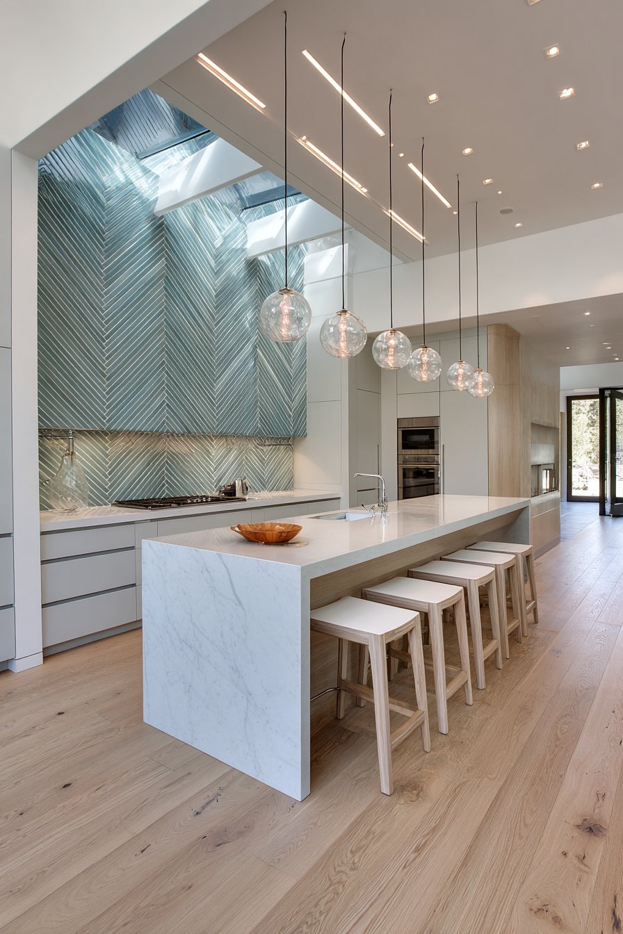
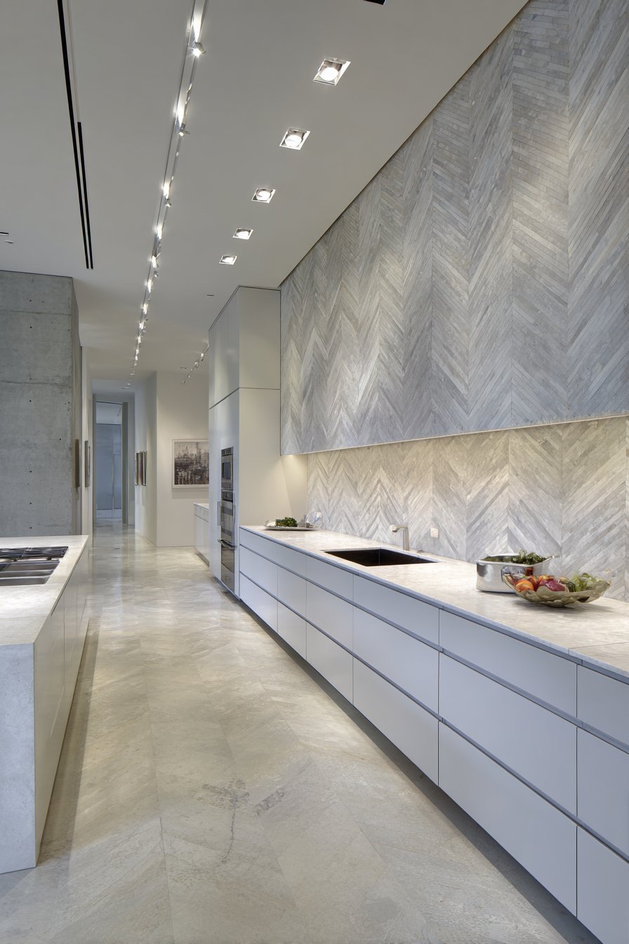
19. Dynamic Chevron Pattern Energy
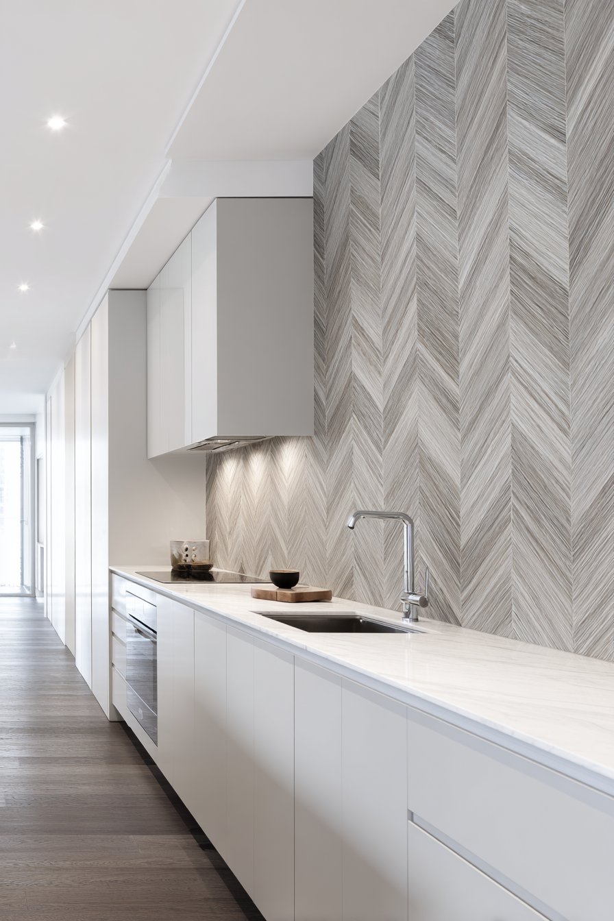
Geometric patterns create visual energy, and this kitchen tile backsplash idea harnesses that power through elongated linear tiles arranged in chevron pattern. The thin rectangular tiles in soft grey create dynamic V-shaped patterns that draw the eye upward and add visual movement to the kitchen wall, the angular arrangement creating more drama and interest than straight horizontal or vertical installations. Each chevron point requires precise installation where tiles meet at perfect angles, the geometric precision essential to the pattern’s success—even slight misalignment breaks the visual illusion and draws attention to installation errors rather than the intended design. This precision requirement makes chevron installations more challenging and typically more expensive than straight-laid patterns, but the dramatic results justify the additional effort.
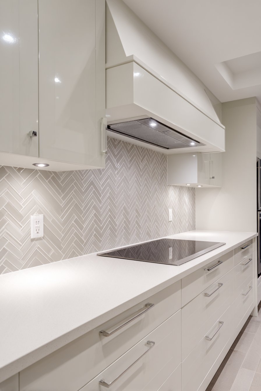
The chevron pattern’s diagonal orientation affects spatial perception—the upward-pointing Vs create vertical emphasis that makes ceilings appear higher, while the overall angular quality adds dynamic energy that makes the kitchen feel more lively and contemporary. White countertops and minimalist flat-panel cabinetry maintain the modern aesthetic, their simple forms and clean lines providing necessary visual rest areas that prevent the patterned backsplash from overwhelming the space. This demonstrates important design balance: busy elements require simple companions, and vice versa. The restraint in cabinetry style and hardware selection allows the chevron pattern to command attention without visual competition.
Recessed ceiling lights create even illumination highlighting the geometric precision, the lighting positioned to minimize shadows that might obscure the pattern while providing adequate task lighting for the countertop work surface. The wide-angle interior photography captures the pattern’s movement and visual energy, showing how the repeated V-shapes create rhythm and visual flow across the entire backsplash. The image reveals how the diagonal lines create more visual interest than horizontal or vertical arrangements while the neutral grey coloring prevents the geometric complexity from feeling too busy or chaotic.
Key Design Tips: Chevron patterns require precise tile cutting at angles and careful alignment during installation; hire experienced installers familiar with pattern work. The pattern creates visual density, so use it judiciously in smaller kitchens or balance with simple surrounding elements. Consider the directionality of chevron points—upward-pointing Vs create height while downward-pointing Vs (herringbone variation) create different visual effects. The thin linear tiles used in this example create finer, more refined patterns than larger tiles would produce; consider scale relative to your kitchen size. When planning chevron layouts, create detailed drawings showing how the pattern will handle corners, outlets, and cabinet edges to avoid awkward partial tiles that break the pattern. The neutral grey allows the pattern itself to provide visual interest without color also competing for attention.
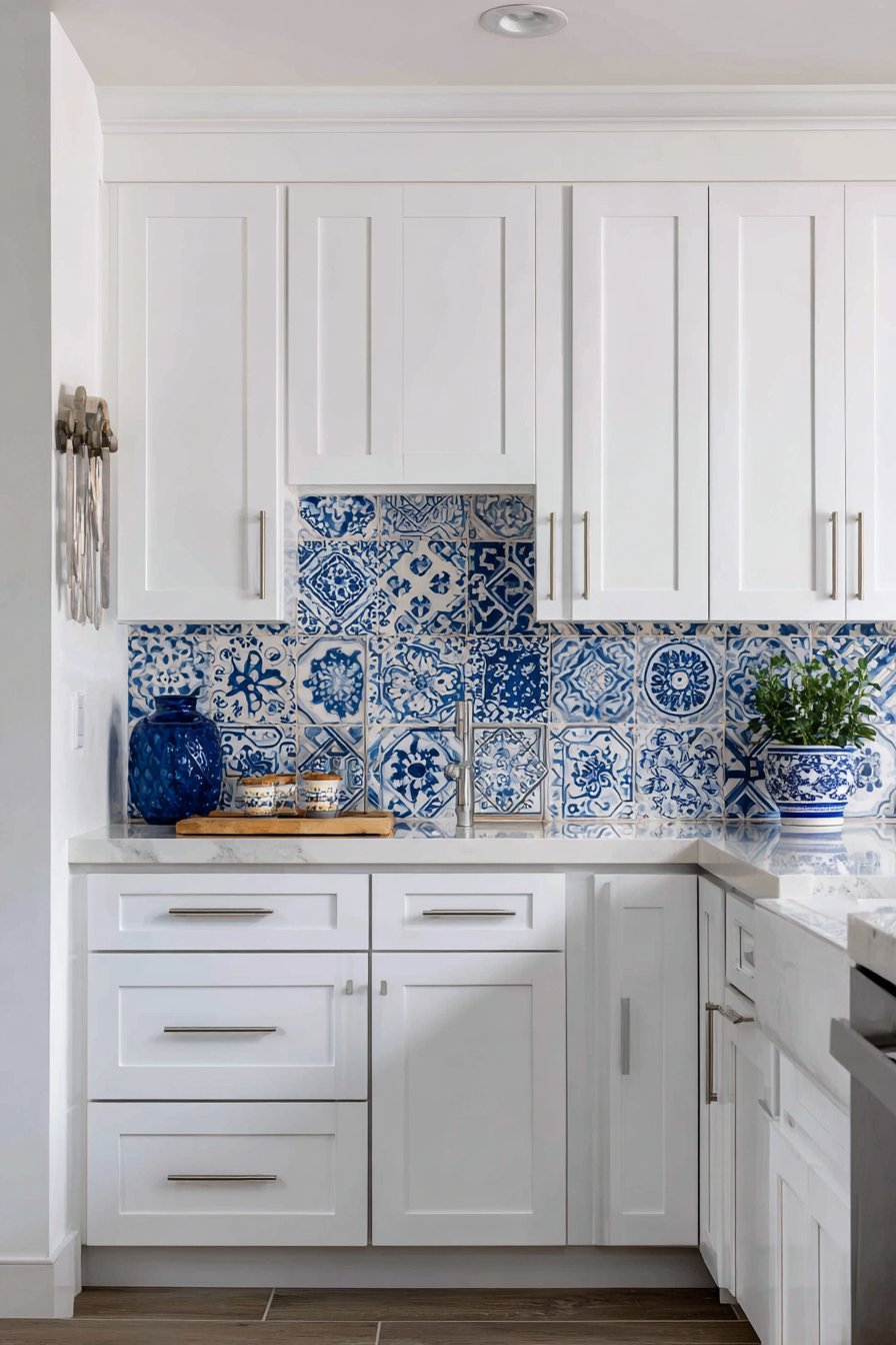
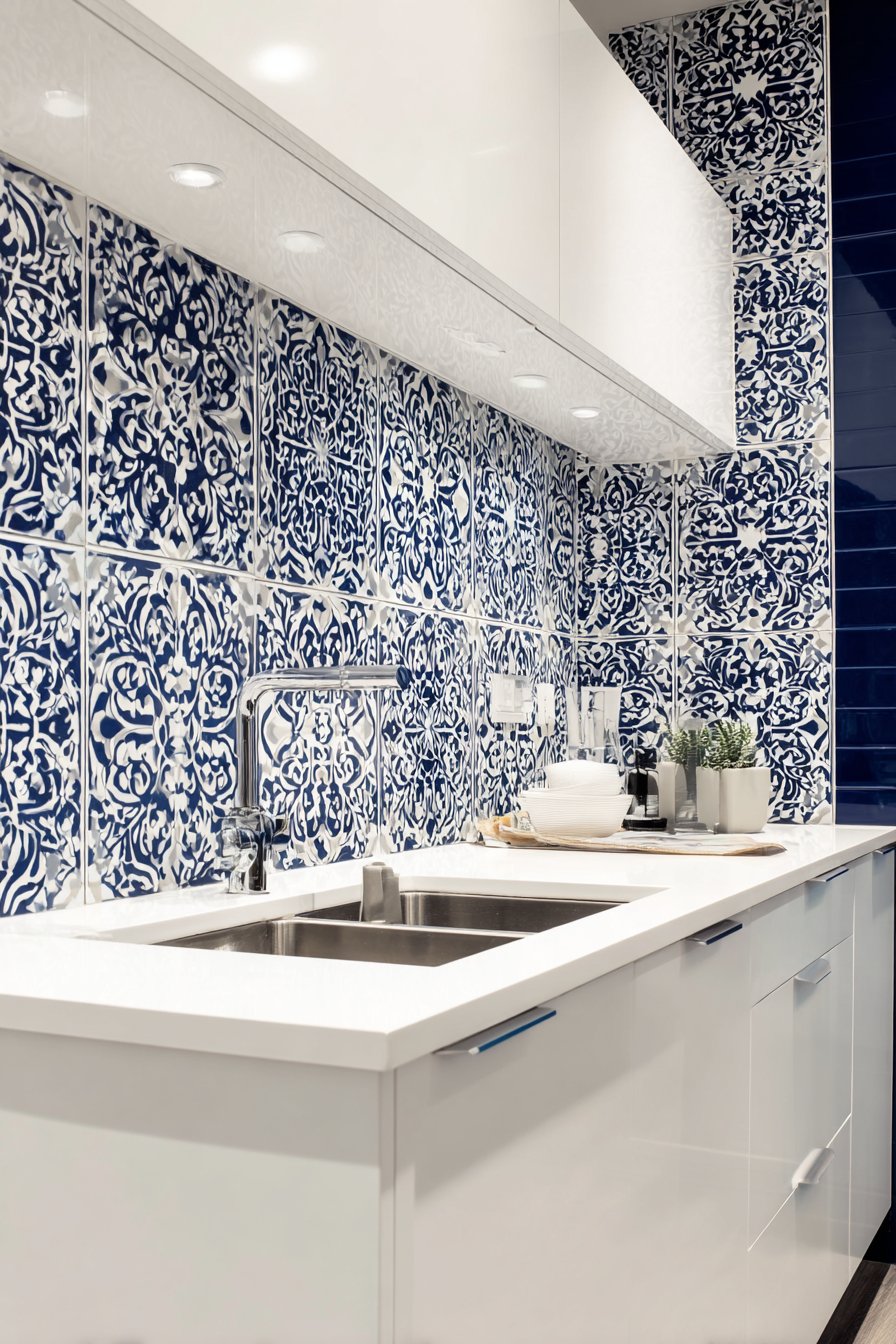
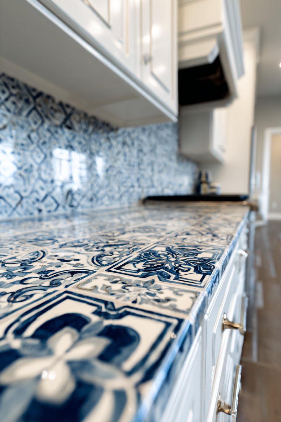
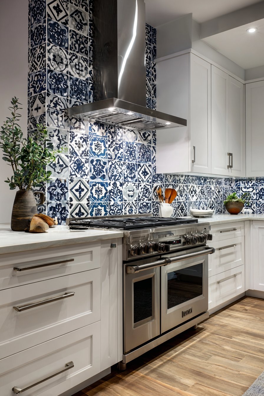
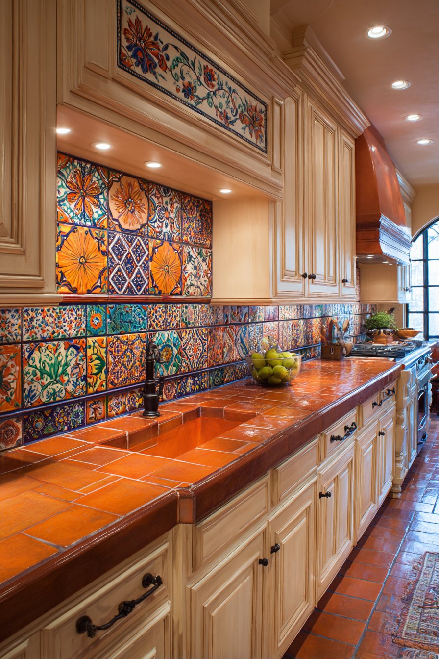
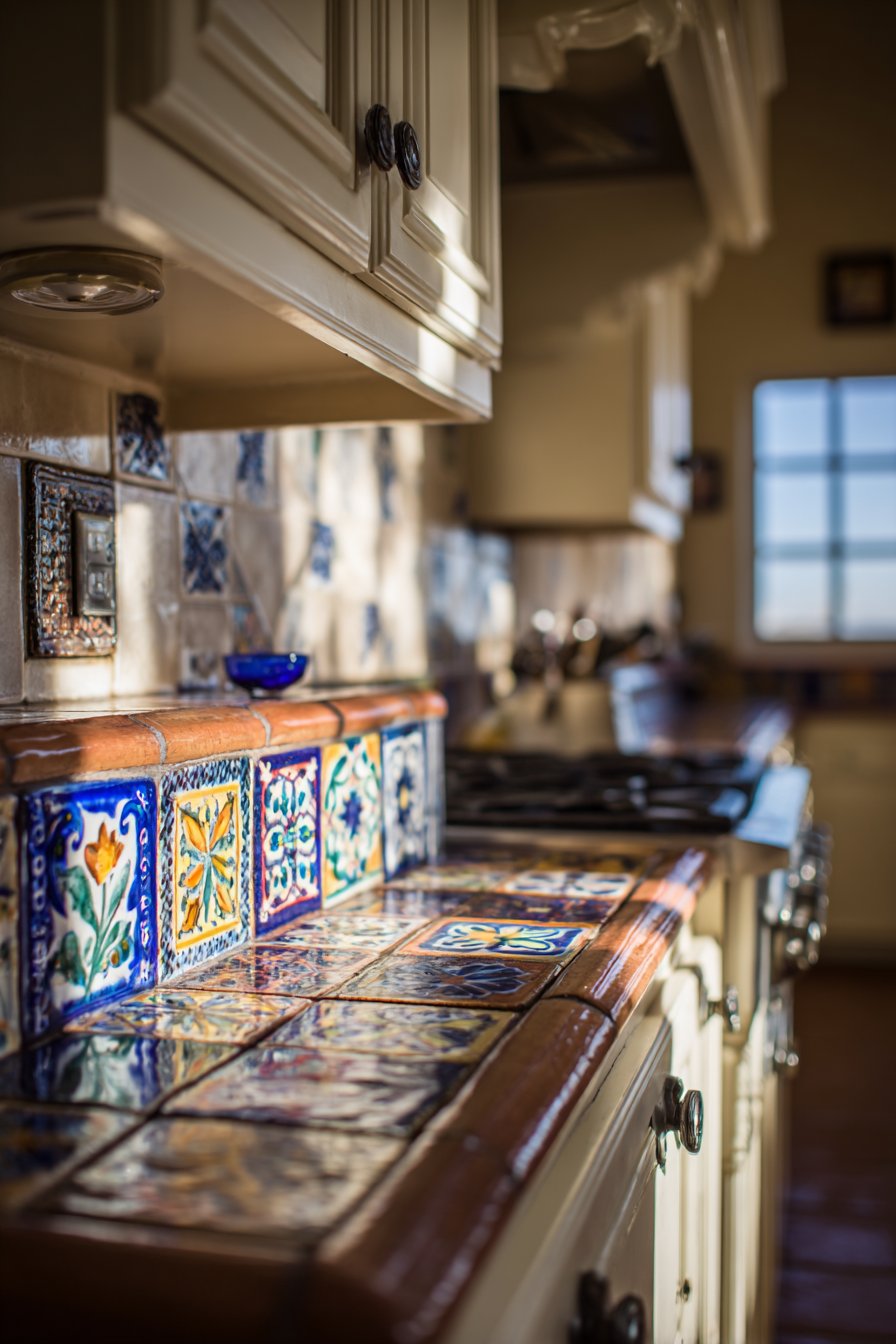
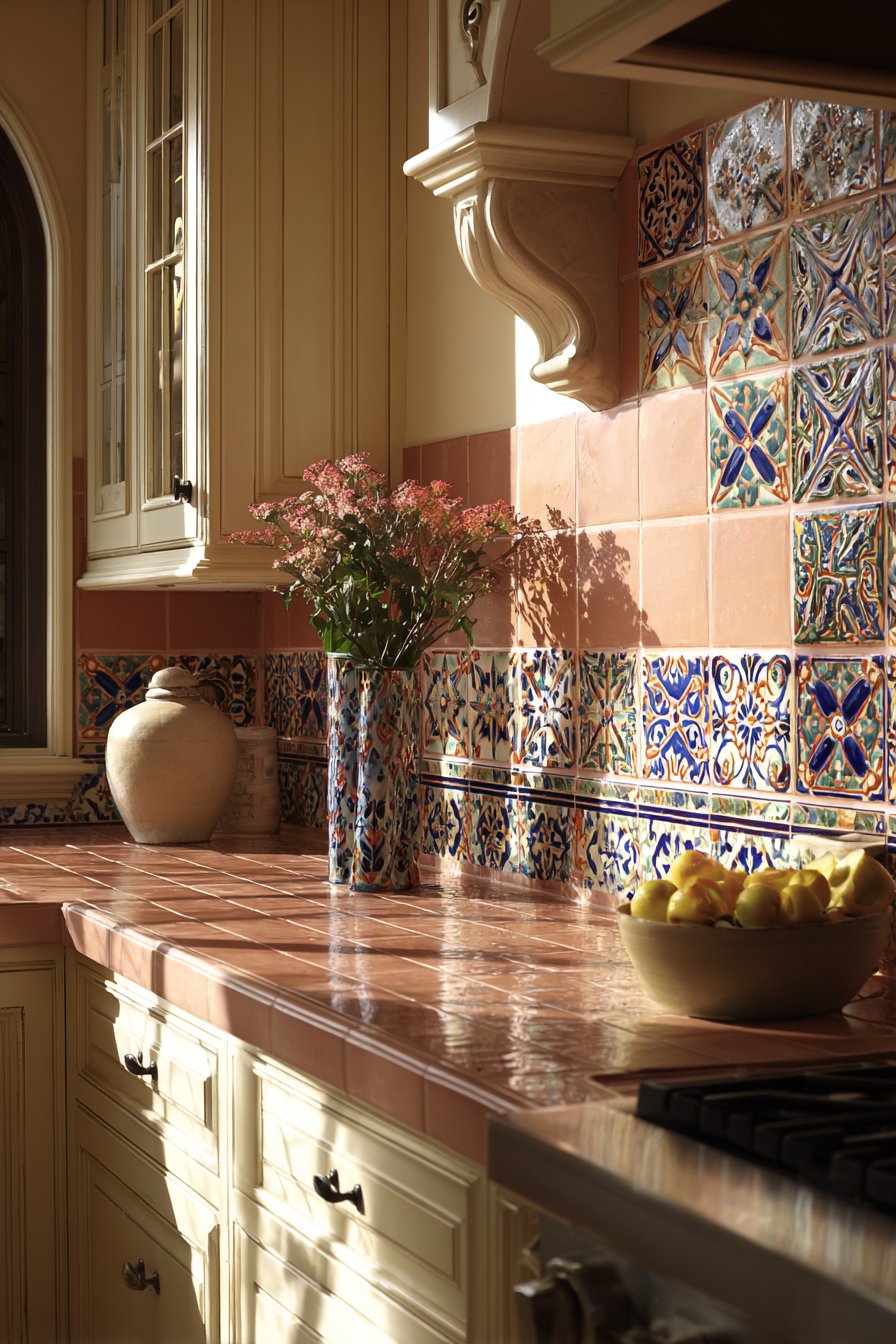
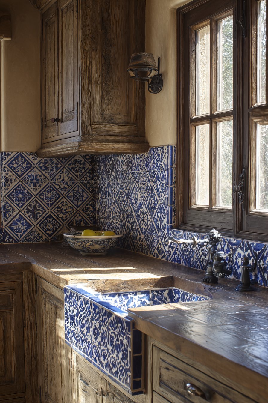
20. Mediterranean Cobalt Cement Tile Heritage
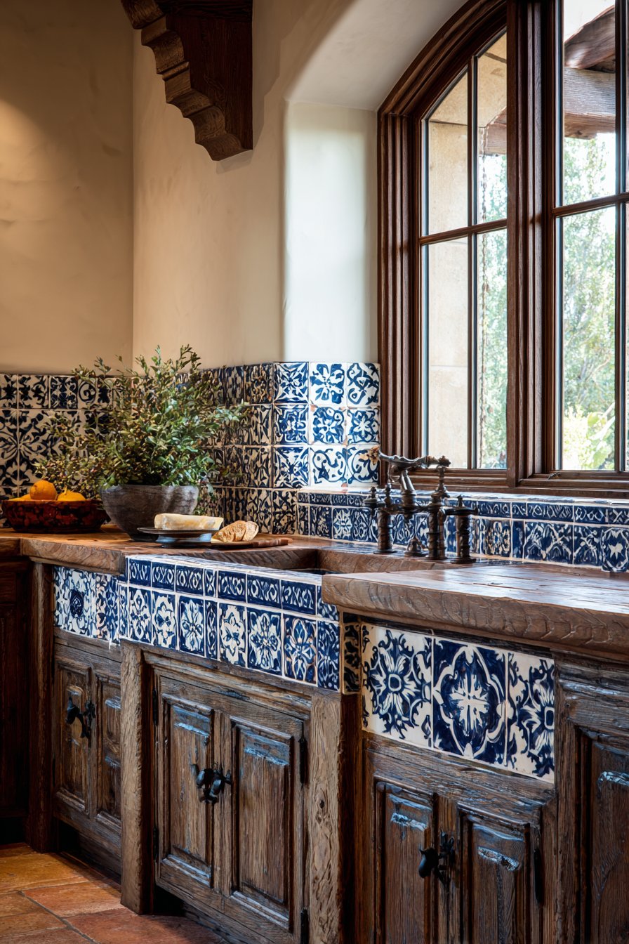
Cultural design traditions bring depth and richness to contemporary kitchens, and this kitchen tile backsplash idea celebrates Spanish and Mediterranean heritage through cobalt blue and white patterned cement tiles. The intricate geometric and floral motifs display deep blue patterns on white backgrounds, traditional designs that have adorned Mediterranean buildings for centuries. The matte finish characteristic of authentic cement tiles displays cement tile characteristics with slight color variation and subtle surface texture that distinguish handmade cement tiles from mass-produced ceramics. Each tile contains hand-applied pigments that create natural variation—slight color depth differences, minor pattern irregularities—that mark the tiles as genuinely crafted rather than industrially produced.
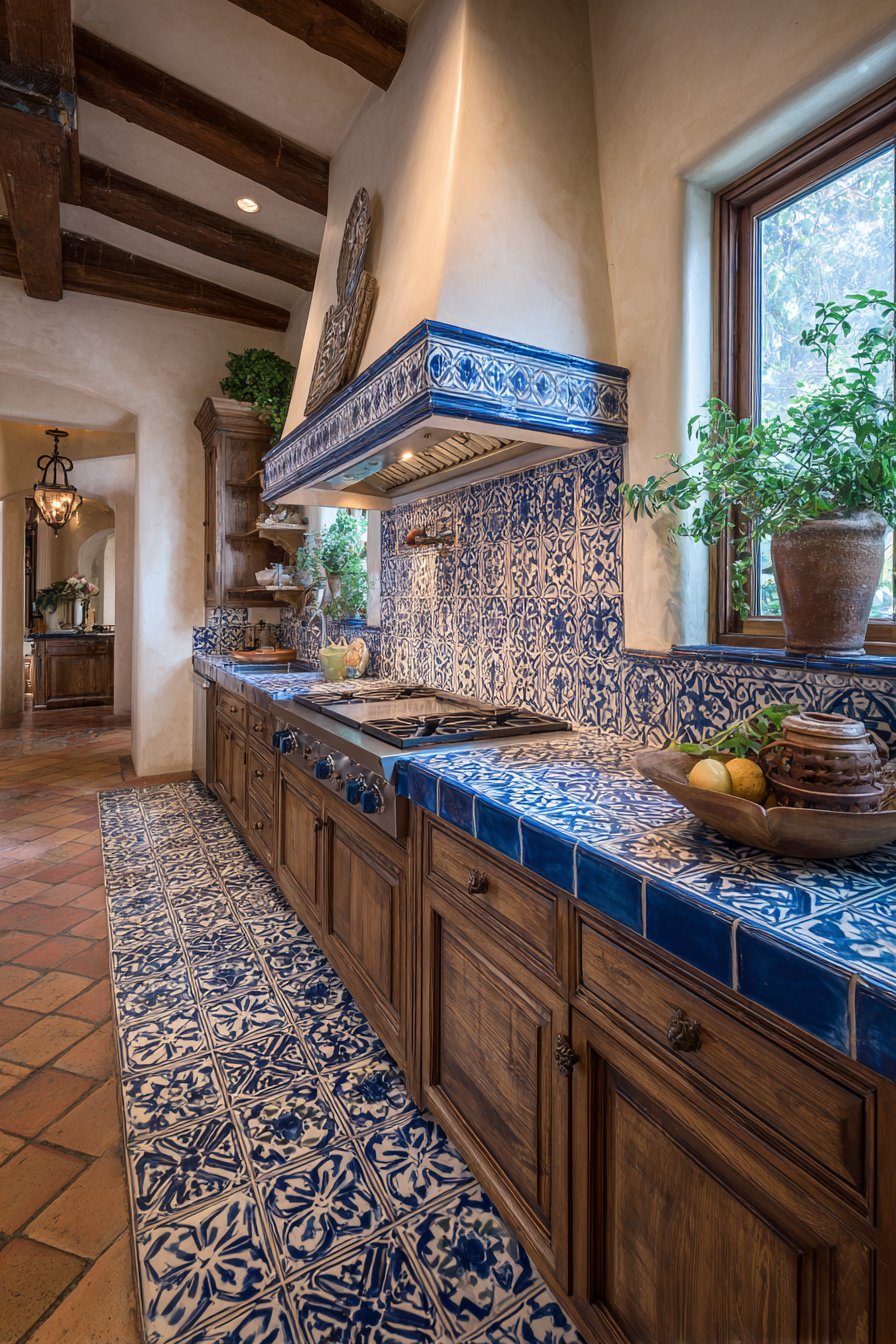
The bold blue and white color combination creates immediate visual impact while maintaining timeless sophistication. Blue and white is one of design’s most enduring color pairings, appearing across cultures and centuries in everything from Chinese porcelain to Dutch Delft tiles to Greek island architecture. This universal appeal means these tiles work in both traditional and contemporary settings, their pattern complexity creating traditional character while their graphic nature suits modern aesthetics. Warm wood countertops and rustic cabinetry complement the old-world charm, their aged surfaces and honest construction methods creating material harmony with the handcrafted tiles. The warm wood tones also prevent the blue and white from feeling too cold or clinical.
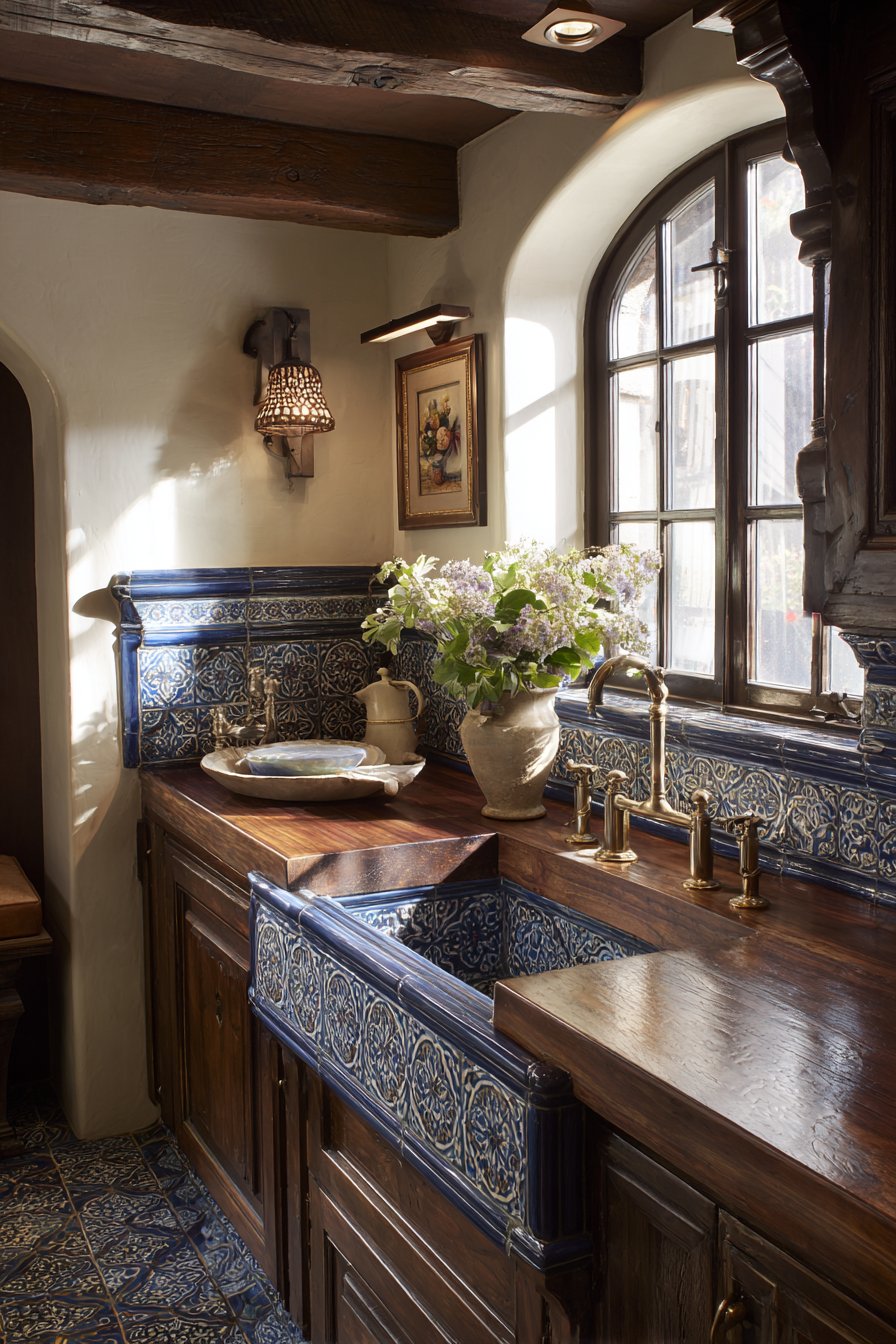
Natural window light creates soft shadows that emphasize the tiles’ slight surface relief—authentic cement tiles aren’t perfectly flat but show subtle dimensional variation where pigments were applied by hand. This textural quality adds visual interest and authentic character that perfectly flat printed tiles cannot duplicate. The interior photography emphasizes cultural authenticity and artisan craftsmanship, capturing both the intricate pattern details and the handmade qualities that give these tiles their distinctive character. The image celebrates traditional craft techniques while showing how historical design elements remain relevant in contemporary kitchen environments.
Key Design Tips: Authentic cement tiles require sealing before and after installation and periodic resealing for stain protection—this maintenance is essential and non-negotiable. The handmade nature means accepting color and pattern variation between tiles and even within individual tiles as part of their authentic character. These tiles are expensive due to handcrafted production and often imported origins, so budget accordingly. The busy patterns work best as feature elements—perhaps behind the range or on a single prominent wall—rather than throughout extensive installations. The porous cement composition makes these tiles more vulnerable to acidic foods and strong cleaning chemicals than porcelain or ceramic alternatives. When working with patterned cement tiles, all tiles from the same production lot ensure color consistency; tiles from different batches may show noticeable variation. Consider the kitchen’s overall style; these traditional patterns require appropriate architectural context to avoid appearing out of place.
21. Elegant Arabesque Moorish Curves
Shape itself can become decoration, and this kitchen tile backsplash idea demonstrates that principle through arabesque-shaped tiles that create elegant Moorish-inspired curves. The distinctive lantern-shaped tiles with glossy finish create overlapping patterns, their characteristic curved forms referencing Islamic architectural traditions and Moroccan design heritage. Each tile’s unusual geometry creates visual interest without requiring pattern or color variation—the shape itself provides all the decoration needed. Light grey grout complements the tile color, defining each arabesque form while maintaining subtle rather than high-contrast definition. The glossy finish adds luxury and light reflection, the curved surfaces catching light at different angles and creating constantly changing highlight patterns as viewing position shifts.
The arabesque shape’s organic curves soften what might otherwise feel hard and angular in a kitchen setting, bringing flowing lines and visual softness that counterbalance the typically rectilinear forms of cabinetry, countertops, and appliances. White cabinetry and grey quartz countertops provide a neutral backdrop for the decorative tile shape, their simple forms allowing the tiles’ unusual geometry to take center stage. This restraint proves essential—the arabesque shape already provides significant visual interest, so surrounding elements should remain relatively simple to avoid visual overload. The neutral color palette throughout allows the shape to be the star without color also competing for attention.
Pendant lighting positioned to create shadows that accentuate the dimensional curved edges proves essential to bringing out the tiles’ special qualities. Without strategic lighting, the dimensional aspects might not register clearly; proper illumination creates shadow lines at each tile’s edge that emphasize the shape and create depth. The professional interior photography focuses on unique tile geometry and shadow play, capturing how the overlapping curved forms create complex visual patterns and how light interacts with the dimensional surfaces. The image shows that unusual tile shapes can provide all the visual interest needed without requiring bold colors or busy patterns.
Key Design Tips: Arabesque tiles are more expensive than standard shapes due to their complex forms and more challenging manufacturing processes. The unusual shape requires experienced installers familiar with these tiles’ specific installation requirements and cutting techniques. The overlapping curved pattern creates visual density, so use these tiles strategically in feature areas rather than throughout extensive installations. When planning layouts, consider how the pattern will handle corners, outlets, and cabinet edges; the curved forms make accommodating obstacles more challenging than rectangular tiles. The glossy finish shows water spots and fingerprints readily, requiring more frequent cleaning than matte surfaces. Consider the arabesque shape in context of your overall kitchen style—these tiles work beautifully in Mediterranean, Moroccan, contemporary, and transitional designs but may feel out of place in rustic farmhouse or industrial settings.
22. Authentic Reclaimed Brick Character
Industrial and rustic design styles celebrate authentic materials with history, and this kitchen tile backsplash idea captures that aesthetic through reclaimed brick veneer tiles showing genuine weathering and color variation. The thin brick tiles in mixed reds, oranges, and browns display natural aging—color variation from years of exposure, slight surface wear, mortar remnants, and authentic patina that can’t be convincingly manufactured. Each brick shows individual character from its previous life, whether in warehouse walls, factory buildings, or historical structures. This authenticity brings immediate character and story to kitchen spaces, creating atmosphere and depth that new materials require decades to develop naturally.
The exposed brick aesthetic has long been associated with urban lofts, industrial conversions, and spaces that celebrate honest materials and structural elements. Mortar joints are slightly recessed, adding to the authentic appearance and creating shadow lines that emphasize the three-dimensional quality. Dark wood butcher block countertops and industrial-style shelving enhance the reclaimed aesthetic, their own aged surfaces and utilitarian forms creating material conversation with the weathered brick. The combination of aged brick, rough wood, and metal elements creates cohesive industrial character that feels genuinely connected to manufacturing heritage rather than superficially styled.
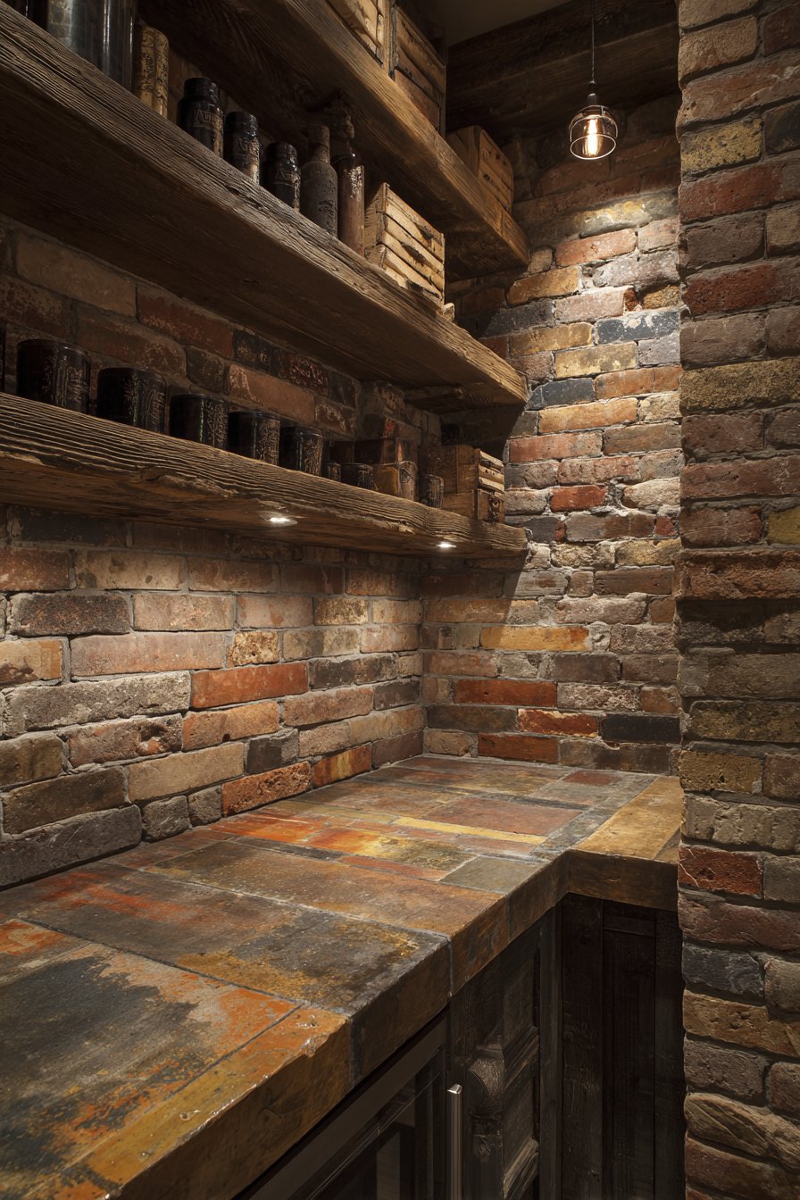
Warm Edison bulb lighting creates ambiance while highlighting brick texture and color variation, the incandescent glow emphasizing the warm red and orange tones in the brick while creating dramatic shadows in the recessed mortar joints. This warm lighting proves essential—cool fluorescent or LED lighting would make the brick appear dull and lifeless, while warm incandescent highlights its natural warmth and texture. The interior photography emphasizes authentic material character and patina, capturing the weathering effects, color variations, and surface texture that give reclaimed brick its distinctive appeal. The image celebrates imperfection and age as design assets, showing how materials with history can create spaces with soul.
Key Design Tips: Authentic reclaimed brick veneer provides the exposed brick aesthetic without full-thickness brick’s weight and installation challenges. The material’s aged character includes imperfections—chips, color variation, uneven surfaces—that should be embraced as part of the authentic aesthetic rather than viewed as defects. These tiles work best in industrial, rustic, loft, and urban farmhouse styles where their weathered character feels contextually appropriate. The rough surface texture creates crevices where grease can accumulate, so seal properly and plan for regular cleaning with appropriate products that won’t damage the aged surface. When installing reclaimed brick tiles, vary the placement to avoid repetitive patterns and ensure mixed colors distribute evenly rather than clustering. Pair with other aged or industrial materials throughout the kitchen—raw wood, metal, concrete—to create cohesive design narratives that feel authentic rather than contrived.
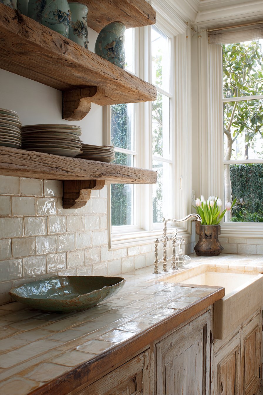
23. Refined Modern Farmhouse Marble Subway
The modern farmhouse aesthetic bridges traditional and contemporary styles, and this kitchen tile backsplash idea captures that balance through white marble subway tiles with natural grey veining. The real marble showcases organic beauty through varied veining patterns across each tile, the natural stone formations creating one-of-a-kind appearances that manufactured tiles cannot replicate. Some tiles display bold dramatic veins, others show delicate wisps, and some remain relatively plain—this natural variation creates visual interest and authentic stone character. The classic brick pattern installation references traditional tile work while the genuine marble elevates the familiar format into luxury territory. Soft grey grout complements the marble veining, creating subtle definition without the harsh contrast of white grout against white tiles.
The material choice proves significant—actual marble rather than marble-look ceramic or porcelain—bringing genuine luxury and authentic stone beauty. White shaker cabinets with black hardware and white marble countertops create cohesive material continuity throughout the kitchen, the repetition of marble in different applications unifying the space through shared material vocabulary. The black hardware provides crucial contrast that prevents the predominantly white kitchen from appearing bland or washed out, while its traditional cup-pull and knob styles reference farmhouse heritage. Natural light from farmhouse windows illuminates the natural stone variations, the changing sun angles throughout the day highlighting different veins and creating ever-changing patterns of light and shadow across the marble surface.
The interior design photography with balanced exposure highlights authentic marble characteristics, capturing the veining detail, subtle color variations, and natural stone texture that define marble’s appeal. The image shows how luxury materials can work within farmhouse aesthetics—proving that farmhouse style doesn’t require everything to be rustic or budget-friendly, but rather represents a design philosophy that values comfort, tradition, and natural beauty. The marble subway tiles bridge rustic and refined, creating modern farmhouse kitchens that feel collected and comfortable rather than overly precious or styled.
Key Design Tips: Natural marble is porous and vulnerable to staining from acidic foods, oils, and strong cleaning products; seal properly before use and reseal regularly. The natural material shows variation not just within the installation but between production batches, so order all tiles simultaneously to ensure acceptable color and veining consistency. Marble backsplashes are significantly more expensive than ceramic or porcelain alternatives—budget accordingly and consider whether the authentic material matters to you versus high-quality imitations. The veining provides natural camouflage for minor splashes and spots, making maintenance between deep cleanings more forgiving than pure white tiles. When selecting marble, view large samples to ensure the veining intensity and color variation match your preferences—marble ranges from heavily veined to subtly marked. Consider marble’s longevity and timeless appeal when evaluating cost; unlike trendy materials that may date quickly, classic marble maintains its value and appeal across decades.
24. Bold Emerald Glass Jewel Tone
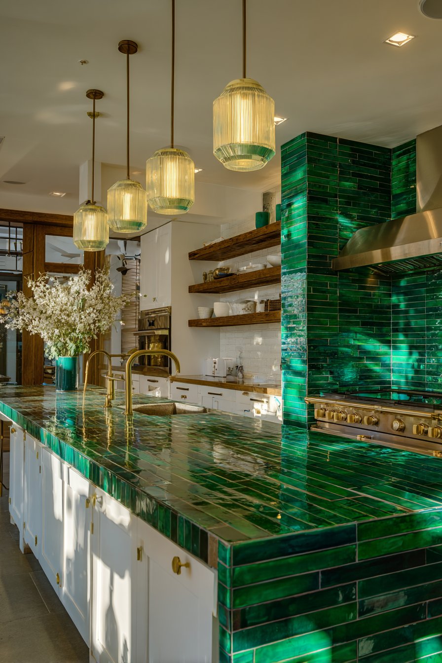
Color creates mood and personality in interior spaces, and this kitchen tile backsplash idea makes a confident statement through emerald green ceramic tiles in glossy finish creating jewel-tone richness. The saturated green rectangular tiles in stacked horizontal pattern create visual impact through pure color intensity, the tiles’ vivid hue transforming the backsplash into the kitchen’s clear focal point. Thin matching green grout nearly disappears against the tiles, allowing the color field to appear continuous rather than broken into individual elements. The glossy finish amplifies the color’s richness while adding reflective properties that multiply available light and create dynamic surface highlights that shift as viewing angles change.
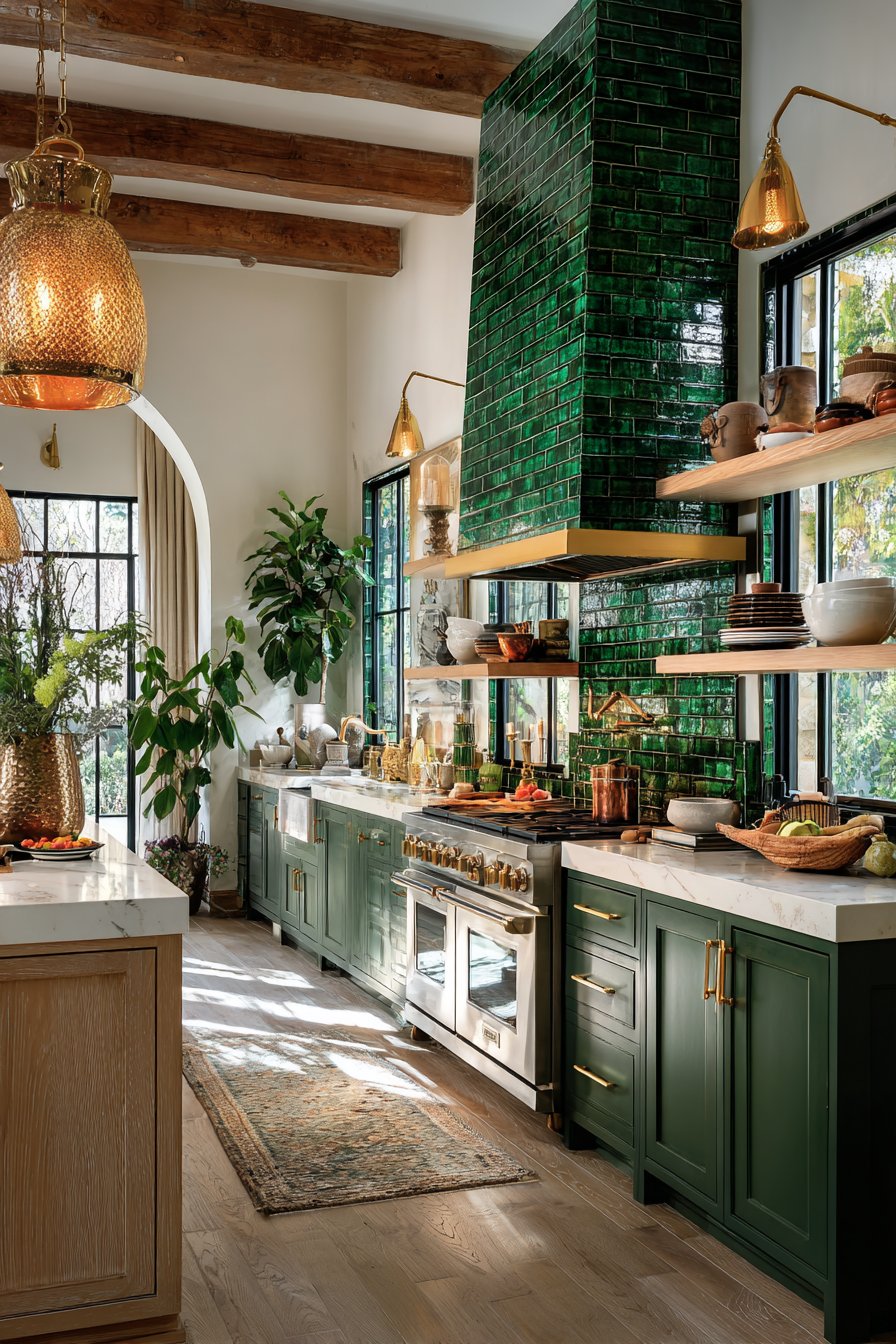
The bold color choice requires confidence and commitment—emerald green announces itself rather than receding politely into the background. This dramatic statement works particularly well when surrounded by complementary elements that enhance rather than compete with the green. Brass fixtures and hardware create luxurious counterpoints, their warm metallic glow creating sophisticated contrast against the cool green while maintaining the overall richness and jewel-tone quality. White countertops provide necessary visual rest and prevent color overload, their neutral presence balancing the green’s intensity. Natural wood open shelving adds organic warmth that prevents the space from feeling too sleek or cold.
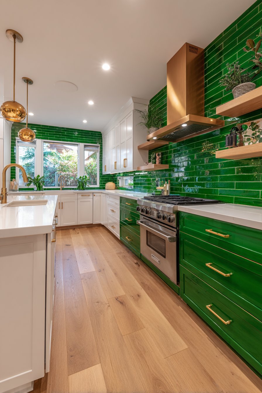
Multiple light sources including pendant and natural light create reflections on the glossy green surface, the overlapping illumination producing complex patterns of highlight and reflection that give the backsplash living, dynamic quality. The green tiles catch and reflect light beautifully, at times appearing almost luminous. The professional interior photography captures color saturation and reflective properties, showing how the emerald hue maintains its intensity while the glossy surface creates light play. The image demonstrates that bold color choices can create sophisticated, livable kitchens when properly balanced with neutral elements and appropriate lighting.
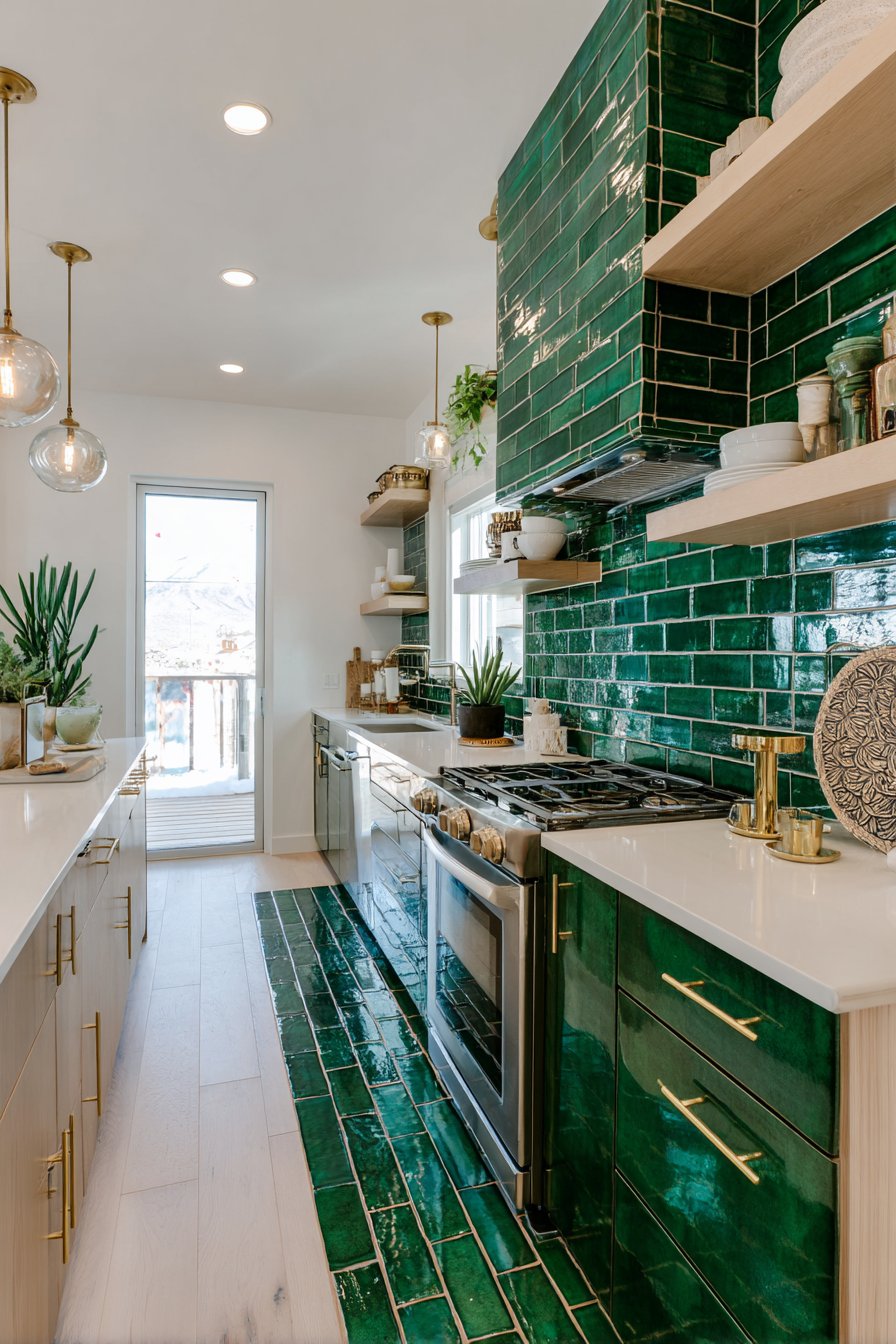
Key Design Tips: Saturated colors make strong statements but can overwhelm small spaces or feel trendy over time; carefully consider your commitment level before installation. The glossy finish amplifies the color’s intensity but also shows every water spot and splash, requiring diligent maintenance. When using bold tile colors, keep surrounding elements relatively neutral to prevent visual overload and allow the colored backsplash to be the star. Consider the color’s psychological effects—green generally creates calming, nature-connected feelings, though very saturated versions are more energizing than restful. Test large tile samples in your actual kitchen at different times of day, as color perception changes dramatically with shifting light conditions. Colored tiles can be more expensive than standard white or neutral options, and bold colors may affect resale value if future buyers don’t share your color preferences. Pair jewel-tone tiles with metallic fixtures in complementary warm tones—brass, copper, or gold—rather than cool chrome or nickel which create less harmonious combinations.
25. Organic Natural Slate Texture
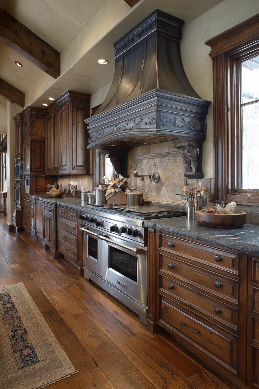
Natural stone brings inherent beauty and authentic character that manufactured materials struggle to replicate, and this kitchen tile backsplash idea showcases slate’s distinctive qualities through natural charcoal grey tiles with rough-hewn edges and natural cleft surface. Each slate tile displays unique color depth and texture patterns inherent to the stone’s geological formation—natural splits where the stone separated along its grain, surface variations from mineral deposits, and organic color shifts from charcoal to lighter grey to subtle green or purple undertones. The rough edges and uneven surfaces mark these as genuine stone pieces rather than manufactured tiles cut to uniform dimensions, bringing raw natural beauty that celebrates rather than conceals the stone’s organic origins.
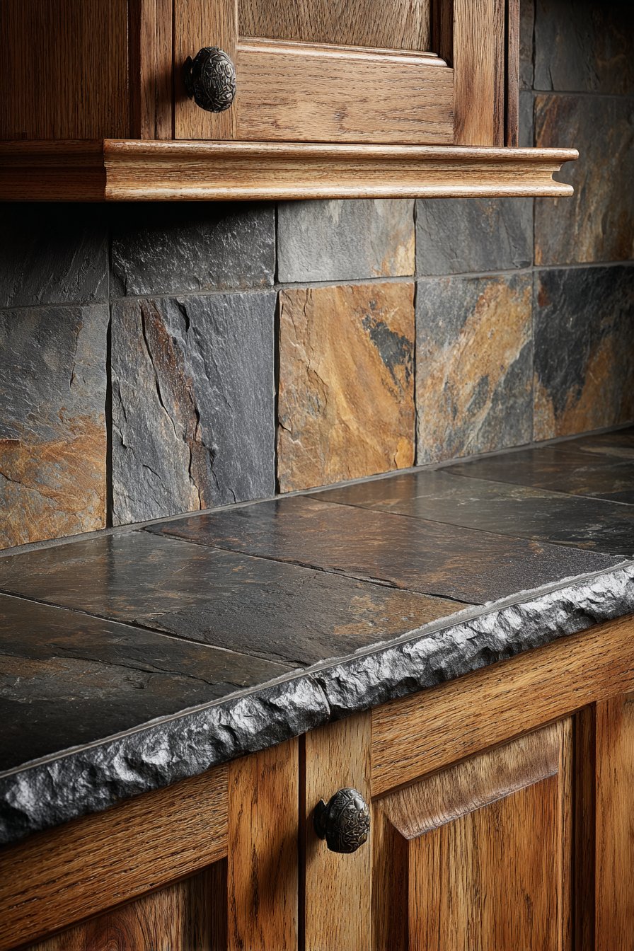
The three-dimensional surface texture created by the natural cleft (the way slate naturally splits) creates dramatic light and shadow play, the raised and recessed areas catching light differently and creating visual depth. This texture also provides tactile interest—running your hand across natural slate reveals the stone’s dimensionality in a way that smooth tiles cannot. Dark countertops and wood cabinetry complement the natural stone aesthetic, creating material harmony where organic surfaces predominate and synthetic materials remain minimal. The dark palette throughout creates sophisticated, grounded atmosphere that feels connected to natural world.
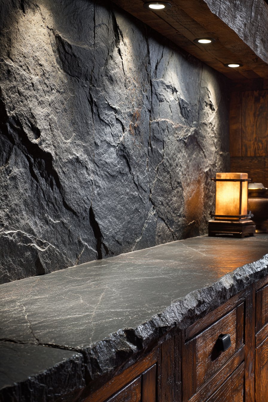
Focused lighting emphasizes the three-dimensional surface texture and natural material authenticity, the light source positioned to graze across the surface at an angle that maximizes shadow depth and texture visibility. Without proper lighting, textured stone can appear flat; with strategic illumination, every surface variation becomes visible and celebrated. The interior photography with attention to tactile qualities and stone characteristics captures the texture detail, color variation, and natural beauty that define slate’s appeal. The image shows how genuine stone’s imperfections and organic qualities create visual interest and authenticity that perfect, uniform tiles cannot match.
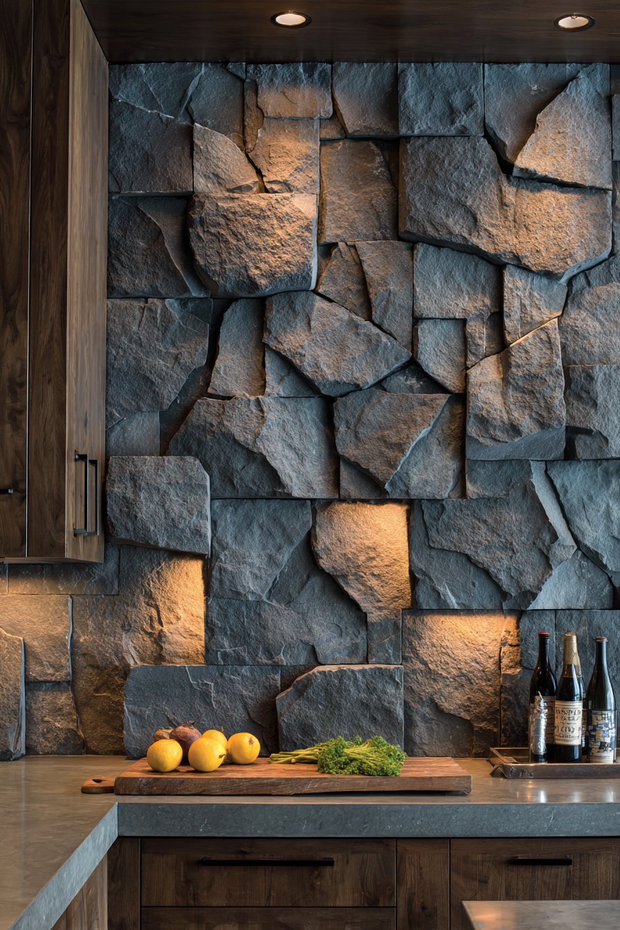
Key Design Tips: Natural slate is porous and must be sealed to protect against staining and moisture absorption—this sealing requires regular renewal. The natural cleft surface creates texture where dirt and grease can accumulate, making these tiles more maintenance-intensive than smooth alternatives. Stone tiles vary significantly in color and texture; select individual tiles during purchase if possible to ensure acceptable variation, or view large samples before committing. Natural stone tiles often vary slightly in size due to their hand-cut origins, requiring skilled installers who can accommodate these variations. The rough surface and edges can feel sharp; consider rounded-edge slate tiles for areas where people might lean against the backsplash. Slate works particularly well in rustic, organic, and natural design schemes but may feel too rough or primitive in formal or highly polished contemporary kitchens. Pair with other natural materials—wood, stone counters, natural fiber textiles—to create cohesive organic design narratives.
26. Sophisticated Metallic Bronze Luster
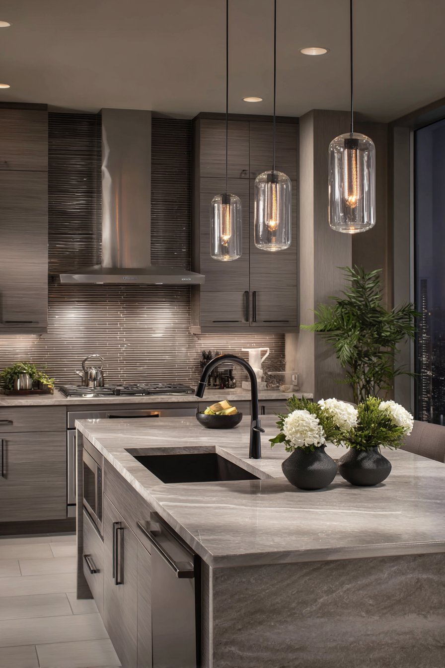
Metallic finishes add luxury and light reflection to interior spaces, and this kitchen tile backsplash idea explores that quality through brushed bronze finish tiles creating warm reflective surfaces. The rectangular tiles with subtle metallic sheen and linear brushed texture bring sophistication through their refined industrial finish, the brushed surface creating directional texture that catches light at different angles. The warm metal tone adds both visual warmth and light-reflecting properties, brightening the kitchen while maintaining sophisticated restraint. Unlike bright polished metals that can feel overpowering, brushed bronze provides subtle metallic presence that enhances rather than dominates.
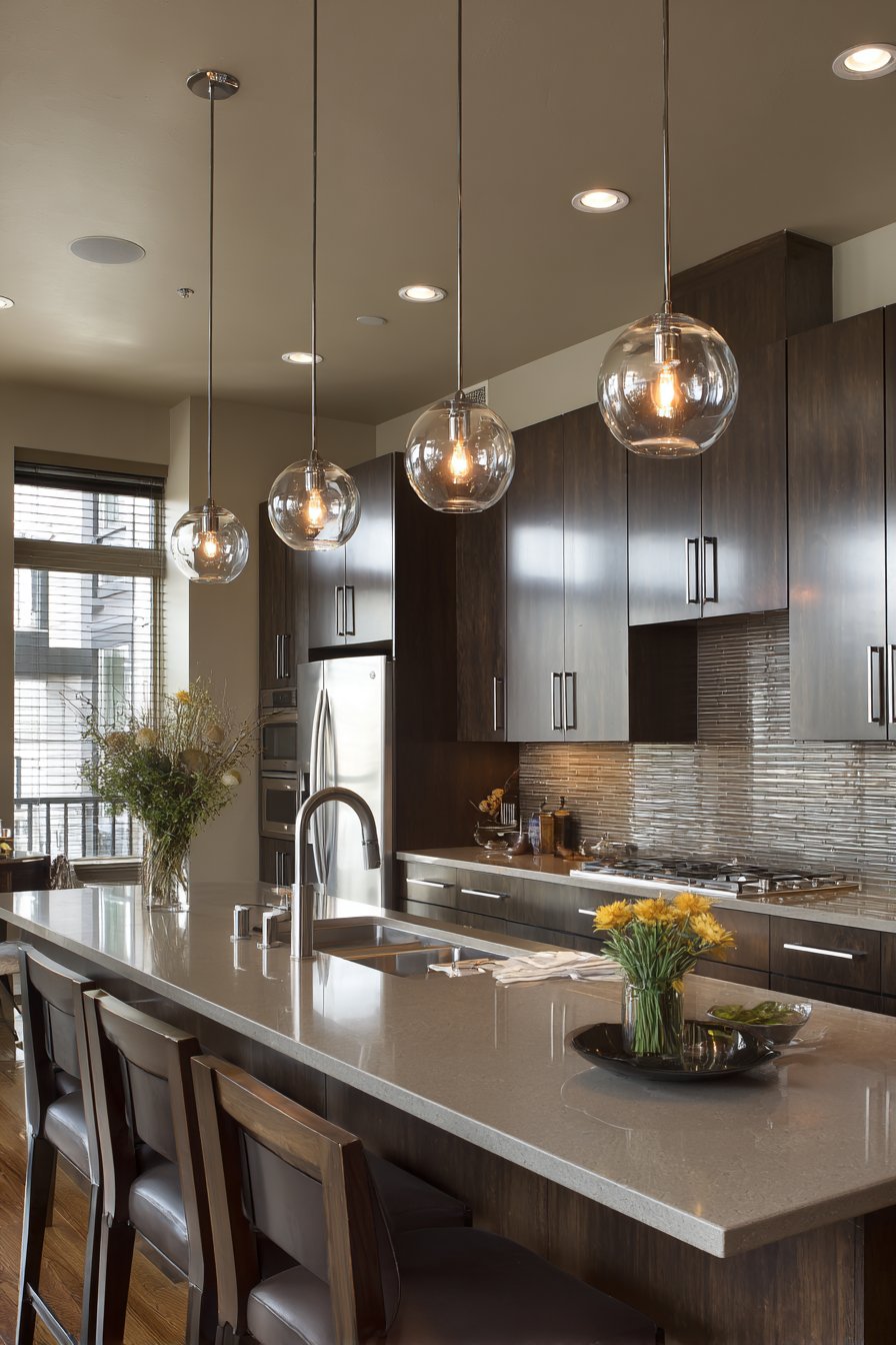
The metallic backsplash creates interesting material conversation with other kitchen elements—reflecting cabinet edges, multiplying light sources, and adding depth through its reflective properties. Dark espresso cabinetry and light quartz countertops create balanced contrast, the dark wood providing grounding weight while the light counters maintain brightness. This color balance—dark below, light above, metallic in between—creates visual hierarchy and prevents any single element from overwhelming. Under-cabinet and pendant lighting create dynamic highlights on the metallic surface, the multiple light sources producing complex patterns of reflection and creating living, changing appearance throughout the day as natural light shifts and artificial lights turn on and off.
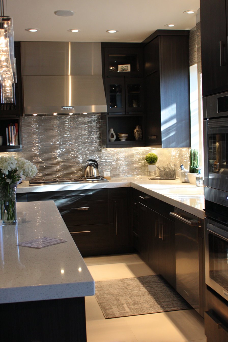
The wide-angle interior photography emphasizes metallic luster and interplay with lighting, capturing how the brushed finish reflects light while the linear texture creates directional quality. The image shows that metallic tiles needn’t be shiny or overwhelming—this sophisticated interpretation demonstrates how subtle metallic finishes can add luxury and light reflection while maintaining restrained elegance. The bronze tone particularly suits kitchens seeking warmth and sophistication without the coolness of stainless steel or the boldness of copper.
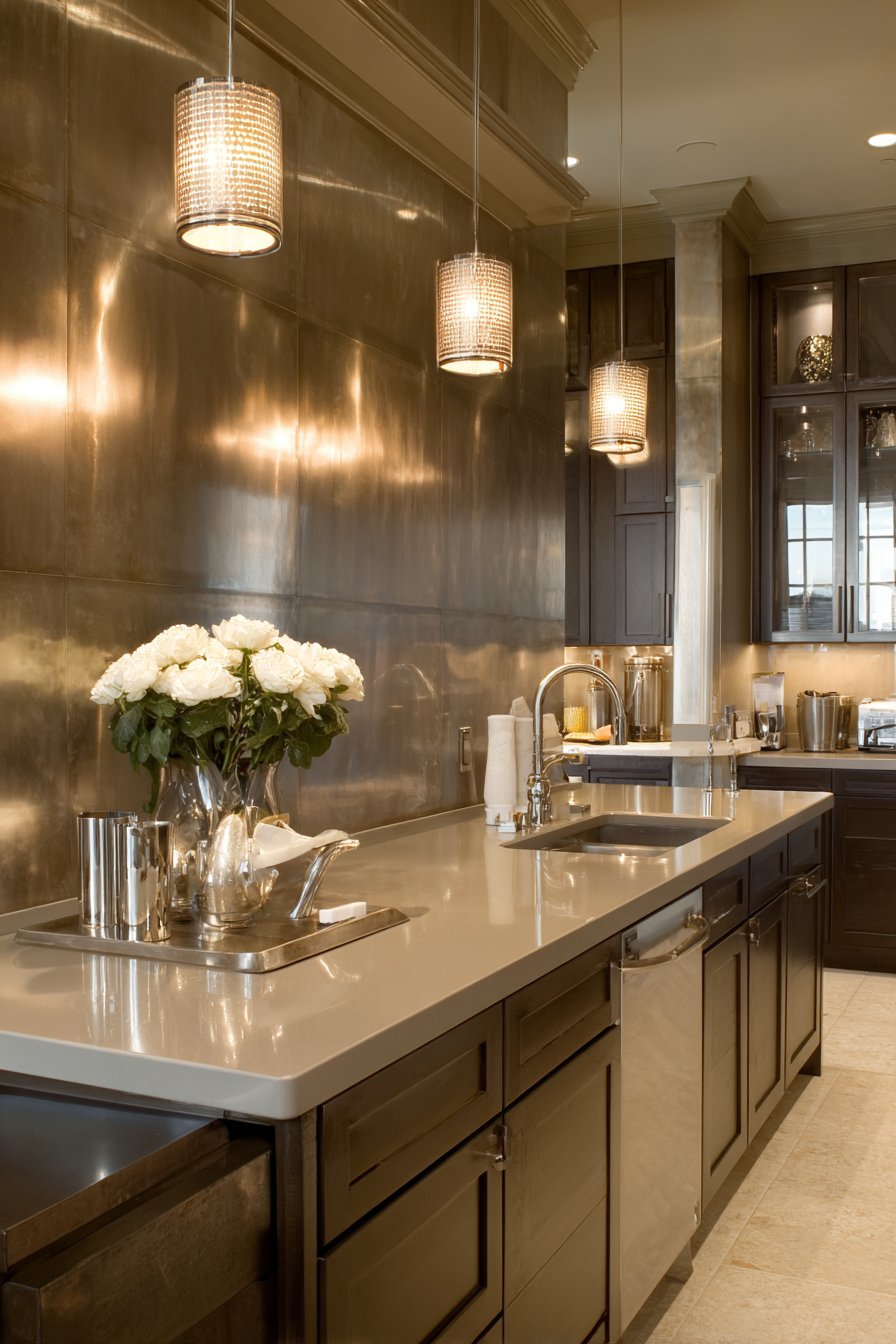
Key Design Tips: Metallic tiles are typically more expensive than standard ceramics due to their specialized finishes and production processes. The reflective surface shows fingerprints and water spots readily, requiring frequent cleaning to maintain pristine appearance. When using metallic tiles, consider the other metals in your kitchen—mixing warm metals (bronze, brass, copper) with cool metals (chrome, nickel) can create visual discord, so maintain metal tone consistency. The brushed texture provides subtle visual interest while being more forgiving of minor marks than polished mirror finishes. Metallic backsplashes reflect light beautifully, making them excellent choices for darker kitchens where maximizing available light matters. Consider using metallic tiles in feature areas—perhaps behind the range or on a single prominent wall—rather than throughout the entire kitchen to maintain their special quality without overwhelming. Pair with simple cabinetry and minimal decoration to let the metallic finish be the jewelry of the kitchen.
27. Pure Scandinavian Minimalist Picket
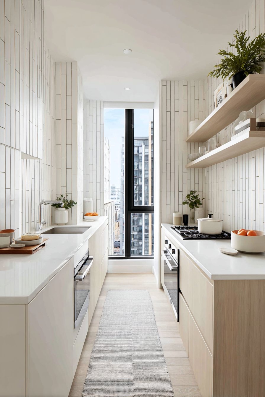
Scandinavian design principles emphasize simplicity, functionality, and connection to natural light, and this kitchen tile backsplash idea embodies those values through elongated picket tiles in matte white creating vertical visual interest. The narrow vertical tiles arranged in continuous columns with minimal grout lines create clean, contemporary aesthetic through pure form and proportion rather than pattern, color, or decoration. The matte white finish maintains the clean Nordic aesthetic, providing smooth surface for easy cleaning while avoiding the reflective distractions of glossy finishes. The vertical orientation creates subtle upward movement that makes standard ceiling heights feel taller while the narrow proportions create refined, elegant appearance.
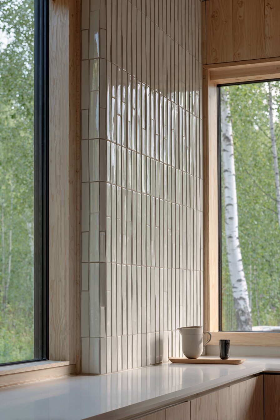
Light oak cabinetry and white countertops enhance the minimalist Scandinavian design, their pale natural tones and simple forms creating serene, uncluttered environment. The limited material and color palette—white, pale wood, more white—creates calm and visual rest that defines Scandinavian interior philosophy. This restraint extends beyond just color into form and decoration as well; everything maintains simple geometric forms without ornament or embellishment. Abundant natural daylight from large windows creates soft even illumination, the natural light quality essential to Scandinavian design where long dark winters make maximizing available daylight crucial for wellbeing.
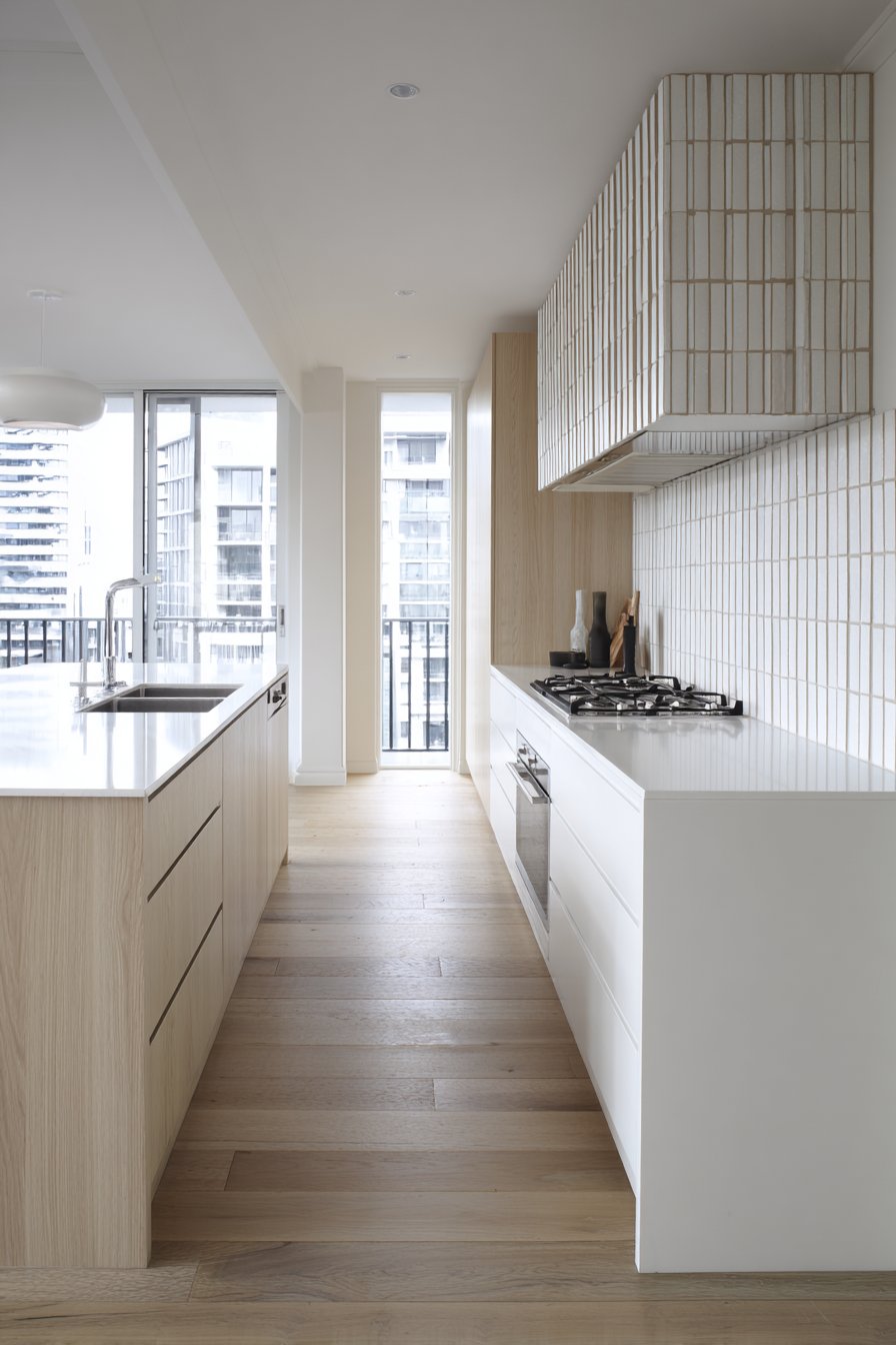
The interior design photography with soft lighting and balanced exposure emphasizes clean lines and simplicity, capturing the restrained beauty and careful proportion that define successful minimalist design. The image shows that dramatic impact doesn’t require bold colors or busy patterns—simplicity, when executed with attention to proportion, material quality, and light, creates powerful and memorable spaces. The narrow picket tiles demonstrate how subtle variations within minimal design vocabulary—choosing narrow vertical tiles rather than standard subway tiles—can create distinction while maintaining restraint.
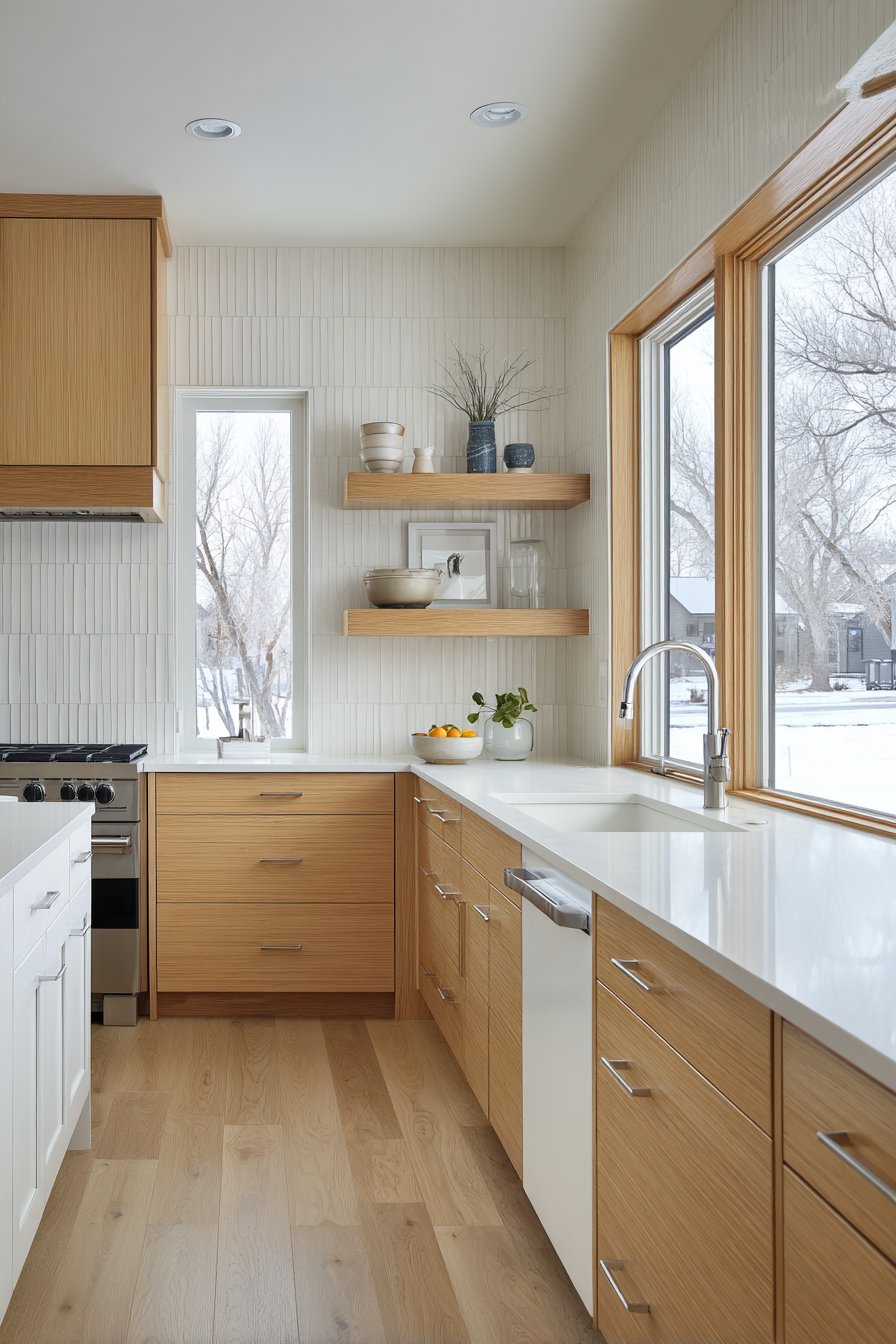
Key Design Tips: Minimalist aesthetics require perfect execution as imperfections have nowhere to hide; ensure skilled installation and quality materials. The vertical picket tiles work particularly well in kitchens with abundant natural light where their clean simplicity can be fully appreciated. When pursuing Scandinavian minimalism, invest in quality materials with excellent fit and finish rather than settling for budget alternatives that may show imperfections. The matte white finish requires regular cleaning but is more forgiving of water spots than glossy alternatives. Consider the overall restraint required—minimalist tile installations work best when surrounding elements maintain similar simplicity without ornate details or busy patterns competing for attention. The vertical orientation suits spaces where additional height emphasis benefits spatial perception. Pair with other Scandinavian design elements—pale woods, natural textiles, simple forms, abundant natural light—to create cohesive Nordic aesthetic rather than isolated minimalist element.
Why These Kitchen Tile Backsplash Ideas Represent the Best in Contemporary Design
These twenty-seven kitchen tile backsplash ideas represent the pinnacle of contemporary kitchen design thinking, each addressing specific aesthetic preferences, functional needs, and lifestyle requirements that define modern culinary spaces. The collection demonstrates that superior backsplash design isn’t about following a single trend or adhering to one aesthetic philosophy, but rather about understanding how materials, patterns, colors, and installation techniques work together to create kitchens that are simultaneously beautiful, functional, and personally meaningful. From the timeless simplicity of white subway tiles with contrasting grout to the bold statement of emerald glass jewel tones, from the cultural richness of hand-painted Talavera ceramics to the sleek minimalism of Scandinavian picket tiles, these examples showcase the remarkable versatility and design potential that kitchen backsplashes offer.
What makes these particular kitchen tile backsplash ideas exceptional is their attention to the intersection of form and function—the understanding that kitchen backsplashes must protect walls from splashes and heat while simultaneously contributing to the room’s aesthetic impact and reflecting the homeowner’s personality. The classic white subway tile with dark grout endures because it balances simplicity with visual interest, provides easy maintenance, and works with virtually any cabinet style or countertop material. The herringbone marble pattern succeeds because it combines timeless geometric arrangement with luxury natural material, creating sophistication through both form and substance. The geometric hexagonal honeycomb demonstrates how shape itself can become decoration, proving that dramatic design doesn’t require bold colors or busy patterns when geometric precision creates visual complexity.
The inclusion of diverse cultural influences—from Moroccan cement tiles to Mexican Talavera ceramics to Mediterranean cobalt patterns—recognizes that kitchen design benefits from global perspectives and artisan traditions that bring depth, authenticity, and story to domestic spaces. These culturally-rooted designs succeed because they’re not superficial styling but rather represent genuine craft traditions with centuries of development and refinement. The handmade qualities—slight irregularities, color variations, artisan marks—that distinguish these tiles create character and warmth that mass-produced perfection cannot replicate. In our increasingly homogenized world, these traditional craft elements provide connection to human skill, cultural heritage, and the beauty of handmade objects.
The material diversity represented—ceramic, porcelain, glass, natural stone, cement, metal—demonstrates that different materials bring distinct aesthetic and functional properties that suit different needs and preferences. Glass tiles’ translucent quality and light-reflecting capabilities make them ideal for darker kitchens needing brightness, while natural slate’s organic texture and earthy character suit spaces seeking connection to natural materials. Mother-of-pearl’s iridescent shimmer adds luxury and light multiplication, while matte ceramic provides understated sophistication without reflective distractions. Understanding these material properties helps homeowners select backsplashes that don’t just look good in photographs but function appropriately for their specific situations—high-traffic family kitchens need different solutions than showcase kitchens used primarily for entertaining.
The pattern variations—subway brick, herringbone, hexagonal honeycomb, chevron, arabesque, stacked bond, vertical orientation—show how arrangement significantly affects visual impact and spatial perception. Horizontal patterns emphasize width, making narrow kitchens appear broader. Vertical patterns create height, making low ceilings feel taller. Diagonal patterns add energy and visual interest. Complex geometric patterns create visual density that commands attention, while simple stacked arrangements recede quietly into the background. This understanding of how pattern affects perception allows thoughtful designers to use backsplash installation as a tool for improving spatial proportions and creating desired atmospheric effects.
The color range—from pristine whites through soft neutrals to bold jewel tones and dark dramatic statements—demonstrates how color choice dramatically affects mood, perceived space, and overall design character. White and light neutrals maximize brightness and create clean, fresh atmospheres that make spaces feel larger and more open. Earth tones and warm colors create cozy, welcoming environments that feel grounded and comfortable. Bold colors like emerald green or cobalt blue create drama and personality, transforming kitchens from neutral backgrounds into memorable spaces with distinctive character. Dark colors like charcoal or black create sophisticated, moody atmospheres that feel dramatic and unconventional. Understanding color psychology and its effects on mood and space perception helps homeowners select palettes that create their desired emotional responses.
The attention to lighting throughout these examples recognizes that even the most beautiful tiles fail without proper illumination. Under-cabinet lighting brings out texture and creates task lighting for food preparation. Pendant lights provide ambient glow and create focal points. Natural daylight activates glass tiles’ translucency and creates changing shadow patterns on textured surfaces. Warm incandescent lighting emphasizes warm tile colors and creates cozy atmospheres, while cooler LED lighting suits contemporary aesthetics. The recognition that lighting design is inseparable from material selection distinguishes thoughtful installations from those that don’t reach their full potential.
The style diversity—from rustic farmhouse through sleek contemporary, from traditional to transitional, from industrial to coastal—demonstrates that quality backsplash design adapts to various aesthetic preferences rather than dictating a single “correct” approach. The rustic terracotta and reclaimed brick suit homes embracing organic materials and authentic character. The sleek large-format marble and minimalist picket tiles suit contemporary spaces valuing clean lines and restrained sophistication. The hand-painted Talavera and Moroccan cement tiles suit homes celebrating cultural heritage and artisan craftsmanship. This pluralistic approach recognizes that different people have different aesthetic preferences and that good design serves those preferences rather than imposing arbitrary rules.
The practical considerations woven throughout—maintenance requirements, sealing needs, cleaning challenges, durability concerns, budget implications—demonstrate that superior design thinking balances aesthetics with real-world functionality. Beautiful tiles that require unrealistic maintenance or exceed reasonable budgets serve homeowners poorly. The honest acknowledgment that glossy dark tiles show every water spot, that natural stone requires sealing, that cement tiles need careful maintenance, that authentic handmade tiles cost more than mass-produced alternatives—this practical honesty helps homeowners make informed decisions that they’ll remain satisfied with over years of use rather than experiencing buyer’s remorse when reality doesn’t match expectations.
The emphasis on installation quality and craftsmanship throughout recognizes that even the most beautiful tiles fail when poorly installed. Complex patterns require skilled installers experienced with geometric layout. Large-format tiles need perfect substrate preparation. Natural stone variations require thoughtful selection and placement. Grout color selection significantly affects final appearance. These technical considerations distinguish professional results from amateur attempts, making the difference between backsplashes that elevate kitchens and those that disappoint despite good intentions and quality materials.
These kitchen tile backsplash ideas succeed because they recognize that kitchens are no longer purely functional spaces but rather serve as gathering places, entertainment venues, and expressions of personal style. The backsplash, positioned at eye level and extending across significant wall area, contributes disproportionately to the kitchen’s overall character and visual impact. A thoughtfully chosen backsplash can transform an ordinary kitchen into something special, providing the visual interest and personality that makes the space memorable and beloved. Whether through material luxury, pattern complexity, color boldness, or cultural authenticity, each of these examples demonstrates how backsplashes elevate kitchen design beyond mere function into the realm of personal expression and aesthetic achievement.
Conclusion
The journey through these twenty-seven distinctive kitchen tile backsplash ideas reveals the remarkable design potential that lies in what was once considered merely protective wall covering. Today’s kitchen backsplash serves as the space’s jewelry—the design element that can transform functional cooking areas into stunning visual experiences that reflect personal style, enhance daily life, and add measurable value to homes. From the enduring appeal of classic subway tiles to the cultural richness of hand-painted ceramics, from the bold statement of jewel-tone glass to the organic beauty of natural stone, the possibilities for creating distinctive, beautiful, and highly functional backsplashes are virtually limitless.
What emerges from examining these diverse approaches is the understanding that successful backsplash selection requires balancing multiple considerations: aesthetic preferences and personal style, practical needs and maintenance realities, budget constraints and value priorities, existing kitchen elements and overall design cohesion. There’s no single “best” backsplash—only the best option for your particular situation, preferences, and priorities. The contemporary homeowner enjoys unprecedented access to materials, patterns, colors, and installation techniques that previous generations couldn’t imagine, making this an ideal moment to explore creative possibilities and craft truly personalized kitchen environments.
As you consider your own kitchen tile backsplash possibilities, remember that this element will be part of your daily life for years to come. Choose materials and designs that genuinely resonate with you rather than simply following trends that may quickly feel dated. Consider how the backsplash will interact with your lifestyle—your cooking habits, cleaning preferences, and aesthetic sensibilities. Invest in quality materials and skilled installation, as these foundational decisions determine whether your backsplash becomes a beloved feature or a source of frustration. Most importantly, trust your instincts and embrace designs that bring you joy, create spaces where you love spending time, and transform your kitchen from merely functional to genuinely inspiring. The perfect backsplash awaits—ready to elevate your culinary space and express your unique vision of home.