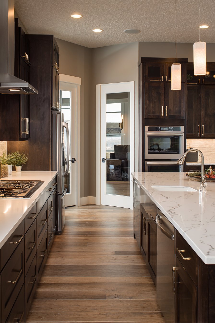
The kitchen is often called the heart of the home, and for good reason. It’s where families gather for meals, friends congregate during parties, and countless memories are created over shared conversations and culinary adventures. Yet, despite its central role in our daily lives, the kitchen walls are often overlooked when it comes to design decisions. Choosing the right wall color for your kitchen is one of the most impactful and cost-effective ways to transform the entire space, setting the mood, enhancing natural light, and reflecting your personal style. Whether you’re drawn to calming neutrals, bold dramatic hues, or soft pastels, the perfect kitchen wall color can make your culinary space feel more inviting, spacious, and uniquely yours.

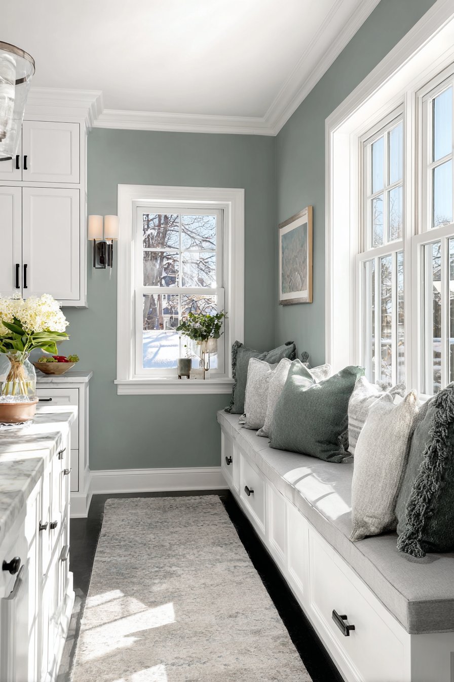
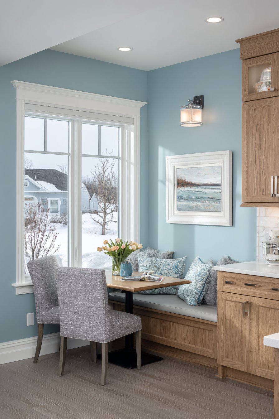
The psychology of color in kitchen design cannot be understated. Warm tones like terracotta, ochre, and soft yellows can stimulate appetite and conversation, making them ideal for family-oriented kitchens. Cool tones such as sage green, soft blue, and grey create calming environments perfect for morning coffee rituals and peaceful meal preparation. Meanwhile, dramatic choices like navy, charcoal, or forest green make bold statements that elevate your kitchen from purely functional to truly extraordinary. The key is understanding how different colors interact with your kitchen’s existing elements—cabinetry, countertops, flooring, and natural light—to create a cohesive design that feels both intentional and effortless.
In this comprehensive guide, we’ll explore twenty-five stunning kitchen wall color ideas that span the spectrum from timeless classics to contemporary trends. Each concept has been carefully curated to showcase how strategic color choices can completely transform your kitchen’s atmosphere, functionality, and aesthetic appeal. Whether you’re planning a complete renovation or simply looking for a weekend refresh project, these ideas will inspire you to see your kitchen walls as the powerful design element they truly are. From Mediterranean-inspired ochre to minimalist concrete grey, from romantic lavender to industrial exposed brick, you’ll discover practical approaches to color that work in real homes for real people.
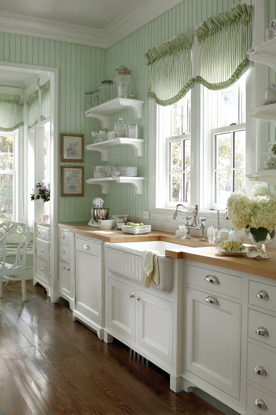
1. Sage Green Serenity
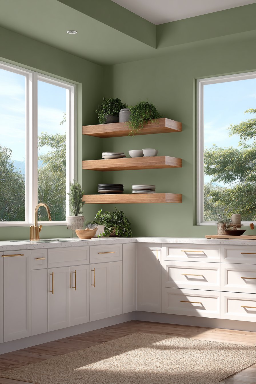
A modern kitchen adorned with sage green walls creates an immediately calming atmosphere that brings the tranquility of nature indoors. This particular shade of green—neither too grey nor too yellow—has emerged as one of the most sought-after kitchen wall color ideas for its versatility and timeless appeal. The matte finish prevents any unwanted shine while allowing the botanical wall tone to absorb and reflect natural light in the most flattering way. When paired with white shaker-style cabinets, the sage green creates a beautiful contrast that feels both fresh and grounded, allowing each element to shine without competing for attention.
The warmth of brass hardware against the cool undertones of sage green adds an unexpected layer of sophistication to this kitchen design. Natural oak floating shelves extend from the green walls, their honey-toned wood grain providing organic warmth while displaying minimalist dishware and potted herbs. This combination of materials—painted walls, natural wood, polished brass, and crisp white cabinetry—creates a kitchen that feels both curated and lived-in. The potted herbs on the shelves aren’t just decorative; they reinforce the connection to nature that the wall color establishes, creating a cohesive story throughout the space.
Large windows in this kitchen are essential to the design’s success, as they allow soft daylight to enhance the organic green hue throughout the day. Morning light brings out the cooler grey undertones, creating a serene start to the day, while afternoon sun warms the green, making it feel more yellow and energizing. This natural light interaction is one of the most compelling reasons to choose sage green as your kitchen wall color—it’s a shade that evolves with the light, never feeling flat or one-dimensional.
Key Design Tips:
- Test your sage green paint in different lighting conditions before committing, as it can read very differently in morning versus evening light
- Pair sage green walls with white or cream cabinets to keep the space feeling bright and open
- Incorporate brass or gold-toned hardware and fixtures to add warmth and prevent the green from feeling too cool
- Add natural wood elements through floating shelves, cutting boards, or bar stools to ground the botanical color palette
- Keep countertops light—white marble, quartzite, or light grey quartz work beautifully with sage green
2. Navy Blue Sophistication
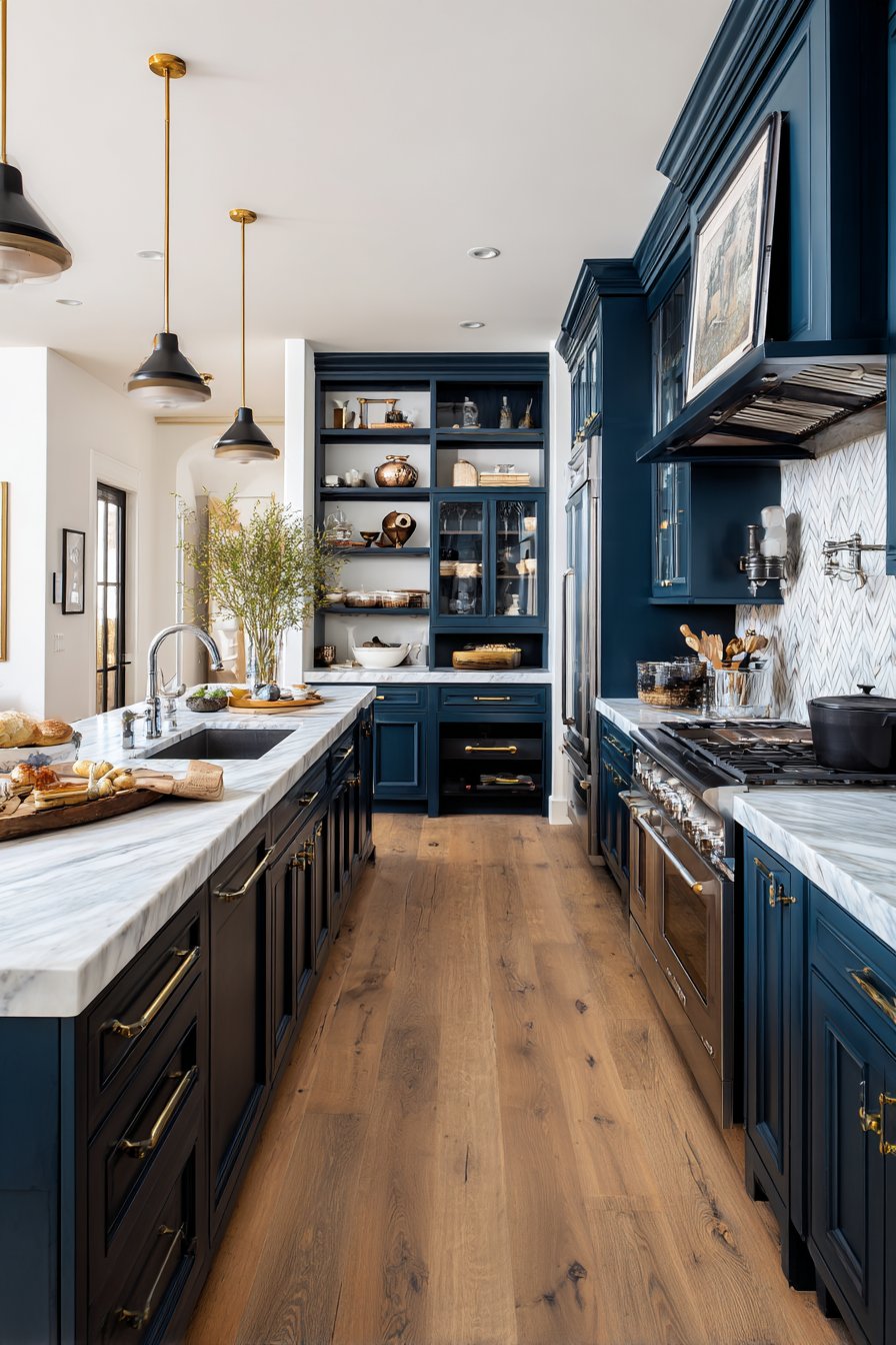
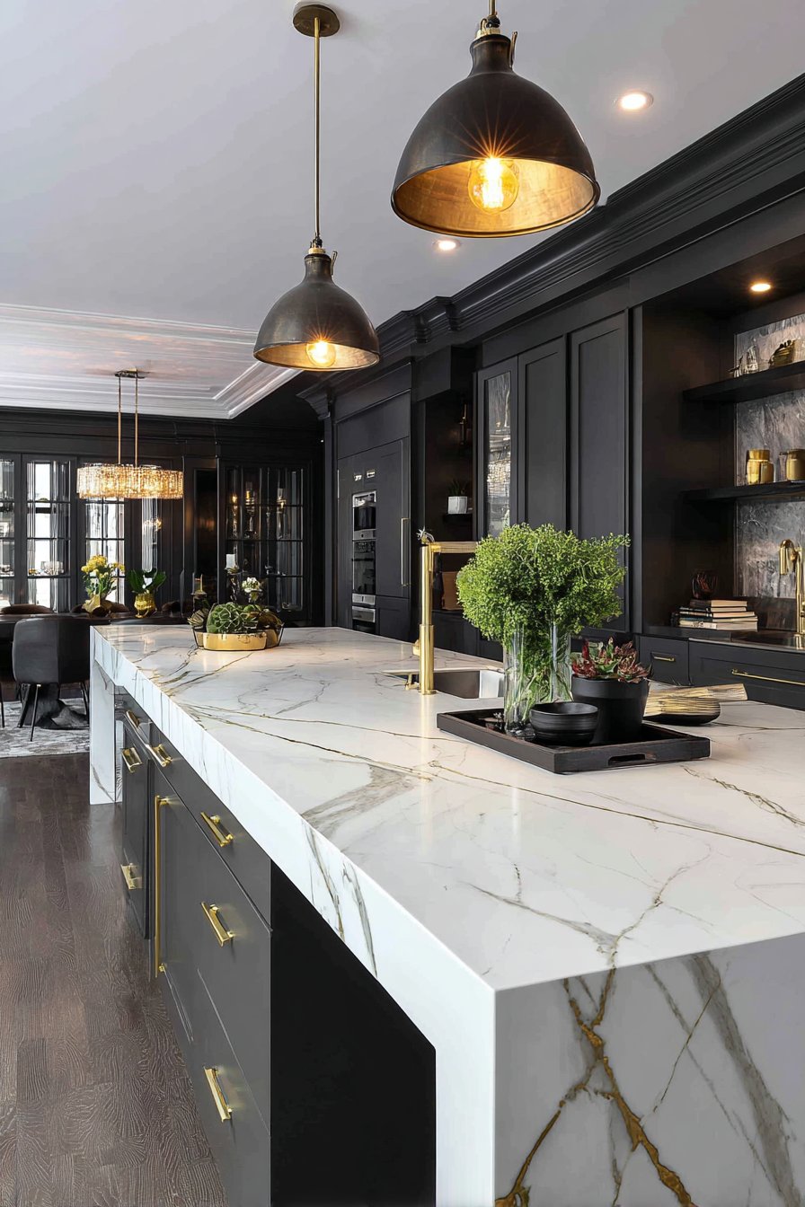
Deep navy blue walls represent one of the boldest and most dramatic kitchen wall color ideas, transforming an ordinary culinary space into a sophisticated haven that rivals any high-end restaurant or boutique hotel. This rich, saturated color creates instant depth and dimension, making the kitchen feel more intimate and cocooning while simultaneously lending an air of elegance and refinement. The contemporary aesthetic of navy blue walls pairs exceptionally well with white marble countertops, where the natural veining in the stone creates beautiful visual interest against the dark backdrop, drawing the eye and adding organic movement to the space.
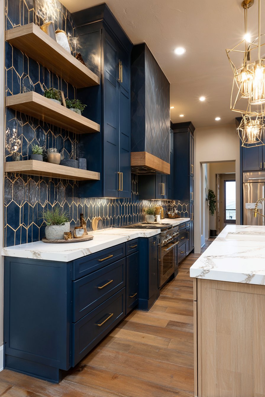
Light wood cabinetry provides the perfect counterbalance to the intensity of navy walls, preventing the space from feeling too heavy or dark. The warm undertones in natural wood—whether it’s oak, maple, or ash—create a welcoming contrast that makes the navy feel intentional rather than overwhelming. When the rich wall color extends to a geometric backsplash area, it creates a stunning focal point behind the cooking zone, turning a functional element into a true design statement. This monochromatic approach, using various shades and textures of blue, demonstrates sophisticated color theory in action.
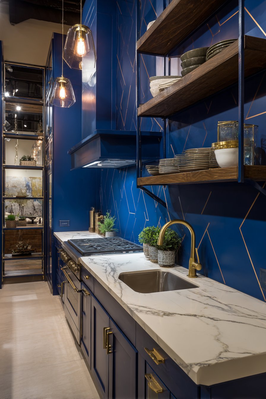
Open shelving in matching navy serves both practical and aesthetic purposes in this kitchen design. Functionally, it frames the cooking zone and provides accessible storage for everyday items. Aesthetically, it creates architectural interest and breaks up the expanse of wall color, preventing it from feeling too monotonous. Pendant lights with brass accents illuminate the workspace while adding another layer of warmth and luxury to the color scheme. The interplay between the cool navy, warm wood, pristine white marble, and golden brass creates a complex, layered design that reveals new details with each viewing.
Key Design Tips:
- Use navy blue in kitchens with ample natural or artificial lighting to prevent the space from feeling cave-like
- Balance dark walls with lighter cabinetry, countertops, and flooring to maintain visual equilibrium
- Incorporate metallic accents in brass, copper, or gold rather than silver to warm up the cool navy tones
- Consider painting just one accent wall in navy if you’re hesitant about committing to the color throughout
- Add texture through materials like marble, wood grain, or woven elements to prevent the dark color from feeling flat
- Ensure proper lighting design with multiple layers—ambient, task, and accent—to showcase the navy’s depth
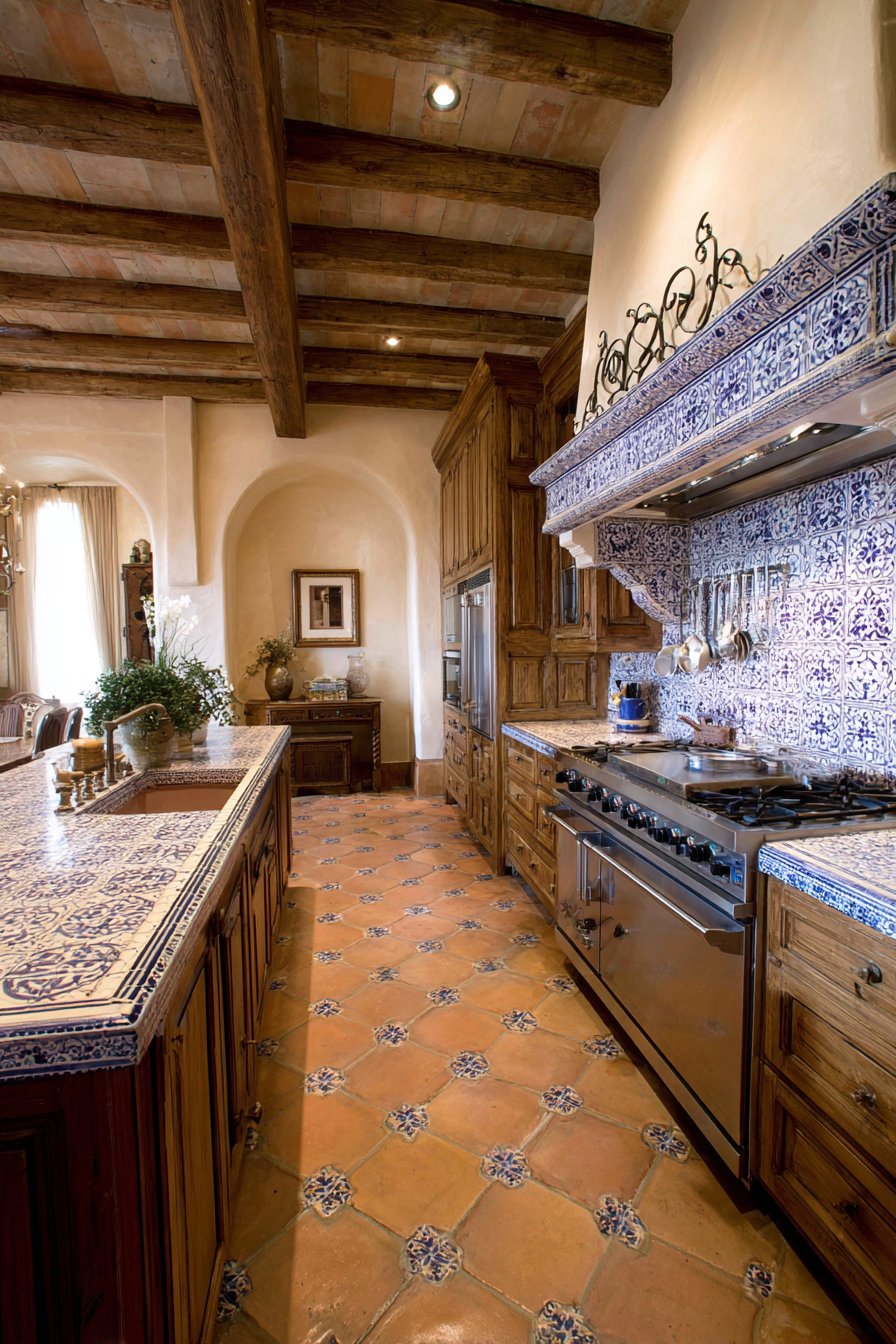
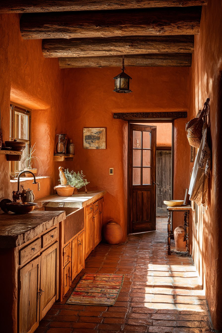
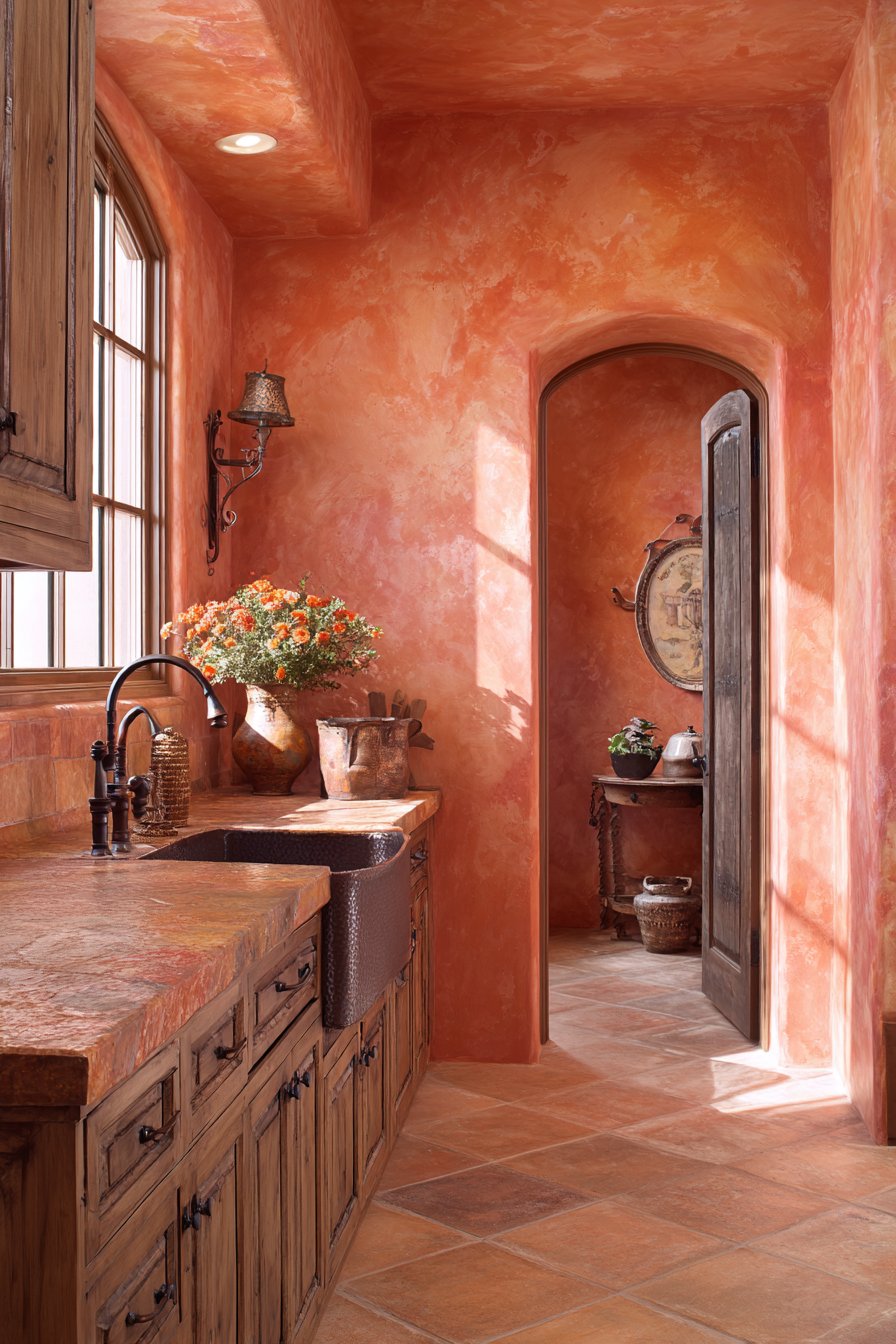
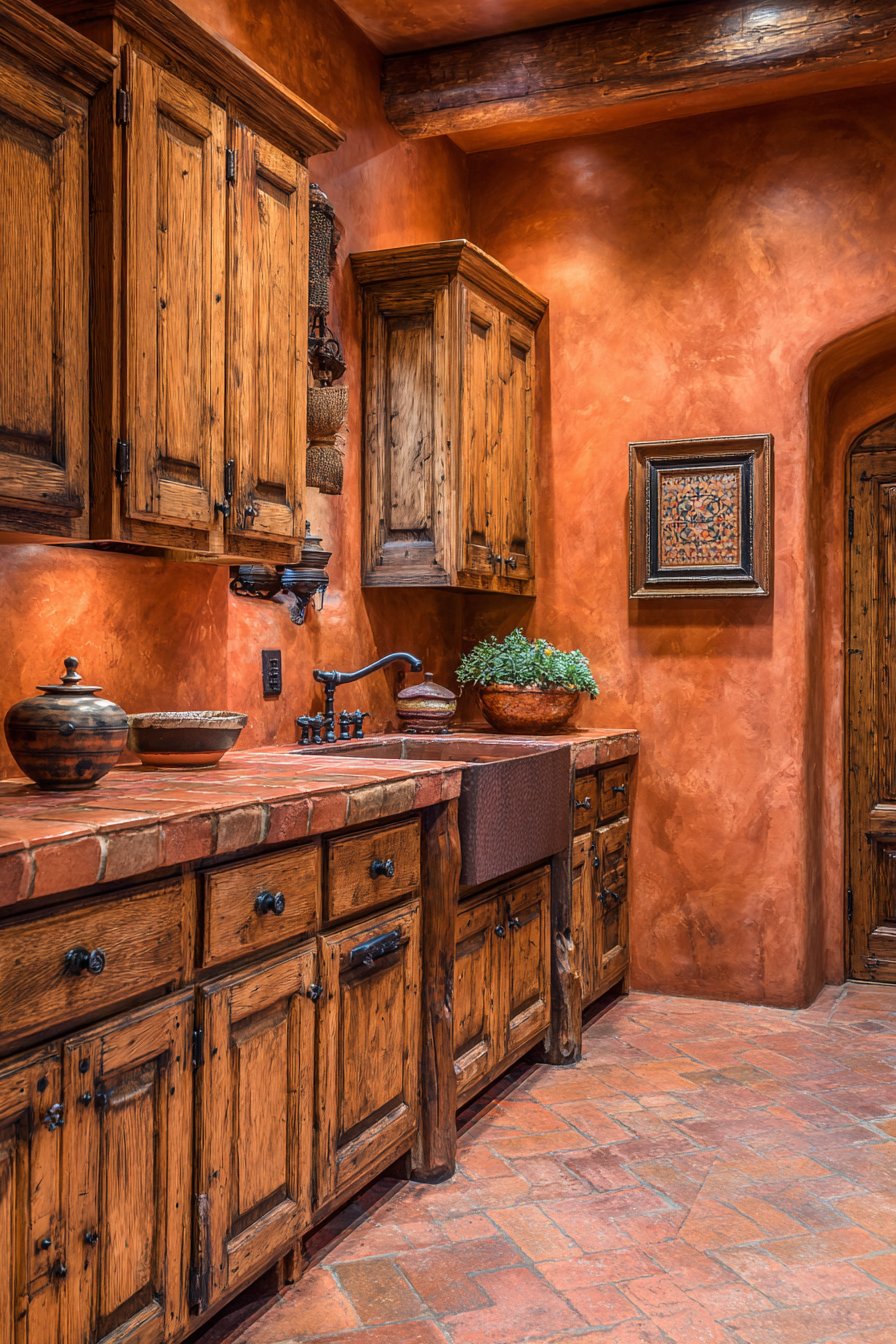
3. Warm Terracotta Mediterranean
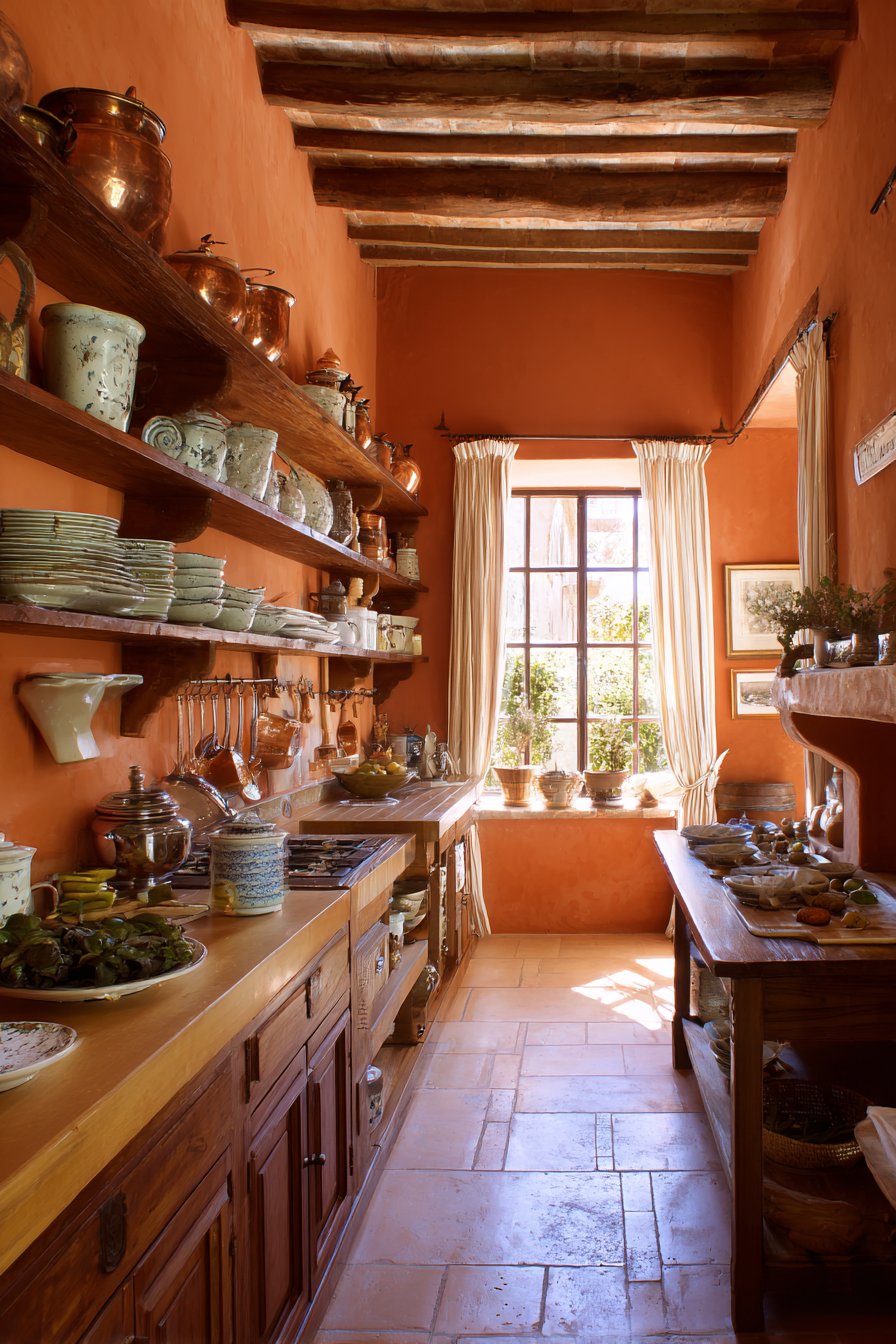
Terracotta walls bring the sun-drenched charm of Mediterranean villas directly into your kitchen, creating a space that feels inherently warm, inviting, and rich with cultural history. This earthy orange-red tone is among the most distinctive kitchen wall color ideas for those seeking to infuse their home with personality and warmth. The rustic appeal of terracotta works beautifully in farmhouse-style kitchens, where the wall color complements cream-colored cabinetry and butcher block countertops in a harmonious dance of warm, natural tones. Unlike cooler wall colors that can feel stark or clinical, terracotta immediately makes a kitchen feel lived-in and welcoming.
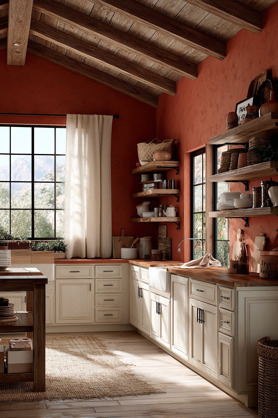
The genius of terracotta as a kitchen wall color lies in its ability to enhance both natural and artificial light. When natural light streams through a window dressed with simple linen curtains, the terracotta walls seem to glow from within, creating an almost magical golden-hour effect at any time of day. This quality makes the kitchen feel perpetually bathed in warm sunshine, lifting moods and creating an atmosphere that naturally draws people together. Vintage-inspired open shelving against these warm walls provides the perfect stage for displaying ceramic dishes in complementary earth tones and copper cookware that echoes the orange undertones in the wall color.
The textural quality of terracotta—whether applied as a flat paint or with added texture to mimic authentic plaster—adds another dimension to this kitchen wall color idea. The slight variations and depth in the color prevent it from feeling one-dimensional, while the warm tone creates a backdrop that makes food look more appetizing and gatherings feel more festive. This is a color choice for those who view their kitchen as a true living space, not merely a functional work zone.
Key Design Tips:
- Pair terracotta walls with cream, white, or natural wood cabinetry to prevent the space from feeling too dark
- Incorporate copper, bronze, or wrought iron fixtures and hardware to complement the earthy wall tone
- Use natural fiber textiles like linen curtains or jute rugs to enhance the Mediterranean aesthetic
- Display ceramics, pottery, and earthenware on open shelving to reinforce the artisanal, handcrafted feel
- Add plants with silvery-green foliage like olive trees or lavender to create beautiful contrast with the warm walls
- Consider a textured paint application to mimic authentic Mediterranean plaster for added authenticity
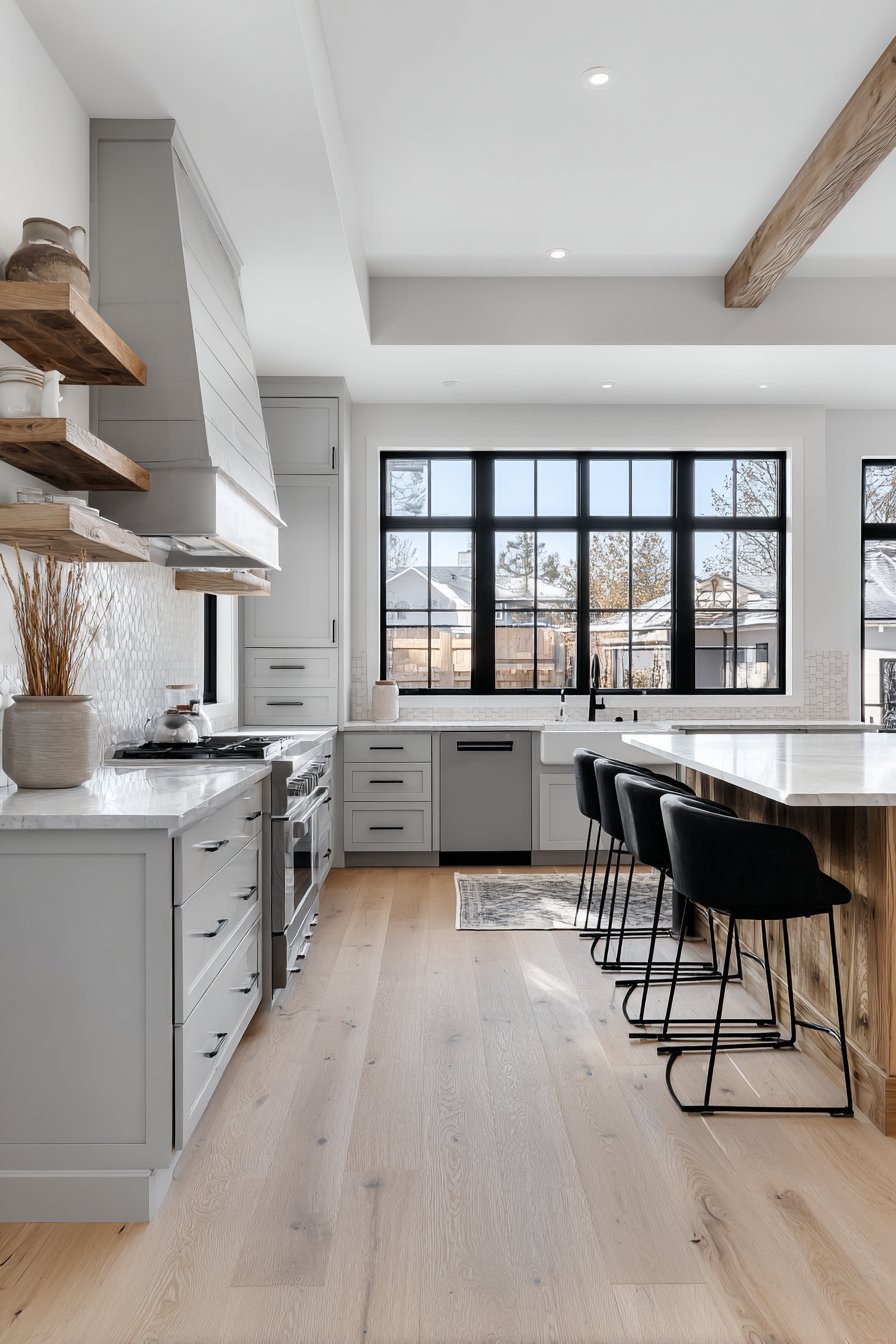
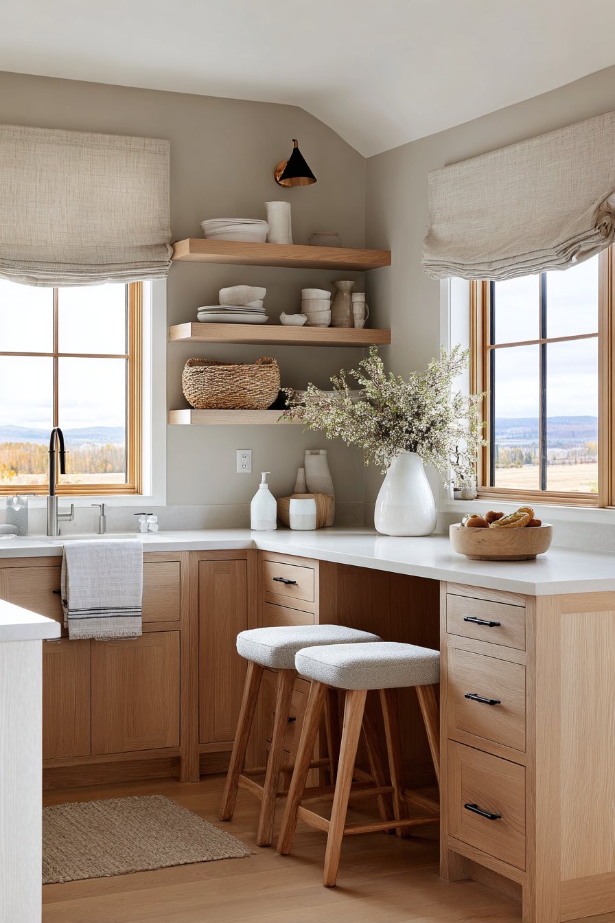
4. Soft Grey Minimalism
The cool-toned soft grey walls of a Scandinavian-inspired kitchen represent the epitome of serene minimalism, creating a peaceful sanctuary for meal preparation and mindful living. This particular shade of grey—with its subtle cool undertones—exemplifies restrained elegance among kitchen wall color ideas, proving that neutral doesn’t have to mean boring. The grey creates a perfect backdrop for white oak cabinets with integrated handles, allowing the beautiful natural wood grain to take center stage while maintaining the clean, uncluttered aesthetic that defines Scandinavian design philosophy.
Matte black fixtures provide carefully considered contrast points throughout this grey-walled kitchen, creating visual interest without disrupting the calming color palette. These black elements—whether faucets, cabinet pulls, or light fixtures—act as punctuation marks in the design, defining spaces and drawing the eye to functional areas. A small breakfast nook with grey upholstered seating echoes the wall color, creating a cohesive flow that makes the kitchen feel larger and more intentional. This repetition of color in different textures and materials demonstrates sophisticated design thinking.
Diffused natural lighting is crucial to making soft grey kitchen walls work effectively. Without adequate light, grey can read as dull or dreary, but when bathed in natural daylight, it reveals subtle variations and undertones that create depth and interest. The professional interior photography approach to this space emphasizes the monochromatic color story, showing how multiple shades of grey—from the walls to the upholstery to the veining in marble countertops—can work together to create a sophisticated, layered design that feels cohesive rather than monotonous.
Key Design Tips:
- Choose a grey with cool undertones for a truly Scandinavian feel, or warmer undertones for a softer, more inviting atmosphere
- Pair grey walls with natural wood elements to prevent the space from feeling cold or institutional
- Use matte black accents sparingly as contrast points to define the space without overwhelming the subtle palette
- Maximize natural light with large windows, minimal window treatments, or strategically placed mirrors
- Incorporate various textures—smooth painted walls, wood grain, linen, marble—to add interest to the monochromatic scheme
- Keep clutter to an absolute minimum to maintain the calming, minimalist aesthetic
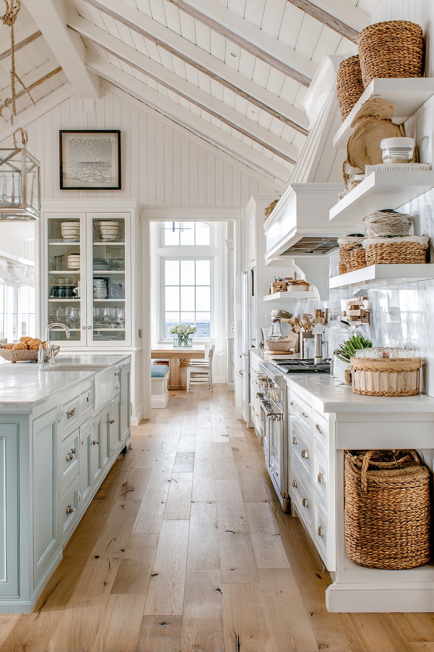
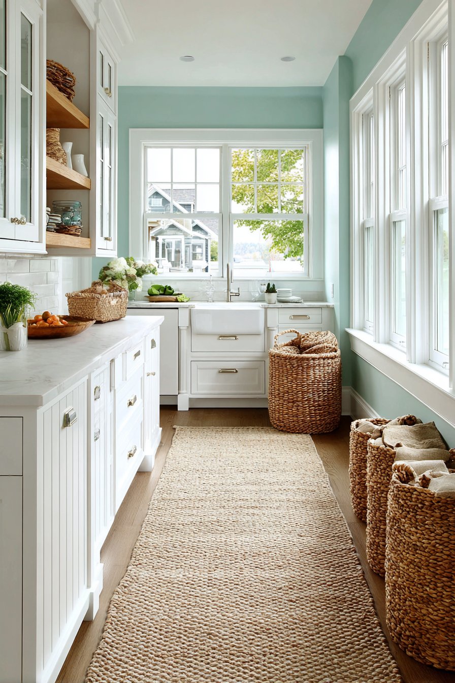
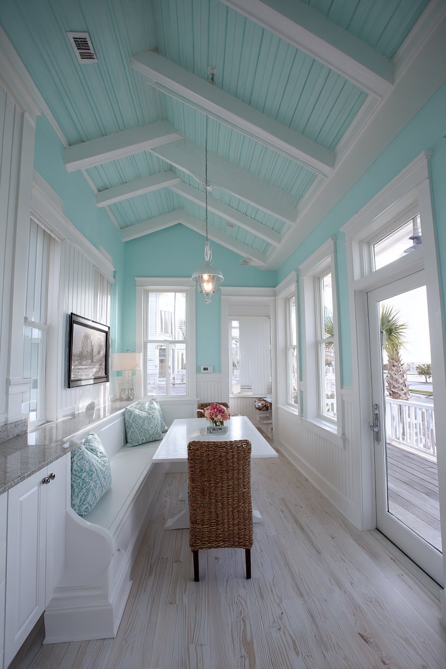
5. Crisp White Coastal
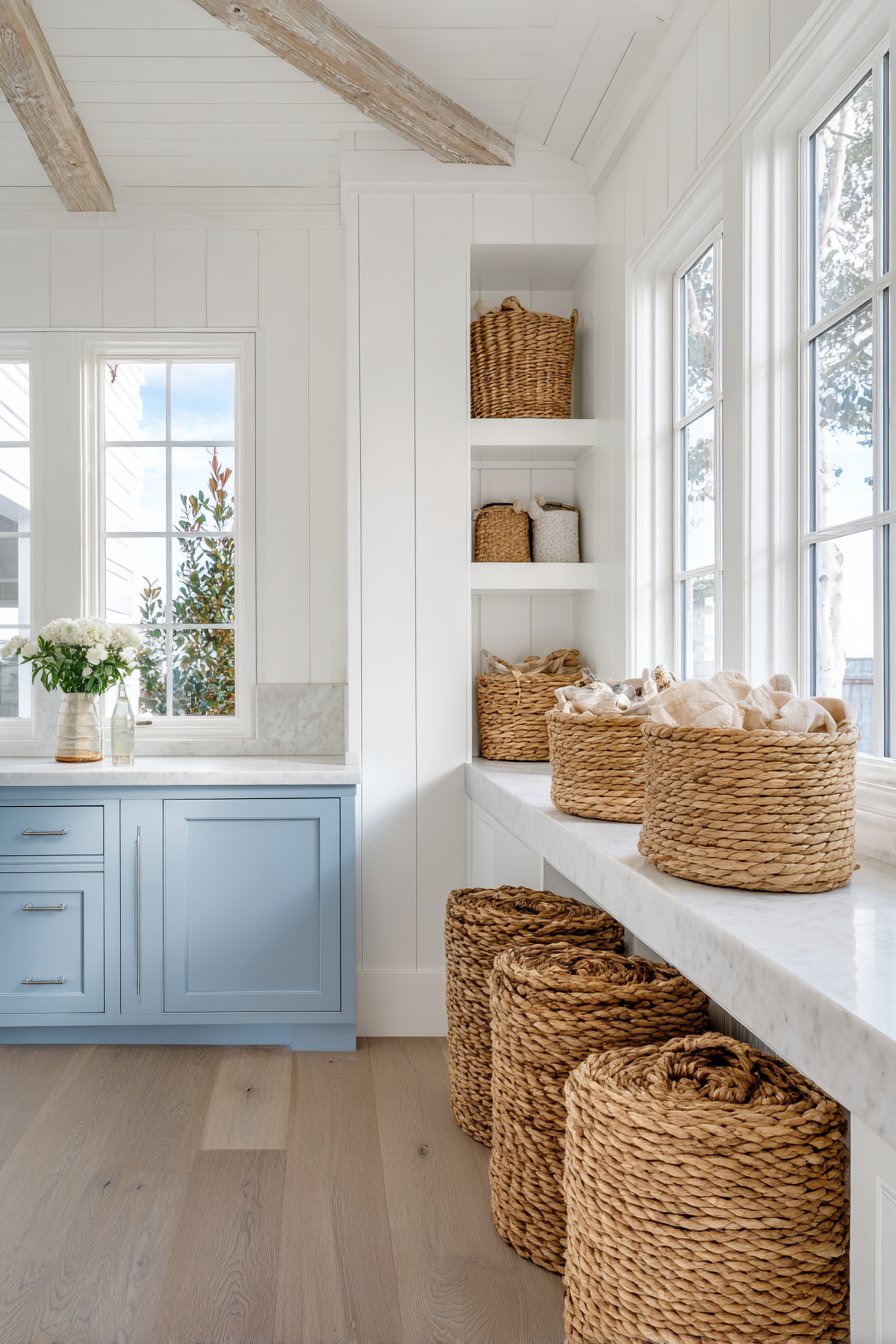
Crisp white walls with subtle texture from tongue-and-groove paneling create the fresh, airy foundation for a coastal-inspired kitchen that feels like a perpetual beach vacation. This classic approach to kitchen wall color ideas proves that white is far from boring when executed with attention to texture and detail. The tongue-and-groove treatment adds dimension and visual interest that flat paint cannot achieve, creating subtle shadows and highlights that change throughout the day as natural light moves across the surface. This textural element transforms simple white walls into an architectural feature worthy of attention.
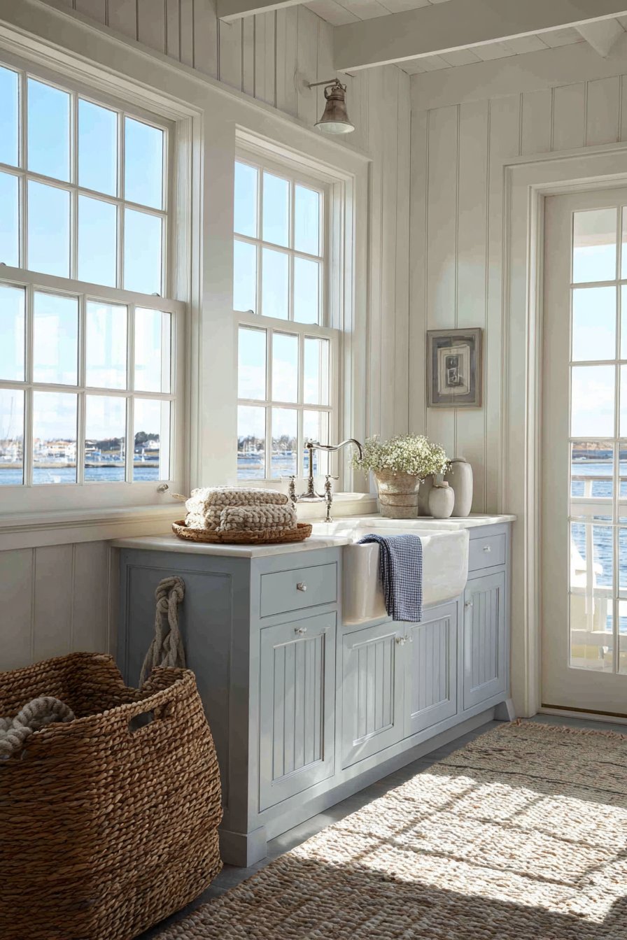
The two-tone cabinet approach in this kitchen—light blue-grey lower cabinets paired with white upper cabinets—creates visual balance while maintaining the breezy coastal aesthetic. This classic combination prevents the all-white walls from feeling too stark or clinical while keeping the overall palette light and fresh. Natural rope accents and woven baskets add organic texture against the clean white walls, introducing warmth and tactile interest that makes the space feel collected and lived-in rather than showroom-perfect. These natural elements are essential to preventing an all-white kitchen from feeling cold or sterile.
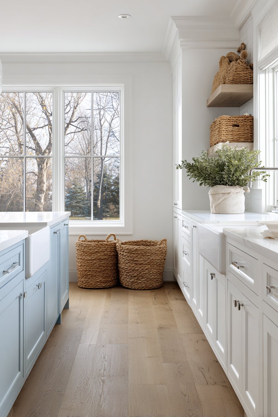
Large windows with simple white trim are the heroes of this coastal kitchen design, flooding the space with natural light that makes the white walls appear luminous and ever-changing. The abundance of light is what allows white to work so effectively as a kitchen wall color—without adequate natural light, white can appear dingy or grey. The interior design photography approach captures the fresh, vacation-home feeling that makes this color choice so appealing to those seeking a sense of escape and tranquility in their daily lives.
Key Design Tips:
- Add texture to white walls through paneling, shiplap, or beadboard to prevent them from feeling flat
- Incorporate two-tone cabinetry in soft blues, greys, or greens to add subtle color while maintaining the fresh aesthetic
- Use natural materials like rope, seagrass, jute, and woven baskets to warm up white walls and add coastal character
- Maximize window size and minimize window treatments to flood the space with natural light
- Choose white with warm undertones (cream, ivory) rather than stark white for a softer, more inviting feel
- Add subtle blue or aqua accents through dishware, textiles, or decorative objects to reinforce the coastal theme
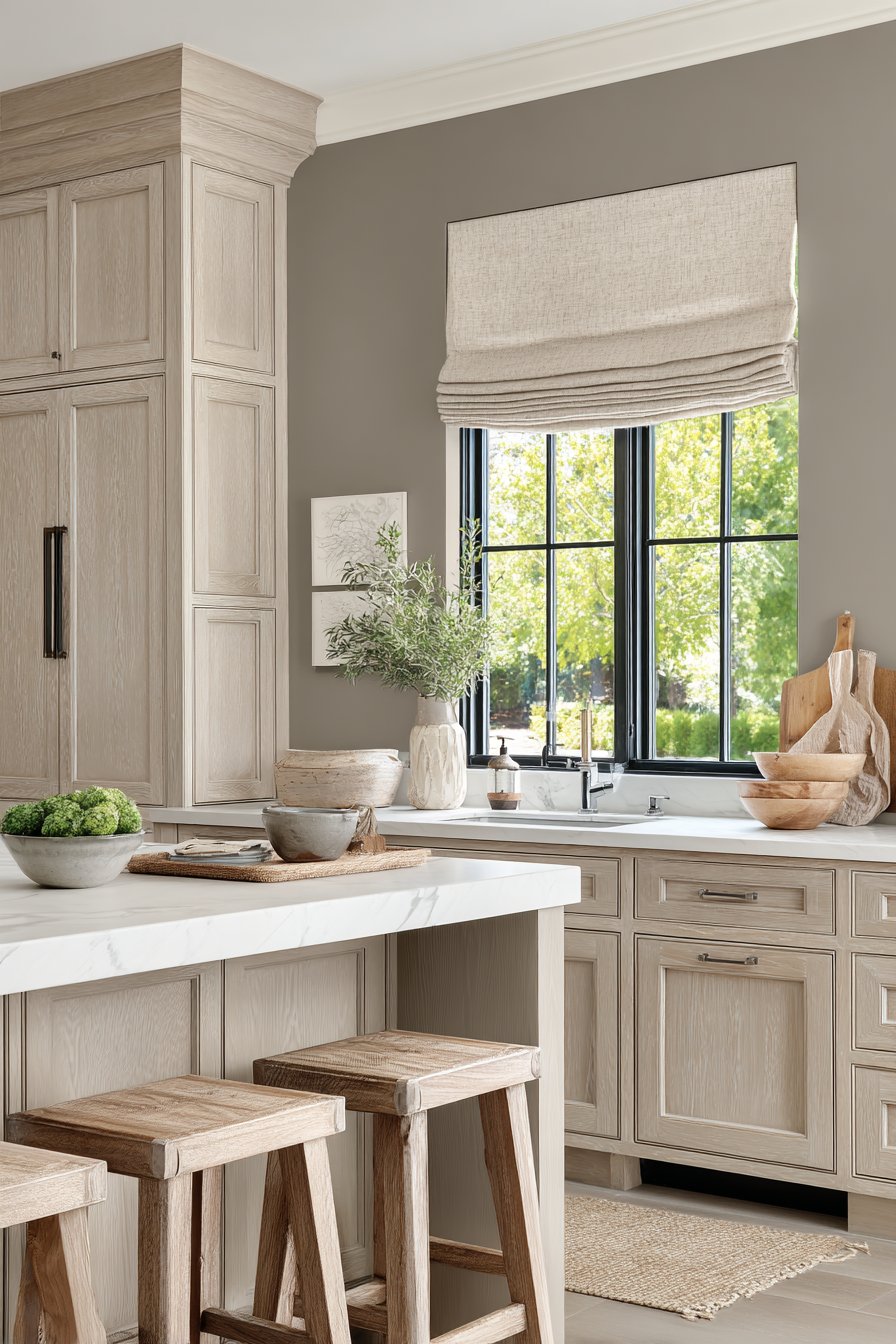
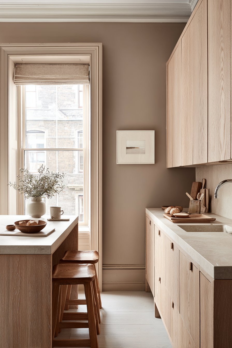
6. Warm Greige Transitional
Warm greige—that perfect blend of grey and beige—represents one of the most versatile kitchen wall color ideas, serving as the ideal bridge between traditional and contemporary design styles. This sophisticated neutral tone creates a welcoming backdrop that allows other design elements to shine while providing enough color interest to prevent the space from feeling bland. When dark walnut cabinets are set against greige walls, the wood gains remarkable depth and richness, with the warm undertones in both the walls and the wood creating a harmonious relationship. White quartz countertops brighten the workspace and provide essential contrast, preventing the darker elements from overwhelming the space.
The gold-toned cabinet hardware and light fixtures in this transitional kitchen are carefully chosen to complement the warm grey-beige wall color, creating a cohesive metallic story throughout the space. This attention to metal finishes demonstrates sophisticated design thinking—the gold doesn’t compete with the greige walls but rather enhances the warmth and creates a subtle sense of luxury. Recessed lighting combined with under-cabinet lights creates layers of illumination that showcase the wall color at its best, preventing any areas from falling into shadow and ensuring the greige reads as warm and inviting rather than dull or muddy.
The beauty of greige as a kitchen wall color lies in its chameleon-like quality. Depending on the lighting conditions and surrounding colors, it can read as more grey or more beige, making it exceptionally adaptable to changing design trends and seasonal decorating. This flexibility means that homeowners can easily update accessories, textiles, or accent colors without needing to repaint, making greige a smart long-term investment for those who like to refresh their decor periodically.
Key Design Tips:
- Test greige paint samples in both natural and artificial light, as these neutrals can shift dramatically depending on illumination
- Pair greige walls with dark wood cabinetry for a traditional feel, or white cabinetry for a more contemporary look
- Use warm-toned metals like gold, brass, or copper rather than cool-toned silver or chrome
- Layer multiple light sources—ambient, task, and accent—to prevent greige from appearing flat or dull
- Incorporate varied textures through materials like wood, stone, metal, and textiles to add visual interest
- Choose greige with undertones that complement your flooring for a cohesive, flowing design
7. Dusty Blue Eclectic
Dusty blue walls inject personality and charm into an eclectic kitchen without overwhelming the space, representing a middle ground among kitchen wall color ideas for those who want color but aren’t ready for bold, saturated hues. This soft, muted blue—with its subtle grey undertones—creates a sophisticated backdrop that works beautifully with a mix of design styles and periods. Open wooden shelving in natural finish creates stunning contrast against the blue, with the warm wood tones preventing the cool wall color from feeling cold or uninviting. The shelves display colorful dishware and plants, turning everyday items into a curated display that adds life and personality to the walls.

The vintage-style range in this eclectic kitchen becomes an even more striking focal point against the dusty blue backdrop, while patterned floor tiles contribute additional character and visual interest. This layering of pattern, color, and texture represents the heart of eclectic design—the careful combination of diverse elements that somehow work together to create a cohesive, collected-over-time aesthetic. The dusty blue walls unify these varied elements, providing enough color interest to feel intentional while remaining neutral enough to let other design features shine.
Natural window light brings out the subtle grey undertones in the blue walls, creating a color that shifts throughout the day from more grey in bright light to more blue in softer lighting. This quality gives the kitchen a living, breathing quality that flat colors cannot achieve. The interior design photography emphasizes the balanced, lived-in aesthetic created by this wall color choice, showing how dusty blue can feel both put-together and comfortably casual.
Key Design Tips:
- Choose dusty blue with grey undertones for a sophisticated look that works with multiple design styles
- Pair blue walls with natural wood elements to add warmth and prevent the space from feeling too cool
- Display colorful dishware, artwork, or plants on open shelving to create personality and visual interest
- Incorporate vintage or antique elements that complement rather than match the blue walls
- Add patterned textiles or floor tiles to enhance the eclectic aesthetic without overwhelming the space
- Use plenty of lighting to ensure the blue reads as sophisticated rather than dark or dingy
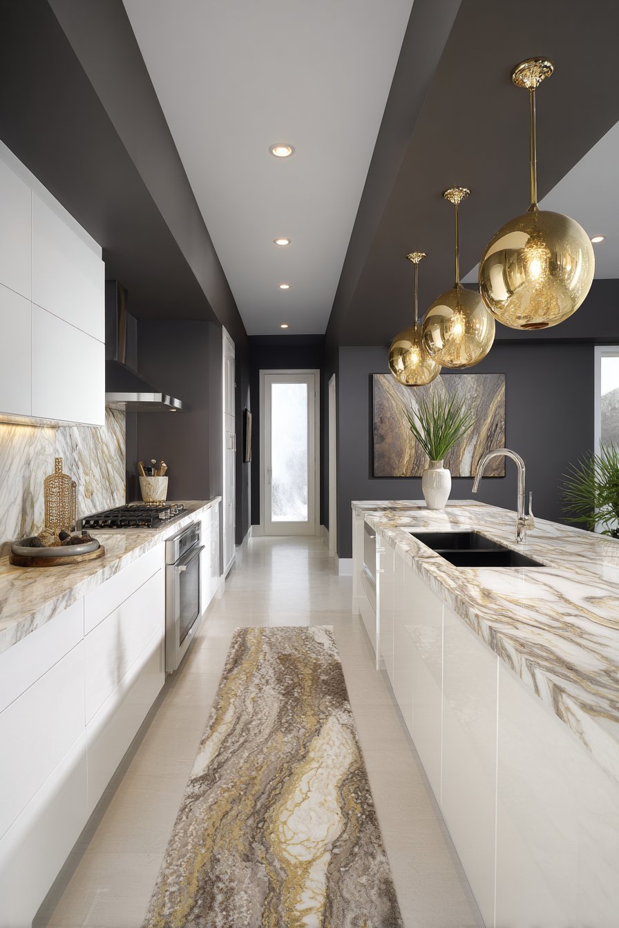
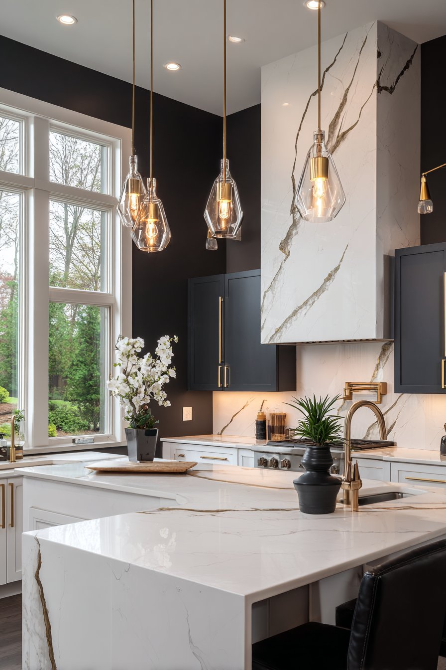
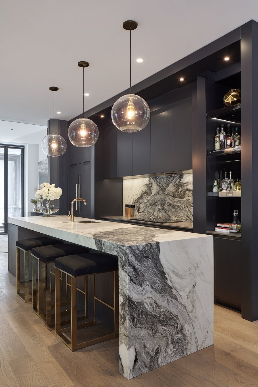
8. Deep Charcoal Drama
Deep charcoal grey walls create unparalleled modern drama in a luxury kitchen, representing one of the boldest kitchen wall color ideas for those unafraid to make a striking statement. This dark, sophisticated color transforms the kitchen from a purely functional space into a jewel box of design excellence. High-gloss white handleless cabinets create striking contrast against the dark walls, their reflective surfaces bouncing light around the room and preventing the space from feeling too enclosed. The sleek, minimalist cabinet design allows the dramatic wall color to take center stage while maintaining the clean lines essential to contemporary design.
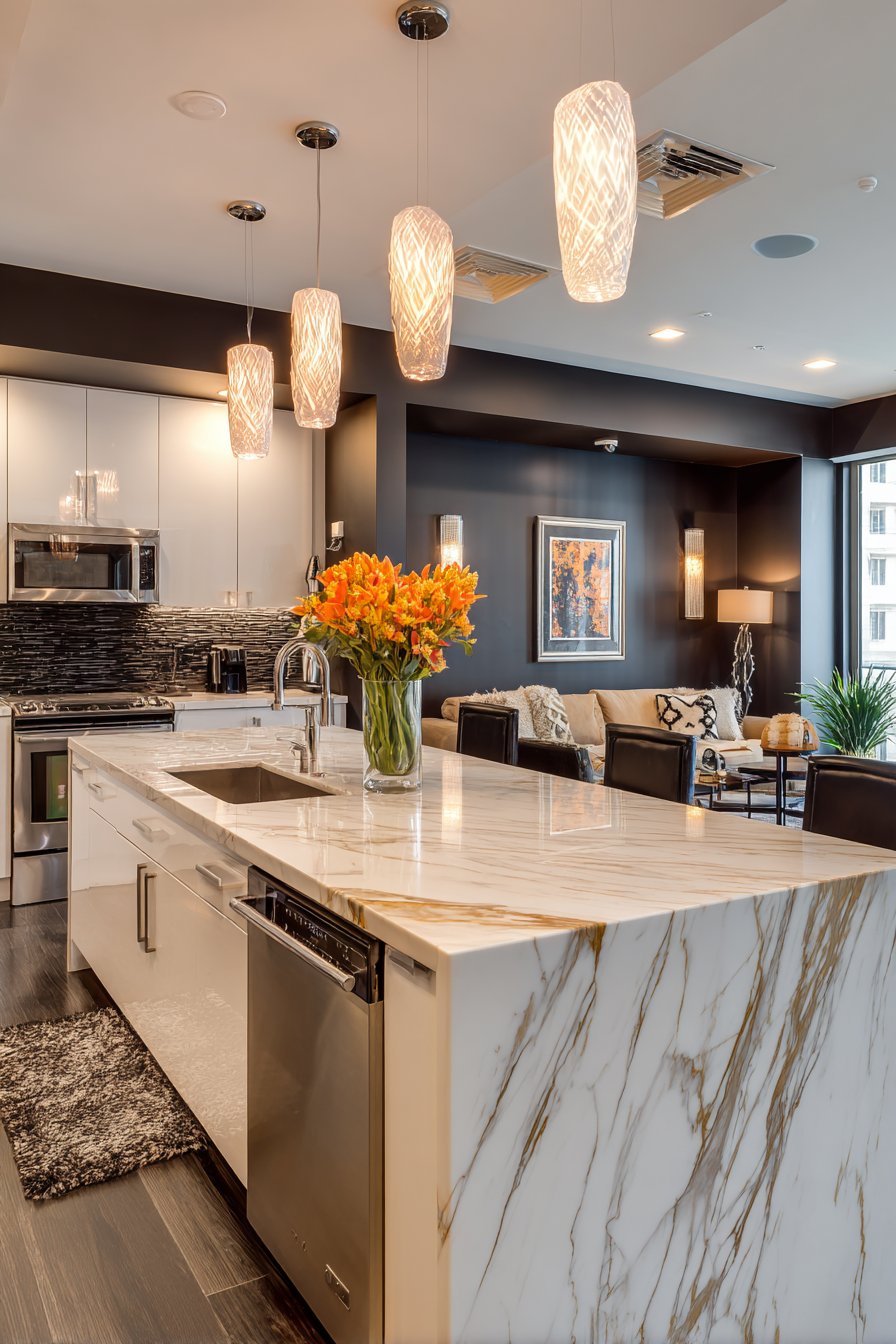
White marble countertops with dramatic gold veining serve as sculptural elements in this charcoal kitchen, their organic patterns creating visual interest and luxury against the solid dark backdrop. The veining appears to glow against the charcoal walls, creating depth and dimension that draws the eye and provides focal points throughout the space. Gold fixtures and hardware add another layer of luxury and warmth, their metallic gleam creating beautiful contrast points that catch the light. Large pendant lights with warm bulbs provide necessary illumination, their glow creating pools of welcoming light in the dramatic space.
Professional interior photography with expertly balanced lighting is essential to capture this bold wall color while maintaining detail in both the dark surfaces and bright elements. This is perhaps the most critical consideration for homeowners contemplating charcoal walls—adequate lighting isn’t optional; it’s essential. Without multiple layers of well-planned lighting, charcoal walls can make a kitchen feel cave-like and oppressive. With proper illumination, they create sophisticated, restaurant-quality ambiance.
Key Design Tips:
- Use charcoal only in kitchens with excellent natural light or invest significantly in layered artificial lighting
- Pair dark walls with high-contrast white or very light cabinets to maintain visual balance and prevent overwhelming darkness
- Incorporate reflective surfaces through glossy cabinets, polished stone, or metallic elements to bounce light around
- Choose warm-toned metals like gold or brass rather than cool silver to add warmth to the cool charcoal
- Ensure at least three layers of lighting—ambient (overhead), task (under-cabinet), and accent (pendant or decorative)
- Keep the color palette relatively simple with charcoal as the star, supported by black, white, and one metallic tone
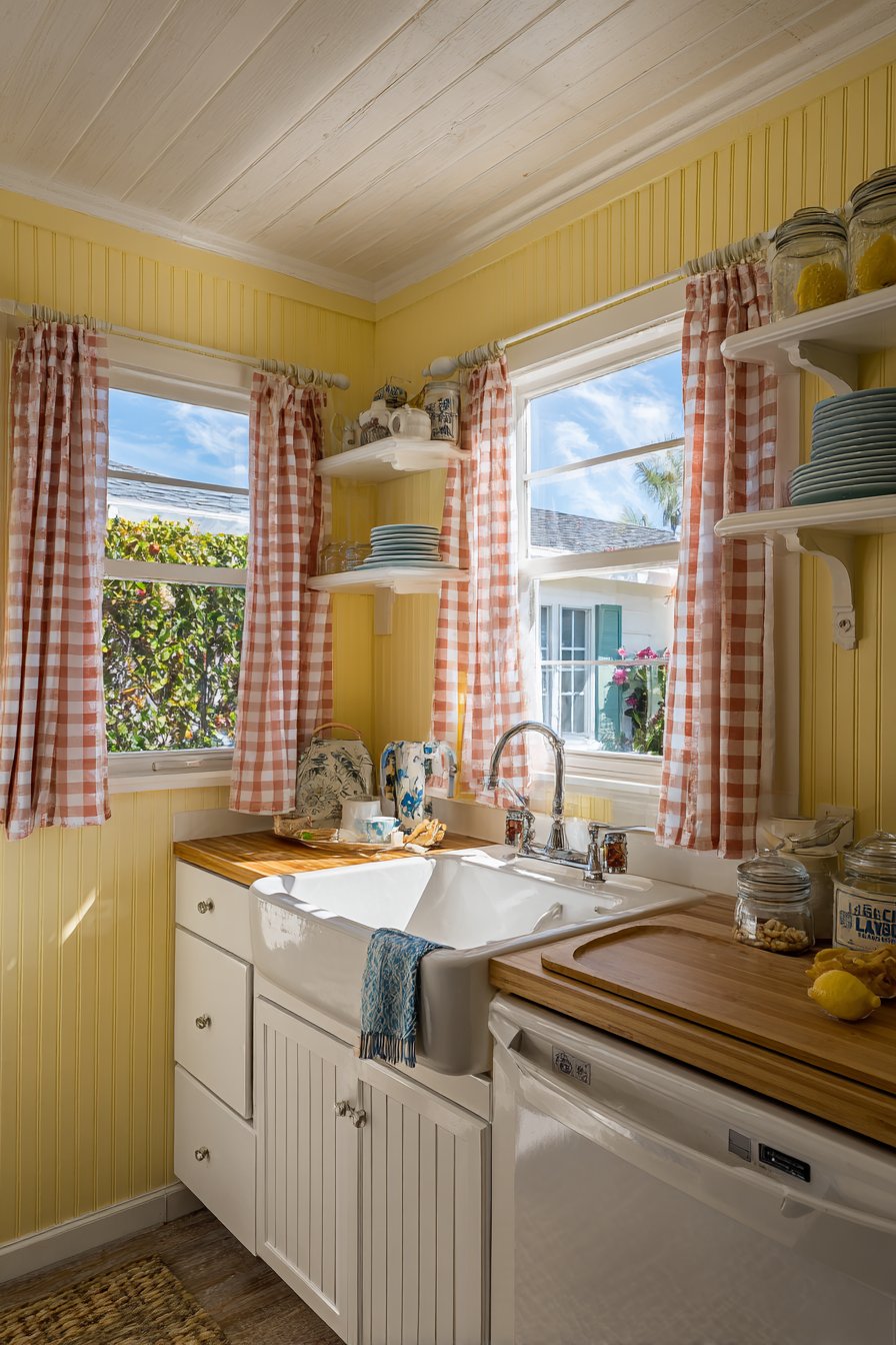
9. Soft Butter Yellow Cottage
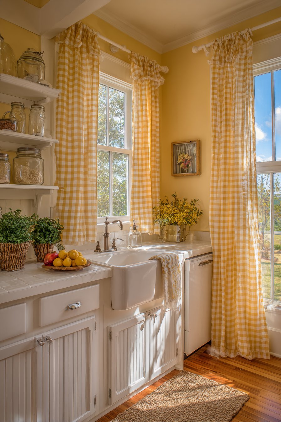
Soft butter yellow walls evoke sunny, cheerful mornings in a cottage-style kitchen, bringing warmth and optimism to one of the home’s most-used spaces. This gentle yellow—neither too bright nor too pale—represents an increasingly popular choice among kitchen wall color ideas for those seeking to create a space that feels inherently welcoming and happy. White beadboard cabinets with cup pulls provide classic charm while keeping the look light and fresh, preventing the yellow walls from feeling overwhelming or too sweet. Open shelving displays vintage-inspired accessories and mason jars, creating a collected, farmhouse aesthetic that feels authentic rather than contrived.
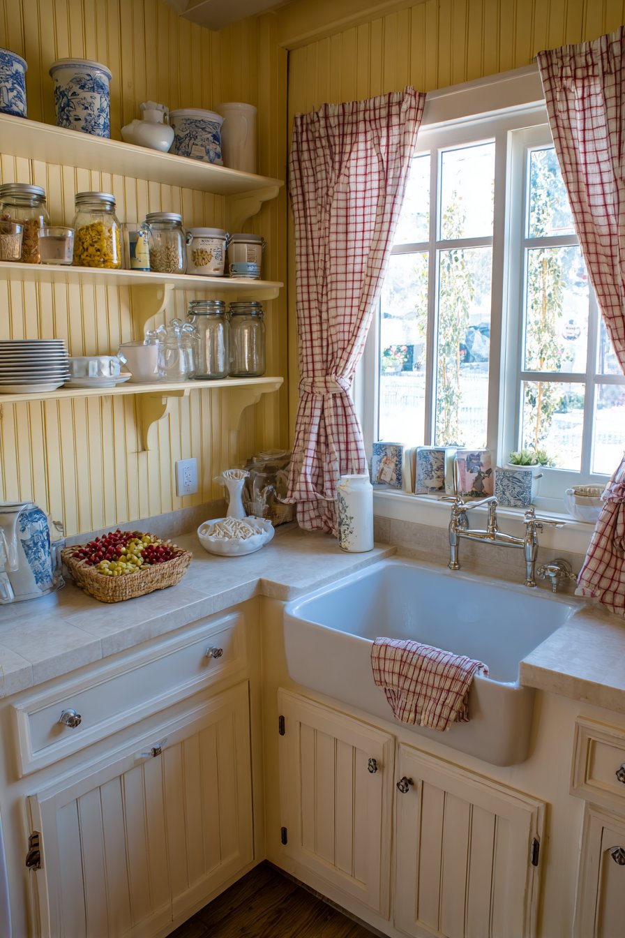
The porcelain farmhouse sink beneath a window with gingham curtains anchors the traditional aesthetic, creating a focal point that embodies cottage style. This classic element against the butter yellow walls creates a scene straight from a storybook—the kind of kitchen where cookies are baked, preserves are jarred, and family recipes are passed down through generations. The yellow walls enhance this narrative, creating a backdrop that feels sunny and optimistic regardless of the actual weather outside.
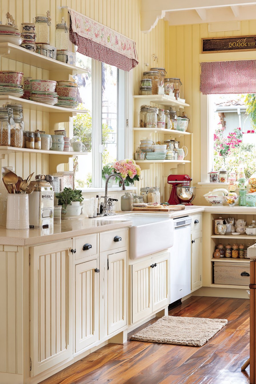
Natural daylight enhances the warm, welcoming glow of the yellow walls throughout the day, making the kitchen feel perpetually bathed in sunshine. This quality makes butter yellow an excellent choice for kitchens with limited natural light or those in climates with long, grey winters. The wide-angle interior design photography captures the cozy, inviting atmosphere created by this wall color, demonstrating how the right shade of yellow can feel elegant and sophisticated rather than childish or overwhelming.
Key Design Tips:
- Choose a soft, buttery yellow with cream undertones rather than bright lemon or gold tones
- Pair yellow walls with white or cream cabinetry to keep the look fresh and prevent color overload
- Incorporate vintage or farmhouse elements like mason jars, enamelware, or ironstone to enhance the cottage aesthetic
- Use natural materials like wood countertops, woven baskets, or linen textiles to ground the cheerful color
- Add blue accents through dishware, textiles, or small appliances for classic yellow-and-blue contrast
- Ensure window treatments are light and airy to maximize natural light and maintain the sunny feeling
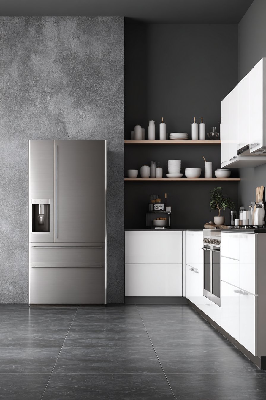
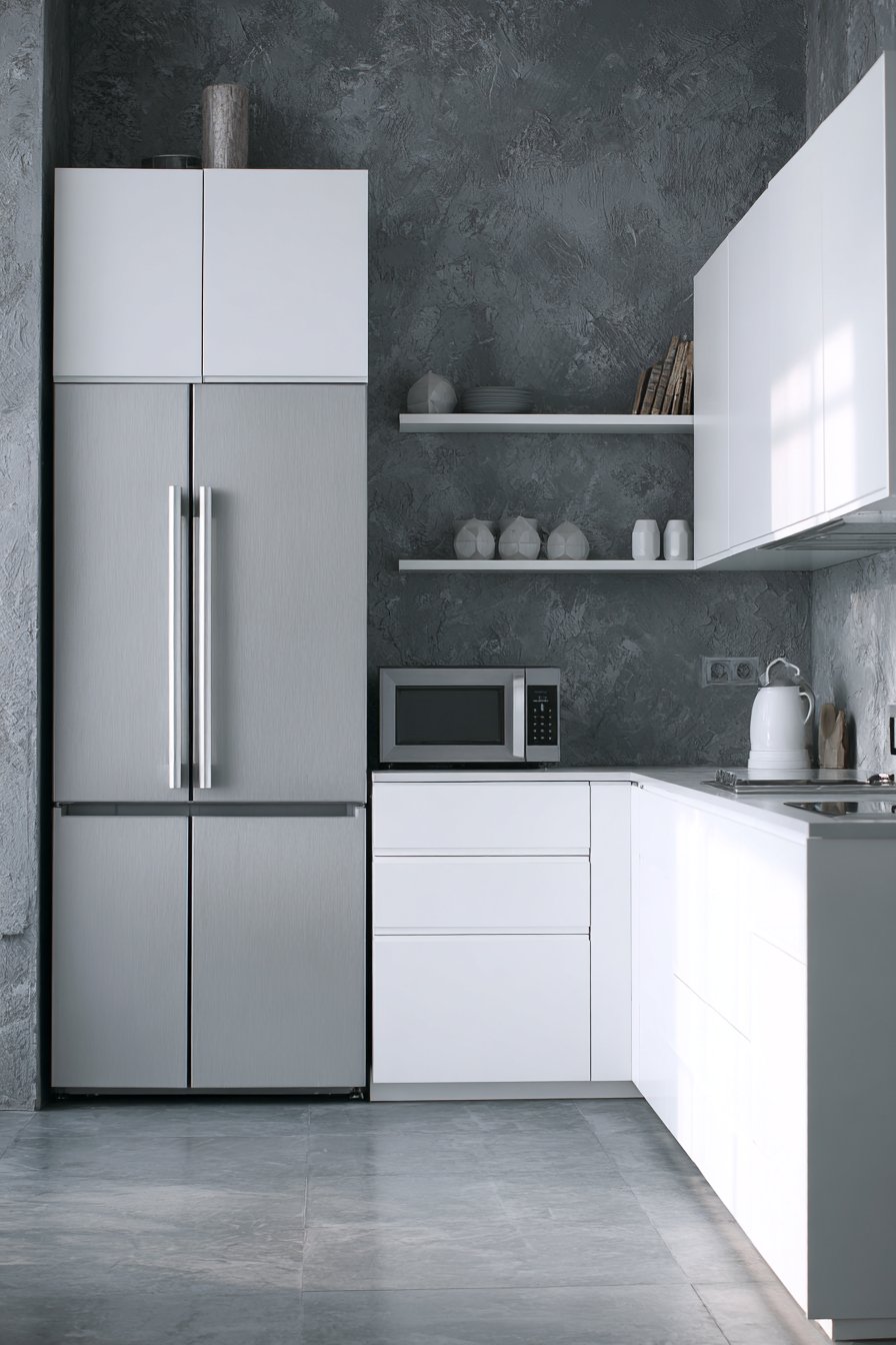
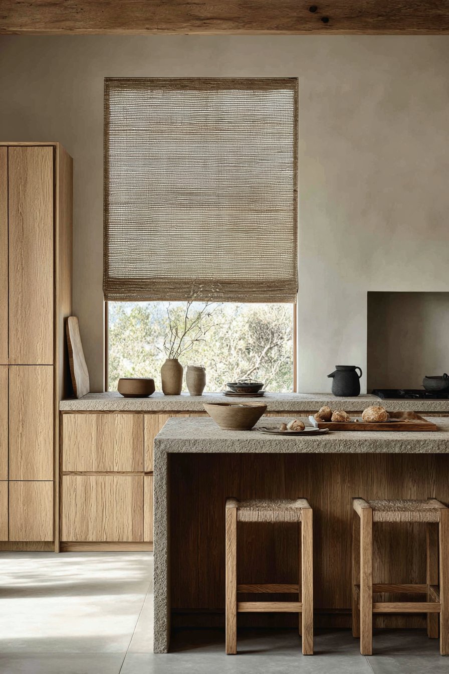
10. Concrete Grey Industrial
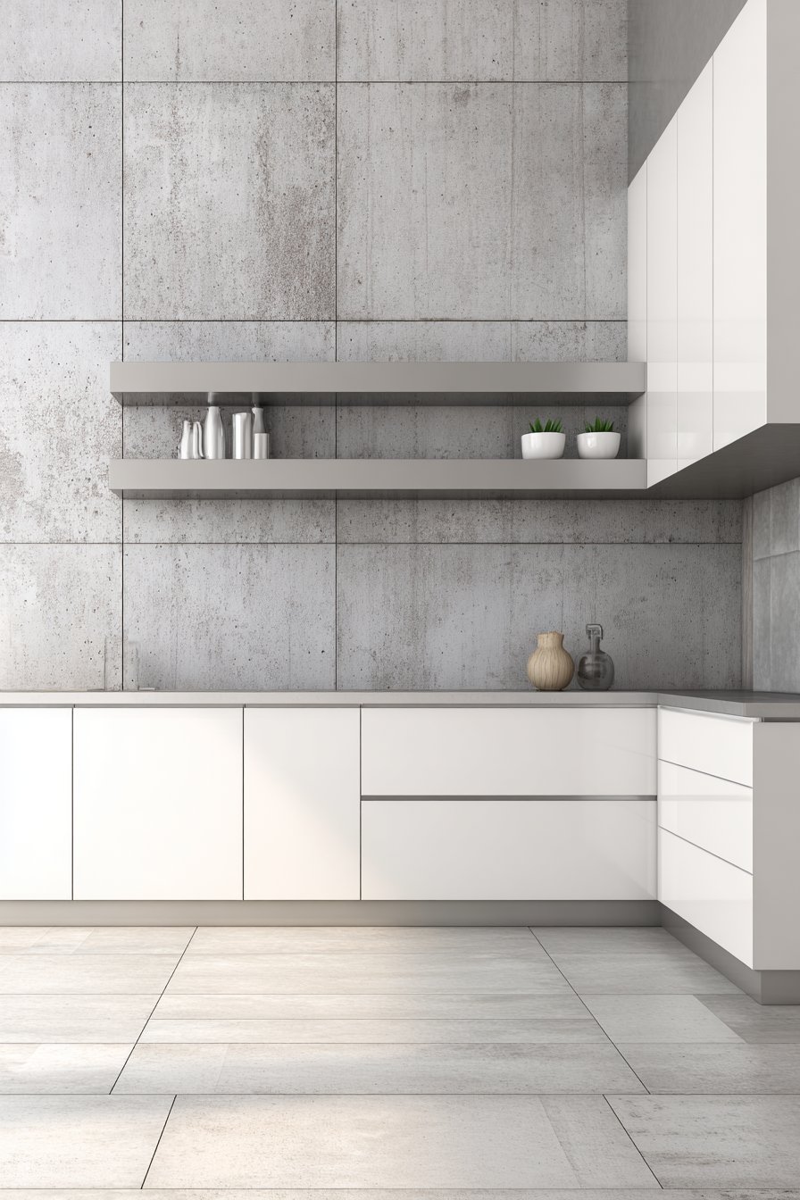
Concrete grey walls bring industrial-meets-modern aesthetic to a minimalist kitchen, creating a sophisticated urban backdrop that feels contemporary and intentional. This cool, neutral shade of grey—inspired by poured concrete and urban architecture—represents one of the more daring kitchen wall color ideas, perfect for those who embrace clean lines and modern materials. Handleless white lacquer cabinets create seamless surfaces against the grey walls, their smooth, glossy finish providing subtle contrast in texture while maintaining the monochromatic color scheme. Stainless steel appliances complement the urban wall tone, reinforcing the industrial aesthetic without adding visual clutter.
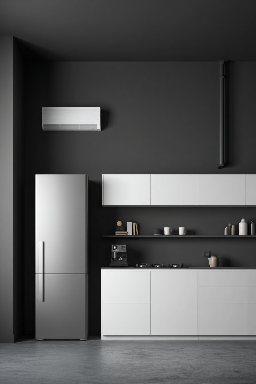
A simple floating shelf displays a few carefully curated objects, demonstrating the “less is more” philosophy central to minimalist design. Against the concrete grey walls, even simple objects become sculptural elements, their forms and shadows creating visual interest in an otherwise pared-down space. Large format grey floor tiles echo the wall color, creating a seamless, cohesive look that makes the kitchen feel larger and more unified. This repetition of color in different materials—painted walls, polished cabinets, matte tiles—creates subtle variation within a tight palette.
Interior photography with balanced exposure showcases the sophisticated simplicity of this monochromatic grey palette, proving that a limited color scheme need not feel boring or flat. The key to making concrete grey walls work is attention to texture, lighting, and proportion. Without these considerations, grey can feel depressing or institutional. With thoughtful design, it creates a serene, gallery-like backdrop for everyday life.
Key Design Tips:
- Use concrete grey in kitchens with modern or industrial design styles for cohesive aesthetic flow
- Pair grey walls with white cabinetry to maintain brightness and prevent the space from feeling too heavy
- Incorporate varied textures—smooth lacquer, matte paint, polished steel—to add interest to the monochromatic palette
- Add warmth through wood accents, whether cutting boards, bar stools, or decorative objects
- Ensure excellent lighting to prevent grey from reading as dull or depressing
- Keep surfaces uncluttered to maintain the minimalist aesthetic that makes this wall color work
11. Lavender-Grey Romance
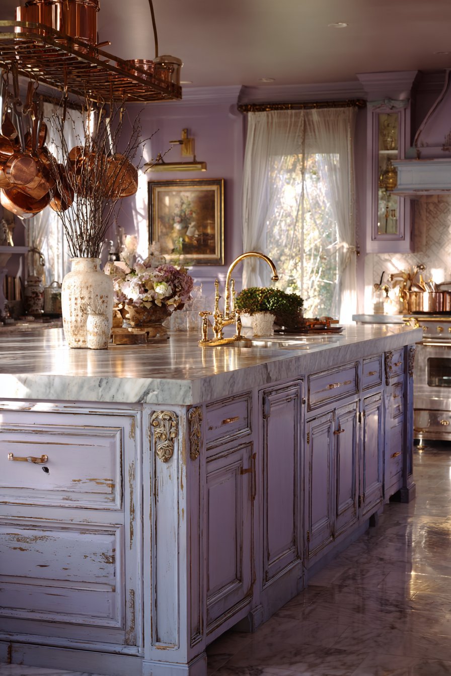
Soft lavender-grey walls add romantic elegance to a French country kitchen, creating a unique and sophisticated color choice among kitchen wall color ideas. This delicate purple-tinted grey is neither overtly feminine nor boldly purple—it’s a subtle, nuanced color that brings unexpected elegance to the kitchen space. Distressed white cabinets with decorative molding enhance the provincial charm, their weathered finish suggesting age and history that pairs beautifully with the soft wall color. Marble countertops add natural luxury while maintaining the light, airy feeling essential to French country design.
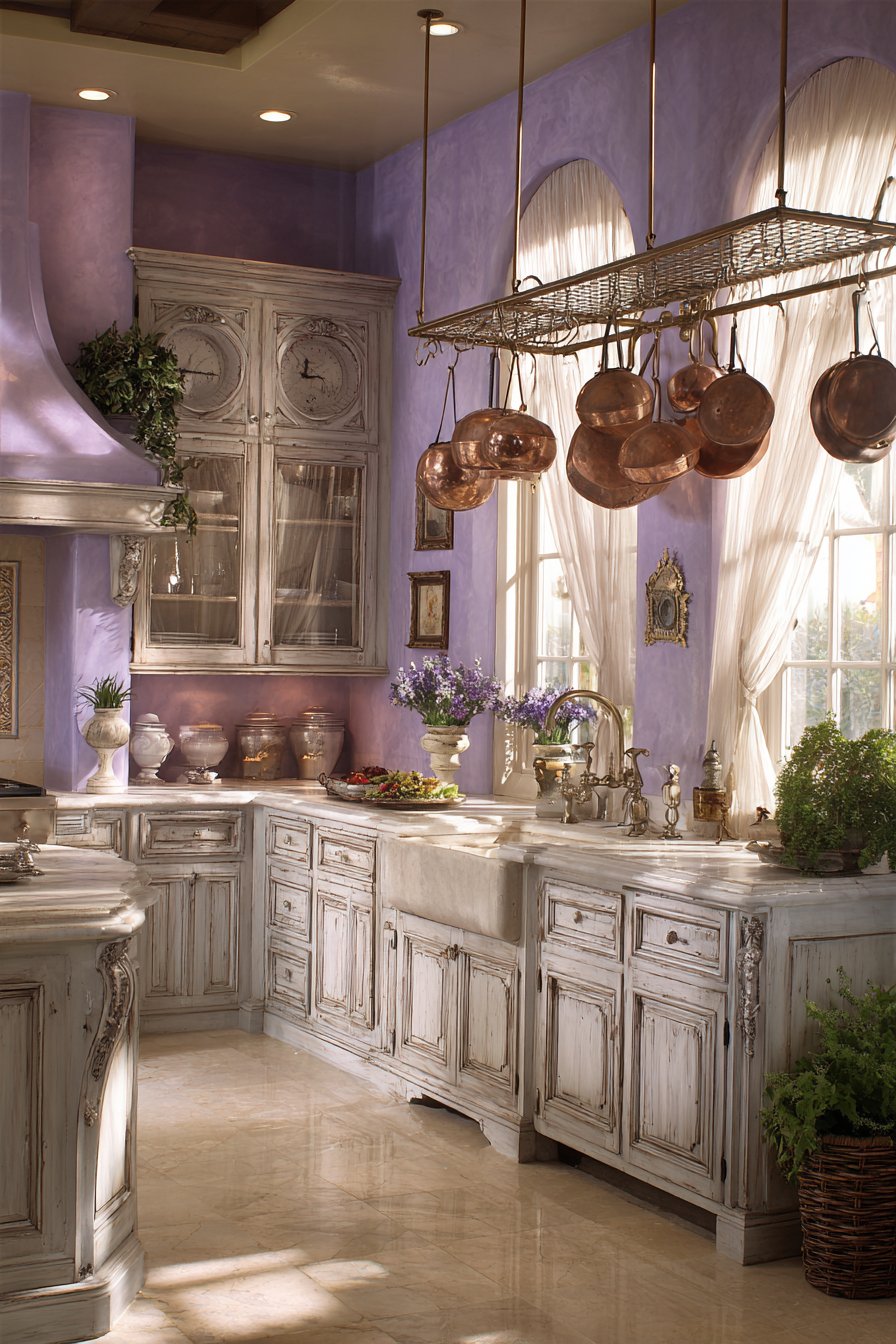
Vintage brass fixtures and a pot rack with copper cookware provide metallic accents that warm up the cool-toned walls, preventing the lavender-grey from feeling too icy or sterile. These aged metal elements—with their patina and character—reinforce the French country aesthetic while adding visual interest and warmth. Sheer curtains filter natural light, creating a soft, diffused glow on the purple-tinted walls that changes throughout the day. This filtered light is essential to the romantic quality of this kitchen—harsh direct light would diminish the dreamy, elegant atmosphere the lavender-grey creates.
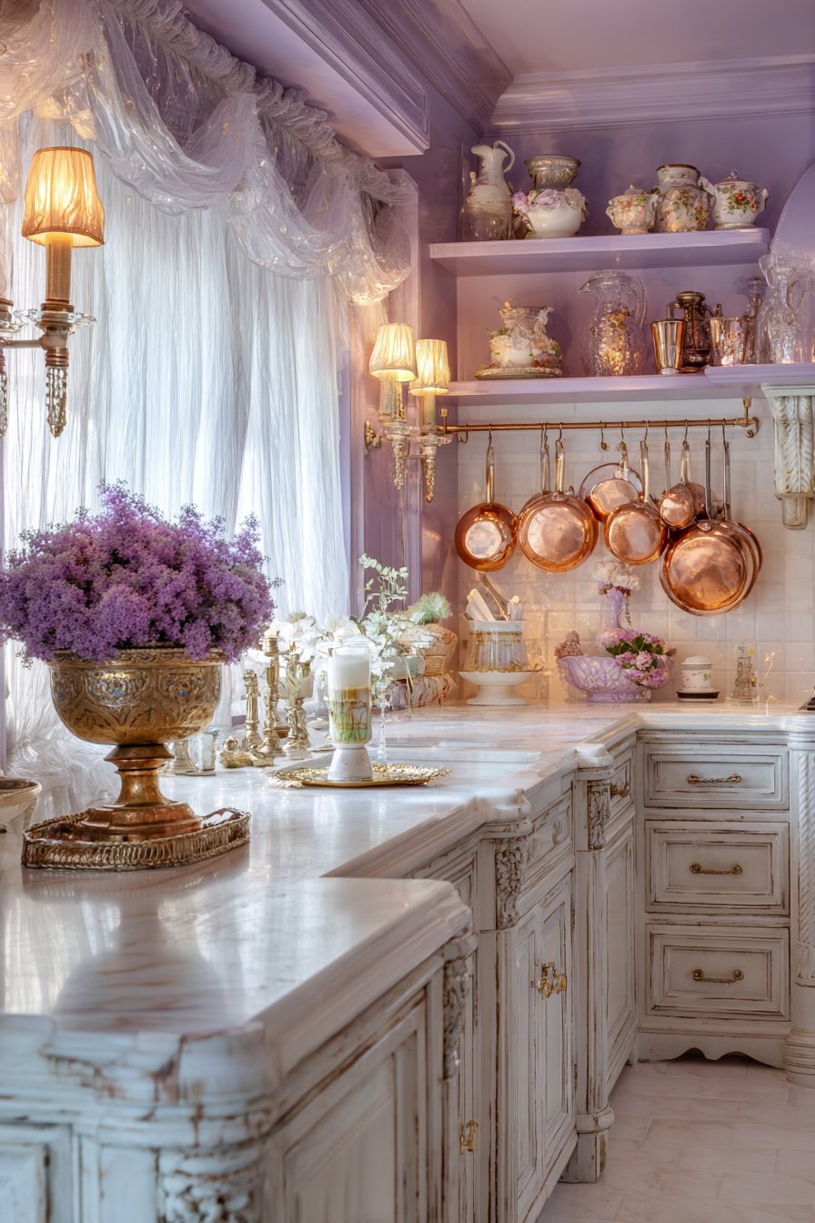
Professional interior design photography highlights this delicate color choice and classic details, showing how lavender-grey can feel sophisticated and timeless rather than trendy or overly sweet. This is a wall color for those who want their kitchen to feel special and distinctive without being loud or demanding. It whispers elegance rather than shouting for attention.
Key Design Tips:
- Choose lavender-grey with more grey than purple to keep the color sophisticated rather than saccharine
- Pair with distressed or painted white cabinetry for authentic French country appeal
- Incorporate aged brass, bronze, or copper metals rather than shiny chrome or nickel
- Use sheer window treatments to filter and soften natural light
- Add vintage or antique elements like mercury glass, ironstone, or enamelware
- Keep the overall palette soft and neutral, allowing the lavender-grey to be the subtle color star
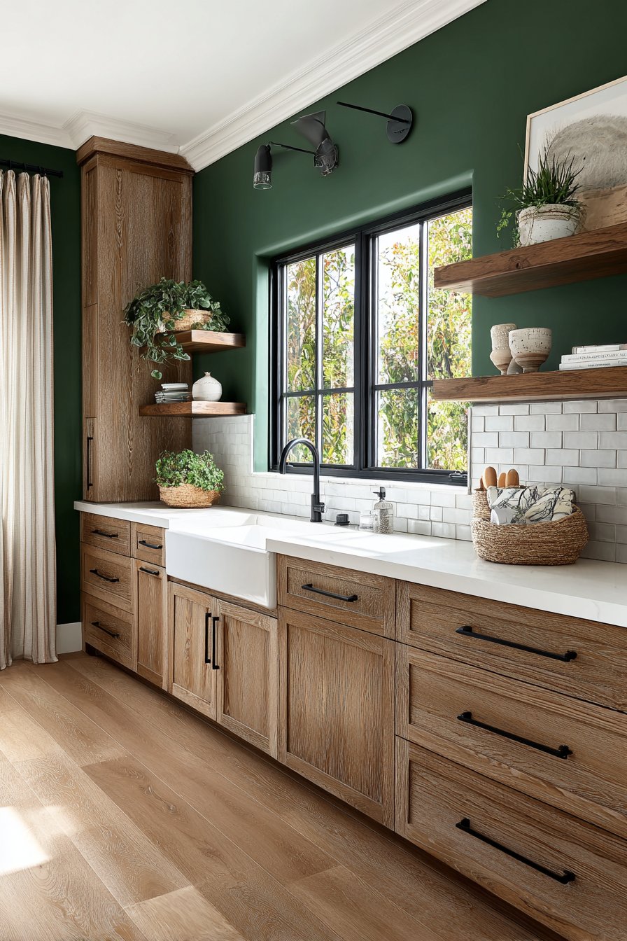
12. Forest Green Organic
Forest green walls create a bold organic statement in a contemporary kitchen, bringing the depth and richness of nature indoors through color. This saturated green—darker than sage but not quite emerald—represents one of the most sophisticated kitchen wall color ideas for those ready to embrace color confidently. Light oak cabinets in horizontal grain pattern warm the space beautifully, their natural wood tones creating perfect harmony with the organic green walls. The horizontal grain adds modern interest while the warm honey tones of oak prevent the green from feeling too cool or dark.
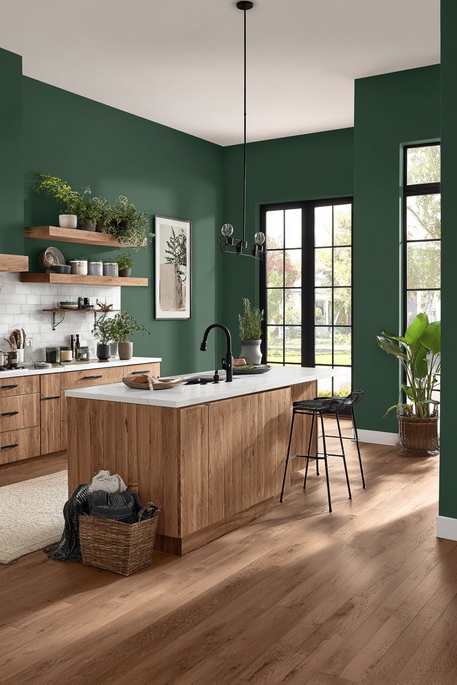
White subway tile backsplash provides clean contrast against the forest green, creating a crisp, fresh focal point behind the cooking area. This classic tile choice keeps the kitchen from feeling too trendy while allowing the bold wall color to remain the star. Matte black hardware and fixtures add modern edge, their dark metallic finish creating sophisticated contrast points throughout the green space. Plants on open shelving reinforce the natural green theme, creating a cohesive biophilic design that connects the indoor space with the natural world.
Interior photography with natural lighting captures the richness and depth of the green wall color, showing how it can read as warm and inviting rather than dark and heavy. The key to success with forest green walls is ensuring adequate lighting and balancing the dark color with plenty of light elements. When executed well, forest green creates a kitchen that feels like a sophisticated retreat.
Key Design Tips:
- Use forest green in kitchens with good natural light or plan for excellent artificial lighting
- Pair with natural wood cabinetry in light to medium tones to warm the space
- Incorporate white or light-colored backsplash and countertops to prevent the space from feeling too dark
- Add matte black hardware for modern sophistication rather than brass or gold
- Include plenty of plants to reinforce the organic, nature-inspired theme
- Consider painting just one or two walls rather than the entire kitchen if you’re hesitant about dark color
13. Warm Cream Traditional
Warm cream walls with subtle yellow undertones create timeless elegance in a traditional kitchen, proving that neutral colors can be rich and interesting. This soft, warm neutral represents one of the most enduring kitchen wall color ideas, working beautifully across decades and design trends. Cherry wood cabinets gain richness against the neutral backdrop, their deep red-brown tones creating beautiful contrast with the cream walls. Granite countertops in earth tones complement the warm palette, their natural patterns adding organic visual interest without competing with the wall color.
Glass-front upper cabinets display china and glassware, creating opportunities for personal expression and collected charm. Against cream walls, these displays become gallery-like vignettes, their contents visible and celebrated rather than hidden away. A decorative tile backsplash adds pattern without competing with the wall color—the cream walls provide enough neutral space to allow this additional design element to shine without overwhelming the senses.
Wide-angle interior design photography captures the timeless, elegant atmosphere that warm cream walls create. This is a color choice for those who value longevity over trends, seeking a kitchen that will feel appropriate and beautiful for decades rather than years. Cream’s versatility means it works with multiple cabinet colors, countertop materials, and design styles, making it a smart choice for the long term.
Key Design Tips:
- Choose cream with warm yellow undertones rather than cool white bases for a welcoming feel
- Pair with rich wood cabinetry in cherry, mahogany, or walnut for traditional elegance
- Incorporate granite, marble, or other natural stone countertops in complementary earth tones
- Add patterned elements through tile backsplash or decorative accents for visual interest
- Use traditional brass or bronze hardware and fixtures to enhance the classic aesthetic
- Display collections or cherished items in glass-front cabinets against the neutral backdrop
14. Modern Farmhouse Shiplap
A shiplap accent wall in classic white, combined with soft grey-blue walls elsewhere, creates a layered approach to kitchen wall color ideas that adds dimension and interest. This modern farmhouse combination represents a more complex color strategy, showing how multiple wall treatments can work together cohesively. The white shiplap creates textural interest and architectural detail while providing a bright focal point, typically behind open shelving or the range. The remaining walls in soft grey-blue provide subtle color without overwhelming the space, creating a balanced design that feels both modern and rustic.
Black window frames and cabinet hardware create strong contrast points throughout the kitchen, their dark finish adding definition and modern edge to the softer color palette. Reclaimed wood floating shelves and a rustic wooden island add warmth and authentic farmhouse character, their weathered finishes telling stories of age and use. Natural light from multiple windows highlights the interplay between the white accent wall and colored walls, creating shadows and highlights that change throughout the day.
Interior photography showcasing this layered approach to wall color demonstrates how multiple treatments can create depth and interest beyond what a single color could achieve. This strategy works particularly well in open-concept spaces where the kitchen needs to relate to adjacent rooms without looking identical. The combination feels collected and intentional rather than matchy-matchy.
Key Design Tips:
- Use white shiplap on one accent wall rather than the entire kitchen to prevent overwhelming the space
- Choose a soft, muted color for remaining walls rather than bright or saturated hues
- Incorporate black accents through window frames, hardware, and light fixtures for modern farmhouse authenticity
- Add reclaimed or weathered wood elements to enhance the rustic character
- Ensure adequate natural light to showcase the interplay between white and colored walls
- Keep the overall palette relatively simple—white, one color, natural wood, and black
15. Exposed Brick Industrial
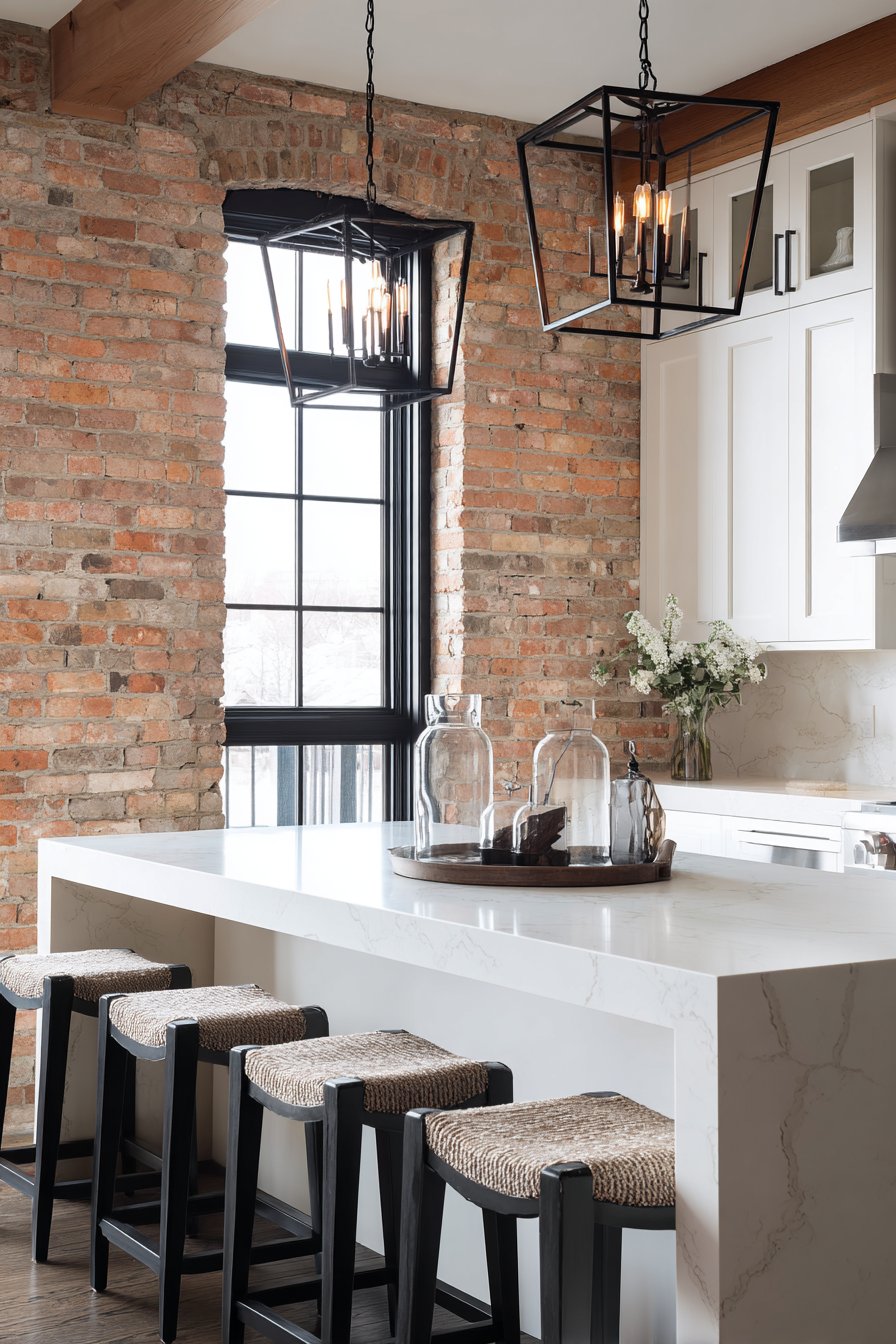
Exposed brick walls bring raw industrial character to an urban loft kitchen, representing one of the most distinctive and architecturally-driven kitchen wall color ideas. The natural red-orange tones of authentic brick create a warm, textured backdrop that cannot be replicated with paint. White minimalist cabinets provide clean contrast against the rustic brick, their simple forms allowing the wall texture to remain the focal point. Concrete countertops complement the industrial aesthetic, their smooth grey surfaces creating beautiful material contrast with the rough brick texture.
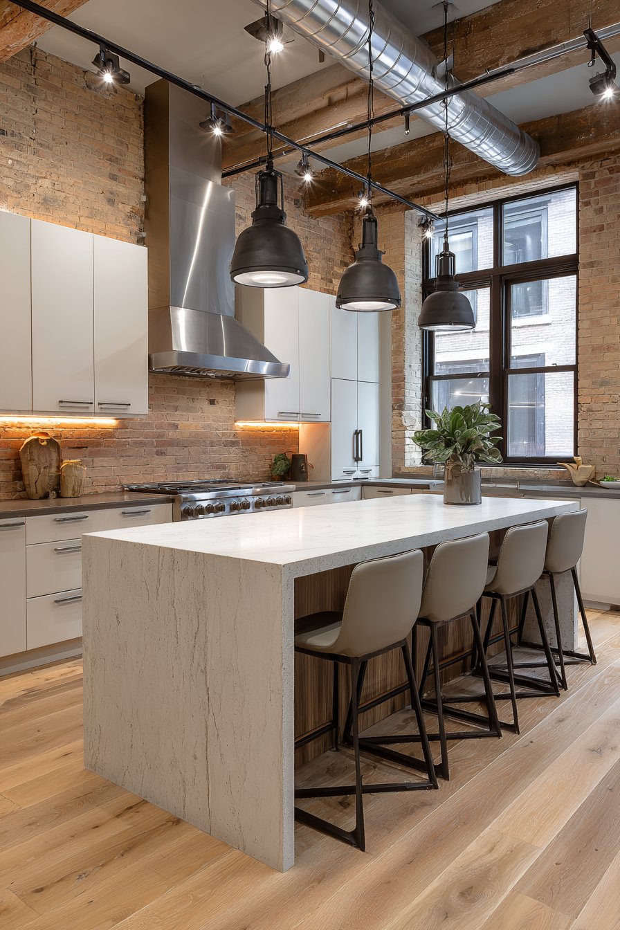
Stainless steel appliances and black metal light fixtures enhance the industrial aesthetic without competing with the brick walls for attention. These elements—cool metals, concrete, brick, and minimal white cabinetry—work together to create an authentic loft feeling that honors the building’s industrial heritage. Large factory-style windows provide abundant natural light, essential for showcasing the beautiful color variations and texture in the brick walls.
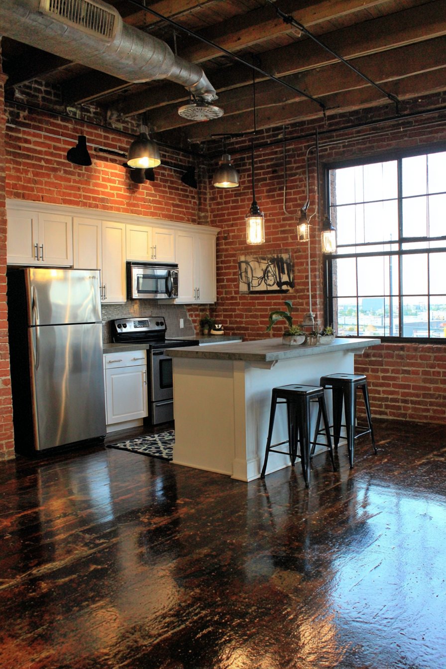
Professional interior design photography captures the authentic texture and color variation in the brick walls, showing how this architectural feature can serve as both art and backdrop. Exposed brick represents a permanent design decision—it’s not painted and changed with trends—making it important to ensure your personal style aligns with this industrial aesthetic before committing to exposing original brick or installing new brick veneer.
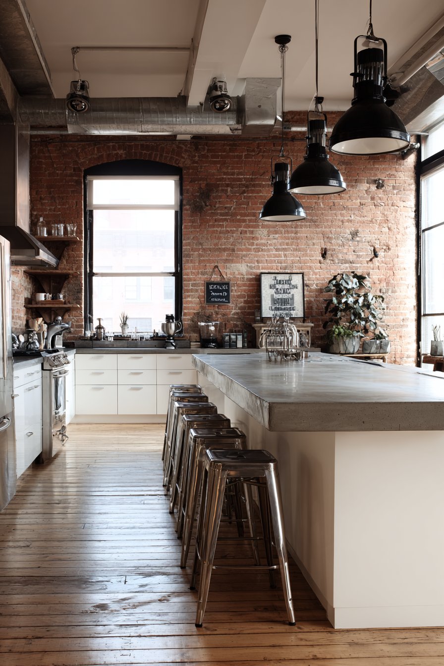
Key Design Tips:
- Seal exposed brick to prevent dust and crumbling while maintaining the raw appearance
- Pair brick walls with simple, minimal cabinetry to prevent visual overload
- Use industrial-style elements like metal light fixtures, steel appliances, and concrete surfaces
- Maximize natural light to showcase the brick’s texture and color variations
- Keep the color palette relatively neutral—brick provides plenty of color and pattern on its own
- Consider exposing brick on just one wall if the full industrial look feels too intense
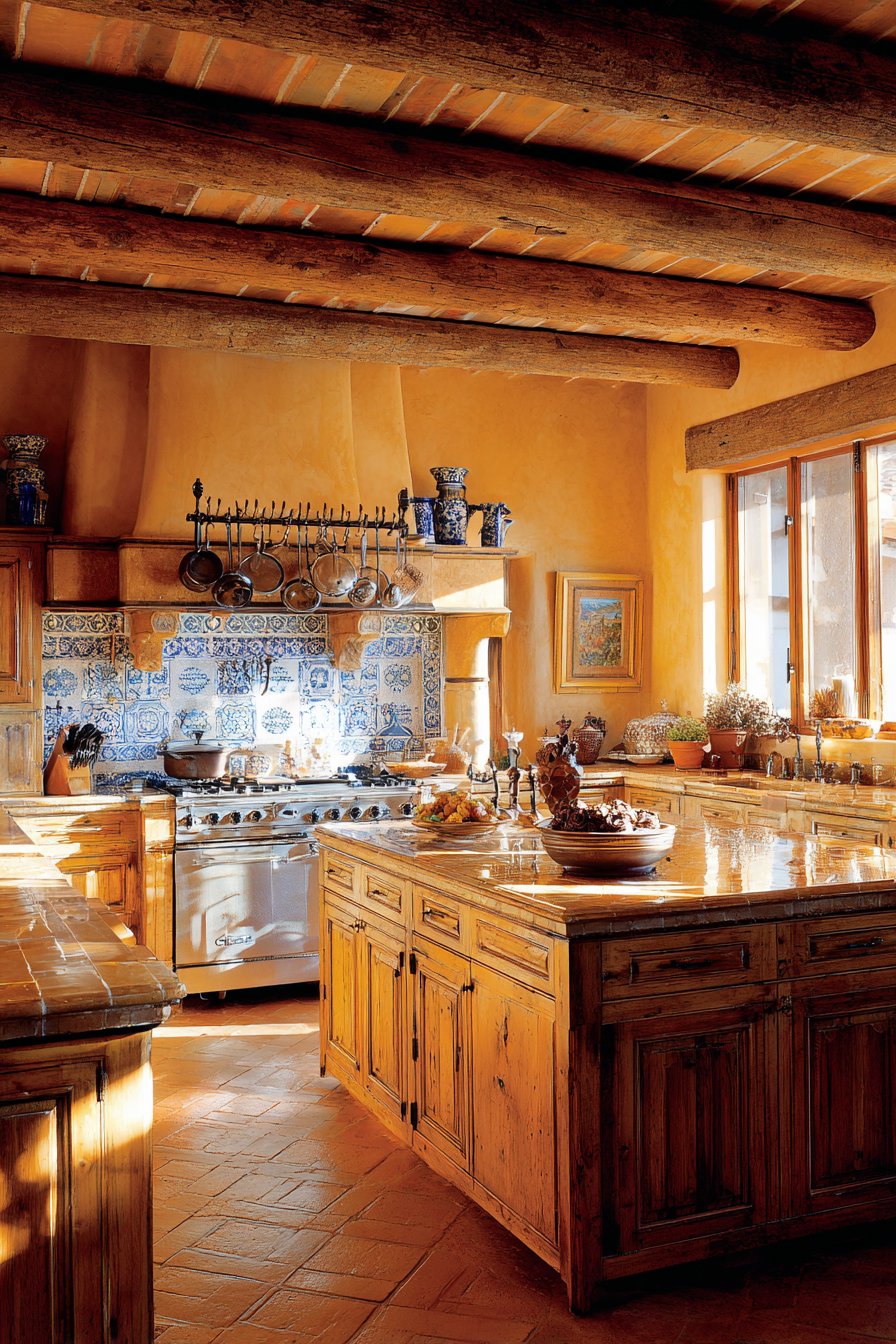
16. Mediterranean Ochre Yellow
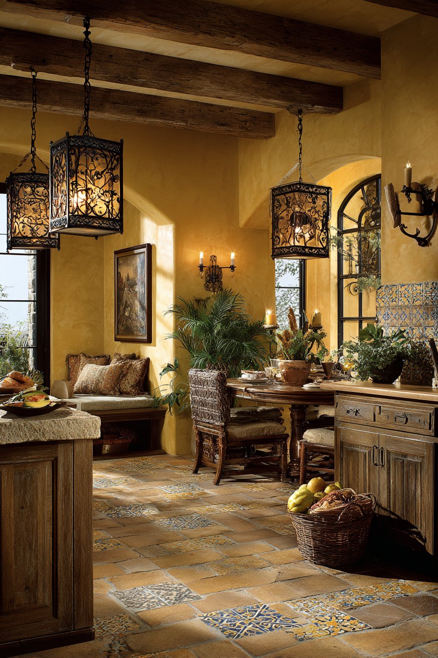
Warm ochre yellow walls reminiscent of Tuscan villas bring Mediterranean warmth and old-world charm to the kitchen space. This rich, golden yellow—deeper and more saturated than butter yellow—represents one of the most distinctive kitchen wall color ideas for those seeking dramatic warmth. Hand-painted ceramic tile backsplash in blue and white patterns adds artisanal detail, creating a focal point that celebrates craft and tradition. The combination of ochre walls and decorative tile creates an authentic Mediterranean feeling that transports the homeowner to sun-drenched European countryside.
Natural wood beam ceiling and terracotta floor tiles complete the regional aesthetic, creating layers of warm, natural materials that work in harmony with the golden walls. These elements—rough wood, earthy tile, painted plaster-like walls—create an environment that feels collected over generations rather than designed in a single shopping trip. Wrought iron pot rack and rustic wooden cabinets embrace the old-world charm, their handcrafted appearance reinforcing the artisanal Mediterranean aesthetic.
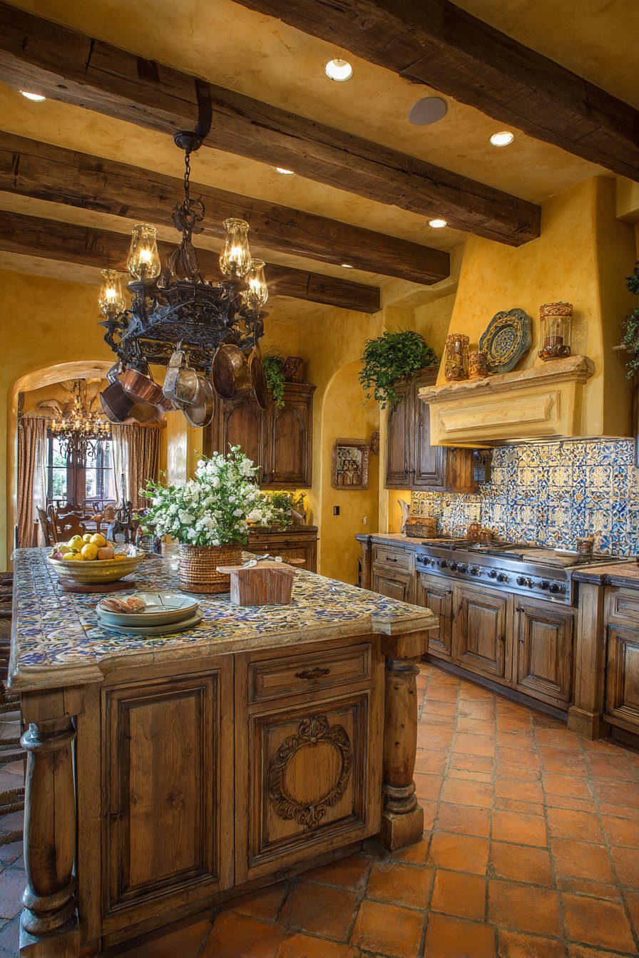
Interior photography with warm natural lighting enhances the golden wall tones, showing how ochre creates an inherently warm, welcoming atmosphere regardless of the actual outdoor temperature. This wall color choice creates kitchens that feel like vacation homes, places where time moves more slowly and gatherings extend late into evening.
Key Design Tips:
- Choose ochre with orange-gold undertones for authentic Mediterranean warmth
- Incorporate hand-painted or decorative tile in blue, white, or earth tones for artisanal character
- Add wrought iron elements through pot racks, light fixtures, or cabinet hardware
- Use natural materials like wood beams, terracotta tile, or stone countertops
- Display pottery, ceramics, and earthenware to enhance the handcrafted aesthetic
- Ensure warm-toned lighting to enhance the golden quality of the ochre walls
17. Japandi Taupe Serenity
Soft taupe walls embody serene minimalism in a Japandi kitchen, where Japanese aesthetics meet Scandinavian simplicity. This warm, neutral shade represents one of the most sophisticated kitchen wall color ideas for those seeking calm, uncluttered spaces. Light ash wood cabinets with minimal hardware create zen-like simplicity, their clean lines and pale wood tones working in perfect harmony with the taupe walls. The combination feels neither cold nor warm but perfectly balanced—a hallmark of successful Japandi design.
A small breakfast counter with simple wooden stools provides functional seating without adding visual clutter, demonstrating the “just enough” philosophy central to this aesthetic. Natural fiber window shades filter light softly, creating diffused illumination that enhances the meditative quality of the space. The taupe walls serve as the perfect neutral backdrop, allowing the natural materials and simple forms to take precedence while providing just enough color to prevent the space from feeling stark.
Professional interior design photography with balanced exposure shows how the neutral taupe walls promote calm and focus, creating a kitchen environment that feels more like a retreat than a work zone. This color choice supports mindful living, providing a serene backdrop for daily rituals without demanding attention or creating visual stimulation.
Key Design Tips:
- Choose taupe with balanced undertones—neither too warm (beige) nor too cool (grey)
- Pair with light wood cabinetry in ash, white oak, or bamboo for authentic Japandi aesthetic
- Minimize hardware, decorative elements, and visual clutter
- Incorporate natural materials like wood, stone, linen, and ceramic
- Use simple, functional furnishings with clean lines and no ornamentation
- Filter natural light through natural fiber shades or minimal window treatments
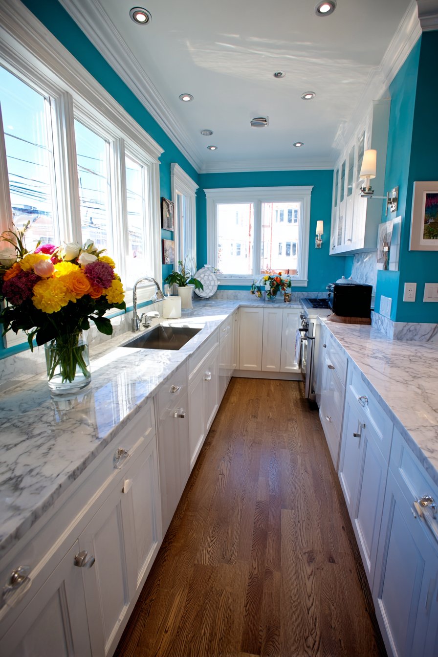
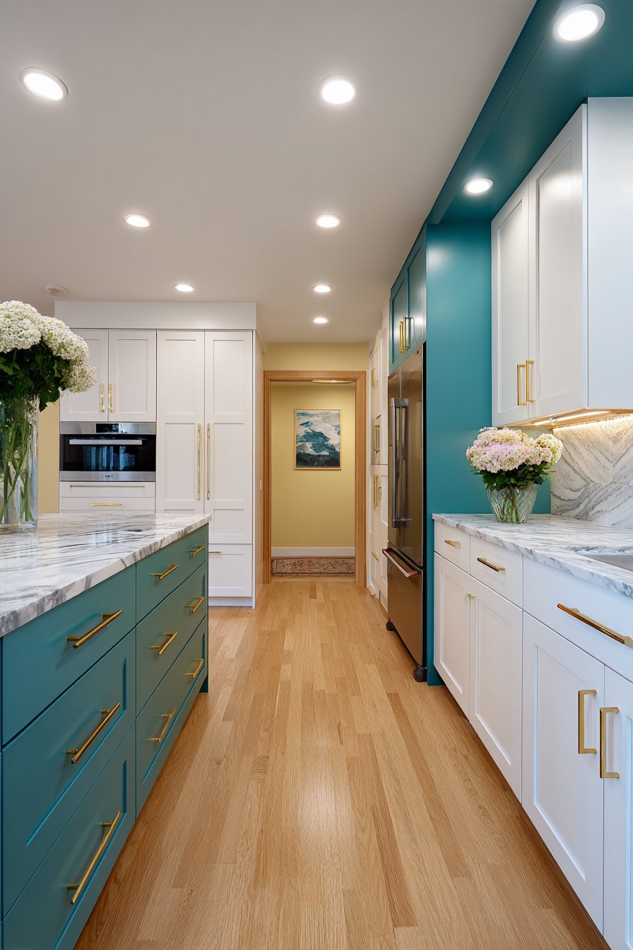
18. Two-Tone Teal Drama
Contemporary two-tone walls featuring soft white upper walls and rich teal lower walls separated by white chair rail molding create dynamic visual interest through strategic color blocking. This creative approach to kitchen wall color ideas demonstrates how multiple colors can work together to add dimension and personality. The white upper walls keep the space feeling light and open while the teal lower walls add dramatic color without overwhelming the room. This balance makes two-tone painting an excellent solution for those who want color but are concerned about dark walls making the space feel small.
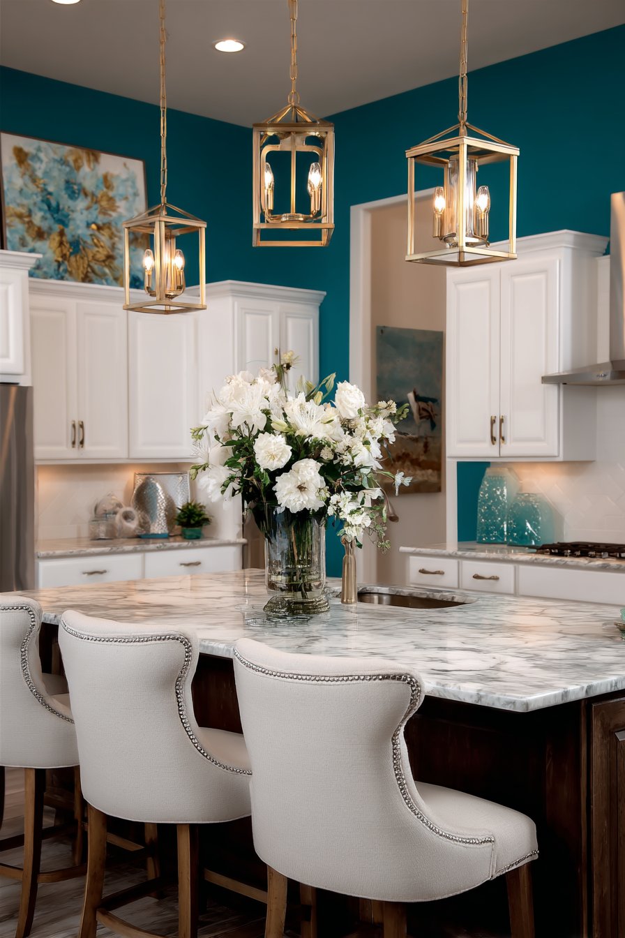
White shaker cabinets and marble countertops maintain a fresh look while the teal adds unexpected depth and sophistication. The white elements—cabinets, countertops, upper walls—create continuity and brightness, while the teal provides the personality and visual punch. Gold cabinet pulls and light fixtures provide warm metallic accents that complement both the white and teal, creating a cohesive metallic story throughout the space.
Wide-angle interior photography captures the dynamic visual interest created by the split wall color approach, showing how this technique can make a kitchen feel larger and more architecturally interesting. The chair rail molding doesn’t just separate colors—it adds architectural detail and traditional craftsmanship to an otherwise contemporary color choice.
Key Design Tips:
- Use darker or bolder colors on lower walls and lighter colors on upper walls to maintain openness
- Install chair rail molding at approximately one-third wall height for proper proportion
- Choose white or very light cabinetry to keep the overall space bright
- Incorporate metallic accents in warm tones to add luxury and tie colors together
- Ensure adequate lighting to showcase both wall colors effectively
- Keep the lower wall color bold but not overly saturated for livability
19. Mushroom Beige Bridge
Warm mushroom beige walls create sophisticated neutrality in a transitional kitchen, serving as the perfect bridge for two-tone cabinetry. This subtle, earthy neutral represents one of the most versatile kitchen wall color ideas for those seeking a color that works with everything. Two-tone cabinetry with grey lower cabinets and white upper cabinets gains cohesion from the beige walls, which relate to both colors while committing to neither. This bridging effect is the genius of mushroom beige—it makes disparate elements feel intentional and coordinated.
Quartz countertops with subtle veining and subway tile backsplash maintain classic appeal while the beige walls add warmth without demanding attention. Brushed nickel hardware and fixtures complement the warm neutral palette, their cool metallic finish providing subtle contrast. The interior design photography highlights how the wall color bridges different cabinet colors seamlessly, creating visual flow and cohesion that allows the eye to move comfortably through the space.
Mushroom beige works particularly well in transitional kitchens where homeowners want to combine traditional elements like subway tile or decorative hardware with contemporary features like two-tone cabinetry or quartz countertops. The neutral wall color allows both styles to coexist peacefully.
Key Design Tips:
- Choose mushroom beige with warm undertones to create inviting rather than dingy atmosphere
- Use with two-tone cabinetry to create cohesion between different colored cabinets
- Pair with classic materials like subway tile and quartz for timeless transitional style
- Incorporate brushed nickel or chrome hardware for contemporary edge
- Add warmth through wood flooring or wood accent pieces
- Ensure good lighting to prevent the subtle color from appearing flat
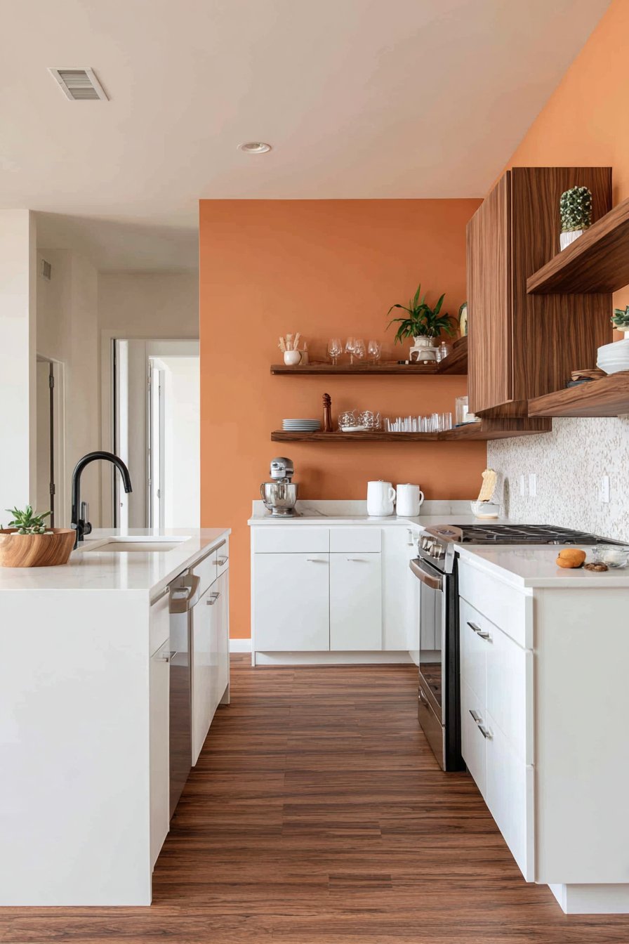
20. Burnt Orange Accent
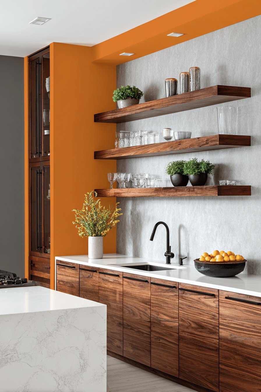
A modern kitchen featuring an accent wall in burnt orange behind open shelving demonstrates how strategic color placement can transform the entire space. This bold approach to kitchen wall color ideas shows that you don’t need to paint every wall to make an impact. The burnt orange accent wall frames floating walnut shelves displaying glassware and plants, turning functional storage into a gallery-like display. The bold wall section provides depth and drama while remaining walls stay neutral white, preventing color overload and maintaining overall brightness.
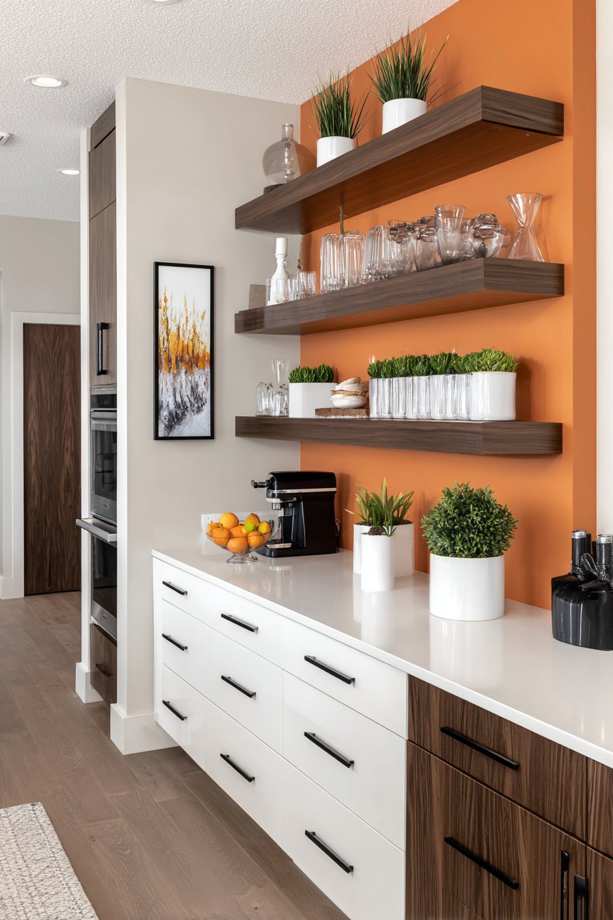
White flat-panel cabinets and white quartz countertops keep the overall look clean and contemporary, allowing the orange accent wall to be the undisputed star of the space. Matte black fixtures anchor the design, their dark metallic finish creating striking contrast points that define the space and add modern sophistication. This combination—white, orange, natural wood, and black—creates a warm, contemporary palette that feels energizing and welcoming.
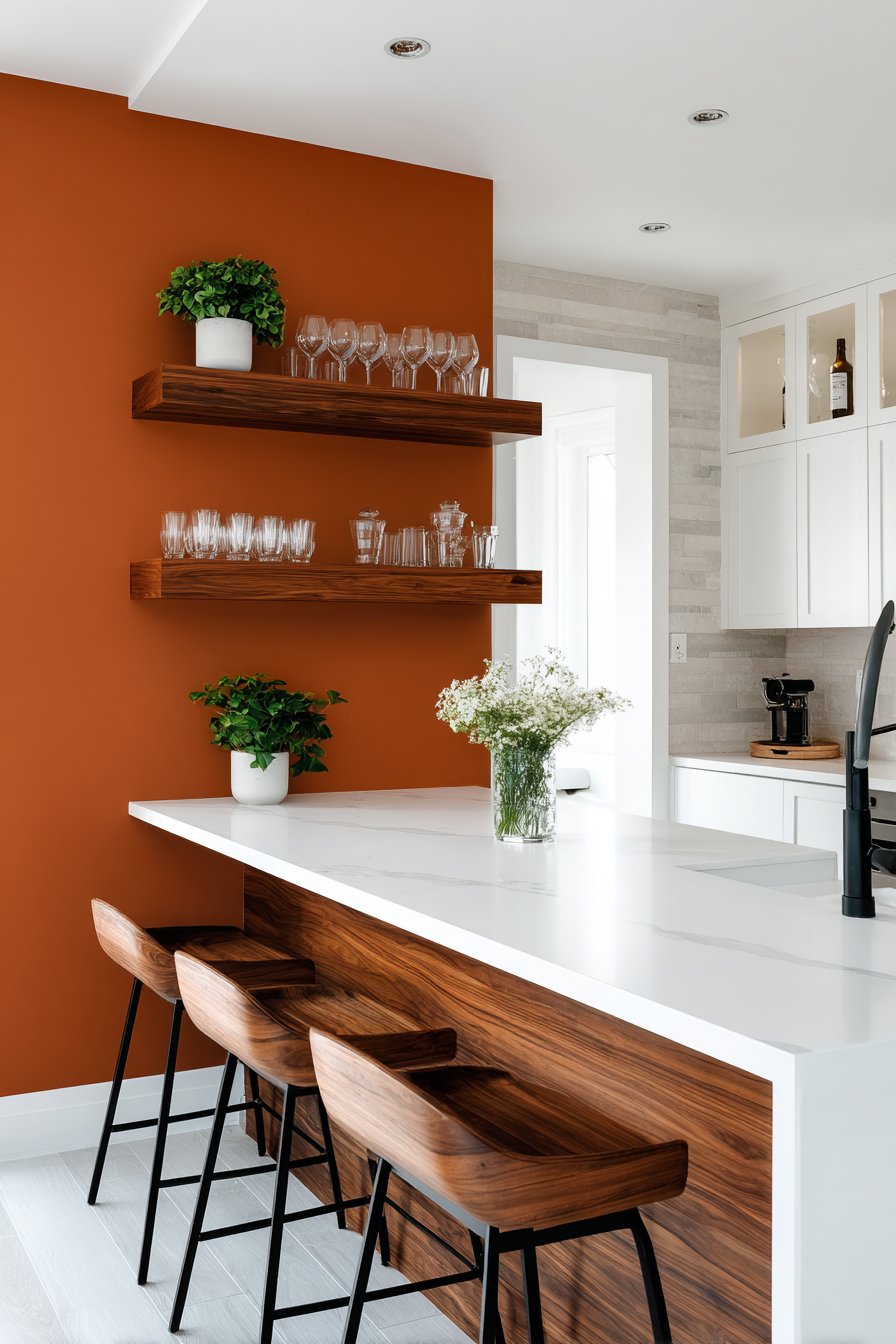
Interior photography shows how a single colored accent wall can transform kitchen wall color ideas without overwhelming the space, demonstrating that commitment-phobes can still enjoy bold color. This approach allows for easier updates in the future—if tastes change, only one wall needs repainting rather than the entire room.
Key Design Tips:
- Choose one focal wall for bold color rather than painting the entire kitchen
- Use the accent wall to frame and highlight architectural features or open shelving
- Keep remaining walls neutral white or cream to maintain brightness
- Pair bold accent color with natural wood elements to warm and ground the space
- Add black or dark hardware and fixtures for contemporary sophistication
- Ensure the accent wall has good lighting to showcase the bold color effectively
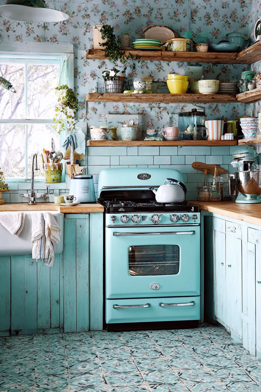
21. Soft Aqua Coastal
Soft aqua walls evoke seaside tranquility in a coastal kitchen, bringing the calming qualities of ocean water indoors through color. This gentle blue-green represents one of the most soothing kitchen wall color ideas, perfect for those who find peace in coastal aesthetics. White beadboard cabinets and pale grey quartz countertops enhance the breezy aesthetic, their light tones maintaining the airy, open feeling essential to beach house style. Natural jute accessories and seagrass baskets add organic texture that prevents the aqua and white palette from feeling too pristine or sterile.
Large windows with simple white trim flood the space with natural light that makes the aqua walls shimmer and shift throughout the day, much like actual water. This light interaction is crucial to making aqua walls successful—without adequate light, the color can appear dull or grey rather than fresh and vibrant. The wide-angle interior design photography captures the fresh, vacation-home feeling that makes this color choice so appealing for everyday living.
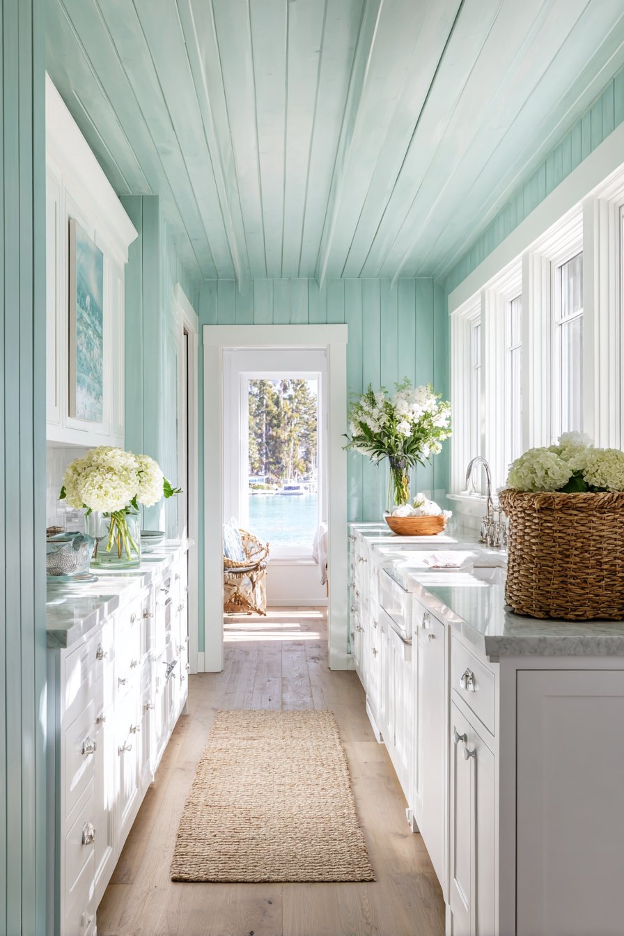
Aqua walls create kitchens that feel like an escape, where the stress of daily life melts away and relaxation becomes the priority. This color supports a lifestyle focused on ease, comfort, and connection to nature—particularly ocean and water environments.
Key Design Tips:
- Choose aqua with balanced blue-green undertones rather than leaning too heavily toward either color
- Pair with white or very light cabinetry and countertops to maintain coastal airiness
- Incorporate natural fiber textures through rugs, baskets, and window treatments
- Maximize natural light with large windows and minimal window treatments
- Add coral, sandy beige, or natural wood accents for authentic coastal palette
- Display seashells, coral, or ocean-inspired artwork to reinforce the coastal theme
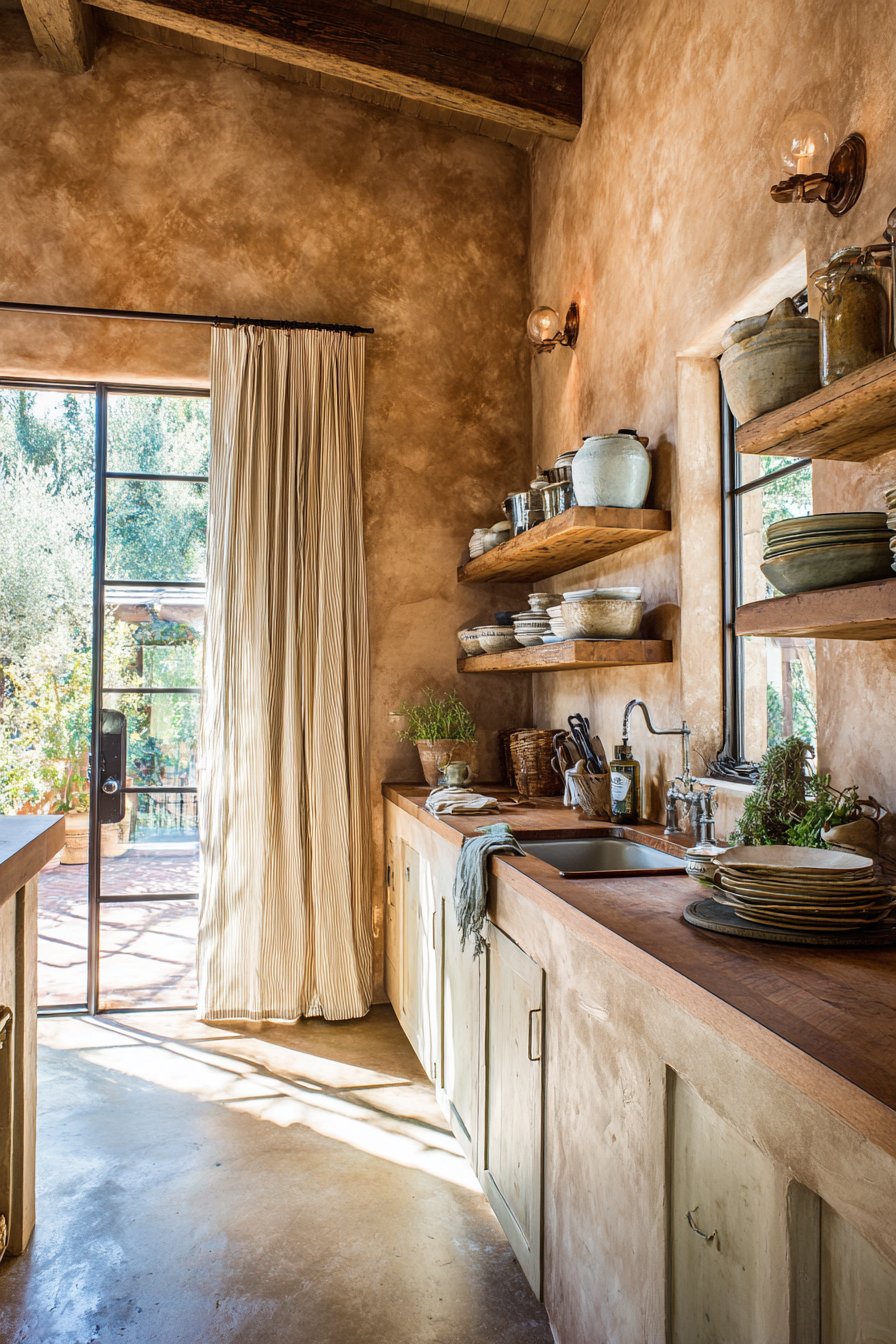
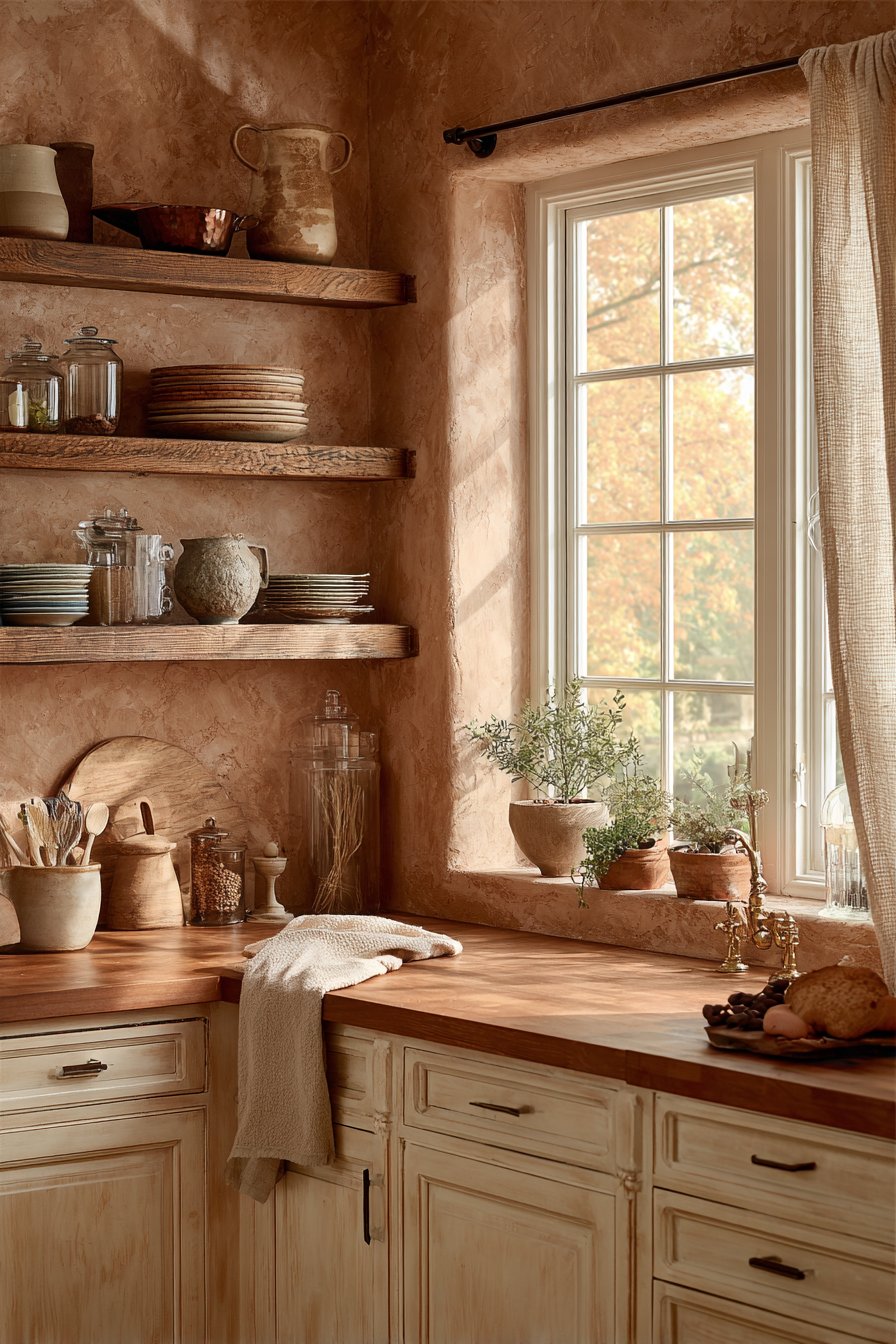
22. Adobe Plaster Southwestern
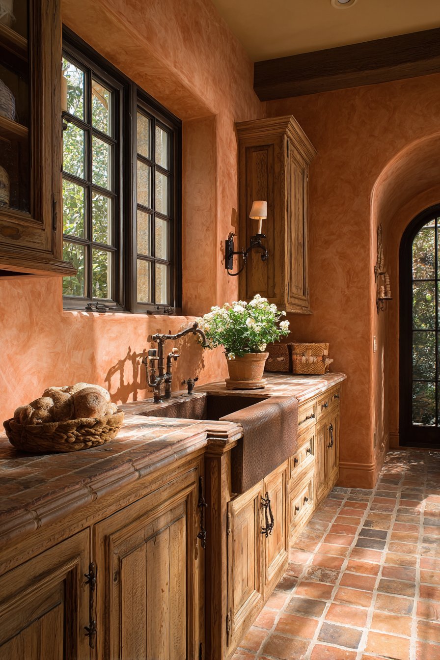
Warm adobe wall color in textured plaster finish creates southwestern character in a rustic kitchen, bringing the desert landscape indoors through authentic color and texture. This earthy orange-pink tone represents one of the most culturally specific kitchen wall color ideas, perfect for those drawn to southwestern or Spanish colonial aesthetics. Knotty alder wood cabinets in honey tone complement the earthy walls beautifully, their natural knots and grain variations adding to the handcrafted, artisanal feeling. Hand-forged iron hardware and a hammered copper sink add artisanal details that celebrate traditional craftsmanship.
The textured plaster finish on the adobe walls is crucial to the authentic southwestern feeling—flat paint simply cannot replicate the depth and character of traditional plaster application. This texture creates subtle shadows and highlights that change throughout the day as natural light moves across the surface. Terracotta tile flooring grounds the warm palette, creating layers of earthy tones that work in harmony rather than competition.
Interior photography with natural lighting emphasizes the textured wall surface and warm color depth, showing how adobe creates environments that feel connected to place and tradition. This wall color choice creates kitchens with strong cultural identity and rich material character.
Key Design Tips:
- Apply textured plaster finish rather than flat paint for authentic adobe appearance
- Pair with natural wood cabinetry in warm honey or amber tones
- Incorporate hand-forged iron hardware, light fixtures, and decorative elements
- Add copper elements through sinks, range hood, or decorative accessories
- Use terracotta or saltillo tile flooring to ground the warm color palette
- Display pottery, woven baskets, or southwestern textiles to enhance the cultural aesthetic
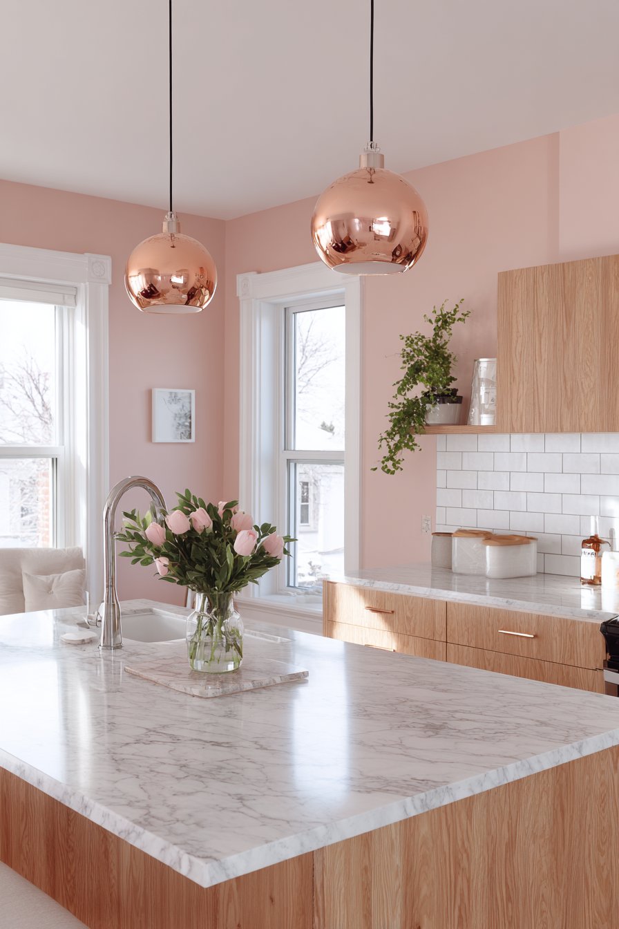
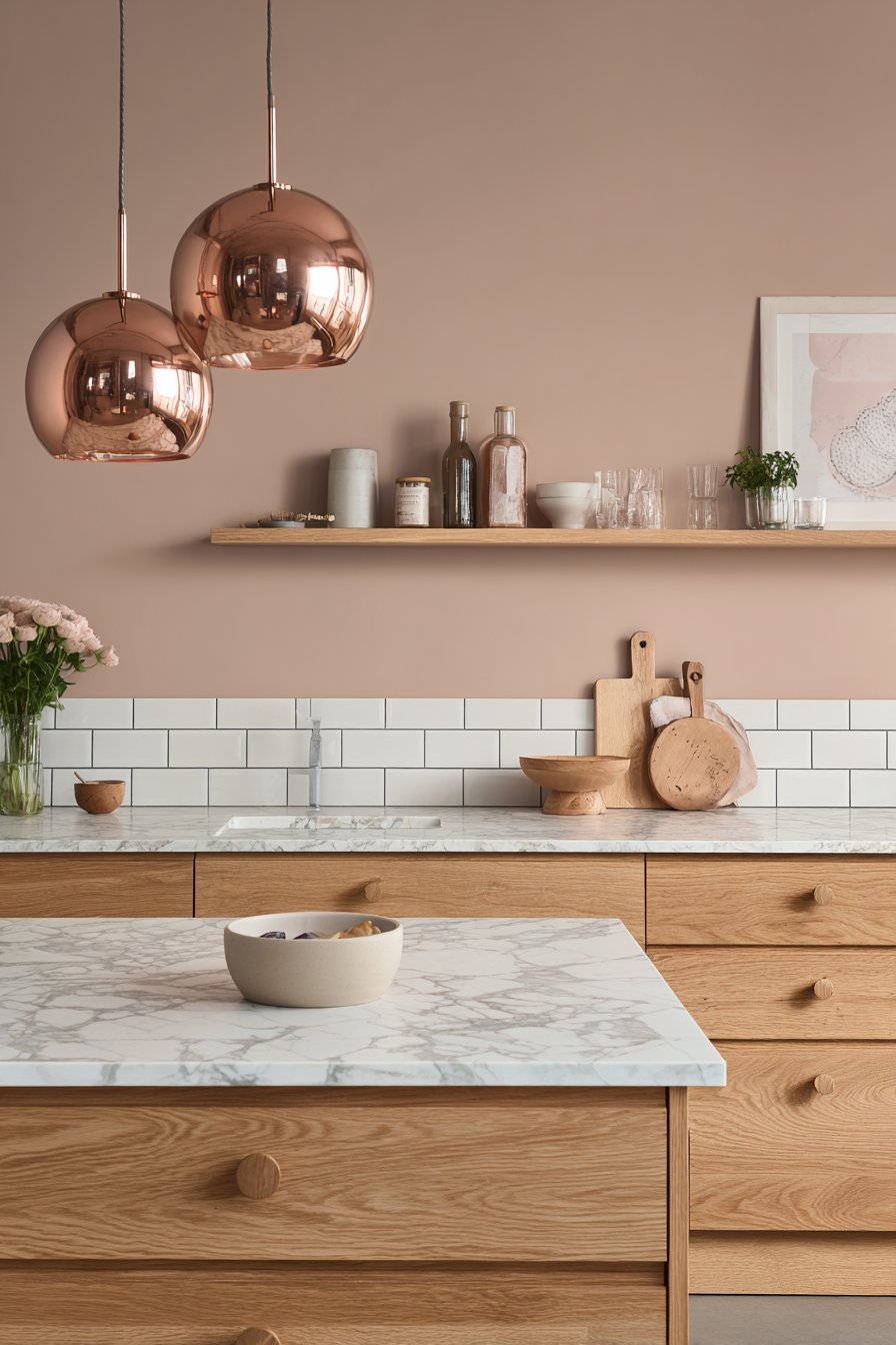
23. Pale Pink Scandinavian
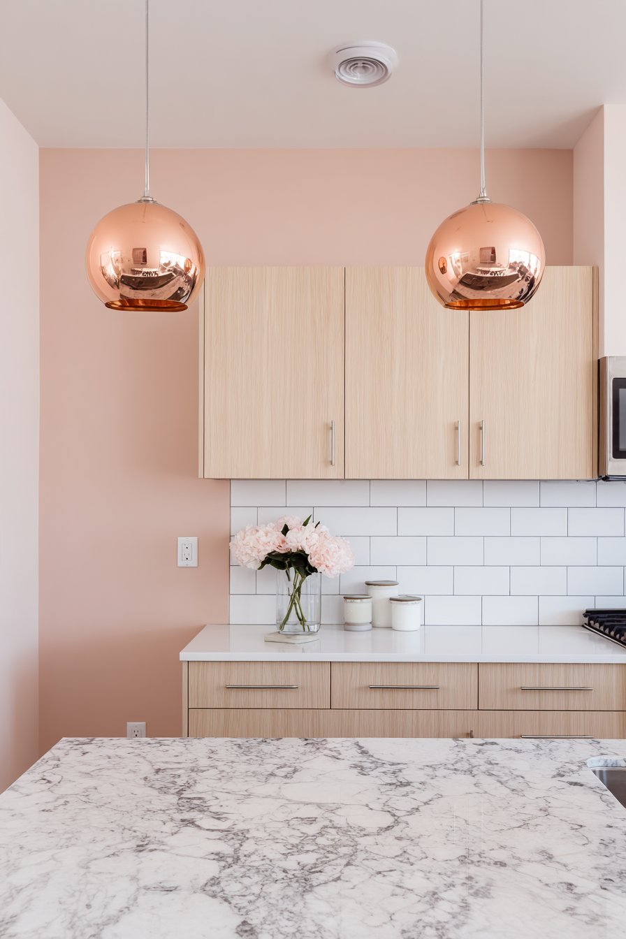
Pale pink walls in a barely-there blush tone add subtle warmth to a Scandinavian kitchen while maintaining Nordic simplicity. This delicate color represents one of the most unexpected kitchen wall color ideas, proving that pink can feel modern and sophisticated rather than overly feminine when executed with restraint. White oak cabinets with simple round knobs maintain Nordic simplicity, their pale wood tones creating a gentle contrast with the soft pink walls. Marble countertops with grey veining and white subway tiles keep surfaces light and fresh, preventing the pink from feeling too sweet or saturated.
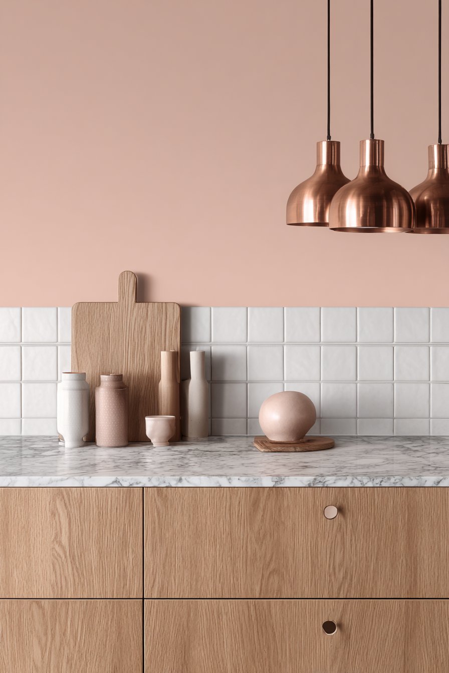
Copper pendant lights provide metallic warmth that complements the pink walls beautifully, their rosy metallic tones creating a cohesive color story. Professional interior design photography shows how soft pink walls can feel modern and sophisticated rather than traditionally feminine, demonstrating that pink has evolved beyond nurseries and little girls’ rooms to become a legitimate neutral in contemporary design.
This pale pink creates kitchens that feel warm and welcoming without sacrificing the clean, minimal aesthetic that defines Scandinavian design. It’s a color choice for those who want to add personality and warmth while maintaining restraint and sophistication.
Key Design Tips:
- Choose pale pink with barely-there saturation for sophisticated, modern appearance
- Pair with white oak, ash, or other pale wood cabinetry for Nordic aesthetic
- Keep surfaces light with white or pale grey countertops and backsplash
- Add copper or rose gold metallic accents rather than brass or silver
- Maintain minimal styling and clutter for authentic Scandinavian simplicity
- Test paint samples carefully—pink can shift dramatically in different lighting
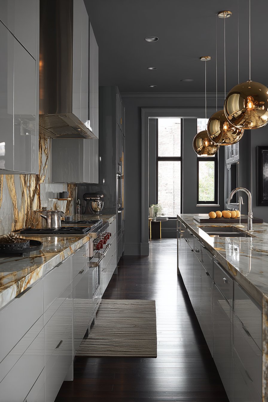
24. Charcoal Black Modern
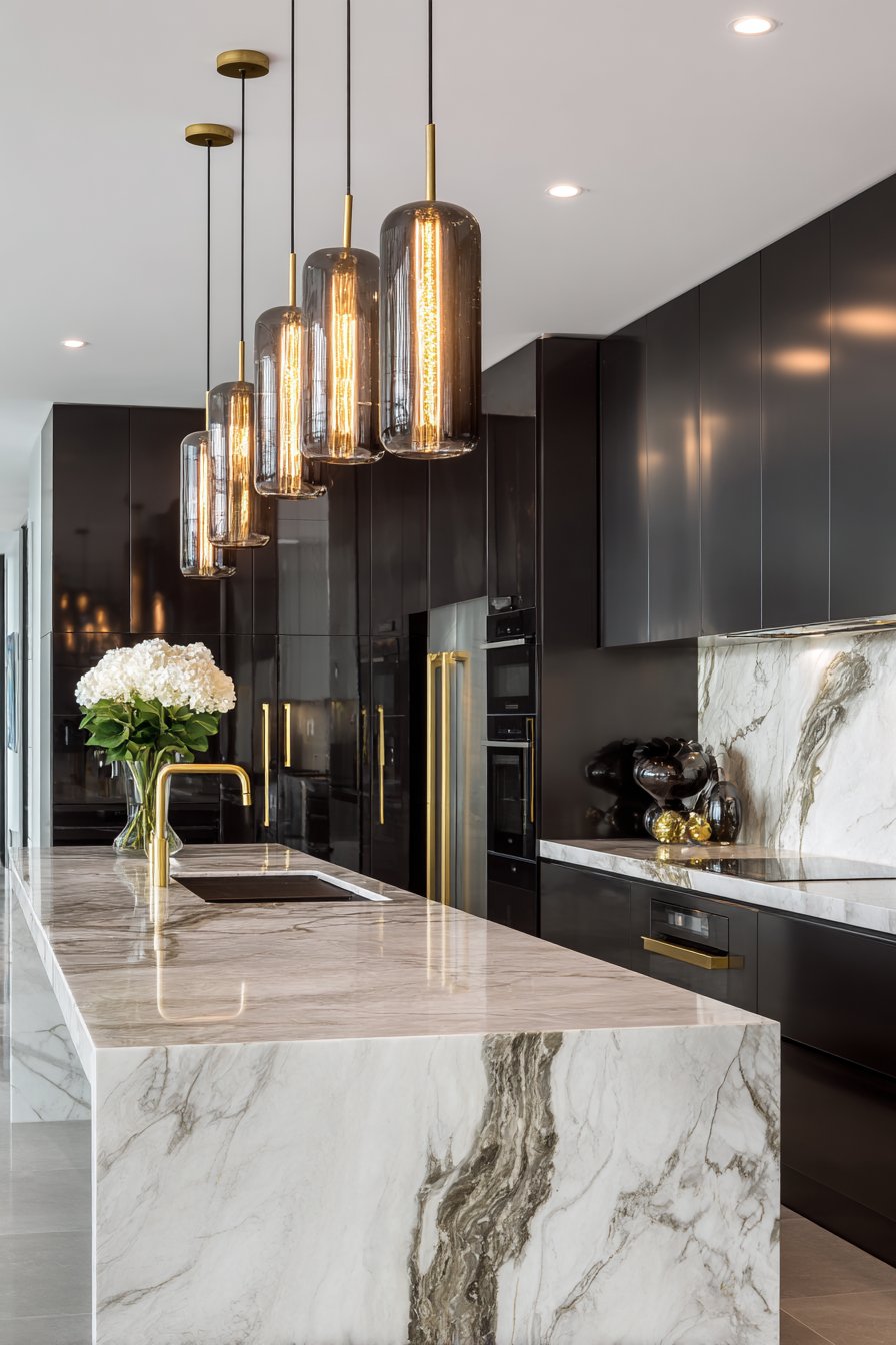
Charcoal black walls create dramatic modern elegance in a contemporary kitchen, representing one of the boldest and most confident kitchen wall color ideas. This deep, saturated color transforms the kitchen into a sophisticated space that rivals high-end restaurants and luxury hotels. White handleless cabinets create striking contrast, their seamless surfaces and bright white finish preventing the black walls from feeling oppressive. White marble backsplash with dramatic veining serves as a sculptural element, its organic patterns standing out beautifully against the solid black backdrop.
Gold fixtures and hardware add luxury and warmth, their metallic gleam creating necessary light reflection in the dark space. Large pendant lights with warm bulbs provide essential illumination, creating pools of welcoming light that make the black walls feel intentional and sophisticated rather than cave-like. Interior photography with expertly balanced lighting captures the bold wall color while maintaining detail in both dark and light surfaces, demonstrating the critical importance of proper illumination with this color choice.
Black walls represent the ultimate commitment to dramatic design, requiring excellent lighting, high-contrast elements, and confident styling to succeed. When executed properly, they create kitchens that feel like design statements—spaces that announce the homeowner’s sophisticated taste and fearless approach to interior design.
Key Design Tips:
- Use black walls only in kitchens with excellent natural light or invest heavily in layered artificial lighting
- Pair with stark white cabinetry and countertops to create necessary high contrast
- Incorporate warm metallic elements in gold or brass to add warmth and luxury
- Install multiple layers of lighting including ambient, task, accent, and decorative
- Add reflective surfaces through glossy cabinets, polished stone, or mirrors to bounce light
- Keep the space uncluttered—black shows every smudge and fingerprint
25. Soft Mint Green Vintage
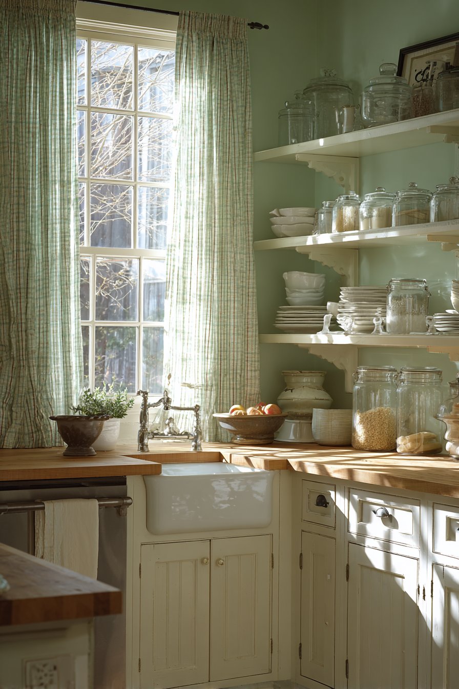
Soft mint green walls bring vintage charm with modern freshness to a farmhouse kitchen, creating a color that feels both nostalgic and current. This gentle green—lighter than sage but more substantial than barely-there pastels—represents one of the most cheerful kitchen wall color ideas, perfect for those who want color with staying power. White shaker cabinets with cup pulls and butcher block countertops create a classic foundation that allows the mint walls to shine. Open shelving displays white ironstone and vintage glass jars, creating collected charm that feels authentic rather than staged.
A porcelain farmhouse sink beneath a window with cafe curtains completes the vintage farmhouse look, creating a scene that could have existed in 1950 or 2025. This timeless quality is the beauty of mint green—it references vintage design without feeling dated or overly retro. Wide-angle interior design photography captures how the mint walls create cheerful, timeless appeal while natural light enhances the soft green tone throughout the day.
Mint green creates kitchens that feel optimistic and welcoming, where baking happens, flowers are arranged, and family traditions are maintained. This color choice supports a lifestyle focused on home, comfort, and the simple pleasures of everyday life.
Key Design Tips:
- Choose mint green with balanced undertones—not too blue (aqua) or too yellow (lime)
- Pair with white or cream shaker-style cabinetry for classic farmhouse appeal
- Incorporate butcher block or wood countertops to add warmth
- Display vintage collections on open shelving against the mint backdrop
- Add porcelain farmhouse sink and period-appropriate fixtures
- Use cafe curtains, gingham, or other vintage textiles to enhance the nostalgic aesthetic
Why These Kitchen Wall Color Ideas Work
These twenty-five kitchen wall color ideas represent a comprehensive exploration of how paint color can transform the most important room in your home. Each concept has been carefully selected based on proven design principles, color theory, and real-world livability. The beauty of these ideas lies not just in their individual appeal but in how they demonstrate the incredible range of possibilities available to homeowners willing to think beyond standard white or beige walls.
Neutral kitchen wall colors like soft grey, warm greige, cream, and taupe remain popular because they provide versatile backdrops that work with multiple cabinet colors, countertop materials, and design styles. These colors offer longevity and adaptability, allowing homeowners to update accessories, hardware, and decorative elements without needing to repaint. They create calming environments that don’t compete for attention, making them ideal for those who prefer their cabinetry, artwork, or collections to be the focal point. Neutrals work particularly well in open-concept homes where the kitchen needs to relate to adjacent living spaces without creating jarring color transitions.
Bold kitchen wall colors like navy blue, forest green, charcoal grey, and burnt orange demonstrate confidence and personality, transforming ordinary kitchens into extraordinary design statements. These saturated colors create depth, drama, and visual interest that neutral tones simply cannot achieve. They work best in kitchens with excellent natural light or carefully planned artificial illumination, as dark colors require more light to prevent them from feeling oppressive. Bold colors pair beautifully with high-contrast elements—white cabinets against navy walls, light wood against forest green, or metallic accents against charcoal. These colors are perfect for homeowners who view their kitchen as a reflection of their personality rather than merely a functional workspace.
Warm kitchen wall colors including terracotta, ochre yellow, butter yellow, adobe, and soft pink create inviting, welcoming atmospheres that naturally draw people together. These colors stimulate appetite and conversation, making them psychologically ideal for kitchen environments. Warm tones work particularly well in kitchens with cooler cabinet colors or in homes located in climates with long winters, as they create a sense of perpetual sunshine and warmth regardless of outdoor conditions. They pair beautifully with natural materials like wood, copper, and stone, creating layered, rich environments that feel collected over time rather than designed overnight.
Cool kitchen wall colors such as sage green, dusty blue, soft aqua, and lavender-grey create calming, serene environments perfect for mindful living and peaceful meal preparation. These colors lower stress levels and create spa-like atmospheres that make the kitchen feel like a retreat rather than a work zone. Cool tones work exceptionally well with white or natural wood cabinetry, creating fresh, airy aesthetics reminiscent of coastal or Scandinavian design. They’re ideal for homeowners who want their kitchen to be a place of restoration and peace rather than high-energy activity.
Textured kitchen wall approaches including exposed brick, shiplap, tongue-and-groove paneling, and textured plaster demonstrate that wall color isn’t always about paint alone. These dimensional treatments add architectural interest, tactile quality, and visual complexity that flat paint cannot achieve. Texture creates shadows and highlights that change throughout the day, making walls feel alive and dynamic. These treatments work particularly well in specific design styles—exposed brick for industrial or loft aesthetics, shiplap for modern farmhouse, tongue-and-groove for coastal, and textured plaster for Mediterranean or southwestern styles.
Two-tone kitchen wall color strategies show sophisticated color theory in action, demonstrating how multiple colors can work together to create dimension, visual interest, and architectural definition. This approach allows homeowners to enjoy bold color without overwhelming the space, typically using darker or more saturated colors on lower walls and lighter colors above. Two-tone walls can make ceilings appear higher, create the illusion of chair rail molding, or simply add visual complexity that single-color walls cannot achieve. This strategy works across multiple design styles from traditional to contemporary.
The success of any kitchen wall color ultimately depends on several critical factors: the amount and quality of natural light in the space, the color and style of existing cabinetry, the tone of countertops and flooring, the overall design aesthetic of the home, and most importantly, the lifestyle and personality of the homeowners. A color that works beautifully in one kitchen may fail in another with different conditions. This is why testing paint samples in your actual space, at different times of day, and viewing them against your specific cabinets and countertops is absolutely essential before committing to a color.
The kitchen wall color ideas presented here span every color family, design style, and aesthetic preference, providing inspiration for traditional and contemporary homes, small apartments and large houses, minimalists and maximalists. Whether you’re drawn to the serene simplicity of Scandinavian-inspired pale pink, the dramatic sophistication of charcoal black, the organic warmth of sage green, or the vintage charm of soft mint, there’s a wall color strategy here that can transform your kitchen into the space you’ve always envisioned.
Conclusion
Choosing the perfect kitchen wall color is both an art and a science—it requires understanding color theory, considering practical factors like lighting and existing materials, and most importantly, trusting your personal instincts about what makes you feel happy and comfortable in your space. The twenty-five kitchen wall color ideas explored in this comprehensive guide demonstrate that there are truly no limits when it comes to creating a kitchen that reflects your unique style and supports your lifestyle. From calming neutrals that provide timeless backdrops to bold saturated hues that make confident statements, from warm tones that wrap you in comfort to cool shades that offer serene retreat, the right wall color can completely transform how you experience your kitchen every single day.
Remember that your kitchen is likely the most-used room in your home—a place where you begin each day with morning coffee, where family gathers for meals and conversation, where celebrations are prepared and holidays are cooked. The walls of this important space deserve thoughtful consideration and intentional choice. Don’t settle for builder-grade white simply because it’s safe or neutral beige because it’s conventional. Instead, consider how color can enhance your daily experience, reflect your personality, and create the atmosphere you want to inhabit. Whether that means embracing the sophisticated drama of navy blue walls, the organic serenity of sage green, the cheerful optimism of butter yellow, or the timeless elegance of warm cream is entirely up to you.
Before making your final decision, invest time in the selection process. Purchase sample pots of your top choices and paint large swatches directly on your kitchen walls—not on poster board that you move around. Live with these samples for several days, observing how they look in morning light, afternoon sun, and evening artificial illumination. Notice how they interact with your cabinets, countertops, and flooring. Pay attention to how the colors make you feel as you move through your daily kitchen routines. This investment of time and a few dollars in sample paints can save you from making an expensive mistake and ensure that your final choice is one you’ll love for years to come.
Finally, remember that paint is one of the most reversible design decisions you can make. While you should certainly choose thoughtfully and test carefully, don’t let fear of making the wrong choice keep you from embracing color that excites you. If you fall in love with a bold navy or vibrant terracotta but worry about commitment, paint just one accent wall. If you’re drawn to soft pastels but worry they might feel too sweet, start with the palest tint and add depth through accessories. Your kitchen should be a space that brings you joy every time you enter it, and the right wall color is a powerful tool for creating that daily happiness. Take inspiration from these ideas, trust your instincts, and create a kitchen that truly feels like the heart of your home.